Tuesday, July 30, 2013

Decoding Bernanke

by Martin Feldstein

CAMBRIDGE – Federal Reserve Chairman Ben Bernanke has been struggling to deliver a clear message about the future of Fed policy ever since his May 22 testimony to the US Congress. Indeed, two months later, financial-market participants remain confused about what his message means for the direction of US monetary policy and market interest rates.

This illustration is by Paul Lachine and comes from <a href="http://www.newsart.com">NewsArt.com</a>, and is the property of the NewsArt organization and of its artist. Reproducing this image is a violation of copyright law.

Illustration by Paul Lachine

Bernanke’s formal statements about the Fed’s two unconventional policies have been clear. First, the Fed is trying to give relatively specific guidance about the future path of the federal funds rate (the overnight rate at which commercial banks lend to each other). Second, the Fed is indicating the conditions that will cause it to start reducing its massive monthly bond-buying program and eventually bring it to an end. Bernanke has emphasized that these two policies are on separate tracks and will respond to different indicators of the economy’s performance.

The Federal Open Market Committee (FOMC), comprising the Fed governors and the presidents of the regional Federal Reserve banks, has agreed that the federal funds rate will remain at its current near-zero level until the unemployment rate drops to 6.5% and can be expected to remain there or decline even further. With unemployment now at 7.6% and falling only slowly, the Fed may not be ready to raise the federal funds rate until 2015.

But there are caveats that make this forward guidance ambiguous – and therefore uninformative. The Fed warns that it might increase the federal funds rate if the anticipated annual inflation rate rises from its current level of a bit less than 2% to more than 2.5%. There is no clue, however, about how that “anticipated future inflation rate” will be determined. So the Fed could, in principle, decide to raise the federal funds rate even before the unemployment rate reaches 6.5%.

Moreover, the Fed recognizes that a substantial part of the decline in the unemployment rate in the past year reflects the large number of people who stopped looking for work (and who therefore are no longer counted as unemployed). So, if the unemployment rate is deemed to have fallen below 6.5% because of continuing declines in labor-force participation, or because firms increase the relative number of part-time workers (which would imply no increase in the aggregate number of hours worked), the Fed may not raise the federal funds rate.

As a result, it is not surprising that the market is confused about the likely path of the federal funds rate over the next 24 months. And that is important, because a rise in the federal funds rate will cause other, somewhat longer interest rates to increase as well.

The bigger policy uncertainty is about the more immediate prospect that the Fed may soon reduce its purchases of long-term assets – so-called quantitative easing. Bernanke continues to stress that shifts in the pace of bond buying will depend on how well the economy is doing. But he startled markets recently by saying that the FOMC’s expected path of stronger growth could lead to a slower pace of buying later this year and an end to the asset purchases by mid-2014.

Bernanke justified his position by stating that quantitative easing is intended “primarily to increase the near-term momentum of the economy,” suggesting that stronger momentum would justify less asset buying. The reality, however, is that the economy’s near-term momentum has actually been decreasing ever since quantitative easing began – and has decreased more rapidly as the size of the program has grown.

The pace of real GDP growth fell from 2.4% in 2010 to 2% in the next four quarters, and then to 1.7% in 2012. The first official estimate of GDP growth in the second quarter of 2013, to be released on July 31, is likely to be less than 1%, implying that annual GDP growth in the first half of this year was considerably slower than in 2012.

So what does this imply about the Fed’s willingness to “taper” its pace of asset purchases? Ironically, it might help to rationalize the decision to begin tapering before the end of the year.

First, the lack of correlation between quantitative easing and GDP growth suggests that the pace of asset buying could be reduced without slowing the pace of growth. That is true even though, contrary to the assumption of Bernanke and some other FOMC members, interest rates will rise as the pace of purchases declines.

Second, if the extreme weakness in the second quarter is followed by a return to a sluggish growth rate of around 2% in the third quarter, the Fed could declare that it is observing the pick-up in growth that it has said is necessary to justify the beginning of tapering.

The policy of extremely low long-term rates is now doing more harm than good by driving lenders and investors to take inappropriate risks in order to achieve higher returns. Bernanke and the FOMC should recognize this and gradually bring the bond-buying program to an end during the next 12 months. They can take credit for what quantitative easing has achieved without holding its termination hostage to the economy’s future performance.

It is significant that Bernanke will be stepping down at the beginning of 2014. He did a remarkably good job in dealing with dysfunctional financial markets during the crisis years of 2008 and 2009. When the financial markets were working again but the economy was still growing much too slowly, he turned to unconventional monetary policies to reduce long-term interest rates and accelerate the housing market’s recovery. So, although the economy is now weaker than he or anyone else would like, he may want to complete his policy legacy by beginning the exit from unconventional policies before he leaves the Fed.

See the original article >>

Everything's Great! Except...

by Tyler Durden

With GDP set to be revised (upwards we are sure) through the power of intangible accounting, the dismal reality of the Q2 GDP print is likely to get lost in the shuffle (especially given all the hope that a 'real' recovery is just around the corner). However, as comments regarding second quarter activity suggest, economic conditions decelerated from the first three months of the year. In fact, based on recent comments from key companies, a looming recession may be signaled by the GDP report this week. Of course, focusing on the bellwether stocks as an indication of reality will never do - instead we are treated to short-squeezed stocks-du-jour and manufactured EPS beats as evidence that "everything's great." It's not.

About those revisions...

Data revisions have the ability to change the economic landscape and the determination of business cycle strengths and turning points. In 2008, fourth quarter GDP was initially estimated to have declined by 3.8 percent. Nine revisions later the actual level stood at minus 8.9 percent. In other words, anything can happen during a benchmark revision.

On the awesomeness of economic conditions to come...

Comments regarding second quarter activity suggest economic conditions decelerated from the first three months of the year. In fact, based on recent comments from key companies, a looming recession may be signaled by the GDP report this week.

Transportation giant UPS is a key barometer for broad economic conditions, its quarterly results offering insight into global activity and trade. During its most recent conference call, CEO Scott Davis said, “Looking forward at the macro picture, though global economic expansion for the second half of 2013 is still expected, forecasts have been lowered in 10 of the 12 largest economies, including here in the U.S. One area the U.S. continues to struggle with is exports, especially to Europe.”

Caterpillar is a good gauge of commodity demand, which is integral in determining trends in China, the world’s second-largest economy. While executives at the construction nd mining equipment manufacturer are not long-term bearish on the Chinese economy, they do see softer growth than many are expecting.

CEO Doug Oberhelman noted, “I am not one in the camp of a China implosion, that China will implode and drag the world down into a massive black hole.” Oberhelman said the company sees China as still healthy, but with a much slower rate of growth in the 5-to-8 percent range. “But that means a maturing of that market for construction equipment and all kinds of things,” he added.

Looking at the restaurant industry as a gauge of domestic demand and discretionary spending, McDonald’s CEO Don Thompson recently said the company expects the remainder of the year to be challenging. “We know we’re seeing ongoing global economic headwinds. We’re seeing flat or declining IEO markets and ongoing competition chasing fewer guest counts as a result of lessened discretionary spending.”

See the original article >>

Weighing the Week Ahead: Are You Ready for Action?

by Jeff Miller

In last week's prediction for the week ahead I guessed that it would be "all about earnings. From a market perspective that was mostly accurate despite some competing stories: charges against SAC Capital, fresh speculation about the new Fed Chair, and the arrival of Prince George.

This week will be quite different with three distinct focal points:

  1. The FOMC announcement – continuing speculation about tapering of QE purchases;
  2. GDP news – which some will seize as evidence of recession; and
  3. Another big week for earnings announcements.

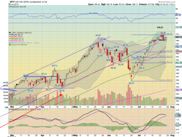
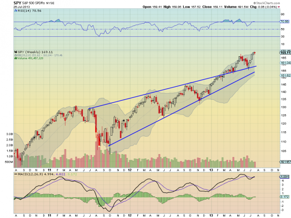
This occurs within a technical backdrop that could facilitate a stock market breakout in either direction. Charles Kirk has returned from his annual vacation and his weekly chart show (small annual subscription, and well worth it) shows the tendencies for each of several time frames. Regular readers know that I love this approach – helpful for almost everyone, but without oversimplifying the story. Charles sees resistance in the current consolidation range, but plenty of room to move if there is a breakout. Most would be surprised by the possible range, especially the next upside target (not what will happen, but what might happen.)

The end of July often starts a very quiet time. Even (!!) Congress will be taking off.

Unless the various factors point in different directions, we could have a surprisingly large move in stocks next week.

Are you ready for action?

I have some thoughts on preparing for next week which I will discuss further in the conclusion.  First, let us do our regular update of last week's news and data.

Background on "Weighing the Week Ahead"
There are many good lists of upcoming events.  One source I regularly follow is the weekly calendar from Investing.com. For best results you need to select the date range from the calendar displayed on the site. You will be rewarded with a comprehensive list of data and events from all over the world. It takes a little practice, but it is worth it.

In contrast, I highlight a smaller group of events.  My theme is an expert guess about what we will be watching on TV and reading in the mainstream media.  It is a focus on what I think is important for my trading and client portfolios. Each week I consider the upcoming calendar and the current market, predicting the main theme we should expect. This step is an important part of my trading preparation and planning. It takes more hours than you can imagine.

My record is pretty good. If you review the list of titles it looks like a history of market concerns. Wrong! The thing to note is that I highlighted each topic the week before it grabbed the attention. I find it useful to reflect on the key theme for the week ahead, and I hope you will as well.

This is unlike my other articles at "A Dash" where I develop a focused, logical argument with supporting data on a single theme. Here I am simply sharing my conclusions. Sometimes these are topics that I have already written about, and others are on my agenda. I am putting the news in context.
Readers often disagree with my conclusions. Do not be bashful. Join in and comment about what we should expect in the days ahead. This weekly piece emphasizes my opinions about what is really important and how to put the news in context. I have had great success with my approach, but feel free to disagree. That is what makes a market!

Last Week's Data

Each week I break down events into good and bad. Often there is "ugly" and on rare occasion something really good. My working definition of "good" has two components:

  1. The news is market-friendly. Our personal policy preferences are not relevant for this test. And especially -- no politics.
  2. It is better than expectations.

The Good

This was a pretty good week for news and data.

  • Voters want more compromise from Congress. While poll results have a partisan flavor, the message seems more important for Republicans. Check it out via the interactive charts.
  • The Europe story continues to improve. Frank Holmes of U.S. Global Investors cites three themes and also some stock ideas. His Europe economic surprise chart is below. Sober Look is not one for irrational exuberance, but cites a number of elements providing "glimmers of hope."

Europe surprises

Image1345

  • Durable goods orders showed impressive growth. Steven Hansen at GEI takes a deep look at monthly changes, year-over-year changes, and inflation adjustments.
  • The oil price spike might be ending, since the gap between WTI and Brent has been closed. (Via Christopher Swann at BreakingViews). (See also NDD at The Bonddad Blog where oil and gas prices are among the high frequency indicators that they track each week).
  • New home sales were strong. Calculated Risk remains bullish on the housing story. A key distinction is between new and existing sales. Read the entire post, but the chart below illustrates the significance of the narrowing gap.

DistressingGapJune2013

  • Consumer confidence from the University of Michigan hit a post-recession high. Calculated Risk notes that the trend has been solidly upward except when "Congress threatened not to pay the bills in 2011. Doug Short's fine chart is the best for relating this to the overall economy:

ConsumerSentJuly2013

The Bad

There was a little bad news.  Feel free to add in the comments anything you think I missed!

  • The House will not act on immigration before the August recess. See The Hill for the story.
  • Rail traffic is down. See Global Economic Intersection for the full story and a helpful chart pack.
  • Larry Summers as Fed Chair? My Kauffman Conference friend Ezra Kauffman broke the story in a carefully measured article. I am scoring this as "bad" for my regular reasons – the market reaction. Even the rumor was enough for some to attribute higher interest rates and lower stock prices to the news. The market sees Janet Yellen as a more dependable dove. For thoughtful commentary on the likely policy impact of either choice consider these viewpoints (all Kauffman friends and colleagues except for McBride). It is pretty one-sided.

    • Cardiff Garcia with a comprehensive a thoughtful analysis of records.
    • Scott Sumner's strong argument against Summers.
    • Brad DeLong's handicapping and emphasis on the need to pick one of the two.
    • Bill McBride on the "premature pivot" to austerity by Summers.
    • The WSJ list of pundits. My favorite quote is from another Kauffman friend, Bob McTeer, who has a great sense of humor. "He [Summers] knows how smart he is, that's a negative, but on the other hand he's real smart, which is a positive."
    • Felix Salmon with another strong opinion against Summers.
    • Mike Konczal (last but never least) on why this is so important. (Hint: no consensus on post-Bernanke actions).
  • Existing home sales missed expectations as Diana Olick reports for CNBC. She notes the effect of distressed sales. Olick continues to have a downbeat take on housing, and this report was a miss by standard criteria. Calculated Risk has a contrary view, emphasizing inventory rather than sales. (See also the new home sales chart above).
  • China's PMI fell to 47.7, the lowest in nearly a year. Prof. Hamilton is concerned, so we should be as well. His concern is not the "modest decline" in the growth rate, but rather credit conditions, so that is what we should monitor.

Hamilton China
The Noteworthy

Maria Bartiromo might be leaving CNBC. Fans will certainly be able to see her somewhere, but it is "no comment" all around so far.

Meredith Whitney states (during a CNBC interview, on the day of the publication of her op-ed in the FT, that she does not want media exposure.

The Indicator Snapshot

It is important to keep the current news in perspective. I am always searching for the best indicators for our weekly snapshot. I make changes when the evidence warrants. At the moment, my weekly snapshot includes these important summary indicators:

  • For financial risk, the St. Louis Financial Stress Index.
  • An updated analysis of recession probability from key sources.
  • For market trends, the key measures from our "Felix" ETF model.

Financial Risk

The SLFSI reports with a one-week lag. This means that the reported values do not include last week's market action. The SLFSI has recently edged a bit higher, reflecting increased market volatility. It remains at historically low levels, well out of the trigger range of my pre-determined risk alarm. This is an excellent tool for managing risk objectively, and it has suggested the need for more caution. Before implementing this indicator our team did extensive research, discovering a "warning range" that deserves respect. We identified a reading of 1.1 or higher as a place to consider reducing positions.

The SLFSI is not a market-timing tool, since it does not attempt to predict how people will interpret events.  It uses data, mostly from credit markets, to reach an objective risk assessment.  The biggest profits come from going all-in when risk is high on this indicator, but so do the biggest losses.

Recession Odds

I feature the C-Score, a weekly interpretation of the best recession indicator I found, Bob Dieli's "aggregate spread."  I have now added a series of videos, where Dr. Dieli explains the rationale for his indicator and how it applied in each recession since the 50's.  I have organized this so that you can pick a particular recession and see the discussion for that case.  Those who are skeptics about the method should start by reviewing the video for that recession.  Anyone who spends some time with this will learn a great deal about the history of recessions from a veteran observer.

I have promised another installment on how I use Bob's information to improve investing.  I hope to have that soon.  Meanwhile, anyone watching the videos will quickly learn that the aggregate spread (and the C Score) provides an early warning.  Bob also has a collection of coincident indicators and is always questioning his own methods.

James Picerno asks, Can the Fed Prevent the Next Recession? He interviews Bob for part of the answer, but also adds his own look at the data. He is asking the right questions in this thoughtful analysis.

I also feature RecessionAlert, which combines a variety of different methods, including the ECRI, in developing a Super Index.  They offer a free sample report.  Anyone following them over the last year would have had useful and profitable guidance on the economy.  RecessionAlert has developed a comprehensive package of economic forecasting and market indicators, well worth your consideration.

Georg Vrba's four-input recession indicator is also benign. "Based on the historic patterns of the unemployment rate indicators prior to recessions one can reasonably conclude that the U.S. economy is not likely to go into recession anytime soon." Georg has other excellent indicators for stocks, bonds, and precious metals at iMarketSignals.

Unfortunately, and despite the inaccuracy of their forecast, the mainstream media features the ECRI. Doug Short has excellent continuing coverageof the ECRI recession prediction, now over 18 months old.  Doug updates all of the official indicators used by the NBER and also has a helpful list of articles about recession forecasting.  His latest comment points out that the public data series has not been helpful or consistent with the announced ECRI posture.  Doug also continues to refresh the best chart update of the major indicators used by the NBER in recession dating. Here are his latest observations:

"Here are two significant developments since ECRI's public recession call on September 30, 2011:

  1. The S&P 500 is up 44.9%, hovering just below its most recent all-time high.
  2. The unemployment rate has dropped from 9.0% to 7.6%."

The average investor has lost track of this long ago, and that is unfortunate.  The original ECRI claim and the supporting public data was expensive for many.  The reason that I track this weekly, emphasizing the best methods, is that it is important for corporate earnings and for stock prices.  It has been worth the effort for me, and for anyone reading each week.

Readers might also want to review my Recession Resource Page, which explains many of the concepts people get wrong.

Our "Felix" model is the basis for our "official" vote in the weekly Ticker Sense Blogger Sentiment Poll. We have a long public record for these positions.  A few weeks ago we briefly switched to a bearish position, but it was a close call. Three weeks ago we switched back to neutral, which was also a close call. Last week Felix turned bullish, again by a small margin. The indicators are more positive this week.

These are one-month forecasts for the poll, but Felix has a three-week horizon.  Felix's ratings have improved quite a bit. The penalty box percentage measures our confidence in the forecast.  A high rating means that most ETFs are in the penalty box, so we have less confidence in the overall ratings.  That measure remains somewhat elevated, so we have a bit less confidence in short-term trading.

[For more on the penalty box see this article. For more on the system ratings, you can write to etf at newarc dot com for our free report package or to be added to the (free) weekly ETF email list.  You can also write personally to me with questions or comments, and I'll do my best to answer.]

The Week Ahead

This week brings plenty of data!

The "A List" includes the following:

  • FOMC announcement (W). No policy change, but words will be parsed for hints about tapering.
  • Employment report (F). People will speculate in advance that the Fed had the number on Wednesday.
  • GDP for Q2 (W). All estimates have been reduced and there is also a major revision of past data. Briefing.com is forecasting a negative print!
  • ISM index (Th). One of the best concurrent economic reads.
  • Initial jobless claims (Th).   Employment will continue as the focal point in evaluating the economy, and this is the most responsive indicator.

The "B List" includes the following:

  • Conference Board sentiment (T). While I prefer the Michigan approach, the Conference Board method usually has a very similar results.
  • Case-Shiller home prices (T). Slower than other sources but widely followed.
  • ADP Employment data (W). A good estimate of private sector employment changes.
  • Chicago PMI (W). Mostly interesting as the best guess for the national ISM number.
  • Auto sales (Th). This is of special interest for overall consumption trends.

There are also several lesser reports – plenty to analyze. Also, after the announcement the "blackout" on Fedspeak will end, so speechifying will resume with Bullard on Friday.

But mostly – Earnings!

How to Use the Weekly Data Updates

In the WTWA series I try to share what I am thinking as I prepare for the coming week. I write each post as if I were speaking directly to one of my clients. Each client is different, so I have five different programs ranging from very conservative bond ladders to very aggressive trading programs. It is not a "one size fits all" approach.

To get the maximum benefit from my updates you need to have a self-assessment of your objectives. Are you most interested in preserving wealth? Or like most of us, do you still need to create wealth? How much risk is right for your temperament and circumstances?

My weekly insights often suggest a different course of action depending upon your objectives and time frames. They also accurately describe what I am doing in the programs I manage.

Insight for Traders

Felix has turned bullish and we are fully invested in trading accounts. The positions include USO (oil) as well as foreign and domestic equity ETFs. While we may well change holdings during the week, we expect to remain fully invested. Felix did well with a short bond position and also the USO trade (so far). The jury is out on the recent switch to a bullish posture. Felix did well to avoid the premature correction calls that have been prevalent since the first few days of 2013, accompanied by various slogans and omens.

Insight for Investors

The most important current theme for investors is what some call the "great rotation." I have called this a potential market turning point. The story continues, so my recent themes are still quite valid.

Josh Brown has a great post summarizing the data and calling the rotation "undeniable."

Gs-chart-o-the-day

If you have not been following this section recently, please find a little time to give yourself a checkup. You can follow the steps below:

  • What NOT to do

Let us start with the most dangerous investments, especially those traditionally regarded as safe. Interest rates have been falling for so long that investors in fixed income are accustomed to collecting both yield and capital appreciation. An increase in interest rates will prove very costly for these investments. It has already started.

  • Find a safer source of yield: Take what the market is giving you!

For the conservative investor, you can buy stocks with a reasonable yield, attractive valuation, and a strong balance sheet. You can then sell near-term calls against your position and target returns close to 10%. The risk is far lower than for a general stock portfolio. This strategy has worked well for over two years and continues to do so. (I freely share how we do it and you can try it yourself. Follow here, and scroll to the bottom).

  • Balance risk and reward

There is always risk. Investors often see a distorted balance of upside and downside, focusing too much on news events and not enough on earnings and value. You need to understand and accept normal market volatility, as I explain in this post: Should Investors be Scared Witless?

  • Get Started

Too many long-term investors try to go all-in or all-out, thinking they can time the market. There is no reason for these extremes. There are many attractive stocks right now – great names in sectors that have lagged the market recovery. Ignore all of the talk about the Fed and focus on stocks.

And finally, we have collected some of our recent recommendations in a new investor resource page -- a starting point for the long-term investor.  (Comments and suggestions welcome.  I am trying to be helpful and I love feedback).

Final Thought

Each week I prepare for action by considering what might happen and how I plan to react. For our enhanced yield program we have some positions where we plan to sell calls on a rally. There are also new positions that would be more attractive to start on a dip. Either way, you can plan for the trade.

For long-term investors you should have a shopping list. When we get new accounts we implement long-term programs gradually. For those who have been in cash (or in poor holdings) you do not need to change everything on day one. Start by selling the worst positions and getting started with your "buy" list.

The most important story might be the GDP report. If it is weak enough, the recessionistas will be out in force. After a two-month absence, we might even see an appearance from the ECRI. None of the important economic data series signal recession, nor do any of my best sources. That will not stop the doomsters if the report is weak enough. Since there are new measurements involved, there will be plenty of spin potential.

Operating without a plan leaves you like a deer in the headlights. You will be unwilling to chase stocks higher on a rally and afraid to buy on a dip.

Volatility is the friend of the trader, but it can be the same for the long-term investor. It starts with having a plan for action.

See the original article >>

SPY Trends and Influencers

by Greg Harmon

Last week’s review of the macro market indicators suggested, after closing the books on the July options cycle and moving into August that the markets were making new highs but looking a bit overdone. We looked for Gold ($GLD) to continue the bounce in its downtrend while Crude Oil ($USO) continued higher. The US Dollar Index ($UUP) looked lower or might consolidate while US Treasuries ($TLT) were bouncing in their downtrend. The Shanghai Composite ($SSEC) looked weak again and headed lower as Emerging Markets ($EEM) were biased to the downside in their bounce in the downtrend. Volatility ($VIX) looked to remain low and biased lower keeping the bias higher for the equity index ETF’s $SPY, $IWM and $QQQ, despite the moves higher the previous week. Their charts were also biased to the upside in the mid term with the QQQ looking lower in the short term while the SPY and IWM could stand to consolidate their moves.

The week played out with Gold gapping higher and holding while Crude Oil found resistance and tailed back slightly. The US Dollar continued lower as Treasuries returned lower. The Shanghai Composite started lower again while Emerging Markets held steady. Volatility tested support before slowly drifting up but remained subdued. Two of the Equity Index ETF’s peaked with the SPY and IWM making new all-time highs before giving back some ground late in the week while the QQQ took all week to close its gap down from last week. What does this mean for the coming week? Lets look at some charts.

As always you can see details of individual charts and more on my StockTwits feed and on chartly.)

SPY Daily, $SPY
spy d
SPY Weekly, $SPY
spy w

The SPY made a top at 169.86 before pulling back slightly. This eventually triggered the bearish Shark (1) Potential Reversal Zone (PRZ) below 168.06. The Shark (2) PRZ remains at 170.22. The bullish engulfing candle Friday gives hope that this was a quick move lower and it is ready to move up again. The Relative Strength Index (RSI) on the daily chart is moving sideways along the 70 technically overbought level, in bullish territory with a Moving Average Convergence Divergence indicator (MACD) that is flat on the signal line and falling on the histogram. These support more pullback or consolidation. The weekly chart shows a consolidation candle after the Advance Block move higher. The RSI is at the 70 level and the MACD is turning higher. These support more upward price action. There is support lower at 168 and 166 followed by 163. The Initial Price Objective (IPO) of the Shark reversal would be to 164.46 and the second target if through that is to 161.13. Resistance higher comes at 169.86 and then there is a target on a Measured Move to 171.25 and then 175. Consolidation in the Uptrend with a Chance of a Pullback.

As July ends and we move into the dog days of August look for Gold to continue the bounce in the downtrend while Crude Oil consolidates or pulls back in the uptrend. The US Dollar Index looks lower while US Treasuries may consolidate but are biased lower. The Shanghai Composite is biased to the downside but may continue to consolidate while Emerging Markets are biased higher in their downtrend. Volatility looks to remain subdued keeping the bias higher for the equity index ETF’s SPY, IWM and QQQ. The QQQ charts seem all for that while the SPY and IWM suggest there is still some downside risk in the short term. Use this information as you prepare for the coming week and trad’em well.

See the original article >>

Should Euro Debt Worry You?

by Tom Aspray

It was a heavy weak of earnings with wild after-hours trading as analysts digested the earnings reports. For example in the first ten minutes after Amazon.com (AMZN) reported its earnings on Thursday, the stock ranged from down $18 to down just $4.

Overall, over 70% of the companies have beat their earning’s estimates and just over 53% have beat on revenue. The earnings beat, so far, is the best since 2006 and was by far the best reading since the end of the bear market. Weaker revenue numbers have been a concern of many analysts and investors. The revenue has been in a gradual downtrend  since the 4th quarter of 2009.

The best news last week came from Facebook, Inc. (FB) whose earnings surprised everyone as its stock gained 22% the day after its earnings were released. In this week’s trading lesson, I took an in-depth technical look at five of the tech giants. The market has not been kind to those that missed earnings as Expedia Inc. (EXPE) lost 22% on the opening Friday.

I also reviewed one of the tech industry groups that has been leading the market higher. It has clearly been a stock picker’s market as the market-tracking ETFs have not allowed many good risk/reward entry points.

My current concern for the stock market is what I see as the longer-term bullish outlook from many analysts. It is not that I disagree with them, but it is not a positive sign for the near-term market outlook. The periodic weaker-than-expected economic news has not dampened the enthusiasm but maybe the Eurozone will again shake up the market before the summer is over. Some negative news from the Eurozone could increase the bearish sentiment enough to fuel another phase in the market’s rally.

chart
Click to Enlarge

The recent efforts by Germany to push their austerity plans fell on deaf ears at the recent economic summit as the majority of the Eurozone, including France, believes that more attention should be paid to economic growth.

The table above demonstrates why Germany is concerned as Greece’s debt is over 160% of its GDP—with Italy, Portugal, and Ireland all over 100% of their GDP, as well. France and Spain are not far behind either. I have favored the stimulus path as the disastrous austerity push in 1936-1937 clearly postponed the economic recovery. I discussed this period in depth last fall Austerity Didn’t Work in ’37…What About Now?.

Of course, I think more could still be done, especially to save the crumbling infrastructure as I fear future disasters will make it clear that this problem needs to be addressed. The US debt level has gradually improved as the economy has become stronger. A growing economy is the fastest way to reduce debt.

chart
Click to Enlarge

There has been some improvement in the economic data from the Eurozone as last Friday’s data on Spain’s unemployment was an encouraging sign. Even better was the purchasing managers data on the Eurozone, which moved above the key 50 level. Germany’s data was even better as after dropping below 50, it rose sharply to 52.8, and France also showed nice improvement.

The business sentiment in Germany, Belgium, and the Netherlands also perked up as Germany’s business confidence improved in each of the past three months. Italian consumer confidence hit its highest level in over a year.

chart
Click to Enlarge

This has given some of the Eurozone stock markets a boost as they had been under pressure for the first half of the year. The % Performance chart for 2013 shows that the iShares MSCI Italy ETF (EWI) was down almost 14% for the year in early April, but now is just down 3.6%.

The ETFs that follow Germany (EWG) and France (EWQ) are now up 7.3% and 6% respectively while Spain (EWP) has just moved back into positive territory. It was  down close to 9% at the start of the month. All are trailing the 18.2% gain in the Spyder Trust (SPY).

Despite these signs of improvement, a shock from the Eurozone is still possible, and next week the Federal Reserve, European Central Bank, and the Bank of England are all meeting. Though nothing substantial is expected from the meetings, a surprise is always possible.

Several of last week’s economic numbers beat expectations as the flash Purchasing Managers Index showed nice gains, and the Durable Good Orders were also much higher due to airplane orders for Boeing (BA). The final reading on consumer sentiment from the University of Michigan was released on Friday and at 85.1 was better than expected

The monthly jobs report is out this Friday, and there is a full slate of economic data this week starting with Pending Home Sales and the Dallas Fed Manufacturing Survey on Monday.

There is more housing data on Tuesday with the S&P Case-Shiller Housing Price Index. The FOMC also starts its meeting and the Conference Board releases its latest data on Consumer Confidence.

The data on Wednesday may set the tone for the whole week as we get the advance reading on the 2nd quarter GDP, the ADP Employment Report, the Chicago Purchasing Managers Index, and the FOMC announcement.

Besides the jobless claims on Thursday, we also get the ISM Manufacturing Index, which sets the stage for Friday’s monthly jobs report. The end of the month adjustment of positions and the full slate of economic data should keep volatility fairly high.

What to Watch
The flat close in the S&P 500 and the Dow Industrials last week was due to the rally late Friday, which brought these averages back to positive territory. The market internals on the NYSE were decidedly negative on Friday. This has weakened some of the A/D indicators, and we still may see a deeper correction as we head into the end of the month. There are no strong sell signals yet, but they may develop this week.

The typical short-term seasonal trend I discussed on June 21 indicated that July would be a better month for stocks. The pattern is also for the market to turn lower at the end of the month and then develop a trading range in August. Given the impulsive rally from the June lows, the pattern may be different this year.

This means that August may be a difficult month for many investors, but those that bought near the recent highs as I discussed last week, may already have some regrets. A further correction should be an opportunity to establish positions in some of the regional banks, as well as the homebuilders, which dropped last week. These stocks are likely to move even lower before their major up trends resume.

A further correction will help to turn the overall sentiment of both the professional investors and the public more negative. The public outlook for the economy is still quite negative as a recent survey by Rutgers University found that 54% of Americans believe the economy will take six to 10 years to recover or will not fully recover from the Great Recession.

This means that a much smaller percentage of the public is invested in the market than they were in the late 1990’s. Those who are investing, like those in the AAII survey, are still too bullish at 45%, even though this is down from 49% in May. The financial newsletter writers are also too bullish at 51.5%, up from a reading of 41.7% on June 26. The number of bears at 19.6% is also too low.

The daily chart of the NYSE Composite shows that while the S&P 500 and Dow Industrials were making new highs last week, it failed to surpass the May high at 9695.46, line a. There is minor support now at 9443-9462 with the 20-day EMA at 9474.

The quarterly pivot is at 9251, and if last week’s high was a short-term top, then the 38.2% Fibonacci retracement support is at 9348 with the 50% support at 9242. This also corresponds to the 20-week EMA at 9237.

The McClellan oscillator, which formed multiple positive divergences at the recent lows, line b, has been diverging as prices moved higher. The drop below the zero line, Friday, confirms the short-term negative divergence and does allow for a further decline.

chart
Click to Enlarge

The daily NYSE Advance/Decline line did not surpass the May highs last week and is now testing its still-rising WMA. It is still well above the support at line c, while the June lows are a more important area of support.

S&P 500
The Spyder Trust (SPY) tested the monthly pivot resistance for the first three days of last week before turning lower. This was the weakest weekly close in the past five weeks, suggesting the rally has lost momentum. The rally from the April lows also lasted four weeks and was then followed by a five-week correction.

There is next support at $167.07 and then at the 20-day EMA at $166.75. The mid-June high was at $166.12, with further support in the $162-$164 area.

The on-balance volume (OBV) turned positive in late June and early July when it moved through its WMA and the downtrend, line d. The OBV has failed to make new highs with prices and this divergence, may be warning of a deeper correction. The OBV has strong support at line e. The weekly OBV is still locked in its trading range and is above its WMA.

The daily S&P 500 A/D made new highs last Monday and has now dropped back to its rising WMA. The WMA could fatten out this week before it is ready to decline. There is initial resistance for SPY in the $168.75-$169.20 area.

chart
Click to Enlarge

Dow Industrials
The SPDR Diamond Trust (DIA) failed to make new highs last week with the Dow Industrials as the high at $155.70 was just below the prior week’s high at $157.74. The flat weekly close has weakened some of the momentum studies as the 20-day EMA at $153.55 was tested on Friday.

The former downtrend, line a, is now in the $150 area with the longer-term up tend, line b, in the $149 area. The key support from late June is at $145.17.

The daily Dow Industrials A/D line broke through the May-June trading range, line c, in early July, and made significant new highs this month. Another new high was made last week though it has now turned lower.

Nasdaq-100
The PowerShares QQQ Trust (QQQ) did much better last week after absorbing the losses from Google, Inc. (GOOG) and Microsoft, Inc. (MSFT) the prior week. Unlike SPY or DIA, it closed the week almost 1% higher as it held above the 20-day EMA at $74.13 and the support at $73.70, line a.

There is additional support now at $72-$73 with the 20-week EMA at $71.83. The quarterly pivot is at $71.03.

chart
Click to Enlarge

The Nasdaq-100 A/D line was stronger than prices last week as it made a new high before turning lower late in the week. The A/D line is still holding above its WMA as it staged a powerful breakout above resistance, line c, in late June.

There is first resistance for QQQ at $75-$75.54 and monthly pivot resistance at $76.08. The weekly starc+ band is at $77.42

Russell 2000
The iShares Russell 2000 Index (IWM) was down a bit for the week as its rally stalled just below $105. The daily starc+ band is now at $106.15 with the quarterly R2 resistance at $106.65.

The daily OBV did confirm the recent highs and is holding well above its WMA and long-term support at line e. The weekly OBV also made new highs, so both OBV time frames are positive.

After breaking out of its trading range, the Russell 2000 A/D line has continued to act strong as it did make a new high with prices and is holding above its WMA.

The rising 20-day EMA is at $102.25 with the daily starc band. There is further support in the $100.38 to $101 area with the quarterly pivot well below current levels at $95.50.

See the original article >>

Stock Market SPX Retraces 50%

By: Anthony_Cherniawski

SPX completed its first impulse on the minute scale at the ope this morning. The rest of the day has been spent on an irregular correction that now appears over at almost precisely the 50% retracement level.

We should see the SPX and other equities markets resume their impulsive decline now.

VIX did not retrace nearly as much as SPX on a percentage basis. It remains clearly above the Ending Diagonal wedge and appears ready to move higher.

See the original article >>

Gold and Silver Price Trend Forecast Progress Report

By: Peter_Degraaf

This chart courtesy Federal Reserve Bank of St. Louis shows the US Monetary Base continues to rise exponentially. This is one of five major (along with many minor) central banks that are daily adding to the money supply of the world. This madness is causing investors to hedge against chaos and price inflation. Precious metals will benefit.

“When national debts have once accumulated to a certain degree, there is scarce, I believe a single instance of their having been fairly and completely paid. The liberation of the public revenue if it has ever been brought about at all, has always been brought about by a bankruptcy, sometimes by an avowed one but always by a real one, though frequently by a pretended payment.” … (Adam Smith).

This chart courtesy Zerohedge.com shows the wide gap that exists in US Government’s spending (red), and revenue (blue). The result is record deficits (green bars). Historically government deficits have coincided with a bull market in gold and silver, due to the fact that deficits are covered with printing press money.

This next chart courtesy Zerohedge.com shows the world's major central banks continue to inflate the combined money supply.

”No paper money system has ever lasted. All have ended in failure and disaster and this present system will end the same way. No matter what efforts are exerted on behalf of paper money.” …(D. R. Schoon).

Featured is the daily gold chart. Price broke out at $1300 on Monday and on Wednesday the breakout was being tested by the gold bears. The supporting indicators are positive (green lines). The RSI at the top of the chart shows a breakout above ‘50’ for the first time this year. A convincing close above the blue arrow sets up a target at the black arrow. Our ‘Gold Direction Indicator’ is bullish at 74%.

Featured is the weekly gold chart. The green arrows point to bottoms in the 7 – 8 week gold cycle. The purple arrows point to tops. The goal is to buy near the bottoms and take partial profits near the tops – not easy, but that is the goal. The breakout at the blue arrow revealed that this is week #4 in the latest cycle. The supporting indicators (green lines) are suggesting higher prices are ahead.

This chart courtesy AIER.ORG shows the Everyday Price Index (blue), compared to the US CPI index (green). The CPI excludes food and energy (who needs those anyway), as being too volatile. The EPI is more realistic and it is warning that price inflation is ongoing. Investors and anyone with money in the bank should add to their stash of gold and silver to protect themselves from this price inflation. Funds on deposit at banks are being eroded as price inflation exceeds interest.

“Invest in inflation; it’s the only thing that’s going up!” …(Will Rogers).


This chart courtesy Short Side of Long shows hedge funds have the least exposure to commodities since the credit crisis of 2008. From a contrarian perspective this is quite bullish for commodities and especially for silver and gold.


The gold stash in JPMorgan's vault keeps dropping. According to Zerohedge.com the total which was 3 million ounces two years ago is now down to just 436 thousand ounces.


This chart courtesy sources listed, shows the demand for gold into China via Hong Kong remains robust.


This chart courtesy Hard Assets Alliance 2013 shows the coincidence between US M2 and the price of gold. The coincidence is currently out of sync, and unless M2 should suffer a very rapid decline, (not likely), the expectation is for gold to rise above M2 again.

“To live beyond your means today is to live below them tomorrow.” ( Hans F. Sennholz).

Featured is the index that compares GDX, (the gold miners ETF), to GLD (the gold bullion ETF). Historically, whenever the miners outperformed bullion, the trend for both was upward bound. Price is in the process of breaking out at the blue arrow. A close above 0.22 will confirm the breakout and marks the July low as the bottom in the correction. The supporting indicators are positive.

Featured is the weekly silver chart. Price is trying to turn up at lateral support near 20.00. Confirmation for the bottom in the 22 month old correction will come once price breaks out at the blue arrow. The supporting indicators are oversold and ready to turn up.

"Back in the 1970s when I liked silver over gold, there was ten times as much silver above ground as there was gold. Despite that, we made twice as much money on silver as we did on gold. Now the ratio has changed. Industrial use has so depleted our silver inventory that US government now owns none. There is six times more gold above ground than silver, which is by far the scarcer of the two metals. So why is gold many times more expensive than silver? Because 99.9% of the people in the world think gold is much rarer than silver. But they are wrong, dead wrong. Sooner or later the supply/demand equation will favor silver and narrow the pricing gap between the two metals." …(Howard Ruff)

Featured is the index that compares SIL (the silver producers ETF) to GDX (the ETF made up primarily of gold producers). Despite the low silver prices, this index has favored silver producers for the past 12 months!!! This is very bullish for silver producers and for silver as well!!! The index is building a bullish chart pattern and a breakout at the blue arrow will set the stage for further gains on the part of SIL over GDX.

See the original article >>

Gold and Gold Stocks – An Important Week

by Pater Tenebrarum

The Perverse Focus on the FOMC and Jobs Data

This week will bring the types of news that are generally considered to be among the most important for gold – the FOMC statement, as well as the July payrolls report (which in turn derives its perceived importance from its effect on central bank policy). It should be pointed out here that it actually makes very little sense for the market to focus on these data points (even though it is clear that the focus exists and cannot be ignored).

Let us consider the payrolls report first: what does it actually tell us? In reality it is a fairly meaningless datum. Not only is it merely an account of the past, it is not even a particularly precise account of the past. The report gets revised several times (at least thrice if memory serves, with the final revisions being done a full year after the report's first publication, when the BLS does its annual revisions). Even the thrice revised version of the report isn't really all that meaningful. After all, the employment statistics are collated in such a manner that all those who are long-term unemployed and considered 'discouraged' are simply no longer counted as unemployed, even though that is what they are. Lastly, even if there were some way of obtaining a perfect payrolls report, it would not really mean much or tell us anything about the future. Employment is a lagging economic indicator. The economy could well be in recession already, even in the face of employment data that still 'look good'.

That is in fact what happened in late 2007: in hindsight it was determined that the economy entered a recession in late 2007, even though most of the real time economic data releases at the time – including payrolls data -  appeared to still look fine. In fact, the Fed, whose reaction to economic data is what the market really cares about, still proclaimed in summer of 2008 that the US economy was likely to 'avoid a recession'. At the time, the recession had been in train for more than half a year already. In short, the Fed is not only incapable of forecasting an economic downturn, it is not even able to recognize a recession that is staring it right into the face.

Now let us consider the FOMC statement, which this month may contain news about the planned 'tapering' of 'QE' as well as refined 'forward guidance' regarding the Fed's interest rate manipulations. Fresh Hilsenblather to that effect has been published late last week, entitled: “Up for Debate at Fed: A Sharper Easy-Money Message”. Apparently we need a more forceful reminder that there will be easy money for as far as they eye can see, or for however long it takes for easy money to bring the economy to utter ruin, whichever comes first.

A pertinent excerpt:

“At their July 30-31 meeting, Fed officials are likely to discuss whether to refine or revise "forward guidance," the words they use to describe their intentions for the next few years.

With short-term interest rates near zero, the Fed sees such guidance as an important part of its monetary-policy arsenal. For instance, telling investors that short-term rates will stay low for a long time, Fed officials believe, helps hold down long-term rates, and that encourages borrowing, spending, investing and growth.

The Fed has said that it intends to keep short-term interest rates near zero at least until the jobless rate drops to 6.5% or unless inflation rises to a 2.5% annualized rate. Mr. Bernanke suggested at his June press conference that the Fed might lower that 6.5% threshold for unemployment, which was set in September. Such a move would drive home to markets that short-term interest rates will be low for a long time.

Some Fed officials argue it would be too soon to raise short-term rates even after joblessness drops below 6.5%. In part, they see inflation as unthreatening, which means rates can stay low longer. They fear the jobless rate, now 7.6%, doesn't reflect other weaknesses in the labor market, such as people leaving the workforce or working part time when they want full-time work.

"There are a number of problems with the labor market," Mr. Bernanke told lawmakers earlier this month. He pointed to "underemployment," people who work fewer hours than they would like or at jobs below their skill level.

There are other rhetorical steps the Fed might take in its forward guidance. One would be to match its publicly set upper bound for inflation with a new lower bound. The central bank has said it will raise short-term rates if inflation is seen as rising above the 2.5% target. It hasn't said what it would do if inflation drops much below the Fed's 2% medium-term objective. One option is to say that short-term rates won't rise if inflation falls below some threshold, perhaps 1.5%. Mr. Bernanke has already suggested as much.

"The [Fed] would be unlikely to raise the funds rate if inflation remained persistently below our longer-run objective," Mr. Bernanke said at congressional hearings this month. A formal assurance might amplify the Fed's message that rates are staying low and address the concern of some officials—notably St. Louis Fed President James Bullard—that the Fed needs to show resolve in preventing inflation from falling too low.

One issue likely to be on the table next week: Whether changing its words will clarify its intentions or further confuse investors and stir market volatility”

(emphasis added)

What hubris to think that tinkering with the price of credit can alter conditions for people who are 'employed below their skill level'. Anyway, to the above we can only say: you heard it here first.  We already pointed out many months ago that the Fed would eventually lower its '6.5% unemployment rate target'. We also emphasized the importance of Mr. Bullard's dovish dissent (which the markets ignored at the time) on the grounds that 'inflation' is allegedly 'too low'.

That such nonsense sees print without the entire economics profession up in arms over the futility and dangers of such misguided interventionism reflects very badly on the economics profession. No wonder many people today no longer even believe economics to be a science or say things like 'the laws of economics don't exist', as was recently asserted in an article in the Atlantic. This is the end result of the quackery promoted above. Essentially, the functional equivalent of a coven of witch doctors is in charge of the economy. Their organization should not even exist: the economy does not require meddling to 'function better'. It works best when it is left to its own devices.

As to the gold market, the main reason why it would do best to ignore the FOMC, is that the damage has already been done. It is clear that at some point the 'QE' program will have to be curtailed or stopped, because not doing so would be playing with fire. However, the negative effects of the policies already implemented have yet to play out. It takes time for these effects to become manifest. In terms of broad and noticeable effects on consumer prices, the lag between too loose monetary policy and the outbreak of 'inflation' as measured by CPI and similar attempts to discern the mythical 'general price level', can amount to many years.

Consolidation Period Ahead of the Data

In any case, both gold itself as well as the gold stocks are consolidating ahead of these data releases, which are presumably going to serve as the 'trigger' for the next major move. Once again, the data themselves are actually irrelevant. Whether or not the FOMC statement is considered 'dovish' or 'slightly less dovish' (we can rule out 'hawkish' a priori) and whether or not the payrolls report is held to be 'strong' or 'weak', it is the market's reaction to the data that will be important, not the data themselves.

In order to better show where things stand, we have taken a closer look at the lows of 2000/2001 in gold stocks. In a previous update on July 17 we pointed out the following with regard to the HUI index:

“From the point of view of bulls, an ideal progression would therefore be: closing of the gap, followed by penetration of the 50 day moving average, followed by a successful test of the moving average as new support on the first pullback, followed by a flattening and upturn of the moving average.”

Here is what this process looked like when the 2000-2001 bottom was put in after a relentless decline into the final low; as you can see, all the conditions listed above were fulfilled, step by step:


HUI-2000-2001

The HUI index 2000-2001. A detailed view of how the turn from bear market to bull market progressed at the time – click to enlarge.


Now let us take a look at the current situation and compare it to the turn shown above:


HUI-today

The HUI today: the 50 day ma has been overcome, there was an RSI/price divergence at the low, and so far,  the tests of the 50 day moving average have held. In addition, the moving average is beginning to flatten out – click to enlarge.


All in all, this looks quite constructive so far: several of the preconditions for a durable turn are in place. There is however still one caveat, namely that the time spent above the 50 day moving average is still quite short. As can be seen in the year 2000 example, there have been several attempts at the time to cross above this moving average that ultimately ended with a rejection. These occasions were marked by the market spending at most a few trading days above this demarcation. Therefore it remains possible that the index will be rejected once again at this point.  However, once the 50 day ma actually turns up, one can probably give the all clear. This week's data releases will likely provide the decisive impetus one way or the other.

Gold itself has been mired in a corrective looking formation, oscillating around its 50 day moving average over the past week. It is currently consolidating just below the important $1,350 level. Once again, this is an area where the market is may be rejected again, but if a breakout occurs, it will be quite convincing. In the former case, we would have confirmation that the bearish phase is not over yet, in the latter case we would have confirmation that at least a medium term rebound is now underway.


Gold, one week, 30 minGold, August contract, 30 minute chart. This looks like some sort of corrective formation – click to enlarge.


Gold spot, daily annotZooming out to the daily chart of spot gold, it is now oscillating around the 50 day moving average, just below the important $1,350 resistance level – click to enlarge.


In short, both from a fundamental and technical perspective, this week is likely to be quite important for the market's short to medium term direction.

There was one event late last week that is worth mentioning. After Newmont Mining (NEM) delivered its earnings report on Thursday after the close – which was as bad as widely expected – the stock opened with a gap down on Friday, but soon found a low and spent the remainder of the day recovering. It ultimately closed in positive territory. Since NEM is a 'bellwether' stock for the sector, this has to be taken as a positive sign:


NEM, 5 minuteNEM recovers after opening 'gap down' following its earnings report – click to enlarge.


And finally, here is a long term chart of the BGMI from our friend Bernard that further illustrates the previously discussed long term 'A-B-C flat correction' idea:


Expanded Flat BGMI

The BGMI from the 1940s to today: the action since the 2008 high is likely a 3-3-5 flat correction  – see the stylized form to the right – click to enlarge.


Of course there remains one fly in the ointment, namely the fact that flat corrections in which wave C ends above the low point of wave A are very rare. Normally one would therefore expect a low below the 2008 low to be eventually made. However, there is one point worth considering in this case, namely the fact that what happened in 2008 was a crash wave. That may well have skewed the correction toward producing a lower A wave low. One reason why this appears increasingly likely is that the wave counts of a number of individual shares look complete.

Nevertheless, one should not dismiss the possibility that wave C could still become bigger. Ironically, although it would then be among the very worst bear markets in gold stocks in history, it would still be technically regarded as part of a secular bull market.

See the original article >>

A Reality Check on the Stock Market in 7 Charts

By Michael Snyder

The mainstream media would have us believe that the U.S. economy must be in great shape since the stock market has been setting new all-time record highs this month.  But is that really true?  Yes, surging stock prices have enabled sales of beach homes in the Hamptons to hit a brand new record high.  However, the reality is that stock prices have not risen dramatically in recent years because corporations are doing so much better than before.  In fact, the growth in stock prices has been far, far greater than the growth of corporate revenues.  The only reason that stock prices have been climbing so much is because the Federal Reserve has been flooding the financial system with hundreds of billions of dollars that it has created out of thin air.  The Fed has created an artificial stock market bubble that is completely and totally divorced from economic reality.

Meanwhile, everything is not so fine for the rest of the U.S. economy.  Economic growth projections have been steadily declining over the past two years, and the growth rate of personal income in the United States has been on a huge downward trend since 2008.  The U.S. economy actually lost 240,000 full-time jobs last month, and the middle class continues to shrink.

So welcome to the "new normal" where most Americans struggle at least part of the time.  According to one recent survey, "four out of 5 U.S. adults struggle with joblessness, near poverty or reliance on welfare for at least parts of their lives".  Things are tough out there, and they are steadily getting tougher.

Yes, the boys and girls up on Wall Street are doing great (for the moment), but most of the rest of the country is really struggling.  We have never even come close to recovering from the last major economic crisis, and now another one is rapidly approaching.

The other day, Chartist Friend from Pittsburgh sent me an email and told me that he had some charts that he wanted to share with me and asked if I wanted to see them.  I said sure, send them over right away.  These charts show very clearly that the stock market has become completely divorced from reality.

In a normal market, stock prices would only rise dramatically if the overall economy was healthy and growing.  Unfortunately, our economy is far from healthy and has been declining for a very long time.  If the financial markets were not being pumped up by so much money printing and so much debt, there is no way that stock prices would be this high.

If we truly did have a free market financial system, stock prices should be a reflection of the overall economy.  Instead, we have a very sick economy and financial markets that have been very highly manipulated.

For example, just check out the first chart that I have posted below.  If the economy was actually getting better, the percentage of working age Americans with a job should be increasing.  Sadly, that is not happening...

CFPGH-DJIA-04

This next chart shows how the average duration of unemployment has absolutely skyrocketed in recent years.  Yes, the duration of unemployment has improved slightly in recent months, but we are still very far from where we used to be.  Meanwhile, the stock market has been soaring to new all-time record highs...

CFPGH-DJIA-11

Traditionally, there has been a high degree of correlation between stock prices and real disposable personal income.  From the chart below, you can see that this relationship held up quite well through the end of the last recession, and then it started breaking down.  This is especially true at the very end of the chart.  Real Disposable income has started to decline sharply but stock prices just continue to soar...

CFPGH-DJIA-19

When an economy is healthy, money tends to circulate through that economy at a healthy pace.  That is why the chart below is so alarming.  The velocity of money is the lowest that it has been in modern times, and this indicates that economic activity should be slowing down.  But the Federal Reserve has enabled the bankers to thrive by pumping massive amounts of money into the financial system...

CFPGH-DJIA-05

When an economy goes into recession, freight shipments tend to go down.  In the chart below, you can see that this happened during the past two recessions.  Unfortunately, we have never even come close to returning to the level that we were at before the last recession, and yet the stock market has been able to soar to unprecedented heights...

CFPGH-DJIA-17

When an economy is growing and people are able to get good jobs, they tend to go out and buy new homes.  Yes, we have seen a bit of an increase in the number of new homes sold recently, but we are still a vast distance away from the level we were at before the last recession.  And now mortgage rates are starting to rise steadily, and this is likely going to cause the number of new homes sold to start going back down.  The chart below clearly shows us that the real estate market is far from healthy at this point...

CFPGH-DJIA-09

For most middle class Americans, their homes are their primary financial assets.  So the fact that home prices have declined so much is absolutely devastating for many families.  But stocks are primarily held by the top 5 percent of all Americans, and as the chart below shows, they have benefited greatly from the antics of the Federal Reserve in recent years...

CFPGH-DJIA-08

There is no way in the world that the stock market should be this high.  The economic fundamentals simply do not justify it.  As a society, we consume far more than we produce, our debt is growing at an exponential pace, our economic infrastructure is being absolutely gutted and our financial system is a giant Ponzi scheme that could collapse at any time.

And no market can stay divorced from reality forever.  At some point this bubble is going to burst, and when financial bubbles burst they tend to do so very rapidly.

As Marc Faber recently said, "one day, this financial bubble will have to adjust on the downside."

When it does "adjust", we are likely going to see a financial panic even worse than we witnessed back in 2008.  Credit will freeze up, economic activity will grind to a standstill and millions of Americans will lose their jobs.

Don't assume that the bubble of false prosperity that we are enjoying right now will last forever.

It won't.

Use the time that you have right now to prepare for what is ahead.

A great storm is rapidly approaching, and I don't see any way that it is going to be averted.

See the original article >>

Junk bond fever building as high grade trails

By Lisa Abramowicz

Investors are pumping money into junk bonds globally at the fastest pace ever while tempering their enthusiasm for higher-rated debt, demonstrating a preference for yield over stability.

Speculative-grade bond funds received a record $5.4 billion of deposits in the week ended July 24 while investors yanked $1.8 billion from investment grade, according to data from market researcher EPFR Global. Bond buyers are accepting the lowest yields in more than two years on riskier dollar- denominated debt relative to more creditworthy notes, Bank of America Merrill Lynch index data show.

Investors who abandoned junk bonds at a record pace in June are now casting aside concern that the securities will lose their allure as the Federal Reserve slows its record stimulus because of the extra yield the securities offer. The demand is allowing the neediest borrowers to ramp up indebtedness.

“High yield is far less vulnerable to a rise in interest rates than investment grade,” Gregory Kamford, a credit strategist at RBS Securities Inc. in Stamford, Connecticut, said in a telephone interview. The securities will “materially outperform investment grade over the balance of 2013,” he said.

Corporate bonds globally of all ratings lost 2.4% in June, the biggest decline since October 2008, after Fed Chairman Ben S. Bernanke said May 22 that sustainable labor-market progress could prompt policy makers to scale back $85 billion of monthly purchase of Treasuries and mortgage bonds.

Junk Rally

Intelsat SA, the world’s biggest satellite services company, has led gains this month of 1.82% on junk bonds worldwide, the most in a year, after Bernanke said on July 17 that the U.S. central bank plans to “maintain a high degree of monetary accommodation.” Investment-grade notes have returned 0.9%.

The gap between yields on dollar-denominated high-yield and investment-grade bonds contracted to 3.18 percentage points on July 23 from 4.6 percentage points a year earlier as demand for the riskier debt surged, Bank of America Merrill Lynch index data show.

Investors poured $1.1 billion into exchange-traded funds that focus on dollar-denominated junk bonds in the five weeks ended July 17, compared with $173.8 million of withdrawals from investment-grade bond ETFs, according to data compiled by RBS.

Default Swaps

“The Fed has successfully dampened volatility over the past few weeks,” Adam Richmond, a credit strategist at Morgan Stanley in New York, said in a telephone interview. “What has changed? Probably not much.”

Elsewhere in credit markets, the cost of protecting corporate debt from default in the U.S. increased, with the Markit CDX North American Investment Grade Index, which investors use to hedge against losses or to speculate on creditworthiness, climbing 2 basis points to a mid-price of 76.3 basis points as of 12:21 p.m. in New York, according to prices compiled by Bloomberg.

The measure typically rises as investor confidence deteriorates and falls as it improves. Credit-default swaps pay the buyer face value if a borrower fails to meet its obligations, less the value of the defaulted debt. A basis point equals $1,000 annually on a contract protecting $10 million of debt.

Morgan Stanley

The U.S. two-year interest-rate swap spread, a measure of debt market stress, rose 0.2 basis point to 16.2 basis points as of 12:22 p.m. in New York. The gauge widens when investors seek the perceived safety of government securities and narrows when they favor assets such as company debentures.

Bonds of Morgan Stanley are the most actively traded dollar-denominated corporate securities by dealers today, accounting for 5% of the volume of dealer trades of $1 million or more as of 12:23 p.m. in New York, according to Trace, the bond-price reporting system of the Financial Industry Regulatory Authority.

Speculative-grade funds globally faced their biggest weekly outflow on record in the week ended June 26 with $6.8 billion of withdrawals, according to EPFR in Cambridge, Massachusetts. Yields on 10-year Treasuries soared to 2.74% on July 5, the highest since August 2011.

When Bernanke said on July 17 that the Fed’s asset purchases aren’t on a “preset course,” the market retraced some of the declines. “We’re going to be responding to the data,” Bernanke said in testimony before the House Financial Services Committee.

Intelsat, Valeant

While high-yield debt has gained back more than half its 2.8% decline in June, investment-grade bonds have recouped less than a third of their return and have lost 1.2% since year-end.

High-yield bonds are graded below Baa3 by Moody’s Investors Service and lower than BBB- at Standard & Poor’s.

Bonds of Intelsat, the largest issuer of high-yield bonds in the U.S. this year, have gained 3.99% this month, the most among the biggest 50 borrowers in the Bank of America Merrill Lynch Global High Yield Index. Valeant Pharmaceuticals International Inc., the Laval, Quebec-based drug distributor acquiring Bausch & Lomb Holdings Inc., returned 3.88%.

Relative yields on high-yield bonds globally were 511 basis points on July 26 compared with the all-time low of 233 in June 2007, Bank of America Merrill Lynch index data show. Spreads on investment-grade notes of 150 basis points are up from this year’s low of 132 on May 28.

More Volatility

Luke Hickmore, an investment director at Scottish Widows Investment Partnership in Edinburgh, said his firm favors junk bonds over higher-rated debt.

“The difference between the absolute yield you get in high yield versus investment grade will grind tighter as slowing stimulus becomes a reality,” he said.

More volatility may be in the offing if the economy shows signs of improvement, flaring concern that the Fed will slow its bond purchases faster which would send yields soaring. Payrolls climbed by 202,000 a month on average from January through June, up from 180,000 in the second half of 2012, Labor Department figures show.

“We’ve been bearish on high yield for several months,” said Andrew Rabinowitz, a partner and chief operating officer of Marathon Asset Management LP, a hedge-fund firm that oversees more than $10.5 billion. “We’re still skeptics of it. It’s a yield play.”

Default Rate

Median leverage for high-yield companies has risen to 3.92 times from 3.42 times at the end of 2011, according to a June 3 report by Morgan Stanley strategists led by Richmond. Borrowers have sold $305.5 billion of speculative-grade bonds this year globally, more than the $206.5 billion issued in the same period last year, Bloomberg data show.

RBS strategists forecast that high-yield bonds will return 8.3% in 2013, compared with a 0.6% gain for investment-grade notes, Kamford said.

The 12-month trailing global speculative-grade default rate fell to 2.8% at the end of the second quarter from 3.1% in the same period last year, Moody’s said July 11. The ratings firm expects the rate to rise to 3.2% by year- end.

“Default rates are close to historic lows and are expected to stay that way for the foreseeable future,” Kamford said. “We prefer high yield versus investment grade due to the extra coupon cushion it provides.”

See the original article >>

Follow Us