Monday, May 2, 2011

What Drives the Deficit?

By Barry Ritholtz

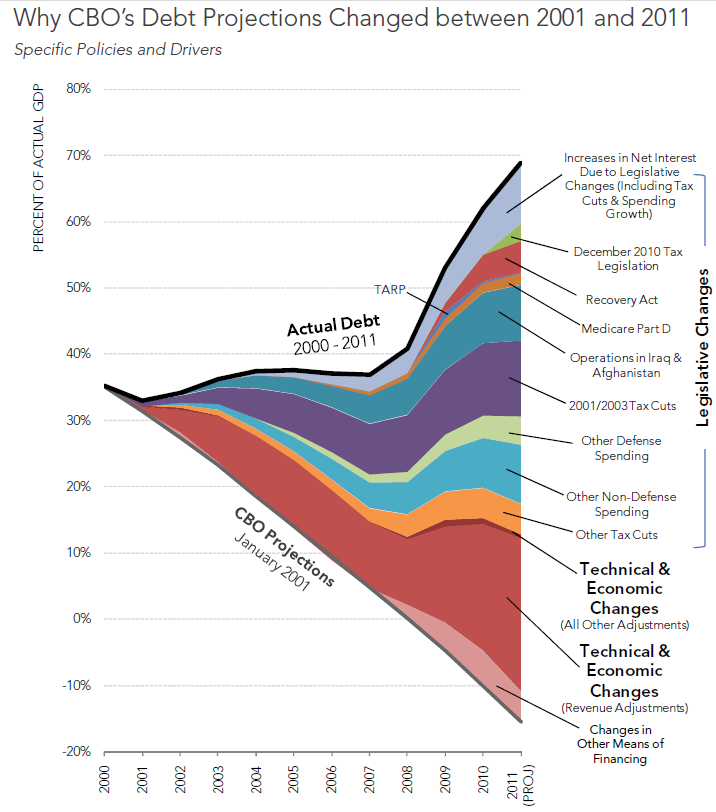
Excellent set of charts and analysis from the Pew Fiscal Analysis Initiative breaking down the sources of the deficit:
The U.S. will likely owe $10.4 trillion this year, its largest debt relative to the economy since 1950. However, the Congressional Budget Office (CBO) projected in 2001 that the federal government would erase its debt in 2006 and be $2.3 trillion in the black by 2011 – a $12.7 trillion difference from today’s reality.
This fact sheet highlights the extent to which major legislation enacted over the last decade and other factors have contributed to the Great Debt Shift – the difference between CBO’s 2001 projections and actual debt today.
Click for larger graphic
>


Prepare for a Stock-Market Reversal, Even at New Bull-Market Highs


Keith Fitz-Gerald writes: In a stunning display of determination (or simple greed), U.S. stock prices are once again at new highs - despite problems in the Middle East, out-of-control government deficits throughout the world, an increasingly inflated China and the looming end to the U.S. Federal Reserve's free-money boondoggle, otherwise known as "QE2."

Should you be worried about a stock-market reversal?

I know that I am.

But here's the thing: While there's no question that a stock-market breakdown could derail the best of investing intentions, it doesn't have to derail your financial future. More to the point, if you understand when stock-market "turning points" are likely to occur, you can establish positions or trades ahead of time that will yield profits when those expected transitions actually come to pass.

Anticipating a Stock-Market Reversal
For example, knowing that a stock-market reversal may be in the cards allows you to tighten up your trailing stops as a means of protecting hard earned profits. Similarly, knowing that a potential turning point is forming can be a powerful signal to ready your "shopping list" of things you want to buy, because dips and periodic pullbacks make great (and highly profitable) buying opportunities.

I'm not advising you to try and "time" the market - study after study underscores what a bad idea that is - but I am telling you to be opportunistic.
And there's a difference. 

By being opportunistic, I'm advising you to take steps to understand the stock market's ebbs and flows - and then using that understanding in ways that help you preserve your wealth and capitalize on opportunity when it knocks.

And if that stock-market reversal never comes to pass, that's fine, too - at least you're thinking strategically about your investments, have set up potential profit opportunities, and are prepared for any number of contingencies. 

So where are we now?

At this point in earnings season, we're looking back at nine consecutive quarters of growth. We're also seeing a shift in sentiment, as even some of the most strident of pessimists become optimists. And last but not least, we're also watching with a mixture of hope and worry as the U.S. central bank gets ready to withdraw QE2 - an act that will rob the markets of the trillions of dollars in cheap money to which it's become addicted. 

Commodities continue to rally and the U.S. dollar continues to fall.

And, unbelievably, still the markets rally. The Standard & Poor's 500 Index, the Dow Jones Industrial Average and the Nasdaq Composite Index are all up substantially off their March 2009 lows: As of Thursday's close, the S&P 500 is up 101.96%, the Dow 94.94%, and the Nasdaq is up 126.42%.

Three Indicators to Watch
But there are some worrisome signs. For instance, many investors have grown overly bullish. They seem determined to cheer on the market bull and, even more worrying, to ignore anything that could remotely interfere with their hopes for riches or dreams of wealth.

The bottom line: They're no longer paying attention to reality.

So where are we right now? Let's look at three indicators I like to follow:

•The "Keltner Bands."
•The "Hindenburg Omen Indicator."
•And the "R-squared" indicator.
We'll start with the Keltner Bands.

Market Insights From the "Keltner Bands"
First publicized in 1960 by Charles W. Keltner in his book, "How to Make Money in Commodities," Keltner Bands identify volatility around the trend rather than volatility around price, which is what their more widely recognized "cousin," the Bollinger Bands, do.

Consequently, they can help you identify situations of relative overvaluation, or undervaluation, especially if prices have moved above or below "normal" price ranges.

Typically comprised of three lines - a trend and two lines representing the upper and lower boundaries of "normal" volatility - the Keltner-Band indicator is surprisingly easy to read.

Here's an example showing the SPDR S&P 500 Exchange Traded Fund (NYSE: SPY) that may help.


Right now, the price is slightly near the upper boundary of normal price movement. This suggests to me that a stock-market reversal is possible if for no other reason than prices are a little "rich."


Beware of the Hindenburg Omen Indicator
As descriptive as the name sounds, the Hindenburg Omen Indicator is one of my favorites, although many investors may not be aware of it.

Based on the High Low Logic Index created by Norman Fosback, the Hindenburg Omen has proven remarkably accurate in gauging the stock market's relative strength or weakness, as measured by the New York Stock Exchange. 

For instance, the Hindenburg Omen has nailed every NYSE crash since 1985.

The key premise is very simple: There are three conditions that, when met, signal a "warning":

•First, the number of NYSE new highs and lows must be more than 2.8% of the advances plus the declines.
•Second, the number of new highs cannot be more than twice the number of new lows.

•And, third, the NYSE composite must be above its 50-day moving average.

When a warning is triggered, the indicator suggests a 30-day cautionary period. A secondary reading within that time period suggests a 77% probability of at least a 5% decline in the following 40 days.

Here's an info-graphic that illustrates several key Hindenburg warnings along with the market's past behavior based on my proprietary version of the calculations. You'll note that there is a "confirmed" reading before each major decline (designated by the shaded regions), which gave investors ample time to prepare and profit prior to the actual stock-market reversal.

At the present time there is no reading. But the lack of a "Hindenburg" warning should not be taken as a signal that you can rest easy. Not right now.


The Artful R-Squared Indicator
The R-squared indicator is a statistical measure taught in basic statistics classes the world over. In a nutshell, it's used to gauge just how good one data series is at predicting the values associated with another. For instance, if the R-squared reading is 1.0, then academics would say you can perfectly predict the second data series' behavior. If it is a 0.0, then the one data series cannot be used at all to model the second.

When it comes to investing, I like to prepare for stock-market reversals or pullbacks when the trend is up and the R-squared reading exceeds 0.80 and is rising. If the trend is down, I'll start loading up on stocks I want to buy as the reading again approaches 0.80. 

Right now, the R-squared reading is 0.22 and rising which suggests, from a mathematical perspective, that the rally is more likely to continue than it is to fail.

Moves to Make Now
In closing, two of the three technical indicators I most prefer to use - I'm speaking here about the Keltner Bands and the R-Squared indicator - are flashing "yellow," which suggests that caution is in order. So is a little preparation. 

Here's what I suggest:

•Move your trailing stops higher across all asset classes and get ready to take profits if there is a stock-market reversal and stock prices break down.
•Consider establishing positions that profit from short-term declines, including the purchase of "put" options on the indices or on specific stocks; also consider the purchase of specialized "inverse funds" that actually rise when everything else falls.
•Get ready to buy. Many of the trends the markets are ignoring right now are not going away, even though a short-term reversal in the markets may cause many investors to lose their nerve. Short-duration bond funds, energy shares, and "glocal" companies are all good choices at the moment. [Editor's Note: A "glocal" stock is a term that Fitz-Gerald uses to describe large, U.S.-based multinational corporations whose global operations include a local presence - especially in the crucial markets of China and Greater Asia. Most of these companies are publicly traded, and have their shares listed on the S&P 500 stock index.]
In closing, I've got one more sure-fire indicator to think about.

Knowing that the herd is almost inevitably wrong at major stock-market turning points, I tend to get very nervous when I hear stories about the last-remaining pessimists shifting over to the optimists' camp - just as perma-bear and notable curmudgeon David Rosenberg, chief economist at Gluskin Sheff & Associates Inc. (PINK: GLUSF), did recently.

EXTREME MARKET CONDITIONS AND THE FED’S DISEQUILIBRIUM

by Cullen Roche

John Hussman’s weekly letter has some excellent insights into the unusual market conditions we are currently confronted with. Clearly, the Bernanke Put has exacerbated moves in just about every market. The result is an ever increasing disequilibrium. This, after all, is what the Greenspan/Bernanke Put has been doing to the market for the last 25 years. Rather than allowing markets to be markets, the Fed has felt the need to coddle and “talk up” markets at every chance possible. They see this as some sort of positive contributing force. I see it as a highly destabilizing market force that significantly contributes to the volatility of the business cycle. The market is not the real economy. Therefore, focusing government policy on nominal wealth creation is just another way of putting the cart before the horse.

So, just how extreme are the current conditions? Mr. Hussman notes:
“It’s clear that present conditions are among the most extreme in history. In fact, to capture instances other than today, 1987 and 2007, we have to broaden the criteria. The following are sufficient for purposes of discussion:
1) Overvalued: Shiller P/E over 18 (presently, the multiple is over 24)
2) Overbought: S&P 500 within 1% of its upper Bollinger band on a daily, weekly and monthly resolution (20 periods, upper band 2 standard deviations above the moving average), and S&P 500 at least 20% above its 52-week low.
3) Overbullish: Investors Intelligence bullish sentiment at least 45% and bearish sentiment less than 25% (presently, we have 54.3% bulls and 18.5% bears).
4) Rising yields: Yields on the 10-year Treasury and the Dow 30 Corporate Bond Average above their levels of 6 months earlier.
I should note that while present conditions easily fit into the foregoing criteria, we generally use a somewhat less restrictive criteria to define an “overvalued, overbought, overbullish, rising-yields syndrome in practice, in order to capture a larger number of important but less extreme periods of risk. The foregoing set of conditions isn’t observed often, but the historical instances satisfying these criteria in post-war data are instructive. Here an exhaustive list of them:
August 1972, November-December 1972: The S&P 500 quickly retreated about 5% from its August peak, then advanced again into to its bull market peak near year-end (about 6% above the August peak). The Dow then toppled -12.3% over the next 50 trading days, and collapsed to half its value over the following 22 months.
August 1987: The market advanced about 6% from its initial signal into late August. The S&P 500 then lost a third of its value within 8 weeks.
June 1997: The only mixed outcome, during the strongest segment of the late 1990′s tech bubble. The S&P 500 advanced another 10% over the following 8 weeks, surrendered 4%, followed with a strong advance for several months, surrendered it during the 1998 Asian crisis, and then reasserted the bubble advance. Over a 5-year period, the overvaluation ultimately took its toll, as the the S&P 500 would eventually trade 10% below its June 1997 level by the end of the 2000-2002 bear market. Still, the emergence of the internet, booming capital spending, strong economic growth and job creation, rapidly falling inflation, and dot-com enthusiasm evidently combined to overwhelm the negative short- and intermediate-term implications of this signal.
July 1999: The S&P 500 advanced by 3% over the next two weeks, then declined by about 12% through mid-October, and after a recovery to the March 2000 bull market high, the S&P 500 fell far below its July 1999 level by 2002.
March 2000: The peak of the bubble – the S&P 500 lost 11% over the following three weeks, recovered much of that initial loss by September, and then lost half its value by October 2002.
May/June 2007, July 2007: The S&P 500 gained 1% from the late-May/early-June signal to the July signal, then lost about 10% through August 2007, recovered to a marginal new high of 1565.15 by October (about 1% beyond the August peak), and then lost well over half of its value into the March 2009 low.
February 2011, April 2011: A cluster of signals in the 2-week period between February 8-22 immediately followed by a decline of about 7% over the next 3 weeks. As of Friday, the market has recovered to a marginal new high about 1.5% above the February peak.
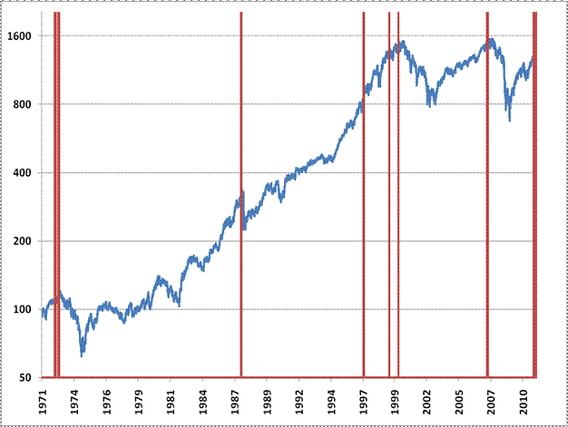
So not including the cluster of signals we’ve observed in recent months, we’ve seen 6 clusters of instances in post-war data (we’re taking the 1997, 1999 and 2000 cases as separate events since they were more than a few months apart). Four of them closely preceded the four worst market losses in post-war data, one was quickly followed by a 12% market decline, and one was a false signal over the short- and intermediate-term, yet the S&P 500 was still trading at a lower level 5 years later. The red bars indicate instances of this syndrome since 1970, plotted over the S&P 500 (log-scale).”
You can clearly see that these destabilizing environments became more pronounced during the Greenspan era. This was the beginning of the Fed’s unprecedented direct intervention in markets and their very vocal market prognostications. The Bernanke era is looking no different. In fact, you could even argue that it is worse. Mr. Greenspan was never as explicit about the Fed’s desire to see higher asset prices as the Bernanke Fed has been. And while John Hussman’s work may not turn out to be prescient (though always enlightening) it does shed some light on the evolving role of the Fed and the highly destabilizing factor they play in the markets.

See the original article >>

Gold Jumping the Track Or Reaching a Routine Target?

By: Adam_Brochert

When looking at longer time frames using technical analysis/charting, it is often appropriate to use a log scale price chart versus using a linear scale price chart for shorter-term time frames. But at what exact time frame should you switch from a log scale chart to a linear scale chart and what are the exceptions? Well, the answer is that we are dealing with art as much as science when using technical analysis.

But while doing my weekly exercise in charting the Gold universe, I found an interesting discrepancy in the Gold chart between its current price level and its prior speculative price peaks earlier in the secular Gold bull market. As an aside, the secular Gold bull market is far from over, so these are only short-term considerations. However, these charting issues could have quite profitable short-term implications for those riding the Golden bull.

Without further ado, here are the charts that have me intrigued. First, a log scale chart over the last 7 years of this Gold secular bull market ($GOLD) thru Friday's close:


Great news and it means we have plenty of upside potential left for the current Gold run. However, the linear scale chart over the same 7 year period demonstrates an interesting and slightly different trend line situation:


So, which chart is correct? Are we heading to a routine price target or jumping the shark and entering a more aggressive phase of the Gold bull market? The answer, I believe, is the latter. I base this partly on the recent action in silver, which has far outperformed Gold over the past year. Here is the linear scale chart of silver ($SILVER) over the same past seven years:


Obviously, silver is in a new linear trend, but it presumably would stop at it's log scale trend line - or would it? Here's the log scale chart of silver over the past 7 years:


The "hot" money has made a boatload of cash in silver and there's likely still more to be made in this intermediate term run for the white metal. However, rotation of speculative money into Gold has likely begun and things could be just starting to heat up. As Sinclair has been saying, $1650 is in the bag for this run. However, could we also be looking at jumping the log scale trend line on this move like silver has done?

It certainly feels like the right time during this bull market in Gold for the transition to begin. The log scale trend line in Gold is likely to result in short-term profit taking as the linear scale trend line did in silver. However, I think it would be just another buying opportunity if it happened.

When the Dow to Gold ratio gets below 2, then I might consider starting to look around for other investment opportunities and selling some physical Gold. When I do sell some Gold, it will likely be in order to buy Gold stocks with the proceeds, which will likely peak after the Dow to Gold ratio bottoms (as they did in the previous two cycle nadirs in the Dow to Gold ratio). Until then, I'm just going to keep enjoying the ride in Gold.

Stock Market May be Ready for a Correction

By: Andre_Gratian

Very Long-term trend –he continuing strength in the indices is causing me to question whether we are in a secular bear market or two consecutive bull/bear cycles. In any case, the very-long-term cycles are down and, if they make their lows when expected, there will be another steep and prolonged decline into 2014-16.

Long-term trend - In March 2009, the SPX began an upward move in the form of a bull market. Cycles and P&F projections point to a continuation of this trend for several more months.

SPX: Intermediate trend –The intermediate trend is still up. We are close to achieving our short-term projection and therefore, another short-term correction is near.

Analysis of the short-term trend is done on a daily basis with the help of hourly charts. It is an important adjunct to the analysis of daily and weekly charts which discusses the course of longer market trends


Market Overview

Last week, some indices appear to have reached a critical time frame. The dollar may have come to the end of its intermediate decline in what appears to be a selling climax characterized by the heaviest selling volume in five months. Gold also displayed buying climax characteristics which could put an end to its rally and trigger a correction. Both indices exceeded the Point & Figure projections that I had given by a small margin.

Equity indices, or the other hand, do not seem to be as vulnerable yet to an important reversal, but a short-term correction could come as early as Monday. Both the SPX and QQQ are severely overbought on the short-term, with extensive deceleration in their momentum indicators and substantial divergence showing in the breadth oscillators. Combine that with a minor cycle bottoming over the next couple of days, and you have a high probability recipe for a near-term correction. The SPX, however, has not reached its target for this phase of the move, and this may turn out to be only a breather before climbing the next few points to fill its P&F projection of 1370.

Once it gets to that higher level, the index should have a longer and deeper projection, but it is possible that it will still be short of an intermediate peak by some 60 or 70 points.

During the past two weeks, equity indices have been exceptionally strong, only pausing at each phase projection for a few hours in a very shallow consolidation before moving on to the next one. This is clearly illustrated on the hourly chart which we will analyze later on.


Chart Analysis

Let's first refresh our perspective about the bigger picture, starting with the SPX Weekly Chart.

The green channel represents the bull market which started in March, 2009 after two major cycles (6-yr & 7-yr) had made their lows. These two cycles were primarily responsible for the bear market and all its financial accoutrements. They are also the cause of the impetus behind the current bull market, which will end when they run out of steam and turn down. Then, unfortunately for those who are unprepared, the next economic dirge will play again as we have decline (probably severe) into the lows of the 40-yr and 120-yr cycles due in 2014-2016.

It is not possible to tell exactly when the bull market top will occur. There are some cycles just ahead of us which should pull down the indices into the end of the year. If you look at the indicator at the bottom of the chart, it is telling us that the current intermediate advance may not have much more of a run.

The negative divergence which shows in the indicator as the market is making new highs is awesome. Only this week, is it trying to break out of its down trend by crossing over. If the next intermediate correction is not too severe, we should be able to make a new bull market high into 2012 before the final plunge begins. As long as we stay within the confines of the green channel, we are practically assured of another attempt at making a new high.

Incidentally, we'll get plenty of warning for the end of the intermediate phase from the action of the daily chart. As we will see next, it is not close to giving a sell signal.


We'll now analyze the Daily Chart.

Last week, the SPX made a recovery high to 1364.56, after it broke out of a Head & Shoulders consolidation pattern. This is likely to produce an eventual move to a minimum of 1424 (using the conventional H&S projection method), and since there are previously established P&F projections to (ca)1435, they reinforce the odds of moving higher after correcting.

There are probably two consolidations directly ahead of us. The first could start Monday and be of a minor degree. The next one, after the SPX reaches its target of (ca)1370 (for the high of the rally from 1295) should be a little more substantial, but still moderate, perhaps fulfilling the retracement to the neckline which normally occurs after a break out from a H&S pattern. It is not until we get to the 1400s that we could end the intermediate trend -- represented on the chart by the blue channel.

The top indicator, which evaluates price momentum, is as overbought as can be at a reading of 100, and is beginning to go flat - since it can't go any higher. The breadth indicator, below, is telling us that we are on the verge of a correction. It is just about ready to give a sell signal. This combination could trigger a retracement at any time.


All buy and sell signals in the daily chart are anticipated in the Hourly Chart, so we'll turn to it next.

In the first advance from 1249, indicators gave a sell signal several days before the index finally broke down. We don't have quite the same pattern, here, but the loss of momentum and the negative divergence which show in the indicators are suggesting that a reversal could be imminent. The minor cycle which is scheduled to bottom on Monday or Tuesday normally does not have much effect on the market but considering the vulnerability of the index position, it could trigger a sell signal as early as Monday.

There are some factors which may prolong the consolidation by a couple of days, but the SPX is not expected to remain in a corrective mode very long before moving on to the 1370 target zone.
The base from which the projection was made is marked in light green on the chart. Also shown are the various interim targets. Note how there was only a pause of a few hours at each one before continuing the rally.

The move from 1249 has now formed a wider channel which may remain valid until the end of the intermediate trend.


Projections

In the SPX, 1334 was the most conservative P&F projection from the base that was established after the 1249 reversal. The re-accumulation pattern formed four distinct projection levels with the second one giving us a target of 1370. The highest one targets a level just above the H&S projection of 1424.


Cycles

After the minor cycle that is making its low early next week, the 14-15-wk top to top cycle which has been very regular since the March 2009 low could bring an end to the intermediate trend which started at 1011. If on schedule and still active, it should top around the third week of May.


Breadth

The NYSE Summation Index (courtesy of StockCharts.com) has risen along with the market, but remains under its former high while the indices have exceeded theirs. This is a sign of negative divergence, but as long as this index remains positive, the intermediate trend is not in trouble.


Sentiment

The level of the long-term indicator of the SentimenTrader (below, courtesy of same) has dropped a little from where it was two weeks ago. Since the market has rallied during that time, it's a normal adjustment and does not forebode a significant increase of market risk.


Dollar index

Last week, the UUP (dollar ETF) dropped sharply into its P&F projection of 21 in what appeared to be a mini-climax at the end of the second leg of a decline from late November. Giving it some credibility was a sharp increase in volume at the low.

The projection was made from a one half point P&F chart, and since the price remained well above 20.50, the projection has not been surpassed. This, combined with the mini-climactic action, is giving the index a fair chance of reversing from here, especially since the P&F projection was complemented by a Fibonacci target of 1.618 times the length of the last up-wave.

In addition to these potentially positive factors, there are two more: First, the index stayed well above the lows of both of its descending channels, and second, it stopped at a support level created by the junction of three valid internal trend lines.

It is too soon to determine whether this will become an important low, or just a blip - assuming it reverses at all! For a significant reversal, the index will have to overcome both descending channel trend lines and get past its 200-DMA which stopped it in its tracks twice, previously. This process would consume some time, and it is likely that the index would therefore be engaged in base building for a while.


The dollar index had a target of 74. It went beyond it to 73. In a climactic terminal move, this is acceptable. For a bona fide reversal, it will have to start pulling away from its low right away.
The only fly in the ointment is that the low was made without any trace of positive divergence!!!


Gold

Gold is exhibiting the climactic symptoms of the dollar, but in reverse. It is also in an area which had been predetermined by Fibonacci projections and P&F counts from the massive Head & Shoulders base which formed after the price of gold hit its November 2008 low. I emphasize "counts", because there are several that can be taken from that level.

Below, there are two charts of GLD, the gold ETF. The first shows the H&S base and projections only, and the second is GLD to-date. There is usually more than one level from which a count can be taken after a base has formed. The counting guide lines tell you to start with the most conservative one and let the stock or index let you know if it wants to go higher.

In the case of the GLD base which is shown below, there are three levels from which projections can be made. They are the 84, 86, and 93 levels and are represented on the chart by different shades of green. The most conservative aspect of the base is at the 84 level, and the most conservative projection from that level is 145. You can stretch it to 148-150 (which is what I have done) but that becomes dubious. If the index moves beyond that point, you have to start looking to the count across the 86 line for guidance.

The 86 level offers much higher potentials -- all the way to a maximum projection of 212-219. Since GLD has now exceeded the projections provided by the conservative base count at 84, we should now switch our attention to the potential presented by the next higher level of 86.

The minimum count from that level is taken to the price low, and it gives us a projection to 139 (which is also a phase count taken across the 84 base). You can see on the second GLD chart, below, that there was some selling at 139 before the index was able to move higher.

Now that it has, we are entitled to move across to the next phase, and that gives us a projection to 154-156


On the second chart, I have marked the re-accumulation base that was formed as a result of the 139 resistance and I have come up with a count across that base to 153-154, with a dubious 156.

On Friday, GLD touched 153. We should soon know if it intends to pause there and correct, or if it intends to move higher, first. The indicator is very close to giving a sell signal but, until it does, we have to let the index tell us its intentions. The next two projection phases could take us to 159 and 161.


Oil

Last week, crude oil crept up a little closer to its 115 target. The WTIC chart is courtesy of StockCharts.com.


Summary

I have provided extensive analyses of the dollar and gold, because both appear to be reaching a reversal point and readying to enter a corrective phase.

SPX may also be ready for a correction, but only near-term. It has a projection to about 1370 before this phase of the uptrend comes to an end.
Gold Melt-Up May Have Started


The interesting thing about gold is that although it has been in a steady long-term uptrend there has still been no meltup, such as we have seen in silver, but if the dollar really caves in that could very well happen - and such a meltup may have just started this past Friday. 

The most important thing revealed by our long-term chart for gold, which goes back to the beginning of its bullmarket, is that its uptrend to date has been steady - there has been no parabolic blowoff move, and certainly no meltup - that is believed to lie ahead of us and it will mark the final climactic phase of this bullmarket that will lead to the latest fiat experiment being consigned to the trashcan of history. If it is just starting now we could see some real fireworks shortly, but as stated in the Silver Market update, you should be careful what you wish for, because such a meltup would be expected to synchronize with an all-out dollar collapse, which the Fed and Wall St banks have worked tirelessly for years to bring about - the Fed has in fact now painted itself into a corner, which is why it cannot follow suit when the European central banks raise rates to head off inflation - it CANNOT raise rates, because if it did it would collapse the debt-wracked US economy and and bring the major Wall St banks' derivatives pyramid crashing down. So it has decided on procrastination and what for it and its cohorts in kleptocracy is the best option, which is to allow the dollar to go down like a lead balloon, which at least serves the purpose of defrauding foreign creditors out of fair value for their holdings of dollar denominated securities, especially Treasuries. 

So it was very interesting to see gold finally follow silver's lead by zooming ahead on Friday, as we can see on our 6-month chart, and while it is possible that both it and silver are putting in an intemediate top, especially with gold now being very overbought on a short and medium-term basis, the latest COT chart for silver, which is strongly bullish despite silver being fantastically overbought, suggests a continuation of the meltup in silver and thus a possible meltup phase for gold, which could lead to its exceeding our $1700 target zone by a country mile. 

With gold well into critically overbought territory on its RSI indicator it is reasonable for it to take a breather early next week to digest its latest gains and we can expect that. Then we will watch to see if silver can vault above its key $50 rersistance level, which will have major implications for gold (and the dollar).

Has the Silver Melt-Up Run its Course?


The big question on the minds of silver investors and especially silver traders is whether the meltup in silver has run its course, or whether it has further to go. On Monday last week we saw temporary burnout with a Reversal Day showing up on the chart at a point where silver was fantastically overbought. On the basis of this, and also the extremely bullish public opinion on silver and extremely bearish public opinion on the dollar (the public are normally wrong) it was reasonable to conclude that silver had either topped out or that a correction was imminent, and that is what we did conclude. However, the situation is now complicated by the fact that the latest COT figures reveal that Commercial short and Large Spec long positions have been dramatically scaled back just over the past week, which is not what you would expect to see ahead of a drop - what should happen is that Commercial short positions either ramp up or least remain constant. This latest COT chart by itself portends another upleg soon. 

To make life even more interesting we had a bizarre divergence between the performance of gold and silver on Friday, with gold soaring and silver reacting back by about 50 cents. Even though they theoretically shouldn't, gold and silver normally move as if joined at the hip in their day to day fluctuations, so this huge divergence was most unusual. What can we put it down to? - well, silver has stalled out at its 1980 highs, and even though the 1980 highs are 31 years ago so we wouldn't expect much resistance at this level as very few will have held on for all those years, it is still a psychologically important level because a break above it means silver attaining new all time highs, and these highs happen to coincide with major "round number" resistance at the $50 level. Therefore, if silver gets above this level we can expect the meltup to accelerate even more, and the COT chart does suggest that this level will soon fall. This is why silver held back on Friday even as gold advanced strongly - the $50 level is hugely important. 


To say that silver's uptrend looks unsustainable on its long-term charts would rank as one of the understatements of the year, given how incredibly overbought it is on its MACD indicator, yet, as we have observed the latest COT chart does suggest another upleg. You have all heard the saying "Be careful what you wish for - (because you might not like the consequences if it comes true), and that is certainly the case here, for if silver's meltup continues, and gold moves into meltup mode too, which may have just started on Friday, then it probably means a collapse in the dollar - not a drop, a COLLAPSE, that will have disastrous consequences for the US economy and way of life as a result of inflation ramping up in the direction of hyperinflation, which will collapse living standards in the US and destroy the middle class (what's left of it), most of whom will suddenly find gas unaffordable and food very costly. It will be back to commuting to work on a bus, if you are lucky enough to have a job, that is, and if you happen to live near a bus route. Look on the bright side, it will at least help to conserve the world's oil supplies.

Obviously, if you are long silver or silver stocks, you will want to milk the meltup for all it's worth - after all, it would be a shame to sell now and then have silver tack another say $30 in a matter of just weeks. But at the same time, you don't want to be around if the wheel suddenly comes off, especially given that when silver drops it drops like a rock. The way to handle this? - simple - stay long and buy yourself cheap protection in the form of out-of-the-money Put options in silver itself, or Call options in something like the ProShares Ultrashort Silver, code ZSL. The cost of these options is peanuts compared to what you will save yourself if silver should suddenly tank. 

See the original article >>

Sell in May? Commodities - Yes, Stocks and Bonds - No


After the short holiday week, the final week in April was much more eventful in the U.S. markets: Lots of economic data, a press conference with Fed Chairman Bernanke following the FOMC meeting, another slide in the U.S. Dollar index, extended gains in risk assets, and more indifference in the bond market. Let's get into the numbers and then look at where we might be going in May and beyond.

Week in Review

Stocks: The major U.S. indexes posted another week of solid gains, with most advancing in the 2% range or better. The NDX was a bit of a laggard, gaining only 1.1%, as it was held back by the rebalancing of the index as well as poorly received earnings outlooks from the likes of Microsoft (MSFT) and Research in Motion (RIMM). The Dow transports powered ahead with a better than 4% gain to confirm the move in the Industrials. Volume increased from the holiday week but was nothing spectacular. S&P sector leadership looked a bit odd, with healthcare out in front followed by industrials and utilities, and with materials and tech bringing up the rear in something of a reversal from the prior week. Every sector, however, gained at least 1%. Financials managed to put in a weak rally attempt on light volume, but overall continued to struggle. In foreign stock markets, the MSCI EAFE index gained 2%. But the emerging markets posted a small loss, held back by weakness in the BRICs. The Sensex 30 in Bombay fell more than 2% while the Shanghai Composite dropped more than 3%.

See the original article >>

Slow Corn Planting Progress Equals Moving Markets

Without the normal amount of corn in the ground, the corn market searches for its correct level.

Last year was an exception. Normally, 46% of the U.S. corn crop is not in the ground by the last full week of April. Normally, 23% of the U.S. corn crop is planted by April 24. But, this year, only 9% of the country’s corn crop was tallied as planted. See the April 24 USDA Crop Progress reports.

With the cool, wet weather patterns taking a toll in the Central and Eastern Corn Belt, the potential exists for delayed plantings all the way until the late May or beyond.

Bob Utterback, president of Utterback Marketing and Farm Journal columnist, says we’ll be lucky if we’re beyond 15% planted at the May 2 USDA Crop Progress reports. (You can find the May 2 data shortly after its release at 3 p.m. CDT today.)

“I think the crop will get planted,” he says. “But, it’s going to get planted later in the cycle and in less-than-ideal planting conditions.”
Even if good weather prevails over much of the corn-growing states this week, Utterback says 90% of the corn crop will not be planted by the third Monday of this month.

“I think we’ll be planting a lot of corn in the Eastern Corn Belt in the later part of May,” he says. Much of this year’s crop has the likelihood of being planted in a cool and wet period, which is expected to be followed by a warm and dry pattern. “Mother Nature tends to have a history of going from one extreme to another. If that were to occur, you would have a case for a below trend-line average yield.”

Utterback says with the slow planting progress, the bull will have two chances to blow the bear out of the market. “If we get to May 15 and crops aren’t in the ground, we get into pollination, heat and weather scares. If you go beyond May 25, you start talking early frost scare.”

With all eyes on planting, Utterback says May 5 to May 20, are the most important days we’ll have in the market for the next two years.


Factors Supporting High Corn Prices 


Kevin Van Trump of Farm Direction says along with the weather issues, extremely tight ending stocks and a very "optimistic" USDA estimated 162 bu./acre average are cause for enough concern to push corn prices higher.

“You have to believe with corn prices at these levels, every producer out there will be doing absolutely the most to get as much corn in the ground as humanly possible this year,” he says. “This crop has the potential to mean more to producers here in the U.S. than any single crop in our lifetime.”

Justin Kelly, Ehedger president, agrees that the recent wet and cold weather has supported the corn market’s high levels. “The market is still watching the forecast and planting progress reports very closely for direction. Just like last week, when the extended forecast improves we could see a quick drop from profit taking.”

The main difference in the market today, Utterback says, is the constant demand for U.S. corn. “What’s so different from anything we’ve seen in the last 40 years is China and India. Their demand is solid.”

Utterback says he is also closely watching the dollar, as it can be a clue to where commodity prices will fall. “When the dollar starts going down and has a key reversal in, that’s going to be very telling for commodities.”

It’s not doubt that weather is always critical for the grain markets. But, when you mix weather with all of these other market factors, Utterback says it’s like TNT. “All you need is the final catalyst to make the market extremely volatile.”

Now, Utterback says, it’s a game of technique. “Volatility is opportunity, but it requires a game plan of how to play.”

See the original article >>

Big Default Rumored at Comex

by Yves Smith

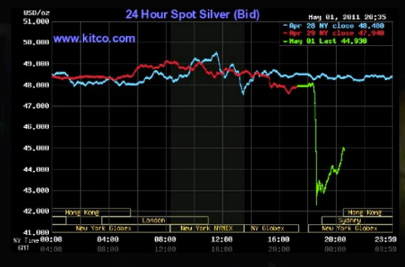
We managed to miss out on the parabolic rise of silver, which has now been followed by a stomach-churning 12% fall in thin holiday trading. And commodity markets are less deep than securities markets. Recall that the famed peak of gold in 1980 to $850, was a violent spike up, vasty high than the level two days earlier or two days later.

Silver in particular has been closely watched due to the presence of very large short interests which were apparently partially closed out late last week leading to some very serious intraday volatility. Today we have this cheery development, courtesy Jesse:

Screen shot 2011-05-02 at 3.50.03 AM
Now this wild ride might not be newsworthy in and of itself, but it is also accompanied by rumors of Serious Pain, presumably at JP Morgan, which quite a few market participants think has been on the wrong side of this trade:
The Comex is facing a default, and the powers that be are very nervous since it involves at least one of the TBTF monstrosities.
Shock and awe in the thin Sunday night trade, running the stops of the new futures holders whose options were filled. Even more heavy handed and blatant than usual.
Shedlock (hat tip reader furzy mouse) is of the view that everyone who wanted to buy silver is “all in”. The rapid runup in the last few months looks like a classic blowoff, and I’ve been more generally of the view that we are having a 2011 rerun of the liquidity-fuelled commodities bubble of the first half of 2008. But we only saw some hedgies (apparently including Magnetar!) get serious bloody noses by getting that trade wrong. A big default at an exchange by a major bank is a whole different kettle of fish. And with this a holiday in London, we aren’t getting as much gossip intelligence as we normally might. Stay tuned!

Earnings and Revenue Beat Rates

by Bespoke Investment Group

At the start of last week, only 322 US companies had reported their quarterly numbers for the first quarter earnings season. By the end of the week, 1,052 companies had reported. As shown below, the percentage of US companies that have beaten earnings estimates this season now stands at 64%. If we narrow the list down to just S&P 500 names, the beat rate jumps up to 73.6%, which means large companies are reporting better numbers versus expectations than their smaller cap brethren.

At 64% for all US companies, the earnings beat rate for the current earnings season is lower than it has been in 7 quarters. We'll see where things stand once the season wraps up in mid-May, however.


While the earnings beat rate is a bit weak this season, the percentage of companies beating revenue estimates currently stands at 72%, which would be the highest reading since 2004 if the reporting period were to end today. 


Stock Market Bull Marches On....


It was an interesting week for the stock market. It had the big news from fed Bernanke on how he would deal with rising inflation that seems to be getting a bit out of control. The Government tries hard to down play how bad things are by saying inflation isn't so bad if you REMOVE food and energy. Makes you laugh with how stupid that is. Shows you how little respect they have for anyone. Food and energy are the two most important aspects of one's life, but we won't count it. We do as citizens, however, and it's really getting insane out there. Fed Bernanke told the world that, although inflation is moving higher, he is far more fearful of the dreaded D word, deflation. 

He told us all that he will be keeping rates low for quite some time and that no new rate hike cycle is going to be getting under way any time soon. The market said that's just fine with it. The market held onto early gains the day the fed made the announcement and moved higher still. Nothing dramatic to the upside, but higher is higher within a bigger picture bull market. If he had said the wrong thing with regards to a more aggressive rate hike cycle being upon us now, the market would have initially sold off quite hard. But that did not happen. I believe it would have recovered quickly based on the idea that he's raising because the economy is now healthy enough to handle some rate hikes. Bottom line is he kept things exactly as they were and the market liked it.

There are headaches that exist out there folks. Many of them are quite concerning. Let's start by talking about sentiment. Two weeks ago we had readings of 41.6% more bulls than bears. Not a good number for the bulls at all. Historically this type of level led to selling in the near-term. We did get some selling which ended up acting as a handle. Not bad at all.

In that selling period we saw the numbers come down to 35.8% where we are right now. A slight jump from the prior week, but we are down about 5% off the highs. Seems like a good thing, and it is, but the problem is that 35.8% more bulls to bears is still a bad number. It can cause a selling episode at any time. Readings below 30% are best. Of course, readings below 25% are ideal. Liquidity is keeping the market rolling along, but be aware of the fact that we can get hit at any time due to sentiment issues still in play. Better than it was for sure, but not where we really want them to be.

There's an even bigger headache out there that seems to worsen by the day. It's called energy inflation with the price of oil completely out of control these days. It's now over $113 per barrel, and you have to wonder when the market is going to say that the price of oil is going to be too much for the economy to handle. Once again, it's the liquidity from the fed that is keeping this issue on hold as far as it affecting the market too adversely. But even liquidity won't stop the market from falling if this trend continues too much longer, one would think. $4 per gallon for gasoline is now in the cards. Is $5 per gallon too far away? If oil goes back to $140 per barrel, you can count on it, and there's no way the market will be able to handle that. Oil is a major problem with no end in sight to just how high this thing wants to go. It's a big time red flag that gets more annoying to the bulls daily.

There is yet another problem for the bulls here short-term. I know folks, it does seem like a lot of headaches doesn't it! However, we all know by now that when RSI's get to 70 on the daily chart it's trouble. However, when it gets to 70 on the daily and weekly chart, that's not good for the bulls short-term. Let's go over the numbers. For the Nasdaq, the daily RSI is at 70 with the weekly level at 66. Getting very close to the magic 70/70. For the S&P 500 it's also very close with the daily RSI at 69, and the weekly RSI at 68. The Dow ism is worst of all with the daily RSI at 72, and the weekly RSI at 73. When all three major indexes get there at the same time you really have to reign in your near-term bullish thinking. We are just about there and close enough for that to kick in at any time. The daily and weekly oscillators are flashing a strong red flag here folks. Careful with ANY new plays from here on in until those oscillators get some real unwinding. A set-up has to be pretty special to put it out. 

The really good news is the Russell 2000 is at all-time highs. The other major indexes took out their old resistant highs. The market is on breakout and the fed is pumping away day after day. The bull market is still very alive, but there are some real things to worry about, as I mentioned above, so please be wise and lose the greed. There's always the months and years ahead to play and do well. Day by day with some real caution short-term.

See the original article >>

Gold and Silver Keep Pushing Higher But Why Stocks Are Not Following?


Gold and silver keep pushing into new high ground, why are the stocks not following? Too often the activity of the gold stocks is a leading indicator as to what the metal might be doing so one should be very cautious about jumping into the commodities at this time. This is not a certainty but the stock performances just may be warning of a metal collapse ahead.

GOLD : LONG TERM

The June gold contract hit $1569.80 on Friday, very close to my long time projection of $1575 ($1600 for simplicity). The next major stopping point on its way to the stratosphere will be the $2300 level. In the mean time things will not go directly there but in all likelihood there will be ups and downs along the way. In fact, a downer is getting closer and closer but even if it should come it is not expected to be a major long term bear but possibly an intermediate term one.

Despite the cautionary tale above, a very encouraging sign that there is significant strength behind this latest move is the fact that the long term momentum indicator has now exceeded its peak from last October. This confirms the strength of the recent price move. Everything, price, volume and momentum are now in new bull market highs, if not all time highs. Technicians are always very happy in situations such as this but I always caution that new bear markets are usually generated from all time market tops. Be that as it may all long term indicators remain positive and above their respective moving average or trigger lines. The long term rating remains BULLISH at this time.

INTERMEDIATE TERM

Although the intermediate term is my favorite time period for speculation (and in gold it is not investing) usually it gets the short shift in my analysis between the long term and the short term. Here, things are also bubbling. About the only difference in the charts and indicators versus the long term is that the intermediate term momentum indicator has not quite matched its peak from last October, but this is a minor point as it is climbing rapidly and is in very strong territory. Here too, all the indicators are in positive territory and above their respective moving average or trigger lines, which themselves are in positive slopes. The intermediate term rating continues to be BULLISH.

SHORT TERM

Everything on the short term chart suggests a strong bull move but also is suggesting that the latest move may be a “blow-off” move. We have one of my expanding bearish FAN trend lines in force. These tend to be broken on the down side. As readers may remember, the breaking of that third FAN trend line is the end of the bull trend with a move expected to at least the first trend line. This break will come long before even my short term indicators go bearish but that is the power of the Expanding FAN trend lines and the “blow-off” stage.


Although the breaking of that third FAN trend line will most likely take place before the short term indicators collapse nothing is certain so let’s just look at what these short term indicators are telling us at this time. First, the gold price remains well above its positive sloping moving average line. The momentum indicator is very high up in its positive zone, in fact it is in its overbought zone from where reversals had occurred in the past. It is also above its positive sloping trigger line. As for the daily volume action, that is still relatively low. This has continually been one of the cautionary indicators that although the price action is very positive there seems to be a lack of speculative interest in jumping in on the up side of this trend. Still, putting these indicators together we still have a BULLISH rating for the short term. This is further confirmed by the very short term moving average line remaining above the short term line.

As for the immediate direction of least resistance, global events seem to dominate and in volatile situations such as that it is dangerous to try and guess what to expect from day to day. However, I would venture a guess that we are getting closer and closer to some sort of a reaction. It may start tomorrow or may not start for another week; global events will most likely dictate the timing.

SILVER

Having just recovered from my power, phone and cable being ripped out of my house by a broken tree I am sort of behind time in this commentary so silver will get the short shift. However, a quick comment for now. Although with a better weekly performance than gold (see Table below), silver failed to make new highs on Thursday or Friday, unlike gold. It seems that silver is giving us an earlier warning of a possible reaction ahead. We will just have to wait and see.

PRECIOUS METAL STOCKS

For some time now I have been cautioning about a possible reversal in the gold and silver stocks. I had been waiting for the Penny Arcade Index to give me that advance warning as the gambling stocks (the pennies) are usually the first to collapse. Well, here we have it. The intermediate term turned negative back in early March and now we have the Index breaking below its long term moving average line for the first time since its bull move started back in late 2008. The long term moving average line has not yet turned downward but that may be only a week or so away. Another sign of a penny collapse is the intermediate term momentum indicator. It has now moved into its negative territory also for the first time since the start of the bull move. This is not the time to be holding the penny stocks and may be an advance warning that holding the speculative and investment quality stocks is also very hazardous. 

There WILL come a time to be jumping into the pennies. This Index should give us that notification with plenty of time to profit thereafter. For now, holding the pennies may be disastrous for your portfolio. Of course, this assessment may end up being wrong but if so one can always get back in with their capital, albeit at a slightly higher price. The option is to hold and pray. If wrong you will not have any capital left to get back in when the turn comes again.

Merv’s Precious Metals Indices Table


COT REPORTS – HEDGE FUNDS DOWNSIZE COPPER HOLDINGS

By Rohan Clarke

In our last episode (here) we noted how China’s steps to tighten liquidity had begun to weigh on its equities markets – and most notably the energy and materials sectors.

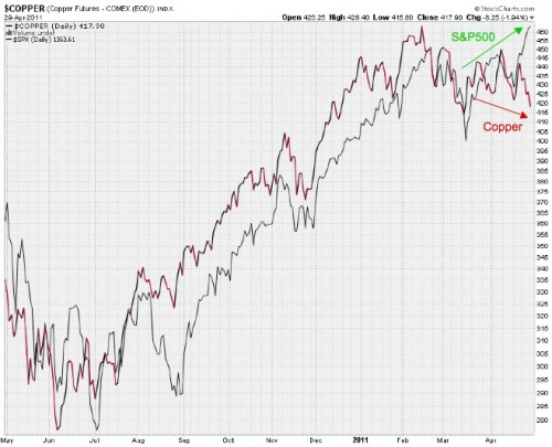
The question is whether the recent stalling in the copper price is reflective of this same effect:
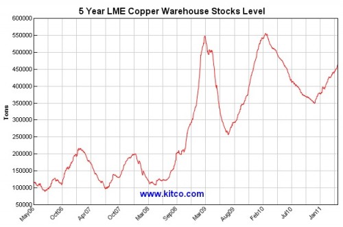
Seems like a reasonable argument. Take for example this FT article (here) that Chinese copper imports are being re-exported into LME warehouses as Chinese traders can no longer finance inventories on the mainland. Estimates are that there are over 700,000 tonnes of metal sitting in bonded warehouses in China that would avoid the 17% value-added tax if it were to be re-cycled in this manner. This activity is consistent with a 43% drop in monthly copper imports to 192,161 tonnes in March compared to the same month last year (here).
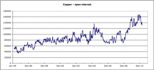
According to the rules of the Silk Road, we could reasonably expect these flows to feed through to global markets. And looking at the most recent commitments of traders reports, it appears that this is indeed the case. Open interest has dropped since peaking in late January.
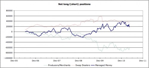
Looks like its been hedge funds that have begun to wind down longs – seen in the new format COT reports as money managers:
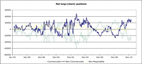
To place this chart in the longer term context, following is the old format report – copper longs remain elevated:
Whether this is signalling a slowdown in China demand for all things resources remains to be seen. It’s notable that electricity consumption is still growing at a healthy clip (here) – this bears further investigation.

See the original article >>

Follow Us