Tuesday, April 26, 2011

Gold Investors Don’t Fear a Pullback in Prices


The S&P credit agency sent shockwaves through the global financial system on Monday when it issued a warning on U.S. debt and changed its outlook on the U.S. sovereign credit rating from “stable” to “negative.” This sent markets lower and the prices of commodities such as oil rocketing back above $110 per barrel and both gold and silver to new highs.

It should be clear the S&P announcement was just a warning, not a lowering of the U.S. debt rating, which was affirmed at AAA (the highest level possible). The fears quickly subsided and U.S. markets hit fresh three-year highs. Essentially there’s only a one-third chance of a downgrade and anyone who’s ever listened to the weather man knows that a 33 percent chance of rain means you probably don’t need your umbrella.

However, the warning validates what we already know: The U.S. needs a plan to address its debt and budget issues…and fast. Due to the fact that future fiscal austerity measures will likely act as a drag on the economy, we also think this opens the door for a third round of quantitative easing (QE3) heading into next year so we’ll have to keep an eye on Bernanke and the Federal Reserve’s next move.

These factors will likely produce downward pressure on the U.S. dollar and upward pressure on commodity prices. This is why we emphatically believe the bull cycle for gold still has a long way to run. (Read: The Bedrock of the Gold Bull Rally).

Last week, one of my fellow presenters at the Denver Gold Group’s European Gold Forum was Dr. Martin Murenbeeld from Dundee Wealth who put the notion of a “gold bubble” in context with the following chart.


If you compare the current bull cycle for gold against gold’s run from the 1970s and 1980s, you can see that today’s run has been slow and steady. It’s also missing the sharp spikes typical of a bubble.

Also, a key difference in this gradual move higher is the growing affluence of the developing world. There people have traditionally turned to gold as a store of wealth and we are seeing that in unprecedented numbers in countries such as China and India.

One of the things we recently pointed out was the effect money supply growth can have on gold. Dr. Murenbeeld also presented this fascinating chart showing how much gold would need to increase in order to cover the amount of money that has been printed since gold was revalued at $35 in 1934.


Using that as the cover ratio, gold would need to climb all the way to $3,675 an ounce to cover all paper currency and coins. If you use a broader—and more common—measure of money (M2), gold would need to rise all the way to $7,931 in order to cover the outstanding amount of U.S. money supply.

With gold pushing through the $1,500 level and silver above $46, many investors are questioning whether we’ll see a pullback. Going back over the past ten years of data, you can see that gold’s current move over the past 60 trading days is within its normal band of volatility, up about 7 percent over that time period.


Silver, however, has traveled into extreme territory. Over the past 60 trading days, silver prices have jumped over 58 percent and now register nearly a 4 standard deviation move on our rolling oscillators (see chart). Based on mean reversion principles, odds favor a correction in silver prices over the next few months.

We should be clear: If a correction occurs, this would not mean the rally is over. It would just be a healthy bull market correction and reflect the normal volatility inherent with these types of investments. Investors must anticipate this volatility before participating in these markets.

This volatility also brings along opportunity. We believe we’re only halfway through a 20-year bull cycle for commodities and investors can use these pullbacks as an opportunity to “back up the truck” and load up for the long-haul.

See the original article >>

Market Breakout; Technicals Look Strong

by Bespoke Investment Group

The Dow Jones Industrial Average broke out to a new high a couple of weeks ago, but for the bull market rally to be confirmed, the S&P 500 needed to do so as well. Today we have gotten that breakout for the S&P 500, and the technicals for the index now look very positive. Oh, and the Nasdaq Composite has also broken to a new bull market high today as well, meaning all three major indices have now cleared their resistance hurdles. 


A Run of the Mill Bull Market...So Far.

by Bespoke Investment Group

The S&P 500 is currently on pace to close at a new bull market high for the first time since February 18th. With this milestone, the bull market will officially make it to the two-year mark (the last closing high on 2/18 was two and a half weeks shy of the two-year mark). 

In the chart below we compare the current bull market to the 25 prior S&P 500 bull markets since 1928. With a gain of about 99% in a little more than two years (778 days), the current bull market ranks right near the middle in terms of duration (11th) and performance (9th). Not including the current period, the average bull market has seen a gain of 101.6% over a period of 890 calendar days.


IMF Says Next U.S. President Will Be The Last


John Rolls Submits: The International Monetary Fund has just dropped a bombshell, and nobody noticed. 

Brett Arends, MarketWatch For the first time, the international organization has set a date for the moment when the “Age of America” will end and the U.S. economy will be overtaken by that of China. 

And it’s a lot closer than you may think. 

According to the latest IMF official forecasts, China’s economy will surpass that of America in real terms in 2016 — just five years from now. 

Put that in your calendar. 

It provides a painful context for the budget wrangling taking place in Washington right now. It raises enormous questions about what the international security system is going to look like in just a handful of years. And it casts a deepening cloud over both the U.S. dollar and the giant Treasury market, which have been propped up for decades by their privileged status as the liabilities of the world’s hegemonic power. 

According to the IMF forecast, which was quietly posted on the Fund’s website just two weeks ago, whoever is elected U.S. president next year — Obama? Mitt Romney? Donald Trump? — will be the last to preside over the world’s largest economy. 

Most people aren’t prepared for this. They aren’t even aware it’s that close. Listen to experts of various stripes, and they will tell you this moment is decades away. The most bearish will put the figure in the mid-2020s. 

China’s economy will be the world’s largest within five years or so. 

But they’re miscounting. They’re only comparing the gross domestic products of the two countries using current exchange rates. 

That’s a largely meaningless comparison in real terms. Exchange rates change quickly. And China’s exchange rates are phony. China artificially undervalues its currency, the renminbi, through massive intervention in the markets. 

The comparison that really matters.

In addition to comparing the two countries based on exchange rates, the IMF analysis also looked to the true, real-terms picture of the economies using “purchasing power parities.” That compares what people earn and spend in real terms in their domestic economies. 

Under PPP, the Chinese economy will expand from $11.2 trillion this year to $19 trillion in 2016. Meanwhile the size of the U.S. economy will rise from $15.2 trillion to $18.8 trillion. That would take America’s share of the world output down to 17.7%, the lowest in modern times. China’s would reach 18%, and rising.

Just 10 years ago, the U.S. economy was three times the size of China’s. 

Naturally, all forecasts are fallible. Time and chance happen to them all. The actual date when China surpasses the U.S. might come even earlier than the IMF predicts, or somewhat later. If the great Chinese juggernaut blows a tire, as a growing number fear it might, it could even delay things by several years. But the outcome is scarcely in doubt. 

This is more than a statistical story. It is the end of the Age of America. As a bond strategist in Europe told me two weeks ago, “We are witnessing the end of America’s economic hegemony.” 

We have lived in a world dominated by the U.S. for so long that there is no longer anyone alive who remembers anything else. America overtook Great Britain as the world’s leading economic power in the 1890s and never looked back. 

And both those countries live under very similar rules of constitutional government, respect for civil liberties and the rights of property. China has none of those. The Age of China will feel very different.

The Federal Reserve Note is Dead, Long Live the U.S. Dollar


In 1520, Count Hieronymus Schlick of Bohemia began minting silver coins known as Joachimsthalers, named for Joachimstal (today called Jáchymov in the Czech Republic), where the silver was mined. In German, thal or tal refers to a valley or dale. Therefore, translated, the coins meant "Jachymov Valley". His "Joachimsthaler" was later shortened in common usage to taler or thaler and this shortened word eventually found its way into English as dollar.

The coins minted at Joachimsthal soon lent their name to other coins of similar size and weight from other places. The Dutch lion dollar, carried by Dutch traders was popular in the Dutch East Indies as well as in the Dutch New Netherland Colony (New York) and the Thirteen Colonies as well as circulating throughout the Middle East in the 17th and 18th centuries.

By the mid-18th century, the lion dollar had been replaced by the Spanish "pieces of eight" which were distributed widely in the Spanish colonies in the New World and in the Philippines. Pieces of eight (so-called because they were worth eight "reals" - eight reals = 1 silver peso) became known as Spanish dollars in the English-speaking world because of their similarity in size and weight to the earlier Thaler coins.

The Americans took the dollar sign ($) from the pieces of eight, as well (see image here). There is no agreed upon date or place from whence the dollar sign came but the most commonly held theory is that it derives from the Spanish coat of arms engraved on the Spanish colonial silver coins, the "Real de a ocho" or Spanish dollars that were in circulation in the Spanish colonies in America and Asia. The Spanish dollars were also legal tender in the English colonies in North America, which later became part of the U.S. and Canada.

US Gold Certificate


US dollars were backed by gold and known as gold certificates from 1882-1933. Dollars backed by silver lasted longer, known as silver certificates, and were in circulation from 1878 to 1964.

However, both have been usurped by the Federal Reserve Note. A completely fiat, non-free market currency. A currency in which, “This Note is Legal Tender for All Debts, Public and Private” needs to be inscribed and backed up by the full force of the government’s guns in order to make it a currency used in regular life.

Also printed on each Federal Reserve Note is a pyramid with the Eye of Providence (a Freemasonry symbol) on it. Odd, one might think, considering the US has no connection to pyramids built around the world – the closest built inside the US are the Mississippian Platform Mounds. As well, no one seems to question why “Novus ordo seclorum” is written below it. Novus ordo seclorum translates to “a new order of the ages”.

Backside of US $1 Bill 


This new order, the one that has made possible every major war since the founding of the Federal Reserve, impoverished countless millions and destroyed untold wealth, is coming to an end. The Federal Reserve Note will be lucky to survive past the 100th birthday of the Federal Reserve Act, on December 23, 2013. Thank god.

The Federal Reserve Note is dead. Long live the dollar.


Welcome to Financial Slaughterhouse


"There are no characters in this story and almost no dramatic confrontations, because most of the people in it are so sick and so much the listless playthings of enormous forces."– Kurt Vonnegut, Slaughterhouse-Five

Hardly a day goes by without an excellent analysis of hard facts and data being followed by a surprisingly disconnected conclusion. Over the weekend, it appeared to be Zero Hedge's analysis of a video report by Eric deCarbonnel of Market Skeptics, which concluded that the Federal Reserve, U.S. Treasury market, and U.S. dollar may all be on the verge of imminent implosion due to the Fed's AIG-esque policy of selling large amounts of protection against an increase in Treasury bond rates. A rebuttal to this view was provided the next day on The Automatic Earth, in a piece entitled Bailing Out The Thimble With The Titanic.

In this piece, it was essentially argued that the U.S. dollar and Treasury market are symbolic of the Fed and the financial elite class, as partly confirmed by deCarbonnel's report, and these elite institutions have been engineering a successful bailout of those markets over the last few years, in tandem with natural financial dynamics and at the expense of everyone else. The bailout was "successful" in the sense that those markets will most likely remain stable in value for at least the next 2-3 years. On April 19 we were provided an excellent report by Chris Martenson, entitled The Breakdown Draws Near, but, as usual, all roads lead to financial chaos in Washington, D.C.

The "excellent" part of the report comes from the thorough data it provides regarding global liabilities that are maturing for banks and governments over the next few years. First, we are given a reference to the IMF's conclusions regarding global bank liabilities maturing in the near-term, with a stern eye locked on Europe [1]:
The world's banks face a $3.6 trillion "wall of maturing debt" in the next two years and must compete with debt-laden governments to secure financing. Many European banks need bigger capital cushions to restore market confidence and assure they can borrow, and some weak players will need to be closed, the International Monetary Fund said in its Global Financial Stability Report.

The debt rollover requirements are most acute for Irish and German banks, with as much as half of their outstanding debt coming due over the next two years, the fund said.


The IMF basically tells us what has become painfully obvious by now - European banks and governments are both struggling to acquire the capital necessary to service their existing and/or refinance maturing debts, and there isn't nearly enough to satisfy them both. The latter fact is especially true when factoring in the maturing liabilities of banks and governments in other parts of the world, which is something that Martenson focuses on in the remainder of his analysis.

It is important, however, to note the added twist in the IMF's statement, in which it says that "some weak players will need to be closed". While it is specifically referring to European banks, the logic can be applied just as well to banks and governments all around the world, but we will return to that point later. In the rest of Martenson's report, we find out that Spain is actually pinning a significant portion of its private financing hopes on China, which, in turn, is facing its own imminent financial crisis due to an imploding real estate bubble.
But it is Spain that is first in the firing line and its 10-year bond premium in the secondary market widened 14 basis points to 194 bps. Madrid is hoping for support from China for its efforts to recapitalise a struggling banking sector... [2]
Prices of new homes in China's capital plunged 26.7% month-on-month in March, the Beijing News reported Tuesday, citing data from the city's Housing and Urban-Rural Development Commission. [3].

We can also expect that housing bubbles in countries such as Australia and Canada will start to implode in lockstep with China, as their economies are both highly dependent on Chinese import demand for natural resources. A renewed round of real estate busts, combined with the ongoing slump in Europe and the U.S. and less aggressive monetary policy (-temporary- winding down of QE), will also feed off of and into a collapse in global equity and commodity values. That collapse will wipe out large swaths of imaginary capital existing on the books of major institutions. All of that leads us to Martenson's seminal question, "Who Will Buy All of the Bonds?", specifically meaning the public bonds of Europe and the U.S.

Martenson refers to the Treasury International Capital (TIC) Report in his piece, which indicated that there was a "lower-than-trend" net inflow of foreign capital ($26.9B) into long-term securities for the month of February, which includes those going into long-term Treasury bonds. When including short-term securities, we see that there was a healthy net inflow of $97.7B into U.S. bond markets from foreign investors. [4]. What this data indicates is that, during the month of February, there was significant foreign investment in U.S. bonds, but 72% of that was into short-term securities (which do not include 10 or 30-year Treasury bonds).

He goes on to conclude that this inflow dynamic will get worse as Japanese purchases drop off in the next few months, and that the proposed "spending cuts" for a few federal programs will hardly do anything to reduce the supply of Treasury bonds over this same time period. I agree that there is a strong possibility of reduced purchases by the Japanese government in the short-term, as well as the governments of China and the UK. In addition, the minuscule spending cuts will indeed be irrelevant to the overall size of the 2011-12 federal budget deficits.

To go from there to the conclusion that the U.S. Treasury faces an imminent funding crisis, however, requires a few major and unlikely assumptions; the classic hallmark of those fretting over hyperinflation of the dollar in the short-term. As briefly discussed above, a slowdown in foreign government purchases of U.S. Treasury bonds could be significantly offset by an increase of inflows from private foreign investors fleeing the equity, commodity, government agency and mortgage-related investments of other regions, as well as domestic investors fleeing those same risky investments.

And that's where we return to the IMF's little "hint" in its report from last week. The financial elites do not need anyone to buy ALL of the bonds, only those that are most important to maintaining their wealth extraction operations. The weak players? Well, they can all fight over the scraps and devour themselves in the financial marketplace. The truly significant capital will be transported towards a few central locations by natural forces and by human design, like lambs to the inevitable slaughter. Of these locations, the most critical are surely the U.S. Treasury market, which can be used to support major U.S. banks, and the U.S. currency market.

What are the chances that the majority of people who find themselves invested in U.S. government bonds and the dollar will get anything close to a return on their investment over 10, 20 or 30 years? The answer to that is probably a massively negative percentage, because the psychological pain of holding on for that long will be even worse than the total wipe out itself. However, the herd typically doesn't figure out how close they were to the edge of the cliff until after they are tumbling down the other side.

Stoneleigh at The Automatic Earth has repeatedly pointed out that people in such fearful environments tend to discount the future by an increasing rate, which means they care less and less about what will happen several decades, years or even months from the present time. The discount situation of financial elites is similar because they know how precarious the dollar-based financial markets are, so their concern is over whether they can corral all of the lambs into one or two places over a relatively short time period. So far, most of the evidence says that not only is it possible, but the process is already well under way.

Another unlikely assumption contained in Martenson’s report is the following [emphasis mine]:
With the Fed potentially backing away from the quantitative easing (QE) programs in June, the US government will need someone to buy roughly $130 billion of new bonds each month for the next year. So the question is, "Who will buy them all?"

I say the above question is an unlikely assumption because it seems to imply that the Fed may stop QE for another whole year after the QE-lite and QE2 programs wind down. If recent history has taught us anything, it's that a fearful deflationary environment is the perfect justification for the Fed to resume QE, and perhaps at an even larger scale than it has "monetized" in the past. Will the American people be up in arms about monetization of the federal debt or an indirect link to sociopolitical unrest, when their own finances, homes and careers are once again being beaten down by the unrelenting force of debt deflation? I really doubt they will be.

In the next section of his article, Martenson himself refers to how significant QE has been when talking about proposed budget cuts [emphasis mine]:
For the record, these 'cuts' work out to ~$3 billion less in spending each month, or less than the amount the Fed has been pouring into the Treasury market each business day for the past five months.

In addition, as discussed in Bailing Out The Thimble With The Titanic, the Fed may also be using Treasury put options to help them exert more control over long-term rates that cannot be reached as easily by QE programs. With regards to the latter, the following table is the Fed's "liquidity injection" schedule for the next month, which is certainly winding down, but still towers over any notional amount that has been "negotiated" by the politicians on Capitol Hill in their budget talks [5]: 


The other major assumption involved here is that interest rates will start to rise along the curve, and this will make sovereign default much more likely, since a significant portion of Treasury debt is in notes with relatively short-term maturities. This logic is circular at best, since it relies on the fact that sovereign default and/or inflation concerns will drive short-term interest rates up in order to posit the argument that increased short-term interest burdens will lead investors to be more concerned about sovereign default or inflation (from printing). There is certainly a positive feedback involved in such dynamics, but the feedback must be rooted in some initial economic or political trigger.

As mentioned earlier in this piece, and many other times on The Automatic Earth, the dominant and natural economic trend is debt deflation, while the dominant (and natural) political trend is aggressive fiscal and monetary policies that are crafted to funnel money into major banks, rather than the productive economy. There are very few reasons to think that either of these trends will reverse in the short-term, either by design of the financial elite class or by the inadvertent consequences of their actions. They have no doubt painted themselves into a corner, but their corner is significantly larger than the concentration camps built to imprison a large majority of the global population. The latter fact is clearly evidenced by the perpetual taxpayer subsidies given to financial institutions in the sullied names of "economic recovery" and "austerity".

The cities of Greece continue to erupt in violence as its citizens are forced to bail out European banks, and, meanwhile, Americans continue to mistake their own reflections in the global mirror. Earlier this year, Standard & Poor's rating agency downgraded the outlook for the triple-A rated status of Treasury bonds (from "stable" to "negative"), in what was nothing less than an act of aiding and abetting the politicians, bankers and major corporate executives who strive for the imposition of austerity on everyone but themselves. The only difference between Greece and the U.S. is that the latter is not a "weak player" in the eyes of elite institutions, such as the IMF. Which means that, while the Greek taxpayers may soon be put out of their misery, we will die a much slower death, choking on our own debt for years to come.


"He kept silent until the lights went out at night, and then, when there had been a long silence containing nothing to echo, he said to Rumfoord, "I was in Dresden when it was bombed. I was a prisoner of war."
- Kurt Vonnegut Slaughterhouse-Five

See the original article >>

US Cattle On Feed Up Five Per Cent

by TheCattleSite

The inventory included 7.12 million steers and steer calves, up seven per cent from the previous year. This group accounted for 63 per cent of the total inventory. Heifers and heifer calves accounted for 4.10 million head, up 2 per cent from 2010.

Placements in feedlots during March totaled 1.92 million, three per cent above 2010. Net placements were 1.87 million head. During March, placements of cattle and calves weighing less than 600 pounds were 380,000, 600-699 pounds were 360,000, 700-799 pounds were 588,000, and 800 pounds and greater were 590,000.

Marketings of fed cattle during March totaled 1.99 million, four per cent above 2010. This is the second highest fed cattle marketings for the month of March since the series began in 1996.

Other disappearance totaled 52,000 during March, 13 per cent below 2010. 

'


Climbing food prices, inflation add millions to poverty : ADB

by Commodity Online

Asian Development Bank, (ADB) Tuesday said climbing food prices and inflation rates threaten to push millions of Asians into extreme poverty and cut economic growth of the region.

In a report released here, ADB said global food prices that surged by more than 30 percent in the first two months of the year while domestic food inflation in many Asian economies has averaged 10 percent early this year.

Inflation rates are likely to continue because of the global oil hikes, production shortfalls due to bad weather and export restrictions by several food producing countries, the report added.

The fast increases in the cost of food are a serious setback for the region that has rebounded rapidly from the global economic crisis. Pressure on world food prices is not likely to easy anytime soon, the ADB said.

A 10 percent increase in domestic food prices could push 64 million people into poverty, the bank estimated, adding that it will also erode the living standards of families already living in poverty.

If higher food and oil prices persist for the rest of the year, economic growth in developing Asian countries could be reduced by as much as 1.5 percentage points, the report said.

ADB said food export bans should be avoided and greater investments made in agriculture.

Poor families in Asia are hit much harder by food price inflation because they spend as much as 60 percent of their income on food, much higher than in developed countries.

See the original article >>

Evening markets: China fears supercharge grain price rally

by Agrimoney.com

Is it just the rain where it is already wet in North America, and dryness where it is already dry across the world, which is worrying investors?
"We are now in a full blown weather market after the three-day holiday weekend," Benson Quinn Commodities said.
Or is there more to the continued rally in grains?
"This is primarily a weather market, but there is some macro commodity buying that is taking place today also, which is also supporting the grains," Darrell Holaday at Country Futures said.
Certainly, funds bought an estimated 13,000 corn contracts on the day, with 4,000 each in soybeans and wheat. And regulatory data out late on Friday showed speculators raising their net long position in corn futures and options by 15,620 contracts to 313,680 in the weekto April 19.
'Hyperinflation risk'
But there is, as ever, a China angle too, after the country over the weekend was reported as saying that some $2 trillion of its $3 trillion in dollar cash reserves.
"This means that China is going to sell dollars and exchange them for other hard natural resources like metals, enery and grains," Darren Dohme at Powerline Group said.
"When China starts to sell those dollars and buy natural resources with that money, it can very likely cause hyper-inflation."
Precious metals markets were taking the threat seriously anyway, sending gold to a fresh record and pushing silver up 8% at one point, before it retreated back to stand 3% up on the day.
'Panic buying'
And it was all grist to the agricultural commodities mill too.
That fund buying helped Chicago corn add 3.4% to $7.62 ½ a bushel for May and 3.2% to $7.68 ½ a bushel for the better-traded July lot, with US weather concerns providing reason to buy, whatever China does.
"The onslaught of rain in much of the Midwest over the last three days prompted some panic buying as the fields in Missouri, Illinois, Indiana and Ohio are extremely wet, and there will not be any planting for awhile and the forecast remains wet most of week and into the weekend," Mr Holaday said.
American corn sowings are expected in a US Department of Agriculture report due later to be shown 9-12% complete, compared with 45% last year and an average of 20%.
US Commodities said: "The trade will be concerned that trend yields will not be achieved if 40% of the crop is not planted by May 1," with May 10 the date at which yield losses are factored in.
'Little planting progress'
For wheat, US Commodities noted some hope for the hard red winter wheat crop which has been deprived of rain.
"Some rain did fall in Kansas and Nebraska over the weekend. The dryness in the southern Plains is shrinking."
Still, the USDA crop progress report is expected to see further deterioration in the crop, besides slow progress in spring wheat sowings too, echoing the slow progress already noted in Russia, where seedings are 40% behind last year's pace.
"Temperatures across the northern plains and Canada are raising concerns about spring wheat plantings with little planting progress taking place over the past week," Benson Quinn said.
Chicago wheat for May added 3.3% to $8.26 a bushel, the best finish for a spot contract for two months, while the July lot gained 3.2% to $8.61 ¼ a bushel.
Soybeans continued to lag, getting a bit of spillover support from the grains to end 0.7% higher at $13.89 ½ a bushel for May and up 0.5% at $13.96 ½ a bushel for July.
China rejection
Among soft commodities, cotton, for which the dry US south is a problem for sowings too, added 1.4% to 133.96 cents a pound for December delivery, a third successive positive close.
But other softs were not so lucky, lacking the support of China buy talk.
Indeed, in sugar Liu Xiaonan at the National Development and Reform Commission, the government's top economic planning body, poured doubts over growing speculation that China may be about to purchase a stack of the sweetener.
"We have already imported quite a volume to replenish reserves, far more than needed to cover the deficit in producing areas, and also enough to ensure the supply for the current year," he said.
Profit-taking
That helped dampen any relief at Indonesia confirming it will import 226,000 tonnes of raw sugar between May and the end of 2011.
New York's May lot added 1.6% to 25.07 cents a pound, while the July lot shed 1.7% to 23.40 cents a pound.
Coffee lost ground too on profit-taking, after it topped 300 cents a pound last week in New York for the first time since 1977.
The May lot shed 1.2% to 287.90 cents a pound, with the July lot easing 1.3% to 289.85 cents a pound.

See the original article >>

Sliced & Diced: A Taste of Structured Investments

by Lori Pizzani

A May 2009 report from Research and Markets of Dublin notes that “structured products are among the fastest growing investment classes in world financial markets.” Although not really an asset class, structured investment products represent an array of investment tools for retail and institutional investors.

They can enhance the returns of traditional asset classes, provide exposure to hard-to-reach sectors and markets, and often mitigate investors’ risk of losing some or all of their principal.
“Structured products allow for a type of customization of risk profiles that you can’t get from old-school diversification across asset classes,” says Keith Styrcula, chairman of the Structured Products Association of New York, the industry’s trade group. “Structured products can be adapted to every market scenario and market view. Achieving two times the upside return of an index with a 20% first-loss buffer can be extremely appealing and can repair a portfolio with no additional downside.”

An infinitude of structured investments can be created through combinations of components to meet an investor’s goals, horizons, risk–return profile, or directional viewpoint on a market or sector. Unlike open-ended investments, all structured products have maturity dates.

According to StructuredRetailProducts.com, $37.6 billion across more than 7,000 structured investment products were sold in the US in 2008. That sales volume was 13% higher than 2007’s sale of $33.2 billion across more than 6,200 individual structured products. US sales during the first quarter of 2009 were nearly $6 billion.

Structured products are not to be confused with the culprits behind the subprime mortgage debacle. They are sometimes incorrectly identified with the troublesome structured credit products that fueled the financial crisis—mortgage-backed securities, collateralized debt obligations, and other much-maligned engineered securities.

TAILOR-MADE

Structured investments are engineered investments created to provide either an income stream or opportunity for investment growth. Each investment is built to achieve a particular objective, such as attempting to capture an index’s upward or downward movement, securing a positive return in an unpredictable market trading up and down within a narrow band, tapping into difficult-to-reach sectors that look promising, or even preserving some or all of the principal invested.

An infinitude of structured investments can be created through combinations of components to meet an investor’s goals, horizons, risk–return profile, or directional viewpoint on a market or sector. Large banks will often create regular monthly calendar offerings of off-the-shelf products that have proven popular, as well as offerings tailored to individual needs through a reverse inquiry process. Unlike open-ended investments, all structured products have maturity dates.

Structured investment products are comprised of three basic interrelated parts that can be sliced and diced to suit both the investor and the issuing bank: the actual structure of the investment, the wrapper built around the investment, and the payoff component. The payoff can include various features, all of which are tied back to the formula established at the outset.

STRUCTURING THE INVESTMENT

“All structured products have a component of a derivatives option plus some kind of fixed income component,” says Robert Benson, PhD, the founder and managing director of London-based Arete Consulting Limited and the proprietor of StructuredRetailProducts.com. For example, a typical vanilla structured equity investment may contain a zero-coupon bond plus an equity option, typically a call or put option. Or the engineered investment may contain multiple options and multiple fixed income components.

Benson explains that the “combined package of financial instruments is then used to deliver the anticipated passive investment return based upon a formula, not some kind of active management return.” Individual investment structures and pricing are developed by issuers through the use of computer modeling, software, and good old-fashioned spreadsheets.

The potential performance of each structured investment is tied to a so-called “underlying”—an equity, commodity, currency, real estate, or other domestic or foreign index, such as the S&P 500. Structured investments can also be linked to an underlying such as a niche index, issuer’s proprietary index, or third-party index.

Structured-products-graph
Structured Investment Products, Monthly Issuance and Sales Levels, January 2007–May 2009. Includes listed and unlisted registered notes, unregistered notes, and certificates of deposit. All products are retail Source: StructuredRetailProducts.com, June 4, 2009. Data is © Structured Retail Products.
Alternately, performance can be linked not to an index but to the performance of a specific commodity such as oil or gold, to an exchange-traded fund, to a mutual fund, to a single stock or a basket of stocks, to currencies, or to combinations thereof. Even specific investment strategies, such as market-neutral long–short strategies, can be underlyings. More sophisticated structured investments can be linked to the yield curve, the consumer price index, and so on.

Current interest rates and market volatility are key to how a bank structures an investment and what features the product offers. For example, a structured investment’s participation rate—that is, how much of the underlying index’s upward or downward performance over the investment term will be captured and paid to the investor—is dependent on interest rates, on volatility, and on whether the bank can buy more or fewer of the component options, Benson notes.

The good news, he adds, is that once a structured investment is created and hedged through the purchase of options, the issuer can basically set it and forget it, at least until maturity, when the calculation agent will determine the final return outcome of the security.

THAT’S A WRAP

Structured investments can be created in different formats or product wrappers. Most commonly, banks wrap a core investment product into a traditional medium-term note that is registered with and regulated by the Securities and Exchange Commission. Foreign banks also offer notes in the US that may or may not be registered with a regulator. Structured notes may be privately negotiated or may trade on a stock exchange.

Structured notes are legally senior, unsecured debt obligations of the issuing bank. They are not collateralized and are dependant on the issuing bank’s credit rating and ability to repay investors at the note’s maturity. If an issuing bank should fail, as Lehman Brothers did in mid-September 2008, investors would become creditors alongside corporate bondholders. Whether they recoup most, some, little, or no return of their investments depends on the failed company’s remaining assets.

Lehman’s bankruptcy became a huge black eye for the global structured products industry when Lehman left many investors holding billions in essentially worthless unsecured structured investments. An immediate flight by investors to banks with high credit ratings also led to a massive surge in market-linked certificates of deposit.

Since then, bank certificates of deposit have become a favored investment wrapper for many market-linked structured investments. Sporting their recently raised FDIC-backed insurance of up to $250,000 per investor through 2013, banks have repackaged many of their more popular structured investments into principal-protected certificates of deposit. Many bank executives expect traditional notes to come back into favor once investors’ jitters subside.

POSITIONING PAYOFFS

Various payoff structures take into account both the market environment at inception and investors’ needs. Because underlying indexes can be unpredictable and move in different ways, payout scenarios can vary.
Partially principal-protected notes are designed to buffer against some specified degree of loss of principal, while 100% principal-protected notes will return all of an investor’s net investment after sales charges, no matter how the underlying performs, as long as they are held to maturity.

Of course, the return of any investment rests with the issuer’s credit quality and financial wherewithal. Moreover, although some degree of principal protection has become popular, many notes offer no principal protection. Instead, their potential for returns is higher.

Several varieties of enhanced-return notes use leverage to generate beefier returns. They may have built-in downside buffers that protect against the first decline in the underlying of 5% to 30% or more. Some may not have any buffer on the downside to protect against a fall in the underlying index; others will cap the achievable upside return.

With absolute-return notes, investors receive a positive payout that equals the absolute change in the index performance as long as the underlying index has a positive or negative return within a predetermined range of performance.

Reverse-convertible securities linked to a single stock typically pay larger coupons than investment in a company’s corporate bond. But if the stock breaches its preset upside or downside price barrier, coupons cease and investors receive no return of cash, only physical shares of that stock. Last year’s volatile market swings caused the majority of outstanding reverse-convertible securities to breach their barriers, according to data from StructuredRetailProducts.com.

Structured products are not an all-or-nothing proposition. Many view them as tactical investments to be used as satellites to investors’ core portfolio holdings. While mutual fund managers, especially those integrating a commodities component, have become fans, structured products haven’t yet fully infiltrated Main Street.

There are other types of structured products for bullish, bearish, or sideways market views. Some pay coupons, some don’t. Generally, the higher the coupon, the greater the risk.

The European structured products market has trounced the US in terms of innovative payout structures, says Philippe El-Asmar, global head of investor solutions at Barclays Capital in New York. Much of the innovation in the US has come through access to themes including India, China, inflationary plays, and long–short strategies. “Issuers are responding to what’s on the minds of investors. All of these innovations are driven by what clients want,” he maintains.

NO SURPRISES
 
While structured products vary, most have three to five potential outcomes or return scenarios. Chris Warren, managing director and head of structured products (Americas) at New York’s DWS Investments, the US arm of Deutsche Bank, says that “structured products are good at outcome-oriented, rules-based returns.”

Warren explains that, since possible payout results are shown within the investment offering documents, “what’s unique to structured products is that while you may be happy or unhappy, you should never be surprised at an outcome. The crux of investing in structured products is to understand the product’s return and be sure it matches the investor’s view of the market.”

For example, an investor may believe the S&P 500 will rise 12% over the next 12 months but would like to achieve an outperformance on the upside if the index rises, and some protection on the downside if the index declines. That investor might choose a structured note with two or even three times leverage (meaning possible earnings of double or triple the index’s return) and perhaps a 15% buffer on the downside. The buffer would protect the principal against an index decline of up to 15% from the initial level determined on the pricing date. However, if the index should decline more than the buffer’s protection level, principal would be eroded. While the degree of erosion varies, typically principal might fall by 1% for every additional 1% decline of the index.

SATELLITE INVESTMENTS

Structured products are not an all-or-nothing proposition. Many view them as tactical investments to be used as satellites to investors’ core portfolio holdings. While mutual fund managers, especially those integrating a commodities component, have become fans, structured products haven’t yet fully infiltrated Main Street.

“The top 10% of financial advisors have devoted the time and effort to become conversant in the risks and attributes of structured products,” says Keith Styrcula. “The other 90% may be doing clients a disservice if they’re not carrying out their fiduciary responsibility to use the latest financial technology to manage risk and volatility and enhance returns and incomes with structured products.”

Sector "Beat Rates" This Earnings Season

by Bespoke Investment Group

The percentage of companies that have beaten earnings estimates this earnings season currently stands at 69%. Below we highlight how the "beat rates" look for specific sectors. As shown, three sectors have beat rates that are better than the overall reading, while the rest have weaker beat rates. 

Interestingly, it's the Financial sector that has the strongest beat rate this earnings season at 81%. On the opposite end of the spectrum, Energy has the weakest beat rate at just 39%. With Energy stocks performing so well heading into earnings season and Financial stocks doing so poorly, it looks like analysts got ahead of themselves and expected too much from Energy and too little from Financials.

Technology and Health Care -- both with beat rates of 70% -- are the other two sectors that are outperforming the overall reading. The Consumer Staples and Consumer Discretionary sectors currently have the 2nd and 3rd weakest beat rates behind Energy. 


GRANTHAM: THIS TIME IS DIFFERENT

by Cullen Roche

Jeremy Grantham is convinced that this time really is different when it comes to the commodity bubble. His latest narrative covers the decline in natural resources and why we have moved from a period of low prices to a period of rising prices. This is fairly shocking commentary from one of the great bubble spotters in history and the king of mean reversion. He writes:
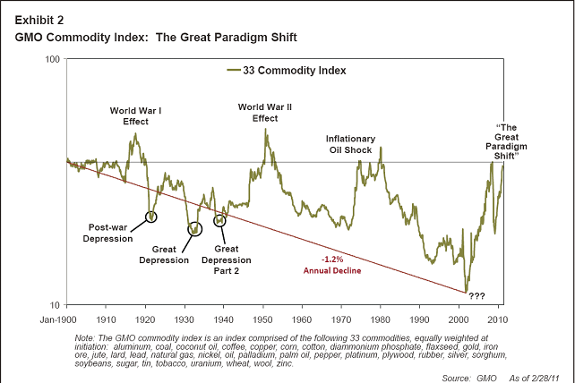
“The history of pricing for commodities has been an incredibly helpful one for the economic progress of our species: in general, prices have declined steadily for all of the last century. We have created an equal weighted index of the most important 33 commodities. This is not designed to show their importance to the economy, but simply to show the average price trend of important commodities as a class. The index shown in Exhibit 2 starts 110 years ago and trends steadily downward, in apparent defiance of the ultimately limited nature of these resources. The average price falls by 1.2% a year after inflation adjustment to its low point in 2002. Just imagine what this 102-year decline of 1.2% compounded has done to our increased wealth and well-being. Despite digging deeper holes to mine lower grade ores, and despite using the best land first, and the best of everything else for that matter, the prices fell by an average of over 70% in real terms. The undeniable law of diminishing returns was overcome by technological progress – a real testimonial to human inventiveness and ingenuity.
But the decline in price was not a natural law. It simply reflected that in this particular period, with our particular balance of supply and demand, the increasing marginal cost of, say, 2.0% a year was overcome by even larger increases in annual productivity of 3.2%. But this was just a historical accident. Marginal rates could have risen faster; productivity could have risen more slowly. In those relationships we have been lucky. Above all, demand could have risen faster, and it is here, recently, that our luck has begun to run out.
…Just as we began to see at least the potential for peak oil and a rapid decline in the quality of some of our resources, we had the explosion of demand from China and India and the rest of the developing world. Here, the key differences from the past were, as mentioned, the sheer scale of China and India and the unprecedented growth rates of developing countries in total. This acceleration of growth affected global demand quite suddenly. Prior to 1995, there was (remarkably, seen through today’s eyes) no difference in aggregate growth between the developing world and the developed world. And, for the last several years now, growth has been 3 to 1 in their favor!
The 102 years to 2002 saw almost each individual commodity – both metals and agricultural – hit all-time lows. Only oil had clearly peeled off in 1974, a precursor of things to come. But since 2002, we have the most remarkable price rise, in real terms, ever recorded, and this, I believe, will go down in the history books. Exhibit 2 shows this watershed event. Until 20 years ago, there were no surprises at all in the sense that great unexpected events like World War I, World War II, and the double inflationary oil crises of 1974 and 1979 would cause prices to generally surge; and setbacks like the post-World War I depression and the Great Depression would cause prices to generally collapse. Much as you might expect, except that it all took place around a downward trend. But in the 1990s, things started to act oddly. First, there was a remarkable decline for the 15 or so years to 2002. What description should be added to our exhibit? “The 1990’s Surge in Resource Productivity” might be one. Perhaps it was encouraged by the fall of the Soviet bloc. It was a very important but rather stealthy move, and certainly not one that was much remarked on in investment circles. It was as if lower prices were our divine right. And more to the point, what description do we put on the surge from 2002 until now? It is far bigger than the one caused by World War II, happily without World War III. My own suggestion would be “The Great Paradigm Shift.”
The primary cause of this change is not just the accelerated size and growth of China, but also its astonishingly high percentage of capital spending, which is over 50% of GDP, a level never before reached by any economy in history, and by a wide margin. Yes, it was aided and abetted by India and most other emerging countries, but still it is remarkable how large a percentage of some commodities China was taking by 2009. Exhibit 3 shows that among important non-agricultural commodities, China takes a relatively small fraction of the world’s oil, using a little over 10%, which is about in line with its share of GDP (adjusted for purchasing parity). The next lowest is nickel at 36%. The other eight, including cement, coal, and iron ore, rise to around an astonishing 50%! In agricultural commodities, the numbers are more varied and generally lower: 17% of the world’s wheat, 25% of the soybeans (thank Heaven for Brazil!) 28% of the rice, and 46% of the pigs. That’s a lot of pigs!
…This is an amazing picture and it is absolutely not a reflection of general investment euphoria. Global stocks are pricey but well within normal ranges, and housing is mixed. But commodities are collectively worse than equities (S&P 500) were in the U.S. in the tech bubble of 2000! If you believe that commodities are indeed on their old 100-year downward trend, then their current pricing is collectively vastly improbable. It is far more likely that for most commodities the trend has changed, just as it did for oil back in 1974, as we’ll see later.
…I believe that we are in the midst of one of the giant inflection points in economic history. This is likely the beginning of the end for the heroic growth spurt in population and wealth caused by what I think of as the Hydrocarbon Revolution rather than the Industrial Revolution. The unprecedented broad price rise would seem to confi rm this. Three years ago I warned of “chain-linked” crises in commodities, which have come to pass, and all without a fullyfledged oil crisis. Yet there is so little panicking, so little analysis even. I think this paradox exists because of some unusual human traits.”
Is it really different this time? I am not so certain. I am still a believer in the idea that a permanent bet on higher commodity prices is a bet against human ingenuity and if there is one great long-term bet over the course of human existence it has been on ingenuity….

AUD/USD IS AS GOOD AS GOLD

By Stephen Cox

The Australian dollar has a lot of upside room against the U.S. dollar, but the charts, as I read them, may be hinting of a corrective lower move presently.

Certainly the Aussie’s technical strength is convincing.

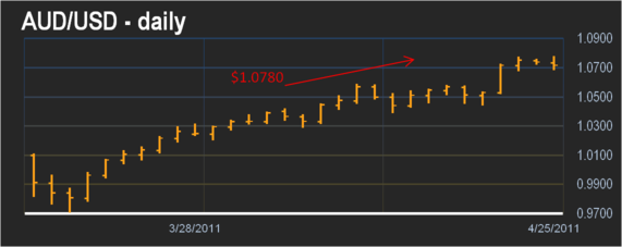
The Australian dollar rose earlier Monday to $1.0780, a new post-1983 float high. That high in fact is the Aussie’s highest level against the dollar since it fell to the 2001 low of AUD0.4773.

On March 28 when the Aussie recorded a new high at $1.0318 I wrote in this column that the ten-year uptrend might be going for nothing less than a test of $1.1862 which I believe is target resistance on the annual chart.

On the other hand, traders with a less expansive outlook on this market might be preoccupied now with the fact that Monday’s long-term high of $1.0780 is little different with Thursday’s high of %1.0777.

In other words technical resistance is building on the daily chart.

I estimate that a decisive move below daily support at $1.0600, if it comes to that, would point the Aussie down to $1.0420-$1.0245 support band.

Observers note that the Aussie’s strength lately has been influenced by commodity prices. Comex June gold, which rose to a record $1,519.20 an ounce earlier, comes to mind in this case.

Presumably, the fire under the gold market is precisely the weak dollar, and so it goes.

Sell Silver


Appears Scotty got it wrong again. We said to beam us up, and he beamed us back. All of a sudden we seem to have returned to 2008. Perhaps, though, we should not be so tough on Scotty. The Federal Reserve had a hand on the controls too, continuing the longest running stretch of asset price distortions in all of history. Think of 97-year-old sports team with one winning season, 1953.

All around signs of the reemergence of 2008 are evident in many measures and indicators. (See Alan Abelson, Barron's,11 April 2011.) But the most insidious reincarnation by the Federal Reserve is with hedge funds. Apparently, the only beneficiary of Federal Reserve policy is the workforce at hedge funds. From in "Hedge funds surge to peak of $2,002bn in managed assets," Financial Times by S. Jones & D. McCrum, 20 April 2010, we read,
"Assets under management in the global hedge fund industry soared to an all-time peak, surpassing the pre-crisis high thanks to the strongest investor inflows in years."
"That comfortably exceeds the $1.930bn peak of June 2008, just months before the collapse of Lehman Brothers..."
Per the article, the low point was $1,330bn at the beginning of 2009. In about a year, hedge fund assets have risen ~$700 billion. Note that is billions with a "b". Are your mutual funds and house back to the June 2008 values?

In the speculative era leading up to the 2008 debacle funds bought mortgage and debt bombs before moving on to commodities. This time, they skipped the debt bombs and went right to commodities. Part of the action also includes a massive bet against the U.S. dollar. Yes, we did read on the internet that the dollar was going to zero. We also read there that UFOs are really really real. In the chart below footprints of that massive bet can be observed. 

That bet against the dollar has resulted in another massive set of price distortions, Around the world, nations are being punished by the Federal Reserve's irresponsible devaluation of the dollar. Silver has been pushed into a massive speculative bubble. Oil, despite no apparent shortage, continues to trade recklessly higher.

But, note the trend line in the above chart. We know several things about trend lines, especially obvious ones. They do not last forever. All trend lines are broken ultimately. Otherwise, we would still all own railroad bonds.

Dollar will walk through that trend line, as is always the case, and it will do so from one of the most oversold conditions it has ever experienced. When we read, on the source of all truth the internet, that U.S. Treasury debt is worthless, we can safely assume a fantasy induced delusion is widespread. We know not the catalyst for this move. Perhaps it will be the recognition that the reign of economic terror by the Obama Regime will indeed end. Could the Jasmine Revolution spread to China?(See Financial Times, 23 April, "Fuel price strike rattles Beijing", and watch the price of rice.)

How does one protect wealth from Hedge Fund Debacle II, brought to you by the friendly elves in the Federal Reserve tree? While the price of $Gold is at risk due to the massive one-sided bets by hedge funds, it will remain an important core asset in the decade ahead. Non dollar Gold investors will be better served as their currencies will likely depreciate.

Silver, however, is certainly an asset to avoid as it has become the "internet stocks" of 2011. Investing in buckets of white sand stored in the basement might provide a higher return. Going to Las Vegas and betting on red every spin might be an alternative. Better odds, and free drinks.

Switching some of your risky Silver holdings into Rhodium should certainly be considered. Covariance on these two metals should be quite low to negative in the future. See our comments in "Rhodium Trading Thoughts."

Another opportunity that investors may want to consider is one that did not much exist a year ago. Chinese government has been moving persistently over the past year to make the Renminbi more available to non Chinese investors. Increasingly available are means of investing in the Renminbi. In terms of its development curve, China is at about the equivalent of 1915 for the U.S. That was about the beginning for the U.S. dollar's rise to global reserve asset dominance.

When 1971 opened, the Yen/$ ratio was 358:1. In 1995 it was 84:1. That appreciation produced a return in excess of 300% to U.S. dollar-based investors. Similar results seem reasonable for the Chinese Renminbi in the future. See valuation below. We do note that such an investment would not be void of short-term risk. The Chinese economy will have bumps and grinds, as their leaders put their pants on the same way as Westerners.

On another matter, we have noted much discussion on the shape of price curve for contracts for future delivery. Misunderstanding of the meaning of the price curve for contracts for future delivery of a commodity seems high. While the markets for all commodities are somewhat unique, the structure of the price curve for contracts for future delivery possesses mathematical characteristics that produce fairly specific conclusions. Shape of the price curve is not open to creative analysis to support one's investment ideology. For that reason, we have been writing on the subject. That effort can be accessed at: http://valueviewgoldreport.com/files/FUTURES_2011_B.pdf


Charting the Course to $7 Gas

By: MISES

J. Kevin Meaders writes: Let's go back to the beginning of the current economic crisis — yes, it is still a crisis for many millions of Americans who lost their jobs, ruined their credit, filed for bankruptcy, lost their homes, and lost their lifestyle. Shanty towns have popped up all over America, though rarely gaining media exposure.

Tens of millions have been ripped from the middle class back down into the poverty from whence their parents or grandparents had climbed.

Make no mistake: it is not capitalism that got us here; it is government interventionism and central banking — the Federal Reserve.

The first two charts we're looking at are the S&P 500 Index (top) and the Effective Federal Funds Rate (bottom). Our current economic state of affairs began with the Internet bubble (the red arrow on the first chart), which itself was exasperated by an earlier easing of the federal-funds rate (the green arrow on the second chart).


After the bubble burst in 2000, Alan Greenspan sought to prop up the "irrational exuberance," against which he himself had cautioned, by dropping interest rates — artificially, of course — from 6.5 percent down to barely 1 percent in 2002 (the orange arrow on the second chart).

The whole idea here was to encourage corporate (and private) spending by lowering the cost of borrowing money. This "cost" was thus much lower than it otherwise would have been in a truly free market, where interest rates are set by the supply and demand of money. Today, a free-market interest-rate environment is simply a dream — it's illusory; it doesn't exist. The Fed, rather, simply creates as much supply as it wants, and then hopes foolish risk takers will take the bait. Indeed, millions did.

Enter the housing boom. Maybe you remember the 1 percent LIBOR interest-only adjustable loans? How completely, unrealistically optimistic (or gullible) did you have to be in order to buy into an adjustable-rate mortgage (ARM) when interest rates were at an all-time low?

In any event, the loose-money policy and low interest rates drove the real-estate market to new, all-time highs, with record low unemployment and a false feeling of risk-free risk taking.

Sure enough, inflation hit, the Fed raised rates, those ARMs adjusted upward, people couldn't sell their house for what they owed, and then record foreclosures ensued. All the while, the banks responsible for the bad loans got bailed out by the taxpayer, and the bank executives got to keep their multimillion-dollar bonuses. Hooray.

But that's not the end of it. Once the housing bubble burst, our masters at the Fed (primarily Comrade Bernanke) decided to drop rates to zero and to inflate the money supply beyond all recognition.

The next chart is the Fed's monetary base. Note the vertical movement during and after the Depression of 2008: an increase from around $800 billion to just over $2.4 trillion.


This is the most worrisome chart I have ever seen. By comparison to what Bernanke has done, take a look at the blip (circled in red) that Greenspan caused just after the dot-com bust in early 2000. This is not the kind of comparison that makes it to CNBC or the front page of the Wall Street Journal.

If 1 percent interest rates and that small Greenspan monetary increase back in 2000 caused the boom and ultimate crash of 2008, then what will be the ultimate result of our current extended course of 0 percent interest rates and a 300 percent increase in the monetary base?

There is an answer, but it's not good. To quote Human Action, by Professor Mises, the economist who actually predicted our current plight over 60 years ago,
There is no means of avoiding the final collapse of a boom brought about by credit [or monetary] expansion. The alternative is only whether the crisis should come sooner as the result of voluntary abandonment of the further credit expansion, or later as a final and total catastrophe of the currency system involved.
The end result seems fixed; the only question that remains is what happens between now and then.
Even though the federal-funds rate has been at zero, and even though the Fed has created enormous amounts of fiat money, most of that money remains at the banks. Take a look at the chart below.


This chart represents the amount of money our nation's banks keep on deposit with the Federal Reserve. So you see, the newly created money is being held by the banks, who instead of loaning it out to folks who would like to refinance their houses and businesses who might expand and hire (which is what the Fed intended), they (the banks) just redeposit the free money back with the Fed, and earn massive amounts of interest.

What? Are you kidding me? The banks got bailed out from billions of dollars in bad loans that they issued, then they got literally $1.2 trillion (as you can see from the chart above) of free money that they then turned around and invested in Treasuries, the interest on which is one of Obama's biggest line-item budget expenses. Are we living in an Ayn Rand novel? How would you like to get free money to invest, the interest on which is guaranteed by the government's taxation authority (and guns)?

And speaking of the budget, the next chart is the second scariest I've ever seen. It shows the federal deficit, which now surpasses $1.4 trillion annually! Note that the chart is denominated in millions.


Unless Congress cuts spending dramatically (which I doubt will happen), the Fed will continue to buy Treasuries to fund our deficit with money that is created out of nothing, just like the Weimar Republic did after World War I. The end result must be a collapse.

Not to throw more fear on the fire, but recently the "Godfather of Bonds," Bill Gross, who manages over $1 trillion, sold every single Treasury his firm owned because, according to a shareholder letter he recently published,
Unless entitlements are substantially reformed, I am confident that this country will default on its debt; not in conventional ways, but by picking the pocket of savers via a combination of less observable, yet historically verifiable policies — inflation, currency devaluation and low to negative real interest rates.
I would venture to say it has already begun.
"So what can we do about it? And how does this affect me and my money?" Did I just hear you ask that? Well, good question. Since I don't have the space or the time to go into detail here, suffice it to say that booms and busts are easy to understand and predict if you reject the currently prevalent Keynesian School of economics and look to the Austrian School.

Most people have heard of the "wheelbarrow inflation" of the Weimar Republic in Germany. History has been down this very same road many, many times, and the result is always the same.

Thus, we can learn from the Austrian economists' reasoning — which reflects realism and historical facts, and not flights of academic fancy. Though I run the risk of dramatically oversimplifying the investment method, essentially you want to be more aggressive in a monetary expansion phase and more conservative in a monetary contraction phase. It sounds easy, huh? In reality, it is impossible to time the market to the day or even the month, but our experience in 2000 and 2008 has shown that it is possible to be correct to within a 12- to 18-month period. The key is knowing what signs inevitably show themselves — and taking heed.

As a prime example, one of the chief indicators we monitor in addition to those above is the velocity of money. This can vaguely be analogized to how quickly a dollar moves from one hand to another, but it is much more than that.

Every time you deposit a dollar into your checking or savings account, your bank can then lend that dollar out to ten other people, essentially creating ten more dollars out of your one dollar deposit. This is called the Mandrake mechanism, and it is part of the problem of expanding credit, because your dollar is leveraged ten to one. This exponential expansion of money in the banking system creates vast profits for the banks, but also vast losses when a run ensues (the true reason the Federal Reserve System was created was to bail out the banks).
So here's a recap:
  1. The Fed has tripled the money supply and reduced interest rates to zero.
  2. A stronger economy is trying to get off the ground but can't because all the newly created money is being retained by the banks in reserve.
  3. Eventually the banks will start lending again and the velocity of money will increase.
  4. When that occurs, inflation will begin to show signs that even Bernanke can't ignore, and he will respond by raising rates.
  5. Eventually, increased velocity, inflation, high oil prices, and interest rates will conspire to crash the market again. And we start the whole thing over again — if we can.
With the tripling of the money supply, cold mathematics would imply that eventually prices would likewise triple — once the new money has made it out into the economy. Thus, $3.50 gas becomes $10.50 gas. Clearly the math is not as easy as that, because really no one (especially Bernanke) can predict what will happen; but if history is any guide, then all of a sudden, $7 gas seems like a deal.

Follow Us