Saturday, June 1, 2013

SPY Trends and Influencers June 1, 2013

Last week’s review of the macro market indicators suggested, heading into the shortened unofficial first week of Summer, that there was some nervous caution in the markets. Gold ($GLD) looked to consolidate with a downward bias while Crude Oil ($USO) churned in the tightening range. The US Dollar Index ($UUP) seemed ready for a pullback in the recent uptrend while US Treasuries ($TLT) were biased lower in their consolidation. The Shanghai Composite ($SSEC) looked strong but Emerging Markets ($EEM) were biased to the downside. Volatility ($VIX) looked to remain benign keeping the bias higher for the equity index ETF’s $SPY, $IWM and $QQQ, despite short term pullbacks and recent new highs. Their charts showed more caution with a further pullback or consolidation likely.

The week played out with Gold moving higher before sellers can back on Friday while Crude Oil moved lower in the range. The US Dollar held at resistance before failing to end the week while Treasuries broke the consolidation moving lower. The Shanghai Composite made a higher high before retreating while Emerging Markets just moved lower. Volatility picked up off of the lows but remained subdued. The Equity Index ETF’s SPY, IWM and QQQ consolidated in triangle patterns tightening into Friday and under the highs from last week. What does this mean for the coming week? Lets look at some charts.

As always you can see details of individual charts and more on my StockTwits feed and on chartly.)

SPY Daily, $SPY
spy d
SPY Weekly, $SPY
spy w

The SPY consolidated for most of the week before falling in a long red candle Friday. The fall took it through the 20 day Simple Moving Average (SMA) and into the bottom half of the Bollinger bands for the first time since April 22nd. The Relative Strength Index (RSI) on the daily chart is falling and at the mid line, a critical level between here and 40, with a Moving Average Convergence Divergence indicator (MACD) that is rolling lower on both the signal line and the histogram. This view looks like more downside. Out on the weekly front the Bearish Engulfing candle follows the Spinning Top from last week, confirming it lower. The RSI is working off a technically overbought condition with a MACD that is starting to level. There is resistance higher at 166.5 and 167.50 and support lower at 163 followed by 159.72. This looks prepared for the pullback everyone has been anticipating. Continued Downside in the Uptrend.

Heading into June the markets look ready to take a breather and perhaps pullback. Gold though is biased higher in the short term in its downtrend while Crude Oil heads toward the bottom of its range. The US Dollar Index and US Treasuries both look to continue lower. The Shanghai Composite maintains an upward bias but may consolidate first while Emerging Markets continue biased to the downside. Volatility looks to low but drifting higher keeping the long term bias higher for the equity index ETF’s SPY, IWM and QQQ, but maybe a drag in the short run. The index ETF’s themselves appear to be weakening in their uptrends with the SPY the weakest followed by the IWM and the QQQ still showing some strength in longer charts., Use this information as you prepare for the coming week and trad’em well.

See the original article >>

What Are The Best Times For A Business To Post On Social Media?

by ChrisTomJones

So the best time to post your tweets and Facebook updates, if your a business what are they? This is an interesting question and the best times can vary dependent on your desired audience.

Now nobody will be online 24 hours a day and you don’t want to annoy your audience by posting the same thing several times to cover all times in a day.

Discovering the best time to post an update is especially important on Twitter as tweets are coming in a continual stream so you want to have the best chance possible for your tweet to be noticed by your target audience. The way to discover the best times is trial and error, over several weeks post your updates on all of your social media platforms at several different times. Now the best times will vary between the different platforms so record the amount of engagement you get for each whether its Facebook, Twitter, Google Plus, Linkedin, or Pinterest, you can monitor the number of clicks you get from social media to your site by using a URL shortener such as ow.ly, bit.ly or goo.gl.

Now people have already done this research and I came across this excellent infographic from the guys at Social Caffeine which details the best and worst times to post on each of the most popular platforms. Now I suggest that you use this info as a guide and do your own research but this info is an excellent starting point.

Best Times To Post Social Media Updates

See the original article >>

The Plastic Water Bottle Environmental Effect

The Plastic Water Bottle Effect

The Plastic Water Bottle Effect infographic

Yen Has Fallen Too Far, Study Says

By Ian Talley

The value of the Japanese yen has fallen too far and the Group of Seven leading economies may consider intervening in foreign exchange markets to reverse the trend if it declines much further, according to a new study from a Washington think tank.

The sharp depreciation of the yen in the past six months has overshot the levels justified by fundamental market and economic conditions by nearly 10%, said the paper by William Cline, a senior fellow at the Peterson Institute for International Economics and a former senior U.S. Treasury official.

Mr. Cline’s semiannual currency report is based on countries’ trade and finance accounts and is one of the most prominent private-sector analyses of the issue.

“The sharp and rapid decline of the yen…suggests that if the yen continues much further along a downward path, the G-7 may need to consider coordinated intervention to stem the decline of the currency,” Mr. Cline said in the report published Friday, referring to the Group of Seven largest industrial economies.

The International Monetary Fund published its own review of the Japanese economy Friday, saying the yen’s fall needs to be viewed in context of Tokyo’s efforts to revive its economy.

“We do not see the current depreciation as problematic,” the fund said in the review.

Still, the IMF’s no.2 official David Lipton said at a press conference in Tokyo Friday that the yen was now “moderately undervalued” and would need to strengthen over the medium term to reflect market fundamentals.

Accounting for inflation, the yen has fallen by almost 25% against the dollar since September, when Prime Minister Shinzo Abe was elected on a vow to move aggressively to jump-start a long stagnant economy. The yen has weakened from around 77.5 yen to the dollar then to around 103 a few days ago.

Japan’s efforts have largely been backed by the G-7 governments, which hope stronger Japanese growth would benefit the global economy. However, they have warned Tokyo against direct currency intervention for a competitive advantage. A weakening yen makes Japanese exports relatively cheaper on world markets, giving them a boost at the expense of others.

In the U.S. Treasury’s latest report to Congress on exchange rates, it used pointed language to warn Japan against competitive devaluation. Treasury said it would “closely monitor” the country’s economic policies to ensure they are aimed at boosting growth, not weakening the currency.

Economists try to calculate currencies’ fair values based on a variety of economic and market measures. Although there’s no single, internationally-agreed method, the Peterson Institute’s report is widely viewed as the private sector standard.

Mr. Cline says the G-7 may have left the door open for coordinated action to prevent further depreciation of the yen. He points to the group’s statement in February, when finance officials agreed that “excessive volatility and disorderly movements in exchange rates can have adverse implications for economic and financial stability,” adding they would, “consult closely on exchange markets and cooperate as appropriate.”

The yen’s value is not a matter to be taken lightly: “It basically adds up to exporting unemployment,” he said in an interview.

Stubbornly-high unemployment in many countries, with levels in some euro zone counties topping those experienced in the Great Depression, and weaker growth in emerging markets have stoked fears that the yen’s drop could spark a global cascade of competitive devaluations, or a “currency war.”

“The yen has fallen farther and faster than the currency movements that in past episodes triggered joint intervention,” Mr. Cline said in the report.

He said it’s not yet clear if the yen’s strengthening in recent days to around 100 yen to the dollar is the beginning of a reversal or only a temporary retreat before heading further south as the Bank of Japan moves ahead with its easy money policies.

See the original article >>

Stock Market Copper Metal Price Disconnect

Driving copper’s interim movements are a confluence of fundamental, technical, and sentimental drivers.  And provocatively one of the stickiest in recent years is the flagship S&P 500 stock index (SPX).  As irrational as it sounds, there’s no denying the SPX’s influence on copper’s fortunes since early 2009.

Interestingly the catalyst for copper’s linkage to the SPX was 2008’s once-in-a-century stock panic.  Prior to the panic copper’s main price drivers tended to be more fundamentally based, supply and demand.  But with the panic’s splash damage causing a devastating 69% selloff in this metal, fundamentals essentially went out the door.

At its panic nadir copper was so fundamentally undervalued that its recovery would glom on to the greater stock-market recovery.  And for the SPX that recovery commenced following its secondary low in March 2009.  By that time the selling was finally exhausted.  And when sentiment turned, it was open season on any and all assets that had been pummeled during the panic.

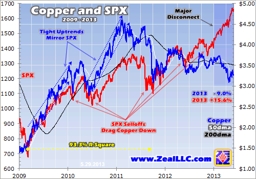
As you can see in this chart, the SPX (red) powered higher in an initial upleg that led to a near double in only about a year.  Risk was also on, with the speculators putting big capital to work in the commodities realm.  Copper (blue) was of course a huge beneficiary, and it easily outpaced the SPX’s gains over this same stretch.

Following a mid-2010 correction the SPX again powered higher, resuming its recovery turned cyclical bull market.  And through the first half of 2011 it achieved numerous post-panic highs.  So what did copper do amidst this SPX climb?  Yep, you guessed it, it followed in the SPX’s steps.  Not only did it deliver its own post-panic highs, copper’s February 2011 apex was an all-time nominal high.

What I really want to bring attention to over this stretch is the correlation between the SPX and copper.  And this correlation is apparent not only visually, but mathematically.  From the SPX’s March 2009 low to the end of August 2011 the SPX and copper had a super-high correlation of 0.966, yielding an r-square of 93.3%.  This means that 93% of the daily behavior of copper’s price could be explained by the daily movement of the SPX.  Copper was slave to the SPX for well over two years!

Beginning in September 2011 this correlation started to soften.  While the SPX was consolidating following a strong correction, commodities continued to correct in a brutal selloff sparked by economic fears in Europe and a Fed head-fake here in the US.  And copper, being an economically-sensitive metal, got crushed to its September low.

When the beat down was finally over copper fell back in tow with the SPX, for the most part.  And as you can see in this chart, the SPX’s strong influence over copper persisted essentially through the end of 2012.  Though it didn’t achieve new highs like the SPX, nor was the mathematical correlation as tight, the directionality was quite harmonious.

Going into 2013 it wasn’t too much of a concern that copper wasn’t hitting new highs.  In a generally weak environment for commodities, copper was still 19% higher than its 2011 low while still being at high levels historically.  But as you can see, 2013 hasn’t been kind to this metal.  And it is not because the SPX has been dragging it lower.  In fact, with the SPX powering higher there’s been a clear disconnect of this multi-year relationship.

This disconnect is obviously quite curious.  And it of course begs the question, why did it happen?  Naturally there’s been a flurry of speculation tossed around, from copper’s bull market being over to the SPX leaving everything else in the dust as it floats on pure hubris.  Ultimately there’s countless ways to rationalize what’s been happening, but I believe there’s one fundamental driver that can shoulder a lot of the blame for copper’s fall, LME stockpiles.

The London Metal Exchange is the world’s premier non-ferrous metals exchange, where over 80% of global non-ferrous business is conducted.  And in addition to providing a market for trade and pricing, the LME manages a global network of warehouses that stores the physical metal.

This storage is quite important as not only does it serve to fulfill redeemed contracts, but it offers a place of refuge for excess supply.  Now since most of the copper that’s mined is shipped directly to the end user following refinement, the volume that flows through the LME warehouses is quite insignificant as far as the global trade goes.  But though this warehoused supply is small, it is vitally important as a buffer between producers and consumers.

LME stockpile levels are also important as they give traders an idea about the economic balance of the copper market.  Low and/or declining stockpiles indicate tighter supply, whereas high and/or rising stockpiles indicate excess supply due to overproduction and/or falling demand.

Naturally these factors can have a big influence on price.  And thanks to the LME’s ability to track stockpile levels on a real-time basis, we have a unique and accurate fundamental read on copper’s economic balance.  And a quick peek at current stockpile levels puts the copper-SPX disconnect in perspective.

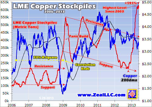
To provide some context, over the last 5 years copper has been consumed globally at an average rate of about 53k metric tons per day.  So LME stockpile levels at 530k metric tons is equivalent to 10 days’ worth of copper.  And while 10 days of supply is most certainly not bull-ending copper-coming-out-of-our-ears levels, it hardly represents a tight economic balance.

What is tight is anything less than about 5 days.  And provocatively LME stockpiles were in this danger zone for 4+ years leading into the panic.  In fact, back in 2005 alarmingly-low LME stockpiles of only about one day’s worth of supply is what triggered copper to break out to new all-time highs.

To show how much of a price driver LME stockpile levels can be, check out the inverse correlation in the several years leading up to the panic.  During this time the miners were struggling to keep up with demand, resulting in stockpiles fluctuating between 2 to 4 days’ worth of supply.  As stockpiles approached support, prices would rise.  And as they approached resistance, prices would ease.  But this relationship that sported a strong correlation r-square of 73% was blasted apart by the infamous stock panic.

With the world coming to an end, the miners suddenly had a harder time finding buyers, which prompted more delivery to the LME warehouses.  LME stockpile levels thus skyrocketed in unison with copper’s plunge.  And ultimately the global economic uncertainty spawned by this panic would really throw levels out of whack in the subsequent years.

Overall it’s probably a good thing copper hitched to the SPX wagon following the panic.  If it didn’t, and stuck with its classic LME stockpile correlation, its price wouldn’t have had nearly the run due to the appearance that there was an ongoing ease on the economic imbalance that had strained supply.

Interestingly higher sustained stockpile levels following the panic build is partly a consequence of consumer-level inventory management.  Given the economic uncertainty manufacturers tightened inventories, either voluntarily or because they had to considering the lack of available credit.

Also veiled by the post-panic rise of LME stockpile levels was the true state of the copper market, which according to the International Copper Study Group (ICSG) still sported bullish near-term fundamentals.  Interestingly from 2009 to 2012 world refined copper production (of which about 85% comes from mining) fell short of meeting usage by 817k metric tons.  The copper market was actually in a supply deficit.

Though LME stockpiles didn’t decisively fall under that 5-day inventory threshold that starts worrying traders, they did trend down following the panic build.  And even though copper was still glued to the SPX, this downtrend no doubt supported copper’s higher prices.

Also supporting copper on the fundamental front was the fact that world refined copper usage hit successive record highs in 2010, 2011, and 2012 (20.5m metric tons).  We didn’t hear much about this from the mainstream media amidst the tub-thumping of their anti-commodities campaign!

This brings us to 2013.  And it doesn’t take a rocket scientist to see why copper has disconnected from the SPX.  Since their low in October, LME copper stockpiles have soared a whopping 191% to this week.  Copper’s producers have pumped 403k metric tons of the metal into LME warehouses in just over 7 months.

This is a major build, the likes of which has only been seen once in copper’s entire bull market.  This other build was of course the panic build, and by quantity it only measured a smidgen higher at 439k metric tons.  At 614k metric tons today, LME copper stockpiles hold nearly 12 days’ worth of supply.  This also represents the highest absolute level in a decade.

Again these are not death-defying levels that alone would signify a bull-ending structural shift.  But they are enough to demonstrate a slackening of the tight balance we’re used to seeing.  And this fundamental slackening is justification for an ease in copper’s price.

And ease is exactly what copper’s price has done.  Copper has disconnected from the SPX’s melt-up to reunite with its old flame, LME copper stockpiles.  So now the question begs, what can we expect for copper going forward?  Unfortunately, its near-term outlook is pretty grim the way I see it.

The good news is the ICSG forecasts record refined copper usage in both 2013 (20.6m mt) and 2014 (21.4m mt).  The problem is this record usage is expected to scrub up with record production (21.2m mt in 2013 and 22.3m mt in 2014) that will push the balance back to a surplus.  And a surplus of 1.1m mt will easily offset the shortage seen in the previous few years.

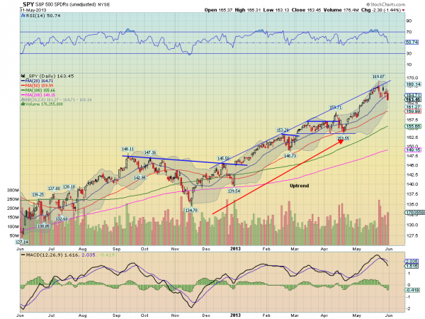
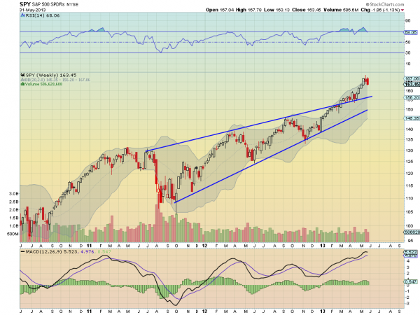
Copper will also likely face downside pressure from an SPX selloff.  The stock markets are currently hitting a myriad of technical and sentimental extremes that are only seen at major toppings.  And they are well overdue for a major correction.

Copper already has that correlation history with the SPX.  And if sliding stock markets face no fundamental resistance, copper will most certainly experience compounded selling pressure.  Not much else diminishes confidence in the economy faster than falling stock markets, and this could spawn the perfect storm for economically-sensitive copper.

It’ll be interesting to see if a perceived or righteous weakening economy will finally reverse the upward trend on usage.  And if usage indeed goes down and prices stay weak, this will eventually have an adverse effect on mine production as the miners would naturally have a harder time finding buyers (higher-cost producers that have come online in recent years would also face pinched economics).

Overall I suspect we’ll see a myriad of drivers tossing this metal around at least for the near term, with the biggest still being LME stockpiles and the SPX.  And given copper’s forecasted production surplus coupled with an imminent SPX correction, we’ll almost certainly see a weaker copper price.

At Zeal we’ve long been bullish on copper and have made a lot of money for our subscribers over the years going long on its miners.  And we continue to be bullish on this indispensable industrial metal’s long-term outlook.  But in the interim there are just too many bearish factors pitted against it.

In our eyes it’s going to be a rough road ahead as nearly all sectors follow the SPX down.  And copper along with most other commodities will hardly be immune to the selling pressure.  But we do believe there is one sector that will thrive when most others are struggling, the precious metals.

The stars are currently aligned for the precious metals and their stocks to soar.  This sector’s fundamentals and technicals are wildly bullish.  And for a contrarian there couldn’t be a better sentimental setup to support a reversal of fortunes.

At Zeal we’ve been loading up on elite gold and silver stocks in our acclaimed weekly and monthly newsletters.  If you’d like to see which ones we’re recommending to our subscribers, get your subscription today!  And if you’d like detailed fundamental profiles on the stocks we own as well as a select group of other high-potential gold/silver miners that we believe will lead the charge, our wildly popular research reports are currently available at a discount.

The bottom line is following several years of copper moving in tandem with the SPX, 2013 has brought about a decisive disconnect.  While the SPX continues to melt up, copper has trended well to the downside.  And this disconnect was sparked by the rekindling of an old pre-panic relationship.

Soaring LME stockpiles have taken pressure off what’s been a tight economic balance.  And copper’s price could face more headwinds via an imminent SPX correction as well as a forecasted supply surplus over the next couple years.  Copper’s and stocks’ misfortunes should however open the door for precious metals to shine as investors seek alternatives.

By: Zeal_LLC

Anybody halfway attuned to the markets knows that copper has been a 21st-century rock star.  No longer just a boring industrial metal, copper is a flamboyant asset that has made fortunes for investors and speculators.  It’s soared a staggering 662% from its 2001 low to 2011 high.  And still today in the $3.25 region copper is nearly four-fold its 20-year pre-bull-market average.

Copper’s journey has of course played out under an umbrella of structurally strong fundamentals, but by no means has it been a lucid and linear trek.  Copper is a commodity after all, and volatility comes with the territory.  Over the last dozen years it’s seen wildly exuberant uplegs as well as crushing selloffs.

See the original article >>

The Silent Killer of Every Bull and Bear Market

By: Clif_Droke

Stocks have reached record levels thanks in large part to a coordinated central bank stimulus. The current financial market-led recovery is unlike previous recoveries in that the economy, unlike the stock market, has been painfully slow to respond to the stimulus. Gold also hasn’t benefited this time around, which is partly attributable to the fact that it’s still deflating some of the excess from its speculative bubble of previous years.

Gold also has failed to capture investor interest this time around owing to the mini-mania for dividend yielding stocks. “Gold doesn’t pay a divided” is the mantra these investors chant when confronted with the metal’s long-standing safe-haven status. At some point, however, gold’s declining fortunes will reverse and the investors currently ignoring gold will come to see its value again.


Overlooked in the analysis of what makes –and breaks – an asset bubble is the single most important indicator: price. Rising prices is what ultimately attracts most investors’ attention, more so than valuation and other fundamental concerns. Price is a double-edged sword, however; while it serves to entice investors on the upside, it eventually evokes its own reversal if it continues rising long enough. When an asset becomes too pricey, investors begin to lose interest simply because the asset becomes unaffordable or otherwise undesirable at such lofty levels. This truism applies in all cases to all markets, whether stocks, bonds, commodities or even gold itself.


In the typical lifecycle of a bull market the small investor will join the party at some point, unable to resist the allure of rising prices. The average investor has fun while watching his investment grow. He tends to move in and out of the market during the bull run, which explains why at some point he can no longer justify buying back in at extremely high levels. It’s the big-money institutional investors who stick out a bull market to the end, mainly because they’re the only ones who can afford it. But a bull market’s days are numbered when only the big-money players are involved. The big money, after all, has to have someone else to sell to – they can’t keep a bull market alive for very long by selling among themselves. This is one reason why gold peaked in 2011, although the end was definitely aided by the tightening of margin requirements.


A bear market is much like a bull market in its psychological allure – only in reverse. Just as the institutional crowd is the last to leave the party in a bull market, they’re among the first to get things moving at the end of a bear market. Attracted by low prices and valuations, they’re early (and at time premature) buying paves the way for the commencement of a new cycle. The rising prices generated by their collective buying eventually captures the attention of the public and before long a new bull market is underway.


At what point does gold become attractive, then, to institutional investors? One way of discerning this is by staying abreast of the research reports and commentaries of top flight analysts and fund managers. They’ll often throw out hints as to what downside price targets they’re watching for buying opportunities. In recent weeks I’ve read more than one analyst mention $1,250-$1,300 as an area where gold purchases would become attractive to them.

Meanwhile there is talk in the financial press that both stocks and bonds have entered a “bubble” phase. These concerns are increased with the fear that the Fed will taper off its QE stimulus program sooner than anticipated. PIMCO, the world’s largest bond investment company, recently warned of a sharp drop in risk assets if economic growth turns out to be much worse. The bull market in stocks will be especially vulnerable to bad news and economic shocks later this summer when a series of weekly Kress cycles is scheduled to peak. This could portend a turning point both for stocks and for gold.


As Barclays pointed out, the strength in gold’s physical demand has somewhat mitigated recent outflows in gold-backed ETFs. The outflows have amounted to some 39 tons during the first week of May and nearly 380 tons for the year to date. Barclays believes, however, that there is a bigger risk of the physical demand slowing down instead of the ETF flows bouncing back in the near term. “Nevertheless,” as Sharps Pixley points out, “central banks will again be the supporter of gold prices at lower prices.” I would add that if gold does indeed reach the $1,250-$1,300 area by summer, we should also see institutional support come to the rescue.


According to CFTC data, speculative short positions for gold – the so-called “dumb money” – remain at its highest level since 1999, the previous long-term low for the yellow metal. By contrast, the commercial interests – the “smart money” in the gold market – have built up a large net long position in gold since 2008. This is another future potential support for gold as major short covering will ensue at some point.

See the original article >>

Eiffel tower patterns in place in Consumer Staples & Discretionary?

by Chris Kimble

CLICK ON CHART TO ENLARGE

If you see the left side of an Eiffel Tower pattern, you often end up experiencing the right side of the tower too!

Eiffel Tower patterns have lead to much lower prices in a wide variety of assets. The 4-pack below reflects prior completed Eiffel Tower patterns, first discussed almost 2-years ago when I brought up the potential of an Eiffel Tower pattern in Gold on 8/23/11. (Eiffel Tower post here)

I also shared that Apple looked to be forming an Eiffel Tower pattern as well (Apple Eiffel pattern).

Both Apple and Gold, which were darlings of the street at the time of the Eiffel tower pattern posting, each lost 30% in value in upcoming months!

CLICK ON CHART TO ENLARGE

Now back to the current situation...Over the past two years, Consumer Staples (XLP) and Consumer Discretionary (XLY) have reflected a ton of relative strength over the S&P 500, doubling SPY from May 1 2011 to May 1 2013!

The top chart reflects that XLY & XLP are up against resistance lines that have seen important declines for these two over the past 9 YEARS! At the same time these ETF's are facing resistance, they might have formed Eiffel tower patterns. Many found it hard to believe last fall that Apple could be forming an Eiffel tower pattern, yet after losing a third of its value, I suspect the pattern seems more possible now.

XLY & XLP have been upside leaders for the past few years....watch these two in upcoming weeks and months to see if the Eiffel tower pattern starts playing out, because the upside leaders could turn into downside leaders!

See the original article >>

The Week Ahead: Four Ways To Summer-Proof Your Portfolio

by Tom Aspray

It has been a very volatile week in many world markets. While much of the attention has been focused on the 5.7% drop in the Nikkei-225 last week, many overlook that the total loss has been closer to 9% in just the past two weeks.

The US stock market looked ready to close the week with slight gains, but then the selling started to pick up just two hours before the close. The selling was very violent in the last 30 minutes, and the Dow lost another 100 points, while the S&P futures dropped more than 15 points.

This was the sharply lower close that I have been warning would signal a start of a full-fledged correction. It has caused the daily technical studies to turn more negative; up until lunchtime, only the NYSE Advance/Decline line actually looked negative. Both the Dow Industrials and the S&P 500 closed below the prior week’s lows.

chart
Click to Enlarge

An equally important development last week was in the bond market. The weekly chart of the T-Bond yields has completed its reverse head-and-shoulders bottom formation.

As I noted in last week’s Eyes on Income, this indicated that yields could rise from their current level of 3.3% to 4%, which is the upside target from the formation. To complete a similar formation on the ten-year T-Note yield chart, the yield would have to close above 2.39%.

This is already being felt by many bondholders. The chart of the Vanguard Total Bond Market Index (VBMFX), with assets of over $116 billion, also completed its head-and-shoulders top, having gapped below its neckline last week. This fund yields 2.47%, but is already down 3.2% from the July 2012 high of $11.25.

The downside target from the H&S top is in the $10.60 to $10.65 area. Even though the weekly trend is now toward higher yields, it would a very large rise before one could conclude that the 30-plus-year bull market in bonds is really over.

The decline in the junk-bond market has been even more serious. The spread between junk-bond yields and Treasuries has risen sharply, which does not normally occur when Treasury yields rise. In a Wall Street Journal article, they note, “the trading price of a bond issued by Caesars Entertainment [CZR] has dropped 6.7% in just the past eight days.”

The flow of money into bond funds this year has been huge, with $187 billion issued so far this year. In January, my analysis of this market, Don’t Buy The Junk, suggested that this market should be avoided.

chart
Click to Enlarge

Emerging markets have also had a tough 2013, and most are lower for the year. Latin America has been hit especially hard. The chart above shows that the region’s exports to China have dropped steadily since 2010.

Brazil is fighting a weak economy, and their central bank has raised rates to fight inflation. The GDPs of Brazil, Mexico, and Chile are lower in the first quarter of 2013 than they were in the last quarter of 2012.

Though euro concerns have been on the back burner recently, the data for some countries is troubling. Portugal is the latest country where leaving the Eurozone is being discussed. I do expect some negative news from the region to rattle the markets this summer.

In the conclusion of this article, I will suggest four steps you should consider taking to help your portfolio weather the summer months and allow you to relax during your vacation time.

Last week’s data on the US economy was positive overall. The S&P Case-Shiller Housing Price Index showed a year-over-year gain of 10.1%, the best one-month reading since 2005.

chart
Click to Enlarge

The consumer also seems to be quite optimistic because of the strong stock market and higher house prices. The Conference Board’s Consumer Confidence and the consumer sentiment numbers from the University of Michigan were both better than expected. The sentiment data released on Friday improved 8.1 points from April.

The GDP for the first quarter was revised downward, but is still in a positive trend overall. This coming week, we will also get new readings on manufacturing and the employment situation. The PMI Manufacturing Index and ISM Manufacturing Index both come out Monday, along with construction spending numbers.

Tuesday, we get the latest numbers on international trade, while Wednesday brings the ADP Employment Report, ISM Non-Manufacturing Index, productivity and costs, and factory orders.

Investors hope that the overall downtrend in jobless claims will continue on Thursday, in advance of the monthly jobs report on Friday.

What to Watch
The late-day sell-off and the close of several major averages below the prior week’s lows indicates that the May 22 highs will not be challenged for some time.

I would expect further selling this week, though the S&P 500 is likely to bounce from the 1,585 to 1,600 level. A rebound will probably fail around 1,640 to 1,650, and this will need to be watched closely, as it may provide an opportunity to hedge one’s portfolio.

In last week’s Trading Lesson, I looked at the number of stocks in the major averages that were above their 50-day moving averages. This percentage rises strongly in the early stages of a stock-market rally, but as the market tops out, the number declines—fewer and fewer stocks are pushing the major averages higher. For the Dow Industrials, S&P 500, Nasdaq-100, and S&P 600, the percentages are well below the highs set early in the year.

Bullish sentiment of individual investors reversed last week, as expected. Only 36% are bullish now, down from 49% last week. The number of bears has also increased to 29.6%, up from only 21%. Even the financial newsletter writers have become a bit more cautious as 52.1% are bullish but less than 20% are bearish.

chart
Click to Enlarge

The daily chart of the NYSE Composite clearly shows the key reversal on May 22 and the close below the prior week’s low. The daily Starc- band is now at 9261, which corresponds to the April highs (line a).

The short-term uptrend (line b) is now at 9,026, with the 38.2% Fibonacci support from the November 2012 lows at 8,928. The 50% support is at 8,729, which is just above the March lows at 8,700.

The major 38.2% Fibonacci retracement support from the 2011 lows is at 8,441, which is more than 10% below current levels, and also corresponds to the uptrend (line b).

The daily NYSE Advance/Decline line dropped below its WMA on May 23, and is now starting to accelerate to the downside. The daily WMA is now starting to roll over, which is consistent with the top-building process. Its uptrend (line c) may be broken this week before stocks try to rebound.

S&P 500
The Spyder Trust (SPY) closed on the lows and below the prior week’s low of $163.94. The next weekly support sits at $162.82.

More important support waits at $159.71 (line a), which was the April high. The daily uptrend (line b) is now at $156.69, and the minor 38.2% retracement support follows at $155.94. This is calculated from the November 2012 lows.

The daily OBV did confirm the recent highs before dropping below its WMA. The WMA is flattening out, but the OBV is not far above stronger support (line b).

The daily S&P 500 A/D line turned lower on Friday, and is now closer to support (line c). Resistance for SPY starts in the $167.78 to $169.07 range.

chart
Click to Enlarge

Dow Industrials
The SPDR Diamond Trust (DIA) also plunged in late trading, and closed below the prior week’s doji low of $155.14, triggering an LCD. The 20-day EMA is now at $151.74, with next good support from the April high at $148.81 (line d). The uptrend from the November lows is at $142.96.

The daily Dow Industrials A/D line now shows a slight pattern of lower lows. A drop well below the May 23 low would be more negative and suggest a test of the uptrend (line f).

chart
Click to Enlarge

Nasdaq-100
The PowerShares QQQ Trust (QQQ) closed the week just a bit lower, but is still well below the reversal high at $74.95. As you will recall from last week, the reversal triggered an LCD on May 22.

Last Friday’s close was near the lows, and the 20-day EMA is now at $73.04. There is additional support at $72.06, which was the last swing low. The monthly pivot support for June is at $71, with the September high (line a) at 70.58. The 38.2% Fibonacci retracement support stands at $69.72.

The Nasdaq-100 A/D line formed a slight divergence on May 22, and shows a clear pattern now of lower highs (line b). It closed the week below its WMA. Next good support waits at line c, which was the April high.

Russell 2000
The iShares Russell 2000 Index (IWM) also closed the week just a bit lower, as well as just above the 20-day EMA at $97. The next support sits at $95.10 (line d), which corresponds to the March highs.

The weekly OBV did confirm the May highs, but the daily OBV (line e) did not. The daily OBV is just holding above its WMA, with next good support at line f.

The Russell 2000 A/D line has been moving sideways for the past two weeks, and is very close to closing below its WMA. The next support can be found at the March highs and the uptrend (line g).

See the original article >>

U.S. stocks fall as data bolster concern on pace of Fed stimulus

By Inyoung Hwang

U.S. stocks fell, paring the seventh monthly gain for the Standard & Poor’s 500 Index, as better- than-forecast data on business activity and consumer confidence bolstered concern the Federal Reserve will scale back stimulus.

The S&P 500 fell 1.4% to 1,630.85 at 4 p.m. in New York.

“May will be the seventh month in a row where the S&P 500 has traded higher, and the markets are maybe looking for a reason to pause or consolidate,” Jim Russell, a senior equity strategist in Cincinnati at U.S. Bank Wealth Management, which oversees about $110 billion in assets, said by telephone. “We wouldn’t be surprised to see the market trade sideways to down in the weeks ahead on, call it, slow summer months, questions around Fed tightening and perhaps sluggish earnings growth in the second quarter.”

The S&P 500 retreated today after data showed consumer confidence advanced in May to the highest level in almost six years. Separate reports showed business activity rebounded in May after declining for the first time in more than three years last month, while consumer spending in the U.S. unexpectedly declined in April.

The data renewed concerns that the Fed would curtail its $85 billion in monthly bond purchases after Chairman Ben S. Bernanke said last week the central bank could reduce monetary stimulus, known as quantitative easing, if officials see signs of sustained improvement in growth.

Message reinforced

“If the data comes in strong, it really reinforces the message that the Fed has been delivering over the past few weeks and probably justifies the tapering of QE,” Joseph Tanious, a New York-based global market strategist for JPMorgan Funds, which oversees $400 billion, said in a telephone interview.

Today’s decline left the S&P 500 down 1.1% in the past four trading days, giving it the first two-week decline since November. The benchmark equity gauge advanced 2.1% in May, the seventh month of gains for the longest winning streak since September 2009. The index has surged 141% since March 2009, driven by better-than-estimated corporate earnings and three rounds of bond purchases from the Fed.

See the original article >>

Follow Us