Sunday, May 1, 2011

The U.S. dollar on the edge of a great cliff! Within a hair of ALL-TIME LOW!

by Martin D. Weiss

chart 1 stocks
Global investors are dumping dollars like there’s no tomorrow.
After plunging for nearly a year, the greenback is down a staggering 15.9% since last June alone.

This week, it hit a low of 72.834, a meager 2.136 points from its lowest level of all time. Meanwhile …

* The dollar is sinking fast against major world commodities like oil, which has surged beyond $113 per barrel in the U.S. and $125 in Europe.

* The U.S. dollar is right at, or near, new all-time lows vis-à-vis silver, as the white metal trades close to $50 per ounce — levels it hasn’t seen since the Hunt brothers manipulated the market over 30 years ago, and …

* The U.S. dollar is ALREADY at all-time lows when measured against gold, which has just sailed past the $1,550 per ounce and is making a beeline for $1,600. 

But this is only a mild dress rehearsal for
what’s possible if Washington stays
on its current wayward path.

It’s the disastrous decline of the dollar that’s largely driving every one of these trends. And it’s the Fed’s money printing — plus Washington’s complacency about its credit worthiness — that’s driving the dollar into the gutter. 

As more central bankers and foreign investors get fed up with losing mountains of wealth in the dollar’s decline … 

And as the world’s financial authorities move closer to replacing the U.S. dollar as the world’s reserve currency …

The big danger ahead is that we could see a bust in the biggest bubble of all — the U.S. government bond market!

How soon? No one can say for sure. But judging from the response on my personal blog last week, many of our readers expect it will happen THIS YEAR!

This is precisely why I decided to issue objective, conflict-of-interest-free country ratings and rate the U.S. government — to help investors see the real risks and dangers beyond the candy-coated ratings issued by S&P, Moody’s and Fitch.

The response has been quite unusual: Dow Jones. MarketWatch. CNN/Fortune. CNBC. Newsmax. Yahoo!
And many more. 

Plus, the feedback on my personal blog has been amazing: Hundreds of readers have posted their comments, suggestions and questions — and we’re here to help in any way we can.

We’re standing by to answer any questions you have about our new country ratings … what they mean to you and your family … and what you should be doing now to insulate your wealth.
See the original article >>

Sell in May………………?

By David Kotok

Sell in May and go away? Is it a cliché or is this the year to obey?

First, let me offer a personal thank you to CNBC for the invitation to discuss this issue on Power Lunch with Michael Farr, Sue Herera, and Tyler Mathison. For those who were advised of the TV schedule and were looking for us, we were seated in the chair at the remote studio in Sarasota, when there was a satellite glitch in that facility. By the time they reconnected to CNBC, the segment had concluded.

In addition, thank you to my friend Michael Farr, who covered for me on the bank stock outlook. Michael and I agree that they are ripe candidates for underweighting. For the discussion, see CNBC.com and search on “Farr”. Choose the clip for Friday, April 29, at 1:05 PM EDT.

Here are the bullet notes we had planned to use in the interview. Michael and I concur that the key to the US stock markets’ forward behavior is held in the hands of the Federal Reserve.
1. Sell in May and go away has supportive history.
2. Our work suggests avoiding markets in the May-Nov period when the Fed is tightening
3. Seasonally negative results are neutralized when the Fed is easing.
4. This year the Fed stops easing in June and goes to neutral and maintains balance sheet size; therefore, the outcome is not clear.
5. But the new FDIC fee assessment method on banks is a negative force, so sell in May could be correct.
6. We are fully invested today but may cut back at any time. We are overweight energy but may peel back. We like the health care sector. We are avoiding banks, so we are at max underweight and have been for a while.
One more element must be added to the list. The US stock market rises and the US dollar falls. There is a relationship. Global investors are allocating flows of funds away from the dollar. This activity is at the margin and explains why the US currency is weak. When the Fed completes QE2 in June, it will go to a holding pattern. It will purchase treasuries in enough quantity to offset the maturities in the Fed’s mortgage portfolio and to roll the rest of the US Treasury holdings. So the Fed will still be in the market buying treasuries. And the mortgage market is still under pressure from liquidation of the GSEs and from the very tepid conditions in the US housing markets.

That is the likely case in July and for the rest of the year. So is that a form of Fed easing, in which case selling in May is premature? Or is this a Fed at neutral, in which case the cliché may be ready for respect. The honest answer is, we do not know, because we have never been in this position of Fed construction before. We may get our first clues from the action in the foreign exchange markets.

We believe the economy is showing more signs of weakness. And we believe the oil price shock is starting to bite as the gasoline price rises into the $4-plus range. It just topped $5 in Connecticut. And we see the foreclosure rate remaining high and the employment reports continuing weak. This tells us that the Fed wants to avoid any chance of tightening, whether it is passive or active. If we are correct, the Sell in May syndrome will be muted, the dollar will remain in a weakening trend, and the stock market bull run is not over.

All of this could change very quickly. So while we are fully invested today and while we are overweighted energy today and underweighted banks today, we could change this at any time.

Sell in May does not specify the date in May. May 30 is a long time from today, with the indicators this sensitive.

Many thanks again to Michael Farr and CNBC and especially to Jennet Chin, who worked behind the scenes so patiently to put the segment together.

Head and Shoulders, Measured Moves and Dead Wait

by Gregory W. Harmon

Friday marked not only the end of the week but the end of the month so it seemed a good time to step back and look at the big picture for a while. Identifying major trends can save even the short term trader a lot of grief and help avoid stepping in front of an oncoming train that may have just been stopping at the station to pick up passengers. There were three many similarities in the SPDR Sector ETF monthly charts but they could also be readily split into 3 groups.

Inverse Head and Shoulders

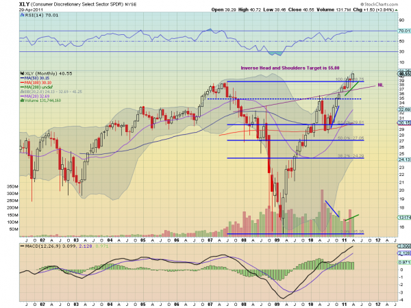
There are five sector funds that fit into this group: Industrials Select Sector SPDR,$XLI, Technology Select Sector SPDR,$XLK, Consumer Staples Select Sector SPDR,$XLP, Health Care Select Sector SPDR,$XLV and Consumer Discretionary Select Sector SPDR,$XLY. Using the chart for XLY below to illustrate, 

Consumer Discretionary Select Sector SPDR,$XLY
xly4 e1304181342957 stocks
there are some interesting points to note. Most prominent is that each chart clearly shows an Inverse Head and Shoulders pattern. The XLY has the furthest yet to run to attain its target of at least 55.00, 35% higher, but the closest one XLP still has over 16% higher to move. Also, all of these sectors are either at or just above a full retracement of their moves from the 2007 highs to the March 2009 lows. Next, for all except the XLK, the volume on current leg higher diverged until the price passed the neckline, when it began to increase again. Almost as if the neckline break confirmed the move higher to investors. Finally for their moves off of the lows all have Measured Move targets that will be reached before the Inverse Head and Shoulders target is achieved so they may pause on the way higher. Speaking of Measured Moves.

Measured Moves

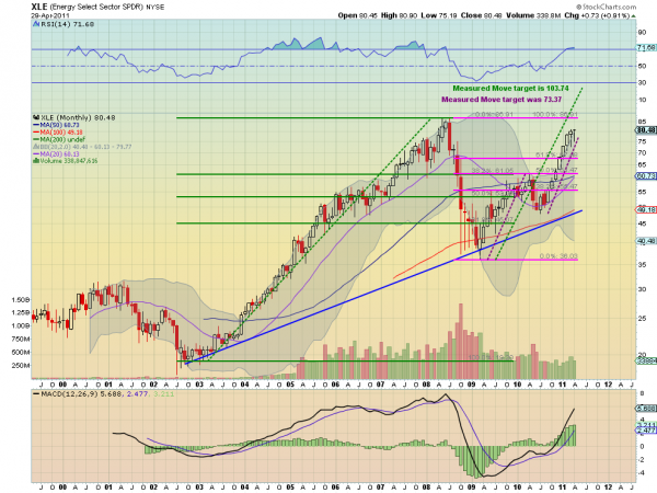
The 5 sector funds mentioned above are working on a Measured Move higher but three other sector funds, Materials Select Sector SPDR,$XLB, Energy Select Sector SPDR,$XLE and Utilities Select Sector SPDR,$XLU, fit into this space better. Using the chart below for the XLE to illustrate, 

Energy Select Sector SPDR,$XLE
xle4 e1304182394347 stocks
there are two Measured Moves that these sector funds are working on. XLE has already achieved the first target and is showing signs of a consolidation or pullback, printing a Hanging man candle for April. The other two are yet to achieve the first Measured Move. It is also worth noting that none of these sector funds have reached the full retracement of their highs, which was in 2008 for each, not 2007 as for the first 5 funds, they were still rising in 2007. These three sectors have been correlated over the past 3 1/2 years and look to be heading higher together with the being the weight on the group. Ah, the Weight.

Dead Wait

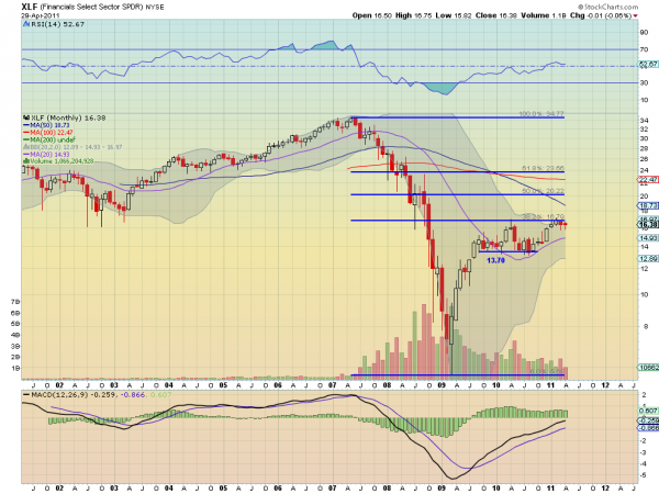
The one remaining sector fund, Financials Select Sector SPDR,$XLF continues to be the Dead Wait (or Weight, you choose) on the market. It lags in many categories. It has only retraced 38.2% of the move from 2007 highs to the 2009 lows, while the worst other sector fund XLU, has cleared a 61.8% retracement. The Relative Strength Index is languishing in the low 50s, undecided between bullish and bearish, while all the others are above 64, firmly in bullish territory. The volume has continued a slow decline since April 2010 while the other sectors have seen a bump up recently. And it is the only sector that is still trading below its 50 and 100 month Simple Moving Averages, which by the way are sloping downward. 

Financials Select Sector SPDR,$XLF
xlf4 e1304183851685 stocks
It has been said by many that XLF needs to move higher to confirm the rally. The evidence suggests that is not the case but should the Dead Wait start to move then even these prognosticators could join in bullish. One potential catalyst for a move could come from the squeezing Bollinger bands which have moved from a range of 14 to a range of just over 4 since the beginning of 2010. it has been a boring sector but keep an eye on those Bollinger bands and the 16.79 Fibonacci level. Moves higher from there could add rocket fuel to the already hot fire.

COPPER AND THE COMMITMENT OF TRADERS REPORT

by Tom McClellan


Copper COT data
April 29, 2011

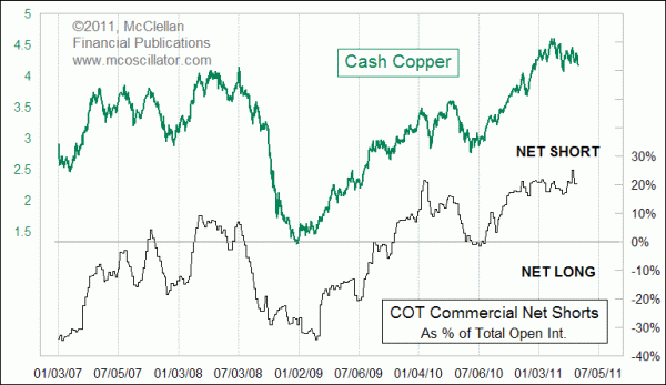
Commercial traders think that copper prices have no business being so high.

The weekly COT Report is published by the CFTC, and it lists the total positions held by commercial, non-commercial, and non-reportable traders of futures contracts. The commercials are the big guys who hold huge positions, and they presumably got to be the big guys by being the smart guys. Non-commercials are the large speculators, usually consisting of hedge funds. The non-reportables are traders whose positions are so small that they are considered not even worth individually reporting, according to the CFTC.

This week’s chart shows that the commercial traders have moved to a big net short position. This means that, as a group, the commercial traders are betting that a big decline is coming in the future for copper prices. One point to understand is that while the commercial traders usually end up being right in the long run, they are often early in adopting their lopsided positions. So the commercial traders’ net position should be thought of not as a timing signal, but rather as potential energy ready to be unleashed once the time is right.

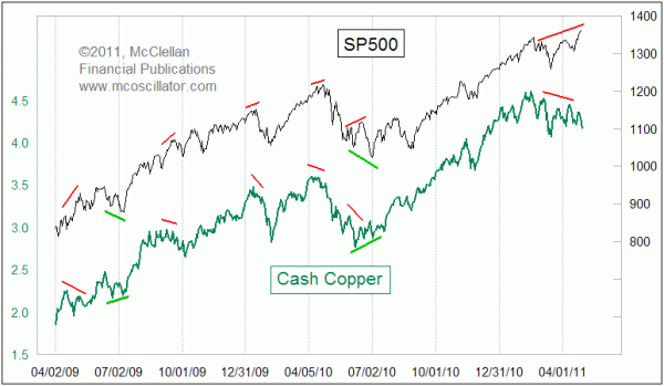
A pending decline in copper prices would be a significant issue for stock market investors because of the strong correlation that copper has shown to stock prices in recent years. Copper prices and the SP500 have been very strongly correlated, but with an interesting twist. Whenever there is a divergence, it is usually copper that ends up telling the truer story about where both are headed.

That is especially relevant right now, as the SP500 is zooming ahead to multi-year highs, while copper prices are nearing the lows for 2011. Copper is not confirming the higher highs in the stock market, and commercial traders of copper futures are making a big bet on copper heading lower. So unless the strong correlation between copper and the stock market is about to break down, or unless the commercials are going to suddenly turn out to be drastically wrong, this is a bad omen for the stock market.

At what point this bad omen finally starts to matter remains to be seen. My bet is that it will really start to matter in June, when the Fed’s POMOs end, and the period of favorable seasonality switches to unfavorable. Get ready to cinch up your seat belts.

Global Carbon Emissions

by StanfordKay

Originally conceived as one of my Myth Buster information graphics for Newsweek's International Edition, a piece on global carbon emissions showing both national and per capita data has found a home in the April issue of the Atlantic Monthly. The image of a footprint is composed of circles sized relative to the carbon emissions of each nation and color coded according to region. In the final version of this information graphic there will be a second footprint of per capita emissions by nations. That will be a very different picture. The leader in per capita emissions is Gibraltar followed by the Virgin Islands. The U.S. drops down to number twelve and China falls way down the list due to its large population. It appears that countries that don't grow or produce much have the largest footprint because they have to import almost everything they need.


Follow Us