By Gail Tverberg
A question that seems to come up quite often is, “Are we going to have inflation or deflation?” People want to figure out how to invest. Because of this, they want to know whether to expect a rise in prices, or a fall in prices, either in general, or in commodities, in the future.
The traditional “peak oil” response to this question has been that oil prices will tend to rise over time. There will not be enough oil available, so demand will outstrip supply. As a result, prices will rise both for oil and for food which depends on oil.
I see things differently. I think the issue ahead is deflation for commodities as well as for other types of assets. At some point, deflation may “morph” into discontinuity. It is the fact that price falls too low that will ultimately cut off oil production, not the lack of oil in the ground.
Even with little oil, there will still be some goods and services produced. These goods and services will not necessarily be available to holders of assets of the kind we have today. Instead, they will tend to go to those who produced them, and to those who win them by fighting over them.
Up and Down Escalator Economies
It seems to me that economies operate on two kinds of escalators–an up escalator, and a down escalator. The up escalator is driven by a favorable feedback cycle; the down escalator is driven by an unfavorable feedback cycle.
For a long time, the US economy has been on an up escalator, fueled by growth in the use of cheap energy. This growth in cheap energy led to rising wages, as humans learned to use external energy to leverage their own meager ability to “perform work”–dig ditches, transport goods, perform computations, and do many other tasks that machines (powered by electricity or oil) could do much better, and more cheaply, than humans.
Debt helped lever this growth up even faster than it would otherwise ramp up. Continued growth in debt made sense, because growth seemed likely for as far in the future as anyone could see. We could borrow from the future, and have more now.
Unfortunately, there is also a down escalator for economies, and we seem to be headed in that direction now. Such down escalators have hit local economies before, but never a networked global economy. From this point of view, we are in uncharted territory.
Many economies have grown for many years, hit a period of stagflation, and ultimately collapsed. According to research of Turchin and Mefedov documented in the book Secular Cycles, such economies have typically gotten their start by learning to exploit a new resource, such as using land cleared for farming, or learning to use irrigation, or in our case more recently, learning to use fossil fuels. These economies typically start out by growing for many years, thanks to the opportunity for more population and more goods and services from the new resource.
After a while, a period of stagflation is reached. Population catches up to the new resource, and job opportunities for young people become less plentiful. Wage disparity grows, with wages of the common worker lagging behind. The cost of government rises. Because of the low wages of workers, it becomes increasingly difficult to collect enough taxes from workers to pay for rising government costs. To work around these problems, use of debt grows. Needless to say, this scenario tends to end very badly.
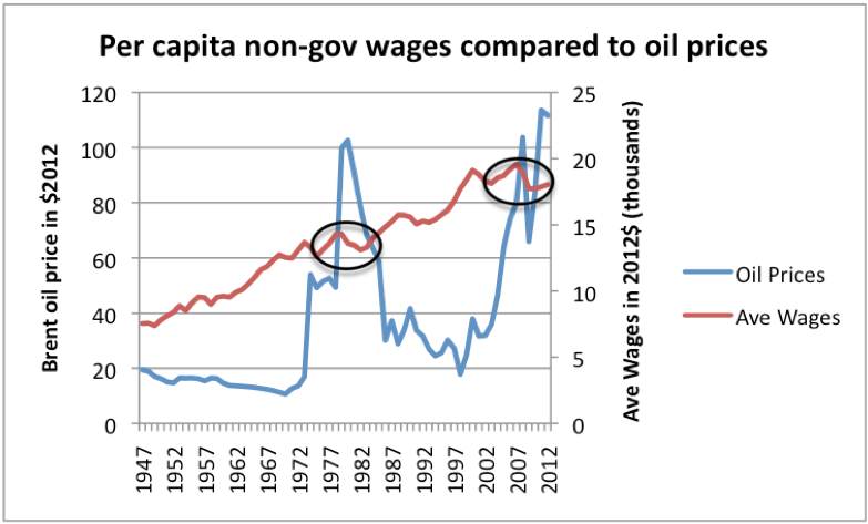
Our situation today sounds a great deal like the down escalator situation. As I have discussed previously,wages stagnate as oil prices rise. In fact, most increases in wages have taken place when the real price of oil was less than $30 barrel, in today’s dollars.
 Figure 1. High oil prices are associated with depressed wages. Oil price through 2011 from BP’s 2012 Statistical Review of World Energy, updated to 2012 using EIA data and CPI-Urban from BLS. Average wages calculated by dividing Private Industry wages from US BEA Table 2.1 by US population, and bringing to 2012 cost level using CPI-Urban.
As oil prices rise, wage-earners hit a second problem–higher outgo for fuel and food, since fuel is used in growing and transporting food. Thus, wage-earners are hit on two sides–flat income and higher outgo for necessities, leading to less discretionary income. Governments find that they need more taxes to pay for increased benefits for the many who no longer have jobs. These higher taxes place another burden on those who are still working. Businesses find their profits pinched by higher oil prices, and respond by outsourcing to a low wage country, or automating processes to cut costs, lowering the amount local citizens earn in wages further. Furthermore, even apart from oil issues, globalization tends to pull US wages down. All of these issues tend to add to the down-escalator phenomenon for the US economy.
In past years, governments and businesses have made promises of many types, such as bank account balances, pensions, Social Security, Medicare, insurance policies, stock certificates, and bonds. The question becomes: what happens to these promises, as we step off the up escalator, and onto the down escalator? All of these promises could be paid when we were on the up escalator. The amount that gets paid is much less clear, if we are on the down escalator. In this post, I would like to examine what happens.
The General Price Trend: Downward, with Discontinuities
Each year, an economy produces various kinds of goods and services. It grows crops, and extracts minerals. It uses energy products to process the crops and minerals into finished goods, and to transport them to their final destination. The amount produced depends on the amount of goods and services potential buyers can afford. If wages are stagnant, and the government’s share keeps rising, the amount wage-earners can afford (in inflation adjusted dollars) keeps falling.
Since the early 2000s, the cost of extracting oil products has been rising, because the oil that was cheapest to extract was extracted first, and the “easy oil” is now gone. There tends to be a relatively small amount of a resource available cheaply, and increasing amounts available at higher and higher prices (Figure 2, below).
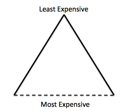 Figure 2. Resource triangle, with dotted line indicating uncertain financial cut-off.
In fact, minerals of all types tend to follow the same pattern as oil for two reasons: (1) Mineral extraction follows the same pattern–cheapest to extract first, moving to the more expensive to extract, and (2) Oil is generally used in extraction. If the cost of oil is rising, its cost tends to get passed on. Of course, in some instances, technological improvements can offset rising prices, but for most of the time since the year 2000, cost of commodity extraction has tended to rise.
There has been a lot of publicity recently about more oil being available, and more natural gas being available. This additional availability is because of high price. It doesn’t bring the cost of extraction down. In fact, if price drops, extraction is likely to drop. This drop will not occur immediately, because much of the cost has already been paid on wells that have already been drilled, so extraction from these wells tends to continue. But future investment is likely to drop off quickly if prices drop, bringing supply down, with a lag.
Because of the downward escalator the economy is on, wage-earners don’t really have enough money to pay the higher prices that are needed for increasingly costly extraction of oil and other minerals. Instead, prices tend to be volatile. The general trend can be expected to be downward, because even if oil prices rise when the economy is functioning fairly well, at some point, the higher price leads to adverse feedbacks, such as consumers defaulting on debt and cutting back on discretionary purchases. The result can be expected to be recession, and again lower oil prices.
The big danger is that lower oil prices will lead to lower oil production, and this lower oil production will become a problem for business and commerce around the world. The United States is likely to be one of the countries whose oil production will be affected most by lower oil prices, for three reasons:
(1) We tend to have most tight oil production, and tight oil production tends to be high-priced production. It also drops off quite quickly, if drilling stops.
(2) Shale gas drillers tend to use a lot of debt. Shale drillers will especially be hit if interest rates rise because of debt problems.
(3) Taxes and fees related to oil production in the US (unlike many countries) do not vary with the price of oil. The US government will continue to get most of its revenue (estimated to average $33.29 per barrel on a $80 barrel of US tight oil by Barry Rogers, Oil & Gas Journal, May 2013), even as companies find themselves short of funds for new drilling.
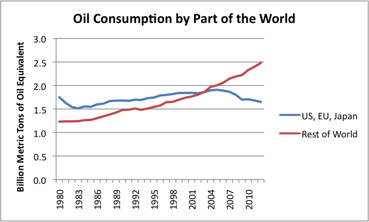
If oil production is down, US oil consumption to be lower as well. The reason for low oil price is likely to be recession and greater job loss. With fewer jobs, less oil is needed for making and shipping goods. Furthermore, the many unemployed cannot afford cars. The pattern of declining demand in the European Union, and Japan is likely to continue, and get worse. (See my post, Peak Oil Demand is Already a Huge Problem.)
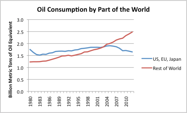 Figure 3. Oil consumption based on BP’s 2013 Statistical Review of World Energy.
In 2008-2009, the economy was able to somewhat recover, so commodity prices increased again. This recovery was not based on US economy fundamentals–a large part of it seems to be related to artificially low interest rates and deficit spending. As interest rates rise, and as deficit spending is eliminated through higher taxes/lower benefits, the US economy seems likely to head back into recession, with more job loss, probably worse than last time.
Countries with low wages to begin with may be spared of some of the down-escalator economy dynamics for a few years, because their low wage levels will continue to make them competitive in a world economy. These countries will attract a disproportionate share of new jobs, allowing them to continue grow for a time, even as the US, the European Union, and Japan continue to lose jobs. Thus, world oil prices may be able to bounce back, but probably not to as high a level as in the recent past. Eventually, these countries will tend to follow the rest of the world into stagflation and collapse, because of the interconnectedness of the global economy, and the similar dynamics that all countries are subject to.
Chance of Discontinuity
In order for the models to work in the expected way, business as usual must continue. A few obvious problems come into play:
(1) “Demand,” as defined by economists, is what consumers can afford to pay. Therefore, a jobless individual without any type of government compensation, would have no demand for food, clothing or shelter–at least using the term in the way economists use the word. All of us know that in the real world, lack of a job and lack of government benefits causes problems. At some point, marginalized people will riot and overthrow governments. Civil war may take place, or war against another country.
(2) Part of Business as usual is continuing availability of debt. At some point, it will start to become clear that the economy has gotten off the up escalator, and moved to the down escalator. On the down escalator, much less debt makes sense. It probably still makes sense to use debt on a short-term basis to cover goods in transit, and it may make sense to use debt to finance investments with a high expected rate of return. But in general, debt is likely to become much less common, greatly worsening the down escalator problem.
(3) As long as the economy was on an up escalator, increasing economies of scale were part of what caused a positive feedbacks. When the economy is on a down elevator, we have the reverse effect–higher fixed costs relative to production. This is even an issue when reduction in sales are intentional–for example, increased water conservation tends to lead to higher fixed costs, per unit of water sold, and greater use of high-efficiency light bulbs leads to greater electricity fixed costs (such as grid costs) per kWh sold. These higher fixed costs tend to push up prices for services further, increasing the down escalator effect.
(4) Investment in a capitalistic system does not work on a down economic escalator. Who wants to invest, if it is probable that the economy will shrink, leading to increasing diseconomies of scale?
What Happens to Government and Business Promises?
There are many kinds of promises currently outstanding:
1. Government promises
- Social Security
- Medicare
- Unemployment insurance
- Continued maintenance of roads
- Free education for all through high school
- Government debt (Federal, state, and local)
- Financial help after hurricane damage
- Guarantees of bank accounts and pension plans
2. Insurance and bank promises
- Life insurance policies
- Annuities
- Long term care policies
- Pension plans
- Auto and homeowners policies, etc.
- Bank account balances
3. Promises by companies of all types
- Stock – implied promise it will be worth more in the future
- Loans borrowed will be paid back (to banks or on bonds)
- Pension plans
- Implied guarantee of future 24/7 electricity availability; grid maintenance
What happens to these promises? Over time, it is clear that pretty much all of them will disappear. They are up-escalator benefits that work when there are plenty of fossil fuels and the economy is expanding. They don’t work for very long on a down escalator.
Promises to Individuals
At the level of the individual, one of the implied promises has been is that an individual who gets a good education will be able to get a good paying job. This is one of the promises that is already disappearing.
There is also a second implied promise–people who actually perform the work, will be compensated for it. This promise is falling by the wayside, as wages fall (partly due to globalization, and partly due to other down escalator effects). At the same time, governments need higher tax rates, to pay for all the promises made to those who are retired, unemployed, or have wages that are too low to support a family.
Goods and Services Produced in a Given Year
In any year, there will be a mixture of people buying goods and services:
- People who are currently in the work force
- Retirees
- People who own assets and want to sell them
One thing that may not be obvious without thinking about it, is that all of the people wanting goods and services have to compete for the same set of goods and services that are available at that time.
For example, we grow a certain amount of corn and rice, and we extract a certain amount of oil and coal and copper, and we make a certain amount of electricity in electric power plants. Because of inventories, there is a little flexibility in these amounts, but basically, the amount that is available is determined by market prices and availability of supply lines. If the amount of goods and services produced is decreasing, because we are on a down escalator economy, this smaller quantity of goods and services needs to be shared by the entire population.
If there is relatively little available in total, and those who produced it don’t want to part with it, a person trying to trade accumulated “assets” for current production will not receive very much scarce production in return for his accumulated wealth, no matter what form it may take. In the case of most assets (stocks, bond, gold, silver, etc,) this means that the value of the asset tends toward $0. If currency is viewed as another asset, its value may go to close to zero as well. In fact, if there has been a government change, its value of the currency may be exactly zero.
How about Quantitative Easing?
Quantitative Easing (QE) represents an attempt to reinflate the economy by making more credit available to the economy, at lower interest rates. It also has the effect of reducing the interest rate the government pays on its own long-term debt, thus holding down that taxes the government needs to collect.
In terms of inflation/deflation effects QE has, its primary effect seems to be to artificially inflate asset prices–stocks, bonds, home prices, and agricultural land prices. The announced goal of the Japanese QE attempt was to try to raise the inflation rate (generally) in Japan to 2%, but it has not had that effect. In fact, the same link shows that in general, QE has not led to inflation.
In my view, the primary effect of QE is to create asset price bubbles. The price of bonds is raised, because of the artificially low interest rates. The price of stocks is raised, because people switch from bonds to stocks, to try to get yield (or capital gains). To get better yield, businesses find it worthwhile investing in homes, with the idea of renting then out on a long-term basis. Very little of QE actually gets through to wages, which is where the major shortfall is.
QE will at some point stop, and the asset price bubble will deflate. (Crunch Time: Fiscal Crises and the Role of Monetary Policy by David Greenlaw, James Hamilton, Peter Hooper, and Frederic Mishkin points out that QE is not viable as a long-term strategy.) This is likely to add to deflation woes. The higher interest rates and the need for higher taxes to cover the higher interest the government needs to pay will add to the down escalator effects, making the trends noted previously even worse.
See the original article >>
 Wolf Richter

 Housing bubbles in socialist paradises up North. Norway's is by far the most impressive – via Mises.org.
 Norway's real house prices compared to the US – the US housing mania looks like a fairly harmless blip by comparison – via Mises.org.


