Saturday, July 13, 2013

A World of Vulnerability

by Jomo Kwame Sundaram

ROME – In 2010, global leaders achieved the Millennium Development Goal (MDG) of reducing the share of the world’s poor to half of its 1990 level – five years ahead of schedule. But rising unemployment and falling incomes underscore the enduring threat of poverty worldwide. After all, poverty is not an unchanging attribute of a fixed group; it is a condition that threatens billions of vulnerable people.

This illustration is by Paul Lachine and comes from <a href="http://www.newsart.com">NewsArt.com</a>, and is the property of the NewsArt organization and of its artist. Reproducing this image is a violation of copyright law.

Illustration by Paul Lachine

Despite their shortcomings, income measures are useful in gaining a better understanding of the extent of poverty and vulnerability worldwide. But the World Bank’s poverty line of $1.25 per day (in purchasing-power-parity terms), which is used in measuring progress toward the MDGs’ poverty-reduction target, is not the only relevant threshold. When the poverty line is raised to per capita daily spending of $2, the global poverty rate rises from 18% to roughly 40%, suggesting that many people are living just above the established poverty line, vulnerable to external shocks or changes in personal circumstances, such as price increases or income losses.

Three-quarters of the world’s poor live in rural areas, where agricultural workers suffer the highest incidence of poverty, largely owing to low productivity, seasonal unemployment, and the low wages paid by most rural employers. In recent decades, vulnerability and economic insecurity have increased with the rise of transient, casual, and precarious employment, including self-employment, and part-time, fixed-term, temporary, and on-call jobs. At-home positions, frequently filled by women, are also on the rise.

Labor-market liberalization, globalization, and unions’ declining influence have exacerbated these employment trends. At the same time, macroeconomic policies have focused on achieving and maintaining low-single-digit inflation, rather than full employment, while limited social protection has heightened economic insecurity and vulnerability.

During the East Asian crisis of 1997-1998, poverty rose sharply. For example, Indonesia’s poverty rate soared from roughly 11% to 37% during the crisis, mainly owing to the massive depreciation of the rupiah.

Likewise, following the 2008 global economic crisis, food-price spikes and recession caused the United Nations Food and Agriculture Organization to revise its hunger estimates upward, to more than one billion people. Considering the FAO’s conservative definition of chronic severe hunger, this is a serious indictment of global poverty-reduction efforts.

Most poor adults in developing countries have to work, if only to survive. Aside from the working poor, an additional 215 million workers worldwide slipped below the poverty line in 2008-2009, owing to the Great Recession. Another 5.9%, or 185 million workers, were living on less than $2 per day. The estimated 330 million working women who lived below the poverty line in 2008-2009 accounted for roughly 60% of the 550 million working poor worldwide.

New estimates by the International Labor Organization (ILO), based on a different methodology from that used by the World Bank, demonstrate that, while the number of those classified as working poor worldwide declined by 158 million from 2000 to 2011 (from 25.4% of workers to 14.8%), progress has slowed markedly since 2008. Indeed, only 15% of workers, or 24 million people, managed to rise above the poverty line in 2007-2011. The other 134 million workers who escaped poverty did so earlier, in 2000-2007. As a result, there were 50 million more working poor in 2011 than projected by pre-crisis trends for 2002-2007.

The lack of basic social protection in most countries exacerbates vulnerability. The ILO World Social Security Report found high or very high vulnerability, in terms of poverty and labor-market informality, in 58 countries, mainly in Africa and Asia. Most such countries do not provide unemployment insurance, while more than 80% of their populations lack social-security coverage and access to basic health services.

Indeed, few countries currently provide comprehensive social protection, as defined by ILO Convention 102 (the instrument establishing internationally-agreed minimum social-security standards). According to the ILO, only one-third of countries worldwide – accounting for roughly 28% of the global population – provide all nine types of protection, meaning that only about 20% of the world’s working-age population (and their families) enjoys comprehensive coverage.

Although all countries offer some kind of social protection or security, in most countries, coverage is severely limited and targeted at specific groups. As a result, only a small minority of the global population has full, legally guaranteed access to existing social-protection schemes – leaving roughly 5.6 billion people worldwide vulnerable to various degrees.

Vulnerability exists at levels far above the World Bank’s $1.25/day poverty threshold, especially given rising job insecurity and inadequate social protection worldwide. To address global poverty effectively, global leaders must take a more comprehensive approach that focuses on reducing citizens’ vulnerability.

See the original article >>

SPY Trends and Influencers July 13, 2013

by Greg Harmon

Last week’s review of the macro market indicators suggested, heading into the first full week of July saw the markets improving and possibly ready to move higher again. We looked for Gold ($GLD) to continue its downward move or consolidate in a broad range while Crude Oil ($USO) continued higher. The US Dollar Index ($UUP) also looked to continue to the upside while US Treasuries ($TLT) resumed their move lower. The Shanghai Composite ($SSEC) might continue its bounce in its downtrend, but the Emerging Markets ($EEM) were biased to the downside. Volatility ($VIX) looked to remain low and drifting lower keeping the bias higher for the equity index ETF’s $SPY, $IWM and $QQQ. Their charts showed that the IWM was the strongest and ready to continue higher while the SPY and QQQ still had some resistance to work through in their short term moves higher before they were in the clear to move higher.

The week played out with Gold deciding it did not like those choices as it moved higher while Crude Oil also moved up, before consolidating to end the week. The US Dollar met resistance and broke lower while Treasuries consolidated under resistance. The Shanghai Composite started higher out of consolidation while Emerging Markets jumped and held their gains. Volatility continued to fall back to lower lows creating a bullish environment. The Equity Index ETF’s responded by moving higher with IWM making new All-time highs, the QQQ new 13 year highs and the SPY closing in on a new high as well. What does this mean for the coming week? Lets look at some charts.

As always you can see details of individual charts and more on my StockTwits feed and on chartly.)

SPY Daily, $SPY
spy d
SPY Weekly, $SPY
spy w

The SPY continued the move higher over the Simple Moving Averages (SMA) and the trend support/resistance line from the November low. It has the look of a possible Shark Harmonic but the low at 155.73 went beyond the 161.8% limit of the extension lower. The week ended with a Doji Star, signaling indecision, just below resistance at 168. The Relative Strength Index (RSI) on the daily chart is rising and bullish and the Moving Average Convergence Divergence indicator (MACD) is also rising and bullish. Out on the weekly chart the strong white candle is watered down a bit by the gapping nature of the rise, looking like an Advance Block than 3 Advancing White Soldiers. A potential trend exhaustion. The RSI is moving higher though and so is the MACD so there is a bullish bias. There is resistance at 168 and 169.07 before free air and new all-time highs. An extended RSI Positive Reversal could see it hit 171.25 above that. Support lower comes at 166 and 163 followed by 161.60. Continued Upside With a Possibility of Consolidation.

Heading into next week, the markets look strong but maybe a bit extended. Look for Gold to continue higher in the downtrend while Crude Oil slows at resistance in the uptrend. The US Dollar Index looks to continue lower along with US Treasuries. The Shanghai Composite and Emerging Markets are biased to the upside in their downtrends and have potential to reverse those trends with continued strong moves. Volatility looks to remain low and drifting lower, keeping the bias higher for the equity index ETF’s SPY, IWM and QQQ. All are biased higher with the QQQ looking the strongest the IWM and SPY perhaps extended a little in their uptrends. Use this information as you prepare for the coming week and trad’em well.

See the original article >>

Get Ready For The Next Great Stock Market Exodus

by Brandon Smith

In the years 2006 and 2007, the underlying stability of the global economy and the U.S. credit base in particular was experiencing intense scrutiny by alternative economic analysts. The mortgage-driven Xanadu that was the late 1990s and early 2000s seemed just too good to be true. Many of us pointed out that such a system, based on dubious debt instruments animated by the central banking voodoo of arbitrary fractional reserve lending and fiat cash creation, could not possibly survive for very long. A crash was coming, it was coming soon, and most of our society was either too stupid to recognize the problem or too frightened to accept the reality they knew was just over the horizon.
The Federal Reserve had cheated America out of an economic reset that was desperately needed. The 1980s had brought us utter destruction disguised as “globalization.” Our industrial center, the very heart of the American middle class that generated enormous wealth and decades of opportunity, had been dismantled and shipped overseas to the lowest bidder. It was then that the U.S. economy actually died; we just couldn’t see it. From that point forward, Americans were fully dependent on the charity of central bank money creation and international bank lending standards. The collapse that should have occurred in the 80s was delayed and thus made more volatile as the Fed artificially lowered interest rates and allowed trillions upon trillions of dollars in dubious loans to be generated. Free money abounded, and average citizens were suckered royally. Their greed was used against them, as they collateralized homes they could not afford to buy more crap they didn’t need. Of course, you know the rest of the story...
Today, credit markets remain frozen. Lending is nowhere near the levels reached in 2006. The housing market is showing signs of life; but that’s only because most home purchases are being made by banks, not regular people, for pennies on the dollar, as bankrupt properties are then reissued on the market for rent rather than for sale. If you are lucky, maybe one day you’ll get to borrow the keys to the house you used to own. And, millions of higher-paying full-time jobs have been lost and then replaced with lower-paying part-time-wage slavery positions. The image of American prosperity carries on, but it is nothing but  a cruel farce; and anyone with any sense should question how long this false image can be given life before the truth dawns.
The novice will question why it is necessary to re-examine all of this information. Is it not widely known? Am I not simply preaching to the choir a message heard over and over again since the crash of 2008? Maybe - or maybe it is time for us to finally apply some foresight given our knowledge of the recent past.
Why did 2008 creep up on so many people? Weren’t there plenty of economists out there “preaching to the choir” at that time? Weren’t there plenty of signals? Weren’t there plenty of practical conclusions being made about the future? And yet, the world was left stunned.
The truth is, human beings have a nasty habit of ignoring the cold hard facts of the present in the hopes of using apathy as a magical elixir for future prosperity. They want to believe that disaster is a mindset, that it is a boogeyman under their bed that can be defeated through blind optimism. They refuse to accept that disaster is a tangible inevitability of life that pays no heed to our naïve, happy-go-lucky attitudes. The American people allowed themselves to be caught off guard in 2008, just as they are setting themselves up to be caught off guard again today.
Again, the reality is clear; the Federal Reserve has propped up equities and bonds using money created out of thin air — so much so that both markets have become totally reliant and disturbingly addicted to fiat injections. The distribution of this fiat threatens the continued dominance of the dollar as the world reserve currency and will invariably lead to currency collapse and hyperstagflation. This process is much more likely to climax in the near term given the accelerated rate of quantitiative easing within our system to date and the accelerated rate at which our primary lenders (namely China) are dumping the dollar in bilateral trade with each other. The endgame is obvious, but I still fear millions of people within this country and around the world will be shell-shocked once again by a renewed crash.
The argument is always the same: “Yeah, things might get dicey, but it won’t be as bad as all the doom-mongers claim, and probably not for many years.”
Similar statements were made by naysayers before the Great Depression and before the 2008 crash. So why are the skeptics wrong again this time around?

The Stimulus Fantasy
Let’s put this in the simplest terms possible: Stimulus is now the lifeblood of our economy. There is nothing else sustaining our nation. Period. Stimulus in the form of bailouts and QE are keeping the stock market and bonds afloat.  This means that the continued existence of equities, and the continued existence of healthy treasuries, and thus the foundation of our currency, our general economy, and a functioning (or barely functioning) government, is completely dependent on the Fed continuing to print.
In recent weeks, the Fed hinted at possible intentions reduce or remove stimulus measures, which would effectively shut down the life-support machine and let the patient drown in his own fluids.

http://money.cnn.com/2013/06/19/news/economy/federal-reserve-stimulus/index.html
http://www.reuters.com/article/2013/06/14/usa-imf-lagarde-idUSL2N0EQ0QI20130614?feedType=RSS&feedName=marketsNews&rpc=43
Day traders and common investors are not very bright, but they do understand well that no stimulus means no stock market and no bond market. In response, indexes have become erratic, shifting on the slightest rumor that the central bank might continue QE for a little longer. Pathetically, the Dow Jones now rallies upward whenever bad financial news hits the wire, as insane investment groups pour in money in the hopes that dismal economic developments might cause the Fed to extend the bailout bonanza.

In our modern nightmare era of hyper-centralized economy, one word or rumor from Ben Bernanke now determines whether stocks dramatically rise or fall.  This is NOT the behavior of a healthy and vibrant fiscal system.
The anatomy of American finance and trade has been horribly mutilated; and clearly, such a monstrous creation cannot last. Stocks are supposed to perform based on the true profitability of individual businesses as well as the political and social health of the overall culture. The wild printing of paper money by private banking magnates is not a catalyst for a successful economy. Whether the Fed actually ends QE is ultimately irrelevant. No fiscal structure can survive when it abandons fundamentals for fantasy. Either QE continues, becoming less and less effective in staving off negative results in equities, inspiring a flight from the dollar leading to a crash, or QE ends, exposing the inevitability of negative results in equities, leading to a crash.  If the Fed ends stimulus, the process of collapse will merely take place slightly faster than if stimulus remains.
But every historic economic crisis has a defining moment, a moment in which the tide turned overwhelmingly sour for a majority of the public. The question now becomes what, exactly, will trigger the avalanche?

Precious Metals Signal Secret Shift To Asia

As I have discussed in numerous articles over the years, China's shift away from the U.S. consumer and the U.S. dollar is well under way.  Over half of the world's major economies now have bilateral trade agreements in place which remove the dollar as the world reserve currency in trade with China and the ASEAN economic bloc.  China is issuing trillions in Yuan and Yuan denominated bonds around the globe, setting the stage for a higher Yuan valuation and allowing Chinese consumer markets to replace American consumer markets as the number one driver of manufacturing in export countries.  At the same time, China has increased its purchases of precious metals exponentially to the point that the nation is now set to become the largest holder of gold and silver in the world in the next two years.  This is clearly in preparation for a currency crisis event...

The buying spree in Asia seems to directly contradict the "paper market" value of metals in recent weeks.  Demand for gold and silver has only increased throughout most of the world, even in light of Federal Reserve suggestions that QE might end.  Manipulations within metals markets by the CME and JP Morgan explain half the story, but there may be another issue at work.

It is very possible that the COMEX is now essentially broken, and that gold and silver ETF's (paper gold and silver) are decoupling from the street value of physical metals during the last gasp of a failing system.  In the near term, I believe that premiums on physical coins and bars will skyrocket, even as the official market prices of those metals is held down.  At the same time, China, Russia, and other countries heavily invested in gold may break from Western COMEX valuations completely using their own metals markets to establish their own prices.

As the dollar loses its world reserve status, the countries holding the most physical gold in their coffers stand to weather the storm most effectively, and because U.S. gold stores have never been officially audited, we have no idea if America has any reserve whatsoever.

Crushing Energy Prices Coming Soon?
While China continues a careful strategy of decoupling from the dollar and the U.S. consumer through bilateral agreements and trading blocks, another issue is arising: the issue of energy. I would like to note that despite globally diminishing oil demand caused by the 2008 credit collapse, gas prices have experienced little to no deflation.  I would also like to note that after the Federal Reserve hinted at shutting down QE, oil was one of the few commodities that continued to rise.

http://www.bloomberg.com/news/2013-01-18/u-s-oil-demand-falls-to-16-year-low-api-reports.html
This has not been caused by a lack of supply, as many American-based companies ramp up production. (I am aware of all the arguments behind peak oil. As soon as a peak oil proponent can show me an example of oil demand not being met because of a legitimate lack of supply, then I’ll be happy to consider that peak oil is the main cause of price increases.)

http://www.bizjournals.com/sanantonio/blog/morning-edition/2013/06/us-oil-production-up-as-global.html
The fact is current regressive global demand and ample supply should have led to lower gas prices, not higher. If speculation was the cause, then price shifts within the oil market should have been far more volatile, with increases lasting weeks or perhaps months, but certainly not years.  The only plausible explanation for this kind of commodity activity is a weakening of the currency it is directly tied to.  The petrodollar is slowly but surely coming to an end.
I believe the next market exodus may be triggered by the weakening effects of stimulus (or the removal of stimulus altogether) along with extreme energy prices cause by steady inflation and a global political crisis in the near future.

China, being strangely and consistently prophetic when it comes to economic calamity, has recently established an astonishing oil trade deal with Russia, which plans to supply China with an alternative petroleum source for the next 25 years. (This news went almost completely unnoticed by the mainstream media.)

http://www.forbes.com/sites/kenrapoza/2013/06/22/russia-inks-big-china-oil-deal/?partner=yahootix

Now, keep in mind that in 2010, China and Russia signed an agreement completely removing the U.S. dollar in bilateral trade. The dollar has been the world reserve and the only currency used to purchase petroleum for decades. The Russia/China oil deal changes everything. It sets a trend toward the removal of the petrodollar function of the Greenback which ultimately destroys any credibility the currency has left. This news flies in the face of dollar proponents who consistently claim that the dollar's ties to oil make it invincible. Apparently, there are some weaknesses in the armor.
Ongoing social unrest in Egypt has also made oil markets jumpy, being that the Suez Canal oversees the transfer of a significant portion of the world’s oil shipping.  Clearly, there are two opposing factions within the country vying for power, and regardless of who is best suited to U.S. interests, the Egyptian people overall have no love for the West.  There is a distinct chance of a shooting war, similar to Syria, in the coming months in Egypt.

Meanwhile, the engineered conflict in Syria continues to go exactly as I predicted in my article 'The Terrible Future Of The Syrian War'.

http://www.alt-market.com/articles/1535-the-terrible-future-of-the-syrian-war

Syria remains an explosive trigger point for regional war which will, in the end, draw in Iran and result in the closure of the Strait of Hormuz, which annually handles the shipping of about 20 percent of the world’s oil. All trends point toward higher gas prices over the horizon, and the U.S. economy is barely able to survive on the cost of energy we have today.

So Close They Can’t See It

Reduced stimulus combined with adversely high oils prices may very well be the tumbling boulders that bring down the mountain. We are close now. Beyond the undeniable economic factors, the very fabric of American government is crumbling. Corruption is openly rampant. Scandals are exposed daily. The establishment leadership is unapologetic and grows even more despotic with each truth that escapes into the open air. They are becoming MORE bold, not less bold, and those of us who seek transparency in all things, from politics, to economics, to surveillance, are being attacked as the source of the problem rather than the solution.

Collapse, from a historical perspective, seems to occur when the searchlights of the individual mind are dimmest, when the threat is the greatest, and when we are most comfortable in our ignorance. In 2008, the U.S. public was mostly oblivious to the danger, and they were painfully stung. Today, I hope that the liberty movement, the alternative media, and alternative economic analysts have created a window of opportunity by which millions of people can this time see the writing on the wall and prepare accordingly. At this point, there is no question that Americans have been warned. Whether or not they pay heed, is out of our hands.

See the original article >>

Bull Descending Triangle

By Tothetick Education

The Descending Triangle as a price pattern is fairly common as it presents frequently in all markets, time frames, & price ranges and tends to provide a great reward-to-risk ratio. Their versatility has made Descending Triangles available as either a bullish or bearish trend continuation pattern or a reversal pattern depending on the trading environment in the background.

Visually Descending Triangles are characterized by a series of lower highs but the same lows. The horizontal lower trendline will experience multiple efforts as price support. The shape of the Descending Triangle is altered by the slope of the descending resistance line which ‘converges’ or; is inclined toward, the lower support line.

Descending Triangles vary in their duration, but will have at least two swing highs and two swing lows in price. Traders should be prepared to adjust the trendlines as needed with additional swings. Volume usually diminishes as the pattern develops. Buyers & sellers create this range-bound price action and eventually prices squeeze to an Apex. The closer to the apex price gets the odds for a breakout of the immediate price range become more likely.

Traders can look to trade the Descending Triangle in numerous similar methods regardless of market environment but with several nuances can ‘stack the deck’ which increases the risk-to-reward ratio for profits. One of the best Descending Triangle performers statistically is the bullish continuation pattern seen in an uptrend.

The bullish continuation pattern has 3 phases:

1) Background: A Strong impulsive, thrusting action with a surge in volume & price establishes a clear picture of the controlling bullish trend direction. In our descending triangle price pattern it is represented visually by a Pole. Higher and more drama the better as the Pole is the Key to recognizing the potential for the continuation of the pattern. The Pole represents trend direction as well as its strength & often this pattern is initiated as a new breakout in price from an established bullish base of support.

2) The second phase is a pause for consolidation of the action both in volume & price and is represented by the descending triangle. As traders we like to see this phase very short in duration with only 2 or 3 swings while our price action is range bound maintaining the lower highs but the same lows shape and the volume is ‘resting’. The best breakouts occur at 50-75% of the triangle completion. Caution if the breakout is delayed until prices crowd into the apex as it is an indication of ‘balance’ or indecision between buyers & sellers.

3) The pattern confirms as a bullish continuation pattern if the action creates a new bullish breakout with a surge again from the bulls in both volume & price. The immediate upper resistance outlined by the descending triangle is the area traders look to see confirm the breakout. Typically the action will mimic the volatility & energy experienced with the Pole creation. Volume considerations aid in recognizing further potential for the pattern.

Options for Trading the Descending Triangle as a bullish continuation pattern:

There are two methods of trading this pattern and it depends on your trading style.

Aggressive traders will enter long trades right around the lower horizontal support trendline once sufficient support has confirmed. The concept is that the trend is on your side and the bulls are maintaining a ‘line in the sand’ support line higher than previous.

This is a very accurate trade that usually has a great risk:reward ratio. Stop placement can be fairly tight right below support & can be adjusted upward accordingly. Note there is a ‘mid-line’ created using the apex as the measurement & traders can gauge success of the immediate swing based on this incremental value. When price approaches the upper descending resistance line you should gauge the momentum: if you see that the momentum is strong stick to the position. However, if you see that resistance prevails, close the trade & take your profits to maximize the reward.

The aggressive trading method can highly increase the profit potential of any triangle, as you can trade the same pattern several times & profit from the ranging swing movements inside the pattern. However, remember that as a trend continuation pattern traders want this consolidation triangle formation to be relatively brief. Two or 3 swings may turn into more with this triangle but the 50-75% formation concept aids trade consideration.

Conservative traders will enter a trade once the upper descending resistance line has been broken &/or the new breakout has confirmed.

False breakouts do happen and confirmation needed is always a traders’ choice. Several methods that apply here for either intrabar &/or close bar options offered in sequence: breakout above resistance price, retrace holds line, price clears breakout swing high price, larger chart combination.

Stop placement considerations can be raised aggressively after the breakout of the price.

Measured Move Targets based on structure of  Pole & the Bull Descending Triangle

Aggressive with Momentum & Volume: duplication of the original move or trader choice measurement of the Pole:

  • Pole measure (added to) Apex or BreakOut price = target
  • Pole measure = (Pole Tip price (minus) Pole Base price)

Conservative:

  • Descending Triangle measure (added to) Apex or BreakOut price = target
  • Descending Triangle measure = (swing high price of triangle (minus) swing low price of triangle)

Examples: Descending Triangle as a bullish continuation pattern:

Bull Descending Triangle bull desc tri June 7 CL 1m 2

See the original article >>

Corn, soybeans retreat as record U.S. crops seen boost supplies

By Jeff Wilson and Whitney McFerron

Corn fell the most this month and soybeans posted the biggest drop since March on signs of ample global supplies as U.S. farmers rebound from last year’s drought with record crops in 2013. Wheat also declined.

Stockpiles of corn in the U.S., the world’s top grower, will more than double to 1.959 billion bushels by the start of the 2014 harvest, the U.S. Department of Agriculture said yesterday. The agency also reduced its outlook for global demand, which will fall short of production. Soybean reserves in the U.S. also will double, boosting world stockpiles by 20% to a record 74.12 million tons, USDA said.

“We continue to expect a significant recovery in U.S. corn and soybean production and lower prices” in the second half of 2013, Damien Courvalin, a New York-based analyst at Goldman Sachs Group Inc., said in an e-mailed report. “Our expectation for lower prices also reflects the already realized large South American harvest and current weakness in global demand.”

Corn futures for December delivery, after the harvest, fell 3.4% to close at $5.0925 a bushel at 1:15 p.m. on the Chicago Board of Trade, the biggest drop for the most-active contract since June 28. For the week, prices gained 3.7% amid earlier concerns that warm weather in parts of the U.S. may hurt crops. Last year, corn rallied to a record $8.49 in August, as the drought cut output by 13%.

Soybean futures for delivery in November dropped 2.6% to $12.5725 a bushel on the CBOT, the biggest decline since March 28. The most-active contract was up 2.4% for the week.

Beneficial Weather

Prices also fell on speculation that warm, sunny days and cool nights during the next week should help to boost yield potential for corn and soybeans in most of the Midwest, Jerrod Kitt, the director of research for the Linn Group on Chicago, said in a telephone interview.

Temperatures the next 10 days will be near normal for most of the Midwest, with rain developing by the end of next week to aid crop development, especially in portions of the driest areas of Nebraska, western Iowa, Missouri and Kansas, T-Storm Weather LLC said in a report today.

“There is nothing in the weather forecasts that is threatening to crop development across the northern and eastern Midwest,” Kitt said. “Corn yields are angling higher.”

Also in Chicago, wheat for September delivery declined 0.3% to $6.81 a bushel, halting a four-day rally. Prices gained 3.2% this week on increased Chinese demand for U.S. supplies and shrinking global production.

Yesterday, the USDA cut its forecast for global wheat inventories to 172.38 million tons, 4.9% smaller than estimated in June, amid rising demand in China. U.S. export sales jumped to 1.47 million tons in the week to July 4, more than double a week earlier, with China buying 1.02 million tons, according to a separate USDA report.

See the original article >>

Portugal Crisis: Will Contagion Make a Comeback?

by Pater Tenebrarum

Crisis Conditions Return

The political crisis in Portugal has received fresh impetus when the country's president Anibal Cavaco Silva decided to reject the government's plan to 'heal its internal rift'. By calling for early elections next year, he is now accused by critics to have ignited a 'time bomb'. As is well known by now, too much democracy isn't  good for EU bailout regimes tied to austerity.

“Portugal's president has thrown the bailed-out eurozone country into disarray after rejecting a plan to heal a government rift, igniting what critics called a "time bomb" by calling for early elections next year.

President Anibal Cavaco Silva proposed a cross-party agreement between the ruling coalition and opposition Socialists to guarantee wide support for austerity measures needed for Portugal to exit its bailout next year, followed by elections.

The surprise move came just when conservative prime minister Paolo Passos Coelho thought he had overcome a cabinet crisis by reaching a deal to keep his centre-right coalition together. The decision was a warning shot to all mainstream parties indicating the conservative president does not think any of them is capable of ruling effectively until the EU-IMF bailout is due to expire in June.”

(emphasis added)

This has promptly emboldened the socialist opposition to demand a 'renegotiation of the bailout terms'. It seems the former austerity 'model student' Portugal is going to throw a spanner into the works – just prior to elections in Germany to boot, which will make any changes to the bailout conditions a hard sell indeed.

“The opposition Socialists demanded a renegotiation of Portugal's bailout terms on Friday, raising a hurdle to a cross-party pact the president says is needed to end the euro zone country's dependence on international funding next year.

Prime Minister Pedro Passos Coelho and Socialist leader Antonio Jose Seguro said they are ready to discuss a deal, but analysts say their divergence on painful austerity policies linked to the bailout could make it hard to resolve the crisis.

"We have to abandon austerity politics. We have to renegotiate the terms of our adjustment program," Seguro told parliament. "The prime minister has to recognize publicly that his austerity policies have failed."

The political turmoil has already forced Lisbon to request a delay in the eighth review of the bailout by its creditors, initially due to start on Monday, until the end of August or early September. The delay drove up yields on Portuguese government bonds, which move inversely with prices, with 10-year yields surging 90 basis points on Friday to 7.87 percent.”

(emphasis added)

As always, the main problem is what the alternative to 'austerity' is supposed to consist of. To state that 'austerity has failed' is not enough. After all, the government is definitely insolvent. It cannot resume deficit spending on a grand scale. The problem with EU style austerity in fact isn't that governments are cutting their spending. It is the failure to implement truly wide-ranging economic reform and the failure to actually shrink government. Instead of giving the market room to breathe, governments have raised taxes so as to keep their 'share of the pie' unchanged. Spain's government is incidentally currently well on its way to intensifying precisely this mistake.


Portugal, 10 year yield, 30 min10 year government bond yield of Portugal, 30 minute chart: back to recent highs – click to enlarge.


Portugal, 10 year yield, daily

10 year government bond yield of Portugal, daily chart. This does not inspire much confidence at present – click to enlarge.


It should be remembered here that the former socialist government originally applied for a bailout from the EU when 10 year Portuguese government bond yields first reached 8.4%. Current yields are not very far away from this level and are definitely too high to allow the government to finance itself in the markets. At current yields, it would immediately enter into an unstoppable debt spiral.  Not surprisingly, Portugal's stock market is under pressure again as well:


PSI-20After a brief bounce, the PSI 20 in Lisbon has turned down again – click to enlarge.


The Danger Beyond Portugal

We haven't seen this discussed anywhere in the mainstream financial media yet, but we suspect that sooner or later, the question will come into focus: namely what a renewed crisis in Portugal could mean to Spain and specifically Spain's floundering banks.

Below is a (slightly dated) overview of the exposure of various banking systems in Europe to Portugal. Spain's banks have exposure amounting to nearly € 70 billion, which is by far the largest in all of Europe.

In short, it is the danger of contagion that should actually be the biggest worry here. Spain's banks have already so many problems that they really don't need yet another headache.


Spain's exposure to Portugal

Bank exposure to Portugal by country and type of debt, via Scott Barber of Reuters.


Among the crisis-stricken euro area countries, Portugal is in the top three in terms of official unemployment rates and its economy continues to be under great pressure. A return of outright crisis conditions could conceivably push numerous marginal borrowers over the edge.


EZ-unemployment

Unemployment in Portugal is at almost 18%, mirroring the weakness of its economy.


As Ambrose Evans-Pritchard writes, the 'wheels are coming off' again in the euro area periphery:

“The Portuguese press is already reporting that the European Commission is working secretly on a second bail-out, an admission that the wheels are coming off the original €78bn EU-IMF troika rescue.

This is a political minefield. Any fresh rescue would require a vote in the German Bundestag, certain to demand ferocious conditions if this occurs before the elections.

Europe’s leaders have given a solemn pledge that they will never repeat the error made in Greece of forcing an EMU state into default, with haircuts for banks and pension funds. If Portugal needs debt relief, these leaders will face an ugly choice.

Do they violate this pledge, and shatter market confidence? Or do they admit for the first time that taxpayers will have to foot the bill for holding EMU together? All rescue packages have been loans so far. German, Dutch, Finnish and other creditor parliaments have never yet had to crystallize a single euro in losses.”

(emphasis added)

We would add that there is yet another danger waiting in the wings that hasn't received much attention yet: what if the EU's new bank resolution process is put to the test? We suspect that even the slightest whiff that Cyprus style 'haircuts' could be in store for bank depositors anywhere else in the euro area periphery would immediately reignite capital flight from the periphery to the center. The Euro-Stoxx bank index is already poised rather precariously just above an important lateral support level. If it breaks below it, it will probably signal that a full-scale crisis is about to be reignited.


Euro-Stoxx banksEuro-Stoxx Banks, weekly: poised precariously just above a support level – click to enlarge.


Conclusion:

As always, it is not just about the isolated case of a relatively small country getting into trouble. The interdependence of banks in the euro area almost ensures that contagion will spread unless the flare-up of crisis conditions in Portugal is quickly brought under control again. Keep in mind that the ECB's 'OMT' promise does not extend to countries like Portugal that have already lost market access. It seems that the times are about to become 'interesting' again, possibly in a hurry.

See the original article >>

Bull Symmetrical Triangle

By Tothetick Education

The Symmetrical Triangle as a price pattern is fairly common as it presents frequently in all markets, time frames, & price ranges and tends to provide a great reward-to-risk ratio when traded with a clear trend bias. Their versatility has made Symmetrical Triangles available as either a bullish or bearish trend continuation pattern or a reversal pattern depending on the trading environment in the background.

Visually the Symmetrical Triangle is characterized by a series of higher lows & lower highs. The shape of the Symmetrical Triangle is altered by the slope of the descending resistance line & the slope of the ascending support line which is ‘converging’ or; inclining toward each other.

Symmetrical Triangles vary in their duration & are often quite large which diminishes their momentum & represents indecision. They will have at least two swing highs and two swing lows in price. Traders should be prepared to adjust the trendlines as needed with additional swings. Volume usually diminishes as the pattern develops because traders become more & more unsure as to the market’s future direction. Symmetrical Triangles are considered neutral & often appear aimless in direction as the range-bound price action is balanced between buyers & sellers exhibiting similar strength. Eventually prices squeeze to an Apex. The closer to the apex price gets the odds for a breakout of the immediate price range become more likely.

Traders can look to trade the Symmetrical Triangle in numerous similar methods regardless of market environment but with several nuances can ‘stack the deck’ which increases the risk-to-reward ratio for profits. One of the best Symmetrical Triangle performers statistically is the bullish continuation pattern seen in an uptrend.

The bullish continuation pattern has 3 phases:

1) Background: A Strong impulsive, thrusting action with a surge in volume & price establishes a clear picture of the controlling bullish trend direction. In our symmetrical triangle price pattern it is represented visually by a Pole. Higher and more drama the better as the Pole is the Key to recognizing the potential for the continuation of the pattern. The Pole represents trend direction as well as its strength & often this pattern is initiated as a new breakout in price from an established bullish base of support.

2) The second phase is a pause for consolidation of the action both in volume & price and is represented by the symmetrical triangle. As traders we like to see this phase very short in duration with only 2 or 3 swings while our price action is range bound maintaining the higher lows & lower highs shape and the volume is ‘resting’. The best breakouts occur at 50-75% of the triangle completion. Caution if the breakout is delayed until prices crowd into the apex as it is an indication of ‘balance’ or indecision between buyers & sellers.

  • regardless of trend direction a Symmetrical Triangle will have higher lows & lower highs & this description also applies to a Pennant price pattern.
  • typically the difference between a Pennant & a Symmetrical Triangle is the size or duration of the consolidation phase. Pennants are usually shorter in duration & therefore 'stubby' in appearance.

3) The pattern confirms as a bullish continuation pattern if the action creates a new bullish breakout with a surge again from the bulls in both volume & price. The immediate upper resistance outlined by the symmetrical triangle is the area traders look to see confirm the breakout. Typically the action will mimic the volatility & energy experienced with the Pole creation. Since the symmetrical triangle represents neutrality it is highly recommended to pay close attention to the volume after the breakout as an aid in recognizing further potential for the pattern. With large patterns where the momentum has been somewhat ‘dampened’, re-tests of the apex &/or breakout price are common before the trend can continue.

Options for Trading the Symmetrical Triangle as a bullish continuation pattern:

There are two methods of trading this pattern and it depends on your trading style.

Aggressive traders will enter long trades right around the support trendline once sufficient support has confirmed. The concept is that the trend is on your side and the bulls are maintaining and pushing a higher level of support as evidenced by the slope of the line.

This is a very accurate trade that usually has a great risk:reward ratio. Stop placement can be fairly tight right below support & can be adjusted upward accordingly. Note there is a ‘mid-line’ created using the apex as the measurement & traders can gauge success of the immediate swing based on this incremental value. When price approaches the upper resistance line you should gauge the momentum: if you see that the momentum is strong stick to the position. However, if you see that resistance prevails, close the trade & take your profits to maximize the reward.

The aggressive trading method can highly increase the profit potential of any triangle, as you can trade the same pattern several times & profit from the ranging swing movements inside the pattern. However, remember that as a trend continuation pattern traders want this consolidation triangle formation to be relatively brief. Two or 3 swings may turn into more with this triangle but the 50-75% formation concept aids trade consideration.

Conservative traders will enter a trade once the upper resistance line has been broken &/or the new breakout has confirmed.

False breakouts do happen and confirmation needed is always a traders’ choice. Several methods that apply here for either intrabar &/or close bar options offered in sequence: breakout above resistance price, retrace holds line, price clears breakout swing high price, price clears swing high price of triangle, larger chart combination.

Stop placement considerations can be aggressively raised after the breakout of the price.

Measured Move Targets based on structure of Pole & the Bull Symmetrical Triangle

Aggressive with Momentum & Volume: duplication of the original move or trader choice measurement of the Pole:

  • Pole measure (added to) Apex or BreakOut price = target
  • Pole measure = (Pole Tip price (minus) Pole Base price)

Conservative:

  • Symmetrical Triangle measure (added to) Apex or BreakOut price = target
  • Symmetrical Triangle measure = (swing high price of triangle (minus) swing low price of triangle)

Example Symmetrical Triangle as a bullish continuation pattern:

bull sym tri May 31  2m ex 2 2

Bull Symmetrical Triangle

See the original article >>

Fed’s Bullard opposes tapering of QE amid slowing inflation

By Steve Matthews and Aki Ito

Federal Reserve Bank of St. Louis President James Bullard, who dissented for the first time last month over the issue of defending the Fed’s price goal, said the central bank shouldn’t trim its monthly bond purchases until inflation accelerates toward its 2% target.

“Pulling back on accommodation as inflation is sinking is not the right combination,” Bullard, who votes on monetary policy this year, said today in a Bloomberg Television interview with Michael McKee to air July 15. “I’d like to see us do more” to ensure inflation doesn’t continue to slow.

Bullard last month dissented against a pledge by the Federal Open Market Committee to maintain its $85 billion in monthly bond buying, saying the panel should “signal more strongly its willingness to defend its inflation goal in light of recent low inflation readings.”

Inflation as measured by the personal consumption expenditures price index rose 1% for the year ending May, below the central bank’s 2% goal.

Price gains have been “very low,” Bullard said today. “I’d at least like to see inflation tick up a little or get some kind of reassurance” that it “will come back toward our target.”

Bernanke’s Timetable

Chairman Ben S. Bernanke said on June 19 that the FOMC may taper bond purchases later this year and end the program around mid-2014 as long as the economy performs in line with the Fed’s forecasts. About half the 19 participants on the FOMC favor ending the program by year’s end, according to meeting minutes released this week.

Philadelphia Fed President Charles Plosser, who has opposed the Fed’s current round of asset purchases, said today the central bank should begin trimming monthly bond buying in September and end the unorthodox stimulus by year-end.

“I don’t want to do it all at once, but I think we should begin to taper very soon and hopefully end it by the end of this year,” Plosser said today in a separate Bloomberg Television interview to air on July 15. “That would be a healthy thing for the economy. We can do it gradually,” Plosser said.

Plosser, who doesn’t vote on monetary policy this year, has repeatedly spoken out against additional easing by the Fed.

In a speech to the Global Interdependence Center in Jackson Hole, Wyoming, Bullard said a recent surge in U.S. Treasury yields may stem from “increased optimism” about the economic outlook, adding that forecasts for growth have proven too optimistic during the past several years.

Improving Markets

Positive indicators include improving real-estate markets, rallying equity markets, a “subdued” European sovereign debt crisis, less U.S. “fiscal brinksmanship” and households improving their financial balance sheets, Bullard said in remarks prepared for the speech.

“However, given recent forecasting performance, we should be careful in using an optimistic forecast to justify current policy decisions,” he said. “A more prudent approach would be to wait to see if better macroeconomic outcomes materialize in the months and quarters ahead.”

In his interview, Bullard said during the June FOMC meeting “there was a little bit of slippage back to date-based guidance,” referring to setting a tentative end date for the bond buying.

Data Dependent

“To have it creep back in was something I found a little disturbing,” though Bernanke “did mitigate that” to “some extent” by highlighting that the schedule was contingent on economic reports, he said.

Bernanke said this week he favored maintaining stimulus “for the foreseeable future,” even as the FOMC has been split on how quickly it should reduce bond buying, or quantitative easing. He referred to “my good friend Jim Bullard” as he agreed the central bank should defend the inflation target when price gains slow too quickly.

U.S. stocks were little changed, with the Standard & Poor’s 500 Index falling less than 0.1% to 1,674.55 at 3:02 p.m., after a report today showed consumer confidence fell. The Thomson Reuters/University of Michigan preliminary sentiment index for July fell to 83.9 from 84.1 a month earlier. The U.S. 10-year Treasury yield rose to 2.6% from 2.57% yesterday.

“There’s a little bit of a mixed bag” on a broad set of labor market indicators, but the main employment indicators including payroll growth have improved since September 2012, Bullard said. The U.S. central bank began its third round of large-scale asset purchases in September.

Housing Strength

“The general sentiment in housing markets has turned positive,” Bullard said in the interview, prior to a planned speech to the Rocky Mountain Economic Summit. “That’s a psychological shift,” he said. “We’ll see an improving housing market going forward.”

Bullard said that the U.S. “could do better” if it had smaller and more innovative U.S. banks that regulators can allow to fail without disrupting the financial system.

“We could win the global competition if we had smaller institutions,” he said.

The St. Louis Fed president has been an outspoken supporter of open-ended quantitative easing, with no limit on the size or duration of the buying. Fed officials should vary the amount of bond purchases in response to fresh economic data, Bullard has said.

Since 2010, Bullard has expressed concern that slowing inflation could lead to deflation, or a sustained decline in prices, and Japanese-style economic stagnation. He has also said the FOMC needs to safeguard the credibility of its inflation target, defending the goal when price gains are either too high or too low.

Bullard, 52, joined the St. Louis Fed’s research department in 1990 and became president of the regional bank in 2008. His district includes all of Arkansas and parts of Illinois, Indiana, Kentucky, Mississippi, Missouri and Tennessee.

See the original article >>

Bear Flag

By Tothetick Education

The Bear Flag is considered one of several price action patterns that lead to a continuation of the bearish trend. Typically they present immediately following an impulsive move in the market & represent a short consolidation before the continuation of the trend. In general Flags are found frequently in all markets, time frames, & price ranges. They also tend to be easy to identify, very reliable & therefore, a trader favorite.

Visually Flags are a 2 part structure: a Pole with a base & a tip tilted toward price & then a small parallelogram or rectangle attached to the Pole tip facing right. In the case of a Bear Flag it looks like an up-side-down Pole with the tip at the bottom.

They are characterized with parallel or near-parallel trend lines drawn to represent the immediate support & resistance. Ideally the Bear Flag portion will be ‘tilted’ or sloped upwardly opposite of the prevailing trend direction during formation which is believed to offer traders a potential ‘edge’. However, a good Bear Flag is not limited to have a tilt as it can also be totally horizontal, or even sloped downward representing ‘nuances’ for traders to consider.

The bearish continuation pattern has 3 phases:

1) Background: A Strong impulsive, thrusting action with a surge in volume & price establishes a clear picture of the controlling bearish trend direction. This action is represented visually by a Pole with tip pointing down. Deeper & more drama the better as the Pole is the Key to recognizing the potential for the continuation of the pattern. The Pole represents trend direction as well as its strength & often this pattern is initiated as a new breakdown in price from an established area & sellers are in control. This pattern has ‘1 rule: all Flags must have a pole.’

2) The second phase is a pause for consolidation of the action both in volume & price and is represented by the Flag. As traders we like to see this phase very short in duration with only 2 or 3 swings while our price action is range bound maintaining the parallel or near-parallel shape & the volume is ‘resting’.

  • Usually the difference between Flags & Rectangles &/or Channel price patterns is their size or duration. Typically, Flags are relatively short in duration and therefore small.

3) The pattern confirms as a bearish continuation pattern if the action creates a new bearish breakdown with a surge again from the bears in both volume & price. The immediate lower support outlined by the Flag is the area traders look to see confirm the breakdown. Typically the action will mimic the volatility & energy experienced with the Pole creation.

Options for Trading the Bear Flag as a bearish continuation pattern:

Aggressive traders may trade short:

  • with each failed swing high effort on resistance: recommend wait for couple of swings
  • less aggressive option: wait for the 1st confirmed failure of price to make it back to the upper resistance line

Conservative traders will enter a trade short:

  • once the lower support line has been broken
  • once the new breakdown has confirmed

False breakouts do happen & confirmation needed is always a traders’ choice. Several methods that apply here for either intrabar &/or close bar options offered in sequence: breakdown below support price, line holds retrace as new resistance, price clears breakdown swing low price, price clears Pole tip price, larger chart combination.

Stop placement considerations can be aggressively lowered after the breakdown of the price.

Measured Move Target based on structure of Pole & the Bear Flag

Aggressive with Momentum & Volume: duplication of the original move or trader choice measurement of the Pole:

  • BreakDown price (minus) Pole measure = target
  • Pole measure = (Pole Base price (minus) Pole Tip price)

Examples Bear Flag as a bearish continuation pattern:

Bear Flags bear FLAG June21  1m 2

See the original article >>

Bull Flag

By Tothetick Education

The Bull Flag is considered one of several price action patterns that lead to a continuation of the bullish trend. Typically they present immediately following an impulsive move in the market & represent a short consolidation before the continuation of the trend. In general Flags are found frequently in all markets, time frames, & price ranges. They also tend to be easy to identify, very reliable & therefore, a trader favorite.

Visually Flags are a 2 part structure: a Pole with a base & a tip tilted toward price & then a small parallelogram or rectangle attached to the Pole tip facing right. They are characterized with parallel or near-parallel trend lines drawn to represent the immediate support & resistance. Ideally the Bull Flag portion will be ‘tilted’ or sloped downwardly opposite of the prevailing trend direction during formation which is believed to offer traders an ‘edge’. However, a good Bull Flag is not limited to have a tilt as it can be totally horizontal, or even sloped upward representing ‘nuances’ for traders to consider.

The bullish continuation pattern has 3 phases:

1) Background: A Strong impulsive, thrusting action with a surge in volume & price establishes a clear picture of the controlling bullish trend direction. This action is represented visually by a Pole with tip pointing up. Higher & more drama the better as the Pole is the Key to recognizing the potential for the continuation of the pattern. The Pole represents trend direction as well as its strength & often this pattern is initiated as a new breakout in price from an established base of support & buyers are in control. This pattern has ‘1 rule: all Flags must have a pole.’

2) The second phase is a pause for consolidation of the action both in volume & price and is represented by the Flag. As traders we like to see this phase very short in duration with only 2 or 3 swings while our price action is range bound maintaining the parallel or near-parallel shape & the volume is ‘resting’.

  • Usually the difference between Flags & Rectangles &/or Channel price patterns is their size or duration. Typically Flags are relatively short in duration and therefore small.

3) The pattern confirms as a bullish continuation pattern if the action creates a new bullish breakout with a surge again from the bulls in both volume & price. The immediate upper resistance outlined by the Flag is the area traders look to see confirm the breakout. Typically the action will mimic the volatility & energy experienced with the Pole creation.

Options for Trading the Bull Flag as a bullish continuation pattern:

Aggressive traders may trade long:

  • with each failed swing low effort on support: recommend wait for couple of swings
  • less aggressive option: wait for the 1st confirmed failure of price to make it back to the support line

Conservative traders will enter a trade long:

  • once the upper resistance line has been broken
  • once the new breakout has confirmed

False breakouts do happen & confirmation needed is always a traders’ choice. Several methods that apply here for either intrabar &/or close bar options offered in sequence: breakout above resistance price, line holds retrace as new support, price clears breakout swing high price, price clears Pole tip price, larger chart combination.

Stop placement considerations can be aggressively raised after the breakout of the price.

Measured Move Targets based on structure of Pole & the Bull Flag:

Aggressive with Momentum & Volume: duplication of the original move or trader choice measurement of the Pole:

  • Pole measure (added to) BreakOut price = target
  • Pole measure = (Pole Tip price (minus) Pole Base price)

Example Bull Flag as a bullish continuation pattern:

Bull Flag

See the original article >>

Another entrant into currency wars? China halts the yuan appreciation

by SoberLook

China's policy of gradual appreciation of its currency has been put on hold. Since the currency is not freely convertible, the authorities generally have a great deal of influence over the exchange rate. Typically when China's growth was deemed to be at risk, such as during bouts of Eurozone-driven financial stress, the renminbi would flat-line or even depreciate against the dollar. Given that the renminbi strength puts China's exporters at a disadvantage, particularly when Japan has been in a devaluation mode, the authorities are probably somewhat concerned. The fact that China's exports have stopped growing (see discussion) is clearly not helping.

Reuters: - An unexpected slump in exports in June marked the latest worrying sign of a slowdown in the world's second-biggest economy and raised the prospect that regulators may be forced to drag the yuan back down after a massive rally this year.
Unfortunately for policymakers, while a weaker yuan might improve the price of Chinese goods sold abroad, it will not be the cure all for exporters. Other factors are driving up production costs at Chinese companies and undermining their competitiveness abroad.
Still, economic reformers at the People's Bank of China (PBOC) will come under pressure to use brute-force exchange rate manipulation to stave off a potentially destabilizing round of factory layoffs.
Liu Ligang, Greater China chief economist at ANZ bank in Hong Kong, said some sort of adjustment - including pushing the currency lower - was likely since policymakers were behind the curve in dealing with a longer downturn in exports demand than expected.
"PBOC policy needs to be corrected according to the changed external environment," he said.
Of course this could further irritate a number of US politicians who are likely to raise the issue of China's controlled currency. Recently a number of US senators introduced legislation to allow the US Department of Commerce to impose tariffs on those nations who are labeled a "currency manipulator". And there will definitely be calls to include China in this camp. The US Administration is also uneasy with the situation. Yesterday for example, the US Treasury Secretary Jacob Lew suggested that China should let its currency appreciate further.
Jacob Lew: - "We have acknowledged that there has been progress in closing the gap, but we've also made it clear that there's still more progress that needs to be made in order to reach the point where there's truly a market-determined rate."
While halting the appreciation would be unwelcome in the US, a depreciation, as suggested by the Reuters story above, would certainly heighten tensions between the two nations. But China has its domestic priorities, and unless exports improve soon, currency "adjustment" could become China's tool of choice.

CNY per one dollar (lower level indicates stronger yuan; source: Investing.com)

See the original article >>

Gold market report: a far better tone to precious metal markets

by Alasdair Macleod

This week bullion prices began to rise in quiet conditions, with gold rising over 6% and silver by slightly more. Trading patterns have changed, with much of the rise coming during US trading hours, confirming that the short positions on Comex are being squeezed.

These shorts are at record levels, as shown in the chart below of Managed Money shorts.

Managed Money short position

And it is not just Managed Money: the Swaps are now nearly in balance, as are ”Other Reported Positions” (i.e. large speculators) courtesy of their near-record shorts. And as we know, the bullion banks are now prepared for a price rise, having gone net long. But the most interesting development this week is Gold Forward rates (GOFO) turned negative.

When GOFO goes negative it indicates that the cost of leasing gold is greater than LIBOR. The normal condition is for gold leasing rates to be less than dollar LIBOR, giving a positive GOFO figure. Admittedly, one could argue that with LIBOR reflecting the Fed’s zero interest rate policy this is no big deal. However, it does reflect a shortage of gold liquidity.

We have to consider this in context. I have managed to establish beyond doubt that central banks have been supplying the market with physical gold for the price to remain near current levels in the face of high global physical demand. The link to the relevant article is here. Therefore, GOFO turning negative is a sign that central banks are at least reducing the pace of their gold leasing, and might even be withdrawing from the market altogether.

It is against this background we need to also consider the very low levels of liquidity indicated by the dealers’ bullion held in Comex-registered vaults, which has fallen to less than 31 tonnes (representing settlement for only 10,000 contracts). Interestingly, few days pass without an exchange-for-physical settlement in the active August contract, totalling 45,305 contracts this week alone. Furthermore, not all of the expired May contract appear to have been settled.

Therefore we must conclude that liquidity in both physical and paper markets from all sources has dried up.

The lack of supply, including liquidity provided by central bank leasing, tells us gold is simply priced at the wrong level, and needs to adjust upwards at least to the $1,550-1,575 level established before the market was driven lower in early April.

A move of this magnitude is completely unexpected in the market, except perhaps by the bullion banks which have transferred their shorts to hapless hedge fund managers, reflected in the chart above. But this is what bear squeezes are all about: the last seller has sold, the stock has disappeared and there is none now available. Prices in these conditions usually rise very rapidly.

See the original article >>

Gasoline Futures Market Rises 45 Cents in 10 Days

By EconMatters

Price Gouging?


Gasoline RBOB futures closes Friday above 40 cents from the price on July 1st which was $2.70 and even reached a high of $3.15 on July 12, without any major news like 5 refiners exploding, a major hurricane demolishing energy infrastructure, or supplies being really scarce.


Supplies Higher Than Last Year


It isn`t due to real demand as gasoline supplies are actually 221 million barrels in storage versus last year when they were 207 million barrels. And to further point out the absurdity in the gasoline market, RBOB futures prices were $2.71 a year ago at this time. So we have more supplies and higher prices from a year ago. Shoot just a couple of days ago RBOB Futures were $2.86. These moves are ridiculous, and they might make sense if Israel attacked Iran, Unemployment was 2% overnight, the US was using more gasoline than usual by a factor of 10, or there was a shortage of oil.

Further Reading: Gold Sitting at Ledge of 2-Year Support Cliff

Less than 1% of Paper Markets Take Delivery


None of these things have occurred and the real ramp in gasoline prices which are going to hit the pump this weekend to the shock of consumers is pure speculators pushing the prices up in paper markets where nobody actually takes delivery of said products. Less than 1% of all energy paper market transactions are ever physically delivered to buyers, and unfortunately for consumers the prices in the physical market are set by the paper/electronic futures markets.

Further Reading: The Stock Market is a Giant Ponzi Scheme

So regardless if JP Morgan has no intention of actually taking physical delivery of gasoline, i.e., they have no use for it as a bank/hedge fund, and as their earning`s point out they make a whole lot of money from running up the paper markets, consumers get stuck with the bill of higher prices at the pump.

Artificial Prices


How do you know these prices are artificial? Easy, do you honestly think there was a massive run on gasoline during the last two weeks? Just look at supply levels versus last year! Look at prices versus last year. It is all a scam by the players involved. Another reason you know prices are artificial is because if the president merely discussed that he was going to release the SPRs to counter higher oil prices, gasoline prices in the RBOB futures market would drop 45 cents in 3 days. If it was true market forces prices would stay high, or only moderate slightly after the threat or release of the SPRs.

SPR`s Threatened Last Year


How do we know because the very thing happened last year, which by the way was an election year, and the president thought that higher gasoline prices would be harmful to his campaign so he made the threat, and prices dropped like a rock last summer. He didn`t have to actually release any supplies, just the threat made energy prices drop like a rock, i.e., oil dropped over $25 a barrel last summer.

There wasn’t true demand last year, and there sure isn`t true demand this year. Americans basically have been using less gasoline, and trending down the last five years as we are a mature gasoline consuming market with higher fuel efficiency standards, newer vehicles replacing old vehicles, and prices have been relatively high despite the weak economy, so consumers have started using fuel more efficiently, i.e., one large trip to the mall or store versus 5 smaller trips.

Further Reading: Lumber Prices near the Top of their Historical Range

I Guess It Was All About the Election


Frankly the president to be consistent (if this wasn`t a political ploy for votes last year like most critics stated at the time) needs to threaten the release of the SPRs next week if he gives a damn about thestruggling middle class in this country. The last thing poor people, citizens on fixed incomes, or just economic growth in general for a 1.8% GDP growth rate economy needs is a 45 cent per gallon tax increase in two weeks.

Criminal Activity?


The fact that a business through the help of the speculators, without any market supply disruptions can get away with this activity ought to be criminal. The general public should be outraged! This is like gouging consumers for batteries and generators during a hurricane, and we have laws against this activity. But yet this crap goes on all the time in the gasoline and oil markets.

Further Reading: Is Inflation really a Problem?


The Reason SPRs Work Is Because It Is All Manipulation to Begin with…


I realize the SPRs weren`t meant to be used to control speculators but it sure works, and has for the last three years. Every time prices spike the president either threatens or actually release the SPRs, and like magic the speculative cockroaches run for the hills, and in the end nobody really wanted the gasoline and oil after all, even at much reduced prices. 

A Rigged Market Requires Governmental Oversight


The oil industry is a monopoly, and consumers rely on the product to go to work, so without government intervention in a rigged market built around speculators with a high utilization of carry trades and QE funds at their disposal, we get a 45 cent price hike in 10 trading days without any supply disruptions.

Take Physical Delivery, Then We Have a Legitimate True Energy Market

There are two solutions: Make everybody who buys or sells a futures contract take or provide delivery, and prices would drop by 50% easily, or when speculation gets out of hand use the SPRs to say enough is enough of this ridiculous price gouging as this is hurting consumers and our economy. So where are you Mr. President Obama? This is where leadership steps up to the plate, not just during election years.

See the original article >>

The Week Ahead: What's An Investor Tto Do Now?

by Tom Aspray

The stock market has been on a tear since the June 24 lows as last week’s gains surprised even the most bullish analysts. The S&P 500 gained 3% for the week and over 6% since the June lows.

The comments last week by Fed Chairman Ben Bernanke fueled a new round of optimism as we entered earnings season. He appears to have silenced concerns that the Fed would cut back on its stimulus. It has been a global affair as the world stock markets are on track to have their best weekly gain in eight months.

The strong earnings from both JPMorgan Chase (JPM) and Wells Fargo (WFC) Friday were a pleasant surprise as heading into earning’s season the consensus estimates was for them to be a fraction lower than the 1st quarter.

A report from Citigroup (C) said that preannouncements on earnings were the most negative since 2009. An early example of this may be United Parcel Service (UPS) as they missed their quarterly earnings and lowered the yearly forecast on Friday. Their stock was down over 5%

The forecasts for earnings growth are the best for the financial sector, which is expected to show a 16% gain this quarter. This is consistent with the technical outlook that I reviewed in last week’s trading lesson, as the monthly, weekly, and daily analyses are positive for the Select Sector SPDR Financial (XLF).

chart
Click to Enlarge

Many investors are trying to determine how they should be investing as the sharp drop in many bond funds has made them question the wisdom of having a large percentage of their portfolio in bonds.

This table from the WSJ shows some of the bond market’s best and worst performers relative to their benchmarks. At the top of the list is the Loomis Sayles Bond Fund (LSBNX), which was down 1.4% beating its benchmark’s 2.5% loss. The DoubleLine Total Return Bond (DLTNX) also beat its benchmark and was the first recommendation in my Eyes on Income column.

On the other end of the spectrum was the 12.4% drop in the Pimco Total Return Asset Institutional (PTTRX) and the 14.3% loss in the DMS India Bank (DAIBX). For those who bought bond funds for safety, these kind of results have been an unpleasant wake-up call.

Two weeks ago in Will the Rates Rally Fizzle or Sizzle? it was my view that the rise in yields was close to a short-term top and that bond holders would get another chance to adjust their bond portfolios this summer.

chart
Click to Enlarge

The daily chart of the 10-year T-note yields shows that yields hit their highest level five days later on July 5. The short-term top has not been confirmed yet but a drop in yields below 2.460% will signal a further decline.

One of my favorite momentum indicators, the MACD, did form a divergence at the recent highs and is negative, consistent with a short-term top. It is quite normal after the completion of a reverse H&S bottom to see a retest of the neckline, which is at 2.278%. This is just below the 38.2% Fibonacci retracement support with the 50% support at 2.173%.

Therefore, a further pullback in yields is still likely this summer but that should be followed by another rally in yields and a further drop in bond prices. This raises the question of what percentage you should have in bonds and what percentage in stocks?

chart
Click to Enlarge

The answer, of course, depends on the individual’s age, as well as other factors, though I have always favored a higher concentration in bonds than stocks. The table above shows how an $100,000 investment would have performed over the past ten years given different portfolio mixes.

The all stocks (represented by the S&P 500) would have grown to $202,249 which is an annualized return of 7.3%. The all bond (using the Barclays US Aggregate Bond Index) would have grown to $155,585 for an annualized return of 4.5%. The performance of the 50/50 mix was in the middle.

I have been recommending since the end of May (4 Ways to Summer-Proof Your Portfolio) that those in bonds should shorten the maturity of their bond portfolio and to gradually build a stock portfolio in the summer months.

It’s important not to chase the market; concentrate on the entry as well as the risk. This should be done in the framework of an overall plan of how much you want to have in each asset class by the fall.

If you have multiple accounts, it is important to be sure you know what percentage is really in each asset class. Next week, I will look at the alternatives that you might consider for shortening the maturity of your bond portfolio.

Though the current data suggests a continually improving economy, there will be some hiccups along the way as the summer months are known for their sharp drops. If the economy is significantly stronger by year end, which is what the stock market is suggesting, I expect to see a low in some of the beaten-down emerging markets.

From a technical standpoint, the correction in the Japanese stock market appears to be already over as new positions were added on the recent drop. I think we are likely to see more problems arise from the Eurozone this summer as their bond yields have also turned higher. This could be a problem for the weakest Eurozone countries. There will also be pockets of strength for new buying opportunities.

The economic calendar was light last week, though on Friday, the Producer Price Index came in at 0.8%, a bit higher than expected while the mid-month University of Michigan Consumer Sentiment was slightly lower.

There is a full slate of data this week as Monday we get Retail Sales, the Empire State Manufacturing Survey, and Business Inventories. Then on Tuesday, there is the Consumer Price Index, Industrial Production, and the Housing Market Index.

On Wednesday Housing Starts will be released with jobless claims and the Philadelphia Fed Survey on Thursday.

What to Watch
The positive divergences in the McClellan oscillator that I discussed in my trading lesson were confirmed on June 27, which was three days after the lows. By early last week, the A/D lines had broken out to the upside confirming that the correction was over.

The rally has been spectacular but this is not a market where you want to chase the indices as most are already close to their starc+ bands. There are many industry groups and stocks like the homebuilders that appear to have just completed their corrections, which will set up good opportunities on a pullback.

Instead of a significant market correction in the S&P 500, we may see more of rolling corrections where strong sectors take a breather and drop back to support. This is what I think we are now seeing in the regional banks as the SPDR S&P Regional Banking ETF (KRE) is down 3.4% from the July 8 highs.

The sentiment did turn more bullish last week as the number of bulls in the AAII survey jumped to 48.9%, up from 42% the previous week, and 29.5% on June 6. The percentage of bears is at 18.3%, which is the lowest reading since January 2012. The financial newsletter writers were also a bit more optimistic as 46.9% are bullish with 22.9% bearish.

The bottom formation I pointed out in the number of NYSE stocks above their 50-day MAs has been confirmed as it dropped below 26 at the market lows on June 24 and has now risen to 66.

The NYSE Composite came very close to its daily starc+ band last Thursday before Friday’s quiet session. The NYSE is still over 2% below its May high at 9705. The correction held between the 38.2% and 50% Fibonacci retracement support levels from the November lows, which is quite typical.

The McClellan oscillator formed two bullish divergences in June (line b) that were confirmed on June 27 when it moved above the zero line and its previous peak. It turned lower Friday consistent with a short-term pullback.

chart
Click to Enlarge

The NYSE Advance/Decline line moved back above its WMA on the same day and now shows a clear pattern of higher and higher lows. It should hold near its rising WMA on a pullback.

There is first support at 9267 and the 20-day EMA. The quarterly pivot is at 9251 with the monthly at 9143. In a daily column last week, I provided a table with quarterly pivot levels for the key ETFs, which I suggest you keep for reference.
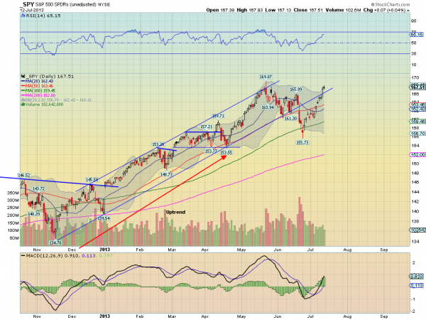
S&P 500
Even though the rally over the past six days has been impressive and the Spyder Trust (SPY) made a new closing high, the intra-day high at $169.24 has not been reached. The decline in June just barely dropped below the 38.2% support level.

The daily OBV lagged prices for the first few days after the low but picked up strength this week. The downtrend, line b, has been overcome and the WMA is now rising. Look for a drop to WMA and then a resumption of the rally.

chart
Click to Enlarge

The S&P 500 A/D line has accelerated to the upside since it moved above its WMA on June 26. The A/D line moved above the May highs (line c) early last week, which is a bullish sign. The WMA of the A/D line is now clearly rising and should provide first support. The A/D line held well above its long-term uptrend on the correction

There is initial support in the $166 area and then at $164.27. The rising 20-day EMA is at $163.41 with the quarterly pivot at $161.01.

Dow Industrials
The SPDR Diamond Trust (DIA) came close to the old highs at $154.98 to $155.14 (line d) but also made a new closing high last Thursday. DIA tested the uptrend from last November’s low but held well above the 38.2% support at $143.47 on the correction in June.

The daily Dow Industrials A/D line broke out of its trading range, line f, last Tuesday and has been acting very strong as it made convincing new highs. The uptrend in the A/D was slightly violated on the correction.

There is initial support at $152.40-$153 with the rising 20-day EMA at $151.19. Additional support is at $150 with the quarterly pivot at $149.52. DIA did trigger an HCD the day after the lows as I noted last time and it turned out to be a very good signal.

chart
Click to Enlarge

Nasdaq-100
The PowerShares QQQ Trust (QQQ) has led the market on the upside as it has gained over 8% from the June lows. It made convincing new highs last week as it gapped sharply higher last Thursday. On the June decline, it broke the 38.2% support intra-day but did not close below it.

QQQ finished the week near its daily starc+ band as it came very close to the quarterly R1 resistance at $75.19. The weekly starc+ band is at $76.67.

The Nasdaq-100 A/D line moved through its resistance on June 28, and then after a slight pullback to the breakout level (line c), accelerated to the upside. The A/D line moved to new highs a couple of days before prices

There is initial support now at the gap between $73.62 and $74.25 with further at $72.70 (line a) and the rising 20-day EMA. The quarterly pivot is significantly lower at $71.13.

Russell 2000
The iShares Russell 2000 Index (IWM) also had a great week, up over 3%, and after closing above the resistance at line d, it really took off. It has already exceeded the 127.2.% retracement target at $102.27 and the quarterly R1 resistance with the R2 at $106.65.

The daily OBV confirmed the breakout in prices by moving through its resistance at line e. It is acting very strong.

The Russell 2000 A/D line caught up with prices after moving to new highs and overcoming the resistance at line f. It is well above its rising WMA so a pullback would not be surprising.

There is initial support at $99.80 to $101.20 with the rising 20-day EMA at $99.20.

See the original article >>

Follow Us