Sunday, June 16, 2013

Analysis: Fed-induced selloff has investors hunting for bargains

By Luciana Lopez, Sam Forgione and Gertrude Chavez-Dreyfuss

Federal Reserve Board Chairman Ben Bernanke listens to opening remarks before testifying at the Joint Economic Committee in Washington May 22, 2013. REUTERS/Gary Cameron

NEW YORK | Sun Jun 16, 2013 12:05pm EDT

NEW YORK (Reuters) - Since Ben Bernanke unleashed a bombshell on May 22 by suggesting the U.S. Federal Reserve could before long start to pull back on its massive monetary stimulus, big stock and bond markets have been feeling the pain.

Rather than run for cover, a number of big money managers have seen the sell-off as a chance to invest cash in a broad array of assets at lower prices. They believe the gloom may be overdone, an overreaction to the concerns that the Federal Reserve won't be throwing money at the economy forever.

The U.S. economy has posted solid if still sluggish growth figures this year, and jobs growth has improved. The euro zone debt crisis has abated somewhat, with the monetary union no longer expected to drag so heavily on world growth. And despite the jitters, global central banks are far from ending easy money policies, pumping money into markets around the world.

Traders with big investors like Pacific Investment Management Company and Loomis Sayles & Company are taking advantage of buying opportunities they say they haven't seen in some time, with in-and-out hot money having flushed out of the system.

"We're finding a lot of opportunities coming out of the volatility," said Curtis Mewbourne, managing director and head of portfolio management for the New York office of PIMCO, which manages more than $2 trillion globally.

Bernanke said on May 22 the central bank "could in the next few meetings ... take a step down in our pace of purchases." This sparked an uptick in volatility that hasn't abated as investors recalibrate expectations for low bond yields that have bolstered borrowing and encouraged investors to take risks in other asset classes.

Japan's stock market has lost 19 percent since that day. The 10-year Treasury yield hit a 14-month high last week. The BofA Merrill Lynch U.S. high yield index .MERH0A0 slumped to a three-month low. The benchmark MSCI EM stock index .MSCIEF is down more than 17 percent this year, and the dollar is near a four-month low against a basket of currencies .DXY.

One place Mewbourne is focused is government debt, even though it is the most sensitive to Federal Reserve expectations. He said it is a good time to buy five- and 10-year Treasuries, since he sees yields falling as the Fed hints it has no intention of slowing its stimulus program. He also sees more potential for gains in mortgages not guaranteed by the government.

The Federal Open Market Committee issues its next decision on Wednesday, and recently Fed officials have remarked that inflation is worryingly low, which might prevent them from reducing the $85 billion-per-month bond buying program, known as quantitative easing.

"We think that the Fed will signal to investors that the markets have overly priced in expectations for a reduction in quantitative easing," he said.

OTHER ASSETS WITH HIGHER YIELDS

Among the other assets that big money managers are now eyeing: high-yield debt; industrials and materials stocks; and some emerging market stocks and bonds.

Junk bonds have been feeling the effect of the rise in Treasury yields, with the Bank of America/Merrill Lynch High Yield Master Index losing 2.91 percent from its peak in early May. The past two weeks have seen outflows of nearly $9 billion from high-yield funds, according to Lipper, a Thomson Reuters company.

The 10-year Treasury yield touched 2.29 percent this week, highest since April 2012.

Loomis Sayles, which manages $191 billion, is picking up what it sees as bargains, said Vice Chairman Dan Fuss. The firm bought 30-year Treasuries last week, adding junk bonds "where appropriate" and some investment grade corporate bonds.

"The high yield market has gotten disorderly," he said. "When was the last time you had discounts like this? Yes, we are buying."

Investors have dumped U.S.-based corporate junk bond funds in droves, pulling out a record $4.6 billion in the week to June 5, according to Lipper.

High yield spreads are almost 500 basis points over Treasuries, said Paul Zemsky, chief investment officer for multi-asset strategies and solutions at ING U.S. Investment Management, which has $180 billion in assets under management.

"That represents good value, roughly six-and-a-quarter percent yield," he said. "If you can earn 6.25 percent from a bond, that's not so bad given we expect inflation to be low."

Emerging markets equity funds had outflows of $2.13 billion for the week ended June 12, the largest since February 2011, while EM debt funds had redemptions of $622 million, their third consecutive week of outflows.

"This has set up an attractive valuation picture both short and long term," said Jim McDonald, chief investment strategist, at Northern Trust Asset Management with assets of $810 billion, who said EM stocks are trading at a 22 percent discount to world equities.

The difference in yield between benchmark emerging markets bonds and safe-haven U.S. Treasuries, measured by the JP Morgan Emerging Markets USD Bond Index .JPMEMBIPLUS, rose to 337 basis points on Tuesday, the widest spread in nearly a year. Emerging markets currencies have also been weak of late as money exits countries such as Mexico and Brazil.

Still, a key exposure indicator in EM bonds from Morgan Stanley showed that EM institutional investors have not abandoned the region and were slightly overweight relative to their benchmark at the end of last week.

Managers are a bit less enticed by Japan right now. Investors flocked to Japanese equities in the anticipation that the heavy dose of monetary stimulus would bolster that market, and it has, at one point being up 54 percent in 2013.

However, domestic investors there have sold into this rally, and that has since turned into a full-fledged selloff. The Nikkei is down 19 percent since May 22, but some still questioned whether it was a time to buy. Japanese equities posted outflows for the week ended June 12 for the second straight week after 28 consecutive weeks of inflows.

"We still expect to see good things out of Japan, but that market has gone up so much it's hard to establish new longs," said Zemsky. "I think there are markets that give you better value for your money."

See the original article >>

Will Gold Price Drop to $500?

By: Peter_Zihlmann

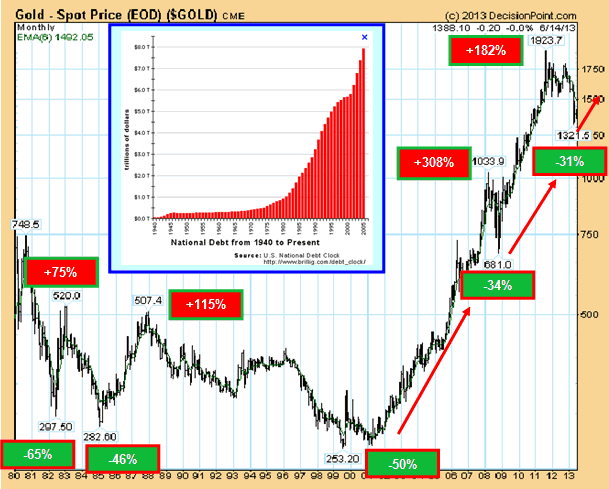
A drop of the gold price to $ 500/ounce is highly unlikely in view of the sharply rising National Debt in the USA but also in Europe.

To quote John Hathaway, manager of one of a most respected gold fund, a sharp rise of the gold price is more likely:

"With gold and silver under continued attack from the mainstream media, John Hathaway warned King World News that we are at the point where global investors will be shocked as gold is quickly repriced a jaw-dropping $1,000 higher, taking gold to new all-time highs.

1980 to 2013: From bear to bull

Spot Gold Monthly Chart

Hathaway also cautioned that global markets are rapidly approaching a loss of confidence in central banks which will cause tremendous turmoil in the paper currency markets. Hathaway, of Tocqueville Asset Management L.P., is one of the most respected institutional minds in the world today regarding gold, and his fund was awarded a coveted 5-star rating."

The long-term picture of the bull market since 2001

Spot Gold Weekly Chart

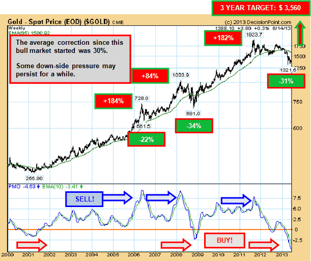
The bull market of the gold price started towards the beginning of 2002. On the way from $ 255.3 to the recent intraday all-time high of $ 1,923.7 (an increase of 650%), several significant corrections took place, the most severe one in 2008 when the gold price sank by 30% only to jump 182% to a new all-time high.

The bull market is not over! The gold price is in an oversold position, as shown above, which is far worse than in 2008 or even in 2000. Such extremes have always been followed by strong movements to the up-side. After 2008, gold rose almost 200% while gold shares jumped 400%.

What the PMO Indicator shown above clearly demonstrates: extremes will always be corrected. In fact, we had great sell opportunities in 2006, 2008 and 2011. On the reverse side, 2001 and 2008 were unique buying opportunities.

At present, we again have such a buying opportunity! This is not the time to stay on the side-lines. You have to buy now!

Should you rather buy gold shares instead of gold?

First, there are a few basic facts that one has to know:

  1. Gold stocks are more volatile than gold.
  2. It is hard work to select the right companies and to monitor them.
  3. You should know the Management.
  4. You should have a long-term view.

As most do not have the time to devote several hours a day

  • to employ a bottom-up selection process and fundamental, proprietary research to identify companies that are considered undervalued, based on growth potential and the assessment of the company's relative value, and
  • to seek exposure to overlooked and undervalued gold stocks across the world,

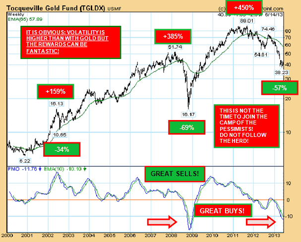
this work is best left to an experienced fund manager. The following chart reveals the risk and rewards of such investment:

Tocqueville Gold Fund Weekly Chart

Gold sometimes outperform gold shares, at times however gold shares fare much better? Following some figures:

  • GOLD 2000 to 2011 (high): +652%
  • GOLD SHARES 2000 to 2011 (high): +1,331%
  • GOLD 2000 to 2013: +416%
  • GOLD SHARES 2000 to 2013: +514%
  • GOLD 2011 (high) to 2013: -31%
  • GOLD SHARES 2011 (high) to 2013: -57%

Big companies or rather "juniors"?

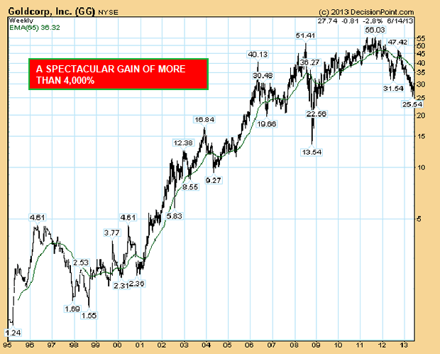
  • Every big company was once a "junior"! See Goldcorp.!

Goldcorp Weekly Chart

  • Selecting the right "junior" is high risk. It makes therefore sense to choose a Fund that invests in "juniors" to diminish the risk.
  • To find out more, go to www.timeless-funds.com

Conclusion

To quote John Hathaway once more: "So from a contrarian point of view, the setup is perfect for the commencement of a huge upward leg that will take gold and silver to all-time highs."

See the original article >>

Stock Market Longer Trend Weakening, Daily Trend Turning

By: Michael_Noonan

Charts are not predictive in nature, rather they are instructive on how to best prepare and get an edge when deciding to enter into a position, [or exit one]. It is of the utmost importance to have a game plan in place, beforehand, otherwise, one is relying upon factors more emotionally driven than fact driven.

The function of reading a chart is to gain insight from the most reliable source available, the market itself. What a market does is generate information that reflects the outcome of all source decision-makers, from the most highly informed and experienced to the least informed and weakest, with varying degrees of skills in between

We know that "smart money," [a term to describe dominating forces that move a market], is always active at high areas, distributing, and low areas, accumulating, with occasional participation in between. They are deft at hiding their "hand," as it were. However, there are clues they cannot always hide as they leave behind "foot prints," or a trail to follow, if one chooses to do so. The biggest clue comes in the form of volume.

High volume bars, especially at highs, lows, and important market turning points are created by them as they take positions. The other side of their trades are the public and less skilled participants. When you see such high volumes at these turning points, it is usually a transfer of risk from weak hands into strong hands. Rather than guess, predict, or rely upon gut feel, [emotion], it is better to follow their lead because they ultimately are the trend setters, literally.

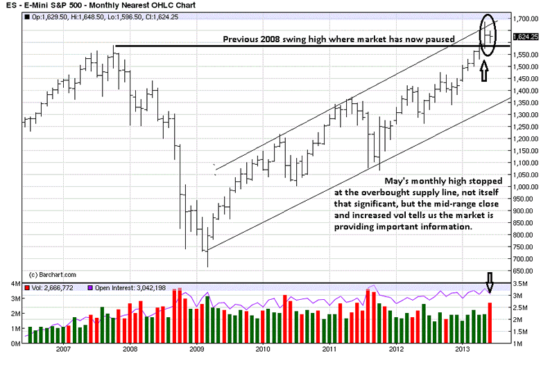
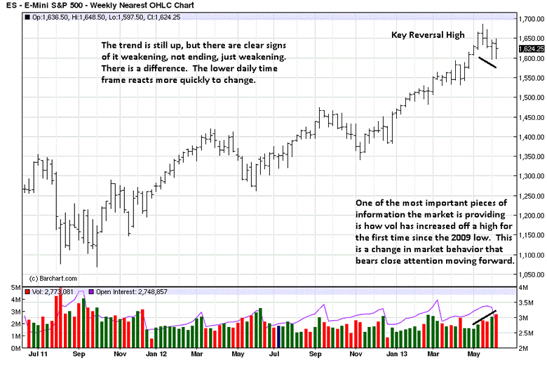
Clues can always be found in the charts. Last month, May went into new high territory, but the close was mid-range the bar on a strong volume increase. Markets have much more logic than people realize. The increased volume is created by smart money. It is the public that reacts to it, almost always to their eventual detriment.

Applying logic, we see the market is at new highs. It is axiomatic to state that smart money, [SM], sells highs and buys lows, so it is no stretch to infer SM is actively selling at this current high level. The fact that price closed mid-range tells us that sellers were meeting the effort of buyers, sufficiently to keep the close from being higher. The public see price is breakout out, above the previous 2008 swing high, so they "jump aboard," not wanting to miss the market going yet higher, or so they believe.

It also worth noting that this selling activity is occurring at the previous high, actually, just above it, making it look like a potential breakout, [SM is big on false appearances]. Price stopped at the overbought TL, [Trend Line], as well. There is a converging of a few important observations that raises one's level of interest.

Few market participants pay any attention to higher time frame charts, like a monthly, but a monthly is not used for market timing, anyway. Timing goes to the daily and intra day charts, once the monthly and weekly provide reasons for doing so.

The KISS principle at work. Rather than focus on too many things, there is one factor we can take from the weekly chart, and it may prove critically important. For sure, it alerts us to a change in behavior not seen since the bull market began in 2009. It is highly unlikely that the public, and even many smart traders, would pay attention to this subtle change.

It is the first time that volume has increased as the market sells off from a high area. Most often it is an indication of a transfer of risk: strong hands taking profits and selling to weak hands, eagerly anticipating higher prices.

Some things never change, and noting those changes can be rewarding.

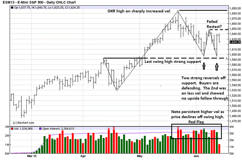
The OKR, [Outside Key Reversal] high is a shot across the bow, a huge red flag when the other noted factors are added into the mix. There are no accidents in life, not even in the markets. Everything happens for a reason.

The May high has a possibility of being a top. The one caveat we personally hold is that this bull market has been Fed fiat-driven, actively managing the market for economical and political reasons. Economically because the Fed is keeping its fiat-house-of-cards afloat and does not want the market to come crashing down, exposing its fiat-Ponzi scheme.

Politically, the Obama regime does not want to world to crash the fiat Federal Reserve Note Ponzi scheme, [Federal Reserve Notes are issued by the Fed and incorrectly called "dollars."], and force Americans to realize the lies and deceptions since the Federal Reserve Act was introduced in December 1913, oddly enough, two days before Christmas when most of Congress was home on holiday. This is another story, but more important than 99% of American can fathom. It is what is impacting the markets, today.

The two strong reversals off important support is the market's way of letting us know that buyers are defending support. Will they succeed is the all-important question? The last rally attempt failed as a retest of the May OKR high. Will this resistance hold, for it is an important piece of information?

We started off saying charts are informative, not predictive. We do not have to know in advance what this chart, and the others, are saying. For now, we are seeing a flurry of red flags to be defensive in participating. This daily chart is telling us to sell out longs or at least place close stops to protect existing profits. For any positions with losses, this is a huge warning to take them now before they become larger. For obvious weak stocks, taking a short position should be considered, always depending upon one's rules and market objectives, profit being the ultimate one.

Wednesday's sell off on increased volume was a strong warning, [3rd bar from the end.] Thursday's rally, [next bar], erased the downside effort of the previous day, but it failed to elicit upside buying, and it stopped under the failed retest.

For now, as long as the retest swing high holds, selling against it would be the order of the day, but only when there are indications to sell. What are those indications? They would be your rules of engagement. If the market does this, then do that, and always in that order. It is how to stay in sync with a trending market, in whatever time frame chosen.

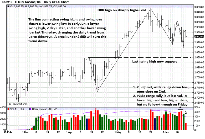
The tech-heavy NASDAQ is showing a little bit weaker, another red flag. You can see how the trend is no longer up, once a lower low occurred after the most recent lower high, as evidenced by the line connecting the swing highs and lows.

The rally attempt on Thursday did not erase the previous down day, like it did in the S&P, and each bar since the failed swing high, [not marked, but 5 bars ago], has been a lower high and lower low.

What the daily charts are telling us about the market and the higher time frames is that the potential for an end to this bull run is increasing. It has not been confirmed on the higher time frames, but the daily is serving ample warning for anyone willing to observe.

There are no Black Swans in the market, just people unaware of being unaware.

See the original article >>

A Technical Look At Fundamentals

by Tom Aspray

Though there has been some improvement in the past 20 years, most fundamental analysts still do not analyze their data using technical analysis. I have found that using trend lines and divergence analysis on fundamental data can often be very useful in confirming your views on the market or on a sector.

In the early 1980s, there was one data series that I regularly watched. It was the number of Help Wanted ads that were in the newspaper. When the number of ads was rising, it was a positive sign for the economy. Conversely, a declining number of ads was a sign that the economy was contracting.

For example, the number of ads turned lower in early 1981 and did not start to rise again until October of 1982. They had formed a clear pattern of lower highs and lower lows (a downtrend), and when it was broken, it indicated that the recession was over. It was consistent with the bullish action in the stock market as it bottomed in August 1982. The recession was officially over in November 1982.

chart
Click to Enlarge

The Help Wanted ads also peaked well before the 1991 recession, but in 2005 the Conference Board replaced it with the Help Wanted OnLine®. The chart shows that the uptrend in these ads, line a, was broken in the summer of 2007 several months before the major stock markets made their highs. By early 2008, it was falling sharply, and it was later determined that the recession began in December of 2007.

The downtrend in ads, line b, was broken in the fall of 2009, and a year later, it was determined that the recession officially ended in June. The ads are positive as they continue to show a pattern of higher highs and higher lows. This is a positive sign for the future growth of the economy.

Another favorite data series from the Conference Board is their Leading Economic Index (LEI), which is made up of ten variables including the unemployment rate, jobless claims, building permits, stocks prices, etc. It has a fairly good record of predicting recessions over the past 50 years.

chart
Click to Enlarge

The chart from the Conference Board shows the LEI in blue and the CEI or Coincident Economic Index in red. The LEI was rising by November 2001, which was determined to be the end of the dot-com recession. By 2003, it was in a clear uptrend, line a.

In the middle of 2004, the LEI moved above the CEI (point 1), which I saw as a sign of strength. The LEI peaked in 2006 and then formed lower highs in 2007, line b, as the S&P 500 and Dow Industrials were peaking. It was then diverging from the CEI.

The LEI plunged in late 2007 and early 2008 as the uptrend, line a, was broken. In the spring of 2009, both the LEI and CEI had started to improve. By later in the year, both were in clear uptrends. Both lines are still rising though the LEI is well below the highs from 2006.

The attitude and the seasonal trend of the consumer is also very important to both the economy, as well as the investor. The chart shows that after the 2003 low, the Consumer Confidence turned higher, and by 2005 lows, there was a clear uptrend, line a.

Consumer Confidence flattened out in the latter part of 2006 and in 2007, line b. Then in the fall of 2007, it started to drop sharply and violated its uptrend, line a. The ensuing plunge in confidence was quite dramatic as it did not bottom out until early 2009.

There were signs in early 2010 that the level of confidence was changing as the last peak before the final low, line c, was overcome. Higher highs were made again in 2011, and the data shows a clear uptrend, line d. In May, it rose sharply to 76, breaking out above the resistance at line e.

chart
Click to Enlarge

This long-term chart shows the Consumer Sentiment from the University of Michigan, along with the Conference Board’s Consumer Confidence. I have chosen to draw trend lines only on the Consumer Confidence data (in green), though you can see that the Consumer Sentiment confirmed the changes in trend.

chart
Click to Enlarge

The uptrend from the 1983 lows, line a, was broken in early 1990 as the recession officially began in July and ended in March of 1991. The Dow Industrials peaked in July and dropped 22.8% in the next five months.

The series of higher lows in the Consumer Confidence in 1992 and 1994 was the start of a powerful uptrend, line b, that was not broken until early 2001. Of course, the Nasdaq Composite peaked in March of 2000, and by the time the Consumer Confidence bottomed in early 2003, it had lost over 75%.

The rally from the 2003 lows was much smaller by comparison, and the support at line c was broken in the fall of 2007. Both are now clearly positive but a reading below 60 would be a reason for concern.

There are quite a few data series that can give you a good reading on the home construction sector, and one of my favorites is the NAHB/Wells Fargo Housing Market Index, which is plotted below with the single family housing starts.

chart
Click to Enlarge

The HMI is a monthly survey of NAHB members, which asks them to rate their prospects for single family homes at the present and for the next six months. The HMI peaked in late 1999 and then formed lower highs in 2006, even though the housing starts were continuing to make new highs. This was a significant divergence as it helped create an overly large inventory that has made it more difficult for the housing market to recover.

The HMI turned down in early 2006, and then in late 2006, it broke the long-term support (line c) that connected the 1991 and 2003 lows. A few of months later, the additional support, line b, was also broken This confirmed the very negative outlook of the home builders.

The HMI formed higher lows in 2009 and early 2012 (line e). The bottom was confirmed in May as the resistance at line d was overcome. This was noted in a Week Ahead column at the time.

The first hint of a bottom in the home construction stocks occurred on October 18, 2011, when volume surged in the home construction stocks.

Since October 2011 lows, the DJ Home Construction Index (DJUSHB) is up over 124% versus just over a 30% gain in the Spyder Trust (SPY). The Index was up 164% on May 15 but has dropped 40% in less than a month.

On the right, you will see the long-term monthly chart of the DJUSHB and the H&S top that it formed in 2004-2007. The neckline (line a) at 548 was broken at the end of June 2007, and the eventual low in late 2008 was 130.

chart
Click to Enlarge

The Home Construction Index made a low in late October of 2011 at 164.93 and rose for the next two months, closing above its 20-month EMA by the end of the year. At the end of May 2012, the 2010 swing high was overcome on a closing basis. This completed the bottom formation and coincided nicely with bullish signal from the HMI the following month.

The current rally has taken it just above the major 38.2% Fibonacci retracement resistance from the 2005 high. The 50% level is at 624.38. There is initial support at 442 with the rising 20-month EMA now at 410.

chart
Click to Enlarge

The weekly chart of the DJ Home Construction Index overcame its 18-month downtrend, line a, in early December of 2011. The relative performance moved through its downtrend (line b) a few weeks earlier as indicated by line 1.

The uptrend that connects the 2011 and early 2012 lows, line c, has been tested several times over the past two months. The weekly RS line confirmed the January 2013 highs but then broke its uptrend, line d, in April. This is often an early warning sign.

The RS line made much lower highs, line e, in May, which was a sign that home construction stocks were no longer leading the S&P 500 higher. The RS line is now back below its WMA and a drop below the April low would be consistent with further weakness in the Index.

In terms of price, the DJUSHB has support now in the 440-446 area. If it is broken, then the major 38.2% Fibonacci retracement support is at 405 with the 50% support at 359. A drop to the 38.2% support would mean a further 20% decline from current levels.

See the original article >>

The Urgent Need to Recapitalize Europe’s Banks

by Harald Benink and Harry Huizinga

Europe has been postponing the recapitalization of its banking sector. This column argues that it has been doing so for far too long. Without such a recapitalization, the danger is that economic stagnation will continue for a long period, thereby putting Europe on a course towards Japanese-style inertia and the proliferation of zombie banks.

Unlike the US, Europe failed to recapitalize its biggest banks following the financial crisis of 2007-09. Instead, policymakers gambled that economic recovery would lift the profitability of financial institutions, enabling them to increase their capital buffers over time. It is now clear that this strategy has failed. The Eurozone is in a new recession and the depressed share prices of many banks signal that they are in dismal health.

On average, the market-to-book value of European banks now is about 0.50 (see Figure 1). This indicates that accountants’ estimates of bank capital are far too rosy, and that banks have substantial hidden losses on their books. In a recent speech, Klaas Knot (2013), Dutch central bank president and European Central Bank governing council member, noted that restoration of banks’ balance sheets is a crucial requirement for economic recovery. To facilitate this process, Mr Knot states, it is essential to create transparency about losses in the banking sector and to have an orderly resolution of loss-making assets. Without this, banks will remain restrictive in making new loans. Mr Knot adds that the planned European banking union offers an appropriate opportunity for speeding up the resolution process.

Stress Tests and State Guarantees

We agree with Mr Knot’s analysis. Unfortunately, an orderly resolution of loss-making bank assets is still a long way off – despite the various bank stress tests conducted in recent years. As reviewed by Hardy and Hesse (2013), these European Banking Authority-sponsored stress tests failed to be credible. They applied stress scenarios that were too mild and enabled banks to get away with insufficiently transparency as to their losses and exposures to problem sectors. Moreover, the European Banking Authority announced recently that it would delay a new stress test until 2014 in order to involve the ECB as part of its envisaged role as the single supervisor for the Eurozone’s largest banks from 2014.

Until now, Europe’s banking sector has been kept afloat by implicit state guarantees of virtually all liabilities. Michiel Bijlsma and Remco Mocking (2013) of the CPB Netherlands Bureau for Economic Policy Analysis find that in 2012 these guarantees provided banks in Europe with an annual average funding advantage amounting to 0.3% of total assets. They base this estimate on a comparison of banks’ diverging credit ratings in scenarios with and without government bailout support. An annual funding advantage of 0.3% of assets can be capitalized to be equivalent to 2% of total assets, on the assumption of a discount rate of 15% commensurate with banks’ uncertain earnings prospects. Given total banking assets of €33 trillion in the Eurozone, we are talking about an implicit guarantee of about €650 billion.

The Cyprus Switch

The plight of Europe’s banks worsened considerably when Jeroen Dijsselbloem (2013), Dutch finance minister and Eurogroup president, stated that the approach taken in Cyprus of resolving failed institutions without using taxpayer money would in future preferably apply throughout the Eurozone. Consistent with this, Wolfgang Schäuble (2013), German finance minister, recently stated his desire -

‘to ensure that enrolling taxpayers to rescue banks becomes the exception rather than the rule’, and that to achieve this ‘we need credible EU bail-in rules as soon as possible’.

Banks are already saddled with ample unrecognized losses on their assets, estimated by many observers to be at least several hundreds of billions of euros and mirrored by low share price valuations, and an additional loss of their present funding advantage will be crippling.

Financial markets understood Mr Dijsselbloem’s message, as shown by a subsequent decline in the share prices of many institutions. Very low bank valuations imply that they will find it very difficult to recapitalize themselves by issuing equity or debt that is convertible into shares – in part because share issuance would further dilute the value of implicit state guarantees. Low share prices, in effect, imply that banks can raise only limited capital by issuing new shares, and that they may need to accept reduced issuance prices. Very few large European banks are raising capital by issuing new shares, no doubt as they realise that this is not in the interest of current shareholders. As exceptions, Deutsche Bank raised almost €3bn in April, while Commerzbank announced plans to raise €2.5bn through a heavily discounted rights issue in May.

Time to Recognize Losses

It is now urgent to start recognizing losses on balance sheets to avoid a proliferation of Japanese-style zombie banks in Europe. To facilitate this, we advocate conducting a new and thorough stress test soon, similar to the one administered by US supervisory authorities in 2009. Of course, the financial position of most governments in Europe is much worse than that of the US in 2009. So Europe needs to take a path towards recapitalization that in some respects differs from the earlier US approach.

  • First, a credible stress test should assess the losses hidden on the balance sheet for each bank, as well as the likely cost of the removal of implicit guarantees of all liabilities.

This will result in an estimated capital shortage, taking into account capital levels as required by international bank supervisors. Recently, the Financial Services Authority (2013) conducted a stress test of UK banks, resulting in a necessary downward adjustment of reported regulatory capital of about £50 billion, and a resulting regulatory capital shortfall of £25 billion. The estimated capital shortfall of £25 billion is likely to be a low estimate, as it is by and large predicated on the continuation of implicit state guarantees in the UK. At any rate, thorough stress tests in other European countries are likely to reveal sizeable capital shortfalls as well.

  • Second, supervisors need to assess whether the capital shortfall can be financed by international capital markets and / or national governments.

In case the required amounts are too high, the bank immediately must be entered into a resolution and restructuring process imposing some losses on unsecured creditors (the Cyprus model).

The legal basis for this resolution and restructuring would be an intervention law, which some European countries may need to enact through emergency legislation. Most banks in Europe, in contrast with their Cyprus counterparts, have significant financing by bond holders and can be recapitalized by imposing losses on holders of subordinated and common debt without infringing on savings deposits.

  • Third, in the event that capital shortfalls are relatively small, supervisors could instead implement the US model.

This would mean that banks are given a limited period of time to issue equity on international capital markets, after which national governments step in to provide the remainder of the equity shortfall.

Concluding Remarks

The way in which Europe recapitalizes its problem banks now has a direct impact on the design of the future European banking union. If many banks are recapitalized by imposing losses on unsecured creditors, such as holders of subordinated and common debt, this is likely to be reflected in the design of the single resolution mechanism that will determine the extent to which bail-ins are mainstreamed in future bank resolutions in the EU.

A single resolution mechanism along these lines will make it easier to reach agreement on the powers of the envisaged future European resolution authority. Last but not least, the adoption of the principle that unsecured creditors should absorb most of the losses of problem banks implies that only limited residual potential losses will be borne by European taxpayers through the European stability mechanism (ESM) and through any future European resolution fund.

Europe has postponed the recapitalization of its banking sector for far too long. And, without such a recapitalization, the danger is that economic stagnation will continue for a long period, thereby putting Europe on a course towards Japanese-style inertia and the proliferation of zombie banks.

See the original article >>

The Week Ahead: Will the Fed Change Course?

by Jeff Miller

After weeks of speculation based upon speeches, newspaper columns, and pundit pontification we will finally have some hard information. Maybe. The two-day FOMC meeting will include not only the regular announcement of the decision, but also revised economic forecasts and a press conference by Chairman Bernanke. Everyone will be watching for any hints of a change in policy.

  1. Will the Fed reduce the pace of the current QE purchasing?
  2. If not, will it provide more information about the timing of a possible change?
  3. What might be the size of any reduction?

Follow up:

Those expecting early action seem to focus on September. Tim Duy reviews the most recent data and concludes,

"Bottom Line: Today's data appears consistent with Fed expectations that they can begin tapering asset purchases this year. Still a horse race between September and December, although I think the Fed is aiming for the earlier date if data allows."

Those expecting later action point to the lack of inflation. Recoveries from recession are usually stronger and faster; that usually means inflation. Rex Nutting notes that it is the lowest core inflation in history.

MW-BE051_inflat_20130613151403_MG

Bloomberg (via Josh Brown) compares inflation to past recoveries. Josh concludes that the Fed has time to jawbone rather than changing policy. Here is the key chart:

Inflation-1024x624

If the Fed does change course, what will be the result?

Most market observers expect a major reaction at the first sign of a Fed policy change. They are not waiting for an actual increase in interest rates, but getting ready to head for the exits at the first sign of a policy shift. This analysis from Barclays, cited in The Economist, is typical. It shows the "sensitivity" of various markets to changes in the Fed balance sheet. There is no attempt to show a causal mechanism.

Intone after me:

Fed prints money. Liquidity, liquidity. POMO, POMO. Asset prices move higher – all of them!

20130615_gdc777_1

I have some contrarian thoughts about what to expect from the Fed. I'll elaborate in the conclusion, but first, let us do our regular update of last week's news and data.

Background on "Weighing the Week Ahead"
There are many good lists of upcoming events. One source I regularly follow is the weekly calendar from Investing.com. For best results you need to select the date range from the calendar displayed on the site. You will be rewarded with a comprehensive list of data and events from all over the world. It takes a little practice, but it is worth it.

In contrast, I highlight a smaller group of events. My theme is an expert guess about what we will be watching on TV and reading in the mainstream media. It is a focus on what I think is important for my trading and client portfolios.
This is unlike my other articles at "A Dash" where I develop a focused, logical argument with supporting data on a single theme. Here I am simply sharing my conclusions. Sometimes these are topics that I have already written about, and others are on my agenda. I am putting the news in context.
Readers often disagree with my conclusions. Do not be bashful. Join in and comment about what we should expect in the days ahead. This weekly piece emphasizes my opinions about what is really important and how to put the news in context. I have had great success with my approach, but feel free to disagree. That is what makes a market!

Last Week's Data

Each week I break down events into good and bad. Often there is "ugly" and on rare occasion something really good. My working definition of "good" has two components:

  1. The news is market-friendly. Our personal policy preferences are not relevant for this test. And especially -- no politics.
  2. It is better than expectations.

The Good

On balance, this was a good week for economic data.

  • S&P revised the outlook on U.S. debt to stable from negative. Do we really care?
  • Year-over-year growth in expected earnings is stronger (via Brian Gilmartin). This comparison deserves more attention.
  • Initial jobless claims surprised and declined to 334K. There is less firing, but we still need more hiring!
  • Retail sales showed a surprising gain, even after subtracting higher gasoline sales. There is solid growth but less than expected from a normal recovery. Scott Grannis has a good analysis with a Fed related theme and many helpful charts. Here is the retail sales "control" group version:

Control group

The Bad

There was some bad news, but probably not as important. Feel free to add in the comments anything you think I missed!

  • Pump and dump is back. Investors who feel like they have missed the rally are trying to catch up in the wrong way. The SEC and FINRA are warning about an increase in scams.
  • The PPI increased by 0.5%, mostly reflecting energy prices. In the long run, we care about food and energy costs, but the year-over year change was only 1.7%.
  • Another debt ceiling debate looms (via The Hill). This can put a lid on job growth.
  • Rail traffic is stagnating (via Cullen Roche). Contrary view from GEI, using different comparisons.
  • Industrial production was flat, missing expectations. James Picerno has a nice analysis, advising that the indicator bears watching but is not yet a "smoking gun." Here is one of the useful charts:

Industrial Production - Picerno

  • Chinese growth is losing some momentum, but still relatively high (via Ed Yardeni).

The Ugly

Congress is a repeat winner of the "ugly" award. It seems like there is often something new. Gallup reports that confidence in Congress has hit an all-time low of 10%, down 3% from last year. One reason for poor performance might be lack of knowledge and attention. The Hill reports that the majority of the Senate preferred to check out early for the weekend rather than to attend a classified briefing on NSA snooping.

There were some other candidates this week, so feel free to add your own ideas in the comments!

MW-BE048_congre_ME_20130613140925

The Indicator Snapshot

It is important to keep the current news in perspective. I am always searching for the best indicators for our weekly snapshot. I make changes when the evidence warrants. At the moment, my weekly snapshot includes these important summary indicators:

  • For financial risk, the St. Louis Financial Stress Index.
  • An updated analysis of recession probability from key sources.
  • For market trends, the key measures from our "Felix" ETF model.

Financial Risk

The SLFSI reports with a one-week lag. This means that the reported values do not include last week's market action. The SLFSI has recently edged a bit higher, reflecting increased market volatility. It remains at historically low levels, well out of the trigger range of my pre-determined risk alarm. This is an excellent tool for managing risk objectively, and it has suggested the need for more caution. Before implementing this indicator our team did extensive research, discovering a "warning range" that deserves respect. We identified a reading of 1.1 or higher as a place to consider reducing positions.

The SLFSI is not a market-timing tool, since it does not attempt to predict how people will interpret events. It uses data, mostly from credit markets, to reach an objective risk assessment. The biggest profits come from going all-in when risk is high on this indicator, but so do the biggest losses.

Recession Odds

I feature the C-Score, a weekly interpretation of the best recession indicator I found, Bob Dieli's "aggregate spread." I have now added a series of videos, where Dr. Dieli explains the rationale for his indicator and how it applied in each recession since the 50's. I have organized this so that you can pick a particular recession and see the discussion for that case. Those who are skeptics about the method should start by reviewing the video for that recession. Anyone who spends some time with this will learn a great deal about the history of recessions from a veteran observer.

I have promised another installment on how I use Bob's information to improve investing. I hope to have that soon. Meanwhile, anyone watching the videos will quickly learn that the aggregate spread (and the C Score) provides an early warning. Bob also has a collection of coincident indicators and is always questioning his own methods.

I also feature RecessionAlert, which combines a variety of different methods, including the ECRI, in developing a Super Index. They offer a free sample report. Anyone following them over the last year would have had useful and profitable guidance on the economy. RecessionAlert has developed a comprehensive package of economic forecasting and market indicators, well worth your consideration.

Georg Vrba's four-input recession indicator is also benign.

"Based on the historic patterns of the unemployment rate indicators prior to recessions one can reasonably conclude that the U.S. economy is not likely to go into recession anytime soon."

Georg has other excellent indicators for stocks, bonds, and precious metals at iMarketSignals.

Calculated Risk joins us in concluding that there will be no recession for "some time" and also in placing a high priority on this analysis.

Unfortunately, and despite the inaccuracy of their forecast, the mainstream media features the ECRI. Doug Short has excellent continuing coverageof the ECRI recession prediction, now over 18 months old. Doug updates all of the official indicators used by the NBER and also has a helpful list of articles about recession forecasting. His latest comment points out that the public data series has not been helpful or consistent with the announced ECRI posture. Doug also continues to refresh the best chart update of the major indicators used by the NBER in recession dating.

The average investor has lost track of this long ago, and that is unfortunate. The original ECRI claim and the supporting public data was expensive for many. The reason that I track this weekly, emphasizing the best methods, is that it is important for corporate earnings and for stock prices. It has been worth the effort for me, and for anyone reading each week.

Readers might also want to review my Recession Resource Page, which explains many of the concepts people get wrong.

Our "Felix" model is the basis for our "official" vote in the weekly Ticker Sense Blogger Sentiment Poll. We have a long public record for these positions. We recently switched our stance to neutral, but it is a close call. Felix might switch to a bearish posture if the overall market drifts lower. The inverse ETFs are more highly rated than positive sectors by a small margin, but remain in the penalty box. These are one-month forecasts for the poll, but Felix has a three-week horizon. Felix's ratings seem to have stabilized at a low level. The penalty box percentage measures our confidence in the forecast. A high rating means that most ETFs are in the penalty box, so we have less confidence in the overall ratings. That measure remains elevated, so we have less confidence in short-term trading.

[For more on the penalty box see this article. For more on the system ratings, you can write to etf at newarc dot com for our free report package or to be added to the (free) weekly ETF email list. You can also write personally to me with questions or comments, and I'll do my best to answer.]

The Week Ahead

This week brings little data and scheduled news, an artifact of the calendar and the holidays.

The "A List" includes the following:

  • Initial jobless claims (Th). Employment will continue as the focal point in evaluating the economy, and this is the most responsive indicator.
  • Building permits and housing starts (T). Building permits are an excellent leading indicator for housing, and housing is what we should be watching.
  • FOMC decision and press conference (W). The key point for the week.

The "B List" includes the following:

  • CPI (T). At some point the inflation data will be more important. For now it is benign.
  • Existing home sales (Th). This is a key element of the economic rebound, so it is important to follow.
  • Leading economic indicators (Th). This report is still widely followed and used by some in recession forecasting.

I am not very interested in the Empire State index or the Philly Fed report, but people will pay attention to extreme moves.

There will also be continuing news from President Obama's travel abroad, but I am not expecting a specific market impact.

How to Use the Weekly Data Updates

In the WTWA series I try to share what I am thinking as I prepare for the coming week. I write each post as if I were speaking directly to one of my clients. Each client is different, so I have five different programs ranging from very conservative bond ladders to very aggressive trading programs. It is not a "one size fits all" approach.

To get the maximum benefit from my updates you need to have a self-assessment of your objectives. Are you most interested in preserving wealth? Or like most of us, do you still need to create wealth? How much risk is right for your temperament and circumstances?

My weekly insights often suggest a different course of action depending upon your objectives and time frames. They also accurately describe what I am doing in the programs I manage.

Insight for Traders

Felix has continued a neutral posture, now fully reflected in trading accounts which have no position in equities. Our partial position includes a bond inverse fund and a commodity. The overall ratings are slightly negative, so we are close to an outright bearish call. This could easily be the case by the end of next week. While it is a three-week forecast, we update the model every day and trade accordingly. It is fair to say that Felix is cautious about the next few weeks. Felix did well to avoid the premature correction calls that have been prevalent since the first few days of 2013, accompanied by various slogans and omens.

Insight for Investors

This is a time of danger for investors – a potential market turning point. My recent themes are still quite valid. If you have not followed the links, find a little time to give yourself a checkup. You can follow the steps below:

  • What NOT to do

Let us start with the most dangerous investments, especially those traditionally regarded as safe. Interest rates have been falling for so long that investors in fixed income are accustomed to collecting both yield and capital appreciation. An increase in interest rates will prove very costly for these investments. It has already started. Bespoke Investment Group has a great chart package showing how the rush into yield-based investments is going South in a big way! Anyone focused on yield should read this post and look at the charts. The most recent victim is the preferred stock, as you can see here:

Pff611

I also recommend the excellent analysis by Kurt Shrout at LearnBonds. It is a careful, quantitative discussion of the factors behind the current low interest rates and what can happen when rates normalize.

  • Find a safer source of yield: Take what the market is giving you!

For the conservative investor, you can buy stocks with a reasonable yield, attractive valuation, and a strong balance sheet. You can then sell near-term calls against your position and target returns close to 10%. The risk is far lower than for a general stock portfolio. This strategy has worked well for over two years and continues to do so. (I freely share how we do it and you can try it yourself. Follow here, and scroll to the bottom).

  • Balance risk and reward

There is always risk. Investors often see a distorted balance of upside and downside, focusing too much on new events and not enough on earnings and value. Check out the ten suggestions from Barry Ritholtz, specifically aimed at those who feel they missed out on the latest market move.

Three years ago, in the midst of a 10% correction and plenty of Dow 5000 predictions, I challenged readers to think about Dow 20K. I knew that it would take time, but investors waiting for a perfect world would miss the whole rally. In my next installment on this theme I reviewed the logic behind the prediction. It is important to realize that there is plenty of eventual upside left in the rally. To illustrate, check out Chuck Carnevale's bottoms-up analysis of the Dow components showing that the Dow "remains cheaply valued."

  • Get Started

Too many long-term investors try to go all-in or all-out, thinking they can time the market. There is no reason for these extremes. There are many attractive stocks right now – great names in sectors that have lagged the market recovery. Ignore all of the talk about the Fed and focus on stocks. One of my favorite sources, Bill Nygren of Oakmark refused to play the game in his CNBC interview this week. He would not answer the standard questions about the short term, and carefully explained why investors should take advantage of volatility to buy cheap stocks. This is also my message, and I agree with many of his specific stock suggestions. For those who were not monitoring CNBC two hours before the opening, you might have missed this great interview.

And finally, we have collected some of our recent recommendations in a new investor resource page -- a starting point for the long-term investor. (Comments and suggestions welcome. I am trying to be helpful and I love feedback).

Final Thought

What should we expect from the Fed?

It has actually been pretty easy so far. Here are the rules:

  • Pay attention to Bernanke, not speeches by others. They are free to talk in the modern era, but the message is not orchestrated.
  • Do not expect a road map when there is no specific plan. When the message is that policy is "data dependent" that is clear communication. It is silly to expect more specificity from a committee. They are all looking at the evidence.
  • Do not over-estimate the Fed impact. This is the most important lesson. Everyone who has been wrong about their forecasts – recessions, interest rates, stocks – has blamed it on the Fed.

These are the same people who told you that the Fed was "out of bullets." They argued that the Fed would not be effective. That the Dow was going to 5000. These are sources that are using the Fed as a fig leaf to cover up their own mistaken analysis.

The reality is that the Fed has had a modest impact on both interest rates and the recovery in stocks. The facile, two-variable correlations between QE and various markets are flawed. Anyone doing serious economic analysis understands that many variables are changing at the same time. Consider the Barclay's graph I cited the introduction.

Do you really think that Turkish stocks will get crushed if the Fed eases off on QE? What happened to the "correlations" that we saw with food prices and energy on the last round of QE? Notice how the comparisons change when convenient?

Fed policy has been a modest substitute for better fiscal policy. It had a modest economic effect when implemented, and will have a modest economic effect when withdrawn.

The psychological effect is another matter, and a problem for another day.

Ultimately, interest rates and stock prices will both move higher. For more explanation check out my post from the start of 2011 I predicted ten things that would be more normal. Some have proved accurate while others are a work in progress. Former Goldman Sachs Asset Management Chairman Jim O'Neill reaches a similar conclusion:

See the original article >>
Quick and easy guide to summer grain trading

By Rich Nelson

The agriculture complex offers unique opportunities for traders in the summer that often are not seen in other markets. There is a lot of information for the market to digest as it focuses on both the crop left over from the previous year and the developing new crop in the ground.

Changes in the information flow from either end can cause sharp price moves. Here is a roadmap of some of the possibilities — and pitfalls — for summer grain trading using fundamental analysis.

Perhaps most important is knowing the operative marketing year of what you are trading. The U.S. Department of Agriculture (USDA) starts the corn and soybean year on Sept. 1 and ends it on Aug. 31. The wheat marketing year runs from June 1 to May 30.

As of early summer 2013, the trade is in the last quarter of the 2012 crop. Traders are monitoring changes to current levels of domestic usage and exports to help determine the Aug. 31 level of “ending stocks.”

Normally with only one quarter left of the old crop marketing year, the trade’s focus would be on new-crop production expectations. In this year particularly, with tight supplies from a drought experienced during the previous season, the trade is monitoring old-crop demand closely.

The single biggest mover of grain prices is the annual change in supply — and ongoing fluctuation in that supply as time goes by. What makes summer grain trading so exciting and potentially profitable is that the bulk of that question will be decided in the short time period when weather really matters. The phases of grain development can be broken up into three parts: Planting/early vegetation, reproduction and fill/finish.

For corn, more than 50% of yield is determined in the small window of time in July called pollination. Cool temperatures and adequate moisture during this time are beneficial. Hot temperatures and little rainfall are a detriment. As can be seen in “July through time” (below), temperatures during this critical period can vary significantly from year to year.

For soybeans, the key yield development phase is in August. Trading during this period is both challenging and volatile. Not only does this small window of time determine a large portion of the fall harvest, but meteorologists are quick to point out they have a tough time pinning down a forecast during the summer.

The newest frontier for grain market research is tackling yield estimation from a statistical basis. Modern yield modeling research, based on the application of proven statistical techniques, provides a clearer and more valid basis for estimating production and price changes during the emotional summer price swings. For grain trading pros, this represents the largest opportunity for solid data mining. For the typical trader, understand that statistically averaging weather between April and September will return trend yields for corn and soybeans. Deviations from average weather, at various phases of development, will give either above or below trend yields. The challenge is measuring the deviation and forecasting the effect.

Yield focus

The current marketing year provides a good case study for the importance of yield expectations. Given the severity of the 2012 yield decline, it is understandable for traders to be skeptical of 2013’s yield potential (see “Yield undone,” below).

Long-term drought maps still show moisture deficits remaining in the western corn belt. However, weather research shows that carry-in soil moisture deviations have little influence on each year’s yields. The past two significant moisture deviation years (1983 and 1988) are perfect examples. The 1983 season was severely wet, while 1988 was a drought of similar severity to 2012. In each of those years moisture deviations remained through the summer of the next year — just like we are seeing right now. The yields for those two years were hardly abnormal, however: Yields in 1984 ended 2% over the year’s projected trend value; yields in 1989 ended 3% over that year’s projected trend value.

World demand

Continued increases in world demand have exaggerated the price impact felt from recent supply problems. Consumers in developing countries have seen sharp increases in purchasing power and are spending it on food choices.

Oilseeds are the main agricultural area to feel the impact of higher world incomes. Per-capita world demand for vegetable oils has grown 17% in the past five years (see “Insatiable,” below). This is on top of normal population growth, so it is highly significant. Any rebounds in world soybean production in 2013 only will be able to ease the tight supply situation. It’s doubtful there will be burdensome oilseed stocks.

For corn and wheat, the situation is different. Demand simply is not at the same levels. Producers still have the potential to outpace world demand.

Energy connection

One of the more interesting plays for corn is its use as a fuel source. (For more on this topic, see “Energy leaders and followers.”) Roughly 9.5% of the nation’s gasoline is ethanol. That’s significant because ethanol production makes up 40% of the nation’s corn demand.

In previous years, sharp rallies or declines in energy prices helped to raise or lower corn prices, and it’s likely this will continue. However, in 2013, this price relationship may not be easy for the beginning grain trader to follow because of the decline occurring for gasoline as well as limits to ethanol blending. This means the normally positive relationship between energy and corn prices may not hold true.

Spread trading

Spread trades involve buying one contract and selling a related contract to profit from changes in the price differential between them. In grains, many traders forgo outright long or short positions in futures contracts for the opportunities uncovered in spreads.

As with many other aspects of these markets, the operative spread trades change with the seasons. During the summer months, one of the more popular trades is playing the changing supply perceptions between old crop and new crop marketing years. For corn, this is done using the July and December contracts. For soybeans, this is done with the July and November futures.

Another opportunity — popular in supply deficit years such as 2013 — is the interplay between the old-crop months. Traders will watch usage of the remaining 2012 crop and decide whether there will be enough to get by, or if some last-minute price premium is needed on the last of the old-crop contracts. An earlier- or later-than-usual harvest also will help drive this price squeeze. For corn, this can be accomplished with the July and September contracts. Soybean traders will be watching the July compared to the August and September contracts.

As the crop develops during July and August, the trade will begin to gain confidence over coming fall supply expectations. In years of adequate supplies, the market encourages producers to keep the bulk of supplies off the market. It generally moves into contango, which is where deferred contracts trade at premiums to nearby. A large harvest will encourage large premiums in the deferred contracts. A small harvest generally makes for narrow back-month premiums. In extremely tight supply situations, there even will be a discount in the deferred contracts.

For corn traders, watch the premiums that the March, May or July contracts hold over the harvest contract, December. In wheat, the back months of September and December are assessed with respect to the harvest contract, July. Coming from years of experience, soybeans rarely see premiums past the January contract compared with the harvest month, November.

Three wheats

Confused as to why there are three separate wheat contracts traded in the United States? Each of them is key and, most important, their interplay can offer profitable opportunities for traders.

The Chicago and Kansas City contracts are both winter wheat contracts from separate geographic production regions. Almost 75% of U.S. production comes from winter varieties that are harvested between June and July. The Minneapolis contract is a spring wheat contract that is harvested in August and September.

It is popular to trade one contract off another as changes in rainfall in one region of the country may expand or contract production compared to others.

Practical tools

Weather is the top issue for the late spring and summer months. If conditions are near normal, expect a sharp rebound in corn production and a moderate rebound in soybean production for 2013. This will complete the market’s perception of 2013 as a transition year. If weather worsens over this period, the trade will be eager to re-price new-crop production.

It’s important to monitor the six-to-ten day forecast from the National Oceanic and Atmospheric Administration (NOAA), the government’s weather agency, for updates each afternoon (available at: www.cpc.ncep.noaa.gov/products/predictions/610day/).

Another popular tool is the NOAA’s monthly update of the long-term seasonal outlook (available at: www.cpc.ncep.noaa.gov/products/predictions/30day/).The next updates will come on June 20. It was this NOAA update, on June 21 of last year, that helped to ignite the 2012 grain rally.

The USDA

The USDA issues many helpful reports for traders to monitor. Every Monday afternoon, the Crop Progress report updates weekly changes in crop conditions. Once per month, the USDA issues the closely followed supply/demand report (WASDE). The next update for the WASDE report is on June 12.

Through these monthly reports, the USDA publicizes its view of the changing old- and new-crop supply picture. On June 28, the USDA will update its view of acreage as well as tell us how much of last year’s small crop is left over as of June 1. Because the March 28 update on old-crop stocks was such a market mover, expect a lot of interest on this one.

Those who closely follow the changing old- and new-crop pictures may be able to see some golden opportunities over the early summer. One note of caution: If you are trading from a fundamental approach during the summer, be ready to accept that conditions can, and will, change quickly — and they easily can change against your outstanding positions. As with all bad trades, accept when that happens and move on.

See the original article >>

Gold And Silver Great Certainty

By: Michael_Noonan

Opinion: noun 1. A belief or judgment that rests on grounds insufficient to produce complete certainty.

That pretty much sums up what has been proposed and "re-proposed" as to the lofty heights that both gold and silver will/may/should attain. For many, the anticipated higher prices should have already been attained. In fact, over the past several months, many opinions have been "re-proposed" as often as central bankers have re-hypothecated their gold holdings. With all the known information: strong demand,[for the physical], inability to deliver the contracted physical, etc, gold and silver remain at recent lows. Hence, the value of opinions.

While opinions can never be asserted with "complete certainty," there is any absolute certainty about them: they will never go away. Who does not have one? A brief editorial on the above follows, followed by the charts.

Some say their eyes glaze over when confronted with charts. However, there is a high degree of logic within them, so for those with glazed-eye tendencies, maybe the appeal to your logic will help, considerably, when reading our comments on/about them.

We look for certainty in the charts, for they are absolute and the final word at the end of day, week, month, etc. There can be no dispute over a bar's high, low and close, plus the volume, for whatever the time period under consideration. There can be differences of opinion over their interpretation, but establishing a fixed set of parameters can mitigate most any potential dispute.

Little can be added to the ongoing developments, from a fundamental perspective, that has not already been painfully scrutinized and presented. When a change does occur, it always, [or almost always, to stave off picky detractors] shows up in the charts in some form of a change in price/volume behavior.

In defense of charts, and for clarity of purpose, they present nothing more than up to the moment past tense facts in the form of price and volume. They are not predictive in value, contrary to many misconceptions, but they can be helpful to read the market's intent. When one can get a fix on the intent, what is then required is confirmation in order to then act upon the developing information.

If one forms an opinion, based upon a reading of a chart's developing market activity, the opinion can be proven wrong, with the blame being assessed against the "faulty" chart, surely not one's opinion. Alternatively, if one makes a reasoned determination about a market's intent and then waits for confirmation to validate the intent, the odds of being successful increase dramatically.

For many who played the futures market, expecting to score big time on the anticipated sharp increase in gold/silver prices, the losses have been huge over the past 20 months. Opinions can be costly. However, if one had waited for confirmation that prices were in a clear up trend, as opposed the protracted trading range and now down trend, losses would not have occurred or would have been relatively smaller.

Without rules for engaging the markets, opinions do not matter, and blaming charts for the wrong reasons is a refusal to accept responsibility for not using confirming rules. No one can escape from forming an opinion. The difference comes in how it is executed in the marketplace. An "unconfirmed" opinion can be dangerous. Even a confirmed one can still prove wrong, but the circumstances are totally different. To the charts.

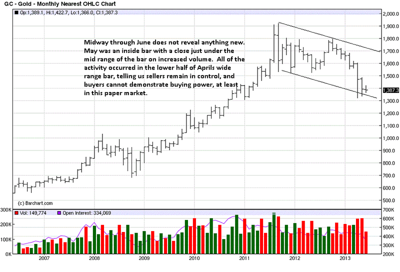
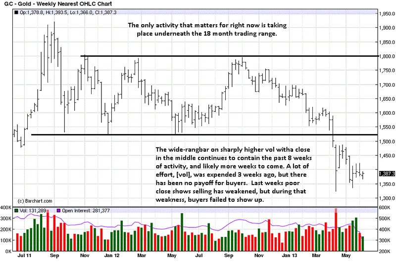
We can assert the trend is down because of lower lows and lower highs. June is now just half-way through the month, so not much credence can be placed on the abbreviated information. What can be seen, at this point, is a very small range, so far, following a small range in May that closed poorly.

What we know for certain is that the downtrend has not yet changed, so lower prices can be expected. Whether lower prices develop cannot be known, but it would be a safe bet to not buy into a declining market. We may hold an opinion that gold will ultimately be considerably higher in value, but there is no confirmation that price has begun to rally.

We have repeatedly advocated buying, and personally holding physical gold, but for a different stated purpose, as a measure of insurance and the potential for creating wealth, based upon past history.

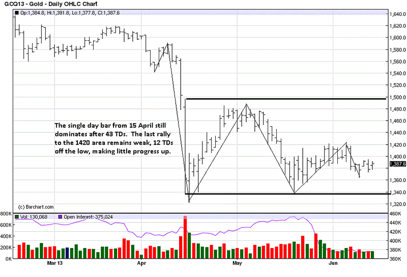
We have stated that wide range bars with closes in the middle tend to contain prices for some time, moving forward. That is an assessment based upon fact from proven market behavior. [See Markets Provide Us The Best Information, click on http://bit.ly/18pk8yE, first 3 gold charts, as examples].

There is insufficient market activity from which to draw a conclusion, at this date. There will be some kind of developing market activity that will alert us to a potential change, and even that will have to be confirmed by subsequent market behavior.

Can this be stopping activity from which price will turn around, or is it a temporary resting area before price resumes the trend lower? We do not know. In fact, no one knows. What we do know is that it does not matter. All we, or anyone, need do is wait for the market to confirm its [advertised] intent, and then follow the market. Too many try to lead the market, based on [ego] opinion[s].

The daily confirms the weekly and monthly, at least in that the[paper] futures market is not going up. There we see the power of a wide range bar containing subsequent price activity, and the last 18 TDs, [Trading Days] show how weak the rally attempts have been.

The chart "story" remains the same: the price of gold is not going up, for now, no matter whose "opinion" you hear/read.

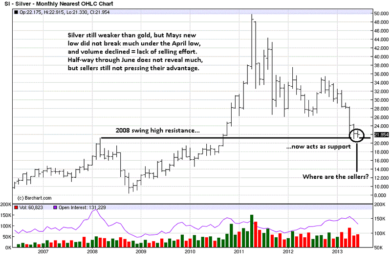
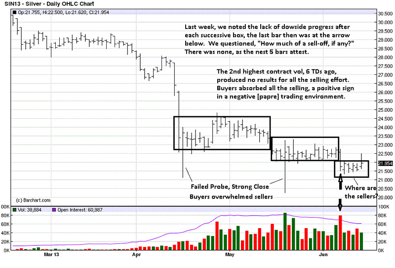
Silver is a bit more interesting, as we suggested last week. Past swing highs can often act as support, and how price reacts to the potential support factor will determine if the high will hold. Right now, the April 2008 swing high has slowed, if not stopped, the decline.

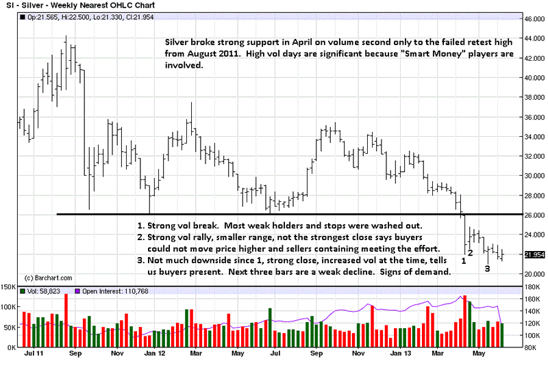
Confirmation of the "opinion" comes from the position of the close 3 months [bars] ago. It was in the middle of the range, telling us buyers were present at the lows, [an example of the logic mentioned earlier], and the following 2 bars have also held. In addition, we are seeing a clustering of closes. What that means is a balance between the forces of supply and demand. From balance comes imbalance, so at some point, we can expect directional movement, up or down, from this area.

The obvious question is posed on the chart: "Where are the sellers?"

Silver did not hold the wide range down bar in April, as gold did, but in the process of breaking and going lower, it has not gone much lower. The momentum has stopped, and we see that in how some of the bars have formed, [based on factual observations]. More developing price/volume activity is needed to determine the market's intent. For sure, the paper market is not headed higher, at this juncture.

We said silver was more interesting. The two failed probe lower bars are important pieces of information. They are a demonstrated form of buyers supporting the market. Will it hold is the question? [Will that observation be confirmed?]

Additional information helped to give added confirmation to what we posed last week, will it hold? The past 5 trading days say yes, at least for now. That could change next week, with additional information, but next week has not yet happened, so one can only base a decision on what is.

In the previous week and now with last week added, we are seeing a slowing of the downward momentum, [remember the monthly swing high potential support]. Is it enough to stop the decline? It is a question many would like to know, but not important to know, because the market will provide us with confirming market behavior that will then put us in a position to possibly take a position.

If this happens, Then do that. Just like not putting the cart before the horse, one does not "do that" before the If.

What we know for certain, based upon facts presented in the charts as derived from the market, the best source of all, is not to be buying the paper futures market. We covered some of this approach in a different market, the S&P, if anyone wants to learn/read more on the topic of learning to be more successful in trading markets. [See S & P - Trend, Facts, Rules = Successful Trading, http://bit.ly/19efpTs].

See the original article >>

Stock Market Correction Continues

By: Tony_Caldaro

Another choppy week in the US as foreign markets continue to confirm downtrends. For the week the SPX/DOW were -1.10%, the NDX/NAZ were -1.45%, and the DJ World index dropped 0.60%. On the economic front positive reports continue to outpace negatives ones. On the uptick: wholesale/business inventories, retail sales, the PPI, the WLEI and the monetary base, plus both weekly jobless claims and the current account deficit improved. On the downtick: export/import prices, consumer sentiment and the budget deficit worsened. Next week we have the FOMC meeting, housing reports and leading indicators.

LONG TERM: bull market

For the past three and one half weeks this market has been in a choppy downward slope while failing to make a new bull market high. This is the longest stretch, without a new uptrend high, since the Nov12-May13 uptrend began. While the market has pulled back only 5.2% during this period. It still appears to be in correction mode.

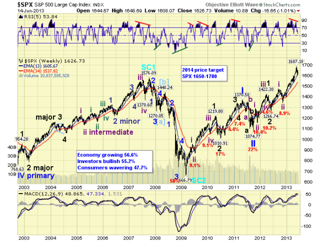
Longer term nothing has changed. We are still counting this four year bull market as Cycle wave [1]. Cycle wave bull markets unfold in five Primary waves. Primary waves I and II completed in 2011, and Primary III has been underway since then. Primary I divided into five Major waves, with a subdividing Major wave 1. Primary III is dividing into five Major waves, but both Major waves 1 and 3 are subdividing into five Intermediate waves. Major waves 1 and 2, of Primary III, ended by mid-2012, and Major wave 3 has been underway since then. Intermediate waves i and ii, of Major 3, ended by late-2012. Intermediate wave iii appears to have ended in May13, and Intermediate wave iv should be currently underway.

After Intermediate wave iv concludes, an uptrending Intermediate v should complete Major 3. Then after a Major 4 correction, an uptrending Major 5 should complete Primary III. Finally, after a Primary IV correction, an uptrending Primary V should complete the bull market. Thus far we continue to project a completion to the bull market by late-winter early-spring of 2014.

MEDIUM TERM: downtrend probable

We tracked the six month November-May uptrend, as Intermediate wave iii divided into five Minor waves, with subdivisions in Minor waves 3 and 5. It was a seemingly relentless uptrend, as every potential turning point just created another extension. Nevertheless, it has been more than three weeks since the market has made a new high, while prices have drifted lower.

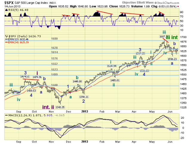
At this point we can not state with absolute certainty that Intermediate wave iv is underway. Simply because this is not subjective Elliott wave, but objective Elliott wave. OEW quantifies the waves as they unfold. And, OEW has not confirmed the downtrend yet. Nevertheless, we have been counting the SPX 1687/1674 highs as the end of Intermediate wave iii. Intermediate wave iv should unfold in three Minor waves: ABC. We have labeled last weeks low at SPX 1598 as the end of Minor wave A. Then the rally to SPX 1649 as the end of Minor wave B. Minor wave C should currently be underway. Minor A appears to have declined in a double zigzag, and naturally Minor C should do the same.

Our target for Intermediate wave iv remains SPX 1536-1540. This is where several fourth waves concluded during the Int. iii uptrend. Since this small range falls in between two OEW pivots, we expanded Int. iv support to between the 1523 and 1552 pivots. The 1552 pivot also represents a 38.2% retracement of the entire uptrend. So this is probably the most likely support area. Medium term support is at the 1614 and 1576 pivots, with resistance at the 1628 and 1680 pivots.

SHORT TERM

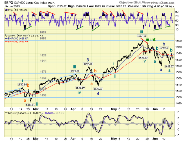
Short term support is at the 1614 pivot and SPX 1593-1598, with resistance at the 1628 pivot and SPX 1636-1640. Short term momentum declined below neutral after hitting quite overbought on Friday. The short term OEW charts are negative with the reversal level now SPX 1630.

This correction has been quite choppy and a bit difficult to decipher. The DOW, for example, has swung triple digits nearly every day as the bulls and bears battle it out. After a complete review of the SPX/DOW charts we feel we have identified the operative pattern.

Minor A unfolded in a double zigzag SPX 1674: 1623-1647-1598. Notice both zigzags were about 50 points. For the DOW, both zigzags were about 400 points. Minor B was a sharp rally from SPX 1598-1649/48 which appeared to have ended in a diagonal triangle. Minor C, thus far has declined in a zigzag from SPX 1649/48-1608, or about 40 points. This was followed by quite a sharp rally to SPX 1641 on Friday. The market should now be embarking on its second zigzag of Minor C.

Another 40 point decline would put the SPX back to 1598, for a double bottom flat. An 80 point decline would put the SPX in the OEW 1552 pivot range. Both patterns could work to end the correction. An alternate count, being carried on the DOW charts, suggests Minor B is still underway and a retest of SPX 1648/49 is next. Early next week should give us the answer to these two counts. Best to your trading!

FOREIGN MARKETS

The Asian markets were mostly lower on the week for a net loss of 1.3%. All eight indices we track are in confirmed downtrends.

The European markets were all lower on the week for a net loss of 2.4%. Only Germany has yet to confirm a downtrend.

The Commodity equity group were all lower for the week for a net loss of 2.6%. All the indices we track are in confirmed downtrends.

The DJ World index is downtrending and lost 0.6% on the week, and 90% of the international indices we track are in confirmed downtrends.

COMMODITIES

Bonds continue to downtrend losing 0.3% on the week.

Gold remains in a weak uptrend gaining 0.3% on the week.

Crude continues to uptrend and gained 1.5% on the week.

The USD is still downtrending and lost 1.2% on the week.

NEXT WEEK

Monday kicks off FOMC/OPEX week with the NY FED at 8:30, then the NAHB at 10:00. Tuesday: the CPI, Housing starts and Building permits. Wednesday: the FED concludes its meeting with a statement. Thursday: weekly Jobless claims, Existing homes sales, the Philly FED, and Leading indicators. On Friday Options expiration. Best to your weekend and week!

See the original article >>

Italian named world's top pasta chef for recession-inspired dish

By Alessandro Garofalo

Chef Giorgio Nava of Italy poses for a photo with his pasta during the Pasta World Championship final in Parma June 15, 2013. REUTERS/Alessandro Garofalo

View Photo

Reuters/Reuters - Chef Giorgio Nava of Italy poses for a photo with his pasta during the Pasta World Championship final in Parma June 15, 2013. REUTERS/Alessandro Garofalo

PARMA, Italy (Reuters) - Giorgio Nava, an Italian chef based in South Africa, won the World Pasta Championship in the Italian city of Parma on Saturday with a low-cost recipe that he said suited Italy's deep economic crisis.

Nava, who has won awards for his work at the Cape Town restaurants '95 Keerom' and 'Carne SA', wooed the public and the jury with a simple plate of cavatelli - small pasta shells - broccoli and oregano flowers.

"Simplicity was the key. I presented a recipe that is very cheap but very tasty," Nava told Reuters after his victory.

"Others competed with expensive fish-based recipes but right now, given the economic situation in Italy, it did not seem right to come forward with extravagant dishes."

The pasta championship, which was held for the first time last year, took place at the Barilla Food Academy in Parma, considered Italy's food capital and best-known for Parmesan cheese and cured Parma ham.

Twenty-four carefully selected cooks, including Hong-Kong born John Leung, competed in the two-day championship.

Participants were given 40 minutes to complete their dish in the first round of the championship on Friday and only 30 minutes during the final on Saturday.

"My dish is something easy to make, anyone can cook it a home," said Nava. "After all, simple things are often the best."

Last year's award went to Japanese chef Yoshi Yamada.

See the original article >>

222 Years Of Gold, Wars, Inflation, Economies, And Presidents

by Tyler Durden

Whether as the basis for the monetary unit of a country, or in its role in comparison to the currency of other assets, the price of gold has long been a subject of great interest to both the scholar and the general public. MeasuringWorth has created a multi-century time series of the barbarous relic's USD price. From the penny, the crown, the rose ryal, the guinea and the sovereign coin, the question of "what was the price then" is answered combining a number of sources and Visualizing Economics compares the 'real' price of gold since 1791 to GDP, wars, US presidents, and inflation...

See the original article >>

Follow Us