By John Mauldin

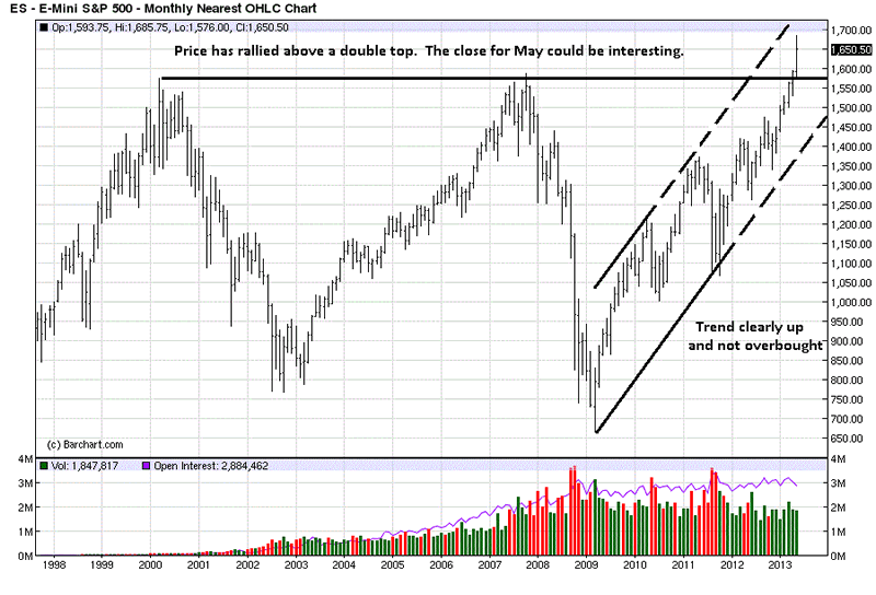
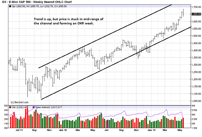
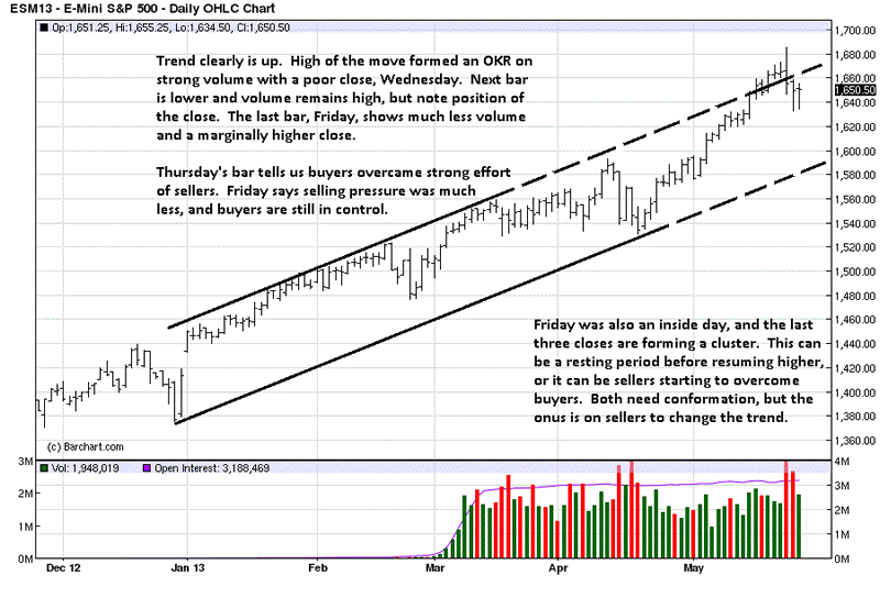
The Underground Recovery
The Cashless Society?
Welfare and Incentives
Carlsbad, Tulsa, Nashville, Brussels, and Homeless in Dallas
But Mousie, thou art [not alone],
In proving foresight may be vain:
The best-laid schemes o' mice an' men
Gang aft agley,
An' lea'e us nought but grief an' pain,
For promis'd joy!
Robert Burns, To a Mouse, on Turning Her Up in Her Nest with the Plough
It is a common trope in science fiction novels. Economic transactions are handled seamlessly with a wave of a card or a physically imbedded chip, and whatever the author imagines money to be is transferred, far removed from the archaic confines of ancient physical monies. If you Google "cashless society" you get about 600,000 references in under a second, and 20 pages into the references there are still articles on a future world where physical cash is no longer needed. Some see it as a sign of the "end times," some as a capitalist plot, some as a frightening vision of socialists and ever-bigger governments, and some as a logical step in the evolution of a technologically driven international commerce.
And some of the "cashless society" references are showcase articles for the latest innovation that turns your phone or smart card into a functional wallet. I can attest it is quite possible to go for days without needing actual cash (as long as there are no kids around). The Bitcoin phenomenon (28 million sources on Google!) is a libertarian enthusiast's dream of not just a cashless society but a society with no need for fiat money and central banks.
Today we'll look at research suggesting that cashless future might be farther off than we either fear or hope. Not only is a cashless society farther away than some think, we are actually seeing an increase in the use of cash all over the world (and this is not just a US phenomenon). We will look at some interesting factoids that in themselves make for thought-provoking discussions, but when we couple them with research on the rise of the unreported economy (aka the underground economy) and the number of people who get some form of government assistance, we may find problematic consequences resulting from hidden incentives that work in unintended ways.
The Underground Recovery
In a recent New Yorker article entitled, “The Underground Economy,” writer James Surowiecki explores the import of a study by University of Wisconsin economist and professor emeritus Edgar Feige, who for many years has done research on the amount of actual cash in the US. Feige has recently updated his work.
What prompted me to follow up and then finally to discuss his work personally with a remarkably accessible Feige was his rather well-documented refutation of a common assertion I have long believed: that at least 2/3 of physical, printed US cash circulates outside the borders of the country. Indeed, you can find research on this topic at the San Francisco Fed and in serious economic journals, so this was not just some anecdotal belief I held from observing the impressively large number of dollars in use wherever I travel in the world. But no, this factoid was something "everyone" simply "knew." Well, everyone but a few people like Feige and evidently some people at the New York Fed.
And we are not talking about a small difference between perception and reality here. Feige asserts convincingly that only 23% of physical US dollars are outside our borders. The difference is $400-500 billion, not a small sum. He vigorously (and I think conclusively) dissects the assumptions in the research that has generated and promoted the larger number. (You can read his 28-page paper here. Let’s look at some of the more interesting parts of his research. (Emphasis mine, of course. This is an academic paper, after all, and polite academics do not use boldface for emphasis.)
The rapid growth of substitutes for cash, particularly debit and credit cards, has led economists to predict the advent of the "cashless society". Yet cash holdings in most developed economies continue to grow and in the U.S., per capita currency holdings now amount to $3000. This paper revisits the long-standing controversy concerning the whereabouts of U.S. cash. Specifically, we employ a previously confidential data source on net shipments of U.S. currency abroad to re-estimate the fraction of U.S. currency held overseas. Contrary to the widely cited figure that 65 percent of U.S. currency is abroad, we now find that direct evidence supports the notion that overseas holdings amount to less than 25 percent. With domestic cash holdings amounting to roughly $2250 per capita, we are far from a "cashless society".
He goes on to note,
Currently, the official figure for the percent of U.S. currency held abroad as published by the Federal Reserve in their Flow of Funds Accounts and by the Bureau of Economic Analysis in the U.S. Balance of Payments Accounts is 39 percent….
To put these figures in perspective, they imply that the average American’s bulging wallet holds roughly 91 pieces of U.S. paper currency, consisting of: 31 one dollar bills; 7 fives; 5 tens; 21 twenties; 4 fifties and 23 one hundred dollar bills. Few of us will recognize ourselves as "average" citizens. Clearly, these amounts of currency are not normally necessary for those of us simply wishing to make payments when neither credit/debit cards nor checks are accepted or convenient to use. Yet as shown in Figure 2, these surprisingly high U.S. per capita currency values were exceeded by per capita currency values for Europe ($3274); Hong Kong ($3963), Switzerland ($6335) and Japan ($7562).
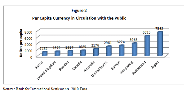
(Very odd factoids for those of us currently obsessed with all things Japanese. Not only do the Japanese have the largest per capita currency in circulation, but surveys tell us that the Japanese people only admit to holding about 10% of that cash. This is indeed, as Feige first noted in research in 1989(!), a "currency enigma." Sidebar question with no immediate answer: Cash is by definition deflationary, and Japan has problems with deflation … and now Kuroda-san is going to crank up the electronic printing presses? I will pose that one to Kyle Bass and Louis Gave, among others, next week. If the answer is interesting, I will report back.)
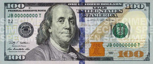
As Feige noted, on average we are each holding 23 $100 bills. Wondering where your Ben Franklins are? Here, just for fun, is the new $100 bill, coming on October 8:
Interestingly, much of the cash outside the US is in $100 bills, so that may explain where some of the missing C-notes are. Here’s Feige:
Even a cursory examination of the growth and magnitude of the U.S. currency supply in circulation with the public reveals that predictions of the advent of the "cashless society" are unfounded. Despite financial innovations giving rise to convenient substitutes for cash, per capita cash holdings continue to increase and by the end of 2011, amounted to $3000 for every man woman and child residing in the U.S. While this figure does not comport with our common sense notion of how many dollars the average person holds in her wallet, we show that Europeans and Japanese citizens hold even larger amounts of cash. Two explanations are offered for these large cash holdings. The first posits that a large fraction of U.S. currency is held abroad, the second that large amounts of cash are employed to undertake transactions that individuals and firms prefer to hide from the government either to avoid taxes, regulations or punishment for illegal activities.
The Cashless Society?
Professor Feige soundly refutes the first theory. The second one is what is interesting here: there is a rather large cash economy in the US.
The above-referenced article by Surowiecki in The New Yorker was actually about another piece of research by Feige on the "underground economy." (Feige is at least in his mid-70s and is clearly still quite active for one with "emeritus" in his title. He has one very impressive, yea, intimidating resumé, with 80 publications to his credit. His first book was published 50 years ago, and he has been called "the father of underground economy analysis.")
In my conversation with him, Feige made it clear that he thinks it should be called the "unreported" rather than the "underground" economy. By whatever name, that economy apparently totals about $2 trillion a year in the US. And the "lost" tax revenue is in the neighborhood of $400 billion a year. That amount is downright puzzling if the cash in US circulation is only $250 billion (as would be indicated if 65% of US dollars really were outside the country). That would be pretty high velocity (the number of times money moves from one hand to another). But if cash is actually $750 billion, then that velocity becomes not so remarkable at all.
Surowiecki writes:
The percentage of Americans who don’t use banks is surprisingly high, and on the rise. Off-the-books activity also helps explain a mystery about the current economy: even though the percentage of Americans officially working has dropped dramatically, and even though household income is still well below what it was in 2007, personal consumption is higher than it was before the recession, and retail sales have been growing briskly (despite a dip in March). Bernard Baumohl, an economist at the Economic Outlook Group, estimates that, based on historical patterns, current retail sales are actually what you’d expect if the unemployment rate were around five or six per cent, rather than the 7.6 per cent we’re stuck with. The difference, he argues, probably reflects workers migrating into the shadow economy. "It’s typical that during recessions people work on the side while collecting unemployment," Baumohl told me. "But the severity of the recession and the profound weakness of this recovery may mean that a lot more people have entered the underground economy, and have had to stay there longer."…
The U.S. is certainly a long way from, say, Greece, where tax evasion is a national sport and the shadow economy accounts for twenty-seven per cent of G.D.P. But the forces pushing people to work off the books are powerful. Feige points to the growing distrust of government as one important factor. The desire to avoid licensing regulations, which force people to jump through elaborate hoops just to get a job, is another. Most important, perhaps, are changes in the way we work. As Baumohl put it, "For businesses, the calculus of hiring has fundamentally changed." Companies have got used to bringing people on as needed and then dropping them when the job is over, and they save on benefits and payroll taxes by treating even full-time employees as independent contractors. Casual employment often becomes under-the-table work; the arrangement has become a way of life in the construction industry. In a recent California survey of three hundred thousand contractors, two-thirds said they had no direct employees, meaning that they did not need to pay workers’-compensation insurance or payroll taxes. In other words, for lots of people off-the-books work is the only job available.
J.D. Tuccille, over at Reason.com, responds to the New Yorker article with an interesting analysis pointing to tax rates as the issue, among other things:
Surowiecki bemoans the "damaging effects of this trend," but he should pay more attention to the damaging taxes and regulations that caused this trend by pushing people to work off the books. People aren't depriving themselves of legal recourse and traditional benefits because it's suddenly hip to do so – they're hiding in the shadows because red tape and taxes are strangling the legal economy.
These are concerns. People respond to personal incentives. If the incentive to make their life better in the short term is to work off the books – and that is the basic choice – then that is what they will do. But that is not where I want to go with this discussion today. Let’s focus on another incentive to move out of the reported economy.
Welfare and Incentives
I think almost everyone participates in the unreported economy in one way or another. Do you tip a waiter or waitress? Pay cash for taxis or tip the bellman at the hotel? The baggage guys at the airport? The guys who do your lawn? Even if you write checks for a service, does that mean that income is reported?
I and most other businesspeople try to pay for everything that is a business deduction with a credit card. That can be tricky during IRS audits, but it is just easier than keeping receipts and documenting expenses when you get homeand then trying to add up your cash payments. And you can use a credit card or cash card without problems almost everywhere.
(When I travel outside the US, I am sometimes frowned at if I try to use a credit card. Singapore? No problem. Across much of Europe a credit card is not an issue, but cash is clearly appreciated. Then again, there was the time I wrote about last January, when I tried to use a credit card at a taverna off the tourist paths in Greece, and they had to hunt for their credit card machine and it didn’t work after they found it. And gods forbid you try and use a credit card in Argentina. My point is that the unreported economy is hardly just a US phenomenon.)
But there is a part of US society where unreported income is a particular problem, due to unintended consequences of poorly designed incentives. That is the segment of the country on welfare.
Let me note up front that this is not an argument for or against welfare or helping the poor and needy. I am just noting the large cash economy and offering another reason why it might be as large as it is: misaligned incentives.
In the last few months, conservative news outlets cited a Republican Congressional survey that shows that welfare is about $1 trillion of the US budget, or $168 per day for those below the poverty line. When you dig into the data, you find that a very loose definition of "welfare" was employed, one that most Americans would not use for many of the programs the survey lists. It might argued that the money in question should not be spent, but the survey does not pass the smell test in identifying actual welfare.
According to the Center for Budget and Policy Priorities, even when one uses a very expansive definition of "welfare," only "13 percent of the federal budget in 2011, or $466 billion, went to support programs that provide aid (other than health insurance or Social Security benefits) to individuals and families facing hardship." (Informationclearinghouse.info)
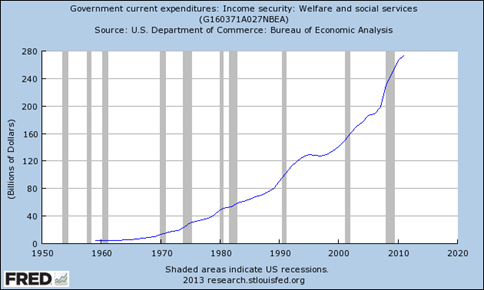
The St. Louis Federal Reserve database shows an even smaller welfare number, at $273 billion (chart below), but you can add about $140 billion at the state level and that gets you closer to the $466 billion mentioned above. That is still a large number per day per family below the poverty line. But let me hasten to add that is NOT what an actual recipient gets; it is just the budgeted cost, which includes what it takes to run the government offices and pay welfare workers.
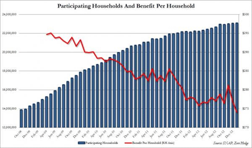
Let’s look at a few quick statistics, which taken out of context can be misleading, so don’t be misled or assume that I am. The total number of people on welfare is about 4,300,000. The total number of people getting food stamps (the SNAP program) is 46,700,000. We just saw a new high for the number of families on food stamps:
In Texas if, as a single mother of two or three kids, you can figure out how to qualify for every type of assistance available, you can amass get the princely sum of about $980 a month (plus some healthcare). Other states are more generous. The popular meme is that 40 states pay more than $8 an hour to those on welfare, with seven paying more than $12 an hour. But if you work and make more than $1,000 a month (more or less, depending on the state) you will not likely qualify for welfare. The more you make the less you can get, until at some point you do not qualify at all. The theory is that benefits should decrease as your work income increases. (Source for some data: http://www.statisticbrain.com/welfare-statistics/)
Of course, there is the earned income tax credit (EITC), which is phased out once income reaches certain levels. To qualify for that, of course, you need to actually earn income. And WIC, housing subsidies, Medicaid, and other programs exist. (And we will not even get into disability payments. We have recently seen the number of people on disability rise faster than the number of people going back to work. Can a child or other member of a family get disability and another get welfare? Yes, the system can be gamed. Different letter.)
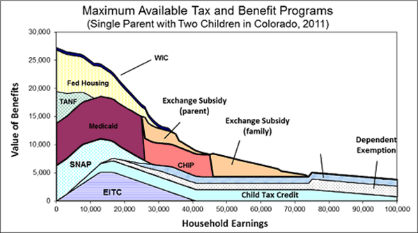
The following chart is from the generally liberal Urban Institute. Note that the maximum amount of total benefits is received by those who have the lowest levels of income, which makes a certain sort of sense. This chart is for a single parent in Colorado, a state that is middle of the road as far as benefits go. Benefits are considerably lower in Mississippi and far higher in Massachusetts and Alaska.
I am not arguing either for or against the level of payments or costs or the rationale for any particular program here. Different issue, different day.
No matter where you live, with few exceptions, being on welfare is not a pleasant lifestyle. Neither is living on $10 an hour, much less on minimum wage.
The point is that people on welfare have a clear need for more money than they get from whatever government check they receive. For most people, welfare is a temporary assistance program to help them out between jobs. But in the last decade, and especially in the five years since the beginning of the Great Recession, the welfare and disability rolls have simply exploded.
The clear incentive, it seems to me, is to work for extra cash in the unreported economy. If as a single working parent you make $10 an hour in the reported economy, you are going to lose most if not all of your welfare benefits (depending on the state); while if you work in the unreported economy, you keep your benefits.
You can view this situation several ways. For instance, perhaps the EITC should be higher, as in, the more you make the more you keep.
If you have a skill that pays you $20-30 an hour (closer to the median family income pay level) you are better off keeping the job and staying off welfare. But if you are minimum-wage labor or not far above it, the equation works out better if you work off the books for that extra income.
Is everyone on welfare working in the unreported economy? I would not suggest that for a minute. Obviously, they aren't.
While acknowledging that correlation is not causation, the parallel growth of the underground economy and the welfare rolls seem to me to be not entirely unrelated. The natural incentives are clearly there. What worries me most is that we are creating a generation of people who are getting used to working off the books, whether or not they are on welfare. They are outside the system and will come to see themselves as not being part of it. It becomes something "other" – except when they want medical care, which, with the advent of Obamacare, will now be available them even if they work in the unreported economy.
None of our kids, yours or mine, believe Social Security will be there for them when they retire. No need to be in the system for that.
There is a lot of controversial work in the economics profession, but I think pretty much everyone agrees that people respond to incentives. I wonder what message we are sending?
Carlsbad, Tulsa, Nashville, Brussels, and Homeless in Dallas
Next Monday I leave for Carlsbad and my conference, which starts on Wednesday evening; but there are lots of meetings and other things to attend to beforehand. Monday I will go to the Altegris office, where there is a lot to discuss, and then I'll meet with Jon Sundt and the other partners that night. The next day will see my Mauldin Economics staff show up for a long day of planning, as we try to deal with our rapid expansion.
And then when the meetings are over and the conference starts up, I get to enjoy again one of my favorite times of the year, when I get to see so many friends and have so many awesome conversations. I personally wish I could make it last for a week or more, as there is just not enough time to spend with everyone. But we take what we can get and savor it.
After the conference I'll be home for a bit before I make my way to Tulsa, where my daughter Abigail will get married May 19. (Her twin sister Amanda is doing fine with one-month-old daughter Addison!)
Later that week I'll fly to Nashville for a night, to speak at a meeting for Altegris, before returning to Dallas to write my letter and then head for Brussels for a week.
I am working on so many writing projects, plus my speech for next week, that I am quite busy. And there are just so many interesting things I come across that seem to demand my attention, not the least of which is working on the new-apartment design and contracting. But of course, we actually have to close the loans and make the purchase first. It seems like it takes forever, which is exactly what everyone told me to expect.
I am still "Homeless in Dallas," living in an extended-stay hotel. I don’t want to rent a temporary apartment until the new place actually closes, so that I can finesse the timing of everything. Therefore, most of my worldly possessions are in storage. It is an interesting experience, as I am finding out that I need far less than I have, and I'm sure I could cut even more. The important things, it seems, are the phone and computer, which are my lifelines to my kids and other family and friends and work. Those two possessions go with me everywhere. And with the new technology in hand, I am finding it easier to enjoy myself wherever I am – and to anticipate the next moment as well. Yes, there are always issues. Kids come with issues galore, and there are always things in the businesses that need tending to. Expenses pile up to more than I like. As do writing deadlines. And now I have to put up with a lack of air traffic controllers and a balky FAA. There is no end of things I could dwell on and stress over, if I wanted to.
There are also a lot of Big Things to worry about in this world of ours, but with an abundance of family and friends, the Small Things seem to work out just fine. You have a great week!
Your living in the moment analyst,
See the original article >>