Saturday, December 7, 2013

Buy Low And Sell High? Our Super Commodity System Do This For You

The system allows to take position on the market well in advance of traditional methods and greatly benefit the investor in the subsequent management of the open positions. Super Commodity works with simple and effective rules and with fixed and not optimized parameters.

Test and evaluate for free our Super Commodity system


Top 10 rules of portfolio diversification
If there is one thing the 2008 financial meltdown taught us, it is the value of a properly diversified portfolio. The second thing is that if you think you are diversified, you may need to check again. At the time, many thought they were, only to see losses across the board as assets that previously were uncorrelated moved together and sunk many a portfolio.
Today, figuring out what constitutes a diversified portfolio and, more importantly, how to actually assemble one can be a difficult and at times frustrating ordeal; every analyst and investment advisor has a different idea. To help you navigate these treacherous waters, we offer the following 10 rules of portfolio diversification.

1. Start with the end in mind. A diversified portfolio is not a one-size-fits-all product. Instead, it should be personalized, focusing on your personal long-term investment goals while considering your current personal circumstances. According to Michael Loewengart, senior investment strategist at E*TRADE Capital Management, your personal circumstances should take into account your current financial situation, expected future expenses and how far away from retirement you are. "The goal of asset allocation is to make sure the level of volatility in your portfolio is in line with your goals, personal circumstances and tolerance for risk," he says. Additionally, consider your temperament. If high-risk assets make you overly stressed, perhaps it would be better to stick with comparably low-risk alternatives.
2. Aim to reduce overall risk. Portfolio diversification has two goals, this being the first and what most people associate with diversification. If you have multiple assets in your portfolio, even if one is not doing well, you have others that are outperforming. As such, this reduces the overall volatility of the portfolio. "[Diversification] reduces your risk. Instead of being stuck in just one sector that may not do well at times, a diversified portfolio can sustain you and keep you in business," Michael Clarke, CEO of Clarke Capital Management, says.
3. Aim to enhance overall returns. Being able to capitalize in markets that are outperforming and adding to your bottom-line is the second goal of a diverse portfolio. Not only does owning a range of assets protect you in the event that one does poorly, but it positions you to take advantage of ones that perform exemplarily. "We try to have a finger in each of the different sectors because in our experience usually something is working and that one may save the bill," says Clarke.

4. Invest in multiple asset classes. Traditionally, a portfolio was considered diverse if it had a mixture of equities and bonds. As investors are becoming more sophisticated, other assets such as commodities, real estate and foreign currencies are receiving more attention. In order to reduce risk and enhance returns, investments in numerous asset classes help keep correlations among assets in check. Each class has its own drivers and its own speed bumps. Taken together, they help smooth out the ride.

5. Invest in multiple sectors within the asset classes. Just as investing in multiple asset classes reduces risk and enhances returns, so too does investing in multiple sectors within those asset classes. Just including equities, bonds and commodities is not enough as equities have sectors reaching from healthcare to industrial metals, bonds have a variety of maturations and commodities include energies, metals and foods. "You want to be allocated amongst the various market sectors and industries. Across asset classes, you want to have further diversification into the different segments," Loewengart says.

6. Own assets that do well in bull, bear and sideways markets. This point really stresses the need for owning a diverse array of assets. You do not want to place all your eggs in a basket that does well when the stock market is moving up, because that also means your portfolio will do very poorly when that bull market turns into a bear. Instead, it usually is advisable to own assets with a negative correlation in which one asset moves higher while the other moves lower. Examples of this relationship include the U.S. dollar and crude oil as well as stocks and bonds. It is often true that in times of crisis all correlations go to 1.0, but some strategies are more resistant to this. It is wise to look broadly at how various assets perform in different environments.
Commodity Trading Advisor Salem Abraham pointed out following 2008 that nearly all asset classes were long the economy. Managed futures, which are diversified in their own right through being long or short disparate sectors like agriculture, metals, energies, interest rates and currencies, also perform well in periods of high dislocation. Other diversified asset classes had the same negative response to the economic crisis but managed futures did well by taking advantage of fat tail events rather than being punished by them.
7. Have a disciplined plan for portfolio rebalancing. If you have constructed your portfolio properly, it is to be expected that some assets will outperform others and over time begin constituting a larger percentage of your portfolio. That is the time to rebalance and bring your investments back in check with one another. "If you have a disciplined plan for rebalancing in place, then you can capitalize on the different movements that will take place from the different assets in your portfolio," Loewengart says.
He explains that that discipline will enable you to automatically sell out of your outperforming assets and buy into those underperforming. Consequently, you will naturally be selling high and buying low.

8. No "borrowing" among classes except during rebalancing. Trading can become emotional and that can cloud your judgment. It may seem like a good idea to abandon an investment decision that is not immediately paying off or to bolster ones that are doing well. Proceed with caution, because that is a move that catches many investors. The reason for having a rebalancing plan is to remove that emotional element. "When you look at your portfolio, rebalancing with a stated framework is going to give you the discipline that many investors inherently lack," Loewengart says. That discipline helps you do the things that you may not want to do, but are in your best interest.

9. Backtest your portfolio, but consider current market conditions. Backtesting can help you see correlations that exist in your portfolio and can allow you to see how it would stack up in various market conditions. There is a reason, though, that investment advisors are required to say, "Past performance is not indicative of future results." Also, remember there will be periods in the past in which your portfolio would not have fared well.
Past events can provide a framework, but also consider current market conditions to better position your portfolio for future events. We can learn a lot from the past, but current events are shaping
tomorrow’s markets.

10. Test asset correlations periodically. If there is one thing we can count on in the markets, it’s that they will never stay exactly the same. What was negatively correlated one year can move lock-step the next. Consequently, it is not enough to simply rebalance from time to time; you also need to test the asset correlations in your portfolio periodically to see if anything has changed. As markets change, you need to make informed decisions as to how you need to alter your portfolio to counter those changes. You can’t expect your portfolio allocation decisions to be a one-and-done event; as markets change, so to must your portfolio.

These rules leave a lot to personal judgment and that is the key to success. One additional item to point out is that any allocation to a less liquid asset should calculate that liquidity risk in addition to other risks to achieve the proper allocation.
Your portfolio should fit your needs. Unfortunately in the past not all potential asset classes were available to retail investors. Today, thanks to innovative exchange-traded funds (ETFs) and mutual fund structures, nearly every investor can access commodities, currencies, short and leveraged strategies as well as active strategies including managed futures. Now everyone truly can be diversified.

Should You Still Use Commodity to Diversify Investment Portfolio?
A new study from the Bank of International Settlements (BIS) raises doubts about the value of commodities as a tool for enhancing portfolio diversification. The paper’s smoking gun, so to speak, is that “the correlation between commodity and equity returns has substantially increased after the onset of the recent financial crisis.” Some pundits interpret the study as a rationale for avoiding commodities entirely for asset allocation purposes. But that’s too extreme.
In fact, this BIS paper, although worth a careful read, isn’t telling us anything new. That said, it’s a useful reminder for what should have been obvious all along, namely: there are no silver bullets that will lead you, in one fell swoop, to the promised land of portfolio design. The idea that adding commodities (or any other asset class or trading strategy) to an existing portfolio will somehow transform it into a marvel of financial design is doomed to failure. Progress in the art/science of asset allocation arrives incrementally, if at all, once you move beyond the easy and obvious decision to hold a broad mix of the major asset classes.
Correlations are a key factor in the design and management of asset allocation, but they’re not the only factor. And even if we can find assets and strategies with reliably low/negative correlations with, say, equities, that alone isn’t enough, as I discussed last week. You also need to consider other factors, starting with expected return. It may be tempting to focus on one pair of assets and consider how the trailing correlation stacks up today. But that’s hardly the last word on making intelligent decisions on how to build a diversified portfolio.
Perhaps the first rule is to be realistic, which means recognizing that expected correlations, returns and volatility are in constant flux—and not necessarily in our favor, at least not all of the time. Bill Bernstein’s recent e-book (Skating Where the Puck Was: The Correlation Game in a Flat World), which I briefly reviewed a few months ago, warns that the increasing globalization of markets makes it ever more difficult to earn a risk premium at a given level of risk. As “new” asset classes and strategies become popular and accessible, the risk-return profile that looks so attractive on a trailing basis will likely become less so in the future, Bernstein explains. That’s old news, but it’s forever relevant.
As more investors pile into commodities, REITs, hedge funds, and other formerly obscure corners, the historical diversification benefits will likely fade. Granted, the outlook for expected diversification benefits fluctuates through time, and so what looks unattractive today may look considerably more compelling tomorrow (and vice versa). But as a general proposition, it’s reasonable to assume that correlations generally will inch closer to 1.0. That doesn’t mean that diversifying across asset classes is destined to become worthless, but the expected payoff is likely to dim with the passage of time.
The good news is that this future isn't a total loss because holding a broad set of asset classes is only half the battle. Your investment results also rely heavily on how and when you rebalance the mix. Even in a world where correlations are higher and expected returns are lower, there’s going to be a lot of short-term variation on these fronts. In other words, price volatility will remain high, which opens the door (at least in theory) for earning a respectable risk premium.
Still, it’s wise to manage expectations along with assets. Consider how correlations have evolved. To be precise, consider how correlations of risk premia among asset classes compare on a rolling three-year basis over the last 10 years relative to the Global Market Index (GMI), an unmanaged market-weighted portfolio of all the major asset classes. As you can see in the chart below, correlations generally have increased. If you were only looking at this risk metric in isolation, in terms of history, you might ignore the asset classes that are near 1.0 readings, which is to say those with relatively high correlations vis-a-vis GMI. But by that reasoning, you’d ignore foreign stocks from a US-investor perspective, which is almost certainly a mistake as a strategic decision.

Nonetheless, diversifying into foreign equities looks less attractive today compared with, say, 2005. Maybe that inspires a lower allocation. Then again, if there’s a new round of volatility, the opportunity linked with diversifying into foreign markets may look stronger.
The expected advantages (and risk) with rebalancing, in other words, are constantly in flux. The lesson is that looking in the rear-view mirror at correlations, returns, volatility, etc., is only the beginning—not the end—of your analytical travels.
Sure, correlations generally are apt to be higher, which means that it’s going to be somewhat tougher to earn the same return at a comparable level of risk relative to the past. But that doesn’t mean we should abandon certain asset classes. It does mean that we’ll have to work harder to generate the same results.
That’s hardly a new development. In fact, it’s been true all along. As investing becomes increasingly competitive, and more asset classes and strategies become securitized, expected risk premia will likely slide. But what’s true across the sweep of time isn’t necessarily true in every shorter-run period. The combination of asset allocation and rebalancing is still a powerful mix—far more so than either one is by itself. And that’s not likely to change, even in a world of higher correlations.

US corporate spreads lowest in 6 years

by SoberLook.com

While everyone talks about the "great rotation" from bonds to equities, we've had a different type of rotation taking place within the US fixed income universe - the rotation from treasuries into credit. Here is a simple comparison of total returns between high yield and treasury bonds over the past few months. Corporate credit outperformance has been remarkable.

The result of this "rotation" has been the collapse in corporate spreads, which has been persistent across the credit spectrum. Both investment and non-investment grade bond spreads have not been this tight since the bubble years.

Of course as corporate spreads come in, there is increasingly less cushion to compensate investors for the losses due to rising yields. And yields are likely to rise in 2014. There is no question that at least within corporate credit we are moving into "bubble" territory.

BW: - Spreads on U.S. investment-grade and junk bonds have contracted by almost 700 basis points from a peak of 896 in December 2008, about three months after the collapse of Lehman Brothers Holdings Inc. helped spark a seizure in credit markets, Bank of America Merrill Lynch index data show.
After average annual returns of 10.8 percent since the end of 2008, investors have been left with spreads that are 8 basis points below the average 208 basis points during the 10 years ended 2007, the index data show. That may leave investors with too thin of a cushion against losses should benchmark interest rates climb.

See the original article >>

The Week Ahead: Where Will Stocks Finish The Year?

by Tom Aspray

Many who are not invested in stocks have been fighting the urge to buy stocks as the market moves higher and higher. The evidence continues to suggest that the public is still not very invested in the stock market. As rates continue to edge higher, many are now also facing losses in their bond portfolios and their year-end statements may provide a shock.

All of the major averages, except the Nasdaq 100, made their highs at the end of November before correcting last week. This was consistent with the deterioration in the technical studies that was especially evident after last Monday’s close. It will take more than Friday’s sharp rally on the jobs report to reverse the signs of deterioration.

Things are much different than a year ago, as in December of 2012, the NYSE Advance/Decline line was leading prices higher, so I felt fairly confident just before Christmas that 2013 would Be Another Double-Digit Year. With the Spyder Trust (SPY) currently up 27.50%, the question now becomes will stocks hold these gains until the end of the year or will they close even higher?

Let’s look at the evidence. First of all, December is a good month for stocks with an average return since 1950 of 1.6%. This would give an end-of-the-year target of $183.89 (see chart) for the SPY.

chart
Click to Enlarge

One can get an even more bullish forecast by just looking at those years since 1990 when the S&P 500 was already up over 20% or more at the end of November. This has only occurred seven times in the past 22 years and the average December gain was 3.5%. This would give a year-end target for the SPY of $187.33. The best year was 1991 when the S&P was up 11.1%.

Unlike last December, the key technical studies are now acting weaker, not stronger, than prices so I cannot be nearly that bullish going into the end of the year. If you look at the years since 1950 when the S&P 500 did close lower in December, the average decline was just over 2%. If the SPY were to close 2% lower this month, then the SPY should settle 2013 at around $177.38.

From the current technical readings, as well as the pivot point and Fibonacci analysis, it is possible that the SPY could decline 3.5% in December, which would give a target for the SPY at $174.70. On the chart, I have drawn a year-end target zone that ranges from $173-$176 (box on chart) with a mid-point of 3.5% or 4174.68.

A correction should give those not in the market an opportunity to buy. Hopefully many of you started a dollar cost averaging program as suggested in August and have been participating in the market’s gains.

I see no signs of a major top for the stock market, though it is not clear yet whether we will see a brief setback or a more extended correction. After a correction, the sentiment for stocks should be much less bullish, which will create an environment that will allow the market to move even higher. This week’s action should give us additional clues as to what type of correction is the most likely.

If you are fully invested, raising some cash would be a good idea, and you should also sell or reduce the position in those stocks that are not performing. This is the strategy that I suggested last week in the review of the Charts in Play portfolio. There are always exceptions but those stocks that have not rallied with the market since October are likely to be the most vulnerable when the market corrects.

As the stock market declined early in the week, the news on the economy continued to improve. The ISM Manufacturing Index jumped nicely on Monday to 57.3 and New Home Sales for October jumped 25.4%. Both were much better than economists expected. The move through the downtrend from the 2011 highs (line a) in the ISM Manufacturing Index is a positive sign.

The news was also good from a global perspective as according to Markit.com’s Global PMI™ it is “tracking a pace of global growth approaching 3% per annum.” Last Thursday’s upward revision of the 3rd quarter US GDP to 3.6% was also a welcome surprise. The strong monthly jobs report should also help boost consumer confidence.

chart
Click to Enlarge

I expect the economy to improve further in 2014, which will allow the Fed to eventually “taper” but I am not expecting such a change until after Janet Yellen takes over. It has been my view since the last wave of double-dip recession forecasts in September of 2011 that the underlying economy was stronger than most believed and that it was bullish for stocks.

The news out of the Eurozone also was better than expected as Germany continues to do quite well, with its construction industry likely to grow sharply in the 4th quarter. Its commercial property is apparently now quite attractive to long-term Asian investors who have avoided these markets in the past.

The outlook for the UK economy has also shown significant improvement as its construction industry is even stronger than that of Germany. Other sectors are also showing nice growth rates with unemployment finally coming down. Therefore, I found this picture from the Business Insider to be a good example of how removed most politicians are from their constituents.

It was taken as Prime Minister Cameron was giving a speech where he argued for a policy of permanent austerity. The lavish surroundings highlighted on the picture do not pass the austerity smell test.

chart
Click to Enlarge

This week, we have a fairly light economic schedule as many are already looking towards the FOMC meeting that starts on December 17. Quite a few of the Fed regional presidents are scheduled to speak on Monday followed on Wednesday by the Treasury Budget.

On Thursday we get jobless claims, which have been declining nicely along with the latest reading on Retail Sales. The Producer Price Index will be released on Friday.

What to Watch
Only the PowerShares QQQ Trust (QQQ) made a new high last week as most of the major averages are still well below the late-November highs. As detailed, some of  the daily technical studies have diverged from prices and suggest a top is being formed.

The weekly volume analysis is positive and does not show signs of a significant top. If the remaining averages, like the Dow and S&P 500, make new highs this week, the technical studies will need to be watched closely to see if divergences are formed. A reversal to the downside would be negative.

In my view, the next two-four weeks are likely to be treacherous as a drop below last week’s lows will generate stronger sell signals. Basis the number of S&P 500 stocks above their 50-day MA, the market is neutral as it is very close to its mean at 62. It could form another lower peak on a rally this week.

The AAII sentiment improved slightly last week as the bullish percentage is at 42.6%, down from 47.3% the prior week. The bearish % is at 27.5%, which is well above the low reading of 17.5% on October 24. The number of bullish financial newsletter writers has risen even further to 57.1%, with just 14.3% now bearish.

The weekly chart of the NYSE Composite shows the doji three weeks ago, and while the doji low has been broken during the past two weeks, the NYSE has not closed below it. This is necessary before a weekly low close doji sell signal could be triggered.

There is first weekly support now at 9900-9990 with the weekly uptrend, line b, now at 9742. The NYSE hit the monthly projected support at 9985 last week and the quarterly pivot is at 9558.

chart
Click to Enlarge

The weekly NYSE Advance/Decline numerically made a slight new high two weeks ago even though it does not look like it on the chart. The WMA and support at line b are being tested. If the market internals are negative this week, the support could be broken, which is consistent with a further decline.

The daily A/D line (not shown) dropped below the prior two lows last week but closed the week above these lows but is still below its WMA. The McClellan oscillator dropped to -133 Thursday before it also rebounded. A close back above the +50 level would be a positive sign.

chart
Click to Enlarge

S&P 500
The Spyder Trust (SPY) came close to its daily starc- band on Wednesday but closed well above the week’s lows. The next resistance is at the all-time high of $181.75 with the daily starc+ band at $182.70. The quarterly R3 resistance and the monthly projected resistance are in the $186-$187 area.

The 20-day EMA at $179.20 now represents first support as it was briefly broken last week. There is more important support now at $178-$178.35, which if broken, should signal a move to the monthly projected support at $176.59.

The daily on-balance volume (OBV) dropped below its WMA and support at line b last week. The OBV also formed a negative divergence at point 2, which is consistent with a top formation. It needs to rise sharply above its declining WMA and prior peak to turn positive.

The S&P 500 A/D line shows a similar pattern as it has formed lower highs (line d) and has just rallied back to its WMA. The A/D line is well above the major support.

Dow Industrials
The SPDR Dow Industrials (DIA) made a convincing new high at $161.58 at the end of November but at last week’s low was 2.3% below the highs. It was able to close the weekly back above the monthly pivot at $159.06.

The correction retested the breakout level, line e, which is normally a very positive sign. The daily starc+ band is at $161.54 with the weekly at $164.75.

The Dow Industrials’ A/D line did finally confirm prices in November by overcoming the resistance at line g. It closed the week above this level as well as its WMA.

chart
Click to Enlarge

Nasdaq-100
The PowerShares QQQ Trust (QQQ) closed at new rally highs Friday as the Dec. 2 high at $85.96 was exceeded. The daily starc+ band is now at $86.99 with the weekly at $87.50. The quarterly R3 resistance is at $88.09.

There is first key support at last week’s low of $84.78 with a more important band of support between $81.39 and $84.

The OBV did make a new high in late November and has turned up from its WMA but has not yet made a new high. The OBV has first good support at line b.

The Nasdaq 100 A/D line shows a clear pattern of higher highs, line c, and held above its WMA during last week’s correction. The A/D line has longer-term support at line d.

Russell 2000
The iShares Russell 2000 Index (IWM) had a wide range last Wednesday and closed right on the monthly pivot of $111.60. It is still well below the high from November 29 at $114.16.

The quarterly R2 is at $114.89 with the daily starc+ band at $114.83. The upper boundary of the trading channel (lines e and f) is now just above $115.

The daily OBV formed a significant negative divergence at the November highs, line g. The OBV has edged above its WMA with key resistance now at the downtrend. There is more important OBV support at line h.

The Russell 2000 A/D line does look stronger as it dropped down to support at line i before turning higher. It held its still rising WMA on the recent pullback

See the original article >>

Why Japan May Matter More Than Tapering

by James Gruber

To taper or not to taper?
Increased Japanese QE coming soon
Impact on the rest of the world

The traditionally quiet period for markets in December is turning out to be not-so-quiet, thanks to a key meeting of the U.S. Federal Reserve starting December 17. The meeting will decide on whether a reduction in quantitative easing (QE) is necessary. Consequently, every economic data point up to the meeting is being analysed and over-analysed. But it does appear that the Fed seems committed to so-called tapering at some point soon and the odds are 50:50 that it’ll pull the trigger in December.

A few weeks ago, I was asked for my 2014 global outlook by a large precious metals website and I told the editor that while tapering will be a key theme, Japan is likely to prove equally important if not more so. The editor was taken aback by this and I can understand why. But let me explain…

The Fed has been flagging tapering for some time and markets appear to have gotten used to the fact that it’ll happen soon. In May, when Bernanke first hinted of tapering, markets freaked out as they assumed a rise in interest rates would come simultaneously. Since then, the Fed has been at pains to say that interest rates will stay low for several years to come while a wind down in QE occurs. Markets appear to have bought this line. They may continue to buy the line through 2014 and even 2015.

While the U.S. cuts back on stimulus, Japan is likely to move in the opposite direction, increasing its own stimulus very soon. That’ll be on top of Japan’s existing QE which is the equivalent of 3x that of the U.S. when compared to GDP. The reason for even more QE is that the grand experiment known as Abenomics, almost one year old, has been a failure. It hasn’t lifted key components such as core inflation, wages or business spending.

Increased Japanese QE will mean a lower yen, potentially much lower. If right, that’ll have significant consequences. Among other things, it’ll increase the risks of exporting rivals fighting back by depreciating their own currencies and embracing a currency/trade war. Second, it’s likely to raise the ire of exporting competitor, China, and raise already high tensions in the South China Sea. If more stimulus fails to lift the Japanese economy, Abe will be desperate to maintain his credibility and a fight with China could just suit his ends. Hence why Japan matters. Perhaps more than tapering.

To taper or not to taper?
It may be the time when the Fed stops with all the flirting and finally starts to cut bond purchases. Bond whiz, Bill Gross of Pimco, suggests there’s a 50:50 chance, or even greater, of tapering this month. And he’s probably right given the many hints from the Fed that it’s ready to go down that path. If tapering does occur, markets will be assessing the potential time frame for a full wind-down of QE and the economic targets set by the Fed for that to happen.

To understand the potential consequences of tapering, let’s do a quick recap of what QE is and what it’s been trying to achieve. The Fed has put in place two key policies since the financial crisis:

  1. Lower short-term interest rates towards zero.
  2. Implement QE, involving the purchase of longer term bonds.

The Fed and other central banks have done this to achieve several ends:

  • Suppress bond yields and thereby interest rates (check).
  • Buying the bonds from banks and other institutions who can use that money to lend out and therefore stimulate the economy (hasn’t happened).
  • The printed money also helping banks to repair their balance sheets, devastated by 2008 (check, at least in the U.S.)
  • Keeping short-term rates near zero means pitiful bank deposit rates and tempting depositors into higher yielding but higher risk investments (check).
  • Rising asset prices inducing the wealth effect, where people feel wealthier and start to spend again (minimal success, but let’s wait and see).
  • Keeping interest rates below GDP rates, thereby reducing the developed world’s large debt to GDP ratios (slow progress given sluggish GDP).

The Fed is now contemplating tapering as it sees a recovering economy and is worried about QE’s stimulatory effects on asset prices. Tapering involves cutting back on the purchase of long-term bonds while keeping short-term interest rates near zero.

In essence, the Fed is saying: “Look everyone, we’re going to keep short-term interest rates near zero for a very long time. We’re resolute with this and hoping that cutting back on the buying of long-term bonds won’t lead to a spike in long-term bond yields. Please, market, cooperate with us in achieving this aim.”

The Fed knows markets largely control the long-term bond. It can’t afford to lose control of the bond market as higher long-term bond yields would result in increased mortgage rates and rising government interest expenses. That outcome would be a disaster as consumers and governments simply wouldn’t be able to cope with even a small spike in rates. And any hoped-for economic recovery would be over.

Key risks to the tapering strategy include a stronger-than-expected economic recovery or higher future inflation expectations, and the Fed moving too late to raise short-term rates. Alternatively, an economic recovery doesn’t take place and more QE is needed to maintain current growth. Here, the Fed would lose immense credibility and may eventually lose control of the bond market as investors start to demand higher yields on government debt.

But these risks may not be short-term story if investors believe that tapering and rising rates don’t go hand-in-hand.

Increased Japanese QE coming soon
On December 16 last year, Shinzo Abe came to power and promised the most audacious economic reforms in Japan since the 1930s in order to arrest a 23-year deflationary slump. Almost a year on, the reforms now known as Abenomics can be judged a failure. This failure may soon result in policies which could have a greater impact on markets in 2014 than the much talked about taper.

Initially Abenomics involved a strategy with the so-called three arrows. The first arrow was a dramatic expansion in the central bank’s balance sheet to lift inflation to a 2% target rate. The second arrow involved a temporary fiscal support program. While the third was structural reform to the economy.

The first arrow came with much fanfare and resulted in a large depreciation of the yen. Yen devaluation wasn’t a stated aim but was certainly a target given a lower currency is needed to lift inflation. The big problem is that inflation has risen for the wrong reasons via higher import costs. Core inflation is flat as wages have barely moved.

Japan CPI & balance sheet

The second arrow was implemented while the third arrow largely hasn’t been fired. The market has been disappointed with the latter as it knows economic reform is needed for stronger and sustainable growth. Abe has resisted change on this front given the entrenched interests against reform.

A fourth arrow has been fired, though, in the form of an increased consumption tax. The tax will increase from 5% to 8% in April next year. This is necessary to raise government revenues given Japan’s unsustainable budgetary position where government debt is 20x government revenues. The problem is that the tax will depress spending and cut GDP growth by an estimated 2% next year. To partially compensate for this, Abe has promised corporate tax relief and infrastructure spending of 5 trillion yen, equivalent to 1% of GDP. In other words, more stimulus to partially offset the impact from rising taxes.

Given the failure of Abenomics to lift core inflation or wages, you can soon expect even more stimulus on top of the 290 trillion yen already planned between now and end-2014. And this is likely to result in a much weaker yen, for the following reasons:

  • To reach a targeted 2% annual inflation rate requires the yen to depreciate by around 15% per year. That translates into a +115 yen/dollar rate by the end of next year.
  • If U.S. tapering occurs, that will widen the yield differentials between U.S. and Japanese bonds even further. Those yield differentials currently point to fair value of 115-120 yen/dollar rate.

Japan US yield differentials

  • More QE should result in more money heading offshore and a subsequent weakening of the yen.

Impact on the rest of the world
If a much lower yen is on the cards, it’ll have the following consequences:

  • Japan will export even more deflation to the world when it least needs it. By this I mean that a lower yen allows Japanese exporters to price their products more competitively vis-vis other exporters. This would raise already heightened global deflationary risks.
  • It’ll put other exporting powerhouses, such as Germany, China and South Korea, in a less competitive position, increasing the odds of a backlash via currency war. The yen at 115 or 120/dollar would change the ballgame and increase the risks of this occurring.
  • Any currency war risks a trade war. Historically, trade wars reduce global trade, sometimes significantly.
  • Putting China in a weakened exporting position will possibly increase tensions in the South China Sea. Tensions are already high and a lower yen won’t help the cause.
  • You don’t have to have a wild imagination to see that if Japan’s experiment doesn’t help lift inflation and the economy, a desperate, nationalist Prime Minister may just be more inclined to take the fight up to China.

The above analysis could well turn out to be incorrect. Perhaps Japan holds off on stimulus. Or it increases QE but combines it with meaningful structural reform.

Maybe. Whichever way Asia Confidential looks at it though, a substantially lower yen would seem to be something you can almost take to the bank. And the implications of that being the case are worth thinking about as we head into 2014.

That’s all from us for this week.

See the original article >>

weekend update

by tony caldaro

After making a new all time high last Friday the market traded lower all week. Then Friday’s Payrolls report was released and the market nearly managed to get back the entire loss in just one day. For the week the SPX/DOW were -0.2%, the NDX/NAZ were +0.3%, and the DJ World index lost 0.9%. Economic reports for the week were overwhelmingly positive. On the uptick: ISM manufacturing, construction spending, auto sales, the ADP, new home sales, Q3 GDP, monthly Payrolls, personal spending, the PCE, consumer sentiment, consumer credit, the M1-multiplier, the monetary base, the WLEI; plus weekly jobless claims, the unemployment rate and the trade deficit all improved. On the downtick: ISM services, factory orders, personal income and investor sentiment. Next week we get a look at retail sales, inventories and the PPI. Best to your week.

LONG TERM: bull market

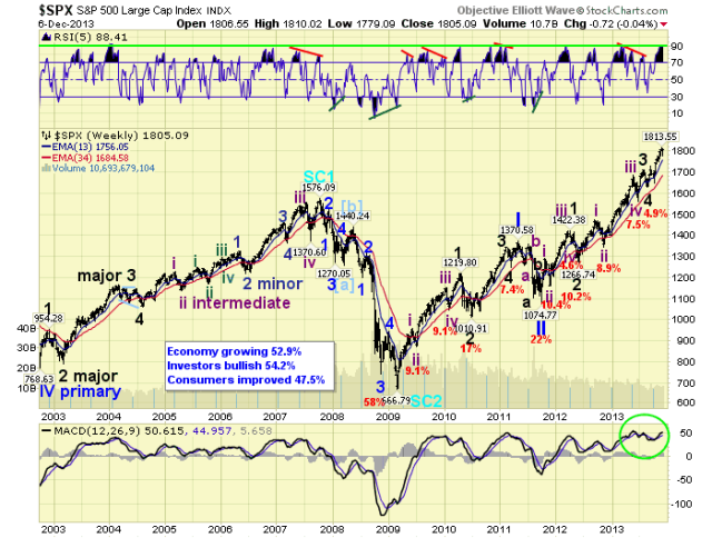
Relentless isn’t it. The Cycle wave [1] bull market, now in its 56th month, has exceeded our bull market high projection by about 3%. We have been expecting this bull market to unfold in five Primary waves, and it is still in Primary wave III. Primary waves I and II ended in 2011. Primary III has been underway since then. Primary I took 26 months to unfold, and Primary III is now in its 26th month. Primary I rose a bit more than 700 SPX points, and Primary III is currently a bit more than 700 SPX points as well. How is that for symmetry.

SPXweekly

There are differences however. Primary I had only one subdividing Major wave, while Primary III already has had two. The fifth wave of Primary I was quite short at 120+ SPX points. Primary III’s fifth wave is already nearly 200 SPX points. On the surface it would appear Primary III has the potential to extend in time and price.

MEDIUM TERM: uptrend

Last Friday the market hit an all time high early, and then had its first significant pullback since that rally from SPX 1777 began. There was also an abundance of negative divergences, from short term to medium and long term. This week the market did sell off, declining to SPX 1779 by midday Wednesday. This resolved most of the short term negatives.

SPXdaily

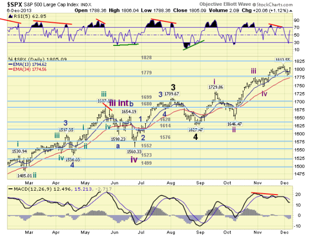
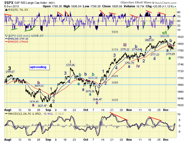
We have been counting the current uptrend since the late August low at SPX 1627. The market first rose in five waves to SPX 1730, then pulled back to 1646. It rose in another five waves to SPX 1775, then pulled back to 1746. And finally another five wave rally to SPX 1814, then a pullback to 1779 this week. We mention this pattern because there has not been one overlap of any of the waves yet. In example: SPX 1746 bottomed above 1730, and SPX 1779 just bottomed above 1775. You can see this on the daily chart above, but it is clearer on the hourly chart below. What this means is that until there is an overlap we can not be certain that an uptrend has ended. Until SPX 1775 is overlapped this uptrend can extend yet again. Medium term support remains at the 1779 and 1699 pivots, with resistance at the 1828 and 1841 pivots.

SHORT TERM

Currently we have a tentative green v/i label at the SPX 1814 high. The ‘v’ suggests a potential Intermediate wave v high, ending Major wave 5 and Primary III. The ‘i’ suggests an Intermediate wave i high, with Intermediate waves ii-iii-iv and v to follow before ending Major 5. Until SPX 1775 is overlapped there is the potential for other counts as well. The overall bias appears to be bullish until SPX 1775 is overlapped.

SPXhourly

Short term support is at the 1779 pivot and SPX 1746, with resistance at SPX 1810, SPX 1818 and the 1828 pivot. Short term momentum ended the week overbought. The short term OEW charts are positive with the reversal level SPX 1797. Best to your trading!

FOREIGN MARKETS

The Asian markets were mostly lower on the week for a net loss of 1.3%. Fifty percent are in confirmed downtrends.

The European markets were all lower on the week for a net loss of 3.1%. Seventy-five percent are in confirmed downtrends.

The Commodity equity group were all lower on the week for a net loss of 1.5%. All three indices are in confirmed downtrends.

The DJ World index is still uptrending but lost 0.9% on the week. Currently 65% of the world’s indices are in confirmed downtrends.

COMMODITIES

Bonds continue to downtrend losing 0.8% on the week.

Crude is uptrending again and gained 5.4% on the week.

Gold remains in a downtrend losing 1.7% on the week.

The USD is downtrending again losing 0.5% on the week.

NEXT WEEK

Tuesday: Wholesale inventories. Wednesday: Treasury budget. Thursday: weekly Jobless claims, Retail sales, Export/Import prices and Business inventories. Friday: the PPI. The FED has nothing scheduled until the FOMC meeting on the 17th and 18th. Best to your week and Holiday season.

See the original article >>

SPY Trends and Influencers December 7, 2013

by Greg Harmon

Last week’s review of the macro market indicators suggested, as December began that the markets were still strong but getting a bit extended on longer timeframes. It looked for Gold ($GLD) to consolidate or continue lower in the downtrend while Crude Oil ($USO) was biased lower but also might consolidate. The US Dollar Index ($UUP) seemed content to move lower in the short term in the uptrend while US Treasuries ($TLT) were biased lower but nearing support. The Shanghai Composite ($SSEC) and Emerging Markets ($EEM) were biased to the upside with a chance of Emerging Markets running in place. Volatility ($VIX) looked to remain low and might drift higher keeping the bias higher for the equity index ETF’s $SPY, $IWM and $QQQ, but not as strong a breeze as has been blowing. Their charts showed the IWM the strongest and the QQQ not far behind but a bit extended while the SPY showed the most signs of a stall or pullback.

The week played out with Gold bouncing a lot but ending lower while Crude Oil not only found support but bounced higher hard. The US Dollar continued lower as did US Treasuries, now on support. The Shanghai Composite moved to the upside and Emerging Markets sank hard before a strong bounce to tend the week. Volatility pushed higher but then reversed to end the week near unchanged. The Equity Index ETF’s started the week lower before moving back higher with the SPY and IWM reclaiming most of the down move and the QQQ finishing at new 13 year highs. What does this mean for the coming week? Lets look at some charts.

As always you can see details of individual charts and more on my StockTwits feed and on chartly.)

SPY Daily, $SPY
spy d
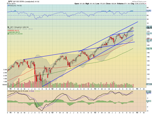
SPY Weekly, $SPY
spy w

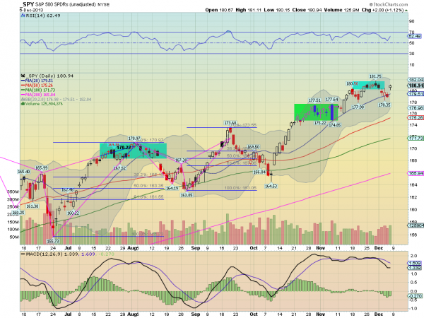
The SPY pulled back as the charts last week suggested it could, finding support at the 20 day SMA. After the non-farm payroll report Friday it gapped higher and held, closing near the top of the day’s range and back in the previous consolidation range. On the pullback, the RSI held above 50 and to the close observer, made a lower low without the price making a lower low. This sets up a RSI Positive Reversal with a target of 182.12. The MACD stopped falling as well and is moving sideways. These support more upside and would be stronger if the MACD started to rise. The weekly chart shows another narrow body topping candle, a Hanging Man. It needs confirmation for a reversal lower. Technically it confirms last week’s Doji lower, but I am not going to call it short for a week 6 cents lower. The RSI on this timeframe remains technically overbought, but with it moving sideways not showing any real strain. The MACD is still rising, supporting the upside. There is resistance at 181.75 and that RSI Positive Reversal target at 182.12 before 187.50. Support lower may be found at 180.40 and 178.5 before 177.50 and 175. Continued Cautious Upward Bias.

Heading into the next week the equity markets look positive but extended on the longer timeframes. Look for Gold to continue lower or consolidate while Crude Oil remains biased higher. The US Dollar Index looks to resume the downward path along with US Treasuries, especially if they break support are biased lower. The Shanghai Composite looks strong while Emerging Markets carry a neutral bias for the week. Volatility looks to remain subdued keeping the bias higher for the equity index ETF’s SPY, IWM and QQQ, with a move lower looking for new all-time highs in the indexes again. The index ETF’s remain biased higher but with caution. The QQQ is the most extended on the weekly time frame with the SPY next and the IWM the least worrisome. Use this information as you prepare for the coming week and trad’em well.

See the original article >>

Everything You Wanted To Know About Equity Market Valuations (And Didn't Know To Ask)

by Tyler Durden

The stock market. Source of unknown riches - but not necessarily for investors. So-called "professional" investors offer to manage your money. However, their fees are based on the level of assets managed, not performance. Hence their goal is to maximize assets, not performance, and prey for markets to behave. You will never hear a bad word about stocks from a professional money manager. the by-laws of many mutual funds do not allow the manager to have cash levels above 5% of assets. He has to be invested at least 95% at all times. On one hand, it is probably right to force money managers to concentrate on stock picking, not market timing. On the other hand, this puts the onus of market timing onto the inidiviual investors. Lighthouse's Alex Gloy's excellent presentation below proves finance doesn't have to be complex (people make it complex).

Via Lighthouse Investment Management's Alex Gloy,

The money management industry would like to have their clients' assets indefinitely, through bull- and bear markets. Ride the wave during good times. And simply state that "nobody could have foreseen this", "we don't have a crystal ball" or "it's too late to sell now" in case of a crash.

There must be a better way to invest.

This publication tries to assess the following questions:

1. What kind of return can be reasonably expected from stock market investments? Is that rate
sustainable?
2. What kind of simple tools exist to tell if the stock market is cheap or expensive?
3. Are stock market returns mean-reverting?
4. Are we going to continue to see similar cyclical fluctuations in the future, or are we in the midst of a structural break?

I will try to keep things as simple as possible. Finance doesn't have to be complex (people make it complex). A picture says more than a thousand words - I hope the following charts help.

Performance: How to Visualize It

How do we look at performance?

Above you see the S&P 500 Index since 18711. By looking at the black line (nominal, non-logarithmic scale) you would think there was no point in investing before 1981. That's why you should look at longterm data on a logarithmic scale. The green surface is the real (inflation-adjusted) S&P 500. Should we look at nominal or real returns? What good is a 10% rise in the stock market if inflation runs at 20%? Conventional wisdom has it that inflation is good for stocks. It that true? Compare the chart on the next page:

Performance: Nominal or Real

Look what the inflationary period of the 1980's did to stocks: not much in nominal terms (black line), but devastating in real terms (green surface). From 1973 to 1982, the nominal S&P remained stable (117 versus 118 points). However, in real terms, the index fell from 640 to 286 (-55%). Yes, you would have lost purchasing power, too, if you kept your money in cash. But that is a different question.

For performance measurement, real returns count.

Today, the S&P 500 is around 1,800 compared to 82 (real) in 1871, yielding a real return of 2.2%3. But the S&P 500 is a price index (as opposed to total return), so we must account for dividends (and reinvestment of those). Including dividends, the total real return is around 6.5%. Impressively, this shows how important dividends are (2/3 of total return) in the long run.

We don't live 142 years, so the average total real return from 1871 to 2013 is not so useful for the individual investor. But you can slice those 142 years into periods of 10, 20 and 30 years. Take the returns over those periods and plot their frequency (see above).

You will notice that among all 10-year periods (blue) you had a few with negative returns. When investing over 20-year periods, you would have suffered only one (ending in 1921) with close to zero return. The longer your investment horizon, the closer the returns are clustered around the average, or expected, value. You can see it visually as the distribution of returns gets "slimmer" (green surface) and contains less "outliers".

The more data points we add, the closer the annual returns lie around the same mean (average). This serves as indication that stock market returns are mean-reverting.

Conclusion: It makes little sense to invest in stocks with a time horizon of less than 10 years.

Problems:

1. In 20 years, many different people will have been at the helm of the job as money manager
2. Career risk: most money managers get terminated after a few quarters of unsatisfactory
performance (hence nobody dares to stick his neck out)
3. End-user risk: very few investors would be willing to accept multiple years of disappointing performance (changing strategy mid-term and hence messing up performance)

And here lies the conundrum: almost nobody is investing according to what theory prescribes.

It doesn't help that you can check on the value of your investments every minute via your smart phone.

Do you check every day what your house is worth? No, because, luckily, that is impossible.

It would probably be beneficial for most investors if their investments traded only once a year. The constant availability of pricing information, coupled with swings from one minute to the next add to psychological pressure, leading to mistakes.

Valuation: Price-Earnings

The previous chapter assumes you don't try to time the market (you just invest whenever funds are available and lock them up for at least 20 years). But the stock market rarely trades at fair value. It is either over- or undervalued. What if you could actually determine those valuations? And what do you base valuation on?

In the long run, stocks are driven by earnings:

The problem: company profits are very cyclical. Meaning: in every recession they decline by large amounts, only to recover strongly afterwards.

From 2006 to 2008, for example, real earnings for the S&P 500 declined from $94.70 to $28.50 (-70%).

The price-earnings multiple, or P/E-ratio, rose from 15.7 to 52.7 despite a drop in share prices. Stocks seem expensive when they are not and vice versa.

So Professor Robert Shiller (Yale) came up with a simple solution to smooth out cyclicality: take the average earnings from the last 10 years. Boom and bust should even out.

Valuation: CAPE

The "cyclically-adjusted price-earnings"-ratio (CAPE, or Shiller-P/E) was born.

It actually does a much better job in pointing out when the stock market is "cheap" or "expensive". It also shows the extent of the stock market bubble in 1999/2000.

The average 10-year CAPE-ratio since 1871 is 17 (low: 7 in 1933, high: 42.5 in 2000). Today, we are at 24.6.

This puts us pretty far towards the expensive side.

What you do know is the starting CAPE-ratio, and assume a regression to mean (17). With today's CAPE (25), we are facing strong headwinds for returns over the next 10 years. Sliding down the above regression line, the expected annual real return for -8 CAPE points is only around 1%. This does definitely not compensate for the risk associated with stocks. As a result, you should lighten up on stocks.

Gloy goes on to discuss the link between GDP and Profits, War, Inflation, and its effect on all markets.

Lighthouse - Equity Market Monitor - 2013-12 by Alexander Gloy

Lighthouse - Equity Market Monitor - 2013-12

See the original article >>

Follow Us