Friday, April 29, 2011

Are Long-Term Earnings Projections Getting Worse?

By James Bianco

Yesterday we noted:
Now that companies have to disclose to all at the same time, we believe their investor relations departments are masters at guiding analysts just below actual earnings. This way the companies “beat” expectations and get the positive press and accolades that come with it. Further, it seems that everyone is happy with this apparent gaming of the system.

And:

In recent quarters, however, revenues are showing an upside bias. Is this because companies are genuinely reporting good numbers or are the investor relations departments now gaming these numbers as well? It’s hard to tell. But we can say in our unscientific review of earnings releases that companies are highlighting revenue beats more now than ever. This is a red flag that these numbers are also being gamed.
If expectations are being gamed on quarterly earnings, what about long-term earnings? Are they a better measure of economic health?

After 25 Years, Are We Getting Better?

In the chart below, the red line shows actual 12-month operating earnings for the S&P 500. The blue line shows the 12-month forward estimate lagged on year. In other words, the red line shows earnings over the previous 12 months and the blue line shows what analysts expected these earnings to look like. The blue bars in the second chart show the difference between these two measures. The source for this data is S&P and Bloomberg and it is calculated on a “bottom up” basis (more on this below).


Note the variance in earnings versus expectations above. The Great Recession caused a massive divergence between expectations and actual earnings. Historically it seems as though the variability between these measures is growing. Whenever analysts miss, their error rate seems to be larger than it was the last time they missed.

Top Down Versus Bottom Up

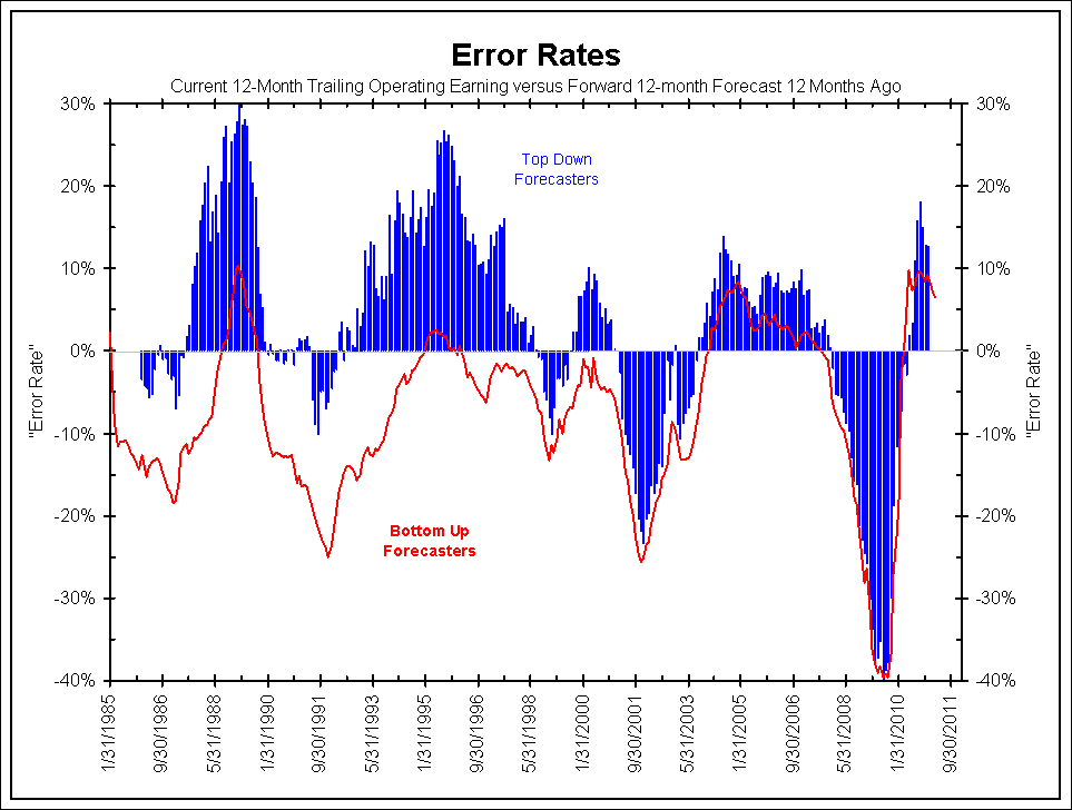
The next chart comes from IBES data. The two measures show the same error rates as explained above. The red line shows the error rate for bottom up forecasters. This is the sum of the earnings estimates for the 500 companies of the S&P 500. The blue bars show the error rate for top down forecasters, or strategists.

From 1985 to 2000 the error rates of top down and bottom up estimates varied greatly. Much of that period the top down forecasters were offering earnings guesses that were below the actual results (resulting in a positive divergence). The bottom up forecasters were often too optimistic and their guesses were above actual results (resulting in a negative divergence).

Since 2000, however, the top down and bottom up forecasts have been in synch with each other. And since 2000, the error rates are the largest we have seen in the last quarter century.


Conclusion

Earlier this month we suggested that U.S. Equities Remain Undervalued. This is completely correct if one can trust earnings estimates. The charts above suggest the estimates “work until they do not.” Restated, earnings estimates often miss when the economy goes into recession. Investing off estimates will usually result in profitability as the economy expands and losses when a recession hits.

See the original article >>

Dyseconomics: The New Macro Econ and The Greatest Economic Boom Ever

By: Submissions

Cetin Hakimoglu writes: *warning the views of this summary may appear bunt, infuriating, and or egregious, but this is my analysis about why things are the way they (normative economic Natalie Bassingthwaighte s) versus a populist feel-good rant about the fed or shadow banking. *

The greatest economic and stock market boom in human history is unfolding because of a counter intuitive economic system called dyseconomics. Dyseconomics is a portmanteau of dysfunctional and dystopian with economics, but it’s actually the optimal economics system strong economic and stock market growth in today’s global economy. It’s dysfunctional or dystopian because it consists of things that people generally don’t like such as high government deficits, high unemployment, and a falling dollar. Dyseconomics is not only an economic practiced by policy makers but also describes the economic developments over the past decade (although most of these are not new, they have all coincided over the past 10 years). Dyseconomics:

1. Increased government intervention in financial markets (bank bailouts) and aggressive monetary policy (cutting rates in financial panic) to keep economic growth steady and recessions & bear markets brief.

2. Economic interdependency between the US and BRIC markets.

3. Increased government spending for things that create economic growth but are not necessarily socially popular such as war, national security, bailouts, stimulus, and tax cuts.

4. Disregard for US dollar and deficits by policy makers. A lower dollar combined with low rates makes the deficit less burdensome, while falling dollar helps multinationals. This spending is subsidized by foreign governments.

6. Two-track inflation characterized by low core CPI and low treasury yields, but steadily rising cost of living inflation due to relentless global economic growth, permanently low rates, and to a lesser degree price gouging & speculation.

7. An economic system that seems to exclusively benefit the ‘elite’ and multinationals though globalization and low borrowing rates.

8. Fed keeping the foot on the gas even during strong economic expansion and only releasing the gas pedal very slowly. It’s not like the 80’s and 90’s interest rates were high as the economy boomed.

9. Breakdown of Okun's law (decoupling of employment and GDP). What this means is economic output is unaffected much less today & in the future by high unemployment than in the past.

10. Dollar-denominated assets (oil, euro, gas prices, high-end real estate, metals, grains, stocks, web 2.0 company valuations) rising and falling in lockstep with the stock market. This is in contrast to the 80’and 90’s when commodities, the dollar, and stocks showed little correlation.

Alan Greenspan’s non-mistake and the 2002-present economic boom

Contrary to popular belief Alan Greenspan didn’t hurt the economy by keeping ‘rates too low’ but was instead adhering to dyseconomics which gave him the luxury of leaving rates low for an extended period. The media would have you believe that had Bush and Greenspan been more fiscally conservative the economy would have been better off by preventing the 2008 recession. The media is wrong because when the stock market crashed, so did PE ratios falling from a high of 22 in 2007 to the low teens. If the fundaments were in trouble PE ratios would have risen or stayed the same as what happened in 2001 when the PE ratio of the S&P 500 actually hit a peak of 47 after the crash due to falling earnings. At the peak of the technology bubble the S&P 500 had a PE ratio of nearly 35 with the index at 1,500; now it’s at 1,300 but the PE is only 23 so you could extrapolate that if it were valued at the same level it was in 1999 it would be at over 2,600. That 1,100 point difference (even after the 2008 recession) is pure earnings that can be attributed to market friendly economic policies of the past decade.

As of March 2011 median US home prices are slightly lower than they were in early 2009, but GDP & profits have recovered markedly lending further doubt to the supposed correlation between the housing market and overall economic strength. Greenspan may have helped inflate a big bubble, but when it burst the S&P 500 felt it only modestly (in terms of profits & earnings). During Greenspan’s 18-year tenure the US economy was in recession for only 16 months, and even after the 2007-09 recession the total duration was just 34 months over the past two decades.

Remember the infamous Clinton surplus? The economy entered a recession on it, further dispelling the notion that high debt implies an unhealthy economy. High interest rates, relatively high personal savings rate, lack of spending contributed to it. Essentially, money began stagnating the late 90’s as the country became a giant piggybank.

Then came the dotcom crash, Iraq and Afghanistan wars, massive tax cuts, low rates, and the BRIC economic boom. These events prevented what could have been a repeat of Japan’s multi-decade economic malaise. Corporations were once again flush with cash and began reporting larger profits & earnings than ever.

As you can see from the chart below during the 90’s PE ratios gradually rose in tandem with the S&P 500, eventually peaking AFTER the market plunged! Since 2002 there has been a divergence meaning that earnings are so good that PE ratios fell despite stocks rallying. Therefore, you can surmise that the economic fundamentals in the past decade (under the least popular president and fed chairman) till the present are better than they were in the 80’s and 90’s, but you won’t hear that from the media.


S&P 500 earnings growth rivals that of the 90’s according to the chart http://static.seekingalpha.com/uploads/2010/6/11/283299-127626464876247-Joe-Eqcome.jpg earnings yields for the past decade matched or exceeded that of the 90’s and presently at the highest rate since 1994.

GDP calculations don’t fully reflect this growth due to the trade deficit deduction, which has become irrelevant as deficits haven’t been shown to be inflationary and economically detrimental. Fund managers know this and that is why the S&P has doubled even though GDP growth is only at 3%. Furthermore, projected United States GDP growth for 2011 exceeds that of any country in the Eurozone.

Exports, productivity, government spending, information technology, low rates, globalization, robust profits & earnings for multinationals, low taxes are the key driving factors for this economic expansion and huge bull market. None of these things shows signs of slowing. The chart below shows an obvious ‘v’ shaped recovery in exports:


Job creation, small business, and housing will have to sit on the sidelines in this boom. Small business is unable to take advantage of low cooperate bond rates, pricing power and globalization that multinationals enjoy and there’s nothing the government can do to spur more hiring or small business expansion that isn’t already being done.

Bank bailouts …a success and a necessity

We constantly read on the blogosphere and to a lesser extent in the main stream media in 2008 and 2009 about how the bank bailouts would lead to moral hazard and a Zimbabwe like hyperinflationary scenario. While risk taking is making a comeback, there was no hyperinflation. Short term yields are hypersensitive to financial shocks allowing bailouts and infusions to be made with impunity. The cost of TARP according to the bond markets was essentially free and it would have been reckless for policy makers to not take advantage of this opportunity.

Letting the banks ‘run wild’ can create volatility, but it’s easy to remedy by ‘printing it away’ as was shown in 1987 black friday, 1998 LTCM and 2008. The 2008 financial crisis, while deep, was brief thanks to the expediency of Bernanke, Geithner, Paulson, and G.W Bush. Risk tasking should be encouraged because it creates innovation and when things do, on occasion, go badly it’s pretty easy to fix the problem due to ‘free money’ in the form of perpetually low rates.

In retrospect the Bernanke TIME man of the year nomination was justified when you look at how well the stock market and economy has done in the past two years.
The debt binge is sustainable

Dyseconomics is not Reaganomics in that ‘reckless’ government spending is almost encouraged because it’s subsidized by an insatiable demand for US treasuries by BRIC and public & institutional holders, thus allowing deficit fueled growth without upsetting the bond vigilantes. This is evidenced by perpetually low 10, 30 year treasury yields. Until GWB came into office the BRIC was in its infancy and income taxes and interest rates were raised on numerous occasions out of necessity. The rise in BRIC economies, more specifically BRIC surpluses, correlates negatively with long term rates. The republican and libertarian fears about tax hikes because of the bailouts & stimulus were unfounded and still are. Despite the bailouts, two wars, and stimulus income taxes have not increased a single penny since Clinton’s tax hike and they will probably never increase again thanks to huge demand for treasuries.

The chart shows below foreign ownership of treasuries has surged in the past decade, enabling the fed to keep rates low


The next chart shows how China’s trade surplus depresses interest rates:


What about China dumping treasuries? Japan and China, whose economies depend on exports aren’t going to begin a trade war by dumping treasuries, so the politically unpopular trend of foreign government helping to subsidize ‘reckless’ spending will continue.

A huge bull market for stocks & web 2.0

The DJIA is poised to hit 17,000-20,000 within the next 2-3 years. By the time the interest rate cycle peaks at 4-6% the DJIA may be well above 50,000. The S&P 500 has already doubled from its March 2009 lows and interest rates still haven’t bunged. Bernanke may finally raise rates by a quarter or half point when the DJIA crosses 15,000.

Will there be a repeat of the 2008 commodities crash now that prices seem overheated again? Odds are no. It just so happened that the financial panic coincided as oil hit $150. The failure of several financial institutions, decline in confidence and the resulting stock market crash had nothing to do with oil. Unless there is a double dip commodities will continue their upward trajectory due to huge global demand, speculation, low rates. The unpopular truth is that surging commodity prices will not hurt growth, but may actually increase growth by forcing people to reduce their personal savings to purchase inelastic goods.

What if the fed begins to raise rates? Will this cause stocks and commodities to crash? No. Between 2004-2006 commodities, stocks, and interest rates rose together because rates were low relative to the expected/anticipated rates. When Bernanke does eventually get around to raising rates the rate hikes will be well-anticipated according to various prediction markets. Rate hikes cause deflation when they are unexpected and exceed the federal funds forecast rate.

The Facebook IPO will be a resounding success with the valuation rising to $200 billion within the first few months of trading. But it won’t be a bubble due to huge growth from facebook ads and its initially high PE ratio will rapidly contract as was the case with BIDU, GOOGLE, OPEN and other successful internet IPOs. The groupon and potentially a twitter IPO will be a similar success.

Usually what seems like a bubble isn’t. Remember the China economy ‘overheating’ talk of 2006? Or how Priceline, Netflix, and Baidu were overvalued last year? Those things still keep going strong and will continue to do so as long as the fundamentals of the economy remain strong.

Living expenses through the roof
Surging commodity and living expenses will result in even more populist angst (if that’s even possible), but have no negative impact on economy. The demand for food, energy, healthcare, education (the stuff rising the most) is considered to be inelastic. But the increased spending on these inelastic goods will translate into pure top line GDP growth without impacting elastic goods such as computers, appliances, and apparel. Thus, surging living expenses helps the economy and stock market by forcing consumers to spend more on these inelastic goods.

The personal savings rate will fall into negative territory like it did in 2008. We’ll see $5/gallon gas, $2000+/ounce gold, $150+ oil and parabolic charts for grains. Unlike in 2008 there will be no collapse; non-core components of the consumer & producer price index will keep rising, but treasury yields will rise only slightly confounding many of the experts like Peter Schiff who have been pounding the table about an impending ‘dollar crisis’ and hyperinflation. Technically there inflation, but it’s non-core inflation, which is the kind Bernanke and the bond market ignores.

Healthcare and college tuition costs will not relent. There will be no popping of the credit card or tuition bubble. The seismic shift in the labor market in the past decade to more technical, specialized jobs is contributing to the college boom.

Winner takes all economy

Companies that are market leaders today such as Facebook, IBM, Netflix, Apple, or Google will remain so long into the future. Large cap, globalist companies and high net worth individuals are the main beneficiaries of current economic policy. The system is one that seems to help those who have the most. if you’re out of college and have a lot of debt or out of a job don’t expect much help from the government. It’s a nation of huge personal debt but huge S&P 500 profits, too. The wealth gap will keep widening and wages continue will lag inflation. Healthcare, education, student loan debt, gas, energy, food will keep skyrocketing. It’s not fair and there’s nothing anyone can do about it. Buying and holding stocks, Euro, and commodities is one way to profit off dyseconomics. Or emigrate before the purchasing dollar becomes nonexistent and you’re stuck.

Job loss, unemployment not such a big deal

High unemployment has been shown to have a negligible to non-existent impact on consumer spending. Ref (http://www.savingpontiac.org/images/torturethenumbers.pdf ) According to msnbc Consumer spending was growing at the fastest pace in four years in the final three months of 2010 The S&P 500 consumer discretionary spider is well above its 2007 pre-recession highs. But the economic gains from high unemployment cannot be dismissed in the context of dyseconomics. High unemployment gives the fed a good excuse to never raise rates that the public will buy (the real reason is BRIC surpluses as explained earlier). High unemployment makes the remaining workers more productive which means higher profit margins. When consumers are less confident they are more productive, but still spending the same amount of money on essentials like gas and food as well as ipods, Netflix, Priceline etc. Spiking consumer confidence could be a bearish indicator for the markets. Finally, any weakness in American consumer & business spending from high unemployment is easily compensated by growing foreign business & consumer demand, and combined with a falling dollar you have a win-win situation for S&P 500 exporters. It’s not like the 80’s and 90’s when foreign markets were much smaller.

For the aforementioned reasons policy makers aren’t expressing much enthusiasm for getting people back to work. Also, No one can ‘force’ companies to hire more people. NO publics works, no shovel ready projects.

Wall st. and the fund managers don’t care about unemployment or housing because the economy in terms of earnings, exports and profits is doing great. That’s what matters from an investor’s standpoint. If you’re a trader a failsafe strategy is to buy the dip of any job news related selloff.

Unemployment will remain above eight percent for remainder of the decade, and may exceed ten percent if more people look for jobs. Their efforts will prove mostly futile as outsourcing, productivity, and technology means fewer workers needed. The baselines unemployment will settle at 7-8% and the total US labor force will continue to shrink. Structured labor tracked by the government will continue to be replaced by underground work.

Conclusion
Even with mainstreet is sitting on the sidelines the US economy now is stronger than it was at any other time in history thanks to dyseconomics. Permanently low interest rates combined with booming earnings and profits makes for a formidable bull market.

See the original article >>

Why commodity prices are soaring

By Dan Denning

A 200-year-old trend may now be over... Is demand growth responsible for the recent surge in commodities? Or is it just a plain old inflationary increase in global money supply?

Right now, all roads lead to China, which is why it's fitting that Australia's Prime Minister Julia Gillard is there at the moment. Maybe she can advise the Chinese on whether Australia's Foreign Investment Review Board will knock back Barrick Gold's C$7.3 billion bid for the Perth-based Zambian copper play Equinox. Barrick's recent bid trumps the offer made by Chinese-backed metals trader Minmetals Resources.

You can see why a metals trader would chase a large copper play. But why would a gold company want to become a copper company too? Not being familiar with Barrick's balance sheet, we don't know if the growth in the asset column (at this price) will lower Barrick's return on equity.

But it's obvious both Barrick and China are bullish on copper. Both Barrick and China are therefore bullish on China. Which brings us to Jeremy Grantham!

You may have already heard of Grantham. He's the Chief Investment Strategist at GMO Partners. He's also a bit of a contrarian, and ruffled a few Aussie feathers last year when he said the local housing market was a "time bomb" and predicted the failure of at least one major bank.

Grantham doesn't have a black box. But he does view markets as essentially mean reverting. Things can't stay overvalued or undervalued forever. He views Aussie house prices as overvalued. But in his April letter, he surprised a lot of people by concluding that commodity prices will go higher.

Grantham writes that, "Accelerated demand from developing countries, especially China, has caused an unprecedented shift in the price structure of resources." You can read the whole letter here.

Grantham is basically saying that "This time it's different with commodities". Why? He's claiming that the growth of the developing world is eclipsing the world's ability to provide the raw materials of civilization at ever cheaper prices. It's no small claim. It reverses about two hundred years of history.

The primary trend in commodity prices is down and has been for the last 200 years. Anyone who is arguing for a long-term bull market in resource prices has to contradict this chart. And the chart makes sense once you look at the grand sweep of economic history.

As more areas of the world are open to exploration (North America and Australia and New Zealand in the 19th century) commodity producers found more of what they were looking for. There were more places than ever to look for copper, oil, iron ore and places amenable to growing wheat, rice, and corn. What's more, improvements in technology made resource extraction cheaper and more efficient.

So why is 200 years of proven pricing history in the commodities markets now changing? Grantham says population growth and GDP growth in the developed world is what is "different" this time. He writes that:

The primary cause of this change [toward structurally higher commodity prices] is not just the accelerated size and growth of China, but also its astonishingly high percentage of capital spending, which is over 50% of GDP, a level never before reached by any economy in history, and by a wide margin

I believe that we are in the midst of one of the giant inflection points in economic history. This is likely the beginning of the end for the heroic growth spurt in population and wealth caused by what I think of as the Hydrocarbon Revolution rather than the Industrial Revolution. The unprecedented broad price rise would seem to confirm this.

This means you can put Grantham squarely in the "demand growth" camp for explaining rising commodity prices. It is a bit odd that Grantham is citing China's massive, commodity-intensive fixed-asset investment as a source of commodity demand, without connecting China's investment binge to its huge accumulation of US Dollars (the whole relationship itself being the major product of the credit bubble).

TWO INTERESTING DIVERGENCES…

by Cullen Roche

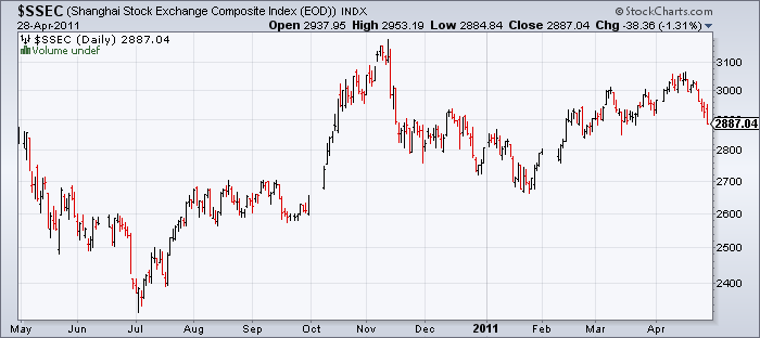
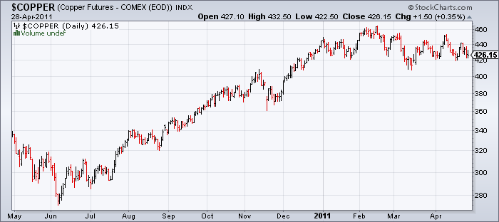
While the markets have continued to melt higher on the hopes of perpetual Fed easing and “better than expected” earnings, some interesting divergences are occurring. In particular, copper prices and the Shanghai Composite are in retreat. The Shanghai Index has proven to be a particularly good leading index in recent years. While the recent divergence is short-lived it is worth keeping an eye on. Slower growth in Asia would be foreshadowed by their equity markets (which have a very high correlation with commodity prices and copper in particular) and as I’ve continually said – slower growth in Asia would be very troubling for a western world that is barely gripping onto a sustainable recovery.


The Shanghai Composite is down 5% in the last few weeks


What In the World Happened in the Grain Markets!?


Today was what we call a "bloody day" in the grain markets with the board lit up with Red. July corn ended Limit-down today finishing at 729 3/4, July wheat ended down 34 1/2 cents finishing at 775 1/4 and July Soybeans ending down 31 cents finishing at 1351 3/4. Throughout the day I have been hearing folks in the media giving out their different opinions on why the market broke so hard. I want to share with you what I wrote in my opening comments in this morning's report. If you are still scratching your head over today's session, I think this will make some sense to you.

With the Fed and their All-Star Mr. Bernanke on the mound yesterday, the crowd was expecting a real barn-burner. Carefully articulated words and crafted thoughts have however left fans leaving the park scratching their heads. In a nutshell, the Feds elected to let QE2 expire as planned, in addition the Fed left rates unchanged and have suggested that extremely low rates will more than likely be maintained for an "extended" period. There was some verbiage and a little more talk than normal about "inflation" and the continued thoughts that inflation is "NOT" an issue. The Fed, and in particular, Bernanke believe the current level of "inflation" is right were it needs to be, and in a sense, I get the feeling this is exactly where they wanted it. Additional comments confirmed that QE2 is still right on schedule to end in June, and that not only rates, but the US Dollar and inflation are not really a major concern into the foreseeable future. In essence, I believe they feel the problems will eventually take cafe of themselves. 

What does all of this mean? I am of the opinion that Mr. Bernanke has a plan and that his plan is going according to schedule. Yes, he would like to see more improvements in jobs, and he would like to see US Housing data improve, but it seems that he is starting to get the ship turned in the right direction. I have learned through the years to listen intently to those who have more experience, education and training. Rather than simply sitting back and arm-chair quarterbacking their every move, and critiquing each mistake, I prefer to try and understand their thoughts and predict their "next" move. Any idiot can talk about what "has" happened, and what they "would" have done, but when given the wheel most would fold in a heart beat. Bernanke has certainly been around the block a time or two, and I am fairly certain he has "forgotten" more about these markets than I know about them. Therefore I am choosing to listen intently rather than criticize. 

Let me give you a brief little rundown on Mr. Bernanke before you jump on the bandwagon and play into the rhetoric that the man doesn't know what he is talking about. Bernanke was in Dillon, South Carolina. From what I am told, his father was a pharmacist, and his mother was an elementary schoolteacher. He has a brother and a sister, and grew up very much just like you and I. During his youth he worked on construction crews, and waited tables. He graduated valedictorian and played saxophone in the marching band. I have read that since his high school did not offer calculus, he learned it on his own. Bernanke achieved an SAT score of 1590 out of 1600, and went on to attend Harvard University were he graduated with a B.A. in economics summa cum laude in 1975. From there he jumped over to the Massachusetts Institute of Technology were he received his Ph.D. in economics in 1979. Bernanke went on to teach at the Stanford Graduate School of Business from 1979 until 1985, and was a visiting professor at New York University. From There he went on to become a tenured professor at Princeton University in the Department of Economics. He resigned his position at Princeton in order to serve as a member of the Board of Governors of the Federal Reserve System from 2002 to 2005. In June 2005, Bernanke was named Chairman of President George W. Bush's Council of Economic Advisers, and resigned as Fed Governor. The appointment was widely viewed as a test run to ascertain if Bernanke could be Bush's pick to succeed Greenspan as Fed chairman the next year. On February 1, 2006, President Bush appointed Bernanke to a fourteen-year term as a member of the Federal Reserve Board of Governors, and to a four-year term as Chairman of the Fed. On August 25, 2009, President Obama announced he would nominate Bernanke to a second term as chairman of the Federal Reserve, bringing us to where we are today. 

I think Bernanke knows exactly what he is doing, whether it plays out the way he plans is another story. I think he honestly doesn't fear inflation because he knows the recent commodity rally and US Dollar weakness is self induced. He believes QE1 & QE2 did exactly what he had envisioned and that was to spark inflation, weaken the US Dollar, and jump start the economy. Obviously with a major goal of turning around the stock market and getting earnings back on track he has done just that. By him not fearing inflation and in fact calling it "transitory" (transitory: meaning existing or lasting only a short time; short-lived or temporary) you have to recognize or read between the lines that he believes commodity prices will not remain at these levels for long. In essence you have to feel that when QE2 ends and with no QE3 in the deck, commodity prices in general may start to ease. With this in mind, I will be looking to make more sales on the rallies and downgrade my overall bullish stance towards commodities as a whole. Do I think the bull run is over? No, I think global "demand" will continue to be a driving force for years to come, but I do however think the self-induced steroid needle will soon be pulled out of the commodity markets arm, and a brief stint in "rehab" may be required in order to deal with the withdrawals. 
 
* I doubt the big boys will stop playing the game "cold-turkey", rather look for them to start easing their way out slowly. You have to believe QE2 will last at least another 45 days. From that point forward the big players could become a little sceptical of further price appreciation and the risk to reward...use your time wisely. 
 
* My friend and subscriber Dean Ohrt over at Heartland Cooperative made a simple but great statement last night. Dean said, "It is important to take some time and have a plan...If you don’t have a price on paper, more than likely your price will never be reached and you will be selling on the way down." Remember my friends; greed, fear and panic. They are always with us.

* In today's trade I would expect poor export sales numbers in corn and beans, and improved weather forecasts for many areas could lean on todays ag markets, despite weakness in the US Dollar and help from the outsides.

See the original article >>

Switch from corn to wheat much lower than expected

by Agrimoney.com

Livestock farmers are proving "reluctant" to switch from corn to wheat despite the cost savings, Australia's AWB said, a trend which could have a significant impact on futures prices if repeated in the US.
The Melbourne-based grain exporter, whcih ships largely to Asian countries, said that rise in corn prices relative to those of wheat, culminating in corn futures gaining a rare premium in Chicago last week, had been "supportive for Australia feed wheat values".
However, Mitch Morison, ABW's general manager commodities, added that while there were "significant quantities of feed wheat available and despite the wide price spread to corn, consumers are not switching significant feed grain demand to wheat".
An AWB spokesman told Agrimoney.com that while "there have been plenty of sales of feed wheat, the expectation was there would be a lot more switching 'between grains] than there has been".
"It may be people are a bit more wedded to their standard feed than they would make you believe."
Corn vs wheat
Rates of switching between the two grains are being viewed with keen interest in the industry, with wheat viewed as filling in a gap in corn supplies depleted by disappointing harvests and strong demand from ethanol plants.
The US Department of Agriculture caused uproar on futures markets early this month in forecasting a hefty level of replacement of corn in feed rations by soft red winter wheat, the type traded in Chicago.
In theory, wheat's higher protein content makes it the better option for livestock rations even with some premium, with broker Allendale putting its feed value advantage at 15%.
However, observers have also noted the reluctance among farmers to change from tried and tested feed ingredients. Even farmers switching need to implement the change gradually to avoid side effects in animals.
Fears overbaked?
AWB's comments came as it lowered by Aus$10 a tonne, to Aus$352 a tonne, its forecast for returns to farmers from its benchmark east coast wheat pool.
The downgrade came hours after the Canadian Wheat Board, the world's biggest wheat and barley seller, cut its pool estimates by up to Can$16 a tonne, citing that dry conditions for crops in Europe and China had yet to cause significant damage.
"The reality is that neither crop has been totally compromised," the board said.
"The European Union wheat crop is in generally good condition and only the continuation of dry and hot conditions for a prolonged period would have a significant impact on yield potential.
"The Chinese wheat crop has been damaged, but this must be kept in context as the majority of the acreage is under irrigation."
Furthermore, India and Pakistan might "challenge" their wheat export records.

See the original article >>

US stock market returns – what is in store?

By Prieur du Plessis

Stock market movements since the start of the credit crisis have been characterised by relatively high volatility as uncertainty became paramount. And as new pieces of the economic recovery puzzle are added every day, investors are increasingly struggling to make sense of the most likely direction of stock prices.

It seems to be a case of so many pundits, so many views. Has the market started topping out and is a primary bear market about to resume, or will the secular bull market merely be correcting the strong rally that commenced in March 2009, before moving higher? Or is a “muddle-through” trading range in store?

It is one thing to trade the market’s rallies and corrections, but this is easier said than done, with not many people actually getting it right with any degree of consistency. Others are of the opinion that the recipe for creating wealth is simply to follow the patient approach, saying that “it’s time in the market, not timing the market” that counts.

This gives rise to the all-important question: does one’s entry level into the market, i.e. the valuation of the market at the time of investing, make a significant difference to subsequent investment returns?

In an attempt to cast light on this issue, my colleagues at Plexus Asset Management have updated a previous multi-year comparison of the price-earnings (PE) ratios of the S&P 500 Index (as a measure of stock valuations) and the forward real returns, as done by Jeremy Grantham’s GMO. Our study covered the period from 1871 to April 2011 and used the S&P 500 (and its predecessors prior to 1957). In essence, PEs based on rolling average ten-year earnings were calculated and used together with ten-year forward real returns.

In the first analysis the PEs and the corresponding ten-year forward real returns were grouped in five quintiles (i.e. 20% intervals) (Diagram A.1).


The cheapest quintile had an average PE of 8.9 with an average ten-year forward real return of 11.0% per annum, whereas the most expensive quintile had an average PE of 25.5 with an average ten-year forward real return of only 2.1% per annum.

This analysis clearly shows the strong long-term relationship between real returns and the level of valuation at which the investment was made.

The study was then repeated with the PEs divided into smaller groups, i.e. deciles or 10% intervals (see diagrams A.2 and A.3).


This analysis strongly confirms the downward trend of the average ten-year forward real returns from the cheapest grouping (PEs of less than six) to the most expensive grouping (PEs of more than 21). The second study also shows that any investment at PEs of less than 12 always had positive ten-year real returns, while investments at PE ratios of 12 and higher experienced negative real returns at some stage.

A third observation from this analysis is that the ten-year forward real returns on investments made at PEs between 12 and 19 had the biggest spread between minimum and maximum returns and were therefore more volatile and less predictable.

As a further refinement, holding periods of one, three, five and 20 years were also analysed. The research results (not reported in this article) for the one-year period showed a poor relationship with expected returns, but the findings for all the other periods were consistent with the findings for the ten-year periods.

Although the above analysis represents an update to and extension of an earlier study by GMO, it was also considered appropriate to replicate the study using dividend yields rather than PEs as valuation yardstick. The results are reported in diagrams B.1, B.2 and B.3 and, as can be expected, are very similar to those based on PEs.


Based on the above research findings, with the S&P 500 Index’s current ten-year normalised PE of 27.1% and dividend yield of 1.8%, investors should be aware of the fact that the market is by historical standards in “extreme overvaluation” territory. As far as the market in general is concerned, this argues for unexciting long-term returns, and possibly a “muddle-through” trading range for quite a number of years to come.

Although the research results offer no guidance as to calling market tops and bottoms, they do indicate that it would not be consistent with the findings to bank on above-average returns based on the current valuation levels. As a matter of fact, there is a distinct possibility of below-average returns.

Only 10 ETFs Below Their 50-Day Average

by Bespoke Investment Group

At Bespoke we regularly track hundreds of ETFs on a daily basis for our ETF Trends report for Bespoke Premium subscribers. After going through our universe of ETFs today, there are currently only 10 ETFs in our universe trading below their 50-day moving average (shown below). As shown, the majority of these ETFs are all in the Financial sector which has been among the market's weakest sectors. On the upside, both DBS and SLV are currently more than 25% above their 50-day moving average. There are also four different country ETFs that make the list of top ten furthest above their 50-day moving average, but one notably absent country is the United States. While the US has been strong, it has been far from a leader in this rally. 


See the original article >>

The Smart Money Buys When Others Are Fearful


Jeff Clark, BIG GOLD writes: You’ve probably heard the term “smart money” used by various pundits, a reference to those investors and institutions that are consistently better at making money than the uninformed masses. Which begs the question: are you one of them?

To answer that query, let’s first describe smart money (not to be confused with the magazine by that name) so we have an idea of what makes this group of investors successful…

Smart money buys when others are fearful. A good example of this is last year’s Gulf oil disaster. Wild speculation of British Petroleum’s ultimate demise caused panicked bouts of selling. The stock lost roughly half its value in less than two months. To use a classic idiom, there was blood in the streets – and that, of course, was the time to buy. The investor who did so is currently up 50%, and that’s not even measuring from the stock’s absolute bottom.

Smart money sells when others are greedy. My colleague Doug Hornig is a perfect example of selling when others are greedy. In the Nasdaq hysteria of the late 1990s, Doug had accumulated a number of Internet stocks and watched his brokerage account swell to a level he’d never seen before. The greed around him was palpable; everyone was talking about the latest stock pick, the classic sign of a mania in full bloom. “But I’d had enough,” he told me. “My positions had logged spectacular gains, and bottom line, I knew this couldn’t go on forever.” He sold his Internet stocks prior to the 2000 top, just as the greed reached a pinnacle.
Smart money sees trends others don’t. Doug Casey urged readers in 1999 to buy gold, convinced from his own research and study that a bull market was about to get underway. But he couldn’t get an audience; no one wanted to talk about the metal or mining stocks. It goes without saying that he and many of his readers have since profited enormously, with many stocks earning doubles on top of doubles.

Smart money ignores the headlines. Beyond the traditional advice of “Buy the rumor/sell the fact,” smart money largely ignores the blather from mainstream media and instead focuses on the factors that ultimately drive headlines. When it reaches mainstream coverage, the smart money is already invested. And is looking at what will be tomorrow’s headlines.

Smart money plays the big trend, not the gyrations. What do Jim Rogers, Marc Faber, Rick Rule, Doug Casey, and Warren Buffett have in common? None of them “traded” their way to riches. They identified the fundamental factors driving the trend, bought big, and held on. No technical analysis, no trend lines on a chart, no fancy signals from moving averages. And they didn’t get scared out at the first drop in price.

Smart money doesn’t count its money before it’s made. These investors understand there are no sure things, and further, that no one is going to bail them out if their analysis turns out to be wrong. They keep a realistic expectation – and an eye – on their investments. And if they take a loss, they learn from it and refuse to let it keep them from investing again.

And the one that’s becoming increasingly critical to businesses and investors…

Smart money ignores official government reports and relies on its own research. There are copious examples of government reporting that is patently off base. The best current example is the Department of Labor’s CPI number. It claims that core inflation is a mere 1.1%. When looking at all your expenses over the past year, have they risen just 1.1% since last spring?

Here’s what real inflation looks like compared to what the U.S. government reports.


Costs in every major area of our lives have risen greater than what the government states in its core figure. The smart money ignores the official report and instead focuses on its own research and data.

With that description of smart money, the next logical question to ask is, what are they looking at now?
To answer that question, understand the time horizon they have in mind. They’re not looking at next week or next month like a trader would, nor so far out that it will take the rest of their life to realize a profit. The smart money is looking at the likely trends over the next few years.
Therefore, I think they’re asking themselves questions like these:
  • Is real inflation likely to rise or fall over the next few years?
  • Is it more probable that interest rates will remain depressed or move higher?
  • Is the U.S. dollar likely to be stronger or weaker in the next few years?
  • What is the best way to hedge against egregious debt and runaway government spending?
  • Which assets are most likely to make money over the next few years? Which should be avoided?
  • Is it time to invest in real estate again, or will it take the rest of my life to see big profits?
  • Will the global economy be on solid footing during the next few years?
  • Is oil – or something else – the best energy investment?
  • Are gold and silver in a bubble, or will they push higher in the coming years?
The answers to those questions will dictate how the smart money invests for the next few years.
When it specifically comes to gold and silver, they ignore the bubble talk and instead focus on facts and trends. While they acknowledge that precious metals have risen tremendously over the past decade, they’re analyzing the factors that will either continue to drive prices higher or take them lower. So they’re looking at supply and demand trends; fiat currencies and if they’re likely to be further diluted; the logical outcome of too much debt and too much deficit spending; the direction of inflation; gold’s role as a store of value and if there are reasons for it to remain; and just as important, how the greater masses are likely to react to all this.

Once you address those topics, you can determine if we’re in a true gold bubble. And your answer to those questions will determine the action you should take at the next correction.

How does Doug Casey answer the question as to whether we’re in a gold bubble? Here’s what he told me:
“The peak is not going to be here until you hear the money-honeys talking about gold on television and all your friends are talking about the latest silver stock. Don’t worry about charts. Don’t worry about statistics, lines on charts, supply and demand figures, or any of that. The best indication of where the market is at any moment isn’t mathematics. It’s psychology. Watch the public’s psychology.”

While new investors are beginning to enter our sector, the psychology of the gold market is not like the crazed hysteria with the Internet stocks in late 1999. Yes, gold is not cheap, but if we were in a bubble, those shouting “Bubble!” would be buying gold, not bashing it. By Doug’s definition, it’s when their psychology has turned from negative to giddy that will mark the top.

If your own research tells you this isn’t a true bubble in precious metals, then you might embrace the next correction instead of fearing it.

What is the smart money doing with bets on interest rates, energy, commodities, and real estate? And what do they think about the economy and the likelihood of another recession? Is a global currency war about to erupt? And with the anticipated change in the Fed’s quantitative easing policy, how big and long of a correction do they see coming with gold and silver?
DOWNSIDE TARGETS FOR SILVER

By Jordan Roy-Byrne

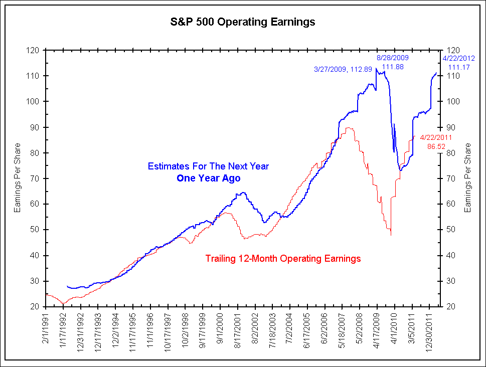
Silver is in a structural bull market and will see significantly higher prices in the coming years. However, now is not the time to be buying. The market has spiked and a retracement is coming. Sentimentrader.com’s public opinion as of last week was over 90% bulls. The daily sentiment index as of last week was 96% bulls. A correction is coming. We have two charts to help decipher a potential bottom.

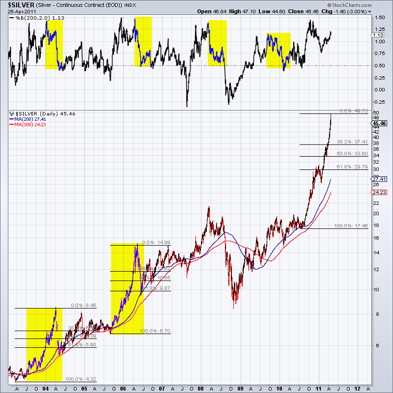
Here is our first chart:


On top we plot Silver’s distance from its 200-day MA. Note that following previous spikes, the market always tested its 200-day MA and it didn’t take long for it to happen. We also compare the current spike to the spikes in 2004 and 2006. Those spikes retraced a little bit more than 62%. The 62% retracement of this spike is nearly $30.

Here is the second chart:


We see two areas of strong support. The first is $34-$37 and the second is $30-$31. We also sketch the potential path of the 300-day MA. We think it hits $30 in July. The 200-day MA is likely to hit $32 before the end of July.

Last year we noted $32-$33 as a potential strong upside target based on the price action in 1980-1981 and various Fibonacci targets. The 38% retracement of the 2008 low to this top is roughly $34.

To conclude, our support points range from $30 to $37 with the strongest confluence at $33-$34.

Throughout 2010 we wrote about the key resistance in Silver at $20-$25. We noted that the breakout would be very big and eventually take Silver to $50. We didn’t expect it to happen immediately. Gold reached its now former all time high in 2008. Three years later, Gold is nearly 80% higher (than $850).

The point is, a market that makes a new all time high for the first time in decades is a market that moves even faster in the future. If Silver follows the same path as Gold then we could be looking at $90 Silver in 2014. Yet, wouldn’t you rather increase your positions in the $30s rather than at $45 or $50? For more analysis and projections on Gold, Silver and the mining shares, consider a free 14-day trial to our service.
Good Luck!

See the original article >>

BREAKING DOWN Q1 GDP


The Bureau of Economic Analysis‘ (BEA) first (“Advance”) estimate of the annualized growth rate of the first quarter 2011 U.S. Gross Domestic Product (GDP) was 1.75%, down significantly from the 3.11% growth rate reported for the fourth quarter of 2010. When compared to the prior quarter the lower growth was caused by a number of factors: somewhat weaker consumption of durable goods, weaker fixed investments, substantially weaker overall trade numbers, and increased contraction in governmental expenditures. The only improving factor was stronger inventory growth, which reverted to form after an anomalous fourth quarter reduction (most likely driven by a noisy, if not aberrant, price “deflater”).

The BEA also reminded us that their “Advance” GDP growth estimate differs on average about 1.2% from their eventual third (i.e., “Final”) growth estimate, and that in July they will restate previously reported growth rates dating back to the first quarter of 2003. Those restated growth rates are not necessarily minor: last July we learned that the “Great Recession” was worse (by as much as a percent in nearly every quarter) than previously reported, and that the bottom of the recession occurred a quarter earlier than we had been previously been told.

As a quick reminder, the classic definition of the GDP can be summarized with the following equation:

GDP = private consumption + gross private investment + government spending + (exports − imports)

or, as it is commonly expressed in algebraic shorthand:

GDP = C + I + G + (X-M)

For the first quarter of 2011 the values for that equation (total dollars, percentage of the total GDP, and contribution to the final percentage growth number) are as follows:

GDP Components Table


Total GDP = C + I + G + (X-M)
Annualized Current $ (trillions) $15.0 = $10.7 + $1.9 + $3.0 + $-0.6
% of GDP 100.0% = 71.2% + 12.4% + 20.2% + -3.8%
Contribution to GDP Growth % 1.75% = 1.91% + 1.01% + -1.09% + -0.08%

The quarter-to-quarter changes in the contributions that various components make to the overall GDP can be best understood from the table below, which breaks out the component contributions in more detail and over time. In the table we have split the “C” component into goods and services, split the “I” component into fixed investment and inventories, separated exports from imports, and listed the quarters in columns with the most current to the left:

Quarterly Changes in % Contributions to GDP


1Q-2011 4Q-2010 3Q-2010 2Q-2010 1Q-2010 4Q-2009 3Q-2009 2Q-2009 1Q-2009
Total GDP Growth 1.75% 3.11% 2.55% 1.72% 3.72% 5.02% 1.59% -0.69% -4.88%
Consumer Goods 1.12% 2.10% 0.94% 0.79% 1.29% 0.42% 1.62% -0.32% 0.41%
Consumer Services 0.80% 0.70% 0.74% 0.75% 0.03% 0.27% -0.21% -0.79% -0.75%
Fixed Investment 0.09% 0.80% 0.18% 2.06% 0.39% -0.12% 0.12% -1.26% -5.71%
Inventories 0.93% -3.42% 1.61% 0.82% 2.64% 2.83% 1.10% -1.03% -1.09%
Government -1.09% -0.34% 0.79% 0.80% -0.32% -0.28% 0.33% 1.24% -0.61%
Exports 0.64% 1.06% 0.82% 1.08% 1.30% 2.56% 1.30% -0.08% -3.61%
Imports -0.72% 2.21% -2.53% -4.58% -1.61% -0.66% -2.67% 1.55% 6.48%

The most recent quarter’s overall slower growth resulted from weaknesses in several parts of the economy:

► Changes in net foreign trade pulled the headline growth number down by 3.35%.
► Fixed investments contributed 0.79% less to the headline number.
► Shrinking governmental expenditures lowered the GDP growth by 0.75%.
► And lower consumption of consumer durable goods dropped the growth rate by 0.67%.
Only one component contributed significantly to the annualized growth when compared to 4Q-2010:
► Inventory building added 4.35% to the headline number.

At this time last quarter we were concerned that large swings (greater than 5%) in the contributions being made by the foreign trade and inventory numbers dwarfed the overall changes. Now we see those large swings reversed and reverting to their multi-quarter trend lines, indicating perhaps that aberrant Q4-2010 deflaters did indeed impact the substance and quality of the fourth quarter’s reports.

Absent those swings, the data shows that the recovery remains weak. Again, consumers, governments and commercial investments were contributing less to growth during the first quarter of 2011 than during the fourth quarter of 2010.

The BEA often highlights the “real final sales of domestic product” (GDP less the change in private inventories) as a good indication of the overall state of the economy. In this report the annualized growth rate for real final sales of domestic product was 0.8%, down sharply from the 6.7% growth rate reported for Q4-2010 (and cited by some media analysts as further confirmation of a strengthening recovery). Again the 0.8% number is a reversion to the trend line established during the first three quarters of 2010. In fact a cynical read of last quarter’s 6.7% rate might be that it was also merely an aberration caused by the Q4-2010 price indexes.

Although the price indexes used for this quarter (representing an aggregate 1.9% annualized inflation rate) are higher than the credibility stretching ones used for Q4-2010 (which representing an astonishingly low 0.4% annualized inflation rate), they are still significantly lower than the inflationary numbers published by the BEA’s sister agencies. The Bureau of Labor Statistics (BLS) has most recently reported that the quarter ending year-over-year CPI-U rate for all items was 2.7%, even as the foreign trade price indexes showed year-over-year changes in excess of 9%. The importance of persistently low deflaters cannot be over emphasized: if the year-over-year CPI-U at the end of the first quarter is used as an alternate deflater, real final sales actually contracted during the first quarter. Even more alarming: using the first quarter’s average monthly CPI-U rates (a 5.75% annualized rate) would cause the entire GDP to be contracting at over a 2% rate.

We continue to feel that the quality of traditional economic data drops sharply during times of dynamic changes in the economy (or during periods of unprecedented monetary or fiscal interventions on the part of the government).

But if the Federal Reserve had set out to engineer an economic report that would further justify Quantitative Easing while not sending shock waves through the equity markets, this “still recovering but at a much slower rate than we might like” report provides exactly what they would like to see.

See the original article >>

QE2′S FAILURE AND THE HOUSING MARKET

by Cullen Roche

Wednesday’s MBA mortgage applications data highlights another glaring error in the efficacy of QE2. While the Fed loves to point to rising equity prices (while denying blame for commodities) they appear to conveniently ignore the consumer’s largest asset – housing. In the now infamous Washington Post op-ed Chairman Bernanke discussed the role that QE2 would play in helping to boost the housing market:
“Easier financial conditions will promote economic growth. For example, lower mortgage rates will make housing more affordable and allow more homeowners to refinance.”
Since then we have heard nary a peep about the housing market. And that’s because mortgage rates have spiked and housing conditions have become anything but “easier”. And as we all know, the housing market remains a disaster with housing prices continuing to decline, record low sales, climbing inventories and rising interest rates. The key here is interest rates and it highlights the failure of QE2. While many academics like to point to real rates the truth is that the consumer has not noticed the benefit of this rate effect at all. This is clear in the MBA application data where you can see the perfect inverse correlation in applications and interest rates:

Mortgage applications have fallen off a cliff since QE2 began last August

As I’ve stated over and over again, this program was destined to fail from its onset because it targeted size and not price. The housing market is perhaps, the most glaring example of QE2′s failure.

Microsoft's 3Q earnings grow 31 pct; stock falls

By MICHAEL LIEDTKE

Microsoft Corp.'s latest quarterly earnings rose 31 percent even as sales of its Windows operating system sagged.

The fiscal third-quarter results released Thursday exceeded analyst estimates.

Still, it marks the second straight quarter that revenue in Microsoft's Windows division has dropped from the previous year.

That may heighten investor worries that Microsoft's lucrative franchise of licensing software for personal computers may be heading into a gradual decline. The company faces threats from the iPad and other tablet computers that rely on rival operating systems made by Apple Inc. and Google Inc.

Revenue in Microsoft's Windows division fell 4 percent, slightly worse than the fall-off in PC shipments tracked by the research firm IDC for the same three month stretch ending in March.

Microsoft shares fell 55 cents, or 2 percent, to $26.16 in extended trading Thursday after the quarterly results came out. The stock has fallen by about 6 percent so far this year. The Dow Jones industrial average, which includes Microsoft, grew 10 percent during that time.

The tablet threat is dogging Microsoft even though most of its business is thriving.

The company, which is based in Redmond, Wash., still has hot-selling products: among them, the latest version of its Office software suite for desktop computers and its Kinect motion-sensing controller for the Xbox 360 video game system.

But the boom days might not last much longer unless Microsoft can overcome its late start in tablets and become more formidable in Internet services, where both consumers and businesses are spending more time and money.

Smartphones, a handheld computing field currently dominated by Apple, Google and Research In Motion Ltd., also remains a weak link for Microsoft.

Microsoft earned $5.2 billion, or 61 cents per share, in the January-to-March period. That compares with net income of $4 billion, or 45 cents per share, a year ago.

The results included a tax benefit of 5 cents per share from a settlement of an audit covering 2004 to 2006. Even without that one-time gain, Microsoft's earnings would have topped the average estimate of 55 cents per share among analysts surveyed by FactSet.

Revenue increased 13 percent to $16.4 billion — about $250 million above analyst estimates.

Microsoft's online operations made progress in the latest quarter, boosted by gains from the early stages of an Internet search partnership with Yahoo Inc. Microsoft's online revenue increased 14 percent from a year ago, but still suffered an operating loss of $726 million.

Driven by the Kinect demand, revenue in the company's entertainment division climbed 60 percent in the quarter.

See the original article >>

Follow Us