Thursday, June 2, 2011

Cotton price to tumble, despite production threats

by Agrimoney.com

Cotton experts have reinforced their forecast for a return to more typical conditions in the cotton market, saying that prices will become less volatile, besides suffering a "significant" decline from historically high levels.
The International Cotton Advisory Committee acknowledged that prospects for world production of the fibre had dimmed, cutting its output forecast by 300,000 tonnes to 27.3m tonnes.
Nonetheless, supplies would prove larger than had been expected thanks to bigger carryover stocks from this season, when higher prices are causing a bigger dent to consumption than had been thought.
"This season started with a firm demand from spinning mills, which were looking to rebuild their stocks depleted in 2009-10, but is ending with weaker demand," the influential intergovernmental group said.
Price impact
Indeed, the ICAC ditched expectations of a small rise in consumption this season.
ICAC cotton forecasts for 2011-12 and (year on year change)
Area: 36.3m hectares, (+8%)
Production: 27.3m tonnes, (+8.8%)
Consumption: 25.8m tonnes, (+3.2%)
Exports: 8.3m tonnes, (+3.8%)
Year-end stocks: 10.2m tonnes, (+11.7%)
Stocks to use ratio: 39.5%, (4.7 points)
And it forecast that while "use is expected to resume increasing in 2011-12, driven by a projected robust global economic growth and boosted by increased production", growth would be "moderated" by competition with artificial fibres, such as polyester.
With world stocks set to end next season at 10.2m tonnes, equivalent to nearly 40% of consumption, the ICAC restated a forecast that prices, as measured by the Cotlook A index, "will decline significantly" over the season, if "probably" remaining above the 10-year average of 60 cents a pound.
The Cotlook A, which measures a basket of physical cotton prices, is expected to average 165 cents a pound in 2010-11.
"It is also possible that price volatility, which has been extremely high this season, will decline in 2011-12, as increased global cotton supplies may give more confidence to market players," the committee added.
Drought threat
The forecast tallies with an outlook from Barclays Capital, which expects cotton prices "to decline in the second half of 2011 on higher global production".
"Global balances are likely to ease over the coming months, with year-on-year higher production across key cotton producers," BarCap analyst Sudakshina Unnikrishnan said on Thursday.
However, Rabobank analysts remain bullish on prices, at least over the summer, flagging the "production risks associated with recent prolonged adverse weather conditions", such as drought in Texas, the top producing state in America, which is the biggest cotton exporter.
The proportion of the Texas cotton crop rated in "good" or "excellent" condition was 33% as of Sunday, compared with 61% a year before, US Department of Agriculture data show.
More than 30% of the crop was rated in "poor" or "very poor" health – up from 3% a year ago.
'Positive bias'
"Given current new crop uncertainty in the US due to continuing hot and dry conditions, we expect price direction to maintain a positive bias in coming weeks," Rabobank said.
Luke Mathews at Commonwealth Bank of Australia added: "Forecasts that Texas will remain hot and dry though to Sunday continue to hold up the cotton market."
Nonetheless, cotton for July delivery has recovered some 13% from a mid-May low, despite losing early gains on Thursday to stand 0.3% lower at 160.44 cents a pound in New York at 12:15 GMT.

See the original article >>

China's soy crop to fall twice as far as expected

by Agrimoney.com

China's soybean harvest will decline twice as far has had been thought this year thanks to the better returns to be had from other crops, which will cut area devoted to the oilseed to the lowest of the century.
China's soybean harvest will fall by roughly 800,000 tonnes to 14.4m tonnes, US Department of Agriculture attaches in Beijing said.
The deeper cut than acknowledged in an official USDA estimate of a 14.8m-tonne harvest reflects the greater profits achieved in corn in 2010-11, at an average of $700 per hectare, than from soybeans, which earned farmers $500 a hectare.
"The difference has negative impacted some soybean planting decisions for 2011-12," the attaches said in a report.
Alternative crops
In the important producing province of Heilongjiang sowings are expected to tumble by 10-20%, particularly in central areas "where weather and growing conditions provide farmers more choices for grain crops", the briefing said, quoting information from "industry sources".
In other provinces, soybeans are expected to lose out to cotton, for which national sowings are expected to increase by 6.6% to 5.4m hectares, the China Cotton Association said on Thursday. The estimated rise in cotton area is, nonetheless, smaller than a 9.8% rise forecast in January.
China's overall soybean area, on a harvested basis, was pegged at 8.5m hectares, 200,000 hectares lower than the current USDA estimate and the lowest since 1999.
Import impact
The extent of the decline will exacerbate a production deficit in China, the world's top soybean consumer and importer.
Indeed, the attaches stuck by an estimate of 72.5m tonnes for soybean use in 2011-12, "due to increased use of oilseed byproducts in animal production, and higher vegetable oil consumption" as wealthier consumers eat more and better.
Consumption of all protein meals is expected to rise by 6% to 65.6m tonnes, fuelled by rising hog production, which has hit a three-year high.
However, the attaches declined to raise their forecast for China's soybean imports in 2011-12, standing by an estimate of 58.0m tonnes, of which 25.0m tonnes are expected to come from the US, and viewing the extra shortall being made up from inventories.
On target
China's soybean imports are a matter of market sensitivity, given their scope, accounting for nearly 60% of total world buy-ins.
The country imported 5.4m tonnes of soybeans in May, sufficient to keep the country on track to meet a USDA forecast for 2010-11 lowered to 54.5m tonnes.
US shipments export sales and shipments in the latest week were, at 412,000 tonnes and 163,000 tonnes respectively, above the pace needed to meet USDA forecasts.

See the original article >>

Near-term Correction in U.S. Treasury Bond Market Yield


If the upmove in 10-year yield from the October 2010 low at 2.33% to the February 2011 high at 3.74% represents the first upleg of a new bull phase (higher yield), then all of the action since the February high is a correction that should be bought ahead of a resumption of the prior upmove.

It is with that in mind that we look to add to our model portfolio position in the ProShares UltraShort 20+ Year Treasury (TBT) into current/near-term weakness. 


See the original article >>

Traders are no more interested in holding positions

By Renisha Chainani

May month was divided into two half- where in first half, there was scenario of “SELL in May and Go away” and then in later half “Goldman Sachs spoke and Market listened”. The month of May began with investors heading for the exit as panic selling was seen across the whole sector. The combination of near record short dollar and long commodity positions had become so stretched that only a small spark was enough to light the fire.

In this case the spark came in the shape of silver. On the very first day of May, CME increased margins in Silver by 13% and bubbling market crashed 36% from $50 to $32 in just four trading sessions and the white metal took all commodities in selling mode. Investors remained sidelined in commodity markets after being rattled by a sharp price correction. Steep declines in silver futures quickly spread to other commodity markets, knocking gold off $1,500, crude oil below $100 and forcing copper below $4 a pound

Crude Oil extended selloff due to demand downgrades. Both the DOE/EIA and the IEA revised lower their forecasts on global oil demand this year. The IEA said that persistent high prices and weaker IMF GDP projections for advanced economies are dampening demand.

Then there were fresh concerns on the European sovereign debt situation as S&P downgraded outlook on Italy on weekend while Fitch warned that it may downgrade Belgium's AA+ credit rating. The Greek government, which finds trapped in a "refinancing hole", where the only choice left is to continuously endorse in EU/IMF demands to not default, had to step up the austerity measures again last Monday, announcing another package of public spending and the state sale assets. The Euro took center stage to make new lows against major rival.

Meanwhile, Energy and Metals gained support as Goldman Sachs and Morgan Stanley both raised oil price forecasts on prolonged losses of Libyan production due to conflicts in the region. Goldman Sachs noted that inventories and OPEC spare capacity will become "effectively exhausted" in a matter of time. All Commodities started recovering from its lows after Goldman Sachs called copper, oil and base metals to move higher. Many commodities gained, but the metals and energies are taking the lead and look like they have made the strongest turn higher on the charts.

Goldman Sachs identified copper as "an attractive opportunity" at current prices, advising clients to purchase the metal in a research note. The bullish call helped lifted prices, and continued to draw investment interest to the red metal. Copper also received a boost from worker protests Wednesday at Chile's El Teniente mine, the world's largest underground copper mine. Local media reported that about 1,000 contract workers protested working conditions and wages at the mine, owned by state-controlled Corporacion Nacional del Cobre de Chile.

Safe-haven interest was seen flowing into gold because of the current heightened worries over sovereign debt in the eurozone - notably Greece and Italy. There were advances elsewhere in the precious metals suite, with silver moving conclusively from $32 to $39. These uncertainties over the financial and monetary prospects in Europe will keep bullion markets on tenterhooks and prone to sudden price-swings, although gold may be able to decouple from the rest of the precious sector to some extent.

In my opinion traders and investors alike are apprehensive around these levels and are using economic data and Geo-political news to form their strategies day to day. It appears traders are not eager to hold positions and instead are quick to take profits when readily available. The market has been feeding off the U.S dollar strength versus the weakness of the Euro. The continued fragility in the European Union continues to drag on the Euro and therefore lending strength to the U.S Dollar.

See the original article >>

Russian wheat prices jump after export ban lifted

by Agrimoney.com

The rise in Russia's wheat prices since the lifting of the country's export ban may not - in practice - be as dramatic as has been made out, given merchants' strong bargaining power, a leading analyst has said.
The Russian Grain Union lobby group said that prices of fourth-grade milling wheat, the type used in exports, had soared by some 700 roubles ($25) to nearly 6,000 roubles ($215) a tonne since Vladimir Putin, the Russian prime minister, on Saturday unveiled the lifting of export curbs from July 1.
The rise could even be higher – at least, in terms of what farmers are asking for, Andrey Sizov, managing director of Moscow-based analysis group SovEcon, said, estimating the increase at 500-1,000 roubles per tonne.
"But that is an offer price. It is correct to say the offer price is going up, but that does not mean there is any trade going on at these levels," Mr Sizov told Agrimoney.com.
The Russian wheat market is being keenly watched abroad now that the country, a fierce price competitor, is returning to exports.
Iowa-based broker US Commodities said: "Russia currently has the cheapest wheat in the world. Russia's re-entry into the world grain markets will shift demand from the US in the coming months."
Strong hand
In fact, Russia's wheat market was likely to take a couple of weeks to adjust to the return to exports, as it did when the ban was announced last August, Mr Sizov said.
And prices then were likely to reflect merchants' bargaining power, after stocking up on grains since late April in expectation of a resumption in trade.
"They have enough stocks to export for now."
Indeed, it looked a buyer's market for now, with farmers needing to sell grains to raise funds for the rest of the spring sowings programme, and to finance the forthcoming harvest of winter crops.
"Merchants have strong negotiating power," Mr Sizov said.
'Grim yields'
The comments came as wheat prices continued to fall on international markets, pressed both by Russia's return to shipments and some rain in Europe, where dry weather has considerably reduced crop hopes.
Yields from the initial French winter barley harvest have come in at 3-4 tonnes per hectare, a result termed "grim" by one merchant, if not necessarily representative, so early, of the rest of the crop.
US meteorological service WxRisk.com said that weather models were indicating a "major rain event for France and Germany" next week.
"A major cold front moves into the northeast Atlantic on June 7 and as the front comes into France the UK and Germany this front brings in significant rains."
Australia & New Zealand Bank said: "In particular, this rainfall is timely for Germany, which is a later crop than in France, helping to limit yield declines at this stage."
Chicago wheat for July stood 1.1% lower at $7.74 a bushel as of 11:45 GMT, with Paris wheat for November down 1.4% at E234.50 a tonne.

See the original article >>

Is the Slow Economic Data Due to Japan or Something Deeper?

by Bespoke Investment Group

Over the last several weeks, we have been discussing the slowdown in economic data on both an absolute basis and relative to expectations. Within the investment community there is a debate over whether the slowdown is a temporary side-effect from the massive earthquake in Japan back in March, or part of a broader global economic slowdown. Ultimately only time will settle this debate, but a look at two widely watched economic indicators and how they reacted following the January 1995 Kobe earthquake shows that the recent slowdown is more likely a result of the earthquake in Japan, and therefore temporary in nature.

In the charts below we show the four-week average of US initial jobless claims and the ISM Manufacturing report going back to 1994. In each chart, the red line represents the six months following the 1995 earthquake and the months following the March 2011 earthquake. 

Before the Kobe earthquake in January 1995, the four-week average of initial jobless claims was steadily declining, and then immediately reversed higher when the earthquake struck. It then steadily rose for the next six months and did not peak until more than a year after the earthquake. The current pattern of jobless claims shows a similar one to 1995. As shown in the chart, the four-week average of jobless claims actually hit a post-recession low on 3/11, which was the day of this year's quake, and has now risen in eight of the ten weeks since then.

The ISM Manufacturing Index has also shown some similarities between now and 1995. In 1995, the ISM index declined for five consecutive months following the Kobe earthquake. In the current period, the ISM Manufacturing Index actually peaked in March and has declined in each of the two months since then.

While the two indicators highlighted below do not ultimately prove what has caused the recent economic weakness, they do show some strong similarities to the period following the 1995 Kobe earthquake. Furthermore, the fact that both indicators were hitting their best levels in several years leading up to the earthquake implies that the earthquake is making its presence felt in the data.


Biggest ADP Payroll Misses and Subsequent Nonfarm Payrolls Results

by Bespoke Investment Group

The monthly release of the ADP Payrolls report only began in late 2006, but it definitely gets its fair share of attention given that it always comes out two days prior to the even more closely-watched nonfarm payrolls report. Economists were looking for today's ADP Payroll report to show job growth of 176,000, but the actual number came in much lower at just 38,000, making this the third biggest miss for the report in its short history.

In the table below we highlight how the nonfarm payrolls report did versus expectations following the weakest ADP reports on record. As shown, the two ADP misses that were bigger than today's miss were actually followed up with two better than expected payrolls reports. Back in January 2007 (the December report), the ADP estimate was for +116,000 jobs, and it actually came in at -40,000. The nonfarm payrolls number that came out two days later was then estimated to come in at +96,000, and the actual number came in at +167,000.

At the moment, the consensus estimate for this Friday's nonfarm payrolls number is at 170,000, but following today's ADP report we are already beginning to see that number fall quite a bit.


See the original article >>

COMMODITIES AND THE MISTAKE OF 1937

by Cullen Roche

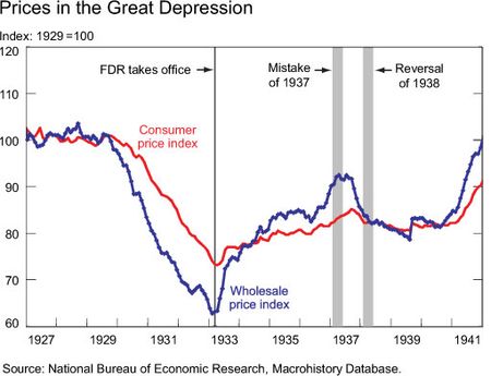
The NY Fed has a very good piece on their blog this morning titled “Commodity Prices and the Mistake of 1937: Would Modern Economists Make the Same Mistake?” It helps shed some light on the current economic environment and shows why investors should not be too quick to assume that high inflation will result from the commodity price increases. They say:
“In 1937, on the eve of a major policy mistake, U.S. economic conditions were surprisingly similar to those in the nation today. Consider, for example, the following summary of economic conditions: (1) Signs indicate that the recession is finally over. (2) Short-term interest rates have been close to zero for years but are now expected to rise. (3) Some are concerned about excessive inflation. (4) Inflation concerns are partly driven by a large expansion in the monetary base in recent years and by banks’ massive holding of excess reserves. (5) Furthermore, some are worried that the recent rally in commodity prices threatens to ignite an inflation spiral.”
They go on to show how economists now focus on headline CPI and not the volatile parts that include commodity prices. This helps “smooth” their outlook and avoid jumping to conclusions. Interestingly, however, the current Fed may have made the exact opposite mistake in 2010.

In August 2010 the Fed panicked over the Euro crisis and a sharp spike in jobless claims that coincided with a few weak economic reports. At the time, prices were in a strong disinflationary trend. And they responded. QE2 was the result. The NY Fed described the 1937 period as a failed response to the rise in commodity prices at the time – in effect, they tightened when they shouldn’t have. You can see the rise in commodities in the following chart:


Ironically, QE2 preceded the most recent surge in commodity prices. And as the BOJ concluded, the Fed and speculation has likely contributed to this rise in commodity prices. As I’ve stated before, this sort of misguided intervention can have a destabilizing effect on the economy. So, interestingly, it’s not the response to the commodity price spike that may have been the policy error this time around - it was the misguided response to price declines, resulting in QE2 that appears to have created the current air pocket in the global economy….

See the original article >>

AAII: STOCK ALLOCATIONS FALL TO 7 MONTH LOW

By Charles Rotblut

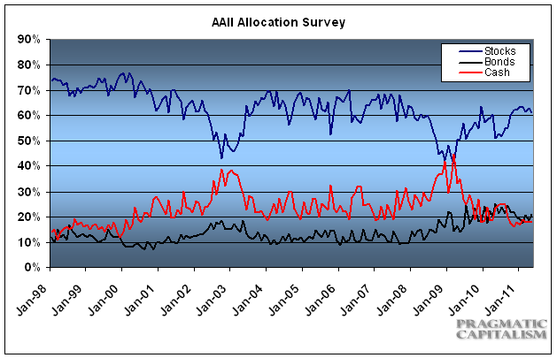
Stock and stock fund allocations fell to a seven-month low according to the May AAII Asset Allocation Survey. Individual investors kept 61.0% of their portfolios in equities last month, a drop of 1.9 percentage points. Even with the decline, May was the eighth consecutive month that stock and stock fund allocations were above their historical average of 60.0%.
Bond and bond fund allocations rose 2.5 percentage points to 21.1%, a six-month high. May was the 24th consecutive month that fixed-income allocations have been above their historical average of 15%.

Cash allocations slipped 0.6 percentage points to 17.9%, a four-month low. May was the 11th consecutive month that cash allocations have been below their historical average of 25%.

The decline in stock and stock fund allocations occurred as optimism about the direction of stock prices fell to its lowest level since last August in our sentiment survey. Ongoing volatility in the stock market reduced some of the cautious optimism that we have been seeing. A rebound in bond prices last month also played a role. It should be noted, however, that last month’s shifts did not impact the trends we have been seeing in our asset allocation survey. Both stock and bond allocations stayed above their historical averages for yet another month.

This month’s special question asked AAII members if they have made any changes to their portfolios because of the ongoing debate over the federal deficit. The majority of respondents said they have not made any changes.

Among those who said they were making changes, many said they were increasing their cash positions. Others said they increased their allocations to commodities, gold and stocks.

Here is a sampling of the responses:
  • “The change I’ve made is to avoid any changes. I’m resisting the frantic shifts that uncertainty would call for.”
  • “Nothing so far, but I will likely get defensive soon if partisan politics don’t soften up some.”
  • “I’m increasing the amount of cash right now. I’m hoping for a correction that will give me a buying opportunity.”
  • “I have switched more into cash and foreign funds.”
May Asset Allocation Survey Results:
  • Stocks/Stock Funds: 61.0%, down 1.9 percentage points
  • Bonds/Bond Funds: 21.1%, up 2.5 percentage points
  • Cash: 17.9%, down 0.6 percentage points
Asset Allocation details:
  • Stocks: 27.1%, down 0.7 percentage points
  • Stock Funds: 34.0%, down 1.1 percentage points
  • Bonds: 4.6%, up 1.3 percentage points
  • Bond Funds: 16.5%, up 1.2 percentage points
Historical Averages
  • Stocks/Stock Funds: 60%
  • Bonds/Bond Funds: 15%
  • Cash: 25%

See the original article >>

WILL THE VIX BREAK OUT?

By Surly Trader

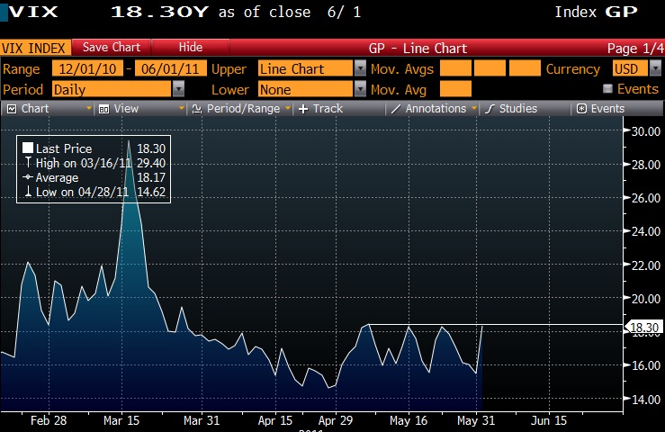
All eyes on the VIX and the S&P 500 to see if we are in for a very ugly summer. Today might have seemed like a strong rough patch, but in reality we have yet to see a complete meltdown or pervasive protection buying. The VIX is actually just hitting its May upside barrier for the fourth time this month:
Fourth time is the charm?

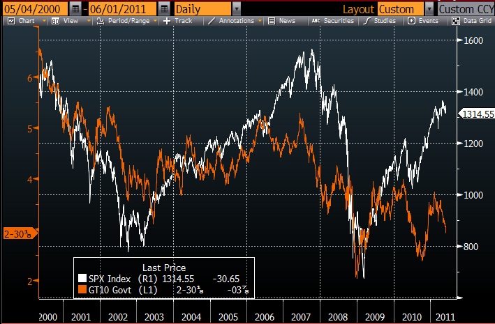
In trying to assess the situation there is one very interesting dichotomy occurring in the US markets. Interest rates continue to fall lower while the equity market has remained stubbornly high. If you look at the 10 year treasury rate versus the S&P 500 price index you can see fairly strong correlation over the last 11 years:
Which is right?

The 10 year treasury at a sub 3% yield does not seem as if we should be overly exuberant. That said, the current earnings on the S&P 500 suggests an earnings yield (earnings over price) of about 6.5%. This suggests that you would have to cut earnings in half for the earnings yield on the S&P 500 to be equal to the S&P 500. Would you rather own a basket of stocks that are currently earning a yield that is twice that of a 10 year treasury or would you like to lock in that the treasury rate for 10 years with no potential for upside and put your money at risk to upside inflation?

I could see a correction setting us back to 1200 on the S&P 500, but at this time I would view it as a buying opportunity and chance to have some fun with volatility.

See the original article >>

THE QE3 CONUNDRUM

by Cullen Roche

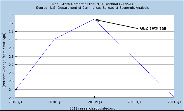
We’re now nearing the end of QE2 and some concrete conclusions can be made. I’ll save my overall analysis of the program until after its conclusion, but I think the impact of QE2 can be pretty much summed up with the following chart:
Economic growth peaked with QE2′s inception

Real GDP peaked as soon as QE2 began. Now, this shouldn’t be shocking to anyone who has been reading pragcap over the duration of this program. From its onset I said QE2 would do nothing for the real economy. In fact, operationally, it could do nothing. But its impacts actually appear to have been damaging to bottom line growth. How so? QE2 helped contribute to a massive surge in speculation in commodity prices.

You see, QE2 didn’t monetize anything. It didn’t cause the money supply to explode. It didn’t really do anything except cause a great deal of confusion and generate an enormous amount of speculation in financial markets that now appears to be contributing to turmoil and strife around the globe. Operationally, it is no different than what the Fed does at the short end when they implement monetary policy. The important distinction, however, is that this policy was implemented incorrectly. Instead of targeting price they targeted size. And the results in the bond market speak for themselves. Rates have meandered up and down and up and down without a care in the world for the Fed’s $600B purchase program. In other words, the program had no impact on rates.

Aside from targeting rates, the program was intended to generate a portfolio rebalancing effect. I won’t repeat the comments I’ve made in the past or those of Richard Koo, but the portfolio rebalancing effect is essentially a form of putting the cart before the horse. Creating nominal wealth without an accompanying real effect that results in real economic growth is very misguided and the worst form of ponzi finance.

Where we saw a real impact was in commodity prices, general price speculation and the financing pyramid. I believe the BOJ has written the finest piece of research detailing this speculative effect. The pass through effect from commodity prices is a contributing factor in the declining real GDP. Inflation has risen marginally due to commodity price increases and the underlying real economy has remained stagnant. In other words, QE2 caused margin compression without helping spur growth. This helped create the disequilibrium I have often discussed. The result is the current air pocket in the economy.

Critics of this analysis are likely to claim that we don’t know what would have happened to the economy without QE2. This is true of course. What we do know is that the economy was growing at 3.3% at the time QE2 was initiated, ISM surged to 57 just days after the announcement and climbed to 58 as the program was beginning. In other words, we can confirm, definitively that the economy wasn’t collapsing as QE2 was beginning, but weakened as the program progressed.

So, the only question left is – if the evidence appears to point to the fact that QE2 didn’t help the economic recovery then why in the world would anyone even consider QE3?

The Stock Market Is Sending Three Bearish Messages


The stock market is a leading economic indicator with an impressive track record. And that’s exactly how I am interpreting three recent developments and why I want to warn you about them today:

Bearish Message #1 —
The Banking Sector
Showing Negative Divergence

The concept of uniformity and divergences is one of the most important technical tools. Strong trends are characterized by a high degree of uniformity. During a healthy bull market more or less all sectors are participating in the rise. And during a strong bear market most everything is falling.

When trends grow old and weak this picture starts to change. Suddenly, during an old bull market the tide isn’t lifting all boats in spite of all the good news that may still be coming out. And at the end of a bear market some sectors stop declining while bad news captures the media.

According to this concept the cyclical rally that started in March 2009 has finally entered its last inning, the topping process. Why? Because more negative divergences are showing up. The most far reaching is coming from the important banking sector. 

As you can see on the following chart the Philadelphia Bank Index made its high for the current cycle in April 2010. When the S&P 500 made new highs this February, the Bank Index also rose, but it lost steam from its 2010 high. And since mid-February until the end of May, the BKX has slid more than 12 percent.
chart1 stocks
Banks have been the worst performing sector year to date. And the chart pattern looks like a huge topping formation with a slightly rising neckline currently around $45. It has not been broken yet, but it’s definitely an ominous looking pattern,

But there is even more to say about the financial sector’s weakness … 

During the past three months when bank stocks staged double-digit losses, 10-year Treasury yields declined roughly 60 basis points. This is a rare combination. And when it occurs its implications are very bearish. 

Historically this combination has been a harbinger of a recession as in 1990, 2000, and 2007 … or of a crisis as in 1998 and 2002 … or both.

Bearish Message #2 —
A Failed Breakout of the S&P 500
and a Broken Uptrend Line

At the end of April the S&P 500, most other U.S. indices and a few international indices like the German DAX rose to new highs for the year and thus for the cyclical bull market. At first glance this looked like a bullish breakout. But the market was already stretched, volume was low, and sentiment much too high. Therefore I was very skeptical.

Now, about four weeks later, all of these indices are clearly back below their respective breakout lines, meaning that the latest breakout attempt has obviously failed. 

During a healthy bull market a breakout has enough follow through buying to keep the market rising. If this is not the case, the market is telling us that a potentially important change in character has taken place, from bull to bear.

A failed breakout is as important a technical signal as a successful one. The latter points towards a continuation of the bull move. But the former indicates severe weakness. It has to be seen as a clear warning sign that the bull market is in jeopardy.


Additionally the S&P 500 has broken its uptrend line, which began in late August when Ben Bernanke announced the implementation of QE2. This break is just another sign of weakness.

Obviously, the technical situation of the stock market has deteriorated markedly. The price momentum oscillator (PMO) is still in neutral territory, leaving lots of room for further short-term downside movement. And longer term momentum indicators exhibit important negative divergences as well. Thus they, too, are signaling a major top in the making.

S&P 500, Momentum Indicator, Volume, 2010 — 2011
chart2 stocks
Bearish Message #3 —
Emerging Markets
Are Looking Weak

As I wrote in my Money and Markets column two weeks ago, there are far reaching negative divergences on a global scale. Most emerging markets stock market indices saw their cyclical highs last November. Their charts are not only showing clear relative weakness, but well-formed potential topping formations have also developed. 

Emerging markets were first to bottom out during the last bear market. And now they may again be ahead and leading the way into the next global bear market.

My recommendation: This is not the time to be in stocks. The market is at least 40 percent overvalued and the macroeconomic picture is deteriorating quickly. 

And to profit from downside moves, you might consider an inverse ETF of a broad index like the S&P 500 or the Nasdaq. Two examples are ProShares Short S&P 500 ETF (symbol SH) and ProShares Short QQQ ETF (symbol PSQ). Try to get the former for around $40.80 and set a stop loss at $38.80. If you want the latter, shoot for $32.50 with a stop loss of $31.

See the original article >>

Market Sentiment and Volume Reach Extreme Panic Levels

by Chris Vermeulen

It was a crazy session as the stock market slid over 2% on heavy volume. This type of price action means fear has taken control of masses and they are unloading (selling their stocks) in anticipation of much lower prices.

Trading off extreme levels of fear can be very rewarding if done right. That’s because fear is the most powerful reaction we as humans have and it’s somewhat predictable. Fear can make people do crazy and or stupid things and it’s these extreme reaction which investors do in the market that lead to great trading opportunities. Buying into fear and selling into greed is what I focus on.

Gold and Silver Showing Greed and Fear
For example, if we take a look at the 4 hour chart of gold and silver you will see how investments which have a large amount of speculation like Silver move the opposite to what other related investments like gold are doing.

The first chart which is gold, shows how today’s fear had investors moving into this shiny safe haven. Silver on the other hand has been the investment of choice for every Tom, Dick and Harry trying to play the popular headline investment. So on a day like today when prices start to slide in the stock market these speculative holders of silver get scared and dump (sell) their position in stocks and silver. The problem with silver is that the market is still small and its does not take many people hitting the sell button to send it 5% lower which is what took place today. This is one sign which is telling me traders are getting scared of a market selloff.
Chart1a stocks
Evidence #2 Showing Signs Of Fear
These data points below clearly show sellers were in control today. I like to look at the NYSE because it holds all the big brand name stocks which the masses like to buy when they feel lucky. So when I see this many traders selling and so few buying I know the masses are dumping shares and going to a cash.

The NASDAQ had 10 shares being sold to every one share being bought which is half the fear level of what the NYSE and that makes good sense. The NASDAQ has many smaller companies which the masses just don’t know about or own so there was not as much selling taking place on that exchange. So brand name stocks getting dumped all at once is another sign of extreme fear hitting the market.
Chart1 stocks
Evidence #3 Showing Signs Of Fear
This chart below provides the momentum of the market. I think of it as the rubber band effect. If the market selling momentum is strong enough then it pulls this indicator down to a level which it cannot go much further before it gives way and moves back a neutral or positive extreme level. This little hidden gem of an indicator can help time entry and exit points with ease once you understand it. Currently its telling us that a pause or bounce is likely to happen tomorrow.
Chart2 stocks
Evidence #4 Showing Signs of Fear and an Oversold Market Condition
Take a look at the 10 minute SPY (SP500) chart below. Simple visual analysis shows that today’s strong selling which has brought the market down into a support zone should provide a pause or a bounce very soon. The question is how big will the bounce or rally be?

Given all the confirming is looking ready for a bounce and I feel we could be nearing not a bounce but an intermediate bottom and higher prices going forward. But if we break strongly below this support level then all bets are off and much lower prices should occur.
Chart3 stocks

Mid-Week Trading Conclusion:
In short, today’s sharp move lower has put the market in a short term oversold condition. Meaning, a bounce is very likely to take place within the next 1-3 sessions. With the masses selling all their positions in stocks and commodities it generally takes 1-3 days after a day like this for the selling pressure to dissipate and for value buyers to step back into the market providing support.

See the original article >>

Follow Us