Saturday, May 21, 2011

Funds Come Back to Corn


The corn market roared back to the upside this week with July corn values closing nearly 80 cents above last Friday’s settlement price. This week the corn market had erased its liquidation break that had begun two weeks ago. The corn market found support from a strong cash market as well as a renewed focus on near-term demand. 

The weekly ethanol data showed that the amount of corn used last week to produce ethanol had climbed to its highest level in six weeks. 

In addition to the solid fundamental news this week, there was evidence that the funds were aggressive buyers of all of the grains when corn, soybean and wheat all crossed their 50-day moving averages. The function of the market continues to work. When prices rose towards their highs of early April, evidence of demand destruction was revealed. When values slipped last week to the lowest levels in two months, signs of a pickup in demand were uncovered. 

There were rumors late on Friday that Russia may re-enter the world wheat trade as early as Monday. This news will have to be monitored over the weekend, as it could lead to a break in wheat and a correction to corn and soybeans to start next week’s trade. Look for all of the grain markets to be bound by its recent trading range through mid-June.


See the original article >>

Crops ride on improved commodity sentiment

by Agrimoney.com

The weather forecasts aren't getting any better.
A broad range of commodities attracted, some, buying on Friday, on thoughts that recent declines had gone too day.
New York oil added 0.6%, not enough to get it back over $100 a barrel, but at least to see it knocking on the door of $99.
And if that underpinned the commodities complex, crops had continued concerns over weather to underpin them too.
Easy option?
In the US, talk is mounting still of the level of crops likely to be lost to the wet spring, with the approach of insurance cut-off dates suggesting that it is not just corn sowings which will be affected.
"We are hearing more talk of those in the severely wet areas may opt for [insurance claims],thus a big switch to more soybean acres may not happen," Mike Mawdsley at Market 1 said.
Soybeans, which are later sown, are sometimes considered a beneficiary, in acreage terms, of poor corn planting conditions.
At Benson Quinn Commodities, Jon Michalscheck said: "We are closing in the [claim] dates of May 25 and June 5 that has been on everyone's radar for the past few weeks, and that should provide some underlying support as we go through the next two week's worth of planting data."
Rain in Spain, but...
In Europe, those hopes of end-of-month rain for parched crops in France and Germany, the top two wheat-producing states, dried up.
"If you recall, the GFS model was developing a significant rain event for France and Germany in the 11-to-15 day period," WxzRisk.com said late last night.
The latest model, "model has this same weather system for May 31, but has the rain for Spain only. The rain does not get into any significant portion of France or Germany in the 11-15 day.
"And all of the Ukraine Eastern Europe and south west Russia stayed quite dry as well."
'Significant pent-up demand'
Analysts looked afresh, with an upbeat eye, at Thursday's US weekly export sales too, which failed in the last session to keep prices higher.
"Total US corn export sales were extremely strong this week, coming in at 1.15m tonnes versus 457,500 tonnes the week prior," Luke Mathews at Commonwealth Bank of Australia said.
"It signals that significant pent-up demand was uncovered as corn prices slumped in early May."
Sales of 672,200 tonnes of 2011-12 wheat were "heartening" too.
Wheat lags
In Chicago, corn led, adding 0.8% to $7.54 ½ a bushel for July delivery as of 07:10 GMT (08:10 UK time), with the new crop December lot up 0.7% at $6.66 ½ a bushel.
Soybeans were 0.5% higher at $13.86 a bushel for July and up 0.6% at $13.58 a bushel for the new crop November contract.
Wheat lagged, amid some worries nonetheless that the grain had done enough for now, despite potentially worsened weather.
"Wheat should probably take a breather from here until we get more good, or bad, news," Australia & New Zealand Bank said.
Chicago's July lot added 0.3% to $8.14 ¾ a bushel, but the Kansas and Minneapolis hard wheat equivalents, which avoided losses in the last session, struggled this time, falling 0.1% to $9.44 a bushel and 0.6% to $10.00 ¼ a bushel respectively.
'Could easily spike'
Cotton, which suffered another week of negative US exports, ie cancellations, struggled too, easing 0.1% to 155.50 cents a pound for July.
The new crop December lot added 0.02 cents a pound to 119.21 cents a pound.
But do bigger gains lie ahead?
"The cotton market is currently weighing up the influence of declining global demand versus worries over 2011 production prospects," Mr Mathews said.
With weather conditions in the US, the top exporter, and China, the top grower, consumer and importer, "far from perfect, in our view, if crop failures materialise prices could easily spike higher".

S&P cuts credit outlook for Italy to "negative"


(Reuters) - Credit ratings agency Standard & Poors cut its outlook for Italy to "negative" from "stable," citing weak outlook for growth and reduced prospects for slashing its debt mountain.
The downward revision, which raises the risk of a downgrade of Italy's sovereign rating, may heighten fears that contagion from Greece's and other European countries' debt crisis could be spreading to the euro zone's third-largest economy.

"In our view Italy's current growth prospects are weak, and the political commitment for productivity-enhancing reforms appears to be faltering," Standard & Poor's said in a statement early on Saturday.

"Potential political gridlock could contribute to fiscal slippage. As a result, we believe Italy's prospects for reducing its general government debt have diminished."

Standard & Poor's affirmed its 'A+' long-term and 'A-1+' short-term sovereign credit ratings on Italy, which is slowly recovering from its worst economic downturn since World War Two and has one of the world's largest public debts.

In recent years, the ratings agency has often taken a bleaker view of the state of Italy's economy, compared to its counterparts Moody's and Fitch.

Moody's currently has an Aa2 rating for Italy, while Fitch rates it at AA-, which means S&P has Italy two notches below Moody's and one below Fitch.

Italy has weathered the financial crisis better than some of its euro zone's peers but its growth has lagged behind the bloc's average for over a decade.

Many analysts say unless it adopts reforms needed to sharply improve its growth potential, it has little chance of meeting its medium term target to cut the debt.

Italy hardly grew in the first quarter, with gross domestic product (GDP) edging up only 0.1 percent, compared with rises of 1.5 percent in Germany and 1.0 percent in France. Crisis-hit Greece grew 0.8 percent.

ITALIAN TREASURY DEFENDS ITS POLICIES

The Italian Treasury criticized the move by S&P, saying data on its economic growth and public accounts had "constantly been better than expected."

However, Italy last month cut its economic growth forecasts for 2011, 2012 and 2013 and raised its projections for the public debt. It kept the deficit outlook unchanged.

The economy is now expected to expand by 1.1 percent this year, down from a previous forecast of 1.3 percent. In 2012, GDP growth is seen at 1.3 percent, compared to 2.0 percent previously.

Public debt is expected to reach 120 percent of GDP this year, before falling slightly to 119.4 percent in 2012.

In a statement after the S&P outlook revision, the Treasury said major international organizations such as the OECD, the International Monetary Fund and the European Commission had recently given "very different" assessments on Italy from that of S&P.

Analysts from the IMF and the OECD said this month that Italy's economy was recovering slowly, but added that it would require major structural reform to boost its growth potential.

A weak economy weighs heavily on the debt and deficit ratios, and both organizations urged efforts to stimulate productivity growth and labor supply.

The Treasury ruled out the risk of political gridlock, which S&P cited as a factor that could contribute to fiscal slippage together with weaker-than-expected economic growth.

It also said measures aimed at meeting its target of balancing the budget in 2014 were "at an advanced stage of preparation" and will get parliamentary approval by July.

S&P's revision is another blow for center-right Prime Minister Silvio Berlusconi, who is embroiled in sex and corruption trials.

The media tycoon's People of Freedom party also suffered a setback this week in local elections seen as a test of his coalition government's popularity and is facing a risky run-off on May 29-30 for the city government of Milan, Italy's business capital.

The Standard & Poor's outlook change implies a one-in-three chance that the credit ratings could be lowered within 24 months.

Standard & Poor's forecast net government debt at 116 percent of GDP this year, up from 100 percent in 2007.

"Under our analysis, the economic contraction between 2008 and 2009 has negated all of Italy's fiscal-consolidation efforts over the last decade," it said.

The Italian banking sector has been strengthened by moves to strengthen capital "and is in a stronger financial position than it was six months ago," the agency said.

See the original article >>

U.S. Dollar Index Reversal Signs


The 2011 downleg in the US Dollar Index recently violated the 2009 low but has held above the more major 2008 low, finding support on the long term chart and producing an initial reversal sign too.


See the original article >>
Gold Breakout or Breakdown, What’s Next?


The precious metals blogosphere was buzzing with the news that billionaire investor George Soros has sold most of his holdings in the bullion-backed SPDR Gold Trust (GLD) and iShares Gold Trust (IAU) in the first quarter of 2011. According to reports filed with the U.S. Securities and Exchange Commission, Soros bought shares of mining companies Goldcorp Inc. and Freeport-McMoRan Copper and Gold Inc. (FCX). All together Soros sold almost $800-million (U.S.) in gold. 

Soros must have been pleased as punch to take his colossal profits off the table.

Last year Soros described gold as “the ultimate asset bubble” as he kept buying more gold. In a Nov. 15 speech Soros said that conditions for the metal to keep rising were “pretty ideal,” and in January this year, he said the boom in commodities may last “a couple of years” longer. 

What effect did Soros’s actions have on the precious metals market? While Soros was selling (and it was not yet in the news) the precious metals markets were actually rising. By the time reports leaked that George was selling, the markets had already begun to correct. So, on the face of it, there was very little effect. We would hardly be surprised if we read in the next Securities and Exchange filing that Soros took advantage of the correction to pile into gold again. In any case, Soros’s gold is still just a small fraction of the global gold market. As a measure of gold’s acceptance as a mainstream investment, the SPDR Gold Shares was the second-most-popular E.T.F. in the United States on April 30, trailing only the SPDR S&P 500 fund.

And, if you’re still worried about Soros’s sale of his gold holdings, the next item should cheer you up. The World Gold Council yesterday reported that China’s total annual gold demand topped 700 metric tons for the first time ever last year and is expected to keep rising over the next decade. China is the second-largest gold-consuming market in the world. China’s gold demand has grown by an average of 14% per year since deregulation of the gold market by Chinese authorities in 2011. Much of the demand is due to concerns about inflation. Keep in mind that China’s market is still in the neonatal stage since it has only been a decade since deregulation. There is still plenty of room for Chinese consumers to catch up with the West.

Let’s have a closer look at the gold market (charts courtesy by http://stockcharts.com). We begin with the long-term chart which looks at gold from a non-USD point of view. We do this is order to put gold’s current short-term volatility into its proper perspective. 


It appears that we have simply seen a testing of the short-term support line, a verification of its support and a move to levels slightly above the 2010 highs based on weekly closing prices. The outlook therefore remains bullish and the price action seen in 2011 is actually now creating what appears to be a very bullish cup-and-handle pattern which indicates the possibility of a strong rally from here. This does not appear to be highly likely at this time but such a rally simply cannot be ruled out based on signals from the non-USD chart.


In gold’s long-term chart (see our previous essay for long-term gold price analysis) from the USD side, we see that the trend remains up. Recent price declines here were stopped by the long-term support line and the outlook still appears to be bullish at this time. Low volume levels on days with rising prices are generally a cause for concern but that may not apply in this case.
Let’s take a look at the short-term chart for more details. 


In the short term GLD ETF chart, we see a number of signals which are worthy of mention. Technical analysis generally yields negative sentiment with the type of price/volume action we see at the end of the above chart.
The case however is simply not as bearish as it would seem and it seems somewhat premature to state that buying power is drying up. We note four previous examples of similar cases (rally on small volume preceded by a decline on big volume) in this chart within the past several months. In 3 of the 4 situations, a short-term rally followed and for this reason, the situation does not appear to be bearish at this time.

A breakout above the declining short-term resistance line has actually taken place in the last two days in the chart. In fact, the resistance lines based upon daily closing prices and daily highs in our chart were both surpassed towards the end. This is overall a bullish development.

Summing up, the overall situation appears bullish for the yellow metal in the short term. Support levels have recently been tested and held, and a study of similar corrections in the recent past indicates that there appears to be at least a short-term time frame in which a further rally appears likely. Once the next local top is in, we expect the decline to continue.

See the original article >>
QE End, Training Wheels Off, Crash Helmets On


Based on many pronouncements by economic policy makers, reams of articles by the top financial journalists and near continuous discussion on the financial news channels, it appears that the quantitative easing juggernaut that has steamed the high seas of macroeconomics for the last three years is finally pulling into port...supposedly for the last time. According to the dominant narrative, QEI and QEII helped stabilize the economy during the Great Recession and now the Federal Reserve is ready to take the training wheels off. If so, the economy may need a helmet because there is virtually no chance that it can avoid major contractions without central banking support.

It is ironic, but there is no doubt that the proposed removal of artificial stimulus would be the best thing for the country in the long term. But very few observers understand how it will inflict short term pain. So confident is the Fed that earlier this week, St. Louis Fed President James Bullard indicated that any notion of additional quantitative easing is off the table. In fact, he said the central bank may tighten policy in 2011 by allowing its balance sheet to shrink. Investors would do well to remember that Bullard was the first Fed official to support the second round of bond purchases now known as QEII. It is likely that he will make a similar reversal if the economy shows any signs of weakening in the months ahead.

Fed policy makers like Bullard are guilty of reckless optimism if they believe the economy has truly healed. The evidence of a pending slowdown is abundant. The Empire State's business conditions index decreased 10 points from April to just 11.9 in May. Meanwhile, the prices paid index rose sharply, with about 70% of respondents reporting price increases for inputs, and none reporting price reductions. That inflation index advanced 12 points to 69.9, its highest level since mid-2008. And things are even worse in Philadelphia. The Federal Reserve Bank of Philadelphia's general economic index fell to 3.9 in May from 18.5 a month earlier.

Turning to the labor front, the four week moving average of initial jobless claims rose to 439,000 last week, from 437,750 in the week prior. Of course, the real estate market continues in its malaise. According to the National Association of Realtors, April existing home sales dropped to an annual rate of just 5.05 million. Prices continue to set new post crash lows, with prices down 5% YOY. Despite the fact that the government still accounts for nearly the entire mortgage market and the Fed has rates near zero percent, inventory of existing homes jumped from 3.52 to 3.87 million units and the months' supply climbed from 8.3 to 9.2. Does it sound like the economy is ready to get up on its own two feet?

But the Fed is under pressure to do something about the growing inflation threat. Year over year increases of CPI, PPI and Import prices are 3.2%, 6.8% and 11.1%, respectively. As price increases hit middle class consumers, the Fed is facing intense pressure to push down inflation by draining the balance sheet and raising interest rates. It's a dangerous game.

In its simplest terms quantitative easing is nothing more than the government's attempt to boost consumption by borrowing trillions of dollars. Over the long haul this is no way to run an economy, and a sustainable recovery will be impossible as long as such borrowing continues. But in the short term, a cessation of government borrowing will lift the veil on our artificial economy, and reveal how dependent we have become.

U.S. fiscal and monetary austerity will cause GDP to fall as the deleveraging process that was interrupted in 2009 returns with a vengeance. I do not believe the Fed or the Administration has the intestinal fortitude to let that happen.

A bona fide Fed exit from interest rate manipulation means that both nominal and real interest rates would rise significantly. The ten year note yield is less than half its average over the past 40 years. Normalization of rates would provide a serious headwind to markets and the economy.

The high leverage that brought on the Great Recession has not been addressed in the slightest. U.S. 

household, corporate and government debt as a percentage of GDP has never been greater. So, if interest rates were to rise, why should we expect a different result from what occurred in 2008?

Whether or not the Fed is bluffing has dramatic implications for investors and the country. Mr. Bernanke will eventually have to choose whether he wants another depression or more of the inflation the Fed is so adept at causing and then denying.

For in-depth analysis of this and other investment topics, subscribe to The Global Investor, Peter Schiff's free newsletter. Click here for more information.
See the original article >>

Stock Market S&P500 Cycle Analysis Update

What leads, technicals or fundamentals? Does a price chart discount all fundamentals? These debates rage on, but I can say with the utmost accuracy that cycles are great for predicting in the next explosion of activity. A rally or a sell off, no matter cycles have an uncanny knack of being on the money when either is in the infant stages.

The latest cycle for the SP500 chart is below. The trend has been up and I have numbered the cycle tops from 1 to 5 in heavy red. One was the news of Greek debt issues, or more precisely QE1 ending, four was the Japanese Tsunami, two and three were not material. What will 5 be? I am not sure yet, but mostly likely the pricing in of QE2 ending masked in another euro debt story just to fool the mums and pops.

We are never keen to trade cycle peaks that are against the trend, but this time I feel its different. Should five be more like one, as both are consulted by the ending of a QE episode. I am not saying a flash crash is to be upon us (but never say never), but we are due for a doosie. I would not take a position base on the Hurst cycle roll over alone, I would need to see confirmation by some selling by the big boys first (via our tool RTT TrendPower). Watching and waiting.

SPY Cycle

SPY Gann Angle

Fundamentals are rolling over to bearish
See the original article >>

CPI Doesn’t Fill Your Belly Like CRB Can


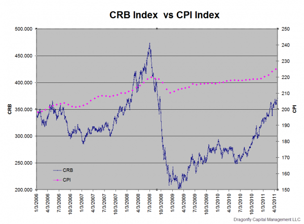
The cost of everything you need to buy, food, gasoline, and clothes is higher and rising rapidly, yet the the Federal Reserve continues to see moderating inflation that is at best transitory. How can that be? Part of the answer lies in how you measure inflation. The Consumer Price Index (CPI) is what the Federal Reserve uses. The ThomsonReuters/Jefferies CRB Index measures the cost of things you actually buy. Below is a chart of the two plotted against each other. The CRB is plotted on the left scale and shows a rise from about 200 to over 360 since the low in 2009. That is about 34% per annum rise in the cost of goods you buy. The CPI is plotted on the right hand scale and shows a rise from about 210 to 226 over this same period or about 3.7% per annum rise. The first thought that comes to mind is that it is no wonder that Ben Bernanke and his team cannot see that everything is more expensive. The second thought is then, how can there be such a big difference?
crb vs cpi2 e1305589026873 stocks
The answer lies in what items you use and how you create your basket of goods. From the US Department of Labor Bureau of Labor Statistics website, “The CPI represents all goods and services purchased for consumption by the reference population (U or W) BLS has classified all expenditure items into more than 200 categories, arranged into eight major groups. Major groups and examples of categories in each are as follows:

FOOD AND BEVERAGES (breakfast cereal, milk, coffee, chicken, wine, full service meals, snacks)
HOUSING (rent of primary residence, owners’ equivalent rent, fuel oil, bedroom furniture)
APPAREL (men’s shirts and sweaters, women’s dresses, jewelry)
TRANSPORTATION (new vehicles, airline fares, gasoline, motor vehicle insurance)
MEDICAL CARE (prescription drugs and medical supplies, physicians’ services, eyeglasses and eye care, hospital services)
RECREATION (televisions, toys, pets and pet products, sports equipment, admissions);
EDUCATION AND COMMUNICATION (college tuition, postage, telephone services, computer software and accessories);
OTHER GOODS AND SERVICES (tobacco and smoking products, haircuts and other personal services, funeral expenses).”

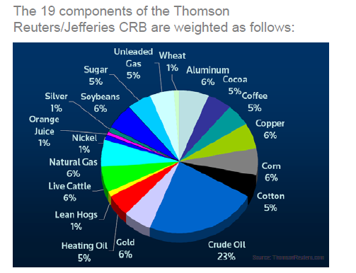
The Composition of the CRB is as below.
5 19 2011 4 29 34 PM stocks

Can you see the difference? The CRB consists of a basket of goods that you buy regularly. You are reminded how much theses goods change every time you fill up your tank or go to the grocery store. The major additions to that the CPI adds in are important costs but ones that often only change once per year or less like a mortgage or rent payment and the cost of healthcare. Additionally it adds items that are usually one off or so expensive that you do not look at them the same way, like college tuition or a new car. These additions have significant weights. Housing for example has a weighting of over 35% excluding energy costs, and new cars, education and medical costs another 18% weighting. Over 50% of the index is from items that change once a year or less. No wonder it is more stable. This does not answer whether or not the Federal Reserve is looking at the correct measure, but at least now you can make the argument with valid data.

The Golden Bottom

by Sean Brodrick


I’ve told you before that gold is showing relative strength to other commodities, and I expect it will lead the next rally. Are we seeing gold bottom right now? And if so, how should you play it?

Let me show you two charts. First, a weekly chart of gold, as tracked by the SPDR Gold 

Trust (GLD)
:
img2 stocks
Looking at the chart, you can see that the GLD hasn’t broken its uptrend — in fact, it is still stepping higher along its 20-week moving average.

An interesting factoid is that the GLD spends an average of 19 to 20 weeks above its 20-week moving average before touching it again. It’s only been above it for 13 weeks this time.

Now, a more cautious investor would wait for the GLD to touch support before buying it again. And you can certainly wait. But if you can stomach risk, there’s nothing wrong with buying it now. By the time the GLD touches its 20-week moving average, that average might be much higher.

And a clue that gold may be about to head higher comes in what’s happening in gold mining shares. Take a look at this chart of the Gold Bugs Index — a basket of leading gold miners — divided by the GLD:
img4 stocks
The green line on this chart is the GLD, the black line is the Gold Bugs index divided by the GLD. 

For the past few months, this miner/metal ratio has nose-dived. But now it’s turning higher. When that has happened in the past, it has signaled that both miners and metals are about to head higher.

The reason is simple: Miners are leveraged to the underlying metal. Investors start snapping up gold miners, or the best ones anyway, when they start to think that gold itself is going higher.

So, this is an indicator of more bullishness spreading through gold and gold mining.

Charts are nice, but many of us need fundamentals before we put money to work.

So, here’s a quick run-down of just five of the forces I’m watching:

5 Forces Lining Up for Higher Gold Prices
  1. Gold coin sales are soaring. Bloomberg recently reported that in the month of May, sales of gold coins are on track for their best month in a year. The last time sales reached that level, the price of gold rose 21% in the next year. 
  2. The United States hit its debt ceiling of $14.3 trillion on Monday. The budget deficit this year alone is set to be a record breaking $1.5 trillion. Difficulty in hammering out a budget agreement erodes the faith of the foreign banks we need to buy U.S. Treasuries. Bookkeeping maneuvers will allow the Treasury to continue auctioning debt for another 11 weeks. Still, our country’s appalling fiscal state is one reason why gold and silver remain important investments for any portfolio.
  3. Threat of Greek debt default. One of the main guys who was working on a solution to the Greek debt crisis — Dominique Strauss-Kahn, the director of the International Monetary Fund — is now cooling his heels in a cell on Rikers Island, facing rape charges. With the IMF in disarray, the already boiling Greek crisis could explode. Portugal is next. These crises affect the stability of the euro, and the last time Europeans got scared about that, they rushed into gold.
  4. Central Banks are buying gold hand over fist. Mexico’s Central Bank just spent $4.6 billion buying 93.3 metric tonnes of gold. Russia bought 18.8 metric tonnes of the yellow metal, Thailand’s Central Bank bought 9.3 metric tonnes, and Belarus bought another 2.5 metric tonnes. Central Banks seem to be picking up the pace of their gold buying. That’s probably bullish for prices.
  5. Gold ore grades are falling fast. A new U.N. report on resource depletion shows how ore grades at gold mines have fallen off over the past century:
img6 stocks
One hundred years ago you could find around 20 grams of gold per metric tonne of ore at mines in Australia, Brazil, Canada and South Africa. Now, there are mines going into production with less than a gram per tonne of gold, and they’re quite profitable!

It’s not for lack of looking that ore grades are going down. In fact, the latest data from Metals Economics Group shows that spending by gold explorers rose by $1.9 billion to $5.4 billion last year.
It’s simple math: Lower grades and higher mining costs should mean higher gold prices. 

How to Invest

I think select gold miners have already bottomed and should head higher from here. One I like is Goldcorp (GG). Its latest earnings report was excellent:
  • Gold sales for the first quarter totaled 627,300 ounces on production of 637,600 ounces.
  • Revenues increased to $1.2 billion dollars, a jump of more than 69% from the year-earlier period.
  • At the same time, earnings per share more than doubled to $0.82 from $0.32.
  • Operating cash flow increased 180% to $586 million from $282 million a year ago.
You can also buy physical gold or one of the funds that holds physical gold. What exactly you should buy depends on your own investing needs and your appetite for risk.

Right now, I’d say gold’s risk is to the upside. Sure, we could see more consolidation here, especially if the U.S. dollar continues to rally in the short term. But the longer-term trends are much higher for gold and gold miners.

See the original article >>

Historical Echoes: Communication before the Blog…

New York Fed Research Library

Over the years, the Federal Reserve System has used many methods to communicate about the role it plays in support of stable prices, full employment, and financial stability. Current communication tools include the new press conferences by the Chairman, speeches by Bank presidents, public websites, economic education programs, local outreach efforts, publications, and blogs like this one.
Ninety years ago, however, the options were more limited. The Fed was still new and the nation’s economy was plagued by a growing number of bank failures. The five posters below (from the mid-1920s), with their images of strength and stability, were part of a larger series designed for display at member banks. They were likely intended to inform the public about the Federal Reserve System and foster confidence in its member banks.

Thanks to the San Francisco Fed archive for making the posters available.


20s_poster1


20s_poster2


20s_poster3


20s_poster4


20s_poster5


See the original article >>

Follow Us