Sunday, June 2, 2013

The Fleeting Beauty of Bubbles and Bonds

by Charles Hugh Smith

Whatever painlessly masks the dysfunction and corruption of the Status Quo will be the policy of choice.


Here's the challenge the Status Quo monetary and fiscal authorities faced in the 2008 global financial meltdown: how do we maintain the power structure and keep the masses passive while masking the fact that the Status Quo is broken?

The solution: sell bonds to fund benefits to the masses, lower interest rates to zero to keep the explosive rise in fiscal deficits affordable, and rapidly inflate new bubbles in assets that painlessly enrich the top 25% of households who then increase their borrowing and spending, i.e. the "wealth effect."

Lowering interest rates to zero is a two-fer, as it not only enables the central state to borrow vast sums by selling low-yield bonds, it also drives everyone with financial assets into a desperate search for higher yields in risk assets such as stocks and housing. This herding of capital into risk assets helps inflate the bubbles needed to generate "growth."

Here's the beauty of asset bubbles. How do you get trillions of dollars into households without having to borrow the money? You inflate the assets owned by the households: stocks and houses. This magically creates money out of nothing, money that the households can borrow against or sell for cash.

Why not create and distribute cash directly? Two reasons: 1) spreading around trillions of dollars in cash could eventually spark inflation, which would kill the entire project by pushing bond yields higher, and 2) politically, the only cohort the authorities care about are the wealthy who fund the political Elite and the half of the adult populace who votes.

The political calculus is simple: the bottom half of households don't vote, don't contribute to political campaigns and don't have enough income to borrow huge sums of money to enrich the banks. They are thus non-entities in the fiscal-monetary project of maintaining the power structure of the Status Quo.

All the Status Quo needs to do is borrow enough money to fund social programs that keep the masses passive and silent: food stamps, Section 8 housing vouchers, Medicaid, Medicare, Social Security, SSI permanent disability, unemployment, etc.

Unfortunately for the Powers That Be, the cost of placating the rapidly increasing marginalized populace is rising much faster than tax revenues. Here are two charts of interest (source: Kleiner Perkins Caufield Byers 2013 Internet Trends)


The happy story of 2013 is that tax revenues are rising fast while government spending has stopped rising. This is risible, as the same agencies drawing these projections have never forecast a recession or downturn. Taxes rise in bubbles, so no wonder tax revenues are up--and of course, tax rates increased on the margins.

Longer term, Federal expenditures will inexorably rise as the social programs for the elderly absorb 10,000 retiring Baby Boomers a day.


Here's the problem with bubbles: they pop, despite the best efforts of the fiscal and monetary authorities to keep them inflating forever. And when bubbles pop, assets decline in value. Borrowing, spending and tax revenues all decline.

Near-zero interest rates have problems, too: One, they stripmine pension funds and savers seeking save yields on cash, forcing everyone into risk asset bubbles, where those seeking higher yields are crushed when the bubbles pop, and two, nothing stays low or high forever. Piling up debt at near-zero rates is affordable fun, but when rates rise, the costs of servicing the debt pile skyrocket.

At that point, a feedback loop is set in motion that will bring down the entire system: investors will see fiscal authorities struggling to fund their social programs and pay rapidly rising interest on the vast mountain of government debt, and start wondering if the government will be able to meet its rapidly rising commitments with stagnant tax revenues.

The prudent investor, money manager and pension fund manager will demand a higher risk premium to reflect the possibility that the bond will be repaid with depreciated currency.

That will drive up the interest rate on all future borrowing, which will further stress government obligations which will increase the risk of default or depreciation of the currency, and so on.

The only way to stop this feedback from starting is for the central bank to buy essentially all the bonds sold by the government. This is the path that Japan and the U.S. have taken; both the Bank of Japan and the Federal Reserve are buying government bonds, essentially removing them from the tidal forces of the market with instantly created money.

Are there any limits on the balance sheets of the central banks? Why not transfer $100 trillion to the balance sheet of the Fed? Indeed, this path appears absolutely painless to all involved, and that's why Japan and the U.S. have pursued this strategy with such gusto.

Whatever painlessly masks the dysfunction and corruption of the Status Quo will be the policy of choice. And right now, that policy is transferring government bonds to the central banks so the fiscal authorities can continue to borrow and blow trillions of dollars rather than restructure their broken financial systems and economies.

The problem with neutering the market to mask systemic dysfunction is that the return on the policy diminishes at the same time that risk is transferred to the entire system. Risk cannot be disappeared, it can only be transferred or hedged. Burying immense debts in the balance sheets of central banks doesn't make risks disappear, it simply transfers the risk to the entire system.

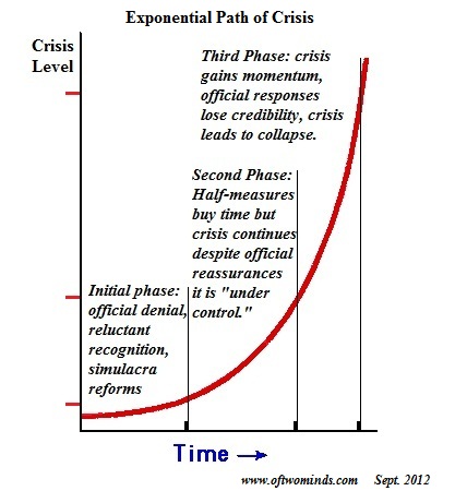
And when you do that, you get a chart like this:

Anyone who is paying attention to the peculiar gyrations and dislocations in the Japanese bond and currency markets has to wonder if Japan has finally succeeded in entering Phase III, when official credibility and the illusion of central control both crumble.

The beauty of bonds and bubbles is fleeting. The fiscal and monetary authorities are claiming the beauty of bonds and bubbles is ageless, thanks to their magic; but no amount of false data and trickery can possibly eliminate the systemic risk piling up behind the rickety facade of illusory control.

See the original article >>

The American Consumer is Not Okay

by Stephen S. Roach

NEW HAVEN – The spin-doctors are hard at work talking up America’s subpar economic recovery. All eyes are on households. Thanks to falling unemployment, rising home values, and record stock prices, an emerging consensus of forecasters, market participants, and policymakers has now concluded that the American consumer is finally back.

This illustration is by Paul Lachine and comes from <a href="http://www.newsart.com">NewsArt.com</a>, and is the property of the NewsArt organization and of its artist. Reproducing this image is a violation of copyright law.

Illustration by Paul Lachine

Don’t believe it. First, consider the facts: Over the 21 quarters since the beginning of 2008, real (inflation-adjusted) personal consumption has risen at an average annual rate of just 0.9%. That is by far the most protracted period of weakness in real US consumer demand since the end of World War II – and a massive slowdown from the pre-crisis pace of 3.6% annual real consumption growth from 1996 to 2007.

With household consumption accounting for about 70% of the US economy, that 2.7-percentage-point gap between pre-crisis and post-crisis trends has been enough to knock 1.9 percentage points off the post-crisis trend in real GDP growth. Look no further for the cause of unacceptably high US unemployment.

To appreciate fully the unique character of this consumer-demand shortfall, trends over the past 21 quarters need to be broken down into two distinct sub-periods. First, there was a 2.2% annualized decline from the first quarter of 2008 through the second quarter of 2009. This was crisis-driven carnage, highlighted by a 4.5% annualized collapse in the final two quarters of 2008.

Second, this six-quarter plunge was followed, from mid-2009 through early 2013, by 15 quarters of annualized consumption growth averaging just 2% – an upturn that pales in comparison with what would have been expected based on past consumer-spending cycles.

That key point appears all but lost on the consumer-recovery crowd. In recent speeches and discussions with current and former central bankers, I have been criticized for focusing too much on the 0.9% trend of the past 21 quarters and paying too little attention to the 2% recovery phase of the post-crisis period. At least it’s a recovery, they claim, and a sign of healing that can be attributed mainly to the heroic, unconventional efforts of the US Federal Reserve.

This brings us to the second part of the argument against optimism: analytics. One of the first concepts to which an economics student is exposed in a basic macro course is “pent-up” consumer demand. Discretionary consumption is typically deferred during recessions, especially for long-lasting durable goods such as motor vehicles, furniture, and appliances. Once the recession ends and recovery begins, a “stock-adjustment” response takes hold, as households compensate for foregone replacement and update their aging durable goods.

Over most of the postwar period, this post-recession release of pent-up consumer demand has been a powerful source of support for economic recovery. In the eight recoveries since the early 1950’s (excluding the brief pop following the credit-controls-induced slump in the 1980’s), the stock-adjustment response lifted real consumption growth by 6.1%, on average, for five quarters following business-cycle downturns; spurts of 7-8% growth were not uncommon for a quarter or two.

By contrast, the release of pent-up demand in the current cycle amounted to just 3% annualized growth in the five quarters from early 2010 to early 2011. Moreover, the strongest quarterly gain was a 4.1% increase in the fourth quarter of 2010.

This is a stunning result. The worst consumer recession in modern history, featuring a record collapse in durable-goods expenditures in 2008-2009, should have triggered an outsize surge of pent-up demand. Yet it did anything but that. Instead, the release of pent-up consumer demand was literally half that of previous business cycles.

The third point is more diagnostic: The shockingly anemic pattern of post-crisis US consumer demand has resulted from a deep Japan-like balance-sheet recession. With the benefit of hindsight, we now know that the 12-year pre-crisis US consumer-spending binge was built on a precarious foundation of asset and credit bubbles. When those bubbles burst, consumers were left with a massive overhang of excess debt and subpar saving.

The post-bubble aversion to spending, and the related focus on balance-sheet repair, reflects what Nomura Research Institute economist Richard Koo has called a powerful “debt rejection” syndrome. While Koo applied this framework to Japanese firms in Japan’s first lost decade of the 1990’s, it rings true for America’s crisis-battered consumers, who are still struggling with the lingering pressures of excessive debt loads, underwater mortgages, and woefully inadequate personal saving.

Through its unconventional monetary easing, the Fed is attempting to create a shortcut around the imperative of household sector balance-sheet repair. This is where the wealth effects of now-rebounding housing prices and a surging stock market come into play. But are these newfound wealth effects really all that they are made out to be?

Yes, the stock market is now at an all-time high – but only in current dollars. In real terms, the S&P 500 is still 20% below its January 2000 peak. Similarly, while the Case-Shiller index of US home prices is now up 10.2% over the year ending March 2013, it remains 28% below its 2006 peak. Wealth creation matters, but not until it recoups the wealth destruction that preceded it. Sadly, most American households are still far from recovery on the asset side of their balance sheets.

Moreover, though the US unemployment rate has fallen, this largely reflects an alarming decline in labor-force participation, with more than 6.5 million Americans since 2006 having given up looking for work. At the same time, while consumer confidence is on the mend, it remains well below pre-crisis readings.

In short, the American consumer’s nightmare is far from over. Spin and frothy markets aside, the healing has only just begun.

See the original article >>

Ms. Watanabe’s Profession

by Yuriko Koike

TOKYO – Ms. Watanabe, age 40, is hesitant. Her mother, Mrs. Watanabe, is known for moving the world’s markets with the financial trading that occupies her breaks from housework.

This illustration is by Paul Lachine and comes from <a href="http://www.newsart.com">NewsArt.com</a>, and is the property of the NewsArt organization and of its artist. Reproducing this image is a violation of copyright law.

Illustration by Paul Lachine

Mrs. Watanabe is the generic name for Japan’s housewife speculators, who have wielded significant influence on foreign exchange and other markets through their trading. After graduating from university, Mrs. Watanabe quit her job when she married Mr. Watanabe (who worked in the same office), became a housewife, and raised one daughter. She did this because, in Mrs. Watanabe’s day, marriage was the final workplace.

Times are different for her daughter, Ms. Watanabe, who majored in economics at a famous university and was hired by a well-known trading firm. But, though she outperformed the men in her recruitment class academically, she was unable to compete for promotion. She could not even have an official business card (which is more important than a passport in Japan); she had no choice but to make one on her computer.

She resolved to hone her skills by following her mother’s example. After work, she would attend night school to become an international accountant. She didn’t like going out drinking with colleagues to complain about their boss; communication through drinking neither improved one’s skills nor helped one to rise through the ranks.

Ms. Watanabe’s story helps to illustrate a remarkable disparity. While productivity in Japanese factories is the highest in the world, owing to robots and other types of automation, the productivity of Japan’s white-collar workers is the lowest among OECD countries.

In 1999, Japan’s Equal Employment Opportunity Act was amended to provide equal employment opportunities for men and women by prohibiting discriminatory labor practices. But the legislation has had little impact on the workplace atmosphere for women.

The other women who joined the company at the same time as Ms. Watanabe married colleagues and quit to devote their time to raising children. The only difference from her mother’s era was that today’s generation quit, married, and gave birth later. Women account for more than 80% of those who use childcare leave in Japan; in reality, more than 60% of Japanese women leave the workplace and don’t come back when they have children.

Before she knew it, Ms. Watanabe was in her thirties. Her mother, Mrs. Watanabe, used the money she had made through financial trading to fund her daughter’s study abroad. Companies pay for men to study abroad, but will not invest in female employees. Without other options, Ms. Watanabe took a long-term unpaid leave of absence (which her company typically does not grant to women) to study for an MBA in America. Although she returned with excellent grades, her position within the company worsened, because she did not have a boss who could use her skills.

One day, Ms. Watanabe received a call from a headhunting firm. She was recruited to work in the accounting department of a Japanese import-export company. Encouraged by her mother, Ms. Watanabe set her sights on new shores. It was a completely new working environment, but her English skills and MBA proved to be invaluable. Her work was interesting, and she played an important role. At times, though, she thought about marriage and children when planning for the future.

Last year, Japan’s government changed, with the Liberal Democratic Party’s return to power. Previously, the LDP had given barely a second thought to women’s issues, focusing only on the needs of business and dealing with an aging society. Now, to Ms. Watanabe’s surprise, it has made women’s policy one of the key aspects of its long-term strategy.

To top it off, exchange-listed companies must now appoint at least one female officer. Ms. Watanabe had heard that companies in Norway or France face delisting if their ratio of female officers falls below 40%, and she joked with her friends that Keidanren (the Japan Business Federation) would vanish under such a law. Nonetheless, with each public company in Japan to appoint at least one female officer, it might be her turn someday.

But she already is 40, and is thinking of marriage. Would maternity leave be possible if she were appointed as an officer? Prime Minister Shinzo Abe’s government says that it will establish daycare centers, but is this really true?

Ms. Watanabe is hesitant. Should she take up an important role at this stage? Or should she pursue happiness as a woman?

Mrs. Watanabe gives her daughter the nudge she needs. Mrs. Watanabe has a talent for seeing how the tide turns. Her advice is to grab the opportunity at work, and also find happiness in marriage and children.

According to an estimate by Kathy Matsui, Chief Japan Equity Strategist at Goldman Sachs, the country’s GDP could rise by 15%, and 8.2 million new jobs could be created, if Japanese women gain equality of opportunity at work. Abe has said that “womanomics” is the most important pillar of “Abenomics,” his government’s growth strategy. Mrs. Watanabe and her daughter have much at stake in its realization.

See the original article >>

After the Gold Rush

by Nouriel Roubini

VENICE – The run-up in gold prices in recent years – from $800 per ounce in early 2009 to above $1,900 in the fall of 2011 – had all the features of a bubble. And now, like all asset-price surges that are divorced from the fundamentals of supply and demand, the gold bubble is deflating.

This illustration is by Barrie Maguire and comes from <a href="http://www.newsart.com">NewsArt.com</a>, and is the property of the NewsArt organization and of its artist. Reproducing this image is a violation of copyright law.

Illustration by Barrie Maguire

At the peak, gold bugs – a combination of paranoid investors and others with a fear-based political agenda – were happily predicting gold prices going to $2,000, $3,000, and even to $5,000 in a matter of years. But prices have moved mostly downward since then. In April, gold was selling for close to $1,300 per ounce – and the price is still hovering below $1400, an almost 30% drop from the 2011 high.

There are many reasons why the bubble has burst, and why gold prices are likely to move much lower, toward $1,000 by 2015.

First, gold prices tend to spike when there are serious economic, financial, and geopolitical risks in the global economy. During the global financial crisis, even the safety of bank deposits and government bonds was in doubt for some investors. If you worry about financial Armageddon, it is indeed metaphorically the time to stock your bunker with guns, ammunition, canned food, and gold bars.

But, even in that dire scenario, gold might be a poor investment. Indeed, at the peak of the global financial crisis in 2008 and 2009, gold prices fell sharply a few times. In an extreme credit crunch, leveraged purchases of gold cause forced sales, because any price correction triggers margin calls. As a result, gold can be very volatile – upward and downward – at the peak of a crisis.

Second, gold performs best when there is a risk of high inflation, as its popularity as a store of value increases. But, despite very aggressive monetary policy by many central banks – successive rounds of “quantitative easing” have doubled, or even tripled, the money supply in most advanced economies – global inflation is actually low and falling further.

The reason is simple: while base money is soaring, the velocity of money has collapsed, with banks hoarding the liquidity in the form of excess reserves. Ongoing private and public debt deleveraging has kept global demand growth below that of supply.

Thus, firms have little pricing power, owing to excess capacity, while workers’ bargaining power is low, owing to high unemployment. Moreover, trade unions continue to weaken, while globalization has led to cheap production of labor-intensive goods in China and other emerging markets, depressing the wages and job prospects of unskilled workers in advanced economies.

With little wage inflation, high goods inflation is unlikely. If anything, inflation is now falling further globally as commodity prices adjust downward in response to weak global growth. And gold is following the fall in actual and expected inflation.

Third, unlike other assets, gold does not provide any income. Whereas equities have dividends, bonds have coupons, and homes provide rents, gold is solely a play on capital appreciation. Now that the global economy is recovering, other assets – equities or even revived real estate – thus provide higher returns. Indeed, US and global equities have vastly outperformed gold since the sharp rise in gold prices in early 2009.

Fourth, gold prices rose sharply when real (inflation-adjusted) interest rates became increasingly negative after successive rounds of quantitative easing. The time to buy gold is when the real returns on cash and bonds are negative and falling. But the more positive outlook about the US and the global economy implies that over time the Federal Reserve and other central banks will exit from quantitative easing and zero policy rates, which means that real rates will rise, rather than fall.

Fifth, some argued that highly indebted sovereigns would push investors into gold as government bonds became more risky. But the opposite is happening now. Many of these highly indebted governments have large stocks of gold, which they may decide to dump to reduce their debts. Indeed, a report that Cyprus might sell a small fraction – some €400 million ($520 million) – of its gold reserves triggered a 13% fall in gold prices in April. Countries like Italy, which has massive gold reserves (above $130 billion), could be similarly tempted, driving down prices further.

Sixth, some extreme political conservatives, especially in the United States, hyped gold in ways that ended up being counterproductive. For this far-right fringe, gold is the only hedge against the risk posed by the government’s conspiracy to expropriate private wealth. These fanatics also believe that a return to the gold standard is inevitable as hyperinflation ensues from central banks’ “debasement” of paper money. But, given the absence of any conspiracy, falling inflation, and the inability to use gold as a currency, such arguments cannot be sustained.

A currency serves three functions, providing a means of payment, a unit of account, and a store of value. Gold may be a store of value for wealth, but it is not a means of payment; you cannot pay for your groceries with it. Nor is it a unit of account; prices of goods and services, and of financial assets, are not denominated in gold terms.

So gold remains John Maynard Keynes’s “barbarous relic,” with no intrinsic value and used mainly as a hedge against mostly irrational fear and panic. Yes, all investors should have a very modest share of gold in their portfolios as a hedge against extreme tail risks. But other real assets can provide a similar hedge, and those tail risks – while not eliminated – are certainly lower today than at the peak of the global financial crisis.

While gold prices may temporarily move higher in the next few years, they will be very volatile and will trend lower over time as the global economy mends itself. The gold rush is over.

See the original article >>

The Multiple Personalities of Coffee [infographic]

Cash brews robust U.S. craft coffee market

By Lisa Baertlein, Marcy Nicholson and Martinne Geller

Coffee beans are sorted in the roasting area at Sightglass, a coffee bar and roastery, in San Francisco, California May 8, 2013. REUTERS-Robert Galbraith

(Reuters) - For exotic coffee connoisseurs like Geoff Watts, the search for the perfect bean isn't the solitary quest it once was.

On a recent visit to Ethiopia's southern Yirgacheffe region eight hours from Addis Ababa, the buyer for Intelligentsia Coffee bumped into a familiar face.

"I saw a random white guy walking around in a field, and it turned out he was a friend and competitor," said Watts.

U.S. craft coffee purveyors are getting less lonely. The segment is a small but growing slice of the $27.9 billion U.S. coffee market, which has increased in recent years at an annual average rate of 5.6 percent and is expected to reach $33.7 billion by 2018, according to research firm IBISWorld, though it does not yet separate revenues for high-end purveyors.

Small bi-coastal chains Intelligentsia, Blue Bottle Coffee and Stumptown Coffee Roasters lead the so-called "third wave" or "slow coffee" movement, while industry behemoth Starbucks Corp shows off its craft roots selling limited-supply "reserve" coffees for up to $50 for a half-pound bag.

The new generation of upscale coffee shops and roasters includes dozens of operators around the country. They are in a race to find rare and distinctive beans and hope to elevate one of the world's oldest and most popular drinks in the same way that craft beer brewers, boutique wineries and olive oil makers won fans by focusing on high-quality ingredients and production.

During the last two years, private equity firms, venture capitalists and wealthy individuals such as former professional skateboarder Tony Hawk, and tech luminaries Instagram Chief Executive Kevin Systrom and Jack Dorsey, a co-founder of Twitter and Square, have poured in well over $55 million - including a large cash jolt for San Francisco-based Philz Coffee in May.

Not your typical retirement investors, they are often coffee connoisseurs themselves and are eager to capitalize on the new breed of enthusiasts who were raised on espressos and lattes popularized by Starbucks.

Customers are willing to pay dearly for their java habit - $80 for a half-pound of rare, roasted beans and $3 and up for a cup of individually prepared "pour over," high-tech "siphon" coffee, or old school espresso. Those prices are as much as triple the cost for an average cup of coffee and bean prices are at least 10 times more.

Sales are expected to climb as the U.S. job market improves and more Americans treat coffee as an experience rather than a utilitarian pick-me-up, said IBISWorld analyst Andrew Krabeepetcharat.

But experts also wonder if there will be enough demand beyond wealthy, urban enclaves to support meaningful growth and whether getting bigger would hurt the mystique that fueled the craft operators in the first place.

"I don't think the (exotic) market is that big," said Bonnie Riggs, restaurant analyst for the NPD Group's foodservice unit. While many people may try such coffees as a treat, winning the loyal, frequent users needed to support significant growth will be a challenge, she said.

Blue Bottle founder James Freeman and his peers say they do not aspire to Wall Street-style expansions, nor the pricey exclusivity of high-end wine.

For around $5, "you can have an incredible experience at a high-end coffee bar and get something impeccably sourced and roasted and made," said Freeman. "It's the democratization of luxury."

EXOTIC, EXCLUSIVE

The new movement is built on the success of Starbucks, whose founder and CEO Howard Schultz often speaks of the "romance" and "theater" of coffee and is credited with pioneering coffee's "second wave" by shifting the masses from cheap, hours-old brew to fresh-made drinks from premium beans.

With some 12,900 cafes in its U.S.-dominated Americas region, Starbucks holds the biggest share of the country's coffee market with 18.7 percent of revenue, according to IBISWorld. That figure shows how competitive and fragmented the business is in the United States, where local cafes, fast-food chains and even gas stations peddle coffee and lattes.

(For a graphic on the top coffee-producing countries, click link.reuters.com/typ38t)

"We are all focused on that highest quality cup of coffee and there is room for everyone to grow," said Craig Russell, senior vice president of Global Coffee for Starbucks.

Seattle-based Starbucks is a major buyer of artisan beans, going up against rivals like Chicago-based Intelligentsia, which sells half-pound (8-ounce) bags of its Santuario Geisha roast from Colombia for $80.50 and expects to grow to 12 stores this year from nine.

"The third wave of coffee really is about understanding the craft and the lifestyle of coffee," said Instagram CEO Systrom, a self-described coffee addict and one of a group of investors led by True Ventures and Index Ventures that poured $20 million into San Francisco-based Blue Bottle late last year.

He and fellow investor Hawk, who said he kicked in $100,000, also advise Blue Bottle on its growth plans.

Investment opportunities appear limited to the very wealthy - but it is not for a lack of effort from fans of the cafes.

"We get all sorts of weird inquiries all the time," said Sightglass co-founder Jerad Morrison, who did accept startup capital from Dorsey, a personal friend.

Baristas at the new coffee shops often sport handlebar mustaches, bow ties or suspenders. They spend long moments lovingly tamping espresso, coaxing clever designs from frothy cappuccino milk, or coaching customers as they select beans.

It is a time-consuming process that bears little resemblance to the button-operated speed and efficiency of Starbucks' current generation of espresso machines.

The third wave caters to fanatics like Northern California author Bill Tancer, 47, who said a "coffee concierge" opened his eyes to a new world of coffee during a visit to Philz, which received an "eight figure" investment from Summit Partners, a private equity firm. TechCrunch reported that the infusion was in the $15 million to $25 million range.

Summit and Philz declined to comment.

"We had this back and forth about what I was looking for in a cup of coffee - did I want rich, light, more acid, flowery?" said Tancer, who since has become a home roaster.

"There are so many coffees out there to discover. It's a bit of an adventure," he said.

HAND UP OR SELL-OUT?

In 2011, Portland, Oregon-based Stumptown, which has nine coffee bars, took a large investment from TSG Consumer Partners, a private equity firm. The parties declined to quantify it, but two sources familiar with the deal said it was in the area of $20 million to $25 million and constituted a controlling stake.

The sources declined to be identified because the information is not public.

Some die-hard fans fretted that the craft coffee trend-setter had sold out, considering that TSG has a strong track record of investing in small brands, helping them grow, and selling them to large corporations. Indeed, one of its most notable investments was a stake in vitaminwater maker Glaceau, which was ultimately sold to Coca-Cola Co for $4 billion.

TSG declined to comment, but Stumptown's new president, Joth Ricci, said maintaining the brand's identity would be a major factor in any future deal.

"You figure out the right fit for a brand. Some work really well and some don't," Ricci said.

Customers said Stumptown's quality remains high, even if it now seems a little more corporate.

"I've definitely seen them go from their scrappy roots to almost acting like a franchise. ... It feels a little less genuine but, I don't think the quality has gone down at all," said videogame maker Lindsay Gupton, 47, who lives in Seattle.

While he is still loyal to Stumptown, Gupton is on the lookout for coffee's "fourth wave."

"I'm such a coffee purist. I'm always going to seek out the latest, greatest," said Gupton.

See the original article >>

Gold and Silver Price Trend Remains Down Despite Reality of Demand

By: Michael_Noonan

The month of May is now on the books. The question is, can anything new be learned from them? Maybe not, but you would have to see them to understand why not. One qualifier to be added is, from our perspective, charts include all the known factors from those who have made a market decision. The basis for the decision-making may be fundamental, [including supply and demand], technical, [including technical supply and demand factors], a combination of the two, gut-trading decisions that may not reflect either and just be ego-driven, and finally, the uniformed, who believe otherwise but trade just the same.

We make no effort to dazzle anyone with fundamentals. There are those who are known to be expert in the field of precious metals who provide detailed analysis and reason for asserting why gold and silver should be trading at considerably higher levels. Their facts and figures are most impressive, but the current prices of gold and silver present a quarrel with their fundamental information. Our sentiments are with them, but our hearts remain with the charts.

Why? The market is the final arbiter of all available information, again, based upon the final decisions of the participants. There are many who argue that the price of both gold and silver are being manipulated, [and we are among them, actually standing in the front line of the collective accusers]. A few would argue that paper gold and silver prices are a sham and emanate from trading exchanges that are equally a sham. That may be truer than not, but those who take that position provide no meaningful alternative, as a guide.

We are keenly aware of the unprecedented demand for physical gold and silver, as it is certainly one side of the all-controlling supply/demand equation. Despite the world-wide unprecedented demand for the physical, it is the supply part of the equation that is being ignored, even if the supply element is being administered in fraud, as many believe to be true. Based on where the prices for gold and silver are trading, one has to accept and deal with what is, and one does not have to know what the definition of is is, either.

Let us assume that the price for gold and silver is being rigged and does not reflect a "true" relationship between the forces of supply and demand. Then one has to recognize and at least acknowledge that whatever is driving supply to keep PM prices low, it is succeeding. This is a more important fact of which to be aware until demonstrated otherwise. As a reader of charts, we must accept what they show, for in the end, that is all that is showing.

It may well be that central banks have no gold for delivery, and defaults are being called something else to provide cover for the lack of available PMs, and all deliveries are to be settled by fiat only. There is one thing for certain, and the charts reflect this, regardless of what anyone believes to be true, or not, the truth is neither gold nor silver can mount any sustainable rally. What does that say for all the "dazzling" fundamentals and demand?

Is there a difference between gold and silver prices, as reflected on the exchanges, and the price for gold and the price for silver? Yes. While we fall into the camp who recommend buying either physical gold or physical silver, or both, [and we say at any price], we also have to pay heed to the controlling forces of supply, for that is the dominating side right now, from a factual perspective.

To put it another way, expressed from market wisdom, "Don't fight the tape."

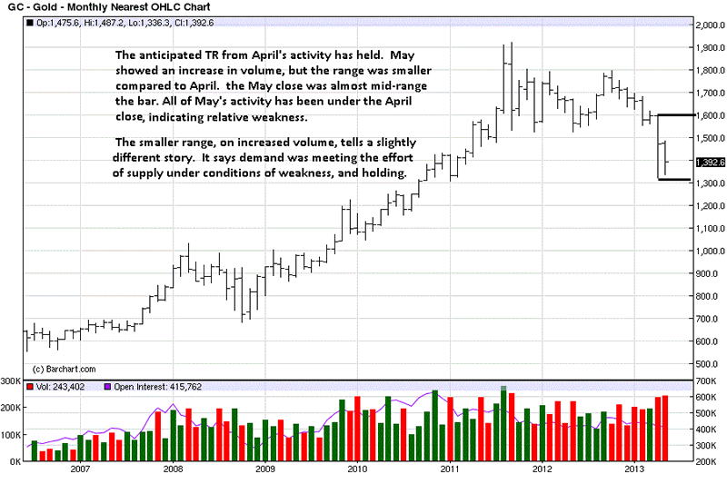
We hold that the higher time frame charts are more controlling than lower time frames. The month of May had a smaller range on increased volume. What this says is that the buyers were meeting the effort of the sellers, preventing the range from extending lower. The close, about mid-range the month, confirms this observation. That would be the qualified good news.

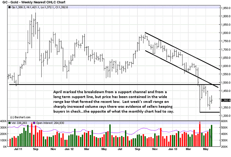
The bad news is all of the activity occurred under the close for April. Buyers did not have enough power to rally price higher. It takes time to stop a trend. So far, there is not enough evidence that the down trend has stopped.

The breaking of the support channel and longer term support line show just how much overhead resistance there is before gold can turn around. The weak response from last week's feeble rally could be problematic. Volume, [effort], increased significantly. For all that volume, last week's close was not much higher. Where was the payoff for the effort? There was none. Weak rallies almost always lead to lower prices as price moves lower to uncover demand.

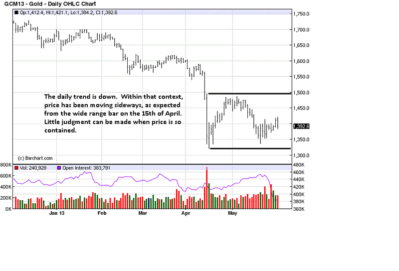
We explained the significance of a wide range bar[s] as it relates to price, moving forward. [See Markets Provide Us The Best Information, http://bit.ly/18pk8yE, 1st paragraph after 1st chart]. While price has not traded lower after the semi-selling climax on 15 April, we would have expected a stronger rally than has developed.

The trading range can hold for many more days, even weeks, but the trading range from which price just broke was much stronger than the one now developing. The odds of it holding are small, for now. While charts are leaning lower, we add the following:

The reason[s] for buying physical gold are opposed to current charts, and actually opposed to all central banks and government interests, but we adamantly maintain the interests of the central bankers and corporate government are opposed to the individuals, those being "governed." One need only look to events in Cyprus, Greece, Ireland, a crippled Spain and Italy to understand why having physical gold offers the best financial remedy against those in power who have been abusing and/or misusing that power.

The power wielded by those who have it are prevailing, and those relying upon the demand side "sentiments" are underestimating the ability of those so willing to remain in power, at all costs, and those costs are being borne by those not in power...the reason to buy gold. Rather than repeat this after the silver charts, the same holds for those buying silver.

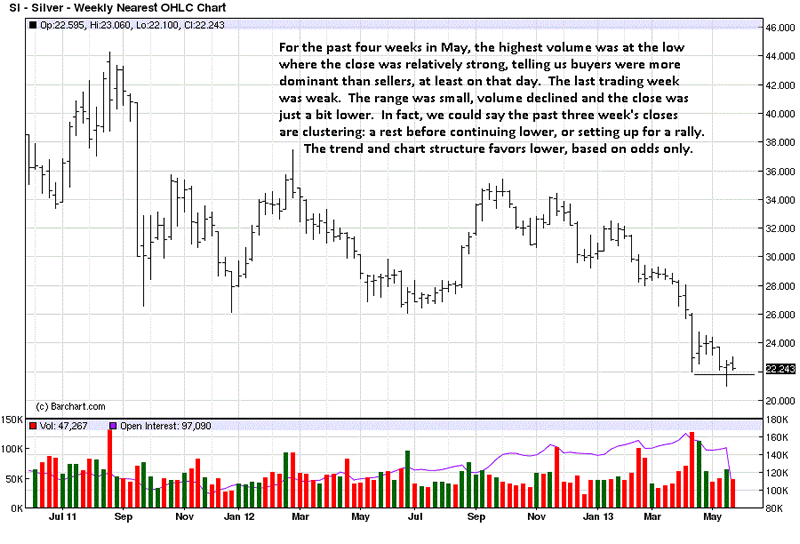
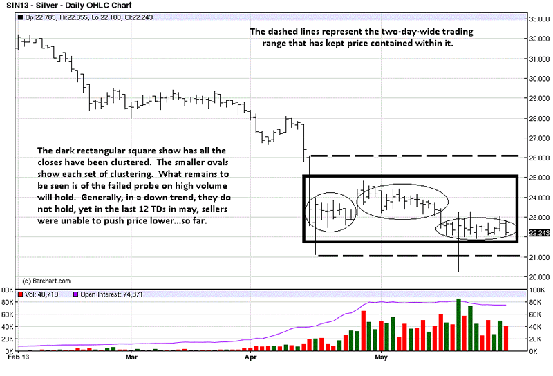
Unlike gold, silver traded under the April low. However, what deserves attention is the how price traded lower. The range was smaller and volume decreased. This tells us that the supply forces were [relatively] weak, or a lack of supply. Demand was not there to offset weaker supply, so this is not to make a case for no, or limited downside from here.

We would expect more sideways, and generally lower trading until there is evidence that the forces of demand can make their presence known. Supply has proven itself. Demand has not. It does not get any simpler, regardless of sentiments. Stick with the known facts.

The chart comments capture the weekly activity. When you look at the wide range bar down, seven weeks ago, and then gauge the subsequent inability of silver to rally against it, you better see how what remains lacking is strong evidence of a turnaround.

A clustering of closes indicates the forces of supply and demand are in balance. Since the April 12 and 15 sell-off lows, price has clustered, as seen in the rectangular box. We await the breakout imbalance that naturally follows.

The headlines touting much higher gold and silver prices may attract attention, but the attention is pandering to the sentiments of those who want to hear news supportive of their own belief system[s]. How has that been working out, so far?

Do not buy gold or silver because you think the price will go higher. Buy because all fiats are being destroyed, and it takes more and more fiat, if one chooses to hold that paper form, to buy the same ounce of silver or gold. [That has not been the case for the past 18 months.] Cypriots would tell you they would rather have paid much higher prices for gold and silver than have kept their fiat powder dry waiting for lower prices. Their remaining fiat holdings will not be able to buy anywhere near what they can now afford. That is what one has to consider as reality, from now on.

If anyone thinks it will not happen in the United States, or other countries still lying in wait, it is like playing a form of Russian roulette. The odds are in your favor, until they are not. Then you will know what it is like to be a Cypriot bank holder. There are no Black Swans, just people unwilling to see the warnings of darkening clouds.

We have acknowledged the eventual likelihood of much higher prices and support the sentiment, which is why our message has been constant: Buy either, or both, physical gold and silver, at any price, for when the day of reckoning arrives, they may not be 1. available, [Never underestimate what the government can/will do], or 2. only at prices that are considerably higher. Hence, better a year early than a day late.

At the same time, we have recognized the reality of the charts and to not buy futures while the trends are down. It is possible that the paper market may be destroyed before any buying "opportunity" presents itself. Paper trading becomes less and less appealing or even relevant. Always remember, if you do not hold it, [personally], you do not own it.

Has anything new been learned from the charts? Not much, for the trend remains down. A lot can be learned from the fact that they are down, relative to the reality of demand, and how that reality does not matter, at least for now. That is a powerful message. We see it as added reason for the constant buying of the physical.

Where? At any price.

See the original article >>

Stock Market Correction

By: Tony_Caldaro

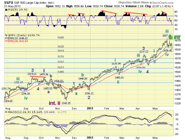
This past holiday shortened week can best be described as choppy until late friday. The SPX started the week at 1650, rallied to 1674, dropped to 1640, rallied to 1662, and ended at 1631. For the week the SPX/DOW were -1.15%, the NDX/NAZ were -0.20%, and the DJ World index was -1.20%. Economic reports remained positively biased with six rising, four declining, and two unchanged. On the uptick: Case-Shiller, pending home sales, consumer confidence/sentiment, the Chicago PMI, and the monetary base. On the downtick: Q1 GDP, personal spending, the WLEI and weekly jobless claims rose. Unchanged were personal income and the PCE. Next week, a busy one, we have the monthly Jobs report, ISM and the FED’s beige book.

LONG TERM: bull market

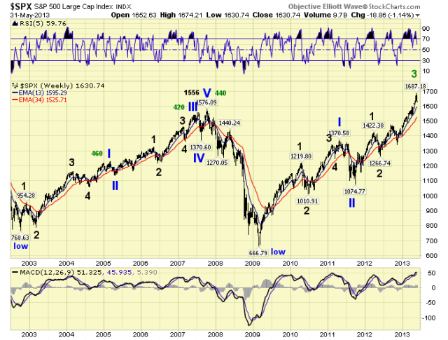
The Secular cycles, we track, in various asset classes continue to unfold as expected. Long term interest rates completed their 30+ year decline in 2012, and are now on the rise. Commodities completed their 10+ year rise in 2011, and have been declining. Foreign currencies completed their 20+ year rise in 2011, and are declining as well. The stock market, however, should remain in its deflationary Secular cycle until around 2016. After that a very explosive Secular growth cycle begins. As interest rates begin to normalize, commodities enter a decade long trading range, and the USD peaks soon after. Until then the stock market remains somewhat range bound, as it has since the year 2000.

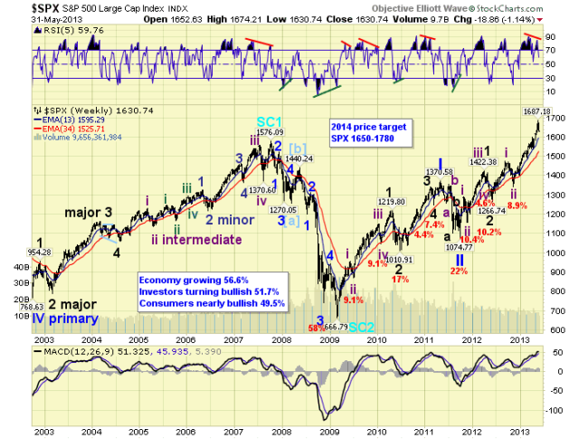
In this phase of the Secular cycle: the bull market from the March 2009 low continues to unfold. This Cycle wave [1] advance is comprised of five Primary waves. Primary waves I and II completed in 2011, and Primary III has been underway since then. Primary I divided into five Major waves, with a subdividing Major wave 1. Primary III is also dividing into five Major waves, but both Major 1 and 3 are subdividing. The above chart displays the Primary and Major waves, without the subdivisions. The below chart, with the subdivisions.

Major waves 1 and 2 of Primary III completed by mid-2012, Major wave 3 has been underway since then. Intermediate waves i and ii, the subdivisions, completed by late-2012, and Intermediate wave iii has been underway since then. This market still needs to complete Intermediate waves iii, iv and v to complete Major 3. Then after a Major 4 correction, Major 5 will complete Primary III. Finally, after a Primary IV correction, Primary V will complete the bull market. Our upside target for the bull market remains in the SPX 1650-1780 range, by late-winter to early-spring 2014. Since the SPX has already reached 1687, this range may need an upward adjustment in the coming months.

MEDIUM TERM: downtrend probable

The current/recent Intermediate wave iii uptrend began in mid-November at SPX 1343. A week ago it hit SPX 1687, making it one of the longest uptrends, in time, for this bull market. And, the strongest uptrend in points for the bull market.

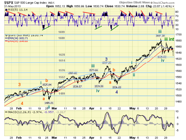
We have been counting this uptrend unfolding in five Minor waves: wave 1 SPX 1424, wave 2 SPX 1398, wave 3 SPX 1597, wave 4 SPX 1536, and wave 5 possibly ending at SPX 1687. Entering this past week, our OEW group had one count suggesting the uptrend ended at SPX 1687, and another suggesting one more rally to go. I went with the latter count using SPX 1636 as the deciding factor. The market did rally on Tuesday. The SPX fell 13 points shy of its high, but the DOW was only 22 points shy of its uptrend high. That was apparently the last rally for this uptrend, as the market started to breakdown Friday afternoon. Nearing the close the SPX dropped below 1636 and ended the week at 1631. We could count this last rally as a failed fifth wave, or just accept the actual high as the end of the uptrend. There are short term counts to fit both. Either way the SPX has now declined 56 points from the 1687 high, or 3.3%, and the expected correction is probably only in its early stages.

Looking ahead. We would expect an Intermediate wave iv correction to last about one month: until June. Since Minor wave 5 was stronger than Minor 1, support should arrive around Minor wave 4: SPX 1536. Right around this level is also Minute iv of Minor 3 at SPX 1540, and Micro 4 of Minute iii at SPX 1539. This level provided support for the uptrend for more than one month. This level also fits between the OEW 1523 pivot and the 1552 pivot. As a result we can broaden the support range for Int. iv to: the 1523 pivot, SPX 1536-1540, and the 1552 pivot. On average then, we are looking at about an 8% – 9% decline. The previous three strongest uptrends and two longest uptrends, of this bull market, corrected between 7.4% and 9.1%. Medium term support is currently at the 1628 and 1614 pivots, with resistance at the 1680 and 1699 pivots.

SHORT TERM

Short term support is at the 1628 and 1614 pivots, with resistance at SPX 1658-1667 and the 1680 pivot. Short term momentum ended the week extremely oversold. The short term OEW charts are negative with the reversal level now SPX 1653.

We have been counting this last rally, Minor 5, with five Minute waves: wave 1 SPX 1598, wave 2 SPX 1581, wave 3 SPX 1687, wave 4 SPX 1636, and wave 5 SPX 1674 (failure). Another count would suggest: wave 3 SPX 1673, wave 4 SPX 1663 and wave 5 SPX 1687. Wave 4 under this second count looked too short for a Minute iv wave. Either way, it does now appear an Intermediate wave iv correction is underway.

If it is indeed a fifth wave failure, we would expect the first decline to be quite substantial. Then after a small counter-rally, the next decline could form a flat to alternate with the Intermediate wave ii zigzag during Oct12-Nov12. Thus far the market has declined to 1640, rallied to 1662, and declined again: 1648-1659-1631. These last three waves all occurred on Friday. The OEW 1628 pivot range should provide the first support, then the 1614 pivot range. Once the latter one breaks there is little support until the 1576 pivot. Which is followed by the 1552 pivot. So the 1614 pivot could be key to the speed of the first decline. After this probable downtrend concludes, likely in June, the market should enter an Intermediate wave v uptrend to new all time highs. There is still three more uptrends in this bull market before it concludes. Best to your trading/investing!

FOREIGN MARKETS

The Asian markets were quite mixed losing 1.3% on the week. Australia, Hong Kong, Japan and Singapore are close to confirming a downtrend.

The European markets were also mixed losing 0.3% on the week. Spain and Switzerland are close to confirming a downtrend.

The Commodity equity group were all lower losing 3.3% on the week. Brazil and Russia are close to confirming a downtrend.

The DJ World index is close to confirming a downtrend and lost 1.2% on the week.

COMMODITIES

Bonds lost 0.7% on the week as their downtrend continues.

Crude lost 2.3% on the week. It appears to have been in an uptrend that can easily reverse back into a downtrend.

Gold gained 0.2% on the week, and also appears to be in an uptrend that can easily reverse.

The uptrending USD lost 0.5% on the week.

NEXT WEEK

A busy economic calendar ahead for next week. Monday: ISM manufacturing and Construction spending at 10:00, then monthly Auto sales. Tuesday: the Trade deficit. Wednesday: the ADP index, Factory orders, ISM services, and the FED’s beige book. Thursday: weekly Jobless claims. Friday: the monthly Payrolls report and Consumer credit. The FED is quite active too. On sunday speeches from FED chairman Bernanke in Princeton NJ, and vice chair Yellen in Shanghai, China. Thursday a speech from FED governor Raskin in Columbus, Ohio. It should be quite a week. Best to you and yours this weekend and the week ahead!

See the original article >>

Caution for Stock Market Bulls and Bears

By: Michael_Noonan

The market is undergoing a correction, but it is enough to call it a top? No. More evidence is required before saying that the Fed has thrown in the towel. If it takes more fiat to keep prices inflated, it will be provided. The alternative would be too painful for investors, [not of concern for the Fed], and too embarrassing to admit to the fraud of QE-Infinity to keep the bubble intact.

The stock markets are the antithesis to gold and silver. The latter have an insatiable demand, as price has declined. The former is void of demand as price has risen to all time highs. The Fed has driven what participants there are to the markets because there are no viable "earning alternatives" to match "rising" stocks. The Fed has chosen to destroy retirees and anyone else seeking gains in interest bearing instruments as a vehicle for income in its efforts to keep the market [lie] alive.

Just as there has been demonstrated manipulation on the Precious Metals, via naked short selling that has no intent of ever delivering what was sold, [anyone else would go to jail for the practice], the same holds true for the stock market. So how valid are the charts? They are all we have, so they must be judged based on what they show. At some point, the reality of [lack of] supply and [false] demand will prevail. All anyone can do is read developing market activity, for it tells the most accurate story of who is winning the battle, and ultimately, the war

Here is what the charts say...

The starting point is to give recognition to the most important element in reading and understanding any chart, in any time frame, and that is the trend. Trends have a proven tendency to persist, and when a trend stops, it takes time to turn it around. There are always signs to act as a guide.

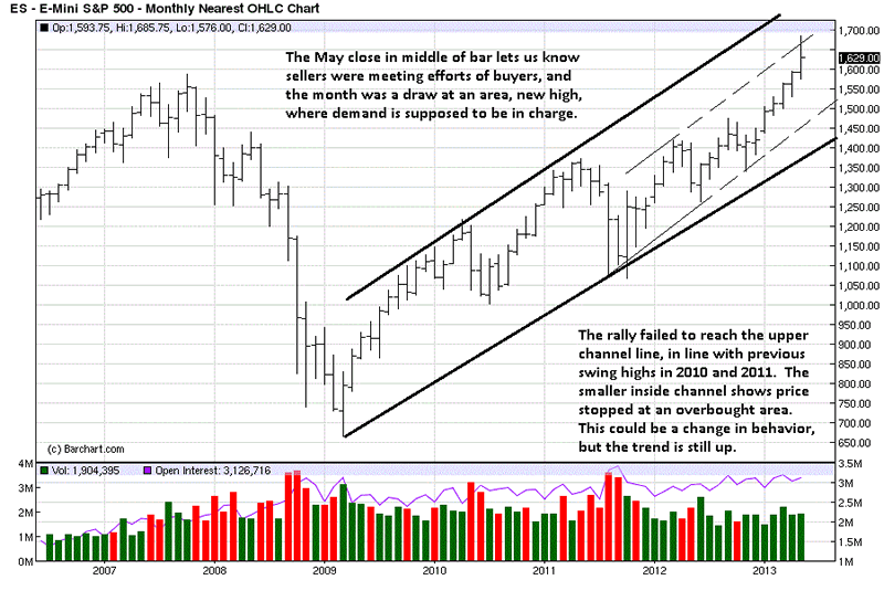
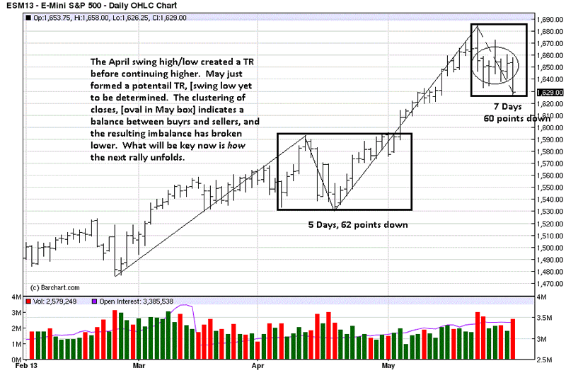
Since the 2009 low, price has been in a steady up trend, with a few corrections along the way. Corrections are a natural and healthy reaction within any trend. What we see for the month of May, [new highs], is a mid-range close. The market's message from that kind of close tells us that sellers more than met the efforts of buyers at the upper part of the highs. The current unfolding decline ran out of month before finishing, so we must deal with what is, as just described, for it could have been worse.

Yes, yes...woulda, coulda, shoulda; just stick with the facts as they are. The trend is up, and there is not enough evidence to say a change has occurred, or even may occur. The higher monthly time frame is more prevailing in effect than lower time frames, and it always makes sense to keep this in mind.

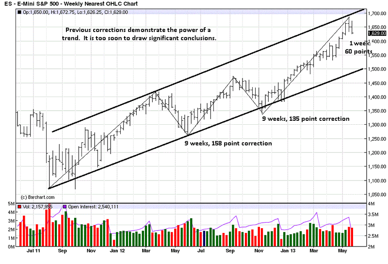
The weekly time frame supports the trend of the monthly, up, and shows no sign of any change, at least none that would warrant going against it, at present. The last two swing lows show how long they took to correct, and how many points in each decline, before resuming the up trend. Volume has increased over the last two weeks as price declined, and using close stops, or simply taking profits, in individual stocks makes sense, but the Fed Bubble has not yet burst, based on the current chart structure.

The daily is the most sensitive to change of the three time frames covered. Even here, one has to respect past activity, like the April correction, and the market's ability to recover and rally to new highs.

We can say that the trend is still up overall, but presently trading sideways. More price development is required in order to determine the character of the present correction. If this market is turning, and existing evidence does not support that conclusion, yet, we will be able to assess the quality of the next rally, as it unfolds, and make a more informed decision. We stress "as it unfolds" because there is no reason to "predict" or get ahead of the market until it tells us, beyond doubt, its intent.

If volume picks up on the next rally and closes are strong, overall, then we can expect higher price levels. If the developing price activity is weak, as in lower volume on rallies, poor closes, increased volume and greater ease of movement on declines, then we put ourselves in a position to be in harmony with the current trend development.

The track record of those who have been "predicting" a top and shorting the market while in an uptrend is very poor, so picking tops is not a profitable endeavor. Let the market reveal its message, and then follow along.

For right now, the message is one of caution, for both the bulls and the bears.

See the original article >>

Japan Foreshadows Next Global Crisis

by James Gruber

Japan is the only game in town right now and for good reason. First, it was the yen’s +20% move in less than six months and now there’s the extraordinary volatility in Japanese stock and bond markets. What’s behind the recent action? Nobel laureate Paul Krugman points to false alarm over rising bond yields which is actually reflective of increased optimism in a Japanese economic recovery. One can only assume Krugman wrote this with a straight face, all the while ignoring the real reasons for Japan’s dysfunctional bond market: 1) investors bailing due to 10-year government bonds yielding just 0.85% when the central bank is targeting 2% inflation 2) And that snowballing into liquidity concerns as the central bank increasingly crowds out other players in the bond market, leading to increased yield volatility.

These first signs of investors’ losing of faith in Japan’s bond market not only spell trouble for the world’s third largest economy. They’re also likely to prove a prelude to what will later happen in other developed markets, including Europe and America. Namely, the unprecedented economic measures of the developed world will reach their limits when investors no longer view government bond markets as safe havens and yields spike on supply concerns. The jig will then be up and it’ll have huge spill-over effects for the world’s currencies, including the reserve currency, as well as stock markets. Hang onto your seatbelts; it’s going to make for a wild ride.

Paul Krugman can’t be serious

I played tennis at a high level as a teenager and one of my then heroes was the irrepressible John McEnroe. During one of his famous temper tantrums, McEnroe was so furious with an umpire at the Wimbledon championships that he uttered the immortal line, “you cannot be serious”, before treating the centre court crowd to a more colourful diatribe.

I couldn’t help but think of the McEnroe line when reading Paul Krugman’s latest take on Japan. In the column in The New York Times, Krugman lauds Japan’s unprecedented stimulus efforts:

“A short term boost to growth won’t cure all of Japan’s ills but, if it can be achieved, it can be the first step to a much brighter future.”

This isn’t a surprise given that Krugman, like the majority of the economics profession, believes that during an economic downturn, government stimulus and reduced interest rates can help to boost GDP growth as reduce unemployment (the Keynesian school of thought in crude terms). I won’t debate that here, but as noted in many prior newsletters, there’s little historical evidence that it actually works.

Krugman then goes to suggest that the stimulus efforts in Japan are starting to bear fruit:

“The good news starts with the surprisingly rapid Japanese economic growth in the first quarter of this year – actually, substantially faster growth than that in the United States, while Europe’s economy continues to shrink. You never want to make much of one quarter’s numbers, but that’s the kind of thing that we want to see.”

Here Krugman is on shakier ground for he knows (or should) that GDP growth isn’t reflective of economic health (didn’t we learn that from the 2008 financial crisis?). And he conveniently ignores the latest inflation statistics which show Japan remains mired in deflation.

Then we get to the more interesting part of the column. Krugman notes other positives in Japan including a steep rise in the stock market (prior to when the column appeared on May 23) and a sharp fall in the yen, aiding the country’s exporters. Of the bond market volatility, he writes:

“Some observers have raised the alarm over rising Japanese long-term interest rates, even though those rates are still less than 1 percent. But the combination of rising stock prices and rising interest rates suggest that both reflect an increase in optimism, not worries about Japan’s solvency.”

Let’s put aside the skewed logic that rising stock markets are a sign that Japan’s economy is getting back on track (supposedly paper wealth via stock markets will trickle down into economic spending).

Let’s instead focus on Krugman’s claim that rising bond yields in Japan are sign of increased optimism. By the way, this is a view shared by most of his Keynesian brethren too.

If this claim leaves you scratching your head, you’re not alone. Apparently we’re supposed to believe that after 23 years of economic stagnation, bond investors (94% of them domestic at last count) now see better times ahead. That 10-year government bond (JGB) yields spiking from 0.35% to 1% in around 7 weeks is a sign of a healthy market. And that the bond market being halted on numerous occasions due to unprecedented volatility is a further sign of a healthy market.

japan-government-bond-yield

Better reasons for a dysfunctional market

There are other, more plausible reasons why Japan’s bond market has become dysfunctional – and I don’t think that’s too strong a word for its current state. The first reason is that there are some investors who are clearly unhappy with getting paltry returns of 0.85% from 10-year JGBs. Why own them when the government is intent on producing 2% inflation, implying a -1.15% real return? Particularly when the bonds are denominated in yen, whose further decline seems assured given the central bank’s extraordinary actions.

The second reason is that these extraordinary actions, involving the Bank of Japan (BoJ) printing money to buy JGBs, mean the central bank is becoming the dominant player in the JGB market, crowding out other investors. This crowding out effect reduces liquidity and heightens volatility. An illiquid market means that banks can’t quickly find counterparties with which to trade large volumes of bonds.

The situation is likely to worsen as the BoJ intervenes more heavily in the bond market going forward. And it may have little choice, just to prevent a more substantial crash in the market.

There’s also the possibility that the volatility in the JGB market will lead to rising yields in other developed world bond markets as investors look for better returns for the risks that they’re taking on. This in turn could put further upward pressure on JGB yields.

The significance of the tumultuous action in Japan’s bond market can’t be understated. As I’ve said on many occasions, the interest of Japanese government debt already takes up 25% of government revenues. If yields were to rise to just 2.8%, that figures becomes 100%. A bond market crash would happen well before it got to that point though.

The more immediate concern is with Japanese banks which hold massive JGB portfolios. According to the BoJ, a 100 basis point increase across all bond maturities would lead to mark-to-market losses of 10% of tier 1 capital for the major banks. Reduced capital means banks wouldn’t be able to lend as much. This in turn would blunt the impact of Japan’s quantitative easing (QE) policies.

A template for what’s to come

Few investors realise it yet, but the action in Japanese markets is likely a prelude to what will happen in other developed countries, including the U.S.

To understand why let’s briefly take a step back. The 2008 financial crisis resulted in governments in many developed markets taking over the enormous debts accumulated in the private sector. Whether this was right or wrong has been endlessly debated and we won’t do that here – it’s done.

Cutting these enormous debts would probably have sent the world into depression. Instead, governments chose to try to inflate these debts away. That’s where QE came into play. QE involved printing money to buy bonds off financial institutions. Theoretically, these institutions would use this money to lend more, thereby stimulating the economy. This would also produce inflation, thereby reducing government debts in local currency terms. Cutting interest rates at the same time would amplify the stimulus.

The problem is that banks haven’t lent the money out to the extent that central banks would like. That’s because consumers have been busy paying off debt and they’ve been frightened to take on more again. They’ve learned their lesson, in other words.

Because stimulus has failed to kick-start economies, government debt in developed markets has continued to skyrocket, and total debt remains on an uptrend too. In fact, total debt to developed market GDP is 270%, 21 basis points higher than it was in 2008!

Developed market total debt - May 2013

Not to be deterred, governments in these developed markets don’t view QE as a failed experiment. They believe that it’s prevented a sharper economic downturn. And that more QE will help their economies recover faster. That means governments and their central banks everywhere are ramping up stimulus. It’s a coordinated effort that’s not been seen in modern history, not even during the Great Depression.

COM-Central-Bank-Balance-Sheets-011813

Therefore, it’s highly likely that QE will be incrementally increased so long as economies don’t recover to the satisfaction of central bankers. That’s why you shouldn’t expect any imminent cut to stimulus in the U.S. either.

In may respects, Japan is the template for what’s to come in other developed markets. After an enormous credit bubble which burst in 1990, Japan has refused to restructure its economy in order for it to grow in a sustainable manner. Instead, it’s chosen the less painful route of printing money to try to revive the economy and reduce debts in yen terms.

It’s been unsuccessful at previous attempts at QE, including in the early 1990s and 2001-2006. Now it’s got to the point where the debt load is so large at 245% of GDP, and the interest burden so excessive, that there are no good choices left. So Japan has chosen to print even more money, at the not-so-subtle urging of developed countries, particularly the U.S.

The trouble with this is that there comes a point where bond investors lose confidence in the ability of the government to repay the money. These investors then refuse to rollover government debt at low rates. When bond markets dry up, they normally do so quickly. The current wobbles in the Japanese bond market can be seen as a prelude to this endgame.

Though Japan has escaped its day of reckoning for a long time, other developed markets are unlikely to be as lucky, given the extent of their indebtedness and continued commitment to flawed policies.

See the original article >>

The Week Ahead: More Interest Rate Surge?

by Jeff Miller

Since 2008 investors have preferred bonds to stocks. When the valuation difference became compelling, the stock rebound was led by defensive sectors – anything with attractive yield. We are now at a crucial point in this trend. Last week's spike in long-term interest rates has driven the ten-year yield back above the dividend yield on the S&P 500 for the first time since 2011. Abnormal Returns discusses the rarity of this situation, noting,

"This relative yield argument has been used by many to get investors to jump back into stocks."

See the full post for a more complete discussion and an interesting chart.

crash-through-the-floor

Follow up:

With plenty of data to fuel the debate, this week's focus will be on interest rates: Will the surge continue?

The one-year chart of the ten-year yield shows the break out from the recent trading range. You need to look carefully to see the last few daily data points, following a gap.

Fredgraph

To set the stage, here are two contrasting viewpoints:

  • Top bond managers Jeff Gundlach and Bill Gross see long-term rates as controlled by the Fed. At the start of May Gundlach stated this viewpoint on several occasions as noted in the WSJ:

    "It's not timely to be betting on higher interest rates," said Jeffrey Gundlach, chief executive and chief investment officer of DoubleLine, a Los Angeles firm with $59 billion under management. He said economic growth remains too soft to allow the Fed to consider cutting back its $85 billion-a-month bond-purchase program known as "quantitative easing," a shift he views as a necessary precursor to any increase in interest rates.

    Gross shared this opinion:

    "Pimco's advice is to continue to participate in an obviously central-bank-generated bubble,'' Mr. Gross said in his monthly investment outlook published last week.

  • Economist Scott Grannis contends that the Fed is Powerless to Manipulate Interest Rates.

    If the Fed bought three quarters of the new issuance of Treasury securities over an 8-month period, with a focus on longer maturities, the 10-yr Treasury yield would almost certainly fall, right? And if the Fed bought all the new issuance of MBS over an 8-month period, increasing its share of home mortgages by over 40% in the process, yields on MBS would almost certainly fall, right?
    Wrong. The Fed has indeed been a huge buyer of Treasuries and MBS since last September, but Treasury yields and MBS yields have moved significantly higher, not lower.

    Grannis shows the effect on the MBS market. Despite Fed purchases equal to the net new issuance, the rates of increased by 100 bps.

    Fed share home mtgs

Despite losses in May, Gundlach is sticking to his guns, expecting the Fed to step in.

How will the interest rate story play out? As usual, I have some thoughts on the bull market question which I'll report in the conclusion. First, let us do our regular update of last week's news and data.

Background on "Weighing the Week Ahead"

There are many good lists of upcoming events. One source I regularly follow is the weekly calendar from Investing.com. For best results you need to select the date range from the calendar displayed on the site. You will be rewarded with a comprehensive list of data and events from all over the world. It takes a little practice, but it is worth it.

In contrast, I highlight a smaller group of events. My theme is an expert guess about what we will be watching on TV and reading in the mainstream media. It is a focus on what I think is important for my trading and client portfolios.
This is unlike my other articles at "A Dash" where I develop a focused, logical argument with supporting data on a single theme. Here I am simply sharing my conclusions. Sometimes these are topics that I have already written about, and others are on my agenda. I am putting the news in context.
Readers often disagree with my conclusions. Do not be bashful. Join in and comment about what we should expect in the days ahead. This weekly piece emphasizes my opinions about what is really important and how to put the news in context. I have had great success with my approach, but feel free to disagree. That is what makes a market!

Last Week's Data

Each week I break down events into good and bad. Often there is "ugly" and on rare occasion something really good. My working definition of "good" has two components:

  • The news is market-friendly. Our personal policy preferences are not relevant for this test. And especially -- no politics.
  • It is better than expectations.

The Good

This was a mixed and abbreviated week for economic data.

  • The Chicago PMI showed a surprising gain to 58.7, the biggest increase in decades. This matters mostly as a hint about Monday's national PMI.
  • Case-Shiller home prices showed a surprising increase. See Calculated Risk for analysis. Dr. Ed, providing this chart, makes the prediction that there will be "no negative equity in U.S. markets in 12-18 months."

Yardeni Home Prices

  • Michigan Sentiment hit a new high. This is a good coincident indicator of consumer activity and employment. I love the Doug Short chart, which combines all of the key factors.

Michigan Sentiment

The Bad

There was some negative data this week, but it was not as bad as the headlines. The market reaction did not seem closely tied to the data. Feel free to join in the comments with any items that you think I missed.

  • Initial jobless claims disappointed, increasing to 354K. This is replacing a "good" week in the 4-week average that everyone follows to reduce noise.
  • Personal income was unchanged, a market disappointment. See Steven Hansen's analysis for trends, inflation adjustments, and year-over-year analysis. Eddy Elfenbein is more encouraged by the result when adjusting for transfer payments. Eddy recommends ignoring the end-of-year "dividend spike" in this chart:

Fredgraph05312013

  • Pending home sales increased, but less than expected. I am scoring this as "bad" but Calculated Risk sees it as a function of fewer low-end foreclosures.

The Ugly

Friday's closing stock market captures this week's "ugly" award. The final hour collapse took the averages into negative territory for the week. There was some talk about a possible bad number in the HSBC Manufacturing PMI for China. This would come out before Monday's opening.

Companies do not execute stock repurchases in the last hour of trading and there is no "window dressing" by long-only managers on the last day of the month. Apparently the Plunge Protection Team had also left for the weekend!

I predicted last week that we would see extraordinary volatility, and suggested that we all needed a game plan. I used mine Friday afternoon to do some buying.

The Indicator Snapshot

It is important to keep the current news in perspective. My weekly snapshot includes the most important summary indicators:

The SLFSI reports with a one-week lag. This means that the reported values do not include last week's market action. The SLFSI has moved a lot lower, and is now out of the trigger range of my pre-determined risk alarm. This is an excellent tool for managing risk objectively, and it has suggested the need for more caution. Before implementing this indicator our team did extensive research, discovering a "warning range" that deserves respect. We identified a reading of 1.1 or higher as a place to consider reducing positions.

The SLFSI is not a market-timing tool, since it does not attempt to predict how people will interpret events. It uses data, mostly from credit markets, to reach an objective risk assessment. The biggest profits come from going all-in when risk is high on this indicator, but so do the biggest losses.

The C-Score is a weekly interpretation of the best recession indicator I found, Bob Dieli's "aggregate spread." I have now added a series of videos, where Dr. Dieli explains the rationale for his indicator and how it applied in each recession since the 50's. I have organized this so that you can pick a particular recession and see the discussion for that case. Those who are skeptics about the method should start by reviewing the video for that recession. Anyone who spends some time with this will learn a great deal about the history of recessions from a veteran observer.

I have promised another installment on how I use Bob's information to improve investing. I hope to have that soon. Anyone watching the videos will quickly learn that the aggregate spread (and the C Score) provides an early warning. Bob also has a collection of coincident indicators and is always questioning his own methods.

I also feature RecessionAlert, which combines a variety of different methods, including the ECRI, in developing a Super Index. They offer a free sample report. Anyone following them over the last year would have had useful and profitable guidance on the economy. RecessionAlert has developed a comprehensive package of economic forecasting and market indicators, well worth your consideration.

Unfortunately, and despite the inaccuracy of their forecast, the mainstream media features the ECRI. Doug Short has excellent continuing coverageof the ECRI recession prediction, now well over a year old. Doug updates all of the official indicators used by the NBER and also has a helpful list of articles about recession forecasting. His latest comment points out that the public data series has not been helpful or consistent with the announced ECRI posture. Doug also continues to refresh the best chart update of the major indicators used by the NBER in recession dating.

This week there is (yet another) effort by the ECRI to suggest that there might be a recession. Doug Short notes as follows:

Here are two significant developments since ECRI's public recession call on September 30, 2011:

  1. The S&P 500 is up 46.2%.
  2. The unemployment rate has dropped from 9.0% to 7.5%.

The average investor has lost track of this long ago, and that is unfortunate. The original ECRI claim and the supporting public data was expensive for many. The reason that I track this weekly, emphasizing the best methods, is that it is important for corporate earnings and for stock prices. It has been worth the effort for me, and for anyone reading each week.

Readers might also want to review my Recession Resource Page, which explains many of the concepts people get wrong.

Our "Felix" model is the basis for our "official" vote in the weekly Ticker Sense Blogger Sentiment Poll. We have a long public record for these positions. About a month ago we were "neutral" for two weeks. (These are one-month forecasts for the poll, but Felix has a three-week horizon). Felix's ratings stabilized at a low level and then improved significantly for several weeks. The ratings are now weaker, but there are still many attractive sectors. The penalty box percentage measures our confidence in the forecast. When there is a high rating, it means that most ETFs are in the penalty box, so we would have less confidence in the overall ratings. That measure is relatively low at the moment, so we have greater confidence in short-term trading.

[For more on the penalty box see this article. For more on the system ratings, you can write to etf at newarc dot com for our free report package or to be added to the (free) weekly ETF email list. You can also write personally to me with questions or comments, and I'll do my best to answer.]

The Week Ahead

This week is loaded with data releases.

The "A List" includes the following:

  • The employment report (F). The Fed is using employment as a benchmark, and so is everyone else.
  • Initial jobless claims (Th). After last week's bounce higher, this will command attention even though it is not part of the survey period for the jobs report.
  • The ISM index (M). A good coincident indicator of economic conditions. It is threatening to turn negative on manufacturing.

The "B List" includes the following:

  • ISM services (W). Services have become more important than manufacturing, but the series has less history.
  • ADP employment (W). A good independent read on employment. This report deserves attention.
  • The Beige Book (W). While the information is anecdotal, this is what the FOMC will see at the next meeting.
  • Construction spending (M). April data, but confirmation for a key sector.

We will also get auto sales data for May. Last but not least, I see about six scheduled appearances by Fed Governors and Regional Presidents. That should provide plenty of material for the Fed punditry!

Trading Time Frame

Felix has continued a bullish posture. The trading positions have become more aggressive. In a very unusual move, Felix also recommends TBF – an ETF that is effectively short long-term Treasuries. Felix is especially good at sticking with a trend until there is clear evidence that it has broken. The method is excellent in helping to stay on the right side of big moves.

There will come a time when Felix is wrong, giving back some gains in a correction. It goes with the territory. There are many ways to trade and invest successfully, and many trading time frames. Felix is making a three-week forecast, but we monitor it daily and adjust our trading positions accordingly.

Investor Time Frame

This is a time of danger for investors – a potential market turning point. I review this investor section carefully every week, although the general advice does not change as rapidly as it does for the trading time frame. The recent themes are still quite valid. If you have not followed the links, find a little time to give yourself a checkup. You can follow the steps below:

  • What NOT to do

Let us start with the most dangerous investments, especially those traditionally regarded as safe. Interest rates have been falling for so long that investors in fixed income are accustomed to collecting both yield and capital appreciation. An increase in interest rates will prove very costly for these investments. I highly recommend the excellent analysis by Kurt Shrout at LearnBonds. It is a careful, quantitative discussion of the factors behind the current low interest rates and what can happen when rates normalize.

  • Find a safer source of yield: Take what the market is giving you!

For the conservative investor, you can buy stocks with a reasonable yield, attractive valuation, and a strong balance sheet. You can then sell near-term calls against your position and target returns close to 10%. The risk is far lower than for a general stock portfolio. This strategy has worked well for over two years and continues to do so. (If you cannot figure it out yourself, or it is too much work, maybe we can help – scroll to the bottom).

  • Balance risk and reward

There is always risk. Investors often see a distorted balance of upside and downside, focusing too much on new events and not enough on earnings and value.

Three years ago, in the midst of a 10% correction and plenty of Dow 5000 predictions, I challenged readers to think about Dow 20K. I knew that it would take time, but investors waiting for a perfect world would miss the whole rally. In my next installment on this theme I reviewed the logic behind the prediction. It is important to realize that there is plenty of eventual upside left in the rally. To illustrate, check out Chuck Carnevale's bottoms-up analysis of the Dow components showing that the Dow "remains cheaply valued."

  • Get Started

Too many long-term investors try to go all-in or all-out, thinking they can time the market. There is no reason for these extremes. There are many attractive stocks right now – great names in sectors that have lagged the market recovery. You can imitate what I do with new clients, taking a partial position right away and then looking for opportunities.

We have collected some of our recent recommendations in a new investor resource page -- a starting point for the long-term investor. (Comments and suggestions welcome. I am trying to be helpful and I love feedback).

Final Thought

This is a crucial time for many investors. Their lifetime savings are parked in very dangerous holdings of bonds and other yield-based instruments that were safe in days past.

They are reassured by guys who manage a gazillion dollars, telling them that these are great choices. On the other side are some academic types, and everyone enjoys making fun of them!

It is time for a reminder to my old readers and a message to new ones.

Here at "A Dash" my mission has always been to find the best experts on any topic. Anyone who is a long-term reader knows that my positions have changed with the evidence. Few can say that. My long-term investment posture has been bullish (and accurate) for some time and my assessment of risk from Europe and recession (declining) has also been right. When I saw higher risk in October of 2011, I said so. My company's programs include the best approach to a bond ladder and the best way to profit from a sideways market. Briefly put, I have no personal stake in stocks moving higher. Unlike the "bond guys" I do not have a specific asset allocation to sell.

With that in mind: Interest rates (on the long end) will move higher. Here are the reasons:

  • The economy is moving toward a natural growth rate -- greater than now.
  • The Fed is trying to create inflation, and they can do it. (See here).
  • Investors will be surprised by losses in their bond mutual funds.

Take a look at the returns from PIMCO's flagship, a fund that I have often selected for clients – at the right time. You can be the most brilliant bond manager around, but you will not make money if the economy is improving and rates are rising. Losing 2% in a month is a staggering shift for these investors.

When it comes to comparing the stock/bond tradeoff, consider these possibilities:

  1. Stock investors are just waiting for bonds yields to get back above 2% so that they can keep up with inflation.
  2. Bond investors will be surprised by actual losses on their statements -- something they have not seen for years.

The choice is pretty obvious. Bonds will get competitive when yields get back to 4% or so. Here is some wise advice from Eddy Elfenbein:

This leads me to think that higher long-term rates signal growing optimism for the economy. The U.S. dollar has also been doing well. Remember that financial markets tend to lead the economy by a few months, so the strength for the economy hasn't shown up just yet.

For now, I encourage investors not to be rattled by any short-term moves. We've had a long stretch of low volatility, and those don't last forever. Get used to seeing higher interest rates.

See the original article >>

Spotting Market Peaks & Valleys

by Tom Aspray

The starc bands are a technical tool that I use frequently in my daily column. They help me determine whether a market is in a high-risk buy area (overbought) or a low-risk buy area (oversold). It is important to understand that just because a market is at its starc+ band, the market can still go higher but the probabilities do not favor it.

The regular formula, developed by the late Manning Stoller, adds or subtracts two times the average true range (ATR) from a six-period moving average. In his experience, a market should stay within these bands approximately 92% of the time. If instead you use three times the ATR, then prices should stay within the bands 99% of the time.

These bands are valuable on any stock, ETF, or market average but there is another tool that I use to help me determine when the overall market is overbought or oversold. This is the number of stocks in an average that are above their 50-day moving average. Of course, you can also look at this number relative to a 10- or a 200-day moving average.

This data is widely available on the Web, but last year, I came across a great site Index Indicators, which has an amazing number of free technical indicators. They have data not only on our exchanges but also on Canada, ten different European indices, 11 Asian/Australian markets, as well as Brazil, Mexico, and Argentina. (I have no idea who developed this site but the data seems clean. Of course, I have no financial connection with them).

A word of caution, if your significant other or family becomes aggravated when you spend long hours on research, this site could be a problem as you can easily spend hours, if not days, using it. In this lesson, I want to focus on how I use one small part of the data that they provide.

This chart features the Dow Jones Industrials and overlaid in green is the % of Dow stocks that are above their 50-day moving average. I find this information to be most valuable at market bottoms. The annotations on the charts and the analysis are mine and are not from of the site.

chart
Click to Enlarge

I am sure everyone remembers the fight over the debt ceiling debacle in the summer of 2011 as stocks started plunging in late July and remained very volatile for the next two months. Many became convinced that another recession was imminent and bearish sentiment was very high.

During the drop in early August, the % fell to zero, and then formed higher highs, line a, at the October lows. The % rose to 13% at the October 4 lows, and a few days later, the A/D indicators turned bullish. I find that combining the A/D analysis with this data can be a powerful tool to identify market bottoms.

In November 2011, stocks dropped sharply the week of Thanksgiving and the % spiked down to 20%, which turned out to be a great buying opportunity. The Dow continued to make new highs, and by the middle of January, the % had reached 100%, which was equal to the October high, line b.

As the Dow was making its high in March, the % was forming a lower high at 90 (line c) and this negative divergence became more pronounced as the Dow made its high on May 1. By the early part of June, the % had plunged to 13 (point d) while the A/D indicators were forming bullish divergences as I noted in Rally Potential That Bears Don’t Expect.

chart
Click to Enlarge

By early August, the % of stocks was again close to 95% but formed a lower high on September 14 as stocks were peaking. The negative divergence, line e, warned of the correction that lasted until just after the election. At the November 16 low, only 3% of the Dow stocks were above their 50-day MA.

Several times in 2013, the % has reached 93%, line g, but has not made higher highs even though the Dow Industrials have made a series of new highs. A drop below the 60% level will probably signal that a correction is already underway.

chart
Click to Enlarge

The chart of the S&P shows some similarities to that of the Dow, as well as some differences. The % of stocks also formed a bullish divergence, line a, at the October 2011 lows and then spiked to over 90%, which was a sign of strength. This and the new highs in the NYSE A/D line indicated that the correction in November was a buying opportunity.

The sharp pullbacks in the % to oversold levels when the A/D line is in the early stages of an uptrend are generally good risk/reward buying opportunities.

In February, the % peaked at 88, but by March, it has made a lower high at 82, line b. By the end of April, it dropped further. In late May and early June, it made lower lows, line c, as no bullish divergence was evident in the %. It should be noted that the % did drop to two standard deviations below the mean signaling a very oversold market.

Even though the % of stocks formed sharply lower highs in October 2012, line d, this was not a divergence since the S&P 500 also made lower lows. By the middle of November, as many thought a new bear market was underway, the % dropped to a low of 23%. They ignored the fact that the NYSE A/D line had confirmed the highs, which meant that the intermediate trend was still positive.

So far in 2013, the % peaked in January at 91 and in May was slightly lower at 90, line e. Another new high in the S&P 500 is likely to be accompanied by a lower peak in the % of stocks above their 50-day moving averages. Oftentimes, multiple negative divergences form before a top is completed.

chart
Click to Enlarge

The Web site also allows you to backtest the % of stocks, as well as all of their other indicators. This table reflects the results of a test on what happened to the S&P 500 for the 15 days after the % dropped below 20. This has happened 41 times in the past two years.

After 15 days, the average gain was 2.53% and the return was positive 77% of the time. It also noted that during the 15 days, the highest return was 4.84%, which occurred at an average of 9.83 days. Its lowest average was -2.41% that occurred 5.29 days after the 20% level was breached.

Their test data suggests that the total return was almost four times better than the buy-and-hold return. They also provide you a listing of all of the signals, which I have not included. Though this test data is interesting, it is not the way I use this indicator.

The Nasdaq 100 was a leading sector in early 2012 as the relative performance analysis indicated it was outperforming the S&P 500. The RS analysis turned negative in September 2012 and has just recently turned around. The % of stocks analysis can often help confirm the relative performance analysis.

chart
Click to Enlarge

In early August 2011, only 2% of the Nasdaq 100 stocks were above their 50-day MA while in early October the reading was 13% as the % formed significantly higher lows, line a. After surging well above the 80 level in October and early November the 20% level was broken on Black Friday.

From the November lows, the Nasdaq 100 rose 30% by the late March highs. The % of stocks peaked at 93% in early February but only reached 85% at the end of April, line b. A month later, the % had reached quite oversold levels at 10% (circle c.).

There were not any divergences at the September 2012 highs as the % made slightly higher highs, line d. The 20% level was tested in November (circle e), but by the end of January, it was back to 90%. On May 21, only 85% of the Nasdaq 100 stocks were above their 50-day MA, so lower highs, line f, have formed. This negative divergence has not yet been resolved.

chart
Click to Enlarge

The backtest summary revealed that the % dropped below 20% 40 times in the past two years, and after 15 days, the average return was 4.15% with a positive result in 88% of the time.

The best return occurred after 12.43 days and was 5.59%. The lowest average return of -1.79% occurred after an average of 4.08 days. The total return of 165.84% was over five times better than the passive return. Of course there are many ways to change the backtesting as you can change the market average or indicator, smooth the indicator with a five-, 10-, or 20-day moving average, select the observation period,  as well as the level of indicator that will trigger a signal.

See the original article >>
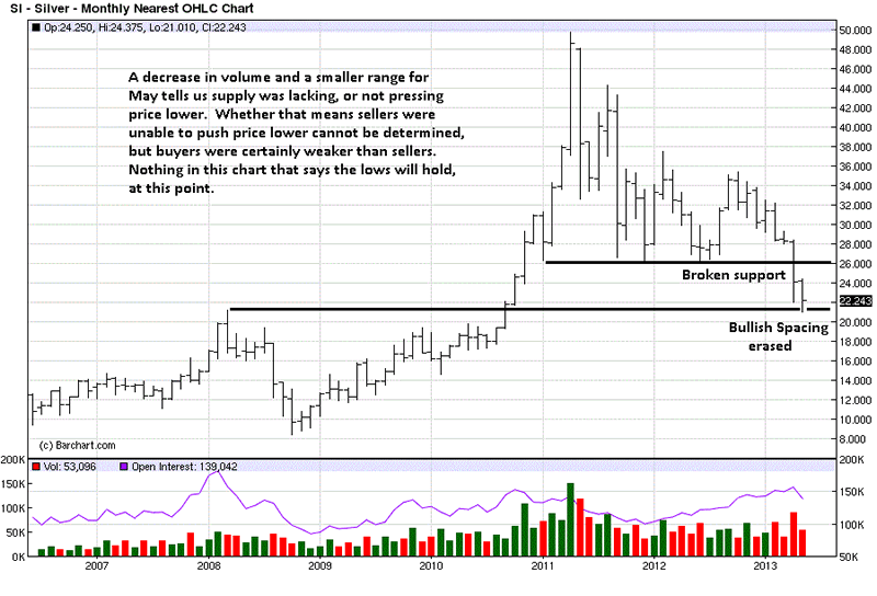
Follow Us