Monday, April 14, 2014

Another bearish wick in Bio Tech took place!

by Chris Kimble

CLICK ON CHART TO ENLARGE

Bio Tech led on the way up and so far is been a leader on the way down!

Another bearish wick this past week took place in IBB.  Keep you eye on this leader and watch for its impact to the NDX 100 !!!

See the original article >>

When The Fed’s Refi Madness Ended, Bank Mortgage Profits Evaporated

by David Stockman

During the course of its massive money printing campaign after the financial crisis of 2008, the Fed drove the 30-year mortgage financing rate down from 6.5% to 3.3% at its mid-2012 low. The ostensible purpose was revive the shattered housing market which had resulted from the crash of its previous exercise in bubble finance.

But what it really did was touch off another of those pointless “refi” booms which enable homeowners to swap an existing mortgage for a new one carrying a significantly lower interest rate and monthly service cost. Such debt churning exercises have been sponsored repeatedly by the Fed since the S&L debacle of the late 1980s.

This time the Fed really outdid itself. During some periods upwards of 80% of new originations were not money purchase mortgages to finance a new home, the declared purpose of interest rate repression, but just refis of existing debt. By resorting to this maneuver to leave more money in the pocket of borrowers each month, our monetary central planners undoubtedly hoped that America’s flagging consumers would buy another flat screen TV, dinner at Red Lobster or new pair of shoes.

Yet two obvious questions recur. First, why does the monetary politburo think that a zero-sum shuffling of shoe purchases into the spring of 2012 and out of 2014 makes any sense? That is the implicit assumption, however, because unless the Fed was prepared to permanently peg the 3.3% refi rate at its mid-2012 level, it was only a matter of time before mortgage rates would rise and household’s buying actual new homes with purchase money mortgages would be paying 4.5% as now, or 6.5% as before the panic, and thereby have far less discretionary cash left over for a trip to Red Lobster.

This cash flow shuffle sounds perfectly silly, of course, but it is essentially what our Keynesian paint-by-the-numbers central bankers are up to because they stubbornly refuse to acknowledge the reality of “peak debt”—especially in the household sector. Yet only a permanent gain in leverage can cause consumer spending to remain elevated in response to monetary stimulus. By contrast, yo-yo-ing the mortgage rate only swaps out cash flow from one arbitrary quarter to the next.

Thus, during the four decades leading up to the financial crisis, the Fed’s interest rate “easing” maneuvers worked because they caused a steady upward ratchet in household leverage ratios. That is, there was still balance sheet space left to hypothecate.  And, as shown below, under the Fed’s post-1970 ministrations, the historically healthy ratio of about 80% debt/wage and salary income climbed parabolically until it peaked at 210% in 2008.

Household Leverage Ratio – Click to enlarge

The above graph also highlights the reason why the Fed is now enmeshed in a pointless exercise of ”yo-yo-ing” the economy in its endless pursuit of accommodation and consumer stimulus. Self-evidently, households have rolled back their leverage ratios to a still historically high and likely unsustainable level of about 180%. So by not permanently adding to their leverage ratio— but actually slowly retrenching it—households have thwarted the Fed’s maneuver to cause a permanent gain in the purchase of shoes and meals at the mall.

And properly so. A continuing rise in the household leverage ratio from the 2008 peak shown above would have led to an even more traumatic retrenchment than that which has already occurred.

But if the Fed’s arbitrary cycle of mortgage rate repression and eventual release—as metered into the financial system by the seers and forecasters resident in the Eccles Building– does not permanently levitate the Main Street economy, it nevertheless leaves an impact: namely, a huge and capricious reshuffling of wealth within both the real economy and the financial system, too. In fact, this wealth reshuffling is so massive and unaccountable that perhaps someday the question will arise as to why the Fed was ever empowered to operate a giant random wealth generator in the first place.

Within the household sector, it is obvious enough that the refi boom benefits only a tiny minority or households—most of which least need help from the state. Stated differently, of the nation’s 115 million households—perhaps 10-15 million have been the lucky recipients of the Fed’s refi maneuver. Clearly the 40 million renters didn’t benefit; nor did the 25-30 million who own their homes free and clear. And upwards of 20-25 million existing mortgage borrowers, who during most of the latest 5-year refi boom were “underwater” or did not have enough positive equity to cover transactions costs and more reasonable down-payment ratios, did not even qualify for the Fed’s lottery.

However, there was one sector that gorged itself on the ”refi” lottery big time—namely, the giant mortgage originating banks on Wall Street who ended up controlling most of the home mortgage market after the Washington assisted mergers during the crisis.  As  summarized in the Fortune article below, the mortgage originators were booking up to $3,300 of up front profit per refi.

And that was just the fee on the transaction—before booking the embedded “gain-on-sale” (often thousands more) when most of this booming mortgage volume was subsequently shuffled off to Freddie and Fannie to be packaged and resold as an MBS. Yes, and at that point, such newly minted “mortgage bonds” did flow back to Wall Street where they were doubtless churned many times over by the dealer side of the banking houses in their endless and remunerative chore of supplying “liquidity” to the homeowners of America.

So the banking side of the Fed’s refi churn did well too—–enjoying a triple profit dip along the way. But there were two untoward effects of these giant windfalls. First, they self-evidently were not a permanent source of bank earnings, as documented by the Fortune article below. JPMorgan’s fee profit per mortgage has now plummeted to a loss of $1,500 each; its mortgage volume has collapsed by upwards of 80%, meaning that fat quarterly profits from “gain-on-sale” into the GSE mills has also evaporated; and its massive trading inventories have been generating losses as often as gains—since bond prices are no longer on a one-way escalator upwards.

The point here is not to lament the resulting sharp decline in the bank earnings from  their triple-dipping mortgage businesses. The windfalls there were no more arbitrary than those captured by households fortunate enough to board the Fed’s refi train while it lasted.

The far more important point is that these were not real economic profits that added permanent value to the American economy.  They were simply central bank enabled “rents” that permitted the big banks to artificially and temporarily repair their balance sheets. The big bank mortgage operations have booked at least $50-$75 billion of this kind of bottled air since the crisis.

And that is were the evil-doing comes in. Based heavily on the windfall of mortgage and fixed income trading profits, the Fed has permitted the Wall Street banks to plunge right back into the business of paying generous dividends and undertaking heavy stock repurchases.  In a word, the very monetary politburo that now says that the solution to financial instability is tougher “prudential” regulation and supervision—rather than the honest thing of slowing down its printing presses—-has engaged in flat-out regulatory folly:  It has permitted Wall Street to re-cycle vast unearned rents to the gamblers and fast money traders who have piled into bank stocks since the crisis.

Instead, it should have been recognized that the giant Wall Street banks are wards of the state. Without access to seven years of deposit funding pegged at zero, the Fed’s discount window privilege in the event of a crisis, and trillions of taxpayer guaranteed deposits, the Wall Street conglomerate banks would not even exist in their current form. So every dime of profit booked—-genuine or windfalls like these—should have been sequestered on their balance sheets until it was truly evident that the “all clear” condition had been reached. Based on first quarter banks results this far, that hardly seems the case.

There was a government anti-drug propaganda movie in the late 1930s called “Reefer Madness”.  It would appear that our monetary politburo has been smoking the same.

By Stephen Gandel, senior editor April 11, 2014: 3:37 PM ET

131122133055-jp-morgan-chase-620xa

FORTUNE — If you are wondering why you can’t get a mortgage, here’s an answer: Every time JPMorgan Chase makes a home loan, it loses money, $1,500 on average. That might not make JPMorgan want to make so many loans.

That helps explain why banks are lending so little, and why the housing recovery, which seemed to be zooming along just a few months ago, has begun to falter. It also may say something about the sluggish economic recovery.

On Friday, JPMorgan (JPM) reported its first-quarter earnings. They were less impressive than analysts were expecting, in part because loan growth at the nation’s largest bank in the country has evaporated. JPMorgan had $730 billion in loans a year ago. It has the same now. Deposits are still rolling in. Typically, a bank makes money lending out the money it takes in from depositors and pocketing the difference. But JPMorgan is now lending out just 57% of its deposits. It used to be more like 80% a few years ago.

Signing up borrowers was never the most profitable part of the mortgage business. The bigger profits came from collecting the interest on the loans, or selling those loans off to others. But it was never a loss leader, either.

A year ago, for instance, JPMorgan made about $750 per loan. The year before that, it booked $3,300 of profits for every new loan.

But then, about a year ago, interest rates began to rise for the first time since the financial crisis. It wasn’t much, around one percentage point, but it was enough to crater one of the few businesses for the banks that had come roaring back. And the housing market remains fragile. All of a sudden, all those people who were rushing into refinance their mortgages every time rates dropped stopped coming in.

JPMorgan funded $53 billion in mortgage loans in the first three months of 2013. That shrank to $17 billion in the first three months of this year. And JPMorgan is based on being big. The result is that you don’t just make less when you make fewer loans. You make nothing. A year ago, JPMorgan earned $500 million in the first quarter from originating home loans. In the first three months of 2014, it lost $200 million.

That might not be all that bad if JPMorgan were still making good money on the other parts of the mortgage process, like collecting interest or selling off loans. But it’s not. Interest rates are still near lows. What’s more, the rise in interest rates has squeezed the difference between what banks can charge mortgage borrowers and the interest they have to promise the purchasers of those loans. That difference a year or so ago accounted for a huge source of profits.

Put it all together and JPMorgan made just $114 million in income from its entire mortgage operations in the first quarter. That was down from nearly $700 million a year ago and $1.1 billion the quarter after that. But bankers like to talk about their businesses not in total profits but the returns they generate. Three quarters ago, JPMorgan’s mortgage business had a return on investment of 23%. Last quarter, it was 3%. JPMorgan could have almost done just as well by putting all of its money in a 10-year Treasury bond and calling it a day.

And it’s not just the mortgage business. Over the past few years, consumers and businesses – some not so great – have been able to secure loans at historically low interest rates. Expectations adjust. Now, interest rates are rising, and borrowers don’t want to pay higher prices. How long will it be before borrowers adjust? If you have just refinanced your 30-year mortgage, it might be a while.

If you want to know what higher interest rates might mean for the banks, take a look at JPMorgan’s mortgage business. It’s not good.

See the original article >>

Silver Price Ultimate Rally: When Paper Assets Collapse

By: Hubert_Moolman

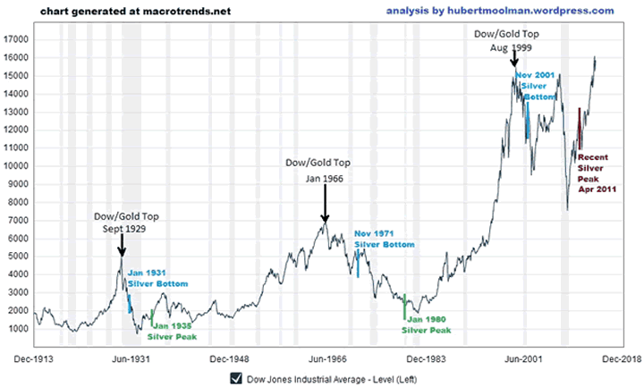
The relationship between the Dow and silver has been very consistent during the last 100 years. After each of the major Dow peaks (real, not necessarily nominal peaks), we eventually had a major bottom in silver. Below, is a 100-year inflation-adjusted Dow chart:

Dow/Silver Relationship - 100-Year Chart

In September 1929, the Dow peaked in terms of US dollars as well as in terms of gold ounces (real terms). After about 1 year and 4 months, silver made a significant bottom. While the Dow continued to fall for most of the time, silver rallied until it peaked in January of 1935. At silver's peak, the Dow was about 30% lower in real terms than what it was at silver's bottom.

Again, in January 1966, the Dow peaked in real terms. After about 5 years and 10 months, silver made a significant bottom. While the Dow continued to fall for most of the time, silver rallied until it peaked in January of 1980. At silver's peak, the Dow was about 55% lower than it was at silver's bottom.

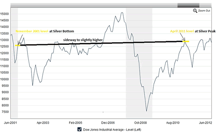
In 1999, the Dow once more peaked in real terms, and about after 2 years and 3 months, silver again made a significant bottom. However, over the period from the silver bottom to the peak in April 2011, The Dow actually went sideways (actually slightly higher). See on the following chart:

Dow/Silver Relationship since 2001 Chart

This is just one of the reasons why I know that the April 2011 high in silver is not the peak for this bull market. Why? Silver stands in direct opposition to paper assets like stocks that are part of the Dow. Therefore, when silver has a "real deal" rally, then paper assets like the Dow will lose significant value over the same time.

This is because the debt-based monetary system does what I call a "mirror-effect", whereby, silver (and gold) is pushed down in value, to a similar extent as to which paper assets such as general stocks are pushed up in value. When the rally of the paper assets eventually runs out of steam, then there is a big push for silver and gold.

Silver's real deal rally will happen when people run to silver for its monetary benefits. That is not really happening yet, in a big way, but it is about to - very soon. Money is what silver is, and it is this that will drive the coming spectacular silver rally.

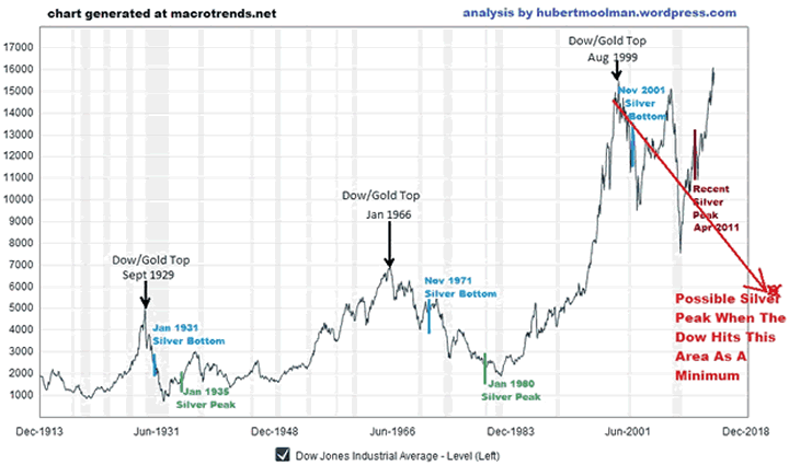
So, if we look at the Dow chart again (below), one can see that the silver peaks of the 70s and 30s occurred when the Dow was trading closer to the lower levels of its range. Currently, the Dow is trading at all-time high levels. If the Dow is currently having a "real deal" rally, then it means we are going to have to wait a long time before silver has its real rally.

Dow/Silver Relationship - 100-Year Chart 2

However, if the Dow is just having a fake rally, then silver will spike as soon as the Dow's fall gathers steam, and possibly peaks when the Dow hits a level indicated on the chart, as a minimum. One, therefore, has to decide whether this Dow rally is real or fake.

See the original article >>

Sugar's crossroads

By Erik Tatje

Sugar (NYBOT:SBK14)

Sugar again finds itself at a technical “crossroads” as price has come off a bit and looks to test the previous support level around 16.70. This significant Fibonacci Confluence Zone was previously tested back on 3/24, when it provided a reversal point for a rally in sugar that took prices above 18.00. The directional bias of this market remains sideways at best. A sustained break below the 16.70 would indeed mark a relatively lower low on the chart and could paint a more bearish outlook for sugar prices. Near-term momentum appears sideways to negative with price action failing to put in new relative highs. For those traders still bullish sugar, the recent pullback into the 16.70 area could offer a well-defined risk/reward buy setup in anticipation of a reversal off this level.

However, a failure below this Fibo C-Zone could easily inject additional technical selling pressure into the market. Traders should keep an eye on additional indicators, such as the RSI, for “clues” as to how price action is going to react to the 16.70 area. In terms of upside targets from here, initial resistance can be seen at 17.00 followed by 17.12 and the 17.35 – 17.40 area on the chart.

Crude oil (CME:CLK14)

Geo-political tensions overseas continues to weigh-in on the prices of crude oil as the May contract traded as high as 104.50 in the early morning session. Prices have since come off a bit; however, near-term momentum remains very bullish. The direcitoanl bias in the crude market also favors a bullish argument given the previous structure of price action. With that being said, price may have some trouble taking out the 104.50 level as it represents a longer term top established on 3/3. After an unsuccessful test of this level during Friday’s session, price has again failed from here in the early mornign trade and has pulled back below 104. This could be a potential near-term double top formation at this resistance pivot, but traders should wait for a price to confirm this with a break below the neckline of the formation. Given previous price action, it is difficult to be bearish on this market; yet, the 104.50 level on the chart is a solid level of resistance, and could provide aggressive traders a short-term, counter-trend selling opportunity in anticipation of a rejection.

Keep in mind, this strategy would be going against the directional bias of the market and would likely have a lower probability of success. For those traders looking to align their strategy with the underlying tone of the market, perhaps buying dips into support would offer a more conservative trading opportunity. The 102.86 – 103.00 area has provided local support to price and could be a valid entry level for bullish traders. If you’d like to discuss additional trading strategies to implement in this market, please contact me directly.

Canadian Dollar (CME:D6)

The Canadian dollar has been very strong over the past six weeks and the recent pullback in price could offer bullish traders an opportunity to get long this market from a more favorable entry point. After peaking around 9200, price has pulled back a bit and now finds itself trading around 9100. In the event that recent weakness persists below 9100, the 90.62 – 90.66 area, as well as the 90.36 pivot, could provide additional support to price. The directional bias remains positive above the 9010 low and buying corrective pullbacks in price could prove to be a valid trading strategy. Price has been coming off a bit off the highs, so traders may want to wait for confirmation of a near-term bottom before getting aggressively long this market.

See the original article >>

A black cloud over the EU?

By Alex Sakalis

The newly announced Le Pen-Wilders alliance in the European parliament has re-ignited speculation about the rise of the far-right in Europe. What can we expect from this new EU supergroup?

The recent success of the Front National in French local elections, as well as the announcement of a Le Pen-Wilders alliance in the European parliament, has re-ignited speculation about the rise of the far-right in Europe. It is widely expected that the far-right will attain their best ever European results in the May elections. Despite this, far right parties and MEPs have historically found it difficult to form groups in the European parliament. Why? And what has changed?

From humble beginnings

European groups are an intrinsic part of the European parliament. They can either be a single European party, such as the EPP, or a coalition of European parties, such as The Greens – European Free Alliance (which is a coalition between the European Green Party and the European Free Alliance). The EPP is the largest group in the Parliament with 274 MEPs, while the Progressive Alliance of Socialists and Democrats is the second largest, with 195 MEPs.

As well as making the Parliament more efficient, the groups themselves provide their members with several benefits. The bigger your group, the more public funds you are given. You also have the right to assume more committee positions and have more speaking time in the Parliament. In order to form a group, you must have at least 25 MEPs representing at least seven countries, and have a “common political affinity”.

In 1999, this “common political affinity” was challenged when several non-inscrits (MEPs not part of any group), decided to join together and form the Technical Group of Independents. The group originally included 29 non-inscrits but within a few days all the non-far right MEPs had left, alarmed by some of their new colleagues, which included representatives from the French National Front and the terrifying Flemish secessionist party, Vlaams Blok.

The group was immediately seized upon by other groups, who argued that the Technical Group did not fulfil the criteria of having a common political affinity and therefore was illegal. After a lengthy legal battle, the courts agreed and the Technical Group was dissolved.

The fascists who just wanted to belong

But from these ashes rose the Orwellian-sounding Identity, Tradition, Sovereignty group, whose members included the father-daughter team of Jean-Marie and Marine Le Pen, Alessandra Mussolini, the colourful grand-daughter of Benito, and Dimitar Stoyanov, a Bulgarian MEP whose career highlight up until that point had been to claim that a Hungarian Roma MEP was too ugly to receive her 2006 Parliamentarian of the Year award and that he could “easily buy a younger and prettier Gypsy bride” back in Bulgaria.

United by a charter that included anti-immigration and anti-EU principles, the EU was unable to dissolve them and was forced to give them access to public funds. MEPs did however manage to block them from gaining positions on parliamentary committees.

Despite constant hostility from other groups in the EU, in the end, the ITS’ greatest enemies turned out to be themselves. Less than a year after its formation, the group collapsed when the Greater Romania Party left in protest at Alessandra Mussolini’s claim that all Romanians living in Italy were criminals.

The rise of the European Alliance for Freedom

Since then, the far-right have struggled to re-assert themselves at the European level. The closest thing we currently have in the European Parliament is the eurosceptic Europe of Freedom and Democracy group (EFD), which is dominated by UKIP and Lega Nord. However, parties such as the Front National and the Freedom Party of Austria have been denied admission to the group for being too extreme and their MEPs continue to sit as non-inscrits. Until now.

The European Alliance for Freedom, initially founded as a small europarty in 2011, now has the backing of Marine Le Pen and Geert Wilders, two of the continent’s most successful far right leaders, and is seeking to become a full political group in the European parliament after the elections in May.

While much has been written about the far right’s attempts to reform and rebrand themselves nationally as they move closer towards mainstream acceptance, comparatively little has been written about their attempts to do the same at a European level.

In the past, the main reason why far-right parties had failed to form official European groups was due to a mutual fear of guilt by association. It is very easy to discredit a party by simply pointing out who they sit next to. The relatively moderate UKIP have suffered such criticisms due to their alliance with Lega Nord in the EFD. As one Labour MEP said: “Ukip’s decision to sit alongside such unsavoury groups as Lega Nord speaks volumes about where they really stand in relation to the extreme right.” Even the UK Conservative party suffered similar opprobrium when they left the EPP to join a new European group, the European Conservatives and Reformists (ECR), which critics alleged contained anti-Semites and homophobes.

But the new group of young far right leaders – Marine Le Pen, Strache, Salvini, etc – are more strategically minded than their predecessors. They know that it is in all of their interests to moderate their views as it will make it easier to form European groups without worrying about being tainted by guilt by association. The larger the group, the more speaking time, financial support and committee positions they are entitled to. And the larger they are, the more legitimate they seem. Being the sixth or seventh largest group in the European Parliament is rather better than having no group at all.

The ongoing European crisis has also given far right parties a chance to unite under common principles that would previously have been hors de combat. Dissatisfaction with austerity, belief that politicians are out-of-touch with and far-removed from their constituents, and a crisis of legitimacy within the EU itself are all vogue issues which give the far-right a strong and united platform.

The EAF’s manifesto is telling in this regard. It talks about giving more power to people and states by reversing the centralisation of power in the EU, halting mass immigration, and suggesting a break-up of the single currency. Presenting themselves as outsiders, fighting with “us” against “them” gives them considerable appeal among disaffected voters fed up with an EU they see as consigning them to austerity alongside unwanted social change through “mass immigration”.

It seems like it has never been a more fortuitous time to be a far-right party in post-Cold War Europe, and the demagogues are taking full advantage.

The far right supergroup – what will it look like?

So how big and influential will this new group be? Using up-to-date aggregate polling, we can hazard the following predictions.

The Front National (FN) looks likely to have the most sensational results. A poll taken the day of their stunning electoral success in south-east France predicts them taking 22% of the vote in May, winning sixteen seats. This would put them – just barely – behind the conservative UMP, who are predicted to win seventeen seats. Hollande’s Socialist Party come an embarrassing third, with thirteen seats.

Le Pen’s main partner will be Geert Wilders’ Party for Freedom (PVV) which is currently predicted to come a dramatic first in the Netherlands’ euro elections with 16.5% of the vote, winning four seats. This despite Wilders’ latest controversial statements on Moroccans in the Netherlands.

The Freedom Party of Austria (FPO) – formerly led by the late Jorg Haider and now under the direction of the charismatic HC Strache – is predicted to come third in a tight three-horse race, winning 21.5% of the vote and four seats.

The Lega Nord were a formidable fixture of Italian and European politics, but they have all but imploded amidst a series of internal scandals. They currently sit with UKIP in the EFD, but have announced their decision to leave and join the EAF. Despite having replaced the outlandish Umberto Bossi with the youthful Matteo Salvini as party leader, they could struggle just to meet Italy’s 4% threshold for election. If they do, they are likely to win only three seats, down from the nine they won in 2009.

Who else is poised to join the group? There are the far-right Flemish nationalists, Vlaams Belang, who look to double their European representation from one to two MEPs. There’s also the Sweden Democrats, who are poised to get their first MEP. The Slovak National Party have announced they are leaving UKIP’s group and look likely to transfer their lone MEP to the EAF.

So that’s 31 MEPs, but only six countries (you need at least seven to join). Who else can they recruit?

Godfrey Bloom, expelled from UKIP after a series of embarrassing gaffes, was a founder of the original EAF, although he is unlikely to be re-elected without his former party’s backing. Perhaps the most curious recruit is the Maltese politician Sharon Ellul-Bonici, who has been appointed secretary-general of the EAF. She ran in the 2009 euro elections as a Labour party candidate.

Other potential “big names”, such as Golden Dawn and Jobbik, both of whom are likely to have their MEPs elected, have been banned from joining the EAF. Likewise UKIP, The Danish People’s Party and Alternative for Germany have all refused to take part in the group, considering it too extremist.

UKIP is an interesting case. Too eurosceptic for the ECR and not fascistic enough for the EAF, they exist in an awkward “in-between” space which has made it difficult for them to find allies in the European parliament. In the May elections, they are currently predicted to take 26% of the UK vote, winning nineteen seats in the European parliament – that’s ten more than they have now. Despite this, they will struggle to form a new group in parliament.

With Lega Nord and the Slovak National Party leaving to join the EAF, and other key allies, such as Greece’s Popular Orthodox Rally and United Poland, unlikely to return any of the six MEPs they currently provide to the EFD, well, you can imagine just how tempting the ascendant EAF may look to the remaining eurosceptic parties in the EFD.

A black dawn for Europe?

Are we overestimating the EAF? How much influence can they possibly have in the European parliament? Not a lot it is true, but they certainly can’t be ignored. Their rise has been meteoric and many will see the finishing line in the distance. They will almost certainly use their platform within the EU to augment their message and draw more supporters to their cause.

Much like Nigel Farage’s speeches in the European Parliament, which regularly reach views in the hundred thousands, it is not hard to see speeches by notorieties such as Marine le Pen and Geert Wilders becoming equally as popular. They will have increased access to funds, committee positions and privileges which will also boost their profile. Most importantly, it will allow them to work towards something they have been attempting for generations – normalisation in the political theatre.

Whatever happens, Europe will not be the same.

See the original article >>

This Chart Shows When the Smart Money Saw The Abenomics Fail

by Wolf Richter

The year 2014 has been lumpy, to use Cisco CEO John Chambers’ propitious term, for stock markets around the world. Gone are the ferocious rallies followed by mild rallies interrupted by minor downticks, followed by more ferocious rallies. That’s so 2013.

It's as if on December 31, someone turned off the spigot. The hype and investor exuberance is still out there, at least on the surface and with retail investors as the well-planned and meticulously executed rotation from the smart money to those who are plowing their life savings into stocks is in full swing. The smart money has been bailing out, not just in the US, but nearly in all major markets – as the chart by Doug Short at Advisor Perspectives makes amply clear.

And look what happened in Japan:

So for last week, hope for more stimulus drove Shanghai up 3.5%, with China’s economy teetering and its credit bubble cracking. On the other side of the spectrum, the Nikkei (red line) plunged 7.3%.

For the year through Friday, there are only three indices of the major eight that are up: the Indian BSE SENSEX (+ 6.9%), the French CAC 40 (+1.6%), and Shanghai (+0.7%). The rest got knocked down: Hong Kong’s Hang Seng -1.3%, the S&P 500 -1.8%, the UK’s FTSE -2.8%, and Germany’s DAX -3.1%. Though still minor, this amount of red had been absent during our crazy money-printing times when they’d gone up automatically, regardless of what happened in the real economy.

The standout is the Nikkei.

For the year through Friday, it’s down 14.3% (not including Monday’s additional decline of 0.36%). The downward momentum has turned into a plunge in April, just when Abenomics is trying to persuade the hapless citizens of Japan, whose sacred yen his policies are destroying, to take their life savings out of the banks that are drowning in deposits and invest them in the stock market. It’s offered as an escape of the financial repression that Abenomics is inflicting on them, with inflation and a brutal zero-interest-rate policy eating up their savings in tiny bites. Their purchasing power too is getting whacked by inflation. Though old hat for Americans, that phenomenon – inflation without compensation – is new to the Japanese.

So now Abenomics has been pitching the stock market as the savior based on some kind of miracle. It worked. The smart money dove into Japanese stocks starting in mid-November 2012, with the hope and hoopla of Shinzo Abe's coming money-printing policies. And for the next six months, the Nikkei soared. After a big mid-year swoon, it hit a new recent high on December 31, up 88% during the initial phase of the Abenomics hype.

But now reality has set in, as has the consumption tax increase. The front loading by consumers and businesses ahead of the increase is reversing. The smart money has been pulling out. And the hapless Japanese who recently followed the government’s encouragement? Instead of watching their money lose value very gradually in their bank accounts, they watched it plunge.

And there are other reasons. Japanese corporations no longer even try to invest in Japan, but they’re falling all over each other grabbing the Bank of Japan’s freshly printed dough to invest it overseas.

See the original article >>

Do You Belong In The Stock Market?

by Economic Noise blog

How bad have markets been recently? If you are watching them day by day or week by week recently, they seem severe. Is this reaction because we have been spoiled and expect markets to always go up? Or, is something else going on?

This chart shows SPY from January 2012 to the present. Each bar represents a week of activity:

spyc2

Looking at the chart does not indicate anything out of the ordinary. The recent price pattern is consistent with those experienced over much of the last two-plus years — at least thus far.

The chart should dispel the notion that something out of the ordinary is occurring. Recent performance is in line with at least five other comparable dips during this period. But, should we assure ourselves in this fashion?

It may be comforting to look and say that nothing extraordinary has happened in the last couple of weeks. Thus far that is visually correct, at least for prices. The previous dips are comforting to the extent that they were brief interruptions in an upward trend. What if the current downtrend continues this week? What if it is the beginning of a new, longer-term trend downward? What if it is the early beginnings of bear market?

Will we look back at this point and say it was merely a dip? Or will we look back and recognize it as the beginning of a bear market? Or will it just be a “normal” 10 – 15% correction (pundits always use the term “normal” to describe most downturns — after all, they don’t want you running away).

No one knows where markets will go from here, although here are a few troubling issues that should be considered:

  • The Federal Reserve has announced and begun executing a taper strategy. I think they will reverse that, but what if they don’t?
  • Volume has been dropping since August of last year. Markets may be running out of buyers, at least at these levels.
  • International trends are working against equity markets. Ukraine is heating up again. Iran, Syria and other spots around the world represent threats to the US. Additionally, attacks on the dollar to dethrone it as the world’s currency are quietly underway.
  • China’s growth has slowed dramatically and there is the real possibility that much of their capital has been squandered in centrally-planned investments that will not survive a slowdown.
  • More troublesome than anything, however, is the dismal economic conditions. There has been no recovery, at least nothing that approaches a traditional one. All efforts have failed and now seem ineffective.
  • Stimuli are not forever. When they don’t work, the tendency is to double-down. That has happened, arguably several times. Resources are finite, although fiat currency is not. At some point the entire stimulus effort will be (if it has not already been) seen as a colossal failure that has seriously harmed the future of the country.
  • Inflation is inevitable if current policies continue. Economic and/or governmental collapse is possible if they don’t.

A man can drive himself crazy pondering these and other negatives. For those old enough to remember investing when it used to be investing, it seemed so much simpler. Put some money in stocks or mutual funds and forget about it. Let American ingenuity and a growing economy increase your savings/investment while you concentrated on more important things like your family and job. Th0se days are long gone in the casino that we call markets.

Buy and hold seems to be crazy in light of the economic and financial dangers. Participating in markets at all is riskier than most would like. But, government financial repression has made it impossible to get returns elsewhere. Recently, equity markets have been the only game in town. Some day, likely sooner than most of us anticipate, the stock market bubble will burst.

There may be more upside from here, but I believe it is undersized relative to the potential downside.

If you want or need to participate in today’s markets, don’t use the techniques and strategies that worked for your father and grandfather. Today, investing is no longer investing but short-term trading. In markets like these, investors are going to get fleeced.

Within the last fourteen years, there have been two major market corrections, both of which saw drops of 55% from their highs. That, or more, is the potential for what lies ahead. For those who went through these markets, it was not enjoyable. A friend told me that he, fortunately, was talked into staying in these markets and recovering his losses. His “advisers” told him to stay. They will do so again next time, but next time the government is unlikely to be able to re-inflate the stock market bubble.

To put into perspective how lucky he was, it took 25 years for the Dow Jones to recover to its pre-crash highs after the Great Depression. Likewise, the Dow hit an intraday high of 1,000 in 1962 but never closed above 1,000 until about twenty years later.

You must decide whether these markets are for you, but if you do you had better be very agile and ready to run when the time comes. Unfortunately, most of us believe that we can get out before the disaster. History shows that thinking to be mostly wrong.

Whether recent market behavior proves to be merely a dip in the chart is almost irrelevant. The country and financial markets are nearing what could very well be an existential event.

Do not be investing like your father or grandfather. Markets today are more like casinos than a way to invest in American growth. Unfortunately, the Federal Reserve has made it impossible to go elsewhere other than your mattress.

See the original article >>

Pound/U.S. Dollar play

By Matt Weller

The GBP/USD is coming off a very interesting week to kick off April. Helped along by decent Manufacturing Production data and a stationary BOE, the pair surged up to test its 4.5-year high at 1.6820 on Thursday before losing steam and turning back lower on Friday. Though the longer-term trend remains to the topside, there are some technical signs that Friday’s selling pressure may carry over into this week’s trade.

Looking to the daily chart first, last week’s reversal has created an Evening Star* formation off the highs. This relatively rare 3-candle reversal pattern shows a gradual shift from buying to selling pressure and is often seen at major tops in the market. In fact, the pair has already formed two significant tops after similar patterns already this year! Meanwhile, the Slow Stochastics indicator is forming a possible bearish divergence with price after ticking into overbought territory ahead of the top.

Zooming into the 4-hr chart (below) reveals a potentially actionable pattern for readers to monitor. Within the daily Evening Star formation, the GBP/USD has actually carved out clear Head-and-Shoulders pattern. With a confirmed break of the neckline near 1.6715 (more aggressive traders may even consider the current dip toward 1.6710 as significant enough), the bearish pattern would be confirmed, pointing to a deeper pullback in the early part of this week. In addition to the price pattern, the downward trending MACD suggests that the momentum has shifted to the bears as well.

The measured move target of the Head-and-Shoulders pattern projects a move down to around 1.6615, but the unit may also find support at the near-term 61.8% Fibonacci retracement at 1.6655. On the other hand, a break back above the right shoulder near 1.6750 may invalidate, or at least delay, the pattern and shift the bias back to neutral in the short term.

* An Evening Star candle formation is relatively rare candlestick formation created by a long green candle, followed a small-bodied candle near the top of the first candle, and completed by a long-bodied red candle. It represents a transition from bullish to bearish momentum and foreshadows more weakness to come.

Key Economic Data / Events that May Impact GBP/USD This Week (all times GMT):

  • Monday: US Business Inventories (14:00), UK BRC Retail Sales Monitor (23:01)
  • Tuesday: UK CPI, PPI, &  HPI (8:30), US CPI & Empire State Manufacturing Survey (12:30), Speech by Fed Chair Yellen (12:45), US TIC Purchases (13:00), NAHB Housing Market Index (14:00), Speech by Fed Member Plosser (19:00)
  • Wednesday: Speech by Fed Member Kocherlakota (00:00), UK Claimant Count & Unemployment Rate (8:30), Fed Member Stein Speaks (12:00), US Building Permits & Housing Starts (12:30), US Industrial Production and Capacity Utilization (13:15), Speech by Fed Chair Yellen (16:15), Speech by Fed Member Fisher (17:25), Fed Beige Book (18:00)
  • Thursday: US Unemployment Claims (12:30), US Philly Fed Manufacturing Index (14:00)
  • Friday: Good Friday – U.S. and U.K. stock markets closed (All Day)

See the original article >>

Energy independence and the WTI/Brent spread

By Jack Malone

America is in the midst of an energy revolution. Crude oil production is up over 40% since the start of 2012 and is currently at levels not seen since May of 1988. The surge continues and is not expected to stop any time soon with North Dakota and Texas leading the way.

In fact, if Texas was its own country, it would rank as the 10th largest producer of energy based off of international oil production in October. In mid-2009, Texas was producing less than 20% of America’s domestic crude oil. In January of this year, this figure hit a new record high of 36.2%. A telling chart going around is the weekly U.S. crude oil production chart which shows highs last seen in 1988.

The WTI (West Texas Intermediate) vs. Brent spread is an interesting relationship that energy traders have been looking at over the past couple of weeks. Theoretically, the two crude oils share similar qualities and should price very closely to each other. By pure make-up of the products WTI should have a slight premium to Brent. The spread between WTI and Brent crude represents the difference between the two crude benchmarks. WTI typically represents the price oil producers receive in the U.S. whereas Brent reflects prices received internationally. The recent production surge in the U.S. has caused a build-up of crude oil inventories at Cushing, Oklahoma, where WTI is priced. This created a supply and demand imbalance at the hub, causing WTI to trade lower compared with Brent.

The above graph shows the WTI-Brent spread from 2009 onwards. Note that when the spread moves wider, it generally means U.S. crude oil producers receive less money for their oil compared with their counterparts that are producing internationally. Libya is close to re-opening four ports that were seized by rebels which will add supplies to Brent. We have recently gone over a support level of -$3.56 and based on this, I am looking for more upside coming.

The energy revolution in the United States has created two distinct positives. The first being that U.S. refineries now have access to cheaper crude oil than their overseas competitors, which provides them with highly attractive margins. Secondly, it has insulated the domestic oil market from disruptive geopolitical events like the situation in the Ukraine, to a certain extent. As the United States continues to export refined products, there will be an upside pressure on the WTI vs. Brent spread.

Overall, the increased production of U.S. crude has created and will continue to create new jobs and opportunities for U.S. businesses. This should also constitute an important economic trigger: for the first time in a long time, we have money coming in from the energy sector instead of it getting spent on energy imports.

North Dakota has the nation’s lowest unemployment rate at less than 3%. The reason for this is the fast growing hydraulic fracking industry. And if projections for increases in Texas oil output are correct, the state could soon surpass Kuwait, the UAE, Iraq, Iran and even Canada to move up in the international oil production rankings and become the world’s fifth largest oil producer. Will we see the WTI vs. Brent spread get back to zero? I would like to think so but only time will tell.

See the original article >>

Elliott Wave Analysis

By Gregor Horvat

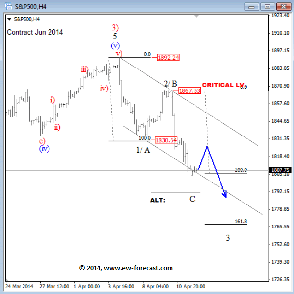
S&P 500

The S&P 500 has turned nicely to the downside last week from 1865/1870 resistance area where wave 2/B completed a corrective rally. Market already reached a new swing low but based on downside fib. projections and strong bearish momentum price could be moving down in wave 3 towards 1765 zone. Only rally above the upper resistance line of a current downward channel would put market back in bullish mode.

Crude (NYMEX:CLK14)

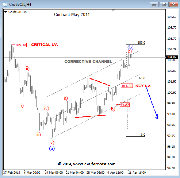
Crude oil exceeded 102.20 swing high last week which makes rally from 97.00 more complex but still corrective. We are looking at a three wave move with a triangle placed in wave b), so current leg from 99.87 can be wave c), final leg within a corrective advance, so we  should be aware of a bearish reversal. An impulsive sell-off back to 101.50 will be an important sing for a completed recovery. In that case we would be looking for short opportunities again. Until then staying aside may not be a bad idea.

Gold (COMEX:GCK14)

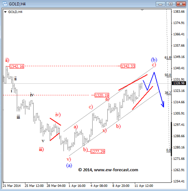
Gold is recovering from 1277 low but still showing a corrective personality because of an overlapping price action. Therefore we think that rally from the low is temporary; ideally it's wave (b) that is part of a larger downtrend. We see price now moving into 1320-1342 reversal zone from where a new sell-off may occur. A decline in impulsive fashion will confirm a downtrend continuation for this market.

See the original article >>

Monday Morning Quarterback

by Marketanthropology


See the original article >>

Gold, Crude Oil and SP500 Elliott Wave Patterns

By: Gregor_Horvat

S&P500 has turned nicely to the downside last week from 1865/1870 resistance area where wave 2/B completed a corrective rally. Market already reached a new swing low but based on downside fib. projections and strong bearish momentum price could be moving down in wave 3 towards 1765 zone. Only rally above the upper resistance line of a current downward channel would put market back in bullish mode.

S&P500 4h Elliott Wave Analysis

Crude oil exceeded 102.20 swing high last week which makes rally from 97.00 more complex but still corrective. We are looking at a three wave move with a triangle placed in wave b), so current leg from 99.87 can be wave c), final leg within a corrective advance, so we should be aware of a bearish reversal. An impulsive sell-off back to 101.50 will be an important sing for a completed recovery. In that case we would be looking for short opportunities again. Until then staying aside may not be a bad idea.
Crude OIL 4h Elliott Wave Analysis

Gold is recovering from 1277 low but still showing a corrective personality because of an overlapping price action. Therefore we think that rally from the low is temporary; ideally it's wave (b) that is part of a larger downtrend. We see price now moving into 1320-1342 reversal zone from where a new sell-off may occur. A decline in impulsive fashion will confirm a downtrend continuation for this market.
GOLD 4h Elliott Wave Analysis

See the original article >>

What to expect from the Vix

By Andrew Wilkinson

As selling accelerated last week the S&P 500 index (CME:SPM14) closed below its 50-day moving average, which currently stands at 1843. The 200-day average by comparison comes into play at 1761. And while the overall level of volatility has picked-up recently it remains well below highs that have coincided with prior negative breaches of the 50-day moving average level for stocks. The CBOE Vix index closed last week at 17.03.

On three-of-the-four previous occasions within the last year when stocks closed beneath the 50-day moving average, volatility has typically spiked to create an easily identifiable pattern. The average reading for the Vix during the four periods during which the bull market faced a significant challenge was 17.26. With the exception of the August breach of its 50-DMA, the Vix index rose just above 21.0 on each occasion.

Should investors’ exuberance for retail sales data slip during the next day or two, the outlook for stocks might be steered by last week’s low at 1814 ahead of support from the 200-DMA, which is currently 3.29% below Friday’s close. Despite the positive start we have not yet suffered the typical boost to volatility that occurs when stocks melt beneath the key technical level of the 50-day moving average.

See the original article >>

Dangerous world adds risk premium

By Phil Flynn

Heats Up!

Rising tensions in Ukraine, violence and the possibility of the Ukraine government getting ready to act against rebels has oil and wheat rising. Gold hit a three-week high and is gaining on silver as systemic risk rises and fears that a conflict could slow the economy. The Ruble is rubbish. Palladium(NYMEX:PAK14) hit the highest level since 2011 on fears that supplies could be cut as Russia produces roughly 40% of global supply. In the United Nations the Unites States and Russia traded accusations pointing fingers at each other as the Libyan government says they are getting ready to act against the terrorists. Ukraine starts the week back in play overshadowing other news.

A deal to reopen Libyan oil ports has yet to produce any exports and some are still skeptical that all is well in Libya. The Wall Street Journal reported that an oil terminal in eastern Libya, which has been occupied by rebels, is on the cusp of loading its first tanker since the takeover, and another terminal has restarted operations, an oil official said Sunday. 

Muhammad el-Harari, a spokesman for Libya's National Oil Corp., said a first tanker will "start loading one million barrels late Sunday or early Monday" from the Hariga terminal. The group, led by militia chief Ibrahim al-Jathran, has also agreed to leave Zueitina terminal. The rebels have yet to reach an agreement with the government on two larger ports, Ras Lanuf and Es-Sider. The oil company said western Libya's Zawiya oil port also has reopened after protesters seeking the resignation of parliament pulled out. Yet until the oil starts to move the market will be doubtful as it has been fooled to many times before.

Add to that Mario Draghi said that the strengthening of the Euro requires further monetary stimulus a sign that the EU is laying the groundwork for quantitative easing. The Euro rising is getting too much for Draghi to handle and it seems the mere force of his personality can’t slow it down. EU inflation is well below the ECB’s target of 2% and the strong Euro currency is hurting EU exports.

The AFP news agency is reporting that “twin blasts at a packed bus station in Nigeria's capital killed "dozens of people" on Monday, a spokesman for the state-run emergency services said.  "It's correct to say dozens of people were killed following the bomb blasts in Nyanya Bus Park this morning," Manzo Ezekiel of the National Emergency Management Agency (NEMA) told AFP.

Oil(NYMEX:CLK14) is hitting key resistance and will move on the perceptions surrounding risk in Ukraine. So far the market has just put in the risk premium that the optimistic trade failed to put in last week. Now it all comes down to the headlines.

See the original article >>

Fourth Reversals in The Gold and Silver Charts

By: Rambus_Chartology

In this Weekend Report I would like to look under the hood of some of the precious metals stocks indexes to see what is really taking place. We'll look at a bunch of PM stocks to get a feel for where we are in the short, intermediate and long term pictures. When one just observes an index you really don't get to see, in detail, the stocks that make up that index that could be showing some important clues to the overall big picture. For instance, there are just three or four of the biggest of the big cap precious metals stocks that account for a large percentage move for say the HUI. There are many more stocks in the index but they don't carry as much weight.

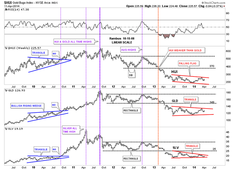
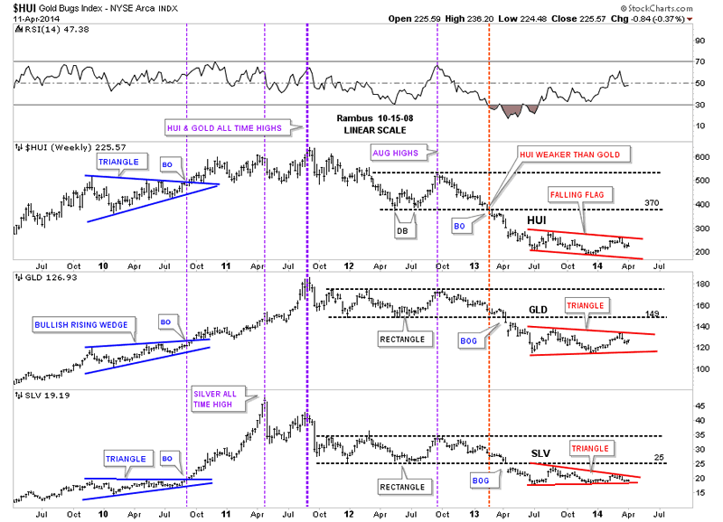
Before we look at some of the precious metals stocks I want to show you a combo chart that puts everything into perspective and gives you a feel for where we are in the intermediate term time frame. This combo chart has the HUI on top, GLD in the middle and SLV on the bottom. First I want you to look at the left hand side of the chart where you see that the HUI and silver each formed a blue triangle while gold formed a bullish rising wedge. Each consolidation pattern took the same amount of time to build and all three broke out together, first purple vertical dashed line. Note the impulse move out of the blue patterns that show SLV leading the way higher as GLD and the HUI had a backtest while SLV didn't. Here's where it gets interesting. As you can see SLV rallied straight up to its bull market top way ahead of the HUI and gold that were lagging behind, second thin purple vertical dashed line. After a few months of consolidation it was gold's turn to go parabolic and make its bull market high in September of 2011. The heavy purple dashed line shows where all three topped out together with the HUI and gold making their bull market highs while SLV was already in correction by falling way short of reaching its bull market top that it made back in April.
What was so frustrating for those of us that were holding precious metals stocks is that they hardly moved when gold and silver had their parabolic moves higher. As you can see the HUI did in fact make its bull market high at the same time gold did but the HUI had no parabolic move up. As you can see it was more of a slightly rising horizontal type move. That had to be one of the worst times to be a gold bug, to see gold and silver go parabolic and the precious metals stocks hardly budging. I'll post this chart here so you can see the blue consolidation patterns on the left side of the chart then we'll discuss the red consolidation patterns on the right side of the chart.


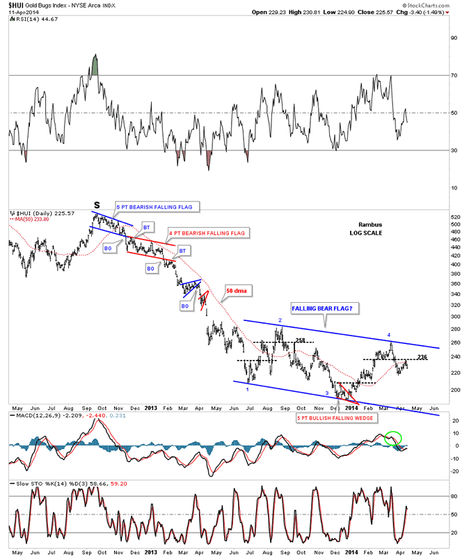
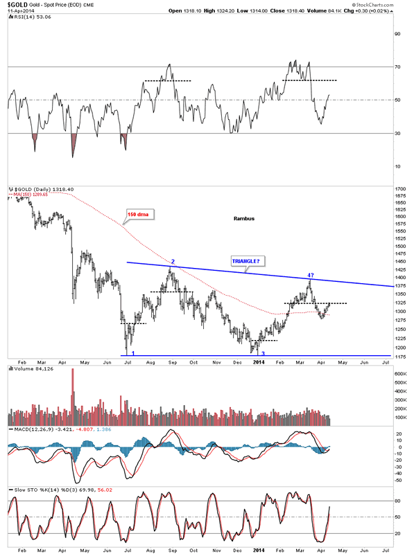
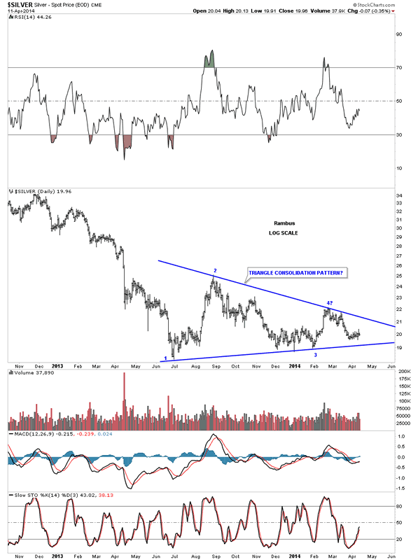
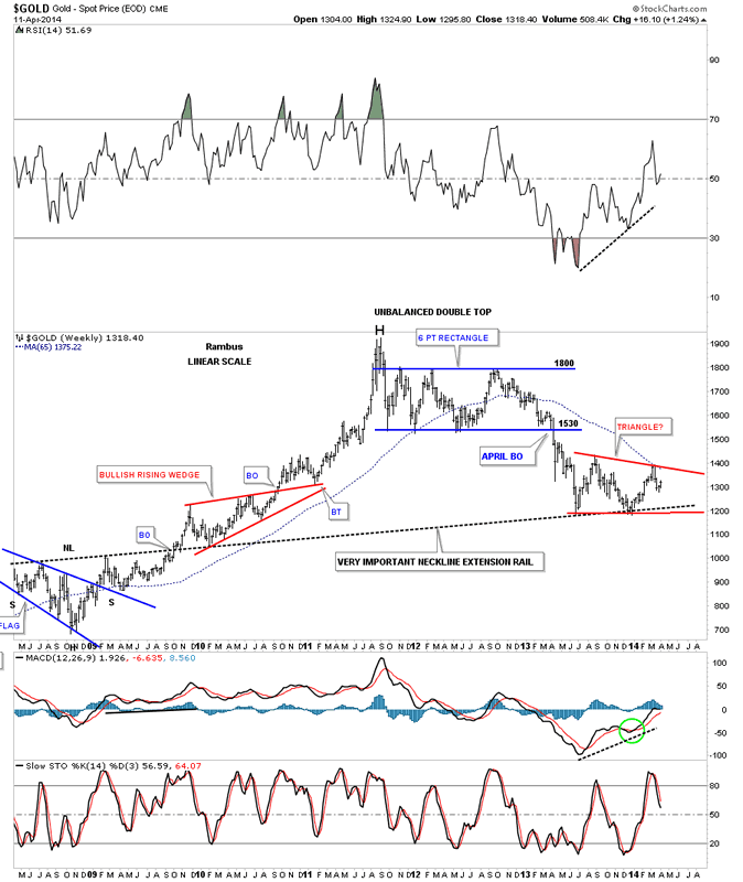
Let's not fast forward to the heavy red dashed vertical line that shows how the HUI was the first of the three to really show weakness by breaking below its horizontal black dashed line first. The precious metals stocks were leading he way down. It took about another 12 weeks or so before GLD and SLV joined the party to the downside when they finally broke out of their nearly 22 month consolidation patterns with a breakout gap. As with the blue consolidation patterns on the left side of the chart our current red consolidation patterns all bottomed at the same time, late June of 2013, and have been chopping out their respective chart patterns ever since. As you can see all three are working on their fourth reversal points right now. Even though the HUI is building out a falling flag formation, which will be pretty bearish if it breaks through the bottom rail, the SLV is trading the closest to its bottom rail of its red triangle. This chart gives you the big picture look and lets you know where we stand and what to look for.
One last comment before we move on. As you know reverse symmetry plays a big role in how I interpret the price action. Until something changes, I'm viewing the blue consolidation patterns, that formed on the left side of the chart with the price action going up, equal to the red triangles on the right side of the chart with the price action going down as reverse symmetry. Since the bull market top in 2011 you can see a series of lower lows and lower highs all the way down to our current price which is just the complete opposite of what we seen in the bull market years. Until we can see a higher low and a higher high the downtrend remains intact.


Lets take a quick peek at our red consolidation patterns starting with the HUI. Here we see the blue falling flag that is working on its fourth reversal point down. As you can see we had an important test of horizontal resistance last week at the 236 area. Also note the big impulse move down that has led to the formation of our current consolidation pattern that I will view as a halfway pattern if the bottom rail is broken to the downside. The HUI should show a similar move that led into our current blue falling flag when the price action leaves, thus this pattern will show up between the two impulse legs down.


Below is gold's blue triangle that is showing the most strength right now between the three. It to is working on its fourth reversal point to the downside. Keep in mind these potential consolidation patterns won't be complete until their bottom rails are decisively broken to the downside. I expect there will be a very big down day once the possible breakouts occurs that will leaves no doubt as to what just happened.


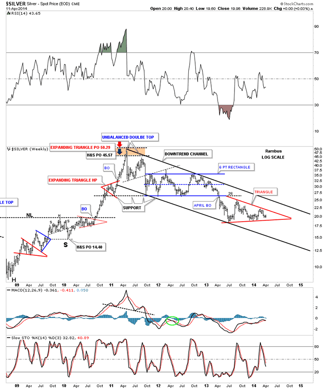
Below is silver's potential blue triangle that is trading the closest to the bottom blue rail. The 18.50 area on the bottom blue rail will be critical support.


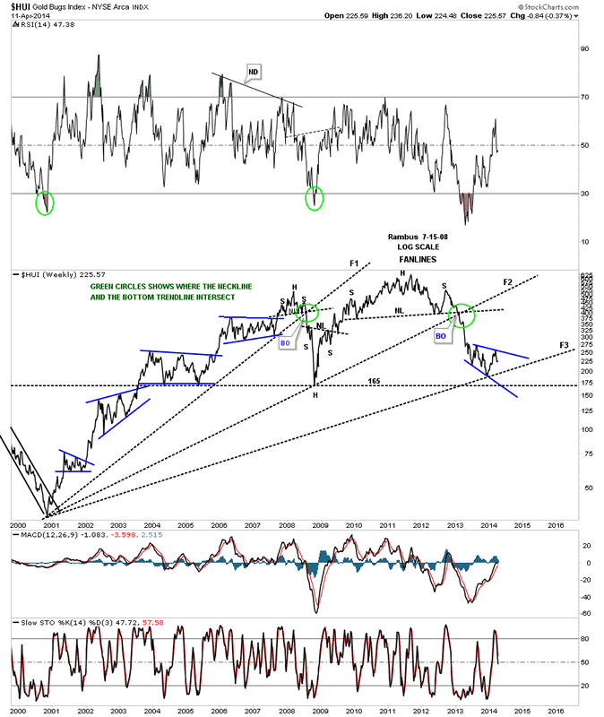
Lets now put our blue consolidation patterns in perspective so you can see how they fit into the big picture. This first chart is for the HUI, which is a long term weekly line chart, that goes all the way back to the beginning of the bull market. Keep in mind a line chart only uses the closing price so the patterns will look slightly different. There is a lot of good information on this chart that we can use to help us understand where we are in the big picture. First notice all the blue consolidation patterns that formed during the bull market years, one on top of the other. That's a bull market folks. Next notice our massive H&S top that reversed the bull market and has led to our current price. We are now reversing symmetry down and what I believe is our first consolidation pattern to the downside with its blue counterpart on the left side of the chart. Next lets look at the fanlines which is a chart pattern. The rule of thumb is when the 3rd fanline is broken to the downside is when you get your big move. Note fanline #1 and #2 that have the green circle around where the fanline and the neckline intersect. Once that area was broken to the downside the HUI wasted little time declining in earnest. Some of our long term subscribers may remember this chart as I was showing it as we were watching the neckline and fanline #2 breaking down. A daily bar chart will show there was a small backtest to the underside of the neckline before the impulse move began.


Lets now look at gold's potential triangle and how it may fit into the bigger picture. Gold's potential triangle has formed on top of the neckline extension rail that is taken off of the 2008 H&S consolidation pattern in which I extended all the way to the right hand side of the chart. Are we seeing reverse symmetry with our current red triangle vs the red bullish rising wedge that formed in the uptrend on opposite side of the chart?


If someone can look at this weekly chart for silver and tell me silver is in an uptrend I would have to call them crazy. Just look at the price action on the left side of the chart when silver was going parabolic creating a series of higher highs and higher lows all the way up to its bull market top. Now compare that price action to the right hand side of the chart since silver topped out just under 50 in April of 2011. Silver has now completed three years of its bear market, this month, by creating lower lows and lower highs. This is basic elementary Chartology. Maybe something will happen to create a new higher high and higher low but until that happens the major trend is down and that is the best direction to trade unless you're a day trader. It's always the easiest to trade in the same direction of the major trend as it can fix a mistake if you bought at the wrong time. Just the opposite in a bull market.


So far we looked at the HUI, gold and silver potential consolidation patterns on the short term to longer term look charts. Now we need to look under the hood and see what some of the precious metals stocks are showing us to help bolster these possible consolidation patterns as having some validity. What we have forming on some of the precious metals stocks are several different consolidation patterns ranging from triangles. expanding triangles, rectangles and rising wedges

See the original article >>

The German Leadership Question

by Otmar Issing

FRANKFURT – Many in the eurozone’s crisis countries complain that the source of their suffering is a rigid economic-austerity regime – including reductions in wages and pensions, tax increases, and soaring unemployment – imposed on them by Germany. Hostility against Germany has reached a level unseen in Europe since the end of World War II.

And yet, despite this antagonism, loud calls for Germany to assume “leadership” in Europe can also be heard. Germany is undoubtedly Europe’s most important economy; and, with low unemployment and relatively sound public finances, it is also the best-performing one – at least for the time being. So Germany is asked to take the lead in saving the eurozone, an outcome that is in the interest not only of the entire European community, but also of Germany, which is widely seen as having gained the greatest advantage from the single currency.

Complaints about the imposition of a “teutonic regime” and appeals for German leadership seem to contradict each other – a kind of continent-wide cognitive dissonance. In fact, the complaints and calls for leadership are mutually reinforcing. The implementation of austerity policies in the periphery has caused these countries to ask for help and request that Germany take the lead by putting more money on the European table.

Nobody would deny that Germany has an interest in preserving the euro. So why shouldn’t it support its partners with financial help to overcome the crisis?

Such support can already be found via the various rescue mechanisms – above all, the European Stability Mechanism and the implicit guarantees of TARGET 2 – that have been erected since the crisis began. But these mechanisms must be distinguished from a regime of more or less automatic, permanent transfers. As long as a fully-fledged political union remains a vision for the future, fiscal transfers must be legitimized by national parliaments.

For now – and probably for a long time to come – the eurozone will continue to be a union of sovereign states, with each country responsible for its own policies and for their outcome. The no-bailout clause that was included in the monetary union’s founding treaty is an indispensable corollary. Eurobonds, for example, would not only create moral hazard; “taxation without representation” would also violate a fundamental tenet of democracy and undermine support for the European idea.

The creation of a European banking union is another area in which misguided calls for solidarity prevail. Establishing a single supervisory authority and a resolution mechanism are valid proposals. But asking others to pay for the legacy of banks’ past irresponsible practices is hard to justify.

What would be the reaction if, say, Italian or Spanish taxpayers were asked to pay for the reckless behavior of the German IKB or HRE banks? Who would not find such a request inappropriate, to say the least? And yet when the bailout is presented the other way around, with German taxpayers asked to backstop reckless Italian or Spanish banks, somehow it is supposed to be an act of solidarity. Legacy problems in national banking systems should be solved at the national level before the banking union moves forward.

Bailing out governments and banks is not the direction in which Germany should lead. If Germany should lead at all, it should do so by providing a model of good economic policies for others to emulate. It should lead by respecting the commitments enshrined in the European treaties. Indeed, Germany set a disgraceful and damaging example when, back in 2003-2004, it undermined the European Union’s Stability and Growth Pact by not adhering to it.

Walter Hallstein, the first president of the European Commission, repeatedly stressed that the union is based on the principle of a community of nations under the rule of law (Rechtsgemeinschaft). Today, credibility can only be restored if treaties and rules are respected again.

Think of the eurozone as a selective club. Unless its members respect the rules by which it is defined, it will wither. Those who violate the rules must be warned and finally sanctioned – preferably in an automatic fashion. Those who violate the rules consistently, and even announce that they will continue in their misbehavior, should not be allowed to blackmail the community and should ultimately consider leaving the club.

Those who are concerned about permanent German dominance of the European “club” can rest easy. Having emerged from the position of the sick man of Europe only a decade ago, Germany is now willfully, if thoughtlessly, undoing the reforms that had so strengthened its economy. By reinforcing already-strict labor-market regulation, pursuing a misguided energy policy, and reversing pension reform, Germany is undermining its current economic position and will move in the direction of problem countries.

This regression will take time, but it will happen. Accordingly, calls for German leadership will disappear and its strained public finances will suppress requests for financial transfers. One wonders how the discussion about “leadership” for Europe will look then?

See the original article >>

What’s the message coming from the “Fear Index” (VIX)?

by Chris Kimble

CLICK ON CHART TO ENLARGE

By now we all know Bio Tech and Social media darlings have been hit hard of late, which could be masking that the broad market is NOT! So far the S&P 500 is off less than 4% from 200-year highs. Is that much reason to be fearful?

Speaking of fear, the VIX index remains inside of a two-year falling channel and a breakout has not taken place. Once a breakout in the fear index took place at (1) above back in 2007, that was when the market became really weak.

At this time the VIX index remains calm, inside of its falling channel and well below line (2). When should a person start biting their nails? If the VIX breaks above its sideways channel and breaks above (2).

See the original article >>

Behold! The Once And Former Momo Basket—The Grim Reaper Cometh

by ZeroHedge

Behold the great momo basket which after being the source of so much joy for momentum chasers over the past year, has mutated into the source of so much sorrow over the past two weeks.

….. according to Goldman not only will the momo stocks not rebound to previous highs and resume their leadership role, but clients increasingly are wondering if this is the second coming of the dot com bubble burst.

So what are the good news? Well, Goldman is bullish on the non-MOMO stocks, which it sees as rising during the next 6 months by, if history is any precedent, 5%. Of course, the market merely regaining its all time highs by October will hardly please the investor community which is used to 20%+ return year after year. After all someone must benefit from the Fed’s ludicrous actions.

But most interesting is Goldman’s attempt to deny that this is the second coming of March 2000:

We believe the differences between 2000 and today are more important than the similarities and the recent momentum drawdown is unlikely to precipitate a more extensive fall in share prices:

  • Recent returns are less dramatic. Although the trailing 12-month returns are similar (22% today versus 18% in 2000), the trailing 3-year and 5-year returns are much lower (51% vs. 107% and 161% vs. 227%, respectively).

  • Valuation is not nearly as stretched. S&P 500 currently trades at a forward P/E of 16x compared with 25x at the peak in 2000. The price/book ratio is 2.7x versus 6.Xx. The EV/sales is currently 1.8x compared with 2.7x in 2000.

  • More balanced market. The reason it is called the “Tech Bubble” is that 14% of the earnings of the S&P 500 came from Tech in 2000 but it accounted for 33% of the equity cap of the index. Today Tech contributes 19% of both earnings and market cap. Top five stocks in 2000 were 18% vs. 11% today.

  • Earnings growth expectations are far less aggressive. Bottom-up 2014 consensus EPS growth currently equals 9%, close to our top-down forecast of 8%. In 2000, consensus expected EPS growth equaled 17%.

  • Interest rates are dramatically lower. 3-month Treasury yields were 5.9% in 2000 vs. 0.05% today while ten-year yields were 6.0% vs. 2.7% today. The yield curve was inverted by 47 bp. Today the slope equals +229 bp.

  • Less new issuance. During 1Q 2000, 115 IPOs were completed for proceeds of $18 billion. In 1Q 2014, 63 completed deals raised $11 billion.

All great points, yet one thing is conspicuously missing and perhaps Goldman can clarify:

  • how much debt as a percentage of global GDP was held by the world’s major central banks then and now, and
  • how much consolidated global leverage, including shadow banking in both the US and China, as well as how many hundreds of trillions of derivatives notional outstanding existed then… and now

Because one can just as easily make the case that as the global financial house of cards, teetering since the great financial crisis of 2008, and upright only thanks to the explicit “wealth effect” support of the final backstop – the world’s money printers – any protracted downward move which implicitly crushes the faith in the monetary religion, and crushes the uber-leveraged smart money community, will make the “drawdown” in both momo and S&P500 stocks in March 2000 seem like a pleasant walk in the part compared to what may be coming.

See the original article >>

Clarifying the stock market correction

By Jeff Greenblatt

What is the most amazing aspect of this correction? It’s the fact that so few people understand it. I haven’t been around as long as some, but I’ve consistently watched the financial news networks since the 1990s. I have never seen a period where the folks who report and those who are interviewed have been so confused.

Let me provide some clarity. This is a correction. It’s a bear phase, and we don't have to wait until it gets to “official” correction territory to acknowledge it. Since tech topped in early March, it validated the massive time window from early in the game. The idea here is to acknowledge when you get a turn at least at the right time it could work out to be fairly significant. One of the problems is we’ve had time windows before and nothing much materialized. Corrections in 2012 and 2013 all ended prematurely. Tech led to the downside while the SPX made a new high late in this game. That threw a lot of people off course because while we’ve actually had selling for over a month, as of last Thursday morning the SPX was only about 1.3% off its high. It tweaked common intelligence.

But it was my contention they only had a “suckers bounce” because the SPX and Dow were merely reacting to a flat 50-day moving average. Why is that so significant? Remember the article I did last year on the VIX, “Leveraging the VIX to spot trend changes,” from the March 2013 hard copy of this magazine? I explained how it works, but more important was the expectation traders have for the next 30 days. Low volatility means traders expect a rising market and traders expect more of the same. Here’s my best explanation taken from that article:

“Most traders get hurt when the trend changes because they ignore signs that the tide has turned. Methodologies such as market-timing windows and the Gann price/time square are key here. Using the VIX also can provide perspective, but remember, when the VIX is low, it does not mean the market will keep rising. Conversely, a high VIX does not always translate to lower market prices.”

The problem, if I may be so bold, is that everything is OK until it isn’t. When it isn’t, it turns bad. When it turns bad, it can turn really bad and it can do it in a hurry. I would say based on watching television that over 90% of the Wall Street community had no idea of these time windows and there isn’t a single person on television reporting on them. So it is you, kind reader, who has a tremendous edge over some of the most supposedly intelligent people in the room. In fact, with all the hoopla over that new Michael Lewis book “Flash Boys,” if you understand how to time the market, the possibility that markets could be rigged should pose absolutely no threat to you. If these people are trying front run scalp you for a mere fractions, if you understand this market is now in a real correction, you are way ahead of most of the people who might be your competition.

The problem here is the people have been programmed like robots to buy that dip. When the market is going up, buying a rising 50-day moving average in a raging bull market is the thing to do. On the SPX alone, they got away with it several times in 2013 and were even able to get over on the market when the price action bell below the 50-day in June, August and October. They even got away with it in February. Just from this chart they got away with it four out of the last five times. Now it was still slightly sloping up but take into the consideration the 50-day on the NDX is absolutely flat and the situation in the Dow is absolutely flat.

Buying the dip on a rising slope is one thing. Buying the dip on a flat moving average is an entirely different conversation altogether. Now go back and read the little paragraph from my VIX article, specifically what I had to say about Gann. In this time window, the square root of the high for the Dow measures 128.96 and it’s about 130 weeks back to the 2011 low. This time it’s not perfect, but it’s really close to a price and time square. Does that make me a prophet? No, all it does is make my Gann methodology look really good.

Now if I was a prophet, I’d tell you something serious is about to happen on that lunar eclipse on Monday night known as the Blood Moon. In fact NASA is interested because there will be several of them in the next year or so, and that doesn’t happen very often. The prophesy people have certainly been talking about these Blood Moons for several years. For my money, I’m fascinated the scientific and religious communities are actually in agreement for once. But when I woke up this morning, it looked like the next phase of the Ukrainian crisis is ready to play out. Maybe there is something to this prophesy stuff after all.

For our work, we look at eclipses of this nature very seriously. They have the potential to either shred the existing pattern, meaning there could be a real trading low by Tuesday, or perhaps a serious breakaway gap if the market really wants to go into a tailspin right now.

Whatever the case, with the VIX this low all I can tell you is buying a flat 50-day moving average is the epitome of arrogance and complacency. Just because a bunch of traders tried it does it mean it was right. They got taken to the woodshed as any number of stocks triggered bull traps. This is RIG and represents just one of hundreds of names who have trapped people trying to either pick a bottom or buy a dip.

This is also the epitome of zero sum trading, which is what I’m teaching my posse to do these days. What you want to do is find a group of people who are the last man in at whatever level the pattern is at. It could be off the high or a decent countertrend trading bounce. Your edge, if you choose to accept it, is to take advantage of the prevailing greed on the Street these days. The better the trap, the more it drops. I know so many intermediate level traders are looking for ways to either participate in this market who have been unkind to both bulls and bears or just trying to figure out how and where to short a spike. Folks, you can do a lot worse than this and you probably won’t do much better.

Our view has been and is going to continue to be a bearish phase, which is going to be complex and confuse a lot of people. How many weeks ago did I first mention it? The other aspect of the time window is the geopolitical situation. We know that markets are extremely allergic to military action. These geopolitical problems should continue to hinder markets throughout the year. Does that tell you what I think is going to happen?

See the original article >>

Follow Us