by Gail Tverberg
In Part 1 of this series, I talked about why cheap fuels act to create economic growth. In this post, we will look at some supporting data showing how this connection works. The data is over a very long time period–some of it going back to the Year 1 C. E.
We know that there is a close connection between energy use (and in fact oil use) and economic growth in recent years.
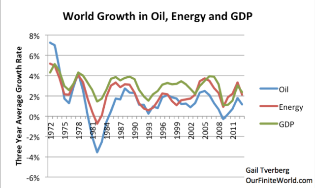
Figure 1. Comparison of three-year average growth in world real GDP (based on USDA values in 2005$), oil supply and energy supply. Oil and energy supply are from BP Statistical Review of World Energy, 2014.
In this post, we will see how close the connection has been, going back to the Year 1 CE. We will also see that economies that can leverage their human energy with inexpensive supplemental energy gain an advantage over other economies. If this energy becomes high cost, we will see that countries lose their advantage over other countries, and their economic growth rate slows.
A brief summary of my view discussed in Part 1 regarding how inexpensive energy acts to create economic growth is as follows:
The economy is a networked system. With cheap fuels, it is possible to leverage the expensive energy that humans can create from eating foods (examples: ability to dig ditches, do math problems), so as to produce more goods and services with the same number of workers. Workers find that their wages go farther, allowing them to buy more goods, in addition to the ones that they otherwise would have purchased.
The growth in the economy comes from what I would call increasing affordability of goods. Economists would refer to this increasing affordability as increasing demand. The situation might also be considered increasing productivity of workers, because the normal abilities of workers are leveraged through the additional tools made possible by cheap energy products.
Thus, if we want to keep the economy functioning, we need an ever-rising supply of cheap energy products of the appropriate types for our built infrastructure. The problem we are encountering now is that this isn’t happening–more energy supply may be available, but it is expensive-to-produce supply. Our networked economy sends back strange signals–namely inadequate demand and low prices–when the cost of energy products is too high relative to wages. These low prices are also a signal that we are reaching other limits of a networked economy, such as too much debt and taxes that are too high for workers to pay.
Looking at very old data – Year 1 C. E. onward
Some very old data is available. The British Economist Angus Maddison made GDP and population estimates for a number of dates between 1 C. E. and 2008, for selected countries and the world in total. Canadian Energy Researcher Vaclav Smil gives historical energy consumption estimates back to 1800 in his book Energy Transitions – History, Requirements and Prospects.
If we look at the average annual increase in GDP going back to the Year 1 C. E., it appears that the annual growth rate in inflation-adjusted GDP peaked in the 1940 to 1970 period, and has been falling ever since. So the long-term downward trend in world GDP growth has lasted at least 44 years at this point.
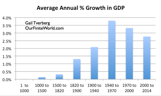
Figure 2. Average annual increase in inflation-adjusted GDP, based on work of Angus Maddison through 2000; USDA population/real GDP figures used for 2000 to 2014.
A brief synopsis of what happened in the above periods is as follows:
- 1 to 1000 – Collapse of several major civilizations, including the Roman Empire. Metal was made using charcoal from wood, but this led to deforestation and soil erosion. Egypt and the Middle East had extensive irrigation of crops using river water. Some trade by ship. Most of the population were farmers.
- 1000 to 1500 – Early use of peat moss for heat energy for industrialization, particularly in Netherlands, leading to increased trade. Continued use of wood in cold countries, with deforestation issues.
- 1500 to 1820 – European empire expansion to the New World and to colonies in Africa, allowing world population to grow. Britain began using coal. Netherlands added wind turbines beside greater use of peat moss.
- 1820 to 1900 – Coal allowed metals to be made cheaply. Parts of farm work could be transferred to horses with greater use of metal tools. Coal allowed many types of new technology including hydroelectric dams, trains, and steam powered boats.
- 1900 to 1940 – Expanded use of coal, with beginning use of oil as a transportation fuel. Depression was during this period.
- 1940 to 1970 – Post war rebuilding of Europe and Japan and US baby boom led to hugely expanded use of fossil fuels. Antibiotic use began; birth control pills became available. Food production greatly expanded with fertilizer, irrigation, pesticides.
- 1970 to 2000 – 1970 was the beginning of the great “oops,” when US oil production started to decline, and oil prices spiked. This set off a major push toward efficiency (smaller cars, better mileage) and shifts to other fuels, including nuclear.
- 2000 to 2014 – Another big “oops,” as oil prices spiked upward, when North Sea and Mexican oil began to decline. Much outsourcing of manufacturing to countries where production was cheaper. Huge financial problems in 2008, never completely fixed.
Growth in GDP in Figure 2 generally follows the pattern we would expect, if fossil fuels and earlier predecessor fuels raised GDP and the great “oopses” during the 1970-2000 and 2000-2014 periods reduced economic growth.
Population Growth vs Growth in Standard of Living
GDP growth is composed of two different types of growth: (1) population growth and (2) rise in the standard of living (or per capita GDP growth). We can look at these two kinds of growth separately, using Maddison’s data. My discussion earlier about cheap energy having a favorable impact on the amount of goods an economy could create relates primarily to the second kind of growth (rise in the standard of living). There would be a carry-over to population growth as well, because parents who have more adequate resources can afford more children.
If we compare the population growth pattern in Figure 3 with the total GDP growth pattern shown in Figure 2, we notice some differences. One such difference is the lower population growth rate in the 2000-2014 period. Compared to the period before fossil fuels (generally before 1820), the population growth rate is still exceedingly high.
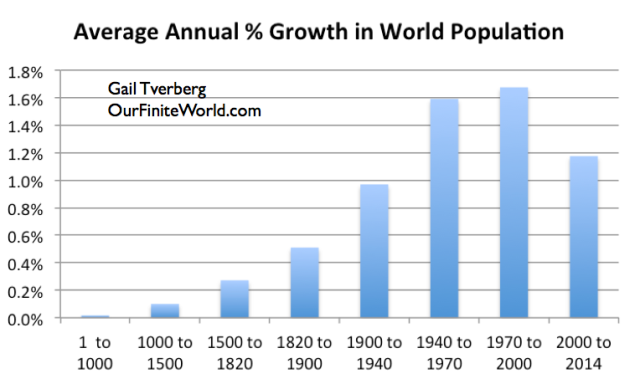
Figure 3. Average annual increase in world population, based on work of Angus Maddison through 2000; USDA population figures used for 2000 to 2014.
If we look at world per capita GDP growth by time-period (Figure 4), we see practically no growth until the time of fossil fuels–in other words, 1820 and succeeding periods.
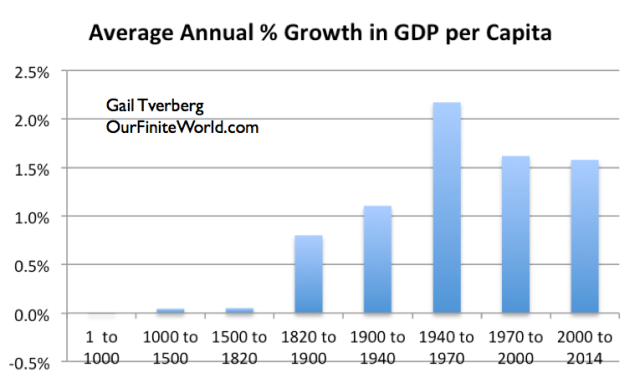
Figure 4. Average annual increase in GDP per capita, based on work of Angus Maddison through 2000; USDA population/real GDP figures used for 2000 to 2014.
In other words, in these early periods, civilizations were often able to build empires. Doing so seems to have allowed greater population and more building of cities, but it didn’t raise the standard of living of most of the population by very much. If we look at the earliest periods, (Years 1 to 1000; 1000 to 1500, and even most places in 1500 to 1820), the average per capita income seems to have been equivalent to about $1 or $2 per day, today.
I earlier showed how world per capita energy consumption has grown since 1820, based on the work of Vaclav Smil (Figure 5).
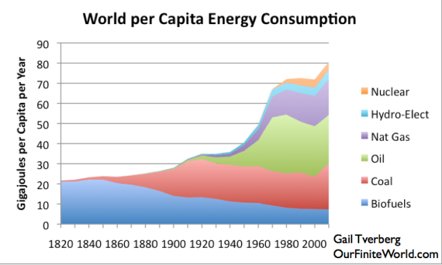
Figure 5. World Energy Consumption by Source, Based on Vaclav Smil estimates from Energy Transitions: History, Requirements and Prospects together with BP Statistical Data for 1965 and subsequent divided by population estimates by Angus Maddison.
It is clear from Figure 5 that the largest increase in energy consumption came in the 1940 to 1970 period. One thing that is striking is that world population took a sharp upward turn at the same time more fossil fuel use was added (Figure 6).
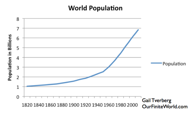
Figure 6. World population growth, based on data of Angus Maddison.
While this increase in population holds for the world in total, analyzing population growth by country or country grouping yields very erratic results. This is true all the way back to the Year 1. If we look at percentages of world population at various points in time for selected countries and country groups, we get the distribution shown in Figure 7. (The list of country groups shown is not exhaustive.)
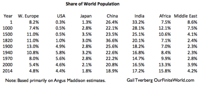
Figure 7. Share of world population from Year 1 to 2014, based primarily on estimates of Angus Maddison.
Part of what happens is that economic collapses (or famines or epidemics) set population back by very significant amounts in local areas. For example, Maddison shows the population of Italy as 8,000,000 in the Year 1, but only 5,000,ooo in the Year 1000, hundreds of years after the fall of the Roman Empire.
Per capita GDP for Italy dropped by half over this period, from about double that of most other countries to about equivalent to that of other countries. Thus, wages might have dropped from the equivalent of $3.oo a day to the equivalent to $1.50 a day. None of the economies were at a very high level, so most workers, if they survived a collapse, could find work at their same occupation (generally farming), if they could find another group that would provide protection from attacks by outsiders.
If we look at the trend in population shown on Figure 7, we see that the semi-arid, temperate areas seemed to predominate in population in the Year 1. As peat moss and fossil fuels were added, population of some of the colder areas of the world could grow. These colder areas soon “maxed out” in population, so population growth had to slow down greatly or stop. The alternative to population growth was emigration, with the “New World” growing in its share of the world’s population and the “Old World” contracting.
Each part of the world has its own challenges, from Africa’s problems with tropical diseases to the Middle East’s challenges with water. To the extent that work-arounds can be found, population can expand. If the work-around is cheap (immunization for a tropical disease, for example), population may be able to expand with only a small amount of additional energy consumption.
One point that many people miss is that Japan’s low growth in GDP in recent years is to a significant extent the result of low population growth. In the published GDP figures we see, no distinction is made between the portion that is due to population growth and the portion that is due to rise in the standard of living (that is, rise in GDP per capita).
Growth in Per Capita GDP in the “Advanced Economies”
As noted above, the big increase in per capita energy use shown in Figure 5 came in the 1940 to 1970 period. No breakdown by country is available, but this period includes rebuilding period after World War II for Europe and Japan, and the period with a huge increase in consumer debt in the United States. Thus, we would expect those three country/groups would benefit disproportionally. In fact, we see very large increases in per capita GDP for these countries, as fossil fuels were added, particularly oil.
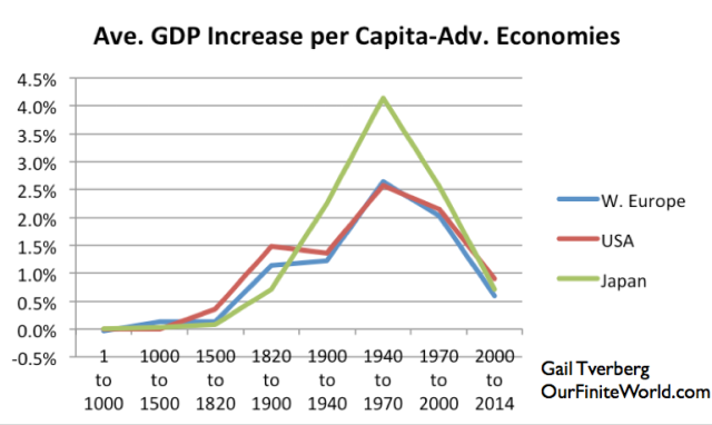
Figure 8. Average increase in per capita GDP for the United States, Western Europe, and Japan, based on work of Angus Maddison for 2000 and prior, and USDA real GDP and population data subsequent to that date.
These three economies (Western Europe, USA, and Japan) are all fairly high users of oil. If we look at long-term world oil production versus price (Figure 9), we see that growth in consumption was rising rapidly until about 1970.
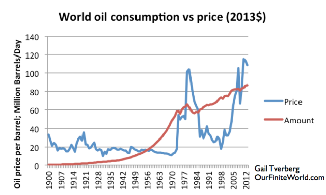
Figure 9. World oil consumption vs. price based on BP Review of World Energy data after 1965, and Vaclav Smil data prior to 1965.
In fact, if we calculate average annual increase in oil consumption for the periods of our analysis, we find that they are
- 1900 to 1940 – 6.9% per year
- 1940 to 1970 – 7.6% per year
- 1970 to 2000 – 1.5% per year
- 2000 to 2013 – 1.1% per year
Growth in oil production “hit a wall” in 1970, when US oil production unexpectedly stopped growing and started declining. (Actually, this pattern had been predicted by M. King Hubbert and others). Oil prices spiked shortly thereafter. The situation was more or less resolved by making a number of changes to the economy (switching electricity production from oil to other fuels wherever possible; building smaller, more fuel efficient vehicles), as well as ramping up oil production in places such as the North Sea, Alaska, and Mexico.
Oil prices were brought down, but not to the $20 per barrel level that had been available prior to 1970. Most of the infrastructure (roads, pipelines, electrical transmission lines, schools) in the USA, Europe, and Japan had been built with oil at a $20 per barrel level. Changing to a higher price level is very difficult, because repair costs are much higher and because an economy that uses very much high-priced oil in its energy mix is not competitive with countries using a cheaper fuel mix.

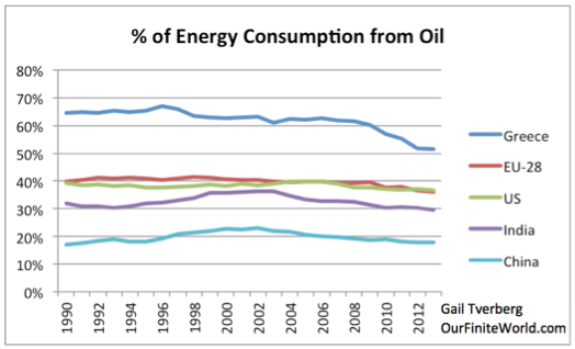
Figure 10. Percentage of energy consumption from oil, for selected countries/groups, based on BP Statistical Review of World Energy 2014 data.
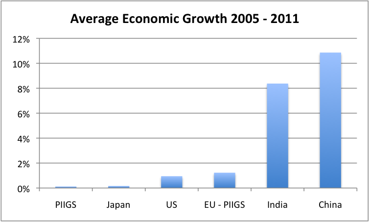
In the 2007-2008 period, oil prices spiked again, leading to a major recession, especially among the countries that used very much oil in their energy mix. With these higher prices, the leveraging impact of oil in bringing down the cost of human energy was disappearing. All of the “PIIGS” (countries with especially bad financial problems in the 2008 crisis) had very high oil concentrations, up near Greece on the chart above. Japan’s oil consumption was very high as well, as a percentage of its energy use. When we looked at the impact of the recession, the countries with the highest percentage of oil consumption in 2004 had the worst economic growth rates in the period 2005 to 2011.
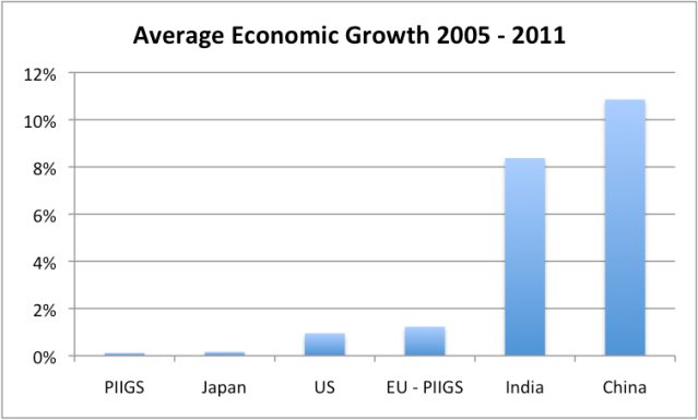
Figure 11. Average percent growth in real GDP between 2005 and 2011 for selected groups, based on USDA GDP data in 2005 US$.
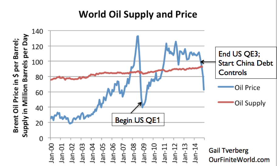
Getting back to Figure 9, after the financial crisis in 2008, oil prices stayed low until the United States began its program of Quantitative Easing (QE), helping keep interest rates extra low and providing extra liquidity. Oil prices immediately began rising again, getting to the $100 per barrel level and remaining about at that level until 2014. The combination of low interest rates and high prices encouraged oil production from shale formations, helping to keep world oil production rising, despite a drop in oil production in the North Sea, Alaska and Mexico. Thus, for a while, the conflict between high prices and the ability of economies to pay for these high prices was resolved in favor of high prices.
The high oil prices–around $100 per barrel–continued until United States QE was tapered down and stopped in 2014. About the same time, China made changes that made debt more difficult to obtain. Both of these factors, as well as the long-term adverse impact of $100 per barrel oil prices on the economy, brought oil price down to its current level, which is around $50 per barrel (Figure 10). The $50 per barrel price is still very high relative to the cost of oil when our infrastructure was built, but low relative to the current cost of oil production.

Figure 12. World Oil Supply (production including biofuels, natural gas liquids) and Brent monthly average spot prices, based on EIA data.
If a person looks back at Figure 9, it is clear that high oil prices brought oil consumption down in the early 1980s, and again for a very brief period in late 2008-early 2009. But since 2009, oil consumption has continued to rise, thanks to high prices and the additional oil from US shale.
The low prices we are now encountering are a message from our networked economy, saying, “No, the economy cannot really afford oil at this high a price level. It looked like it could for a while, thanks to all of the financial manipulation, but this is not really the case.” Meanwhile, we see in Figure 8 that for the combination of the EU, USA, and Japan, growth in per capita GDP has been very low in the period since 2000, reflecting the influence of high oil prices on these economies.
Growth in Per Capita GDP for Selected Other Economies
In recent years, per capita GPD growth has shifted dramatically. Figure 13 below shows increases in GDP per capita for selected other areas of the world.
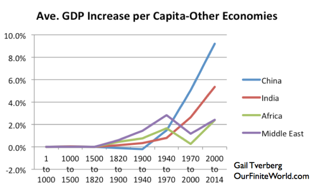
Figure 13. Average growth in per-capita GDP for selected economies, based on work of Angus Maddison for Year 1 to 2000, and based on USDA real GDP figures in 2010 US$ for 2000 to 2014.
The “stand out” economy in recent growth in GDP per capita is China. China was added to the World Trade Organization in December 2001. Since then, its coal use, and energy use in general, has soared.
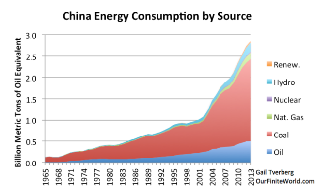
Figure 14. China’s energy consumption by source, based on BP Statistical Review of World Energy data.
If we calculate the growth in China’s energy consumption for the periods we are looking at, we find the following growth rates:
- 1970 to 2000 – 5.4% per year
- 2000 to 2013 – 8.6% per year
A major concern now is that China’s growth rate is slowing, in part due to debt controls. Other factors in the slowdown include the impact pollution is having on the Chinese people, the slowdown in the European and Japanese economies, and the fact that the Chinese market for condominiums and factories is rapidly becoming “saturated”.
There have been recent reports that the factory portion of the Chinese economy may now be contracting. Also, there are reports that Chinese coal consumption decreased in 2014. This is a chart by one analyst showing the apparent recent decrease in coal consumption.
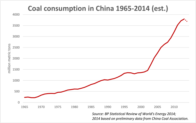
Figure 15. Chart by Lauri Myllyvirta showing a preliminary estimate of 2014 coal consumption in China.
Where Does the World Economy Go From Here?
In Part 1, I described the world’s economy as one that is based on energy. The design of the system is such that the economy can only grow; shrinkage tends to cause collapse. If my view of the situation is correct, then we need an ever-rising amount of inexpensive energy to keep the system going. We have gone from trying to grow the world economy on oil, to trying to grow the world economy on coal. Both of these approaches have “hit walls”. There are other low-income countries that might increase industrial production, such as in Africa, but they are lacking coal or other cheap fuels to fuel their production.
Now we have practically nowhere to go. Natural gas cannot be scaled up quickly enough, or to large enough quantities. If such a large scale up were done, natural gas would be expensive as well. Part of the high cost is the cost of the change-over in infrastructure, including huge amounts of new natural gas pipeline and new natural gas powered vehicles.
New renewables, such as wind and solar photovoltaic panels, aren’t solutions either. They tend to be high cost when indirect costs, such as the cost of long distance transmission and the cost of mitigating intermittency, are considered. It is hard to create large enough quantities of new renewables: China has been rapidly adding wind capacity, but the impact of these additions can barely can be seen at the top of Figure 14. Without supporting systems, such as roads and electricity transmission lines (which depend on oil), we cannot operate the electric systems that these devices are part of for the long term, either.
We truly live in interesting times.
See the original article >>


