Tuesday, March 11, 2014

Putin’s Imperial Road to Economic Ruin

by Sergei Guriev

PARIS – The debate around Crimea is no longer centered on international law: Russian President Vladimir Putin has publicly recognized that he does not feel bound by it and does not care if the rest of the world deems Russia’s actions illegal. What is not clear is whether Russia’s economy can bear the burden of Putin’s objectives in Ukraine.

Regardless of the West’s response to the Crimean crisis, the economic damage to Russia will be vast. First, there are the direct costs of military operations and of supporting the Crimean regime and its woefully inefficient economy (which has been heavily subsidized by Ukraine’s government for years.) Given the uncertainty surrounding Crimea’s future status, these costs are difficult to estimate, though they are most likely to total several billion dollars per year.

A direct cost of this magnitude amounts to less than 0.5% of Russia’s GDP. While not trivial, Russia can afford it. Russia just spent $50 billion dollars on the Sochi Olympics and plans to spend even more for the 2018 World Cup. It was prepared to lend $15 billion to former Ukrainian President Viktor Yanukovych’s government and to provide $8 billion annually in gas subsidies.

Then there are the costs related to the impact of sanctions on trade and investment. Though the scope of the sanctions remains uncertain, the effect could be enormous. Annual inward foreign direct investment is estimated to have reached $80 billion in 2013. A significant decline in FDI – which brings not only money but also modern technology and managerial skills – would hit Russia’s long-term economic growth hard. And denying Russian banks and firms access to the US (and possibly European) banking system – the harshest sanction applied to Iran – would have a devastating impact.

In the short run, however, it is trade that matters much more than investment. Russia’s annual exports (mostly oil, gas, and other commodities) are worth almost $600 billion, while annual imports total almost $500 billion. Any non-trivial trade sanctions (including sanctions on Russian financial institutions) would be much more painful than the direct cost of subsidizing Crimea. Of course, sanctions would hurt Russia’s trading partners, too. But Russia’s dependence on trade with the West is certainly much larger than vice versa.

Moreover, the most important source of potential damage to Russia’s economy lies elsewhere. Russian and foreign businesses have always been worried about the unpredictability of the country’s political leadership. Lack of confidence in Russian policymaking is the main reason for capital flight, low domestic asset prices, declining investment, and an economic slowdown that the Crimea crisis will almost certainly cause to accelerate.

Indeed, Russia’s response to events in Ukraine has exceeded the worst expectations of those who were already questioning whether Putin is, as German Chancellor Angela Merkel put it, “in touch with reality.” The move to annex Crimea has reversed any soft-power benefit that Putin might have gained from the Sochi Olympics and the pardons he granted (as recently as December) to imprisoned opponents like Mikhail Khodorkovsky and the members of Pussy Riot.

The sacrifice of these gains suggests that the Crimea adventure was not part of long-considered plan. On the contrary, since the crisis began, Russia’s leaders have repeatedly contradicted their previous statements, backtracked, reversed decisions, and denied easily verifiable facts. All of this indicates that Russian political leaders have no strategy and do not foresee the consequences of their decisions. Even the Kremlin’s own supporters acknowledge that Putin “is improvising.

It is also clear that the decisions to violate international law, despite the risk of economic isolation, were made in an ad hoc fashion by Putin’s innermost circle. For example, Valentina Matviyenko, the chairwoman of the Federation Council (the parliament’s upper house), announced that Russia would not send troops to Ukraine – just two days before she and the Council voted unanimously to authorize Putin to do precisely that. And Matviyenko is one of the 12 permanent members of Russia’s National Security Council, the supreme decision-making authority on such matters.

Regardless of whether the Kremlin is irrational or simply uninformed, its policy in Crimea sends an unmistakable signal to investors: Russia’s political leaders are impossible to predict. This will further undermine Russian and foreign investors’ confidence and increase capital flight, which could not come at a worse time. With credit-fueled consumer spending – the engine driving GDP growth since 2010 – now running out of steam, the economy is stagnating.

Meanwhile, investment is still below its 2008 peak. Despite a wealth of opportunities across the Russian economy, the country’s hostile business climate – including bloated bureaucracies, widespread corruption, and the expansion of state-owned companies – has weakened Russian and foreign investors’ incentive to start new projects or expand existing ones. The realization that Putin has entered, to quote Merkel again, “another world” will only make matters worse.

Will Russians notice the economic costs of the Kremlin’s irrationality? GDP growth has already slowed and may turn negative. The stock market has already fallen sharply and may fall further. Of course, equity ownership in Russia is narrow; most Russians do not even follow market indices. But increased capital flight will also affect something that ordinary Russians know and care about: the ruble’s exchange rate.

On the Monday after Putin’s Crimea adventure began, the Central Bank of Russia reportedly spent $11.3 billion to prop up the ruble. Such support is clearly unsustainable; in fact, the CBR recently announced that it will allow the ruble to float, implying an exchange rate that reflects the market’s expectations concerning oil prices and future capital outflows.

Thus, worries about a Putin who has “lost touch with reality” imply not only a lower (or even negative) GDP growth rate, but also – and more immediately – a weaker currency, driving up prices of imported consumer goods. All Russians will soon feel the effects; whether that will bring their president back from his world to this one is another matter.

See the original article >>

Will the IMF Lose Ukraine?

by Mitchell A Orenstein

BOSTON – An incumbent trying to win an election in a stagnating economy must stimulate growth. This is one the most basic principles of modern politics. And yet the West, which wants to help its allies in Ukraine’s interim government win the general election on May 25, seems to have forgotten it.

Instead, plans are underway to impose on Ukraine the biggest austerity package Eastern Europe has ever seen. This is no way to win votes. After the Russian-imposed chaos, the International Monetary Fund is planning to inflict its own chaos on Ukraine. It is time to remind the IMF that political stability, not a controversial raft of emergency reforms, must be the top priority.

The IMF has long sought to impose a range of economic “reforms” on Ukraine. Some are reasonable; others are not – and the IMF’s track record in Ukraine is weak. Some of the reforms the IMF previously tried to get Ukraine to adopt, like pension privatization, were tried in other countries and ditched. The IMF does not always get it right. Today, its main blind spot in Ukraine has concerned consumer subsidies and transfer payments.

It is true that Ukrainian households need to be weaned off absurdly large energy subsidies, which amounted to 7.5% of GDP in 2012. But, in a cold country where most of the population needs heating subsidies to survive and massive investments are required to increase energy efficiency, abruptly withdrawing support to households is politically unfeasible. No government that cuts heating subsidies suddenly will survive. The subsidies must be phased out and compensated by targeted cash benefits – the Ukrainian government estimates that it will cost €100 billion ($139 billion) to fix its energy policy – and these reforms need to be enacted after the upcoming election. 

In addition, one-third of official income in Ukraine comes from government “transfer” payments of various sorts, but mainly pensions paid to elderly women, given that the country’s men rarely live much beyond the official retirement age. These women often use their pensions to subsidize their children and grandchildren. As a result, a majority of the country benefits from government transfer payments, and many households cannot do without them.

Yet cutting them ahead of the election – or announcing sharp cuts – is exactly what the IMF wants and what the interim Ukrainian government plans to do; in the words of Prime Minister Arseniy Yatsenyuk, “We don’t have any other options.” Yatsenyuk may be willing to sign away his political future, but the West should not let him do it. Not now.

The IMF and Western governments need to give Ukraine some breathing room. Ukraine’s economy was growing rapidly in the years before the global financial crisis, driven by exports of basic industrial goods, such as steel. Any emergency financial package must enable the government to survive through the May election and signal a commitment to reviving economic growth.

The international financial institutions should then turn their attention to crafting an aid package that does not require the budget to be balanced on the backs of the poor. Instead of cutting consumer subsidies, the IMF could help Ukraine to improve tax collection. More than half of the economy is unofficial and untaxed. Oligarchs can be asked to contribute to any program as a condition of support for their regions or industries. And the IMF can come up with clever ways to encourage energy efficiency, for example, by designing a tax credit for households that purchase high-quality heaters.

No successful Eastern European government has been asked to impose a dramatic austerity and reform program prior to democratic elections; it would be utter folly to start now. In Poland, the region’s star reformer, and elsewhere in post-communist Europe, citizens were asked to make the sacrifices that economic reform requires only after the government had gained a popular mandate.

Ukraine is still a step away from this politically. If the IMF insists that the interim Ukrainian government impose austerity immediately, the country will be forced to break uncertain new ground at a particularly dangerous time.

In short, the Western strategy for Ukraine should be to stimulate the Ukrainian economy until the May election and then negotiate a package of reforms with the government that emerges. Emergency economic reforms can wait two months; Ukraine’s unity and stability cannot.

See the original article >>

Sugar prices ease, amid talk of 'limited' demand

by Agrimoney.com

Sugar prices eased amid talk of higher values encouraging the release of extra supplies, at a time when demand in the key market of Brazil has proven "limited", with buyers viewed as having ample supplies.

Sugar for May stood 1.5% lower at 17.94 cents a pound in New York.

The fall came despite continued dryness in central Brazil, a major producing area for coffee and orange juice as well as sugar - and, indeed, contrasted with a 1.7% increase to 207.15 cents a pound in New York arabica coffee futures for May.

May coffee earlier hit 208.90 cents a pound, the highest for a nearest-but-one contract since February 2012.

However, while data overnight from Cecafe showed Brazilian coffee exports soaring 28% year on year in February, to 2.52m bags, and the coffee trade association expects full-year shipments to rise to 33m tonnes from 31.1m tonnes last year, evidence of demand for sugar has proven more downbeat.

'Limited demand'

"Demand for additional raw sugar volume remained limited in the spot market in Sao Paulo during February," said Cepea, the market research institute linked to Sao Paulo University.

Industry sources said that supplies agreed through existing contracts were "enough to meet needs".

"As a result, trades in the spot market involved smaller volumes compared to those in January - only a few trades involving higher amounts were closed," the institute said.

In fact, raw sugar prices in Sao Paulo rose 3.1% to R$51.49 ($21.99) per 50-kilogramme bag, equivalent to about R$1,030 ($440) per tonne.

Raw sugar futures rose 5.9% last month in New York, on a spot contract basis, and by 12.3% in London.

Brazilian prices now meant that mills – albeit now in a seasonal shutdown - would earn 10% more for turning cane into sugar rather than anhydrous ethanol, and 12% more than making hydrous ethanol.

Supply-demand dynamics

Separately, Marex Spectron flagged the impact of higher sugar prices in raising supplies, in part through encouraging cane processors to produce sugar rather than ethanol.

"In Centre South Brazil, we will gain about 2.5m-3.0m tonnes of extra sugar production as the ethanol/sugar mix will go to its maximum of around 50.5:49.5%, compared with last year's 54.5:45.5%," the London broker said.

In China, world sugar prices were "now far above" domestic values, meaning that "if prices stay here or go higher, Chinese imports, which were expected to reach 2.5m tonnes this year, will fall to about 1.5m tonnes".

"In India, we will gain about 1m tonnes of extra exports."

Sugar prices should "at some stage gravitate back" to about 17.00-17.50 cents a pound, a level Marex termed an "equilibrium point", where Chinese imports become viable, and Indian exports unprofitable.

However, higher prices were possible later on, to encourage output and "cure" the world sugar production deficit foreseen for 2015.

See the original article >>

Chinese Credit Concerns Clobber Copper; Collapse Continues To Lowest Since July 2010

by Tyler Durden

Copper futures prices are plunging once again, back under $3.00 back at the lowest levels since July 2010. The last 3 days have seen prices drop over 7.5% as China credit contagion concerns surge and letters-of-credit from last summer's cash-for-copper financing deals roll-off and businesses need the cash. The vicious circle of tumbling collateral values (copper and Iron ore) is exacerbating the tightening financial conditions in China as banks hoard liquidity, unwilling to lend to the over-capacity industries that the government has deemed unworthy. Rumors today of further defaults triggered this latest drop, and as we noted previously, there are a lot more to come.

Copper futures intraday are collapsing...

Which takes it back to July 2010 levels...

and LME Copper (where much of the L/C cash-for-copper deals were held) is also in freefall.

Rumors today of another Chinese corporate default, the second in a row are adding fuelt to the fire.  Via BusinessWeek,

Baoding Tianwei Baobian Electric Co. (600550)’s bonds and stock were suspended from trading today after the Chinese electrical equipment maker said it reported losses for a second year running.

The company, which also makes solar panels and is based in the northeast province of Hebei, reported a net loss of 5.23 billion yuan ($852 million) in 2013 versus a 1.55 billion yuan earnings deficit a year ago, according to a statement to the Shanghai stock exchange yesterday. The exchange, in line with its rules, will decide in seven trading days whether to continue the trading halt on Tianwei Baobian Electric’s bonds until its losses are reversed.

Investor scrutiny of China’s onshore bond market is mounting after Shanghai Chaori Solar Energy Science & Technology Co. last week became the first company to default. Chaori Solar’s failure to pay has stoked speculation more companies may miss debt deadlines also.

This should not be surprising - there are many more trusts and bonds to come...

As we warned previously,

Naturally, for an economy in which credit creation is of utmost importance, the loss of one such key financing channel will have very unintended consequences at best, and could potentially lead to a significant "credit event" in the world's fastest growing large economy at worst.

And don't look at what's coming down the shadow banking default pipelines, as we showed before. via BofA's David Cui

12 potential defaults reported by the media

Table 1 summarizes the information on the 12 major potential defaults in the trust industry that have been reported by the media. Most of them are coal mine related and heavily concentrated in one area, Shanxi Province. So far it seems to us that most of them may get extended upon the due date. The only exception over the next few months appears to be a product issued by China Credit Trust for a lead and zinc miner in Sichuan, Nonggeshan. Even without any major default over the next few months, the process of debt restructuring can be messy and weigh heavily on market sentiment.

19 Feb 2014, Rmb109mn borrowed by Liansheng & arranged by Jilin Trust

  • Details: This Rmb109mn tranche is part of a six-tranche trust product worth a total of Rmb973mn arranged by Jilin Trust for Liansheng, a Shanxi coal miner. The other five tranches have matured since 2H 2013 and remain overdue.
  • Potential outcome: Repayment may be extended.
  • Reason: Liansheng is undergoing a debt restructuring coordinated by the Shanxi provincial government. 1) The provincial government plans to help out involved financial institutions to ensure the region’s access to ongoing financing. According to people close to the situation, the implicit guarantee practice will most likely continue with the Liansheng’s case. 2) Trust companies may have to follow banks to help the miner out. Banks have agreed to extend their mid/long term loans by three years. Top 3 banks have total debts of Rmb10.6bn to Liansheng; top 3 trust lenders, Rmb3.7bn.

(Shanghai Securities News, 2/11; Economic Information, 2/13)

21 Feb 2014, Rmb500mn borrowed by Liansheng & arranged by Shanxi Trust

  • Potential outcome: repayment may be extended.
  • Reason: Same as the Jilin Trust case.

(Caiing 1/27; China Securities Journal, 1/27; 21st Century Business Herald, 2/14)

07 Mar 2014, Rmb664mn borrowed by Liansheng & arranged by Changan Trust

  • Details: Other than the Rmb664mn product to mature on Mar 7, Changan Trust arranged another two products for Liansheng, totaling Rmb536mn which matured in Nov 2013. Both products remain overdue.
  • Potential outcome: repayment may be extended.
  • Reason: Same as the other Liansheng cases.

(Caiing 1/27; China Securities Journal, 1/27; 21st Century Business Herald, 2/14)

31 Mar 2014, Rmb196mn borrowed by Magic Property & arranged by CITIC Trust

  • Details: invested in an office building in Chongqing. The Chongqing developer ran into financial problems in mid-2013. CITIC Trust tried to auction the collateral but failed to do so because the developer has sold the collateral and also mortgaged it to a few other lenders.
  • Potential outcome: The developer and the trust company may share the repayment.
  • Reasons: 1) When CITIC Trust sold the product, it did not specify the underlying investment project. 2) The local government has intervened, fearing social unrest. A local buyer of a unit in the office building committed suicide as he/she could not obtain the title to the property due to the title dispute between the trust and the developer.

(Source: Financial Planning Weekly, 3/6/2013; Guangzhou Daily, 4/6/2013, Boxun, 5/10/2013)

14 May 2014, Rmb1.5bn borrowed by Liansheng & arranged by China Jiangxi International Trust

  • Potential outcome: repayment may be extended.
  • Reason: Same as the other three Liansheng cases.

(Caiing 1/27; China Securities Journal, 1/27; 21st Century Business Herald, 2/14)

30 May 2014, Rmb140mn borrowed by Nonggeshan & arranged by China Credit Trust

  • Details: invested in a lead and zinc mine in Sichuan.
  • Potential outcome: Likely to default.
  • Reasons: 1) Compared to coal mines of Zhenfu and Liansheng, the lead and zinc mine is a much less attractive asset: it is located in the mountains over 5,000 meters in altitude, inaccessible for 6 months of the year due to weather conditions, with low lead/zinc content; 2) According to an unnamed regulator, the central government is comfortable with trust defaults in the range of Rmb100-200mn.

(Source: 21st Century Business Herald, 31/7/2012; Caiing, 1/27)

25 Jul 2014, Rmb1.3bn borrowed by Xinbeifang & arranged by China Credit Trust

  • Details: Xinbeifang is another Shanxi coal miner.
  • Potential outcome: repayment may be extended.
  • Reason: Xinbeifang is negotiating with an SOE to sell some of its coal mine assets.

(Source: China Securities Journal, 1/15)

27 Jul 2014, Rmb319mn borrowed by Hongsheng & arranged by Huarong Trust

  • Details: Hongsheng is a Shanxi coal miner. Huarong sold another trust product for it which will mature in 4 September 2014, worth Rmb63mn.
  • Potential outcome: repayment may be extended.
  • Reason: Hongsheng may have assets to secure more financing. It issued these two trust products to replace another trust product that matured in Q3 2012. The owner also issued other trust products using his personal property assets as collateral and raised Rmb1.2bn.

(21st Century Business Herald, 20/12/2013)

7 Sept 2014: Rmb400mn borrowed by Zengdai & arranged by CCB Trust

  • Details: 1) The proceeds of the product were invested in financial markets. 2) Its 1st tranche, worth Rmb400mn, matured in Mar 2013 with a 38% loss vs. an expected return of 20-30%. Investors agreed to extend the maturity of the product to Sept 2014. 3) Its 2nd tranche, worth Rmb359mn, matured in June 2013 with a 31% loss vs. an expected return of 20-30%. Investors agreed to extend the maturity of the 2nd tranche to Dec 2014.
  • Potential outcome: The trust company and the investment company may share the losses.
  • Reasons: 1) The investment company refused to repay investors in full at the original due date so the trust company may have to chip in; 2) By Jan 2014, the 1st tranche reported a narrower loss of 24%, and the 2nd tranche, also a narrower loss of 13%; 3) Zengdai may pay on behalf of its investment company for reputation’s sake.

(Source: Securities Daily, 9/7/2013; CCB Trust)

20 Nov 2014, Rmb600mn borrowed by Liansheng & arranged by China Jiangxi Int'l Trust

  • Potential outcome: repayment may be extended.
  • Reason: Same as the other Liansheng cases.

(Caiing 1/27; China Securities Journal, 1/27; 21st Century Business Herald, 2/14)

23 Dec2014: Rmb1.1bn borrowed by Xiaoyi Dewei & arranged by China Resources Trust

  • Details: Xiaoyi Dewei is a Shanxi coal miner. The trust product originally matured in Dec 2013 but repayment was extended to Dec 2014.
  • Potential outcome: Likely to default.
  • Reason: Both the miner and the trust company refused to repay investors in full at the original due date. There has been no reporting on asset sales by Xiaoyi Dewei.

(Source: Financial Planning Weekly, 11 Nov 2013)

15 Jan 2015, Rmb1.2bn borrowed by Hongsheng’s owner & arranged by Minmetals Trust

  • Details: the collateral is the Shanxi coal miner’s personal property assets.
  • Potential outcome: May be replaced by a new trust product.
  • Reason: Same as the July 2014 Rmb319mn trust product issued by Huarong Trust.

(21st Century Business Herald, 20/12/2013)

2Q/3Q 2014 – the next peak maturing period for collective trusts

We consider the trust market the most vulnerable part of the major financing channels for companies, i.e. loan, corporate bond and trust. The quality of the borrowers in the trust market tends to among the lowest. Within the trust market, collective trust products, i.e. those sold to more than one investor, tend to be risker than single trust products, i.e. those sold to a single investor. This is because investors in single trust products tend to be more substantial in resources, thus most likely more sophisticated in their risk control.

The Wind database lists close to 12,000 collective trust products, worth Rmb1.34tr, which cover roughly half of the collective trust market (Rmb2.72tr as of the end of 2013). It has reasonably good quality data series on the issuing dates and amounts raised. However, data on maturing dates are sporadic. We estimate that the average duration of the trust products is around 2 years. Based on this assumption and the issuing dates, we have mapped out a rough maturing profile of the collective trust market. As we can see from Chart 1, 2Q and 3Q this year will be the next peak maturing period for this market.

See the original article >>

Gold's Bull Days Are Back? Making Green from Gold, Palladium and Pollution

By: Frank_Holmes

Gold is coming back with a vengeance, experiencing a clear recovery and grabbing the attention of market cynics. Analysts from Noruma Securities even upgraded its outlook for gold, expecting bullion to climb over the next three years, according to Barron's.

Nomura analysts attribute their increased gold forecast to real interest rates that "don't seem to be heading anywhere at the moment." In addition, there appears to be "long-term demand support from Asian nominal income growth, an evolving post-QE macroeconomic environment and lower disinvestment potential."

Gold is also gleaming a little brighter in Japan, as its central bank announced that monetary policies will remain very accommodative. With a weakening yen, gold will likely be seen as a store of value for Japanese investors.

Palladium Near Its Highest Level in Almost a Year

Two global events recently colluded that dramatically affected the palladium and platinum market. The situation in Ukraine and Russia along with six-week-long strikes in South Africa began raising concerns that these palladium-rich countries may not be able to continue supplying the commodity at normal levels.

Currently South Africa supplies around 37 percent of the world's palladium; Russia supplies close to 40 percent of the world's palladium.

What does this all mean for the palladium and its sister platinum? It seems that fear surrounding the international political landscape is helping to push the precious metals prices higher and higher.

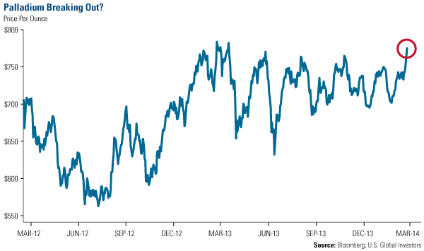
You can see the effect the political landscape is having on palladium. Over the past year, the metal has mainly traded sideways, but this week hit its highest level in almost a year. The precious metal reached $775 per ounce while its sister, platinum, climbed to nearly $1,500 an ounce.

In January, I indicated that platinum and palladium looked extremely compelling. There were supply and demand drivers I felt would drive the metals higher.

Just last week, the U.S. Mint is "ending a four-year exit from the market" by selling one-ounce American Eagle platinum bullion coins, writes Frank Tang from Reuters. According to a wholesaler last week, initial demand is strong, as 1,000 coins have already been scooped up.

Like I discussed with Resource Investing News at the Vancouver Resource Investment Conference, industrial demand has been gaining strength. Take rising automobile sales in the U.S. that I talked about a few months ago. With interest rates on car loans so low, Americans have been replacing their clunkers with more fuel efficient cars, which is positive for platinum and palladium.

It's a similar story in emerging markets. In Africa, the GDP without a leveraged economy is still growing at 5 percent, and you definitely need platinum and palladium for their vehicles, even if they are diesel.

In China, vehicle sales last year rose faster than expected, climbing nearly 14 percent compared to a year earlier, according to the China Association of Automobile Manufacturers. The country is already the biggest automobile market in the world and millions of new cars on the roads add up fast.

See the interview here.

We're pleased that our technical models signaled initial bullish signs, as our palladium- and platinum-related holdings helped boost the returns of the Gold and Precious Metals Fund (USERX) and the World Precious Minerals Fund (UNWPX).

Renewable Energy Could Get You More Green

In our webcast last week, Brian Hicks, portfolio manager of the Global Resources Fund (PSPFX), talked about four opportunities he sees in resources over 2014.

One relates to China's focus on alternative energy.

See the other three opportunities now.

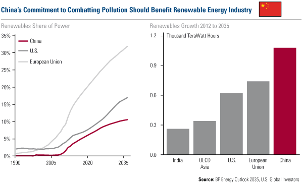
In BP's latest Energy Outlook 2035, you can see the incredible long-term growth anticipated in the renewable energy industry. In terms of volume growth, China is expected to surpass the European Union countries by 2035. Based on this secular transformation, the local clean energy sector should continue to benefit.

China's Commitment to Combatting Pollution Should Benefit Renewable Energy Industry

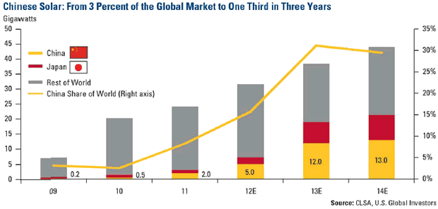
Specifically, wind power and solar look especially attractive, especially given the excessive pollution in the Asian giant. Take a look at CLSA data: In 2009, the country had about 0.2 percent of the global market. By 2014, it's estimated to grow to one third of the global market.

China isn't the only country with a growing renewable energy market. After the massive earthquake hit Japan in 2011, the solar market is taking off there too.

Chinese Solar: From 3 Percent of the Global Market to One Third in Three Years

If you were too busy to tune into our webcast last week, you missed a good discussion among Brian Hicks, John Derrick and me. It was an hour chock-filled with investing ideas in the U.S. market, emerging countries, resources and gold. However, it's not too late to watch the replay at your leisure this weekend.

See the original article >>

Silver Price Back Below $21

By: P_Radomski_CFA

Briefly: In our opinion short speculative positions (half) in silver and mining stocks are justified from the risk/reward perspective.

We previously emphasized that the situation in Ukraine was the main bullish factor for higher precious metals prices (mainly for the price of gold) and that remains to be the case. However, even though the situation didn't improve, precious metals moved decisively lower on Friday. This does not bode well for the precious metals market, but let's examine the key charts before making the final call (charts courtesy of http://stockcharts.com):

Based on Thursday's closing prices, we wrote the following:

The volume was very low during yesterday's upswing, which has bearish implications. We wrote the same yesterday, but this time the implications are clearer as the rally was clearer as well. Bigger rally + very low volume have more bearish implications than a rather small rally on the same volume levels.

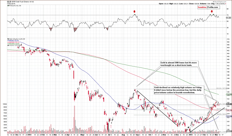
On Friday gold declined on relatively strong volume, which is another confirmation of the bearish outlook. The yellow metal now follows the rally-on-low-volume-but-decline-on-high-volume pattern, which is a bearish phenomenon. High volume usually tells the true direction of the market and in this case it's down.

The same was the case in the silver market and for mining stocks. Let's take a look at the latter.
GDX Market Vectors Gold Miners NYSE

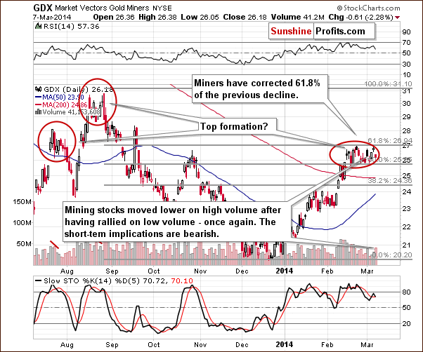
As you can see on the above chart, the GDX ETF moved higher on low volume but declined (on Friday) on relatively high volume. Again, the implications are bearish, especially that the past few weeks have been similar to the July and August 2013 topping patterns.

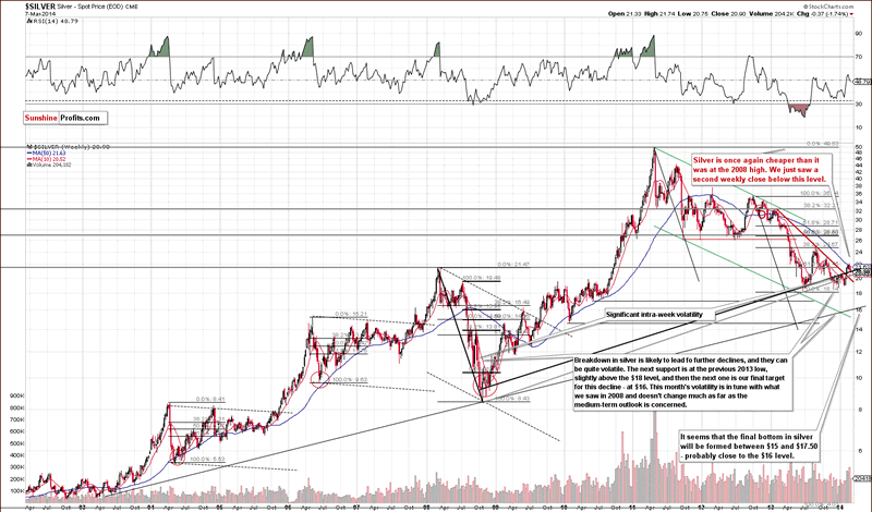
Silver also moved lower - in fact, most decisively in the whole sector. It is now well below the 2008 high and it was the second weekly close below it. Silver is currently below the $21 level. For the bearish outlook to be confirmed (and for us to increase the size of the short position in silver), we would like to see a move below the rising long-term support lines - marked in black and grey on the above chart. They are close to where silver is now, so we may see further deterioration relatively soon.

Meanwhile, what we wrote about the USD Index regarding the medium-term perspective remains up-to-date:

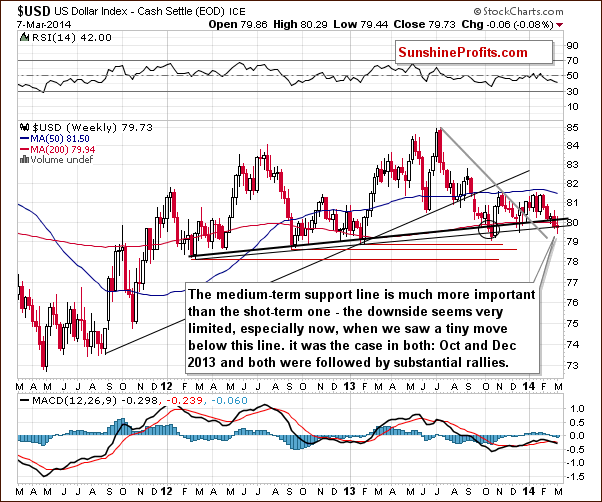
The USD Index declined below the previous 2014 low (while gold, silver, and mining stocks didn't move above their 2014 highs), but this "breakdown" doesn't really have bearish implications. Similar "breakdowns" were followed by significant rallies back in October and December 2013. The breakdown is not confirmed in a technical sense, and it seems doubtful that it will be followed by more weakness or that it will really be sustainable.

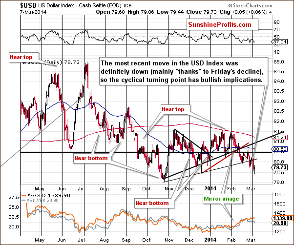
From the short-term perspective, we see that the USD Index declined on Friday but quickly moved back up. It moved to the December 2013 lows, which proved to be support. The most important thing visible on the above chart is the presence and proximity of the cyclical turning point. The USD Index is now right after the turning point, and the preceding move was definitely down, so a turnaround here seems very likely.

All in all, what we wrote previously about the outlook for the precious metals sector remains up-to-date. It doesn't seem that keeping a full long position in the investment category is justified at this point in our view. Based on last week's events and what had happened over the weekend it was likely that gold would move much higher - but its reaction has been very weak. It looks like there will be no rally in gold before a bigger decline. We are keeping half of the funds in gold, though, just in case the next days bring improvement (or perhaps the tensions in Ukraine would increase). If not - things will become even more bearish and we will likely adjust the position once again.

We might suggest changing the short-term speculative position and / or the long-term investment one shortly, based on how the markets react and what happens in Ukraine.

In other news, we have recently posted an important report on the role of rebalancing in the case of the mining stocks sector. You can often read that one should do "some rebalancing" but we went much further than that. We dedicated months of research to comparing the classic buy and hold approach with rebalancing and you will find results in our latest report. It's available free of charge.

To summarize:

Trading capital (our opinion): Short position (half): silver and mining stocks.

Stop-loss details:

- Silver: $22.60 - GDX ETF: $28.9

Long-term capital (our opinion): Half position in gold, no positions in silver, platinum and mining stocks. Insurance capital (our opinion): Full position

See the original article >>

Hussman Warns S&P 500 Over-Valuation Now Higher Than Housing In 2006

Excerpted from Hussman Funds Market Comment

Based on valuation metrics that have demonstrated a near-90% correlation with subsequent 10-year S&P 500 total returns, not only historically but also in recent decades, we estimate that U.S. equities are more than 100% above the level that would be associated with historically normal future returns. We presently estimate 10-year nominal total returns for the S&P 500 averaging just 2.2% annually over the coming decade, with zero or negative nominal total returns on every horizon of less than 7 years. Regardless of very short-term market direction, it is urgent for investors to understand where the equity markets are positioned in the context of the full cycle.

It is the series of extreme instances over the past year that give investors the hope and delusion that historically reckless market conditions will lead only to further gains and greater highs. This is a mistake born of complacency in the face of a nearly uninterrupted, Fed-enabled 5-year market advance, and is the same mistake that was made in 2000 and again in 2007. By the time the present market cycle is completed, we expect the S&P 500 to be at least 40% lower than present levels. Only the reliance on historically unreliable valuation metrics, and what Galbraith called the “extreme brevity of financial memory” makes that assertion seem the least bit controversial.

Investors and policy-makers that focus attention on some alternative valuation measure (usually because it seems pleasantly benign) would be well-advised to examine the data, and compare the historical relationship between competing measures and actual subsequent market returns.

It is incorrect to believe that the 2008-2009 market plunge and financial crisis were caused by the housing bubble. The housing bubble was merely the expression of a very specific underlying dynamic. The true cause of that episode can be found earlier, in Federal Reserve policies that suppressed short-term interest rates following the 2000-2002 recession, and provoked a multi-year speculative “reach for yield” into mortgage securities. Wall Street was quite happy to supply the desired “product” to investors who – observing that the housing market had never experienced major losses – misinvested trillions of dollars of savings, chasing mortgage securities and financing a speculative bubble. Of course, the only way to generate enough “product” was to make mortgage loans of progressively lower quality to anyone with a pulse. To believe that the housing bubble caused the crash was is to ignore its origin in Federal Reserve policies that forced investors to reach for yield.

Tragically, the Federal Reserve has done the same thing again – starving investors of safe returns, and promoting a reach for yield into increasingly elevated and speculative assets. Thinking about the crisis only from the perspective of housing, investors and policy-makers have allowed the same process to play out more broadly in the equity market.

On a quantitative basis, the overvaluation of the equity market is greater percentage-wise, and greater dollar-wise, than the overvaluation of housing in 2006-2007. We fully expect that from present valuations, U.S. stocks will produce zero or negative returns on every horizon shorter than 7 years.

There is no antidote or alchemy that will allow a buy-and-hold approach to squeeze water from this stone.

There is no painless monetary fix that will shift the allocation of capital toward productive investment and away from distortive speculation.

Instead, one must wait for the rain. Impatient, crowd-following investors are all too willing to wastefully scatter seeds onto this parched desert, thinking that this is their only chance to sow. To wait patiently in the expectation of fertile soil and rain is not an act of pessimism, but an act of optimism and informed experience.

See the original article >>

Missing Indicators and Confirmation Bias

by Jeff Miller

Objectivity!

One of the most important questions for consumers of punditry is whether the source is intellectually honest about methods and interpretation. The test is a simple one:

  1. If an indicator is cited as support for a market position, take note.
  2. If the observer decides to change indicators, there should be a logical explanation – best done when it is not an excuse for maintaining current viewpoints.
  3. If the indicator is dropped when it no longer supports the pre-conceived viewpoint, be warned!

Since I read widely from many sources, I am often intrigued by provocative claims. If you want to challenge your own biases, you must be willing to see an opposing viewpoint. If you learn that a source has turned a blind eye that should be a red flag.

Two Examples

Case one. There has been a lot of recent buzz about high levels of margin at the NYSE. For a time, your favorite conspiracy site insisted that this had nothing to do with short interest, since that was declining as the S&P was rising. Here was the chart:

Let us now compare with more recent data via CNBC:

It is pretty obvious that the ZH post coincided with the one big diversion in this series. Do not hold your breath waiting for an update!

Case two. A famous pundit who is generally bearish identified an interesting indicator – purchase of dental services. The basic idea was that many dental procedures were discretionary and therefore a great real-time indicator of consumer strength. Since I admire the source and his ability to find innovative ideas, I thought this was quite interesting. I put the key stock, which he recommended as a short, on my quote screen. One of his several public comments (and not the first) was in mid-2012 when he noted that the stock was at an all-time high. Here is the stock chart:

We can see that the stock is up 50% since the time of this widely-publicized article. You probably did not short it, and neither did I. Our hero (no doubt) had a nice stop on his short. That is not the point.

What about the status of this great, little-noted indicator? Has something happened so that the "discretionary" dental purchases are not a good indication? Maybe there was an explanation that I missed, but it seems like just another discarded indicator. Meanwhile, the pundit continues to write daily about headwinds and new reasons to short the market. How about an explanation of what has changed about discretionary dental expenditures?

How Investors Can Use this Concept

It is pretty simple. Make some notes about the reasoning – not just the conclusions – of your favorite sources. Look at the indicators and specific forecasts.

It is perfectly acceptable to change your mind about an indicator. In my weekly updates I am quite clear about what is important and what is not. If there is a change, I explain it. This is the standard that you should expect.

There are dozens of similar examples. I invite nominations from readers.

See the original article >>

Monday USDA report moves corn, soybeans and wheat

By Allendale Inc

Corn: Monday's USDA report offered bullish U.S. carryout news and bearish world numbers. Trade was looking for the U.S. carryout to rise from 1.481 to 1.488, and instead that carryout was actually lowered to 1.456.

All of this carryout reduction came from the USDA raising exports by 25 million bushels. This carryout increase should not surprise anyone in the market with the way the weekly export/sales reports have been running lately. There has not been a price level seen yet that has slowed that report. Keep a close eye on Thursday’s weekly sales report as that will reflect what demand was seen when old-crop corn briefly touched $5.

On the world side, the USDA raised total supply from 157.30 MMT to 158.5. That increase was significant but it is likely the U.S. carryout number will take more importance. Given that corn volume was quite low for a report day, it is likely more accurate to say funds were not present in this market today rather than to make a case they were sellers. Short-term fund activity (or a lack thereof) will guide this market the most. Longer term trade will start putting even more focus on acreage and spring weather concerns.

Soybeans: The USDA lowered ending stocks on Monday's report but not as much as the trade had thought they would. This led to a buy-the-rumor, sell-the-fact reaction to the report. The market had rallied $1.45-½ since the February report, and it was definitely susceptible to profiting if the bull was not fed.

As for the report, ending stocks were lowered slightly, from February’s 150 million bushels estimate to 145 this month. The trade had been looking for ending stocks to drop to 141 million bushels. While USDA did increase exports by 20 million bushels, that was partially offset by a 10 million tonne decline for domestic crush and a 5 million tonne increase for imports.

We anticipate exports to be raised on upcoming reports as even with Monday’s upward revision higher, the U.S. still has sold 93 million more bushels the USDA projected. The trade will now get concerned that USDA may manage ending stocks like last year when they refused to project ending stocks below 125 million bushels. During that time, ending stocks were left unchanged from February through September.

As for the world numbers, they lowered Brazil soybean production from 90 million tonnes down to 88.5. This was a little higher than the trade had anticipated. Argentina bean production was left unchanged at 54 mt. World soybean stocks declined from 73.0 last month to now 70.6. This is still an increase from last year’s 58.

As for price expectations, our bullish price target for old crop soybeans was filled weeks ago. There is just a little left to fill our $12.15 target for the November. As the trade will begin debating a soybean plantings in earnest now, we expect sharply lower prices after planting. We feel USDA’s Ag Forum estimates, released in February at +3 million, to be sharply increased after this month’s survey. Our downside target is $9.25 for November.

In additional news Monday that pressured the market were unconfirmed reports that China had canceled 20 cargoes of beans purchases from Brazil over the weekend. The trade will be on the lookout for more cancellations of US purchases…Jim McCormick

Wheat: Wheat finished the day lower. The USDA released their monthly supply and demand tables, and trade showed some disappointment to the lack of bullish information and met that with some moderate selling. The USDA left the numbers month over month unchanged and slightly increased world ending stocks, which sent the markets down in the May soft contract, the most active contract.

Wheat is currently ahead of the five-year average pace for exports but doesn’t appear to be changing the general trend as exports move on a fairly linear line through the end of the marketing year. The move lower is not going to change the general theme of this market as the trend is still higher and with first support coming in for the May soft contract at 620 and the gap fill at 605, we have plenty of support to continue the recent trend.

The USDA did not change exports, which some had expected with the recent situation between Russia and the Ukraine did add to the disappointment and sell off but trade will continue to monitor this situation closely. A recent warm up in U.S. temps is going to start to push some wheat out of dormancy, but the lack of severally cold temperatures also gives the trade little reason for concern.

Spring rains are the biggest factor for determining wheat yields, so continue to monitor weather as there are several of the large wheat growing areas in the plains still suffering through some dryness. Global stocks aren’t changing and speculation on U.S. production is going to be the biggest market driver moving forward.

See the original article >>

23 Commodity, Equity, and Currency Markets since the 2009 Low

by Attain Capital

It seems like only yesterday we had 700 point down moves in the Dow, Lehman going bankrupt, and billions and billions in bailouts being handed out as the stock market made new lows seemingly every week, dragging down most commodity markets with it. But can you believe it’s actually been 5 years, with the low of the crisis happening 5 years ago yesterday – March 9, 2009. The first 3 years sure went by quickly… as we didn’t really know we were in the clear, and now the last two have been a blur of new highs in the stock market seemingly every week.  My how things change in a hurry.

Markets Since 09

Now, that was the low in the US stock market – other markets like Crude Oil bottomed before then, and some like Wheat bottom after that – but it’s hard to find many losers among the basket of markets we track since that fateful day 5 years ago. Everything on our list is up since then besides the US Dollar and Japanese Yen (imagine that, the two economies which went nuclear in terms of providing capital to the markets).

Some items of note include Copper outpacing Gold almost 2 to 1… (funny we don’t recall any stories about Copper vending machines over the past 5 year); Cotton surging over 140%, and Crude Oil the only other market not a stock index having more than doubled with gains of 124% (of course that would have been tough to realize with the cost of carry and negative roll yield.)

(Source: All data markets above are cash data provided from CSI.)

Meanwhile, Bonds have managed to stay positive despite 5 years of predictions of rising rates and debt ceiling debates; while Natural Gas somehow managed to get into the black after spending most of the 5 year period worse than the March 9th, 2009 low.  And most impressive of all, of course, is US stocks, where the S&P has even become a bit of a third wheel despite more than doubling, because of the high flying Nasdaq and Russell 2000 which are both better by more than 225%. Wow – why didn’t Bernanke just come out and tell Americans to buy stocks, on margin, on March 9th – and guarantee against any losses…

The question is – which markets will be the top performers over the next five years. Will we see a five year replay of the start of 2014, where last year’s laggards are this year’s stars (so far), or will history repeat itself in one of the greatest bull market continuations of all time (not sure we can count on that…unless Bernanke wants to come out of retirement and make that guarantee). To remind us just how things can change from one 5 year period to the next, we decided to use March 9th, 2009 as a marker and look at the 5 year returns of the main asset classes both leading up to that point, and since that point. You can see a tale of two five year periods, with the two Asset Class scoreboards almost an exact inversion of one another.

2004 2009 Asset Class2009 Present
(Disclaimer: Past performance is not necessarily indicative of future results)

See the original article >>

Gold and Gold Stocks – Technically Still Convincing

by Pater Tenebrarum

Dips Are Bought, Pennants Indicate Trend Continuation

We recently came across the information that the DSI (daily sentiment index), a short term futures traders sentiment survey, clocked in at about 80% bulls. This is as high as at the interim peak in gold in late August 2013, so we want to caution that in the very short term, gold looks a bit stretched from a sentiment perspective. However, it must be pointed out that it is only this very short term indicator that shows a high level of bullishness. Similar enthusiasm is simply not reflected in any other sentiment data we watch. One point that needs to be made about the DSI is that it can sometimes remain stretched for long periods of time, and is moreover quite volatile, so that often a brief correction is all it takes to bring it back to a more balanced reading. Meanwhile, gold continues to look technically convincing and the same is true of gold stocks:


gold-30 minuteGold, April contract, 30 minute chart. The payrolls report dip was bought, with the low successfully retested earlier this week – click to enlarge.


gold, dailyThe daily chart of the April contract has developed a bullish-looking pennant formation – click to enlarge.


gold, public opinion

Gold, public opinion – sentimentrader's amalgam of the most important sentiment surveys. Contrary to the DSI, we see no sign of froth here as of yet. In fact, sentiment is at best lukewarm – click to enlarge.


Gold Stocks – Same Story, Only More So

Gold stocks have likewise built a pennant on the daily chart. A few things are worth noting: the 50-day moving average is now rising at the steepest clip since the rally of autumn 2012, while the 200-day ma is trying to flatten out for the first time since turning down in late 2011. Prices are now above both moving averages, and we suspect will manage to remain above at least one or perhaps even both of them in the near to medium term in the event of a pullback. Note also that RSI remains stubbornly above the 50 mark so far this year, which is a positive sign as well. Here is the daily chart of the HUI illustrating this:


HUI dailyResistance awaits between about 265 and 280 points, but so far the action continues to look bullish to us – click to enlarge.


The 'more so' reference above has to do with sentiment on gold stocks as reflected in the Rydex precious metals fund. This fund is an excellent proxy of sentiment on the sector, and it has so far barely shown any signs of life in terms of inflows, never mind signs of froth. On the contrary, it reflects enduring and widespread skepticism about the recent rally. This is of course inherently bullish:


Rydex pm assets
Rydex precious metals assets and the percentage the fund represents of all Rydex assets. Both remain at levels that reflect a great deal of skepticism about the recent rally – click to enlarge.


We should add an anecdotal observation here as well: many 'old hands' who are well known experts on the sector are also skeptical about its near term prospects. This is quite a change from the far more hopeful tone that still prevailed at similar index levels last year. Mind, this is not something we can really put numbers to – no statistical analysis of 'expert sentiment' is at our fingertips. We can only come to a qualitative judgment based on what we are reading and hearing, so you will have to take our word for it and keep in mind that we don't have the time to read everything (just as an example, Rick Rule, Sprott's junior mining expert, recently called the gold market 'frothy', a characterization we think is not applicable at this juncture. We are not picking on Mr. Rule by the way, who really does deserve the designation 'expert'. We merely note that he and other experts are quite cautious at the moment – and that is actually not a bad sign this early in a rally that has started from a very depressed level).

Addendum: Gold-Silver Ratio

Along the lines of what we discussed in recent updates on commodities, we want to point to the gold-silver ratio, which serves as an indicator of waxing and/or waning economic confidence. As Bob Hoye likes to say, it acts like a proxy for  credit spreads, even though it isn't one. In fact, it can at times give us early warning signals that the credit markets only confirm later. The idea is that silver tends to outperform gold when economic confidence is rising due to its significant industrial demand component, and vice versa when economic confidence is waning. Currently, gold is outperforming silver and the ratio chart suggests that this could continue for a while yet. If so, then it would indicate that more pronounced economic weakness must be expected in the not-too-distant future.

gold-silver ratioGold-silver ratio: still in an uptrend, and forming a pennant as well, which indicates it could well go higher from here – click to enlarge.

See the original article >>

'US is running out of soybeans' - Goldman

by Agrimoney.com

Goldman Sachs hiked its forecasts for soybean prices, and nudged higher expectations for corn and wheat prices, reflecting the impact of higher-than-expected exports in eroding US supplies.

"The US is running out of soybeans," the investment bank said, highlighting China's reluctance, so far, to cancel import orders from the US, as had been expected with a strong Brazilian harvest now in progress, and prices there cheaper.

"Shipments and export sales to China remain elevated despite a record large start to Brazil's soybean exports in February, and against our prior expectation for a slowdown," Goldman analyst Damien Courvalin said.

"The window for these [Chinese import order cancellations] to occur is shrinking quickly, given the continued strong pace of shipments in recent weeks.

"The fact that current strong US shipments are occurring despite lower South American than US cash prices, and sharply collapsing Chinese soybean crush margins, introduces a risk that the US over-exports soybeans, bringing domestic inventories to critically low levels."

Year of two halves

The bank forecast US soybean inventories ending 2013-14 at 139m bushels - 6m bushels below a forecast issued by the US Department of Agriculture on Monday, itself a downgrade of 5m bushels.

The estimate, which reflects ideas of US soybean exports hitting 1.565bn bushels, more than the USDA foresees, would leave stocks, as a proportion of use, at a historically low 4.2%, implying buyers will need to compete heavily for supplies and raise offers.

However, even upgraded by $1.50 to $14.00 a bushel on a three-month timescale, and by $1.00 to $10.50 a bushel in a year's time, the bank's forecasts for Chicago soybean futures prices remain below the levels the market is expecting.

The bank highlighted the potential for "record high" US soybean imports from Brazil this summer, more than the USDA is counting on, plus flagged the threat of porcine epidemic diahorrea virus (PEDv) to domestic demand, in stemming growth in the hog herd.

Further ahead, it cautioned that the "very strong Chinese soybean restocking" currently underway may be followed by slower purchases in 2014-15, when the US will face early-season competition from Brazilian soybeans left over from their record current harvest.

"We continue to expect that soybean prices will decline strongly in the second half of 2014," Mr Courvalin said.

Corn, wheat upgrades

For corn, Goldman raised its forecast for prices in the three-month horizon by $0.25 a bushel to $4.50 a bushel, prompting a "mechanical" upgrade to the estimate for Chicago wheat futures of $0.40 a bushel to $5.85 a bushel.

Prices of corn and wheat, as rivals for uses such as feed, typically show a good correlation.

Again, the bank cited better-than-expected exports in corn - plus a forecast of a "strong ramp up" in ethanol production next month as low inventories of the biofuel and healthy export demand underpin margins.

However, with the prospect of a strong harvest this year, pencilled in at 13.988bn bushels, a fraction above the USDA expectation, Goldman remained cautious over corn prices for next season.

"Our yield model based on trend yield growth and summer weather suggests that the US corn yield should reach 165 bushels an acre under average conditions this summer, bringing corn prices below $4.00 a bushel," Mr Courvalin said.

See the original article >>

Great Graphic: Emerging Markets' External Hard Currency Debt

by Marc Chandler

This Great Graphic was posted on Business Insider by Matthew Boesler. He got it from Nomura, who drew BIS and IMF data.  It looks the mix of foreign currency bonds. issued offshore, (red)) local currency bonds, issued on shore (gray) and cross-border loans (blue). 

Off-shore bonds are not picked up in the country-level balance of payments and capital account figures. The traditional national accounts are more interested in residency of the issuance not the nationality of the issuer.  Nomura estimates that since 2010, corporations, based in emerging markets, have issues about $400 bln in offshore debt, or about 40% of its total issuance.  The bulk is thought to be denominated in dollars. 

The bonds issued abroad potential currency-mismatch and need to be assessed on a company-by-company basis, but a relatively large amount of foreign currency borrowings is potential risk that is often not appreciated when looking at national accounts.   Russia has the highest amount of hard currency debt at about 12% of GDP.  In Russia's case this may sound more threatening than it actually is.  Consider a company that exports oil, gas, or industrial metals.  Its revenue is likely to be large in dollars.  Dollar income could be matched with a dollar-denominated bond. 

Other companies may not have achieved such a natural offset, but borrowed in dollars because it is cheaper. Such companies may be more exposed to adverse local currency movement.  As the local currency falls, such as the Russian rouble, the foreign debt increases, lifting overall debt as a percentage of assets. 

This lower chart was tweeted by  Niall  O'Connor, which he got from UBS.   It shows that in  several emerging markets, the external debt as a percentage of GDP is lower than 1996.   However, the take away might not be so benign as suggesting there is less risk of widespread currency mismatches.
First, only half of the eight countries selected show improvement (Thailand, Indonesia, Philippines and Mexico) and there are some considerations that suggest more than meets the eye. For example, 1996 was the eve of the 1997-1998 Asian financial crisis.  External debt in Asia was near a peak.  Mexico, for its part, was just getting out of its Tequila crisis.
Second, some countries have actually more external debt than previously.  The chart shows this is true for South Africa and, to a less extent, Turkey.   Third, even with small improvement, 20% external debt to GDP can still be problematic.  It is also important to understand the mix between public and private sector foreign debt.  It depends on the provisions, including whether hedging instruments are used and central currency reserves.   Risk is also a function of how much of the external debt is short-term and how much is long-term. 

See the original article >>

Seeing Through Emerging-Market Volatility

By AllianceBernstein

Stock markets in emerging markets (EMs) have gotten off to a rough start this year after a challenging 2013. Valuations have fallen and volatility remains high. So should investors add exposure to emerging markets—or is it better to steer clear?

In our view, it’s probably too early for a large tactical shift towards emerging markets. But we do think the time is right for investors who are underweight EMs—or who lack exposure altogether—to start rebalancing towards their strategic targets in developing-world stocks. While short-term caution is appropriate, we think EM stocks continue to provide a good long-term opportunity—especially for active managers.

New and Old Problems

EM stocks’ underperformance started with the Fed’s tapering talk, but now the spotlight is on endogenous problems. These include some that have traditionally plagued emerging markets, notably the troubles in the “fragile five”—Brazil, India, Indonesia, South Africa and Turkey—which depend on foreign investment flows to fund domestic deficits and are more at risk from currency depreciation. And as Russian stocks plunged this week in response to the Ukraine crisis, investors received a stark reminder that political instability is a fact of life in key emerging markets.

Newer threats are also worrying investors. These include China’s slowdown and the need for structural reforms in several large EMs, including the BRICs (Brazil, Russia, India and China), which could suppress growth. Fears of a credit crunch are also rife after a rapid credit expansion in many EMs; several banking systems—and large EM companies with heavy benchmark weights—could be vulnerable.

Reasons for Resilience

However, we think these concerns have also obscured some key reasons why most developing countries are likely to be more resilient than in past crises:

  • External independence—with the exception of the fragile five, most larger developing countries today have strong public finances and large foreign currency reserves
  • Low inflation—monetary policy should remain accommodative, except in countries with external deficits that are raising interest rates to defend their currencies
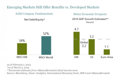
  • Company resilience—balance sheets of companies are typically strong and there is often more scope for margin improvement than in developed-market counterparts (Display, left chart)

Fay_EM-Equities_display1_d3

We also think worries about China are overdone. Although the days of double-digit growth are over, we expect growth to stabilize at about 7.5% a year. This still would represent a huge engine for demand from the world’s most populous country.

Why Maintain Exposure?

We believe that there’s still a compelling longer-term case for significant EM equity exposure within a diversified portfolio. Emerging-market equities can provide better long-term earnings growth from access to the rapid economic growth that is typically fueled by stronger productivity growth. In some countries, working age populations are growing much faster than in developed markets. And valuations today are once again significantly lower than in developed markets.

Diversification is another benefit. Although correlations between emerging and developed markets have increased in recent years, last year reminded us that they often still behave very differently. And within emerging markets, investors can diversify further by including smaller markets; stocks in the United Arab Emirates, Qatar and Vietnam markets have done very well this year.

Good Conditions for Active Management

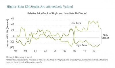
In today’s volatile conditions, we think stock picking is the best way to go. Spreads are unusually wide between higher-beta, more cyclically exposed stocks, and “safer” low-beta stocks (Display). While some of these stocks, for example in basic commodity sectors, may deserve low valuations, our research suggests that others look more promising, such as Indian cyclicals. There are also many high quality companies with solid fundamentals and high return on equity to be found.

Fay_EM-Equities_display2_d5

We’re wary of taking a passive approach and just buying an index. Since last year’s sell-off was not uniform, it has accentuated some already large pricing discrepancies that are creating rich pickings for bottom-up stock pickers. And the stocks that win in the years to come are likely to be very different from the winners in the last five, as the sources of growth in emerging markets shift. Meanwhile, macro risks vary widely by country and are not always fully reflected in pricing differentials; so, in our view, it’s especially important to discriminate in country exposure within a portfolio.

Emerging markets have always been volatile—but that’s one of the reasons why they have also delivered higher returns than developed markets over time. We think it’s no different today. In our view, investors with a long-term horizon should maintain their allocation to emerging-market stocks.

See the original article >>

The Fed Has Failed (and Will Continue to Fail), Part 1

by Charles Hugh Smith

The Fed's policies have been an unqualified success for financiers and an abject failure for the bottom 99.5% who have to work for a living.

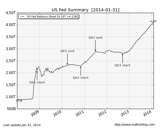
After five long years of politicos and the financial media glorifying the Federal Reserve's policies as god-like in their power and efficacy, let's take a quick look at the results of these vaunted policies: ZIRP (zero interest rates), (QE) quantitative easing, both of which are ways of shoving nearly limitless, nearly-free money ( a.k.a. liquidity) into the banking sector, where all this free money is supposed to filter into the global economy, working miracles of prosperity.
Let's start with a chart of the Fed's balance sheet, which reflects just how much money the Fed has created and pumped into the financial system. $4 trillion is larger than the entire GDP of Germany, and roughly 25% of U.S. GDP.


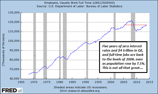
Next, let's look at the effect of the much-glorified Fed policies on full-time employment: If you call a return to the levels of 2005 (despite a 7.5% increase in population) a success, then what would you consider a failure?
Let's recall that the Fed's policies are unprecedented. Keeping interest rates near-zero for five years and pumping $4 trillion into the system are both completely off the scale of central bank policy in the U.S.


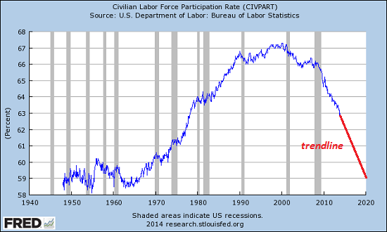
Next, let's look at the participation rate--how many people of working age who are actively in the workforce. The trend is ugly; the percentage of the civilian population who are working or actively seeking work is plummeting.


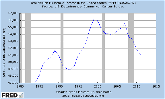
Next: real median household income: this is household income adjusted for inflation.Another ugly chart, as real median household income is back to the levels of 1990. Once again: if you reckon this a success, then what would you consider a failure?


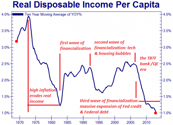
How about the annual change in disposable income? we can assume that "prosperity" and "recovery" mean disposable income are rising at a healthy clip, right? Alas, the rate of disposable income growth is sinking toward zero. The Fed's policies of bailing out "too big to fail" banks and QE/ZIRP have correlated to the most stunning drop in disposable income growth in decades.


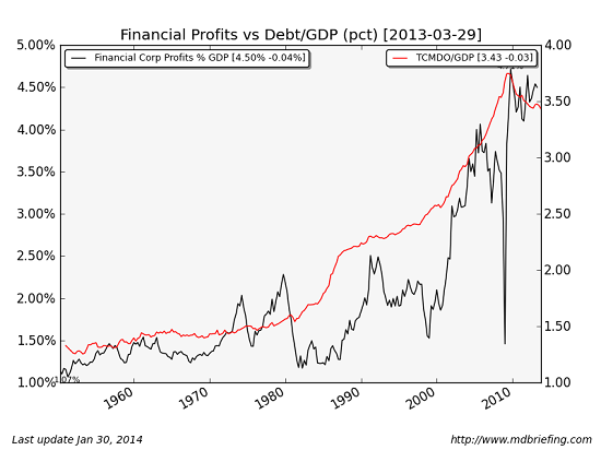
How about financial sector profits? Hey, now we're finally getting somewhere-- these are through the roof. We finally found something with a positive correlation to Fed policies--financial profits are hitting all-time highs. Yee-haw, we have a winner.


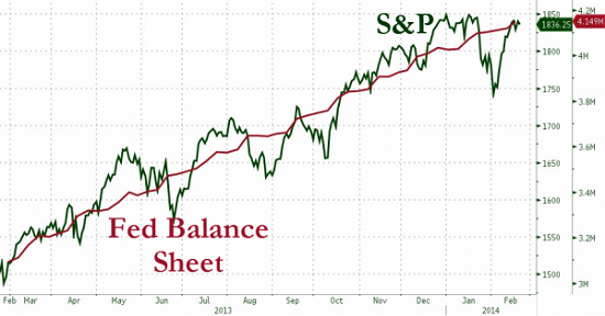
Last but not least, how about the stock market? Here is a chart of the Fed balance sheet and the S&P 500 since 2009. Ding-ding, we have another winner--stocks are also hitting all-time highs.

Source: Zero Hedge

The most charitable assessment we can make of Fed policy is that the "prosperity" it created is at best, ahem, grossly concentrated in the most parasitic and politically powerful sector: finance. Why should we be surprised that the Fed, itself a servant of the banking sector, should devise policies that enrich the bankers and financiers?
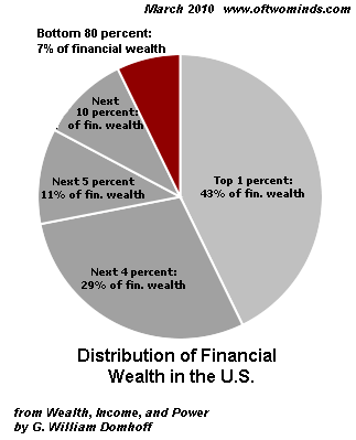
Let's be clear about one thing (to quote the president): the Fed's policies have been an unqualified success for financiers and an abject failure for everyone who has to work for a living. The Fed has not just failed to rectify the nation's obscene inequality in wealth and income; it has actively widened it by handing guaranteed returns to the banks and financiers while stripmining what's left of the middle and working classes' non-labor income, i.e. interest on savings.
Just as a refresher:

Tomorrow: how the Fed rewards imprudent parasites and punishes the prudently productive.

See the original article >>

10 Warnings Signs Of Stock Market Exuberance

by Lance Roberts

Imagine that you are speeding down one of those long and lonesome stretches of highway that seems to fall off the edge of the horizon.  As the painted white lines become a blur, you notice a sign that says "Warning."  You look ahead for what seems to be miles of endless highway, but see nothing.  You assume the sign must be old therefore you disregard it, slipping back into complacency.

A few miles down the road you see another sign that reads "Warning: Danger Ahead."  Yet, you see nothing in distance.  Again, a few miles later you see another sign that reads "No, Really, There IS Danger Ahead."  Still, it is clear for miles ahead as the road disappears over the next hill. 

You ponder whether you should slow down a bit just in case.  However, you know that if you do it will make you late for your appointment.  The road remains completely clear ahead, and there are no imminent sings of danger.  So, you press ahead.  As you crest the next hill there is a large pothole directly in your path.  Given your current speed there is simply nothing that can be done to change the following course of events.  With your car now totalled, you tell yourself that there was simply "no way to have seen that coming."

It is interesting that, as humans, we fail to pay attention to the warnings signs as long as we see no immediate danger.  Yet, when the inevitable occurs, we refuse to accept responsibility for the consequences. 

I was recently discussing the market, current sentiment and other investing related issues with a money manager friend of mine in California. (Normally, I would include a credit for the following work but since he works for a major firm he asked me not to identify him directly.)  However, in one of our many email exchanges he sent me the following note detailing the 10 typical warning signs of stock market exuberance.

(1) Expected strong OR acceleration of GDP and EPS  (40% of 2013's EPS increase occurred in the 4th quarter)

(2) Large number of IPOs of unprofitable AND speculative companies

(3) Parabolic move up in stock prices of hot industries (not just individual stocks)

(4) High valuations (many metrics are at near-record highs, a few at record highs)

(5) Fantastic high valuation of some large mergers (e.g., Facebook & WhatsApp)

(6) High NYSE margin debt

Margin debt/gdp (March 2000: 2.7%, July 2007: 2.6%, Jan 2014: 2.6%)

Margin debt/market cap (March 2000: 1.8%, July 2007: 2.3%, Jan 2014: 2.0%)

(7) Household direct holdings of equities as % of total financial assets at 24%, second-highest level (data back to 1953, highest was 1998-2000)

(8) Highly bullish sentiment (down slightly from year-end peaks; still high or near record high, depending on the source)

(9) Unusually high ratio of selling to buying by corporate senior managers (the buy/sell ratio of senior corporate officers is now at the record post-1990 lows seen in Summer 2007 and Spring 2011)

(10) Stock prices rise following speculative press releases (e.g., Tesla will dominate battery business after they get partner who knows how to build batteries and they build a big factory.  This also assumes that NO ONE else will enter into that business such as GM, Ford or GE.)

All are true today, and it is the third time in the last 15 years these factors have occurred simultaneously which is the most remarkable aspect of the situation.


The following evidence is presented to support the above claim.

Exhibit #1: Parabolic Price Movements

Kumar-IBB-030714

Exhibit #2: Valuation

Tobins-Q-Shiller-PE-111113

Excerpt from a recent report by David J. Kostin, Chief US Equity Strategist for Goldman Sachs, 11 January 2014

"The current valuation of the S&P 500 is lofty by almost any measure, both for the aggregate market as well as the median stock:

(1) The P/E ratio;

(2) the current P/E expansion cycle;

(3) EV/Sales;

(4) EV/EBITDA;

(5) Free Cash Flow yield;

(6) Price/Book as well as the ROE and P/B relationship; and compared with the levels of inflation; nominal 10-year Treasury yields; and real interest rates.

Kostin-Chart1-030714

Furthermore, the cyclically-adjusted P/E ratio suggests the S&P 500 is currently 30% overvalued in terms of Operating EPS and about 45% overvalued using As Reported earnings.

Reflecting on our recent client visits and conversations, the biggest surprise is how many investors expect the forward P/E multiple to expand to 17x or 18x. For some reason, many market participants believe the P/E multiple has a long-term average of 15x and therefore expansion to 17-18x seems reasonable. But the common perception is wrong. The forward P/E ratio for the S&P 500 during the past 5-year, 10-year, and 35- year periods has averaged 13.2x, 14.1x, and 13.0x, respectively. At 15.9x, the current aggregate forward P/E multiple is high by historical standards.

Most investors are surprised to learn that since 1976 the S&P 500 P/E multiple has only exceeded 17x during the 1997-2000 Tech Bubble and a brief four-month period in 2003-04. Other than those two episodes, the US stock market has never traded at a P/E of 17x or above.

A graph of the historical distribution of P/E ratios clearly highlights that outside of the Tech Bubble, the market has only rarely (5% of the time) traded at the current forward multiple of 16x.

Kostin-Chart2-030714

The elevated market multiple is even more apparent when viewed on a median basis. At 16.8x, the current multiple is at the high end of its historical distribution.

The multiple expansion cycle provides another lens through which we view equity valuation. There have been nine multiple expansion cycles during the past 30 years. The P/E troughed at a median value of 10.5x and peaked at a median value of 15.0x, an increase of roughly 50%. The current expansion cycle began in September 2011 when the market traded at 10.6x forward EPS and it currently trades at 15.9x, an expansion of 50%. However, during most (7 of the 9) of the cycles the backdrop included falling bond yields and declining inflation. In contrast, bond yields are now increasing and inflation is low but expected to rise.

Incorporating inflation into our valuation analysis suggests S&P 500 is slightly overvalued. When real interest rates have been in the 1%-2% band, the P/E has averaged 15.0x. Nominal rates of 3%-4% have been associated with P/E multiples averaging 14.2x, nearly two points below today. As noted earlier, S&P 500 is overvalued on both an aggregate and median basis on many classic metrics, including EV/EBITDA, FCF, and P/B."

Exhibit #3: Selling Of Company Stock By Senior Managers

Excerpt from a recent article by Mark Hulbert

"Prof. Seyhun - who is one of the leading experts on interpreting the behavior of corporate insiders - has found that when the transactions of the largest shareholders are stripped out, insiders do have impressive forecasting abilities. In the summer of 2007, for example, his adjusted insider sell-to-buy ratio was more bearish than at any time since 1990, which is how far back his analyses extended.

Ominously, that degree of bearish sentiment is where the insider ratio stands today, Prof. Seyhun said in an interview.

Note carefully that even if the insiders turn out to be right and the bull market is coming to an end, this doesn't have to mean that the U.S. market averages are about to fall as much as they did in 2008 and early 2009. The one other time since that bear market when Prof. Seyhun's adjusted sell-buy ratio sunk as low as it was in 2007 and is today, the market subsequently fell by 'just' 20%.

That other occasion was in early 2011. Stocks' drop at that time did satisfy the unofficial definition of a bear market, and the insiders' pessimism was vindicated."

Exhibit #4: Investor's Confidence

AAII-Bull-Bear-030714

AAII-INVI-Bearish-13wk-030714

Exhibit #5: Ownership Of Stocks As % Total Financial Assets

Flow-Of-Funds-Equity-TotalAssets-030714

The point my money managing friend wishes to make is simply that the ""warning signs" are all there. However, since the road ahead seems clear, it is human nature that we keep our foot pressed on the accelerator.   

As the Federal Reserve extracts liquidity from the markets, the "Bernanke Put" is being removed which leaves the markets vulnerable to a "mean reverting event" at some point in the future.  The mistake that many investors are currently making is believing that since it hasn't happened yet, it won't.   This time is only "different" from the perspective of the "why" and "when" the next major event occurs.

Of course, despite the repeated warning signs, the next correction will leave investors devastated looking to point blame at everyone other than themselves.  The question will simply be "why no one saw it coming?"

See the original article >>

Ukraine/Crimea – the Map That Explains Everything

by Pater Tenebrarum

What the Economy Needs

We want to briefly comment on the suggestions that the Ukraine – this is to say the government of the Ukraine – allegedly needs to “borrow at least $35 billion”. This has been reported in terms such as these:

“The political crisis has cost Ukraine economically as the country is facing a possible debt default. Ukraine needs approximately $35 billion in aid to improve its economy, according to the country’s finance ministry.”

The last thing a country needs to “improve its economy” is a giant loan to its government. Government equals waste, even if it isn't prone to stealing, which we suspect the new administration in Kiev definitely is. Why should it be any different from the previous 'Orange Revolution' government? It's the same people, only fortified by a bunch of extreme right-wing nationalists this time, who incidentally hold a number of important portfolios, including everything relating to police, defense, national security and even the post of prosecutor general. Germany's news magazine Der Spiegel, which is largely sympathetic to the new government, reports this most recent tidbit from Kiev:

“They [the Maidan activits, ed.] are afraid that the political profiteering of recent years will carry on, just with different beneficiaries.

[…]

Their concern appears to be justified. Last Monday, a high-ranking officer from Ukraine's customs administration contacted a newspaper to inform editors of a new deal pertaining to the "internal" allocation of unexpected customs revenues. No longer would confiscated money and valuables be given to Yanukovych's Party of Regions as they had been previously. Rather, they would go to the Fatherland alliance. Timoshenko, the man said, had personally approved the deal. Furthermore, the Communist Party, he said, had been handed the leadership of the customs administration so that it would support Timoshenko in the future.”

(emphasis added)

Just as we suspected a short while ago: meet the new boss, same as the old boss! The US and EU governments have done their tax payers no favors by opening up this new black hole to throw money into. They should have let Russia lend the $15 billion it was prepared to lend to the Ukraine, then their new arch-enemy Putin would be stuck with the bill.

As Ludwig von Mises pointed out:

Investment and lending abroad are only possible if the receiving nations are unconditionally and sincerely committed to the principle of private property and do not plan to expropriate the foreign capitalists at a later date. It was such expropriations that destroyed the international capital market [this was published in 1949 and the destruction of the international capital market Mises refers to has since been largely rescinded, ed.]

Intergovernmental loans are no substitute for the functioning of an international capital market. If they are granted on business terms, they presuppose no less than private loans the full acknowledgment of property rights. If they are granted, as is usually the case, as virtual subsidies without any regard for payment of principal and interest, they impose restrictions upon the debtor nation's sovereignty. In fact such "loans" are for the most part the price paid for military assistance in coming wars. Such military considerations already played an important role in the years in which the European powers prepared the great wars of our age. The outstanding example was provided by the huge sums which the French capitalists, pressed hard by the Government of the Third Republic, lent to Imperial Russia. The Czars used the capital borrowed for armaments, not for an improvement of the Russian apparatus of production. They did not invest it; they consumed a great part of it.”

(emphasis added)

The problem with the Ukraine is precisely that it has so far not adequately protected the property rights of foreign investors. It is all dependent on political whim, and thus far, it has made no difference whether the Western or Eastern Ukrainian parties were in charge. Moreover, as Mises correctly points out, intergovernmental loans are for the most part wasted on consumption and are frequently used for the purchase of war materiel. The economies of the nations concerned cannot possibly be improved this way.

Unless the country develops reliable institutions and rids itself of graft (which is tantamount to the entire political caste resigning – perhaps introducing a lottocracy would help), it will remain an economic backwater, no matter how much money is thrown at its government.

The Conflict Explained by a Single Map

As the title to this post promises, here is a map of the Ukraine that explains best why the EU tried to get its foot into the door and why the US government egged on by the usual suspect neo-con circles financed the revolution. It also explains in one stroke why Russia believes that its vital strategic interests are under threat from the Russo-phobe ultra-nationalists now in charge in Kiev and their Western backers, and why it decided to grab the Crimea (and with it the all-important Sevastopol port) while it still could.

Mind, this does not alter the fact that Putin's moves are legally highly dubious. The excuse that he is merely following Yanukovich's invitation is really quite lame, although it is quite funny as well. Western countries usually don't wait to be invited before they bomb everything to hell in all sorts of places, and their pretexts are usually no less lame. At least the Russians haven't come charging in guns blazing, a difference that is noteworthy. Anyway, we merely want to explain motives, not debate the legal and moral fine points. Clearly, the people of the Ukraine remain way down on everybody's list of priorities anyway, all the sappy pronouncements to the contrary notwithstanding. And here it is – the map that explains everything:


_73340564_ukraine_gas_pipelines_624_v3

Pipelines and gas fields in the Ukraine, or the map that explains everything (source:BBC)

See the original article >>

Follow Us