Saturday, July 23, 2011

Record-low cattle herd could herald profits surge

by Agrimoney.com


Data due on Friday expected to show the US cattle herd shrinking to its lowest on record could represent a marker on the road to a far more profitable ranching sector.
The US Department of Agriculture is due later, in a twice-yearly report, to show the domestic cattle herd falling by 1.4% from July 1, dropping below 100m head for the first time since the series began in 1973.
The decline is seen in part down to the sector's greater productivity since the spread of feedlots, which has allowed producers to shorten fattening periods while increasing animal weights.
US producers are expected to produce some 26m pounds of beef, nearly one-quarter more than in 1973, despite a herd which has shrunk by one-quarter over the same period.
But it is also "a reflection of the fact that grain farming is more profitable than cattle ranching", Don Roose, president of broker US Commodities said.
"It has been more profitable for farmers to tear up pastures and replace them with crops."
Supply squeeze ahead?
However, the extent of the decline in the cattle herd may swing the pendulum of profitability back towards ranchers, once high beef prices persuade the industry to go back into expansion mode, a report by Paragon Economics and Steiner Consulting said.
Expectations for USDA cattle herd data, as change in year to July 1
All cattle and calves: -1.4%
Cows and heifers that have calved: -1.3%
(Includes beef cows: -1.9%
And dairy cows: -0.1%)
Annual calf crop: -1.5%
Source: Dow Jones survey
The increased beef production has come against a background of population growth to 7bn people worldwide, from 4bn people in the early 1970s.
"Increasing global incomes, lower trade barriers and more fluid markets have led to ever-rising beef demand globally," the briefing said.
"All of this will put more pressure on US beef prices long term, and cattle prices will rise to points that once again make it profitable to invest in this business."
Indeed, if cattle prices appear high now - with futures in both feeder animals, ready for placement in feedlots, and live animals, ready for slaughter, within 10% or so of record highs – "they will be even higher when producers finally decide to hold back heifers for herd rebuilding".
Friday's report is expected to show the calf crop falling 1.5%, implying some 2m fewer calves produced than five years ago.
'No feed in Texas'
One factor which has held back cattle production this year is the drought in the US South which has threatened pasture on an area home to roughly one-third of the US herd.
Expectations for USDA cattle on feed data, as year-on-year change
Total cattle on feed, July 1: +2.7%
Placed on feedlots in June: -6.6%
Marketed in June: +2.8%
Source: Thomson Reuters survey
Indeed, the dryness has been seen as a major impetus behind a jump in placements, even of smaller than-usual cattle, on feedlots, until a sharp slowdown in June.
Analysts are divided over whether a separate USDA report on Friday, a monthly census on feedlots, will show buy-ins of feeder cattle remaining weak last month, or whether the dryness revived placements.
At Country Futures, Jerry Stowell, while forecasting a 10% slide in placements for June, said the number "could be up 20% for July" because of the shortage of fodder.
"There is no feed in Texas – no hay, no nothing," Mr Stowell said.


Official corn and soy harvest estimates 'too high'

by Agrimoney.com


Lanworth, the analysis group which draws crop estimates from satellite data, has pegged the US corn harvest 570m bushels below government estimates, warning of weather damage and lower sowings than officials are counting on.
The prominent consultancy, which was also more downbeat that the US Department of Agriculture on prospects for the country's soybean output, said that yields of both the oilseed and corn would come in close to trend in the important agricultural states of Illinois, Iowa and Nebraska.
However, surrounding areas would see losses of 7-9%.
"The largest losses are expected in the eastern Corn Belt, where historically delayed planting under wet conditions has been followed by hot and dry conditions, and in drought-affected Southern areas," Lanworth said.
"Imagery confirms extremely low vegetation density in eastern Indiana, central and southern Kansas, northwest Ohio, and southern Michigan."
Harvest estimates
Corn sowings were, on a harvested basis, pegged at 83.99m acres for corn, some 900,000 acres below the USDA figure.
The data led to a production forecast of 12.90bn bushels, below an official forecast of 13.47bn bushels.
For soybeans, the estimate for harvested acreage was pegged bang in line with the government expectations, although a production figure of 3.07bn bushels was 158m bushels below the USDA forecast.
The estimates, from a consultancy with a solid forecasting reputation, come at a time when supplies of both crops are already expected to be tight, and were attributed for supporting futures prices on a day when forecasts for rainier weather might have been expected to encourage selling.
"It could be why markets have been reluctant to pullback much even with rain falling in Chicago," a US broker told Agrimoney.com.


Sugar futures jump on - another - Brazil downgrade

by Agrimoney.com

Sugar prices jumped 5% after Kingsman joined analysis groups cutting forecasts for Brazil's sugar output, blaming the age of the cane following two years of low replanting rates.
The influential consultancy cut by 35m tonnes to 525m tonnes its forecast for cane output in Brazil's Center South region – the top producing area in the main sugar-producing country.
Sugar production was pegged at 31.9m tonnes a figure which, while higher than a 30m-tonne estimate on Thursday from Brazilian consultancy Canaplan, was below the benchmark figure of 32.4m tonnes set by Unica, the cane industry group, last week.
Kingsman's stance was also viewed with particular interest as it has been one of the more upbeat on hopes for the world sugar production surplus in 2011-12, earlier pegging it at 10.6m tonnes.
'Terrible shape'
At Macquarie, analyst Kona Haque said: "The downgrades to Brazilian estimates keep on coming.
"Our colleagues in Brazil say the cane is in terrible shape. It is old, and is not going yield any better going forward," leaving the country on track for its first drop in production in a decade.
Brazil, which is also the top sugar exporter, "is likely not crushing fast enough to satisfy importers."
While Macquarie estimates the world surplus at 5m-6m tonnes in 2011-12, the impact of this in extra supplies from alternative producers such as India was not likely to be felt until November at the earliest.
Raw sugar for October hit 31.55 cents a pound in New York, a contract high, and the best price for a near-term lot since February, before easing to stand at 31.46 cents a pound in late deals, up 5.4%.
In London, white sugar for October closed 4.0% higher at $812.70 a tonne.
Feeling the cold
Kingsman attributed its downgrade to concerns that "the effect to two consecutive years of low renovation rates" in Center South cane planting was "stronger than expected".
Indeed, the low level of resowings - a hangover from the global economic crisis, and its impact on sugar enterprises with stretched balance sheets – "may be exacerbating the impact of the recent frost affecting certain planting areas".
The group noted that this was the second season when a lack of cane, rather than milling capacity, had limited Brazil's sugar output, highlighting too that concentrations of sugar per kilogramme of crop were among the lowest of the last decade.

Cocoa prices at risk of 'precipitous collapse'

by Agrimoney.com

Cocoa prices are at risk of "precipitous collapse" if prospects for supplies improve further, ABN Amro warned as it raised its outlook for world production of the bean and a slowdown in consumption growth.
The bank lifted by nearly one-half to 227,000 tonnes its forecast for the cocoa output surplus in 2010-11, highlighting an "extremely good season" for farmers in countries such as Ghana and Ivory Coast, the world's biggest producers.
"In West Africa, the main crop has been excellent," said the bank, whose research is undertaken with VM Group.
However, prospects for consumption looked weak, given the "gloomy clouds" hanging over European and US economies, where austerity measures have "yet to feed through into daily lift.
It was "doubtful" that a rise in cocoa grindings evident in recent months "is sustainable – after all, chocolate is one item in the weekly shopping basket that does not have to be bought".
'Collapse could be precipitous'
While the bank stuck by a forecast of cocoa production returning to deficit in 2011-12, by some 93,000 tonnes, it warned that this depended on an "optimistic" view of consumption.
If industrialised nations, by far the biggest chocolate consumers, struggled, and the production outlook improved, the market faced conditions far less supportive to prices, which remain at historically high levels.
"The price collapse could be precipitous," ABN said.
Indeed, it was already a "wonder" that the price "remains so persistency high", given the political resolution in Ivory Coast which has allowed the shipment of about half the 470,000 tonnes of cocoa stockpiled during export curbs imposed by Alassane Ouattara during his battle to assume presidency.
Port arrivals
The report came as Ivory Coast's Coffee and Cocoa Bourse (BCC) reported that bean arrivals at the country's ports had reached 1.33m tonnes since the beginning of the 2010-11 marketing year in October, up 24% from the same period the previous season.
And it came as prices indeed dipped, falling 1.3% to £1,945 a tonne in London for September delivery, and by 1.2% to $3,135 a tonne in New York, for the same month.

EUR Breakout or a Third Lower High

by Bespoke Investment Group

Positive news out of Europe regarding Greece sent the Euro back above its 50-day moving average today. Before investors will feel more comfortable going long Euros, however, the currency will have to break its short-term downtrend as well as its string of lower highs.


Second Quarter Earnings and Revenue Beat Rates

by Bespoke Investment group

Since last Monday when earnings season began, 345 US stocks have reported their quarterly numbers. As shown below, 70% of these companies have beaten earnings per share estimates, while 71% have beaten revenue estimates. Both of these numbers are high relative to prior quarters during the current bull market, but they also both typically pull back as earnings season progresses.

Last season, the earnings beat rate came in at its lowest level of the bull market. As of now, it appears as if the beat rate will be stronger this quarter, which is a good sign. The revenue beat rate wasn't all that bad last quarter, and it will be pretty impressive if we can see a quarter-over-quarter increase when all is said and done this season.


The Sovereign Debt Crisis and Currency Sovereignty

by Edward Harrison

We had a big summit in Europe over Greece Thursday (July 21) and a deadline of sorts on the debt ceiling in the US Friday. I am scheduled to appear on BBC World News Friday to talk about the sovereign debt crisis and these issues specifically. The interview is scheduled for one of the main news programs, GMT with George Alagiah, which begins at 1100GMT – 0700am EDT. Hopefully, I will be toward the end, since 7am is pretty early.

One particular aspect the BBC wants to discuss tomorrow is: What if it does all go wrong? How bad could it actually be? What’s the worst case scenario for the world economy, and do the twin debt crisis in the US and Europe have the potential to drag down China too?

So I am writing this post as a prelude to that interview and those particular questions. I am not going to answer those ‘financial Armageddon’ questions here because to understand where things are headed you need to know how we got here and why. So I want to present the most important issues in the sovereign debt crisis in the US and Europe here.

Framing the issues

The US and the Euro zone face different problems. However, the genesis of the debt crises is the same. In both areas, excessive leverage and private sector indebtedness was used to purchase assets at inflated prices, property being the asset class of greatest importance. When asset markets corrected, they did so violently, which precipitated a credit crisis and deep economic downturn. For fear of an implosion in the financial system, governments decided to socialise a large fraction of the losses from this indebtedness by bailing out large financial institutions instead of allowing these institutions to fail.

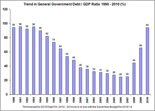
In the countries like Spain, Ireland, the US, and the UK, where the property markets seized up the most, governments also socialised the most losses. For example, Ireland now has government debt to GDP well over 100% from a relatively benign 25% mark before the crisis. In the US, Simon Johnson estimates that government debt to GDP increased 40% as a direct consequence of the financial crisis.

In April 2010, I said plainly that here we could see the origins of the next crisis.
There are four ways to reduce real debt burdens:
  1. by paying down debts via accumulated savings.
  2. by inflating away the value of money.
  3. by reneging in part or full on the promise to repay by defaulting
  4. by reneging in part on the promise to repay through debt forgiveness
Right now, everyone is fixated on the first path to reducing (both public and private sector) debt. I do not believe this private sector balance sheet recession can be successfully tackled via collective public sector deficit spending balanced by a private sector deleveraging. The sovereign debt crisis in Greece tells you that. More likely, the western world’s collective public sectors will attempt to pull this off. But, at some point debt revulsion will force a public sector deleveraging as well.
And unfortunately, a collective debt reduction across a wide swathe of countries cannot occur indefinitely under smooth glide-path scenarios. This is an outcome which lowers incomes, which lowers GDP, which lowers the ability to repay. We will have a sovereign debt crisis. The weakest debtors will default and haircuts will be taken. The question still up for debate is regarding systemic risk, contagion, and economic nationalism because when the first large sovereign default occurs, that’s when systemic risk will re-emerge globally.
And as contagion in the Euro zone spreads to Spain, Italy and potentially to Belgium or France, we are at that moment when systemic risk will become acute.

The problem in the US is political

In the US, the short-term problem is the debt ceiling. This limitation on government debt has become a political issue which has created a choice between defaulting or cutting spending. But this is an artificial – a political – and self-imposed limitation to prevent excessive deficit spending.

If you march down to the government with your paper IOU with $100 printed on it to demand your money, the government will simply hand you another paper IOU with the exact same amount printed on it. That’s how fiat money works. All US government obligations are substantially identical promises to repay a specific amount of the currency unit of account backed by nothing but taxing authority. So, Treasuries don’t ‘fund’ anything. That’s the confidence trick of fiat currency. If confidence erodes, tax evasion will rise, citizens will begin surreptitiously using other media of exchange to transact and inflation and currency depreciation will spiral out of control.

Clearly the US government cannot involuntarily default on a currency obligation it can manufacture in infinite quantities. The same is true in Japan or Australia. These nations are sovereign in their currency. Bond market participants know this. That is why Italy is under pressure and Japan is not. That is why US yields are under 3% and Spanish yields are not. That is why Ireland could default but the UK will not.

The US government issues Treasuries only because it is forced to do so to create the artificial tie between Treasuries and deficits and the mental connection we make as a result. This is why artificial constraints like the debt ceiling are in place.

So the US crisis is a political crisis, not a solvency or even a liquidity crisis. This debate, then, is not an objective one. And that makes it emotional, intractable, and potentially violent in the same ways that political questions were during other major crises like the American Revolution, the Civil War and the Great Depression.

Pendulum swings in policy and ideology are a product of people without conviction on issues taking sides. In today’s context, political and ideological battle lines will harden. Eventually, someone will win these policy battles and policy will tilt one way. Afterwards, one side or the other will be proved right by events. And then we can start all over again with the backfire effect because you can’t disprove a negative. But, those in the middle who lacked conviction about the outcome, who didn’t have a strong view will be convinced by the empirical evidence and they will move the ball forward, backfire effect notwithstanding.
The crisis in Europe is about politics too, but it is also liquidity and solvency
The countries within the euro zone do not have currency sovereignty. Greece doesn’t create the euro. Spain doesn’t create the euro. Ireland doesn’t create the euro.
Eurozone countries are users of currency not creators of currency. In fact, the Eurozone setup has a lot of similarities to the gold standard. I like to think of the Euro as gold and the Euro countries as having implicitly retained their national currencies with a fixed rate to the Euro. If you recall, that actually was the setup when the countries pegged their currencies to the ECU before Euro money was introduced.
Now, insolvency for companies or countries, individually or systemically is almost always caused by a liquidity crisis. So, when a liquidity crisis strikes, eurozone countries are vulnerable unless they can generate enough cash through taxation to fund government spending. Sovereign default is where Greece, Ireland, Portugal and Spain would be if not for the bailouts via the ECB. The ECB’s buying up Greek debt is the equivalent of the Fed buying up debt from the state of California.
So for the euro zone countries, the ECB is the difference. Without liquidity provided by the ECB, we would already have witnessed more than one sovereign default in the euro zone. The ECB does have the power to end this liquidity crisis. They have not done so for ideological reasons. They do not want to ‘monetise’ euro zone debt and make the euro a weak currency. The immediate impact of buying up Italian or Spanish or Greek debt would be a rise in the euro-denominated gold and silver price, currency depreciation more generally, and increased inflation expectations. So this is a beggar thy neighbour economic policy – competitive currency devaluation; and that is precisely the kind of action the ECB wants to avoid. However, they must monetise or there will be multiple sovereign defaults within the euro zone.

Meanwhile, just as in the US, fiscal consolidation is seen as the only path to solvency for weaker debtors within the euro zone. But fiscal consolidation lowers economic output and therefore increases deficits in the short-term. This is what we have seen in Greece and Ireland to date. That means debt levels will continue to increase across Europe, sowing the seeds of doubt about solvency in markets and continuing the liquidity crisis that requires ECB intervention. Muddling through means deepening crisis for the euro zone then.
The Germans will never have any appetite for a transfer union. You may hear pro-European noises coming from Germany’s old guard including former Chancellor Kohl, but it is clear that these people are not talking about fiscal union. They are talking about cross-border financial regulation or bailouts via a European Monetary Fund that ensures adherence to the existing stability and growth pact. No Eurobonds, no central treasury, no transfer union. Nein.
Only when all other options have failed and the euro is about to break apart will any of these ideas be entertained by German policy makers. As I have argued on two occasions, that’s the psychology of change and the political economy of large, hierarchical systems like corporations or nation states.
I believe the sovereign debt crisis will deteriorate further for just this reason. And then we will just have to see what the politics of the individual countries in Euroland look like. If austerity brings the economy to a crawl and europopulism is well advanced, the euro will collapse. If not, the European will push forward with greater integration.
Over the medium-term, a credible solution to Europe’s debt crisis must be soft restructurings that reduce interest payments and lengthen maturities for some debtors and hard restructurings that also reduce principal repayment for the most-indebted sovereign debtors.

Over the long term, institutional structures for dealing with recessions and economic crises must be formed that are not reliant on artificial constraints like the stability and growth pact. I have some thoughts on a longer-term solution that meets the test in dealing with the politics, the liquidity issues and moral hazard which I will post soon.

See the original article >>

Sovereign Bonds: Japan vs Italy

by Dirk Ehnts 

Paul Krugman wonders why Italian government bond yields are much higher than Japanese bond yields:
A question (to which I don’t have the full answer): why are the interest rates on Italian and Japanese debt so different? As of right now, 10-year Japanese bonds are yielding 1.09%; 10-year Italian bonds 5.76%.
I ask this because in a number of ways the two countries look similar. Both have high debt levels, although Japan’s is higher. Both have awful demography. In other respects, the numbers if anything favor Italy, which has a much smaller current deficit as a percentage of GDP.
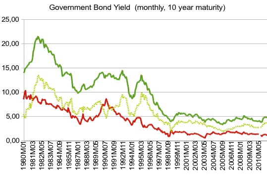
Let us take a look at some historical data, taken from Eurostat (why is this series abandoned in mid-2007, when the financial crisis hit?) and ECB (because apparently that is where they now have the data). The green line represents data points of Bella Italia, the red line those of Japan, a lighter green marks the spread (ITA-JPN):

So, the spread is quite persistent. For decades Italian government bonds delivered a higher yield than Japanese ones. What does theory say about this?

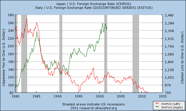
The relevant piece of theory, I believe, is the uncovered interest rate parity. The nominal interest rates plus the expected change in the exchange rate should be equalized all over the world (or at least where financial markets are free). This translates into the case of Japan (low yields) and Italy (high yields) as expectations of the Italian Lira to depreciate against an anchor currency, like the US-dollar, whereas the Japanese Yen is expected to appreciate. Here is a back of the envelope calculation: From 1980-2000, the Italian government bond yield averages 12.4 percent, the Japanese bond yield 5.2 percent. Here are the exchange rates for that time:

So, investing $1,000 in Italian government bonds in 1980 will give you about L800,000. This will increase about 10-fold in 20 years at an average yield of 12.4%, returning you L8,000,000 in 2000. Since a dollar is now worth L2.250 this translates into $3,555. Now for Japanese bonds. Y250 to the dollar would have given you Y250,000. With a yield of 5.2% the return will be about 2.75, which gives you about Y687,500, which in 2,000 at an exchange rate of Y105 to the dollar would have been $6,547. In seems that the Japanese government debt would have been the better investment in hindsight (assuming that there is no risk of default, of course).

Now in 2,000 the euro was already introduced, since a year before the exchange rates were fixed. Now people expected the euro to appreciate over the long-run against the dollar, and Italian yields came down towards German levels. Japan, having been in a slump since 1990, had low yields since inflation was no problem and the Yen expected to gain further. The recent experience of higher Italian yields is a euro zone problem, I’d say. While Japan can print its way out of its government debt if it needs to, Italy cannot. Also, Japan is very competitive in world markets and therefore the risk of a prolonged slump (in order to regain competitiveness) is unlikely, especially since the Bank of Japan oversees the exchange rate and does intervene from time to time.

In Italy, control over the instrument of monetary policy has been lost, and there is no exchange rate to manipulate either. Decreasing prices would kick-start exports, but at the same time increase the burden of real debt for the borrowers, which would harm domestic consumption. Doubts might arise whether Italy can repay at all.

To sum up, I would argue that higher yields of Italian debt from 1980 to 2000 was mostly driven by expectations of exchange rate changes, and that now with the euro these still determine the spread between the government bond yields of Japan and Italy. Yes, Italy might look better from the debt mechanics, with debt/GDP not as high as in Japan (but more insecurity on where growth should be coming from), but Japan looks better from the international perspective, being a net exporter with a currency that historically has gained against the dollar.

An Elliott Wave Analysis of The Shanghai Composite


Elliott Wave Analysis of Shanghai SE Composite Index reveals a five wave rally that completed at 3478. That level was just about 38.2% retracement of the whole big move down from 6120 to 1655. If you examine the internal waves of the rally to 3478, you will see that the 5th wave was longer than all the other impulse waves.

Typically, when we get an extended 5th wave, the correction that follows will quickly take us down to the 2nd wave of the extension itself. This phenomenon has been illustrated in dozens of charts in www.wavetimes.com and across different asset classes.


The interesting thing about the Shanghai SE Composite Index is this. If the correction to 2320 (from 3478) was the end of wave 2, we should have had an explosive third wave rally. But what we are seeing is a sideways movement that will eventually resolve to the downside, and potentially take the index to around 2100.

Now you need to be aware that we might not go down there directly, because the hourly charts shows a pattern that requires one more recovery after a slight dip down. But in the absence of a sharp rally, the odds will increase for a move lower, and you will be better off for having read these technical comments. Good luck.

China Stocks: Correction and Buying Opportunity Ahead?


Since the middle of May I am on record for being bullish on Chinese stocks. One of the top Chinese managers, Liu Tang, chairwoman of Atlantis Investment Management echoed my bullish view in an interview with Bloomberg on Monday, July 11. She has been negative on Chinese stocks since the end of last year but thinks these stocks offer significant rally despite all the concerns about debt globally.

But just why is Tang so bullish?

I think the two of us are on the same wavelength because she is clearly aware of the relationship between the Chinese stock market and the CFLP manufacturing PMI. She is obviously expecting the CFLP manufacturing PMI to rise in the near future from 50.9 in June.

Sources: CFLP; Li & Fung; I-Net; Plexus Asset Management.

But, as in the case of the Bloomberg interviewers, you may question her bullishness about China’s manufacturing sector. As the manufacturing PMI fell for the third consecutive month in June this must surely be an indication of not only a weaker Chinese economy but also evidence of a weakening global economy.

As things stand with the default concerns in the Eurozone and weakness, and especially on the job front in the U.S., the outlook is not bright at all. Not so?
Yes, without any further research that will be Tang’s and my first take. There is another major factor in China’s economy and specially the manufacturing sector that should not be ignored. Seasonality!

The seasonal pattern in China’s CFLP manufacturing PMI is clearly evident in the following graph where the monthly PMIs since 2005 are depicted. Please note that 2008 and 2009 have been omitted as patterns were disturbed as a result of the global liquidity crisis.

Sources: CFLP; Li & Fung; I-Net; Plexus Asset Management.

My computed seasonal trend has a narrow relationship with the Shanghai Composite Index. It can therefore be expected that the Chinese stock market will rally through end September and that a level of 3200 is achievable – nearly 15% from today’s closing level of 2787!

Sources: CFLP; Li & Fung; I-Net; Plexus Asset Management.

But is the relative weakness of the CFLP manufacturing PMI since March not a clear sign that China’s manufacturing sector is in distress? To some extent, yes, but to me Japan’s twin disasters played a major role. It is particularly evident if I seasonally adjust the CFLP manufacturing PMI and compare it with Markit’s Japan manufacturing PMI.

Sources: CFLP; Li & Fung; Markit; Plexus Asset Management.

My only concern is that China’s stock market has run ahead of itself as it is anticipating a jump in the PMI to in excess of 52 compared to June’s 50.9. July is normally a very weak month from a seasonality perspective and I will not discard the possibility that the Shanghai Composite Index could retreat again to the 2650 level.

Sources: CFLP; Li & Fung; I-Net; Plexus Asset Management.

But the million dollar question is what if Japan’s recovery gains further momentum, pulling along China’s manufacturing PMI? In that case the Chinese stock market is aptly priced and we have therefore seen the lows, unless another black swan arrives.

China’s economy grew by 9.5% in the second quarter on a year-ago basis. This was ahead of my expectation of 9.2%.

PortfolioMatters: Is Now The Time To Move to Cash?


“Is it time for you to move to cash?” was a headline I saw on Reuters.com yesterday. Just two days earlier, I had spoken to a member who was considering putting part of his portfolio into a money market fund.

This was likely just a coincidence, but both occurred as the U.S. debt ceiling debate remains unresolved (something that may or may not change by the time you read this) and Europe is dealing with its own problems. Plus, the economy is moving along at a sluggish pace.

Yet, despite the Reuters’ headline implication that investors are moving to cash, the data suggests otherwise. Retail money market funds held $919 billion in assets as of July 13, according to the Investment Company Institute (ICI). This is down from $947 billion at the start of the year. Institutional money market funds also hold fewer assets now than they did at the start of the year.

This is not to say that there aren’t some investors who have shifted to cash. Cash allocations were at 21.5% in our June Asset Allocation Survey, the highest levels since August 2010. I have also heard from some AAII members who have decided to increase their cash allocations. But there has not been a run to cash. In fact, cash allocations remain below their historical average, according to our survey.

Cash does have an allure when times are uncertain because its reported value is not impacted by the fluctuations of the market. Your purchasing power (what a dollar can buy) will eventually be eroded, and there are risks associated with where cash is stashed, but the account balance of cash isn’t impacted by the market’s ever-changing mood. I should add an asterisk to that last sentence because there have been discussions about letting a money market fund’s reported net asset value float daily. The result would be that a fund’s net asset value could drop below a $1 per share on a given day, the so-called “breaking of the buck.”

The problem with moving to cash when market conditions are considered to be unfavorable is knowing when to get back out of cash. Selling out of stocks during the summer of 2007 and getting back into stocks in March 2009 would have been a great strategy, but few people actually did that. Thus, while you may limit your downside risk, you also risk losing out on potential gains. One of the most common mistakes that investors make is moving into and getting out of cash too late, locking in big losses and missing out on big gains.

Over short periods, an allocation to cash is not a bad thing, especially if it accounts for a small portion of your portfolio. This is particularly the case if you sold a security or fund and are trying to decide where to reinvest the proceeds. Cash also makes sense if you know you are going to have an upcoming withdrawal from your account, such as a required minimum distribution (RMD) from an IRA.

You also need to look at what you have outside of your brokerage accounts. Financial planners recommend that employed individuals have cash savings equal to several months of expenses. Retirees should also have a certain amount of savings to cover unexpected events and emergencies. If there is a large expense that you expect to incur within the next couple of years, such as a new car, you should keep those funds in cash as well. I bring this up because all of your accounts contribute to your net worth, and anyone with a savings account already has an allocation to cash. Thus, you already have some protection against the market’s volatility.

The key to portfolio risk is to find a balance between what allows you to sleep at night and what allows you to achieve your financial goals. If you want to protect your wealth against the eroding effects of inflation, you will need some exposure to stocks. Cash can provide short-term safety, but it won’t protect you against the dual threats of inflation and the risk of outliving your money.

See the original article >>

Options: The Profit Strategy Behind This Oft-Overlooked Investment Tool

By Larry D. Spears

Stock options are a valuable tool for any investor who wants to increase income, maximize returns, and better control risks in his or her stock portfolio.

Yet despite these benefits, few investors make an effort to use - or even understand - options strategies.

If you're among this group of reluctant option traders, it's probably because you're a victim of what I call "The Options Myth," which goes something like this:

"Options aren't for you. Only really sophisticated and experienced investors should consider options. With options, it's all or nothing; you can lose your entire investment. At least with a good stock you know it's not going to zero. If you're wrong, you've always got a chance for a comeback, because you still own something!"

This mantra is chanted to clients by thousands of financial professionals around the world - "advisors" who either don't understand options themselves or view them exclusively as ultra-high-risk. Some mainstream brokerage firms - Edward Jones, for example - refuse to let their account holders trade them.

But the truth is, options can be for you - and they should be, whether you're a go-for-the-gold speculator, an average investor looking to hedge your portfolio against market pullbacks, or a retiree seeking a little extra cash flow from your dividend-paying shares.

Here's a quick primer on the options basics - all the information you need to fully understand what they are, how they work, and why they should be part of your investing arsenal.

First, a little background...

The Growth of the Options Industry

Although the concept has been around for centuries, options as we know them today are barely four decades old.

Initially, options were individual contracts negotiated on a one-to-one basis between buyer and seller. Prices and terms varied substantially, and the underlying assets involved ranged from stocks and real estate to farm crops, metals, and even tulip bulbs.

That changed on April 26, 1973, when the Chicago Board Options Exchange (CBOE) first made "listed" stock options available. "Listing" on a recognized exchange meant that all key aspects of a stock option contract were well defined, with standardized expiration dates and strike prices.

More importantly, it meant a ready market for trading options, with a clearing corporation set up to protect the interests of both the buyer and seller.

Any CBOE member broker anywhere in the country could now take your option order and submit it to the exchange, and it would be matched up with an opposite order from somewhere else - no face-to-face contact needed. Commissions, though quite high by today's online standards, also became reasonable, compared to earlier days when so-called "put and call brokers" had to negotiate every aspect of an option trade.

Listed options turned out to be a huge success. Annual volume mushroomed from under two million contracts in 1973 to nearly 100 million in 1980.

Today, the Options Industry Council (OIC) estimates nearly 300 million options trade every day, with more than 3.6 billion contracts having changed hands last year. Options trade on nearly 40 exchanges worldwide, with more than a dozen electronic trading venues - eight in the U.S. alone.

Of course, those numbers are pretty meaningless if you don't really know what an option is or how it works, so let's get back to the basics.

Understanding Stock Options

For starters, an option is defined as a type of derivative contract that gives its holder the right, but not the obligation, to buy or sell an underlying financial asset at a specified price during a set period of time or on a specific date.

(NOTE: Most standardized options are so-called "American" options, meaning they can be exercised at any time prior to the expiration date. But there are also "European" options, which can be exercised only on the expiration date.)

The underlying assets that have "listed" options include more than 2,600 individual stocks (in 100-share lots), exchange-traded funds (ETFs), broad market indexes and specific market sectors (these are usually what are known as "cash-settled" options), currencies, interest-rate instruments, commodity and financial futures, and even some physical commodities like precious metals.

Regardless of the asset underlying an option, however, there are just two basic types:
  • A CALL option gives its owner the right (but, again, not the obligation) to BUY a specific underlying asset at a designated price for a limited period of time. For example, a January 30 WFC call option would give its purchaser the right to buy 100 shares of Wells Fargo & Co. (NYSE:WFC) common stock (the underlying asset) at a price of $30 per share (the strike price) at any time between the date of purchase and the option's stated expiration date (in this case, January 21, 2011), no matter where WFC's trading at that time. (The "30" refers to the price, $30, and is not part of the January date. I'll explain in a moment why it expires January 21.)
  • A PUT option gives its owner the right to SELL a specific underlying asset at a designated price for a limited period of time. For example, a February 15 DELL put option would give its holder the right to sell 100 shares of Dell Inc. (NasdaqGS:DELL) common stock at a price of $15 per share at any time between the date of purchase and the option's stated expiration date (in this case, February 19, 2011).
  • Both puts and calls have three general identifying features:
  • The underlying asset: As a derivative, an option must first be identified by the asset from which it derives its value - e.g., in the first instance above, 100 shares of Wells Fargo common stock.
  • The "strike" price: Also called the "exercise" price or the "striking" price, this is the price at which the option can be exercised. In other words, it is the price at which a call holder has the right to buy the underlying asset or a put owner has the right to sell it. In the second example above, the strike price is $15 per share, meaning the put holder can sell 100 shares of Dell stock at that price any time prior to February 19, 2011. The intervals between strike prices vary from $1.00 for lower-priced and some actively traded mid-range stocks, to $2.50 for moderately traded issues, and $5.00 for higher-priced shares.
  • The expiration date: This is the date after which an option can no longer be exercised to buy or sell the underlying asset (and thus ceases to exist). In the United States, listed stock options normally stop trading on the third Friday of the expiration month (and officially expire the following day). Listed options trade on primary cycles with expiration occurring every three months - e.g., Cycle 1 options expire on the third Friday in January, April, July, and October. However, the most popular stocks also have shorter-term "serial" options that expire on the third Friday of the intervening months. A few very heavily traded stocks even have options that expire weekly.
  • (NOTE: Check out the "option chains" for WFC, DELL, and many other stocks on Google Finance or Yahoo! Finance to get a better idea of the range of strike prices and expiration dates for current listed stock options. Yahoo also has a special section in its "Options Center" that can help you learn to read option symbols - they tend to look, at first glance, like a random string of numbers and letters.)

Stock Option Appraisal

The final element in understanding options is how their prices - or "premiums" - are determined, as well as some of the factors that cause those premiums to change over the life of the option.

To begin with, option premiums are made up of two parts - "intrinsic value" (or "real value") and "time value."

All options have time value. But only "in-the-money" options have intrinsic value - which is the actual difference between the option's exercise price and the current market price of the stock. Thus, call options have intrinsic value only when the current stock price is above the option's exercise price, and put options have intrinsic value only when the current stock price is below the option strike price.

For example, if Wells Fargo stock was priced at $30.75, and the January 30 call listed above had a premium of $2.45, then the call would have an intrinsic value of 75 cents ($30.75 stock price - $30.00 call strike price = $0.75). The rest of its premium - $1.70 ($2.45 - $0.75 = $1.70) - represents time value. On the other hand, if Wells Fargo stock was priced at $29.05 and the January 30 call had a price of $1.35, then the entire option premium would be time value.

In the first instance, the buyer of a January 30 WFC call would need the price of Wells Fargo stock to rise to $32.45 (the strike price plus the premium paid for the call) on the expiration date to break even. At any level above that, he or she would profit. At any Wells Fargo price between $30.00 and $32.45, the call buyer would suffer a partial loss of the $245 ($2.45 premium x 100 shares) he paid for the option. At any WFC price below the call's $30.00 striking price, he would suffer a total loss. However, $245 would be the most he could lose, regardless of how far Wells Fargo stock fell below $30.00.

In the real-life case presented second, the buyer of the January 30 WFC call would need the price of the stock to climb above $31.35 to make a profit, would suffer a partial loss at a stock price between $30.00 and $31.35, and would lose the entire $135 he paid at any WFC price below $30.00 a share.

In the case of the put option, if DELL stock was priced at $13.75 and the February 15 put had a premium of $2.90 - meaning it was in the money (ITM) - then the put would have an intrinsic value of $1.25 ($15.00 put strike price - $13.75 stock price = $1.25). The rest of its premium - $1.65 ($2.90 - $1.25 = $1.65) - would be time value. By contrast, if Dell's stock was priced at $15.30 - meaning the put was out of the money (OTM) - and it had a price of $1.55, then the entire option premium would be time value.

The buyer of the put in the ITM scenario would need the price of Dell stock to fall to $12.10 to break even ($15.00 - $2.90 = $12.10). He would suffer a partial loss at any price between $15.00 and $12.10. And he would suffer a total loss at any price above $15.00, but would profit at any Dell price below $12.10. In the OTM case, Dell would have to fall to $13.45 for the put buyer to break even, but he would profit at any lower price, though he'd suffer a total loss at any level above the put's $15.00 strike price.

The intrinsic value of an option is absolute. It always represents the difference between an in-the-money option's strike price and the actual stock price.

By contrast, time value changes constantly. It's based on an assortment of factors, ranging from the volatility of the underlying security and the market as a whole to the degree by which the option is in or out of the money and - most importantly - the amount of time remaining until expiration.

As a rule, the basic equation in option pricing is "the more time, the more time value." As such, options are considered to be "wasting assets," meaning their value (and price) drops as they approach expiration.

It is this erosion of time value that motivates most sellers of stock options. They hope the options they sell will wind up out-of-the-money (OTM) on the exercise date and thus expire worthless, allowing them to keep the entire premium they received for selling the option (or part of it, if the option is only slightly ITM).

Outright buyers of stock options are, of course, hoping for the opposite result - a move in the price of the underlying stock by expiration sufficient to cover the premium they paid for the option and give them a nice profit, to boot.

Their primary motivations in buying options are the absolutely limited risk of such trades and the high degree of leverage they provide.

For example, in the Wells Fargo trade, the call buyer controlled $2,905 worth of stock for more than two months at a cost of just $135. That was also his maximum risk of loss. Yet his profit was theoretically unlimited - and his potential return was truly phenomenal.

To illustrate, if WFC's stock price climbed to $36.00 a share, the option buyer made a profit of $465 on the trade, giving him a return of 344.4% ($465/$135 = 344.4%). If WFC stayed below $30.00 a share, he lost just $135. A stock buyer, on the other hand, had $2,905 at risk. So she would have made $695 on a rise in the price to $36.00 a share, but her return would have been just 23.9% ($695/$2,905 = 23.9%). And her loss could have been as much as $2,905, had Wells Fargo stock plunged to zero.

The advantages to the option buyer are clear, but with time-value erosion always working against him, the outright purchase of options can only be considered a stark speculation.

However, as mentioned at the beginning, there are a couple of dozen other option strategies that have substantial added benefits and far more acceptable risk/reward scenarios.

So watch for future Money Morning strategy pieces on how to make options an integral part of your investment program.

Pity the Policymakers


I don’t know about you, but whenever I am in an airplane experiencing turbulence, I draw comfort from the belief that the pilots sitting behind the cockpit’s closed door know what to do. I would feel very differently if, through an open door, I observed pilots who were frustrated at the poor responsiveness of the plane’s controls, arguing about their next step, and getting no help whatsoever from the operator’s manuals.

So it is unsettling that policymakers in many Western economies today resemble the second group of pilots. This perception reflects not only the contradictory pronouncements and behavior of policymakers, but also the extent to which economic outcomes have consistently fallen short of their expectations.

This perception is evident in Europe, the United States, and Japan, where indicators of economic sentiment are deteriorating again, already-weak recoveries are stalling, and over-stretched balance sheets are becoming even more precarious. Understandably, companies and households are becoming even more cautious – inevitably making a difficult job for policymakers that much harder.

In Europe, policymakers have failed to counter an expanding sovereign-debt crisis in the eurozone’s periphery, despite many summits and programs, multiple expensive bailouts, and the imposition of painful economic sacrifices on societies. Like an airplane piloted in confusion, the European economy has not behaved according to the instructions. As Greek Prime Minister George Papandreou put it last week in his powerful letter to the head of the Eurogroup, Luxembourg’s Prime Minister Jean-Claude Juncker, “The markets and rating agencies have not responded as we had all expected.”

With outcomes that fall far short of policymakers’ projections, it is not surprising that there is little harmony in official circles. Narratives increasingly conflict – and in an astonishingly open and unsettling way.

Disagreement in Europe is not limited to that between “solution providers” (the troika of the European Central Bank, the European Union, and the International Monetary Fund) and countries now implementing painful austerity measures (Greece, Ireland, and Portugal). Damaging discord has emerged within the troika itself, with a particularly disruptive impasse between Frankfurt, where the ECB resides, and Berlin, the seat of the German government.

The situation in the US is not as acute as it is in Europe, but policy impotency prevails here, too. Despite unprecedented fiscal and monetary stimulus, economic growth remains sluggish, and unemployment is stuck at a worrisomely high level. The medium-term fiscal outlook continues to deteriorate while, in the short term, politicians play with the country’s valuable AAA credit rating by arguing like schoolchildren over how to extend the debt ceiling.

Then there are the complex technical difficulties facing policymakers, to which US Federal Reserve Chairman Ben Bernanke referred in his refreshingly candid manner, acknowledging that “We don’t have a precise read.”
The Fed’s economic manuals, including technical models and historical analyses, shed insufficient light on today’s economic situation. Little wonder, then, that the latest release of the closely followed minutes of the Federal Open Market Committee meeting points to a divided body, whose members anticipate divergent paths for monetary policy, with some expecting further accommodation and others expecting a round of tightening.

Meanwhile, Japan continues to languish. Four months after a major earthquake, a devastating tsunami, and the start of persistent nuclear uncertainties, a comprehensive reconstruction program has yet to be launched. The resulting economic uncertainties are compounding years of inadequate growth and deteriorating public-debt dynamics.

Six important issues speak to the problem for policymakers in Europe, the US, and Japan. First, all three economic areas are struggling with unsettling de-leveraging dynamics. Like oxygen being sucked out of our metaphorical airplane in midflight, deleveraging destabilizes societies and undermines the traditional effectiveness of official policies. Indeed, left completely to their own dynamics, these economies would probably shed excessive debt and alter long-standing social contracts in a manner that is both highly disorderly and that leads to economic contraction and a higher risk of another financial crisis.

Second, domestic de-leveraging dynamics are aggravating other structural impediments. While the specifics vary by economic region and sector (housing, labor markets, credit intermediation, etc.), it is a combination with a common and unfortunate outcome: it inhibits economies’ ability to grow, and thus to overcome debt overhangs in an orderly way.

Third, policymakers are operating in a global economy that is in the midst of major re-alignments, as several systemically important emerging economies, led by China, continue to plow through their developmental breakout phase.

Fourth, in choosing cyclical measures to deal with structural problems, policymakers have complicated matters even more – a reflection, again, of their inability to understand the unusual challenges that they face.
Fifth, politics is complicating matters significantly. The reason is simple: in most cases, the required structural measures involve immediate pain for longer-term gain – a tradeoff that politicians abhor, especially when they are subject to short election cycles.

Finally, communication has been dreadful. Rarely have I witnessed such failure by policymakers to provide a clear vision of their medium-term economic vision – a failure that has added to the general and unsettling sense of uncertainty.

All of this speaks to why we should pity today’s policymakers, who must confront unusually difficult challenges with abnormally ineffective tools. But pity is not a free pass: we should also urge policymakers to shift from their traditional cyclical mindset to one that can better comprehend, and effectively address, the more complicated, yet critically important, structural issues that underlie today’s malaise.

Unfortunately, this will not happen overnight; and, in some cases, conditions might have to become a lot worse in order to focus policymakers’ minds. In the meantime, companies and households lucky enough to be in a position to build precautionary cushions will inevitably continue to do so. Others, unfortunately, will be vulnerable to even greater stomach-churning turbulence – without the perceived benefit of a closed cockpit door.

Mohamed A. El-Erian is CEO and co-CIO of PIMCO, and author of When Markets Collide.

See the original article >>

Debt and Delusion


Economists like to talk about thresholds that, if crossed, spell trouble. Usually there is an element of truth in what they say. But the public often overreacts to such talk.

Consider, for example, the debt-to-GDP ratio, much in the news nowadays in Europe and the United States. It is sometimes said, almost in the same breath, that Greece’s debt equals 153% of its annual GDP, and that Greece is insolvent. Couple these statements with recent television footage of Greeks rioting in the street. Now, what does that look like?

Here in the US, it might seem like an image of our future, as public debt comes perilously close to 100% of annual GDP and continues to rise. But maybe this image is just a bit too vivid in our imaginations. Could it be that people think that a country becomes insolvent when its debt exceeds 100% of GDP?

That would clearly be nonsense. After all, debt (which is measured in currency units) and GDP (which is measured in currency units per unit of time) yields a ratio in units of pure time. There is nothing special about using a year as that unit. A year is the time that it takes for the earth to orbit the sun, which, except for seasonal industries like agriculture, has no particular economic significance.

We should remember this from high school science: always pay attention to units of measurement. Get the units wrong and you are totally befuddled.

If economists did not habitually annualize quarterly GDP data and multiply quarterly GDP by four, Greece’s debt-to-GDP ratio would be four times higher than it is now. And if they habitually decadalized GDP, multiplying the quarterly GDP numbers by 40 instead of four, Greece’s debt burden would be 15%. From the standpoint of Greece’s ability to pay, such units would be more relevant, since it doesn’t have to pay off its debts fully in one year (unless the crisis makes it impossible to refinance current debt).

Some of Greece’s national debt is owed to Greeks, by the way. As such, the debt burden woefully understates the obligations that Greeks have to each other (largely in the form of family obligations). At any time in history, the debt-to-annual-GDP ratio (including informal debts) would vastly exceed 100%.

Most people never think about this when they react to the headline debt-to-GDP figure. Can they really be so stupid as to get mixed up by these ratios? Speaking from personal experience, I have to say that they can, because even I, a professional economist, have occasionally had to stop myself from making exactly the same error.

Economists who adhere to rational-expectations models of the world will never admit it, but a lot of what happens in markets is driven by pure stupidity – or, rather, inattention, misinformation about fundamentals, and an exaggerated focus on currently circulating stories.

What is really happening in Greece is the operation of a social-feedback mechanism. Something started to cause investors to fear that Greek debt had a slightly higher risk of eventual default. Lower demand for Greek debt caused its price to fall, meaning that its yield in terms of market interest rates rose. The higher rates made it more costly for Greece to refinance its debt, creating a fiscal crisis that has forced the government to impose severe austerity measures, leading to public unrest and an economic collapse that has fueled even greater investor skepticism about Greece’s ability to service its debt.

This feedback has nothing to do with the debt-to-annual-GDP ratio crossing some threshold, unless the people who contribute to the feedback believe in the ratio. To be sure, the ratio is a factor that would help us to assess risks of negative feedback, since the government must refinance short-term debt sooner, and, if the crisis pushes up interest rates, the authorities will face intense pressures for fiscal austerity sooner or later. But the ratio is not the cause of the feedback.

A paper written last year by Carmen Reinhart and Kenneth Rogoff, called “Growth in a Time of Debt,” has been widely quoted for its analysis of 44 countries over 200 years, which found that when government debt exceeds 90% of GDP, countries suffer slower growth, losing about one percentage point on the annual rate.

One might be misled into thinking that, because 90% sounds awfully close to 100%, awful things start happening to countries that get into such a mess. But if one reads their paper carefully, it is clear that Reinhart and Rogoff picked the 90% figure almost arbitrarily. They chose, without explanation, to divide debt-to-GDP ratios into the following categories: under 30%, 30-60%, 60-90%, and over 90%. And it turns out that growth rates decline in all of these categories as the debt-to-GDP ratio increases, only somewhat more in the last category.

There is also the issue of reverse causality. Debt-to-GDP ratios tend to increase for countries that are in economic trouble. If this is part of the reason that higher debt-to-GDP ratios correspond to lower economic growth, there is less reason to think that countries should avoid a higher ratio, as Keynesian theory implies that fiscal austerity would undermine, rather than boost, economic performance.

The fundamental problem that much of the world faces today is that investors are overreacting to debt-to-GDP ratios, fearful of some magic threshold, and demanding fiscal-austerity programs too soon. They are asking governments to cut expenditure while their economies are still vulnerable. Households are running scared, so they cut expenditures as well, and businesses are being dissuaded from borrowing to finance capital expenditures.

The lesson is simple: We should worry less about debt ratios and thresholds, and more about our inability to see these indicators for the artificial – and often irrelevant – constructs that they are.

Robert J. Shiller is Professor of Economics at Yale University.

A Catastrophe in the Making


Aid workers have long been warning that a famine was approaching in East Africa. Now that it is here, they are struggling to feed millions of victims of what is said to be the worst drought since 1950. The situation is likely to get even worse.


For a long time they hoped that the rain would begin falling after all. Only after their last animal wasted away and died did Batulo Mahmud give up and head out with her family. For four days and four nights Batulo marched southwards together with her husband and five children through Somalia's arid steppe. They had nothing to eat and only a little water with them.

They managed to drag themselves across the border into Kenya and finally they reached Dadaab, the largest refugee camp in the world. Exhausted, they cowered under a tarp and waited to be registered by the UN refugee organization UNHCR. "We used to have 100 goats and seven camels," Batulo said. Now, they have nothing. Ambia, her three-year-old daughter, is sleeping in the coarse dust of the steppe, flies crawling on her lips. Her parents no longer had the strength to wave them away.

Compared to others, Batulo and her family are doing well. Others arrive at the camp after weeks of walking, emaciated and with deeply sunken eyes. Many look as though only their skin is holding their bones together. Others die on the way.

The UN established the camp at Dadaab 20 years ago to house some 900,000 refugees from Somalia. Currently, there are some 380,000 Somalis living in the improvised tents among the bushes of the Savannah. Every day, some 1,000 more arrive. They stand in long lines waiting for water and they bury their dead at the edge of the camp under hastily dug earthen mounds. Many of the mounds are new.

Just the Beginning

Eastern Africa is baking under a merciless sun; the last two rainy seasons have brought no precipitation at all. It is said to be the worst drought since 1950. And hunger comes at its the heels. In Somalia, Ethiopia, Kenya, Djibouti, and Uganda, people are suffering like they haven't in a long while. The UN estimates that some 12 million people are already faced with hunger. And that is likely just the beginning.

There are many indications that the situation will only worsen in the coming weeks. For the moment, many of the regions in eastern Africa are classified by the UNHCR as "emergency" areas. But on Wednesday, the UNHCR declared famine in two regions in southern Somalia and said that it could spread unless enough donors can be found to help those in need. "If we don't act now, famine will spread to all eight regions of southern Somalia within two months," said Mark Bowden, humanitarian coordinator for Somalia.

It is a catastrophe that has been a long time in coming. Experts have been warning of the approaching famine for months and the causes are clear. They also know that the current disaster won't be the last. As a result of climate change, it has become increasingly the case that rainy seasons fail to materialize in the region. Adding to the problem, the population in the countries currently suffering has quadrupled in recent decades, from 41 million to 167 million. Plus, aid organizations tend to budget most of their money for emergency situations, leaving little left over for wells, fertilizer, seeds and efforts to teach farmers how to make the most from their plots of land -- all measures that could forestall the next disaster.

Somalia has been especially hard hit because the Islamists from the al-Shabab militia, who are fighting against the country's government, have chased almost all aid organizations out of the country. Hundreds of thousands of Somalis have also fled the violence, making the situation in the surrounding refugee camps even more difficult.

Stray Bullets and Nearby Explosions

"The people have no choice, they are even fleeing to Mogadishu," says Mari Honjo. A native of Japan, Honjo leads the office of the UN's World Food Programme in the Somali capital. Conditions in the city are hellish and for years it has been a battleground between Shabab militants and government troops.

Honjo's team is housed at the airport, a group of 19 foreigners guarded by a small unit of African Union peacekeepers. Despite the security detail, their headquarters are hardly secure. Stray bullets have been known to whistle through the camp and nearby explosions keep the aid workers on their toes.

They hardly ever leave their camp: The Shabab Islamists would take the foreigners hostage if they could. And they would shoot the heretics if they couldn't get close enough to kidnap them. Instead, the aid workers rely on a team of 145 Somalis to take care of the field work for them.

Despite the difficulties, the WFP has managed to more or less rebuild the harbor in recent years. Warships from the European Union anti-piracy mission Atalanta guide freighters full of aid supplies through the pirate infested waters and into the harbor. That is one of Honjo's office's primary responsibilities. "It is a challenge to work here," she says.

Currently, the WFP team is trying to feed 1.5 million mouths, most of them in Mogadishu itself -- for it is only here that the African Union artillery can open a path for the aid workers. The WFP withdrew completely in 2010 from those regions controlled by the Shabab militants. Employees kept getting killed or kidnapped, aid deliveries were stolen or the Islamists would extort money from workers. In the end, they managed to chase the "agents of the unbelievers" out of the areas they controlled.

'Donor Fatigue'

Only now, as a result of the great drought, have they announced that aid organizations are once again welcome. "I think even they are desperate," Honjo says. But she still doesn't trust them. "The Shabab militias consist of numerous factions. They don't all share the same position. We need guarantees. We will have to wait and see."

An equally large problem is the phenomenon known in aid circles as "donor fatigue." People around the world are becoming tired of sending money to Africa, where nothing ever seems to change. Just last year, the WFP asked rich countries for $500 million to combat hunger on the Horn of Africa. They were unable to raise even half of that. And that despite the fact that the scientists working for the US-based Famine Early Warning System have long been warning that first the crops, then the animals and finally the people themselves would begin dying should the rainy season fail to materialize.

The second consecutive rainy season without a single drop of rain has just come to an end. The next one is set to begin in the autumn. Even if the rain begins to fall then, it would take months before farmers and nomads would be able to fill the markets with grain and meat. "From computer models, we know that this part of the continent is hit by more extreme events than other regions," says Daphne Wysham, a climate analyst at the Institute for Policy Studies in Washington, D.C. She calls the Horn of Africa the "epicenter of global warming." She says that additional periods of extreme drought are to be expected in coming years.

Making matters worse is the fact that food prices have shot up around the world, straining both aid organizations and the people themselves. The price for red millet, a grain which makes up a large part of the diet in Somalia, for example, has shot upward by 240 percent in the last year. Many can no longer afford it.

Of course people around the world have to step in to save those now suffering from the famine, says the German development expert Willi Dühnen. Based in Nairobi, he has for the last decade been monitoring the difficulties facing eastern Africa for the group Vétérinaires Sans Frontieres (VSF), particularly the tragedy of the nomads and their animal herds.

"The population has grown significantly, production has sunk dramatically, the climate is changing and many areas used for agriculture have been lost to the nomads," he says. The land, he says, can simply no longer feed the population.

Follow Us