Tuesday, July 9, 2013

Gold Slips Into Backwardation

by Pater Tenebrarum

GOFO Goes Into Negative Territory Three Months Out

The Gold Forward Offered Rate, or GOFO for short, is the rate at which dealers are prepared to swap gold for dollars in the London market, i.e. it is the interest rate one must pay if one lends gold and simultaneously borrows dollars for a fixed period. Normally this forward rate should be in positive territory, similar to the gold futures curve being normally in contango. Since there can theoretically never be a 'shortage' of gold as all the gold ever mined still exists, gold is usually not liable to go into backwardation similar to e.g. copper or crude oil. The latter have inventories that are measured in weeks or months of demand. If a near term supply shortage becomes evident, traders will tend to bid up spot and near month futures contracts in these commodities, while later delivery months will tend to trade at lower levels. Backwardation in short is an indicator of an emerging near term supply shortage.

On rare occasions something along similar lines happens in the gold market as well and it is usually a good indicator of developing stresses in the market. It essentially indicates that someone is trying to get hold of bullion in the here and now and finds it difficult to get hold of the desired amount. Since GOFO refers to gold in the form of good delivery bars, its message is actually of some importance. The premiums that occasionally develop on certain small scale forms of gold such as coins or small bars bought by retail investors, by contrast mainly indicate that refineries have been surprised by a surge in retail demand and need to catch up with producing gold in the desired sizes and forms.

GOFO is calculated by subtracting the gold lease rate from LIBOR. Under normal circumstances, the gold lease rate should always be below LIBOR, not least because dollar interest rates must sport a larger price premium; after all, the dollar can be inflated at will, while gold cannot. A swap of gold for dollars is  essentially a dollar loan secured by gold collateral – hence the rate one pays is lower than the one paid for an unsecured loan. An analogous trade can be put on by using the futures market: one can e.g. sell  physical gold and buy an equivalent number of gold futures contracts three months out. One can then earn the spread between the interest rate on gold as expressed by the contango and the interest one receives for the dollars on the gold sold (as the amount one has to put up for margin earns interest as well, it is a fairly straightforward and theoretically risk-free carry trade). The arbitrage/carry is obviously even better and more obvious on the rare occasions when gold is in backwardation (see Keith Weiner's previous discussions of the topic).

Note that normally, given the positive GOFO rate, people will employ gold to get their hands on dollars. In other words, gold is normally used to obtain dollar liquidity. It follows that their motivation is reversed when GOFO turns negative: in that case, dollars are offered in order to get hold of gold.

Below are the most recent charts of one month and three month GOFO which were provided to us by the 'dailymarketsummary.com'. As can be seen, both one and three month GOFO have now turned slightly negative:


GOFO-one monthOne month GOFO moves into negative territory – click to enlarge.


GOFO 3 months3 month GOFO is likewise in negative territory – click to enlarge.


What It Means

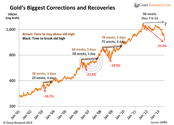
Look at the other times when GOFO turned negative on the charts above. The last time was at the low in gold prices in 2008, when the market was in the grip of a panicked liquidation of speculative long positions in gold futures. The only previous occasion of note was the large turn into negative territory shortly before the Washington agreement limiting central bank gold sales and gold leasing operations was announced in 1999. The agreement created a big obstacle for the at the time still extremely popular gold carry trade and had market participants scrambling to get hold of gold (presumably they were forewarned).

In 2008 and today we believe that the move in GOFO mainly indicates that a gap in perceptions about gold has developed, namely between the perceptions expressed in the 'paper market' for gold on the one hand and the activity in the actual physical market on the other hand. Note that the gold market in London is largely fractionally reserved. Unallocated gold deposits are employed by bullion banks for their own business purposes. The holders of gold in unallocated accounts have a claim to gold, but most of the gold is actually not there – only a fraction of it is, which is thought to be sufficient to satisfy the normally relatively low level of delivery demands. Unfortunately for the gold banks, there is only limited help that can be provided by central banks to stop a run on unallocated accounts. The central banks have large gold reserves, but they cannot create more gold ex nihilo. The Washington agreement has limited the amount the biggest gold holders among the central banks may offer for sale or lending purposes. Moreover, a number of important central bank gold holders have stopped the practice of leasing their gold altogether (for instance the German Bundesbank).

So here is an educated guess as to what we can conclude from the fact that GOFO has moved into negative territory: the sell-off in the COMEX futures market has led to a surge in demand for physical bullion. Obviously many buyers of bullion believe gold to be undervalued at the moment – futures traders got carried away a bit by their bearish sentiment. This general surge in demand has probably in turn led to an increase in delivery demands on unallocated gold accounts. Since these accounts are fractionally reserved, there is now a  scramble to get hold of gold for immediate delivery. In order to entice gold holders to part with bullion, the putative borrowers are taking the unusual step of actually offering to pay interest for swapping dollars for gold. Getting hold of bullion in sufficient amounts in the here and now has apparently become a pressing problem.

Again, it must be stressed how unusual this is, given the large extant supply of above ground gold. This is also why we suspect that it is the fractionally reserved nature of unallocated gold accounts that provides the impetus.

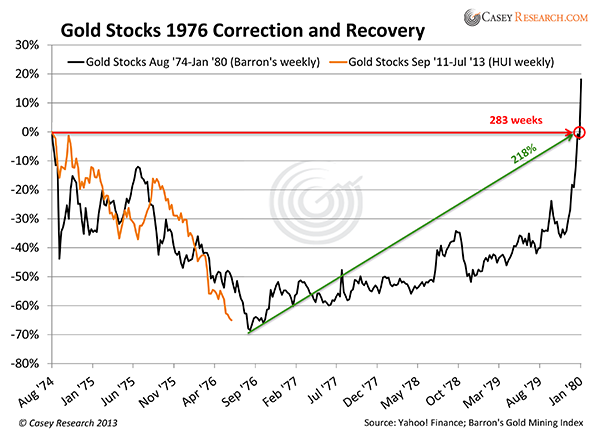
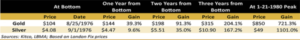
Lastly, it should be noted that on previous occasions when GOFO turned negative, large rallies in the gold price ensued thereafter. While there is no guarantee that the same will happen again (the sample size is obviously small), it would actually be logical to conclude that gold is likely to rally in the wake of this development – after all, it signifies a surge in demand.

See the original article >>

Dow 4.3% away from 16,000…Key “Emotipoint” level at hand!

by Chris Kimble

CLICK ON CHART TO ENLARGE

The chart above reflects that some of the key "Emotipoints" (Emotional highs and lows) since the early 1980's come to a crossroads at Dow 16,000. Currently the Dow is a little more than 4% away from this key resistance situation.

The 4th of July might be behind us, yet odds are high some really important fireworks and volatile price action will take place the closer the Dow get to the 16,000 level, especially if the Dow would be able to break above these stiff resistance lines!

See the original article >>

Retail fixed income investor capitulation

by SoberLook.com

Spooked retail investors are exhibiting complete capitulation in their bond portfolios. They have been dumping fixed income assets, particularly munis, in record amounts.

Source: DB

And the proceeds are ending up in money market funds - while institutions are reducing their overall money market funds holdings.

$mm (source ICI)

Are US retail investors overreacting to "taper" talk? For those who like to take contrarian bets, this looks like an opportunity.

See the original article >>

Will Bank Earnings Push Stocks Even Higher?

by Tom Aspray

The stock market added to its recent gains on Monday and while the Select Sector SPDR Financials (XLF) was only up 0.73%, many of the banks like Bank of America (BAC) and Citigroup Inc. (C) were up close to 2% on good volume. These gains pale in comparison to the 20% jump in the stock of the National Bank of Greece ADS (NBG).

The market internals were positive Monday and the A/D lines on the S&P 500, Dow Industrials, Nasdag 100, and Russell 2000 are now in clear up trends. The NYSE Advance/Decline is still lagging slightly.

Alcoa (AA) led the start of earnings season reporting a larger loss than expected, but the focus this week will be more on the financial sector as banks have been leading the market higher since the late June lows. The SPDR KBW Bank ETF (KBE) is up over 9% in just the past nine days versus a 4% gain in the Spyder Trust (SPY).

The regional banks have done even better as the SPDR KBW Regional Bank ETF (KRE) is up almost 11.5% during the same period. On June 26, the relative performance analysis indicated that it was one of the 3 Trend-Bucking Picks.

With JPMorgan Chase & Co. (JPM) and Wells Fargo & Company (WFC) both reporting earnings this week, are these stocks you should be buying or selling?

chart
Click to Enlarge

Chart Analysis: The weekly chart of the DJ US Banks Index (DJUSBK) shows a well-defined upward trading channel, lines a and b, that goes back to the summer of 2012.

  • The support that goes back to the November and April lows (line b) was tested in late June before it reversed to the upside.
  • There is next resistance at 277.40 with the upper resistance, line a, in the 295-300 area.
  • The relative performance bottomed out last September as it retested its support, line b, in April.
  • The RS broke through resistance at line c in late May signaling it was a market-leading sector.
  • The volume data only goes back to the start of 2013, but the OBV appears to have held support (line e) and moved back above its WMA
  • There is initial support at 266.58 and the June low at 255.27 should hold on any correction.

JPMorgan Chase & Co. (JPM) tested its rising 20-week EMA at June’s low of $51.51 before closing the week at $52.79, which was a bullish sign. They report earnings before the opening on Friday, July 12.

  • JPM started the quarter above its pivot at $51.48, which was a sign of strength.
  • In Monday’s session, JPM hit a high of $54.91 with the early June high at $55.91 when the weekly starc+ band was tested.
  • The relative performance is close to making new highs as it shows a solid uptrend, line g.
  • The RS line is well above its rising WMA.
  • The weekly on-balance volume (OBV) broke out of its base formation, line h, in early January and retested its WMA (see arrow) two weeks ago.
  • There is initial support now at $53.15-$53.60 and then at $52.75 with key support at the June lows

chart
Click to Enlarge

Wells Fargo & Company (WFC) retested the weekly breakout level, line a, at $39.40 in June. They also report earnings before the opening on Friday, July 12.

  • The quarterly R1 is at $43.48 with the weekly starc+ band at $43.76.
  • The relative performance moved through its strong resistance, line b, at the end of May.
  • The RS line is in a strong uptrend and well above its WMA.
  • The weekly OBV broke through its resistance (line c) two weeks ahead of the RS line.
  • The OBV shows a pattern of higher highs and is well above its WMA.
  • The daily OBV (not shown) is above its WMA so the OBV multiple time frame analysis is also pointing higher.
  • The first zone of support is in the $41.70-$40.70 area with the quarterly pivot at $39.84.
  • The June 24 low of $39.40 should hold on any correction.

Commerce Bancshares Inc. (CBSH) is a $4.17 billion regional Southwest bank that has a current yield of 2.0%. It is scheduled to report earnings on Thursday and currently yields 2.0%.

  • The weekly chart shows a breakout from a major trading range, lines e and f, in the middle of May.
  • The close last week was quite close to the quarterly R1 at $46.57 and the weekly starc+ band at $46.74.
  • The upside targets from the trading range are in the $50-$52 area.
  • The relative performance formed a base in late 2012 and early 2013 before breaking its downtrend, line g.
  • The OBV also confirmed the price action by overcoming resistance at line h.
  • The OBV shows a long-term uptrend, line i, and the daily OBV is confirming the price action.
  • There is first support at $45.20 to $44.60 with the quarterly pivot at $42.51.

What it Means: The technical action of all of these banks stocks is positive and the weekly relative performance analysis suggests they are likely to be market leaders for the rest of the year.

New positions need to be established on enough of a pullback so that a stop under the June lows can be used. Commerce Bancshares Inc. (CBSH) is quite overextended, but I have no new recommendation for now.

How to Profit: For JPMorgan Chase & Co. (JPM), go 50% long at $53.66 and 50% long at $52.88, with a stop at $50.73 (risk of approx. 4.8%).

For Wells Fargo & Company (WFC), go 50% long at $41.68 and 50% long at $41.14, with a stop at $39.14 (risk of approx. 5.5%).

Portfolio Update: As previously recommended, should be 50% long MB Financial Inc. (MBFI) at $25.86. Sell ½ at 28.66 or better and raise stop on the remaining position to $26.18.

Here are the changes in the other orders from the June 26 column.

For SPDR Regional Banking ETF (KRE), go 50% long at $34.28 and 50% at $33.36, with a stop at $32.03 (risk of 5.3%).

For M&T Bank Corp. (MTB), the buy level was missed, and I would cancel the order for now.

See the original article >>

Orange juice strengthens as tropical storms forming

By Jack Scoville

FCOJ (NYBOT:OJU13)

General Comments: Futures closed higher again as some tropical systems were seen forming in the Atlantic. It is too late to hurt the current production as the harvest is mostly over, but a big storm now could severely impact the coming production. So far the storms do not appear strong enough to damage crops, and might not get close enough to production areas to cause any concern. Showers are reported and conditions are said to have improved in almost the entire state. Ideas are that the better precipitation will help trees fight the greening disease. Greening disease and what it might mean to production prospects continues to be a primary support item and will be for several years. Temperatures are warm in the state, but there are showers reported. Brazil is seeing near to above normal temperatures and mostly dry weather.

Overnight News: Florida weather forecasts call for showers. Temperatures will average near to above normal. ICE said that 0 delivery notices were posted today and that total deliveries for the month are now 0 contracts.

Chart Trends: Trends in FCOJ are mixed. Support is at 130.00, 125.00, and 122.50 September, with resistance at 135.00, 138.00, and 139.00 September.

COTTON (NYBOT:CTV13)

General Comments: Futures were mixed to higher on follow through buying from last week and also on ideas that crop conditions are getting worse in Texas. After the close, USDA showed that overall crop ratings dropped in the US and that most of the drop came in Texas. Parts of the Southeast are getting too much rain and Texas growing areas remain mostly hot and dry. Conditions in Alabama, Mississippi, and Missouri are below average now. Futures held the short term range. It is possible that futures can work lower again as demand has turned soft, but production and weather might be more important in the short term. Weather for Cotton appears good in India, Pakistan, and China.

Overnight News: The Delta should be dry except for showers and storms on Thursday and Southeast will see showers and rains Thursday through the weekend. Temperatures will average near to above normal. Texas will be mostly dry. Temperatures will average above normal. The USDA spot price is now 82.01 ct/lb. ICE said that certified Cotton stocks are now 0.610 million bales, from 0.601 million yesterday. ICE said that 77 notices were posted today and that total deliveries are now 2,592 contracts.

Chart Trends: Trends in Cotton are mixed . Support is at 86.00, 85.20, and 84.00 October, with resistance of 87.45, 88.00, and 88.20 October.

COFFEE (NYBOT:KCU13)

General Comments: Futures were higher due to almost nonexistent offers from origin. Demand was not much stronger than the offer and the cash market remains very quiet. Sellers, including Brazil, are quiet and are waiting for better prices of the next crop. Buyers are interested on cheap differentials, and cheap futures. Brazil weather is forecast to show dry conditions, but no cold weather. Current crop development is still good this year. Central America crops are seeing good rains now. Colombia is reported to have good conditions. Robusta prices are holding stronger as the Vietnamese export pace has really dropped.

Overnight News: Certified stocks are lower today and are about 2.742 million bags. The ICO composite price is now 118.15 ct/lb. Brazil should get dry weather except for some showers in the northeast. Temperatures will average near to above normal. Colombia should get scattered showers, and Central America and Mexico should get showers, and rains. Temperatures should average near to above normal. ICE said that 0 delivery notices were posted against July today and that total deliveries for the month are now 810 contracts. Brazil exported 30.54 million bags of Coffee in 2012-13, up 2.5% from the previous marketing year. The ICO estimated world production at 144.6 million bags in 2012-13, up 8% from the previous marketing year.

Chart Trends: Trends in New York are mixed. Support is at 120.00, 117.00, and 116.00 September, and resistance is at 125.00, 126.00, and 127.00 September. Trends in London are mixed to up with objectives of 1835 and 1900 September. Support is at 1790, 1755, and 1720 September, and resistance is at 1825, 1855, and 1870 September. Trends in Sao Paulo are mixed to down with no objectives. Support is at 140.00, 137.00, and 134.00 September, and resistance is at 150.00, 151.00, and 155.00 September.

SUGAR  (NYBOT:SBV13)

General Comments: Futures closed higher on some talk that UNICA could show reduced Sugar production in reports later this week. Ideas are that mills had not had time to produce more Sugar due to a delayed harvest in Brazil because of rains and also because they are concentrating on producing ethanol. Futures might try to work lower again this week as trends have turned down again and new contract lows were made, but at least one more day or recovery trading is possible. There is still a lot of Sugar around, and not only from Brazil. The Indian monsoon is off to a good start and this should help with Sugarcane production in the country. Northern areas are in good shape, but southern areas might be too hot and dry and some stress to the Sugarcane is possible in the short term. Traders remain bearish on ideas of big supplies, especially from Brazil. Traders in Brazil expect big production to continue as the weather is improved.

Overnight News: Showers are expected in Brazil, mostly in the south and southwest. Temperatures should average near to above normal.

Chart Trends: Trends in New York are down with objectives of 1580 October. Support is at 1620, 1600, and 1570 October, and resistance is at 1650, 1665, and 1690 October. Trends in London are mixed to down with objectives of 465.00 and 448.00 October. Support is at 470.00, 466.00, and 463.00 October, and resistance is at 480.00, 485.00, and 490.00 October.

See the original article >>

Gold ETP assets drop below 2,000 tons first time since 2010

By Phoebe Sedgman and Glenys Sim

Holdings in gold-backed exchange-traded products fell below 2,000 metric tons for the first time since May 2010 after bullion slumped on expectations the Federal Reserve will taper stimulus measures.

Assets declined 24%, or 638.2 tons, this year to 1,993.76 tons, heading for the first annual drop since the products were introduced in 2003, and wiping $61 billion from their value, according to data compiled by Bloomberg. Holdings reached a record 2,632.52 tons in December as gold climbed for a 12th year, the data show.

Bullion slid 23% last quarter, the biggest loss since at least 1920, as some investors lost faith in the metal as a store of value and Fed Chairman Ben S. Bernanke indicated the central bank may slow asset purchases if the economy continues to improve. ETP assets may fall a further 500 tons in the next 12 months, UBS AG estimates. Holdings in the SPDR Gold Trust, the biggest such product, fell to a four-year low.

“A lot of investors are starting to exit their hedge against unorthodox monetary policy in the U.S.,” Dominic Schnider, head of commodities research at UBS’s wealth- management unit in Singapore, said in a phone interview today. “As an insurance asset, gold, which worked out so well for people in the past few years, is not attractive anymore.”

The decline in ETP holdings this year is equivalent to about 22% of mined output in 2012, which was 2,847.7 tons, according to the World Gold Council. Total gold demand was 4,405.5 tons last year, comprising 1,534.6 tons of investment demand in the form of bars, coins and ETPs.

Gold Slumps

At the peak in December, assets in gold ETPs were the world’s third-largest hoard when compared with national reserves. They have now fallen to fifth place behind the U.S., Germany, Italy and France, according to data compiled by Bloomberg and the council.

Prices plunged 25% in 2013 to $1,249.18 an ounce, sliding into a bear market in April and heading for the worst annual drop since 1981. The MSCI All-Country World Index of equities climbed 6.4% and the dollar gained 5.6% against a basket of six major currencies.

SPDR Gold Trust assets fell 1.6% to 946.96 tons, the lowest since February 2009, according to data compiled by Bloomberg. Billionaire investor George Soros joined funds run by Northern Trust Corp. and BlackRock Inc. in cutting holdings in the SPDR in the first quarter, U.S. government filings showed in May. John Paulson, the biggest investor, kept his stake of 21.8 million shares.

Paulson, Goldman

Paulson’s PFR Gold Fund posted a 23% decline last month, according to a letter to investors. The drop brings the loss to 65% since the start of the year, the firm said in a July 3 letter, a copy of which was obtained by Bloomberg News. The fund, with about $300 million in assets, consists mostly of Paulson’s own money and is the smallest at the firm, which manages $19 billion.

Goldman Sachs Group Inc. cut its price target for the end of 2013 to $1,300 from $1,435 and expects ETP holdings to decline by about 1 million ounces a month, it said in June. The bank joins analysts from Morgan Stanley to Credit Suisse Group AG in trimming forecasts.

“The real story for owning gold from a kind of an inflation protection perspective has just not materialized,” Jeffrey Sherman, who helps manage more than $57 billion of assets for DoubleLine Capital in Los Angeles, said in a telephone interview. “You’ve got to think about why you own the precious metal to begin with and right now it’s hard to make a very bullish case for it.”

Coins, Jewelry

Sales of coins and jewelry surged around the world after bullion plunged in April, spurring a 13% rebound in prices in less than three weeks. There are now signs interest has slowed, with the U.S. Mint selling 57,000 ounces of American Eagle gold coins in June from 209,500 ounces in April, according to data on its website. Sales from Australia’s Perth Mint declined for a second month in June, it said last week

U.S. President Richard Nixon severed the dollar peg to gold in 1971 and the government lifted curbs on citizens owning gold at the end of 1974.

See the original article >>

Great Graphic: Investment Flows

by Marc to Market

The Federal Reserve is suggesting that barring a deterioration of economy activity in the coming months, it is preparing a protracted exit to the extraordinary monetary policy pursued since the credit cycle ended. Talking about is part of the Fed's forward guidance and is also part of the exit strategy. Investors, both retail and institutional are adjusting their positions accordingly.

This Great Graphic was published on FT Alphaville, which in turn got them from Credit Suisse.   The top chart tracks the flow of funds into three broad categories of mutual funds.  The dark red bar is the  flows into, and now out, of bond funds.  The dark blue bar are the flows into/out of US equity funds.  The light blue, (look closely) track the global equity funds.  Roughly $60 bln has left the fixed income funds, apparently the most on record.   

This has been represented in the popular and business press, but the second chart puts it in a larger context of the stock of investments that have accumulated in various investment vehicles since the late 1990s. For example, the green line, which tracks flows into bond mutual funds, shows that the stock of such investment is near $3.5 trillion.  On the eve of the Lehman debacle, there was around $1.7 trillion under management by fixed income mutual funds.    There is no compelling reason to think that there is a mean reversion process at work and all the funds that flowed into the bond funds will now flow out.
In addition, the bond mutual funds capture mostly retail interest.  Institutional investors have also been selling fixed income  We noted that Japanese investors, for example, have been significant sellers of foreign bonds this year and  in May appear to have sold about $30 bln of US Treasury bonds and notes.  We also know that the Fed's custody holdings of Treasuries has fallen by about $26 bln from late May through early July. 

See the original article >>

U S Stock Markets… Chartology’s Best Kept Secret…The Bullish Rising

By: Rambus_Chartology

As most of you know I’ve been bullish on the stock markets for quite sometime now. I know there are a lot of investors that are bearish on the US markets and are looking for them to crash on burn. From my perspective nothing is broken that would tell me at this point in time to expect a major correction. So far the charts have been playing out beautifully and if nothing is broken there is no need to fix it.

The first chart I would like to show you is a very long term monthly look at the INDU that seems to be repeating a pattern that formed back in 2002 to 2007 rally phase. I’ve shown this chart several times in the past that shows the bullish rising wedge that formed as a halfway pattern in the middle of the 2002 to 2007 rally. No one at the time recognized this pattern, the bullish rising wedge, because everyone always considers these patterns as bearish. Nothing could be further from the truth as I have shown many times they act and perform just as any other consolidation if the price action breaks out through the top rail. The chart below shows the bullish rising wedge that formed in 2002 to 2007 as a halfway pattern that measured out perfectly in time and price to the 2007 high just before the crash. You can see our current bullish rising wedge that I’ve been showing since the breakout about 6 months or so ago.

This next chart is the exact same chart as shown above. It may look a little busy but it shows you what I’m look for with our current bullish rising wedge #2. Note the two black rectangles from 2002 to 2007 that measured out the bullish rising wedge #1 as a halfway pattern in time and price. Now look at our current bullish rising wedge #2 that is showing a price objective up to 18,870 as measured by the blue arrows with a time frame in January of 2015 or so. You will only see a chart like this at Rambus Chartology and nowhere else because no one is looking for this pattern. The bears were all over the bullish rising wedge before it broke out to the upside. Its now been about 6 months and nothing is broken.

This next chart is a closeup look at the 2002 to 2007 price action that measured out the bullish rising wedge as a halfway pattern.

The next chart is the COMPQ that also shows a bullish rising wedge that has broken out and has been in backtest mode for the last month or so. It looks like it is trying to breakout from the red bullish expanding falling wedge that is sitting on the top rail of the blue bullish rising wedge which is normally a bullish setup.

The COMPQ monthly.

Below is a 60 minute chart for the SPX I showed you several weeks ago as it was still forming its consolidation pattern. As you can see it closed just below the top rail last Friday.

The daily chart shows the bullish rising wedge with the bullish expanding falling wedge as the backtest. If you recall I was looking at 1560 as a potential low on this bar chart. Now it just needs to breakout through the top rail to enter the next leg up.

This next chart for the SPX is a weekly line chart that shows the breakout of the 13 year expanding flat top triangle. The backtest here comes in at 1580 or so which has already been tested. Again, as long as the top blue rail holds support nothing is broken and we have to follow the price action where ever it leads us.

The next chart shows a beautiful H&S consolidation pattern for the transportation index that broke out 6 months or so ago. Nothing is broke here either.

Next I want to update you on some of the indexes that I’ve been showing you once a month or so that are still in a bullish mode. The BKX, banking indexes, is still moving as expected after breaking out from the blue bullish expanding falling wedge followed by the red red bullish rising wedge. Note the 11 year support and resistance rail that gave anyone watching this index a huge clue that when the price action broke below the S&R rail a top was in place. You never know for sure how the move down would unfold but with such a big top in place you knew it couldn’t be good.

The BTK, biotech index. is still trading above its red bullish rising wedge I showed you when it broke out. Are you beginning to see a theme here with all the bullish rising wedges in play?

The RLX, retail index, is hitting new all time highs by the looks of this weekly chart. I would think this would have to be bullish for the stock markets. Also another bullish rising wedge that are built in fast moving markets.

Oil is at a critical juncture right here. It’s testing the top rail of the bigger triangle pattern. The moment of truth is now for oil.

Its getting late and I need to get this posted. I hope everyone had a fun filled 4th of July. I know I did. All the best…Rambus

See the original article >>

Golden Slumbers

by Kenneth Rogoff

CAMBRIDGE – In principle, holding gold is a form of insurance against war, financial Armageddon, and wholesale currency debasement. And, from the onset of the global financial crisis, the price of gold has often been portrayed as a barometer of global economic insecurity. So, does the collapse in gold prices – from a peak of $1,900 per ounce in August 2011 to under $1,250 at the beginning of July 2013 – represent a vote of confidence in the global economy?

This illustration is by Margaret Scott and comes from <a href="http://www.newsart.com">NewsArt.com</a>, and is the property of the NewsArt organization and of its artist. Reproducing this image is a violation of copyright law.

Illustration by Margaret Scott

To say that the gold market displays all of the classic features of a bubble gone bust is to oversimplify. There is no doubt that gold’s heady rise to the peak, from around $350 per ounce in July 2003, had investors drooling. The price would rise today because everyone had become convinced that it would rise even further tomorrow.

Doctors and dentists started selling stocks and buying gold coins. Demand for gold jewelry in India and China soared. Emerging-market central banks diversified out of dollars and into gold.

The case for buying gold had several strong components. Ten years ago, gold was selling at well below its long-term inflation-adjusted average, and the integration of three billion emerging-market citizens into the global economy could only mean a giant long-term boost to demand.

That element of the story, incidentally, remains valid. The global financial crisis added to gold’s allure, owing initially to fear of a second Great Depression. Later, some investors feared that governments would unleash inflation to ease the burden of soaring public debt and address persistent unemployment.

As central banks brought policy interest rates down to zero, no one cared that gold yields no interest. So it is nonsense to say that the rise in the price of gold was all a bubble. But it is also true that as the price rose, a growing number of naïve investors sought to buy in.

Lately, of course, the fundamentals have reversed somewhat, and the speculative frenzy has reversed even more. China’s economy continues to soften; India’s growth rate is down sharply from a few years ago. By contrast, despite the ill-advised fiscal sequester, the US economy appears to be healing gradually. Global interest rates have risen 100 basis points since the US Federal Reserve started suggesting – quite prematurely, in my view – that it would wind down its policy of quantitative easing.

With the Fed underscoring its strong anti-inflation bias, it is harder to argue that investors need gold as a hedge against high inflation. And, as the doctors and dentists who were buying gold coins two years ago now unload them, it is not yet clear where the downward price spiral will stop. Some are targeting the psychologically compelling $1,000 barrier.

In fact, the case for or against gold has not changed all that much since 2010, when I last wrote about it. In October of that year, the price of gold – the consummate faith-based speculative asset – was on the way up, having just hit $1,300. But the real case for holding it, then as now, was never a speculative one. Rather, gold is a hedge. If you are a high-net-worth investor, or a sovereign wealth fund, it makes perfect sense to hold a small percentage of your assets in gold as a hedge against extreme events.

Holding gold can also make sense for middle-class and poor households in countries – for example, China and India – that significantly limit access to other financial investments. For most others, gold is just another gamble that one can make. And, as with all gambles, it is not necessarily a winning one.

Unless governments firmly set the price of gold, as they did before World War I, the market for it will inevitably be risky and volatile. In a study published in January, the economists Claude Erb and Campbell Harvey consider several possible models of gold’s fundamental price, and find that gold is at best only loosely tethered to any of them. Instead, the price of gold often seems to drift far above or far below its fundamental long-term value for extended periods. (This behavior is, of course, not unlike that of many other financial assets, such as exchange rates or stock prices, though gold’s price swings may be more extreme.)

Gold bugs sometimes cite isolated historical data that suggest that gold’s long-term value has remained stable over the millennia. For example, Stephen Harmston’s oft-cited 1998 study points to anecdotal evidence that an ounce of gold bought 350 loaves of bread in the time of Nebuchadnezzar, king of Babylon, who died in 562 BC. Ignoring the fact that bread in Babylon was probably healthier than today’s highly refined product, the price of gold today is not so different, equal to perhaps 600 loaves of bread.

Of course, we do not have annual data for Babylonian gold prices. We can only assume, given wars and other uncertainties, that true market prices back then, like today, were quite volatile.

So the recent collapse of gold prices has not really changed the case for investing in it one way or the other. Yes, prices could easily fall below $1,000; but, then again, they might rise. Meanwhile, policymakers should be cautious in interpreting the plunge in gold prices as a vote of confidence in their performance.

See the original article >>

1994 vs 2013: Spot The Carbon-Copy Similarities

by Tyler Durden

The only thing that is necessary for something to happen, is for everyone to say it can't possibly happen. Such as a carbon copy replica of the 1994 bond crush. Presenting: 1994 vs 2013, or as it is better known "It can't happen... It can't happen...It can't happen... It just happened"

And some rather spot on commentary on just this from Guggenheim's Scott Minerd, who just like us, sees the inevitable outcome of the upcoming taper (which is coming), as the untaper, i.e., even moar printing by the Chairman (or woman as the case may be in 2014).

From Guggenheim's Scott Minerd

The Fed's Bind: Tapering, Timetables and Turmoil

There are striking parallels between the dramatic recent sell-off in U.S. Treasuries and the Great Bond Crash of 1994. But the summer of volatility now facing financial markets is no doomsday scenario. Instead, it puts the U.S. Federal Reserve in a bind. Higher interest rates will reduce housing affordability, which is especially troublesome since housing is the primary locomotive of U.S. economic growth. That means the Fed, despite Ben Bernanke’s recently announced timetable, may be forced to expand or extend quantitative easing if the housing market’s response to recent events becomes more acute and starts to negatively affect the job market recovery.

At the start of June, I waxed nostalgic about the canary in the coal mine. In the aftermath of a string of downside moves in financial markets, I wrote about how early mines lacked ventilation and so miners brought caged canaries into new seams to detect deadly gasses. The story went that if the canary stopped singing, or even worse, died, the mine would be evacuated until the gas buildup could be cleared to make work safe again. My point was that markets were foreshadowing worse trouble ahead. Now, I regret to tell you, my prognosis was all too accurate. The canary is certainly dead. And, in the sudden market rout that has marked the beginning of the summer season, the chirpy yellow bird was far from the only casualty.

I see striking parallels between the dramatic recent sell-off in U.S. Treasuries and the Great Bond Crash of 1994. To make matters worse, today’s bond market is even more sensitive to fears about tightening thanks to the U.S. Federal Reserve’s unprecedented expansionary program since the 2008 crisis.

At the start of 1994, Bill Clinton signed the North American Free Trade Agreement into law, Alan Greenspan was at the helm of the U.S. Federal Reserve, and markets were optimistic. I was working in London, running European credit trading for Morgan Stanley. Our desk turned over about $500 million in credit daily. Bond yields were historically low, inflation was muted. Then, after a calm start to the year and almost without warning, bond markets suffered their largest crash since the Great Depression.

The trouble began in February when Fed Chairman Greenspan, after four years of monetary expansion, announced a seemingly innocuous 25 basis point increase in the federal funds rate. Bond markets reacted swiftly and violently, re-pricing securities based on where investors anticipated interest rates would be at the end of what markets correctly assumed was a tightening cycle. Liquidity significantly dried up, and over the next nine months, the 10-year yield rose 240 basis points. We were on the front lines of the crisis -- during those dark days, our daily volume on the trading desk shriveled from $500 million to just $15 million.

In 1994, investors were caught off guard because the duration of their positions – a great deal of which were mortgage-backed securities – was lengthened beyond their targets due to rising interest rates. Those investors used Treasuries as a means to sell duration because they were their most liquid assets. Credit spreads soon exploded as dealers lacked the ability to take on larger positions from would-be sellers. Both sides of the Street were sprinting in one direction, leading to a violent stampede for the only exit.

It appears we are witnessing a similar cascade today. The sell-off began at the start of May, as U.S. economic data suggested housing could spark a stronger economy. It continued after May 22, when Fed Chairman Ben Bernanke told lawmakers that the central bank would, in the coming months, discuss how it might approach tapering its asset purchases. Then on June 19, the other shoe dropped when Dr. Bernanke held his post-Federal Open Market Committee meeting press conference. Despite his insistence that tightening is not imminent, his guidance amounted to an outline and a timetable of how quantitative easing (QE) will be tapered, and eventually ended. Markets were caught off guard by how quickly the Fed could take away the proverbial punch bowl.

Both Greenspan and Bernanke pushed the boundaries of Fed transparency, but the way they telegraphed their messages seems to have contributed to market volatility. Greenspan’s rate increase in February of 1994 marked the first time the FOMC released a statement announcing a move in the federal funds rate, its main policy tool. And Bernanke is the first Fed chairman to hold post-FOMC press conferences, a practice he began in April, 2011. The message contained in Bernanke’s June 19 post-FOMC press conference certainly triggered the market rout that would follow.

Part of the recent correction in the bond market is the result of the readjustment of the term structure of interest rates, but most of it is due to concerned investors seeking to reduce their portfolio exposure by shedding duration, often by shorting Treasuries. Many of these investors have recently been engaged in a leveraged carry trade, meaning higher interest rates magnified the downside losses and, in the case of mortgage securities, the effect on prices was even more amplified as durations extended as a result of reduced expectations of repayment. This leveraged effect on mortgage portfolio losses explains the dramatic decline in mortgage REITs over the past weeks. While in the very near term things could improve, the situation could worsen because the rising interest rate trend looks set to continue, with a medium-term target of 3.25-3.5 percent for the 10-year note. The eventual follow-on to this will likely be a widening of credit spreads.

Rising rates will continue to reduce housing affordability, which is especially troublesome because housing is the primary locomotive of U.S. economic growth. Housing activity has been driven by artificially low mortgage rates. Housing-related activity, including private residential investment, personal expenditures on household durable goods and utilities, as well as the wealth effect on consumption from home price appreciation, has positively contributed to GDP growth for the last five quarters.

Housing activity was the sole positive contributor to economic growth in the second quarter of 2012, and it comprised over two thirds of real GDP growth in the first quarter of 2013. First quarter real GDP growth was only 1.8 percent, 69 percent of which was directly attributable to housing. Rising interest rates caused mortgage applications to fall sharply in May, and profits from new construction also faltered. The housing refinancing index has also come under pressure.

The Fed’s assumptions now include a forecast that unemployment will drop to 7.2-7.3 percent by year end. That suggests that the Fed believes economic activity will accelerate as we head into the summer. I do not subscribe to this view, since we are already seeing pressure on housing and the broader economy from higher interest rates, and the negative impact of the recent spike in yields is likely to continue to show up in the economic data over the summer. That means the Fed, despite Dr. Bernanke’s recently announced timetable, may be forced to expand or extend QE if the housing market’s response to recent events becomes more acute and starts to negatively affect the job market recovery. Consequently, it is fairly certain that QE will continue at its current rate through the end of 2013, and the Fed will likely still be carrying out asset purchases well into the second half of 2014. This view is supported by the low near-term risk of inflation.

Meanwhile Fed officials are struggling to put the toothpaste back in the tube. In the wake of Bernanke’s press conference, numerous Federal Reserve presidents have attempted to clarify or even refine the message. San Francisco Fed President John Williams, who in May said the central bank could begin tapering its asset purchases by the summer and finish them by year-end, backtracked in recent days. The centrist policymaker now says it’s too early to say when the Fed will taper and that the central bank must be certain the recovery can withstand ongoing fiscal contraction.

Another important consideration in the recent market dislocation is the value of primary dealer positions relative to the bond market’s total size. Ultra-low interest rates since 2008 spurred increased debt issuance while dealer positions in commercial paper, investment grade, and high-yield corporate bonds have declined from their peak of about $260 billion in 2007 to $69 billion today due to banking regulations. This means bond market dealer balance sheet coverage has shriveled from 4 percent of total inventory in 2007 to less than 0.7 percent of today’s $9 trillion market.

There will likely be further selling pressure when mutual funds post quarterly statements featuring losses, and as the carnage from the bond market shows up on 401k statements. These investors will not care that the risk of a recession is highly remote but will focus instead on signals from the Fed that interest rates will rise.

The New York Stock Exchange Advance Decline line is also forecasting tough times ahead. Over the long-term, equities prices will likely reflect the recovery in the underlying economy, but a stock market fall of 10-20 percent is still likely given how volatile markets have become. Uncertainty will remain elevated through the summer because we will not be able to gauge the impact higher interest rates are having on the economy until we get data in August that reflects housing activity from months earlier.

Fixed-income investors should be particularly cognizant of liquidity levels, keeping maturities short and spread duration low. High-yield spreads may widen by another 100 basis points because of the recent Treasury crash and Gold may ultimately regain its safe-haven status.

Markets are certainly under pressure, but this is not a doomsday scenario. This liquidity flush will continue to unfold, and things will likely get worse before they get better. Investors face a rough summer, but it is important to remember that even the extreme bear bond market that began in February 1994 ended before the end of that year.

This year, Treasuries began selling off in April, so if this swoon behaves like the 1994 bear market for bonds, we can expect to be out the other end by the end of the year. Certainly, I don’t think we will see any relief for lower bond prices until economic data begins to reflect a slowdown in both housing activity and price appreciation.

See the original article >>

Time To Buy Gold….in Yen Terms

by Greg Harmon

Gold has been in the dumper since it cracked below the 1550 level in early April. And it does not look like it is going to get better anytime soon. Unless, you trade your Gold in terms of other currencies. There is one famous television commentator that will always state that he likes Gold against another currency. Perhaps he is reading or thinking the same way now about Gold priced in Yen. The chart below uses the SPDR Gold Trust ETF, $GLD, and the Currency Shares Japanese Yen Trust, $FXY, as a proxy for Gold and the Yen. It shows the hard sell off in Gold since April but the last 3 candles are what is intriguing and force you to consider a reversal. The Harami, or inside weeks, indicate a potential

gld-fxy

reversal. It needs to be confirmed, but there are additional signs as well. The 200 week Simple Moving Average (SMA) acted as support on the move lower and is still holding. The Relative Strength Index (RSI) is flattening and possibly turning up at the technically oversold level. The Moving Average Convergence Divergence indicator (MACD) continues to move lower on the signal line but the histogram has leveled and is starting to improve. You could wait for the signal, a move over 1.25, or start a small position now against the 200 week SMA. Then you too can be long Gold in Yen terms.

See the original article >>

The China Asian Giant Stampeding into Gold

By: Frank_Holmes

I recently discussed how traders were stampeding out of gold as a result of rising interest rates and the threat of evaporating monetary fluid that was lubricating markets. Hovering around $1,200 at the beginning of July, the gold price has completely disconnected from the precious metal's fundamentals, in my opinion. Prices have fallen too far out of fear, but the drivers for gold are still in place.

My friend and highly respected analyst, Gregory Weldon, highlighted an important point about rising rates in the U.S. The coupon on the nation's $13.22 trillion debt averages 1.88 percent with an average maturity of 5.4 years. As interest rates rise, debt will be rolled over at a higher rate, making the burden even greater than it already is. This suggests a likely tipping point for Treasuries. Will the Federal Reserve suppress yields at that "line in the sand?"

Domestic Equity Market - U.S. Global Investors

In this environment, gold should remain attractive. However, as the West flees the precious metal, another set of gold buyers has come forward with the aim to preserve wealth. Take a look at the chart below which shows total gold production compared to the gold deliveries on the COMEX and the Shanghai Gold Exchange. In May, gold imports into the Asian giant rose to the second-highest level ever. While mining production is around 1,134 tons so far this year, gold delivery on the Shanghai Gold Exchange is 918 tons. This is strikingly in contrast to the gold delivery on the COMEX, which stands at only 103 tons year-to-date as of the end of May.

Domestic Equity Market - U.S. Global Investors

In fact, this year's demand is so significant that the physical gold delivered on the Shanghai Gold Exchange through May is almost all of the official gold reserves in China! As George Topping of Stifel Nicolaus puts it, "Annualizing 2013 year-to-date figures, China's imports would be equivalent to 50 percent of [world] mine production."

China may be devouring even more of the supply in the future if the price of gold remains subdued. I've been talking with several gold company executives, who tell me they are seeing squeezed margins because of lower grade finds, as well as governments raising taxes or increasing royalty rates.

The top priority for these miners today is cost control, focusing their efforts on viable projects that have all-in costs of less than $1,000 per ounce of gold. If spending is too expensive, exploration is cut and production is halted.

This is an extremely conservative amount, as some gold mining projects in certain countries come in significantly higher. The CEO of Gold Fields recently indicated that the average all-in cost in Africa is $1,500!

This is a similar phenomenon to the supply of natural gas recently. When there were huge discoveries in the commodity, companies immediately halted drilling. There's a notable difference in drilling gas versus mining gold, though: The natural gas cycle is shorter and measured in months, so there can be a relatively quick recovery in supply. When gold companies cut production, the restart cycle can take decades.

To me, these supply and demand drivers point to a sustained higher gold price.

See the original article >>

Telegraphing the Turnaround in Gold Price

By: Jeff_Clark

As of last Friday, gold has now fallen as much 35.4% (based on London PM fix prices) over 96 weeks. But if you're like us, you still recognize that the core reasons for investing in gold haven't changed. People who sold their gold recently made a shortsighted decision. Before too long precious metals will rebound—and probably in a big way.

But when? Does history have any clues about how long we'll have to wait for that rebound?

Perhaps the most constructive way to forecast a turnaround in gold is to look at how its price behaved in prior big corrections.

Here's an updated view of gold's three largest corrections since 2001, along with the time it took the price to return to the old high and stay above that level.

It has taken a significant amount time for gold to return to old highs after each big selloff this cycle. And the bigger the correction, the longer it has taken—with each correction lasting longer than the last.

However, I think our current correction more closely resembles what occurred in 1974-1976 than any of the dips so far this cycle. Here's an updated overlay of the gold price then and now.

As you can see, during the big correction of the 1970s, gold declined 47% and took 187 weeks to recapture old highs. This fits in with the pattern discussed above: the bigger the correction, the lengthier the recovery. Another interesting pattern: the time to reach new highs always equals or exceeds the duration of the decline.

While the current correction hasn't been as deep as that of the mid-'70s, the decline is already longer, and it's the most prolonged of the current cycle. It is thus reasonable to expect gold to take two years or more to regain the $1,900 level and continue beyond. Barring a black swan event, gold will likely log its first annual loss since 2000 this year. These are not predictions, just possibilities, and a reminder that if gold is slow to recover, it's simply adhering to past patterns.

However, it's not all bad news, as the chart shows: gold nearly doubled in the two years from its '76 low to its '78 return to former highs. The message here is obvious: add to your inventory at depressed levels. And don't worry about missing the bottom; investors who waited to buy until gold had retraced 30% of its decline still netted about a 70% gain once it returned to prior highs.

The same patterns hold true with stocks. You can see the high-to-low-to-prior-high time frame was longer, but the gains were bigger once the dust settled.

Investors who bucked the conventional wisdom of the day and bought a basket of gold and silver producers in the autumn of 1976—after they had dropped by almost 70%—more than tripled their investment. We're now approaching the degree of selloff that was seen then, setting up a similar opportunity to profit.

Don't let the long recovery times shown in the charts deter you. Stay focused on the pattern; once the declines reversed, the general trend was up. Contrarians and forward-thinking investors need to prepare for that reality, rather than take umbrage with how long it might take to beat old highs. By the time mainstream analysts—who know little about gold in the first place—declare it has entered a "new" bull market, the lows will be long behind us, along with the best buying opportunities.

Selloffs Can Be Profitable Setups

Once gold bottomed at $103.50 on August 25, 1976, the trend reversed and the metal rose a whopping 721% to peak at $850 on January 21, 1980.

Silver's climb was even more dramatic. From its 1976 low of $4.08, it soared 1,101%. This is the 10-bagger grail of investing, where investors had the chance to add a zero to their initial investments.

But remember: the process was multiyear and began after a dismal two-year decline that was punctuated with sharp selloffs, similar to gold's behavior since its 2011 high. While that's a stupendous return within a short time frame, the biggest gains were seen in the final five months. The patience of some investors would certainly have been tested in those first three years.

Here's a look at the gains for the metals from their respective lows.

Both gold and silver logged double-digit returns every year after the bottom (except silver the first year). Once the momentum had shifted, buying and holding while the fundamental forces played out led to huge profits. No "trading" was necessary; just buy after a big correction and hold on for the ride.

No need to attempt to time the bottom, either; those who bought a year after the lows still reaped gains of 490% for gold and 996% for silver. The largest chunk of profits came in the second year and beyond.

Also of note is that the second leg up in precious metals was bigger than the first. There's no reason to think we won't experience the same thing this time around.

The messages from history are self-evident:

  • Be patient. Odds favor gold emerging from a period of price consolidation and volatility. This process will take time.
  • Be prepared. Big gains follow big selloffs. We can't be certain if the final bottom is in yet, but buying at these levels will ultimately net big profits if you're buying the most solid of the major producers and potentially life-changing gains if you're buying the best juniors.
See the original article >>

Why I’m Bullish on This Precious Metal Right Now

By Michael Lombardi

What we are seeing right now in the gold bullion market is unprecedented. The mainstream media continue to rail against gold as an investment, and prominent pundits have even declared that the precious metal will decline to $1,000 or even lower. But, in my opinion, it looks like these commentators are unable to see past the recent decline in prices.

When I look at the amount of negativity in the gold bullion market, I actually take it as a bullish signal. Contrarians will agree with me on this: when there’s blood in the streets, the best buying opportunities arise.

Gold has come under intense scrutiny in the paper market, but it seems to have become a buying opportunity for those who thought they had missed out after the gold bullion prices reached their highs in 2011.

Nothing has changed. The fundamental reasons for the rise in gold bullion remain in play. In spite of the recent price decline, the demand for gold is still just as valid as it was at its highest.

The clearing statistics by London Bullion Market Association (LBMA) showed that the total transfer of gold bullion among its members increased by 17.2% to a daily average of 28.2 million ounces in May—the highest amount in 12 years. In fact, in the same period a year ago, the LBMA reported just 19.5 million ounces in gold transfers.

And the monetary value of gold bullion transfers stood at a daily average of $39.8 billion in May—the highest since August of 2011. (Source: “LBMA: Volume of Gold Transferred Climbs To 12-Year High in May,” Kitco News web site, June 28, 2013.)

Central banks, which have been a net seller of gold bullion, are now buying. The first quarter of this year marked the seventh in a row in which central banks purchased more than 100 tons of gold bullion.

Central banks in countries like China need significant amounts of gold bullion because other major central banks (like those in the U.S. and Germany) hold a significant portion of their reserves in gold bullion—more than 70%—while China holds just less than two percent. If China decides to bring its central bank reserves even just to 10%, it would cause a profound rise in the price of gold bullion.

Remember, central banks will never say when they are going to buy; however, their actions speak louder than their words. Believe me when I tell you that they want to buy more gold bullion.

What the mainstream advisors don’t realize is that gold bullion stores its value and protects itself from uncertainty. Consider, as an alternative, the U.S. dollar: The buying power of Americans continues to decrease—what could be bought for one dollar in 1980 costs $2.83 in 2013. (Source: Bureau of Labor Statistics web site, last accessed July 2, 2013.) The opposite is true with gold bullion.

Frankly, I am bullish on gold bullion because it has great prospects in its future. Demand continues to increase, and the uncertainty around the future of the U.S. dollar makes the precious metal even more desirable. The stress in the gold bullion prices is simply due to false belief in a U.S. economic recovery created by the stock market and the Federal Reserve.

See the original article >>

A Historic Inversion: Gold GOFO Rates Turn Negative For The First Time Since Lehman

by Tyler Durden

Today, something happened that has not happened since the Lehman collapse: the 1 Month Gold Forward Offered (GOFO) rate turned negative, from 0.015% to -0.065%, for the first time in nearly 5 years, or technically since just after the Lehman bankruptcy precipitated AIG bailout in November 2011. And if one looks at the 3 Month GOFO, which also turned shockingly negative overnight from 0.05% to -0.03%, one has to go back all the way to the 1999 Washington Agreement on gold, to find the last time that particular GOFO rate was negative.

Before we get into the implications of this rather historic inversion, let's review the basics:

What is GOFO (Gold Forward Offered Rates)?

GOFO stands for Gold Forward Offered Rate. These are rates at which contributors are prepared to lend gold on a swap against US dollars. Quotes are made for 1-, 2-, 3-, 6- and 12-month periods.

Who provides the rates?

The contributors are the Market Making Members of the LBMA: The Bank of Nova Scotia–ScotiaMocatta, Barclays Bank Plc, Deutsche Bank AG, HSBC Bank USA London Branch, Goldman Sachs, JP Morgan Chase Bank, Société Générale and UBS AG.

When are the rates quoted?

The means are set at 11 am London time. These are the rates shown on the LBMA website.  To show derived gold lease rates, the GOFO means are subtracted from the corresponding values of the LIBOR (London Interbank Offered Rates) US dollar means.  These rates are also available on the LBMA website.

How are the GOFO means established?

At 10.30 am London time, the Reuters page is cleared of all rates. Contributors then enter their rates for all time periods. A minimum of six contributors must enter rates in order for the means to be calculated. At 11.00 am, the mean is established for each maturity by discarding the highest and lowest quotations in each period and averaging the remaining rates.

What are some uses for GOFO means in the market?

They provide a basis for some finance and loan agreements as well as for the settlement of gold Interest Rate Swaps.

* * *

Unpleasant similarities with Libor and most other fixed (literally and metaphorically) rates aside, what is known is that under normal market conditions, GOFO is always positive, or in other words gold serves as a money-equivalent collateral for a pseudo-secured loan against paper fiat (USD in this case) hence the low interest rate.

Sometimes, however, normality inverts and the rate goes negative and as such serves as a useful indicator of gold market dislocations. Thus, while disagreements exists, one can safely say that what GOFO is, is simply a blended indicator of liquidity, counterparty or collateral (physical availability) stress in the gold market. Since it is next to impossible to isolate just which component is causing the indicated disturbance, it is prudent to be on watch for all three.

The best known example of a complete collapse in the GOFO rate, is the September 1999 Washington Agreement on Gold, which in brief, was an imposed "cap" on gold sales (mostly European in the afteramth of Gordon Brown's idiotic sale of UK's gold) to the tune of 400 tons per year. The tangent of the Washington Agreement is quite interesting in its own right. Recall the words of Milling-Stanley from the 12th Nikkei Gold Conference:

"Central bank independence is enshrined in law in many countries, and central bankers tend to be independent thinkers. It is worth asking why such a large group of them decided to associate themselves with this highly unusual agreement...At the same time, through our close contacts with central banks, the Council has been aware that some of the biggest holders have for some time been concerned about the impact on the gold price—and thus on the value of their gold reserves—of unfounded rumours, and about the use of official gold for speculative purposes.

"Several of the central bankers involved had said repeatedly they had no intention of selling any of their gold, but they had been saying that as individuals—and no-one had taken any notice. I think that is what Mr. Duisenberg meant when he said they were making this statement to clarify their intentions."

Of course, this happened in a time long ago, when the primacy of Fractional reserve banking was sacrosanct, when the first Greenspan credit bubble (dot com) was yet to appear, and when barbarous relics were indeed a thing of the past, only to be proven oh so contemporary following not one, not two, but three subsequent cheap-credit bubbles which have vastly undermined the religious faith in fiath and central banking, sending the price of gold to all time highs as recently as 2011.

Another subsequent negative GOFO episode occurred in early 2001, which coincided with what has been rumored to be a speculative attack and reversal of the futures market. However, while pushing 1 month rates negative, 3 month rates remained well positive.

Indeed, the only other time when both 1M and 3M GOFOs were both negative or almost so (3M touched on 0.05%) was in the aftermath of the AIG bailout following the Lehman collapse in November 2008.

Fast forward to today, when both 1M and 3M GOFOs just went negative.

And while both Antal Fekete and Sandeep Jaitly, traditionally two of the most vocal pundits in the arena of gold backwardation and temporal and collateral gold market arbritrage, are likely come up with their own interpretations of what may be causing this historic inversion, the reality is that one can't know for sure until after the fact. It may be one of many things:

  • An ETF-induced repricing of paper and physical gold
  • Ongoing deliverable concerns and/or shortages involving one (JPM) or more Comex gold members.
  • Liquidations in the paper gold market
  • A shortage of physical gold for a non-bullion bank market participant
  • A major fund unwinding a futures pair trade involving at least one gold leasing leg
  • An ongoing bullion bank failure with or without an associated allocated gold bank "run"
  • All of the above

The answer for now is unknown. What is known is that something very abnormal, and even historic, is afoot at the nexus of the gold fractional reserve lending market. 

See the original article >>

The Sky Is (not) Falling: a “Little More Chicken” Tale

by Charles Hugh Smith

A guest essay by Eric A. questions our attraction to Armageddon and addresses food security.


Once again I welcome a guest essay by longtime contributor Eric A. This two-part essay asks if we are already in a Depression, and speaks to the resilience of human communities. Part 2 (to be published tomorrow) will address time-tested ways of increasing our food security that are within reach of many of us.


Lately John Michael Greer has been popping up in the blogosphere with well-thought and well-researched insights about the Arc of Empires throughout history. He proposes that like Spengler and others have proposed, Empire rises in a certain recognizable fashion, peaks in a certain fashion, but most importantly falls in a predictable fashion.

Any cursory look at history will tell you this is true, but is likewise easily understood from systems analysis: an Empire, by definition, is the process of extracting wealth from the periphery to the core. What happens once the colonies, frontier, the developing world is already paying all possible tribute?
The only remaining expansion is to both expand the periphery by colonizing ones own citizens, and to shrink the Core to ever-fewer insiders, both of which we see now. Ultimately, the core becomes an oligarchy of a few dozen while the colonized people become everyone else in the system--a 99.9999% vs the 0.0001%, an unstable situation that predictably collapses.
Greer has two returning points with this: one is that this never leads to the end of the world, and the implied point I remarked on in my previous essay: that these things unfold in their own time over the expanse of many years.
The attraction to believe in cultural, financial, or ecological Armageddon is deeply compelling. One can even find data to support these beliefs from commentators or scientists that share one’s outlook. However, in over 2,000 years this has never turned out to be the case. Let’s take two sudden and remarkable ones: The Crash of 1929 and "The Year Without a Summer" in 1816.
The Crash of 1929 and the Great Depression is well-known by this chart:

A 90% loss of value for the proxy of the largest US companies. This was accompanied by the closure of hundreds of banks and the confiscation of savings accounts, along with a drop of trade by 60%, GDP by 25%, and a rise in unemployment to 25%.

This was a sudden, severe break in events that had broad, deep repercussions. Was it severe, unprecedented even? Yes. Yet even with a crash of this magnitude, what happened? 99% of people tightened their belts, made do, and carried on.


There were points of extreme desperation recorded by photographers such as Dorothea Lange and writers like Steinbeck, however, this under-reports the same conditions throughout the previous 100 years of Industrialization, such as the Massachusetts child mill workers, the Ludlow Coal Massacre of 1914, or the beating or shooting workers during the steel strike of 1919. Although the numbers and locations fluctuate, there are poor people and oppressive conditions in all countries at all times. We need to compare the average trouble to the peak trouble.
So let’s compare: you see the unemployment rate on the right hand of the above chart? That’s us.
Statisticians such as John Williams, using a consistent methodology between then and now, mark our present unemployment rate as high as 25% -- the same as during the Great Depression. He also records a 2% drop in GDP every year for 8 years, or a 20% drop in GDP—same as the Great Depression. How did it feel in 1935? How does it feel now to you now? Because that’s how it was.


So what should we do to prepare for the Great Depression? Well, I hate to inform you, but it’s already too late. We’re already in it, so you already know what should you have done in 2001, 2007 or now.
Is it Armageddon? Would stocking beans or bullets in 1999 or 2005 have been helpful to you? For more on this subject, you could read reports from other countries where similar things have happened, writer FerFal from Argentina for instance, or Selco from the war in Serbia, but I think you’ll find the same thing: the problem did not happen that fast, nor did the world end.
Challenges were mostly composed of steadily increasing economic pressure with ever-increasing risks of failure. Rent, taxes, debt, sickness, crime: the same challenges as in the good times, only harder.
But the Depression is surely light stuff: let’s move on to an epic ecological catastrophe, the "Year Without a Summer".
In 1815, Mount Tambora in Indonesia exploded with earth-shaking force. It was the largest eruption in 1,300 years, with an explosion audible in Sumatra 2,000km away. Volcanic ash filled the skies, blotting out the sun, and snow fell in Albany in June. River ice flowed in Pennsylvania in July. Frost fell every month of the year in areas of Canada, the US, and Europe. The entire crop was lost before the bitter and endless winter of 1817 where deep-harbor New York recorded temperatures of -26 F (-32 C). Prices rose suddenly through the western world and food riots broke out. This is as close as the modern world has ever come to a nuclear holocaust and nuclear winter.
Never heard of it? That’s odd. You would think the largest explosion and climate event in 1,300 years would have more effect on daily life.
And that’s my point. The world doesn’t end. Nor does it change very quickly or without going through a long series of steps.
I could recount the 85 Million killed in World War II, the 200 Million killed by the Black Death in the 1300s, Communist purges of Stalin and Mao and so on, but the point is the same: things don’t change very quickly or very much. In fact, we’re already in the middle of the next great crisis and you didn’t notice. So are things going to suddenly change tomorrow, next week, next year?
I bring this up because what we THINK will happen determines what we DO in response. For many this has been ignoring risks completely, complete with buying new houses, investing in that 401k, and taking Caribbean Cruises. For others, it’s to stock up on guns, canned goods, and bunker down waiting for the zombie apocalypse.
I propose neither way is sensible, because of the way the world changes ponderously and one step at a time.
Our emotional desire to find either a return to normal or an instant end of everything colors our approach, fatally compromising our ability to accurately prepare for real challenges that are far more likely or even certain. However, comparing to previous crises we can reliably predict what is most likely to happen and where our real risks lie.
As there are a constellation of risks, let’s just take one example of risk and its solution, that I’m personally familiar with: Food Security.

Do you need food security? With 1 in 5 Americans on food stamps and a 25% unemployment rate, I’m going to guess that if you don’t need it already, there’s a good possibility you will in the future.

And that’s only for economic reasons: looking back over history we find major wars with rationing at 70-year intervals. Then there are unique events like Tambora, the Dust Bowl, or has been lately suggested, Global Warming and/or violent weather.
In addition, modern food crops are far more concentrated than ever in history. Concentrated into geographical regions with certain requirements such as oil-hungry irrigation, planting, tilling, and harvesting equipment that will be expensive if not impossible to continue. Concentrated also genetically, where 5 major crops account for most of the calories grown on earth, and of those, a huge proportion are similar strains (corn, wheat) if not near-clones of each other (bananas, Holsteins). This is in addition to the ever-fewer seed producers and the enormous increase in GMO and terminator seeds.
And this is presuming that we have the money to buy food or that we won’t be turned out of our homes by eviction, foreclosure, or war.
With such a variety of factors, how do we create a food plan? By looking to history, of course.
Starting with our two events, how could one have best prepared? Preparations for 1816 are simple: enough food for 1-2 years along with a reserve of heating fuel for the pounding winter of '17. Alternately, you could say that food was available even in this hard time—the problem was price, not availability. So arguably one could have stored a year’s worth of either food or money.
At the same time, if you had stored food only, the 1816 economy was 90% farming: you might have lost the house or farm with the lack of crop income while town dwellers could be evicted away from their pantry when high fuel prices caused them to miss rent. Looked at another way, you could say that food rose sharply in price relative to money and rent. So if you had food in store, you could have sold it to get by--under those conditions, storing food WAS storing money.
How does this compare to the 1929? In the Depression, wholesale prices collapsed and food got far cheaper—but only if you could find the scarce money to buy it with. The Depression wasn’t over in a year, either, but lasted from '29 through '39, then through 1945 with the war rationing for over 20 years of grinding hardship. In Europe, the food and fuel crisis persisted far longer as whole nations were tediously reconstructed from rubble.
While storing food might have helped a little, it’s clearly unrealistic both to buy 10 years’ worth ahead of time and expect to store it safely through the greatest turmoil of the 20th century. If instead you had stored money, you might have done well in America, but only if you were outside stocks, bonds, banks, commodities and real estate. And storing money in the battle zones of Europe would not have been much help at all.
Two very different events with two very different responses, and with food concentration and weather volatility, our needs are different again today. Is there any way to create food stability at low cost, with broad genetic, political, and weather stability with low storage requirements?
Let me ask you a question: why are you storing food in the first place? Is it to eat it? And where does food come from? From the cupboard, from the store, from your paycheck? No. It comes from the ground.
We live in a money paradigm. All things are delivered for money (trade). All goods are compared to money (prices). Then we live and die by our trade and the money-signals that prices give us. Stop trade, wobble the prices around, and we starve by millions.
We also swim in a consumer paradigm. We work to get people halfway around the world buy our stuff so that we can buy stuff back from them. Why? If you want an apple, which is easier: to work, trade that work for money through the online banking system, have money load that apple on a tractor in New Zealand, ship it to a warehouse, a cargo ship, a truck, a store, your car, then your mouth? Or is it easier just to go in the back yard and pick one?
Worried about prices? All those middle men must be paid, from New Zealand to New Hampshire. Which do you think is cheaper? Which do you think is more reliable? Which do you think tastes better?
What I’m saying is, if you want food, then GO MAKE FOOD. Be a producer, not a consumer. And the best part is that if you produce food, whether by seed or tree, it will produce over and over for 10, 20 or 100 years. Through the long Depression. You can sell it in a war or food interruption. You can pick varieties that do not require inputs of oil or water and are not susceptible to genetic crisis. Even if you get turned out, seeds are small, legal, valuable, and the skill to grow them is easily transported. For stability, for price, for size, for long-term reliability, nothing beats making your own.
How do you get cheap food stability? Make it yourself. In Part Two I’ll cover a variety of ways ordinary people can create their own food plan.
copyright 2013 by Eric A.

See the original article >>

Consumer Adjusted Oil Prices Hit $120

by Lance Roberts

The sweltering summer temperatures aren't the only thing heating up this summer.  Oil prices have been surging over the past month as tensions in the Middle East have fostered a breakout of a long term consolidation pattern as shown in the chart below.

oil-price-breakout-070813

Today, more now than ever, we are barraged with economic data; most of which is lost on the average person. One data point, however, that everyone understands is the price of oil as it directly impacts us where it counts the most - the wallet.  The price of oil cannot be escaped as it is plastered just about everywhere from being discussed in the financial media, headlines in newspapers or on the internet.  However, ultimately, we see it at the gas pump.  Oil prices affect us every day in more ways than just what we are paying for gasoline; it also affects everything that we wear, consume or utilize from hard products to services due to rising input costs, fuel surcharges, etc.

This is one reason that when the government reports the consumer price index (CPI), and then strips out food and energy to report "core" inflation, it almost always elicits a negative response.  "Main Street" America is directly impacted by two factors when it comes to energy:  1) price changes in the things that they consume; and 2) changes to their personal incomes after taxes.  The reason that the "average American" can't grasp things like "core" inflation is because they live in a world where their daily lives are affixed to the disposable personal income they bring home versus the fixed and variable costs of maintaining their lifestyle.

While there has been much pandering about high oil prices - what is more important to note is how these price increases in oil "feel" to the average American. The thing that the Fed misses, in my opinion, is that the average "American" is dealing with a lot rising cost pressures that aren't necessarily included in the inflation calculation. Furthermore, while prices of things like oil, commodities, college costs, insurance, health care, etc. have been rising; disposable personal incomes have been falling. Therefore, each price increase that occurs subsequently has a larger net effect on the limited amount of disposable personal incomes available to the consumer.

Personal-Income-070813

This is why most consumer polls show that consumers "feel" like we are still in a recession. To those individuals a recession is equivalent to not being able to make ends meet at home.  This is specifically why we are seeing such a lack of final demand from the consumer by small businesses.  This defensive position was witnessed in the June jobs report which showed increases in temporary hires and reductions in full time employment.

The chart below shows inflation adjusted oil prices, prices and events at peaks, and oil prices.

oil-price-events-070813

Since oil prices are a direct cost into so many different aspects of the daily lives of the average "American" - price spikes in oil have a very real impact on the way that consumers "feel" about their ability to make ends meet.

What we find is that when oil prices spike there is an immediate shock to the disposable personal incomes for individuals. For example, during the Iran crisis oil peaked at $115.90 per barrel for consumers, however, it "felt" like $255.  Then at the peak of the oil market in 2008 when oil traded for $145.02 a barrel it felt much closer to $275 as real disposable incomes had declined. Today, as oil trades around $103 a barrel consumers "feel" like it is closer to $120.

This psychological "cost pressure" obviously impacts the way that consumers behave with their money.  While the government tries to massage the differences in inflationary pressures to suppress adjustments to Social Security and Medicare; the average American is rapidly coming to grips that there is something entirely wrong with the state of affairs in the U.S. economy.

There is plenty of evidence that the economy remains mired in a state of "slow growth."  The perpetual mantra from the Federal Reserve, and mainstream economists over the last three years, has been that this year will be the resurgence of economic growth.  Unfortunately, each year has come and gone with the economy remaining mired at sub-par growth rates.  Once soaring profitability that came at the expense of employment, and increases in productivity, has now given way to the realities of slower demand and rising cost pressures.  However, such economic realities have been readily dismissed due to the ongoing central bank interventions and artifically low interest rates that have inflated asset markets since the "financial crisis."

While "Wall Street," and the top 20% of Americans that have investments, revel in the rise of "liquidity induced" financial markets; "Main Street" continues to struggle with still high unemployment, stagnant disposable incomes and increases in their costs of living.   Of course, when the next "retail sales" report is released it will be important to notice just how much of the increase in sales is related to gasoline and food.  What is generally missed by the mainstream analysis is that consumers are not buying MORE stuff - they are just spending MORE for it.

See the original article >>

Follow Us