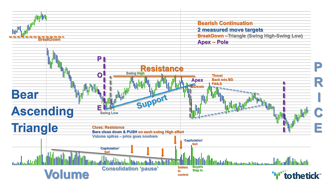
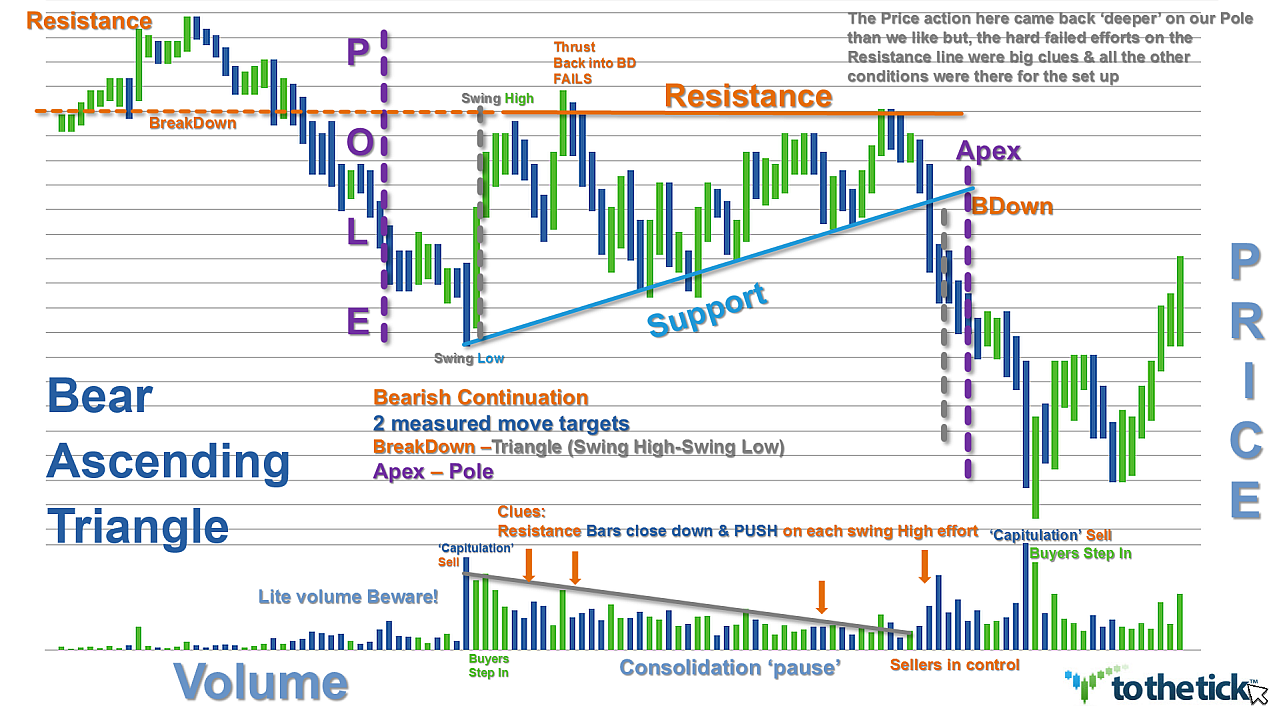
The Descending Triangle as a price pattern is fairly common as it presents frequently in all markets, time frames, & price ranges and tends to provide a great reward-to-risk ratio. Their versatility has made Descending Triangles available as either a bullish or bearish trend continuation pattern or a reversal pattern depending on the trading environment in the background.
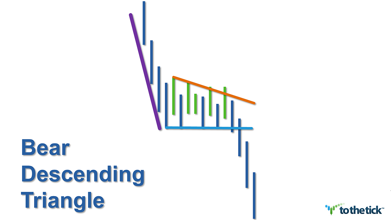
Visually Descending Triangles are characterized by a series of lower highs but the same lows. The horizontal lower trendline will experience multiple efforts as price support. The shape of the Descending Triangle is altered by the slope of the descending resistance line which ‘converges’ or; is inclined toward, the lower support line.
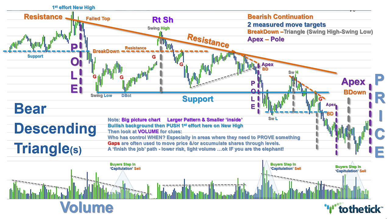
Descending Triangles vary in their duration, but will have at least two swing highs and two swing lows in price. Traders should be prepared to adjust the trendlines as needed with additional swings. Volume usually diminishes as the pattern develops. Buyers & sellers create this range-bound price action and eventually prices squeeze to an Apex. The closer to the apex price gets the odds for a breakdown of the immediate price range becomes more likely.
Traders can look to trade the Descending Triangle in numerous similar methods regardless of market environment but with several nuances can ‘stack the deck’ which increases the risk-to-reward ratio for profits. One of the best Descending Triangle performers statistically is the bearish continuation pattern seen in a downtrend.
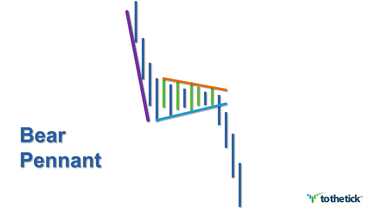
The bearish continuation pattern has 3 phases:
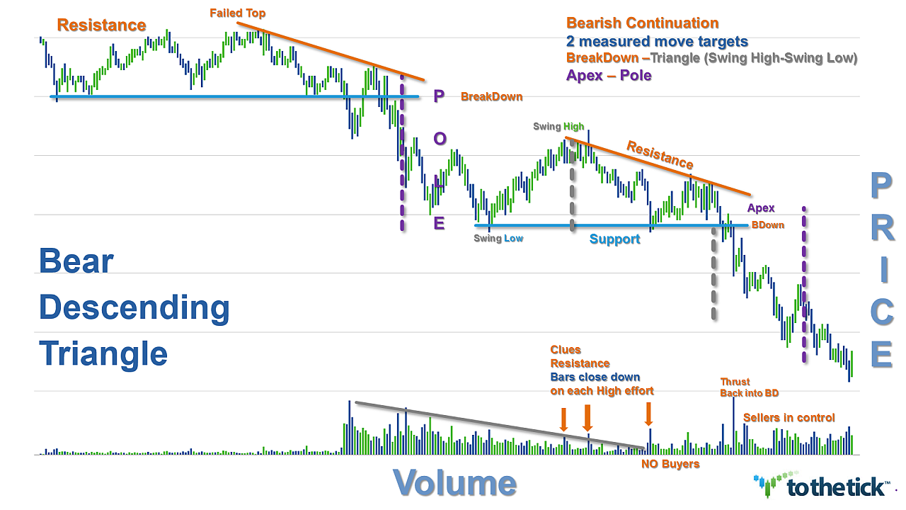
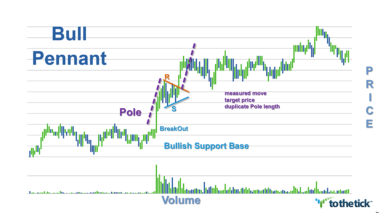
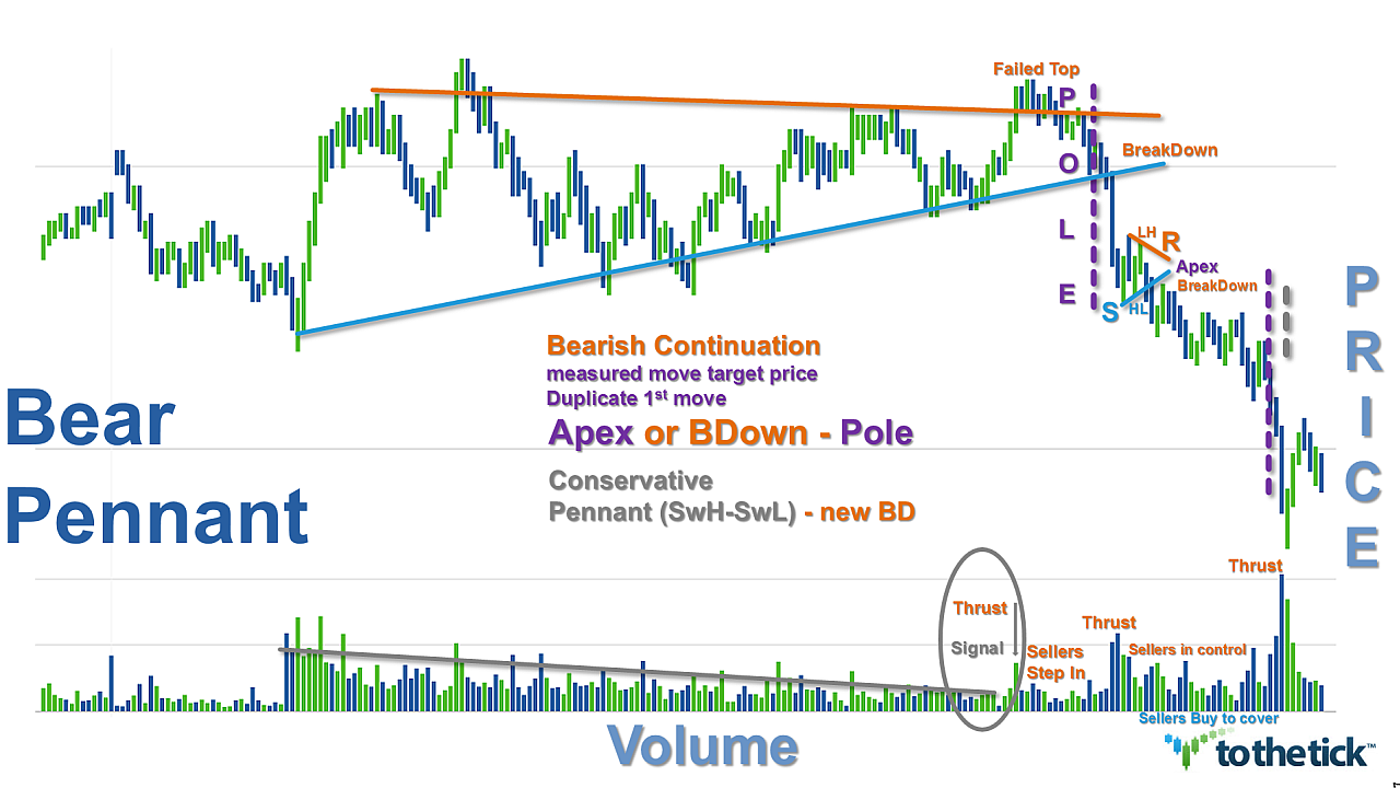
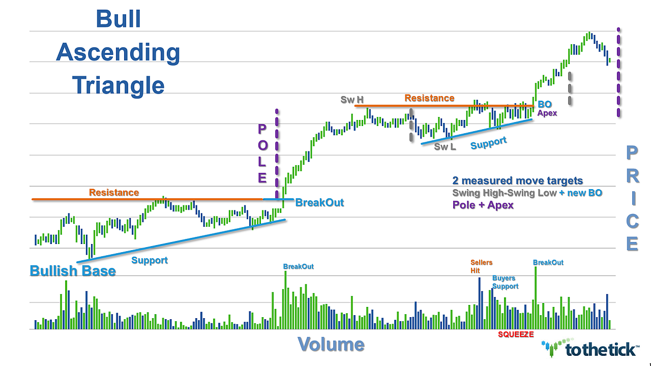
1) Background: A Strong impulsive, thrusting action with a surge in volume & price establishes a clear picture of the controlling bearish trend direction. In our descending triangle price pattern it is represented visually by a Pole. Deeper and more drama the better as the Pole is the Key to recognizing the potential for the continuation of the pattern. The Pole represents trend direction as well as its strength & often this pattern is initiated as a new breakdown in price from an established area & sellers are in control.
2) The second phase is a pause for consolidation of the action both in volume & price and is represented by the descending triangle. As traders we like to see this phase short in duration with only 2 or 3 swings while our price action is range bound maintaining the lower highs but the same lows shape and the volume is ‘resting’. The best breakouts occur at 50-75% of the triangle completion. Caution if the breakout is delayed until prices crowd into the apex as it is an indication of ‘balance’ or indecision between buyers & sellers.
3) The pattern confirms as a bearish continuation pattern if the action creates a new bearish breakdown with a surge again from the bears in both volume & price. The immediate lower support outlined by the descending triangle is the area traders look to see confirm the breakdown. Typically the action will mimic the volatility & energy experienced with the Pole creation. Volume considerations aid in recognizing further potential for the pattern.
Options for Trading the Descending Triangle as a bearish continuation pattern:
There are two methods of trading this pattern & it depends on your trading style.
Aggressive traders will enter short trades right around the upper resistance trendline once sufficient resistance has confirmed. The concept is that the trend is on your side & the bears are maintaining a ‘wall of resistance’ that continues to drop lower in price squeezing prices to the horizontal level of support.
This is a very accurate trade that usually has a great risk:reward ratio. Stop placement can be fairly tight right above resistance & can be adjusted downward accordingly. Note there is a ‘mid-line’ created using the apex as the measurement & traders can gauge success of the immediate swing based on this incremental value. When price approaches the lower horizontal support line you should gauge the momentum: if you see that the momentum is strong stick to the position. However, if you see that support prevails, close the trade & take your profits to maximize the reward.
The aggressive trading method can highly increase the profit potential of any triangle, as you can trade the same pattern several times & profit from the ranging swing movements inside the pattern. However, remember that as a trend continuation pattern traders want this consolidation triangle formation to be relatively brief. Two or 3 swings may turn into more with this triangle but the 50-75% formation concept aids trade consideration.
Conservative traders will enter a trade once the lower horizontal support line has been broken &/or the new breakdown has confirmed.
False breakouts do happen & confirmation needed is always a traders’ choice. Several methods that apply here for either intrabar &/or close bar options offered in sequence: breakdown below support price, retrace holds line, price clears breakdown swing low price, larger chart combination.
Stop placement considerations can be aggressively lowered after the breakdown of the price.
Measured Move Targets based on structure of Pole & the Bear Descending Triangle
Aggressive with Momentum & Volume: duplication of the original move or trader choice measurement of the Pole:
- Apex or BreakDown price (minus) Pole measure = target
- Pole measure = ((Pole Base price (minus) Pole Tip price))
Conservative:
- Apex or BreakDown price (minus) Descending Triangle measure = target
- Descending Triangle measure = (swing high price of triangle (minus) swing low price of triangle)
Examples: Descending Triangle as a bearish continuation pattern:


