| The vast majority of Americans are saving too little to fund their future retirement needs, and US defined contribution (DC) plans cannot single-handedly make up the difference. The American retirement system is in crisis. According to the Employee Benefit Research Institute (EBRI) and Mathew Greenwald & Associates, 57% of American workers surveyed in March 2013 reported that they had less than $25,000 in total savings and investments (not including the value of their primary residence or defined benefit plans). And fewer than 20% have between $25,000 and $99,000 in savings—retirement or otherwise. This disheartening scenario has led some in the retirement industry to a state of hopeless inertia, while others are determined to scrap the entire DC system and start afresh. But we disagree with pundits who say the existing DC system can’t be fixed. In our view, DC plans and participants already have the right tools to significantly improve retirement outcomes. And the changes that must be made don’t need to be painful. Indeed, combining only modest adaptations can effect major change. Losing Ground As explained in our recent research paper, The Future of DC Has Arrived: Improving Retirement Outcomes Now, just a few key variables drive a DC plan participant’s ability to achieve a comfortable retirement: the asset-allocation mix of the glide path, the savings rate before retirement, the spending rate after retirement, and age at retirement. When plan sponsors and participants make relatively small changes at the same time to the settings of these variables, retirement outcomes can improve dramatically. But under current capital-market conditions, without altering these variables, participants are losing ground—fast. The blue profile in the display below shows how a typical DC participant would fare in a historically normal market environment. The upward-sloping line describes the period during which the participant saves and his or her assets grow. The peak corresponds to retirement (in this case, at age 65). The slope of the line declines as the participant begins to spend assets during retirement. That’s just the median experience, however. The box-and-whiskers graphic below the profile shows that what the participant experiences depends a lot upon market conditions. In favorable conditions, the wealth lasts longer; in unfavorable conditions, not as long. Whiskers to the right and left represent best and worst cases under normal market environments (where the whiskers are not truncated by our 105-year age limit). At first blush, a median of age 91 seems like a good outcome for a typical participant. That’s three years longer than the expected lifespan in 2050! However, we don’t expect market returns to be normal for the foreseeable future. Bond returns in particular are likely to be low as interest rates rise off multi-decade lows. That must be factored into our analysis. With the green profile, we applied capital-market conditions consistent with these expectations. These lower expected returns cause the participant to run out of money four years before his or her average life expectancy of 88. Here we’re finally seeing the potential impact of the retirement crisis from another vantage point. And this is just the median outcome. In a poor market environment (25th percentile), the picture becomes even more abysmal. All Together Now But it doesn’t have to be this way. And the solution doesn’t have to be painful, either. (That may be the best news yet.) We began with the same basic assumptions underlying our display above and then modestly adjusted just three of our variables—the asset allocation, the savings rate and age at retirement—as shown in the display below. We encourage you to explore our recent research and recommendations. You’ll learn which variable adjustments are most and least successful, find examples of other potential combinations, and get practical advice for putting these ideas into place. Because together, we can turn this crisis around. And we can do it now. |
Wednesday, April 9, 2014
Critical Mass: Defined Contribution Can Transcend State of Crisis


Low cost-retail breaking support…what is the Big Picture message?
by Chris Kimble
|
CLICK ON CHART TO ENLARGE Three popular low cost retailers look to have created bearish wedges and are breaking support. Who and what do we blame this on? If low cost retail is starting to show fractional weakness, what about the other end of the retail world? What are the wealthy doing???
CLICK ON CHART TO ENLARGE Sotheby's can be viewed as a "wealth indicator." The above chart reflects that several times over the past 14-years, the S&P 500 was near a high, when Sotheby's was near resistance level (1). I'm not really into the blame game! I believe price is the only thing that pays and its worth keeping a close eye on retail at the high and low cost ends of the spectrum. The majority of GDP is driven by the consumer, consumption. An upside breakout by Sotheby's and the low cost retails could be a good sign for the economy. Maybe better weather will help out! |


Monetary Collapse and Silver Price Not So Orderly Rise
By: Hubert_Moolman
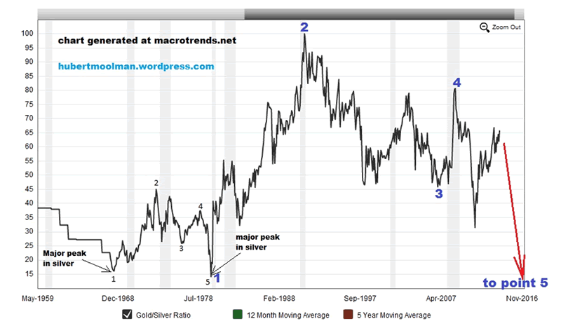
| We are about to see the end of our current international monetary system. Based on much of the evidence that I have written about previously, this appears to be a certainty. The systematic build-up of this current monetary order went together with the gradual phasing out of silver from the monetary order. This system, by its very nature, has been diverting value away from silver. To understand this, just imagine that silver was actually used as currency (like the paper Dollar is currently used); we would then have much less silver available for sale in the current silver market. Based on the demand and supply economic model, this would then mean that the silver price would rise significantly. The fact that silver is not held by central banks in significant quantities(or not held at all), puts it at a further disadvantage as compared with gold, in the current monetary regime. This is one of the reasons why silver is often mistakenly ignored as real money. The rise of silver and the collapse of the monetary system is inescapably linked. Therefore, if the collapse of the monetary system is not orderly, then the rise of silver's value will not likely be orderly. Collapse by definition suggests: to break or fall suddenly. This would suggest that when the time comes, silver will explode higher suddenly; for example, it could be possible that it rises $10, $20, $100 a day, until you can suddenly not buy it with fiat money. Interestingly, that actually means that silver and gold will reach the same price in fiat currency. So, if you are buying physical silver to hedge against the collapse of the monetary system, you are not buying it, and looking for the price to rise to about $30 at the end of this year. No, you are expecting a sudden explosion of price, you just do not know exactly when. The approach of the silver “stackers” is therefore, the best approach, given that a monetary collapse is inevitable. Due to the fractal nature of markets, I believe that what happened to silver during the 70’s was a prelude to this coming “end of the monetary system rally”. Silver went from $8.70 in August 1979 to $50 in January 1980. That was a phenomenal feat. Few goods (if any at all) have seen such a big increase in such a short time. Here, I will be using the Gold/Silver ratio to illustrate how the 70s price movements for silver (and gold) is a miniature version of price movements from 1980 to 2014. Below, is a 100-year Gold/Silver ratio chart:
On the chart, I have marked two patterns with points 1 to 5. It appears to be a relevant comparison, since both patterns start from a major peak in silver, 1968 and 1980, respectively. Both patterns started at the bottom of the 100-year range of this ratio, in fact, at a major bottom (1968 & 1980). The two patterns appear very similar – similar, but not identical. If the similarity continues, then the current pattern may complete at a point much lower than a ratio of 15. This could mean significantly higher silver prices just like it did in 1979/1980. There are more indicators that support the likelihood of a sudden and massive spike in silver due to collapse of the monetary system. |
From Financial Subprime To Global Energy Subprime
By: Andrew_McKillop
| Russian Sanctions and the Energy Subprime The U.S. subprime crisis of 2008, although it was cast in stone by 2006-2007, was a dreadful surprise for political deciders. It sprang at them from the murky world of Wall Street's frenzied brewing of incomprehensible financial instruments with names like algos, swaps and derivatives. The crisis surged at them from outside, forcing deciders to make a panic recourse to more government debt and massive new borrowing, to shore up the financial economy and then the real economy. We live with the enduring results, today. The “mature postindustrial democracies”, symbolized by the G7 group, are locked into slow growth-high unemployment for the long term. Sovereign debt goes on rising. The return of all-out panic on financial markets, for many analysts, is only a matter of time. The subprime crisis was a “backdoor crisis” for political deciders. But today's still-backdoor global energy rout which is set to surge from the shadows with the fast-reviving, Cold War vintage, political standoff between Russia and the West is a politicians' crisis, manufactured and willed by them, not one born in the murky backrooms of the Financial Herd. The politicians, this time, have no excuses The Coming Energy Subprime To be sure, for politician, this will be another crisis they didn't expect. They will of course claim to a man and woman, from Barack Obama to Angela Merkel and back again that “we didn't know” but their predictable future claims of pure innocence will not wash. The signs that a global energy crisis is being politically manufactured are now popping up, everywhere. Headline-grabbing statements are coming thick and fast about the so-called “switching” of European energy supplies, starting with frothy fantasist claims that Europe can “switch” to American gas, other LNG suppliers, and even to American and non-Russian oil supplies. In the US, this political fantasy is being fanned at the highest levels. US media is hailing the launch of Obama’s oil and gas offensive. New, impossible to finance, and even more impossible to build, pipeline projects to bring Central Asian, Middle Eastern and even West African gas or oil to Europe are being mooted. Europe's almost moribund nuclear power industry has been wheeled back on stage – using the shaky premise that atomic energy could loosen Russia's energy stranglehold on Europe. The bottom line for Europe, every time, is the continent will have to pay more for its energy – despite European energy prices already being among the highest in the world. Whether this is remotely possible is presently unimportant to political deciders, as they engage in a bizarre remake and follow-on to the Cold War. The real world of energy is rigorously placed on the back burner of an emerging political fantasy, because the EU is not currently prepared, neither technically nor in energy-economic terms, to buy exported energy from the US which under the most extreme optimistic scenarios will not be available in anything but tiny, near-symbolic quantities until at least 2017 for gas, and far into the 2020s for oil. Other non-Russian energy supplies face similar and basic problems of credibility. Political herd thinking is at least as skewed and dangerous as Wall Street herd thinking, enabling politicians to airily dismiss all “minor details”. Europe's energy transport and oil refining infrastructures, for starters, have been adapted to and based on large, reliable supplies of Russian oil and gas, for decades. Claiming this can be “switched' in an eyeblink of time is nonsense but politicians operate in that cloud cuckoo domain, especially at times of panic. The consensus view of energy-economists, not politicians, is that it would take at least ten years for even the most industrially and technically advanced EU countries, starting with Germany, to significantly reduce Russian energy dependence and significantly diversify supply sources, including American gas supply. And this would be on the understanding that heroically massive financing was first made available, to satisfy the political fantasy. Other LNG suppliers may “ramp up” a little faster than the US, but suggesting this can enable a major cut of EU dependence on Russian gas supply – anytime before about 2025 – is political dreaming. Russian oil supply to Europe (around 3.65 million barrels/day or 32% of total EU imports) will be yet more impossible to substitute and replace on a rapid basis. Crisis and Triage Energy price and energy financing impacts of a major shift in European energy away from Russian dependence presume that the US and Europe are ready and able to operate a new Marshall Plan. The fragile political notion that in a crisis, previously ignored or under appreciated investment opportunities will surge, almost from nowhere, carries its own major dangers because these opportunities are also imagined as offering a quick return on investment. The history of European nuclear power, starting with the Euratom Treaty of 1957, is a somber reminder that dreaming of energy “silver bullets” leads directly to politicians shooting themselves in the feet. There are no silver bullets, only lead ones. Europe, since Dec 2008, is already engaged on a slow-moving and uber-expensive energy transition towards non-fossil energy, that itself has racked up energy prices in most EU28 countries at 5 to 10 times the official CPI. European politicians can claim the transition plan is working – oil and gas, and electricity consumption go on falling in most EU28 countries. Europe is less dependent on imported fossil energy. But the main real world causes of this are economic decline, deindustrialization and mass unemployment. Asking if German industry, for example, is now prepared to pay more for gas from overseas, as domestic-produced electricity prices grow at historic rates and gas prices stay high, for the dubious pleasure of “punishing Putin”, is a billion-euro-question and German industry says no. The Baltic States, Poland, Romania, Bulgaria and Hungary, the Czech and Slovene Republics and other heavily Russian-dependent countries, with energy infrastructures often exclusively designed, built and operated using Russian gas and oil, would be the first to go. Germany's political elite knows this, and members of Merkel's cabinet, notably Sigmar Gabriel have already said that adapting energy infrastructures in Europe, away from Russian supply, will firstly need a massive seaboard LNG terminal-building programme to decompress and store the gas, followed by a major programme of building new pumping stations, with a sure and certain knock-on to prices for consumers and users. To date, showing the fragility of politicians' thinking, only Russian gas is targeted by “calls for switching supplies”. When Russian oil is added to the mix, Europe will shoot itself in the feet a second time. Oil prices, at least in Europe, will have to significantly grow for the continent to even begin a supply diversification strategy. With no surprise therefore, US president Obama's mounting calls for Europe to “switch energy supplies' coincided with his visit to Saudi Arabia. Obama publicly claimed that he came to Riyadh with an offer to help speed up the development of Saudi and Gulf state LNG export capacity in return for GCC countries bringing down gas export prices for delivery to Europe. This can for starters be called fantasist or very unlikely, but a major reduction in Europe's energy dependence on Russia will also need action to raise oil supplies from outside Russia. Global Gas OK, Oil Not OK Due to the subject being “technical” and therefore of no interest to politicians when they are in panic mode, global gas resources and supplies, including LNG, are most certainly growing. This implies prices can be cut and probably will be cut. World oil supply capacity has none of that political elbow-room. Even a cut by 15% or 20% in Russian oil supply to Europe would dramatically raise European oil prices but – also not obvious to politicians – a sharp drop in European oil consumption will inevitably reduce global oil prices. Oil prices are currently at least $10 to $15 per barrel above their energy-economic equilibrium price, for a host of reasons featuring Wall Street meddling with “financial oil assets”, but a cutback in oil prices to even $80 per barrel, and possibly much less if Europe shot itself in both feet with a crisis program of oil saving, would have devastating impacts in the oil sector. This would not only affect oil-sector investment, exploration, and development, but also directly impact several major oil exporting countries. Iraq tops the list, and Libya is another, followed by a long list of others including Nigeria and Venezuela, all of them dependent on economic life-support from high oil prices. Russia, almost certainly, would not cut its oil production, or exports, and would shift them to Asia as fast as it could, while Europe imposed “oil austerity”. The global impact would include a relatively steep drop in world oil prices – while European oil prices soared. This would trigger a potential runaway process of oil sector, and oil producer country turmoil, quickly leading to global cuts in oil supply. Oil price volatility would be a traders' dream and meal ticket, but the result would end with much lower oil prices. The Energy Subprime of 2014 would have begun. Spinoff and collateral energy-sector impacts would be followed very closely by financial and economic collateral damage. One simple example would be the increasingly probable use by the US of its SPR, strategic petroleum reserve, to export oil to Europe and to try capping the initial uptick in global oil prices resulting from sharply increased sanctions against Russia. The US would then import more oil to rebuild the SPR, again enabling and ensuring massive fluctuations of global oil prices, before they dropped like a stone. The US SPR currently contains about 700 million barrels of oil, and showing the direct political linkage, five million barrels were unloaded onto the market during the Washington visit of the acting interim Ukrainian Prime Minister Arseniy Yatsenyuk. Vastly larger amounts of the SPR's stock would need to drawn down then rebuilt, if the Punish Putin Programme was truly launched. Finally, by an almost supreme irony, Russia's economy would also be dealt a massive blow – certainly harming its oil and gas-sector investment and export capacity, if global oil prices even fell to $85 per barrel. The Russian national budget in 2014, saddled with $50 billion of expenses for the Sochi Olympics, was drawn up with an average price of $93 per barrel. The growing likelihood of oil and gas exporters, everywhere, shifting away from the dollar for their sales, would certainly be intensified by the knock-on of huge volatility of the US dollar's world value as the Energy Subprime surged. The really supreme irony, perhaps, is that throughout the 1948-1991 Cold War it almost never produced anything like the current menace to global energy security. As already noted, this is a politicians' crisis. It is manufactured by politicians – so in theory they should take all responsibility for its sequels, which will be massive. |
2 Stock Market Scenarios
by Tom Aspray
| As the Dow Industrials moved in and out of positive territory early Tuesday, the market internals stayed clearly positive, which was consistent with the higher daily close. This was enough to cause many of the technical studies, like the McClellan oscillator, to turn higher. The focus over the past few days has been on the steep drops in many of the high-flying technology and biotech stocks. Even with Tuesday’s bounce, stocks like Facebook, Inc. (FB) are still down close to 20% from their highs. Those who are convinced that this weakness is warning of a sharper decline or a bear market are likely looking to sell a further rally. Though a more extensive market correction is of course possible, the positive readings from both the weekly and daily NYSE Advance/Decline give no indication that the bull market is over. The sharp drop in the PowerShares QQQ Trust (QQQ) and high-profile stocks has caused an increase in bearish sentiment that I thought the market needed in January. The sentiment has certainly changed since late 2013 as many investors are once again scared of the stock market. In my opinion, the sideways pattern in the S&P 500 since early March is a pause in the uptrend, not a top. Of course, it is the technical readings that will ultimately determine the market’s next significant move. I see two likely paths for the market, and by early next week, there should be clear evidence of which path is now the most likely. Let’s look at what signs investors and traders should be now looking for in the week ahead.
Chart Analysis: The NYSE Composite has dropped below the 20-day EMA over the past two days as it is now down 2% from last Friday’s high.
The Spyder Trust (SPY) dropped to a low of $183.59 on Tuesday as the support zone (line f) was tested.
The Lennar Corp. (LEN) has been one of the strongest homebuilding stocks over the past six months and was recommended in early November (point 1).
The iShares Core S&P Small-Cap (IJR) was recommended on March 19 but was stopped out with Monday’s drop.
What It Means: If the market takes the bullish path, then we should get a further rally with strong market internals and any setbacks should be brief. If instead we get a weak rebound and the futures fail to move above the retracement resistance at 1861-1868, one will need to closely watch the key support in the A/D lines. If this support is broken, then a drop in the SPY to $180 or lower would not be surprising. Though it is possible that the correction in the iShares Core S&P Small-Cap (IJR) is already over, I would wait for confirmation. The buy levels in the Spyder Trust (SPY) recommended at the end of March have been reached. The long position in Lennar Corp. (LEN) resulted in over a 22% gain while the iShares Core S&P Small-Cap (IJR) was stopped out with a 4% loss. How to Profit: No recommendation for now. Portfolio Update: For the Spyder Trust (SPY) should be 50% long at $186.08 and 50% at $183.96, with a stop at $179.77. Stay tuned to my Twitter feed for updates on this position. |


Risk On, Regardless
by John Mauldin
| U.S. stocks leaped 30% last year, continuing the rally that commenced in March 2009 and elevated the S&P 500 index 173% from its recessionary low (Chart 1). By late 2013, many investors were in a state of euphoria, even irrationally exuberant about prospects for more of the same this year and seized on any data that suggested that robust economic growth here and abroad would underpin more of the same equity performance.
Optimistic ForecastsMany forecasts from credible sources accommodated them. The Organization for Economic Cooperation and Development in January said the leading indicators for its 34 members rose to 109.9 in November from 100.7 in October, foretelling faster economic growth in the first half of 2014 for the U.S., U.K., Japan and the eurozone. The International Monetary Fund in mid-January raised its global growth forecast for 2014 real GDP from its October estimate by 0.1 percentage points to 3.7%, with the U.S. (up 0.2 points to 2.2%), Japan (up 0.4 to 1.7%), the U.K. (up 0.6 to 2.4%), the eurozone (up 0.1 to 1.0%) and China (up 0.3 to 7.5%) leading the way. Outgoing Fed Chairman Ben Bernanke on January 3 said that the fiscal drag from federal and state fiscal policies that restrained growth in recent years was likely to ease in 2014 and 2015. Other deterrents such as the European debt crisis, tighter bank lending standards and U.S. household debt reductions were easing, he said. “The combination of financial healing, greater balance in the housing market, less fiscal restraint and, of course, continued monetary policy accommodation bodes well for U.S. economic growth in coming quarters.” A Wall Street Journal poll of economists found an average forecast of 2.7% growth in 2014, up from 1.9% in 2013 and the official forecast of the perennially-optimistic Fed, made before Christmas, called for 2.8% to 3.2% real GDP growth this year. Also, chronically-optimistic Barron’s, in its Feb. 17, 2014 edition, headlined its cover story, “Good News. The U.S. Economy Could Grow This Year At A Surprisingly Robust 4%. Forget The Snow. Consumers And Businesses Are Ready To Spend.” Many investors also believed that the U.S. economy was about to break out of the 2% real GDP rises that have ruled since 2010. Sentiment ShiftIt’s interesting that Barron’s ran this headline after investor sentiment shifted dramatically. It’s as if an iron curtain came down between the last trading day of 2013 and January 2014. A headline in the Feb. 5, 2014 Wall Street Journal screamed, “Turnabout on Global Outlook Darkens Mood.” As stocks flattened and then fell, people started to realize that economic growth last year was weak, rising only 1.9% from 2012 as measured by real GDP. The fourth quarter annual rate was chopped from the 3.2% “advance estimate” by the Commerce Department to 2.4%, and one percentage point of the 2.4% was due to the jump in net exports as imports fell due to domestic shale oil and natural gas replacing imported energy. Nevertheless, exports remain vulnerable to ongoing weakness in American trading partners. Also in the third quarter of 2013, 1.7 percentage points of the 4.1% growth was due to inventories. Given the disappointing Christmas sales, these were probably undesired additions to stocks and will retard growth this year as they are liquidated. Even the stated GDP numbers show this to be the slowest recovery in post-World War II history (Chart 2). And real median income has atypically dropped in this recovery, largely due to the slashing of labor costs by American business.
Pending home sales, which are contracts signed for future closings, peaked last May and had dropped considerably before cold weather set in this past winter while housing starts fell for a third straight month in February. Wary InvestorsWhile stocks soared in 2013, investors didn’t dig too deeply into corporate earnings reports, but now they are. As we’ve discussed in many past Insights, with limited sales volume increases in this recovery and virtually no pricing power, businesses have promoted profits by cutting costs, resulting in all-time highs for profit margins. Many investors are now joining us in believing that the leap in profit margins, which has stalled for eight quarters, may be vulnerable. They’re also paying more attention to the outlook for future profits and cash-generation as foretold by acquisitions and spending on R&D. Shareholders favor those companies that invest while penalizing companies that fall short. Per-share profits gains due to share buybacks are no longer viewed favorably. Furthermore, investors are aware that two-thirds of the 30% rise in the S&P 500 index last year was due to the rising P/E, with only a third resulting from earnings improvement. In mid-February, the S&P 500 stocks were trading at 14.6 times the next 12 months earnings, higher than the 10-year average of 13.9. As Insight readers may recall, we take a dim view of this measure since it amounts to a double discount of both future stock performance and analysts’ perennially-optimistic estimates of earnings. In December, Wall Street seers, on average, forecast a 10% rise in stocks for 2014, the average of the last 10 years. But the average forecasting error over the past decade was 12% with a 50% overestimate in 2008. That 12% error was larger than the average gain of 10%. Besides cost-cutting, the leap in profit margins has been supported by declining borrowing costs spawned by record-low interest rates. Low rates have also made equities attractive relative to plenty of liquidity supplied by the Fed and Chinese banks and shadow banks. Last May and June, stocks, bonds and other securities were shaken by the Fed’s talk of tapering its then-$85 billion per month worth of security purchases, in part because many assumed that also meant hikes in the central bank’s federal funds rate. But then the Fed then went on an aggressive offensive to convince investors that raising rates would be much later than tapering, and investors have largely shrugged off the credit authorities’ decision in December to cut its monthly purchases from $85 billion to $75 billion in January and by another $10 billion in February. The Fed’s decision in January came despite the recent signs of weak U.S. economic activity, weather-related or not, and indications of trouble abroad. Furthermore, although the Fed is still adding fuel to the fire under equities, it is adding less and less, and is on schedule to end its quantitative easing later this year. The Age of DeleveragingSo the zeal for equities persists but we remain cautious about the spread between that enthusiasm and the sluggish growth of economies around the globe. As in every year of this recovery, the early-in-the-year hope for economic acceleration that would justify soaring equities may again be disappointed, and real GDP is likely to continue to rise at about a 2% annual rate. Deleveraging after a major bout of borrowing and the inevitable crisis that follows normally takes a decade. The process of working down excess debt and retrenching, especially by U.S. consumers and financial institutions globally, is six years old, so history suggests another four years of deleveraging and slow growth. And, as we’ve noted many times in the past, the immense power of deleveraging is shown by the reality that slow growth persists despite the massive fiscal and monetary stimulus of recent years. Furthermore, although the Fed hasn’t started to sell off its immense holdings of securities, as it will need to in order to eliminate excess bank reserves, it is reducing the additions to that pile by tapering its new purchases. Consumers RetrenchIn the U.S., some have made a big deal over the uptick in domestic borrowing in the fourth quarter of 2013. Auto loans have risen, the result of strong replacement sales of aged vehicles, but sales are now falling. Student debt and delinquencies continue to leap (Chart 3). The decline in credit borrowing may be leveling, but what’s gotten the most attention was the rise in mortgage debt.
Since housing activity is falling, the mortgage borrowing uptick is due to fewer foreclosures and mortgage writeoffs as well as easier lending standards by some banks. They are under continuing regulatory pressure to increase their capital and slash their exposure to highly-profitable activities like derivatives origination and trading, off-balance sheet vehicles and proprietary trading, so banks are eager for other loans. Furthermore, the jump in mortgage rates touched off by the Fed’s taper talk has slaughtered the profitable business of refinancing mortgages as applications collapsed. Household debt remains elevated even though, as a percentage of disposable personal income, it has fallen from a peak of 130% in 2007 to 104% in the third quarter, the latest data (Chart 4). It still is well above the 65% earlier norm, and we’re strong believers in reversion to well-established norms. Even more so considering the memories many households still have of the horrors of excess debt and the losses they suffered in recent years.
Furthermore, given the lack of real wage gains and real total income growth, the only way that consumers can increase the inflation-adjusted purchases of goods and services is to reduce their still-low saving rate or increase their still-high debts. Furthermore, consumer confidence has stabilized after its recessionary nosedive but remains well below the pre-recession peak. So, in rational fashion, consumers are retrenching, with retail sales declines in December and January and slightly up in February. That’s much to the dismay of retailers who appear to be stuck with excess merchandise, as reflected in their rising inventory-sales ratio. And recall that retailers slashed prices on Christmas goods right before the holidays to avoid being burdened with unwanted inventories. Of course, there’s the usual argument that cold winter weather kept shoppers at home. But that's where they could order online, yet non-store retail sales—largely online purchases—actually fell 0.6% in January in contrast to the early double-digit year-over-year gains. We’re not forecasting a recession this year but rather a continuation of slow growth of about 2% at annual rates. But with slow growth, it doesn’t take much of a hiccup to drive the economy into negative territory. And indicators of future activity are ominous. The index of leading indicators is still rising, but a more consistent forecaster—the ratio of coincident to lagging indicators—is falling after an initial post-recession revival. HousingHousing activity is retrenching, with pending sales, housing starts and mortgage applications for refinancing all declining. Also, as we’ve discussed repeatedly in past Insights, the housing recovery has never been the on the solid backs of new homeowners who buy the starter houses that allow their sellers to move up to the next rung on the housing ladder, etc. Mortgage applications for house purchases, principally by new homeowners, never recovered from their recessionary collapse. Multi-family housing starts, mostly rental apartments), recovered to the 300,000 annual rate of the last decade but single-family starts, now about 600,000, remain about half the pre-collapse 1.1 million average. Many potential homeowners, especially young people, don’t have the 20% required downpayments, are unemployed or worry about their job security, don’t have high enough credit scores to qualify for mortgages, and realize that for the first time since the 1930s, house prices nationwide have fallen—and might again. Prices have recovered some of their earlier losses (Chart 5), but in part because lenders have cleaned up inventories of foreclosed and other distressed houses they sold at low prices. In any event, prices weakened slightly late last year.
Some realtors complain that existing home sales are being depressed by the lack of for-sale inventory. Nevertheless, inventories of existing houses rose from December to January by 2.2%. Fannie Mae reported that its inventories of foreclosed properties rose for the second time in the last three months of 2013 as sales fell and prices dropped for the first time in three years. Also, with the percentage of underwater home mortgage loans dropping—to 11.4% in October from 19% at the start of 2013—potential sellers may emerge now that their houses are worth more than their mortgages. Income PolarizationRising equity prices persist not only in the face of a weak economic recovery, including a faltering housing sector, but also a recovery that has been benefiting relatively few. The winners are found in the financial sector and those with brains and skills to succeed in today’s globalized economy that put the low-skilled in direct competition with lower-paid workers in developing lands. The ongoing polarization of incomes illustrates this reality eloquently. Chart 6 shows that the only share of income that continues to increase is the top quintile. All of the four lower quintiles continue to lose shares. Income polarization is very real in the minds of many. It probably doesn’t bother people too much as long as their real incomes are rising. Sure, their shares of the total may be falling but their purchasing power is going up. But now both the shares and real incomes of most people are falling.
Resentment is being augmented by huge pay packages of the CEOs of big banks that were bailed out by the federal government. The number of billionaires in the world, most of them in the U.S., rose from 1,426 in 2012 to 1,645 last year, far surpassing the 1,125 in 2008. The leaders of financial institutions and other businesses appear to be setting themselves up as easy targets for President Obama, who is fanning the flames of income inequality with some rather pointed rhetoric. Last year, he said, “Ordinary folks can’t write massive campaign checks or hire high-priced lobbyists and lawyers to secure policies that tilt the playing field in their favor at everyone else’s expense. And so people get the bad taste that the system is rigged, and that increases cynicism and polarization, and it decreases the political participation that is a requisite part of our system of self-government.” Minimum WagesNevertheless, pressure to reduce income inequality remains strong and the Administration’s attempts to raise minimum wages are an obvious manipulation of its efforts in this area. The President issued an executive order raising minimum wages on new federal contracts and in his State of the Union address called for an increase in the federal minimum wage from $7.25 per hour to $10.10 in 2016. The effects of the minimum wage have been hotly debated for years, no doubt since it was first introduced in 1938, and during each of the nearly 30 times it’s been raised since then, the latest in 2009. Liberals argue that it increases incomes and purchasing power and lifts people out of poverty. Conservatives believe that higher labor costs reduce labor demand, encourage automation, the hiring of fewer high-skilled people and result in more jobs being exported to cheaper areas abroad. A new study by the bipartisan Congressional Budget office found that both arguments are true. The report predicts that 16.5 million workers would benefit from the President’s proposal and lift 900,000 out of poverty from the 45 million projected to be in it in 2016. Earnings of low-paid workers would rise $31 billion. Since low-income people tend to spend most of their paychecks, higher consumer outlays would result. But the CBO also predicts that the proposed rise in minimum wages would eliminate 500,000 jobs and because of their income losses, the overall effect on wages would be an increase of only $2 billion, not $31 billion. Also, 30% of the higher pay would go to families that earn three times the poverty level since many minimum wage workers are second earners and teenagers in middle- and upper-income households. And higher labor costs would retard profits and result in price increases, muting the effects of more spending power by higher minimum wage recipients. In any event, it appears that the proposed jump in the minimum wage from $7.25 to $10.10 would cause a lot of distortions and no doubt unintended consequences for a net gain in low-wage earnings of just $2 billion. That’s less than a rounding error in the $17 trillion economy and would do almost nothing to narrow income inequality. Regardless of the merits, the evidence suggests that higher federal minimum wages are probably in the cards. UnemploymentBy his promotion of an increase in the minimum wage, the President reveals his preference for higher pay for those with jobs over the creation of additional employment. This seems strange politically in an era when unemployment remains very high, especially when corrected for the fall in the labor participation rate (Chart 7).
As also noted earlier, the cutting of costs, especially labor costs, has been the route to the leap in profit margins to record levels and the related strength in corporate earnings in an era when slow economic growth has curtailed sales volume gains, the absence of inflation has virtually eliminated pricing power and the strengthening dollar is creating currency translation losses for foreign and export revenues. ObamacareOne reason for the Administration’s emphasis on income inequality and raising the minimum wage may be to divert attention from the troubled rollout of Obamacare. True, big new government programs always have bugs but the Administration’s overconfidence in initiating Obamacare and the lack of testing of its website is notable. Also, Obama promised that "if you like your plan, you can keep it," but many, in effect, are being forced into high-cost but more comprehensive policies. To reduce the flack it is receiving, the Administration plans for a second time to allow insurers to sell policies that don't comply with the new federal law for at least 12 more months. Another problem for the Administration is that Obamacare will reduce working hours by the equivalent of 2.5 million jobs by 2024, according to the CBO. People will work less in order to have low enough incomes to qualify for Obamacare health insurance subsidies. Also, older workers who previously planned to keep their jobs until they could qualify for Medicare will cut back their hours or leave the workforce entirely in order to qualify for Medicare, the federal-state programs for low-income folks that are being expanded under Obamacare. Hospitals may benefit from Obamacare. Under a 1970s-era law, they must shoulder the emergency room costs of the uninsured, but those risks are being shifted to insurers and taxpayers. Taxpayers will also pay more since 25 states have refused to expand Medicaid, leaving the federal government to set up and run the enhanced programs. More Medical CostsNot only is Obamacare proving unaffordable for many but also promises huge additional costs for the government. Healthcare outlays have been leaping and were already scheduled to continue skyrocketing under previous laws as the postwar babies retire and draw Medicare benefits while Medicare costs leap. The original projected jump in insured people under Obamacare was not projected by the Administration to increase the government’s health care costs appreciably from what they otherwise would have been. You might recall, however, that when Obamacare was enacted, we noted in Insight that after Medicare was introduced in 1967, the House Ways and Means Committee forecast its cost at $12 billion in 1990. It turned out to be $110 billion—nine times as much. Obamacare is no doubt destined for the same cost overruns. Acting in what they perceive to be their best economic interest, elderly people and those in poor health—but not healthy folks—have persevered through the government website labyrinth to sign up for healthcare exchanges. They're taking advantage of the law's ban on discrimination based on health conditions and age-related premiums. Many healthy people, on the other hand, don’t want to pay higher premiums than on their existing policies, and many of those who are uninsured want to remain so. So, to make insurance plans economically viable, in the absence of younger, healthy participants to pay for the ill ones, insurers will need to be subsidized by the government or premiums will need to be much higher and therefore much less attractive to all but the chronically ill. This self-reinforcing upward spiral in health care insurance premiums would no doubt also require substantial government subsidies. Aetna expects to lose money this year on its health care exchanges due to enrollment that is skewed more than expected to older people. Many of the young, healthy people needed to make Obamacare function as a valid insurance fund would rather pay the penalty, which begins at $95 for this year, and continue to use the emergency room instead for medical treatment. Even the escalation of the penalty from $150 in 2014 for a single person earning $25,000 to $325 in 2015 and $695 in 2016 may not spur sign-ups. In total, there are 11.6 million people ages 18 to 34 who are uninsured, a big share of the 32 million Obamacare is intending to insure. Some employers, especially smaller outfits, plan to encourage employees to sign up for exchanges and drop company plans. The government could push up the now-low penalties for not signing up to force participation, but we doubt that the Administration would risk the ire of an already-unhappy public in pursuing this approach. On balance, the taxpayer cost of Obamacare seems destined to exceed vastly the $2 billion originally projected gap. The FedThe Fed is on course to continue reducing its monthly purchases of securities and at the current rate, would cut them from $65 billion at present to zero late this year. The minutes of the Fed’s January policy meeting indicate that it would take a distinct weakening of the economy to curtail another $10 billion cut in security purchases in March. The tapering of the Fed’s monthly security purchases only reduced the ongoing additions to the staggering pile of $2.5 trillion in excess reserves. That’s the difference between the total reserves of member banks at the Fed, created when the central bank buys securities, and the reserves required by the bank’s deposit base. Normally, banks lend and re-lend those reserves and each dollar of them turns into $70 of M2 money. But with banks reluctant to lend and regulators urging them to be cautious while creditworthy borrowers are swimming in cash, each dollar of reserves has only generated $1.4 in M2 since the Fed’s big asset purchase commenced in August 2008. At present, those excess reserves amount to no more than entries on the banks’ and the Fed’s balance sheets. But when the Age of Deleveraging ends in another four years or so and real GDP growth almost doubles from the current 2% annual rate, those excess reserves will be lent, the money supply will leap and the economy could be driven by excess credit through full employment and into serious inflation. So as the Fed is well aware, its challenge is, first, to end additions to those excess reserves through quantitative easing and then eliminate them by selling off its huge securities portfolio. This will be Yellen’s major job, assuming she's still chairwoman in coming years. Raise Rates?Last spring, when the Fed began to talk of tapering its monthly security purchases, investors assumed that to mean simultaneous increases in interest rates, so Treasury notes and bonds sold off as interest rates jumped. In the course of 2013, however, the Fed’s concerted jawboning campaign convinced markets that the two were separate policy decisions and that rate-raising was distant. Still, as in almost every year since the great rally in Treasury bonds began in 1981 (Chart 8), the chorus of forecasters at the end of 2013 predicted higher yields in 2014.
“Treasury Yields Set To Resume Climb,” read a January 2 Wall Street Journal headline. It cited a number of bond dealers and investors who expected the yield on 10-year Treasury notes to rise from 3% at the end of 2013 to 3.5% a year later or even 3.75%. They cited a strengthening economy, Fed tapering and higher inflation. Many investors rushed into the Treasury’s brand new floating rate 2-year notes when they were issued in January in anticipation of higher rates. About $300 billion in floating-rate securities already existed, issued by Fannie Mae and Freddie Mac as well as the U.K. and Italian governments. Nevertheless, Treasurys have rallied so far this year as the 10-year note yield dropped to 2.6% on March 3 from 3.0% at the end of 2013. U.S. economic statistics so far this year are predominantly weak, as noted earlier. Emerging markets are in turmoil. China’s growth is slowing. InflationBesides concerns over the sluggish economic recovery and chronic employment problems, the Fed worries about too-low inflation, which remains well below its 2% target, and over the threat of deflation. As discussed in our January 2014 Insight, there are many ongoing deflationary forces in the world, including falling commodity prices, aging and declining populations globally, economic output well below potential, globalization of production and the resulting excess supply, developing-country emphasis on exports and saving to the detriment of consumption, growing worldwide protectionism including competitive devaluation in Japan, declining real incomes, income polarization, declining union memberships, high unemployment and downward pressure on federal and state and local government spending. Very low inflation is found throughout developed countries (Chart 9). It ran 0.8% in the eurozone in January year over year, well below the target of just under 2%. In Germany, where employment is high, inflation was 1.2% but lower in the southern weak countries with 0.6% in Italy, 0.3% in Spain and a deflationary minus-1.4% in Greece in January from a year earlier. In the U.K., inflation in January at 1.9% was just below the Bank of England’s 2% target.
Chronic Deflation DelayedWe’ve noted in past Insights that aggressive monetary and fiscal stimuli probably have delayed but not prevented chronic deflation in producer and consumer prices (see “What’s Preventing Deflation?,” Feb. 2013 Insight). Still, this year may see the onset of chronic global deflation. And it will probably be a combination of the good deflation of new technology- and globalization-driven excess supply with the bad deflation of deficient demand. Why do the Fed and other central banks clearly fear deflation and fight so hard to stave it off? There are a number of reasons. Steadily declining prices can induce buyers to wait for still-lower prices. So, excess capacity and inventories result and force prices lower. That confirms suspicions and encourages buyers to wait even further. Those deflationary expectations are partly responsible for the slow economic growth in Japan for two decades. Central banks also worry that with deflation, it can’t create negative interest rates that encourage borrowers to borrow since, then, in real terms, they’re being paid to take the filthy lucre away. Since central bank target rates can’t go below zero, real rates are always positive when price indices are falling. This has been a problem in Japan many times in the last two decades (Chart 10). Furthermore, credit authorities fret that if chronic deflation sets in, it can’t very well raise interest rates. That means it would have no room to cut them as it would prefer when the next bout of economic weakness threatens.
Central banks also are concerned that deflation raises the real value of debts and could produce considerable financial strains in today’s debt-laden economies. In deflation, debt remains unchanged nominally, but as prices fall, it rises in real terms. Since the incomes and cash flows of debtors no doubt fall in nominal terms, their ability to service their debts is questionable. This makes banks reluctant to lend. Governments also worry about the rising real cost of their debts in deflation, especially when slow growth makes it difficult to reduce even nominal debts in relation to GDP. This is the dilemma among the Club Med eurozone countries. Deflationary cuts in wages and prices make them more competitive but raises real debt burdens. Emerging Markets: Sheep and GoatsAs noted earlier, the agonizing reappraisal of emerging economies by investors commenced with the Fed’s taper talk last May and June. Investors have been forced to separate well-managed emerging economies, the good guys, or the Sheep that, in the Bible, Christ separated from the bad guys, the Goats with poorly-run economies. Our list of Sheep—South Korea, Malaysia, Taiwan and the Philippines—have current account surpluses, which measure the excess of domestic saving over domestic investment. So they are exporting that difference, which gives them the wherewithal to fund any outflows of hot money. The Sheep also have stable currencies against the U.S. dollar, moderate inflation and fairly flat stock markets over the last decade. Also, with their current account surpluses, the Sheep haven’t been forced to raise interest rates in order to retain hot money. In contrast, the Goats have negative and growing current account deficits. These countries include the “fragile five”—Brazil, India, Indonesia, South Africa and Turkey—with basket case Argentina thrown in for good measure. They also have weak currencies, serious inflation and falling stock markets on balance. These Goats rely on foreign money inflows to fill their current account deficits, so when it leaves, they’re in deep trouble with no good choices. They’ve raised interest rates to try to retain and attract foreign funds. Higher rates may curb inflation and support their currencies but they depress already-weak economies while any strength in currencies is negative for exports. The alternative is exchange controls, utilized by Argentina as well as Venezuela. That’s why Argentina hasn’t bothered to increase its central bank rate. But these policies devastate already-screwed up economies. In Argentina, artificially-low interest rates and soaring inflation encourage Argentinians to spend, not save. Inflation is probably rising at about a 40% annual rate this year, up from 28% in 2013 but officially 11%. Purchasers are frustrated because retailers don’t want to sell their goods, knowing they’ll have to replace inventories at higher prices—if they can obtain them. Who Gives? Who Gets?In some ways, even the Goats among emerging economies are better off than they were in the late 1990s. Back then, many had fixed exchange rates and borrowed in dollars and other hard foreign currencies. So they didn’t want to devalue because that would increase the local currency cost of their foreign debts. Consequently, they all were vulnerable and fell like dominoes when Thailand ran out of foreign currency reserves in 1997. That touched off the 1997-1998 Asian crisis that ultimately spread to Russia, Brazil and Argentina. Today, less foreign borrowing, more debts in local currencies and flexible exchange rates make adjustments easier. Still, as discussed earlier, the sharp currency drops that are seen promote inflation, but raising interest rates to protect currencies depresses economic growth. Either way, it's no-win in Goatland. Furthermore, as our friends at GaveKal research point out, current account balances globally are a zero sum game, so if the Goats’ current account deficits decline, other countries’ balances must weaken. This is difficult in an era of slow growth in global trade. Which countries will volunteer to help out the Goats? Not likely the Sheep. Not the U.S. As noted earlier, the Fed has said clearly that the emerging countries are on their own. China isn’t likely as overall growth slows and both import and export order indices in China's Purchasing Managers Index have dropped below 50, indicating contraction. Furthermore, China maintains her mercantilist bias and isn’t overjoyed with her much diminished recent current account and trade balances. A collapse in oil prices would transfer export earnings from OPEC to energy-importing Goats but oil shocks as a result of a Middle East crisis or an economic collapse and revolution in Venezuela seem more likely. Japan is going the other way, with the Abe government’s trashing of the yen designed to spike exports, reverse the negative trade balance and the soon-to-go-negative current account. The eurozone is also unlikely to help the Goats due to its slow growth and attempts by the Club Med South, mentioned earlier, to become more competitive and improve their trade balances. |


Treasuries fall as Fed prepares to sell $21 billion in notes
By Cordell Eddings and Susanne Walker
| Treasuries fell for the first time in five days as the U.S. prepared to sell $21 billion of 10-year notes an hour before the minutes of the Federal Reserve’s last policy meeting are released. The securities yielded 2.72 percent in trading before the 1 p.m. auction, compared with the 2.73 percent high yield at the last government sale on March 12. Treasuries have rallied since the March employment report released April 4 showed the U.S. added fewer jobs than forecast, easing concern the Fed would accelerate its winding down of monetary stimulus. “The supply, the better tone of the equity market and the uncertainty about the Fed minutes are weighing on the market,” said Adrian Miller, director of fixed-income strategies at GMP Securities LLC in New York. “The market has been very cautious, and wants to see what the minutes have to say as it continues to try to understand the Fed’s intentions.” The benchmark 10-year yield rose three basis points, or 0.03 percentage point, to 2.71 percent as of 9:39 a.m. in New York, according to Bloomberg Bond Trader prices. The 2.75 percent note due in February 2024 fell 1/4, or $2.50 per $1,000 face amount to 100 10/32. The yield declined 12 basis points during the previous four days. The Standard & Poor’s 500 Index of stocks rose 0.3 percent. Market View “U.S. bonds are trading cheaper,” said Craig Collins, managing director of rates trading at Bank of Montreal in London. “We do have supply on the horizon. We have tended to trade better into supply, but there is a concession this morning as people are looking for the Fed minutes to have a more hawkish tone.” The Treasury sold three-year debt yesterday, and it plans to auction 30-year bonds tomorrow. With today’s 10-year note, the sales total $64 billion. A the previous auction of 10-year debt, investors bid for 2.92 times the amount offered in March, the highest level in a year at the monthly sales. Today’s sale is a re-opening of the 10-year note sold Feb. 12. The auctions will benefit from money managers reinvesting funds paid out to them from maturing securities, said John Gorman, head of dollar-denominated interest-rate products for Asia at Nomura Holdings Inc. in Singapore. The company is one of the 22 primary dealers that underwrite the U.S. debt. New Cash Investors hold $50.5 billion of Treasuries maturing on April 15, while the U.S. is raising $13.5 billion of new cash. When the government issued this combination of securities in March, the sales also totaled $64 billion, though half of it was comprised of new cash. Ten-year yields may rise to 3.25 percent in the next three months as U.S. employment gains improve, Gorman said. Fed policy makers at their March 18-19 meeting cut monthly bond purchases by $10 billion to $55 billion. Fed Chair Janet Yellen said the central bank may start to increase interest rates “around six months” after ending its asset buying. The central bank is winding down the stimulus program it has used to support the economy, while keeping its target for overnight lending between banks in a range of zero to 0.25 percent since 2008. The Fed’s preferred inflation gauge, personal consumption expenditures, dropped to 0.9 percent in February from a year earlier, the lowest since October, according to data released on March 28. “Bond market participants expect only limited inflation,” said Yoshiyuki Suzuki, the head of fixed income in Tokyo at Fukoku Mutual Life Insurance Co., which has the equivalent of $59.4 billion in assets. “If market participants start to believe the Fed will increase interest rates, long-term yields will go up, but it will be limited.” The difference in yields on 10-year notes and inflation- protected debt, known as the break-even rate, was at 2.12 percentage points, almost the lowest level since Feb. 7. |
The Stock Market and Dow Theory
By: Tim_Wood
| I have recently received a number of e-mails, phone calls and texts asking if we have recently seen a “Dow Theory Buy Signal.” As I understand it, this question was prompted as a result of the Industrials and the Transports having moved to new intraday highs last week. I want to explain each and every issue with this alleged “Dow Theory Buy Signal.” Then, I will walk you through the Dow Theory events that have followed in the wake of the 2009 low and where we are now in accordance with Dow Theory. First and foremost, there is no such thing as a Dow Theory “buy” or “sell” signal. Such terminology was never used in any of the writings by our Dow Theory Founding Fathers. Fact is, the Dow Theory Founding Fathers did not use a move above or below a secondary high or low point as a buy or sell signal. This is a myth. Rather, they established positions on weakness at what they termed “buy spots” and moves above previous highs were used as confirmation, not as a “buy signals.” There is no question, the Dow Theory Founding Fathers clearly advocated establishing positions upon “dullness on declines after secondary reactions.” Here is a direct quote on what they termed “buy spots.” “Our theory of buying in a bull market, which all readers should know by this time, is to take on stock when, after a reaction, trading becomes dull on further recessions.” The notion of Dow Theory “buy and sell signals” after a move above or below a previous low is simply wrong and is a product that has evolved from a lack of understanding and misapplication of Dow theory over the years. The next issue with an alleged “buy signal” having occurred last week, is that the Industrials moved to a new high only on an intraday basis. The Dow Theory Founding Fathers used the closing price only. In fact, in those days, only the close was recorded. So here too, to call an intraday movement above a previous intraday high an alleged “buy signal,” is invalid. Per the Dow Theory Founding Fathers, it is clearly the close that counts. According to Dow Theory, once a primary trend change occurs, that trend is considered to be “in force” until it is “authoritatively reversed.” According to Dow theory, an authoritative reversal requires a joint move below or above a previous secondary high or low point, depending on whether it is a bullish or bearish primary trend that is being reversed. So, even if you were to erroneously call a move above a previous secondary high point on an intraday basis a “buy signal,” since we have not seen an “authoritative reversal” of the previously established primary bullish trend change, an intraday move above a previous high could not trigger another alleged “buy signal” if the existing “buy signal” was never reversed. Bottom line, we did not have a Dow Theory “buy signal” last week. With this behind us, I want to walk you through the Dow theory events since the 2009 low in order to show you where we are in accordance with Dow theory and how we got here. Following that Dow Theory non-confirmation, the averages jointly closed below their previous secondary low points on August 4, 2011, which triggered a Dow Theory Bearish Primary Trend Change. When this occurred, I did acknowledge that it was a bonafide bearish trend change, but I also stated in articles and interviews that “ Not all Dow Theory Primary Trend Changes were created equally.” I further stated that I had to “discount this primary trend change” and that in spite of my longer-term bearish views I actually looked for the market to move above the previous highs once the next intermediate-term cycle and secondary low point was seen. This was documented in interviews and articles on various websites and in great detail to my subscribers in the monthly research letter.
In spite of my longer-term bearish views, I was able to make that call simply as a result of my statistical based research and the fact that none of the DNA Markers associated with major long term tops were seen in conjunction with that Dow Theory bearish trend change. Point being, while the statical based DNA Markers can be used to tell us when we have seen a major top, their absence tells us when we have not. Just as their absence and the statistics suggested, the anticipated low was seen in October and higher prices followed with the Industrials moving to a new recovery high in February 2012. However, at that point the Transports had not confirmed the continued advance seen by the Industrials. As a result, since the previously establish bearish trend change had not been “authoritatively reversed” by a joint close above the previous secondary high points, the previously established bearish trend change officially remained “in force.” Finally, as the missing DNA Markers suggested, higher prices prevailed and on January 18, 2013 both averages closed above their previous secondary high points. As a result, the August 4, 2011 bearish primary trend change was “authoritatively reversed” with a bullish primary trend change. From that point both averages moved higher throughout 2013 and into their last joint closing high, which occurred on December 31, 2013 at 16,576.66 on the Industrials and at 7,400.57 on the Transports. This joint secondary high point was followed by further strength on behalf of the Transports into their January 23, 2014 high at 7,569.89, at which point, both averages moved down into their early February lows. From those lows the Transports have yielded a higher close, which occurred on April 2, 2014 at 7,695.51. But, the high close for the Industrials in association with the advance out of the February low occurred on April 2, 2014, which occurred at 16,573.00, falling short of the December 31, 2013 close. As a result, rather than a totally erroneous Dow Theory “Buy Signal” having occurred in association with the advance last week, fact is, we actually have an upside Dow Theory non-confirmation in place. Robert Rhea wrote, “a wise man lets the market alone when the averages disagree.” Now, this non-confirmation could be mended, but until it is, it stands. Also, the possibility exists that this could prove to be just another correction that is followed by higher prices. This all depends on whether we see the statistical based DNA Markers and the associated structural setup solidified. Now as to the current market, I continue watching for my statistical based DNA Markers and the necessary structural developments to solidify a top. As I have maintained all along, until such time, the advance will continue. Cyclically speaking, which has absolutely nothing to do with Dow theory, the advance out of the 2009 low is now the longest 4-year cycle advance in stock market history. I maintain that the rally out of the 2009 low has not been a secular bull market and that it is apt to ultimately result in a manufactured financial holocaust. Once the proper statistical based DNA Markers and structural setup are in place, I truly find the potential downside fallout terrifying. There is no doubt in my mind that this advance has NOT been a secular bull market and that the decline out of this very extended 4-year cycle top has the potential to dwarf the destruction seen in association with the decline into the 2009 4-year cycle low. If you want to know more about the statistical based research in which I base this opinion or the specifics on the DNA Markers and the structural setup that will eventually cap this advance, that research is available at cyclesman.com through the subscription based research letters. |
Oil independence for U.S?
By Phil Flynn
| The Energy Information Administration says that tight oil (NYMEX:CLK14) production of shale production as it is known will mean that net imports share of liquid fuels will reach a big goose egg! That is a major achievement. The EIA is predicting that the U.S. will be totally independent by 2037! Yet we can celebrate another day because in short term oil is more focused on the short term future. Oil rose on geopolitical fears and disappointment that the Energy Information Administration is cutting back their outlook for US oil production for this year. The Energy Information Administration lowered its U.S. oil production to mere 8.37 million barrels a day the highest in 40 years but less than a previous forecast. They also adjusted demand slightly higher to 18.9 million barrels per day. Yet the American Petroleum Institutes is reminding us that there is no shortage of oil in the United States. The API reported that US crude supply rose 7.1 million barrels last week, The Increase was led by a surge in US oil imports that increased by 1 million barrels a day as things get back to normal in the Gulf Coast after the reopening of the Houston Shipping Channel. We also saw a rather surprising increase in Cushing Oklahoma supply of 204,000 barrels. The API reported that Gasoline stocks fell by a hefty 3.6 million barrels a day. It seems that even as crude supply increased refiners did not quite rebound from Gulf related shutdowns. On top of that seasonally gas supply's fall as we sell out those cheap winter blends. Refinery runs perked up by 87.9 percent that seems to suggest decent gas demand. The Energy Information Administration big picture sees gas price slightly lower this summer. They expect retail gasoline prices to average $3.57 a gallon in the April-to-September summer driving season, a penny less than last summer! A whole penny!! Put that in your loafer. Distillate stocks rose so the long RBOB short Diesel spread should continue to work. The spread got support from a Bloomberg report that Exxon Mobil Corp.'s refinery in Baton Rouge, Louisiana, extending planned work on crude unit and coker from April 9. Ethanol will also watch today's grain report with interest. Ethanol surge inspired in part by rail delays will focus on the rebound in corn prices. Corn surged in yesterday's trade as the market is fearing a bullish report. The USDA in its monthly supply/demand should lower its forecasts of U.S. 2013/14 corn and soybean ending stocks due to strong US exports. Corn and bean exports have blown away expectations. On top of that winter weather has kept farmers out of the field so the expectaions are that planting progress will be slow. DA on Wednesdaywill cut its outlook for U.S. Traders expect that the 2013/14 soybean ending stocks to 139 million bushels, the smallest in five years. USDA also was expected to cut its forecast for the Brazilian soybean harvest to 87.43 million bushels due to the drought. The USDA reported that crop progress report of 2014 that 35 percent of the U.S. winter wheat crop was in good to excellent condition, down from 62 percent in November, ahead of the crop's winter dormancy. The rating was also down from a year ago, when USDA rated 36 percent of the crop as good quality excellent. Kansas fell for a fourth straight week, with 29 percent of the state's crop rated good to excellent. |
a Dead Cat Bounce
by Marketanthropology
| The SPX fell into a bounce zone in yesterday morning's session and found support around last month's lows. This begs the question for both traders attempting to paint the edges or investors looking to hedge their portfolios - will it hold, how strong of a bounce to expect and for how long? Taking into account our comparative sensibilities, a follow-up query might provide greater perspective. If the equity markets have indeed exhausted, what kind of top was it? Short-term, intermediate, long-term - cyclical, secular?
|


