Wednesday, May 25, 2011

S&P 500 A/D Line Nearing Extreme Oversold Territory

by Bespoke Investment Group

While S&P 500 just recently dipped below its 50-day moving average, breadth in the index is very close to extreme oversold levels. In fact, the last time breadth was this oversold was back on March 16th, which based on the lower chart, turned out to be an attractive buying opportunity.


What went wrong with cotton?

By Chuck Kowalski

Cotton futures made one of the most remarkable runs in recent history for commodities, but cotton prices have nosedived in the last two months. The cotton market was making headlines almost every day as prices shot above $2 and made record highs.

Almost every news agency was carrying stories of the remarkable rally and the implications of high cotton prices. As we know, commodity markets cannot rally straight up forever and now we are seeing the fallout of an unsustainable rally.

Cotton prices have fallen about 25 percent in the last two months, but the market is still 16 percent higher for the year and 90 percent higher for the last 12 months. That gives you a picture of the magnitude of this rally.

There was a panic rally in cotton, which often happens in commodities when supplies become extremely tight and end users have to scramble to buy supplies. To exacerbate the rally, commodity traders will typically push the market even higher when they smell blood in the water.

Eventually, the price will get to an extreme level where demand gets crushed. It looks like that happened when cotton stretched about $2. The marketplace will have to decide if it can support cotton prices above $2.

That is why extreme prices will often be tested at least twice. If cotton rallies up to that level again and demand dives, then the market will probably roll over hard and it will take some time before it can get there again.

The supply side is still tight for cotton, but demand needs to return. We have already seen some weather problems for the cotton crop and this year's harvest could come in low once again. The season has just begun and we'll see if cotton can form a short-term bottom around $1.50 on the July contract.

The Metal Family Tree


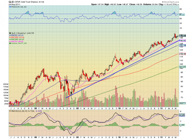
Metals ETF’s have been moving as if they have no connection to each other. But they are a family. With each family member taking on a different role. The dominant first born. The middle child unafraid of authority pushing the boundaries. And old Uncle Jessie who has his ups and downs. Gold (ticker: $GLD) is like that first born child. Look at the weekly chart below.

GLD
gld e1306277043665 stocks
In a steady up trend since making a low in November 2008 GLD just keeps plugging higher. Occasionally it visits the trend line around the 20 week Simple Moving Average (SMA) but there is no confusion about where this confident metal is heading. look for the pullbacks to the trend and 20 week SMA to buy or add to your position.

SLV
slv3 e1306277261357 stocks
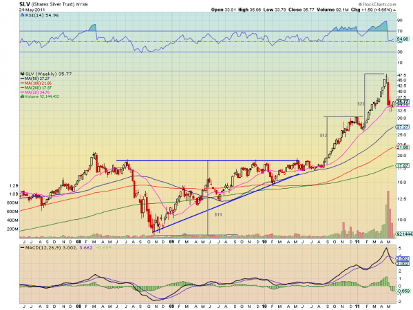
The Silver ETF (ticker: $SLV) is like the middle child. It heads forward in fits and starts and then occasionally runs away to test the boundaries, like when it culminated in a parabolic top 4 weeks ago. After being punished for that move it is trying to get back on track now with a bullish candle on the weekly chart through the first 2 days of this week, also off of support of the 20 week SMA. If it can get above 36.20 then it could be off to the races again.

JJC
jjc1 e1306278077828 stocks
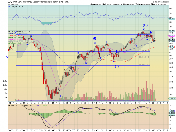
Old Uncle Jessie has put in a hard life working and has his good and bad times. The Copper ETF (ticker: $JJC) is the working man metal like Uncle Jessie. The weekly chart above shows the Elliott Wave count now in corrective Wave (IV) before moving higher. Elliott guidelines suggest that this pullback will end before it hits 50, and then start Wave (V) higher. The quick support of the 20 week SMA does not hold the same magic for JJC. The current bear flag on the 50 week SMA suggests a continuation lower to the 100 week SMA at 46.79 is likely. So how does Uncle Jessie feel? Looks like he woke up with a spring in his step today.

A Rare Setup In The SP500 & Qs


I wanted to share this rare setup with you that is occurring in the SP500 and the QQQ right now. The chart is a weekly chart with the 12 week 2 SD Bollinger bands in cyan. In the past year there have been two instances of this setup in the SP500, which occurs when the Bollinger bands go completely flat and tight for at least 6 weeks.

 stocks
Looking back at the SP500 over the last 30 years this setup has occurred very few times, but almost always leads to a powerful move. The RSI and MACD can both be used to confirm the trend when the market breaks out. At the moment both are in a neutral condition.

The longest period that I found for this condition was 12 weeks, although another case with some variance lasted 14 weeks. The current setup is now 5 weeks long, so we may have as many as 7 to 9 weeks more to go, but I doubt it will be more than 3 or 4 weeks. The breakout is typically in the direction of the trend on the next higher time frame. The monthly trend is currently a strong uptrend, so the most likely breakout direction is to the upside.

I wanted to bring this to your attention as there is increasing talk on trading blogs and sites about the beginning of a protracted decline. Even on CNBC, Bob Pisani was airing his concerns that traders are apathetic as opposed to fearful, which might be a setup for a selloff. The fact is, as I pointed out in my last post, that while trader talk might be complacent, traders are becoming increasingly bearish with their positioning according to the ECPR. As the consolidation continues I expect the sentiment to become even more bearish which will support a powerful rally for the rest of the year. This is a change from my earlier view that we would see a top in June.

In this type of environment leading stocks will tread sideways or edge higher as laggard stocks correct. The simplest thing to do here is to replace positions that are stopped out with new high relative strength stocks. When the breakout comes it might be difficult to get on board.

Sugar futures 'better bet' than cocoa or coffee

by Agrimoney.com

Sugar looks a top bet among soft commodities, given that markets have already fully priced in the prospect of easier supplies – unlike for cocoa or coffee, Commerzbank analysts said.
The German bank, in the latest of a spate of bank briefings on commodity markets, forecast that arabica coffee prices "should retreat slightly initially, and then more pronounced" if fears of frost in Brazil go unrealised and the harvest in the top producing country lives up to high expectations.
"Arabica prices at around $3 a pound are exaggerated and not sustainable," the report said.
Cocoa prices, meanwhile, have further "downside scope" as exports resume from the Ivory Coast, the main producer of the bean, following the lifting of a ban imposed by Alassane Ouattara during his – successful - fight to claim the presidency won at elections last year.
'Exaggerated correction'
However, a fall of nearly 40% in sugar prices, since hitting a 31-year high of 36.08 cents a pound in February, appears "exaggerated", given the threats remaining to world production.
Supply prospects have improved, thanks to better hopes for Thailand's output which, at 9.6m tonnes looks set to trounce the previous record, and a weak start to Brazil's 2011-12 harvest appear reflect a timing issue rather than an underlying threat.
But Commerzbank cautioned over overoptimistic estimates for 2010-11 output in India, the second-ranked sugar maker, after the Indian Sugar Mills Association clocked the country's production at 24.2m tonnes, more than 2m tonnes below some other forecasts.
And flooding earlier in the year would limit Australia's rise in output to 300,000 tonnes, taking it to 4m tonnes.
'Room for disappointment'
"The good news from the supply side should be priced in already," the report said.
"There is room for disappointment regarding crop prospects in the upcoming months. Similar to last year, prices should therefore rise in the course of the year after the decline in spring."
The bank forecast the price of New York sugar, as measured by the near-term lot, averaging 25.0 cents a pound in the July-to-September period, and 26.0 cents in the last quarter of the year.
The spot contract, currently for July delivery, stood at 22.10 cents a pound at 10:00 GMT, up 0.9% on the day.
Coffee for July was 0.4% up at 262.35 cents a pound, with July cocoa up 0.1% at $2,887 a tonne.

See the original article >>

Macro E.U. — D.O.A.

By Greg Weldon

Today’s Money Monitor theme can be pitched two ways …

… D.O.A. = Dead on Arrival …

… or … D.O.A. = Debt Offenders Anonymous

Either way, the title applies to our examination of the still-intensifying EU debt-deficit debacle. We are tempted to say that the Eurocurrency is currently being rushed to the hospital, and that it is likely to be pronounced ‘D.O.A.’, or dead-on-arrival …

… but we think the more ‘appropriate’ analogy is to look at the EU as if it were a prime candidate to join a twelve-step self-help program called D.O.A., or ‘debt-offenders-anonymous’.

The first step would be ‘acceptance’.

However, the EU is not yet capable of this, as it remains ‘in denial’.

As EU debt markets come under renewed pressure amid a broadening in the scope of downgrades to sovereign credit ratings, and ratings outlooks, we note commentary from the Union’s Economic and Monetary Affairs Commissioner Olli Rehn …

… “We have contained the crisis to the three countries now in the EU-IMF programs. It is not correct to speak of a crisis of the euro or monetary union.” 

DENIAL, case closed.

EU officialdom, via their denial, continues to be an ‘enabler’.

Of course, a symptom almost always attached to an ‘addict’, is lying … by the addict, AND by the co-dependent enabler.

Thus we find it MOST interesting to observe last week’s startling admission from the head of the EU Finance Ministers, Luxembourg’s Jean-Claude Juncker, who stated that he “LIED’ to the press and the public, regarding a secret meeting of top EU officialdom, held to discuss the Greek situation …

… “It was done in the interest of the people who use the euro as their common currency. The denial immediately prevented further speculation in the markets. Speculation about an exit by Greece from the euro-zone had to be avoided at all costs, in the interest of the euro-zone.” 

Denials and lies — this has become the EU’s arsenal.

The reality is … the EU is unwilling to accept the fact that it has become addicted to debt and deficits, and that their fiscal life has become ‘unmanageable’. The EU must first admit to themselves, and to the markets, the exact nature of their wrong-doing.

Without acceptance, the EU cannot reach the point where they can make a conscious decision to turn over their ‘will’ to a ‘higher power’, which in this case would be ‘fiscal austerity’, and a restructuring of debt that will allow the situation to become ‘manageable’.

Without acceptance, the EU cannot even think about ‘making amends’.

The EU (along with the US) is in desperate NEED of a ‘spiritual awakening’.

The problem is one linked to our instinctive nature as human beings …

… a thing called … the desire to avoid pain, at any cost.

The EU, like the US, suffers from what we might call the ‘Cyrenaic Syndrome’, a dynamic linked to the ancient Greek philosophers Aristippus and Hegesias of Cyrene, who, in 3rd and 4th Centuries BC, hypothesized that the goal of life was the avoidance of pain and suffering. Addicts accomplish this thru substance abuse. The EU is trying to accomplish this thru pure denial, and an outright refusal to accept that austerity, like sobriety, is the ONLY way to actually deal with the problems it faces.
The EU is still … FAR … from ‘hitting bottom’.

For SURE … the debt-deficit crisis is NOT “contained”, as Olli Rehn would have us believe. We have been pounding the table for years, screaming that the problems facing Greece, Ireland, and Portugal, will look like CHILD’S PLAY, when the situation in Belgium, Spain, and Italy, begins to take center stage. This is NOW HAPPENING, on the back of today’s outlook downgrade placed on Belgium and Italy, in synch with intensified anxiety linked to Spain following weekend elections in which the ruling Socialist party got mauled.

At the heart of the issue in Spain, and Greece, is rising unemployment. Indeed data released last week in Greece revealed a jump to yet another new high in the Unemployment Rate, as seen in the chart. The Unemployment Rate jumped to 15.9% in February (data lagged by one-month), up from 15.1% in January, and up from 12.1% in Feb-2010. Worse yet, the Number of Unemployed has now spiked higher by +30.1% versus last February, and is up by a mind-numbing +99.9% versus February of 2008.

We also shine the spotlight on data released by the Greek National Statistics Service two weeks ago revealing that Industrial Production contracted by (-) 8.0% year-over-year during the month of March, plummeting deeper into negative territory versus the decline of (-) 4.8% yr-yr posted in February …

… LED by a double-digit decline in the year-year rate of Manufacturing Output, which plunged by (-) 10.3% during March, sliding from a (-) 6.8% yr-yr contraction in February, and the (-) 4.5% yr-yr decline seen in January. Evidence the chart on display below, which speaks for itself.

Further, we note today’s report on the Greek Budget, revealing that DESPITE austerity measures undertaken as part of the EU-IMF directed program, the Deficit WORSENED during the month of April. Indeed, the government reported a deficit of (-) EUR 7.246 billion in the four-month YTD 2011, an ‘increase’ of +13.7% versus the same period 2010.

Worse yet … Revenue FELL, while Spending ROSE … with Revenue falling by (-) 9.1% in the YTD-yr-yr, and Spending rising by +3.6%.

Problematic for SURE … as a rise of +14.4% in Outlays linked directly to Interest Payments on the debt, which accounted for a MIND-BLOWING 52.7% of the TOTAL DEFICIT in the year-to-date, pegged at (-) 3.819 billion EUR.

Unfortunately, Greek bond yields continue to SOAR, reaching a new ALL-TIME HIGH TODAY, as evidenced in the chart below, wherein the 2-Year Bond yield now exceeds 25%.

Turning to Spain, we note that the ruling Socialist Party got crushed in regional elections, falling victim to promises made by the People’s Party that they will move to restructure the electoral process, and squash planned cuts to social spending programs.

Perhaps more troubling is the fact that the United Left Party, formerly the Spanish Communist Party, saw a significant rise in support from a disenchanted populous, in line with massive protests among the youth in the country last week, who reject thoughts of … austerity.

Subsequently, we continue to closely monitor the action in the Spanish Government Bond market, with focus on the line-drawn-in-the-sand at 5%, as evidenced in the chart on display below plotting the country’s 5-Year Sovereign Bond yield. Clearly, from a technical perspective, a rise in this bond’s yield thru the double-top marked at 4.93%-4.95% would constitute a major upside breakout, and would come in synch with the upside acceleration taking place in the long-term trend defining 200-Day EXP-MA.

Similarly, we observe the chart shown below in which we plot the 5-Year Sovereign Credit Default Swap Rate linked to Spain’s government’s credit worthiness. We focus on the upside push taking place today, and the violation of the highs reached last May, in line with the upside directional reversal by the long-term 200-Day EXP-MA.

We have repeatedly stated that Greece, Ireland, and Portugal represent the minnows in the debt-deficit pond, while Spain and Belgium might be considered big-fish.

But, when it comes to Italy, we have used the term WHALE to describe the country and the risk attached to their HUGE outstanding debt, pegged at more than $2 trillion (including interest payments). With that in mind, we shine the spotlight on today’s downgrade to Italy’s credit rating outlook, instituted by Standard and Poor’s, with specific focus on commentary from the agency …

… “In our view, Italy’s current growth prospects are weak, and the political commitment for productivity-enhancing reforms appear to be faltering, and potential political gridlock could contribute to fiscal slippage. As a result, we believe Italy’s prospects for reducing its general government debt have diminished. If one or a combination of these risks materializes, Italy’s general government debt could stagnate at current high levels. In this case, we may lower the long- and short-term ratings on Italy.” 

Subsequently, Italian Government Bond yields rose sharply today, with the 2-Year Bond moving above 3%, and the 5-Year yield spiking upwards to more than 4% … amid a widening in the spread over Germany’s comparable 2-Year Schatz yield, and the German 5-Year BOBL yield. We note the 5-Year spread in the chart on display below, with focus on the fact that Italy’s yields are threatening to breakout to the upside, while German yields actually fell today, amid a flight to safety among regional bond investors.

We are keen to watch the price action in the Italian 10-Year BTP futures contract, as noted in the chart below, with thoughts of being short amid the downside violation of the 100-Day EXP-MA, and the fresh sell signal being generated by the med-term Oscillator.

Against the negative backdrop of ratings news, macro-economic weakness, and overt denial by EU officialdom …

… we examine the chart on display below plotting the Italian MIB Stock Index, which PLUNGED by (-) 3.32% in today’s trading session, producing THE SINGLE LARGEST one-day LOSS of ANY industrialized nation, and trailing only Vietnam (down -3.48%) and Bangladesh (down -5.98%) as the day’s largest losers in the world, stock market wise.

More importantly, we note the technical damage inflicted on the Italian stock index during today’s trading session. We evidence the downside violation of the uptrend line that has defined the bull market run since the 1Q of 2009, in synch with the move below the March swing low, and the penetration of the long-term 200-Day EXP-MA (which has completed its downside directional reversal). A further decline below the May-25th 2010 low marked at 18,382 would constitute a full-blown breakdown.

The Spanish stock market got whacked as well, losing (-) 1.42% and taking out its March low. As noted in the chart below, the Spanish IBEX stock index is highly correlated to the German DAX, and tends to lead the German market. Indeed, both the Italian MIB and the Spanish IBEX are now threatening to lead the German market to the downside.

As such, we are becoming increasingly bearish on the DAX, in synch with the weakness exhibited by the Spanish and Italian equity markets. We shine the spotlight on the long-term weekly chart of the German DAX, shown below, with specific focus on the significant degree of bearish momentum divergence exhibited by the 52-Week Rate-of-Change indicator, and the long-term Oscillator, neither of which ‘confirmed’ the most recent newer new high in the underlying index itself.

Moreover, we note that both the long-term Stochastic indicator and the long-term Oscillator have generated renewed ‘sell signals’, via their dual downside rollovers. Subsequently, the door has been opened for a move to test the swing low set on March-16th at 6,412 (basis the nearby futures contract). A violation of this key technical support pivot would also cause a downside penetration of the long-term trend defining 52-Week EXP-MA, last marked at 6,792.

But there is a ‘bigger picture’ risk in play here, as ALL the addicts are at risk, the debt addicts, and the dollar-debasement/excess-liquidity addicts, as evidenced in the overlay chart on display below. We plot the path of the Spanish IBEX (blue), the German DAX (black), along with the US S+P 500 Index (purple), and the CRB Index of commodities prices (red).

In fact, Fed monetization driven ‘Dollar Debasement’ has been like ‘smack’ to the asset market … without it … withdrawal could be UGLY.

We note the high degree of correlation between dollar depreciation, as defined by the green bars plotted in the overlay chart shown below, representing the inverted price of the US Dollar Index (inverted to reflect a rise, when the value of the dollar declines) …

… and … the European stock markets, as represented by the German DAX (black line) and the Spanish IBEX (blue line).

With the Fed threatening to pull their debt monetization support for a continued debasement in the value of the USD … the time for DENIAL is running short. We will be keeping an EKG attached to the Eurocurrency, seen in the daily chart below, to determine if it might be, DOA, or dead-on-arrival. We focus on today’s technical breakdown, with a violation of the med-term trend defining 100-Day EXP-MA, completion of a head-and-shoulders topping pattern, and the bearish divergence in, and preliminary sell signal offered by, the med-term Oscillator.

Debt addicts are in denial, and monetary officialdom’s enablers have shown a willingness to LIE, in order to provide protection from reality.

Dollar debasement addicts are also in denial, if they believe that there is NO pain to be felt in ALL asset markets, if the USD’s multi-month trend towards depreciation is in the process of reversing, in line with a breakdown in the Eurocurrency.

If Europe is NOT willing to feel some pain, fiscally …

… the markets will INFLICT PAIN, in the form of lower equity quotes, and higher bond yields.

Within the context of our Macro-Global Discretionary Managed Accounts Trading Program, we are bearish on European stock markets, and are becoming increasingly interested in the bearish side of the US equity market.

We are bearish on bond markets linked to fiscally challenged countries, against a bullish stance on the US and German bond markets.

We are bullish on the US Dollar Index … and bearish on the EUR, along with the Canadian Dollar.

And, we are bearish on select commodity markets, with specific focus on the Industrial Metals sector (with focus on Copper, Nickel, Lead, Zinc, and Palladium) along with the Tropical-Soft sector (focusing on Sugar, Cocoa, Cotton, and Coffee).

See the original article >>

How To Handle A Stock Market Down Day


On Monday, the markets gapped down and stayed down most of the day.


At first glance seeing as how we broke the blue support zone should we freak out and sell sell sell? Should we jump to a conclusion immediately? 

Well before we answer that question let’s back up a moment and shift to what we do when we see markets getting hammered in pre-market (remember gaps are events over which you have no control over anyway as you never know when they are coming).

When we see markets are going to open down the first thing we do is WE DON’T REACT! The second thing we do is we let the opening nervousness settle down and THEN we look at our current holdings to see exactly what they are doing/showing technically speaking. This is what we mean when we say “Let Your Stocks Tell You What To Do By The Action They Are Exhibiting”

We look at technical supports, we look at how much we are down on the position on its own, but never really need to freak out because of trade size risk management. So you see, as always trade size risk management saves you ALL the time and allows you to never have to concern yourself with “am I getting hammered?” More often than not a bad day for you is that of a little spilled coffee on yourself.

Case in point a good example of why we don’t want to jump to conclusions immediately is that of IRBT. Last week this issue broke its uptrend and at one point we were underwater to the tune of about 8% on the position on its own.

Monday this issue rallied right back up to the 50-day and here we are at break even again. This is exactly why we don’t jump to conclusions. Had we jumped to a conclusion on the break down? We’d have taken a loss, now? Breakeven to slightly ahead. It doesn’t happen all the time but more often than not for us it has. The phrase that comes to mind is “it’s more of an art than it is a science”.


See the original article >>

Farmers Closing in on Corn Planting


Major planting progress was made in many key corn states during the past week. As of May 22, 79% of the U.S. corn crop is in the ground. This compares to a five-year average of 87% for this point in the season.

Ten of the 18 corn states that planted 92% of the 2010 U.S. corn acreage has passed the 80% planted mark.
(click to enlarge)
Several states are still way behind average. Ohio only has 11% of its corn crop planted, which compares to the normal 74% planted by this time. Indiana, Pennsylvania and North Dakota have just under are under 50% planted this year, normally these states would be around 75% planted by this time.
Overall corn emergence went from around 20% emerged as of May 15 to 45% emerged by May 22. The five-year average for corn emergence by this time is 59%.
See the “Corn Planting Progress” reports.


Soybean Planting Progress Passes 40%

As of May 22, 41% of the country’s soybeans are in the ground. The five-year average for this time is 51%.
(click to enlarge)
Illinois, Iowa, Kansas, Louisiana, Mississippi, Missouri and Nebraska are all at a normal pace or exceeding the average of beans planted by this time.
Ohio has 4% of the 2011 crop planted, a staggering drop from the five-year average of 54%. North Dakota, Minnesota, Michigan, Indiana and Wisconsin are also all well behind their normal planting progress.
See the “Soybean Planting Progress” reports.


Cotton, Sorghum and Rice Planting on Track

As of this week, 57% of the U.S. cotton crop is planted. Normally just over 60% of the crop is planted by this time. Farmers in Arizona, California, Louisiana and Virginia all have more than 90% of their crops in the ground.
See the “Cotton Planting Progress” report.

The U.S. sorghum crop is on pace to be planted at a normal rate. The five-year average for this time is 40%, which is also the current planting progress.
States such as Arkansas, Texas and Louisiana are more than 70% planted, while South Dakota, Colorado and Illinois are around the 10% planted mark.
See the “Sorghum Planting Progress” report.
Of the six major rice-growing states, all but one has more than 70% of their crops in the ground. Missouri is the only state lagging behind with 53% planted, likely due to the major flooding earlier this spring in the rice-growing areas of the state.
Currently, 84% of the U.S. crop is planted, which is only slightly behind the five-year average of 90%.

See the original article >>

Oats flag concerns for condition of corn crop too

by Agrimoney.com

They say oats are a leading indicator on crop prices. Are they a signal on corn condition too?
As if the corn market did not have enough to worry about from late sowings, and the prospect of abandoned acres, oats data has shown that the quality of the crop which has made it into the ground may not be that good either.
US Department of Agriculture data overnight showed the deterioration already highlighted in winter wheat spreading into rice, where the proportion rated in "good" or "excellent" condition fell by five points to 49%, compared to 68% last year.
Furthermore, the first rating on the US oats crop came in with 56% in those top two rating bands, down from 80% a year ago – a factor which could bode ill for corn.
The statistics "may indicate" that, when the USDA next week publishes its first ratings on the US corn crop, the proportion rated in the top two bands will be below 56%, Don Roose, president of US Commodities told Agrimoney.com.
Corn vs oats
"The first row crop to get rated that has been planted in the spring and grown up is oats. That makes it of interest in looking at corn."
While Mr Roose said he was not aware of any historic link between oat and corn yields, "the question is, why is corn going to be any different? Why is it going to be in excellent shape, if oats is worse than last year?"
Some of the big oat states of Minnesota and North and South Dakota were big corn growers too. That said, oats in these areas appeared to have got a better-than-average start, with Ohio and the parched state of Texas looking a bigger threat than the wet northern region to oats' hopes.
The USDA said that in Texas, where the grain is winter sown and often cut for hay, "wheat and oats dried out due to windy conditions and hot temperatures in areas of the Plains".
About one-third of Texas's oats crop had been harvested as of Sunday, with 14% of winter wheat in silos.
'Worrisome but not critical'
The USDA reported revealed that farmers had continued to play catch up on delayed corn sowings, getting 79% of the crop in the ground, only eight points behind the average pace.
Nonetheless, the figure is slightly below the figure the market had expected, with Ohio growers having only planted 11% of their corn as of Sunday, compared with an average of 80% by now.
With the optimal sowing window now well past, and the cut-off dates approaching when growers can apply for insurance payouts on unseeded crops, the slow pace is prompting expectations that corn area will miss earlier expectations.
And the briefing showed corn developing late, as might be expected from delayed plantings, with only 45% emerged compared with an average of 59%.
"How serious is this situation? Worrisome but still not critical in our opinion," a report by Paragon Economics and Meyer Consulting said.
"Three years ago was the slowest emergence year since 1999 and the national average yield that year was 153.9 bushels per acre, 2.3 bushels per acre above the trend yield."

Stock Market Bears Getting Close....


That rising trend line has actually been broken to the down side, but the psychological level of 1315 is holding up for the moment. No arguing that the bears are making their move over the past couple of weeks. It took many tries to first take out 1335 on the S&P 500. On about the fifth try they broke it down and allowed for a back test that ultimately failed for the bulls. It's just what you'd expect from the bears once they captured this first important level of support. Now their focus is 1315 and nothing else. They want it badly but it's not coming easily. The bulls know the importance of this important support zone and will fight as hard as humanly possible to make it hold. You can see the erosion.

Day by day we're losing a little bit of ground in the overall bullish behavior. Advance-decline lines are eroding away. More and more stocks are losing their 50-day exponential moving averages. Fewer and fewer are recovering those lost 50's once they occur. With fewer stocks recovering it's getting harder to run back up. All this adds up to a recognition that the bears are starting to gain more control of things. But they've yet to conquer the holy grail of losing 1315 with force.
That's their only focus, and although it must be frustrating to them because of how well the bulls are holding things up, they aren't exactly walking away from the table. They are now fighting much harder. They have more of a swagger to their efforts. They seem more intent on getting this annoying support level to go away. This is why you have to play this game from this new perspective. One of much greater caution. You can't just expect the market to be able to explode up at a moment's asking. It's much tougher now, and will be this way for some time to come, even though there will still be strong up days in this process. Your game plan should be focused on how things are shifting from one side to the other. The bears haven't done anything yet to feel great about but you have to respect their efforts and the damage they've been able to create over the past several weeks. A whole group of Nasdaq stocks, along with other sector stocks, broke below their 50-day exponential moving averages some weeks or days back, retested them and are now breaking back down again. Some of the big names this is happening to are Bidu Inc. (BIDU) and Apple Inc. (AAPL) to name just a few heavyweights.

When big leading stocks back test and fail this is something to take note of because this is a complete of character we haven't seen in quite some time. Changes of character this significant than what we've seen in a year or more, should not be ignored. Lots of other changes are taking place as I've discussed above, but this one really stands out because of the leaders that are involved. Not only are these stocks failing on their back tests, but they're doing so with huge gap downs making the resistance created much more difficult to get back through. More and more headaches from a technical perspective are appearing, and thus, we have to really hunker down in defensive mode here.

There's only one thing keeping this market alive and that's fed Bernanke and his printing press. Let me make this very clear. If you think he's done printing dollars on his printing press just because QE2 is ending at the end of June, you're sadly mistaken. He will find many ways to keep the press rolling along and flooding the system with new dollars that should hold the market up bigger picture. Only if he walked away from protecting the banks would this market collapse. There is virtually no chance this will take place, folks. Not on his watch.

If the banks fail, the whole economy goes under, and he has spent and wasted too many dollars already to let that take place. He'd look like the biggest fool in the world admitting that he simply created more debt for no good reason and delayed the inevitable financial collapse. He will print away. He will do anything to keep Wall Street humming in order to protect Main Street. The dollars will continue to fly off his machine as all he's really concerned about is keeping Bank of America Corporation (BAC) and Citigroup, Inc. (C), and all the other big banks solvent. Nothing else concerns him. Not you. Not me. No one. Just the banks, folks. Just the banks.

Think about those financial stocks, folks. Think about the whole financial sector for the past many years. They have lagged badly throughout the entire bull market. There are clearly reasons for this. They know they are holding only by the grace of the fed and nothing else. Left alone they'd all go bye-bye, folks. The world of the financials is still very much on the critical list and only breathing through a machine. This is how tenuous things are for this whole economy. Follow those financial stocks for real insight about the real world. It's not a pretty picture by any means. The commodity stocks are now joining the financial stocks in acting and behaving rather poorly, and the market just can't afford to lose both and hope to hold 1315 S&P 500. The bubble on those commodity stocks seems to be bursting just a bit, so it's getting close to do or die time for this market. The days and weeks ahead will be more than interesting, but no matter how dire things look, the bears must remove 1315 S&P 500 with some force or they've done zero. Loads of cash is the best way to be positioned.

BONDS ARE FOR LOSERS?

by Cullen Roche

David Rosenberg catches a lot of flak for being excessively bearish about US equities, however, there have been a lot of good calls within his commentary over the years. One of the best calls has been his outlook for inflation. While many commentators have called for hyperinflation or a 1970′s style inflation Rosenberg has remained staunchly at the opposite end of the of the spectrum. And to this day, he still says deflation is the principle risk. In his most recent note Rosie elaborates:
“There was no shortage of press articles over the weekend attacking the enemy – the bond market. After all, for the typical equity market portfolio manager who is overweight this market, it must be a nagging feeling going home every night now seeing bonds yields lower – a clear non-ratification for the near-universal view of sustainable growth in the economy and earnings. At a time when the Fed is incrementally withdrawing, the extent of the fiscal drag at all levels of government should not be underestimated…
Meanwhile, sentiment towards bonds remains deeply negative (which in market parlance is a “contrary positive”). See Own Government Bonds? Here’s Something Else To Fret About on page B1 of the weekend WSJ. And Treasurys Gains at Risk on page C2 of yesterday’s edition. Or how about the article on B7 – Municipal Bonds Have Surged – But Investors Need To Be Skeptical. Here’s Why. This second article draws the conclusion that “the problem is that the trend could easily reverse. With rates this low, the best-case scenario is that they remain flat; the worst and most likely scenario is that they will rise” (although nobody seems to be very concerned over the corporate market, even though we just came off a week of record supply issuance of $30 billion last week!).
Geez – didn’t we hear that sort of talk all last year? And what do we have? A 10-year note yield pervasively stuck in a 2-4% range. And here we have the end of government support for risk assets, the global economy cooling off and commodity inflation peaking out. Worries over Greece are also giving a lift to safe0havens and the 10-year yields in Greece moving above 16.5%, it would seem a safe bet to say that the markets are bracing for some sort of default, even if couched in more palatable terms….
And event, the 3.07% yield level for the 10-year note would represent a key technical break – where the 200 day moving average resides. Mortgage convexity would then very likely take the yield down to 2.9%. And the rally we are seeing of late in the Treasury market is occurring on the back of renewed deflation pressure – the 5-year CDS spreads, measuring US government default risks, actually widened 10bps last week to 51bps.
Of course, deflation is now going to rear its head again. Oil prices are down 13% from the nearby peak. The base metals complex is down 10% from the recent high as well and trading both below the 50 and 200 day moving averages. The agriculture price sphere has corrected 10%. Gold is off the boil and silver has plunged 35%. Deflation is the principal threat, not inflation.”
Of course, I agree to a large extent. All of those cries about the bond bubble last year and hyperinflation have turned out to be dead wrong. The current environment is not consistent with past hyperinflations or even periods of high inflation. What is boiling beneath the surface is the balance sheet recession, however, the USA has done enough spending to fend off this beast for the time being. That said, the risk is still not hyperinflation in the USA. In fact, I believe the risk of hyperinflation remains close to nil. At the beginning of the year I said we were likely to experience inflation in the 2.5% range this year – higher than what I had been calling for over the last 2 years, but lower than the historical average. That’s been pretty close to dead right so far. I also think Bernanke is likely to finally get something right – this surge in inflation (mostly due to motor fuel prices) is likely to be transitory.

As for bonds, Rosenberg has nailed it. You can’t be super bearish about bonds unless you believe in one of two scenarios – hyperinflation or booming growth. Ironically, the paper bears don’t understand that the history of hyperinflations (as previously covered here) is not even remotely consistent with the current state of the US economy. So, the only way they will likely be right about bonds is by being wrong (about US economic growth). And while I’d love to be a believer in booming growth I just don’t see the USA experiencing strong economic growth with such enormous slack remaining in the economy and the increasing likelihood of austerity in the coming years. We remain deep in the balance sheet recession and until policy makers recognize that the likelihood of stronger growth is very low. And because of this malaise and persistent government ineptitude (around the globe) US bonds will continue to perform just fine.

See the original article >>

DIVINING RISK APPETITE – IT’S DIFFERENT THIS TIME

By Rohan Clarke

As a sucker for a crusty cliche, I was a natural to work in finance. It’s as much the refuge of ’euphemism, question-begging and sheer cloudy vagueness‘ as any political stamping ground.

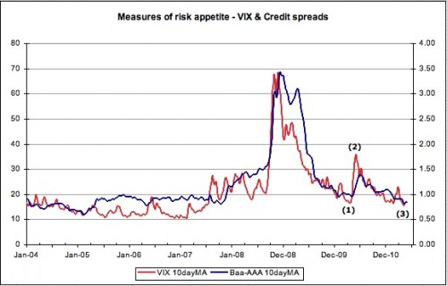
So you’ll understand my intent when I say “it’s different this time”. No really, it is. Consider the following chart of the VIX and credit spreads (as measured by the AAA to Baa spread on US corporate bonds):
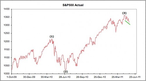
To explain – we are going to compare the end of QE1 in March 2010 with the current environment. The numbered inflection points provide the backdrop;
(1) The VIX made a low of 15.73 on 20 April 2010 (all prices are at the daily close) – while the S&P500 made its high on 23Apr10.
(2) The VIX high of 45.79 was recorded on 20 May 2010 – the S&P500 made a low on 2 July 2010.
(3) The VIX registered a low of 14.62 on 28 April 2011 – the S&P500 reached its high on 29 Apr 2011.
This all seems pretty consistent – the VIX leads the S&P500 by a day or thirty. So what if we haven’t actually finished with QE2 yet? We all know what happened next – seems reasonable that the exits would be rushed a little sooner this time.

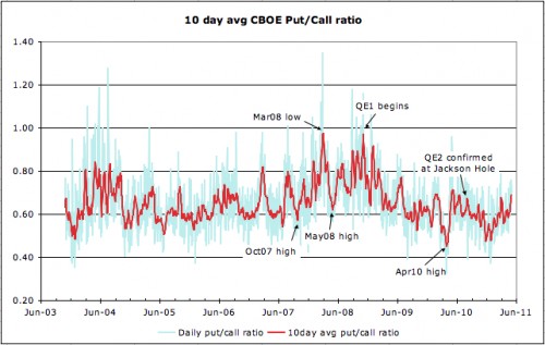
Then what to make of the CBOE put/call ratio? It’s been trending higher since Christmas which is hardly consistent with previous instances of extreme bullishness before the fall.
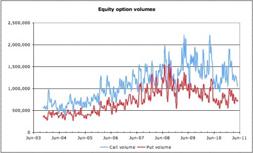
If anything, volumes suggest that it’s contracting demand for calls that has been dragging the ratio higher. While this indicator is a bit of a blunt tool, as it says nothing about the shape of the volatility smile nor the nature of options being exchanged, it does clearly indicate that volume is on the wane. This is a trend reflected in NYSE volume incidentally.
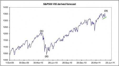
In any event, while the VIX may be an imperfect measure, it does have form in anticipating turning points. This is the reason why we keep an eye on the following charts:
Note the same inflection points as noted earlier. At (1), the S&P500 as implied by the VIX, failed to confirm the actual indexes high, and the actual index promptly sank 200 points. And (2), following the low in the VIX in May, the implied S&P index marked out a long positive divergence against the actual index – which ultimately followed it higher.

So we get to the more curious current events. Not only did the S&P500 as implied by the VIX make a new high on 19 May 2011 well after the high in the actual, the implied has failed to make any new low on the downside with the most recent weakness.

Now maybe this divergence is simply indicating that this measure is broken. It’s a reasonable argument – that QE has distorted option market activity by encouraging the selling of ATM risk while buying the wings. Maybe. But it never hurts to have an open mind…

At least, we can’t argue with the statement ‘it’s different this time’.

See the original article >>

The U.S. Dollar’s Impact on the S&P 500, Gold, Silver, & Oil


In doing some brief reading around the blogosphere I have noticed that most pundits are writing off gold, silver, and oil entirely. In fact, I have even read that the selloff is just beginning in precious metals and energy. In addition to the bearish traders, it seems as though even more traders are expecting some period of consolidation. Lower prices and a period of consolidation make sense, but what I am more interested in at this stage is a clear setup that offers solid risk / reward.

In basic terms, I try to identify key price levels and then allow price action to generate signals about Mr. Market’s preferred direction, regardless of the underlying asset. Trading is an undertaking where operating with defined risk is paramount to both survival and success. Leveraging probability and focusing on trade/money management represent the other side of success. With that said, I am currently sitting in cash waiting for setups to emerge. The following analysis should be viewed as merely a context of price action and not a catalyst(s). Technical analysis is only one view of the marketplace and often times it proves to be contradictory to Mr. Market’s plans.

Currently I have differing views on various asset classes as it relates to risk and sensitivity to the U.S. Dollar. As of mid-morning on Monday, price action in the S&P 500 and oil was ugly as European debt issues still loomed large over global financial markets. The debt issues in the Eurozone were pushing prices of the U.S. Dollar Index higher while the Euro tested critical support. So far Tuesday we are seeing higher prices in risk assets, although the S&P 500 is lagging behind gold, silver, and oil.

For readers who have been reading my work in the recent past, I have not made any predictions but instead typically offered both sides of the price action and allowed individual investors and traders to come to their own conclusions. I generally do not trust financial writers or pundits who are always biased about price direction because often times I feel like they are pumping their book or hoping to get viewers or readers to follow them into their recommended positions.

At this time I do not have an open position in any of the underlying assets discussed in this article. No equity, futures, or option positions are open at this time and members of my service at OptionsTradingSignals.com have come to realize that when the market gets choppy, I like to remain in cash and wait for solid setups. Right now the S&P 500 looks like it could go either direction, but the day/week is far from over and Tuesday’s closing bell has not been heard. The following analysis is my current view of the marketplace.

S&P 500

The S&P 500 (SPX) is trading slightly higher today (Tuesday) as it retraces the big move lower we saw on Monday. Currently the SPX is trading right at a key support level. Solid volume accompanied lower prices yesterday as represented by the S&P 500 E-Mini futures contracts as well as the SPY ETF. I am going to be watching price action closely the next few days to see how the S&P 500 index handles the current support level. Right now the SPX looks poised to break down, but a bounce later today could push the index back above the key support level and an extension higher could be seen making a potential reversal more likely. The close on Tuesday and Wednesday should provide traders with clues about where the S&P 500 is headed. The daily chart of SPX shown below illustrates the key support levels in the short term:
chart1 options
U.S. Dollar Index

The U.S. Dollar Index pushed above recent highs on Monday but is experiencing selling pressure today. The selling pressure is being largely dismissed by the S&P 500 but other risk assets such as gold, silver, and oil are benefitting. Members of my service at OptionsTradingSignals.com understand that I have been focusing on the U.S. Dollar for weeks. Right now risk assets are trading primarily in the opposite direction of the Dollar. Obviously there are exceptions to the rule, but a strong Dollar has meant lower equity and oil prices specifically. Gold and silver have been holding up well as fearful investors are using gold and silver as safe havens against the potential for a European debt default or a Euro currency crisis.

The U.S. Dollar may have put in a key pivot low on the daily chart back in the early part of May. In addition, the key 200 period moving average is overhead and the U.S. Dollar may be poised to test the key price level in the future. The daily chart of the U.S. Dollar can be seen below:
chart2 options
While the Dollar could roll over and probe lower, the fact that it has put in a higher low and broken out above recent highs is bullish. Similar to the S&P 500, the next few daily closes are going to be critical as it relates to risk assets. I will be monitoring the U.S. Dollar’s price action quite closely as a clue where equities may be headed.

Gold

Gold futures closed the day above the 20 period moving average on Monday and are extending gains today. Gold did not sell off to the same degree as silver and so far the 50 period moving average on the daily chart has offered key support. I would not be surprised to see the rally in gold continue in coming days and weeks as the situation in Europe will likely be in the forefront of headlines in the near term.

It is possible for gold futures to push higher and possibly attack and test the recent highs. If we do get a strong extension higher in gold I would expect a blow-off top and a subsequent selloff that is quite deliberate and nasty. I think in the short term we could see gold put in new highs and possibly climb above the key $1,600 an ounce price level. However, if we do get a strong extension higher I will expect to see sellers beginning to step in if price gets above the $1,600 price level. The daily chart of gold futures is shown below:
chart3 options
Light Sweet Crude Oil

Analysts from Goldman Sachs are declaring that oil prices will likely increase in the near to intermediate term. Price action so far on Tuesday has just about totally negated the nasty red candle from Monday. Oil continues to consolidate near the lows and will eventually either breakdown to new lows and possibly test the 200 period moving average or we will see an extension higher to the $103 – $105 / barrel price level. The daily chart of oil futures is shown below:
chart41 options
In the longer term, I remain extremely bullish of energy as the fundamentals indicate that oil demand will likely continue to rise while supply levels remain flat or begin to increase. Oil prices are likely to go much higher than what most analysts are expecting. For now, I’m going to be watching the key support level illustrated above. If oil prices continue to consolidate at these levels a breakout is nearly inevitable. The question remains which way will oil break?

Silver Futures

Silver futures are rallying hard on the weak price action in the U.S. Dollar. Silver is currently trading +3.50% intraday and is on target to test the .236 Fibonacci Retracement level. Silver looks relatively strong here and if prices continue to work higher I would expect to see prices of silver reach as high as $41.25 before sellers take back control. The daily chart of silver futures is shown below:
chart5 options
The consolidation that I am seeing in silver reminds me that the underlying demand for silver is still there. If the Dollar continues to weaken or more money pours into silver as a safety hedge away from the Euro currency, we could see silver put on a strong run higher before ultimately selling off again. Silver futures trade with increased volatility during specific periods of time. I am going to continue to monitor the price action in the U.S. Dollar, Gold, and silver.

Conclusion
 
I continue to watch price action waiting for a solid setup to form before getting involved. I realize that precious metals and oil are higher today, but both are the products of a weaker U.S. Dollar. It remains to be seen whether we continue to see stocks selloff. In terms of the price action in the S&P 500, I continue to wait to see if we get a clear cut setup. What I do know is taking an anticipatory trade on the S&P 500 is a great way to lose money. I hate losing money, so I will remain in cash in the short run and let price action dictate my next trade.

In my opinion we are sitting at a key inflection point that is going to tell us a great deal about the tenor of the marketplace. When we get a failed break or a key breakout it should provide traders with clues about Mr. Market’s intentions. Until then we will have to sit back and wait patiently for prudent setups to transpire.

Follow Us