By Rohan Clarke
As a sucker for a crusty cliche, I was a natural to work in finance. It’s as much the refuge of ’euphemism, question-begging and sheer cloudy vagueness‘ as any political stamping ground.
So you’ll understand my intent when I say “it’s different this time”. No really, it is. Consider the following chart of the VIX and credit spreads (as measured by the AAA to Baa spread on US corporate bonds):
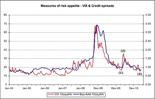
To explain – we are going to compare the end of QE1 in March 2010 with the current environment. The numbered inflection points provide the backdrop;
(1) The VIX made a low of 15.73 on 20 April 2010 (all prices are at the daily close) – while the S&P500 made its high on 23Apr10.
(2) The VIX high of 45.79 was recorded on 20 May 2010 – the S&P500 made a low on 2 July 2010.
(3) The VIX registered a low of 14.62 on 28 April 2011 – the S&P500 reached its high on 29 Apr 2011.
This all seems pretty consistent – the VIX leads the S&P500 by a day or thirty. So what if we haven’t actually finished with QE2 yet? We all know what happened next – seems reasonable that the exits would be rushed a little sooner this time.
Then what to make of the CBOE put/call ratio? It’s been trending higher since Christmas which is hardly consistent with previous instances of extreme bullishness before the fall.
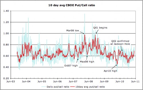
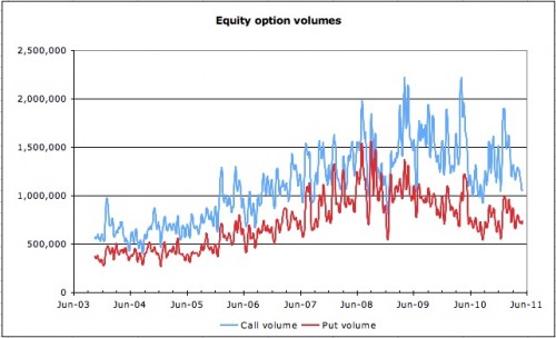
If anything, volumes suggest that it’s contracting demand for calls that has been dragging the ratio higher. While this indicator is a bit of a blunt tool, as it says nothing about the shape of the volatility smile nor the nature of options being exchanged, it does clearly indicate that volume is on the wane. This is a trend reflected in NYSE volume incidentally.
In any event, while the VIX may be an imperfect measure, it does have form in anticipating turning points. This is the reason why we keep an eye on the following charts:
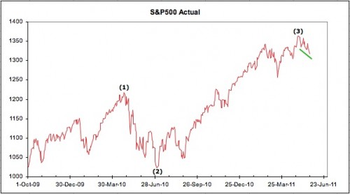
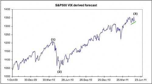
Note the same inflection points as noted earlier. At (1), the S&P500 as implied by the VIX, failed to confirm the actual indexes high, and the actual index promptly sank 200 points. And (2), following the low in the VIX in May, the implied S&P index marked out a long positive divergence against the actual index – which ultimately followed it higher.
So we get to the more curious current events. Not only did the S&P500 as implied by the VIX make a new high on 19 May 2011 well after the high in the actual, the implied has failed to make any new low on the downside with the most recent weakness.
Now maybe this divergence is simply indicating that this measure is broken. It’s a reasonable argument – that QE has distorted option market activity by encouraging the selling of ATM risk while buying the wings. Maybe. But it never hurts to have an open mind…
At least, we can’t argue with the statement ‘it’s different this time’.
No comments:
Post a Comment