Tuesday, February 3, 2015

Secular Bull and Bear Markets

by Doug Short

Was the March 2009 low the end of a secular bear market and the beginning of a secular bull? At this point, over five-and-a-half years later, the S&P 500 has set an inflation-adjusted record high based on monthly averages of daily closes.

Let's examine the past to broaden our understanding of the range of historical trends in market performance. An obvious feature of this inflation-adjusted series is the pattern of long-term alternations between up-and down-trends. Market historians call these "secular" bull and bear markets from the Latin word saeculum "long period of time" (in contrast to aeternus "eternal" — the type of bull market we fantasize about).

Click to View
Click for a larger image

The key word on the chart above is secular. The implicit rule I'm following is that blue shows secular trends that lead to new all-time real highs. Periods in between are secular bear markets, regardless of their cyclical rallies. For example, the rally from 1932 to 1937, despite its strength, remains a cycle in a secular bear market. At its peak in 1937, the index was 29% below the real all-time high of 1929. For a scholarly study of secular bear markets, which highlights the same key turning points, see Russell Napier's Anatomy of the Bear: Lessons from Wall Street's Four Great Bottoms.

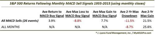
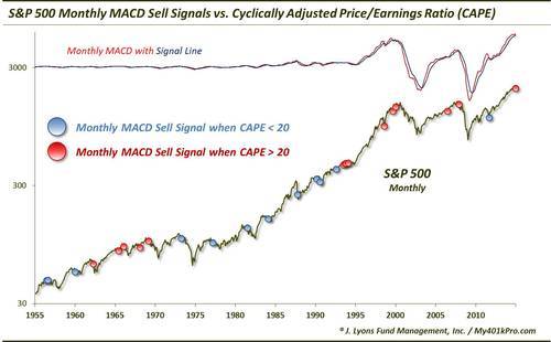
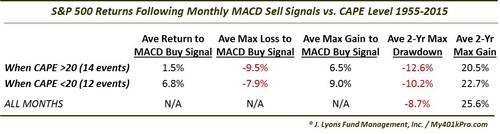
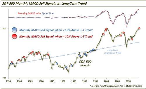
If we study the data underlying the chart, we can extract a number of interesting facts about these secular patterns (note that for the table below I am including the 1932-1937 rally):

The annualized rate of growth from 1871 through the end of December (the latest month for which we have an inflation rate) is 2.25%. If that seems incredibly low, remember that the chart shows "real" price growth, excluding inflation and dividends. If we factor in the reinvested dividend yield, we get an annualized return of 6.86%. Yes, dividends make a difference. Unfortunately that has been less true during the past three decades than in earlier times. When we let Excel draw a regression through the data, the slope is an even lower annualized rate of 1.76% (see the regression section below for further explanation).

If we added in the value lost from inflation, the "nominal" annualized return comes to 9.06% — the number commonly reported in the popular press. But for a more accurate view of the purchasing power of the market dollars, we'll stick to "real" numbers.

Since that first trough in 1877 to the March 2009 low:

  • Secular bull gains totaled 2075% for an average of 415%.
  • Secular bear losses totaled -329% for an average of -65%.
  • Secular bull years total 80 versus 52 for the bears, a 60:40 ratio.

This last bullet probably comes as a surprise to many people. The finance industry and media have conditioned us to view every dip as a buying opportunity. If we realize that bear markets have accounted for about 40% of the highlighted time frame, we can better understand the two massive selloffs of the 21st century.

Based on the real (inflation-adjusted) S&P Composite monthly averages of daily closes, the S&P is 144% above the 2009 low and only about 1% off its record close.

Add a Regression Trend Line

Let's review the same chart, this time with a regression trend line through the data.

Click to View
Click for a larger image

This line is a "best fit" that essentially divides the monthly values so that the total distance of the data points above the line equals the total distance below. The slope of this line, an annualized rate of 1.76%, approximates that number. Remember that 2.25% annualized rate of growth since 1871? The difference is the current above-trend market value

The chart below creates a channel for the S&P Composite. The two dotted lines have the same slope as the regression, as calculated in Excel, with the top of the channel based on the peak of the Tech Bubble and the low is based on the 1932 trough.

Click to View
Click for a larger image

Historically, regression to trend often means overshooting to the other side. The latest monthly average of daily closes is 91% above trend after having fallen only 13% below trend in March of 2009. Previous bottoms were considerably further below trend.

Will the March 2009 bottom be different? Perhaps. But only time will tell.

For a more optimistic view, see Chris Puplava's assertion a year ago that The Secular Bear Market in Stocks Is Over. Chris's commentary includes some interesting demographic analysis based on the ratio of the higher earning, bigger spending age 35-49 cohort to less financially empowered age 20-34 cohort. Unfortunately this ratio is being savagely trumped by a far more powerful demographic shift: The ratio of the elderly (65 and over) to the peak earning cohort (age 45-54). The next chart, based on Census Bureau historical data and mid-year population forecasts to 2060, illustrates this rather amazing shift.

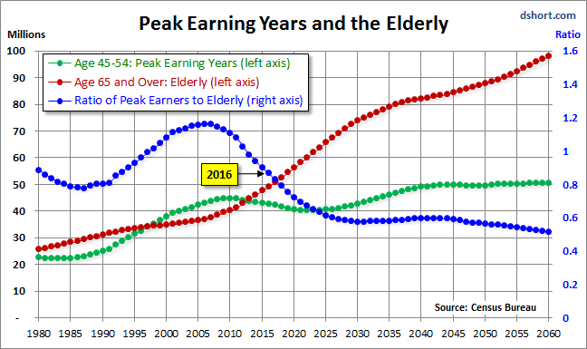
In the chart above, the elderly cohort (red series) is dramatically increasing in numbers. The ratio of the two, the blue line in the chart, peaked in 2007 and began its long rollover in 2008, coincident with the beginning of the last recession. We have many years to go before this ratio approximately levels out around 2030.

Even more disturbing is the elderly dependency ratio, the label given by demographers to the ratio of the 65 and older population to the productive workforce, which for developed economies is usually identified as ages 20-64. The next chart illustrates the elderly dependency ratio with Census Bureau forecasts to 2060. Note that in this chart I've followed the general practice in demographic research of multiplying the percent by 100 (e.g., the estimated mid-year 2014 elderly dependency ratio is 24.3% x 100 = 24.3).

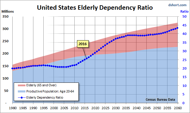
As the chart painfully illustrates, the elderly dependency ratio is in the early stages of a relentless rise that doesn't hit an interim peak until around 2036, over two decades from now. Given the unprecedented demographic headwinds for today's investors, I'm unable to share the Chris's confidence that the US is now in a new secular bull market.

See the original article >>

FTSE Stock Market Triple Top - The Golden Age of QE and The Fiat Endgame...

By: Clive_Maund

As you are doubtless aware we are living in a new paradigm - the age of global QE has arrived. Amongst the major power blocs it started with the US, spread to Japan, which adopted it with a particular gusto, after suffering from deflation for decades, and just has been taken up by Europe in a big way, after waiting for half its young people in many constituent countries to become unemployed due to the ravages of deflation. Smaller countries will have to join in or their currencies will soar and they will become uncompetitive.

It is vital to understand that, having become a universal policy, QE is here to stay - this is a genie that can't be put back into the bottle. The reason is that any attempt to reverse course and rein it in would quickly lead to soaring interest rates because of immense debt levels, a global market crash and a liquidity crisis, in other words a deflationary implosion. Another important to note is that in this "Golden Age of Fiat" where money does not have to be backed by anything and where our masters are accountable to no-one, they can indulge in as much QE as they like.

QE has a number of huge advantages for the ruling elites. First of all it allows them to remain in power indefinitely, because credit crises and the social strife that follows can be avoided by the simple expedient of printing ever more money - the European elites were slow to grasp this point, but judging from the magnitude of their just announced QE, they definitely understand this now. As we know, one of the maxims of the elites is to "privatize profits and socialize losses" - put crudely and simply, when they make money they keep it all to themselves, but when they goof up and lose money, they will push the bill onto the general population, the middle and lower classes - a brazen and glaring example of this being when the "too big to fail" banks and other big institutions in the US got society at large to bail them out at the height of the financial crisis via TARP, the Troubled Asset Relief Program, which of course was not put to a vote.

QE is just another enormous scam, a principal objective of which is to socialize bank and government debt by inflating it onto the masses. They print money (QE), hand as much of it as they please to their crony pals in banks and other powerful elite controlled institutions, and then the increase in money supply reduces the relative magnitude of government debt, since while the debt is nominally the same, there is much more money in existence to service it or pay it off. The public then picks up the tab in the form of inflation as the increased money supply drives up prices.

The reason for the bizarre mismatch where stockmarkets have been continually rising but commodity prices have been falling is due to the fact that the elites are awash with cash to play the markets, while the average poor schmuck on the street is getting poorer and aggregate demand is diminishing as a result, reducing the demand for raw materials. One would think that this must eventually impact stock prices as overall sales fall and profits drop, but in the crazy world in which we now live, we have to factor in the elites with their huge bags of free cash that they have to invest in something, which includes the big banks of course. Their cash mountains resulting from QE could overwhelm old fashioned considerations like corporate profitability and drive stock prices higher regardless. This can be a difficult concept for older investors, who grew up in an age of relative fiscal propriety, to grasp.

A crucial point to understand is that the world is now actually run by and for the benefit of the big banks, who are a "de facto" World Government. Governments and politicians universally do what these banks require of them, or they suddenly find themselves sidelined or usurped - or worse. The banks have encouraged everyone and everything to get into as much debt as possible to maximize profits - they spirit money into existence and then turn round and lend it out at comparatively vast rates of interest. They are using to QE to clamp interest rates at 0 (for them), so that they can maximize the differential with the rates they charge, resulting in, needless to say, huge profits for doing very little, and, as mentioned above they use the zero rates to stop their massive debts from compounding and use the QE to inflate them away at public expense.

The above is not abstract theorizing - it is necessary that we understand what the game really is in order that we have a greater chance of being on the right side of the trade. If we really are in the new age of global QE, then we are living in a very different investment landscape to what would otherwise be the case, with the Masters of the System now able to adjust the faucets to decide how deep recessions will be, and even whether there is a recession or not - and don't forget a recession to them is when the value of their investments falls, not when the guy on the street is broke or unemployed. This is why we have the situation where big Western stockmarkets like the FTSE in the UK or the S&P500 in the US are near to all-time highs, while the average middle class person is struggling.

Comprehending that we are in a new age of global QE, where they can print up as much money as they like at any time, changes the way one looks at markets. This gives the elites the power to manipulate markets on a grand, unprecedented scale.

A dramatic example of such gargantuan manipulation may be about to play out in the London stockmarkets. The normal interpretation of the giant pattern forming in the UK FTSE index which we looked at not long ago, using traditional Technical Analysis, is that a huge Triple Top is completing, but the government may be able to avert this outcome by simply doing QE on a sufficient scale to head this off and force an upside breakout. All they have to do is keep pumping money at a sufficient rate and make sure it reaches those whose task it is to keep the market levitated. This is the "new paradigm" that we wrote of near the start - never before have governments had such power to control markets. If they succeed in breaking the FTSE out the top of its gigantic Triple Top, where there is huge resistance, this index will soar. If it starts to descend from this Triple Top, things could get ugly in a hurry.

The markets' reaction to the Fed yesterday was negative, as we can see on the 6-month chart for the S&P500 index below...

S&P500 6-Month Chart

If the FTSE does break out upside from its Triple Top, then US and other markets should soar too. The US should remain "leader of the pack" for various reasons. The obvious one is that its currency, the dollar, is the global reserve currency. The next is that it is "smelling of roses" right now because it is not doing QE, while other centers of economic power are, although the fact is that the Fed still has a huge tub of money from the last big QE to goose the markets. Still another one is that the US is geographically homogeneous and distant from world trouble spots, unlike Europe which is composed of potentially warring tribes. So while there might be some nasty shakeouts in the US markets over the short to medium-term, as might be occasioned by a disappointing earnings season, there should be plenty of cash sloshing about to drive them back up again. All this is a reason why we are looking at things like airline stocks, which stand to benefit also from the drop in the oil price.

The other side of this manipulation coin is that they also have to power to beat down things they don't like, such as gold and silver, by endless waves of naked shorting - but this will only work until the gap between the physical and paper price becomes untenably large. Given the rampant global QE now underway and the resulting destruction of currencies, and the fact that most of the available physical gold in the world has already been bought up by Asian countries, most notably China, their power to beat down the paper price of gold looks spent, and it is starting to rise again, after the onslaught of the past 3 years.

The end result of relentless global QE would be a hyperinflationary depression, where prices rise strongly because of the endless increase in money but get people get poorer as wages fail to keep pace. When you mention hyperinflation people think of it as prices rising by thousands of percent per year, like in the Weimar Republic in Germany or Zimbabwe at its worst, but it doesn't have to be anywhere near that bad to be hyperinflation - if prices only rise by 60% per year, most citizens would be ruined within 2 years. That could easily happen if this QE gets out of hand.

When we consider the outlook for gold and the impact on the gold price of all this relentless global QE, any fool can see that if you continually increase the money supply, the cost of something finite like gold is going to rise - and possibly rocket, especially as a lot of the physical supply of gold has already been soaked up by more shrewd players like China. This means that the jokers on the Comex with all their naked shorting are going to be way out on a limb, when the price gap between paper and physical gold yawns to untenable and unsustainable levels - it is already big.

So even though the blizzard of unbacked money created by the ongoing global QE can be expected to drive the prices of many investments like stocks higher and higher, gold (and silver) are not going to be left out for much longer. They are already starting to come to life. Older investors will recall that gold's gigantic bullmarket of the 1970's was punctuated by a big 2-year correction in the middle of it that corresponds to the big 3-year correction that we have just witnessed, before it took off higher again into a massive ramp and a spectacular blowoff top, which is what we should see repeated again, only this time round, given the unprecedented excesses that now exist, it is likely to be orders of magnitude larger.

Gold 1970-2005 Chart

The biggest danger to the system that could yet - and at any time- cause markets to crash would be a widespread failure of confidence in the banks and the system. So far investors don't seem to care about banks and governments destroying their children's future with their reckless QE programs, but should that change and investors "get cold feet" things could get nasty in a hurry. We are going to need to keep our wits about us.

See the original article >>

The VIX and the Stock Market

by Pater Tenebrarum

A Disturbance in the Farce?

We usually like to keep an eye on indicators that are not getting a lot of attention, in an attempt to circumvent the “what everybody knows isn’t worth knowing” problem. Recently, several noteworthy things have happened with the $VIX, or rather, the derivatives traded on the VIX. The VIX is a measure of implied volatility, referring to front month options on the S&P 500 Index (it used to be the S&P 100 back when OEX options were still the most liquid index options – the OEX version is these days called VXO). While the first OEX version used only at-the-money options expiring 30 days hence, the calculation has been expanded over time. Now it is a blend of front and second-month at-the-money and out-of-the-money options. Those interested in the precise calculation procedure can take a look at it here: CBOE VIX White Paper (PDF). The aim is to calculate the expected 30-day volatility of the SPX at a 68% probability (one std. deviation) as expressed by the options market.

gi-takingstock01rb1

Image credit: James Steidl / Thinkstock)

For some time VIX futures and options that reference these futures have been trading. Both the futures and options are extremely popular, as hedging instruments, but also as speculative vehicles. In addition, there are VIX ETNs (both long and short, some of which are leveraged), which are also highly popular. Since the stock market usually becomes much more volatile when it goes down rather than up, the VIX tends to rise whenever the market declines. In a steadily rising market with little volatility, the term structure of VIX futures tends to be in contango. There have already been two occasions in 2015 when the cash VIX traded above the futures curve, and even now (after a strong market rise on Monday), the nearest futures contract trades above the two subsequent ones.

1-$VIX

On two occasions in 2015, the cash VIX was trading above the level of VIX futures. The term structure remains partially inverted – click to enlarge.

2-VIX term structure

VIX futures curve – although the cash VIX ended below the futures curve on Monday, March and April futures are still in backwardation vs. February futures – click to enlarge.

When the first inversion of 2015 occurred in January, the event was subject to what could turn out to be an erroneous interpretation at Business Insider. While it is true that over the past year or so, the curve tended to invert close to short term lows, it didn’t invert right at those lows, but before they were made. It is also the case that generally, over the longer term, VIX curve inversions are actually a negative sign, as Gavekal points out here (with a chart that shows a lot more history than the one in the BI article). Prior to the 2008 unpleasantness the VIX term structure also went into backwardation. It was obviously not a good idea to buy stocks at that juncture (it was a good idea to buy VIX calls though).

The recent episodes of VIX futures curve inversion are still small, and may well turn out to be meaningless, similar to those seen last year. However, one needs to keep in mind a few things here: With the sole exception of the October correction, these inversions tended to last just one day in 2014, and were as a rule followed by a divergence (a lower low in the SPX, while the backwardation disappeared). This year we have had two of them closely grouped together on rather mild declines. If the phenomenon turns out to be persistent and the backwardation steepens, then it will definitely fall under the header “warning sign”.

“No More Hedging Required”

Moreover, the event needs to be brought into context – namely into context with what has happened with VIX options. We were surprised to learn what has happened in terms of call vs. put open interest in VIX options in January, and how this was rationalized, according to a Bloomberg report :

“Even with stock swings nearly doubling since 2014 and U.S. equities poised for their worst month in a year, traders aren’t signaling too much concern.

Investors own about 2.4 million options betting on a rise in the Chicago Board Options Exchange Volatility Index, compared to about 1.6 million contracts wagering on a drop. That’s around the lowest ratio of calls to puts in more than two years, data compiled by Bloomberg show, indicating traders don’t anticipate an increase in market turbulence anytime soon.


This seems to be the exact opposite of what VIX futures are signaling, as backwardation in VIX futures is always a sign of “concern.” Here is more about why speculators and hedgers alike seem no longer willing to bet on a rise in the VIX – in spite of the fact that it has actually clearly moved into a higher trading range this year:

“Traders have abandoned options betting on jumps in the VIX since November, even as the gauge spiked at least 18 percent three times this month. Stocks’ tendency to power past declines at the end of 2014 encouraged traders to shed hedges and speculative bets in VIX options they weren’t profiting from, according to Todd Salamone of Schaeffer’s Investment Research Inc.

“We’ve seen a massive drop-off in call open interest,” Salamone, senior vice president at Cincinnati-based Schaeffer’s, said by phone. “There’s been the lack of a big selloff or major volatility pop that hasn’t been short-lived, which could be responsible for that.”

Individuals use VIX options as a tool to protect their stock holdings from losses or to speculate on increases in market stress. The VIX moves in the opposite direction of the Standard & Poor’s 500 Index about 80 percent of the time. Investors have dramatically reduced their positions in VIX calls since September, when they owned about 4.4 contracts betting on upside in the gauge for every put, the highest ratio since February 2007.

Open interest in calls has plunged 50 percent since then, while ownership in options wagering on a VIX decline has grown 49 percent. The put-call open interest ratio in the contracts fell to 1.4 on Jan. 23, the lowest since April 2012.”


We believe there is a lot more speculative interest in VIX calls than hedging interest, but that is just a hunch. We also believe that those trading VIX futures are more likely to be professional traders, as the futures obviously involve a lot more risk than the options; more risk than for option buyers that is – option writers are exposed to very similar risk as futures traders.

We find it quite remarkable that call open interest in VIX options has plunged dramatically just as the VIX actually seems to be threatening to break higher. This definitely strikes us as a bearish divergence. It also means that the behavior of the term structure is most likely of the “warning sign” variety. In fact, it is suggested in the article that the lack of protection via VIX calls may be exacerbating stock market volatility this year (as non-hedged longs are more likely to use stops):

“The frustration level has steadily grown as people see these spikes in the VIX become more and more fleeting,” Breier, a senior equity-derivatives trader at BMO in New York, said by phone.

The stock market’s durability last year could have led to investors shedding unused protection and never replacing it, Salamone at Schaeffer’s said.

“Those that typically use VIX call options to hedge long portfolios could be giving up on those hedges,” he said. Through most of last year, “it wasn’t unusual for 90 percent of those calls to expire worthless,” he said.

The consequences endured by underhedged investors may have already surfaced in exacerbated stock swings. The S&P 500 has posted average daily moves of 0.9 percent so far this year, almost double the 0.53 percent average each day in 2014.”


What’s more though, hedging activity seems to have moved away from the options market to the futures market, indirectly confirming our above assertion regarding VIX futures mainly being the playground of professional traders. Incidentally, some of the rising open interest in VIX puts is possibly explained by the increase in long positions in VIX futures. Once again though we think one should not underestimate how much short term speculation there is in VIX options. It is as though traders in these options have “learned their lesson” and are now increasingly betting on declines in the VIX – quite possibly at exactly the wrong time:

“Even as VIX options traders give up on calling for more turbulence, hedge funds and other large speculators own the most such bets in VIX futures contracts since December 2009, according to data compiled by the Commodity Futures Trading Commission. These managers held about 86,700 long positions and 79,700 short ones through Jan. 20, CTFC data show. Hedge funds are expressing the view that volatility will gradually rise this year without trying to time when the VIX will spike, according to Dan Deming at Equity Armor Investments.

“Right now, there’s a belief from a trader’s perspective that owning VIX futures is a better strategy,” Deming, managing director at Equity Armor, said by phone from Chicago. Larger market participants “are buying downside puts because they’ve ramped up their volatility exposure,” he said.

The two most-owned options on the VIX are wagering on it to decrease within the next 30 days. Contracts expiring Feb. 18 with a strike price of 14 have the highest ownership, followed by options wagering on a drop to 15 by that same day.


Something has clearly changed – but the one factor that is most unlikely to have changed is that the options crowd will be wrong again. If so, then the VIX is set to rise.

Conclusion:

Investors and traders should keep a close eye on the VIX term structure and the put/call open interest ratio in VIX options. The term structure can be followed here, at VIX Central. Charts summarizing various VIX options-related data can be found here. If these recent trends persist, it could well prove to be meaningful.

Addendum: Bonds vs. Stocks

Here is one more chart that deserves to be looked at from time to time, and now is such a time. It plots the ratio of the 30 year treasury bond price vs. the SPX. As you can see, whenever this ratio has “broken out” to the upside, it too warned of an impending increase in market volatility. Its current rise may yet turn out to be a flash in the pan, but this also bears watching closely:

3-30-year-SPX ratio

The ratio of the 30 year treasury bond price vs. the SPX – it seems to have bottomed in 2014, and now it is rising. So far the increase is small, but it may well turn out to be an early warning sign as well – click to enlarge.

See the original article >>

After the Perfect Storm in US Smaller-Cap Stocks

by Bruce Aronow

Last year was a tough one for US small- and mid-cap stocks, but there’s reason to think 2015 may be different. For investors who trimmed their smaller-cap allocation last year, we think it may be time to consider taking it back to its long-term target.

Over time, a steady allocation to the asset class has paid off. But first, let’s take a brief look at what went wrong in 2014.

Valuation was a big part of the problem. Smaller-cap stocks—especially biotech and Internet names—began the year with fairly rich valuations both absolutely and relative to their large-cap counterparts. When reported earnings failed to measure up to initial expectations—in many instances because of the unusually harsh winter—investors soured on the entire asset class. Earnings for their more diversified larger-cap peers held up much better.

Volatility also inflicted damage. A bout of market turbulence early in the fourth quarter, sparked by plunging oil prices and worries about the global economy, caused many investors to retreat from risk by paring back equity holdings in general and taking refuge in safe havens such as US Treasuries. Smaller-cap companies suffer disproportionally from declining risk appetites.

Put another way, 2014 served up something of a perfect storm for smaller-sized companies. The Russell 2500 Index of US small- and mid-cap (SMID-cap) stocks still provided a modest positive return in absolute terms, but it was well off the blistering pace set over the prior two years and well below what large-cap stocks delivered.

Smaller-Caps: Strong Historical Performers
Now let’s widen the lens. When we do, we find that over time, smaller-cap stocks have been stellar performers. As the Display below shows, US SMID-caps have comfortably outperformed not just US large-caps over the long run, but also international equities and intermediate maturity bonds.

In our view, too, the backdrop for the asset class has brightened. The strengthening US economy, which is expected to continue growing more swiftly than economies overseas, favors smaller, domestically-oriented firms because a larger percentage of their sales are US-based. That should benefit earnings growth at smaller-cap companies.

What’s more, small-caps look more reasonably valued today than they did at the start of 2014, when data from Russell Indexes showed the Russell 2000 was trading at a 20% premium to the large-cap Russell 1000 Index. By Dec. 31, that premium had been cut in half, leaving it roughly in line with the long-term average.

It’s Time Invested that Matters, Not Timing the Market
As a result, we think investors who cut their smaller-cap allocation during last year’s turmoil might want to think about restoring it to its long-term target. As the following Display shows, missing just one month of the average small-cap bull market would have cut average annual total return by about 15%. Sitting out for five months would have more than halved it.

SMID-Caps: Often Misunderstood, Mispriced
To be sure, smaller-cap stocks are more volatile than large-caps. One reason for that boils down to neglect. Smaller companies everywhere receive less research coverage than large ones. The average stock in the Russell 2000, for example, has fewer than seven analysts covering it, compared to 16 for the average Russell 1000 stock.

As we’ve seen, this neglect often causes smaller companies to be misunderstood and mispriced. But it also gives active managers more opportunity to add value, especially if they have the research resources needed to dig into company fundamentals.

In our view, investors should look beyond last year’s performance and consider maintaining a consistent allocation to smaller-cap stocks. If 2015 turns out to be the year the US economy finally shifts into high gear, the ride’s likely to be a lot smoother.

See the original article >>

The Longer Outlook in ….. The Russell 2000

by Greg Harmon

Small cap stocks are often looked to for leadership in the stock market. This is because on average over time they produce better returns than large cap stocks. This makes sense as a small company has one more worry that a big company does not have: survival. They are riskier companies and therefore should create higher returns. With greater sensitivity it is often possible to see trends that are beginning sooner. This is good in practicality for a long term investor and in theory for a trader. But as an observer of price action one thing I notice is that small caps are not always able to push the large caps around. It is better to study small caps on their own.

russell 2000

The chart above of the monthly price action in the Russell 2000, the small cap index, offers some interesting information. First notice the original ‘V’ bottom that was created with the financial crisis. The Russell was quick to move back to pre-crisis levels, faster than the S&P 500, but actually the Nasdaq 100 moved quicker.

The hiccup in May 2010 created an Inverse Head and Shoulders pattern that upon breaking the dotted neckline set a price objective of 1115. It reached that milestone in October 2013. And since then it has done nothing. Certainly no leadership for over 15 months. But is that a concern? Maybe not.

There is a second Inverse Head and Shoulders as well. This one uses the red neckline and has a much smaller left shoulder than right shoulder. It was triggered on a break of the neckline in December 2012 and carries a price objective to 1390. The 15 month consolidation comes right in the middle of the move to the price objective. Almost like a bull flag, waiting to gather strength for a move higher.

If you look at the price series from an Elliott Wave perspective, it could have a lot higher to move still. Looking at the move lower in the financial crisis as an A-B-C corrective wave, then the move from the 2009 low may just be in Wave IV of the V Wave Impulse higher. These Impulse Waves alternate between trending and corrective, with the two corrective waves having different character. That is to say that if one pulls back then the other is generally flat, like Waves II and IV. The current consolidation would make sense then. Using a little math then and assuming that Wave V extends as long as Wave I but not longer than Wave III gives a range of 1575 to 1650.

The momentum indicators are not quite as bullish though. With the RSI drifting lower there is some small weakness. But it looks like the bleed off in momentum is acting out in a sideways consolidation, not a pullback, and that RSI has now worked off the overbought condition but held very strong. The MACD is a similar story. Pulling back and crossed down, gives cause for a pullback. But the trajectory has been quite shallow thus far.

So it looks like the long train ride higher has yielded to a pause, not a correction. That is strength. If the Russell were to close materially below 1100 on a monthly basis, then you can start to look for more downside and maybe a test of the 50 month SMA at 950 or even the neckline at 900. But until the intermediate bias is sideways within the long term uptrend.

See the original article >>

Market Oversold Enough For A Bounce

by Lance Roberts

Since I was traveling this past weekend for the 2015 World Economic Conference, I did not have a chance to analyze the short-term market dynamics thoroughly in this past weekend's X-Factor Report. However, there is some excellent commentary worth your reading from Authur Hill, Bill Gross, and Crispin Odey.

However, I did want to send out a quick note on the very short-term oversold condition of the S&P 500.

The bounce at the end of the day yesterday, driven by news flow out of Greece, was likely the beginning of a short-term oversold retracement of the recent decline. It is important to keep in context that the recent decline, despite the media's incessant hand-wringing and panic, has been a mere 3% since the beginning of this year.

Nonetheless, during any correction, or more importantly during a mean-reversion process, the financial markets do not move in a singular direction but rather like a "ball bouncing down a hill." For investors, it is these short-term bounces that should be used to rebalance exposure to "portfolio risk."

As shown in the chart below, the S&P 500 has gotten oversold on a short-term basis and is due for a bounce to the current downtrend resistance line. Importantly, the market is sitting on what has been very important support in recent months at the 150-day moving average.  A failure of this support will lead to a retest of the October, 2014 lows.

SP500-DailyChart-Analysis-020215-2

A rally from this support line could last several days to a couple of weeks. It is advisable to use the rally to "clean up" existing portfolios by selling laggards, reducing high-beta risk and rebalancing winners by taking profits and rebalancing back to target weights.

(Important note:  Notice that I did not say "rebalance portfolios" which implies selling winners to buy losers. The goal here is to let winning positions continue to flourish by simply "pruning" the position, and "weeding" the portfolio by selling the losers dragging on overall performance.)

The chart below shows a listing of the major markets and sectors in terms of relative performance to the benchmark index. This helps to identify areas that should be paid attention to in portfolios currently.

Market-Rotation-020215

As shown the areas to pay the most attention to in terms of laggards are:

  • Financials
  • Technology
  • Energy
  • Emerging Markets

Areas to focus on for positions to hold, or remain underweight, at the moment are:

  • Basic Materials
  • International

Lastly, clear winners to hold/take profits and rebalance back to portfolio weights are:

  • Industrials
  • Mid-Capitalization
  • Small-Capitalization
  • Discretionary
  • Real Estate
  • Staples
  • HealthCare
  • Utilities
  • Bonds

Importantly, it is worth noting that the bulk of the winning sectors have been, and continue to be, defensive areas in nature that are primarily large cap and dividend yielding.

The chase for yield over the past couple of years has pushed these sectors to extreme deviations from their long-term means. This suggests that during a major market reversion, when it occurs, that the defensive sectors are at risk of not providing the "shelter" that is suggested by their historical tendencies.

Lastly, the long-term chart of the markets are beginning to flash warning signs that this extremely long bull-market cycle may be at risk. While it is still too early to make a more defensive call now, there are signs of significant deterioration in the overall "momentum" of the market.  In the weekly X-Factor Report, I run a model for managing 401k plans that consists of the three (3) buy/sell indicators. (Subscribe for free e-delivery)

The chart below shows two of the three indications on a monthly basis labeled S1 (sell signal 1) and S2 (sell signal 2). There have only been three periods since 1998 where the S1 indicator has been triggered.  The first was in late 1999 as the markets climaxed toward their peak in 2000; the second was in late 2007, and the third was in January of this year.

SP500-Sell-Signal-1

Considering that market momentum is waning, deflationary pressures are rising and economic growth is slowing on several fronts (along with a rather rapid decline in corporate earnings) it certainly suggests that risks are beginning to significantly outweigh the rewards. Is this suggesting that the next major bear market is underway? No. It does suggest, however, that investors should pay much closer attention to the inherent risk in portfolios currently.

The S1 signal could be reversed with a very strong rally that propels the markets to new highs. While this is certainly possible, it has historically not been the case. However, the market over the last few years, due to massive Central Bank interventions, has repeatedly defied statistical analysis and historical comparisons.

The next couple of weeks will be extremely important for the markets to regain their "mojo" otherwise the risk of a much larger correction remains a dominant threat. As we saw with the Seattle Seahawks during the SuperBowl, making the wrong call late in the game can have disastrous consequences.

See the original article >>

Why Peak Oil Is Finally Here

By Ron Patterson

In this life nothing is certain. Therefore I am not declaring, absolutely, that we are at peak oil, only that it is a near certainty. But I am putting my reputation on the line in making the claim that the period, September 2014 through August 2015 will be the year of Peak Oil. Below are my reasons for making this claim.

First of all, Peak Oil is not a theory. The claim that Peak Oil is a theory is more than a little absurd. Fossil hydrocarbons were created from buried alga millions of years ago and they are finite in quantity. And as long as we keep extracting them in the millions of barrels per day, it is only common sense that one day we will reach a point where their extraction starts to decline. In fact most countries where oil is extracted are already in decline. So obviously if individual countries can experience peak oil then the world as a whole can also experience peak oil.

All charts below are in thousand barrels per day of Crude + Condensate with the last data point September 2014.

WorldLessUSA&Canada

First I want to deal with the portion of the world that reached peak oil about four years ago, in January 2011. That is everywhere else in the world except the US and Canada. I am not saying that every country outside the US and Canada has reached peak oil, but combined they have reached peak oil.

Related: Bearishness Continues Among Oil Industry Experts

The world outside the United States and Canada has been on a bumpy plateau for ten years and now, even with that last September 2014 surge, is still 1,670,000 barrels below the peak of January 2011. However only a few countries are responsible for this plateau.

The bumpy plateau actually began back in 2005 where the peak was in July. Since then, outside the USA and Canada, there have been 15 countries with production increases and 21 countries with production declines. Here is a look at the 15 winners outside the US and Canada.

ProductionWinners

Dealing with the winners one at a time:

Iraq: The EIA has data only through September but Iraq has actually increased production by about 300 kbd to December. But word is they are slightly down in January. That puts Iraq up almost 1.5 million barrels per day since they started their massive infill drilling program in 2009. Iraq still has some upside potential but their downside risk now even greater.

Russia: Russia has peaked, even according to Russian analysts. They will decline only slightly in 2015 but their decline will accelerate after that.

Brazil: Brazil has some upside potential and a lot of downside potential. The finances of Petrobras are a damn mess. Moody’s has downgraded them to Baa3, just one notch above junk status and further downgrades are expected soon. To increase their pre-salt production much more will require a lot more borrowed money. That is not very likely.

Qatar: The EIA says Qatar C+C production increased by 598,000 barrels per day between July 2005 and September 2014. The OPEC Monthly Oil Market Report says their crude only production declined by 78,000 barrels per day during that time span. The chart above was made with EIA data which counts condensate as oil. OPEC reports only crude. On the chart below the EIA data is through September, the OPEC data is through December 2014.

Qatar

The EIA says Qatar has increased condensate production from her massive natural gas fields. Qatar crude oil production is in decline and has been since 2008. Qatar crude will continue to decline and their condensate is likely at a peak also.

Angola: Angola peaked in 2009 and 2010 and is now in decline. However some of the decline is caused by political problems. Those problems will likely get worse.

Colombia: Colombia’s production has doubled in the last 8 years but they reached their peak in 2013 and have held almost flat for the last two years. Colombia has peaked and will decline, though that decline will likely be very slow. I have included Colombia in the chart below that shows four countries that have recently peaked.

Kazakhstan: Kazakhstan is at peak of currently producing fields. Production will likely decline until Kashagan comes on line sometime in 2017. This field that once promised to produce over a million barrels per day is now expected to barely produce 300,000 barrels per day… if it ever manages to come on line. But nothing spectacular is expected out of Kazakhstan, especially since its old fields are expected to start to decline soon.

China: China peaked in 2010 and has held pretty well steady since then. I expect China will start to decline soon.

Azerbaijan: Azerbaijan peaked in 2010 and has been in steady decline since.

UAE, Oman and Kuwait: All three of these Middle East countries have implemented massive infill drilling programs in the last decade or so. But all three have now peaked. These three nations, along with Colombia, show a beautiful increase in production then a rounding peak at the top.

YAEKuwaitOmanColombia

These four countries are responsible for 1.5 million barrels per day of the increase since 2005. They have all four now peaked, or at least very near their peak.

Saudi Arabia: Saudi has brought their last mothballed field on line, Manifa. Now they have none. Saudi is producing flat out. They might, with great effort, produce a few more barrels per day, but basically they are at peak right now.

And a look at the 21 losers.

ProductionLosers

I have changed the negative numbers to absolute numbers in order to make it easier to read. But basically these are the nations that have peaked and are now in decline. A couple, Iran and Libya, because of political problems, have declined a lot more than they would have without that conflict. However neither is likely to recover very soon. And even when they do, it will be to a point lower than they were before their problems. Syria and Sudan, including South Sudan, and Yemen are others that will not recover in this decade, or until long after we are on the down-slope of peak oil.

That brings us to the US and Canada.

USACanada

The USA and Canada are responsible for about 120% of the increase in world oil production since 2005, even though they did not begin their grand ascent until 2009. Canada’s over 400,000 bpd increase in September is responsible for that last spike upward. But can this continue?

In a word… no. The gain has been almost all LTO and oil sands. And low prices are killing both. If prices stay low both Canada and the USA will begin to decline by the second half of this year. But even if prices return to the $70 to $80 range, (it is not likely they are going higher than that), their production will still not increase fast enough to offset the decline in the rest of the world.

Related: U.S. Crude Inventories Reach Highest Levels Since 1982

But what about those massive reserves still in the ground? Many say we have not yet produced half the URR, the Ultimate Recoverable reserves, and until we are at least that half-way point, we cannot be at peak oil. Well, there are a few really serious problems with that logic. First, what is meant by the word “recoverable”? And at what price? Let’s look at really important chart.

The 2014 data point on the chart below is the average January through November.

HistoricalOilPrices

Here is a chart of Historical Crude Oil Prices. The average price, the blue line, is the average price of oil for that year. The orange line is the average price from 1946 to any point on that line. For instance the average price of oil for the 34 years from 1946 through 1973 was $23.68. And that is in today’s dollars. From 1946 through 1973 oil companies were getting an average of $23.68 a barrel for their oil, and they were making a pile of money at that price. Today, the price is more than twice that amount, and many of them are losing a pile of money.

So let’s get back to reserves. The reserves produced in 1973 and prior years were very profitable at less than $24 a barrel. Then all hell broke loose in the Middle East and prices skyrocketed. Then for the next dozen years oil companies made windfall profits. But in 1986 oil prices came down to normal. Between 1986 and 2002 oil prices averaged $30.42 a barrel. (Not shown on the chart.) Even at that price oil companies still made huge profits. But today they are losing money at $50 a barrel.

The problem is with those “reserves”. Today’s reserves are just not the same as those earlier reserves. All the good cheap stuff has already been sucked up. We are now left with dregs at the bottom of the barrel. All today’s new oil is harder to find, depletes a whole lot faster, and costs many times as much to produce. None of the cheap stuff is left except in a few old super giant fields that are undergoing infill drilling like there is no tomorrow.

Once again, we are at peak oil right now. The peak will straddle the 2014 and 2015 time line. 2016 will be the first full post peak calendar year. It really doesn’t matter how many barrels of oil are left in the ground. The point is we will never again pull it out of the ground at the same rate we are pulling it out right now.

See the original article >>

Bad News For World Economy That No One Wants To Hear

By Kurt Cobb

Reading the general run of financial headlines might lead one to believe that price declines in those commodities which are highly sensitive to economic conditions such as iron ore, copper, oil, natural gas, coal, and lumber are good on their face.

Obviously, the declines aren't good for those who sell these commodities. But, those of us who buy these commodities in the form of cars, houses, utility bills and other products and services ought to be helping the world economy as we buy more stuff with the freed up income.

As true as that may be, these commodity price declines also signal something else: exceptional weakness in the world economy. It is no secret that economic growth in Europe has been stalled for some time and is now receding. The European Union's confrontation with Russia over the Ukraine conflict and the resulting tit-for-tat economic sanctions levied by both sides are only worsening the economic climate.

Russia has been hit by the double whammy of oil price declines and sanctions which are probably sending the country into recession. And now the new anti-austerity government in Greece seems to be pushing Europe headlong into another Euro crisis as worries about Greek debt default spread.

Related: Winners And Losers Of Low Gasoline Prices

Chinese economic growth appears to be faltering. And, that seems to be one of the direct causes of the broad-based commodities price decline. A fast growing China has previously created enormous demand for basic commodities needed to build out its infrastructure--commodities such as copper, iron ore and the petroleum products needed to run all the vehicles and machines essential to that build-out. Chinese demand for basic commodities has also increased as China's expanding wealth has allowed many more people there to own private automobiles and to enjoy other fruits of a spreading consumer society.

Economic distress for China seems to come when its hypercaffeinated annual growth rate falls below 7 percent where it seems to be heading now. Official Chinese statistics have long been suspect, so growth may already be below 7 percent. Lower growth makes it difficult for the country to provide work for all those who are leaving the countryside and streaming into the cities as China industrializes.

Commodity-exporting nations such as Canada, Brazil and Australia have taken a big hit on declining Chinese and world demand. But, their bourses seem surprisingly buoyant given the extent of the damage.

The commodity price declines aren't just confined to the industrial and energy commodities mentioned above. Food commodities have been swooning as well recently. Of course, food prices swing based on farm yields which have no necessary relation to the economy at a particular time. What is especially telling about the decline in the prices of foodstuffs is how broad-based it is.

Price declines affected wheat, corn, soybeans, and oats in part due to record harvests. Prices for cocoa declined due to rising harvests and falling demand. But, not every food commodity is experiencing increased harvests. Sugar production has actually declined in the last growing cycle. Yet, sugar prices fell. At the margin, it seems, people are buying less of what are essentially discretionary food commodities such as cocoa and sugar. Does that seem right if consumer buying power is being buoyed by cheaper industrial and energy commodities?

Stock and bond markets across the world are being levitated by central banks which have telegraphed to investors that the banks will react to practically any weakness in stocks or bonds. Of course, central banks don't much concern themselves with the prices of commodities because they cannot control them directly in the way they manipulate money and credit. That's why commodity prices right now are a much better barometer of the global economy than the world's stock markets.

One could say that the stock markets of the world disagree with the global commodity markets about the direction of the world economy. One could also say that the world's bond markets agree with the commodity markets. Low bond yields typically mean that investors expect inflation and economic growth to be low or even negative. High inflation and/or economic growth tend to cause investors to demand higher yields as credit availability tightens and as concern about inflation eroding bond returns rises.

It is especially telling that in the United States, where the U.S. Federal Reserve Bank ceased its government bond buying program last year (known as quantitative easing), that long-term government bonds returned almost 39 percent, much better than the U.S. stock market which registered a 12 percent gain in the S&P 500 index. With waning support from the U.S. central bank, government bonds were supposed to decline (and yields go up). Just the opposite happened--big time!

And as 2015 began, the consensus was that U.S. (and Canadian) interest rates would rise and thus bond prices would decline. Instead, long-dated U.S. governments--which are very sensitive to interest rate changes--spurted upward another 12 percent in January alone as yields plunged to record lows. This was in perfect concert with the continuing commodity rout suggesting that investors in these markets expect low or no economic growth in the year ahead.

Related: Russian Stimulus Plan ‘Just Talk’

Practically the entire investor class across the world believes that central banks now guarantee stock prices, and that the stock market therefore is a sure thing. Commodities and bonds, however, are telling a contrarian story. The obvious questions are: If central banks are omnipotent, then why didn't they prevent stock market crashes in 2001 and 2008? If it's different this time, what exactly will central banks do to prevent another crash? Can they really effectively lower interest rates which are already at zero in much of the world (and below zero in a few instances)? If central bank policy is so powerful, why haven't six years of the lowest interest rates in memory--and in the case of Great Britain since the beginning of central banking there in 1694--resulted in booming growth across the world?

Last week analyst Doug Noland of Credit Bubble Bulletin fame, summarized the situation this way:

To this point, mounting risks – financial, economic, geopolitical and the like – have been viewed as guaranteeing only greater injections of central bank liquidity.

The assumption has been that if markets falter, central bank liquidity can and will always hurl them higher than before. It seems there is no crisis too big that ever greater liquidity injections cannot solve it. That assumption is already being tested this year, and there are likely to be many more tests coming.

The rather precipitous, alarming and lockstep trends in bond yields and commodity prices in the last year suggest that we are likely to get some clarifying answers in 2015 to the questions listed above.

See the original article >>

The Housing Chart Which Refutes The Washington/Wall Street Recovery Myth

By Michael Snyder

Did you know that the rate of homeownership in the United States has fallen to a 20 year low?  Did you know that it has been falling consistently for an entire decade?  For the past couple of years, the economic optimists have been telling us that the economy has been getting better.  Well, if the economy really has been getting better, why does the homeownership rate keep going down?  Yes, the ultra-wealthy have received a temporary financial windfall thanks to the reckless money printing the Federal Reserve has been doing, but for most Americans economic conditions have not been improving.  This is clearly demonstrated by the housing chart that I am about to share with you.  If the economy really was healthy, more people would be getting good jobs and thus would be able to buy homes.  But instead, the homeownership rate has continued to plummet throughout the entire “Obama recovery”.  I think that this chart speaks for itself…

Homeownership Rate 2015

Of course this homeownership collapse began well before Barack Obama entered the White House.  Our economic problems are the result of decades of incredibly bad decisions.  But anyone that believes that things have “turned around” for the middle class under Barack Obama is just being delusional.

If the U.S. economy truly was in “good shape”, the percentage of Americans that own homes would not be at a 20 year low

The U.S. homeownership rate fell to the lowest in more than two decades in the fourth quarter as many would-be buyers stayed on the sidelines, giving the rental market a boost.

The share of Americans who own their homes was 64 percent in the fourth quarter, down from 64.4 percent in the previous three months, the Census Bureau said in a report. The rate was at the lowest since the second quarter of 1994, data compiled by Bloomberg show.

Rising prices and a tight supply of lower-end listings have put homes out of reach for some entry-level buyers, who also face strict mortgage standards. The share of U.S. homebuyers making their first purchase dropped in 2014 to the lowest level in almost three decades, the National Association of Realtors reported last week.

And it appears that this trend is actually accelerating.  During 2014, the rate of homeownership plummeted by a total of 1.2 percentage points for the year.  That was the largest one year decline that has ever been measured.

So why is this happening?

Well, in order to buy a home you have got to have a good job, and good jobs are in very short supply these days.

Over the past decade, the quality of the jobs in our economy has steadily declined as good jobs have been replaced by low paying jobs.  In addition, government policies are absolutely murdering small business.  At this point, small business ownership in the U.S. is hovering near record lows.

This has resulted in millions of people falling out of the middle class, and it has contributed to the growing divide between the wealthy and the rest of the country.

If our economy was working the way that it should, the middle class would be thriving.

But instead, it is being systematically destroyed.  If you doubt this, I have some statistics that I would like to share with you.  The following facts come from my previous article entitled “The Death Of The American Dream In 22 Numbers“…

#1 The Obama administration tells us that 8.69 million Americans are “officially unemployed” and that 92.90 million Americans are considered to be “not in the labor force”.  That means that more than 101 million U.S. adults do not have a job right now.

#2 One recent survey discovered that 55 percent of Americans believe that the American Dream either never existed or that it no longer exists.

#3 Considering the fact that Obama is in the White House, it is somewhat surprising that 55 percent of all Republicans still believe in the American Dream, but only 33 percent of all Democrats do.

#4 After adjusting for inflation, median household income has fallen by nearly $5,000 since 2007.

#5 After adjusting for inflation, “the median wealth figure for middle-income families” fell from $78,000 in 1983 to $63,800 in 2013.

#6 At this point, 59 percent of Americans believe that “the American dream has become impossible for most people to achieve”.

You can read the rest of that article right here.

The group that has been hit the hardest by all of this has been young adults.

Back in 2005, the homeownership rate for households headed up by someone under the age of 35 was approximately 43 percent.

Today, it has declined to about 35 percent.

From a very early age, we push our young people to go to college, and today more of them are getting secondary education than ever before.

But when they leave school, the “good jobs” that we promised them are often not there, and most of them end up entering the “real world” already loaded down with massive amounts of debt.

According to the Pew Research Center, close to four out of every ten households that are led by someone under the age of 40 are currently paying off student loan debt.

It is hard to believe, but total student loan debt in this country is now actually higher than total credit card debt.  At this point, student loan debt has reached a grand total of 1.2 trillion dollars, and that number has grown by an astounding 84 percent just since 2008.

If you are already burdened with tens of thousands (or in some cases hundreds of thousands) of dollars of debt when you get out of school and you can’t find a decent job, there is no way that you are going to be able to afford to buy a house.

So we have millions upon millions of young people that should be buying homes and starting families that are living with their parents instead.

Back in 1968, well over 50 percent of all Americans in the 18 to 31-year-old age bracket were already married and living on their own.

But today, that number is actually below 25 percent.  Instead, approximately 31 percent of all U.S. adults in the 18 to 34-year-old age bracket are currently living with their parents.

Something has fundamentally gone wrong.

Our economy is broken, and anyone that cannot see this is just being foolish.

So what is the solution?

See the original article >>

How Ominous Is This Long-Term S&P 500 Sell Signal?

by Dana Lyons

The other day, we wrote a post about one of the continuing longer-term positives in the market: the persistent new highs in the NYSE Advance-Decline Line. Today, we explore one of the recent long-term negative developments in the market. One of the most widely used indicators among market technicians is the Moving Average Convergence Divergence, or MACD. As the name implies, it is composed of various moving averages and is designed to measure the momentum of a stock or index. Since “price” is its only input, it can be applied to any time frame, from intraday to daily or weekly, etc. Today, we look at MACD from a long-term perspective: a monthly basis. The reason is that as of the end of January, the monthly MACD on the S&P 500 issued a “sell” signal. We took a peek at the indicator from a few different angles to see just how concerning this signal is.

First, sell signals are typically generated when the MACD line crosses below an indicator line, usually the 9-period moving average of the MACD. That is what we are using here. In this chart, you can see the monthly MACD sell signals for the past 20 years.

image

You can see that there were a few head fakes leading up to the signal in January 2000 that forewarned the loss of momentum and cyclical downturn in the market. The same thing occurred in July 2006 before a timely signal in 2007. No indicator is perfect and the MACD is no exception. It will issue sell signals before any major cyclical selloff; however, it will also issue false signals. Overall, here are the results from a couple different views following monthly MACD sell signals on the S&P 500 going back to 1955.

image

There have been 26 monthly MACD sell signals on the S&P 500 since 1955. The first column in the table measures the  returns following these signals until the MACD generated a buy signal (i.e., the MACD line crossed above the signal line). At an average gain of +3.9%, we see right off the bat that this sell signal is not a death knell for the market. Furthermore, 21 of the 26 sell signals actually resulted in a gain by the time the MACD issued a buy. Looking a bit further, all was not rosy, though. The average maximum loss, -8.8%, on a monthly closing basis following the sell signals actually did exceed the average maximum gain of +7.7%. So, although by the time the MACD gave a buy signal the S&P 500 was usually higher than at the time of the sell, there was typically some turbulence along the way.

We also listed the 2-year average maximum drawdowns and maximum gains following the signals. Considering these signals are based on monthly data, their relevance is longer-term in nature and thus a 2-year horizon may be most pertinent. As the table shows, while we found that the average drawdowns are a bit worse than those following all months, and the maximum gains slightly lower, there is no compelling statistical evidence from this data to scare investors out of the market.

The problem is while there have been some MACD sell signals that have led to horrific cyclical bear markets, most signals have been rather benign. The key is to identify those that are not head fakes. And although we did not do an exhaustive study into the intricacies of each signal, we did parse the data a bit in an effort to isolate some possible characteristics of those signals that were legitimate.

First, we broke the signals down based on the level of the Cyclically Adjusted Price/Earnings Ratio, or CAPE, at the time. We wanted to see if those signals generated when valuations were elevated proved more effective. With the CAPE currently sitting around 26, this seemed worthwhile to examine. This chart shows the signals occurring when the CAPE was above vs. below the 20 level.

image

As one can see, many of the signals during the secular bull market of the 1980’s-90’s occurred when the CAPE was subdued, i.e., less than 20. And the same more recently with the signal in September 2011. There were a few valid signals during the 1970’s secular bear market, however, that occurred without an elevated CAPE. Furthermore, the handful of signals in the mid-1990’s occurred with the CAPE above 20 (though, closer to 20 than the current 26) and we know the market exploded higher from that point. Breaking down these signals, we get the following results.

image

The returns following signals when the CAPE was above 20 were a little worse overall than the average of all signals. The return until the MACD buy signal was just 1.5% as opposed to almost 4% for all signals. Additionally, the max loss:gain until the buy signal was about 9:6 versus the 8:7 for all signals. The 2-year numbers were slightly worse for the drawdown and max gain, but not materially. All in all, the signals occurring alongside an elevated CAPE are a bit worse than normal, but again not a consistent marker of doom for the market.

Lastly, we cross-checked the monthly MACD sell signals versus the proximity of the S&P 500 to its long-term trend at the time of the signal. For “trend”, we are using a long-term exponential regression line spanning from 1871 to the present (see this post for some more background). We understand that this method is not perfect, but we feel it still portrays a reasonable view of the extent of which the market is “overbought” or “oversold”. At present, the S&P 500 is more overbought versus its long-term trend than at any time in history other than the 1998-2001 period. In this chart, we broke the signals down by those occurring while the market was more than or less than 10% above its long-term trend.

image

Though not perfect, this factor proved a little more effective in separating those legitimate sell signals from failed ones. Here are the results based on the above or below 10% overbought variable.

image

Average returns from MACD sell signal to buy signal when the S&P 500 was over 10% above its long-term trend were essentially flat at +0.3%. This contrasts with the average of all signals of nearly +4%. Furthermore, the average max loss versus max gain until the MACD buy signal approached 2:1. And looking out 2 years, the average max drawdown was -16.3%, almost double that of all months. On top of that, at +16.5%, the average max gain was basically no better than the average drawdown. Over a 60-year period that saw the average max 2-year gain triple that of the average drawdown, this is statistically significant.

The bottom line is that if you’re looking for the holy grail (and we don’t suggest you do), the MACD is not it. In fact, its monthly sell signals have been inconsistent to average, at best. That said, there have been several very timely signals which occurred very near the peaks of cyclical bull markets. The signals generated in 1969, 1973, 2000 and 2007 led to 2-year max loss:max gain ratios of -28:2, -41:1, -25:9 and -50:-5, respectively. More concerning are the conditions accompanying the recent monthly MACD sell signal. With a CAPE of 26 and the S&P 500 90% above its long-term trend, variables are in place which have led to the more effective MACD sell signals historically, i.e., worst losses. There certainly may be bigger concerns out there. However, this loss of momentum signaled by the MACD, in conjunction with those other concerns, is another unwelcomed development for a market as stretched as this one is.

See the original article >>

Why central bankers around the world have lost control

by Stephen Roach

Quantitative easing isn’t up to the task of restoring sustainable growth

NEW HAVEN, Conn — Predictably, the European Central Bank has joined the world’s other major monetary authorities in the greatest experiment in the history of central banking.

By now, the pattern is all too familiar. First, central banks take the conventional policy rate down to the dreaded “zero bound.” Facing continued economic weakness, but having run out of conventional tools, they then embrace the unconventional approach of quantitative easing (QE).

The theory behind this strategy is simple: Unable to cut the price of credit further, central banks shift their focus to expanding its quantity. The implicit argument is that this move from price to quantity adjustments is the functional equivalent of additional monetary-policy easing. Thus, even at the zero bound of nominal interest rates, it is argued, central banks still have weapons in their arsenal.

Like lemmings at the cliff’s edge, central banks seem steeped in denial of the risks they face.

But are those weapons up to the task? For the ECB and the Bank of Japan, both of which are facing formidable downside risks to their economies and aggregate price levels, this is hardly an idle question. For the United States, where the ultimate consequences of QE remain to be seen, the answer is just as consequential.

QE’s impact hinges on the “three Ts” of monetary policy: transmission (the channels by which monetary policy affects the real economy); traction (the responsiveness of economies to policy actions); and time consistency (the unwavering credibility of the authorities’ promise to reach specified targets like full employment and price stability).

Notwithstanding financial markets’ celebration of QE, not to mention the Federal Reserve’s hearty self-congratulation, an analysis based on the three Ts should give the ECB pause.

In terms of transmission, the Fed has focused on the so-called wealth effect.

First, the balance-sheet expansion of some $3.6 trillion since late 2008 — which far exceeded the $2.5 trillion in nominal gross domestic product growth over the QE period — boosted asset markets. It was assumed that the improvement in investors’ portfolio performance — reflected in a more than threefold rise in the S&P 500 SPX, +1.30%  from its crisis-induced low in March 2009 — would spur a burst of spending by increasingly wealthy consumers. The BOJ has used a similar justification for its own policy of quantitative and qualitative easing (QQE).

The ECB, however, will have a harder time making the case for wealth effects, largely because equity ownership by individuals (either direct or through their pension accounts) is far lower in Europe than in the U.S. or Japan. For Europe, monetary policy seems more likely to be transmitted through banks, as well as through the currency channel, as a weaker euro EURUSD, -0.01%  — it has fallen some 15% against the dollar over the last year — boosts exports.

The real sticking point for QE relates to traction. The U.S., where consumption accounts for the bulk of the shortfall in the post-crisis recovery, is a case in point. In an environment of excess debt and inadequate savings, wealth effects have done very little to ameliorate the balance-sheet recession that clobbered U.S. households when the property and credit bubbles burst.

Real consumption has grown slowly since the recession, despite massive quantitative easing by the Fed.

Indeed, annualized real consumption growth has averaged just 1.3% since early 2008. With the current recovery in real GDP on a trajectory of 2.3% annual growth — two percentage points below the norm of past cycles — it is tough to justify the widespread praise of QE.

Japan’s massive QQE campaign has faced similar traction problems. After expanding its balance sheet to nearly 60% of GDP — double the size of the Fed’s — the BOJ is finding that its campaign to end deflation is increasingly ineffective. Japan has lapsed back into recession, and the BOJ has just cut the inflation target for this year from 1.7% to 1%.

Finally, QE also disappoints in terms of time consistency.

The Fed has long qualified its post-QE normalization strategy with a host of data-dependent conditions pertaining to the state of the economy and/or inflation risks. Moreover, it is now relying on ambiguous adjectives to provide guidance to financial markets, having recently shifted from stating that it would maintain low rates for a “considerable” time to pledging to be “patient” in determining when to raise rates.

But it is the Swiss National Bank, which printed money to prevent excessive appreciation after pegging its currency to the euro CHFEUR, +0.31%   in 2011, that has thrust the sharpest dagger into QE’s heart. By unexpectedly abandoning the euro peg on Jan. 15 — just a month after reiterating a commitment to it — the once-disciplined SNB has run roughshod over the credibility requirements of time consistency.

With the SNB’s assets amounting to nearly 90% of Switzerland’s GDP, the reversal raises serious questions about both the limits and repercussions of open-ended QE. And it serves as a chilling reminder of the fundamental fragility of promises like that of ECB President Mario Draghi to do “whatever it takes” to save the euro.

In the QE era, monetary policy has lost any semblance of discipline and coherence.

As Draghi attempts to deliver on his nearly two-and-a-half-year-old commitment, the limits of his promise — like comparable assurances by the Fed and the BOJ — could become glaringly apparent. Like lemmings at the cliff’s edge, central banks seem steeped in denial of the risks they face.

See the original article >>

Follow Us