by Dana Lyons
The other day, we wrote a post about one of the continuing longer-term positives in the market: the persistent new highs in the NYSE Advance-Decline Line. Today, we explore one of the recent long-term negative developments in the market. One of the most widely used indicators among market technicians is the Moving Average Convergence Divergence, or MACD. As the name implies, it is composed of various moving averages and is designed to measure the momentum of a stock or index. Since “price” is its only input, it can be applied to any time frame, from intraday to daily or weekly, etc. Today, we look at MACD from a long-term perspective: a monthly basis. The reason is that as of the end of January, the monthly MACD on the S&P 500 issued a “sell” signal. We took a peek at the indicator from a few different angles to see just how concerning this signal is.
First, sell signals are typically generated when the MACD line crosses below an indicator line, usually the 9-period moving average of the MACD. That is what we are using here. In this chart, you can see the monthly MACD sell signals for the past 20 years.
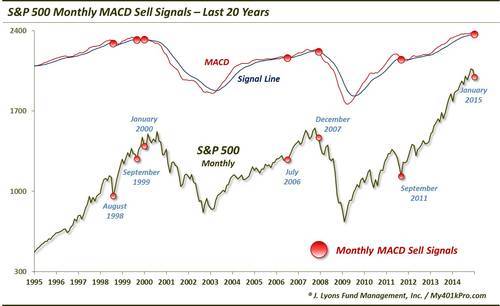
You can see that there were a few head fakes leading up to the signal in January 2000 that forewarned the loss of momentum and cyclical downturn in the market. The same thing occurred in July 2006 before a timely signal in 2007. No indicator is perfect and the MACD is no exception. It will issue sell signals before any major cyclical selloff; however, it will also issue false signals. Overall, here are the results from a couple different views following monthly MACD sell signals on the S&P 500 going back to 1955.
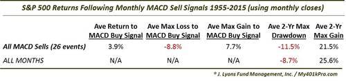
There have been 26 monthly MACD sell signals on the S&P 500 since 1955. The first column in the table measures the returns following these signals until the MACD generated a buy signal (i.e., the MACD line crossed above the signal line). At an average gain of +3.9%, we see right off the bat that this sell signal is not a death knell for the market. Furthermore, 21 of the 26 sell signals actually resulted in a gain by the time the MACD issued a buy. Looking a bit further, all was not rosy, though. The average maximum loss, -8.8%, on a monthly closing basis following the sell signals actually did exceed the average maximum gain of +7.7%. So, although by the time the MACD gave a buy signal the S&P 500 was usually higher than at the time of the sell, there was typically some turbulence along the way.
We also listed the 2-year average maximum drawdowns and maximum gains following the signals. Considering these signals are based on monthly data, their relevance is longer-term in nature and thus a 2-year horizon may be most pertinent. As the table shows, while we found that the average drawdowns are a bit worse than those following all months, and the maximum gains slightly lower, there is no compelling statistical evidence from this data to scare investors out of the market.
The problem is while there have been some MACD sell signals that have led to horrific cyclical bear markets, most signals have been rather benign. The key is to identify those that are not head fakes. And although we did not do an exhaustive study into the intricacies of each signal, we did parse the data a bit in an effort to isolate some possible characteristics of those signals that were legitimate.
First, we broke the signals down based on the level of the Cyclically Adjusted Price/Earnings Ratio, or CAPE, at the time. We wanted to see if those signals generated when valuations were elevated proved more effective. With the CAPE currently sitting around 26, this seemed worthwhile to examine. This chart shows the signals occurring when the CAPE was above vs. below the 20 level.
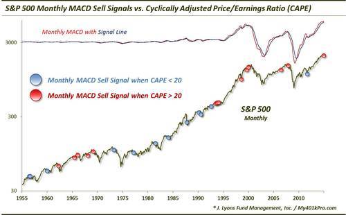
As one can see, many of the signals during the secular bull market of the 1980’s-90’s occurred when the CAPE was subdued, i.e., less than 20. And the same more recently with the signal in September 2011. There were a few valid signals during the 1970’s secular bear market, however, that occurred without an elevated CAPE. Furthermore, the handful of signals in the mid-1990’s occurred with the CAPE above 20 (though, closer to 20 than the current 26) and we know the market exploded higher from that point. Breaking down these signals, we get the following results.
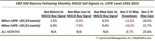
The returns following signals when the CAPE was above 20 were a little worse overall than the average of all signals. The return until the MACD buy signal was just 1.5% as opposed to almost 4% for all signals. Additionally, the max loss:gain until the buy signal was about 9:6 versus the 8:7 for all signals. The 2-year numbers were slightly worse for the drawdown and max gain, but not materially. All in all, the signals occurring alongside an elevated CAPE are a bit worse than normal, but again not a consistent marker of doom for the market.
Lastly, we cross-checked the monthly MACD sell signals versus the proximity of the S&P 500 to its long-term trend at the time of the signal. For “trend”, we are using a long-term exponential regression line spanning from 1871 to the present (see this post for some more background). We understand that this method is not perfect, but we feel it still portrays a reasonable view of the extent of which the market is “overbought” or “oversold”. At present, the S&P 500 is more overbought versus its long-term trend than at any time in history other than the 1998-2001 period. In this chart, we broke the signals down by those occurring while the market was more than or less than 10% above its long-term trend.
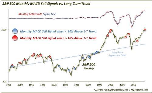
Though not perfect, this factor proved a little more effective in separating those legitimate sell signals from failed ones. Here are the results based on the above or below 10% overbought variable.
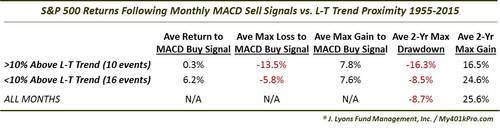
Average returns from MACD sell signal to buy signal when the S&P 500 was over 10% above its long-term trend were essentially flat at +0.3%. This contrasts with the average of all signals of nearly +4%. Furthermore, the average max loss versus max gain until the MACD buy signal approached 2:1. And looking out 2 years, the average max drawdown was -16.3%, almost double that of all months. On top of that, at +16.5%, the average max gain was basically no better than the average drawdown. Over a 60-year period that saw the average max 2-year gain triple that of the average drawdown, this is statistically significant.
The bottom line is that if you’re looking for the holy grail (and we don’t suggest you do), the MACD is not it. In fact, its monthly sell signals have been inconsistent to average, at best. That said, there have been several very timely signals which occurred very near the peaks of cyclical bull markets. The signals generated in 1969, 1973, 2000 and 2007 led to 2-year max loss:max gain ratios of -28:2, -41:1, -25:9 and -50:-5, respectively. More concerning are the conditions accompanying the recent monthly MACD sell signal. With a CAPE of 26 and the S&P 500 90% above its long-term trend, variables are in place which have led to the more effective MACD sell signals historically, i.e., worst losses. There certainly may be bigger concerns out there. However, this loss of momentum signaled by the MACD, in conjunction with those other concerns, is another unwelcomed development for a market as stretched as this one is.
No comments:
Post a Comment