Thursday, March 13, 2014

Buy Low And Sell High To Generate Significant Capital Growth

Super Commodity Strategy generates significant medium term capital growth with simple and strict risk management rules. Our Super Commodity Trading Signal Service takes + 251.85 % since 2009.


In addition we also provide automated intraday and short-medium term signals with some winning trading systems om your managed accounts.

gywxsncx.hyt
Daily e Monthly Equity


31t1laf0.a1h
                Download Historical Results Pdf


Material in this post does not constitute investment advice or a recommendation and do not constitute solicitation to public savings. Operate with any financial instrument is safe, even higher if working on derivatives. Be sure to operate only with capital that you can lose. Past performance of the methods described on this blog do not constitute any guarantee for future earnings. The reader should be held responsible for the risks of their investments and for making use of the information contained in the pages of this blog. Trading Weeks should not be considered in any way responsible for any financial losses suffered by the user of the information contained on this blog.

Retail Sales: The Trend Is Sinking

by Jeffrey P. Snider

This post will include an excess of charts and graphs, ostensibly to put to rest any weather notions as well as highlight the macro component of what is clearly economic dysfunction. The beginning of 2013 was bad in its own right, but the excuses laid then pertained to QE’s lag (as well as winter grumbling). Since QE3 wasn’t inaugurated until October 2012 (first MBS purchase and settlement), and QE4 December 2012, there was some plausibility (gullibility) to the idea QE hadn’t had time to create the virtuous cycle its practitioners promised.

Now in February 2014, that excuse is no longer valid, particularly in light of the inventory cycle that I maintain is the sole imprint of QE on the real economy (the financial economy is another matter altogether). The just-released February retail sales figures are worse than January, by quite a bit, even in comparison to the downward revisions in January (and December).

ABOOK Mar 2014 Retail Sales Revisions

In every subcategory of retail trade, February’s growth was less than the latest CPI figures, meaning that in real terms (or as close as we can estimate using official inflation estimates) February saw contraction across the retail trade industry. That comes after January was barely positive in real terms (less than 1% across the board). Given the cycle highs for inventory levels, these are particularly bad results that portend much more weakness in production ahead (and very bad news for China).

ABOOK Mar 2014 Retail Food Sales Inflation2

Where we can rule out any QE lag effects, that leaves the weather and the rolling Polar vortices that have struck across these past few months as mainstream distractions. Here too we can eliminate that possibility with the simple exercise of not ignoring the recent history beyond this winter.

ABOOK Mar 2014 Retail Food Sales Genl Merch ABOOK Mar 2014 Retail Sales ex Autos ABOOK Mar 2014 Retail Food Sales ex Autos ABOOK Mar 2014 Retail Food Sales Nonstore Genl Merch

In all these data points, two conclusions can be drawn without ambiguity. First, there was a massive and dramatic slowdown in the middle of 2012 that has persisted without interruption since. Second, the 6-month average for every segment shown here is the lowest since 2009. Since a 6-month lookback period reaches to September 2012, that would certainly control for any wintry interference. If that is not enough to forestall any cold appeal, then we can simply put the past six months in context with other periods of more well-known “cyclical” determinations.

ABOOK Mar 2014 Retail Food Sales v 2013

The last 6 months were significantly worse than just a year before, averaging almost a full percentage point below.

ABOOK Mar 2014 Retail Food Sales v 2008

Compared with the opening months of the Great Recession, retail trade has fared worse in nominal terms. Even adjusting for inflation, the results are extremely similar.

ABOOK Mar 2014 Retail Food Sales v 2006 1995

There is no mistaking the last 6 months for any avowed period of actual growth, inflation or not. Despite QE’s proclaimed promise, the results are conclusive of what has actually been delivered (finance vs. real economy).

ABOOK Mar 2014 Retail Food Sales v 2001

In terms of comparison, the closest period for an analog of retail trade is actually the months leading up to the dot-com recession that began in March 2001.

Given how all of this aligns with what we have seen recently (and for more than a year) with anecdotes of all shapes and sizes, it seems pretty clear that there is a macro factor that subsumes all these other interpretations. Again, the only way these additional explanations make any sense is if you are totally biased by ideology that QE beneficence is a given.

Setting aside any question of cycle or whether recession is at hand, QE at the very least promised better economic conditions. These, and so many others, show that conditions are worse than when QE began (or even compared to just a year ago). That will likely lead us back in full circle to the “created vs. saved” debate, where practitioners will begin to proclaim that though it is bad and not what was promised, it would have been worse. It is the worst example of sloppy “science” imaginable, where the theory is entirely unfalsifiable. Perhaps there is comfort in human nature ignoring repeated attempts at conjuring illusions. In other words, eventually the boy who cried growth will be ignored and then maybe we can actually try something else.

See the original article >>

Happy Anniversary Top at hand? 5-year rally the “Exact” same length?

by Chris Kimble

CLICK ON CHART TO ENLARGE

The rally from the 2002 low to 2007 high, took 5 years! I sent the above chart to  premium members earlier this week, as the 500 index was 5-years from its 2009 lows! Current rally last the "exact same time frame???"

Rally last the same length and put a high in?  Odds are low, impact is high, if it takes place!

See the original article >>

Crude descent continues

By Moming Zhou

West Texas Intermediate crude (NYMEX:CLJ14) traded near a five-week low as China refined the least crude in four months and U.S. inventories surged.

Prices moved between gains and losses. Refinery processing in China fell 1% from a year earlier in the January-to- February period, the National Bureau of Statistics said today. U.S. crude stockpiles increased last week to the highest level since Dec. 13 as refiners reduced operations to a four-month low. WTI rose earlier on better-than-expected U.S. economic reports.

“If China consumes less crude, obviously it’s going to hit the oil market,” said Tom Finlon, Jupiter, Florida-based director of Energy Analytics Group LLC. “The economic news is good. Crude has a chance to come back above $100 when the utilization rate increases.”

WTI for April delivery rose 30 cents to $98.29 a barrel at 11:26 a.m. on the New York Mercantile Exchange after dropping to $97.67. The contract decreased 2% to $97.99 yesterday, the lowest close since Feb. 6. The volume of all futures traded was 30% above the 100-day average.

Brent for April settlement slipped 32 cents, or 0.3%, to $107.70 a barrel on the London-based ICE Futures Europe exchange. Volume was 23% below the $100-day average. The European crude traded at a premium of $9.41 to WTI. The spread ended at $10.03 yesterday, the widest close in six weeks.

Chinese demand

Refinery crude use in China decreased to 78.78 million metric tons, the statistics bureau said in a statement on its website. That’s equivalent to 9.79 million barrels a day, the lowest rate since October. The bureau in Beijing combines data for the two months, citing distortions from the week-long Lunar New Year holiday, whose timing differs each year.

“Refinery demand is weak both in China and the U.S.,” said Phil Flynn, senior market analyst at the Price Futures Group in Chicago. “It’s a big concern for the market.”

U.S. crude stockpiles rose 6.18 million barrels last week to 370 million barrels, according to the Energy Information Administration, the Energy Department’s statistical arm. Domestic production climbed 1.3% to 8.18 million barrels a day, the most since July 1988.

The refinery utilization rate slipped 1.4 percentage points to 86% of capacity, the least since October. Supplies at Cushing, Okla., the delivery point for WTI futures, fell 1.34 million barrels to 30.8 million, a two-year low.

Test sale

The Energy Department announced yesterday it would sell 5 million barrels of crude from the Strategic Petroleum Reserve in a test of the distribution system. The sale of less than 1% of the total stockpile was scheduled and isn’t tied to turmoil in Ukraine or other geopolitical events, the department said. Potential buyers have until tomorrow to submit bids. Delivery will start April 1 and end April 30.

The release is “a storm in a tea-cup, given the small size,” Harry Tchilinguirian, head of commodity markets strategy at BNP Paribas SA in London, said by e-mail. There is probably no connection between the release and tensions with Russia over Ukraine, he said.

WTI rose earlier as jobless claims unexpectedly fell last week to the lowest level since the end of November and retail sales rose in February for the first time in three months.

The euro approached $1.40, a level it hasn’t touched in more than two years, as policy makers signal support for the currency bloc’s economic recovery. A stronger euro and weaker dollar increase oil’s investment appeal.

Copyright 2014 Bloomberg. All rights reserved. This material may not be published, broadcast, rewritten, or redistributed.

See the original article >>

Roller coaster ride for WTI?

By Dominick Chirichella

Since breaching the $100/bbl level yesterday afternoon the spot Nymex WTI (NYMEX:CLJ14) contract has been steadily declining. The spot contract is off another 1.2% so far this morning. The market is finally acknowledging that the destocking of crude oil inventories in Cushing is resulting in a surplus building in the Gulf or PADD 3 region. I have been discussing this issue for several months in this newsletter and in our Energy Insight Blog “The Big Shift”.

As of last week’s EIA oil inventory report crude oil stocks in the Gulf are above last year and the five year average with the spring refinery maintenance season barely getting underway. Last night’s API report showed a larger than expected build in total crude oil stocks of 2.6 million barrels. Later this morning the EIA will release their report with a PADD breakdown. I am expecting another above average build in PADD 3 again this week.

The direction of WTI is primarily driven by the short term fundamentals with more and more market participants starting to recognize that it is not a question as to will a crude oil surplus build in the U.S. Gulf, rather how large will the surplus be and how long will the region remain in a surplus position. As the refining sector moves into the heart of the lower crude oil demand refinery maintenance season the surplus will only grow and likely grow at an accelerated rate.

As I have also warned the Brent/WTI spread is being impacted by the so called “Big Shift” as WTI has been in a downward trending pattern while the Brent contract has been much more stable. Until the refinery maintenance season is over in a few months or so the spread will have difficulty in working its way toward a more normal historical relationship that existed prior to the surplus years in the Cushing region.

The April spread has now breached the $8/bbl technical resistance area that has been in play since the middle of February. The spread is now looking like it will settle into an $8/bbl to $11/bbl trading range for the short term. The direction of the spread has been consistently moving in the inverse direction of the spot WTI contract as the Brent contract has remained relatively stable.

In fact the Brent (NYMEX:SCJ14) contract has been in a technical triangular or consolidation trading pattern while the WTI contract has been in a downtrend over the same timeframe. Brent is garnering support from the ongoing and evolving geopolitical issues in places like Libya, Ukraine and elsewhere in the MENA region as well as market participants starting to look forward to the North Sea maintenance season which will result in reduced supply of North Sea crude oil.

In the short term I expect the spread to remain with a bias toward widening while longer term the narrowing pattern should return.

Global equity markets are continuing to drift lower with the EMI Global Equity Index now at the lowest level of the year erasing all of the recovery gains over the last several weeks. The EMI Index is now showing a year to date loss of 5.9% with seven of the ten bourses in the Index now in negative territory. Although Brazil was the only bourse to add value over the last twenty four hours it is still the worst performing exchange in the Index. Canada remains on top of the leader board but if oil prices continue to slide Canadian equities are likely to get hit. Global equities have been a negative price driver for the oil markets as well as the broader commodity complex. The US dollar Index continues to move higher and is also acting as a negative price driver for oil and commodities.

The EIA released their latest Short Term Energy Outlook yesterday. Following are the main oil highlights from the report. In this month’s report they lowered their forecast for global demand by 100,000 bpd but also lowered their global supply projection by 300,000 bpd.

  • EIA projects world petroleum and other liquids supply to increase by 1.3 million barrels per day (bbl/d) in both 2014 and 2015, with most of the growth coming from countries outside of the Organization of the Petroleum Exporting Countries (OPEC). The Americas, in particular the United States, Canada, and Brazil, will account for much of this growth.
  • Harsh winter conditions over the past few months negatively affected well completion activity in the northern U.S. plays. As more evidence of this seasonal slowdown has appeared in the data, EIA has revised downward initial estimates for December 2013 and January 2014 U.S. crude oil production. Because the weather effects are temporary, much of the production slowdown is expected to be made up by accelerated completion activity over the next few months.
  • EIA expects strong crude oil production growth, primarily concentrated in the Bakken, Eagle Ford, and Permian regions, continuing through 2015. Forecast production increases from an estimated 7.5 million bbl/d in 2013 to 8.4 million bbl/d in 2014 and 9.2 million bbl/d in 2015. The highest historical annual average U.S. production level was 9.6 million bbl/d in 1970.
  • Projected world liquid fuels consumption grows by an annual average of 1.2 million bbl/d in 2014 and 1.4 million bbl/d in 2015. Countries outside the Organization for Economic Cooperation and Development (OECD), notably China, drive expected consumption growth. Non-OPEC supply growth contributes to an increase in global surplus crude oil production capacity from an average of 2.1 million bbl/d in 2013 to 3.9 million bbl/d in 2015.
  • EIA estimates that global consumption grew by 1.2 million bbl/d in 2013, averaging 90.4 million bbl/d for the year. EIA expects global consumption to grow 1.2 million bbl/d in 2014 and 1.4 million bbl/d in 2015. Projected global oil-consumption-weighted real GDP, which increased by an estimated 2.3% in 2013, grows by 3.1% and 3.5% in 2014 and 2015, respectively.
  • EIA estimates that OPEC crude oil production averaged 30.0 million bbl/d in 2013, a decline of 0.9 million bbl/d from the previous year, primarily reflecting increased outages in Libya, Nigeria, and Iraq, and strong non-OPEC supply growth. EIA expects OPEC crude oil production to fall by 0.5 million bbl/d and 0.3 million bbl/d in 2014 and 2015, respectively, as some OPEC countries, led by Saudi Arabia, reduce production to accommodate the non-OPEC supply growth in 2014.
  • EIA expects that OPEC surplus capacity, which is concentrated in Saudi Arabia, will average 2.6 million bbl/d in 2014 and 3.9 million bbl/d in 2015. This build in surplus capacity reflects production cutbacks by some OPEC members adjusting for the higher supply from non-OPEC producers. These estimates do not include additional capacity that may be available in Iran but is currently offline because of the effects of U.S. and European Union sanctions on Iran's oil sector.
  • EIA estimates that OECD commercial oil inventories totaled 2.59 billion barrels by the end of 2013, equivalent to roughly 56 days of consumption in that region. Projected OECD oil inventories rise to 2.61 billion barrels at the end of 2014 and 2.62 billion barrels at the end of 2015.

Wednesday's API report was neutral to bearish as total crude oil stocks increased more than the expectations while refined product inventories were declined mostly within the expectations. The build in crude oil is primarily related to the an increased in crude oil imports as well as the shifting of crude oil from Cushing down to the Gulf. The API reported a slightly larger than expected draw in gasoline and an expected draw in distillate fuel. Total inventories of crude oil and refined products were slightly lower on the week.

The oil complex is mostly lower as of this writing and heading into the EIA oil inventory report to be released at 10:30 AM EST today. The market is usually cautious on trading on the API report and prefers to wait for the more widely watched EIA report due out this morning.

Crude oil stocks increased by 2.6 million barrels.  On the week gasoline stocks decreased by about 2.2 million barrels while distillate fuel stocks decreased by about 0.8 million barrels. Refinery utilization rates decreased by 0.3% suggesting the spring maintenance season may be starting to get underway.

The API reported Cushing crude oil stocks decreased below the expectations by 1.3 million barrels for the week. The API and EIA have been very much in sync on Cushing crude oil stocks and as such we should see a similar draw in Cushing in the EIA report. Directionally it is neutral for the Brent/WTI spread.

My projections for this week’s inventory report are summarized in the following table. I am expecting a modest build in crude oil stocks as the restocking process continues for the eight week in a row. I am also expecting a modest draw in gasoline inventories and in distillate fuel last week with refinery run rates starting to decline.

I am expecting crude oil stocks to increase by about 2.4 million barrels. If the actual numbers are in sync with my projections the year over year comparison for crude oil will now show a deficit of 15.2 million barrels while the overhang versus the five year average for the same week will come in around 12.1 million barrels.

I am expecting crude oil inventories in Cushing, Okla., to show the seventh weekly stock decrease in a row as the Keystone Gulf Coast pipeline is continuing to slowly ramp up its pumping rate. I would expect the Cushing stock decline to be in the range of around 2 million barrels based on the fact that more oil was moved out of Cushing to the USGC on Keystone last week.

In fact the Keystone Gulf Coast line increased its pumping rate for the fifth week out of the last six weeks. Genscape reported an average flow of 308,751 bpd for last week (report period for this week’s inventory report) as the line continues to work its way up to full operating capacity. The Keystone Gulf Coast Line is impacting the crude oil storage levels in Cushing and should result in Cushing stocks consistently declining going forward. Last week alone the Keystone line moved about 2.2 million barrels of crude oil out of Cushing. This will be bearish for the Brent/WTI spread this week. I am also expecting an above normal build of crude oil stocks in PADD 3(Gulf) of over 2 million barrels.

With refinery runs expected to decrease by 0.2% and wit the industry working down its stocks of winter grade gasoline I am expecting a modest draw in gasoline stocks. Gasoline stocks are expected to decrease by 1.8 million barrels which would result in the gasoline year over year surplus coming in around 0.7 million barrels while the surplus versus the five year average for the same week will come in around 1.6 million barrels.

Distillate inventories are projected to decrease by 1 million barrels as exports of distillate fuel out of the US Gulf continue while heating demand last week was above normal on cold winter weather along the east coast. If the actual EIA data is in sync with my distillate fuel projection inventories versus last year will likely now be about 6.9 million barrels below last year while the deficit versus the five year average will come in around 28.5 million barrels.

I am adjusting my oil view and bias to cautiously bearish but I am still flying the caution flag as the situation in the Ukraine continues to unfold. Most of the commodities in the oil complex have breached their respective technical support levels and are moving into new, lower trading ranges.

I am maintaining my Nat Gas (NYMEX:HPJ14) view and bias at neutral as the market sentiment seems is shifting away from the winter weather trading mode. The Nat Gas market is exhibiting all of the signs of a market establishing yet another market top.

See the original article >>

Why 2014 Is Beginning To Look A Lot Like 2008

by Charles Hugh-Smith

Does anything about 2014 remind you of 2008?

For example, the increasing signs of stress in the global financial system, from periphery currencies crashing to China’s shadow banking bailouts to the constant flow of official assurances that all is well and whatever situations aren’t well are on the mend.

The long lists of visible stress in the global financial system and the almost laughably hollow assurances that there are no bubbles, everything is under control, etc. etc. etc.  certainly remind me of the late-2007-early 2008 period when the subprime mortgage meltdown was already visible and officialdom from Federal Reserve chairman Alan Greenspan on down were mounting the bully pulpit at every opportunity to declare that there was no bubble in housing and the system was easily able to handle little things like defaulting mortgages.

Some five years after repeatedly declaring there was no bubble in housing and nothing to worry about even as the global financial system was coming apart at the seams, Greenspan bleated out a shopworn and not very credible mea culpa, Never Saw It Coming: Why the Financial Crisis Took Economists By Surprise (Foreign Affairs magazine, December 2013).  First, he claimed no one foresaw the crisis, and second, he attributed this failure to a lack of insight into “animal spirits,” the emotional drivers of behavior.

Greenspan claimed that the herd behavior of animal spirits drove financial firms (i.e. Wall Street and Too Big To Fail banks) to keep extending risky bets lest they lose fat profits by exiting the risk-on trade too early. In Greenspan’s view, the abundance of apparent liquidity in the bullish phase created the expectation that the liquidity would be available when everyone decided to sell their positions and exit the risk-on trades.

In Greenspan’s words:

“Financial firms accepted the risk that they would be unable to anticipate the onset of a crisis in time to retrench. However, they thought the risk was limited, believing that even if a crisis developed, the seemingly insatiable demand for exotic financial products would dissipate only slowly, allowing them to sell almost all their portfolios without loss.

They were mistaken. They failed to recognize that market liquidity is largely a function of the degree of investors’ risk aversion, the most dominant animal spirit that drives financial markets. Leading up to the onset of the crisis, the decreased risk aversion among investors had produced increasingly narrow credit yield spreads and heavy trading volumes, creating the appearance of liquidity and the illusion that firms could sell almost anything. But when fear-induced market retrenchment set in, that liquidity disappeared overnight, as buyers pulled back. In fact, in many markets, at the height of the crisis of 2008, bids virtually disappeared.”

It wasn’t just gamblers and financiers who were mistaken—so was Greenspan. Numerous analysts waved the warning flag long before 2008, and the financial media began publishing stories about the housing bubble as early as 2005. In claiming no one foresaw the inevitability of a subprime mortgage meltdown and a domino effect on securitized debt based on those mortgages, Greenspan is flat-out wrong.

Greenspan is also off-track on another of his claims: that the global financial meltdown of 2008 was widely considered a “once in a lifetime” tail risk, too unlikely to ever happen.

The founder of fractal mathematics, Benoit Mandelbrot, published a book in 2004 titled The (Mis)Behavior of Markets: A Fractal View of Risk, Ruin and Reward that completely eviscerated the standard portfolio model of immense faith in the low odds of major crises ever erupting in modern hedged markets.

On the contrary, Mandelbrot showed, major crises were likely to erupt far more often than predicted, and with less predictability than was assumed by the cohort of economists and financiers that dominated the Fed and Wall Street.

In other words, not only was the global meltdown of 2008 foreseeable, it was inevitable.

Looking to Charts for Clues

A number of technical analysts have been posting charts that suggest a meltdown-type decline in global markets could occur in 2014—there’s an analog chart of 1929 making the rounds, and Tom McClellan published a chart of the Coppock Curve indicator that looks like the next downdraft is imminent.

Chris Kimble published a chart of the St. Louis Fed financial stress index that suggests market complacency has returned to the low levels last touched just before the 2008 global financial meltdown. (Kimble annotated his copy of the chart; this is the plain chart.)

There are a great many indicators, metrics and correlations to watch for signs of a breakdown: analog charts that overlay the current markets onto past eras, corporate earnings, credit spreads, volatility indices, investor sentiment readings, inflation expectations, and various carry trades and ratios such as the S&P 500 (SPX) to gold, oil, Treasury yields and so on.

Just for context, here is a chart of the S&P 500 (SPX) from 2005 to the present:

Hindsight is 20-20, as the saying goes, so it’s worthwhile to look at a chart of the Dow Jones Industrial Average (DJIA) I annotated on December 30, 2007. The head and shoulders visible in the above chart—a classic topping pattern—was already visible, but technically, a bullish case could still be made at the end of 2007.

By late summer 2008, just before the collapse of Lehman Brothers unleashed a cascading decline in global markets, the technical picture was much uglier:

The Bullish case had been extinguished by June, when the recovery broke down at the uptrend line, and as a result there were technical reasons to target the 10,300 level (and once below that, then on to even lower targets).

Properly used, charts help us anticipate what might happen once various targets are hit, but that’s not the same as forecasting a timeline for a global crisis and meltdown. To do that, some fundamental and/or cyclical analysis must be brought to bear.

For example, consider this chart from my friend and colleague Gordon Long of Gordon T. Long Market Analytics & Technical Analysis.

This chart combines an analysis of trend lines and patterns with cycles of speculative bubbles and inflation, deflationary fear, reflation and real deflation.

Martin Armstrong and other analysts have published forecasts based on cycles: the four-year cycle, the 8.3 year cycle, etc.  It is noteworthy that the market peaks in January 2000 and late 2007 were about eight years apart, as were the bottoms in 2002 and 2009.

It’s tempting to extend these cycles and forecast the next top in 2015 and the next bottom in 2017, and perhaps that’s exactly what will transpire. But if we take Mandelbrot’s lessons to heart, we have to accept the fractal nature of markets and the possibility that these cycles may not be reliable guides.

Here are three more charts for your consideration, of income and employment. I’ve annotated the first chart to match what I view as the waves of financialization that have inflated speculative credit bubbles and temporarily, incomes:

Notice that the current asset reflations (or bubbles, if you dare speak the word openly) in stocks, bonds and real estate have failed to lift the year-over-year rate of change in disposable per capita income, which has been declining since 2007.

(Source)

Income per capita doesn’t reflect the enormous divide between the top 10%, who have seen their incomes rise in financialization, and the bottom 90%, who have seen their income stagnate for four decades:

The number of full-time jobs has also failed to reach the peak set in 2007; clearly, the current asset bubbles have failed to boost meaningful (i.e. full-time) employment.

The Party Is Clearly Ending

Collectively, these charts above force us to ask two questions:

1.  If asset bubbles no longer boost full-time employment or incomes across the board, what is the broad-based, “social good” justification for inflating them?

2.  If employment and incomes are stagnating for the vast majority of Americans, how much longer can assets increase in price, presuming there is still some correlation between incomes and sales, profits, creditworthiness, etc.?

In Part 2: What Will Be Different About the Crisis of 2014/2015, we unpack the unprecedented state and central bank policies that turned a global financial rout into one of the most extended Bull markets in history, and make the case that these -- policies designed to combat a liquidity crisis and then a collateral crisis -- have reached diminishing returns.

As a result the next crisis will not be a repeat of 2008 but a much less fixable and much more monumental crisis.

See the original article >>

Poll Shows Why QE Has Been Ineffective

by Lance Roberts

I have discussed many times in the past the Fed's ongoing Quantitative Easing (QE) programs and their ineffectiveness of generating "self-sustaining" economic growth.  While the Fed's interventions have certainly bolstered asset prices by driving a "carry trade," these programs do not address the central issue necessary in a consumer driven economy which is "employment."

In an economy that is nearly 70% driven by consumption, production comes first in the economic order.  Without a job, through which an individual produces a good or service in exchange for payment, there is no income to consume with.  While income can come from social welfare, as seen in the latest personal income data, these dollars are derived from the production of others through taxation.

Social-Benefits-DPI-030314

Like any common accounting equation, if taxation is increased on one side of the ledger, the offset is lower consumption, and ultimately economic growth, on the other.  This is why the multiplier from government spending, and social welfare, is effectively near zero, if not potentially a negative.

The problem with the Federal Reserve's ongoing QE program is that the inflation of asset prices, the "wealth effect," has not impacted much of the overall economy.  A recent Bloomberg National Poll found:

"More than three-quarters of Americans say the five-year bull market in U.S. stocks has had little or no effect on their financial well-being."

This is not surprising when you look at the statistics of how wealth is divided in the domestic economy today.  The video below, based on a Harvard Business School study, shows the wealth distribution in America.

Here is the key graphic:

wealth3

When you consider that the lower 80% have less than one years savings set aside for retirement it is not surprising that:

"Seventy-seven percent of respondents dismissed the 176 percent rise in the Standard & Poor's 500 Index (SPX) since its March 9, 2009 financial crisis low, according to the poll, taken March 7-10. Barely one in five -- 21 percent -- said the market's gains have made them 'feel more financially' secure."

The poll also showed that most Americans still think the country is on the wrong track economically particularly as it relates to employment.  The poll showed that:

"Thirty-eight percent anticipate hiring prospects to pick up compared with 24 percent who say jobs will be tougher to find. A year ago, poll respondents by 43 percent to 26 percent predicted labor market improvement."

This conforms with the recent NFIB survey which showed that plans for employment dropped sharply in the latest month, and remains at levels normally associated with the on set of recessions.

NFIB-Employment-031214

The President gets little credit for what gains in employment there have been.  This is because it has been a function of population, rather than demand driven, growth.  The chart below shows "full time" employment relative to the population.  It is "full-time" employment that leads to household formation and stronger economic growth.  The flat-line chart shows that job growth has paced population growth and little else.

Employment-Fulltime-population-031214

The poll's findings confirm what I have been saying for the last couple of years.  The Fed's ongoing interventions have been a massive boom to Wall Street and those in the top wealth bracket.  From the poll:

"Those who participate in financial markets through 401(k) retirement plans often have only modest sums invested. Half of Fidelity Investments customers have less than $25,600 in their 401(k) accounts, according to Michael Shamrell, a spokesman.

Wealthier Americans have a greater share of their assets invested in the stock market, while middle-income households have more of their wealth tied up in their homes.

The wealthiest 10 percent of families earn 11 percent of their annual income from capital gains, interest and dividends, according to the Fed. The poorest three-quarters get less than 0.5 percent of their income from such sources."

I will agree that the "forward pull of consumption" caused by the Fed's interventions did stabilize the economy, and likely kept the previous recession from becoming far worse.  However, the problem is that, like putting a comatose patient on a respirator, the artificial support cannot be removed without negative consequences.

The poll also showed this is still the single worst economic recovery ever.

GDP-Growth-ByCycle-031214

The "wealth effect" only works if the positive shock is deemed to be permanent as opposed to transitory.  What is amazing is that this very basic premise of creating a permanent impact on the economy has escaped the Federal Reserve, economists and Congressional representatives driving current economic policies.  The problem is that a many of the respondents believe that the newly found net worth is simply an artificially stimulated illusion created by Fed policy.

However, as I stated, what the Federal reserve has managed to do this cycle was help the "rich get richer" with no major positive multiplier impact on the real economy.  As David Rosenberg stated in July of last year:

"Sorry, but Peoria Illinois, probably does not know how to locate the corner of Broad and Wall. So the Fed, by virtue of its excursions into the private marketplace for capital, manages to engineer the mother of all Potemkin rallies, sending the S&P 500 up 140% from the 2007 trough to attain record highs by May of this year (even with the June swoon, the SP 500 still managed to eke out a 2.4% advance in the second quarter and is up 12.6% for the year in the best first-half performance since 1998 when GDP growth was 5.5% ... for this the Fed should just continue with the status quo?). It took but six years to make a new high in the stock market. In the Great Depression, it took 25 years. Bravo!"

With the Federal Reserve now effectively removing the "patient" from life support, we will see if the economy can sustain itself.  If this recent Bloomberg poll is correct, then we are likely to get an answer very shortly, and it may very well be disappointment.

See the original article >>

Ukraine and the Coming Wage and Debt Slave War

By Russ Winter

The western parasite guild has moved quickly to install an central banker stooge in the Ukraine and has prepared an economic austerity plan. First, the 11 billion euros that the EU is offering Kiev is not aid but yet another loan. Then, in what has been and will be a familiar pattern, is the putting in place of a pure wage and debt slavery regime complete with Massahs. Ukrainian pensions will be cut from $160 to $80 a month, social services will be cut, government workers will be laid off, and key assets will be looted. The Ukraine is a valuable breadbasket. Western Parasite Guild members that lent money to Ukraine can then be bailed out with IMF and other loans from public sources.

As I wrote last week, the Russians will try and save their ethnic enclaves and then, after the guildist loot of Ukraine and the wage slavery regime is well underway, they can say “we told you so” as part of a grander plan.

The biggest question of all is whether the Russians — and more importantly the Chinese, Indian, Brazilians and others — will finally decide that the costs outweigh the waning benefits from the forces of global monetary inflation and U.S. hegemony. The Ukraine is but an ongoing round. Developing nations have $1.5 trillion of corporate obligations coming due by the end of 2015. Sovereign debt is coming due daily.

Who will eat this obvious loss: the guildists or the wage/debt slaves? Will the Icelandic or Greek model be incorporated? One way to gauge the outcome is to measure foreign central bank custodial holdings of parasite guild paper. The trend so far this year has been generally soft, in part because developing and emerging countries have used up reserves in currency defenses.

Another battleground emerging involves whether developing countries will allow the U.S. to keep its veto powers in the IMF. Even “partners” like Germany and Australia have long been asking that this be given up. Meanwhile, Congress is set to block this reform. Those might be additional “fightin’ words” to the developing world at this point, especially as a divide materializes around the manner of the IMF-Ukraine debt/wage slave bail out and model. Every developing country in the world knows the Ukraine could soon be them. This might open the gateway for Russia to galvanize China, India, Brazil and others to staunchly oppose both the continued U.S. IMF veto, the Ukraine package and even the whole notion of Anglo debt/wage slave hegemony.

See the original article >>

Three Reasons to Buy Gold Now

By: DailyGainsLetter

Mohammad Zulfiqar writes: When it comes to gold bullion prices, despite their mere 10% climb since the beginning of 2012, I wouldn’t be at all surprised to see gold bullion prices increase even further. With this, companies producing or looking for the precious metal are still presenting a great buying opportunity.

Let me explain…

We see demand for gold bullion continues to increase, and at the same time, supply constraints are slowly starting to show. This is something I have been talking about for some time now and at the very core, it is the perfect recipe for higher gold bullion prices ahead.

In 2013, we learned that the Indian government and the central banks have been working together to curb the demand for gold bullion in that country. This was a concern to many because India was the biggest consumer of the precious metal at that time. As a result of this, emotions took over, and we saw massive selling. A little-known fact that never made the mainstream: though the official demand for gold bullion declined, smuggling the precious metal into the country became the next big thing.

According to the World Gold Council (WGC), smuggled gold bullion in the country amounted to 150–200 tonnes in 2013. The WGC also predicts that if the restrictions imposed by India’s government remain in place, then it wouldn’t be a surprise to see an increase in the amount of gold bullion smuggled into the country. (Source: “UPDATE 1-Gold smuggling in India likely to rise if curbs stay-WGC,” Reuters, February 18, 2014.)

But this is just the tip of the iceberg.

We see uncertainty in the global economy is increasing, as well. For example, the troubles in Ukraine continue to show signs of escalation. We don’t think anything major will occur in terms of war, but what’s happening now is just enough for investors to run towards safety, which gold bullion provides.

As this is happening, we also hear about very problematic data that is coming out of the Chinese economy. The country is showing signs of deep stress and there may be a cash crunch—companies strapped for cash are in the making.

Above all, the debt levels in the global economy continue to increase. This means countries are creating more money out of thin air. This is only bullish for gold. Consider this: according to the data from the Bank for International Settlement compiled by Bloomberg, the global debt level has increased 40% since the financial crisis. Between mid-2007 and mid-2013, global debt rose by $30.0 trillion, from $70.0 trillion to $100 trillion. (Source: Glover, J., “Debt Exceeds $100 Trillion as Governments Binge,” Bloomberg, March 10, 2014.)

The sell-off in the gold bullion market in 2013 was a blessing in disguise. It forced gold companies to cut their costs—as gold bullion prices increased, their costs for these companies soared as well. As a result of this, they are cutting back on their exploration expenses, delaying projects, and so on and so forth. This all creates a massive constraint on the supply of the metal.

Gold companies fell victim to the sell-off last year. Since early this year, they have seen some huge gains. I have seen some junior gold mining companies double. Now imagine what happens if the price of gold goes up from $1,350 to say $1,500 an ounce—these companies may double or triple from their current levels.

You just have to be careful when choosing what you buy. There are companies that may look like a great story, but that shouldn’t be the only criteria on which you decide to buy. I would consider companies looking to cut their production costs with high-grade, quality reserves and cash on hand.

See the original article >>

How Global Debt of More Than $100 Trillion Is Threatening Your Portfolio

By: DailyGainsLetter

Sasha Cekerevac writes: There is a recent statistic that is quite shocking: the total amount of debt globally is now over $100 trillion, a jump of 40% over the last six years.

According to the Bank for International Settlements, which is run by 60 central banks, since the financial crisis, the majority of the $100 trillion in debt has been issued by governments and nonfinancial corporations. (Source: “March 2014 quarterly review,” Bank for International Settlements web site, March 9, 2014.)

You would think that with such a huge amount being issued, it would drive interest rates higher amid a debt crisis. But as we all know, the exact opposite has occurred with interest rates still near historic lows.

What’s really shocking is that governments and corporations have borrowed and pumped out a massive amount of money, yet the global economy is barely moving. We know why corporations have issued the debt; with interest rates low, it does make sense to take advantage of the environment, borrow money, and fund share buybacks and dividends.

Of course, it makes one ask the question—if high levels of debt fueled the previous debt crisis, can we fundamentally solve this problem with even more debt? Not likely.

The real question for investors who are allocating capital to these markets is: are they suitable for long-term investors, or should we consider if a debt crisis is possible?

With the situation in Ukraine deteriorating along with other parts of the world, such as Venezuela, this is creating a flight to the perceived quality of the bond market in the developed world. However, long-term, I’m not so sure.

With the U.S. official debt now well over $17.0 trillion, $100 trillion is a massive amount of money. As we all know, the unfunded liabilities for America are much higher.

Chart courtesy of www.StockCharts.com

We’ve already seen long-term interest rates begin creeping higher, as investors are beginning to anticipate that higher interest rates will eventually be coming. The real question is: how will investors react? This is always a question to consider if we are talking about a potential debt crisis.

Let’s be honest: for the most part, countries are not running budget surpluses, which means that it's impossible for them to pay back all the money borrowed. I think that most governments would be quite happy to see inflation begin rising enough to inflate away this overhang before a full debt crisis explodes.

I don’t believe U.S. interest rates will surge anytime soon, because of the lack of available investments for institutions elsewhere. I do think interest rates will continue rising at a steady rate, which means I would avoid long-term fixed-income products.

I also think we are close to an inflection point when it comes to the velocity of money. Trillions of dollars have been printed, yet inflation remains relatively low. This is because the velocity of money has hit all-time lows.

In my opinion, we are coming to a point where inflation is about to begin to increase here in America. However, it’s a fine line between somewhat manageable inflation and an outright debt crisis. If things get out of hand and long-term interest rates begin rising, this will severely affect the economy.

Of course, none of this will happen tomorrow, as it takes time for these events to occur. As long as interest rates remain low, the rise in the stock market will continue. But I would begin taking precautions by adding some gold bullion to a well-diversified portfolio.

See the original article >>

Food prices Moooooving Higher this year!

by Chris Kimble

CLICK ON CHART TO ENLARGE

Looks like a trip to the grocery store will be a more expensive endeavor in the near future as Beef, Hogs, Coffee, Grains and Milk are rapidly moving higher since the start of this year.

Is the weather to blame for higher prices? Just kidding. Did any of you make it to the grocery store when the weather was bad? Skip eating???

Regardless of my poor jokes about the weather, future trips to the grocery store could cost a good deal more.

I shared with members the chart below the first week of this year. I shared that if you believed in the "Buy Low and Sell Higher" approach, this should be the area to start buying!

CLICK ON CHART TO ENLARGE

The Power of the Pattern continues to suggest large opportunities (Both Long & Short side) remain in the commodities complex.

See the original article >>

Copper Price Breakdown Means Short Silver

By: P_Radomski_CFA

Briefly: In our opinion short speculative positions (half) in silver and mining stocks are justified from the risk/reward perspective.

There were basically no changes in gold, silver and mining stock charts yesterday, except for gold moving slightly higher on news about increased tensions in Ukraine. Gold's reaction was once again weak.

As a reminder, here's what we wrote on March 3:

Given greater uncertainty and increased geo-political tensions we expect gold to outperform the rest of the precious metals sector in the near future. Technically, as you will see in the following part of today's alert, the situation deteriorated. Therefore, if the tensions ease, the move lower could be simply bigger - markets would give away the tension-based rally and then move lower just as if this weekend's events didn't happen. Consequently, at this time we are not suggesting moving fully back in for the entire precious metals sector. Normally, we would suggest going back in with half of each part of the sector (gold, silver, platinum and mining stocks), but at this time it seems that it would be better to move back fully in with gold and leave the rest out. In this case we are somewhat half-in but are also positioned to utilize gold's expected outperformance.

Since that time gold has been indeed outperforming mining stocks and, especially, silver.

In today's alert we decided to show you two charts that seem most critical as far as determining the outlook for the following weeks is concerned (charts courtesy of http://stockcharts.com):

SLV iShares Silver Trust NYSE

Silver moved higher during the session but did so only initially. The rest of the session was largely about canceling the previous move and ultimately silver closed more or less where it had begun the session. Silver's slight move higher took place on low volume, which is not a bullish sign.

In today's alert we would like to draw your attention to one of the markets that is not the part of the precious metal sector, but that has lead the precious metals quite often in the previous years - copper.

Copper broke below the rising support line many months ago, but it wasn't until yesterday that it moved below the 2013 lows. The decline here seems to continue and the downside target is quite far away. Could copper decline so far? Of course - it declined even further in 2008.

As you can see on the above chart, the major price moves have taken place simultaneously in copper and the precious metals sector. Copper's breakdown is therefore a bearish factor for the precious metals sector, which might simply follow copper lower.

Technically speaking, there is strong support in the $2.1 - $2.2 range, and if copper declines significantly, that's where we expect the bottom to form. That's quite far from where copper is today, so if precious metals are to move similarly to copper, they too might decline quite profoundly.

It seems that the precious metals sector will move lower in the coming weeks, but just in case the situation in Ukraine deteriorates, we are keeping half of the long-term investment position in gold.

See the original article >>

Wheat overcomes broker cautions to extend rally

by Agrimoney.com

Wheat overcomes broker cautions to extend rally

Wheat futures extended their rally on Thursday, approaching $7 a bushel in Chicago, despite a series of cautions that concerns over the Ukraine crisis, viewed at the centre of the price rises, may be being overplayed.

Chicago wheat for May touched $6.96 1/2 a bushel, the contract's highest since October, before easing a little to $6.90 1/4 a bushel as of 07:00 local time (12:00 UK time), up 1.0% on the day.

In Paris, the May contract hit E216.00 a tonne, its best for nigh on a year, before paring gains to stand up 0.4% at E214.25 a tonne.

The gains were widely attributed to concerns over the threat of Ukraine's crisis to its grain export prospects, besides a dearth of rain for winter wheat seedlings in the US southern Plains too.

"The political crisis in Ukraine and the dryness affecting US winter wheat production is providing support," Paul Georgy at Chicago-based broker Allendale said.

However, the headway defied a series of cautions that fears over Ukraine may be overdone for now.

'Attractive opportunities to sell'

UkrAgroConsult, the Kiev-based analysis group, said that while 5-10% of Ukraine's grain exports are handled in Crimea – the region invaded by Russian troops, and at the centre of the country's political turmoil - the impact on shipments is likely to prove limited for now as most of the volumes have already been cleared.

At Commonwealth Bank of Australia, Luke Mathews said that "there is only a small probability that Russian-Ukraine tensions cause a meaningful disruption to grain trade from the Black Sea region", viewing prices as offering "attractive opportunities" for domestic producers to sell at.

"The US Department of Agriculture this week confirmed global grain supplies are currently comfortable," he added.

At FCStone's Dublin office, Jaime Nolan Miralles warned that the wheat price may be "divorcing itself from direct wheat/market fundamentals, and I would caution bulls' temperament under such an environment.

While Ukraine remains a "wild card" for the market, especially with a controversial poll on Crimean secession due this week, "if escalation is not the end result there, it is difficult to see where this short term bull run will find its next feed from".

Importers shifting?

Rabobank stuck by a "bearish outlook" for wheat prices in the second half of this year, cautioning that "favourable conditions for most of the major wheat growing regions through the Black Sea and European Union" would spur a 20m-tonne rise in world inventories of the grain – although many commentators have a more conservative estimate.

However, Commerzbank highlighted the potential for worries over Ukraine exports to drive buyers to other markets.

"Uncertainty over the availability of wheat from Ukraine points to higher demand for wheat from the EU and the US, something that is likely to be confirmed by the export figures due to be published today," the bank said.

A UK grain trader told Agrimoney.com: "The speculative money still has plenty of scope for putting more cash into the market.

"Wheat has been the one grain in which hedge funds have had a net short. They are way off any kind of net long position which might look like they had overegged the pudding."

See the original article >>

Soros: Europe faces 25 years of stagnation

By Bloomberg

Billionaire investor George Soros discusses the crisis in Ukraine and Europe with Bloomberg Television’s Francine Lacqua and said, Europe faces 25 years of Japanese-style stagnation unless politicians pursue further integration of the currency bloc and change policies that have discouraged banks from lending, “[Europe] may not survive 25 years of stagnation. You have to go further with the integration. You have to solve the banking problem, because Europe is lagging behind the rest of the world in sorting out its banks.”

George Soros on what is facing Europe today:

What is facing Europe, unless there is a more radical change is a long period of stagnation. Nations can survive in that way. Japan is just trying to break-out of 25 years of stagnation, where Europe is just entering. The European Union is not a nation. It’s an incomplete association of nations and it may not survive 25 years of stagnation.

“The financial crisis as such is over. But now we are facing a political crisis, because the Euro crisis has transformed what was meant to be a voluntary association of equal sovereign states that sacrificed part of their sovereignty for the common good into something radically different. It is now a relationship between creditors and debtors, where the debtors have difficulty in paying and servicing their debt and that puts the creditors in charge. And that divides the Eurozone into two classes – the creditors and debtors. The creditors are in charge and unfortunately the policy that Germany in particular is imposing on Europe is counter-productive and is making the condition of the debtor countries worse and worse. So, right now Europe is already growing a little bit, the Eurozone, but that’s only because Germany is forging ahead and more than let’s say Italy and Spain are falling behind. ”

On Central Banks and whether he cares about the weakness we saw in the data and deflation:

“That’s going to be a very tough year for the banks. They are under pressure, because they have to meet the stress test. The banks have an interest in passing the stress test rather than reviving credit to the economy, so the banks have a transmission mechanism for the people’s savings channeling it into the real economy. They are not fulfilling their function.”

On Ukraine’s impact on Europe:

“Ukraine is a wake-up call to Europe, because Russia has emerged as a rival to the European Union. Putin has tried to reconstitute the Russian empire as a rival for the European Union and has been very successful politically. Not terribly unsuccessful financially and economically, because the Russian economy is not doing well at all, but Putin has outplayed, outmaneuvered the European Union, because Europe it [inaudible] to form, it demanded too much and offered too little. So, it wasn’t difficult for Putin to output it. But the Ukrainian people stood up and demonstrated by actually sacrificing their lives. Their commitment to be part of Europe, so this is a challenge for Europe and Europe needs to rediscover its own European identity instead of each country just pursuing its national interests and getting further and further into conflict with the others. There are certain core principles and this is a political thing – democracy, open society, freedom that Europe has believed in and ought to actually stand up and be united.”

“Putin has a very different idea of what a society should be like. He believes that people can be manipulated. He actually has got a blind spot. It’s beyond his comprehension that people can spontaneously resist. He believes that if Ukraine resists that there is a conspiracy that people, that Americans, CIA, my foundation are conspiring to threaten him or to undermine is policies. And that’s not the case, people do believe in freedom. ”

See the original article >>

Yellenomics: The Folly of Free Money

by David Stockman

The Fed and the other major central banks have been planting time bombs all over the global financial system for years, but especially since their post-crisis money printing spree incepted in the fall of 2008.  Now comes a new leader to the Eccles Building who is not only bubble-blind like her two predecessors, but is also apparently bubble-mute. Janet Yellen is pleased to speak of financial bubbles as a “misalignment of asset prices,” and professes not to espy any on the horizon.

Let’s see. The Russell 2000 is trading at 85X actual earnings and that’s apparently “within normal valuation parameters.”  Likewise, the social media stocks are replicating the eyeballs and clicks based valuation madness of Greenspan’s dot-com bubble.  But there is nothing to see there, either–not even Twitter at 35X its current run-rate of sales or the $19 billion WhatsApp deal. Given the latter’s lack of revenues, patents and entry barriers to the red hot business of free texting, its key valuation metric reduces to market cap per employee–which  computes out to a cool $350 million for each of its 55 payrollers.   Never before has QuickBooks for startups listed, apparently, so many geniuses on a single page of spreadsheet.

Tesla: Valuation Lunacy Straight From the Goldman IPO Hatchery

Indeed, as during the prior two Fed-inspired bubbles of this century, the stock market is riddled with white-hot mo-mo plays which amount to lunatic speculations.  Tesla, for example, has sold exactly 27,000 cars since its 2010 birth in Goldman’s IPO hatchery and has generated $1 billion in cumulative losses over the last six years—–a flood of red ink that would actually be far greater without the book income from its huge “green” tax credits which, of course, are completely unrelated to making cars. Yet it is valued at $31 billion or more than the born-again General Motors, which sells about 27,000 autos every day counting weekends.

Even the “big cap” multiple embedded in the S&P500 is stretched to nearly 19X trailing GAAP earnings—the exact top-of-the-range where it peaked out in October 2007.  And that lofty PE isn’t about any late blooming earnings surge.  At year-end 2011, the latest twelve months (LTM) reported profit for the S&P 500 was $90 per share, and during the two years since then it has crawled ahead at a tepid 5 percent annual rate to $100.

So now the index precariously sits 20% higher than ever before. Yet embedded in that 19X multiple are composite profit margins at the tippy-top of the historical range. Moreover, the S&P 500 companies now carry an elephantine load of debt—$3.2 trillion to be exact (ex-financials). But since our monetary politburo has chosen to peg interest rates at a pittance, the reported $100 per share of net income may not be all that. We are to believe that interest rates will never normalize, of course,  but in the off-chance that 300 basis points of economic reality creeps back into the debt markets, that alone would reduce S&P profits by upwards of $10 per share.

America’s already five-year old business recovery  has also apparently discovered the fountain of youth, meaning that recessions have been abolished forever. Accordingly, the forward-year EPS hockey sticks touted by the sell-side can rise to the wild blue yonder—even beyond the $120 per share “ex-items” mark that the Street’s S&P500 forecasts briefly tagged a good while back. In fact, that was the late 2007 expectation for 2008—a year notable for its proof that the Great Moderation wasn’t all that; that recessions still do happen; and that rot builds up on business balance sheets during the Fed’s bubble phase, as attested to by that year’s massive write-offs and restructurings which caused actual earnings to come in on the short side at about $15!

In short, recent US history signifies nothing except that the sudden financial and economic paroxysm of 2008-2009 arrived, apparently, on a comet from deep space and shortly returned whence it came. Nor are there any headwinds from abroad. The eventual thundering crash of China’s debt pyramids is no sweat because the carnage will stay wholly inside the Great Wall; and even as Japan sinks into old-age bankruptcy, it demise will occur silently within the boundaries of its archipelago. No roiling waters from across the Atlantic are in store, either: Europe’s 500 million citizens will simply endure stoically and indefinitely the endless stream of phony fixes and self-serving lies emanating from their overlords in Brussels.

Meanwhile, what hasn’t been creeping along is the Fed’s balance sheet, which has exploded by $1.2 trillion or 41 percent versus two years ago and the S&P price index, which is up 47 percent in that span. Likewise, the NASDAQ index is up 60 percent compared to earnings growth that languishes in single digits.

Not Even Orange?

Still, Dr.Yellen recently told a credulous Congressman that “I can’t see threats to financial stability that have built to the point of flashing orange or red.”

Not even orange? Apparently, green is the new orange. The truth is, the monetary central planners ensconced in the Eccles Building are terrified of another Wall Street hissy-fit. So they strive by word cloud and liquidity deed to satisfy the petulant credo of the fast money gamblers—namely, that the stock indices remain planted firmly in the green on any day the market’s open.  It is not a dearth of clairvoyance, then, but a surfeit of mendacity which causes our mad money printers to ignore the multitude of bubbles in plain sight.

Actually, the Fed’s bubble blindness stems from even worse than servility. The problem is an irredeemably flawed monetary doctrine that tracks, targets and aims to goose Keynesian GDP flows using the crude tools of central banking. Yet these tools of choice— pegged interest rates and stock market puts—actually result not in jobs and income for Main Street but ZERO-COGS for Wall Street. And the latter is an incendiary, avarice-inducing financial stimulant that enables speculators to chase the price of financial assets to the mountain tops and beyond. So at the heart of our drastically over-financialized, bubble-ridden economy is this appalling truth: the speculator’s COGS—that is, his entire “cost of goods”—consists of the funding expense of carried assets, and the Fed’s prevailing doctrine is to price that at near zero for at least seven years running through 2015.

Pricing anything at zero is a recipe for trouble, but the last thing on earth that should deliberately be made free is the credit lines of gamblers and speculators. That is especially so when the free stuff—-repo, short-term unsecured paper, the embedded carry cost in options, futures and OTC derivatives—-is guaranteed to remain free through a extended time horizon by the central banking branch of the state. In that respect and even with tapering having allegedly commenced, just look at the two-year treasury benchmark. In the world of fast money speculation the latter time horizon is about as far as the eye can see, but the cost to play amounts to a paltry 37 basis points.

Even J.M. Keynes Knew Better

Once upon a time traders confronted reasonably honest two-way money markets. When they woke up in the morning in 1980-1981 they most definitely did not believe that the money market rate was pegged even for the day–let alone seven years. Instead, by allowing short rates to soar to market-clearing levels, the Volcker Fed laid low the carry trade in commodities, thereby reminding speculators that spreads can go negative—suddenly,sharply and even catastrophically

Owing to the reasonably honest money markets of the Volcker era, the leading edge of inflation–soaring commodity prices—was decisively crushed and the inflationary fevers were quickly drained from the system. But more importantly, the vastly swollen level of capital pulled into the carry trades during the 1970s Great Inflation was reduced to its natural minimum—that is, to the amount needed by professional market-makers to arbitrage-out imbalances in the term structure of interest rates. Under those conditions, fund managers made a living actually investing capital, not chasing carry.

But nowadays, by contrast, the central bank’s free money guarantee nullifies all that and induces massive inflows to speculative positions in any and all financial assets that can generate either a yield or an appreciation rate slightly north of zero. To adapt Professor Keynes’ famous aphorism, the Fed’s quasi-permanent regime of ZERO-COGS  “engages all of the hidden forces of economic law on the side of [speculation], and does it in a manner that not one in [nineteen members of the Fed] is able to diagnose”.

Indeed, no less an authority on the great game of central bank front-running than Pimco’s Bill Gross trenchantly observed last week: “Our entire finance-based system….is based on carry and the ability to earn it.”

Stated differently, the preponderant effect of the Fed’s horribly misguided ZIRP has been to unleash a global horde of financial engineers, buccaneers and plain old punters who ceaselessly troll for carry. The spreads they pursue may be derived from momentum-driven stock appreciation and credit risk premiums or, as Bill Gross further observed, they may be “duration, curve, volatility or even currency related…..but it must out-carry its bogey until the system itself breaks down.”

Not surprisingly, therefore, our monetary central planners are always, well, surprised, when financial fire storms break-out. Even now, after more than a half-dozen collapses since the Greenspan era of Bubble Finance incepted in 1987, they don’t recognize that it is they who are carrying what amounts to monetary gas cans. Having no doctrine at all about ZERO-COGS, they pour on the fuel completely oblivious to its contagious, destabilizing and perilous properties. Nor is recognition likely at any time soon. After all, ZERO-COGS is an artificial step-child of central bankers’ writ; its what they do, not a natural condition on the free market.

The Prehistoric Era of Volcker the Great vs. Bathtub Economics

When money market yields and the term structure of interest rates are not pegged by the Fed but cleared by the market balance between the supply of economic savings and the demand for borrowed funds, the profit in the carry trades is rapidly arbitraged away—as last demonstrated during the pre-historic era of Volcker the Great. So the way back home is clear: liberate interest rates from the destructive embrace of the FOMC and presently money markets would gyrate energetically and the global horde of carry-seekers would shrink to a corporals’ guard. Pimco’s mighty balance sheet would also end-up nowhere near $2 trillion gross, if it survived at all.

By contrast, as we approach the bursting of the third central banking bubble of this century, the fates have saddled the world with the most oblivious and therefore dangerous Keynesian Fed-head yet. Not only does Yellen not have the slightest clue that ZERO-COGS is a financial time-bomb, she is actually so invested in the archaic catechism of the 1960s New Economics that she mistakes today’s screaming malinvestments and economic deformations for “recovery.”

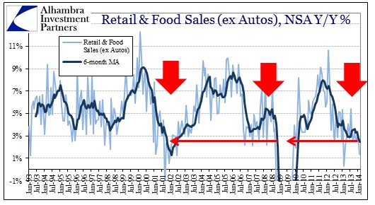
In that regard, the ballyhooed housing recovery in the former sub-prime disaster zones is not exactly all that. Instead, the housing price indices in Phoenix, Los Vegas, Sacramento, the Inland Empire and Florida went screaming higher in 2011-2013 due to speculator carry trades.

Stated differently, the 29-year olds in $5,000 suits riding into Scottsdale AZ on the back of John Deere lawnmowers are not there owing to their acumen as landlords of single-family, detached homes, nor do they bring competitively unique skills at managing crab-grass in the lawns, insect infestations in the trees and mold in the basement. What they bring is cheap funding for the carry. They will be gone as soon as housing prices stop climbing, which in many of these precincts has already happened.

Similarly, the auto sector has rebounded smartly, but the catalyst there is not hard to spot either—namely, the re-eruption of auto debt and especially of the sub-prime kind. The latter specie of dopey credit had almost been killed off by the financial crisis—when issuance plummeted by 90%, and properly so.  After all, sub-prime “ride” loans had been mainly issued against rapidly depreciating used cars and down-market new vehicles at 115% loan-to-value ratios for seven year terms to borrowers living paycheck-to-paycheck, meaning that they had an excellent chance of defaulting if the Fed’s GDP levitation game failed and their temp jobs vanished.

All the forgoing transpired in 2008-2009, of course, but that is ancient credit market history that has now been forgiven and forgotten. Since those clarifying moments, sub-prime car loans have soared 10X—-rising from $2 billion to $22 billion last year, when issuance clocked in above the frenzied level of 2007. Sub-prime loans now fund a record 55% of used car loans and 30% of new car loans, but there’s more. The Wall Street meth labs have already produced a credit mutant called “deep sub-prime” which now account for one-in-eight car loans. Borrowers able to post a shot-gun or PlayStation as downpayment can get a loan even with credit scores below 580.

In short, even as real wage and salary incomes grew by less than 1% last year, new vehicle sales boomed by 25% during the last two years to nearly the pre-crisis level of 16 million units. The yawning disconnect between stagnant incomes and soaring car sales is readily explained, of course, by the usual suspect in our debt-besotted economy—namely, auto loans, which were up 25% since the post-crisis bottom and now at an all-time high.

This reversion to borrowing our way to prosperity also highlights the untoward pathways through which the Fed’s toxic medicine of cheap debt disperses through the body economic. Much of the dodgy auto paper now flowing out of dealer showrooms is not coming from Dodd-Frank disabled banks, but from non-banks like Exeter Finance and Santander Consumer USA that have a tell-tale capital structure. They are funded with a dollop of “private equity” from the likes of Blackstone and KKR and tons of junk bonds that have been voraciously devoured by yield hungry money managers who have been flushed out of safer fixed income investments by the monetary central planners in the Eccles building.

The Financial Crime of ZERO-COGS

At the end of the day, the financial crime of ZERO-COGS is a product of the primitive 1960s ”bathtub economics” of the New Keynesians. Not coincidentally, their leading light was professor James Tobin, who was not only the architect of the disastrous Kennedy-Johnson fiscal and financial policies that caused the breakdown of Bretton Woods and its serviceably stable global monetary order, but who was also PhD advisor to Janet Yellen. To this day Tobin’s protégé ritually incants all the Keynesian hokum about slack aggregate demand, potential GDP growth shortfalls and central bank monetary “accommodation” designed to guide GDP and jobs toward full capacity.

In more graphic terms, however, the fancy theories of Tobin-Yellen reduce to this: the $17 trillion US economy amounts to a giant bathtub that must be filled to the brim at all times in order to insure full employment and maximum societal bliss. But it is only the deft management of the fiscal and monetary dials by enlightened PhDs that can that can keep the water line snuff with the brim–otherwise known as potential GDP. Indeed, left to its own devices, market capitalism tends in the opposite direction—that is, a circling motion toward the port at the bottom.

For nigh onto fifty years, however, it has been evident that the bathtub economics of the New Keynesians was fundamentally flawed. It incorrectly  assumes the US economy is a closed system and that artificial demand induced by the fiscal or monetary authorities will cause idle domestic labor and productive assets to be mobilized. Well, we now have $8 trillion of cumulative and chronic current account deficits that prove the opposite—that is, the relevant labor supply is the 2 billion or so workers who have come out of the EM rice paddies and the relevant industrial capacity is the massive excess supply of steel mills, shipyards, bulk-carriers and iron ore mines that have been built all over the planet based on export demand originating in the borrowed  prosperity of the West and ultra-cheap capital flowing from central bank printing presses around the world.

The truth is, pumping up the American ”demand” mobilizes lower cost factors of production abroad in a great economic swapping game. Exchange rate-pegging, mercantilist-oriented central banks in the EM swap the sweat of their domestic workers and the resource endowments of their lands for the paper emissions of the US and other DM treasuries.  And the $5.7 trillion of USTs held abroad, mostly by central banks, proves that proposition, as well. In any event, it is not Uncle Sam’s fiscal rectitude that has created the EMs’ ginormous appetite for pint-sized yields on America’s swelling debts.

So through all the twists and turns of Keynesian demand management since the days when Tobin and his successors and assigns supplanted the four-square orthodoxy of President Dwight Eisenhower and Chairman William McChesney Martin, what really happened was not the triumph of modern policy science or economic enlightenment in Washington, as Kennedy’s arrogant PhD’s then averred. Instead, “policy” spent nearly a half-century using up the balance sheet of the American economy and all its components on a one-time basis.  Total credit market debt—-including business, household, financial and government–went  from its historic ratio of 1.5X GDP  to 3.5X at the crisis peak in 2007—where it remains until this day.

The $30 Trillion Rebuke To Keynesian Professors

Those extra two turns of aggregate debt amount to $30 trillion—a one time exploitation of American balance sheets that did seemingly accommodate Keynesian miracles of demand management. GDP was boosted by households that were enabled to spend more than they earned and a national economy that was empowered to consume more than it produced.

But there was nothing enlightened about the rolling national LBO over the decades since Professor Tobin’s unfortunate arrival in Washington. It was then—and always has been—just a cheap debt trick. During each successive business cycle’s stimulus phase, debt ratios were ratcheted up to higher and higher levels. But now we have hit peak debt in both the public and private sectors, and there is no ratchet left because balance sheets have been exhausted.

The household sector data tell the story of the cheap debt trick which is now over. The relevant leverage ratio here is household debt to wage and salary income, because the NIPA “personal income” metric is now massively bloated by $2.5 trillion of transfer payments—-flows which come from debt and taxes, not production and supply.

As shown below, the ratchet was powerful. During the 1980-1985 cycle, the household debt ratio jumped from 105% to 117% of wage and salary income; then it ratcheted from 130% to 147% during the 1990-1995 cycle; thereafter it climbed from 160% to 190% during 2000-2005; and it finally peaked out at almost 210% at the 2007 peak.

That’s the Keynesian cheap debt trick in a nutshell: it does not describe a timeless science that can be applied over and over again, but merely a one-time party that is over. As shown below, the ratio has now retraced to the 180s, but that’s still high by historic standards, and more importantly, is the reason that Professor Larry Summers can be seen on most days sucking his thumb, looking for “escape velocity” that can’t happen.

The up-ratchet in private and public leverage ratios is over, and that means that the Keynesian monetary policy is done, too. It worked for a few decades thru the credit transmission mechanism to the household sector, but one thing is now certain: the only part of household debt that is growing is NINJA loans to students and what amounts to de facto rent-a-car deals in autos, which in due course will lead to a new pile-up of defaulted paper and acres of repossessed used cars.

Meanwhile, Yellen and her mad money printers keep “accommodating”  as they try to fill to the brim an imaginary bathtub of potential GDP. The exercise would be laughable, even stupid, if it were not for its true impact, which is ZERO-COGS. The latter, unfortunately, is fueling the mother of all bubbles here and abroad; crushing savers and fixed income retirees; showering the fast money traders and 1% with unspeakable windfalls of ill-gotten “trickle-down”; and placing control of the very warp and woof of our $17 trillion national economy in the hands of unelected, academic zealots.

The worst thing is that Yellenomics is just getting started because the whole crony capitalist dystopia that has become America can not function for more than a few days without another dose of its deadly monetary heroin.

Household Leverage Ratio - Click to enlarge

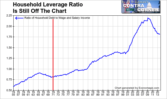
Household Leverage Ratio – Click to enlarge

See the original article >>

Hogs might flirt with a top, while cattle stays strong

By Rich Nelson

Hogs: It would be hard to say hog futures are trying to put a top in. Instead, you could suggest Wednesday’s trade was simply a small amount of introspection. Grain markets have seen some trouble this week, partially on concerns for a China growth slowdown. This can spill over into pork as well.

China is the No. 3 buyer of U.S. exports. As exports are 24% of U.S. demand, China purchases about 3% of all pork produced in this country. We would expect lower pork exports to them first due to the negative hog production margins they have had since December. Low hog prices deter buying from the U.S. The concern about their economy is a secondary issue.

A 20% year-over-year decline to China this year would cut 0.6% off U.S. demand base. This still pales in comparison to this year’s PED problems, but it is something to give this uptrend a pause. In other news, there will be heavy interest in the afternoon weekly PED report. Last week’s report suggested the peak weekly finding was 306 for the week ending Feb 9. The week after was 303 and the most recent week fell to 252. Will tonight’s update confirm that the worst (of the weekly findings) is behind us?…Rich Nelson

Cattle: At the time of this writing, there has been no cash cattle trading to report. Most packers were holding on to $146 bids, though we have heard talk they were willing to move up to steady with last week ($148).

While the smallest kill week of the year is behind us, this week’s run won’t be a big one. Kill levels won’t noticeable improve until April. Additionally, due to the past few days of rising pork prices, we now have record wholesale beef prices. That has given beef packers a narrow window of time for profitable operations. The trade is eager to see how this one plays out.

For the big picture, this week’s cash trading is not the be-all-end-all. This is a temporary period of time before market-ready cattle numbers build back up.

In other news, agriculture markets received an update on negotiations for the US/EU trade pact. Along with concern over EU protections with GMO grain and dairy products, the EU is not budging too much on hormone-treated beef. With eight months of negotiations behind us, it would appear the ban on U.S. beef will remain in place. This is not an issue that will affect U.S. meat prices. The U.S. meat industry does not expect their stance to change…Rich Nelson

See the original article >>

What Happened to Flight 370? An Analysis of What Is Known

by Charles Hugh Smith

If we put these together, we can establish a number of logical parameters around each plausible scenario, where plausible scenario means a situation based on previous losses of commercial aircraft.

Like many other people, I am following the story of what happened to Malaysia Airlines Flight 370 with keen interest. Much of what we've been told doesn't add up, deepening the mystery.
It seems to me that we can already draw a number of conclusions from the known data by pursuing a logic-based analysis of what is possible and what can be excluded as illogical.
Let's start with what is known:

1. The Malaysian authorities have been evasive to the point of misdirection, in other words, they've hidden the facts to serve an undisclosed agenda.
What is the agenda driving their evasion? What is known is that Malaysian security is obviously lax. This fact has caused Malaysian authorities to lose face, i.e. be humiliated on the global stage. Malaysia is an Asian nation, and maintaining face in Asia is of critical importance. We can conclude that one reason the Malaysian authorities are dissembling is to hide their gross incompetence.
It is also suspected that Malaysia is a safe haven for potentially dangerous Islamic groups. (Follow the threads from Pakistan's secret nuclear proliferation program to Malaysia for documentation of this possibility.) The Malaysian government may have an informal quid pro quo along these lines: you are welcome to set up shop as long as you don't cause any trouble here or do anything to cause Malaysia to lose face.
This provides another logical source of Malaysian evasion: if there is indeed a terrorist connection to the loss of the aircraft, this would focus the global spotlight on Malaysian tolerance of potentially dangerous groups.
That the Malaysian military was unable to effectively monitor the aircraft or coordinate with civilian air traffic control (ATC) also suggests incompetence at the most sensitive levels. Revealing this would also cause a loss of face.
Summary: Malaysian authorities have not been truthful or timely in their reporting. The logical conclusion is that they're hiding data to protect national pride and the true state of their abysmal security.
2. Additional information is available but is not being shared with the public. To take one example, the Aircraft Communications Addressing and Reporting System (ACARS) on Flight 370 was functioning and automatically sent data on four critical systems, including the engines. This data has not been released by Malaysian Airlines.
It also appears that the pilot of another 777 airliner heading to Japan contacted the pilot in Flight 370 and reported the transmission was garbled.
Even with the transponder off, the aircraft would appear on primary (military) radar. The Malaysian military tracked Flight 370 but is dissembling. Clearly the authorities are not revealing the full extent of what is known.
3. Satellite imagery did not detect a high-altitude explosion. This excludes all scenarios in which the aircraft crashes into another plane, explodes in mid-air, etc.
4. Flight 370 changed course and altitude, and then maintained the new bearing for hundreds of miles and an additional hour of flight after losing contact with ATC (air traffic control). This limits scenarios in which decompression causes everyone on board to lose consciousness or a catastrophic electrical fire incapacitating the flight deck to an emergency that enabled the pilots to set a new course before losing consciousness or control of the aircraft.


5. The Malaysian military reported Flight 370's altitude as 29,500 feet. This conflicts with eyewitness accounts from fishermen reporting a large aircraft at a much lower altitude around 1,000 meters (3,000 feet). If the radar altitude is correct, this suggests the aircraft was not experiencing decompression, as the pilots would descend as an emergency response to decompression. If the fishermen's report is accurate, then decompression would not be an issue.
6. Mobile phone data suggests the passengers' phones were still functioning after the aircraft lost contact with air traffic control (ATC) and the transponder was turned off/failed.

7. Releasing data from the U.S. intelligence space-based network would reveal U.S. capabilities. The Strait of Malacca is a key shipping lanes chokepoint, and is thus of strategic interest to the U.S. and other nations with space-based assets. U.S. authorities have already revealed that U.S. coverage of the area is "thorough."
This confirms that U.S. communications monitoring and space-based assets cover the seas around the Strait of Malacca. Given what is known about these monitoring and space-based assets, it is likely that the U.S. intelligence agencies have additional data but are not revealing them, as this would provide direct evidence of U.S. capabilities.
We can surmise that the U.S. maintains thermal imaging capabilities that can detect more than large explosions. We can also surmise that the communications monitoring networks picked up any signals from the aircraft or related to the aircraft.
That the head of the C.I.A. publicly professed ignorance is interesting. What course of action would one pursue if one wanted to keep U.S. capabilities secret? Publicly proclaim ignorance.
This is not to suggest that the U.S. "knows where flight 370 is;" it is simply to note that this is not "open ocean" comparable to the mid-Atlantic where Air France Flight 447 went down five years ago. This is a strategic chokepoint of great interest to the U.S., and therefore it is likely that U.S. networks and space-based assets collected data that would either exclude certain possibilities or make other possibilities more likely.
What can we logically conclude from the most reliable and trustworthy data available?

1. The pilots were conscious when they turned off the transponder (or the transponder failed) around 1:30 a.m. and when they changed course soon after.The aircraft was under the control of the pilots long enough for them to set a new course.
2. The aircraft flew an additional hour or more on the new westward course at cruising altitude.

3. No distress signal was sent during this 1+ hour flight after whatever event caused the the pilots to change course.

If we put these together, we can establish a number of logical parameters around each plausible scenario, where plausible scenario means a situation based on previous losses of commercial aircraft.
1. Pilot suicide. If the pilot had decided to commit suicide by crashing the plane, why not ditch the aircraft in the South China Sea? Why change course and fly for another hour?
Alternatively, the Malaysian military's reports are completely false and they were tracking an unknown aircraft near Pulau Perak at 2:15 a.m. (previously reported as 2:40 a.m.)
How many unindentified large aircraft are flying around Pulau Perak at 2:15 a.m. on a typical night? The possibility that the radar signal was not Flight 370 seems remote.
2. Mechanical failure that caused decompression or an electrical fire that incapacitated the flight deck. If such an emergency occurred, it enabled the pilots to change course and altitude.
Assuming a decompression event, we could expect the pilots to descend rapidly. If Flight 370 was indeed at 29,500 feet at 2:15 a.m., that suggests the aircraft was still capable of flight at cruising altitude. So either the pilots were still flying the aircraft or the decompression event enabled them to change course and set the autopilot before losing consciousness.
If the aircraft was being flown by autopilot, it could have flown for many more hours, given its fuel load, which raises the question: if the pilots were unconscious at 2:15 a.m., why did the aircraft suddenly crash 10 minutes later?
If an emergency had crippled the aircraft's electrical system, it's unlikely the plane could have continued flying at cruising altitude for an additional hour. If a catastrophic electrical fire crippled the flight deck, how could the plane continue flying at cruising altitude for another hour, given that the battery backup would last at best 30 minutes?
In other words, the additional hour of flight time on a new course does not logically align with an emergency decompression or fire that led to the flight deck and pilots being incapacitated. A decompression event would have led to either A. a rapid controlled descent or B. the pilots unconscious/unable to take control and the autopilot flying the aircraft on the new course for many hours.
Alternatively, a catastrophic electrical fire would have either brought the aircraft down within minutes of the event or at best provided 30 minutes on emergency battery power. Neither jives with an additional hour of flight at cruising altitude.
This leads to the conclusion that the aircraft was still being flown by the pilots, i.e. conscious decisions were being made by either the pilots or someone who had seized control of the flight deck.

If a mechanical emergency had crippled the aircraft, it seems unlikely that the pilots could change course and altitude but not be able to send a distress signal. If the pilots had lost consciousness but the rest of the plane's systems were nominal, the autopilot would have continued flying the aircraft until the fuel ran out, many hours beyond 2:15 a.m.
That suggests there was conscious control of the aircraft and that those in charge made a decision sometime after 2:15 a.m. that led to the loss of the aircraft. This scenario strongly suggests human action or error as the operative emergency rather than mechanical failure.
Either that, or some key data that has been released as fact is actually false.
Late breaking news: if the satellite images released by China (taken one day after Flight 370 went missing) are in fact photos of wreckage, then the Malaysian military was obviously not tracking Flight 370 to the west an hour later.

The blurry photo does not reveal much, but several features are noteworthy:

1. The three pieces are very large, which means they must be intact sections of the wings or fuselage. It is unlikely these would still be floating hours after a crash. We might also wonder, what sort of impact would create three large pieces rather than a debris field?

2. The three pieces are close together. Unless the aircraft landed intact in the water and sank in one piece, there would likely be a field of much smaller floating debris.

3. What else could this be? The large size of the pieces is certainly consistent with the scale of a 777.

4. Why did China withhold the imagery for three days? Did their own search ships reach the coordinates identified by the satellite?

5. The ocean currents and the location of the presumed debris do not compute. Ocean currents in the area are 2 kilometers/hour. Presumed debris is 141 miles from last known position This doesn't compute: the satellite image was taken 11 am Sunday 33 hours after MH370 presumably crashed; debris would only drift 33 hr X 2 KM=66 KM or about 40 miles from the last known position of HM370. Debris was 140 miles to the east--100 miles beyond what's possible in terms of debris drifting with currents from the presumed crash site.

In summary, these images open additional questions. There is no substitute for actually finding the aircraft or debris.

See the original article >>

Follow Us