Friday, March 7, 2014
China: Bubble Trouble May Be Brewing
Money Supply and Lending Growth Decline Sharply
Both the growth rate of China's narrow M1 money supply and the broader M2 measure have recently declined to levels not seen in many years. Here is a recent chart showing both:
 Annualized growth in China's narrow money measure M1 (currency and sight deposits) has collapsed to just 1.5%, a level not seen in at least the past 15 years (and probably a good while longer). M2, which includes savings deposits, corporate time deposits, deposits in trusts and a few other smaller items grew at 13.2% year-on-year, but even that is one of the lowest growth rates of the past decade – click to enlarge.
We're not 100% sure if China's M1 is a good proxy for money TMS, as there is a paucity of readily available monetary data from the PBoC (its web site is basically useless, at least it was when we last looked) and we don't know whether savings deposits are available on demand in China or not, but it is a fairly good bet that it actually is at the very least a good proxy for TMS-1.
As such we would expect it to be more volatile, which it indeed is. As you can see, its growth rate has peaked at nearly 39% year-on-year in the post Lehman push by the Chinese authorities, when they took steps to reliquefy the system by ordering China's banks to lend as much as possible to all comers. It's a good thing we have fiat money and these central planners everywhere, as that sure lowers the monetary system's volatility a lot! Steady as she goes!
Looking at M1 in absolute numbers, we can see that the sharp drop-off in the annualized growth rate was the result of a very big monthly contraction in M1 early this year. This suggests the authorities are deliberately stepping on the brakes, or are at least not trying to counter a case of private sector loan contraction.

China's M1 money supply in absolute numbers. There have been several instances of month-on-month contractions, but the most recent one was unusually large – click to enlarge.
It is no wonder in light of these developments that China's economic data have lately been on the weak side. We understand the authorities are trying to restore some balance to the system after the credit binge of 2009-2010, but there is a not inconsiderable chance that this time, they will end up producing a major bust in the process. That is not a problem per se, but we are wondering how much capital malinvestment it will actually reveal. It could be a lot, judging from the anecdotal evidence of entire cities standing empty, vast stock piles of industrial metals securing loans that are in turn invested in dubious 'wealth management' products, the extremely large capacities in heavy industry, and so forth. A chart showing bank loan growth and 'total social financing' further buttresses the idea that a major slowdown and perhaps even a recession could be close at hand:
 China: Bank loan growth, 'social financing' growth (includes shadow banking channels) and nominal GDP growth – click to enlarge.
Stocks Are Already in the Dumps – Is It Real Estate's Turn Next?
2013 was a year of brisk price rises for real estate in China's major cities. These cities are experiencing the by far greatest urban population growth, and in previous years, China's authorities were targeting them for a selective reining in of property speculation. These selective curbs were lifted by the new government in late 2012, leading to a price explosion in 2013.
Admittedly, China's property market is difficult to decipher from afar. One often wonders how it is possible for prices to remain as sky high as they are (especially relative to incomes) in view of so much supply coming on stream over the years. Partly the supply is probably soaked up by ongoing urbanization, and partly the resilience of prices is probably due to the country's closed capital account. Many people evidently don't know how to best invest their savings in light of interest rates that are often negative in real terms, and real estate is regarded as a 'sure thing' (and so far, it has been).
However, the rate of price increases in the large cities has begun to turn down lately:

New home prices, year-on-year percentage change in large Chinese cities – click to enlarge.
One thing is clear, there are many signs that economic activity in general is possibly on the verge of contraction. PMI data have been consistently weak for instance, especially in the manufacturing sector. If a more widespread decline in real estate prices were to happen, banks could soon be forced to admit to more NPLs than they have so far done.
Miscellaneous Charts – Bank Loans, NPLs, Trust Products, Steel Production …
We found the following 'all is well'(?) chart published by the Economist magazine a while back, that compares loan and NPL growth in China:
 It does not look very credible, but there it is …
According to estimates by China's Banking Regulatory Commission, NPLs will rise a tiny little bit in coming years, but by and large there is nothing to worry about…(note that the 2012 low in NPLs for listed banks only was even lower at just 0.93%!)

NPLs across the entire banking system, actual and estimated (official estimate) – click to enlarge.
But looking at a few other charts, we can just not bring ourselves to actually believe it …

Wealth management products up for redemption every month until January 2016, via BAC – click to enlarge.

China's steel production – evidence of malinvestment? We think so – click to enlarge.

And lastly, the Shanghai stock index – still in a downtrend – click to enlarge.
Conclusion:
There is plenty of scope for a financial/economic 'accident' in China now that money supply growth is slowing down sharply. Like nearly every year, we wonder once again if the mandarins in Beijing will be able to pull yet another rabbit out of the hat. One of these days, the wizards will come up empty.
Copper Collapses Most Since Dec 2011 On China Credit Fears
by Tyler Durden
We noted last night that Iron Ore futures prices were in free-fall as the vicious circle of China's commodity-collateral-backed shadow banking system unwind hits home amid fears of contagion from the Chaori Solar default. The first domestic Chinese corporate bond default has retail investors running scared as surprise spreads that the local government did not come to the rescue. The deleveraging is now spreading to copper prices (remember the massive cash-for-copper schemes of last year) as borrowers are forced to sell to meet cash calls which in turn drops copper prices, reducing collateral values and tightening credit conditions even more. This is the biggest copper price drop since Dec 2011...

More on Chaori and the fallout...
As Deutsche Bank notes,
On the topic of China, according to the WSJ the country’s first onshore corporate bond default has occurred earlier today in the form of Shanghai Chaori Solar Energy’s missed/incomplete RMB89.8m coupon payment. As we have written over the last couple of days, the bond is relatively small (RMB1bn or US$160m in face value) and the issuer is small (US$1.2bn in assets) but it’s an interesting case for a number of reasons.
Firstly, it’s a bond where the majority of bondholders are retail investors (WSJ, citing company management) which widens the scope of the impact from the market’s typical institutional investor base. Weibo, China’s version of Twitter, is showing photos of retail investors at a local Shanghai government office protesting the authorities’ lack of action in assisting the issuer (21st Century Business Herald).
Secondly, it should be highlighted that Shanghai Chaori avoided a default on its annual coupon payment last year due to the intervention of a local Shanghai government who persuaded banks to roll over loans. This time around, the policy appears to have changed with no last-minute assistance on the cards. Indeed, state-affiliated news agency Xinhua wrote in an opinion piece that a default would be the “the market playing its own decisive role”.
Interesting, given that the Chinese solar energy market was heavily subsidised by the Chinese government in recent years. The Xinhua article also commented that Chaori was not going to be China’s “Bear Stearns moment”.
In addition, domestic media are reporting that the company’s bankers and bond underwriters will not be helping the company make interest payments (21st Century Business Herald). Though this is a relatively small bond, there are potentially wider ramifications.
Bloomberg reports that China’s renewable energy industry faces US$7.7bn in bond maturities this year, and already three domestic bond issuances have been postponed or cancelled in recent days according to Reuters. This is certainly a macro story to watch in 2014
And we warned of China's Bronze Swan last year...
Copper, as China pundits may know, is the key shadow interest rate arbitrage tool, through the use of financing deals that use commodities with high value-to-density ratios such as gold, copper, nickel, which in turn are used as collateral against which USD-denominated China-domestic Letters of Credit are pleged, in what can often result in a seemingly infinite rehypothecation loop (see explanation below) between related onshore and offshore entities, allowing loop participants to pick up virtually risk-free arbitrage (i.e., profits), which however boosts China's FX lending and leads to upward pressure on the CNY.
...
But what does it mean for the actual Copper Financing Deal? The below should explain it:
An example of a typical, simplified, CCFD
In this section we present an example of how a typical Chinese Copper Financing Deal (CCFD) works, and then discuss how the various parties involved are affected if the deals are forced to unwind. Exhibit 3 is a ‘simplified’ example of a CCFD, including specific reference to how the process places upward pressure on the RMB/USD. We believe this is the predominant structure of CCFDs, with other forms of Chinese copper financing deals much less profitable and likely only a small proportion of total deal volumes.
A typical CCFD involves 4 parties and 4 steps:
- Party A – Typically an offshore trading house
- Party B – Typically an onshore trading house, consumers
- Party C – Typically offshore subsidiary of B
- Party D – Onshore or offshore banks registered onshore serving B as a client
Step 1) offshore trader A sells warrant of bonded copper (copper in China’s bonded warehouse that is exempted from VAT payment before customs declaration) or inbound copper (i.e. copper on ship in transit to bonded) to onshore party B at price X (i.e. B imports copper from A), and A is paid USD LC, issued by onshore bank D. The LC issuance is a key step that SAFE’s new policies target.
Step 2) onshore entity B sells and re-exports the copper by sending the warrant documentation (not the physical copper which stays in bonded warehouse ‘offshore’) to the offshore subsidiary C (N.B. B owns C), and C pays B USD or CNH cash (CNH = offshore CNY). Using the cash from C, B gets bank D to convert the USD or CNH into onshore CNY, and trader B can then use CNY as it sees fit.
The conversion of the USD or CNH into onshore CNY is another key step that SAFE’s new policies target. This conversion was previously allowed by SAFE because it was expected that the re-export process was a trade-related activity through China’s current account. Now that it has become apparent that CCFDs and other similar deals do not involve actual shipments of physical material, SAFE appears to be moving to halt them.
Step 3) Offshore subsidiary C sells the warrant back to A (again, no move in physical copper which stays in bonded warehouse ‘offshore’), and A pays C USD or CNH cash with a price of X minus $10-20/t, i.e. a discount to the price sold by A to B in Step 1.
Step 4) Repeat Step 1-Step 3 as many times as possible, during the period of LC (usually 6 months, with range of 3-12 months). This could be 10-30 times over the course of the 6 month LC, with the limitation being the amount of time it takes to clear the paperwork. In this way, the total notional LCs issued over a particular tonne of bonded or inbound copper over the course of a year would be 10-30 times the value of the physical copper involved, depending on the LC duration.
Copper ownership and hedging: Through the whole process each tonne of copper involved in CCFDs is hedged by selling futures on LME futures curve (deals typically involve a long physical position and short futures position over the life of the CCFDs, unless the owner of the copper wants to speculate on the price).
Though typically owned and hedged by Party A, the hedger can be Party A, B, C and D, depending on the ownership of the copper warrant.

As Goldman further explains, the importance of CCFD is "not trivial" - that is an understatement: with the implicit near-infinite rehypothecation in which the number of "circuits" in the deal is only a factor of "the amount of time it takes to clear the paperwork", there may be hundreds of billions, if not more, in leverage resulting from this shadow transaction that has been used in China for years. Now, that loop is about to end. The reality is nobody can predict what the impact will be, but whatever it is - i) it will extract tremendous leverage from the system and ii) it will have adverse impacts on both China's ability to absorb inflation and grow its economy.
Hence this...

5 Things To Ponder: Serious Stuff
by Lance Roberts
There was so many good things to read this past week that it was hard to narrow it down to a topic group. After a brief respite early this year, the markets are hitting new highs confirming the current bullish trend. As a money manager, this requires me to increase equity exposure back to full target weightings. After such an extended run in the markets, this seems somewhat counter-intuitive. It is, but as Bill Clinton once famously stated; "What is....is."
However, while the current market "IS" within a bullish trend currently, it doesn't mean that this will always be the case. This is why, as investors, we must modify Clinton's line to: "What is...is...until it isn't." That thought is the foundation of this weekend's "Things To Ponder." In order to recognize when market dynamics have changed for the worse, we must be aware of the risks that are currently mounting.
1) Fisher Warns Fed's Bond Buying Could Be Distorting Markets via Reuters
While this article falls in the "no s***" category, Dallas Fed President Richard Fisher points out areas that we should be paying closer attention to for signs of change.
"There are increasing signs quantitative easing has overstayed its welcome: Market distortions and acting on bad incentives are becoming more pervasive," he said of the asset purchases, which are sometimes called QE.
"I fear that we are feeding imbalances similar to those that played a role in the run-up to the financial crisis."
Here are his main points:
1) QE was wasted over the last 5 years with the Government failing to use "easy money" to restructure debt, reform entitlements and regulations.
2) QE has driven investors to take risks that could destabilize financial markets.
3) Soaring margin debt is a problem.
4) Narrow spreads between corporate and Treasury debt are a concern.
5) Price-To-Projected Earnings, Price-To-Sales and Market Cap-To-GDP are all at "eye popping levels not seen since the dot-com boom."
"We must monitor these indicators very carefully so as to ensure that the ghost of 'irrational exuberance' does not haunt us again,"
In order to make it in professional sports, you have to be an elite athlete. What is amazing, is that among all of the elite athletes, there are always one or two that rise above all others. Players like Michael Jordon, Tiger Woods, Nolan Ryan and many others have elevated their game to inexplicable levels. In the investment game, there are a few individuals that have done the same. The follow three pieces are views from some of these men Howard Marks, Jeff Gundlach and Seth Klarman.
2) Howard Marks: In The End The Devil Usually Wins via Finanz Und Wirtschaft
"Our mantra at Oaktree Capital for the last few years has been: «move forward, but with caution». Although a lot has changed since then I think it’s still appropriate to keep the same mantra. Today, things are not cheap anymore. Rather I would describe the price of most assets as being on the high side of fair. We’re not in the low of the crisis like five years ago."
"Let’s think about a pendulum: It swings from too rich to too cheap, but it never swings halfway and stops. And it never swings halfway and goes back to where it came from. As stocks do better, more people jump on board. And every year that stocks do well wins a few more converts until eventually the last person jumps on board. And that’s the top of the upswing."
"But there actually are two risks in investing: One is to lose money and the other is to miss opportunity. You can eliminate either one, but you can’t eliminate both at the same time."
"There are two main things to watch: valuation and behavior."
3) Seth Klarman: Downplaying Risk Never Turns Out Well via Value Walk
"“In the face of mixed economic data and at a critical inflection point in Federal Reserve policy, the stock market, heading into 2014, resembles a Rorschach test,” he wrote. “What investors see in the inkblots says considerably more about them than it does about the market.”
"If you’re more focused on downside than upside, if you’re more interested in return of capital than return on capital, if you have any sense of market history, then there’s more than enough to be concerned about.”
“We can draw no legitimate conclusions about the Fed’s ability to end QE without severe consequences.”
“Fiscal stimulus, in the form of sizable deficits, has propped up the consumer, thereby inflating corporate revenues and earnings. But what is the right multiple to pay on juiced corporate earnings?”
“There is a growing gap between the financial markets and the real economy,”
“Our assessment is that the Fed’s continuing stimulus and suppression of volatility has triggered a resurgence of speculative froth.”
“In an ominous sign, a recent survey of U.S. investment newsletters by Investors Intelligence found the lowest proportion of bears since the ill-fated year of 1987,” he wrote. “A paucity of bears is one of the most reliable reverse indicators of market psychology. In the financial world, things are hunky dory; in the real world, not so much. Is the feel-good upward march of people’s 401(k)s, mutual fund balances, CNBC hype, and hedge fund bonuses eroding the objectivity of their assessments of the real world? We can say with some conviction that it almost always does. Frankly, wouldn’t it be easier if the Fed would just announce the proper level for the S&P, and spare us all the policy announcements and market gyrations?”
4) Jeff Gundlach & Howard Marks: Beware Of Junk Bonds via Pragmatic Capitalist
"There’s been some cautionary commentary in recent months from some bond market heavyweights. Most notably, Howards Marks and Jeff Gundlach. In a Bloomberg interview today, Marks said you need to be cautious about low quality issuers:
'When things are rollicking and the market is permitting low-quality issuers to issue debt, that’s when you need a lot of caution,'
And just a few weeks before that Jeff Gundlach referred to junk bonds as the most overvalued they’ve ever been relative to Treasury Bonds."
5) Bernanke Unleashed: What He Can Say Now That He Couldn't Say Beforevia Zero Hedge
Now that Ben Bernanke is no longer the head of the Fed, he can finally tell the truth about what caused the financial crash. At least that's what a packed auditorium of over 1000 people as part of the financial conference staged by National Bank of Abu Dhabi, the UAE's largest bank, was hoping for earlier today when they paid an exorbitant amount of money to hear the former chairman talk.
"The United States became 'overconfident', he said of the period before the September 2008 collapse of U.S. investment bank Lehman Brothers. That triggered a crash from which parts of the world, including the U.S. economy, have not fully recovered.
'This is going to sound very obvious but the first thing we learned is that the U.S. is not invulnerable to financial crises,' Bernanke said.
"He also said he found it hard to find the right way to communicate with investors when every word was closely scrutinised. 'That was actually very hard for me to get adjusted to that situation where your words have such effect. I came from the academic background and I was used to making hypothetical examples and ... I learned I can't do that because the markets do not understand hypotheticals.'
“The complexity though arises because in order to help the average person, you have to do things -- very distasteful things -- like try to prevent some large financial companies from collapsing. The result was there are still many people after the crisis who still feel that it was unfair that some companies got helped and small banks and small business and average families didn’t get direct help. It’s a hard perception to break.”
I guess the real question is now that the markets are once again over confident, over extended and excessively bullish - have we actually learned anything?
The Secret History of the Financial Crisis
by Harold James
PRINCETON – Balzac’s great novel Lost Illusions ends with an exposition of the difference between “official history,” which is “all lies,” and “secret history” – that is, the real story. It used to be possible to obscure history’s scandalous truths for a long time – even forever. Not anymore.
Nowhere is this more apparent than in accounts of the global financial crisis. The official history portrayed the US Federal Reserve, the European Central Bank, and other major central banks as embracing coordinated action to rescue the global financial system from disaster. But recently published transcripts of 2008 meetings of the Federal Open Market Committee, the Fed’s main decision-making body, reveal that the Fed has effectively emerged from the crisis as the world’s central bank, while continuing to serve primarily American interests.
The most significant meetings took place on September 16 and October 28 – in the aftermath of the collapse of the US investment bank Lehman Brothers – and focused on the creation of bilateral currency-swap agreements aimed at ensuring adequate liquidity. The Fed would extend dollar credits to a foreign bank in exchange for its currency, which the foreign bank agreed to buy back after a specified period at the same exchange rate, plus interest. This gave central banks – especially those in Europe, which faced a dollar shortage as US investors fled – the dollars they needed to lend to struggling domestic financial institutions.
Indeed, the ECB was among the first banks to reach an agreement with the Fed, followed by other major advanced-country central banks, including the Swiss National Bank, the Bank of Japan, and the Bank of Canada. At the October meeting, four “diplomatically and economically” important emerging economies – Mexico, Brazil, Singapore, and South Korea – got in on the action, with the Fed agreeing to establish $30 billion swap lines with each of their central banks.
Though the Fed acted as a kind of global central bank, its decisions were shaped, first and foremost, by US interests. For starters, the Fed rejected applications from some countries – whose names are redacted in the published transcript – to join the currency-swap scheme.
More important, limits were placed on the swaps. The essence of a central bank’s lender-of-last-resort function has traditionally been the provision of unlimited funds. Because there is no limit on the amount of dollars that the Fed can create, no market participant can take a speculative position against it. By contrast, the International Monetary Fund has finite resources provided by member countries.
The Fed’s growing international role since 2008 reflects a fundamental shift in global monetary governance. The IMF emerged at a time when countries were routinely victimized by New York bankers’ casual assumptions, such as J.P. Morgan’s assessment in the 1920’s that Germans were “fundamentally a second-rate people.” The IMF was a critical feature of the post-WWII international order, intended to serve as a universal insurance mechanism – not one that could be harnessed to advance contemporary diplomatic interests.
Today, as the Fed documents clearly demonstrate, the IMF has become marginalized – not least because of its ineffective policy process. Indeed, at the outset of the crisis, the IMF, assuming that demand for its resources would remain low permanently, had already begun to downsize.
In 2010, the IMF made a play for resurrection, presenting itself as central to solving the euro crisis – beginning with its role in financing the Greek bailout. But here, too, a secret history has been revealed – one that highlights just how skewed global monetary governance has become.
The fact is that only the US and the massively over-represented countries of the European Union supported the Greek bailout. Indeed, the major emerging economies all strongly opposed it, with the Brazilian representative calling it “a bailout of Greece’s private debt holders, mainly European financial institutions.” Even the Swiss representative condemned the measure.
As fears of a sudden collapse of the eurozone have given way to a prolonged debate about how the costs will be met through bail-ins and write-offs, the IMF’s position will become increasingly convoluted. Though the IMF is supposed to have seniority over other creditors, there will be demands to write down a share of the loans that it has issued. Poorer emerging-market countries would resist such a move, arguing that their citizens should not have to foot the bill for fiscal profligacy in much wealthier countries.
Even the original advocates of IMF involvement are turning against the Fund. EU officials are outraged by the IMF’s apparent effort to gain support in Europe’s debtor countries by urging write-offs of all debt that it did not issue. And the US Congress has refused to endorse the expansion of IMF resources – part of an international agreement brokered at the 2010 G-20 summit.
While the outrage that followed the appointment of another European as IMF Managing Director in 2011 is likely to ensure that the Fund’s next head will not hail from Europe, the IMF’s fast-diminishing role means that it will not matter much. As 2008’s secret history shows, what matters is who has access to the Fed.
With Average House Prices At $6.8 Million In Central London, Is A Property Bubble Set To Burst!
by GoldCore
Today’s AM fix was USD 1,348.25 EUR 971.22 and GBP 805.16 per ounce. Yesterday’s AM fix was USD 1,334.25, EUR 971.57 and GBP 798.00 per ounce.
Gold rose $12.90 or 0.96% to $1,350.30/oz. Silver also rose $0.30 or 1.42% to $21.47/oz.
Gold has continued to edge higher and should achieve a fifth consecutive weekly higher close. This continued rise in gold’s price is bullish from a technical and momentum perspective.
Is London’s Property Bubble Set To Burst?
There are increasing signs that the London residential property market is displaying bubble like qualities.
Authorities such as the Bank of England have denied that a house price "bubble" is developing due to ultra-loose monetary policies.
However, if present trends continue, national house price inflation may rise above 10% within a few months, far higher than the current rate of CPI inflation, which stood at 1.9% in January.

UK Department for Communities and Local Government House Prices London – UK ONS via Bloomberg
Although it’s often argued that London is a unique property market fuelled by a buoyant London economy and continued international interest from overseas buyers, recent price appreciation has taken on a distinct frothy appearance.
This is not to say that London property prices may not keep rising in the short term – momentum is a powerful force. However, investors should tread carefully and evaluate evidence of a bubble.
“This time is different.”
These are the four most expensive words in financial history. Yet, this is the mantra regarding London property prices.
The same thing was said about Dublin property prices in 2006. Dublin? But Dublin is not a financial capital. That is correct, however it is worth remembering that the same things were said about Zurich and Tokyo before the property bubbles in these two financial capitals burst.
Evidence Of A Property Bubble
Official house price reports from organisations such as the Land Registry for England and Wales and the Office for National Statistics (ONS), the Halifax House Price Index and from the Nationwide all show that property prices in most parts of the UK are rising. All these surveys are pointing in the same direction and show that London property prices have risen and are rising at a particularly fast rate.
Halifax House Price Index
According to the widely used Halifax house price index, annual house price inflation is currently running at 7.5% for the UK, but at 15.4% for Greater London, where the average house price has now reached £310,000.
House prices are continuing to accelerate across the UK, according to the latest snapshot from the Halifax mortgage lender.

HBOS UK Property Prices (Bloomberg)
Its latest survey, for February, shows that prices rose by 2.4% last month, leaving them 7.9% higher than a year ago. That was the fastest annual pace of increase since October 2007 and means the average UK home now costs £179,872.
However, record levels of debt and continuing pressures on household finances, as earnings fail to keep pace with consumer price inflation, are expected to remain a constraint on the rate of growth of house prices in the UK.
Sales have been picking up strongly too in the past year. In January, house sales in the UK had risen for the ninth month in a row. The number of mortgages approved for home buyers, but not yet lent, was 42% higher than a year ago, suggesting a further rise in sales is still to come.
At the top end, or prime, segment of the London market, which generally means the top 5-10% of properties, the average price of a property is now £4 million in central London, £1.8 million in Greater London and £1 million in the surrounding Home Counties. While overseas buyers investing in central London have long been credited to have pushed out the majority of other buyers, their impact is now starting to boost prices in the prime segments of Greater London and surrounding areas, as rich domestic buyers are also forced to buy further afield.
That overseas rich cash buyers are primarily responsible for driving up central London prime residential prices is not just hearsay. It is well documented. London’s Evening Standard recently highlighted at least 740 ‘ghost mansions’ worth £3 billion in total that are currently sitting empty and unused around central west London and a number of other enclaves. Even the current uncertainty in the Ukraine is adding to the mix, with London’s prime estate agents having noticed an increase in enquiries from rich Ukrainian and Russian clients over the last few weeks.
Knight Frank
According to Knight Frank, the reputable London estate agent, house prices in the prime central London segment rose for the 40th consecutive month in February, the longest consecutive rise since the firm began producing its London prime index in 2004. They note that 12 month price appreciation to February 2014 was 12.8% in the sub-£2 million category and 3.4% in the £10 million plus bracket. Knight Frank notes that the rate of increase at the very top end £10 million plus has slowed compared to the previous year, when it reached 6.1%, and the year prior to that, when it touched 10.7%. With central London so expensive, the ripple effect is going ever outwards.
Savills
Savills, a similar firm to Knight Frank, forecasts that London prices over the next five years to 2018 will still rise strongly with the larger gains outside the very centre. Savills predicts a 23.1% gain in central London over the five years to 2018, a 22% gain in ‘other London’, and a 25% gain in inner commuting belts. However there is evidence that these forward looking rosy forecasts by industry agents need to be tempered with the consideration of additional evidence.
Shiller
U.S. economist Robert Shiller recently warned that London property prices could be in a bubble. Shiller, the Yale based economist who shared last year's Nobel Prize in economics, is notably for his work on demonstrating that asset prices can become irrational and out of step with economic fundamentals. He is co-creator of the widely followed Case-Shiller Home Price Indices in the US. Last October, Shiller commented that the rapid price rises in London property looks like a bubble that is being fuelled by easy credit availability.
RICS
In its latest monthly survey of the UK residential market, the Royal Institution of Chartered Surveyors (RICS) confirms an overheating London market, finding that price rises are by far the strongest in London and the South East relative to the rest of the country. Every month RICs collates market feedback from its’ members into a blended net balance indicator of sentiment using factors such as house prices, new buyer enquiries, agreed sales, and new vendor instructions.
The overall net balance figure for the UK is now at +50 and has been so for five consecutive months. The last time this occurred was in mid-2002. Most strikingly though, the net balance figure is now +87 for London and +80 for the South East region. As a comparison, the same figure is +21 in Wales and +12 for the North of England.
Feedback from RICs members in London is nearly unanimous in highlighting “a lack of supply pushing prices higher”, “a dire shortage of new sales”, “most properties going under offer as soon as they hit the market”, and “international buyers still showing a good interest, particularly in new builds”. Commenting on the February report, RICs director Peter Bolton-King said that London prices may become unstable.
EY
Adding to the evidence of a London bubble, EY Item Club, the independent economic forecast group sponsored by Ernst Young, released its own report last month, aptly titled “UK housing: no bubble to burst…except in London”. The EY report warns that housing bubble conditions are emerging in Greater London with the acceleration of prices now extending beyond the prime properties of central London and out to the broader London residential market.
EY notes that policy makers and regulators could attempt to cool demand by enforcing London specific lending limits on borrowers based on mortgage to income multiples, but the authors concede that without any real changes in government policy or market dynamics, London’s unique factors of a) super-rich cash buyers in the prime market and b) well paid London professionals in much of the rest of the market, appear to indicate that price appreciation is not going to cool off anytime soon.
Civitas
Independent social policy think-tank Civitas also released a property study last month and called for the imposition of controls on wealthy overseas buyers in the London property market. The authors refer to the “rampant house price inflation” in London, where the “global super-rich” are using London property as an investment vehicle and a safe haven shield from more volatile countries, while younger and less well-off London residents are being squeezed out of the market.
The report highlights that while the ratio of average income to average property prices across the UK has risen from 2.3 in 1980 to 4.6 in 2013, the same ratio for London hit 6.1 in 2013. As a supply boosting measure, Civitas calls for regulations that would only allow overseas investment buyers to acquire existing properties in London if they proved this would add to the available housing stock. Similar rules already exist in economies such as Australia, Switzerland and Singapore.
OECD
The most recent OECD semi-annual economic outlook warned that UK house prices might be experiencing a potential bubble since economic policy and supply constraints are causing an overheating market.
Government Policy
UK residential market prices are currently being supported by various favourable economic factors and government led schemes. The government’s ‘help to buy scheme’, supposedly structured for those who otherwise could not afford a property, offers an interest free loan of 20% of the purchase price of a house up to £600,000, with a 15% lender loan guarantee by the government. This scheme is helping to drive mortgage applications and has been criticised by the IMF and others for potentially stoking a property bubble, and for having specified an upper house price that, while realistic for London, is very generous for other parts of the country.
Historically low official Bank of England rates are feeding into relatively favourable mortgage rates. The official stance of the UK Treasury and Bank of England is not expected to change anytime soon since they require low interest rates to support an economic recovery. However external economic shocks are not unknown and can come when least expected.
Affordability of property in relation to earnings is an issue and is becoming a bigger issue as prices continue to rise, not just in London, but across the UK. There are also signs that various parts of the market are becoming choked as those who would otherwise move up can’t and so this impacts younger potential buyers who can’t get on the property ladder.
Asset bubbles don’t always announce themselves and can sometimes be violent when they begin. This then can create liquidity issues on the sell side as many participants rush to sell simultaneously.
Interest Rates
Interest rates are at historic lows. Given the precarious financial position of the UK it is highly likely that interest rates will only go higher in medium and long term. The ramifications for property markets and especially the residential sector should not be ignored.

Conclusion
London is a truly global city, as such its fortunes rise and fall on the tide of the global international marketplace.
Evidence clearly suggests the London property market is attracting safe haven funds from global investors seeking reprieve from a post financial-crisis world where the competitive devaluation of currencies, prolonged low interest rates, unorthodox monetary policy such as QE have all combined to make London an attractive haven for investment monies.
As monetary officials the world over wrestle with deep systemic imbalances, geopolitical uncertainties and the looming threat of bail-ins, investors will continue to seek shelter in assets that operate as a safe haven such as property but also more conventional safe haven assets such as gold.
We believe that ultimately these elevated asset price levels in London property are unsustainable and will be subject to violent correction. Given that interest rates are at historical lows, the London property prices will become increasingly sensitive to any upward movement in interest rates.
This Market Update is reprinted in full in Issue 7 of GoldCore's Insight Series. Download your copy here: Is London’s Property Bubble Set To Burst?
Gazprom Warns Of "Repetition Of 2009 Gas Situation" In Ukraine
by Tyler Durden
We have discussed the sword of Damocles that is hanging over the heads of the Ukrainian (and European for that matter) people for some time. The dominant role that Russia plays in providing energy is becoming critical, however, as Gazprom notes:
- *GAZPROM SAYS TODAY IS DEADLINE FOR NAFTOGAZ TO PAY FOR FEB. GAS
- *NAFTOGAZ OVERDUE PAYMENTS AT $1.89B FOR GAS SUPPLIES: GAZPROM
- *GAZPROM SAYS NAFTOGAZ ISN'T OBSERVING CONTRACT
- *GAZPROM: UKRAINE DEBTS CREATE 'RISK OF RETURN TO SITUATION AT BEGINNING OF 2009' (when Gazprom cut off Ukraine gas supplies)
Of course, the US agreed to $1b bailout yesterday - but that's not supposed to be used as a direct transfer payment to the Russians.
Via Interfax,
The debt that Ukraine's Naftogaz Ukrainy owes for Russian natural gas has risen to $1.89 billion, Gazprom CEO Alexei Miller told journalists.
"In fact, this means that Ukraine has stopped paying for gas," Miller said.
"This is completely at odds with the provisions of the contract and international trade practice. For our part, we have always met and will meet our contractual obligations. But we can't supply gas free of charge. Either Ukraine repays its debt and pays for current deliveries or the risk of returning to the situation at the beginning of 2009 will appear. We will notify the Russian government concerning the situation that is taking shape," Miller said.
"Today, March 7, was the payment deadline for February's deliveries of gas to Ukraine. Gazprom has not received payment on the debt. Including the price discount in effect in the first quarter, the overdue debt for gas has increased significantly and now totals $1.890 billion," he said.
It would appear this is the most important map in Europe once again...

and what happened in 2009...
Gazprom demanded a price hike to $400-plus from $250, Kiev flatly refused, and on New Year's day 2009, Gazprom began pumping only enough gas to meet the needs of its customers beyond Ukraine.
Again, the consequences were marked. Inevitably, Russia accused Ukraine of siphoning off supplies meant for European customers to meet its own needs, and cut supplies completely. As sub-zero temperatures gripped the continent, several countries – particularly in south-eastern Europe, almost completely dependent on supplies from Ukraine – simply ran out of gas. Some closed schools and public buildings; Bulgaria shut down production in its main industrial plants; Slovakia declared a state of emergency. North-western Europe, which had built up stores of gas since 2006, was less affected – but wholesale gas prices soared, a shock that was declared "utterly unacceptable" by Brussels.
Forget those sanctions...
The market is not happy - Ukraine is not fixed as June 2014 bond yields soar to 47%!!

and German stocks are tanking...

The acting Premier is in panic mode:
- *UKRAINE NEEDS `URGENT' FINANCIAL AID, PREMIER YATSENYUK SAYS
- *UKRAINE SEEKS TO END TALKS WITH IMF AS SOON AS POSSIBLE: PM
We suspect, as the bond market makes clear, that any IMF money will go direct to Gazprom and not to debt repayment
Corn hits $5, wheat soars on Crimea, dryness fears
by Agrimoney.com
Corn futures regained $5 a bushel, and wheat prices jumped on both sides of the Atlantic, spurred by concerns of the Ukraine crisis driving import demand to Europe and the US, with Brazil dryness adding to buying pressure.
Corn futures for May delivery, the best-traded lot, touched $5.02 ½ a bushel in Chicago, topping $5 a bushel for the first time for a nearest-but-one contract since August last year.
Wheat for May soared 2.6% to $6.63 a bushel in Chicago, a three-month high, while in Paris jumping 3% to E212.75 a tonne, a level not seen in a nearest-but-one contract in 10 months.
The gains came amid ideas of continuing unease in Ukraine, whose southern Crimea region will on March 16 vote on joining Russia in a poll condemned in Kiev, and which has been seen as fuelling east-west tensions over the crisis.
Export worries
Although there is little evidence so far of disruption to grain export logistics in Ukraine, the third-ranked corn exporter and sixth-biggest wheat shipper, the crisis is seen as likely to prompt buyers to switch orders to other origins.
"As Ukraine is the third largest corn exporter in the world, the ongoing tensions are causing worries that exports could be disrupted, even though there were no signs of disruptions as of yet," Vanessa Tan at Phillip Futures said.
It is also dissuading Ukraine farmers from selling, with crops, being dollar-denominated, viewed as a hedge against a vulnerable hryvnia, trading near record lows against the greenback.
"The conflict between Russia and Ukraine over the Crimean peninsula is continuing to boost the corn price," Commerzbank said.
"The problems in Ukraine are likely to increase demand for US corn."
Ukraine, which has exporter 25m tonnes of grain so far in 2013-14, starting in July, has forecast shipments of a further 8.7m tonnes in shipments over the remaining four months of the crop year.
'Higher risk of a downgrade'
Australia & New Zealand Bank flagged the threat to wheat too, saying that "potentially lower exports from the Black Sea region", combined with some crop risks, "are likely to keep wheat prices elevated".
Ukraine has become a worry in terms of 2014 grains production too in part from the potential setback to sowings from financial constraints caused by unrest, but also dryness in central and eastern areas.
"A recent warm spell has left the Ukraine wheat crop with a higher risk of a production downgrade," the bank said, highlighting the thin snow cover which has left it vulnerable to cold weather.
"On top of this, soil moisture is low in both the Ukraine and Russia, leaving both crops dependent on good spring rainfall to meet current production expectations."
'Dryness still prevalent'
Dryness has also grown as an issue for US winter wheat, with a weekly update on Thursday from the US Department of Agriculture showing "dryness still prevalent in the western Corn Belt and the Plains", Richard Feltes at RJ O'Brien said.
The US hard red winter wheat belt, in the central and southern Plains, is "still facing a dry outlook over next four weeks, even through southern plains have two shots at light moisture over next week," he added.
And in Brazil too, the dryness more noted for sending coffee and sugar prices soaring is proving a setback for corn output too, in dissuading farmers from planting the grain, as a follow-on, so-called safrinha, crop on fields cleared by the ongoing soybean harvest.
In fact, some farmers are switching from safrinha corn, the main source of Brazil's corn export supplies, to wheat, of which the country is a strategic importer.
In the southern state of Parana, "drier weather in January and February, coupled with lower corn prices, stronger wheat prices and problems getting the corn planted in a timely fashion, convinced some farmers to switch to wheat," respected crop scout Michael Cordonnier said.
Could Silver lose 30% of its value from here?
by Chris Kimble

CLICK ON CHART TO ENLARGE
I shared the above chart three weeks ago with members...suggesting to "Rent Rallies in Silver, not own them!" Why Rent? The above long term chart focuses on "Ascending and Descending Triangles" in Silver.
The bullish "Ascending Triangles" helped us score big while on the way up and the "Descending Triangles" have helped to give us perspective in the bigger sense towards Silver on the way down. This pattern not only has been helping us, Sentiment has too, as Silver bulls doubled in a couple of weeks. Since Silver hit $50, each time Sentiment doubled in a few weeks, Silver ran out of gas.
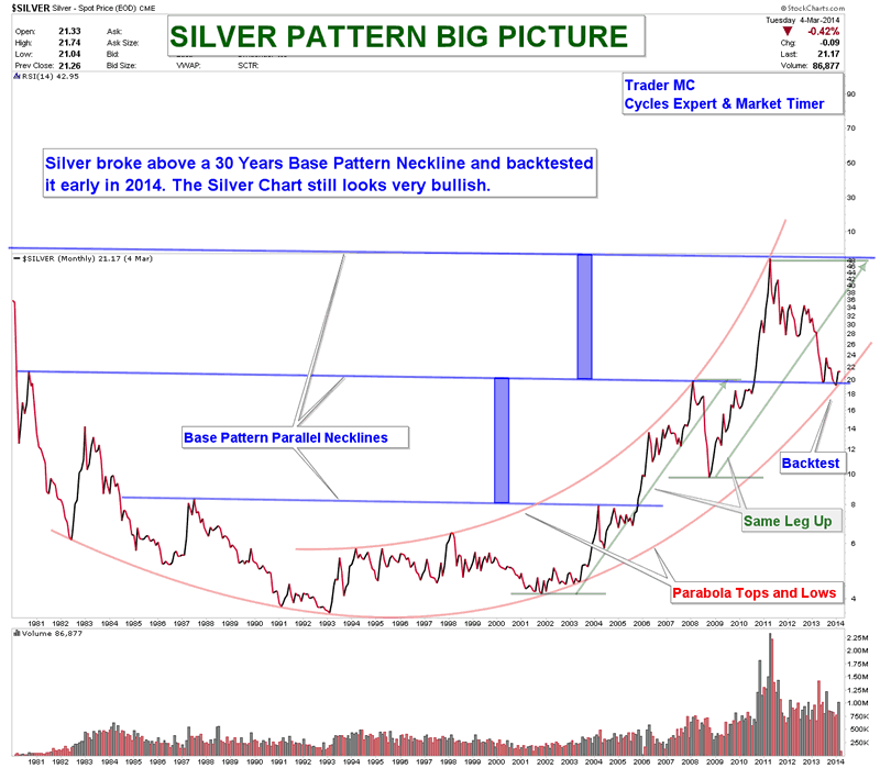
Stock Market Top - 2014 The Year of Gold, Silver and Commodities
By: Submissions
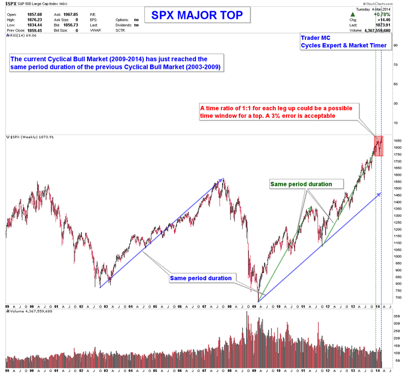
Trader MC writes: Charts are telling me that 2014 should be a great year for Commodities and Miners and I expect a period of financial market turmoil for the US Market. I believe that we are very close to an important corrective move as the Market is due to top in March 2014. The Rhythm of the Dow Jones Index is telling me that a major top could already have been printed:
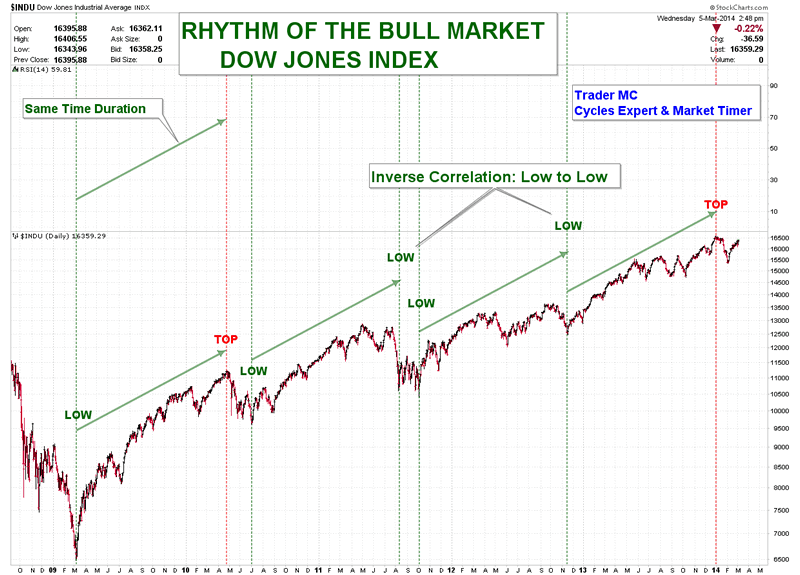
The current Cyclical Bull Market has reached the same period duration as the previous one (2003-2009). The second leg up of this Bull Market has also been reached 2 months ago. Therefore the time window for a top has been completed and I think we should not be surprised if a strong down move begins in the coming days.
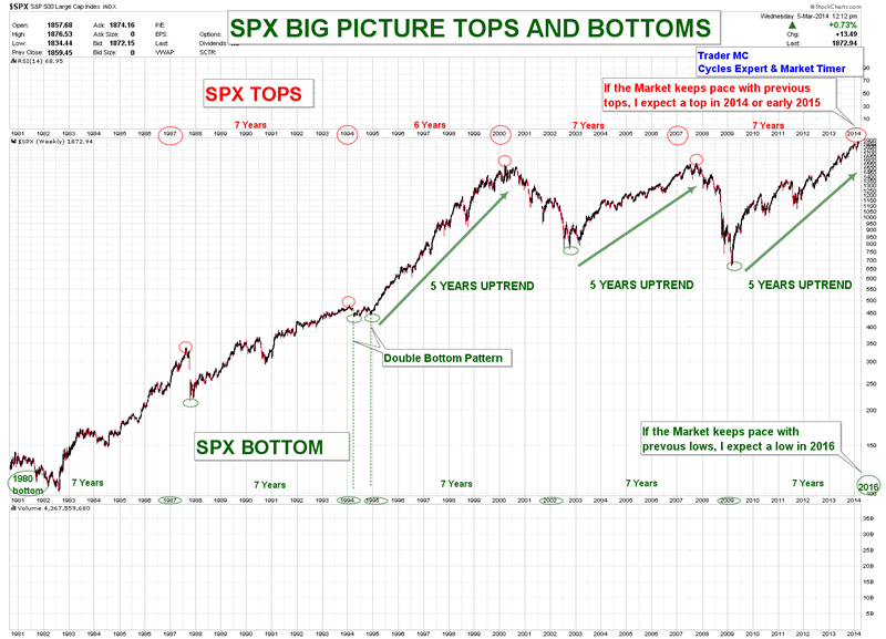
The following chart puts in perspective the major tops and lows in the US Market. If the market keeps pace with the previous rhythm, I expect a major top in 2014 and a major low in 2016.
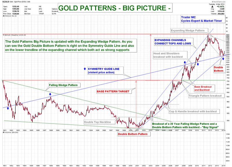
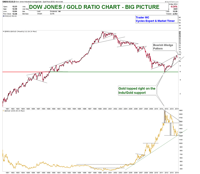
Here are the Gold and Silver big picture charts. The current Gold Double Bottom Pattern occurs right on the symmetry guideline. Silver is also in a process of a Double Bottom Pattern and back tested twice the Base Pattern neckline.
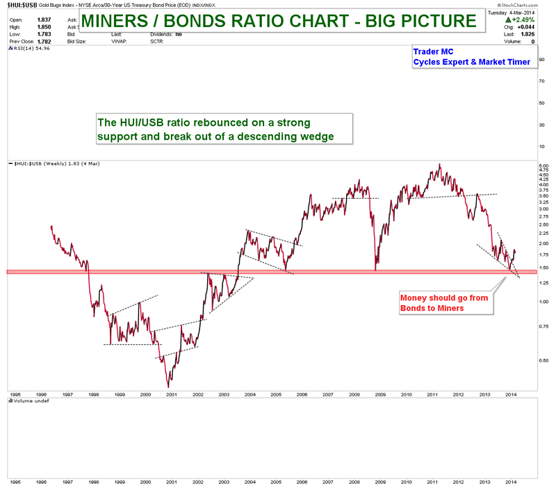
Since the beginning of the year we can notice that some money flow was coming into Commodities, Metal and Miners. The market gave us some important clues already at the beginning of 2014 - some ratio charts were clearly telling us that early January was a buy signal for all the Mining stocks. They also put in perspective that money flow was going to come into the Metal and the Miners sectors. Here you can see the Dow Jones/Gold and the Miners/Bonds ratio charts showing that investors are leaving the US Market and the Bonds to come into the Metal and Miners Sectors:
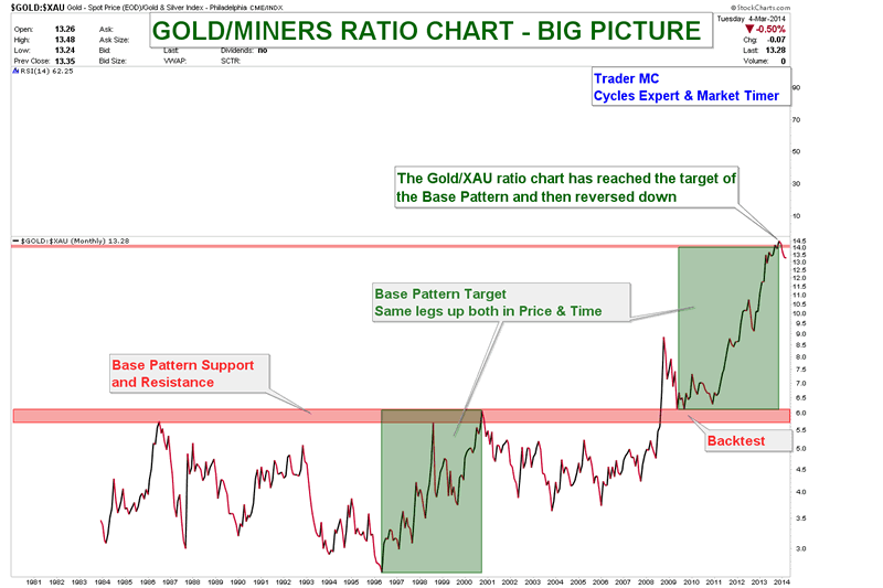
On the following chart we can notice that Miners should outperform the Gold Metal:
Below is the ratio chart of SPX/CRB that also shows that money is leaving the US market and is coming into Commodities. There is still a lot of downside potential move.
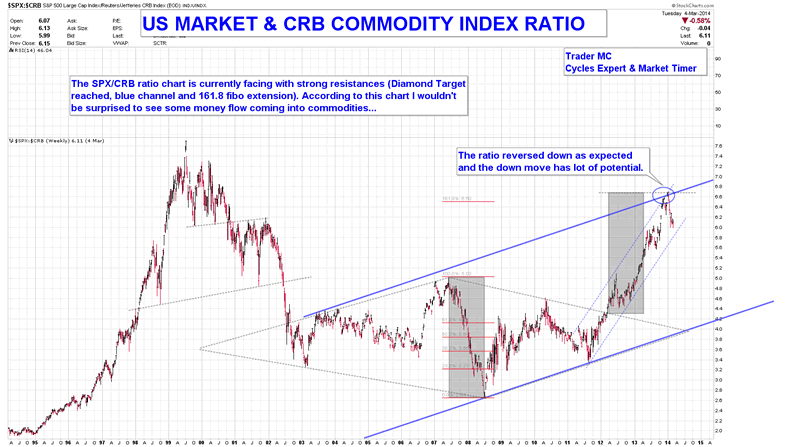
I believe that most institutional investors have already anticipated a turn in the US Market and started to invest in the Commodities sectors. Metal, Miners and Agriculture should be the best sectors that will outperform in 2014. Large profits will be made by those who keep in mind the big picture.
Gold and Silver Stocks Interesting Developments in the Charts
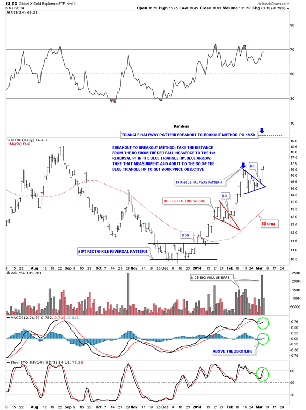
As I promised you last night lets look at the GLDX, Junior Gold Stock Explorers etf that maybe one of the hottest areas in the markets right now. Tonight I’ll show you the two different measuring techniques I use to get an idea of where the price may move once a breakout is in progress.
The first method I call the breakout to breakout method which the name implies. You can use this method when you have a top, bottom or consolidation pattern below your current consolidation pattern. Using the GLDX we see this is the case. We have the red bullish falling wedge that formed below our current blue triangle. If this plays out according to plan the blue triangle will be in the middle between the red bullish falling wedge and the price objective up to the 19.50 area.
To measure the blue triangle as a halfway pattern I just take my fib tool and measure the distance from the breakout from the red bullish falling wedge to the first reversal point in the blue triangle, blue arrow. You do this with any consolidation pattern, whether it’s a rectangle, wedge, Diamond or whatever the consolidation pattern is. You then take that measurement and add it to the breakout of the blue triangle halfway pattern to get your price objective up to the 19.50 area. Sometimes these measurements can be dead on the money and other times fairly close. It gives you a place to look for other signs of where the impulse move may run into resistance. In this case you can see a top that was formed last August in the 19.50 area so that is another good clue that the breakout move should go up into that area.
Note the MACD just crossed with the Histogram moving above the zero line along with the slow stoch also crossing. This breakout is being accompanied by some nice big black volume bars also. As you can see today’s price action is testing the high of the blue triangle which is encouraging. So there are a lot of positive things going on with this little junior stock index.
The other method I use to measure a price objective I call the impulse method as it’s measuring the equal distance above and below a halfway pattern. Using the same GLDX chart we are going to measure the blue triangle as a halfway pattern using the impulse method. Again, take your fib tool and measure from the last reversal point in the previous consolidation pattern, red falling wedge, which actually starts the impulse leg up. You then take that measurement and add it to the last reversal point in the blue triangle to get your price objective up to the 18.85 area as shown by the blue arrows. It doesn’t make any difference how many reversal points a consolidation pattern has, 4,6,8 or more, you always use the last reversal point in any consolidation pattern to measure for your price objective.
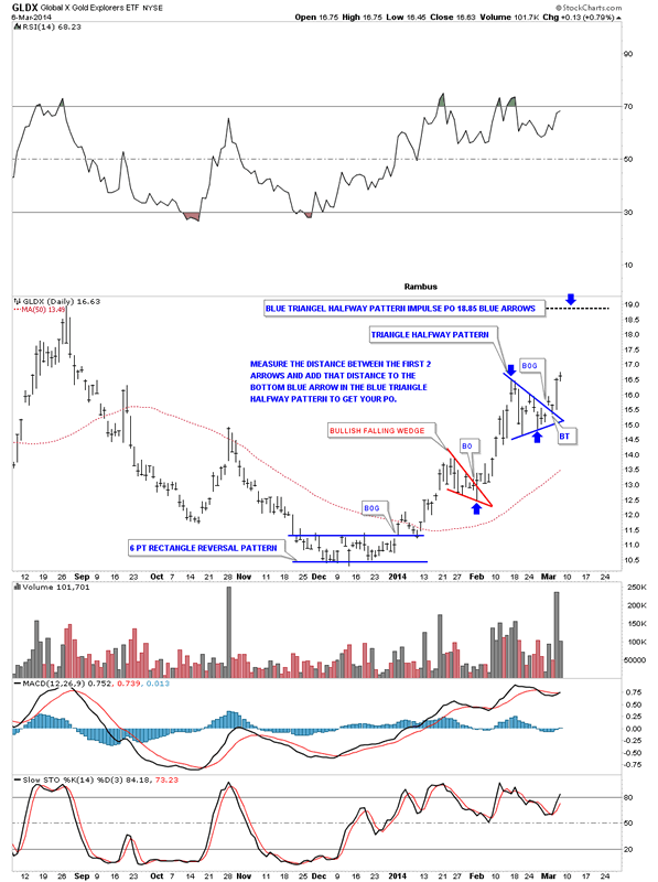
So between the two different measuring techniques we get a range between 18.85 and 19.50 with the previous high made last August also in that area gives us a place to shoot for. I know there are other measuring techniques that people use but for me this is how I like to calculate a measured move.
It’s been awhile since we looked at the US dollar that has been showing some weakness lately. The first chart is pretty cut and dried as it shows a big blue bearish rising wedge that had a clean breakout and backtest. It then went on to form the red triangle just below the bottom blue rail which as you know I view as a bearish setup. The price objective for a rising or falling wedge, many times is the beginning of the wedge. In this case the blue bearish rising wedge started to form back in the late summer of 2011 at the 73 area. You never know 100% for sure how the inter market analysis is going to play out but a decline, in the US dollar to the 73 area, could be a big catalyst for a large move up in the precious metals complex. We’ll know in hindsight.
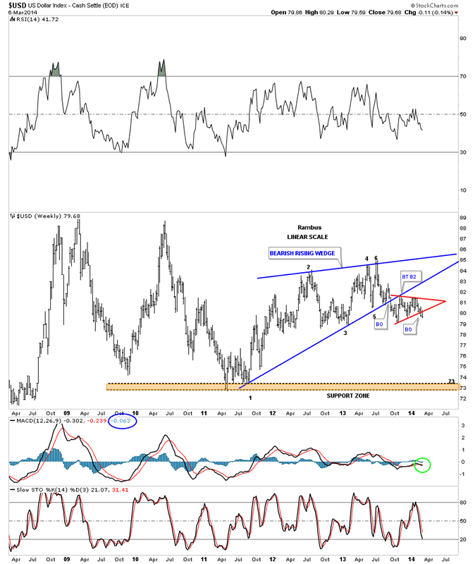
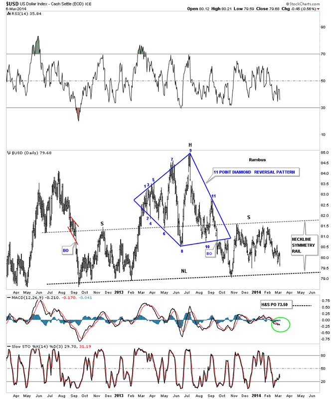
Some of our longer term subscribers may remember this big 11 point Diamond reversal pattern that formed last year. This is a very similar setup to the big Diamond that gave me a clue that the HUI was in a very large topping pattern well before the price action broke down. I view the blue Diamond as the head portion of a big H&S top formation. I’ve added a neckline symmetry rail that is just a parallel line taken off of the neckline that often times gives us a place to look for a high on the right shoulder. As you can see it nailed the height for the right shoulder. The price objective is quite interesting for this H&S top. If the neckline gets broken to the downside the price objective would be down to the 73.50. This puts the price down into the 73 area as shown by the bearish rising wedge on the chart above. Again, we’ll know in hindsight if this all plays out but for the moment this is what the Chartology is telling us.
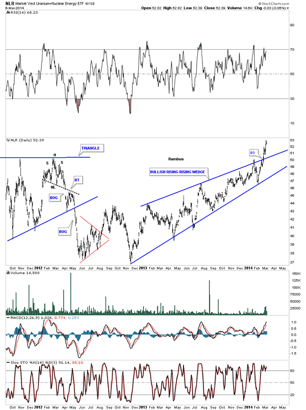
There is another area we haven’t looked at in awhile and that is the Uranium Sector. This area has also caught on fire. Lets look at the NLR, the Uranium etf, that shows the price action breaking out though the top rail of a bullish rising wedge. This is a pretty impressive move taking place right now in this sector.
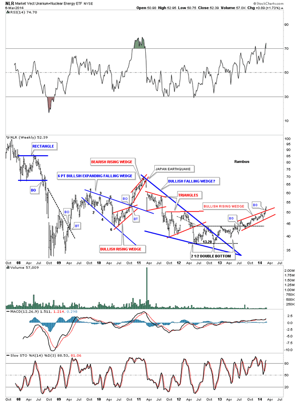
Below is a weekly chart for the NLR that shows all the chart patterns that have developed over the last 6 years. Note the big blue bullish falling wedge that broke out well over a year ago but it was a slow grind higher until just recently as prices have started to accelerate to the upside. Sometimes I’m still amazed at what the Chartology can show you sometimes before an event happens. Notice the red bearish rising wedge that had formed back in late 2010 around the 65 area. That vertical breakdown form that red bearish rising wedge was the Japan earthquake. That was the top like so many other commodities that have been in a 3 year correction that started in 2011. Three years is a nice long time for a correction to take place in a secular bull market. Maybe we’ll see inflation first and then deflation. It really doesn’t make and difference as we will be following the price action to where ever it takes us. All the best…Rambus
Will There be a Parabolic Rise in Gold Equities..?
By: Mark Wallace
This is the question on the mind of many a gold share “bug.” I can say with relative certainty that the answer is YES. Why? I think the reason should be fairly obvious. Everything moves in cycles.
As we’ve discussed ad nausea within these pages, gold has had a dismal few years. In 2011 gold hit a high of around $1,900 USD per ounce, fueled by easy money and fears of a currency debasement. Money printing continues to this day, but the dollar is alive and well. As of December 2013 gold sat below $1,200 USD per ounce. Silver fared worse yet, declining from almost $50 USD per ounce, to under $20 USD per ounce.
Share This Article with a Friend!
When we look at the gold mining equities it’s really ugly. The NYSE Arca Gold Miners Index lost about 70% of its value in that time frame. Many junior companies lost 90% plus, and some just blew away like so much pixie dust in the wind.
Chris and I were casualties of this decimation ourselves. Most of our junior stocks, and almost all of our recommendations related to anything gold/silver were just taken out back and shot. Plain and simple.
In general though 2013 was a bit of an anomaly, in that gold declined while the broader equity indexes rose substantially. Over the past 13 years prior, gold had outperformed equities. With the decline in gold it’s no surprise that gold stocks got clobbered so badly, as the fundamentals were awful.
Bellwethers like Goldcorp and Barrick Gold had massive losses and reduced reserves in anticipation of lower gold prices. In the last quarter of 2013 Goldcorp lost a whopping $1 billion USD, while Barrick claimed a $2.83 billion USD loss. These “big guys” were forecasting gold could be as low as $1,100 going forward.
As they so often are, the “big guys” were wrong. Gold has risen to $1,335 USD per ounce as I write this, and the stocks of the senior miners have risen over 25% on average. The old axiom, “Buy when there’s blood in the streets” seems to have held once again. The time to buy a stock, whether its a resource stock or otherwise, is when they begin rising on negative news. This is precisely what has happened with the miners.
Our very own Brad Thomas put out a Trade Alert to subscribers on Barrick saying the following:
“I continue to hold the view that there will be an ultimate price to pay for all of the unprecedented monetary “stimulus” and money printing that we have observed over the last 5 years across most developed markets. This ultimate cost will be inflation, with a resulting dramatic rise in precious metals.
If ever there was a time to invest in gold stocks now is probably the best time due to a number of factors:
- Sentiment towards gold stocks is exceptionally bearish – how much more bearish can sentiment become
- Given the above it is highly likely that this is the most under-owned that gold stocks have been in a couple of decades, with the result that shares of mining companies are likely to be concentrated in the hands of a relative few – where is the marginal seller of gold stocks going to come from?
- Most gold producers are making losses, which suggests that the cost of producing gold is about $1200 an ounce – how much below the cost of production can gold go before material shutdown of capacity occurs?
- Fundamental valuations are exceptionally low with most of the big producers trading more or less @ book value – are we likely to see any further compression of price multiples?
Why ABX specifically? In essence while the price of gold has continued to fall over the last 8 months, Barrick’s share price hasn’t, which suggests that Barrick’s stock price has probably found a long-term bottom.”
Brad recommended the January 2016 $25/$35 spread. With this trade you would buy the $25 option and sell the $35 option. At expiration if ABX was to close:
- Below $26.50 – loss = 100%,
- @ $28.00 – profit of 100%,
- @ $30 – profit of 220%,
- @ $35 – profit of 567% (a maximum profit will be achieved if ABX closes @ 35 or higher).
Taking a look at the weekly chart of ABX, that price level being achieved within the next 2 years looks to be a good bet!
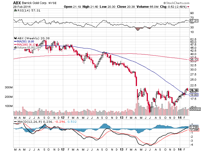
The moral of this story is that the bear market in the precious metals and the associated equities may be coming to an end. The bad news has been delivered, and now we are seeing prices rise. This is likely a new trend forming, with the classic higher lows patterns developing in the individual equities.
Insitutional and retail investors are starting to take notice. Reuters reported on February 27th that,“The world’s largest gold-backed exchange-traded fund, New York’s SPDR Gold Shares, is on track for its first monthly inflow of metal in more than a year after a run of weaker U.S. data boosted investment interest in gold. The SPDR fund added 10.5 tonnes to its reserves so far this month. That means that, barring a large outflow on Friday, February would be the first month to show an increase since December 2012.”
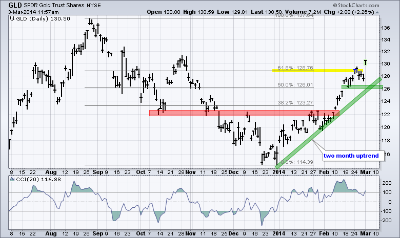
The chart above is courtesy of StockCharts.com and John Murphy, an EXCELLENT technical analyst that I’ve followed for the last 15 years. According to John, the chart, “Focuses on the two month advance in the Gold SPDR (GLD). With GLD trading near 130, it has retraced just over 62% of the prior decline. Even though the 62% area could mark a reversal zone, the trend since early January is clearly up. The trend line zone and late February lows combine to mark supportin the 126-127 area. The indicator window shows the Commodity Channel Index (CCI) moving into positive territory in early January and remaining largely positive during this advance.”
Everything seems to be lining up for gold at this point in time.
Brent Cook, former associate of Eric Sprott and one of the best mining analysts in the world believes that, “2014 should be a good year for investors to begin positioning themselves in the better metal deposits, mining companies, and the most competent explorers. The reason is quite simple: the industry is not finding enough economic deposits to replace mine production.”
To further that, Grant Williams, the prolific editor of Things That Make You Go Hmmm, in regards to an impetus for a potential violent upwards move in the gold price has stated, “I fear that it will be a shortage in physical metal because that could be very, very extreme…”
For an excellent timeline of important developments in 2013 that will affect the gold price going forward, I recommend reading Alasdair Macleod’s (Gold Money) recent post, Gold in 2013: The Foundation For 2014.
If you want to skip to the conclusion, which by the way we agree with, Alasdair states:
“The events of 2013 persuaded investors in western capital markets that gold’s bull market had definitely been broken, and that gold would probably go lower or at best move sideways in 2014. The underlying reality is very different, with China in particular managing to corner the physical market with trend-following Western analysts caught unawares.
So far, instead of continuing to fall the gold price actually bottomed on 31 December at $1182, and since then has rallied over 13% to $1340. The position today is that some hedge funds which were short have closed their positions and there are more yet to do so. There is growing evidence for the trend-chasers that the price is entering a new bull phase, with the 50-day and the 200-day moving averages both rising and about to complete a golden cross.
Central banks appear to be facing a problem of their own making. The lesson from Germany’s attempt to repatriate her gold appears to have provided prima face evidence that central banks have little or no physical liquidity left. Minor central banks, such as Finland’s, must now be wondering if gold out on lease will ever be returned to them, so may be increasingly reluctant to make their gold available for further leasing. Instead they are likely to end current leasing agreements as they mature rather than extend them.
In 2014 there is likely to be a growing realisation that the vaults in the West are very low on stock.”
Happy 5th Anniversary To The Bull Market
by Tyler Durden
5 years ago today, the S&P 500 made its post-crisis low at the oddly demonic 666 level. What many may not remember is... the last so-called-at-the-time "secular" bull market lasts exactly 5 years and 1 day (from October 10th 2002 to October 11th 2007)... it's different this time though.
The last "secular bull market"

The current "secular bull market"

h/t Brad Wishak of NewEdge
Of course - nothing changes...
As a gentle reminder: At the end of October 2007, right before markets began their descent to their current lows Cramer gave out investment advice on his wildly popular show, Mad Money.

Here was his game plan at the time:
"You should be buying things and accept that they are overvalued, but accept that they're going to keep going higher.
I know that sounds irresponsible, but that's how you make the money.
Right now, up is down, left is right, peace is war."
Indeed. Just don't look at the following chart...

High-Probability Of Russian Assault Overnight, Ukraine Pravda Says
by Tyler Durden
On the heels of the Russian navy intentionally sinking a vessel blocking the Ukrainian navy from entering The Black Sea, Ukraine Pravda reports that it is "most probable that Russian troops will assault units in Ukrainian Crimea overnight continuing to the weekend." Citing a source in the uniformed services, Ukraine Pravda warns that "despite reports that Russian troops ended in learning, active phase lasts. They did not return to the barracks," and maintain "peak readiness."
Via Ukraine Pravda (via Google Translate),
On the night of Thursday to Friday a great opportunity to assault Ukrainian part of the Russian special forces.
This "Ukrainian Pravda" reported a source in the uniformed services.
"Despite reports that Russian troops ended in learning, active phase lasts. They did not return to the barracks. Could maintain peak readiness by the end of the weekend," - said the source.
"The most probable that the assault would take place that night, but the danger will persist to the end of the weekend" - source added.
"There are three scenarios. First - this air strike," - said the source.
He said that if Russian troops will withdraw from parts of the Ukrainian, that would mean this version.
"Helicopters are already relocated, and it is possible that they will do exactly helicopters," - said the UP.
"The second option - a special operations force for disarmament," - he said.
The interviewee said that in the Crimea are Russian special forces "Alpha", "Vympel" and "Zaslon."
"The third option: they can come up with ryazhenymy Cossacks, as with a living shield. Example is happening" - he added.
He also reminded that the Russian troops flooded his ship to block the path of Ukrainian courts.
According to the source, impacts may not be in all parts, but only by those who are the most combat-ready, including Sevastopol and Feodosiya.
And this follows the sinking of a ship to block the Ukrainian Navy...
An anti-submarine boat may have been the first casualty of the Russian incursion into Crimea, but it was hardly an act of violence, much less war: The Russian navy sank one of its own, junked vessels to create an obstacle, a Ukrainian official said on Wednesday.
The sinking was the latest in a series of moves by Russian naval forces in the area that were jangling the nerves of Ukrainian officers... the mouth of the bay was blocked by 10 Russian vessels including the formidable guided missile cruiser Moskva.

Why Are We in This Oil and Energy Predicament?
by EconMatters.com
Quiz: What will cause world oil supply to fall?
- Too little oil in the ground
- Oil prices are too low for oil producers
- Oil prices are too high for oil consumers leading to recession, debt defaults, and ultimately a cut back in credit availability and very low oil prices
- Oil exporters are subject to civil unrest and overthrow of governments, due to low prices and/or depleting reserves
- Lack of money (and physical resources that might be purchased with this money) to pull oil out of the ground.
- Pollution related issues–too much smog in China; too many problems with fracking; too many problems with CO2.
- The financial current system fails, and can only be replaced by one that allows much less debt. Oil prices remain too low under such a system.
In my view, any answer other that the first one is likely to be at least partially right. Ultimately, the issue is that to extract oil or any fossil fuel, we have to keep the financial and political systems together. These systems can be expected to fail, far before we run out of oil in the ground. Most oil in the ground (as well as most other fossil fuels in the ground) will be left in the ground, in my view.
Basing estimates of future oil production on oil reserves is likely to give far too high an indication with respect to actual future production. Even more absurd numbers come from using “resource” numbers (which are higher than reserve numbers) to make estimates of future oil production. Coal and natural gas production is likely to fall at exactly the same time as oil, because the problems are likely to be financial and political ones, not “resources in the ground” problems.
Direct Application of M. King Hubbert Theory is Incorrect
M. King Hubbert is known for his estimates of future oil production based on reserve amounts. There are two things of importance to notice about his estimates:
(a) The oil reserve estimates used are of free flowing oil reserves of the type that geologists currently were looking at. Thus, they were restricted to “cheap to extract” reserves, and
(b) When Hubbert showed graphs of world oil production following a generally symmetric curve (so downslope looks like a mirror image of upslope), Hubbert showed some other source of energy supply (nuclear in his early papers, solar in later ones) rising to high levels, before world oil production ever dropped. He even talked about making liquid fuels using a huge amount of energy plus carbon dioxide and water–in other words, reversing combustion. In order to ramp nuclear or solar up to these very high levels, they would need to be extremely cheap.
The assumptions that M. King Hubbert makes are effectively ones that would allow the economy to continue to grow and the financial system to “hang together.” If a person looks at today’s situation, it is quite different. We do not have an alternate fuel supply that will allow the economy to continue to grow, regardless of fossil fuel consumption. The published reserves include large amounts of oil in the ground that are not of the very cheap to extract type. Extracting such oil will be impossible if oil prices are very low, or if credit availability is lacking. It is tempting for observers to look at oil reserves and assume that all is well, but this is definitely not the case.
Basic issue: Future oil extraction and future substitution is uncertain
One basic issue is the “iffiness” of the reported reserve and resource amounts:
There is lots of oil in the ground, if we can actually get it out. Getting it out requires a combination of a financial system that allows us to do this (high enough prices for producers, adequate credit availability for producers, equity investment available if credit is not available, buyers who can afford the products) and political system that allows this to happen (citizens in countries with oil extraction not rioting for lack of food; banks open in countries trying to import oil; adequate trade connections among countries).
Likewise, substitution is possible among energy products, if it is possible to overcome the many hurdles involved in doing this. There are two cost hurdles: the higher ongoing cost of the substitute and the transition cost. The transition cost gets to be very high if there are a lot of “sunk costs” that are lost–for example, if citizens are forced to quickly change from gasoline powered cars to electric cars, so that the resale value of their gasoline powered cars drops precipitously. There is also a technology hurdle: we need to have the technology to enable using the different energy source.
If the cost of the substitute is higher than the cost of the original energy source, a change to the substitute will tend to make the economy shrink, because wages will “go less far”. If citizens need to pay a whole lot more for new cars, or if electricity is more expensive, citizens will cut back on discretionary expenditures. This cut-back on expenditures will lead to layoffs in discretionary sectors, and will make it more difficult for the government to collect enough tax revenue.
Another basic issue: Wages don’t rise as oil (or energy) prices rise
Economists would like us to believe that we just pay each other’s wages. Wages can rise arbitrarily high independently of actually creating goods and services using energy products.
Unfortunately, this doesn’t seem to be true in practice. Based on my research, in the US high oil prices are associated with flat wages, in inflation-adjusted terms. Wages do not rise as fast as oil prices. Instead, wages tend to rise when oil prices are low, making goods and services affordable.
Part of the problem with rising oil prices is that they radiate through the economy in many ways: in higher food prices, because oil is used to produce and transport food; in higher metal prices, because oil used in metal production; and in higher finished products, such as automobiles and new homes, because they use oil in their production. With wages not rising sufficiently, as oil prices rise, workers find they need to cutback on discretionary goods. The result is recession and job layoffs. I document this issue in the article Oil Supply Limits and the Continuing Financial Crisis, published in journal Energy in 2012.
The flip side of this issue is that without wages rising as fast as the cost of oil extraction, it is hard for the selling price of oil to rise high enough to provide an adequate profit margin for oil producers. It is inadequate oil prices for oil producers that seem to be the current problem.
Economists don’t think that prices can remain too low for oil producers. It can happen, because their model of supply and demand is not correct in a world with energy limits. Even if prices temporarily rise again, recession hits again, and we are back to low prices again.
Another basic issue: Diminishing returns
Diminishing returns occurs when it takes more and more energy or other resources to produce the same amount of goods. In the case of oil supply, we reach diminishing returns because companies extract the easy-to-extract oil first. Thus, the price of oil rises because the oil that can be produced cheaply is mostly gone. If we want to obtain more oil, we need to extract the more expensive to extract oil.
One way to see what diminishing returns does is to think about an economy producing two kinds of goods and services:
- The goods and services the consumer really wants–such as food, fresh water, transportation that takes the consumer from door to door, electronic goods, and housing that meets the person’s needs.
- All of the intermediate “stuff” that goes into making the end products in (1).
What happens with diminishing returns is more and more of society’s physical labor and its resources go into intermediate products, leaving less and less to produce end products, and less to actually “grow” the economy. In some sense, it is as if we are becoming less and less efficient at producing final goods and services. In my view, this is a major reason why wages stop rising as oil prices rise, and as other energy prices rise.
Another basic issue: The rate of growth in energy supply is closely tied to the rate of GDP growth
We use energy to make goods and services, so it stands to reason that using more energy would lead to more GDP growth. Economists don’t necessarily agree. They are sometimes of the view that the connection has only to do with “Demand”–in other words, when the economy is growing rapidly it needs more oil and energy products to support it its growth. I discuss Steve Kopits’ talk on this subject in Beginning of the End? Oil Companies Cut Back on Spending.
Something that is perhaps not obvious is the fact that cheap energy supply tends to easier to ramp up than expensive energy supply. Cheap energy supply requires relatively less investment. Goods created using cheap energy supply tend to be inexpensive, making them easier to sell to consumers and more competitive in the world market.
Another basic issue: The role of debt
Long term debt plays an extremely important role in the economy, because it allows consumers to buy expensive goods like houses and automobiles that they could not otherwise afford, and because it allows businesses to invest in projects before they have saved up sufficient profits from past projects to fund the new projects. It also allows governments to spend more money than they have in tax dollars. All of this purchasing power tends to prop up the price of commodities such as oil and metals, making it feasible to extract them.
We had a chance to see how important a role debt plays in 2008, during the debt crisis in the second half of the year. During that period, the price of oil dropped from briefly hitting $147 barrel to the low $30s range. Major banks needed to be bailed out, and the insurance company AIG was taken over by the US government because of problems with derivatives.
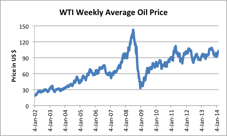 Figure 1. Average weekly West Texas Intermediate “spot” oil price, based on EIA data.
The big drop in oil price in 2008 was due to a drop in oil demand because of lack of credit availability. I wrote an article in 2008 about the huge impact this decrease in credit availability had on energy prices of all kinds, even uranium.
A related concern relates to the fact that “borrowing from the future” — which is what we do with long-term debt, is a great deal more feasible in a growing economy than it is in a shrinking economy. There are a lot more defaults in the latter case, because people keep losing their jobs and businesses keep closing.
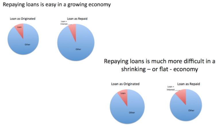 Figure 2. Repaying loans is easy in a growing economy, but much more difficult in a shrinking economy.
The concern I have is that as economic growth slows, we will reach a point where long term debt becomes very hard to obtain. The lack of credit in 2008 has not been fully fixed. It was only with the help of Quantitative Easing (QE), which added more demand to the marketplace because of very low interest rates, that oil prices have been able to rise again after the drop in 2008. With the very slow economic growth we have been experiencing recently, it has been necessary to use QE to keep interest rates low enough that people can still afford to buy homes and cars.
If the economy shifts from adding debt to subtracting debt, we are likely to see a huge drop in oil prices, perhaps similar to the drop in oil prices in 2008 to the low $30′s range. If this should happen again, it is not clear that the Federal Reserve would be able to find a way to make the price rise again because is already using a huge amount of stimulus, and thus has fewer options left.
If oil prices drop to a low level and stay down, a large share of oil production will be discontinued. Very little new drilling will be done. Similar effects are likely to happen for other fossil fuels and for mining for metals as well. Such a drop in oil production is likely to be steep–at least as steep as when the Former Soviet Union collapsed.
Oil production dropped by about 10% per year, and other energy use dropped rapidly as well. Customers such as the Ukraine and North Korea saw even steeper declines in their oil imports.
Another basic issue: Government funding
Governments are only possible because of the surpluses of an economy. Greater surpluses allow more government employees and more services. Mario Giampietro (2009) is one researcher who writes specifically about this issue. Furthermore, as an economy grows, rising tax revenue makes it is easy to add more programs and services.
As an economy reaches diminishing returns, studies of past economies show that inadequate government funding is one of the major bottlenecks. This occurs because falling resources per capita leads to increasing disparity of wages, with new workers finding it difficult to find good-paying jobs. Governments are called on to provide more programs at precisely the time when their ability to raise sufficient funds to pay for these programs is lacking. A major factor leading to collapse is the inability of governments to collect sufficient taxes from increasingly impoverished citizens.
The Two Way Escalator Problem
As I see it, the economy as it is currently constructed only gives us two options: up and down. The markers of the “up escalator” are
- Cheap energy
- Growing energy supply
- GDP growth
- Wage growth
- Debt growth
- Growing government programs
The markers of the “down escalator” are
- Expensive to produce energy supply
- Energy supply grows slowly
- GDP Growth lags or declines
- Wages lag
- Outstanding debt tends to shrink
- Increasing inability to fund government programs
The two deal-killers with respect to these two escalators are
- Moving from debt supply growth to debt supply shrinkage. This is like moving from Keynesian economics to the opposite. Or from getting a credit card with a large available balance, to having to pay back old credit card debt without adding new debt.
- Increasing inability to fund government programs
The above two reasons are why I expect financial and governmental problems to lead to the end of our current system. Diminishing returns is already leading to higher oil prices, and thus moving us from the up escalator to the down escalator.
I am doubtful we can reestablish very widespread use of long-term debt after a collapse because by that time, the economy will clearly be shrinking. A person often hears people talk about getting rid of the fractional reserve banking system because it requires growth to maintain, but in fact, having such a system has been very helpful in enabling extraction of fossil fuels and allowing the economy to use metals and concrete in quantity. The availability of bonds for financing has been helpful as well.
One essential part of today’s economy is very long supply lines. These allow very complex products to be made, using supplies from all over the world. What we found in the 2008 credit crisis is that many businesses (both large and small) in these supply chains were hit hard by lack of credit availability. I see this issue as being very difficult to solve. If it cannot be solved, we will be faced with making goods locally using smaller companies and very much shorter supply lines. It would be a different system than we have today, and would likely support a smaller world population.
A lot of “peak oilers” would like to think that somehow it is possible to “get off at the mezzanine,” and have a viable economy similar to today’s with a small amount of expensive renewables, plus a continuing supply of fossil fuels. I have a hard time seeing this actually happen. One problem is the likelihood that fossil fuel supply will decline quickly because of low price. Another potential problem is a major cutback in credit availability making transactions difficult; a third issue is governmental problems, as taxes fall short of what is needed to fund programs.
We could in theory get back on the up escalator if we find alternative fuels that meet all of the required specifications–very cheap; available in huge quantity, expanding year by year; can be transformed to a liquid fuel similar to oil; and non-polluting. This seems unlikely right now.
Otherwise, what we do have is all the “stuff” we have today, for as long as it lasts. The economy won’t stop on a dime. We also have the ability to recycle things that we can no longer use, that might be more helpful in another place. Solar panels that people currently own will continue to function for a while (especially off-grid), and the grid will probably continue for a while. We know that many people lived in local economies, before we had fossil fuels, and it is likely to be possible again. We certainly live in interesting times.
Courtesy Gail Tverberg, Founder of Our Infinite World (EconMatters author archive Here)
Subscribe to:
Posts (Atom)