Thursday, September 1, 2011

We’ve Seen How This Game Ends Before: In Misery

by Graham Summers

“The bottom is in! Stocks are in a new bull market. QE 3 is just seconds away!”

These are the taglines being tossed around by the mainstream financial media as stocks get rammed higher into month’s end. As usual these folks are both clueless and wrong.

We had the exact same move at the end of June when the market exploded over 8% due to end of the month (and quarter) performance gaming and start of the month/ quarter buying.

Here’s what followed:

So here we are again… it’s the end of the month, volume is extremely light because of the upcoming weekend… and SURPRISE! Stocks are exploding higher again. In fact, we’re up 9%, quite similar to the 8% rally at the end of June.

Folks, this current move is just another trader game occurring on next to no volume. It will end precisely as the end of June rally did: in misery.

Indeed, the credit markets haven’t budged from being on DEFCON 1 throughout this rally. The European banking system continues to implode with Germany and France now being drawn into the mess. And the US economy is an absolute disaster no matter what the fudged data says.

QE 3 won’t solve this mess (assuming it even arrives). Neither will the European bailout fund. We’re already in the Second Round of the Great Crisis which will see the EU broken up, the US economy implode, and a market collapse that will make 2008 look like a joke.

S&P 2010 vs. 2011

by Bespoke Investment Group

We've gotten quite a few requests over the past few days to compare the S&P 500's price chart in 2010 to this year's price chart. Last year, the S&P 500 made its pre-correction high in late April, and it wasn't until Bernanke's Jackson Hole speech in late August that the market broke out of its summer funk. As shown below, the S&P 500 also made its pre-correction high in late April of this year, and we've at least seen a short-term bottom at the end of August right around the time of this year's Jackson Hole speech. In 2010, the S&P 500 was down 3.12% on September 1st, and it closed the year up 12.8% after pretty much going straight up over the last four months of the year. As we enter this September, the S&P currently sits down just under 3%. If history repeats itself, the country will surely end the year in a much better mood than it's in now. Don't expect the market to be that easy though!


Welcome To The Rodeo

by Market Anthropology

Anyone that swims in the market knows that there is always a danger in bringing too much dogma to the table. Anyone that trades with very short time frames knows that it actually does not even belong at the table. You trade what you see - not what you expect should happen.

But like everything else in life, there are exceptions to the rules and I have been making them on a regular basis for the last six months.

Why?

Because the market telegraphed an increased in difficulty and started throwing trap doors on a regular basis. We entered the rodeo stage where you are either thrown off the bull and bled by a thousand cuts, a few deep cuts - or proactively anticipate the beast that is actively trying to keep you off balance and vulnerable to fall.

Here is another indicator that may color expectations with regards to those trap doors.

The chart below is of the McClellan Oscillator, which gives an indication of breadth. In essence, it is derived from advancing issues less the number of declining issues and presented as a ratio.

From StockCharts:
Think of the McClellan Oscillator as the MACD for the AD line, which is a cumulative measure of net advances. Just as MACD puts momentum into the price plot of a stock, the McClellan Oscillator puts momentum into the AD line.
To oversimplify the interpretation here for the current market, if the NYMO breaks through the previous high established on July 1st - there is a good chance that the market will at the very least give you an opportunity to sell at new highs. If the NYMO diverges from the July 1st high, it is a strike against the market and opens the late 2007/2008 comparisons where breadth continued to diverged from price. What the market has going for it here is the very short time window since the previous high. An eclipse of that level (granted - quite extreme +89) would be a step in the right direction.
I included (once again) the market environment from 2007 - the last time traders navigated a bullish gauntlet of trap doors and surprises.

See the original article >>

Bear Flags May Spell Trouble for Stocks


Thursday’s news-driven rally fizzled out, and with ominous bear flag patterns forming on the charts for several major stock indices, the short-term market action will be critical.

The close on Tuesday (August 23) suggested a short-term bottom was in place, which indicated that the major averages and ETFs should challenge or exceed last week’s highs. Wednesday’s higher close supported this view.

Stocks started off Thursday in a bullish mood following Warren Buffett’s investment in Bank of America (BAC), but the rally fizzled, which makes Friday’s action quite important.

If the financial media is correct in concluding that the market’s strength was based on today’s speech by Fed Chairman Ben Bernanke, it suggests that the market is really in weak hands. Though it is possible Bernanke will say something supportive for the markets, basing a trading or investing strategy on this hope is not really a strategy at all.

The primary concern now is that many of the key global markets show chart formations that are commonly referred to as “bear flags.” These are continuation patterns which are an interruption or pause in the overall trend. These will be confirmed by a break below Monday’s lows, which would signal another sharp market decline.

If the NY markets were forced to close because of hurricane Irene, and with overseas markets also weak, it could make any decline even worse.
Chart Analysis: The daily chart of the September E-mini S&P 500 futures might be the best market to watch over the next few days. After Tuesday’s bullish close, I had been looking for a move to the 1225 area, such as I have drawn (line a) before the futures turned lower. To keep this scenario intact, the futures need to overcome Thursday’s highs at 1188.50.
  • If Wednesday’s low at 1142.50 (red line) is broken instead, it is will make the completion of the bear flag formation, lines b and c, more likely
  • A break of Monday’s low at 1111.25 will confirm a new decline and suggest a drop below the prior lows at 1077. A test of the 1000-1020 area is possible
  • The McClellan Oscillator bounced to the +67 level Wednesday, but negative A/D numbers Thursday have broken the uptrend, line d, which is negative. This indicator often leads prices.
The iShares MSCI EAFE Index Fund (EFA) is designed to track the performance of publicly traded securities in the European, Australasian, and Far Eastern markets. The chart shows that EFA has had a much weaker rebound from the August lows, as it has not even come close to filling its gap from last week.
  • There is key support now at $50.10-$50.35 and a break of this level would complete the flag formation, lines e and f
  • A completion of the pattern has downside targets in the $45-$46 area
  • EFA needs to close above the $52.45 level to reverse the deterioration
The Spyder Trust (SPY) has also traced out a flag formation (lines a and b), as Thursday’s close was just barely above Wednesday’s low. The uptrend is now in the $113.40 area with Monday’s low at $112.41.
  • There is a band of support from summer 2010 in the $105-$108 area. A completion of the flag formation has downside targets in the $101-$102 area
  • The major 50% retracement support is at $102.14
  • The on-balance volume (OBV) has just dropped back below its weighted moving average (WMA) and is well below its downtrend, line c
  • Initial resistance is at $118-$119.40 with further resistance in the $120.40 area
The iShares Russell 2000 Index Fund (IWM) has already broken the major 38.2% support levels, which makes the next likely target the 50% support in the $60.54 area.
  • The support from the July 2010 lows is at $58.66 and the downside target from the flag formation (lines d and e) is in the $56 area
  • The volume has been low over the past week and the OBV has stayed below its weighted moving average and the former support at line f
  • There is first resistance now in the $70.30-$71.89 area (line d)
What It Means: The rally failure on Thursday certainly turns the focus to the downside and the weaker relative action in many of the key global markets is a concern. The late decline in the German DAX on Thursday clearly hurt the US market. The DAX was down another 2.2% before the release of the GDP report.

A more defensive position is certainly warranted, as another 10% decline is possible from current levels. The GDP report was released and came in as expected at 1%. So far, the futures are down only slightly after the report. How the market stands going into the last hour of trading will be important.

How to Profit: Hopefully you trimmed your portfolio on last week’s rally above 1200 in the S&P 500. Since premiums are high, hedging your portfolio with index put options may not be the best strategy.

If you have existing long stock positions in some of the sectors that I have recently favored, I would suggest selling in-the-money call options against these positions, especially if the S&P 500 and Advance/Decline (A/D) numbers are negative an hour before the close.

“COMMODITY PRICES SEEM MUCH TOO HIGH”

by Cullen Roche

I rarely use technical analysis in my work, but there are times when a picture really is worth a thousand words. Sometimes a chart can help an investor to visualize market relationships better than raw data can. In this way, technical analysis can be particularly helpful in gauging risks and potential mean reverting situations. One such potential mean reverting situation is the long-term outlook for commodity prices. This is, in my opinion, particularly important given Wall Street’s recent attempts to push the “commodities are an investment class” theme.

As I’ve previously mentioned, betting on the actual commodities is never an investment. In fact, over the long-term, commodities have very poor real returns. Rather, an investor who is looking to benefit from a commodity bull market or the negative correlation of some commodities, is better off investing in the ingenuity of the corporations that benefit from these markets. In this manner, you are actually buying human ingenuity rather than buying physical commodities which are the equivalent of selling human ingenuity.

In a recent strategy note, analysts at Societe Generale discussed the long-term surge in some commodity prices and why it could be foreshadowing of a mean reverting event:
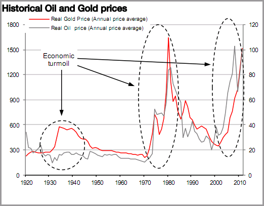
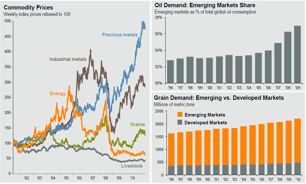
“Commodity prices seem much too high as economic growth is slowing. Over the past three years, all commodities have touched historical highs. The most recent high seen for Gold, in August, was sparked by forex fears. Oil prices used to be very sensitive to US growth, but things are different this time, as emerging market demand partly outpaces that of the US, maintaining global oil demand at high levels. But, now the surge in Gold suggests that markets are looking for safe haven investments, as was the case in the 1930s and the 1970s. Hence, financial markets begin to doubt that the current forecast for global growth of 4% pa is sustainable, thus, commodity prices seem much too high at this stage of the economic cycle.”
Now, I don’t like lumping gold into this analysis because I think gold has some intangible components that make it more unique than other commodities, but I am generally skeptical of the idea that broad commodities are going to sustain high real prices in the same manner that other asset classes have historically. As Jeremy Grantham believes, this time would truly have to be different in order for this to persist. Of course, this is not my way of saying that one should go out and short all commodities. Quite the contrary. It just means that you have to recognize that you’re speculating when you buy raw commodities and if you’re trading that might suit your needs perfectly fine. If instead, you are an investor with a long-term diversified focus you would be wise to focus on the underlying ingenuity that benefits from commodity markets by investing in the actual corporations themselves. Don’t fall for Wall Street’s latest sale’s pitch which is trying to push investors into physical commodities of all sorts. History is not on your side.

LPL: BE PREPARED FOR A DISASTROUS ISM MANUFACTURING REPORT

by Cullen Roche

If the “whisper number” for this week’s ISM Manufacturing report is correct then we can expect a disastrous report. According to LPL Financial the regional manufacturing reports are consistent with a contracting ISM figure:
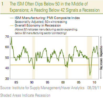
Based on weakness in various regional ISM and Federal Reserve manufacturing sentiment surveys already released for August (Philly Fed, Empire State manufacturing, Richmond Fed, Dallas Fed), the consensus expects the August reading on the ISM to dip below 50 (to 48.5), from the 50.9 reading in July. The so-called “whisper number” among traders (who often informally have their own forecasts for key economic data and events that differs from the consensus estimate culled from economists) is probably closer to 44.0 or 45.0. Thus, expectations for ISM are quite low. A reading below 50 on the ISM has historically corresponded with contraction in the manufacturing sector, while a reading about 50 suggests an expanding manufacturing sector. The last time the ISM was below 50 was in July 2009, the first month of the current economic recovery.
They warn, however, that it’s unwise to overreact to the negative number. As they show, it’s not unusual for the ISM to contract during an economic expansion:
As noted in Chart 1, it is not unusual to see the ISM to approach, and dip below, 50 in the midst of an economic expansion. The index dipped below 50 in the middle of the long 1982–1990 expansion and did several round trips above and below 50 in the 1991–2001 recovery, notably in 1995 and again in 1998. In the 2001–2007 expansion, the ISM dipped back toward the 50 level in 2004, before reaccelerating in 2005. More recently, we point out that manufacturing activity/output—vehicle production, industrial production, durable goods shipments and orders, manufacturing employment etc.,have held up much better than measures of manufacturing sentiment like the ISM and the regional Federal Reserve manufacturing indices.
As sustained reading of 42 or below indicates recession, and the ISM did get to that level in both the 1991 and 2001 recessions. It got as low as 33.3 at the worst of the 2007–2009 Great Recession.

SPX Reversal


After posting this afternoon, the market might close below 1200, we got some “dissapointed” emails. Well, the market is reversing today. Let us see if we manage to close below 1200, and everybody gets fooled into the false bull once more. Meanwhile, for those following our charts, we reached our target today, 1220. For the interested, below is a chart of SPX. We clearly see how strong reversals, both up and down, SPX puts in after those typical hammer/inverted hammers/hanging man formations. Today is one of those reversal days.


Global Commodities

By Barry Ritholtz

Given the spike in copper and oil (but not gold), perhaps its time to take a look this long term chart of commodities:
>


Secular Bear Markets

By Barry Ritholtz

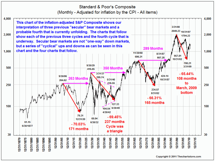
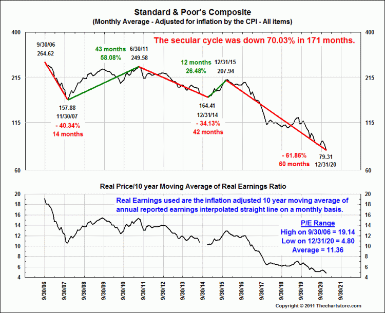
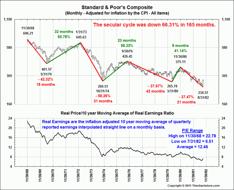
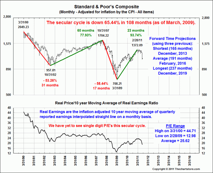
Fantastic set of charts from Ron Griess of The Chart Store below – weaves some of this into your long term thinking about Markets, price and valuation.
>

˜˜˜

˜˜˜

˜˜˜

˜˜˜

˜˜˜


S&P 500 Index At Inflection Points


Swing Charts of S&P 1929-42

By Barry Ritholtz

Another fascinating set of historical charts from Ron Griess of The Chart Store looking at the post depression/crash era up to WW2:
>

˜˜˜

˜˜˜


Follow Us