Saturday, June 20, 2015

The FOMC Decision – Studying the Flight of Birds and Gold

by Pater Tenebrarum

Federal Open Yawn Committee puts Kremlinologists all over the World to Sleep …

The Fed’s monetary policy statement delivered on Wednesday was the non-surprise/yawn-inducer of the year. Readers can take a look at the trusty WSJ statement tracker, which reveals that apart from a few minor and unimportant changes, the statement was basically a carbon copy of the last one.

Not a single dissent mars this bland exercise in bureaucratese, so there isn’t even anything to report on that front. If you have trouble sleeping, reading this statement might be a very good alternative to Valium.

So did anything noteworthy happen? Well, yes. Apparently market participants believe they have to react to the forecasts of a bunch of bureaucrats who are quite likely among the worst economic forecasters in the world – and that’s really saying something.

augursAugurs in ancient Rome, observing the behavior of hens.

The High Priests of Augury

It is widely assumed that it is the job of economists to “make predictions”. This is actually not the case. The job of making predictions is that of augurs and soothsayers. In fact, modern-day economists strike us as today’s equivalent of the caste of augurs in ancient Rome.

As Wikipedia informs us:

“The augur was a priest and official in the classical world, especially ancient Rome and Etruria. His main role was the practice of augury, interpreting the will of the gods by studying the flight of birds: whether they are flying in groups or alone, what noises they make as they fly, direction of flight and what kind of birds they are. This was known as “taking the auspices.” The ceremony and function of the augur was central to any major undertaking in Roman society—public or private—including matters of war, commerce, and religion.”

(emphasis added)

Instead of studying the entrails of freshly slaughtered animals or the flight patterns of birds, today’s augurs are poring over statistics in order to “take the auspices” – but the success rate of their predictions is depressingly similar to that of the ancient birdwatchers. If the members of the FOMC board, the high priests of this caste in modern times, were to retire tomorrow and never again utter a forecast, the global economic soothsaying hit rate would likely improve considerably.

It is all the more astonishing that in light of the evidence to date – the chance that an economic forecast by the Fed actually pans out is approximately 0.0% (give or take a zero behind the decimal point) – market participants are actually paying attention to nonsense like the infamous “dot plot”.

dot plot june 2015The bizarre “dot plot” which indicates the estimates of FOMC members regarding the “future path of monetary policy”. Might as well throw darts, click to enlarge.

The Fed is actually not really “planning” anything – it is just reacting, mainly to data that have become meaningless by the time it reacts, as they simply describe the past. It is an organization that is driving forward with its eyes firmly fixed on the rear-view mirror. Meanwhile, any estimates of future economic trends provided by its members have historically proved to be an exercise in futility. Charts like the one above aren’t revealing any earth-shattering insights.

This brings us to the market reaction to the FOMC statement. So far we have seen both immediate and delayed reactions, which seemed largely based on the dots on the above “dot plot” dropping a bit compared to last time. These reactions have included a sharp pullback in the US dollar, a noteworthy jump in the gold price, and quelle surprise, a sizable rally in the stock market. Evidently the idea is that the most extensively pre-announced rate hike in all of history might be postponed even further.

This is quite funny, because it should make little to no difference to the economy whether or not the Federal Funds target rate corridor is set a handful of basis points higher. It might make a difference to a few carry trades, but any dollar carry trades that existed (using the dollar as a funding currency) have likely been blown out of the water long ago.

Does it Make Sense to Buy Gold Based on Dot Plot Fluctuations?

August gold, COMEX- 20 minutesA 20 minute candlestick chart of the August gold contract over the past three trading days click to enlarge.

As you can see above, traders have apparently also bought gold based on the premise that a Fed rate hike might happen somewhat later. It should be noted that gold was actually quite oversold going into the FOMC meeting, so it may well have bounced no matter what. Assuming though that the “dot plot” was the trigger, the question is: Does this make any sense?

Apart from the fact that the “dot plot” has actually no predictive value, there are other grounds for believing that this reasoning may be flawed. Don’t get us wrong – we have nothing against gold going higher. We believe its current price doesn’t adequately reflect extant systemic risk, although we must also concede that the current fundamental backdrop isn’t unequivocally bullish (as to why, see our list of fundamental drivers of the gold price). However, it appears that there is enough “insurance buying” of gold combined with fairly strong reservation demand from current gold holders to lend strong support to the price near current levels.

Normally rising interest rates are bearish for gold, ceteris paribus (if nominal rates were to rise, while inflation expectations rise even faster, the ceteris would of course no longer be paribus). The low interest rate backdrop and the still brisk growth rate of the US money supply (and the even brisker growth rate of the euro area money supply), which would normally be bullish for gold, are currently mainly supportive of the bubble in assorted risk assets. As long as the bubble in risk continues to expand, market participants won’t have much interest in gold.

As a result of this, gold bulls should probably root for a rate hike. In the very short term, the gold market would likely react negatively to a rate hike. But the gold market traditionally has a tendency to be extremely forward looking. This is probably why gold didn’t rally when “QE3” was launched (apart from losing its euro area crisis premium). Gold market participants intuited correctly that QE3 would be followed by a tightening of monetary policy, which has indeed happened via “tapering” and the cessation of QE3. Any move by the Fed that endangers the bubble in risk should therefore be bullish for gold. The gold market would soon look beyond the tightening of monetary policy and begin to discount its inevitable loosening in the future.

A rate hike delay might turn out to be unequivocally bullish for gold if it eventually becomes apparent that there will never be a rate hike, i.e., if the QE spigot is reopened without an intervening rate hike. This possibility cannot be dismissed out of hand, in spite of Mrs. Yellen’s seeming determination to get at least one rate hike in before the year ends. We cannot dismiss it, because we don’t know what exactly will prick the bubble. Eventually there will be a reversal of the credit expansion-induced distortions in relative prices in the economy and a bust will begin. While this normally requires rising rates and a sharp slowdown in money supply growth, the current situation is highly unusual and things may not play out in line with the traditional script.

Conclusion

Government intervention in the economy is actually the main reason why economists are bothering to make predictions about a multitude of statistics nowadays. Most of their usually quite inaccurate macro-economic forecasts would be of little use in an unhampered market economy, and their market value would accordingly be very low. Given its record, it seems especially odd that people are taking actions in the markets based on the forecasts released by the FOMC.

With respect to the gold market, what is actually medium to long term bullish or bearish is often not as obvious as is generally believed. One must keep in mind that the gold market tends to discount future developments far in advance; because of this, superficially bullish or bearish developments may ultimately turn out to have a different effect than expected.

See the original article >>

Tuesday, March 24, 2015

Who Left the Crash Window Open?

by Charles Hugh Smith

Can stocks keep hitting new highs even as sales and profits fall?


Given that we live in a world where a modest 3% decline in the stock market triggers panicky demands for more quantitative easing (QE 4), few observers expect much a correction, regardless of the souring fundamentals such as sales and profits.

A correspondent notified me of a Puetz "crash" window (based on the analysis of Stephen J. Puetz) opening in late March-early April. (Since I am not a subscriber to Puetz's work, I can't confirm this.) As I understand it, while these windows do not predict a crash/sharp correction, such moves tend to occur in these windows, which are based on cycles and events such as eclipses.

So I decided to look for any evidence that a sharp correction might be in the offing.

One classic precursor of corrections is weakening market leaders and narrowing of breadth/liquidity/volume. When leaders who pulled the index higher roll over, the index is usually not far behind.

Consider the chart of Apple, (AAPL), long the engine that has been pulling the indices higher for years. Apple's chart is looking weak:


Another classic precursor of a decline is high levels of complacency, which is reflected in a low VIX or volatility index. When fear has been vanquished, the VIX declines to the 10-12 range. These levels reliably indicate market tops.

Interestingly, the VIX has been tracing out a descending wedge, a pattern that is usually bullish. (The VIX soars when stocks fall sharply and fear comes alive.)

The signs of a global slowdown are so plentiful that even the most ardent bulls should start feeling caution. Yet the central-bank-driven stock markets in the UK and Germany are hitting new highs, and the S&P 500 (SPX) in the US is within a few points of its all-time high.

But the S&P 500 is acting rather tired. Despite the declining VIX, the SPX has only managed a tepid 30-point gain in the past three months--months that are typically among the best in the calendar year for strong equity gains. This is characteristic not of a robust Bull trend but of a topping process--a process that typically takes several months to manifest.

Can stocks keep hitting new highs even as sales and profits fall? History suggests we've reached Peak Central Banking--the faith that central bank easing can push markets higher forever, regardless of fundamentals, has reached near-euphoric levels. Few fear a decline or an increase in volatility.

So it's all smooth sailing even as the global economy slides into recession? That is a disconnect from reality that beggars belief.

Perhaps the VIX will soon awaken from its slumbers, reflecting a "surprise" plummet in stocks.

See the original article >>

Sunday, March 22, 2015

Free Super Stocks Signals - Control your risk with simple and winning rules

Super Stocks Intestazione

Download Historical Results Pdf

Dowload some trades example


FREE SUPER STOCKS SIGNALS!

We are happy to offer to a small number of selected investors the signal service or managed accounts service on all the stocks of Dow Jones, Nasdaq and Nyse, using our Super Stocks strategy. Super Stocks works alike and with the same fixed and non-optimized parameters of Super Commodity, obtaining very good results even on all the stock markets.

We offer free Super Stocks signal service for a short period, then we offer it just $ 99 per month fpr all 2015.

Follow us on our blog Trading Weeks, for a short time we will publish the free weekly trading signals.

Contact me michele.giardina@quantusnews.com

For more Info

Featured

SIMPLE AND STRICT TRADING RULES

With our Super Stocks and Super Commodity strategies can operate on all markets with a simple, safe and reliable method, generating significant capital growth, with simple and strict trading rules and risk management rules.

BUY LOW AND SELL HIGH!

Super Stocks and Commodity strategies wants to be a solid reference point for all those investors which want to approach all markets world with a robust tool with low risk levels.
This strategies works automatically searching for specific patterns around markets, those highly profitable patterns with a good success percentage. These graphic formations demonstrated during the years to be turning points in robust and reliable manner. Super Stocks and Commodity were born in order to use these points as very good launch points for its trades.
Super Stocks and Commodity must be considered a pattern recognition systems which searches graphic formations with preselected features. The strategies uses six different patterns which determine particular rules the systems uses to manage trades.


Super Commodity Intestazione

Download Historical Results Pdf

Dowload some trades example

Trade2


These strategies have the undeniable advantage to sell the highs and buy the lows. In fact, they look for the turning points of the market at the end of the waves, taking the highs and lows as stop loss. In this way, when the set-up is correct, we often see the price run in favor of the trade, reaching very often and very quickly the profit target.

The various patterns determine particular rules the strategy uses to manage trades. The pattern set-up is made ​​after the markets close and any new signals are used in the next market session.

Trade1


MANAGED ACCOUNT SERVICE
Contact Me michele.giardina@quantusnews.com

TRADING SIGNALS SERVICE
Contact Me michele.giardina@quantusnews.com


Material in this post does not constitute investment advice or a recommendation and do not constitute solicitation to public savings. Operate with any financial instrument is safe, even higher if working on derivatives. Be sure to operate only with capital that you can lose. Past performance of the methods described on this blog do not constitute any guarantee for future earnings. The reader should be held responsible for the risks of their investments and for making use of the information contained in the pages of this blog. Trading Weeks should not be considered in any way responsible for any financial losses suffered by the user of the information contained on this blog.

Monday, March 16, 2015

Italian Bad Debt Hits Record $197 Billion As Bank Lending Contracts For Unprecedented 33 Consecutive Months

by Tyler Durden

Repeat after us: the biggest threat facing Europe's banking system is not a Grexit, is not the Austrian "bad bank" black swan (although it is pretty bad), it is the trillions in non-performing loans on the balance sheets of European banks, which Europe has no idea how to and which continue to multiply in the process threatening to impair depositors with bail-ins (see Cyprus). It is also why, after years of debate, the ECB finally agreed to flood European banks with what it hopes will be over €1 trillion in excess reserves a la the US (of course, if Zero Hedge, and now JPM, is correct, the ECB will break the bond market long before it achieves its goal) in order to mitigate the relentless cash demands of a constantly rising NPLs.

And unfortunately for the third largest issuer of sovereign bonds in the world, Italy - the country all eyes will focus on once Greece and/or Spain exit the Eurozone - when it comes to NPLs things are going from bad to worse because as Reuters reported earlier, citing ABI, gross bad loans at Italian lenders continued to rise, totaling 185.5 billion euros ($196.5 billion) in January from 183.7 billion euros a month earlier.

As the chart below shows, Italy now has over 10% of its  GDP in the form of bad debt.

But there has to be a silver lining though, right? If the banks are issuing loans with reckless abandon, at least many more loans are entering the general population right, something which also happens to be the biggest hurdle for ECB's clogged QE plumbing - the unwillingness of European banks to lend money.

Well, sorry, no silver lining, because as NPLs rose, total debt issuance contracted once more. Again Reuters:

Lending by Italian banks to families and businesses decreased 1.4 percent year-on-year in February, its 33rd consecutive monthly fall, even though the pace of decline is slowing, banking association ABI said. ABI said the February figure was the lowest rate of decline since July 2012.

Loans to households and non-financial companies had fallen 1.5 percent in January, a figure revised from a 1.8 percent drop announced a month ago.

Lending by Italian banks has been steadily falling since May 2012 as the euro zone's third biggest economy grappled with its longest recession since World War II.

That's ok, though, because all that needs to happen for banks to resume lending after nearly 3 years of consecutive declines in loan issuance, is for the ECB to start printing money. Because Draghi said so. Oh, and for Italy et al to change the definition of GDP once again so that economic growth under a Keynesian voodoo regime is no longer purely a function of how much credit is being created. Because across Europe, none is.

See the original article >>

Wednesday, March 11, 2015

The End of the Great Debt Cycle

by Bill Bonner

Rushing Toward the Limits

“It’s the end of the great debt cycle,” says hedge fund manager Ray Dalio of Bridgewater Associates, taking the words out of our mouth. Bond fund manager Bill Gross adds context:

In the past 20 to 30 years, credit has grown to such an extreme globally that debt levels and the ability to service that debt are at risk. […] Why doesn’t the debt supercycle keep expanding? Because there are limits.

Neither Mr. Dalio nor Mr. Gross nor we know precisely where those limits are. But the Europeans and the Japanese are rushing toward them.

3635983541_b568ca6216_z

Photo credit: William Stark

A Poke in the Eye for Lenders

In Europe, bond yields are lower than they’ve ever been. Between $2 trillion and $3 trillion in sovereign and corporate bonds now trade at negative nominal yields. We don’t need to tell you that it is unnatural and perverse for lenders to accept a poke in the eye for giving up their valuable savings.

But that’s just part of the perversity of the present system – no real savings are involved. The money never existed in the first place. Getting a negative yield seems almost appropriate, if nevertheless incomprehensible. Today, banks create “money” from thin air, in the form of new deposits, when they make loans.

As our friend Richard Duncan explains in his book The New Depression: The Breakdown of the Paper Money Economy, by the turn of the new millennium the reserve requirement – whereby banks are forced to hold some cash or gold in reserve against new loans – was so low that it played “practically no role whatsoever in constraining credit creation.”

That means as long as banks meet regulators’ capital adequacy requirements, they can create as much new money (loans) as they want. No risk of mining accidents. No need for anyone to sweat or strain. No self-discipline or forbearance required. Savers can eat their cake. And borrowers can have it too.

TMS-2 vs. bank reserves, linear

Mr. Duncan is correct about the fact that so-called “reserve requirements” have been utterly meaningless to the expansion of the credit and money supply. Reserves only rose sharply after the 2008 crisis, as a balance sheet item created by QE. QE also vastly increased the money supply (more than doubling it between early 2008 and early 2015) when banks temporarily slowed down their inflationary lending – click to enlarge.

Doomed Public Finances

Economists who still have their wits about them – if there are any left – are baffled. The lowest bond yields in history… and along comes the European Central Bank with a plan to drive them lower by way of €1.1 trillion ($1.2 trillion) of QE. What is the sense of it?

No one can say. Rather, no one wants to admit that the real motive is to relieve banks of their bad debt. Banks bought the debt of bankrupt European governments. Everybody knows there is no way governments will pay it back. Fortunately, when central banks buy government debt, it is effectively canceled – forgotten forever. So, the ECB helpfully exchanges this bad debt for new bank reserves before the public catches on.

Over in Japan the government has been running budget deficits for 25 years – funded largely by Japanese “salary-men” who think they are saving money for their retirements. What a disappointment it will be when they discover that the money was not saved at all, but spent by their government.

And now, Tokyo’s debts have grown so large that 43% of tax receipts are required just to service its debt, to say nothing of the amounts needed for current and future deficits. You can imagine how far you’d get if you tried this at home. Try living on 57% of what you earn (the rest goes to pay your creditors)… while still spending more than your income. See how long that would last…

The Japanese are too polite to mention it, but their public finances are doomed. And it can only be a matter of months – okay, maybe years – before the entire Ponzi scheme blows up.

Public debt to GDP ratios

Gross government debt to GDP ratios of selected future insolvency cases – click to enlarge.

Tokyo … Then Harare

Since 2009, we’ve been saying that our itinerary was likely “Tokyo… then Harare.”

By that, we meant that we were probably going to experience a Japan-like deflationary slump… and then a Zimbabwe-like hyperinflation.

We are now in year six of that slumpy, lumpy, bumpy ride. The US economy has been growing, but it is the weakest postwar “recovery” on record. And what little growth we saw was in asset prices. And it was bought with about $4 trillion in central bank stimulus. Few people realize it, but this also retarded real economic growth.

You can see that by looking at the difference between what has happened in the financial markets and what has happened in the real economy. Wall Street is as bubbly as ever. But Main Street is still struggling. Real wages and real business investment, for example – things that mark and measure genuine prosperity – are as limp as a Tokyo noodle. Why?

Prosperity depends on savings and capital formation. You have to devote real resources to new output capacity. You have to hire people and find new and better ways of doing things. But business investment has gone down since 2007. Based on fourth-quarter figures from 2007 and 2014 and annualized, $400 billion was invested in business development in 2007 against only $300 billion in 2014.

US-Nonfinancial-Companies-Investment-and-Buybacks-600x413

Although this chart by Smithers & Co is slightly dated by now, it does get the point across …

Borrowing Binge

Meanwhile, businesses borrowed about $3 trillion more. Where did all this money go? It appears to have gone into share buybacks, mergers and acquisitions, bonuses, fees and other speculator payoffs. These things benefit the 1% of the 1% – the insiders who are in on the deals. They do nothing for the real economy, except deprive it of the capital it needs to make real progress.

In 2000, we had a bubble in tech stocks. In 2007, we had bubbles in finance and housing. Now, we have bubbles in corporate bonds ($14 trillion)… securitized auto loans ($20 billion)… and student loans ($1.2 trillion).

Pop … pop … pop – that’s what will happen to these bubbles. And when it does, it will complete our travel to Tokyo. That is when our slumpy ride turns into a terrifying train wreck. Yes, Tokyo deflation before we get to Harare hyperinflation.

Zimbabwe-hyperinflation

Exponential growth in money supply inflation and its effect on prices in Zimbabwe.

Charts by: St. Louis Federal Reserve Research, Bloomberg, Smithers & Co., pixshark

The above article is taken from the Diary of a Rogue Economist originally written for Bonner & Partners. Bill Bonner founded Agora, Inc in 1978. It has since grown into one of the largest independent newsletter publishing companies in the world. He has also written three New York Times bestselling books, Financial Reckoning Day, Empire of Debt and Mobs, Messiahs and Markets.

See the original article >>

Sunday, March 8, 2015

The Week Ahead: Does Your Portfolio Need Adjusting?

by Tom Aspray

The US stock market was not impressed with the details of the ECB stimulus plan and then sold off sharply Friday in reaction to the very strong jobs report.
For February, 295,000 new jobs were added, considerably more than the estimate of 230,000. Bond yields rose sharply on the news and interest rate sensitive stocks bore the brunt of the selling.

The impact of weaker crude oil prices and the strong dollar on earnings had many again questioning the strength of the US economy. After the jobs report, the focus has turned again to what language, if any, the Fed may change at their March 17 meeting. Investors should not let this change their strategy.

Many have likely panicked over similar concerns in the past only to have the market move higher after the weak longs have been shaken out of the market. This obsession with the Fed’s verbiage creates more uncertainty and should increase the bearish sentiment as I hoped last week (Calling All Bears).

Click to Enlarge

The recent ETF flow data from Markit shows that-so far in the first quarter-$16.8 billion has moved out of US equity funds. The big beneficiaries have been the Japanese and the EuroZone markets where a looser monetary policy is being pursued. One needs to remember that over $100 billion moved into US equity ETFs in the last quarter of 2014.

The German Dax has been very strong so far in 2015 as it is up almost 18%. As pointed out on January 23, the Dax (see chart) had completed its continuation pattern. This bullish action suggested that the US markets would also soon breakout to the upside as they did in February.

Many are therefore wondering whether they should be shifting into the overseas stocks markets or making other changes in their portfolio. Let’s look at the overseas stock markets first.

Click to Enlarge

Since the start of 2015, the Spyder Trust (SPY) is up just about 2%, but it is lagging well behind the iShares MSCI EMU Index (EZU) which is up over 5%. EZU has total assets of $7.93 billion with an expense ratio of 0.48%. There are 236 stocks in the ETF with just 24.6% in the top ten holdings and it has a yield of 2.94%.

The Vanguard FTSE Pacific (VPL) is doing even better as it is up over 7.5% so far in 2015. This ETF has an expense ratio of 0.12% with 812 stocks in the ETF. In addition to having 56.4% of its holdings in Japan, it has 19.3% in Australia, 11.3% in Korea, 8.9% in Hong Kong, and 3.7% in Singapore. It has a yield of 2.56%.

In last month’s European ETFs on Sale I recommended both EZU and SPDR STOXX Europe 50 (FEU) in light of their discounted price, based on the cyclically adjusted price/earnings ratio. As of the end of January, the discount was over 25% below the long-term average.

Neither of the European ETFs have had enough of a pullback to reach the previously suggested buying levels. It is my view that this week’s lower close is the start of a correction in these two overseas ETFs. Therefore, I would not chase them at current levels as I think there will be a better entry point in the next few weeks and the weekly charts explain why I have this opinion.

Click to Enlarge

The iShares MSCI EMU Index (EZU) looks ready to close the week lower and the 20-week EMA is now at $37.71. There is further support in the $37-$37.40 area with the quarterly pivot at $36.38.

The relative performance broke its downtrend at the end of January and is trying to hold above its rising WMA. The weekly OBV completed its bottom formation in January as resistance at line b, was overcome. Investors should go 50% long EZU at $37.59 and 50% long at $36.88, with a stop at $35.27.

The Vanguard FTSE Pacific (VPL) has been trading near its weekly starc+ band for the past few weeks as it is back to strong resistance from $61-$62. The monthly projected pivot support and the 20-week EMA are now at $58.94. There is additional support at $58.25 with the quarterly pivot at $57.51. A completion of the weekly trading range, lines c and d, has upside targets in the $70-$72 area.

The weekly relative performance is above its WMA, but is still well below the downtrend, line e. A strong new uptrend is needed to indicate it is outperforming the S&P 500. The OBV has surged sharply to the upside breaking through the resistance (line f) in early January. Investors should go 50% long VPL at $59.24 and 50% long at $58.36 with a stop at $56.83.

Click to Enlarge

There has been some improvement in the EuroZone economies and it has been my view since last summer that their economy would turnaround in 2015. The EuroZone PMI hit a seven month high and is very close to breaking its downtrend, line a. A move above the 55 level would be very positive and job creation has just hit a three year high. A drop below support at line b, would be a sign of weakness.

The euro dropped sharply last week at the 1.09 level and this will continue to drive the exports from the EuroZone. Denmark cut their deposit rate last month as it joins the long list of countries that are lowering their rates.

Click to Enlarge

Things are not nearly looking as good for the Russian economy as its PMI is in a well established downtrend after a brief bounce back above the 50 level last year. This is likely to put more pressure on Putin and may be enough to cut into his support at home or slow down his overseas aggression. Let’s hope so.

For the US, the manufacturing data is still mixed as last week the PMI Manufacturing Index was better than expected while the ISM manufacturing Index was a bit weaker. It has declined steadily from last October’s peak at 57.9.

This week’s economic calendar is light with Retail Sales, Import and Export Prices, as well as Business Inventories coming out on Thursday. The Producer Price Index will be released on Friday along with the mid-month reading on consumer sentiment from the University of Michigan.

What to Watch

The strong jobs report certainly shook the market on Friday and the sharply lower weekly close likely sets the stage for more selling this week. The light economic calendar will turn the focus on the bond market as well as the EuroZone.

In Thursday’s daily column I reviewed the daily technical studies and pointed out that an increase in bearish sentiment was needed before the market could move higher. The drop on Friday should create more fear as CNN’s Fear and Greed Index has dropped 16 points. On a short-term basis, Friday’s drop has created an oversold condition that should lead to a sharp rebound this week.

In last weeks trading lesson Avoiding Bear Markets, I took a look at past bear markets to point out what warning signs the market and the economy give you before the start of a bear market. There are no such signs at this time and they would take many months for the economic indicators to top out.

There are also no signs yet of a sharp 15-20% correction at this time as the warnings signs are also not in place now. The patterns that one typically sees in the A/D line would take three to five weeks or more before they could develop.

There are some divergences in the weekly volume analysis that is contrary to the positive signs from the weekly A/D lines. The new highs in the NYSE, Nasdaq 100, and S&P 500 A/D lines suggest that this is a correction.

Now that the S&P 500 has decisively broken the support in the 2085-2090 area, the next likely support is in the 2060-2068 area. The market should bounce from this level this week. If the rally back to the 2080-90 area is weak, then a drop to the 2020 level becomes a possibility. This would be a correction of 5% from the highs.

Sentiment is mixed, as while the put/call ratios are positive, the small speculators are heavily long the S&P futures according to COT Expert John Person.

I still view this correction as a buying opportunity, as while the market is concerned about higher rates, the jobs data is sending a strong message that the economy continues to improve. Therefore, stocks continue to be the best bet, though yields did rise last week.

There are many stock charts that continue to look better than the market indices and the strong A/D numbers is a healthy sign for the market. Some stocks are already starting to buck the trend as Apple (AAPL), which was discussed last week, was up on Friday.

Click to Enlarge

One of the negative signs comes from the % of S&P 500 stocks above their 50-day MAs as it has turned down after failing to make it to overbought levels. The lower highs, line a, are also a reason for concern.

The weekly chart of the NYSE Composite shows the sharply lower close last week as the 20-week EMA at 10.823 is already being tested. The monthly projected pivot support is at 10,658 with the quarterly pivot at 10,597.

A weekly close below 10,400 at line a, would be negative with the weekly starc- band at 10,358.

Click to Enlarge

The weekly NYSE Advance/Decline made a new high just two weeks ago as it moved through the longer-term resistance at line b. The A/D will be lower once the final weekly numbers are in, but it still will be above the support at line c and the WMA. It is a positive sign that the WMA is still clearly rising.

The weekly OBV did not make a new high with prices and it will close the week back below its WMA. The support, at line e, is much more important as a weekly close below it would start a new downtrend.

S&P 500
The weekly chart of the Spyder Trust (SPY) reveals that a low close doji sell signal was triggered last week with the close below the doji low of $210.48. The close Friday was below the daily starc- band with the 20-week EMA at $206.05. There is additional support now at $204.50-$205 with the monthly projected pivot support at $201.60.

Click to Enlarge

The weekly S&P 500 A/D line made a new high the week of February 20 and its WMA is still rising. There is more important support going back over a year at line b. As I noted on Thursday, the daily A/D line (see chart) gave a short-term warning of Friday’s drop.

The weekly on-balance volume (OBV) dropped below its WMA on Friday and also failed to make a new high with prices two weeks ago. There is next strong support at the January lows and then at line c, which connects the lows from 2014.

There is first resistance now at $210.50 and the 20-day EMA.

Dow Industrials
The SPDR Dow Industrials (DIA) also closed well below the prior week’s lows with the 20-week EMA now at $176. The monthly projected pivot support is at $173.45 with the

The weekly relative performance is trying to again turn higher as it has just tested the uptrend, line d, that goes back to the middle of last year. The weekly OBV is still above its WMA but does show a pattern of lower highs. A drop below the late January low would confirm the negative divergence.

Nasdaq 100
The PowerShares QQQ Trust (QQQ) did hold up better on Friday than the other major averages. There is next minor support at $106 with the sharply rising 20-week EMA at $103.43. This also corresponds to the breakout level, line a.

The weekly Nasdaq 100 A/D made a new high last week and is still above the breakout level, line b. The A/D line has next support at its WMA with further at the long-term uptrend (line c).

Click to Enlarge

The weekly OBV is acting much weaker than the A/D line as it has been diverging from prices since late 2014, line d. It has now dropped back below its WMA but is still above the January lows.

There is short-term resistance now at $108.50-$109 with the daily starc+ band at $110.26.

Russell 2000
The iShares Russell 2000 (IWM) looks ready to close down 1.7% on Friday but is still barely above the three-week lows at $120.90. The rising 20-week EMA is just above $118 with the monthly pivot support at $116.85.

The weekly Russell 2000 A/D line is still above its WMA, but has turned down after forming lower highs. The A/D line now has important support at line f.

The weekly OBV shows a similar negative divergence, line g. A drop below the recent lows, line h, would confirm the negative divergence.

We are still long both SPY and IWM from our January recommendation . I adjusted the stops last week but will be watching any rally this week closely. If there are signs of a rally failure, I will likely take profits. If so, I will let you know via my Twitter feed.

See the original article >>

Weekend update

by Tony Caldaro

REVIEW

The market started the week at SPX 2105. After a rally to SPX 2118 on Monday the market had gap down openings three of the next four trading days. By late Friday the SPX had traded down to 2067, then ended the week at 2071. For the week the SPX/DOW were -1.55%, the NDX/NAZ were -0.80%, and the DJ World index lost 1.70%. Economic reports for the week were slightly biased to the negative again. On the uptick: personal income, the PCE, auto sales, ISM services, payrolls, plus the unemployment rate and trade deficit improved. On the downtick: personal spending, ISM manufacturing, construction spending, the ADP, factory orders, consumer credit, the WLEI, the monetary base, plus weekly jobless claims rose. Next week we get reports on Retail sales, the PPI and Consumer sentiment.

LONG TERM: bull market

We continue to count this six year Cycle wave [1] bull market unfolding in five Primary waves. Primary waves I and II occurred in 2011 and Primary wave III has been underway since then. While Primary I was a relatively simple two year advance of five Major waves, with only a subdividing Major wave 1. Primary III has already entered its fourth year, with an extensively subdivided Major wave 3 after a simple Major wave 1. Since we are expecting Primary III to continue into the year 2016, we are expecting Major wave 5 to subdivide as well.

SPXweekly

We recently posted price and time targets for Primary III: SPX 2530-2630 by Q1/Q2 2016. As you will note in the weekly chart above, Primary III has spent most of its time trading around the mid-point of the rising channel from 2011. When it tops we would expect it to hit the upper trend line. Then after a serious correction for Primary IV, we would expect Primary V to take the market to all time new highs in 2017.

MEDIUM TERM: uptrend

The uptrend that started the first day of February at SPX 1981 ran into some profit taking this week, as the market experienced its biggest decline since the uptrend began. Last weekend we had noted four potential short term counts into the SPX 2120 high. Two counts suggested the uptrend was subdividing into waves of a lesser degree. Two counts suggested a five wave advance, from SPX 1981, had completed and a pullback/correction would be next.

SPXdaily

On Monday the market held SPX 2104 and rallied to nearly a new high at 2118. This kept all four counts alive. On Tuesday, however, the market dropped below SPX 2104 eliminating one of the subdividing counts. Then on Friday the market broke below SPX 2072 eliminating the other subdividing count. As a result we are left with a completed five wave pattern from SPX 1981 to 2120, and a pullback/correction underway. The five waves were previously noted: 2072-2042-2102-2085-2120.

With the five wave pattern we now have two possibilities. Either the SPX 2120 high completed the uptrend, or it is just Minor wave 1 of the uptrend. After reviewing the RSI on the weekly chart we arrived at the conclusion that the recent five wave advance is only Minor wave 1 of the uptrend. If it was the entire advance it would be the weakest impulsive wave, non B-wave, of the entire bull market. It looks similar to the beginning of Major 3 of Primary I, and the beginning of Minor 3 of Primary III. Both had small advances to start their uptrends, pulled back without ever reaching overbought, then resumed their uptrends. We will go with this count and discuss it in the section below. Medium term support is at the 2070 and 2019 pivots, with resistance at the 2085 and 2131 pivots.

SHORT TERM

As noted above we had a five wave advance from SPX 1981 to 2120: 2072-2042-2102-2085-2120. For now we are going to label this advance Minor wave 1, of a five Minor wave Intermediate one uptrend, with Minor 2 currently underway. Since the fifth wave of the advance was the weakest, wave structure support, for Minor 2, should arrive between SPX 2042 and 2072. Also there are three possible Fibonacci levels for the pullback: 38.2% (2067), 50% (2051) and 61.8% (2034). The SPX 2067 level is the actual low of the pullback thus far. Since the 2051 and 2067 levels fall in between the 2042-2072 range, we would expect one of these two to provide Minor 2 support.

SPXhourly

In order to consider this advance a completed uptrend, this pullback/correction will have to drop below the OEW 2019 pivot. Until that occurs we will continue to expect this uptrend to resume once this pullback ends. Short term support is at SPX 2051 and the 2070 pivot, with resistance at the 2085 pivot and SPX 2120. Short term momentum ended the week extremely oversold.

See the original article >>

What Happened 12 Of The last 13 Times Jobs And Stocks Were Here?

by Dana Lyons' Tumblr

Unemployment Hits 6-Year Low; Bad News For Stocks?OK, before we get a barrage of hate mail, no, we do not think the drop in the unemployment rate is bad news. And no, we are not among the cadre of folks who — whether due to perma-bear status or simply a grumpy disposition — are always looking for the dark cloud in everything. We are simply intrigued by the quantitative aspects of the financial markets. And today’s Chart Of The Day reveals an intriguing piece of quantitative data:Since 1969, when the U.S. U3 unemployment rate has hit a 6-year low while the stock market (as measured by the broad, equally-weighted Value Line Geometric Composite) is at a 12-month high, the market has been lower 1 year later 12 out of 13 times by a median -14.8%.Again, do we think the drop in the unemployment rate is a bad thing? No. Do we think 6-year lows in the past have caused stock market corrections? No. Truth be told, it is probably just “one of those things”. However, there are likely a few messages worth considering here.First, the historical market weakness following coincident 6-year lows in the unemployment rate and 12-month highs in the equity market probably speaks to the location in their respective cycles. That is, rather than the notion that the U3 being at a low or the Value Line being at a high is a negative, the combination has historically occurred toward the end of an economic expansion and bull market cycle. Despite the weak nature of the post-2009 recovery, 6 years into an economic expansion is a pretty long way, historically speaking. And while the condition of the stock market being at a 12-month high is not by itself a negative, occurring 6 years into an expansion suggests some vulnerability to corrective action.Second, bull markets do not end amidst bad news. Rather, they end when stocks fail to advance on good news. This chart is indicative of that. Flash back to the periods marked on the chart (e.g., 1969, 1987, 1989, 1998, 2007) and you will find mostly positive sentiment among consumers and investors. We are not foolish enough to make predictions about a top here in the equity market. Even if this were a genuine concern, rallies have at times persisted for several more months in the past before peaking. However, the sentiment situation, at least in the market, is certainly consistent with those prior periods of either complacency or downright euphoria. This again is probably just one of those interesting market data quirks. The phrase “correlation does not imply causation” certainly applies here. However, we would not totally dismiss the potential message regarding the current proximity of the market cycle. And while the good news of low unemployment and high equity prices has brought understandable good cheer, that is always the case at the peak.Just sayin.________More from Dana Lyons, JLFMI and My401kPro.The commentary included in this blog is provided for informational purposes only. It does not constitute a recommendation to invest in any specific investment product or service. Proper due diligence should be performed before investing in any investment vehicle. There is a risk of loss involved in all investments.

Unemployment Hits 6-Year Low; Bad News For Stocks?

OK, before we get a barrage of hate mail, no, we do not think the drop in the unemployment rate is bad news. And no, we are not among the cadre of folks who — whether due to perma-bear status or simply a grumpy disposition — are always looking for the dark cloud in everything. We are simply intrigued by the quantitative aspects of the financial markets. And today’s Chart Of The Day reveals an intriguing piece of quantitative data:

Since 1969, when the U.S. U3 unemployment rate has hit a 6-year low while the stock market (as measured by the broad, equally-weighted Value Line Geometric Composite) is at a 12-month high, the market has been lower 1 year later 12 out of 13 times by a median -14.8%.

Again, do we think the drop in the unemployment rate is a bad thing? No. Do we think 6-year lows in the past have caused stock market corrections? No. Truth be told, it is probably just “one of those things”. However, there are likely a few messages worth considering here.

First, the historical market weakness following coincident 6-year lows in the unemployment rate and 12-month highs in the equity market probably speaks to the location in their respective cycles. That is, rather than the notion that the U3 being at a low or the Value Line being at a high is a negative, the combination has historically occurred toward the end of an economic expansion and bull market cycle. Despite the weak nature of the post-2009 recovery, 6 years into an economic expansion is a pretty long way, historically speaking. And while the condition of the stock market being at a 12-month high is not by itself a negative, occurring 6 years into an expansion suggests some vulnerability to corrective action.

Second, bull markets do not end amidst bad news. Rather, they end when stocks fail to advance on good news. This chart is indicative of that. Flash back to the periods marked on the chart (e.g., 1969, 1987, 1989, 1998, 2007) and you will find mostly positive sentiment among consumers and investors. We are not foolish enough to make predictions about a top here in the equity market. Even if this were a genuine concern, rallies have at times persisted for several more months in the past before peaking. However, the sentiment situation, at least in the market, is certainly consistent with those prior periods of either complacency or downright euphoria.

This again is probably just one of those interesting market data quirks. The phrase “correlation does not imply causation” certainly applies here. However, we would not totally dismiss the potential message regarding the current proximity of the market cycle. And while the good news of low unemployment and high equity prices has brought understandable good cheer, that is always the case at the peak.

See the original article >>

Saturday, March 7, 2015

SPY Trends and Influencers March 7, 2015

by Greg Harmon

Last week’s review of the macro market indicators suggested, heading into March the strength that was anticipated to close February did not appear, but weakness did not show up either.

Elsewhere looked for Gold ($GLD) to continue the short term bounce higher while Crude Oil ($USO) churned in the consolidation of the downward move. The US Dollar Index ($UUP) seemed ready to move higher again while US Treasuries ($TLT) were biased higher short term in the pullback. The Shanghai Composite ($ASHR) was on the cusp of another leg higher and Emerging Markets ($EEM) were stalled at resistance but not showing any bias.

Volatility ($VXX) looked to remain subdued and possibly drifting lower keeping the bias higher for the equity index ETF’s $SPY, $IWM and $QQQ. Their charts were not as strong with consolidation or a pullback looking more likely in them, especially the SPY with the IWM next and QQQ strongest, holding level.

The week played out with the Gold bounce lasting a nanosecond before reversing lower while Crude Oil continued in the consolidation range. The US Dollar broke out of consolidation higher while Treasuries broke lower and just kept going. The Shanghai Composite found resistance and pulled back while Emerging Markets followed everything else lower.

Volatility tested last week’s low before rebounding higher. The Equity Index ETF’s started the week drifting with a downward edge, but accelerated after the Non-farm payroll report Friday, closing near the lows. What does this mean for the coming week? Lets look at some charts.

SPY Daily, $SPY
spy d

The SPY started the week to the upside, testing the 212 area and in consolidation. But it did not take long for the price to break to the downside. The 20 day SMA acted as support for a couple of days but then Friday saw a big push lower. The range of the long red candle had not been seen for two weeks. It ended the week below the December high but over the January high of the prior consolidation range. The daily chart shows the RSI pulling back along with the price pullback from the rising trend resistance and the MACD crossed down and falling. These all bode for more downside.

On the weekly chart the price moved back into the consolidation zone that started in October. The RSI on this timeframe is falling but bullish and the MACD about to cross down. Also a downside bias. Notice on both timeframes that the Bollinger Bands® are tightening, often a precursor to a bigger move. There is support lower at 206.40 and 204.30 followed by 203 and 202.30 before 200 and 198.60. Resistance higher stands at 209 and 210.25 followed by 212.25. Continued Pullback in the Uptrend.

SPY Weekly, $SPY
spy w

Heading into next week the equity markets look vulnerable. Elsewhere look for Gold to continue lower while Crude Oil churns in a consolidation zone. The US Dollar Index looks to continue higher while US Treasuries continue lower. The Shanghai Composite looks to continue its broad consolidation with a short term downside bias and Emerging Markets are biased to the downside.

Volatility looks to remain low keeping the bias higher for the equity index ETF’s SPY, IWM and QQQ. Their charts look better to the downside though with the SPY the weakest and the IWM and QQQ a bit stronger on the longer timeframe. Use this information as you prepare for the coming week and trad’em well.

See the original article >>

Monday, March 2, 2015

Weekend update

by Tony Caldaro

REVIEW

The week started off at SPX 2110. Then after dipping to SPX 2103 Monday morning the market rallied to new highs at 2120 by Wednesday. After that it spent the next two days within that range. For the week the SPX/DOW were -0.1%, the NDX/NAZ were mixed, and the DJ World index was +0.3%. On the economic front negative reports continued to outpace positive ones. On the uptick: Case-Shiller, durable goods, the FHFA, consumer sentiment, and pending homes sales. On the downtick: existing home sales, consumer confidence, the CPI, the Chicago PMI, Q2 GDP, the WLEI and weekly jobless claims rose. Next week’s reports are highlighted by monthly Payrolls, the FED’s beige book and the PCE.

LONG TERM: bull market

The five primary wave Cycle [1] bull market from March 2009 continues. Primary waves I and II completed in 2011, and Primary wave III has been underway since then. During the entire 130 year recorded history of the US stock market there has only been five bull markets that have lasted five calendar years or more: 1921-1929, 1932-1937, 1987-2000, 2002-2007 and 2009-2015 so far. Of these five, three have been the last three bull markets and the current one is the third longest in history. During each of these five bull markets each of the three rising waves unfolded in 1, 2, 3, 5 or 8 years. These are all Fibonacci numbers. The longest one for example had rising waves of 3, 8 and 2 years. As a result of this analysis, and the new highs posted this year, we are expecting Primary III to top around Q1/Q2 of 2016. When applying several mathematical relations we arrived, as posted last week, with a target of SPX 2530-2630 for Primary III. Then after a steep Primary IV correction we are expecting the bull market to top in 2017, completing an eight year long term uptrend. Fundamentally, the ECBs EQE, scheduled to start in March, supports this scenario.

SPXweekly

We have labeled Primary III with Major waves 1 and 2 in late 2011, then Major waves 3 and 4 in late-2014 and early-2015. The current uptrend, which started in early -February, should be the beginning of Major wave 5. Since we are not expecting Major wave 5 to complete until next year, we are labeling this uptrend as Intermediate wave i. After it concludes we still should have at least four more trends, Intermediate waves ii thru v, before Major wave 5 completes. Since this uptrend is only one month old, and has not reached an overbought condition on the weekly RSI, we are expecting it continue higher.

MEDIUM TERM: uptrend

After a somewhat complex Major wave 4, Major wave 5 began on the first trading day of February. From the downtrend low of SPX 1981 the market has risen about 7% during this month. Currently we see five waves up from that low, with each rising wave shorter than the previous wave: 2072-2042-2102-2085-2120. This is a bit unusual for a potential completed wave pattern, since the third wave is usually the longest. However, it is acceptable since the fifth wave is the shortest wave.

SPXdaily

The easiest way to count this pattern is either: 1. a completed uptrend, or 2. a completed wave 1 of the uptrend. In both of these cases the SPX would have to drop below 2085 to consider either of these two counts valid. Since we are expecting the uptrend to continue higher, #2 would then be the best option. Another way to count this pattern would be a series of subdividing waves. More on this below. Medium term support is at the 2085 and 2070 pivots, with resistance at the 2131 and 2198 pivots.

SHORT TERM

If we were to consider this uptrend currently in a series of subdividing waves, then the easiest count would be a 1-2, i-ii, 1-2. But this seems a bit stretched since this uptrend has already risen about 140 points from its low. The count we do prefer is the one posted on the chart below. This suggests Minor waves 1 and 2 completed at SPX 2072 and 2042. Then Minor wave 3 has subdivided into four Minute waves thus far: 2102-2085-2120-2104. With this count, and the somewhat lethargic market action lately, we would expect Minor 3 to top around the OEW 2131 pivot. This count also offers several interesting wave/price relationships.

SPXhourly

With Minute i 60 points, (2042-2102), and Minute iii only 35 points, (2085-2120), the maximum Minute v could reach is also 35 points, (2104-2139). Wave five can not be longer than wave three, when wave three is shorter than wave one. Should it exceed SPX 2139 then the triple subdivision noted above would be in play. Should it end around the 2131 pivot then another wave/price relationship comes into play. Minor wave 1 rose 91 points (1981-2072). In order for Minor 3 to equal, or better, Minor 1 it has to reach at least SPX 2133, (2042-2033 or 91 points). Should it reach SPX 2133 or better, then Minor 5 can be any length. If not, Minor 5 will be limited to the length of Minor 3 or less. Should it be less this uptrend will not make it to the OEW 2198 pivot. If more, then the 2198 pivot an even higher is obtainable before any sizeable correction.

While this all may seem quite complicated we will try to summarize with some defined levels. If the SPX drops below 2085 we will have five waves up from the 1981 low, suggesting either the uptrend completed, or more likely, only the first wave up of the uptrend completed. If/when the SPX rises above 2120 then Minor wave 3 continues. The rest we will deal with on a day to day basis as this market unfolds. Short term support is at SPX 2104 and the 2085 pivot, with resistance at SPX 2120 and the 2131 pivot. Short term momentum ended the week oversold.

See the original article >>

Sunday, March 1, 2015

Weighing the Week Ahead: Will the Economic News Alter Fed Policy?

by oldprof

The economic calendar includes an avalanche of important data. The daily economic news, culminating in the jobs report on Friday, will dominate the market discussion this week. The popularity of parsing everything through the lens of Fed policy creates a special situation. Pundits will ask:

Will the economic data alter Fed policy?

Prior Theme Recap

In last week’s WTWA I predicted that the punditry would focus on housing data and economic impacts with a brief diversion for the Yellen testimony. That was as good call, since the housing debate bracketed the testimony and still followed our themes at week’s end, especially on CNBC programming. Josh Brown’s excellent article, 10 reasons the housing market could go ballistic this spring, captures the spirit of the discussion. Regular readers know that I have long recommended viewing pent-up demand (reason #2) along with shadow inventory. All ten reasons are interesting.

Feel free to join in my exercise in thinking about the upcoming theme. We would all like to know the direction of the market in advance. Good luck with that! Second best is planning what to look for and how to react. That is the purpose of considering possible themes for the week ahead.

This Week’s Theme

The upcoming week is loaded with interesting data, more than we often see in two weeks and including the most important reports. With Fed Chair Yellen’s testimony fresh in our minds, it will be natural to combine questions about the Fed with interpretation of the data.

Will the Economic Data Alter the Fed’s plan?

The Viewpoints

Here are the key viewpoints on the economy and Fed policy:

  • The Fed is on course to raise interest rates this year. Vice-Chair Fischer suggests that the current balance sheet effect, without any more buying, is 110 bps on the ten-year yield. This leaves room to normalize rates.
  • The Fed will remain data dependent, with a possible delay until next year (Bloomberg).
  • The Fed will be forced to initiate more QE. (Critics fearing deflation).
  • The Fed has undermined all data. It is hopelessly “behind the curve” from a failure to raise rates earlier. (Critics fearing hyperinflation).

Critics of all flavors were represented during Chair Yellen’s Congressional testimony. The same economic data will be viewed quite differently depending upon the viewing lens. Bob Dieli emphasizes the inflation test as especially important and provides an interesting chart to consider the timing of the first rate hike:

Dieli on Fed

As always, I have some additional ideas in today’s conclusion. But first, let us do our regular update of the last week’s news and data. Readers, especially those new to this series, will benefit from reading the background information.

Last Week’s Data

Each week I break down events into good and bad. Often there is “ugly” and on rare occasion something really good. My working definition of “good” has two components:

  1. The news is market-friendly. Our personal policy preferences are not relevant for this test. And especially – no politics.
  2. It is better than expectations.

The Good

There was some good news last week.

  • Progress in Greece. The four-month delay was agreed upon.
  • Inflation is still subdued. And no, it is not a deflationary threat, explains Brian Wesbury.
  • Weekly jobless claims dipped. Back below 300K. Calculated Risk analyzes and charts the significance.
  • Q4 GDP was revised lower, but beat expectations at 2.2%. While the market sold off later in the day, this did not seem to be a major factor. Some were encouraged at the reasons for the revisions, including a lower inventory effect. Doug Short has the best summary of the effect of each component:

dshort gdp

  • Durable goods orders beat expectations. Steven Hansen at GEI has a complete analysis, including a longer trend and some caveats.
  • Earnings reports strengthened. The blended growth rate is 3.7%. Companies beating estimates are seeing solid stock price increases. (FactSet). Brian Gilmartin is pretty optimistic about the picture for 2015 focusing on increases in the bottom-up estimates.
  • The chemical activity index. We always appreciate updates from “Davidson” via Todd Sullivan. The correlation suggests “a rise in equity prices for the next 12 months or so.”

Screen-Shot-2015-02-24-at-10.11.45-PM-622x420

  • Michigan sentiment rebounded to 95.4. This is slightly off the recent high, but still very strong.
  • Pending home sales hit 18 month highs. (Calculated Risk) This is a forward looking indicator, but Bill remains concerned about NAR sales estimates. He has an update noting major revisions in seasonal adjustments for the West region.

The Bad

There was also some discouraging economic news.

  • Fund managers are bullish. This is negative on a contrarian basis (The Short Side of Long). Contra from The Fat Pitch, tracking financial bloggers. Both sources have interesting charts, so make up your own mind. I am scoring this with the standard contrarian interpretation.
  • Jobless claims rose dramatically to 313K, the most since December, 2013. This is an important series, but difficult to track with moving holidays like President’s Day. (Bloomberg)
  • Ukraine cease fire is in jeopardy, hanging by a “hair trigger.” (CNN) This is a continuing human tragedy and a major drag on the world economy.
  • Existing home sales disappointed, the lowest level since May, 2014. Mesirow Financial observes that the best investment properties have traded and the baton must now be passed to first-time buyers – a crucial shift. Other observers blame low inventory (WSJ).

The Ugly

Congress is back in action! Or inaction. With minutes to spare before funding would end for the Department of Homeland Security, Congress managed a one-week funding extension. This means that we get to watch the entire story again next week. Groundhog Day was a month ago. Even Greece and the Germans managed a four-month extension.

And following up from a prior “Ugly” the Chicago financial situation gets worse.

The Silver Bullet

I occasionally give the Silver Bullet award to someone who takes up an unpopular or thankless cause, doing the real work to demonstrate the facts.  Think of The Lone Ranger.

This week’s award goes to Nicholas Cola and Jessica Rabe of Convergex. Cola takes on the oft-cited Jeff Gundlach slide deck on the 2015 outlook. Gundlach states that equities have never risen for seven years in a row since 1871. The Convergex analysis, while quite deferential, demonstrates that Gundlach is inaccurate in several respects. The points are all nicely documented and charted in a supplement. The conclusion is that several more years of rally would not be a surprise.

(Note more discussion of bull markets and old age in today’s final thought).

Quant Corner

Whether a trader or an investor, you need to understand risk. I monitor many quantitative reports and highlight the best methods in this weekly update. For more information on each source, check here.

Recent Expert Commentary on Recession Odds and Market Trends

RecessionAlert: A variety of strong quantitative indicators for both economic and market analysis. While we feature the recession analysis, Dwaine also has a number of interesting market indicators. This week he notes an increase in his combined measure of economic stress, although the levels are still not yet worrisome.

Doug Short: An update of the regular ECRI analysis with a good history, commentary, detailed analysis and charts. If you are still listening to the ECRI (three years after their recession call), you should be reading this carefully. Doug has the latest interviews as well as discussion. Also see Doug’s Big Four summary of key indicators.

Georg Vrba: has developed an array of interesting systems. Check out his site for the full story. We especially like his unemployment rate recession indicator, confirming that there is no recession signal. Georg continues to develop new tools for market analysis and timing, including a combination of models to do gradual shifting to and from the S&P 500. I am following his results and methods with great interest. You should, too.

Bob Dieli does a monthly update (subscription required) after the employment report and also a monthly overview analysis. He follows many concurrent indicators to supplement our featured “C Score.”

This week’s report is chock full of insights and ideas. Here is Bob’s take on last week’s theme, housing:

James Picerno, a leading business cycle expert, warns against relying on too few “cherry-picked” indicators. He cites a statement that the housing recovery is faltering. His thoughtful article has several great examples, leading him to conclude as follows:

On that note, recession risk is still quite low, based on a broad review of the published numbers. Yes, the housing market may be an early sign of trouble; ditto the weak trend in commodity prices. But there are many positives one could point to as well. But it’s ridiculous to get into a tit-for-tat debate–my indicators are better than yours! The emphasis should be on developing superior multi-factor business cycle benchmarks. Fortunately, there’s no shortage of efforts on this crucial work. The bad news is that you’re not likely to read about it unless you’re looking beyond the usual suspects.

Sad, but true. The story that “all is well” does not get much attention.

The Week Ahead

It will be a big week for economic data.

The “A List” includes the following:

  • Employment report (F). The most watched economic indicator, despite the wide error band and revisions.
  • ISM Index (M). Important concurrent economic read with some leading qualities.
  • Personal income and spending (M). Will the bonus from lower gas prices show up?
  • PCE prices (M). Favorite Fed inflation indicator.
  • Auto sales (T). Good non-government verification of spending. Weather effects last month?
  • Initial jobless claims (Th). The best concurrent news on employment trends, with emphasis on job losses.
  • ADP private employment (W). Deserved recognition as a solid independent measurement of job growth.

The “B List” includes the following:

  • ISM services index (W). Less history than the manufacturing index, but now covering more of the economy.
  • Beige book (W). Anecdotal economic evidence that the FOMC will use at the next meeting. If you are a veteran of the Art Cashin era you may call this the “tan book.”
  • Trade balance (F). Impact of oil prices should be evident.
  • Construction spending (M). January data, but an important growth measure.
  • Factory orders (Th). January data for this volatile series.
  • Crude oil inventories (W). Maintains recent interest and importance.

There is not much FedSpeak, but plenty on the international affairs front.

How to Use the Weekly Data Updates

In the WTWA series I try to share what I am thinking as I prepare for the coming week. I write each post as if I were speaking directly to one of my clients. Each client is different, so I have five different programs ranging from very conservative bond ladders to very aggressive trading programs. It is not a “one size fits all” approach.

To get the maximum benefit from my updates you need to have a self-assessment of your objectives. Are you most interested in preserving wealth? Or like most of us, do you still need to create wealth? How much risk is right for your temperament and circumstances?

My weekly insights often suggest a different course of action depending upon your objectives and time frames. They also accurately describe what I am doing in the programs I manage.

Insight for Traders

Felix has continued a “bullish” posture for the three-week market forecast. The data have improved a bit, but are only slight better than the recent neutral readings. There is reduced uncertainty, reflected by the falling percentage of sectors in the penalty box. Our current position is still fully invested in three leading sectors, and we remain aggressive. For more information, I have posted a further description — Meet Felix and Oscar. You can sign up for Felix’s weekly ratings updates via email to etf at newarc dot com.

This week’s special advice for traders comes from two of my favorite sources: Brett Steenbarger citing Charles Kirk. The basic idea is the importance of not overfitting your trading models. The important technique is to resist temptation to add many variables for slight theoretical improvements in performance. My partner Vince calls this “pruning.” It is the key to what he calls a “robust” model. When you are looking at a new trading system it is one of the key things to consider. Less is more.

As I have noted for seven weeks, Felix continues to feature selected energy holdings. The focus has shifted from refiners, to producers, to natural gas during this time. Solar stocks have also earned a high rating.

Insight for Investors

I review the themes here each week and refresh when needed. For investors, as we would expect, the key ideas may stay on the list longer than the updates for traders. Major market declines occur after business cycle peaks, sparked by severely declining earnings. Our methods are focused on limiting this risk. Start with our Tips for Individual Investors and follow the links.

We also have a new page summarizing many of the current investor fears. If you read something scary, this is a good place to do some fact checking.

My bold and contrarian prediction for 2015 – that the leading sectors would lose and the laggards would win – still looks promising. I also see plenty of time left in this economic and stock cycle.

Other Advice

Here is our collection of great investor advice for this week:

Personal Finance

The annual Berkshire Hathaway letter is a must-read for investors. If you cannot spare the time to read all 42 pages, see pp. 18-19 for an explanation about why to prefer stocks to bonds in the long run. The risk often comes from our own behavior:

Investors, of course, can,by their own behavior, make stock ownership highly risky. And many do. Active trading, attempts to “time” market movements, inadequate diversification, the payment of high and unnecessary fees to managers and advisors, and the use of borrowed money can destroy the decent returns that a life-long owner of equities would otherwise enjoy. Indeed, borrowed money has

No place in the investor’s tool kit: Anything can happen anytime in markets. And no advisor, economist, or TV commentator – and definitely not Charlie nor I – can tell you when chaos will occur. Market forecasters will fill your ear but will never fill your wallet.

And also see page 34-35. Mr. Buffett advises at least a five-year time horizon for those buying his stock. He also explains the reason for keeping adequate cash reserves (counting Treasuries):

The reason for our conservatism, which may impress some people as extreme, is that it is entirely predictable that people will occasionally panic, but not at all predictable when this will happen. Though practically all days are relatively uneventful, tomorrow is always uncertain. (I felt no special apprehension on December 6, 1941 or September 10, 2001.) And if you can’t predict what tomorrow will bring, you must be prepared for whatever it does.

A CEO who is 64 and plans to retire at 65 may have his own special calculus in evaluating risks that have only a tiny chance of happening in a given year. He may, in fact, be “right” 99% of the time. Those odds, however, hold no appeal for us. We will never play financial Russian roulette with the funds you’ve entrusted to us, even if the metaphorical gun has 100 chambers and only one bullet. In our view, it is madness to risk losing what you need in pursuing what you simply desire.

Barry Ritholtz is on the same theme:

The noise box in your den (and on the wall of your trading room) has been tallying a catalog of potential crises and hazards. That parade of terribles seems to be getting longer each day. Although none of them are new, it is as if all of them have suddenly risen in unison, a chorus of noise, funk and angst. Markets are expensive, the Federal Reserve’s stimulus of quantitative easing and zero interest rates is ending, the euro is collapsing, deflation is a threat, rates are rising, residential real estate is a mess, biotech is a bubble, oil prices are plunging, Grexit will arrive any day.

Stock and Sector Ideas

Surprise! As Pimco reaches beyond its identity as a bond company, it now features income-oriented funds that feature stocks as well. Simon Constable (Barrons) has an excellent story that also includes information about the fund holdings – plenty of ideas.

Barron’s also features Vulcan Materials (VMC). We have been looking at stocks in this sector as solid value plays.

“We’re in the second inning of the cycle,” says Rick Lane, lead manager of Broadview Opportunity fund, which owns Vulcan stock (ticker: VMC). Lane sees Vulcan generating more than $1 billion in free cash in the next three years, which could help drive the stock price to $127, up more than 50% from last week’s $82.

Beware the high-yield market.

The thirty most-shorted stocks. (Akin Oyedele at BI)

Market Outlook

Morgan Housel has another great column, this time on the forecasting failures of Wall Street analysts. He cites the chart below from Birinyi Associates concludes as follows:

Finance is much closer to something like sociology. It’s barely a science, and driven by irrational, uninformed, emotional, vengeful, gullible, and hormonal human brains.

If you think of finance as being akin to physics when it’s actually closer to sociology, forecasting becomes a nightmare.The most important thing to know to accurately forecast future stock prices is what mood investors will be in in the future. Will people be optimistic, and willing to pay a high price for stocks? Or will they be bummed out, panicked about some crisis, pissed off at politicians, and not willing to pay much for stocks? You have to know that. It’s the most important variable when predicating future stock returns. And it’s unknowable. There is no way to predict what mood I’ll be in 12 months from now, because no matter what you measure today, I can ignore it a year from now. That’s why strategists have such a bad record.

Worse than a Blind Forecaster.

Birinyi on forecasts

No wonder Mr. Buffett recommends a five-year horizon.

Ben Carlson weighs in on the same theme using a great success story.

Perception and Psychology

You probably get involved in the debate over “the dress” and what color it is. For the full story — Market Watch’s Shawn Langlois starts my day with his “Need to Know” column. Perhaps more than anyone I appreciate how difficult this is – something like a daily WTWA. He also contribute other pieces like this one on the Internet debate over the dress. Mrs. OldProf and I disagreed on this one, as did our team at the office. If you managed to miss it, take a look and decide for yourself. There are some important investment lessons:

  1. No matter how simple the question, people see things differently.
  2. We do not understand the foundation for our perceptions – not even recognizing why they differ from those of others.
  3. No wonder people see the same chart, or the same balance sheet, and draw different conclusions.
  4. Buyers and sellers at the same price….

Business Cycle

Consistent with our Silver Bullet award is this excellent article from Cullen Roche, warning about extreme viewpoints and stubborn adherence thereto. He suggests that the bull market has another $816 million to go.

Final Thought

One of my regular themes is the difference in time frames between traders and investors.

Traders parse everything through the lens of Fed policy. HFT algorithms look for key words and front-run the humans. Human traders do the same thing – but more slowly. The blog posts hit, “explaining” why the Fed will change course.

If you are a trader, you have a tough job competing in this game.

Investors are free to ignore the immediate psychological reaction and to consider the fundamentals. Here are the most important two points:

  1. The exact timing of the first Fed rate increase does not matter. There is a difference between tight monetary policy and slightly less accommodative policy. Markets do quite well in the early stages of rising rates, especially when starting from a low initial point. This will be ignored by many who will invoke “Don’t fight the Fed.” This will be the fundamental battleground between traders and investors, bears and bulls, and various political types – perhaps lasting for years.
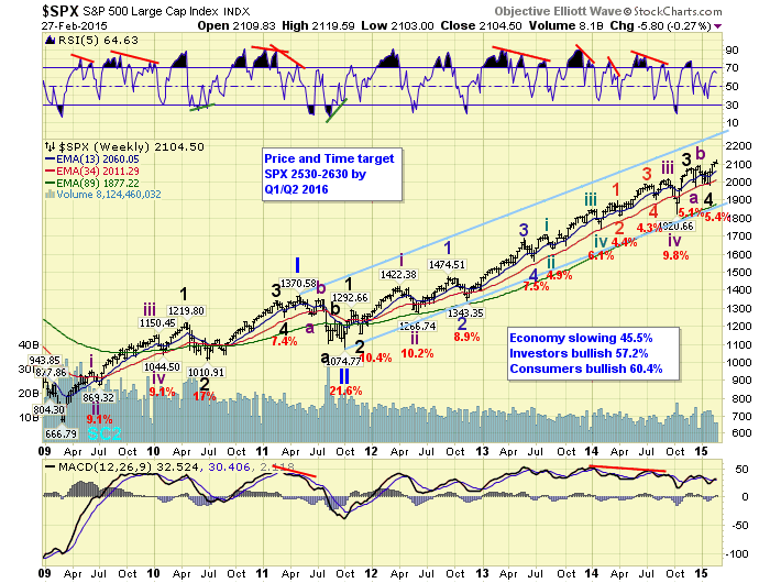
  2. The end of the business or stock market cycle is not imminent. Bull markets do not die of old age. Investors should understand that this one might run for many years. There are many famous and successful investors who have explained this, but I especially like this year-old analysis from Leon Cooperman. It happened just as a famous technical analyst noted that markets were at “an inflection point” not unlike the 1929 crash. (See also David Rosenberg).
See the original article >>

Follow Us