Monday, July 15, 2013

Bull Neutral Rectangle

By Tothetick Education

The Neutral Rectangle as a price pattern can be seen quite often as it presents frequently in all markets, time frames, & price ranges. They are one of the few patterns that can be considered a bullish or bearish trend continuation pattern, a reversal pattern, and even as a sideways ‘neutral’ pattern that may last quite some time depending on the trading environment.

Visually Neutral Rectangles are characterized by parallel or near-parallel trendlines drawn representing equal lows & equal highs in price. The pattern highlights the current indecision and doubt from traders as the price action is in ‘balance’ between buyers & sellers. The forces of supply & demand are basically equal. The horizontal upper trendline will experience multiple efforts and acts as price resistance. The horizontal lower trendline will also experience multiple efforts and it acts as price support. Typically Neutral Rectangles are horizontal or flat but they can also present with a slight slant upward/downward against a prevailing trend.

Neutral Rectangles vary quite a lot in their duration & the time involved in creating the pattern is key to helping the trader determine whether to risk taking a trade with such a balanced scenario. Often their sheer size will neutralize whatever momentum existed when the pattern first started to form. To be considered viable they must have a minimum of two swing highs and two swing lows in price to create the basic pattern. There is no limit or restriction on how large or how long the pattern may take. Traders should be prepared to adjust the trendlines as needed with additional swings. Volume usually diminishes as the pattern develops as buyers & sellers both become more indecisive with what seems to be ‘aimless’ range-bound price action.

Traders can look to trade the Neutral Rectangle with three basic methods & regardless of traders’ choice for entries, stop placement should be fairly tight with placement directly under support and directly above resistance.

  1. Trade with the swing action while in ‘the box’: trade short with hits on resistance &/or trade long with hits on support - regardless of the background environment.
  2. Wait until a confirmed breakout/down happens on either resistance or support & trade with the direction of the break.
  3. Trade only in the direction with the prevailing trend in the background looking for it to be an ‘edge’ . This method increases the risk-to-reward ratio for profits & relies heavily on the current strength or weakness of the trend. This method will be looking for the Neutral Rectangle to be a set up for a ‘trend continuation’ trade.
Traders looking for a bullish continuation pattern note it has 3 phases:

1) Background: A Strong impulsive, thrusting action with a surge in volume & price establishes a clear picture of the controlling bullish trend direction. In our neutral rectangle price pattern it is represented visually by a Pole. Higher and more drama the better as the Pole is the Key to recognizing the potential for the continuation of the pattern. The Pole represents trend direction as well as its strength & often this pattern is initiated as a new breakout in price from an established area & buyers are in control.

2) The second phase is a pause for consolidation of the action both in volume & price and is represented by the neutral rectangle. As traders we like to see this phase very short in duration with only 2 or 3 swings while our price action is range bound maintaining the equal lows & equal highs parallel or near-parallel shape and the volume is ‘resting’.

  • Note: the main difference between this pattern and a Flag is the duration of the consolidation portion of the pattern. While we would like this phase to be short, traders should be prepared for this pattern to take some time.

3) The pattern confirms as a bullish continuation pattern if the action creates a new bullish breakout with a surge again from the bulls in both volume & price. The immediate upper resistance outlined by the neutral rectangle is the area traders look to see confirm the breakout. Typically the action will mimic the volatility & energy experienced with the Pole creation. Since the neutral rectangle represents balance & neutrality it is highly recommended to pay close attention to the volume after the breakout as an aid in recognizing further potential for the pattern. With large patterns where the momentum has been somewhat ‘dampened’, re-tests of the breakout price are common before the trend can continue.

Options for Trading the Neutral Rectangle as a bullish continuation pattern:

Aggressive traders will enter trades right around the support trendline once sufficient support has confirmed. The concept is that the trend is on your side and the bulls are maintaining a higher level of support above the support level in the background.

Stop placement can be fairly tight right under support & can be adjusted upward accordingly.

Note the middle price area of the neutral rectangle is a ‘muddy trench’ in this tug of war between buyers & sellers. It will offer an immediate incremental target after an entry. When price approaches the upper resistance  line you should gauge the momentum: if you see that the momentum is strong stick to the position. However, if you see that resistance prevails, close the trade & take your profits to maximize the reward.

The aggressive trading method can highly increase the profit potential of any rectangle, as you can trade the same pattern several times & profit from the ranging swing movements inside the pattern. However, remember that as a trend continuation pattern traders want this consolidation rectangle formation to be relatively brief. Two or 3 swings may turn into more with this rectangle so traders need to be prepared to be patient & continue to evaluate the risk:reward parameters to fit the action.

Conservative traders will enter a trade once the upper resistance line has been broken &/or the new breakout has confirmed.

False breakouts do happen and confirmation needed is always a traders’ choice. Several methods that apply here for either intrabar &/or close bar options offered in sequence: breakout above resistance price, retrace holds breakout line, price clears breakout swing high price, larger chart combination.

Stop placement considerations can be aggressively raised after the breakout of the price.

Measured Move Targets based on structure of Pole & the Bull Neutral Rectangle:

Recommend:

  • Neutral Rectangle measure (added to) BreakOut price = target
  • Neutral Rectangle measure = (swing high price of rectangle (minus) swing low price of rectangle)

Aggressive with Momentum & Volume: duplication of the original move or trader choice measurement of the Pole:

  • Pole measure (added to) 50-50’ or mid-line price of Bull Neutral Rectangle = target
  • Pole measure = (Pole Tip price (minus) Pole Base price)

Example Neutral Rectangle as a bullish continuation pattern:

Bull neutral rectangle

See the original article >>

The Eurozone is on the verge of repeating Japan's lost decade

by SoberLook

Recently the IMF made it clear that the current euro area leadership needs to address its ongoing banking problems. The Eurozone's banks are continuing to deleverage, with total loan balances to euro area residents now at the lowest level in 5 years. What makes the situation even more troubling is that many Eurozone banks banks are repeating the Japanese experience of the 90s. They are carrying poor quality and often deteriorating assets on their balance sheets, refusing to take writedowns that will require recapitalization.

The IMF: - Faced with high funding costs, weak [Eurozone] banks are unable to recognize losses. This perpetuates uncertainty about the quality of their assets, hinders fresh private capital injections, and ultimately restrains credit. To reverse these dynamics, bank losses need to be fully recognized, frail but viable banks recapitalized, and non-viable banks closed or restructured.
This is exactly what created the "lost decade" in Japan by stifling credit growth for years. Loss recognition was not part of Japan's banking culture, as loan officers consistently kept bad loans at par and refused to move to workout/liquidation. There was little room for new credit creation in that environment.

Japan loan growth
(source:  Credit supply and corporate capital structure: Evidence from Japan, Konstantinos Voutsinas, Richard A. Werner; Centre for Banking, Finance and Sustainable Development, School of Management, University of Southampton, 2011, Original source: Profit Research Center Ltd and Bank of Japan)

And now numerous banks in the Eurozone are facing similar issues. Failure to recognize losses combined with new Basel III requirements has created Japan-style credit stagnation. The latest data from the ECB shows such weakness in loan growth that even some of the more pessimistic Eurozone economists have been surprised.

YoY growth in loans to Eurozone households (source: ECB)

YoY growth in loans to Eurozone non-financial companies (source: ECB)

In order to have any hope of a sustained economic recovery, the euro area's leadership needs to take some decisive action now. That may include recapitalizing or shutting down banking institutions. Allowing the banking sector to sustain itself via the ECB funding while maintaining the appearance of being sufficiently capitalized in the face of deteriorating loan portfolios will undermine economic growth for years to come. The Eurozone could be repeating the costly mistakes of the Japanese banking system of the 90s.

The Economist: - Banks are central to Europe’s prospects. The fear, especially in peripheral economies, is a repeat of Japan’s experience in the 1990s, when “zombie” banks staggered along for years, neither healthy enough to lend to firms nor weak enough to collapse. There are the same unvital signs in Europe. The average price-to-book ratio for European banks remains below one, suggesting that investors think lenders are worth more dead than alive. In America, where banks were recapitalised quickly, the ratio exceeds one. Italy’s two big lenders, UniCredit and Intesa Sanpaolo, have ratios of 0.34 and 0.42 respectively.
The suspicion of European lenders is well-founded. The amount of shaky loans keeps climbing: worryingly, there are more non-performing loans in the Italian banking system than there is core “Tier-1” capital. Lots of peripheral banks have been loading up on their own governments’ bonds: Portugal’s three biggest banks increased their holdings of Portuguese sovereign debt by 16% in the first quarter of the year. Mortgages account for even more bank assets’ and house prices keep falling—at the fastest pace on record in Spain in the first quarter.

See the original article >>

Funds bought gold in biggest rally since 2011

By Joe Richter

Hedge funds raised bets on higher gold prices for a second week as comments from Federal Reserve Chairman Ben S. Bernanke damped expectations for an imminent tapering of stimulus. Futures rose the most since 2011.

Speculators increased their net-long position by 4.1% to 35,691 futures and options, U.S. Commodity Futures Trading Commission data for July 9 show. Net holdings expanded even as speculators increased short bets to a record. Net- bullish wagers across 18 U.S.-traded commodities retreated 3.4% as investors became the most bearish ever on corn. They were more bullish on silver and palladium.

The U.S. needs “highly accommodative monetary policy for the foreseeable future,” Bernanke said July 10. Minutes from the Fed’s June policy meeting showed many officials wanted a stronger labor market before tapering bond purchases. Gold more than doubled from 2008 to a record $1,923.70 an ounce in September 2011 as the Fed cut interest rates to a record low and bought debt. Prices plunged into a bear market in April as some investors lost faith in the metal as a store of value.

“Bernanke’s comments put some positive feeling back into gold and into all commodities,” said Dan Denbow, a fund manager at the $1 billion USAA Precious Metals & Minerals Fund in San Antonio. “The Fed has been working hard to show that taking back a little bit of bond buying isn’t removing accommodation, and Bernanke was very firm on that. There was a bit of a sentiment shift.”

Gold Bulls

Gold futures gained 5.4% to $1,277.60 on the Comex in New York last week, the most since October 2011. Traders are the most bullish in five weeks, with 19 analysts surveyed by Bloomberg expecting prices to rise this week. Nine were bearish and three neutral. Bullion for delivery in August rose 0.5% to settle at $1,283.50 today in New York.

The Standard & Poor’s GSCI Spot Index of 24 commodities% added 1.7% last week, reaching a three-month high on July 11. The MSCI All-Country World index of equities gained 3.4%. The Bloomberg Dollar Index, which tracks the greenback against 10 major trading partners, fell 1.6%, the most in a month. A Bank of America Corp. Index shows Treasuries returned 0.6%.

Last week’s rally means gold has now reversed most of the losses made after Bernanke said June 19 that the central bank may start paring the pace of bond buying this year and end the purchases around the middle of next year if the economy improves. The metal is still down 23% for the year.

‘Bullish Signal’

Bullion’s drop to a 34-month low in June is spurring demand from buyers of physical metal and jewelry. The cost of borrowing gold reached a 4 1/2-year high in London last week, and may be a “bullish signal,” Standard Chartered Plc said in a report July 10. The bank said gold may rally above $1,400 by the end of the year. A scarcity of liquidity in leasing can lead to high lease rates and negative forward rates, according to the London Bullion Market Association.

While Deutsche Bank AG said July 8 that the worst of the selloff may have passed, banks including Goldman Sachs Group Inc. and Credit Suisse Group are forecasting more declines. Money managers’ holdings of short contracts reached 80,147 last week, the highest since the CFTC data begins in 2006. That can also magnify any rally as speculators close out bearish bets by buying contracts.

Assets in exchange-traded products backed by bullion have plunged 25% this year, wiping $59.8 billion from the value of the funds.

Stronger Dollar

Gold entered a bear market in April as U.S. inflation failed to accelerate as much as some bullion buyers had anticipated and equity markets rallied. The prospect of higher interest rates and a stronger dollar mean the recent gains may be short-lived, said John Goldsmith, the deputy head of equities with Montrusco Bolton Investments in Toronto.

“Gold may have gotten oversold and was due for a bounce, but a bounce doesn’t a bull market make,” said Goldsmith, whose company manages C$5.50 billion ($5.28 billion) of assets. “There’s upward pressure on rates and on the dollar.”

Money managers withdrew $1.42 billion from gold funds in the week ended July 10, according to Cameron Brandt, the director of research for Cambridge, Massachusetts-based EPFR Global, which tracks money flows. Total outflows from commodity funds were $1.68 billion, according to EPFR.

Net-long positions in crude oil climbed 6.9% to 281,918 contracts, the highest since May 2011, the CFTC data show. Prices climbed for three weeks, the longest rally since May, and on July 11 reached a 15-month high. U.S. inventories fell 5.1% in two weeks, the biggest plunge since at least 1982, Energy Information Administration data show.

Copper Holdings

The funds trimmed the net position in copper to a short 26,284 contracts, from 26,963 a week earlier. Imports of the metal by China, the biggest user, rose to a nine-month high in June, government data show. The decade-long bull market in commodities may extend for an additional 15 to 20 years, driven by urbanization and growing populations in countries including China and India, Michael Haigh, the head of commodities research at Societe Generale SA, said in Singapore last week.

A measure of net-long positions across 11 agricultural products tumbled 29% to 126,962 futures and options, the lowest since April. Investors more than doubled the bets on a decline in corn to 55,767 contracts, the highest since the data begins in 2006. Stockpiles in the U.S., the top grower, will more than double by the start of the 2014 harvest, the government said July 11.

Wheat Buying

Bearish wheat holdings declined to 47,844 contracts from 50,152 a week earlier. The U.S. last week cut its forecast for global inventories by 4.9% amid rising demand in China. U.S. export sales jumped to 1.47 million metric tons in the week to July 4, more than double a week earlier, with China buying 1.02 million tons, according to government figures.

“I’d be a buyer of commodities,” said James Paulsen, the Minneapolis-based chief investment strategist at Wells Capital Management who helps oversee more than $340 billion of assets. “Demand for commodities is going to hinge on whether the emerging world does a little better in the second half, and my feeling is that it will.”

See the original article >>

1% Growth: QE Policy a Failure, Time for A Change

By EconMatters

Fed Policy – Pushing on a string: Is far too Kind


Economists are now ratcheting down their forecasts for final 2nd quarter GDP to 1% which just further illustrates the ineffectiveness of fed policy measures. Ben Bernanke blames fiscal policies out of Washington, saying he can only do so much to counteract their lack of a healthy tax code, job creation plans, and inefficiencies.

However, it is starting to look more and more like Fed policy, a lack of creative fed policy, or even too much fed policy is equally to blame for the non-recovery five full years after the financial crisis. 

Dallas Fed President Richard Fisher talked about pushing on a string, and it looks more and more that the fed is actually doing more harm than good to the economy with their programs.

Pushing on a string implies that they just aren`t getting the desired results from their programs, but that they definitely are not having negative effects on the economy. But the Fed is actually damaging the economy through policy measures in several ways.

Low Interest Rates Hurts many Segments of the Economy: Savers


For example, just in my limited sphere of contacts on a daily basis over the last four years I have met many people who rely on CDs for their income; this is their only major source of income. They are unemployed, their spouse has died, and the deceased husband left enough money in a CD program with a paid off mortgage for the wife to pay her monthly living expenses.

The Stock market is great for younger, more risk taking investors, but for many baby boomers and others not wanting to take chances on the market given its volatility CDs with higher interest rates serve a valuable need in the economy for protection of capital, with a slight return to supplement their income.

This entire market niche has been hurt and destroyed by the fed policy of keeping low rates for such an extended period of time.

A high saving`s rate has many benefits for the economy. For one, it means the health of people’s finances is in much better position to handle unexpected life events. Often the government has to fill in the gaps when citizens fall upon hard times because their savings rate was inadequate.

This is an inefficient model, which leads to higher governmental debt, higher costs, and higher taxes which provides a major economic headwind for future growth.

The Stock Market isn`t the Economy


Another way in which low rates hurt the economy is that companies are incentivized to buy back stock with these low interest rates instead of using the money to put towards business investment which will lead to more hiring.

This improves the economy because the derivative benefits of higher employment feeds on itself, and more add-on jobs are created to account for more spending in the economy by those members of society who now have disposable income to buy goods and services.

I worked in major fortune 500 companies, and I can tell you from firsthand experience, the executive team who are the ones who make all the business decisions, mainly care about hitting their earning`s expectations so they don`t get fired. Furthermore, making sure their stock price goes up so they don`t get fired and collect with all their executive peers the hefty stock options that become vested in their compensation plans.

The stock buybacks accomplish those two goals far better than growing the business through planned business development. Ergo, extremely low interest rates where borrowing money at exceptionally low rates serves as a major enabler of the status quo and proves as a dis-incentive for taking risks, growing the business through creative means, and hiring new employees. It is highly ironic because these are the desired outcomes that the Fed talks up in their policy philosophy.

This is a major reason why corporate earnings are so much better than the actual economy for the last 5 years. The fed might want to look a little deeper into the harm this has caused for economic growth the last five years. A major QE policy failure in my opinion.

Gasoline & Oil Prices much higher than Fundamentals = Major Tax on Growth


The price of oil and gasoline has been much higher than theyshould have for the last five years because of QE policies.

In fact, Oil and gasoline priced much closer to the fundamentals would have served as a major stimulus to consumers who would have much more disposable income to infuse into the economy over the last five years.

Instead all this money goes towards filling up the tank, and even limits mobility as high gas prices, limit travel, leisure opportunities, and even business profits which could be used for re-investment, and hiring additional workers.

It is obvious that Oil and thus gasoline would have beenmuch lower over the last five years without QE Liquidity used to artificially inflate many asset prices.

The amount of money that is wasted on higher energy prices, and the knock on effects that high energy prices have on business growth and investment models served as a major drag on the economy over the last five years and is a major policy failure.

America needs to Rethink the Makeup of the Federal Reserve: Too Much Group Think


This is much worse than merely pushing on a string Mr. Fisher, this is outright fed incompetence. The incompetence is that the fed continues the same policy initiatives even after it fails to get the desired results they were seeking at the outset of the programs. That is why they continue additional QE programs.

But what did Albert Einstein say regarding insanity and continuing to do the same thing over and over again, and expecting different results? You would think that after the policy didn`t meet their objectives, that they would try something different! I think this is where we need more diversity in the Fed governors.

We have too many members of the same ilk, same type of academics, no market experience, no business experience, no minorities, when was the last time an African American was on the Fed, or an Asian American, a Latin American, etc. How about cross-discipline smart people on the board of governors?

But the failure, and continued adherence to a limited scope of fed tools to try and invigorate this economy given substandard results screams out “Group Think” on the Board of Governors at the Federal Reserve.

Inaction is sometimes the best policy: Let the natural business cycle work


It is obvious that more diversity is needed on the Fed; we need more diverse points of view from an analysis standpoint. Sometimes no policy action is actually a policy tool, I know who would have thought?

It is the same notion behind a divided Congress; that they will become gridlocked, and thus cannot pass a bunch of costly legislation that will increase government spending, waste money through inefficient programs, and actually harm the economy.

Well, the same thing applies to Fed inaction; a Fed that did nothing might have actually produced a much better outcome over the last five years. Think of a world where we have low energy costs, higher interest rates, and businesses make decisions based on needing to grow a business by providing value towards consumer needs versus useless stock buybacks.

Fed Policy Needs to Dis-incentivize Stock Buybacks through Higher Interest Rates


Stocks buybacks have nothing to do with Business Development, and businesses investing and spending, and thus hiring is what is required to really grow the economy!

Maybe some middle ground might have even better results like low interest rates for six months, and then slowly start raising the Fed Funds Rate every four months by 25 basis points would have better overall results.

But it is hard to argue that a Fed that did absolutely nothing could have had less of an economic impact than producing a 1% GDP quarter 5 years out from the recession. It is time for a major Sea-Change in Federal Reserve Policy. Replace the entire team; we need some new minds with new ideas regarding monetary policy. Sometimes it is better to do nothing at all!

See the original article >>

Only a 99% loss in two years… now its back to old highs!

by Chris Kimble

CLICK ON CHART TO ENLARGE

This stock only lost $983 in two years time!

Something like a 99% loss off its 1999 highs!  That's right....this stock went from $990 to $7 in just two years.  It then created a double bottom and now 10 years later, its back to its 1999 price!  Party like it 1999 again?

Could a double top be in place with 85% bulls?  Would have to respect a breakout if it finally happens for sure in Priceline, as it would be great for the stock and maybe reflect decent demand for travel too!

See the original article >>

How to make profits on gap fill swing trades every week

by ACTIVETRADINGPARTNERS

How to make profits on gap fill swing trades every week

As a short term trader, one of the best ways to make consistent profits and take them out of the market is buying oversold gap fill set ups. I’m looking for strong stocks that are having very rapid short term pullbacks in price.  When I see the pullback, I immediately check the 5 or 10 day charts on an hourly basis and look for any gaps in the chart below.

Gaps are a situation where a stock moved up with a higher bid price than a recent closing price (Can be on a 15 minute, hourly, or daily basis even) and never came back down to where that Gap was created.  These gaps often close because traders set stops just at or below where that gap was created and then often the computer trading systems end up running all the stops until the final stops are filled at or below those gaps.

I use that type of arbitrage and volatility to scale into that stock as the gap is approaching.  I never try to buy the exact gap because often a stock will fill the gap on 100 shares and then reverse quickly to the upside, and then you are stuck watching and or chasing the stock higher. This only adds further risk to your trading, not less.

Often a gap will fill and the stock will dip a bit below the gap as well, so I will continue to buy shares as that occurs as well looking for the reversal while lowering my average entry point at the same time.

We have a real time sample below in DATA (Tableau Software) a recent IPO.  This stock is pretty thinly traded so it can move up or down a few dollars quickly for no real reason, thus creating the arbitrage.  Yesterday this peaked near $60 and as of this morning it was trading below $55 per share on light volume as a gap on the 10 day chart was sitting there around $54.80.  Noting that gap and the near term oversold condition, as a trader, you would want to begin to buy just over 55 and down to and below the gap. The stock filled that gap and dropped into the 54.50′s briefly.

The stock then recovered to $56.30 just 15-20 minutes later, giving that trader a quick $1.20 -$1.50 per share profit on his or her position in very little time.

Now this pattern repeats over and over again every week in the market giving the savvy trader opportunities all week long.  At our ATP service we somewhat use the same idea, though not on a 1-2 hour scale per se, but the same general concept applies.  Time frames can be much different, but the idea is it is one reversal technique you can deploy with attack capital to take money out of the market.

You must be quick on your feet and not afraid to pull the buy trigger, add to your position, and then move to sell at the appropriate time.  This technique is best for the more advanced trader who has time to watch the screen.

Join us at ATP for Real Time Stock and ETF Alert set ups with ongoing buy and sell advice. WWW.ACTIVETRADINGPARTNERS.COM

628 data gap fill

See the original article >>

Why Great Stocks Drop Hard and Reverse

By: David_Banister

One thing that will always over rule charts and technical analysis is fundamentals in the long run.  To be sure, I love technical analysis but I always combine my work there with fundamental research. I rarely if ever buy a stock just because the chart looks nice, that is almost always a recipe for disaster.

With that said, how many times have you seen a good company with strong fundamentals and a seemingly great looking chart break down over 1-2 weeks and take everyone out of the trade?  Then for sure, the stock reverses right back up all the way back to where the decline began?  To make matters worse, this happens without any real news or any bad news as it were.  What is it that causes these crazy down the mountain and up the mountain moves anyways?

Insitutional Sell Programs— sometimes referred to as “Bots” or “Algo” program trading

How does it work?

In an apparently strong fundamental growth stock with no apparent issues, an institution will have a pre-defined price at which point instructions are triggered to liquidate the entire position almost at any price once that price point is hit. They protect themselves ahead of time with Puts, which give them profits if the targeted stock drops hard while they are selling out of the position, thereby locking in their targeted sell price.

Lets take several examples below with 3 month charts to show you exactly how they look on paper. If you can learn to spot these moves you will be more likely to add to positions on big declines rather than selling out at a loss as all the stops trigger along with the margin calls:

The stocks we will chart out here are AMBA, DATA, DECK, and GILD.  All strong companies with good growth profiles:

See the original article >>

Bull Neutral Rectangle

By Tothetick Education

The Neutral Rectangle as a price pattern can be seen quite often as it presents frequently in all markets, time frames, & price ranges. They are one of the few patterns that can be considered a bullish or bearish trend continuation pattern, a reversal pattern, and even as a sideways ‘neutral’ pattern that may last quite some time depending on the trading environment.

Visually Neutral Rectangles are characterized by parallel or near-parallel trendlines drawn representing equal lows & equal highs in price. The pattern highlights the current indecision and doubt from traders as the price action is in ‘balance’ between buyers & sellers. The forces of supply & demand are basically equal. The horizontal upper trendline will experience multiple efforts and acts as price resistance. The horizontal lower trendline will also experience multiple efforts and it acts as price support. Typically Neutral Rectangles are horizontal or flat but they can also present with a slight slant upward/downward against a prevailing trend.

Neutral Rectangles vary quite a lot in their duration & the time involved in creating the pattern is key to helping the trader determine whether to risk taking a trade with such a balanced scenario. Often their sheer size will neutralize whatever momentum existed when the pattern first started to form. To be considered viable they must have a minimum of two swing highs and two swing lows in price to create the basic pattern. There is no limit or restriction on how large or how long the pattern may take. Traders should be prepared to adjust the trendlines as needed with additional swings. Volume usually diminishes as the pattern develops as buyers & sellers both become more indecisive with what seems to be ‘aimless’ range-bound price action.

Traders can look to trade the Neutral Rectangle with three basic methods & regardless of traders’ choice for entries, stop placement should be fairly tight with placement directly under support and directly above resistance.

  1. Trade with the swing action while in ‘the box’: trade short with hits on resistance &/or trade long with hits on support - regardless of the background environment.
  2. Wait until a confirmed breakout/down happens on either resistance or support & trade with the direction of the break.
  3. Trade only in the direction with the prevailing trend in the background looking for it to be an ‘edge’ . This method increases the risk-to-reward ratio for profits & relies heavily on the current strength or weakness of the trend. This method will be looking for the Neutral Rectangle to be a set up for a ‘trend continuation’ trade.
Traders looking for a bullish continuation pattern note it has 3 phases:

1) Background: A Strong impulsive, thrusting action with a surge in volume & price establishes a clear picture of the controlling bullish trend direction. In our neutral rectangle price pattern it is represented visually by a Pole. Higher and more drama the better as the Pole is the Key to recognizing the potential for the continuation of the pattern. The Pole represents trend direction as well as its strength & often this pattern is initiated as a new breakout in price from an established area & buyers are in control.

2) The second phase is a pause for consolidation of the action both in volume & price and is represented by the neutral rectangle. As traders we like to see this phase very short in duration with only 2 or 3 swings while our price action is range bound maintaining the equal lows & equal highs parallel or near-parallel shape and the volume is ‘resting’.

  • Note: the main difference between this pattern and a Flag is the duration of the consolidation portion of the pattern. While we would like this phase to be short, traders should be prepared for this pattern to take some time.

3) The pattern confirms as a bullish continuation pattern if the action creates a new bullish breakout with a surge again from the bulls in both volume & price. The immediate upper resistance outlined by the neutral rectangle is the area traders look to see confirm the breakout. Typically the action will mimic the volatility & energy experienced with the Pole creation. Since the neutral rectangle represents balance & neutrality it is highly recommended to pay close attention to the volume after the breakout as an aid in recognizing further potential for the pattern. With large patterns where the momentum has been somewhat ‘dampened’, re-tests of the breakout price are common before the trend can continue.

Options for Trading the Neutral Rectangle as a bullish continuation pattern:

Aggressive traders will enter trades right around the support trendline once sufficient support has confirmed. The concept is that the trend is on your side and the bulls are maintaining a higher level of support above the support level in the background.

Stop placement can be fairly tight right under support & can be adjusted upward accordingly.

Note the middle price area of the neutral rectangle is a ‘muddy trench’ in this tug of war between buyers & sellers. It will offer an immediate incremental target after an entry. When price approaches the upper resistance  line you should gauge the momentum: if you see that the momentum is strong stick to the position. However, if you see that resistance prevails, close the trade & take your profits to maximize the reward.

The aggressive trading method can highly increase the profit potential of any rectangle, as you can trade the same pattern several times & profit from the ranging swing movements inside the pattern. However, remember that as a trend continuation pattern traders want this consolidation rectangle formation to be relatively brief. Two or 3 swings may turn into more with this rectangle so traders need to be prepared to be patient & continue to evaluate the risk:reward parameters to fit the action.

Conservative traders will enter a trade once the upper resistance line has been broken &/or the new breakout has confirmed.

False breakouts do happen and confirmation needed is always a traders’ choice. Several methods that apply here for either intrabar &/or close bar options offered in sequence: breakout above resistance price, retrace holds breakout line, price clears breakout swing high price, larger chart combination.

Stop placement considerations can be aggressively raised after the breakout of the price.

Measured Move Targets based on structure of Pole & the Bull Neutral Rectangle:

Recommend:

  • BreakOut price (added to) Neutral Rectangle measure = target
  • Neutral Rectangle measure = (swing high price of rectangle (minus) swing low price of rectangle)

Aggressive with Momentum & Volume: duplication of the original move or trader choice measurement of the Pole:

  • Pole measure (added to) 50-50’ or mid-line price of Bull Neutral Rectangle = target
  • Pole measure = (Pole Tip price (minus) Pole Base price)

Example Neutral Rectangle as a bullish continuation pattern:

Bull neutral rectangle

See the original article >>

Is Gold the Next Subprime Mortgage Scandal?

by WashingtonsBlog

See the original article >>

Why is Gold & Silver, the Precious Metals Complex Falling ?

by Rambus

A subscriber asked me this week why the precious metals complex has been falling and if the charts could show the reason why. From the Chartology perspective it’s really a no brainier why this sector has fallen on hard times.

Many of you may recall the bull market that occurred, in the stock markets, back in the 1990′s which was a traders dream come true. During that time gold and the precious metals stocks were not even on my radar screen as I was too busy trading the tech stocks to even consider the precious metals sector. I couldn’t tell you the price of gold or what a junior miner was. All I knew was that the action was in the tech stocks and that is all that mattered to me at the time. I know a lot of you folks were trading the precious metals stocks in the 90′s and by looking at a long term chart for gold or the XAU, which has the most history, those were some lean years to say the least.

As the stock market finally topped out in 2000 the precious metals complex was bottoming. I didn’t know it at the time that precious metals complex was going to be the trade of the decade as I didn’t know anything about this out of favor sector. It was in the spring of 2002 that I just happened  upon a long term chart for gold and I immediately seen the huge base that was being built, and from a Chartology perspective, that’s all I needed to see. I started the process of learning all I could about this new sector that was so foreign to me. I started to look at some of the big cap precious metals stocks and liked what I seen. I still didn’t know about the juniors yet but I quickly found out there could be some serious money made when I began to explore this sector.

The rest is history as they say. I traded the juniors exclusively, on the long side, until late last year when I began to notice some subtle changes being made in in the PM sector and also the stock markets. I was just as bullish on the precious metals complex as anyone else. I was expecting the latest consolidation pattern on gold to breakout to the upside and start the next impulse leg higher. I even did a post titled, All Hail the Queen, which I showed how I expected this next rally leg to unfold.

http://rambus1.com/?p=12141

It was only a week or two after I posted that article that I began to see some things which you don’t want to see when an impulse leg begins. The breakout of the little triangle kept stalling and failed to move out like all the other impulse legs did. Below is one of the charts that I used in the article, All Hail the Queen, that shows one of the most beautiful bull markets that a chartists could ever chart. As you can see each consolidation pattern broke out to the upside in an impulse move followed by another consolidation pattern. Note the last triangle at the top of the chart. At the time I thought this was going to be just another consolidation pattern followed by an impulse leg up just like all the rest. As you can see the top blue triangle did in fact breakout to the upside but there was no follow through. The longer it took for gold to make up its mind the more it began to look like a false breakout. I kept waiting for the backtest and then the move higher but the price action  just drifted slowly down not creating any hysteria.

gold little trianble

I posted this next chart to show my subscribers where to look for the backtest. The dashed blue lines shows the breakout and the solid blue line shows the backtest. As you can see everything looked fine at the backtest point on the chart that had the top blue rail of the triangle and the bottom rail of the 2008 uptrend that should hold support. It did for about 4 weeks or so when the price action started to break below the 2008 bottom rail of the uptrend channel. That was all I needed to see to know something was amiss. This is where following the price action can keep one out of trouble. The long trade was failing and an important support rail was being broken to the downside. As you can see there was one more backtest to the top blue rail of the triangle that could have saved the day but that was not going to happen. The apex of a triangle is a strong area of support or resistance depending on which way the stock is moving as all the energy is focused to that one point.. A break down through the apex of the blue triangle signaled bad news ahead. For me it signaled a top in place which was even hard for me to believe as I was a staunch gold bull. The charts don’t lie it’s just the interpretation of the chart is where most run into trouble.

gold backtest

While gold was topping out in the fall of 2011 the SPX was just starting to build out a bullish rising wedge pattern that would lead to new all time highs. All the experts said this was still a secular bear market in the SPX and that we would see another crash and burn scenario like in 2000 and 2008. Again, if you just follow the price action you don’t have to worry about what all the experts are saying. You can see with your own two eyes what is happening. Below is a weekly chart for the SPX that shows the breakout and backtests of the bullish rising wedge. The SPX is right on the verge of making a new all time high regardless of what is happening in the economy. It doesn’t make any difference what the experts are saying, just look at the price action. That is the truth.

spx wede

This next chart will answer any questions you may have on why the precious metals complex is in a bear market. If you are still holding your precious metals stocks hoping the bottom is in place and the next leg up is about to take off, this weekly ratio chart comparing the HUI to the SPX may give you a reason for concern. As you can see the HUI had been the place to be since it began its bull market in 2001. The HUI had outperformed the SPX handily until the HUI and gold topped out in 2011. That is the high on this ratio chart that began the steep decline for the precious metals complex. There is a massive topping pattern that has broken down below the bottom rail of the 5 point bearish expanding rising wedge reversal pattern. What this chart shows is that the breakout and backtest to the bottom blue rail in now complete. What the Chartology of this chart shows is that this ratio chart is going to start to accelerate to the downside meaning the SPX is going to outperform the HUI in a bigger way than has already happened. We are now entering the reverse symmetry portion of this chart that shows how this ratio went up is how it is going to unwind to the downside.

hui spx ratio

The chart above shows you why the precious metals complex is under pressure right now. Like the 1990′s when the stocks markets were in a major bull market, the precious metals were weak, as money was flowing into the stock markets. The exact same thing is happening again today. Money is leaving the precious metals complex and is finding a better return in the stock markets. I know how hard it is for some folks to believe how the stock markets can go up, with everything you read and hear and how can the precious metals complex be under such severe pressure. It’s in the charts folks. I don’t make up these charts, investors do. I only interpret their behavior by following the price action and pay no attention to the so called experts. Clarity and perspective are a must when one puts their hard earned capital to work in the markets. All the best…Rambus

See the original article >>

Bear Neutral Rectangle

By Tothetick Education

The Neutral Rectangle as a price pattern can be seen quite often as it presents frequently in all markets, time frames, & price ranges. They are one of the few patterns that can be considered a bullish or bearish trend continuation pattern, a reversal pattern, and even as a sideways ‘neutral’ pattern that may last quite some time depending on the trading environment.

Visually Neutral Rectangles are characterized by parallel or near-parallel trendlines drawn representing equal lows & equal highs in price. The pattern highlights the current indecision and doubt from traders as the price action is in ‘balance’ between buyers & sellers. The forces of supply & demand are basically equal. The horizontal upper trendline will experience multiple efforts and acts as price resistance. The horizontal lower trendline will also experience multiple efforts and it acts as price support. Typically Neutral Rectangles are horizontal or flat but they can also present with a slight slant upward/downward against a prevailing trend.

Neutral Rectangles vary quite a lot in their duration & the time involved in creating the pattern is key to helping the trader determine whether to risk taking a trade with such a balanced scenario. Often their sheer size will neutralize whatever momentum existed when the pattern first started to form. To be considered viable they must have a minimum of two swing highs and two swing lows in price to create the basic pattern. There is no limit or restriction on how large or how long the pattern may take. Traders should be prepared to adjust the trendlines as needed with additional swings. Volume usually diminishes as the pattern develops as buyers & sellers both become more indecisive with what seems to be ‘aimless’ range-bound price action.

Traders can look to trade the Neutral Rectangle with three basic methods & regardless of traders’ choice for entries, stop placement should be fairly tight with placement directly under support and directly above resistance.

  1. Trade with the swing action while in ‘the box’: trade short with hits on resistance &/or trade long with hits on support - regardless of the background environment.
  2. Wait until a confirmed breakout/down happens on either resistance or support & trade with the direction of the break.
  3. Trade only in the direction with the prevailing trend in the background looking for it to be an ‘edge’ or a ‘stack the deck’. This method increases the risk-to-reward ratio for profits & relies heavily on the current strength or weakness of the trend. This method will be looking for the Neutral Rectangle to be a set up for a ‘trend continuation’ trade.
Traders looking for a bearish continuation pattern note it has 3 phases:

1) Background: A Strong impulsive, thrusting action with a surge in volume & price establishes a clear picture of the controlling bearish trend direction. In our neutral rectangle price pattern it is represented visually by a Pole. Deeper and more drama the better as the Pole is the Key to recognizing the potential for the continuation of the pattern. The Pole represents trend direction as well as its strength & often this pattern is initiated as a new breakdown in price from an established area & sellers are in control.

2) The second phase is a pause for consolidation of the action both in volume & price and is represented by the neutral rectangle. As traders we like to see this phase very short in duration with only 2 or 3 swings while our price action is range bound maintaining the equal lows & equal highs parallel or near-parallel shape and the volume is ‘resting’.

  • Note: the main difference between this pattern and a Flag is the duration of the consolidation portion of the pattern. While we would like this phase to be short, traders should be prepared for this pattern to take some time.

3) The pattern confirms as a bearish continuation pattern if the action creates a new bearish breakdown with a surge again from the bears in both volume & price. The immediate lower support outlined by the neutral rectangle is the area traders look to see confirm the breakdown. Typically the action will mimic the volatility & energy experienced with the Pole creation. Since the neutral rectangle represents balance & neutrality it is highly recommended to pay close attention to the volume after the breakdown as an aid in recognizing further potential for the pattern. With large patterns where the momentum has been somewhat ‘dampened’, re-tests of the breakdown price are common before the trend can continue.

Options for Trading the Neutral Rectangle as a bearish continuation pattern:

Aggressive traders will enter trades right around the resistance trendline once sufficient resistance has confirmed. The concept is that the trend is on your side and the bears are maintaining a lower level of resistance below the resistance level in the background.

Stop placement can be fairly tight right above resistance & can be adjusted downward accordingly.

Note the middle price area of the neutral rectangle is a ‘muddy trench’ in this tug of war between buyers & sellers. It will offer an immediate incremental target after an entry. When price approaches the lower support line you should gauge the momentum: if you see that the momentum is strong stick to the position. However, if you see that support prevails, close the trade & take your profits to maximize the reward.

The aggressive trading method can highly increase the profit potential of any rectangle, as you can trade the same pattern several times & profit from the ranging swing movements inside the pattern. However, remember that as a trend continuation pattern traders want this consolidation rectangle formation to be relatively brief. Two or 3 swings may turn into more with this rectangle so traders need to be prepared to be patient & continue to evaluate the risk:reward parameters to fit the action.

Conservative traders will enter a trade once the lower support line has been broken &/or the new breakdown has confirmed.

False breakouts do happen and confirmation needed is always a traders’ choice. Several methods that apply here for either intrabar &/or close bar options offered in sequence: breakdown below support price, retrace holds BD line, price clears breakdown swing low price, larger chart combination.

Stop placement considerations can be aggressively lowered after the breakdown of the price.

Measured Move Targets based on structure of Pole & the Bear Neutral Rectangle:

Recommend:

  • BreakDown price (minus) Neutral Rectangle measure = target
  • Neutral Rectangle measure = (swing high price of rectangle (minus) swing low price of rectangle)

Aggressive with Momentum & Volume: duplication of the original move or trader choice measurement of the Pole:

  • 50-50’ or mid-line price of Bear Neutral Rectangle (minus) Pole measure = target
  • Pole measure = (Pole Base price (minus) Pole Tip price)

Example Neutral Rectangle as a bearish continuation pattern:

Bear neutral rectangle

See the original article >>

The One Chart Explanation Behind Ben Bernanke's "Open Mouth Operation" Scramble

by Tyler Durden

Two months ago Ben Bernanke, using his trusty mouthpiece Jon Hilsenrath, floated a trial balloon that a tapering of bond purchases is coming, necessitated by the drop in gross US TSY issuance and lower deficit funding need (maintaining the status quo ante rate of monetization would lead to even more deliquification in the bond market as Bernanke soaked up even more high quality collateral from the market). What happened next was not quite what Bernanke expected: a surge in bond yields that matched the dreaded 1994 episode...

... and instead the much needed steepening, so critical to banks whose prop trading abilities have been severely curtailed, the TSY curve bear flattened resulting in even more pain for banks.

How much pain? Enough for Bernanke to engage in the most dramatic Open-Mouth Operation scramble in recent Fed history to assure markets that while buying stawks is encouraged and a matter of Fed policy, selling bonds is certainly not on the Fed's agenda nor endorsed by the Fed's markets desk.

The pain that banks have experienced can best be seen in the following chart showing the latest update in "Net unrealized gains (losses) on available-for-sale securities" from the Fed's weekly H.8.

Two things come to mind (as previewed two weeks ago):

  • For the first time since April 2011, unrealized gains in AFS portfolios among the entire US banking sector became losses, and 
  • The two month rate of loss creation in MTM exempt AFS portfolio soared to the highest in series history.

Except even more Fed jawboning until the black line above finally moves back up.

See the original article >>

Should You Be Buying Now?

by Tom Aspray

It was a stellar week for the stock market as the late buying pushed all of the major averages into positive territory. It was hard to find a bearish voice after Friday’s close but most investors do not benefit from the advice of these analysts. Overnight data from China was better than expected and the futures are higher in early trading.

One well-known technical analyst said Friday that he would buy the market now. Unfortunately, the interviewer never asked the follow-up question as to what it would take for him to change his view or what type of stop he would use on this position.

Now, while I would also expect the market to be significantly higher between now and the end of the year, that does not mean you should buy everything and at any price. I think that the regular investor or trader must pay attention to the risk of each investment.

The further improvement in the market internals noted on Friday continues to favor the long side of the market but not at any price as most of the major averages are quite overextended. The charts below reveal the hazards of chasing the index-tracking ETFs and also why one sector should be avoided.

chart
Click to Enlarge

Chart Analysis: The daily chart shows that the Spyder Trust (SPY) closed Friday at $167.51, which was not far below the quarterly R1 resistance at $168.48.

  • The daily starc+ band was tested last Thursday and is now at $169.71. The prior intra-day high was $169.07.
  • The quarterly pivot is at $161.01 with the last swing low at $159.86, which was the June 28 low.
  • A stop at this level would mean a loss of 4.8% but a more comfortable stop would be under the June lows at $157.42.
  • A drop below this level would mean a loss of 7.8% for those who bought Friday’s close.
  • The daily chart has initial support in the $165 area, which is 1.5% below last week’s close.
  • There is better support in the $163-$163.40 area, which includes the rising 20-day EMA.
  • The NYSE A/D line broke its downtrend, line b, on June 28 and made marginal new highs Friday.
  • The A/D line would need to decisively break below the June lows to weaken the outlook.

The PowerShares QQQ Trust (QQQ) was almost 1% stronger than the SPY last week and closed at $75.30, which was above the daily starc + band and the quarterly R1 resistance.

  • The weekly starc+ band is at $76.68 with the quarterly R2 at $79.10.
  • For longs established on Friday’s close, the tightest stop would be under $71.03 or the late June low of $70.78.
  • This would be a risk of 6% while a stop under the June low of $69.15 would be a risk of 8.2%.
  • The daily relative performance surged last week but is still below the resistance at line d.
  • The sharp rise in the OBV last week reflects heavy buying as the downtrend, line f, was overcome on July 3.
  • The gap between the OBV and its WMA is quite large (see ellipse #3), which also reflects an overextended market.
  • The gap at $73.62 to $74.25 is the first support with the rising 20-day EMA at $72.67.

chart
Click to Enlarge

The Dow Jones Steel Index (DJUSST) is down 3.7% for the year and down 26% from the early 2012 highs.

  • The chart shows what could be a bottom formation, line b, and closed with nice gains last week.
  • There is next resistance in the 212-214 area, line a, and the early 2013 highs.
  • The relative performance dropped through support at line c, at the end of March, which reaffirmed its downtrend.
  • The RS line is still well below its declining WMA.
  • The weekly OBV also shows a similar break of key support, line e, in March.
  • The OBV is still below its WMA and the downtrend, line d.
  • There is weekly support in the 180 area.

United States Steel Corporation (X) is one of the better-known and weaker steel companies.

  • The chart shows that major support, line f, was broken in March, consistent with the resumption of the major downtrend.
  • The chart shows that prices are now trying to hold the support in the $15.80-$16.11 area, line g.
  • The upside should be limited by the heavy resistance now in the $19.70-$20.85 area.
  • The relative performance looks very weak as it broke support, line h, in March.
  • So far, the RS line has not been able to move back above this resistance or its WMA.
  • The on-balance volume (OBV) violated its uptrend, line i, in early February.
  • The OBV has been in a gradual uptrend from the April lows, line j, and is just barely above its declining WMA.
  • Though the OBV shows a potential positive divergence the weekly chart still looks negative.

What it Means: The analysis of the potential risk of buying Friday’s close in the SPY or QQQ is a process that one should do with any position they are considering.

As I mentioned early in the year, determining your buy levels is an important part of successful investing or trading.

The market could still rally another 1-3% before we get a correction. Keep an eye on the support levels outlined above, and with a lower close, I will be better able to target the buying levels in my column or on Twitter.

After such a strong market rally, some focus on the weakest sectors or stocks but this requires quick action and does not work in the long run. There are several steel stocks, like Steel Dynamics (STLD) and Nucor NUE +0.98% Corp. (NUE), that look better than United States Steel Corporation (X). The overall sector is lagging the S&P 500, and I would rather concentrate on the market-leading sectors like those discussed in Red-Hot Summer Sectors.

How to Profit: No new recommendation.

See the original article >>

Hidden Risks at German Banks

by Pater Tenebrarum

Deutsche Bank's Accounting Raises Questions

Regarding the risks in Germany's banking system, it should be pointed out that  large German Banks are among the most highly leveraged in Europe relative to their net tangible capital. This is when the known risks are considered, but it has recently turned out that there are also hitherto unknown, hidden risks. Consider in this context the recent revelation that Deutsche Bank has kept loans to Brazil and Italy off the books, as well as loans to Greek banks and other dubious debtors such as Dexia, in spite of the fact that it remains fully exposed to the associated credit risks. Mind, DB apparently did nothing illegal here – but this accounting practice does mask the extent of risk the bank is exposed to.

“Between 2008 and 2011 Deutsche Bank AG, the largest bank in Germany and one of the largest in the world, made loans to Italian bank Banca Monte dei Paschi di Siena SpA and Brazilian bank Banco do Brasil SA totaling $3.3 billion but did not include these transactions in financial reports sent to investors. Similar loans were made to Dexia SA, TT Hellenic Postbank SA, National Bank of Greece, and Qatari bank Al Khaliji.

These loans are part of $395.5 billion in liabilities that Deutsche Bank AG has offset with other liabilities, an amount equal to 19 percent of the company’s total reported assets. Deutsche Bank spokesperson Kathryn Hanes says that these accounting practices are proscribed by law and that Deutsche Bank’s actions are in line with the letter and intention of financial regulations. She also claims that this information does not impact the company’s financial health or key financial ratios.”

(emphasis added)

Nothing to see here, move right on! Until one considers the finer details of these 'netting' transactions that is:

“Secured loans usually entail a company providing collateral in exchange for cash that a bank has on hand, and the collateral is held until the loan is repaid in full. Instead, Deutsche Bank AG sold its collateral, government bonds in this case, to come up with the cash to make the loan, leaving it with an obligation to return the bonds.

Under the terms of the agreement Deutsche Bank AG was only obligated to return the ‘cheapest-to-deliver’ equivalent of the bonds, protecting it from devaluation but leaving the bank exposed to default. This maneuver effectively put a short on the government bonds, exposing Deutsche Bank to greater risk than if it had simply held the bonds for the duration of the loans. Deutsche Bank then sold credit-default insurance to investors, recording an immediate €60 million profit at the outset of the Monte Paschi deal.”

(emphasis added)

In other words, these 'secured' loans are not really secured, unless one considers what is effectively  a short position on the bonds that were provided as collateral to represent adequate security. In addition, DB apparently 'spiced' the deals up by writing credit default swaps, exposing it to even more credit risk.

As Bloomberg further reports, this isn't the first time DB has obscured its true financial position by means of accounting practices that are not necessarily illegal, but certainly raise questions about how to properly evaluate the risks the bank is exposed to.

Meanwhile, the banks that have received the loans in question were able to continue to report ownership of the bonds DB has sold, allowing them to misrepresent their own financial health as well. In fact, that appears to have been the true reason for the odd accounting treatment of these transactions. While Deutsche's hands are considered legally clean, those of e.g. Monte Dei Paschi apparently are not:

“Monte Paschi is currently being investigated by Italian prosecutors for using the loan to hide losses, and both Banca Monte dei Paschi di Siena SpA  and Banco do Brasil SA continued to report ownership of the bonds that were used as collateral since they were due to receive them back. Prosecutors have not alleged any wrongdoing on the part of Deutsche Bank AG in this case.

However, analysts say that netting makes it difficult to accurately gauge the company’s financial health and that it goes against the spirit of financial regulations by hiding the real amount of risk that Deutsche Bank has on its books.

This isn’t the first time Deutsche Bank AG has been accused of obscuring financial information this year. In the aftermath of the Libor scandal the bank was previously investigated for possibly hiding $12 billion in losses by incorrectly valuing its derivative portfolio.”

(emphasis added)

We're not sure at this point what, if anything, came of the above mentioned investigation into derivatives accounting, but would note that derivatives open a great many possibilities for 'obscuring' balance sheet information.

Leverage Ratios of European Banks

Below are a few chart that illustrate the fact that the leverage of German as well as French banks is extremely high. These snapshots are from different sources and are not 100% congruent. It depends a bit on the precise definitions of balance sheet items. The first chart shows both average bank liabilities as a percentage of the host country's national debt and its GDP, as as well as bank assets as a percentage of net tangible equity capital.


Banking-systems-vs.-GDP

Banks in different countries: their liabilities as a percentage of the public debt and the GDP of the host country, and their assets divided by net tangible equity capital. Note that in terms of the latter measure, German banks were leveraged 52:1 at the time this snapshot was taken (in 2011) – the highest amount of leverage of all banking systems considered here (via Bridgewater) – click to enlarge.


The next chart shows the leverage of individual 'systemically important' banks according to an article at Daily FX, which is supposed to be based on Basel definitions as of 2012 (it also shows where these ratios should be according to Basel 2 and Basel 3). Note that in this case SocGen has to our knowledge disputed the conclusions of the original source regarding its leverage ratio, so one has to take this particular information with a grain of salt.


SIFI leverage
Leverage ratios of individual 'systemically important' banks (via Daily FX) - click to enlarge.


And lastly, a chart published by the IMF in 2012, showing the average net assets/net tangible common equity ratios of banking systems in different countries. This chart shows slightly less leverage than the Bridgewater chart further above, presumably due to slight differences in definitions of what exactly constitutes tangible equity. Still, the esential message remains the same: German and French banks are sporting extremely high leverage ratios.


leverage

Average bank leverage by country, IMF 2012. Germany and France both have extremely leveraged banking systems.


In summary, even if one disregards the 'hidden exposure' to credit risk such as that revealed in DB's loans to assorted rather dubious borrowers, bank leverage in Europe remains worryingly high. It is no wonder that the 'banking union' isn't getting off the ground as smoothly as some would like. It also explains why there was such a panic over the exposure of European banks to sovereign debt in 2011. While the outright panic has subsided, the reasons for it remain firmly in place.


DB

Deutsche Bank's share price over the past decade. The market seems more sanguine about DB than about many other European banks, but the bank is highly leveraged and exposed to a lot of risk as a result. Its greatest strength is probably its domestic loan book.

See the original article >>

Reflationary Road

by Marketanthropology

As expected, silver has taken its time in building out a foundation. However, once completed and as described by the historic momentum patterns shown below in copper, we expect silver to turn up another reflationary road towards its previous May 2011 highs. 
Assuming silver's historic leading relationship with gold - and by extension inflation expectations, participants current concerns with lack of inflation may be fleeting.

Click to enlarge images

See the original article >>

Gold Prices Search for That Illusive Ignition

By: Bob_Kirtley

Let me start by stating that I am a gold and silver bull and that the precious metals sector has been very good to me. However, any stock or commodity doesn’t not go up or down in a straight uninterrupted line. There are bear phases in a bull market just as there are bullish rallies in a bear market. Gold prices are in a long term bull market despite being in a bear phase at the moment. With that being our starting point then being short rather than long in the near term, makes sense to me.

As retail investors we should be able change and implement a new strategy all in one day. This is not so easy to do for the bigger players who hold sizeable stakes in some mining companies, but this should not be a stumbling block for retail investors. We have the advantage of being small enough and therefore nimble enough to recognize change and position ourselves accordingly.
The Gold Chart

This capitulation in gold prices isn’t 'total' in that it feels more like death by a thousand cuts than a total wash out of the weak hands. Gold has rallied and gained about $100/oz recently and should gold manage to form a new near term high; get above $1400/oz then we might get a decent rally, but don’t count on it.
The Illusive Ignition
Last week’s fire side chat by Ben Bernanke changed nothing other than to calm the market participants who feared that the punch bowl was about to be drained. The dollar dropped and gold rallied bringing forth a chorus of ‘that’s the bottom in’ from the Perma-Bulls. The point here is that the employment figures are viewed as good enough to justify no further increase in QE and that deprives gold of the oxygen that it needs to rally.
The demand for physical gold continues unabated; however it is not strong enough to overcome the paper market as defined by the COMEX, at least not just yet. The bears have a tight grip of the paper market and until the selling is truly exhausted any rally in the precious metals sector will be capped.
The argument that gold can’t go any lower because this is what it costs to produce it is a strange one; if it were true then we wouldn’t have any bankruptcies as the price wouldn’t go any lower. When the pendulum swings it doesn’t stop at equilibrium, it tends to overshoot the mark and gold is well capable of doing just that. Mining companies will consider their options such as staff layoffs, a wage freeze, shelve expansion programs, spend some of their cash and reduce dividends, etc., in order to keep mining. The bigger operations would need to be moth balled which is an expense in itself. Gold may not go any lower, but it won’t be due to this sort of reasoning as it is flawed.
A resurgence of bank bail-ins in the southern EU countries could cause a few investors to seek refuge in the precious metals sector as the fear grows that their hard earned cash could be confiscated. However, there are many alternatives to cash which an investor can utilize and as gold does not pose a rosy picture at the moment alternatives will be sort.
There is the possibility of social unrest given the high levels of youth unemployment across the Eurozone but they have tolerated the current situation up to now. Although we have had riots from Istanbul to Stockholm, gold prices didn’t head higher, they drifted lower.
A Black Swan Event could boost prices; however, by definition this is an unexpected event and can hardly be depended upon as a reason for gold prices to boom.  
Conclusion
We are still in a bear phase of this bull market and so we can profit from it if we trade on what we know and not on what we imagine. If you think this bear phase is set to continue then you could consider deploying some of your ‘opportunity cash’ to your change of view. A well thought out strategy involving put options or a few straight out ‘short’ positions could be well worth your consideration.
In 2013 this strategy has served us well and helped us to build cash pile in readiness for the resumption of this bull market or indeed opportunities out with this market sector. This consolidation period may have further to run so we’ll need a fair amount of patience to get through it. However, as investors we can make money whether gold goes up, down or sideways, all we have to do is take the blinkers off and recognize the current situation for it is and not for what we would like it to be.

See the original article >>

Syria, Egypt And The Middle East Oil Price Risk Premium

By: Andrew_McKillop

SYRIAN OIL
The role of Syria's disastrous civil war as a “tailwind” helping maintain oil prices at artificially high levels is easy to show. Claims by oil analysts that this civil war “will spillover and deflagrate the entire Middle East” bump up prices. The same applies to Egypt, the Arab world's biggest country now potentially facing the risk of civil war. With imagination, the contagion talk can be extended to Libya, Tunisia, the Yemen, Bahrain, the other Gulf states, and other Mid East and North African countries. The talk helps nudge up day traded prices for Brent or WTI by 50 cents or a dollar, quite regularly, but the risk and fear premium on Arab oil is highly uncertain. When we drill down to strict net export surplus fundamentals – production versus national oil demand - any claims that Syria, Egypt, the Yemen or other countries, except Libya, Algeria, Iraq and the Gulf states, are more than tiny exporters probably moving towards net oil importer status, are very hard to defend. This is a political risk premium.

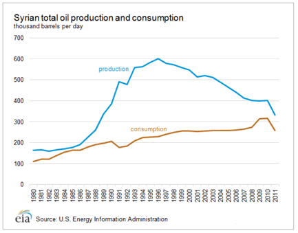
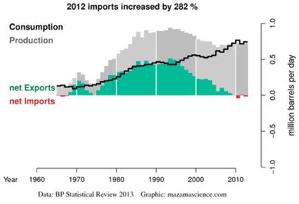
Syria's “glory days” as a small net exporter are already well in the past.

The typical newsfeed concocted with the aim of driving oil prices up, until the Morsi government fell in Egypt, featured “the Syrian concern” of traders that “potential region-wide supply disruption” could ensue if violence in Syria goes international. This is linked with often exaggerated reports from Iraq and Lebanon saying that Qatar-financed Al Qaeda djihadists from Iraq (and elsewhere), on the Sunni side, and Iraqi Shia as well as Iran-financed Hezbollah fighters, on the Shia side, are “flocking to fight in Syria”. The picture painted is of massive sustained armed conflict but in recent weeks, in fact, the fighting has diminished, and the Syrian massacre of unarmed civilians is hard to call warfare.

Whatever oil supply disruption we might fear, this will not concern Syria's own oil export supply because output has been falling for years and will go on falling, now followed by falling demand.

Looking at Egypt, the only way to use this country to talk up day traded oil prices is to wave the threat of Suez canal closure – carefully avoiding the fact that oil shipments through the canal are declining at an impressive rate – for numerous reasons. Some are for the least unexpected, and concern the satellite positioning tags for oil tankers tracked by Inmarsat. As Peter Blackhurst, head of maritime security at Inmarsat said in a December 7, 2012 interview with Reuters, “a ship can get its Global Positioning System (GPS) to give false data, including pretending to be another vessel”. Routing phantom tankers from Iran, but flagged Tanzanian, through the Suez canal when they are in fact steaming through the South China Sea to the Chinese port of Ningbo, is now a well known sanctions busting trick. Real tanker movement through the Suez canal is also falling for the simplest-possible technical factor of what maximum size of tanker the canal can accept.

While the Morsi government pondered canal fee hikes or surcharges, along with its other play-for-time strategies never followed by concrete decisions, hoping that increased revenues could serve it during IMF loan talks which were stymied, Lloyds List on 28 June reported that canal transits are continuing to decline. In first quarter 2013 there was a 10% year-on-year fall, especially marked for larger-sized vessels. The maximum sized vessels able to use the canal (Suezmax, about 160 000 tons deadweight) are charged around $1.2 million per return trip through the canal. Larger tankers, sometimes two times that size plying around the Cape to reach Europe, pay no transit fees but use more fuel.

Egypt's short-lived and small scale status as a net oil exporter, already sharply declining in the last years of Mubarak has for understandable reasons (investor retreat, civil unrest, rising domestic demand) tilted back into net importer status. This will likely continue.

TRY HARDER
Bloomberg News always goes that extra mile. In a May 28 article, its journalists worked overtime to tell us: “The civil war tearing Syria apart is threatening to erase century-old borders across the Middle East as what began as a peaceful rebellion against President Bashr al-Assad escalates into a regional religious and ethnic battle”.

This is talk aimed at adding $1 to $5 extra on the barrel! Adding Bloomberg spice to the tale, the article said that previous Anglo-French wrangling over oil concessions in the Arabian Peninsula, which ended with the Sykes-Picot secret accord of 1916 – at a time when the Turkish Ottoman empire was not yet beaten – took no account of the region's seething rivalries. The article said : “The Middle East’s entrenched ethnic, political and religious rivalries weren’t a major consideration when a well-heeled British diplomat, Sir Mark Sykes, and his French counterpart, Francois Georges-Picot, secretly redrew the region’s borders in their agreement concluded on May 16, 1916”.

Syria was however soon found to be “low prospect” for oil relative to then-independent Kurdistan and British Iraq including its Kuwait province, and American-reserved and dominated Saudi Arabia. Syria, French-dominated in the post-Ottoman carve up, became a small producer concentrated in its eastern Kurdish region, at most aiming for oil self-sufficiency. At its peak net export supply capacity in the 1990s, attained long after its independence from France in 1946, Syria's exports occasionally came near 350 000 barrels per day (0.35 Mbd) – at a time when prices rarely topped $15 per barrel. World traded oil shipped across at least one border totals about 51 Mbd.

With the collapse of the Ottoman Empire in 1917, the two European powers, France and Britain divided Greater Syria into modern-day Lebanon, Syria and Iraq,  a part of Turkey, Israel, and Jordan. The two latter were then later on split out of British Palestine. The “logic” of the frontiers, to be sure, can be radically criticized as totally absent – but comparison with the famous Balkans and their frontiers is worthwhile. Today's African frontiers can also be checked for their “logicality” or lack of it. South America's frontiers can then be compared for their “naturality”, relative to Mid East frontiers.

There was nothing inherent or natural about the post-Ottoman frontiers in the Arabian peninsula and eastern Mediterranean but the Sykes-Picot agreement only intensified an unnatural divide-and-rule patchwork set as far back as the Crusaders, Mongols and then Ottomans. Today, these “unnatural frontiers” supply copy for excited journalists at Bloomberg saying the house of cards “could fall apart in an eyeblink”. More likely, the latest unraveling that started with Arab Spring in 2011 will continue.

To be sure, apart from the “traditional flashpoint” of Israel-Palestine, another certain pressure point for change is Syria, Iraq and Kurdistan. The bad news for oil importers is that oil production, even oil reserves are far from the only issues in the region's layered and longstanding historical disputes. Rather than deliberate sabotage or military attack on oil installations, the domestic, regional and sectarian political conflict will cause “collateral damage” to oil production and export infrastructures

THE REAL PRESSURE POINTS – TO THE EAST
Turkey's relations with its own Kurds, and the Kurdish diaspora are complex and very long-dated. On occasions, Turkey will at least tacitly support Sunni Arab djihadists if they are fighting Kurdish militants in Turkish frontier regions. At the same time, Turkey is currently extending a pipeline with a capacity of 1 Mbd right up to the Kurdistan frontier – but not beyond. Turkey also runs a huge road fleet of tanker trucks, day and night importing oil from Kurdistan. The Baghdad Federal Iraqi government of Nouri al-Maliki actively disapproves of this but to no avail.

Iraqi Kurds support efforts by their Syrian counterparts to extend the present de facto, and they intend de judere Kurdish writ in Syria from today's Kurdistan in the northeast of Iraq. Inside Kurdistan, the state and nation's existence is already de judere for Kurds and any oil companies wanting to work in Kurdistan. Iraq however still claims Kurdistan is only a de facto entity, and Baghdad weakly claims it still has legitimate power over this “province”, in what it calls “northern Federal Iraq”. The likelihood or even the potential of Federal Iraq using military force to destroy independent Kurdistan must be reckoned as almost zero.

If Kurds succeed in expanding their territory out from oil-rich Iraqi Kurdistan, to Syrian Kurdistan, this will certainly set an increased challenge to the integrity of Iraq as well as Syria. Relations between the Kurd leaders Massoud Barzani, and Jalal Talabani symbolize Kurdish domestic political divides. Both are Kurd but the second is the official president of the Governing Council of Federal Iraq since April 2005. Their relations are so complex we can summarize them by saying that both, or either, are able to have a meeting with whatever US president is presently in office, whenever they want.

More simply, both aim for Kurdish independence. How they obtain it, how Syria and Iraq are “carved up” to create an enlarged Kurdistan is only one minor factor among the several factors driving the “car bomb war of Iraq”, that has reached deadly intensity since early 2013. Massoud Barzani can be called relatively Iran-friendly and Jalal Talabani relatively Saudi-friendly. Kurds can be called generally and relatively pragmatic and patient, but their patience since the 1923 “de-recognition” of Kurdistan during the Versailles Treaty conference series, by the Allied victors, in deference to Turkey, is now very limited and can become a war motive.

The political context has also moved outside of “pure sectarian lines”, since about 2003. The Middle East patchwork, today, is now responding less to theological distinctions sealed in Sunni-Shia sectarian conflict, and has moved more towards very concrete political and economic strategic interests. The case of Kurdistan is a major example, but even the mass street protests against Mohamed Morsi's failed government in Egypt can be taken as example of this trend. Sectarian Sunni-Shia conflict is not a major part of the Egyptian political conflict, either at present or in the future.

At the same time the probable or possible death throes of the Assad regime in Syria is now focused on entirely Alawite security interests – notably securing a corridor from Damascus through Homs to the Mediterranean coast enabling the home area of Assad’s Alawites to feel it is in security. This area includes the port city of Tartus, home to Russia’s only naval base in the region. Russia's real interests in Syria are however hard to fathom and could or may be related to its own domestic struggle against Sunni extremists, for example in Daghestan and Chechnya using the 'Al Qaeda' brand name. Several alternate options are available, for describing Russian Middle East policy.

US AND WESTERN POSTURING
Until very recently, in fact until 2011, Western posturing about regional geopolitics was fixated by and rooted in the 1948 creation of Israel and non-creation of Palestine. Israel-Palestine relations were the almost sole interest, outside of oil.

John Kerry expresses ritual concern on the Syrian crisis, treated as a spinoff from Israel-Palestine posturing, most recently on May 22. He said that he feared that Syrian fighting “would lead ultimately potentially to the splitting apart of Syria itself”. Added to this, the Obama administration has also publicly worried about the territorial integrity of Lebanon and the stability of Jordan. As Kerry knows full well, Syria’s border with Lebanon is open for Hezbollah fighters who cross into Syria to guard Shia villages and fight for the Assad regime. Also including Iranian volunteers, Iranian-backed Hezbollah and Iraqi Shia are in Syria battling Sunni djidhadists affiliated with the Iraqi branch of al-Qaeda supported by the Sunni ruled petromonarchies of the Persian Gulf.

Rarely if ever noted or admitted by Western diplomats and analysts, the ultra weak Lebanese state is probably the “best-fit model” for the region. Lebanon's national integrity is so flimsy that national census data is a state secret. The population, for years, is officially given as “about 4 million” to not incite domestic political and sectarian animosities and claims. Its frontiers are porous. Different communities inside the loose federal national entity are organized differently, exactly as they were organized across the region under the 300-year hegemony of the Ottomans.
Both Iraq and Iran, as well as the Gulf states are feeling the shock waves. Exactly 10 years after the probably illegal war of George Bush and Tony Blair to topple Sunni dictator Saddam Hussein, Iraq not only faces the de facto secession of Kurdistan, but also “the car bomb war”. Attacks from Baghdad to Basra killed more than 700 people in June according to the United Nations, the highest monthly death toll since 2007. Sunni mosques have been attacked, and Shia neighborhoods have been ripped apart by car bombs. Both sides in this heavily sectarian conflict are well armed and financed, but the “novelty” in this sombre killing is that the car bomb war is now also political, as well as sectarian.

The usual argument given by Western political deciders and their listened-to analysts is that “Syria is contaminating Iraq”. The claim is that what is happening inside Syria is having a major impact inside Iraq, pushing Iraqi Sunnis to “try taking back Iraq” from the Shia majority of the oil-rich east of Iraq, and from the Sunni but non-fundamentalist Kurds. As already noted, Kurdish political action has been operated with diplomatic skill, as well as military force to push the agenda for total independence. For many observers and even some Iraqis, both Sunni and Shia, the only solution for Iraq is “the Lebanon solution” of a loose, weak central government enabling large regional and sectarian autonomy – but this is exactly not the type of Iraq that the US and UK wanted in 2003.

The same Western dreaming applies to Syria. This is despite its de facto move towards a “patchwork state” being almost admitted by al-Assad's attempt at creating the Alawaite “secure zone” in the Damascus-Homs-Tartus corridor. Eastern Syria is already de facto Syrian Kurdistan, although opposed by Sunni terrorists backed by the Gulf state Sunni autocrat regimes. These “Al Qaeda factions” hold relatively large parts of the southern desert of Syria, without oil, and could be compared with the fundamentalist Muslim separatist communities in Egypt's Sinai desert, or the early kibbutzim of Israel.

Western handwringing on Arab Spring degenerating into Sunni-Shia civil war is sure to rest vain without the right decisions being taken – but the weight of historical action and repeated inaction, and the current playacting as performed by John Kerry, make it unlikely that constructive change will occur. Sectarianism has been deepening across the Middle East and North Africa since 2000. Sunni autocracy Saudi Arabia and the Qatari petro principality have flexed their petromoney and propaganda muscles – and almost inevitably have chosen to back Sunni fundamentalist fighters, but to date have only been able to viciously crush majority Shia dissent in one tiny Sunni ruled state - Bahrain.

Across the Gulf to the east the real “elephant in the closet”, the vastly bigger state of Iran has reinforced its Shia sectarian bridges to eastern Iraq, eastern Saudi Arabia and other Gulf states. At the same time, as in Turkey and Egypt,  Iran is in no way exempt from street protest but to date, the massive protests that unseated Libya’s Muammar Khadafi, Tunisia's Ben Ali, and Egypt’s Hosni Mubarak followed by his Sunni Muslim Brotherhood successor Mohamed Morsi, were all successful mass protests against Sunni leaders. 

THE OIL BARGAINING CHIP
Presently, US State department analysts cited by the media tend to back the concept of “continued Balkanization of Syria”, rather than outright collapse. As already noted, Syrian onshore oil is concentrated in Syrian Kurdistan, and offshore shale gas and oil potential is for the moment only that – potential. Several commentators also see Syria fragmenting like Lebanon, ending as a central government with tenuous control over some cities and some enclaves, with a patchwork of regions having more or less autonomy. Iraq is almost certainly going down the same “slope of least resistance”, and similar loose federalization would be a likely break-up model for Saudi Arabia, when or if domestic conflict developed.

The role of Syria and Iraq as models for this process are called “regional contagion” and “soft partition”, but one of the main dangers is the Western-willed concept of strong, united, national states in a region where there is no real tradition of this model. For both Europeans and Americans, with either de facto federal European administration, or de judere American federalism, the imposition of highly traditional national and even monarchic or autorcratic government models in the Middle East is very easy to criticize as an anachronism.

Oil has certainly dogged and distorted the pace of change in the Middle East and North Africa. The earliest Western geopolitical and economic strategic concept for Israel, we can note, was to provide a Mediterranean pipeline terminal point and refining hub for Arabian oil, enabling the Suez canal to be avoided. Only a few relics of that era, such as rusted remains of 10-inch diameter pipelines, still exist to mark that failed concept. Both technology, time and politics relegated this Strategic Israel concept to the wastebin. Strategic Iraq is now rapidly changing, like Syria and possibly soon Egypt.

As previously noted in this article, oil is not the be-all and end-all for domestic change in the region. For outsiders it is. Mixing the two, in an increasing number of cases is like mixing oil and water, making for even less predictable and faster change. To be sure, the region's huge dependence on food imports – Syria for some while being treated as a potential “Arab breadbasket” by Saudi strategists – makes it certain it will have to go on producing and exporting oil. The likelihood, therefore, of anything other than collateral damage to oil production and export infrastructures, during regional political change, can be considered relatively low.

See the original article >>

Follow Us