Sunday, September 21, 2014

Where’s the Growth?

By John Mauldin

In 1633 Galileo Galilei, then an old man, was tried and convicted by the Catholic Church of the heresy of believing that the earth revolved around the sun. He recanted and was forced into house arrest for the rest of his life, until 1642. Yet “The moment he [Galileo] was set at liberty, he looked up to the sky and down to the ground, and, stamping with his foot, in a contemplative mood, said, Eppur si muove, that is, still it moves, meaning the earth” (Giuseppe Baretti in his book the The Italian Library, written in 1757).

Flawed from its foundation, economics as a whole has failed to improve much with time. As it both ossified into an academic establishment and mutated into mathematics, the Newtonian scheme became an illusion of determinism in a tempestuous world of human actions. Economists became preoccupied with mechanical models of markets and uninterested in the willful people who inhabit them….

Some economists become obsessed with market efficiency and others with market failure. Generally held to be members of opposite schools – “freshwater” and “saltwater,” Chicago and Cambridge, liberal and conservative, Austrian and Keynesian – both sides share an essential economic vision. They see their discipline as successful insofar as it eliminates surprise – insofar, that is, as the inexorable workings of the machine override the initiatives of the human actors. “Free market” economists believe in the triumph of the system and want to let it alone to find its equilibrium, the stasis of optimum allocation of resources. Socialists see the failures of the system and want to impose equilibrium from above. Neither spends much time thinking about the miracles that repeatedly save us from the equilibrium of starvation and death.

– George Gilder, Knowledge and Power: The Information Theory of Capitalism and How It is Revolutionizing Our World

And to that stirring introduction let me just add a warning up front: today’s letter is not exactly a waltz in the park. Longtime readers will know that every once in a while I get a large and exceptionally aggressive bee in my bonnet, and when I do it’s time to put your thinking cap on. And while you’re at it, tighten the strap under your chin so it doesn’t blow off. There, now, let’s plunge on.

Launched by Larry Summers last November, a meme is burning its way through established academic economic circles: that we have entered into a period of – gasp! – secular stagnation. But while we can see evidence of stagnation all around the developed world, the causes are not so simple that we can blame them entirely on the free market, which is what Larry Summers and Paul Krugman would like to do: “It’s not economic monetary policy that is to blame, it’s everything else. Our theories worked perfectly.” This finger-pointing by Keynesian monetary theorists is their tried and true strategy for deflecting criticism from their own economic policies.

Academic economists have added a great deal to our understanding of how the world works over the last 100 years. There have been and continue to be remarkably brilliant papers and insights from establishment economists, and they often do prove extremely useful. But as George Gilder notes above, “[As economics] ossified into an academic establishment and mutated into mathematics, the Newtonian scheme became an illusion of determinism in a tempestuous world of human actions.”

Ossification is an inherent tendency of the academic process. In much of academic economics today, dynamic equilibrium models and Keynesian theory are assumed a priori to be correct, and any deviation from that accepted economic dogma – the 21st century equivalent of the belief by the 17th century Catholic hierarchy of the correctness of their worldview – is a serious impediment to advancement within that world. Unless of course you are from Chicago. Then you get a sort of Protestant orthodoxy.

It’s About Your Presuppositions

A presupposition is an implicit assumption about the world or a background belief relating to an utterance whose truth is taken for granted in discourse. For instance, if I asked you the question, “Have you stopped eating carbohydrates?” The implicit assumption, the presupposition if you will, is that you were at one time eating carbohydrates.

Our lives and our conversations are full of presuppositions. Our daily lives are based upon quite fixed views of how the world really works. Often, the answers we come to are logically predictable because of the assumptions we make prior to asking the questions. If you allow me to dictate the presuppositions for a debate, then there is a good chance I will win the debate.

The presupposition in much of academic economics is that the Keynesian, and in particular the neo-Keynesian, view of economics is how the world actually works. There has been an almost total academic capture of the bureaucracy and mechanism of the Federal Reserve and central banks around the world by this neo-Keynesian theory.

What happens when one starts with the twin presuppositions that the economy can be described correctly using a multivariable dynamic equilibrium model built up on neo-Keynesian principles and research founded on those principles? You end up with the monetary policy we have today. And what Larry Summers calls secular stagnation.

First, let’s acknowledge what we do know. The US economy is not growing as fast as anyone thinks it should be. Sluggish is a word that is used. And even our woeful economic performance is far superior to what is happening in Europe and Japan. David Beckworth (an economist and a professor, so there are some good guys here and there in that world) tackled the “sluggish” question in his Washington PostWonkblog”:

The question, of course, is why growth has been so sluggish. Larry Summers, for one, thinks that it’s part of a longer-term trend towards what he calls “secular stagnation.” The idea is that, absent a bubble, the economy can’t generate enough spending anymore to get to full employment. That’s supposedly because the slowdowns in productivity and labor force growth have permanently lowered the “natural interest rate” into negative territory. But since interest rates can’t go below zero and the Fed is only targeting 2 percent inflation, real rates can’t go low enough to keep the economy out of a protracted slump.

Rather than acknowledge the possibility that the current monetary and government policy mix might be responsible for the protracted slump, Summers and his entire tribe cast about the world for other causes. “The problem is not our theory; the problem is that the real world is not responding correctly to our theory. Therefore the real world is the problem.” That is of course not exactly how Larry might put it, but it’s what I’m hearing.

Where’s the Growth?

It’s been more than five years since the global financial crisis, but developed economies aren’t making much progress. As of today, the United States, Canada, Germany, France, Japan, and the United Kingdom have all regained their pre-crisis peaks in real GDP, but with little else to show for it.

Where orthodox neo-Keynesian policies like large-scale deficit spending and aggressive monetary easing have been resisted – as in Japan years ago or in the Eurozone debtor countries today – lingering depressions are commonly interpreted as tragic signs that “textbook” neo-Keynesian economic policy could have prevented the pain all along and that weak economic conditions persist because governments and central banks are not doing enough to kick-start aggregate demand and stimulate credit growth at the zero lower bound.

In places like the United States and Japan, where neo-Keynesian thought leaders have already traded higher public debt levels and larger central bank balance sheets for unspectacular economic growth and the kinds of asset bubbles that always lead to greater instability in the future, their policies have failed to jump-start self-accelerating recoveries. Even in the United States, when QE3 has been fully tapered off, I would expect to see the broader economy start to lose momentum once again.

We’ve tried countercyclical deficit spending to resist recessions, procyclical (and rather wasteful) deficit spending to support supposed recoveries, and accommodative monetary easing all along the way (to lower real interest rates and ease the financing of those pesky deficits); but growth has been sluggish at best, inflation has been hard to generate, and labor market slack is making it difficult to sustain inflation even when real interest rates are already negative.

Call me a heretic, but I take a different view than the economists in charge. To my mind, the sluggish recovery is a sign that central banks, governments, and, quite frankly, the “textbook” economists (despite their best intentions) are part of the problem. As Detlev Schlichter commented in his latest blog post (“Keynes was a failure in Japan – No need to embrace him in Europe”), “To the true Keynesian, no interest rate is ever low enough, no ‘quantitative easing’ program ever ambitious enough, and no fiscal deficit ever large enough.” It’s apparently true even as debt limits draw closer.

While the academic elites like to think of economics as a reliable science (with the implication that they can somehow control a multi-trillion-dollar economy), I have repeatedly stressed the stronger parallel of economics to religion, in the sense that it is all too easy to get caught up in the dogma of one tradition or another. And all too often, a convenient dogma becomes a justification for those in power who want to expand their control, influence, and spending.

Whereas an Austrian or monetarist approach would suggest less government and a very light handle on the monetary policy tiller, Keynesian philosophy gives those who want greater government control of the economy ample reasons to just keep doing more.

Schlichter expands his critique of the logic of pursuing more of the same debt-driven policies and highlights some of the obvious flaws in the pervasive Keynesian thinking:

Remember that a lack of demand is, in the Keynesian religion, the original sin and the source of all economic troubles. “Aggregate demand” is the sum of all individual demand, and all the individuals together are not demanding enough. How can such a situation come about? Here the Keynesians are less precise. Either people save too much (the nasty “savings glut”), or they invest too little, maybe they misplaced their animal spirits, or they experienced a Minsky moment, and took too much risk on their balance sheets, these fools. In any case, the private sector is clearly at fault as it is not pulling its weight, which means that the public sector has to step in and, in the interest of the common good, inject its own demand, that is [to] “stimulate” the economy by spending other people’s money and print some additional money on top. Lack of “aggregate demand” is evidently some form of collective economic impotence that requires a heavy dose of government-prescribed Viagra so the private sector can get its aggregate demand up again.

Generations of mismanagement have left major economies progressively weaker, involving

  1. dysfunctional tax/regulatory/entitlement/trade policies created by short-sighted and corrupt political systems,
  2. private-sector credit growth encouraged by central bank mismanagement, and
  3. government expansion justified in times of crisis by Keynesian theory.

But rather than recognizing real-world causes and effects, neo-Keynesian ideologues are making dangerous arguments for expanding the role of government spending in places where government is already a big part of the problem.

We are going to delve a little deeper into this thesis of “secular stagnation” posited last year by Larry Summers and eagerly adopted by Paul Krugman, among others; and then we’ll take a trip around the rich world to assess the all-too-common trouble with disappointing growth, low inflation, and increasingly unresponsive labor markets. Then I’ll outline a few reasons why I think the new Keynesian mantra of “secular stagnation” is nothing more than an excuse for more of the same failed policies.

I think we’ll see a consistent theme: fiscal and monetary stimulus alone cannot generate “financially stable growth with full employment.” In fact, such policies only make matters worse. And funny things happen in the Keynesian endgame.

USA: Secular Stagnation or Public Sector Drag?

This latest theory – “secular stagnation” – argues that powerful and inherently deflationary forces like shrinking populations…

… and potentially slowing productivity growth (as posited by Northwestern University professor Bob Gordon)…

… are adding to the deleveraging headwinds that always follow debt bubbles. According to the “stagnation” theory, structural forces have been bearing down on the natural rate of interest and weighing on the full-employment level of economic growth since the early 1980s; but the slowdown in trend GDP growth has been masked by a series of epic bubbles in technology stocks and housing.

Even before the 2008 crisis, the argument goes, the real interest rate required to restart the business cycle had been trending lower and lower for years, and the average level of growth experienced during business cycles has fallen.

Moreover, it has taken longer and longer to recoup the jobs that were lost in each of the last three recoveries.

It’s hard to argue with the data, but it’s really a matter of how we interpret it. While the five-year-old “recovery” is still the weakest business cycle in modern US history…

… I quite frankly still believe the effects on growth are temporary. Difficult and long-lasting, for sure (as Jonathan Tepper and I outlined in our books Endgame and Code Red), but temporary nonetheless as private-sector deleveraging continues. We have encountered a massive debt crisis and still have a long way to go in dealing with the sovereign debt bubbles that are being created in Europe and Japan – with the potential of one’s ballooning out of control in the US unless we turn ourselves around.

It may take a crisis, but the forces that plague rich-world economies will eventually shake out and usher in a new era of technology-driven growth. In other words, this too shall pass… but continuing with the same old policies is highly likely to create another crisis through which we all must pass first.

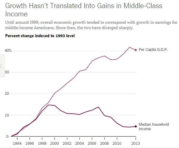
Yes, shrinking workforces, private-sector debt overhangs, and technological innovation are making it difficult to achieve “financially stable growth with full employment” (quoting Summers); but governments and central banks are themselves becoming an increasing drag on rich-world economies. Our governments have saddled us with excessive public debt, onerous overregulation, oppressive tax codes, and their attendant distorted market signals; while our central banks have engaged in currency manipulation and monetary-policy overmanagement. Those in power who rely on Keynesian policies almost always find it inconvenient to cut back in times of relative economic strength (as Keynes would have had them do). And if, according to their arguments, the economy is still too weak even in periods of growth to enable the correction of government balance sheets, then perhaps their reluctance has something to do with debt piling up, market signals being distorted, and governments being empowered to encroach on every aspect of the lives of their productive citizens .

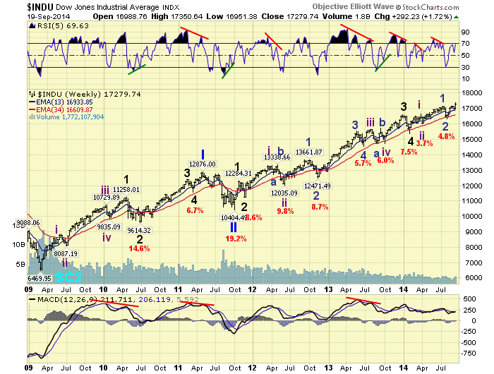
My friend Grant Williams used this chart in a speech yesterday. It shows that we have come to need ever more debt just to produce the same amount of GDP. With a deleveraging in the private sector underway, it is no wonder that growth is under pressure.

Debt is simply future consumption brought forward. Another way to think about it is that debt is future consumption denied. But there comes a point when debt has to be repaid, and by definition, from that point forward there is going to be a period of slower growth. I have called that point the Endgame of the Debt Supercycle, and it was the subject of my book Endgame.

As a result of central bank and governmental machinations, Keynesian growth is ultimately debt-fueled growth (either through the swelling of public debt via deficit spending or the accumulation of private debt via credit expansion); and eventually, public and private balance sheets run out of room to expand anymore. It has taken decades for cracks to show up in the prevailing theory, but now the cracks are everywhere.

One place where the crack-up is especially evident is Japan, where an uber-Keynesian combination of aggressive fiscal deficits and a planned doubling in the monetary base started to lift real GDP and inflation numbers last year before falling back into a deflationary trap. Yet the Japanese experience has seemingly convinced ECB President Mario Draghi that similar policies should be implemented across the Eurozone.

Last quarter, the Japanese economy shrank by an annualized 7.1%; business investment fell by 5.1%; and residential spending was down 10%. This is after one of the most massive Keynesian quantitative easing efforts in the history of the world.

So, let’s go to Japan, which may now have to retitle itself “the land of the setting sun,” since it is facing the steepest expected decline in population and in workforce-to-population ratio on the planet.

Land of the Setting Sun

Japan’s long-awaited “recovery” is already losing steam without the effective implementation of Prime Minister Shinzo Abe’s “third arrow” of structural reform, which to my mind was always the most critical element of his entire “Abenomics” project (and of course the most politically difficult). Despite massive fiscal and monetary stimulus and a desperate attempt to boost tax revenues by hiking the sales tax this past April, Japanese GDP collapsed in Q2:

Let’s review how Japan got there.

Prime Minister Abe took office in late December 2012 and, together with his (initially reluctant) colleagues at the Bank of Japan, quickly fired the first two fiscal and monetary policy arrows, which aimed to propel the world’s third-largest economy out of its deflationary trap. The third arrow has yet to fly.


Source: Wall Street Journal, March 2013

Since January 2013 the Bank of Japan has expanded its balance sheet by 78% (42% on an annualized basis)…

… and pushed the USD/JPY exchange rate to a six-year low of a fraction under 109 yen per dollar as of the market close yesterday.

In true Keynesian form, the Japanese government ran a massive fiscal deficit in 2013, equivalent to 8.4% of GDP. This was its 22nd consecutive year of deficit spending, starting in mid-1992…

… despite the fact that the Japanese public-sector debt-to-GDP ratio is quickly approaching 250%:

While inflation has popped to its highest level since the early 1990s…

… headline CPI has been decelerating since May and could quickly revert to deflation in the event of continued economic weakness, as was the case after the 1997 tax hike… which would then bring on even more “money-financed” deficit spending.

Abe advisor Etsuro Honda was very clear on this point: “Regardless of the next sales tax hike, it could be that additional monetary easing might be called for if inflation and demand fail to pick up and the output gap doesn’t narrow…. I can fully see the possibility that such a situation will occur.”

Of course, the party cannot go on forever. More than twenty years of constant deficit spending and public-sector debt growth have finally led to a situation where debt service and entitlements are crowding out the government’s general budget.

And now the situation is turning dangerous. Japan has been flirting with current account deficits for the past few years, and the trend looks decidedly negative over the coming decade. That, in turn, could force the Abe administration to look for foreign investment to fund its ongoing operations, pushing interest rates up dramatically to the point that debt service and entitlements could consume more than half the annual operating budget.

Bottom line: Abenomics has delivered a bounce in economic growth and inflation, but it’s failing to push Japan into a self-sustaining recovery. Without a detour through structural reforms (which would be quite painful), this road leads to higher public debt balances and even more dysfunction in the medium term, leaving Japan only a shock away from disaster. As predicted here three years ago, I continue to believe that the yen will be over 200 to the dollar by the end of the decade, and possibly much sooner.

Keynesians argue that Abe had the right idea, he just didn’t spend enough and will need to spend a lot more in the near future. In other words, fiscal and monetary stimulus can lift inflation and boost growth in the short term… but the problem is that you can’t have that stimulus if you want to consolidate the national debt and boost tax revenues at the same time.

Some economists would argue that Abe’s policies don’t necessarily have to add to the debt load, as long as the government has a firm commitment from the central bank to monetize the debt along the way. The fact that that would destroy the buying power of the yen doesn’t seem to be a consideration for them. The elderly on fixed incomes might disagree.

So with their highly leveraged banking system and already crushing sovereign debt loads, why wouldn’t the Europeans embrace the same model?

Draghi’s Turn at Abenomics?

I’ve written extensively on the Eurozone in recent months, so I will keep this section brief.

Much of Southern Europe has been mired in depression, with hopelessly slow or negative growth rates, low inflation or outright deflation, and extremely high levels of unemployment (especially among young workers), for several years.

It’s a toxic situation for a multi-country monetary system that still lacks the underpinning of banking or fiscal unions. Demonstrations in the Catalonia region of Spain, inspired by this week’s Scottish referendum, reveal the very real political risks that are only growing with voter frustration. 

Perhaps it was just talk, but Mario Draghi laid out a three-point plan similar to Abe’s in his presentation at the recent Jackson Hole meeting of central bankers. It quickly acquired the sobriquet “Draghinomics.”

Draghi recently cut the ECB’s already-negative interest rates and has promised a large round of quantitative easing. But the core problems facing Europe are not interest rates or a lack of liquidity but rather a structurally unwieldly labor market, too many regulations being dreamed up in Brussels, a lack of capital available to small businesses, and major regulatory headwinds for business startups.

Compound all that with the significant structural imbalances between Northern and Southern Europe, dramatically overleveraged banks, and an obvious sovereign debt bubble, and you have all the elements of a major crisis in the making.

That the Eurozone is a fragile and politically unstable union will come as no surprise to Thoughts from the Frontline readers who have been diligently perusing my letters for the past several years, but it is a critical point that we cannot ignore. How, I wonder, can Draghi even hope for a successful European implementation of a three-point plan like Japan’s – where a leader who started with very strong approval ratings has burned through most of his political capital before structural reforms have even gotten off the ground?

Draghi simply does not have the political power to make the changes that are necessary. All he can do is prop up a failing system with liquidity and low rates, which will ultimately create even more serious problems.

The Failure of Monetary Policy

There are many economists, with Paul Krugman at their fore, who believe that Keynesian monetary policy is responsible for the United States doing better than Europe. I beg to differ. The United States is outshining Europe due to the combined fortuitous circumstances of massive new discoveries of unconventional oil and gas, new technologies, and an abundance of risk-taking entrepreneurs. Indeed, take away the oil boom and the technology boom centered in Silicon Valley, and the US would be as sclerotic as Europe is.

None of the above has anything to do with monetary policy. In fact, I would argue that current monetary, fiscal, and regulatory policy is getting in the way of that growth.

Robert A. Hefner III, chairman of The GHK Companies and the author of The Grand Energy Transition: The Rise of Energy Gases, Sustainable Life and Growth, and the Next Great Economic Expansion, wrote a wonderful piece in last month’s Foreign Affairs, entitled “The United States of Gas” (hat tip, Dennis Gartman).

Consider how much can change in one year alone. In 2013, on properties in Oklahoma in which the GHK Companies hold interests covering 150 square miles, one large U.S. independent company drilled and completed over 100 horizontal wells. Had those wells been drilled vertically, they would have exposed only about 1,000 feet of shale, whereas horizontal drilling allowed nearly 100 miles to be exposed. And rather than performing the 100 injections of fracking fluid that a vertical well would have made possible, the company was able to perform between 1,000 and 2,000 of them. The company’s engineers also tinkered with such variables as the type of drill bits used, the weight applied while drilling, the rotation speed of the drill, and the size and number of fracking treatments.

Thanks to that continuous experimentation, plus the savings from scale (for example, ordering tubular steel in bulk), the company managed to slash its costs by 40 percent over 18 months and still boost its productivity. The result: in 2014, six or seven rigs will be able to drill more wells and produce as much oil and gas as 12 rigs were able to the year before. Since the shale boom began, over a decade ago, companies have drilled about 150,000 horizontal wells in the United States, a monumental undertaking that has cost approximately $1 trillion. The rest of the world, however, has drilled only hundreds of horizontal wells. And because each borehole runs horizontally for about one mile (and sometimes even two miles) and is subjected to ten or more fracking injections, companies in the United States have fracked about 150,000 miles of shale about two million times. That adds up to around a thousand times as much shale exposed inside the United States as outside it.

There is a divide in the United States, and indeed in the world, between those who believe (and the emphasis is on believe) that government in all its various shapes and sizes is the font of all growth and progress and those who believe that it is individual effort and free markets that “move the ball down the field” of human progress. Count me in the latter group.

Government is necessary to the extent that we need to maintain a level playing field and proper conduct, but with the recognition that wherever government is involved there are costs for that service that must be paid by the private market and producers. For example, almost everyone thinks that the government’s being involved in student loans is a public good. We should help young people with education, right? Except that John Burns released a report this week that shows that student loans will cost the real estate industry 414,000 home sales. Young people are so indebted they can’t afford to buy new homes. Collateral damage?

The unintended consequences of government policies and manipulation of the markets are legendary. But often unseen.

Monetary policy as it is currently constructed is only marginally helping private markets and producers. Monetary policy as it is currently practiced is an outright war on savers, which sees them as collateral damage in the Keynesian pursuit of increased consumer demand.

It is trickle-down monetary policy. It has inflated the prices of stocks and other income-producing securities and assets, enriching those who already have assets, but it has done practically nothing for Main Street. It has enabled politicians to avoid making the correct decisions to create sustainable growth and a prosperous future for our children, let alone an environment in which the Boomer generation can retire comfortably.

It is a pernicious doctrine that refuses to recognize its own multiple failures because it starts with the presupposition that its theory cannot fail. It starts with the presuppositions that final consumer demand is the end-all and be-all, that increased indebtedness and leverage enabled by lower rates are good things, and that a small room full of wise individuals can successfully direct the movement of an entire economy of 300 million-plus people.

The current economic thought leaders are not unlike the bishops of the Catholic Church of 16th-century Europe. Their world was constructed according to a theory that they held to be patently true. You did not rise to a position of authority unless you accepted the truth of that theory. Therefore Galileo was wrong. They refused to look at the clear evidence that contradicted their theory, because to do so would have undermined their power.

Current monetary and fiscal policy is leading the developed world down a dark alley where we are all going to get mugged. Imbalances are clearly building up in almost every corner of the market, encouraged by a low-interest-rate regime that is explicitly trying to increase the risk-taking in the system. Our Keynesian masters know their policies and theories are correct – we must only give them time to more perfectly practice them. That the results they’re getting are not what they want cannot be their fault, because the theory is correct. Therefore the problem has to lie with the real world, full of imperfect people like you and me.

What our leaders need is a little more humility and a little less theory.

Washington DC, Dallas, Chicago, Athens (Texas), and Boston

I find myself in the Hill Country north of San Antonio, Texas, attending the Casey Research Summit, where I speak tomorrow. I’m surrounded by many friends in very pleasant circumstances. And when I hit the send button, I will have two days of fascinating conversations ahead of me. I am doing a number of videos with various interesting personalities, which we will post on the Mauldin Economics site in the coming weeks. More on that later.

On Monday I fly back to Dallas, where I will stay until the end of the month, then head off to Washington DC. In the middle of October I’ll visit Chicago, Athens (Texas), and Boston, all in one week.

I can't hit the send button without noting that Jack Ma, the Chinese ultra-billionaire founder of Alibaba, was at the New York Stock Exchange for the launch of his IPO and sought out my friend Art Cashin, saying “I can't leave without a picture with Art Cashin.” As one of Art's friends subsequently wrote on our round-robin group email, Jack is clearly a man who understands who is really running things. The incident also shows that anyone can be a groupie. But what really intrigues me is that here is one of the richest men in the world, a force in China, obsessively focused on creating a merchandising machine, and yet he is so in touch with the world of investment and business that he watches CNBC enough to know who Art is. And to appreciate the character and class that Art has shown us for years – and want to meet him. Jeff Bezos may have his work cut out for him in the coming years.

See the original article >>

Minimum Requirement For A Bear Market

By Chris Ebert

The best time to prepare for a Bear market, as with any foreseeable disaster, is long before it strikes. If one waits for word of a Bear market to be broadcast on the evening news, chances are good that it is already too late to prepare.

It’s too late to build a storm cellar when the tornado sirens are blaring, too late to get off the volcano when the pyroclastic flows have begun, and too late to buy bread and milk when the blizzard winds are howling. The best one can normally hope for, when a disaster is already underway, is to mitigate the damage; and that includes stock market crashes.

The problem with preparing for disaster is that there is a natural tendency to become desensitized to warnings that later prove inaccurate. As television’s Simpsons character Troy McClure observed many years ago, in 1995, “phony tornado alarms reduce readiness”. So to do phony predictions of coming stock market crashes reduce readiness.

Many have viewed the widely circulated charts showing the similarities of the current stock market to that of the Crash of 1929. While it is conceivable that such similarities could indeed mean we are headed for another stock market crash, the truth is that so many similar predictions have failed in the past that even if this one proves to be true it will likely be ignored, quite like phony tornado alarms.

As with any indicator, including stock market indicators, the value of the indicator depends on its ability to avoid as many false alarms as possible, while retaining the ability to send all valid alarms with enough advance notice to allow for time to prepare. Too many issued false alarms, too many missed valid alarms, or too many valid alarms issued too late, make any indicator useless.

With those constraints in mind, here is a nearly foolproof means of analyzing stock options in order to warn of a Bear market affecting the stocks in the S&P 500 while there is still time to prepare.

Click on chart to enlarge

* All profits are calculated at expiration, as a percentage of the underlying SPY share price. SPY is an Exchange Traded Fund (ETF), the SPDR S&P 500 ETF Trust (NYSEARCA:SPY) that closely tracks the performance of the S&P 500 stock index. All options are at-the-money (ATM) when-opened 4 months (112 days) to expiration. (e.g. Profit of $6 per share on an expiring Long Call would represent a 3% profit if $SPY was trading at $200, regardless of whether the call premium itself actually increased 50%, 100% or more)

You are here – Bull Market Stage 1 – the “Digesting Gains” Stage.

On the chart above there are 3 categories of option trades: A, B and C. For this past week, ending September 6, 2014, this is how the trades performed on the S&P 500 index ($SPY):

  • Covered Call and Naked Put trading are each currently profitable (A+).
    This week’s profit was +2.5%.
  • Long Call and Married Put trading are each currently profitable (B+).
    This week’s profit was +2.0%.
  • Long Straddle and Strangle trading is currently not profitable (C-).
    This week’s loss was -0.5%.

Using the chart above, it can be seen that the combination, A+ B+ C-, occurs whenever the stock market environment is at Bull Market Stage 2, known here as the digesting gains stage. This stage gets its name from the tendency for stocks to experience periods of gains interspersed with significant pullbacks, as if traders are taking time to digest each individual gain. Digestion is often bullish, but not nearly as bullish as the recent lottery fever of Stage 1 which occurred in late August and early September.

A chart describing all of the different Options Market Stages is available by clicking the link at the left.

What is a Bear market?

In order to sound the alarm signaling the presence of a Bear market, the first step is to define exactly what a Bear market is. Such a task may seem simple enough, but it is not.

Take a typical definition of a Bear market being a 20% decline in stock prices. If every 20% decline in stock prices represented a Bear market, there would be no need to analyze the market further; a trader could become wealthy simply by buying stocks and holding them, only to dump them the moment a 20% decline came about.

The problem with rigid numerical definitions (e.g. a 20% decline) is that such rigidity does not allow for sufficient flexibility to avoid false alarms of a Bear market while simultaneously capturing every true Bear market with enough advance notice to allow for preparations (e.g. selling stocks).

Perhaps a better method of defining a Bear market is to simply state that it is a stock market in which the risk of owning stock is greater than the perceived reward.

The risk is tangible, and easily calculated; the reward is not. Stock prices can only fall to zero, at worst, so the risk of stock ownership is always known. The reward, on the other hand, is not known. Since stock prices have no upper limit, the potential reward of stock ownership cannot be defined, thus the potential reward is nothing more than the perception among traders of how high the stock price will go.

When stock prices are going up, the consensus among traders is generally that there is a reward. Traders may disagree on the amount of the potential reward, nevertheless they usually agree that there is a potential to profit from a continuation of the upward trend in prices.

If stock prices climb too far, too fast, the consensus can quickly shift. A perception that stock prices have reached a limit and have little potential upside can lead to a sell-off. Quite simply, the risk of loss (that stocks could go to zero) outweighs the perception of reward (that there is little chance of upside profits), stock prices can tumble until either the risk decreases, or the perceived reward increases, or both. When stock prices fall to a point at which an equilibrium is reached – when weighted risk equals the perceived reward – that’s when prices stop falling and begin to rise once more.

Sometimes, however, prices do not reach equilibrium, at least not for many weeks or months. In a cascading effect, falling stock prices sometimes do not represent bargains,

  • In a Bull market – Falling prices cause an increase in the perception of the potential rewards of stock ownership, and a simultaneous decrease in risk.
    Falling prices leave more perceived room for upside moves, thus the further stock prices fall the greater the perceived reward. As stock prices decrease in a Bull market, maximum risk decreases (since stock prices are getting closer to zero – zero being their lowest possible value) while perceived reward increases, thus equilibrium is reached relatively quickly as the two forces are moving towards each other.
  • In a Bear Market – Falling stock prices cause a decrease the perception of the potential rewards of stock ownership, and a simultaneous decrease in risk.
    Falling prices are perceived as likely to be followed by even more falling prices, thus the further stock prices fall, the lower the perceived reward. As stock prices decrease during a Bear market, maximum risk decreases (since stock prices are getting closer to zero – zero being their lowest possible value) but the perception of potential reward is decreasing as well. Equilibrium takes much longer to reach in a Bear market because the forces, risk and reward, are traveling in the same direction, not toward each other as in a Bull market.

In the most extreme example possible, if stock prices were to fall to zero in a Bear market there would be no risk in stock ownership but there would be a perception of a potential reward. Therefore, individual stock prices rarely go all the way to zero, even when a the company that issued the stock has gone bankrupt, as long as a glimmer of hope remains, no matter how faint.

Stock indexes, such as the Dow Jones, Nasdaq or S&P 500 are even less likely to go to zero than the individual stocks they contain, for the simple reason that the closer the index gets to zero, the lower the risk. Thus, the tiniest glimmer of hope for potential reward can outweigh the risk of going to zero, especially as the index gets closer to zero. Equilibrium, even in the most severe of Bear markets, will be reached long before a major stock market index reaches zero.

Importance of Option Traders in Bear Markets

The reward for an option trader is often quite different than the reward for a stock owner. Option traders can and do earn profits when stock prices fall. The fact that it’s possible for some option traders to profit from a Bear market, however, is an oft overlooked useful bit of information that can be used to identify a Bear market.

If chosen carefully, the profitability of certain options can serve as an early-warning Bear-market alarm for all traders, stock market traders included. Unlike the profitability of short-selling stocks, which occurs whenever stock prices fall regardless of whether the price decline constitutes a Bear market, certain specific options only profit during a Bear market.

Since every option contract has a buyer and a seller, the profit of every option owner is always equal to the loss of the seller and vice versa. The options market is truly a zero-sum game. Options neither create nor destroy wealth, but merely move wealth from one place to another. That’s a stark contrast to the stock market, in which wealth can be created as well as destroyed.

It is important to note the inability of options to have any net effect on total wealth, because any analysis of options that only includes positions that experience an increase in wealth must exclude all positions that experience a decrease. The profits and losses of  individual option positions are meaningless unless the net positions are known.  Individual options themselves are therefore often poor indicators of the stock market, however, combinations of options and stock positions often provide very meaningful data.

For example, a trader may buy 100 shares of stock and sell 1 standard Call option. The stock price may subsequently rise above the strike price of the option and the Call option owner may exercise the option. In this case the Call buyer may experience a profit, since exercising the Call option allows him to buy 100 shares of stock at the strike price of the option and then sell those 100 shares of stock at a higher price on the open market.

The Call seller may also experience a profit, as long as the purchase price of the stock was less than the net sales price, when accounting for the Call option premium received. Both the Covered Call seller and the buyer of that particular Call option can each make a profit at the same time, on the same stock.

In order to use options to determine whether a Bear market is underway, it is necessary to study only those options which would give stock owners a perceived reward that is greater than the risk of loss. This narrows down the list of potentially hundreds of possible combinations that would serve as a Bear market indicator, to just two:

  • A stock owner can buy Put options (Protective Puts) to limit risk
  • A stock owner can sell Call options (Covered Calls) to generate a reward

The presence of a Bear market, as outlined earlier, is evident whenever the risk of owning a stock is greater than the perceived reward potential. Also as previously outlined, not every decrease in stock prices results in a Bear market. Only those decreases in stock price that cause the risk of stock ownership to be greater than the perceived reward are bearish; declines that do not tip the risk/reward scale can often be healthy Bull market corrections.

A stock owner always has risk. The only way to eliminate risk completely is to sell the stock; and the only reason to eliminate risk completely is because of a perception that the potential reward is not worth the risk. As long as risk can be limited to a reasonable level by buying Put options, there is no immediate need to sell stocks that are owned.

Stock owners who buy Protective Puts can and do experience losses, but as long as Puts are cheap, the risk is relatively small. In a Bull market, when implied volatility is low, as is commonly indicated when the VIX is low (below 20), Puts are relatively inexpensive. It is unlikely if not impossible for a Bear market to begin while Put options are cheap – when the VIX is low.

No matter how deep a sell-off, no matter how severe a correction, as long as stock owners can limit risk with inexpensive Puts, the perceived reward of stock ownership will always be greater than the risk. A Bear market simply cannot take hold until the VIX is elevated, until Put premiums become so high that the risk of protecting stocks with Puts outweighs any potential perceived reward.

Even when option premiums rise, there is an alternative to stock owners. Rather than buy Puts for protection, they can sell Covered Calls against their existing stock positions. The higher the implied volatility (the higher the VIX) the higher the Call premiums; so the reward of stock ownership remains intact even during a decline in stock prices, thanks to the options market.

The only way the risk of stock ownership can become so great that it exceeds the perceived reward potential is for a stock owner to run out of suitable option alternatives. The stock owner can buy Protective Puts, and if that doesn’t offer enough reward for the risk, sell Covered Calls. If Covered Calls don’t offer enough reward for the risk, then there are very few suitable alternatives.

How much reward for the risk is acceptable? That’s certainly debatable. However, when there is zero reward for the risk, there is not really much left for debate. When a stock owner cannot limit risk to an acceptable level with at-the-money (ATM) Put options, or can’t create any reward at all selling at-the-money (ATM) Covered Call options, it’s time to sell the stock.

Sure, it’s possible the stock owner could use in-the-money (ITM) options and might be able to eke out a profit. But is it worth it? Buying ITM Protective Puts or selling ITM Covered Calls is a little like chasing a bus, and the profits, if there are any, are often not worth the effort, much less the risk of loss. That doesn’t mean all ITM options are bad choices; but when ITM options are the only ones a stock owner can use successfully, it might be better for a stock owner to just sell the stock and sit on the sidelines for a while.

Historical Success Identifying Bear Markets

The following chart shows the profitability of several common types of option strategies applied to the S&P 500 index as a whole. Above the yellow line, in the blue and green zones, stock owners who protect their positions by buying ATM Put options earn a profit. There’s no way a Bear market can begin if stock owners can buy Put options and still earn a profit; it’s simply not possible.

OMS 09-20-14b

An expanded 10-year historical chart is now available.

Below the yellow line, in the yellow zone, stock owners may experience a loss if they protect their positions with Puts, however, stock owners who did not buy Puts can still earn a profit. Not every stock owner buys Puts for protection; some choose to trade without a safety net. Those traders will profit from rising stock prices, even when the increase is very small, since they are not spending anything on option premiums for protection. A Bear market is highly unlikely to begin when stock prices are still rising.

Below the orange line, in the orange zone, stock owners may experience losses, but not if they sold ATM Covered Calls against their existing stock positions. It is highly unlikely a Bear market could begin when stock prices fall, as long as it is possible for stock owners to continue to profit from their stocks, by selling Call options.

Below the red line, in the red zone, stock owners cannot experience a gain by buying ATM Put options or by selling ATM Covered Calls against their existing positions. Below the red line, the stock owner has run out of options… literally. The red line therefore defines the point, at any time, past or present, at which the risk of stock ownership outweighs the perceived reward.

A Bear market is almost a certainty below the red line, and almost certainly impossible above it. For historical perspective, the following chart shows the level of the S&P 500 relative to the red line. In other words, this chart shows how for the S&P would need to fall for a Bear market to begin (if a Bull market is underway) or how far the S&P would need to rise for a Bear market to end (if a Bear market is underway).

The chart below is formed by viewing the S&P 500 from the vantage point of the red line as depicted on the chart above.  For the week ending September 20, 2014, the most recent date for which data was available, the red line in the chart above is located at the 1903 level for the S&P 500, so on the chart below the S&P is approximately 5.3% higher than the red line, at the 2010 level. 2010 (the current S&P level) = 1903 (the current red line level) + 5.3%.

Percentage Above Bear 2014

For example, if the S&P 500 is 5% above a Bear market, a level of 2000 for the S&P would indicate that a decline of more than 5%, or 100 points, would likely cause a Bear market. A decline of 5% or less, 100 points or less, would be considered a Bull market correction. This gives traders an opportunity to place stop-loss orders in order to avoid losses caused by a Bear market.

The chart shows that Bear market alarms produced using the above methods are rare, yet the alarm never fails to sound when a Bear market is underway. No speculation, no comparison to disasters such as the Crash of ’29, just advance warning when it’s needed most.

A few areas of interest on the chart include:

  • Identification of the beginning of the Mini-Bear market of 2011 on August 5, 2011 at S&P 1199 and its end on November 18, 2011 at S&P 1215 avoiding the intervening low of S&P 1122
  • Identification of the beginning of the Mini-Bear market of 2010 on June 25, 2010 at S&P 1076 and its end on August 20, 2010 at S&P 1072 avoiding the intervening low of S&P 1010
  • Identification of the beginning of the Crash of 2008 on July 11, 2008 at S&P 1239 and its end on January 23, 2009 at S&P 831 avoiding the intervening 400 point decline, albeit prematurely signaling the true end of that particular Crash by 30 days. Even so, only the final 150 points of losses for the S&P occurred during those 30 days, and a trader who bought stock could have avoided most or all losses associated with that final 150 point loss by selling ATM Covered Calls against each stock position. Covered Call sellers are always the first traders to become profitable when a Bear market ends.
  • Very few  Bear market false alarms were generated, most notably on June 1, 2012 and July 6, 2012, however a trader could easily have taken steps to avoid each of those nuisance signals, since each was triggered by the S&P being just 3 or 4 points inside the required range of a Bear market, too narrow a range to be meaningful  considering the limits of error on the data are likely on the order of +/- 10 points.

Weekly 3-Step Options Analysis: 

On the chart of “Stocks and Options at a Glance”, option strategies are broken down into 3 basic categories: A, B and C. Following is a detailed 3-step analysis of the performance of each of those categories.

STEP 1: Are the Bulls in Control of the Market?

The performance of Covered Calls and Naked Puts (Category A+ trades) reveals whether the Bulls are in control. The Covered Call/Naked Put Index (#CCNPI) measures the performance of these trades on the S&P 500 when opened at-the-money over several time frames.

Most important is the profitability of these trades opened 112 days prior to expiration, which balances sluggish responses of longer expirations with irrelevant noisy responses of shorter expirations.

Covered Call Trading

Covered Call trading did not experience a single loss in 2013, and the streak endures so far in 2014, continuing a streak of nearly lossless trading extending all the way back to late 2011. That means the Bulls have been in control since late 2011 and remain in control here, nearly 3 full years later, in 2014.

As long as the S&P remains above 1903 over the upcoming week, Covered Call trading (and Naked Put trading) will remain profitable, indicating that the Bulls retain control of the longer-term trend. Below S&P 1903 this week, Covered Calls and Naked Puts will not be profitable, and since such trades only produce losses in a Bear market, it would suggest the Bears were in control.

The reasoning goes as follows:

•           “If I can sell an at-the-money Covered Call or a Naked Put and make a profit, then prices have either been going up, or have not fallen significantly.” Either way, it’s a Bull market.

•           “If I can’t collect enough of a premium on a Covered Call or Naked Put to earn a profit, it means prices are falling too fast. If implied volatility increases, as measured by indicators such as the VIX, the premiums I collect will increase as well. If the higher premiums are insufficient to offset my losses, the Bulls have lost control.” It’s a Bear market.

•           “If stock prices have been falling long enough to have caused extremely high implied volatility, as measured by indicators such as the VIX, and I can collect enough of a premium on a Covered Call or Naked Put to earn a profit even when stock prices fall drastically, the Bears have lost control.” It’s probably very near the end of a Bear market.

STEP 2: How Strong are the Bulls?

The performance of Long Calls and Married Puts (Category B+ trades) reveals whether bullish traders’ confidence is strong or weak. The Long Call/Married Put Index (#LCMPI) measures the performance of these trades on the S&P 500 when opened at-the-money over several time frames.

Most important is the profitability of these trades opened 112 days prior to expiration which balances sluggish responses of longer expirations with irrelevant noisy responses of shorter expirations.

Long Call Trading

Long Call trading became unprofitable this past March, Those losses intensified during April and early May before reverting back to profits in recent weeks and months. Losses for Long Calls are a sign of weakness for a Bull market. Such weakness can be dangerous because it lowers the perceived reward potential for stock owners, which makes stocks less attractive, in turn lowering the price stock sellers are able to obtain from buyers.

As long as the S&P closes the upcoming week above 1995, Long Calls (and Married Puts) will remain profitable, suggesting the Bulls retain confidence and strength. Below 1995, Long Calls and Married Puts will not be profitable, which would suggest a significant shift in sentiment, notably a loss of confidence by the Bulls. Confidence and strength show up as a “buy the dip” mentality, while a lack of confidence and strength produces a “sell the rip” sentiment that tends to set recent highs as brick-wall resistance, since each test of that high is perceived as a rip to be sold.

The reasoning goes as follows:

•           “If I can pay the premium on an at-the-money Long Call or a Married Put and still manage to earn a profit, then prices have been going up – and going up quickly.” The Bulls are not just in control, they are also showing their strength.

•           “If I pay the premium on a Long Call or a Married Put and fail to earn a profit, then prices have either gone down, or have not risen significantly.” Either way, if the Bulls are in control they are not showing their strength.

STEP 3: Have the Bulls or Bears Overstepped their Authority?

The performance of Long Straddles and Strangles (Category C+ trades) reveals whether traders feel the market is normal, has come too far and needs to correct, or has not moved far enough and needs to break out of its current range. The Long Straddle/Strangle Index (#LSSI) measures the performance of these trades on the S&P 500 when opened at-the-money over several time frames.

Most important is the profitability of these trades opened 112 days prior to expiration, which balances sluggish responses of longer expirations with irrelevant noisy responses of shorter expirations.

Long Straddle Trading

The LSSI currently stands at -0.5%, which is normal, and indicative of a market that is neither in imminent need of correction nor in need of a major breakout from the trading range of the last few months. Negative values for the LSSI represent losses for Long Straddle option trades. Small losses are quite normal and usual for Long Straddle trading.

The 3 unusual conditions for a Long Straddle or Long Strangle trade are:

  • Any profit
  • Excessive profit (>4% per 4 months)
  • Excessive loss (>6% per 4 months)

Long Straddle trading (and Long Strangle trading) will not be profitable during the upcoming week unless the S&P closes above 2041. Values above S&P 2041 would suggest a continuation of the recent euphoric “lottery fever” type of mentality that tends to lead to a rally for stock prices.

Excessive Long Straddle trading profits (more than 4%) will not occur unless the S&P exceeds 2119 this week, which would suggest absurdity, or out-of-control “lottery fever” and widespread acceptance that stock prices have risen too far too fast for the rate to be sustainable, thus needing to correct in order to return to sustainability.

Excessive Long Straddle losses (more than 6%) will not occur unless the S&P falls to 1925 this week. Since excessive losses tend to coincide with a desire for traders to make stock prices break out, either higher or lower than the boundaries of their recent range, a break higher from 1925 would be a major bullish “buy the dip” signal, while a break below 1905 would signal a full-fledged Bull market correction was underway.

The reasoning goes as follows:

•           “If I can pay the premium, not just on an at-the-money Call, but also on an at-the-money Put and still manage to earn a profit, then prices have not just been moving quickly, but at a rate that is surprisingly fast.” Profits warrant concern that a Bull market may be becoming over-bought or a Bear market may be becoming over-sold, but generally profits of less than 4% do not indicate an immediate threat of a correction.

•           “If I can pay both premiums and earn a profit of more than 4%, then the pace of the trend has been ridiculous and unsustainable.” No matter how much strength the Bulls or Bears have, they have pushed the market too far, too fast, and it needs to correct, at least temporarily.

•           “If I pay both premiums and suffer a loss of more than 6%, then the market has become remarkably trendless and range bound.” The stalemate between the Bulls and Bears has gone on far too long, and the market needs to break out of its current price range, either to a higher range or a lower one.

See the original article >>

US F-22 Jets Intercept 6 Russian Warplanes 55 Miles Off The Alaskan Coast

by Tyler Durden

Yesterday it was the UK which scrambled a squadron of Typhoon jets when two Russian Tu-95 "Bear" Bombers had gotten too close to its shores, even if still located in international space. Then overnight, none other than the US did the same when two F-22 fighter jets intercepted six Russian military airplanes just over 50 miles away from the western coast of Alaska, military officials said Friday, among which identified as two IL-78 refueling tankers, two Mig-31 fighter jets and the same two "Bear" long-range bombers, which are known to carry tactical ICBMs with nuclear warheads among their arsenal.

According to the AP, they looped south and returned to their base in Russia after the U.S. jets were scrambled.

Lt. Col. Michael Jazdyk, a spokesman for the North American Aerospace Defense Command, or NORAD, said the U.S. jets intercepted the planes about 55 nautical miles from the Alaskan coast at about 7 p.m. Pacific time Wednesday.

Additionally, at about 1:30 a.m. Thursday, two Canadian CF-18 fighter jets intercepted two of the long-range bombers about 40 nautical miles off the Canadian coastline in the Beaufort Sea.

In both cases, the Russian planes entered the Air Defense Identification Zone, which extends about 200 miles from the coastline. They did not enter sovereign airspace of the United States or Canada.

Jazdyk said the fighter jets were scrambled “basically to let those aircraft know that we see them, and in case of a threat, to let them know we are there to protect our sovereign airspace.”

In the past five years, jets under NORAD’s command have intercepted more than 50 Russian bombers approaching North American airspace.

So just more training missions by Russia, or is the Kremlin testing out US and UK response capabilities?

And if the US scrambles jets whenever Russian jets fly over international airspace, some 200 miles away from the coastline, how should Russia feel when US, pardon NATO, military jets do combat missions some 20 miles away from the Russian border from the Baltics all the way to Ukraine? Or perhaps the answer is irrelevant, because when it comes to "feeling threatened", only one side of the rational response story matters.

See the original article >>

Stocks Bull Market Resumes

by tony caldaro

REVIEW

The wild and volatile week we expected was nearly all to the upside. The market started the week unchanged, completed its 1.5 week pullback on Tuesday, then made new highs on Thursday and Friday. For the week the SPX/DOW were +1.5%, the NDX/NAZ were +0.5%, and the DJ World index rose 0.3%. Economic reports for the week were mixed. On the uptick: NY FED, NAHB, leading indicators, WLEI, monetary base, and weekly jobless claims improved. On the downtick: industrial production, capacity utilization, CPI, housing starts, building permits and the Philly FED. Next week we get more reports on Housing, Durable goods orders, and Q2 GDP.

LONG TERM: bull market

This week the FED announced they will be ending QE 3 in October, and the ECB had a somewhat disappointing TLTRO 1. Nevertheless US and European markets reacted well to both events. The count we have been carrying on the SPX remains as posted. Primary waves I and II, of an expected five primary wave bull market, ended in 2011. Primary wave III has been underway since then. Primary wave I divided into five Major waves with a subdividing Major wave 1. Primary III has also divided into five Major waves, but this time Major waves 3 and 5 have subdivided.

SPXweekly

The SPX count suggests the market is currently in Intermediate wave v of Major 5. The last uptrend of Primary III. The recent underperformance of the R2K and the NYAD suggest this uptrend is indeed a fifth wave. Should this count work out to be the market’s count, then Primary IV would begin when this uptrend ends. Primary II lasted about five months, and the market lost 22% of it value. Primary IV should be a similar 3-5 month decline, while the market loses about 15%-20% of its value. The key level to watch is SPX 1905. Should the market decline to this level at any time in the near future Primary IV is underway.

DOWweekly

Due to the odd pattern in the DOW, and the smaller than expected recent correction in the NDX/NAZ, we are carrying another count on the DOW charts. This counts suggests that the last uptrend high and downtrend low were of one lesser degree: Minor waves 1 and 2. Not Intermediate waves iii and iv. Under this count Intermediate wave iii would be extending, just like the Intermediate wave iii during Major 3. The key level to watch for this count is SPX 1991. After this uptrend completes, and the next downtrend begins, if the market drops below SPX 1991 the extension is invalidated. If one is adept at Elliott Wave they will now realize, any future downtrend that drops below SPX 1991, or is confirmed below 1991, suggests Primary IV is underway.

MEDIUM TERM: uptrend

The current uptrend started at SPX 1905 in early August. After it completed five waves up to SPX 2011 in early September, we expected a pullback into the 1973 or 1956 pivot ranges. That pullback completed at the open on Tuesday when the SPX traded at 1979. When the market made new highs on Thursday we updated the count to display the first five waves up only completed Minor wave 1 of the uptrend. Minor wave 2 ended at SPX 1979. Minor wave 3 is currently underway.

SPXdaily

This uptrend should complete five Minor waves before we should look for an uptrend high. Typically third waves get quite overbought on the daily RSI, and MACD before they begin to top. Thus far we have only observed a 40 point rally off the recent Minor 2 low at SPX 1979. During this rally the RSI has just reached overbought, and the MACD is just beginning to turn higher.

When this uptrend began we gave a minimum target of the OEW 2019 pivot, which was reached on Friday. Our expected target was the OEW 2070 pivot, which we have been expecting for over a year heading into the timeframe. We would now like to add one more pivot at SPX 2085. Since these last two pivots nearly overlap there should be significant resistance once the SPX reaches their pivot ranges. Medium term support is at the 1973 and 1956 pivots, with resistance at the 2019 and 2073 pivots.

SHORT TERM

From the early August downtrend low at SPX 1905 we counted five waves up to SPX 2011. Waves 1 and 2 at 1945 and 1928. Wave 3 subdivided into five waves: 1964-1942-1995-1985-2005. Wave 4 was a simple decline to SPX 1991. Then wave 5 unfolded in a diagonal triangle: 2006-1995-2009-1998-2011. After that we got a somewhat complex zigzag. After a simple Wave A to SPX 1990, and wave B to SPX 2008, wave C got complex. Wave a of C declined: 1991-2000-1983; wave b of C rose: 1997-1986-1998; wave c of C declined: 1978-1987-1979. This pullback completed at the open on Tuesday.

SPXhourly

From that SPX 1979 low the market rallied quite nicely to 2004 on Wednesday, and then had a series of reversals right after the FED released their FOMC statement. Since none of these swings actually registered quantitatively, we are considering them just post-FOMC noise. The market then gapped up on Thursday and Friday, hitting SPX 2019, and then had its first quantitative pullback since the low. Therefore, we are counting the entire rally from SPX 1979 to 2019 as one wave, potentially Minute i, and Friday’s pullback to 2007 as likely the major part of Minute ii. If Minute wave i is not subdividing, as we expect, the market should pullback a bit further Monday to end Minute ii. Then a rising Minute iii should be underway. Oddly, Minute i of Minor 1 was 40 points (1905-1945), and Minute i of Minor 3 appears to be 40 points (1979-2019). Short term support is at SPX 2000 and SPX 1993, with resistance at the 2019 and 2070 pivots. Short term momentum ended the week at neutral.

See the original article >>

Ukraine on the brink

by Sober Look

While we see a great deal of media coverage of Ukraine-related geopolitical risks, there hasn't been sufficient discussion about the dire economic and fiscal conditions the nation is facing. Writing about men in masks fighting in eastern Ukraine sells far more advertising than covering the nation's economic activity. However it's the economy, not the Russian army that has brought Ukraine close to the brink. And just to be clear, some of Kiev's economic and fiscal problems were visible long before the spat with Russia (see post from 2012).
Ukraine is now in recession. Deep economic ties with Russia have resulted in painful adjustments in recent months. The nation's exports are down some 19% from last year in dollar terms and expected to fall further. A great example of Ukraine's export challenges is the Antonov aircraft company known for its Soviet era large transport planes as well as other types of aircraft.

As the military cooperation with Russia ended, Antonov was in trouble. It had to take a $150 million hit recently by not delivering the medium-range An-148 planes to the Russian Air Force. The Russians will find a replacement for this aircraft, but in the highly competitive global aircraft market, it's far less likely that Antonov will find another client.
Here are some key indicators of Ukraine's worsening situation:
1. The nation's GDP is down almost 5% from a year ago and growth is expected to worsen.

2. Ukraine's retail sales are falling at the rate we haven't seen since the financial crisis.

3. And industrial production is collapsing.

4. The most immediate concern however is the nation's currency, which has been trading near record lows in spite of currency controls. In fact Friday's fall in hryvnia was unprecedented (over 11%), as Kiev fails to stem capital outflows.

Intraday exchange rate (source: Bloomberg)

Those who have spend any time in Ukraine during the winter know how harsh the weather can get. And at these valuations, hryvnia isn't going to buy much heating fuel from abroad. Furthermore, it's not clear if the government will have the wherewithal to provide sufficient assistance to the population.
5. Inflation rate is running above 14% and will spike sharply from here in the next few months if the currency weakness persists. Real wages are collapsing.
6. Finally, Ukraine's fiscal situation is unraveling. In its attempts to defend the currency, Kiev has been using up its foreign exchange reserves. It is only the access to some IMF funding that has allowed Ukraine's government to maintain some semblance of order in its FX markets.

Moreover, public debt levels continue to rise as the government attempts to keep the Ukrainian banking system afloat.

Fitch Ratings: - Government debt (including guarantees such as NBU liabilities to the IMF) to GDP has quadrupled since 2008, reflecting exchange rate depreciation, fiscal deficits, low growth and below-the-line costs such as recapitalisation of banks and Naftogaz. There is high dollarisation and foreign-currency exposure, making government solvency, banks' balance sheets and the overall economy vulnerable to sharp depreciation.
A number of economists now believe that given worsening economic crisis, the country's public debt problem is simply unsustainable and default is becoming increasingly likely.
Goldman: - We continue to see downside risks to activity and to our forecast for a contraction of output of 8% this year and for growth of 1% next year. As we recently argued, this severe economic weakness is likely to cause public debt to rise to 70% this year and 77% next year, above the IMF’s “high-risk threshold” for debt sustainability. These downside risks to our forecasts further call into question the sustainability of Ukraine’s debt trajectory.

See the original article >>

The Great Divergence Since 1999: Real Per Capita Income Up 20%, Median Household Income Down 8%

by Contributor

Re-posted from My Budget 360

The annual Census data was recently released and showed a grim picture when it comes to household income. While GDP continues to grow and the stock market continues to reach new peaks, the middle class continues to fall further behind economically. Americans however continue to add mountains of student debt and auto debt as to make up for the lack of income growth. This appears to be a seminar of better living through debt. The middle class is witnessing the impact of inflation. While the CPI figures highlight moderate growth, just look at the cost of housing, cars, education, food, and healthcare and ask yourself if inflation really is that tame. It is not. Inflation is hitting middle class Americans where it hurts the most unfortunately. That is why the new Census data combined with figures on debt growth highlight a disturbing trend. That is a trend where middle class families are plugging gaps in income with going into deeper debt.

Household income going nowhere

While GDP continues to expand and the stock market makes new peaks, it is hard to tell how much of this is filtering down to working class Americans. Keep in mind that many companies were able to boost earnings via lower wages, cuts in benefits, and passing on higher profits to a few in a company. 90 percent of all stock wealth is held in the hands of 10 percent of the population. The Census data is released once a year but does a good job at highlighting where things stand in the current economy.

If we look at per capita GDP and household income growth we would find the following:

household income

Source: NY Times

While per capita GDP growth is up significantly, little of this is showing up in household income growth. That is tough on households that are finding the cost of many things soaring through the roof. If a family would like to send their kids to college, they can expect to pay a very large price tag. Many families are unable to help so students merely take on incredible levels of debt. We’ve also documented how many lower income Americans are being given subprime auto loans to purchase their vehicles. A car is a necessity in many cities but it is hardly an item to be counted as an asset.

Incomes absolutely matter because they are a proxy to what Americans can purchase. If most items in life are increasing in price and incomes are not keeping up, the standard of living will go down. This is why with a record in the stock market, general economic sentiment in the population is not good:

economic conditions

The Census figures simply tie into what we already know and that is the cost of living is increasing via inflation. This inflation is occurring largely because of the way debt is funneled into the economy. With schooling for example, the loans are backed by the government so schools have every incentive to push prices up to the level of maximum student debt. Many for-profits rely on Federal funding for virtually 100 percent of their revenues. The argument is, education should be an option for all so funding needs to be there. Yet if you truly believe in education for all, why not make it free? After all, with the $1.2 trillion in student debt outstanding I’m sure we can give access to many students.

This is the first generation since World War II that is likely to see their children in a tougher economic situation than their children. It isn’t like older Americans are walking in paradise either. Just look at retirement accounts for most Americans and the picture isn’t pretty.

The Census data merely highlights what we already know and that is for middle class families life is becoming more expensive and costs are rising.

See the original article >>

SPY Trends and Influencers September 20, 2014

by Greg Harmon

Last week’s review of the macro market indicators suggested, heading into September Options Expiration Week, that the equity markets look tired and ready for a pullback. Elsewhere looked for Gold ($GLD) to continue lower while Crude Oil ($USO) did the same. The US Dollar Index ($UUP) was strong and looked to continue higher while US Treasuries ($TLT) were biased lower. The Shanghai Composite ($FXI) was also strong and biased higher while Emerging Markets ($EEM) looked to continue their pullback. Volatility ($VIX) looked to remain subdued keeping the bias higher for the equity index ETF’s $SPY, $IWM and $QQQ. Their charts showed more consolidation in the zone for the IWM and a possibility of consolidation or even a pullback for both the SPY and QQQ.

The week played out with Gold pushing lower to new lows on the year while Crude Oil caught a Dead Cat Bounce before falling back. The US Dollar continued its break out higher while Treasuries found support and consolidated. The Shanghai Composite consolidated around resistance while Emerging Markets continued their pullback. Volatility poked higher over the moving averages only to finish back below them. The Equity Index ETF’s had a mixed week with the IWM falling but the SPY and QQQ making new closing highs Thursday and then intraday highs on Friday before pulling back. What does this mean for the coming week? Lets look at some charts.

As always you can see details of individual charts and more on my StockTwits feed and on chartly.)

SPY Daily, $SPY
spy
SPY Weekly, $SPY
spy w

The SPY had a roller coaster week. Sunday night the world was going to end and it opened lower Monday only to rally to new all-time closing highs by Thursday. Friday would have been another record if it had not paid a dividend. The price action on the daily chart is mixed. The price did hold over the 20 day SMA Friday, but with a red candle. The RSI on the daily chart is in the bullish zone but may be making a lower top, caution, with a MACD that is crossing up though, a good sign. On the weekly chart the picture is much more clear. There is consolidation at the highs with a strong RSI and a MACD avoiding a cross down by moving sideways. There is support at 200 and 199 followed by 198.30 and 196.50. Resistance stands at the new high at 201.85, with a 150% Fibonacci extension above that at 202.78 and Measured Moves to 208 and 209. Consolidation with an Upward Bias, in the Uptrend.

As we close the books on the September Options cycle and move into Fall, the equity markets still look strong but a bit tired. Elsewhere look for Gold to continue lower along with Crude Oil. The US Dollar Index continues to look strong while US Treasuries are bouncing in their downtrend. The Shanghai Composite is also strong and looks better to the upside while Emerging Markets are biased to the downside. Volatility looks to remain subdued keeping the bias higher for the equity index ETF’s SPY, IWM and QQQ. The SPY and QQQ look the strongest but on the weekly timeframe, with some cracks on the daily charts. The IWM looks weak in the short run and probably continues towards the bottom if its consolidation zone. Use this information as you prepare for the coming week and trad’em well.

See the original article >>

Do Market Divergences Signal a Warning for Stock Investors?

by oldprof

(09/21/14) In the wake of the FOMC meeting and the IPO hype, we face a week with little new information – the lull before earnings season. This sort of vacuum makes it difficult to predict the week ahead, but I have an interesting idea:

This week will feature discussion about market divergences — gold, oil, small caps, and bitcoin are losers. Large cap stocks have been winners. Why?

A lot of buzz came from a Bloomberg article saying that 47% of NASDAQ stocks were “mired in a bear market.” This was portrayed as showing a narrowing appetite for risk and loosely links it to prospective changes in Fed policy. It is an intriguing topic for further study.

Prior Theme Recap

In my last WTWA I predicted that the media focus would be the FOMC and the potential for changing course. That was very accurate, since the Fed meeting was the center of attention through Thursday. My question of whether the Fed would change course was answered with a firm, “No.”

Feel free to join in my exercise in thinking about the upcoming theme. We would all like to know the direction of the market in advance. Good luck with that! Second best is planning what to look for and how to react. That is the purpose of considering possible themes for the week ahead.

Calling All (Young) Writers

The Financial Times and McKinsey and Company have joined to offer the Bracken Bower Prize for the best proposal for a book on the challenges and opportunities for growth. A prize of £15,000 will be given for the best book proposal. It is also a good way to attract a publisher for your idea. Entries close on September 30th. More information is available here.

This Week’s Theme

Whenever there is a light schedule for data and events, the market focus can easily change. We have some important housing data this week, but my sense is that many are still digesting the implications of the Fed meeting. It seemed to be a non-event, with no change in the “considerable time” language or the pace of QE tapering. Despite media efforts to coax a story out of nothing, the “spikes” in stocks and bonds exhibited less volatility than we often see on the average trading day.

What was interesting? The continuing strength of the dollar. The currency market was the closest to showing a real spike, even when the Scotland effect removed one threat to the Euro. The dollar strength is a combination of the perception of increasing US interest rates, the relative rate advantage for US investors, and the comparative strength of the US economy. If you are a European investor, and you do not see a currency risk, why not take the higher US interest rates? We can guess that some fund managers are doing this trade on a leveraged basis.

The expectation of higher interest rates comes not from the official policy statement or from Fed Chair Yellen, but from the “dot plots.” This chart reveals the individual expectations of Fed members. Despite repeated warnings that this is not official policy, that the group decision is not the sum of individual opinions, that not everyone has a vote, etc., etc., the market takes the dot plot seriously. Here is the recent version via MarketWatch:

screen shot 2014-09-17 at 2.06.16 pm.png

Here are some interesting supporting themes. Expect to read and hear more about them in the week ahead:

  • Outflows from European stocks (FT).
  • Smallcaps struggling (Bespoke with the chart you expect).
  • Gold has “looked like death” according to Joe Weisenthal. Josh Brown highlights the same point in time, comparing gold to stocks. Eddy Elfenbein joins in.
  • Oil prices are falling (WSJ) and so are oil stocks.
  • Izabella Kaminska sees “the end of bitcoin.” Josh Brown wouldn’t trade it, but thinks it is a key support level. Kaminska has some interesting charts, but here is the key argument:

    Well it’s the same old story of frivolity, irrational exuberance, hysteria and of course the mistaken belief that something like a free lunch is truly possible. (Not to mention the cult’s last great hope being lost, that of Scotland adopting Bitcoin…)

As usual, I have a few thoughts to help with these questions. First, let us do our regular update of the last week’s news and data. Readers, especially those new to this series, will benefit from reading the background information.

Last Week’s Data

Each week I break down events into good and bad. Often there is “ugly” and on rare occasion something really good. My working definition of “good” has two components:

  1. The news is market-friendly. Our personal policy preferences are not relevant for this test. And especially – no politics.
  2. It is better than expectations.

The Good

There was a lot of very good news, supporting the general thesis of economic strength.

  • Dow Transports have been strong. Bespoke observes, “Many investors look for the Transports to lead the way, and the fact that it has done so well is a bullish sign for the major indices like the Dow and S&P 500 in our view.” See the full post for the expected fine chart.
  • BLS benchmark revisions were extremely low. This little-followed story is actually very important. Each year, the BLS checks their monthly estimates of net job change by comparing the employment data from surveys with actual reports at state employment agencies. It takes months to compile, but it avoids the popular criticisms of the monthly employment data. There is no issue about seasonal adjustments, surveys, revisions, or the birth/death model. The job count is not exaggerated because no business will pay employment taxes on non-existent employees. It is our best employment data, but it comes with a delay. Barry Ritholtz highlights the story, quoting from employment experts at The Liscio Report:

    The annual benchmark is based on the unemployment insurance system’s records, which cover close to 100% of establishment employment, and are the last word in employment. It will be made official early in 2015.

    The revision, through March 2014, was an unusually small 7,000 jobs, which is less than +0.05%, far below the +/- 0.3% average of the last ten years.

    And concluding:

    This is, of course, a disappointment for those of us who await the annual benchmark with bated breath, but it might quiet some chatter about the birth/death model, whose job is done once the benchmark is in place. It was remarkably accurate for the 12 months ended March 2014.

    This is something to keep in mind each month as we get the employment data. Those who intone “birth death adjustment” while rolling their eyes, or complain about seasonal adjustments, or claim that data were fabricated —- they were completely wrong last year.

  • Initial jobless claims hit a new low. Most people follow the seasonally adjusted four-week moving average, shown in the chart below. Bespoke also provides the NSA data and chart, the lowest reading for this week of the year since 2000.

091814 Initial Claims 4WK

  • The Scotland independence referendum failed. Please note that I am scoring this as “good” because it was market-friendly, not because of the merits of the issue. There were many dire warnings about what would happen had it passed – bank failures, plunging European currencies, and worldwide ripples. Overnight futures rallied as the results came in.
  • Homebuilder confidence is at the highest level since 2005. (Calculated Risk). Are they seeing something not apparent from the reported sales data? Builders report an increase in buyer interest and traffic. See also Nick Timiraos at the WSJ.

BN-EO908_STARTS_G_20140917154446

  • Retail sales were in line, but the revisions were positive. Ed Yardeni shows the relationship with his earned income proxy and the continuing growth of both series.

Yardeni Retail Sales

  • FOMC policy. No matter what you think of the Fed, the market quietly celebrated the decision and even held ground through the Yellen press conference.
  • Inflation data were benign. See Doug Short’s deep dive for comprehensive analysis and his typical fine charts.

The Bad

There was also some important negative news, especially housing data.

  • Industrial production fell 0.1%. A gain of 0.3% was expected. Steven Hansen of GEI looks at the story from several viewpoints, including the unadjusted data. See the full post and the interesting collection of charts.
  • Student loan debt is hurting home sales. Nick Timiraos of the WSJ has a helpful account of a report from John Burns Real Estate Consulting. The estimate is that each $250 in monthly loan payments reduce purchasing power by $44,000. Those with $750 payments or higher are often completely priced out of the market.

BN-EP979_STUDEN_G_20140919121300

  • Earnings revisions drop significantly. Check out the green line in Ed Yardeni’s chart below and you will see the dramatic decrease in Q3 estimates. Dr. Ed looks on the bright side, expecting a strong beat rate. Earnings expert Brian Gilmartin still sees a chance for 2014 growth of 10% and highlights the potential in financial stocks.

Yardeni forward earnings

  • High frequency indicators show deceleration. New Deal Democrat has his regular important weekly update for these data.
  • Housing starts were poor. So were building permits, my own preferred lead indicator. Calculated Risk comments as follows, while noting that the months in 2014 still show improvement over the same month in 2013:

    This was a disappointing report for housing starts in August.

    Starts were only up 8.0% year-over-year in August.

    There were 670 thousand total housing starts during the first eight months of 2014 (not seasonally adjusted, NSA), up 8.6% from the 617 thousand during the same period of 2013.  Single family starts are up 3%, and multi-family starts up 23%.  The key weakness has been in single family starts.

StartsAug20132014

The Ugly

Our “ugly” list for the last few weeks remains unfortunately accurate. We had headline news from all conflicts with plenty of violence and death competing for our attention. The Ebola crisis, cited a few weeks ago, is deepening. Some are calling it a “Katrina moment” for the World Health Organization.

Looking for some new themes to worry about– a panel has suggested an overhaul in end-of-life health care. Here is another political third rail. We are delivering costly care that patients do not want while depriving them of counseling and comfort that they need. Until you have witnessed this personally, you do not really understand how dysfunctional our system is. Despite this, it defies correction.

The Silver Bullet

I occasionally give the Silver Bullet award to someone who takes up an unpopular or thankless cause, doing the real work to demonstrate the facts.  Think of The Lone Ranger. No award this week. Nominations are welcome.

Quant Corner

Whether a trader or an investor, you need to understand risk. I monitor many quantitative reports and highlight the best methods in this weekly update. For more information on each source, check here.

Recent Expert Commentary on Recession Odds and Market Trends

Doug Short: An update of the regular ECRI analysis with a good history, commentary, detailed analysis and charts. If you are still listening to the ECRI (three years after their recession call), you should be reading this carefully. Doug includes the most recent ECRI discussion concerning continuing economic weakness in Japan. Doug covers the possible implications for the US.

Bob Dieli does a monthly update (subscription required) after the employment report and also a monthly overview analysis. He follows many concurrent indicators to supplement our featured “C Score.”

RecessionAlert: A variety of strong quantitative indicators for both economic and market analysis. Dwaine’s “liquidity crunch” signal played out as projected. This week he highlights his HILO Breadth index which he has designed to pinpoint bottoms and to warn of protracted corrections. Current readings imply an opportunity that usually shows up only once a year. Check out the full post for a description and charts.

Georg Vrba: Updates his unemployment rate recession indicator, confirming that there is no recession signal. Georg’s BCI index also shows no recession in sight. Georg continues to develop new tools for market analysis and timing. Some investors will be interested in his recommendations for dynamic asset allocation of Vanguard funds.

Barron’s summarizes reasons to expect 3.5% economic growth through 2015. Check out the four interesting reasons.

The Week Ahead

After last week’s avalanche of news, we have a more normal week for economic data and events.

The “A List” includes the following:

  • Initial jobless claims (Th). The best concurrent news on employment trends.
  • New home sales (W). Housing remains crucial to the economic rebound and new homes have the biggest impact.
  • Michigan sentiment (F). Good concurrent read on employment and consumption.

The “B List” includes the following:

  • Existing home sales (M). Will we finally see a real rebound?
  • Durable goods (Th). Wild swings in the headline number; ex-transportation was weak last month.
  • GDP final estimate for Q214 (F). This is old news, but still an interesting baseline.

There is plenty of Fedspeak on tap. We might think that there is little fresh news on that front, but we still see surprises that add color to the official statements.

Breaking news from Ukraine and Iraq has become a part of the investment landscape. These stories are having an effect, but are nearly impossible to handicap on a short-term basis.

How to Use the Weekly Data Updates

In the WTWA series I try to share what I am thinking as I prepare for the coming week. I write each post as if I were speaking directly to one of my clients. Each client is different, so I have five different programs ranging from very conservative bond ladders to very aggressive trading programs. It is not a “one size fits all” approach.

To get the maximum benefit from my updates you need to have a self-assessment of your objectives. Are you most interested in preserving wealth? Or like most of us, do you still need to create wealth? How much risk is right for your temperament and circumstances?

My weekly insights often suggest a different course of action depending upon your objectives and time frames. They also accurately describe what I am doing in the programs I manage.

Insight for Traders

Felix has shifted from bullish to neutral based upon overall strength. Ratings for the broad market ETFs are mixed. Our Felix trading accounts remain fully invested for now because there are still at least three solid choices. With the generally modest ratings, Felix might signal a move to more cash during the coming week. The trading program can sometimes go short via the inverse ETFs, but that has not happened in more than a year.

Traders should all be reading everything from my friend, Dr. Brett Steenbarger. This week I especially liked his article about going “on tilt,” the emotional response familiar to poker players. Hint: Be realistic in your expectations.

You can sign up for Felix’s weekly ratings updates via email to etf at newarc dot com.

Insight for Investors

I review the themes here each week and refresh when needed. For investors, as we would expect, the key ideas may stay on the list longer than the updates for traders. The current “actionable investment advice” is summarized here. In addition, be sure to read this week’s final thought.

We continue to use market volatility to pick up stocks on our shopping list. We do this because we also sell positions when they reach our (constantly updated) price targets. Being a long-term investor is not the same as “buy and hold.”

Here is our collection of great advice for this week:

Economic prospects are better than most people think – including Alan Greenspan. Last week I featured the former Fed Chairman’s 9 Reasons Why the Economy Stinks. It seems only fair to include a response from John Kim, Chief Investment Officer at New York Life, who notes that he has access to a perspective different from Greenspan’s. He has 9 Reasons Why Alan Greenspan is Wrong about Everything. This is an interesting list, and I recommend taking a minute to consider the various points, listed in reverse order. The final point relates to big data. The following is a key section:

We are at a point where we can quantify the positive impact of Big Data, Kim said, noting that as we realize some $300-$600 billion in annual cost savings and productivity gains from Big Data, the U.S. economy is building fresh GDP equivalent to about +1.5 to +3%…all from Big Data. The Economist noted that data is new big natural resource, analogous to what steam was in the 18th century, what electricity was in the 19th century and what hydrocarbons were in the 20th century.

And the U.S. is driving it.

Beware of unregulated and leveraged commercial loans. Lisa Abramowicz at Bloomberg has an excellent story, Dirty Secret of $1 Trillion Loans Is When You Get Your Money Back, showing the dangers, the big payoffs for banks, and the possibility for cascading effects throughout the financial system. The reach for yield has driven fund managers to include these holdings, which are not securities. The article does not explain exactly how to protect yourself. I am studying this further. It fits a general pattern of investments that supposedly offer safe yield.

Celebrity stock pickers? Be careful. Barry Ritholtz starts with a story about leading jazz musician Kenny G (a favorite of Mrs. OldProf). He starts his day with Starbucks – the stock price, not the coffee! Barry reviews the results from Playmates, actresses, and models, as well as the infamous story of Lenny Dykstra. Remember when Gisele Bundchen insisted on payment in Euros? This article is fun, but it also has an educational lesson.

Strong dollar stocks? Here are some ideas from Reuters and from GaveKal.

Beware the pump-and-dump schemes. I know that I have emphasized this topic before, but I am trying to help individual investors. People continue to fall for these schemes. What is your defense? My colleague at Scutify, Cody Willard, will not permit the penny stock promotions that you see on other investment sites. Global Economic Intersection is all over these stories, with regular updates. Here is the key quote from the SEC on this one:

Zirk de Maison concocted an array of reverse mergers and company name changes on his way to gaining control of the vast majority of Gepco stock in order to conduct a multi-faceted manipulation scheme. To help avoid the pitfalls of microcap fraud, it’s important to check the histories of companies and determine their legitimacy before deciding whether to invest in them.

Speaking of Scutify, there is a new feature that you might want to try. If you register at the site and add #question to your scuttle, you can get answers from a number of experts with differing methods. It is easy, fun, and educational. There was a good debate Friday on Alibaba. (I was bidding for one of our programs – the “high-octane” portfolio – but it was too rich for us. Others bought and some were very skeptical.

Don’t go “all out” of the market. The safest investment strategy is not one of all cash. AllianceBernstein shows that even risk-averse investors should have a 20% stock allocation – even with time horizons of only three years.

If you are stuck in gold or out of the market completely, you might want to reconsider your approach. The current economic cycle is in the fifth inning. This is one of the problems where we can help. It is possible to get reasonable returns while controlling risk. You can get our report package with a simple email request to main at newarc dot com. Also check out our recent recommendations in our new investor resource page — a starting point for the long-term investor.  (Comments and suggestions welcome.  I am trying to be helpful and I love and use feedback).

Final Thought

I currently have a free trial subscription to an “independent” take on the news. Each night I am told that the official government data are wrong, the stock rallies are all contrived, and the wheels will come off at any moment. Reading it is an interesting exercise, but I have an advantage. I know what to look for and taught graduate level classes in research methods and statistical analysis. My guess is that most consumers are either deceived or falling victim to confirmation bias.

The divergence story is a bit like that. When small stocks were leading the rally, we were warned that the market was frothy – a sign of a top. Now that the big stock/small stock relationship is coming into line, it is a sign of a “dangerous divergence.”

I have two suggestions:

  1. Ignore the various death crosses and omens. Adam Grimes does a careful analysis of the Death Cross, showing that the effect lasts only a week or so and then quickly decays. His method is actually more likely to show an impact than you usually see, since his comparisons use the upward-sloping baseline from stock performance. His post, which you should read carefully if you are an investor who depends on technical indicators, notes that much of technical analysis depends upon compelling visual impressions rather than statistical support.
  2. Many of the current effects are dollar-related and difficult to time. The obvious first-line effects are energy and materials stocks. These are core holdings for value managers because they are all cheap by traditional metrics. Gold is also a casualty.

The strong dollar will eventually be good for the US economy, consumers, and stock investors. It is important to understand this instead of chasing short-term dollar effects. Investors who want to understand the time frames better could start with this Barron’s article by Schwab’s Liz Ann Sonders. It is right on target.

See the original article >>

Follow Us