Tuesday, May 31, 2011

Orange Juice Futures sweetness fall on market uncertainties

by Commodity Online

Orange juice prices have been on the rise for the last two years, expanding almost 150 percent, as bad weather conditions affected outputs of major orange producing nations. Besides the fact that orange juice prices almost tripled, price movement was noted to be inside the range the markets have observed for the last 25 years, noted a report from RaboBank.

The worry, however, is not only affiliated with rising prices, but the structural changes happening in the market that could render the price inflation of orange juice permanent.

The price rise was mostly due to the fall in production in Sao Paolo and Florida in 2010, but expectations of a rebound in production this year, although too early to tell, is sure to bring prices down.

Declining ProductionHowever, a continuously falling production, which fell 50 percent since 1999 in Florida, is one of the focal points of the issue, according to the report from Rabobank. The traders are wary, and expectations that the market will reverse once it neared the upper ceiling of the range, inside of which prices have been trading for 25 years, is low.

The report also showed that availability of concentrated orange juice declined to the lowest in 10 years in 2010.

Cultivation of oranges depend on the acreage, trees per acre and yield per tree, all of which is reported to have remained more or less the same in Brazil and Florida, the report from Rabobank says. But the acreage is falling continuously in Florida and is a serious source of concern.

Cost PushRising labour charges, increasing spending on fertilizers and diseases have compounded the cost to produce oranges. But higher yields protected farmers earlier from such increments in cost. However, that ceases to exist now as the yield largely remained flat since 1991. This exposes farmers to price fluctuations, Rabobank report shows.

Fertilizers have also contributed a great deal to the cost, although prices have fallen of the late, but remains to be higher than 2003/04 levels.

The cost of producing oranges during 2003/04 were only at 0.60 for delivering oranges at a processing plant in Brazil, which has now increased to 0.90 for 6.8 kilograms of orange, the report cites.

Cost pressures and the volatility in orange prices have stressed the value chain, resulting in farmers benefitting little from the system. These lead farmers away to other sources of revenue such as sugar cane cultivation. Planting new trees have also resultantly declined, greatly contributing to the loss in output. The report from Rabobank states Florida Department of Citrus (FDOC) estimation that production of the fruit will fall another 30 percent if they fail to plant more trees.

This problem will persist unless the costs are not passed on to the customers, notes the report.

Other SourcesOther producers of orange include Mexico, Indonesia, China, Italy and Spain, all of which has yet to come into the market as a major producer. The US and Brazil continues to dominate the supply with both the countries almost contributing an equal share, totalling in at 80 percent of world production.

ConclusionThe orange juice market has an inbuilt progressive price structure, which is backed by firm fundamentals. The current high prices of orange are seen to come down later during the year only if production in Sao Paolo and Florida bounce back. Even if that happens, the long term structural problems such as strained value chain and the rising need for new trees to be planted needs to be dealt with.

See the original article >>

Industry woes could keep orange juice prices high

by Agrimoney.com

This rally in orange juice prices will be different, in not ending in a severe correction, Rabobank said, citing raised costs, and the potential for the birth of a new force in the industry.
It is "not at all certain" that orange juice futures - which in closing at 185.35 cents a pound in New York on Friday remained within 5 cents of a four-year high – will decline as supplies recover from 2010 levels, which were the lowest in a decade.
Indeed, any dip would only prove "temporary", given "structural change" in both the main producing areas, the US state of Florida, and the Brazilian state of Sao Paolo, Rabobank analyst Francois Sonneville said.
Florida's production has near-halved since 1999 thanks to the appeal of cashing in on real estate prices, while weakening margins from orange growing have dissuaded investment in groves.
The proportion of Florida orange trees aged over 14 has doubled to more than 60% so far this century, lowering production potential, and prompting Florida Department of Citrus officials to forecast a drop of a further 30% in the state's orange output could be on the cards by 2017-18.
"The average age of trees has already risen to critical levels, and without investments, we will see a severe structural decline in orange supply in the coming years, regardless of weather conditions."
'Low profitability'
Sao Paolo growers have been hurt by raised costs, swollen by hikes in Brazil's minimum wage, and the appreciating real.
In US dollar terms, Brazil's minimum wage is, at more than $300 a month, six times bigger than it was eight years ago.
The cost of the 6.8 kilogrammes of fresh oranges needed to produce 1 kilogramme of solid frozen concentrated orange juice has doubled over that period to $0.92, an increase which the industry has struggled to pass on fully to the consumer.
"For farmers, the profitability of orange production has been low and volatile, making alternatives such as such cane production or selling out to project developers more attractive," Mr Sonneville said.
'Higher for longer'
"History suggests that price will decrease once demand slows [thanks to higher prices] and orange yields recover," he said.
"However, history may now prove a poor guide."
Prices were likely to stay "higher for longer" and, could remain elevated "for the next decade".
The new Brazil?
Such an outcome could bring some solution to the supply squeeze by fostering the development of orange output in a lower-cost country, just as Brazil's industry followed on in the 1970s from Florida's, Mr Sonneville added, noting China, Indonesia Italy, Mexico and Spain, which already have notable citrus industries, as potential alternatives.
Mexico was "particularly interesting" given the that its minimum wage is lower than Brazil's and because its juice is not subject, like its Latin American rival's, to import duties to enter the huge US market.
"With sufficient investment, Mexico could develop in the way Brazil did," given that its yields, while currently less than half those in Brazil, were only some 20% adrift in the 1960s.

See the original article >>

Food prices to soar up to 180% as supplies tighten

by Agrimoney.com

Prices of agricultural commodity prices are to soar by up to 180% by 2030, unless governments take action to tackle the squeeze on food supplies presented by climate change and a growing world population.
The change in the world weather patterns, reflecting rising levels of greenhouse gases, "will have adverse effects" on both yields and output "across all developing regions", including some of the largest agricultural producing countries, Oxfam said.
"Climate change poses a grave threat to food production," the charity said, citing dangers to underlying yields and of droughts and floods "which can wipe out harvests at a stroke".
Estimates suggested that rice yields may fall by 10% for every rise of 1 degree Celsius in minimum temperatures during growing countries' dry season, with potentially "catastrophic" declines in yields in sub-Saharan Africa.
Price hikes
Corn productivity was poised to fall 35% short of potential in 2030 in South Africa, which remains a significant exporter of the grain, if overtaken by many Latin American countries.
Climate change poses a threat to these countries too, including Brazil, where wheat output will fall 20% below where it would be in 2030.
In rice, China, the world's largest producer, will lose 9% of its potential to the changes in the weather patterns evident in the "climate chaos" which has sent the world "stumbling into our second food price crisis in three years".
With demand increasing with a rise in the world population to 9bn, the impact of unfulfilled supply potential would be evident in prices which, for corn, will soar by nearly 180% by 2030 without government action, Oxfam said.
Rice prises will rise by more than 130%, with those in wheat gaining nearly 120% and livestock prices doubling.
'Avoidable crisis'
The charity proposed international action to forestall "an avoidable age of crisis", including the shifting of some production from "polluting industrial farms to smaller, more sustainable farms", along with the winding down of subsidies in richer nations.
"Rich country governments have spectacularly failed to resist the capture of agricultural policy making by their farm lobbies," blaming Western subsidies for discouraging agricultural improvements in poorer countries, besides raising taxes in developed nations.

RICHARD RUSSELL: BUY SILVER

by Cullen Roche

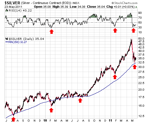
Like myself, Richard Russell had been vocally skeptical about the parabolic surge in silver prices. But he isn’t a believer in the silver theory. Russell says the recent correction is healthy and he feels as though the recent consolidation is setting the stage for the next leg up. In his latest Dow Theory Letter the investment legend explained why he’s bullish again about silver:
“Silver — According the Constitution of the United States, only gold AND silver are money. Silver is a lot cheaper than gold, and for a while the “crowd” rushed in to buy silver as a ” safe haven substitute” for gold. Silver turned into a speculative bubble, and when the bubble broke, silver suffered a crushing drop from a price of 49.75 to 32.
I wrote that silver’s upward post-crash correction might surprise most silver-haters and silver shorts. As I write silver has rallied to above 37. The bull market in gold is still very much intact, and I believe gold will take silver UP with it.
Remember I said that during recessions, silver is treated as an industrial metal, but during periods of inflation silver is treated as a monetary metal. With inflation built into America’s future, I see silver following gold to higher levels. And I see the public once more rushing in to buy silver as a safe-haven currency against a shaky dollar.
Below I include a daily chart of silver, going back two years. Like gold, silver seems to respect a 150-day moving average, which I have drawn on the chart (blue line). Also, note that silver is still severely oversold, as per RSI.”
“Confession — I had sold much of my silver prior to the big break (I didn’t like the parabolic action of silver and the accompanying public excitement), but I have changed my mind about silver. Now that silver is trading above 37 again, I like it and suggest positions in SLV and CEF.”

See the original article >>

Sugar Commodity Price Bounce Getting Underway


2011 has so far favoured the bears in Sugar, following the test of a long term Fibonacci level which provided strong resistance. Certain supports have been reached, or neared, which suggest a recovery phase is in the offing.


See the original article >>

Euro, Dollar Indices and Gold Market A Short-Term Must Watch!


We have often discussed how the movement of index level values for both the euro and the dollar mirror each other in a fairly precise manner most of the time. This is mainly due to the euro being the largest component of the USD Index. The currency markets have a great deal of influence on stocks and precious metals alike, so what happens in these markets must be a regular part of any meaningful analysis of trends across the precious metals sector.

A pause is seen in the recent moves of Euro and USD Indices. An expected upside for Euro index and downside for Dollar index would be the litmus for gold moves in the short-term. What could be the implications of currency indices in short-term gold market? Before analyzing the scenario, let’s begin with the recent happenings that influenced gold market sentiment. 

The unanimous agreement by the European Parliament’s Committee on Economic and Monetary Affairs (ECON) to allow central counterparties to accept gold as collateral has been a great step while considering the gold market news. This is yet another act of recognition of gold’s growing relevance as a high quality liquid asset. Market demand for gold to be used as a high quality liquid asset and as collateral has been building for some time. In late 2010, ICE Clear Europe, a leading European derivatives clearing house, became the first clearing house in Europe to accept gold as collateral. In February 2011, JP Morgan became the first bank to accept gold bullion as collateral via its tri-party collateral management arm. Exchanges across the world, such as Chicago Mercantile Exchange, are now accepting gold as collateral for certain trades and London-based clearing house LCH Clearnet has said that it also plans to start accepting gold as collateral later this year.

We suppose that Europeans have noticed that Greece has 111.5 tons of gold, Portugal has 382.5 tons, Spain has 281.6 tons and Italy is top dog with 2,451.8 tons. That’s a lot of collateral.

The euro zone problems keep impacting the price of gold positively. It seems that if Greece thought all its troubles were over with the coming of the Apocalypse, it seems that for now it will have to deal with its problems after all. Greece doesn’t have any good options. Financial markets are jittery at the prospect of a Greek default since European banks are highly leveraged. They are not in a strong position to withstand losses on their large portfolios of European government securities if, as seems likely, Greek problems cause a fall in the market price of Spanish, Italian, Belgian, or other euro zone sovereign debt. The PIIGS were able to borrow so much relative to the size of their economies because creditors believed their debt was safe. A restructuring of Greek debt will cause big losses to French, German and other banks, not to mention the havoc caused to the entire euro zone and, in turn, to the global economy.

To see if we should be in rapture over the prices of precious metals, let’s turn technical part with the analysis of the Euro Index (charts courtesy by http://stockcharts.com.)


In the long-term Euro Index chart, we see a number of profound implications which will impact precious metals move in the short-term. The index levels moved below late 2010 highs if you decide on measuring highs in terms of intra-day highs or even daily closing prices. The strongest support, though, is provided by weekly closing prices, taking this approach provides us with a bullish view on the situation as the euro did not break its previous high. The support line (thick line) is more important in the case of bigger moves than are the lines based on intra-day highs and lows (thin, dashed line).

In our previous essay (Gold, Euro and True Seasonals for Mining Stock) we wrote the following about the key support line:

We’ve based this support line on weekly closing prices (the most important implications are based on these prices) - 159.35 / July 7th and 149.62 / Nov 23rd.

Although the above chart doesn’t allow for much precision because of its long-term nature, taking a closer look at the key support level that is currently in play provides us with a strong support right at the 140 level. This is where euro bottomed on Monday and reversed on Tuesday. This is a bullish development.

So with the euro apparently bouncing off the support line, let’s continue with analysis of the USD Index to see if the same can be seen (as expected) with respect to a resistance line.


In the long-term USD Index chart, the upper border of the declining trend channel based on – again - weekly closing prices has been reached. This is the heavy dark line in our chart and is providing resistance at this time. This is, of course, not surprising in view of what we saw in our prior chart of the Euro Index.

What this means is that the dollar is likely to move lower once again. This is good news for precious metals as gold, silver, and gold and silver mining stocks are all likely to move higher in the event of a downturn in the dollar.


In the short-term USD Index chart, if daily closing prices are used, then the breakout has not been confirmed at this point. However, if we choose to base last year’s November low on intra-day lows, the breakout appears to be in. Due to this confusion, we feel it best to state that it does not appear that the breakout has been confirmed. This is especially true when taking the long-term chart into consideration.

The next cyclical turning point for the USD Index is expected in early June. This means that the current trend could very well reverse in a week or so, but it could mean that a decline will be seen in the following days and a rally will materialize soon after that. 

Naturally, that would imply that the coming decline in the dollar would be short-lived – so the question is if it could be really meaningful and worth taking into account at all. We believe that the answer is yes – please note that half of the dollar’s May rally materialized in just two trading days. It is important to keep in mind that the same could happen to the downside in a similar rapid move.

Summing up, the short-term situation remains bearish for the USD Index and bullish for the Euro Index, which makes the short-term picture for the precious metals bullish as well.

See the original article >>

The Stock Market Coming 6-year Cycle Peak


The year 2011 to date has seen its share of ups and downs in the financial market, yet nothing like the volatility of 2010 has made its appearance. With an important long-term yearly cycle scheduled to peak in just a few months, this would be a good time to look ahead as we try to discern what the balance of the year will bring.

The longest yearly cycle in the Kress series of cycles is 120 years. By itself, it’s not a cycle but rather the composite of the six component cycles, all of which are scheduled to bottom simultaneously in late 2014 to form the bottom of the composite 120-year period. Mr. Kress refers to the 120-year as the Grand Super Cycle and also the Mega Cycle.

In the latest edition of his SineScope advisory (15 Phoenix Ave., Morristown, NJ 07960), Kress writes, “Of the six component cycles, the interaction between any two of the three most significant cycles – the 30-year mini super cycle; the 12-year primary direction cycle; the 6-year secondary direction cycle – portrays the long term position of the market. Similar to a year which has four quarters/seasons – spring, summer, fall winter – the 120-year includes four 30-year cycles, each effectively representing four economic seasons. The fourth and final 30-year began in late 1984. Midway through the 30-year, 15 years, began the severity of economic winter. This occurred in late September/early October, 1999 (+ or – 1-2 quarters).” Kress pointed out that the S&P 500 index achieved its historic high around 1,535 during that time, which Kress refers to as the “terminal high” for the Grand Super Cycle bull market.

Kress goes on to explain the importance of the 12-year primary directional cycle and its relationship to the 30-year cycle. He writes, “When adding 12 years at the time of the peak of the previous three 30-year cycles, the market’s level in the twelfth year was higher than at the price of the peak of the 30-year cycle.” He points out that by adding 12 years to the September/October 1999 peak of the previous 30-year cycle brings us to this year’s September/October time frame. He also observes that the market’s early May high of 1,365 in the S&P is over 10% below the 30-year cycle peak back in late 1999/early 2000.

What Kress is suggesting here is that if you look at the prior 30-year cycle peaks from 1909 through 1999 and then add 12 years to those peaks, each peak was higher than the previous one, beginning in 1921 and continuing until 1981. The most recent 30-year cycle peak in late 1999, however, was the only time in the last 120 years that there was a *lower* peak. He illustrates this phenomenon in the following graph.

In view of the above chart, Kress offers this opinion: “Clearly, the market is telling us that the underlying economics since the turn of the century are waning.”

Although the long-term economic trend is contracting, we’re currently passing through a small window within the yearly Kress cycles which began at the end of 2008 when the 6-year cycle bottomed. The bottom of this important cycle lifted a sufficient amount of downward pressure from the financial market to allow for a temporary reprieve in the de-leveraging process which began in 2007 with the credit crisis. The nominal force behind the credit crisis was the metastasis of toxic debt but the impetus behind it was the long-term yearly cycles which compose the Grand Super Cycle of 120 years and is scheduled to bottom in late 2014. The final “hard down” phase of the 60-year component cycle, for instance, began in 2007-08.

With the bottom of the 6-year cycle in late 2008 and the corresponding “good years” of 2009-2011, individuals and institutions have had an excellent opportunity to get their balance sheets in order and expunge debt from their lives as much as possible. The 6-year cycle is scheduled to peak in October this year but as Mr. Kress has emphasized, it’s a possibility that the weight of the long-term 30-year, 40-year and 60-year cycles could end up foreshortening the peaking process before October. It’s important therefore to be prepared for the eventual end of the Fed’s loose money policy and the closing of the 6-year cycle window, the effects of which should be felt within a few months.

To be sure, the months ahead are not without challenges. And while the market could well be in the midst of an extended longer-term topping process, 2011 won’t likely witness a return of a vicious bear market. As Ken Fisher recently has pointed out in a recent Forbes column, “…when two up years have followed a big bear-market bottom we’ve never had a disaster third year – ever. So don’t bet on it.” He went on to observe, “Third years of U.S. bull markets historically have been up a little or down a little, averaging 3.7%, rarely up by double digits…” His conclusion harmonizes with my forecast for 2011 which we talked about in January, namely that the S&P will likely see either a low single-digit gain or a low single-digit loss by year’s end (i.e. a trading range), but not a bear market.

While the third year of a recovery doesn’t normally witness a crash, it can be a topside transition year for stocks and commodities. With the upside momentum generated by the Fed Quantitative Easing 2 (QE2) program, a topping process encompassing several months would seem to be the most likely outcome. This would also jibe with the Kress Cycle outlook.

It would be unusual indeed for a recovery as strong as the one we’ve experienced since March 2009 to end without a substantial pickup in interest for new shares. The greed for initial public stock offerings has characterized most previous bull markets and a sizable take-off in the IPO market would fit the bill for a topping market. The market for IPOs has just starting to take off after being dormant the last few years – witness the recent euphoria for the recent LinkedIn stock offering. A red-hot market for IPO shares is typical of a topside transition year.

Since the peak of the 30-year mini Super Cycle in late 1999 you may have noticed that bear markets, recessions and the subsequent recoveries that follow have been much quicker and more pronounced than at any time in the past 100 years. Along these lines, in a recent interview, James Grant of Grant’s Interest Rate Observer, made a thought provoking statement. He said, “My big thought is that our crises are becoming ever closer in time. The recovery time from the Great Depression was 25 years. The stock market peaked in 1929. It got back there in 1954. We had a peak in 2000, crash, levitation, then the biggest debt crisis in anybody's memory. The cycles are becoming compressed. The temptation to become invested at peaks of these shorter cycles is ever greater.”

The reason for this can be ascribed to the conflicting force of central bank monetary intervention and the long-term downward force of the long-term Kress cycles. This tug-of-war has been fierce, and while it may appear that the Fed is winning, the natural downward force of the cycles should ultimately prevail by the time of the 120-year cycle bottom arrives in 2014. Deflation, not inflation, will be the watchword once the 6-year cycle has peaked and the residual effects of the Fed’s loose money policy has abated.

While we’re on the subject of the Kress cycles, there are some intriguing observations that can be made regarding natural phenomenon. In light of recent weather events I couldn’t help asking myself, “Does the influence of the long-term Kress cycles extend beyond the stock market?” I’ve often wondered if is there is indeed a correlation between the peaking and bottoming phases of the long-term cycles and weather-related events and natural disasters. A brief survey of recent history is certainly enough to give one pause for thought.

Consider that the 6-year cycle is currently in its peaking stage and that the last time this cycle peaked was in 2005, with previous peaks in 1999 and 1993. The year 2005, the year of the previous 6-year cycle peak, was characterized by the most severe hurricane season the U.S. had seen in decades. Hurricane Katrina made its devastating presence known about a month before the 6-year cycle peaked in ’05. It resulted in the flooding of New Orleans and several cities along the Gulf Coast.

The 6-year cycle peak of 1993 was marked by the “Great Flood of 1993” in which the Mississippi and Missouri Rivers flooded from April to October (at which time the cycle actually peaked). The flood was among the most costly and devastating to ever occur in the United States, with $15 billion in damages and by some measures was the worst U.S. flood since the Great Mississippi Flood of 1927 (which incidentally was also a 6-year cycle peak year).

This year as the current 6-year cycle peaks into October we’re witnessing yet another major flood. The current Mississippi River flood which began last month is already being called the worst flood in 80 years and is still ongoing. Assuming the correlation between the 6-year cycle peak and weather-related disasters isn’t merely coincidental, the worst may still be to come in terms of weather disasters (between now and September/October) based on historical analogs.

Gold ETF

Although the dollar has been strong recently and commodities (most notably oil) have been generally weak, gold has shown relative strength lately in spite of the strong dollar. Our proxy for the gold price – the SPDR Gold Trust ETF (GLD) – closed decisively above its 15-day moving average on Friday, May 20. This marked the first time since the top of the previous rally was seen last month that GLD has been decisively above this immediate-term trend line.

After holding up well and showing relative strength during the recent commodities correction, GLD recently confirmed an immediate-term bottom and is gearing up for a test of the previous high from late April. Using the previous 6-year cycle analog from 2005, GLD should be able to achieve at least a token new high in June before its next short-term peak.

See the original article >>

When To Sell Your Gold

By: Jan_Kaska

Late last year, we were trying to short gold on the movement in world real rates. We had a beautiful chart, great correlation and a trade that should have performed magnificently (Chart 1). Yet, it did not. True, gold fell from 1400 to 1300, but nowhere near 1150 as we expected. As you can see on Chart 2, the correlations did not really break up, but the gold got boosted by some special alpha. 

Chart 1


Chart 2 


We do not like being treated by markets like that and had get into some more research what is driving gold price. We do know that marginal cost of production is around 600 USD/oz and there is very limited demand for industrial production, thus in fact, there must be about 900 USD put on the Fed and other central banks. 

In order to keep things simple, we will not pay attention just to Fed, as it is still the main reserve central bank and besides, ECB is more hawkish, thus any strength in gold should be stemming primarily from Fed. The Asian central banks are also behind the curve, but have been hiking lately and are also partially dependent on Fed.

So what are the variables we are looking at that may drive gold? First, we naturally looked at real short term rates. If people are not compensated in the bank in real terms, they will start searching for other stores of value. Naturally, we could have tested different segments of yield curve or their combinations, not just real 3M T-Bill yields, but as we work with old-school excel to test our hypothesis, there is simply not enough will to do all the permutations by hand. We think 3M real yields as sufficient proxy to measure strength of debasement. We also work with historical CPI as we not buy into rational expectations theory. 

On Chart 3, we regressed monthly CAGR of gold prices over 12 months against 12M average real rate. Our recent experience tells us, that people were buying into gold as they knew Fed would remain on hold for long time (their QE2 program told in October that they will basically stay on hold for next 8 months and people like David Tepper would famously go "balls to the wall", flying on the money printing wave. Thus we also tested, if we can make our regression any better based on some kind of expectation proxy - here we used a small trick and pushed forward the real rates by couple of months, with 7 months lead giving us the best fit.

When we look at residuals and do the same correlation testing, we find strongest links between 12M absolute CPI change (probably due to the fact that everyone likes to look at annual changes), which means basically taking into account whether inflation is accelerating or decelerating and also , we find some minor, yet explanatory, relationship with broad trade-weighted USD. The reason why it is minor, is due to the fact that real rates and CPI moves drive currencies as well. What the model does not account for is any speculative positioning in the commodity exchanges, Asian factors, etc. We will try to upgrade the model by taking account these two into account, but for now, we need to get satisfied with overall R2=46%. The final regression equation for monthly CAGR of gold price over one year is : 

Monthly CAGR of gold price over 1 year = 1.12% - 0.261% * (3M T-Bill - Headline CPI y/y)12M average of 7 months forward and 4 months historical + 0.299% * ( CPIT - CPIT-1) - 0.678 * 12M CAGR in Trade weighted US Dollar


Before we start judging our model, we will have a look how gold did over certain major time periods. From 1973 to 1979 Keynesianism was in full swing and central banks helped to accommodate fiscal policy. 1980 was the period when Volcker came into office, yet gold and inflation mania was so entrenched, that despite hiking rates like crazy, not much really happened to price. 

1981-1991 and 1991-2001 were periods when real rates were kept positive and gold corrected. Since 2000, Greenspan put and later Bernanke put were put into effect and you can see what the price did by yourself. 

Now let us give you a hint how gold price has been evolving over time with respect to the model. 


Chart 8 and 9 shows very good fit of the model, gold is doing exactly what it should as real rates were positive. On chart 10, we see some flattening of the 10 year linear regression and upward shift. That shows some tentative signs that markets are losing patience with US central bank. 


Conclusion: We believe there will be continuous CPI increases in US stemming primarily from commodities and import price pressures from China. Let us assume for a while that we will get CPI stabilized at 2%, we will have stable USD and Fed will remain at zero yields for next year and half. With real rates at negative 2%, the equation is quite simple. Monthly price appreciation of gold should reach : 1.1% - 0.26% * (-2) = 1.1% + 0.52% = 1.62% p.m. = 21% p.a. over next year. Another scenario is to apply current yield curve which points to slow rate hikes early next year and reaching real rates equal to zero by early 2013. With broad USD dropping at the pace of just 2% due to rise of Asian currencies and CPI stable, we come down to our 1 year return on gold of 10-14% p.a.

It may look truly crazy to expect 10-21% p.a. appreciation in gold with just 2% CPI, but as gold has no physical impact on economy like oil, it can move quite freely. Also we think gold has little memory (little return-to-the-mean tendency and its returns are driven dominantly by real rates, CPI and USD) . If oil went up by 50% y/y today, it would crush world economy. On the other hand, if gold trades like a currency, it won't affect competitiveness of any nation. Gold is just a subject to demand with the supply being pretty stable. 

Should we get continuous negative -2% real rates while economy grows at 2% p.a. in real terms, then more and more people will ask themselves why should I be a subject of continuous devaluation? There is a clear robbing of the saver going on. In case real rates start going up, we will get much more cautious on gold. But as of now, we would remain cautious buyers.

See the original article >>

Stock Market Bottoming Soon


Another choppy week in the US stock market that led to the fourth consecutive, albeit small, weekly loss. On the economic front positive reports outpaced negatives 8:5. On the negative side: durable goods orders, pending homes sales, the M1-multiplier, and the WLEI declined; while weekly Jobless claims rose. On the positive side: we had increases in new homes sales, the FHFA housing index, PCE prices, the monetary base and consumer sentiment. Remaining positive were Q1 GDP and personal income/spending.

For the week the SPX/DOW were -0.40%, and the NDX/NAZ were -0.45%. Asian markets lost 1.6% and European markets lost 0.6%. The DJ World index, however, gained 0.2% and the Commodity equity group gained 2.0%. Bonds were +0.8%, Crude gained 1.2%, Gold gained 1.6%, and the USD lost 1.0%. Next week: Chicago PMI, ISM , the Payrolls report and Case-Shiller.

LONG TERM: bull market

When we review the monthly and weekly charts we see very few signs of a potential market top. We have, however, posted a very low probability SPX bull market top count on the NDX daily chart. Other than this potential count we see very few market internals supporting this view. Our weekly chart continues to look like a bull market is unfolding.


Notice during bull markets, 2002-2007 and 2009-now, the MACD remains above the neutral line and the RSI spends most of the time in overbought condition. Then during a bear market both of these indicators reverse. Also observe how the last bull market started off quite simple and then extended into a complex Major wave 5. We may be experiencing the early signs of a wave extension in our current market.

We have been expecting this bull market to unfold in five Primary waves. Primary I consisted of five Major waves, and Primary II was a somewhat complex correction. Primary wave III started off simple enough with Major waves 1 and 2. Now it appears we may be experiencing a subdivision for Major wave 3, or a continuation of Major wave 2 in the form of an irregular correction. Either way, it’s still a bull market.

MEDIUM TERM: downtrend likely underway

The uptrend started off simple enough from the SPX 1249 March low. A rally to SPX 1339, a pullback to 1295, then another rally to 1371. The monday SPX 1371 was hit was the first trading day after the news of Osama bin Laden’s death. That week the risk trade appeared to wind down as both Silver and Crude tumbled. The stock market also started to weaken with a drop to SPX 1329. For the rest of the month the SPX has been drifting lower in choppy action. The decline thus far has been 4.3% (SPX 1371 to 1312).

The internal count for the March-May uptrend offers three possibilities. We have been using the above count since the uptrend began in March. If the market can avoid a downtrend confirmation next week it is still the working count.

The second and higher probability count is a five wave structure, with a small second wave and much larger fourth wave, completing Intermediate wave one. This SPX count is displayed on the DOW hourly/daily charts.

The third count suggests that the entire uptrend was a B wave of Major wave 2. And the C wave decline to end Major wave 2 is currently underway. This SPX alternate count is posted on the NAZ daily chart. Currently we prefer the five wave structure count, alternate #1.

SHORT TERM

Support for the SPX remains at 1313 and then 1303, with resistance at 1363 and then 1372. Short term momentum hit overbought during friday’s rally and ended around neutral. There is a high probability the SPX has been in a downtrend since the 1371 high. When the downtrend is confirmed we will switch the SPX internal count to alternate #1 posted on the DOW hourly/daily charts. The decline from the high appears to be unfolding in a double three.

The first decline was an ABC zigzag from SPX 1371 to 1319. Then we had a counter trend rally to SPX 1347. That was followed by a decline to SPX 1312 and a rally to 1335. We are counting this last activity as an A and B of the second ABC decline. We also note the first decline was 52 points (1371 to 1319). Should the second decline equal the first, and the SPX should bottom around 1295 = 1347 – 52.

After the first trading day of the month, the market has spent the rest of May trading between the 1313 and 1363 pivots. Naturally, a breakout to the upside would indicate the bull market is resuming, a breakdown the correction continues. Our short term count suggests there will be a retest of the 1313 pivot, plus the 1303 and 1291 pivots as well. Should the OEW 1291 pivot fail, then the SPX alternate #2 count would come into play. Best to your trading!

FOREIGN MARKETS

Asian markets were all lower on the week for net loss of 1.6%. China’s SSEC dropped 5.2% and all five indices are in confirmed downtrends.

European markets were mostly lower for a net loss of 0.6%. Three of the five indices we track are in downtrends.

The Commodity equity group were all higher on the week gaining 2.0%. All three are still in downtrends, but improving.

The downtrending DJ World index gained 0.2% on the week.

COMMODITIES

Bond prices continue to uptrend, +0.8% for the week, and rates downtrend. The 1YR is yielding 0.18%, suggesting no chance of a FED rate increase in the foreseeable future.

Crude is downtrending but gained 1.2% on the week. This looks like a B wave rally with $105, more or less, the upper limit. Support is between $85 and $93.

Gold, (+1.6%), is likely to confirm a downtrend soon, joining Silver and Platinum. It held support quite well during the selloff in commodities. Yet, it has been unable to generate the upside momentum needed to resume the uptrend.

The uptrending USD lost 1.0% on the week. We have resistance between 77 and 79 DXY.

Euro Debt Crisis, Greece, Portugal, Spain Debts Are Unpayable


We hope all of our appearances on Greek TV, radio and in the press have helped the educational process and to allow the Greeks to identify who the real culprits are, and what to do about it. It has just been over a year since this tragedy became reality, but we reported on Greece and Italy ten years ago. They both bent the rules to enter the euro zone. We knew then that Goldman Sachs and JPMorgan Chase were assisting them by creating credit default swaps. There were a few European journalist who reported on the issue, but the elitists control the media and few noticed that Greece and Italy were beyond bogus. 

The events of the past year remind us of the onslaught of the credit crisis, which unfortunately is still with us. What finally brought about trouble for Greece and other euro zone countries was the zero interest rate policy of the Fed and slightly higher rates by the EC. These policies encouraged speculation and caused problems that would have never happened otherwise. In addition, the stimulus measures by both banks were embarked upon to save the financial sectors and in that process promote speculation by the people who caused thee problems in the first place. That began with QE1 and stimulus 1, which we now recognize as our inflation drivers. Wait until QE2 and stimulus 2 appear next year. It will be very shocking.

Just to show you what a loser lower rates are just look at economic progress. There has been no recovery under either QE1 or QE2. Even 4.60% 30-year fixed rate mortgages have not encouraged people to buy homes. They are either broke or they don’t know whether they will be employed five-months or even one year from now, so how can they buy a house? Consumer spending is falling along with wages. The small gains you see are for the most part the result of higher inflation.

Growth moved from the fourth quarter of 2010 of 3.1% to 1.8% in the first quarter of 2011. We had forecast 2% to 2-1/2% growth for 2011. That is little to show for a minimum of $1.8 trillion spent in QE2 and stimulus 2. Without that we probably would have been at a minus 2%. Just think about that. Trillions of dollars spent with little results. Obviously such programs do not work very well. You would have thought the Fed would have found a better way after two such failures. They know what the solution is, but they won‘t put it into motion and that is to purge the system and face deflationary depression. That will happen whether they like it or not, but in the meantime the flipside is 10% inflation headed to 14% by yearend and another greater wave next year, and another in 2013. Unimpressive results is not the word for it. It has been a disaster and the Fed keeps right on doing it. As a result of the discounting of QE3 we wonder what the stock market has in store for us? We would think that a correction would be in the future. If that is so could that negatively affect the economy? Of course it could. All the good news coming, further stimulus by the Fed, will have been discounted. What does the Fed do for an encore? Create more money and credit – probably? Does that mean hyperinflation, of course it does. If the Fed stops the game is over. We are also seeing fewer results from additional stimulus. It is called the law of diminishing returns. In the meantime the dollar goes ever lower versus other currencies, but more importantly versus gold and silver.

If you can believe it, even though the Fed has provided financial flows and assisting speculative flows so Wall Street, banking and hedge funds can glean mega-profits, it still has not provided enough liquidity for additional GDP growth. The small and medium sized businesses have been shut out. The latter participants do not play those games, it is the propriety trading desks, hedge funds and the remainder of the leveraged speculating community that takes advantage of the excess liquidity and the Bernanke put of keeping bonds and stocks up artificially. The Fed and the others are sustaining this process. There are negatives for the Fed and their friends, higher commodity and gold and silver prices. The Fed and banks temporarily took care of that and haven’t quite finished their latest short-term foray in that sector. There are still fears as well regarding Greek debt fears and their CDS, Credit Default Swaps, and those of other euro zone members. They could still blow up in everyone’s faces in a partial if not total default, which is very likely. Banks are on the wrong side of this trade as well as the bond trade, not only with Greece, but with five other nations as well.

In the final analysis papering over the problem never works. The problems also reemerge with new additional problems. The combination of excessive speculation and liquidity and too big to fail is going to end badly, as it always has. De-leveraging will eventually rear its ugly head.

As we said, Greece and others could cause extensive bond and CDS problems and that is not only being reflected in a lower euro, but in higher Greek bond yields of 16-3/8% in their 10-year notes and 24-3/4% in two-year yields, and Portugal, Ireland and Spain are not far behind. The socialists just lost the latest election in Spain in a big way showing the public is fed up with the lies of government and the bankers. The euro is attempting to break $1.40 to the downside as a result of those election results and the Greek impasse. It is obvious that Greece cannot service its debt and reduce its deficit and the other deficient nations are in the same boat. The CDS marketplace would be severely disrupted if there were a sovereign debt default. That fear, of contagion, could be seen in higher rates in Spain, some .30%, the highest upward move this year. Greece, Ireland and Portugal have problems that can never be resolved and Spain, Italy and Belgium are not far behind.

Spain is implementing austerity, but that means like in recent weeks millions have demonstrated in 72 Spanish cities. The 17 autonomous regions have doubled their debt in the last 2-1/2 years. The socialists just did not know when to stop, now they are out of office. Spain is going down. There is no way they can sustain. That should bring the CDS situation front and center. It will also increase unemployment for those 18 to 35 to 40% or more. It is not surprising that half of the protestors were in that age group.

Greek PM George Papandreou, who secretly promised Europe’s elitists bankers that he would sell-off and or pledge Greek state assets, wants to sell stakes in Hellenic Telecommunications, Public Power Corp., Postbank, the ports of Piraeus and Thessaloniki and their local water company. All supposedly worth $70 billion. The bankers, of course, say they are worth far less. They want to buy them for 10% to 20% of what they are worth – so what else is new. The Cabinet went along with the giveaway, as expected, and without a whimper. The EU is demanding all the assets be sold off immediately, so the bankers can buy them as cheaply as possible. The threat by the bankers is if you do not sell and sell fast for a pittance, then we won’t fund loans of $42 billion over the next 2-1/2 to 3 years. If not funded it would be “re-profiled” another new euphemism for default and debt restructuring, or perhaps debt extension. 

Then there is the threat that the bankers, the ECB-European Central Bank for the Euro Zone, would refuse to supply the Greek banking system with any further liquidity. They would then admit their new word refilling would mean default. This would end with Greece leaving the euro zone and the euro and total default, the issuance of a new drachma at 50% of the value of the euro and perhaps even leaving the EU, the European Union. Jens Weidmann, the Bundesbank’s new president said no compromise on monetary stability and a correction back to normality and a full separation between monetary and fiscal policy. It is obvious to us that in spite of debt of $620 billion that Germany wants to cut Greece loose. The German voters said that in last month’s elections. The Germans should have accepted default for $0.50 on the dollar offered by the Greeks a year ago. Even if the Greeks sold $50 billion in assets it would be a drop in the bucket, when they cannot possibly pay off the remainder of the debt ever. This shows you how derelict the bankers and sovereign countries were in allowing this debt to be accumulated. In addition Goldman Sacks and JPMorgan Chase hid their problems, via credit default swaps and now these same banks and others want to loot the country.

Tuesday Jean-Claude Junker, chair of the euro zone finance ministers committee had to admit he lied about the secret meeting the bankers had concerning Greece. He is another who says Greece cannot pay its debt under its current debt burden. Both he, and Lorenzo Bini Smaghi, Member of the Executive Board of the European Central Bank, said that any partial or total default would put all of Europe and the euro in jeopardy. In fact, some of these apologists for banks, especially the Germans, have entertained having Germany control Greek budgets and collect taxes. That means you would have a financial SS running things not only in Greece, but also in Ireland and Portugal and eventually in Belgium, Spain and Italy.

It should be noted the ECB paid in capital $14 billion and they hold $183 billion in Greek debt. We would say the ECB is already insolvent. It could be the Ponzi scheme, much like that of the Fed’s will soon come to an end. Some believe that a 50% markdown is in store for Greek debt. That could have worked a year ago, but not low. It is 2/3’s or more of a write down. We can just imagine Greece, Portugal, Ireland, Belgium, Spain and Italy recapitalizing the ECB – forget it. This is why partial or full debt default are out of the question. Just to buy time the ECB will kick the can down the road as long as they can. Those six nations in trouble should all go back to their currencies, default by at least 2/3’s and leave the euro zone.

European bondholders with a 50% debt write off are offside $1.2 trillion for Greek, Portuguese and Irish debt. If we include Spain, Italy and Belgium the 50% write off is $846 billion. That should easily destroy the ECB and the euro zone. We predict that by October changes will have to be made not only in the EU and euro zone, but in the UK and US as well. The battle rages in the euro zone, EU, UK and in the US over overwhelming debt. The debts are all unpayable. This dance of debt could go on for 4 or 5 months. Even a temporary solution is not going to work. The debts are unpayable. Once the lending stops the bottom falls out. The same is true in the US.

See the original article >>
COMFORT IS RARELY REWARDED; MAVERICK RISK & FALSE BENCHMARKS

By JJ Abodeely

In Rob Arnott’s November 2010 piece, “The Glad Game” he asks investors to consider “Maverick Risk” as an important driver of investment outcomes:
There’s conventional volatility in returns, which introduces a risk of poor investment returns. There’s the asset/liability mismatch, which leads to a risk that we cannot cover our future obligations. And, there’s maverick risk, in which investors choose a different path than their peers, exposing them to criticism, especially when performance suffers. All three risks are hugely important. Yet, we typically focus our analytics on the first of these, simple volatility, and our behavior on the last of these, maverick risk.
The idea of “Maverick Risk” is an interesting one. We know that from a human behavioral standpoint, we are conditioned to think of being outside of the herd as “risky.” There is plenty of evolutionary logic behind this idea considering that humans have spent much of their existence as both predator and prey; there is safety in numbers. So as much as we modern humans know the value of “thinking outside the box” or “being contrarian” and as much as we value and revere those in society who are capable of going it alone or using creative or original thought– when it comes down to financial decisions, our lizard brains take over and we seek the safety of crowds. This is true for amateurs and professionals alike. This is well documented in the rapidly growing popular and academic literature on behavioral finance.

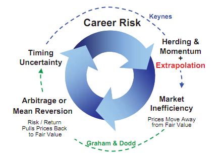
GMO takes the idea of “Career Risk” and relates it to idea that it can drive periods of over and undervaluation. As Ben Inker, the head of asset allocation at GMO was quoted as saying in a recent Advisor Perspectives article:
“The market tends to be priced in a way that if you want to try to outperform, you have to take a risk of looking like an idiot,” Inker said. To outperform, you have to deviate from your benchmark, and that increases the risk of underperformance and, in the extreme, looking like an idiot and getting fired. As a result, markets exhibit herd-like behavior, which in turn encourages momentum and other self-reinforcing behaviors, such as money flowing into whatever strategy has been doing well, Inker said. That merely ratchets up valuations within better-performing asset classes and sectors, he said, creating a self-fulfilling prophecy.
Of course this can not continue indefinitely. Eventually prices move far enough away from fair value and the risk/return trade off becomes so one-sided, that prices get pushed back towards fair value. Consider this chart from GMO.
The Way the Investment World Goes Around: They Were Managing Their Careers, Not Their Clients’ Risk

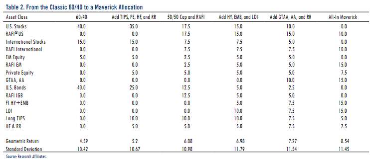
Rob Arnott suggests that by embracing Maverick Risk and deviating from the traditional 60/40 stock bond portfolio, one can add several percentage points a year to expected returns above and beyond the expected returns that are available from the valuation of traditional asset classes themselves. This is good to hear as broad equity and bond market indexes are priced to deliver very low single digit returns over the next 5-10 years, with a high likelihood of meaningful periods of negative returns. Consider my post, Expensive Markets Mean Low or Negative Prospective Returns.

The basic approaches that Arnott advocates for range from adding non-core asset classes such as emerging markets, high yield bonds, and “alternative” strategies to choosing fundamentally-weighted indexes (Research Affiliates Fundamental Index or RAFI is what they sell after all). Importantly, he advocates employing an active, dynamic, and contrarian approach to asset allocation, which presumably does not require investment in each of these asset classes or strategies at all times. It does however require that each of these asset classes and strategies are at a minimum, part of investors’ tool box, our universe of potential investments.
Research Affiliates’ Expected Returns for Various Allocations
GMO’s Inker agrees when it comes to power of truly active asset allocation to drive investment returns:
“The good news is that in the investment business there are very few people who do real asset allocation and actually move money around in an aggressive way,” Inker said. “It’s a tough thing to do and survive. The nice thing about it, and the reason why we do it, is because this means it’s an inefficiency that is not going to get arbitraged away anytime soon.”
GMO knows what they are taking about when the say that it’s a tough thing to do and survive. Their refusal to chase expensive markets in the late 1990′s meant they lost half their assets under management. HALF. 50% of their assets, 50% of their revenues, gone. They were willing to embrace Maverick or Career risk and looked like idiots for doing so. That must have been a somewhat painful experience, but perhaps they were comforted by John Maynard Keynes:
…it is the long term investor…who will in practice come in for most criticism, wherever investment funds are managed by committees or boards or banks. For it is the essence of his behaviour that he should be eccentric, unconventional and rash in the eyes of average opinion. If he is successful, that will only confirm the general belief in his rashness; and if in the short run he is unsuccessful, which is very likely, he will not receive much mercy. Worldly wisdom teaches that it is better for reputation to fail conventionally than to succeed unconventionally.
Of course, the bubble burst, GMO saved/made their clients lots of money while most others were comfortably failing (read: losing money) the conventional way, and the assets came back and then some. In his piece, Arnott is quick to point out that
taking these steps is not comfortable. Comfort is rarely rewarded. Investors can move down the path toward this maverick portfolio, careful not to exceed their board’s or their client’s “comfort” threshold. This approach goes against human nature and invites second-guessing whenever it inevitably doesn’t work. Keynes’ oft-cited “reputation” quotation, in its more complete form, bears careful consideration.
This point bears further consideration. GMO clearly did exceed their client’s comfort threshold. That’s why so many left.
If we spend too much time as professional investors calibrating ourselves to our client’s comfort threshold there is significant risk that we will make sacrifices to our process, our investment discipline, and ultimately to our fiduciary duty of acting in our clients’ best interests. It’s not just a little ironic that the line between doing what is right for our clients and doing (or not doing) things that might make them fire us is a blurry one indeed.

Client-Manager Alignment

How do we deal with this paradox? For starters, there needs to be a high level of trust between clients and investment managers. This trust should be based on the obvious considerations like ethics and integrity, but also the more difficult ideal of alignment and understanding of the investment objectives and the process by which we are trying to meet those objectives. This requires open communication among other things.

Seth Klarman is unequivocal when he says “having great clients is the key to investment success.” For those unfamiliar with Klarman, his Baupost Group hedge fund gained an average of 17 percent annually from 2000-2010, a period in which the S&P 500 Index fell 1 percent annually. And while Baupost faced some criticism during the 1990s when the fund had a hard time keeping up with the raging and speculative bull market, the fund has returned 19 percent a year since it was started in 1982 (Klarman was 25 years old), even as it held more than 40 percent of its assets in cash at times. In an interview, he goes on to describe Baupost’s ideal client as having two characteristics:
1.) If we feel we have had a good year, they agree, regardless of relative performance
2.) When we call, asking them to consider adding new capital, they a.) appreciate the call and b.) add new capital
The second characteristic is important for Baupost because they often invest in illiquid securities or non-traded assets such as real estate. When prices are down, they want to have extra liquidity from clients in order to purchase more assets. Such was the case in 2008-2009 when Baupost doubled their assets under management to $22 billion after being closed to new investors for many years.

The subtext of point #1 is that Klarman’s clients know that his number one priority is to generate positive absolute returns regardless of the market’s direction. To put it another way, Klarman’s self-identified “key to investment success” is having clients who want what he is offering: a strategy that seeks out attractive returns for the risk that he is incurring without the expectation that he will outperform in every market environment. Indeed, he is clear that the returns they will generate are a function of the opportunity set presented by the market’s valuation and is not afraid to return capital to investors (whether they want it or not) as he did at the end of 2010 if the market is not offering abundant opportunity.

At a recent Grant’s Interest Rate Observer Conference, Klarman professed to “being surprised at how little cash we have.” 28% of the Baupost portfolio was held in cash. While 28% sounds like a large amount of cash (mutual funds currently hold 3.4% of their assets in cash) to most relative return investors– the expensive valuations present in the stock and bond markets have pushed an absolute return-oriented investor like Klarman to buy hotel properties in places like Charlotte, N.C. at a 7-9% cap rate, while keeping 28% of dry powder for an eventual return to attractive valuations in the public markets.

Bringing it all home: What’s your benchmark?

We should all strive to place less emphasis on the conventions of the day and seek to arrive at a fundamental understanding what really drives investment returns so that we can make smart decisions about where we put our money. We can not accomplish this however, without knowing what our future liabilities or objectives are and addressing as Arnott puts it, “the asset/liability mismatch, which leads to a risk that we cannot cover our future obligations.” For most individuals, these “future obligations” come in the form of a desire for lifestyle maintenance in retirement, the ability to leave a legacy, or give back to the world. These obligations tend to be absolute in nature– that is requiring a certain level of assets– independent of how much your neighbor is making on his portfolio or how much “the market” returned last year.
As Tom Brakke of the Research Puzzle put it:
Decisions large and small are off kilter because the looming shadow of benchmark risk overwhelms almost everything else… maybe they should consider a low volatility strategy, even if some “underperformance” in a bull market comes with it, since such a shortfall versus a benchmark is not really a risk that matters relative to other considerations… Many of the benchmarks are, in fact, false ones. I dare say that the S&P 500 is not a natural liability for many individuals or organizations to fund. Nor is some broader market portfolio. These are made-up constructs and should not be the prime guide for decision making. But the business of investing is tied to them, to its detriment and that of its clients (emphasis mine).
The bull market of the 1980s and 1990s provided the fuel for the relative return performance derby embraced by so many people and organizations today. In a consistently rising market, when nearly all returns are positive, the collective focus shifts towards relative returns and places undue importance of “false benchmarks” such as meeting or exceeding the S&P 500. The last 10 years has demonstrated the importance of remaining vigilant and keeping our eye on the true “natural” benchmark of earning absolute returns without being exposed to catastrophic of permanent losses of capital.

See the original article >>

Follow Us