Saturday, April 30, 2011

Gold Rally With a Silver Lining


There were plenty of silver linings this week. Silver moved close to the 1980 and the key barrier of $50 and gold is moving to new highs at the moment of writing these words. Before jumping right into gold and silver charts, let’s take a few moments to examine the situation in the Euro Index, as it has been recently highly correlated with gold. We will start with the long-term chart (charts courtesy by http://stockcharts.com.)


In the long-term Euro Index chart this week, we see a breakout above the declining trend channel. The Euro rallied soon thereafter and the question now is “how far it will go?” Taking the chart and RSI level into account, it appears that a move past the 150 level is possible with likely target area close to 152 (2009 high). This would coincide with the upper border of the rising medium term trend channel and would be in tune with an RSI showing an overbought condition as well.

Here, in this very long-term chart, the RSI may send a sell signal but we must keep in mind that this chart is based upon weekly index levels, not daily. Therefore, the point to sell could materialize in a week or two once this RSI sell signal is given.


Looking at the short-term Euro Index chart, we see that both the Euro and gold, which are positively correlated, are approaching turning points. Although this is not precise, the indication is that risky territory is fast approaching. Caution is necessary, as both markets are likely to go higher in the following days, but not much longer.

Moving to the precious metals market, let’s take a look how gold fared – from the long-term perspective.


Unlike in many previous weeks, we have actually seen a new development this time. Note that a small move above the very long-term resistance line is seen, but with the index level just a little above this line, it is not yet cause for great excitement. Now what we would like to see is a continued uptrend, then a decline back to the support line on low volume and finally a continuation of the rally on significant volume.

Until a clear move is seen following the recent small move above the resistance line, it is not clear whether it is a breakout or a fake out so it must be monitored closely. In other words, this small breakout does not invalidate points made earlier.

Moving on to the silver market, we would like to provide you with a follow-up to our previous essay on silver price. In that essay we wrote that the top may be in, however based on the most recent bullish action in gold it seems that silver might indeed move somewhat higher. Please take a look below for details.


In the long term chart for silver this week, we can see just how precisely the target based on the Phi number 1.618 actually was. Although the $49.73 was not hit exactly, we saw the local top ($49.79) quite close to this level before the US markets opened on Monday.

On April 25th, 2011 we wrote the following:

If this top is going to be similar to the previous major tops that we've seen so far - and we view that as likely, then we will see significant volatility in the following days/weeks and probably a double top of some kind; please take a look at 2006 and 2008 tops in silver for more details. This means that there will probably be another chance to exit the market that would be accompanied by additional confirmations.

On April 28, 2011 we continued:

The volatility is clearly high and silver appears to be on its way to form above-mentioned "double top of some kind". Perhaps it would reach its record $50.35 intraday high. Yes, that is significantly higher from where silver is today, but please note that with this kind of volatility in the white metal, it will not be easy to exit one's position. 

The next target level for silver, if it does move above its previous high, could be the 1980 high of $50.35. This should indeed provide a very strong resistance to silver’s rally and without some new support, silver does not seem likely to make it here on its own. Perhaps with soaring stock market and gold moving to new highs, this could be seen but it does not appear at this time to be very likely. Indications are that the local top is close.

Still, given the current volatility (which is not likely to decrease soon) in the silver market, it seems that confirmations from other markets will be key to properly assessing whether the final top is in or not. We will leave this part of the analysis to our Subscribers.

Before summarizing, please take a look at one of our indicators that flashed a buy signal recently. 


Our indicator detecting short-term bottoms has flashed a buy signal on April 27th, 2011 which - given its previous performance - is something that should not be ignored. 

This indicator did a good job of signaling i.a. the March bottom and also the prior one seen in January –February to name only a few. We were likely at a short-term bottom in the precious metals sectors (right after Monday/Tuesday decline), but please note that this indicator has a short-term nature meaning that it was designed to detect short-term moves. Consequently, the only thing that should be inferred based on the buy signal is that the precious metals sector is likely to rally in the following days. Nothing more and nothing less – it does not tell us whether or not the rally will continue for more than just several days, nor does it tell us if gold stocks will move above their previous highs.

Summing up, combining the above information with other points made in this essay regarding gold, silver, and euro it seems that the whole precious metals sector is about to move at least a little higher (the risk/reward ratio being most favorable for gold), but the turnaround is just around the corner.

To make sure that you are notified once the new features are implemented, and get immediate access to my free thoughts on the market, including information not available publicly, we urge you to sign up for our free e-mail list. Gold & Silver Investors should definitely join us today and additionally get free, 7-day access to the Premium Sections on our website, including valuable tools and unique charts. It's free and you may unsubscribe at any time.

Macro Week in Review/Preview April 29, 2011


Last week’s review of the macro market indicators looked like higher prices for Gold and a bias higher for Crude Oil and US Treasuries. The US Dollar Index looked to continue its death march lower with the Shanghai Composite and Emerging markets moving to the upside. Continued subdued volatility would be supportive to more upside for the equity index ETF’s, SPY, IWM and QQQ, but being mindful that all three printed potentially bearish reversal candles on Thursday. Continued caution on the long side.

The week moved as anticipated from the charts with the exception of the Shanghai composite, which bounced lower off of resistance and the Emerging market that consolidated sideways. A very technical week. But what about the details and what does it mean for next week. Let’s look at the charts.

As always you can see details of individual charts and more on my StockTwits feed and on chartly.)

Gold Daily,$GC_F
gold2 stocks
 
Gold Weekly,$GC_F
gold3 stocks
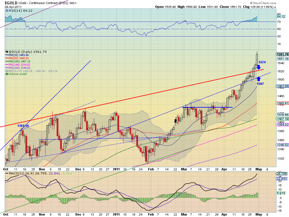
Gold returned to its beastly ways rocketing higher after holding support of the trendline extension (in blue on daily chart). The Simple Moving Averages (SMA) are accelerating higher along with the Moving Average Convergence Divergence (MACD) indicator. The Relative Strength Index (RSI) is also sloping higher but is starting to get a bit lofty at 84 on the daily chart and it closed outside of the Bollinger bands (BB), both suggesting some caution and a potential pullback or consolidation. If it does then there is support at 1524 and then 1507. The weekly chart shows the rise to resistance at the intermediate dashed trend line, with resistance higher at 1610. It also has rising SMA and MACD, and a RSI that is near the caution zone with it outside of the weekly BB. The weekly also suggest some caution, and it is understandable after a $150 move in 4 weeks. Look for Gold to continue its trend higher but with the expectation that it will slow down its rise and consolidate shortly.

West Texas Intermediate Crude Daily,$CL_F
oil1 stocks
 
West Texas Intermediate Crude Weekly,$CL_F
oil2 stocks
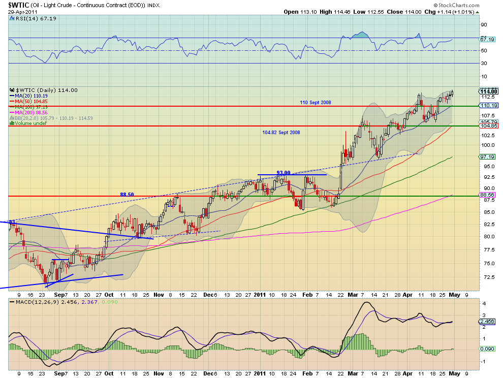
Crude Oil moved higher slowly through out the week with a series of small candles on the daily chart, culminating with a breakout higher Friday. The SMA’s are all sloping higher and the RSI is slowly rising on the daily timeframe, but the MACD has just turned positive. The weekly chart shows a push through 113.50 resistance to end the week and it can now look higher. The SMA’s are turning higher and the RSI is rising, but the MACD is stalling. Look for Crude Oil to continue its move higher into next week with the potential that it consolidates or has some small moves. 121.29 is the target after it can get through the 119 level which is a Measured Move (MM) higher on the daily chart. 

US Dollar Index Daily,$DX_F
usd1 stocks
 
US Dollar Index Weekly,$DX_F
usd2 stocks
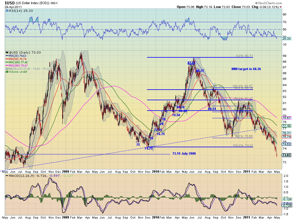
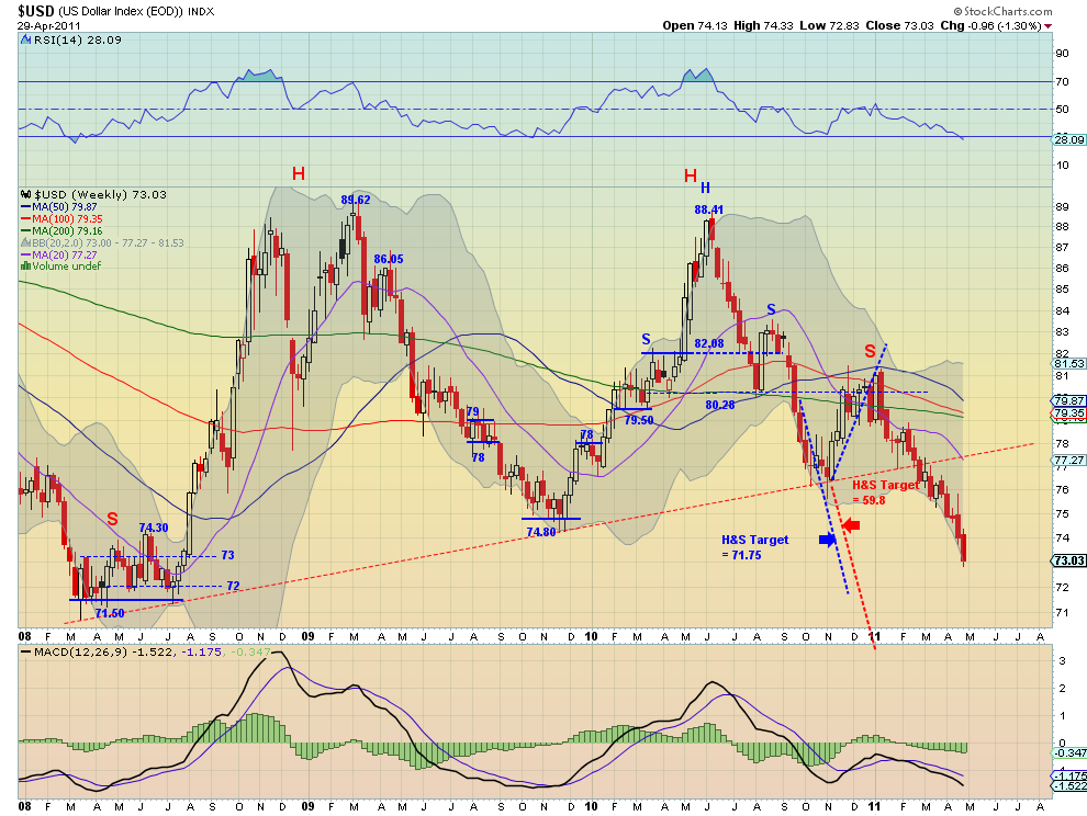
Down. That is all there is to say about the US Dollar Index. It was down for the week and it looks set up to continue lower next week. Everything is trending down on both timeframes: the SMA’s, RSI, and the MACD. The danger zone approaches as it heads to the 71.50 area which is an all time low. There is support at 73 and 72 along the way. Enough said.

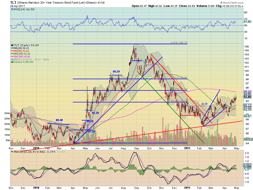
iShares Barclays 20+ Yr Treasury Bond Fund Daily,$TLT
tlt2 stocks
 
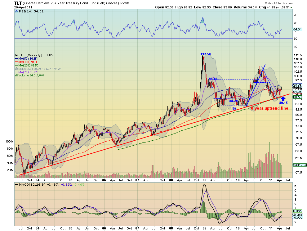
iShares Barclays 20+ Yr Treasury Bond Fund Weekly,$TLT
tlt3 stocks
US Treasuries, proxied by the TLT, continued the recent uptrend the past week within mixed technicals. On the daily timeframe the shorter 20 and 50 day SMA’s have turned higher but the longer 100 and 200 day SMA’s are still sloping downward. The RSI is vacillating in bullish territory and the MACD is flat but positive. The weekly chart is slightly bullish with an RSI and MACD that are rising and all but the shortest SMA sloping higher. The long term trend remains higher and look for Treasuries to continue in that direction next week with some resistance at the 95 area, which could the catalyst for a breakout higher or pullback. 

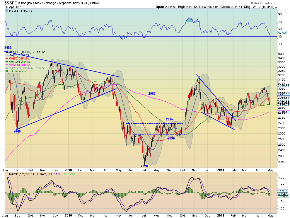
Shanghai Stock Exchange Composite Daily,$SSEC
ssec stocks
 
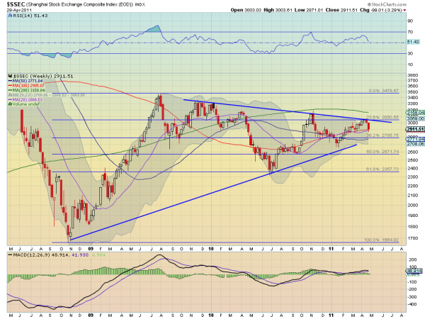
Shanghai Stock Exchange Composite Weekly,$SSEC
ssec2 e1304115188309 stocks
The Shanghai Composite continued its technical bounce off of the 23.6% Fibonacci retracement at 3050 of the move off of the lows from 2008. The RSI and MACD on the daily chart suggest move downside and the BB are expanding to allow for it. The SMA’s on the daily chart are also starting to turn on the short timescale. The weekly chart shows that it is on support of the 20 and 100 week SMA’s and at the mid line of the symmetrical triangle around 2900. The RSI is sloping lower and the MACD is about to cross down, suggesting a continued ride lower next week with 2810 and 2785 as potential support areas. 

iShares MSCI Emerging Markets Index Daily,$EEM
eem stocks
 
iShares MSCI Emerging Markets Index Weekly,$EEM
eem1 stocks
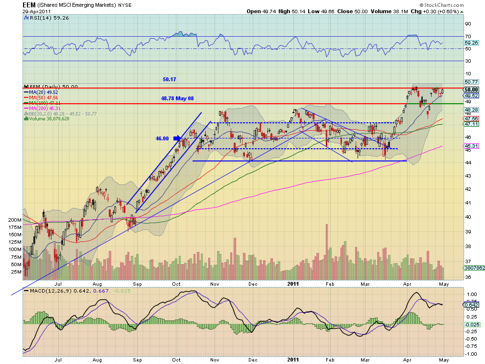
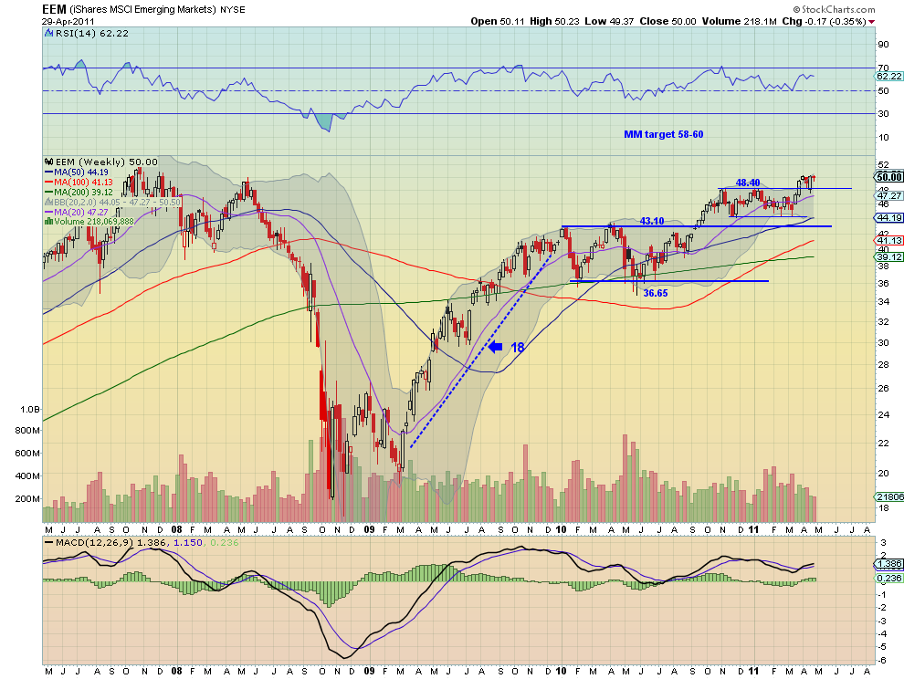
Emerging Markets, proxied by the EEM, stalled this week moving in a tight range between long term support/resistance at 50.17 and the 20 day SMA. The daily chart shows the indecision with the RSI moving sideways and the MACD flat near zero. The SMA’s are sloping upward, but barely other than the 20 day SMA. the weekly chart shows that indecision as a near doji print. It also has relatively flat SMA’s and RSI with a MACD that is positive but barely. Look for EEM to continue to test the resistance at 50.17 next week with perhaps the rising 20 day SMA giving it the kick to get over the top, with the 48.40 as support on any pullback. 

VIX Daily,$VIX
vix stocks
 
VIX Weekly,$VIX
vix1 stocks
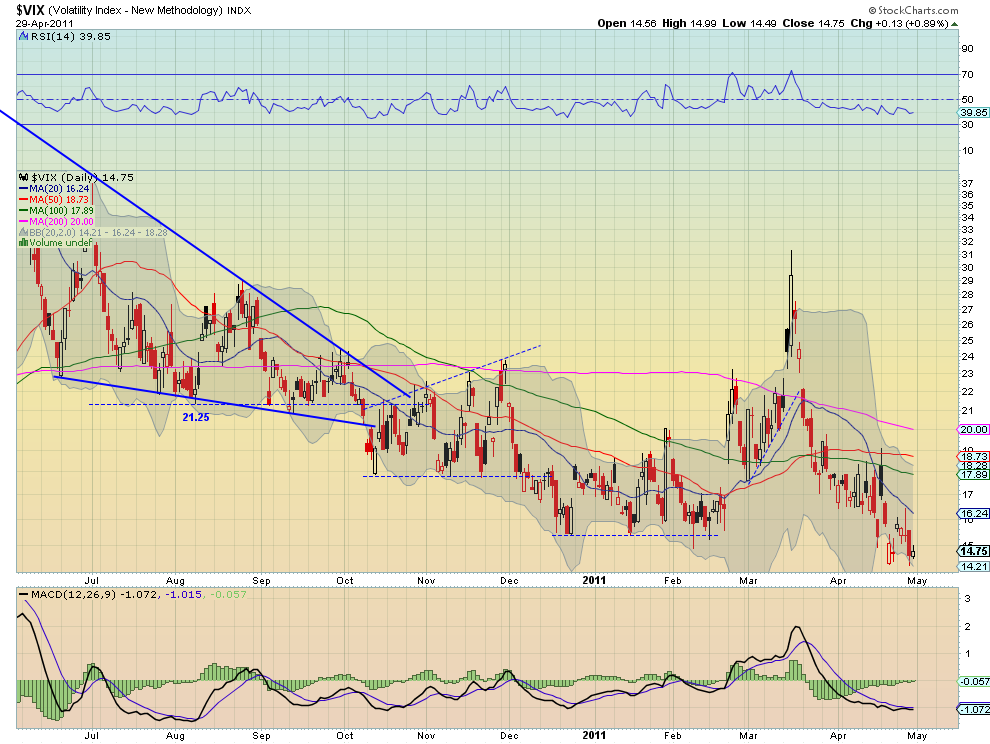
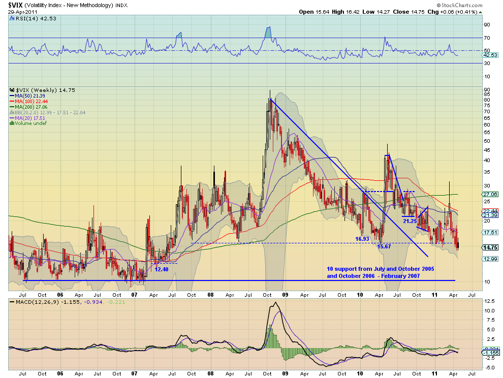
The Volatility Index continued its slow grin lower this week ending near last week’s nearly 4 year low. On the daily timeframe the SMA’s are flat to pointing down and the RSI is slowly sloping lower, but with a MACD diverging, and improving, suggesting the bottom may be near. The weekly chart shows that the the move lower could continue. The RSI is still moving lower ad the MACD has crossed down, while all the weekly SMA are sloping lower except for the 200 week SMA. Look for the VIX to remain relatively calm next week with upside resistance in the 16 – 18 range and the real possibility that it dips lower to the 12.40 are from mid 2007.

SPY Daily,$SPY
spy stocks
 
SPY Weekly,$SPY
spy1 stocks
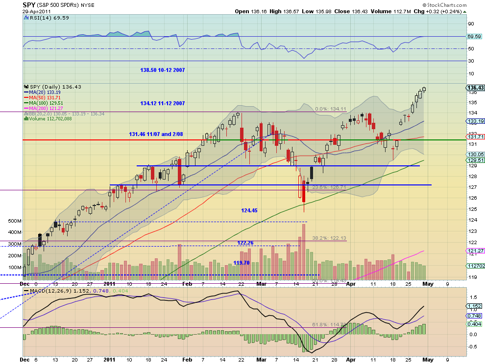
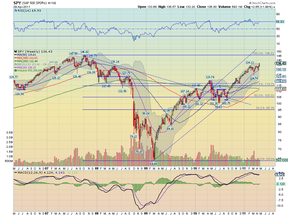
The SPY continued its trend higher and looks strong. The SMA are all sloping higher and the RSI and MACD are rising and increasing. As it rides higher the BB are expanding to allow for more upside. The next target on the daily chart is a MM to 139.11. The weekly chart looks very bullish as well with rising SMA’s and RSI and a MACD that is crossing positive. If the move higher had more volume associated with it bulls would have more comfort, but the trend is up. Look for this to continue next week with additional resistance at 141.73 and 146.02. Any pullback should now find support at the 134.11 area.

IWM Daily,$IWM
iwm stocks
 
IWM Weekly,$IWM
iwm1 stocks
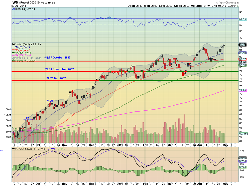
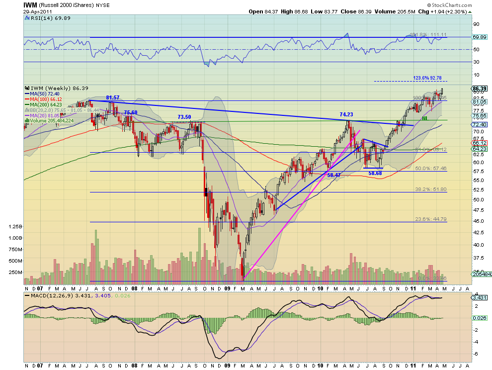
The IWM also continued its trend higher and looks strong. The SMA here are all sloping higher and the RSI and MACD are rising and increasing. As it rides higher the BB are expanding to allow for more upside as well. The next target on the daily chart is a MM to 89.84. The weekly chart looks very bullish as well with rising SMA’s and RSI pinned at the 70 level and a MACD that is crossing positive. If the move higher had more volume associated with it bulls would have more comfort, but the trend is up. Look for this to continue next week with additional resistance at 92.78. Any pullback should now find support at the 85-86 area.

QQQ Daily,$QQQ
q stocks
 
QQQ Weekly,$QQQ
q1 stocks
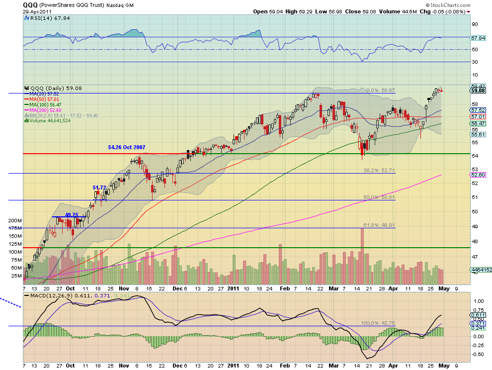
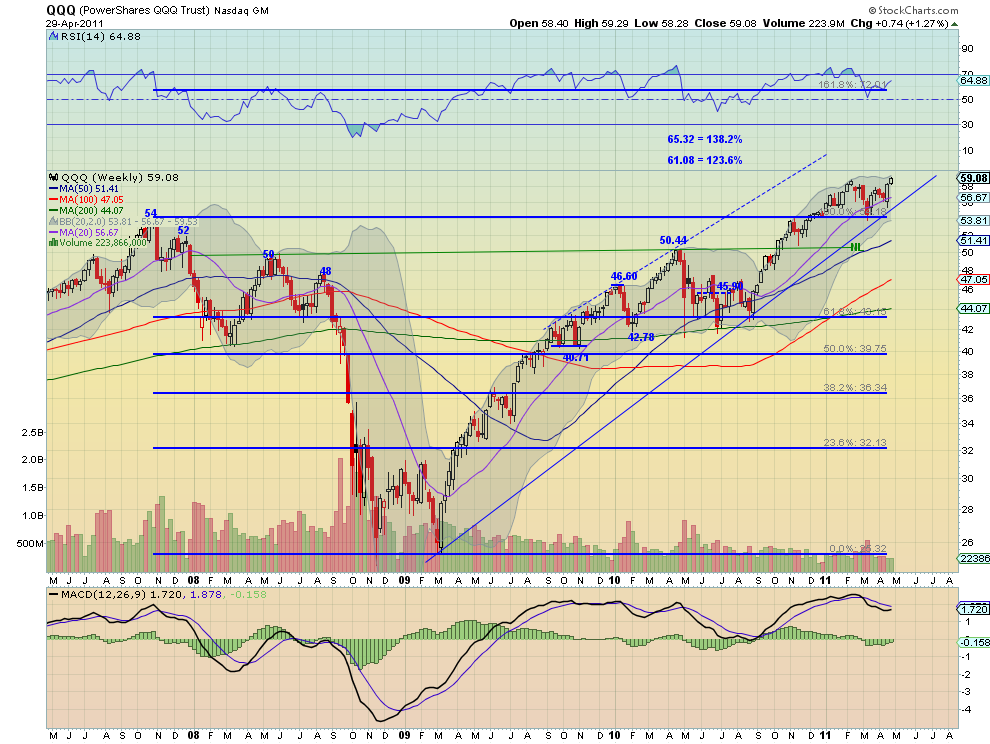
The QQQ continued its trend higher but is not as strong as the SPY and IWM, and consolidated the back half of the week. The SMA are all flatter with the RSI flat near 70 and the MACD flattening but positive. It did move outside of the expanding BB and is now back inside. The next target on the daily chart is a MM to 59.70. The weekly chart looks more bullish with rising SMA’s and RSI and a MACD that is crossing positive. Look for higher prices next week out of consolidation with additional resistance at 61.08 and 62.67. Any pullback should now find support at the 57-58 area

So next week looks cautiously higher for both Gold and Crude Oil. The US Dollar Index looks to continue it death march lower searching for new all time lows while US Treasuries continue to favor the upside. The Shanghai Composite on support has more downside potential and the Emerging Markets look to be in a range, with a bias higher. Low and stable Volatility look to continue to support an environment for the Equity Index ETF’s, SPY, IWM and QQQ to move higher, with the SPY and IWM looking to have the best prospects in the short term. Use this information to understand the major trend and how it may be influenced as you prepare for the coming week ahead. Trade’m well.
See the original article >>

The Endgame Headwinds

By John Mauldin

The Endgame Headwinds
If Something Can’t Happen…
GDP = C + I + G + Net Exports
Increasing Productivity
Toronto, Cleveland, LA, Philadelphia, Boston, and Italy


I have written repeatedly about the Endgame in the weekly letter, as well as in a New York Times best-seller on the same topic. By Endgame I mean the period of time in which many of the developed economies of the world will either willingly deleverage or be forced to do so. This age of deleveraging will produce a fundamentally different economic environment, which the McKinsey study referenced below suggests will last anywhere from 4-6 years. Now, whether this deleveraging is orderly, as now appears to be the case in Britain, or more resembles what I have long predicted will be a violent default in Greece, it will create a profoundly different economic world from the one we have lived in for 60 years. This makes sense, in that the prior world was defined by ever-increasing amounts of leverage. Outright reductions in leverage or even a significant slowing of the rate of growth is a whole new ballgame, economically speaking.

In all this I have explained the various options facing the developed world, but I have refrained from putting forth my own estimates as to what will actually happen and what the environment surrounding that outcome will be. That is about to change. I have been giving this a great deal of thought and research. While my conclusions will be somewhat controversial (I know, surprise, surprise), with enough to offend almost everyone on some point, I hope that I can muster enough clarity to help you think through your own personal views and how you will respond to what I think will be yet another crisis on the not-too-distant horizon. Whether that is Crisis Lite or Crisis Depression is up to us and the politicians we elect. I argue that we need to choose most wisely, because we are at a crossroads that is as critical as any since 1940.

As I start this letter, I am on a flight to San Diego, where I will co-host my 8th annual Strategic Investment Conference. As usual, I will be the last speaker on Saturday. This letter will be the beginning of that speech, and we will conclude (hopefully) next week. What I hope to do here is summarize the main points, add some new ones, and then move on to how I think the Endgame will play out. These next two e-letters will be among the more critical ones of the last few years. Feel free to forward, and if you are reading this letter you can join my one million closest friends and sign up for my free weekly letter at www.johnmauldin.com. (This letter may print longer than usual, as it will have a significant number of graphs.)

But before we jump in, many of you know that I am a serial entrepreneur. I look for business opportunities for inclusion in “the Mauldin companies.” My “hobby,” if you will, is looking at cutting-edge biotechnology. You have been asking for details and an update on one I mentioned last year. We partnered with a very serious biotech research firm, International Stem Cell Corporation, whose scientists discovered a patent-pending formula that rejuvenates skin. We continue to partner with them to help augment this breakthrough and, most importantly, to help fund their therapeutic research to find cures for very serious diseases. You can learn more at www.lifelineskincare.com/antiagingbreakthrough. Now, let’s get into the letter.


The Endgame Headwinds

Before we can get to how I think the Endgame of the debt supercycle plays out in the US, we need to quickly survey the current environment, and revisit (at least for long-time readers) a few basic economic themes that I will call the “headwinds” of economic growth. So many leaders in so many countries think that with the right policies they can grow (export) their way out of the problem. As I have written, not everyone can grow their way out of a crisis at the same time. Someone has to buy.

And while the right policies will in fact help, growth is, in my opinion, going to be severely constrained in the multi-year period of the Endgame. But, jumping right to the bottom line here, one way or another we will get through this very difficult period. Really. And my personal view is that in the period following the Endgame cycle we’re going to see a very real economic boom, for reasons we will visit briefly in this series and at length over the coming year. I am quite optimistic longer-term, but the flight to get there may be very bumpy if you are not prepared for it. I will try to do my part to help you.

Briefly, for new readers, let me define what I mean by the Endgame, as dealt with at length in Endgame: The End of the Debt Supercycle and How It Changes Everything (www.amazon.com/endgame). The US in particular and much of the developed world in general began a cycle of ever-increasing debt in the late ’40s, after World War II, both in the private and public sectors. Government began to grow as a percentage of overall GDP in the latter part of this cycle. In addition, politicians created large (well, huge) entitlement programs of pensions and health-care benefits that require significant taxes and, as we shall see, are unsustainable in the our present medium term.

There is a limit to how much money an individual or country can borrow. We all intuitively know this. If you grow your debt faster than your income and your ability to service the debt over a long period of time, people will eventually stop loaning you money. This is true for individuals, businesses, and nations. The end result is a restructuring of the debt (default by one of several means, including serious inflation) or a very reduced standard of living (by previous standards) for a period of time in order to service the debt. For individuals, that may mean cutting off the cable, no eating out, no vacations, etc. For countries it means reduced government programs and benefits, and higher taxes.

And make no mistake. I believe that the situation in the US is becoming urgent all too quickly. We are risking the health of the economic body of the US. While the republic will survive the crisis, the shocks and burdens it will place on all of us will be very great. For those not prepared it will seem like the end of the world, as jobs and safety nets might evaporate without proper restructuring. As I argue, the goal of fiscal sanity is to get the growth of the debt below that of the growth rate in nominal GDP. Failure to do so will result in the US suffering much as Greece or Ireland are today. Ugly.

The 2008 banking crisis showed us the limits of how much individuals can borrow, at least against their home equity. Since then, private debt (except recently for student loans in the US) has begun to shrink. But governments everywhere stepped into the breach by massively borrowing. But even governments, including the US, have a limit. We see that in Greece and Ireland, and are watching the debt crisis unfold in Portugal and Spain as well. It will soon become all too painfully clear in Japan. As I have often noted, Japan is a bug in search of a windshield. Japan is big enough that when it hits its own version of the Endgame, it will shake the world. It will not be pretty. (But there are opportunities for the nimble.)

As we will quickly cover here, the economic environment in which individuals and governments either willingly or are forced by the markets to reduce their borrowing and debt is significantly different from the period where they could create ever-increasing amounts of leverage. I call this period the Endgame. What we think of as normal gets turned upside down. Volatility increases, at a minimum. For many people this will qualify as a true crisis. But if you can see it coming and prepare, you can at least insulate yourself (somewhat) from many of the negative aspects of the Endgame. And volatility and crisis also mean that there will be opportunities for those prepared for them.

Now, let’s look at three graphs. The first is familiar to long-time readers. It shows the rise of debt in the US. And even with the recent pullback in consumer debt, because of the enormous government deficits, the rise is still there if we update this chart to last year.

The next two charts come from the Bank of International Settlements. They outline for 12 countries what happens, in terms of the debt-to-GDP ratio, if current spending and tax rates remain unchanged (the top dotted line), what happens if there are efforts to rein in spending with small gradual spending cuts and tax increases (middle line), and what would happen with serious spending cuts and significant tax increases (the lowest line). Some countries, even with measures that could be considered draconian, simply do not recover.

While the chart shows what would happen if age-related spending were held constant, most seniors would think that getting ever-smaller pensions and health care would be drastic measures indeed. These countries are in an unsustainable spiral, which means drastic (the word used by the BIS) measures will be needed.

Note that there is only one example of a country that ever saw its debt-to-GDP rise over 150% and did not default, and that is Britain at the height of its empire and power, with long-term rates at a very low level and a completely different investment and bond climate. But notice how many of the countries are now on a path to twice that level in the very near future.


If Something Can’t Happen…

There is rule in economics: If something can’t happen, it won’t happen. That may seem obvious, but so many people think the current linear trend can go on forever. This time is different, we tell ourselves. And I (and some others, like David Walker, Stockman, etc.) are telling you that so many things are on unsustainable paths that changes in present trends, as much as we might not like to think about them, are inevitable. So what we must think about now is what will happen when change is either forced on a country or entered into willingly. Some times you have to think the unthinkable.

Look at the projected debt for the US, compiled last year by the Heritage Foundation, based on realistic assumptions, not with rose-colored glasses. This is a chart of something that will not happen. Long before we get ten years of multi-trillion-dollar debt, the bond market will being to require much higher rates than we currently experience, driving up the interest-rate cost as a percentage of tax revenues to very painful levels, forcing cuts in all sorts of things we currently think of as absolutely necessary, like military, education, and Medicare spending. Later on I will put a timeline on this prediction.

One way or another, the budget deficits are going to come down. As we will see later, we can choose to proactively deal with the deficit problem or we can wait until there is a crisis and be forced to react. These choices result in entirely different outcomes.

In the US, the real question we must ask ourselves as a nation is, “How much health care do we want and how do we want to pay for it?” Everything else can be dealt with if we get that basic question answered. We can radically cut health care along with other discretionary budget items or we can raise taxes, or some combination. Both have consequences. The polls say a large, bipartisan majority of people want to maintain Medicare and other health programs (perhaps reformed, but still existent), and yet a large bipartisan majority does not want a tax increase. We can’t have it both ways, which means there is a major job of education to be done.

The point of the exercise (reducing the fiscal deficit to sustainable levels) is to reduce the deficit over 5-6 years below the growth rate of nominal GDP (which includes inflation, about which more below). A country can run a deficit below that rate forever, without endangering its economic survival. While it may be wiser to run some surpluses and pay down debt, if you keep your fiscal deficits lower than income growth, over time the debt becomes less of an issue.


GDP = C + I + G + Net Exports

But either raising taxes or cutting spending has side effects that cannot be ignored. Either one or both will make it more difficult for the economy to grow. Let’s quickly look at a few basic economic equations. The first is GDP = C + I + G + net exports, or GDP is equal to Consumption (Consumer and Business) + Investment + Government Spending + Net Exports (Exports – Imports). This is true for all times and countries.

Now, what typically happens in a business-cycle recession, as businesses produce too many goods and start to cut back, is that consumption falls; and the Keynesian response is to increase government spending in order to assist the economy to start buying and spending, and the theory is that when the economy recovers you can reduce government spending as a percentage of the economy – except that has not happened for a long time. Government spending just kept going up. In response to the Great Recession, government (both parties) increased spending massively. And it did have an effect. But it wasn’t just the stimulus, it was the absolute size of government that increased as well.

And now massive deficits are projected for a very long time, unless we make changes. The problem is that taking away that deficit spending is going to be the reverse of the stimulus – a negative stimulus if you will. Why? Because the economy is not growing fast enough to overcome the loss of that stimulus. We will notice it. This is a short-term effect, which most economists agree will last 4-5 quarters, and then the economy may be better, with lower deficits and smaller government.

However, in order to get the deficit under control, we are talking on the order of reducing the deficit by 1% of GDP every year for 5-6 years. That is a very large headwind on growth, if you reduce potential nominal GDP by 1% a year in a world of a 2% Muddle Through economy. (And GDP for the US came in at an anemic 1.75% yesterday, with very weak final demand.)

Further, tax increases reduce GDP by anywhere from 1 to 3 times the size of the increase, depending on which academic study you choose. Large tax increases will reduce GDP and potential GDP. That may be the price we want to pay as a country, but we need to recognize that there is a cost to growth and employment. Those who argue that taking away the Bush tax cuts will have no effect on the economy are simply not dealing with either the facts or the well-established research. Now, that is different from the argument that says we should allow them to expire anyway


Increasing Productivity

There are only two ways to grow an economy. Just two. You can increase the working-age population or you can increase productivity. That’s it. No secret sauce. The key is for us to figure out how to increase productivity. Let’s refer to the last equation.

The I in the equation is investments. That is what produces the tools and businesses that make “stuff” and buy and sell services. Increasing the government spending, “G”, does not increase productivity. It transfers taxes taken from one sector of the economy and gives them to another, with a cost of transfer, of course. While the people who get the transfer payments and services certainly feel better off, those who pay taxes have less to invest in private businesses that actually increase productivity. As I have shown elsewhere, over the last two decades, net new jobs in the US have come from business start-ups. Not large businesses (they are a net drag) and not even small businesses. Understand, some of those start-ups become Google and Microsoft, etc. But many just become small businesses, hiring 5-10-50-100 people, but the cumulative effect is growth in the economy and productivity.

Now, if you mess with our equation, what you find is that

Savings = Investments.

If the government “dis-saves” or runs deficits, it takes away potential savings from private investments. That money has to come from somewhere. Of late, it has come from QE2, but that is going away soon. And again, let’s be very clear. It is private investment that increases productivity, which allows for growth which produces jobs. Yes, if the government takes money from one group and employs another, those are real jobs, but that is money that could have been put to use in private business. It is the government saying we know how to create jobs better than the taxpayers and businesses we take the taxes from.

This is not to argue against government and taxes. There are true roles for government. The discussion we must now have is how much government we want, and recognize there are costs to large government involvement in the economy. How large a drag can government be? Let’s look at a few charts. The first two are from my friend Louis Gave, who will be speaking at my conference this weekend. This first one is the correlation between the growth of GDP in France and the size of government. This chart shows the rate of growth in GDP and the ratio of the size of the public sector to the private sector. The larger the percentage of government in the ratio, the lower the growth.

I know, you think that is just the French. We all know their government is too involved in everything, don’t we. But it works in the US as well. The chart below shows the combined federal, state and local expenditures as a percentage of GDP (left-hand scale, which rises as the line falls) versus the 7-year structural growth rate, shown on the right-hand side. And you see a very clear correlation between the size of total government and structural growth. This chart and others like it can be done for countries all over the world.

Sidebar: Now, I would not argue, as some libertarians do, that we need almost no government. I do not. But we must recognize the cost-benefit. I think the benefits of police are clear. Schools. A professional military (its use can be up for debate). Financial regulation. Courts. Etc. Certainly, society functions better with these and other services, and in a broad sense you can say that increases productivity. We “buy” services collectively with tax dollars that are seen as essential public goods. Those services could be offered by private companies.

But there is a limit in the minds of most people. Do you want your government to own the steel mills and airlines? Energy production? In many countries and at times in history, the answer was yes. But government-run businesses are rarely as efficient as private ones. And that efficiency is a direct component of productivity.

Next, (and finally for this week), let’s look at a chart from my good friend Rob Arnott. This is part of what will one day be an Outside the Box. (For new readers, this is a publication that goes out Monday night, which features the writing and thinking of someone other than your humble analyst, and which I don’t always agree with, but that does make us think. You can get it at www.johnmauldin.com just by putting in your email address and becoming one of my 1 million closest friends.)

The chart needs a little set-up. It shows the contribution of the private sector and the public sector to GDP. Remember, the C in the equation was private and business consumption. The G is government. And G makes up a rather large portion of overall GDP.

The top line (in dark blue) is real GDP per capita. The next line (yellow) shows what GDP would have been without borrowing. So a very real portion of GDP the last few years has come from government debt. Now, the green line below that is private-sector GDP. This is sad, because it shows that the private sector, per capita, is roughly where it was in 1998. The growth of the “economy” has been government.

Is it any wonder that we have no net new jobs over the last decade? I get that there have been two recessions, but in an effort to appear to be “doing something,” to “feel your pain,” government is slowly sucking the air out of the room. Not all at once. Just a bit at a time.

And it shows up in worker pay. The average worker has not seen their pay rise in real terms in almost 15 years. If they have a job. In fact, for the last decade, they LOST 5%.

Do you want more tax revenues so we can have more government services like health care? We have to grow the private economy. If we tax the private economy as it is now, that will just reduce the growth in the private economy and slow or reduce the growth of jobs. There is simply no way to get around that fact.

I will close here and start with part two next week. But the short take-away? The fiscal deficit and the national debt are a cancer on our economic body. They threaten to destroy the economic body of the republic. As a conservative, simply writing the words “tax” and “increase” in the same sentence makes me nervous. But I am even more afraid of what will happen if we do not get the deficit under control over time (next week we’ll explore why we cannot do it all at once). Sometimes, when they have cancer, people take drugs they would not normally want to be in the same zip code with, in order to increase their chances of surviving. But those drugs have side effects, some of them quite severe and long-term.

How we solve this crisis will determine the nature of the Endgame. But that is for next week.


Toronto, Cleveland, LA, Philadelphia, Boston, and Italy

I am in La Jolla with about 450 attendees at my annual Strategic Investment Conference, co-hosted with Altegris Investments. It is a fabulous, sold-out event. It is truly one of the highlights of my year, joining so many old and new friends for a few days. And the intellectual conversation? Wow. We are recording the panels and hope to make them available at some point.

I fly to Toronto on Sunday for a quick speech, then back to Dallas, on to Cleveland for a night, then right off to Rob Arnott’s annual conference in LA. Another very impressive line-up and one that I am privileged to be allowed to participate in. Then home for a weeks to catch my breath.

I will be in Philadelphia Tuesday May 24 to moderate a panel and listen to a serious gathering of speakers at the 29th annual Monetary and Trade Conference, where the topics are “Is Housing Ready for a Rebound?” and “QE2, Housing and Foreclosures: Are they Related?” Philly Fed president Tom Hoenig, Chris Whalen, Michael Lewitt, Paul McCulley, William Poole, and Gretchen Morgensen, among others. To find out more you can go to http://www.interdependence.org/Event-05-24-11.php. Then it’s on to Boston with some friends for fun (and a board meeting), then straight to Italy and a train to the little village of Trequanda in Tuscany, where vacation for me is staying in the same place for a few weeks, writing and thinking, and having friends show up. The kids will be there for the beginning, and Tiffani and I will make it a working vacation after that. And then I’m off to Kiev, Geneva, and London with my youngest son in tow; but more on that later.

It is time to hit the send button. I have 450 guests wondering where I am, so I bid you adieu for today, and we will finish up next week. Have a great week.

Your just a very happy and contented analyst,

The Dollar: Sliding or Crashing?

by Bryan Rich

Much has been made of the persistent slide in the dollar in recent months. Many proclaim it’s the end of its status as the primary world reserve currency. Others suggest it’s a notice of the demise of America. These viewpoints tend to quickly spread to Main Street, and that has a tendency to create panic.

How bad is it?

For some broader perspective, the Dollar Index (the dollar against a basket of major currencies) still sits 3.5 percent above the lows of 2008. Measured against over 75 currencies in the world, the dollar is weaker against 26, flat against 11 and stronger against 38 since the onset of the global financial crisis.

And it still commands 62 percent of global currency reserves — down only three percentage points from pre-crisis levels.

So, while it’s made new all-time lows against some currencies, it’s not a bloodletting like the media would have you believe. In fact, from a fundamental and technical perspective, it’s so stretched it has all of the makings of a market that’s going to snap-back violently.

Nonetheless, the drama surrounding the panic scenarios prompted journalists this week to prod a response out of Treasury Secretary Tim Geithner and Fed Chairman Ben Bernanke.

Geithner made an unusually defensive comment about the dollar saying, as long as he’s around the U.S. has a strong-dollar policy.

Bernanke maintained his rare but consistent comments on the dollar, saying a strong and stable dollar was important for the U.S. and the global economy and that the Fed’s policy efforts were consistent with achieving a strong dollar.

So if policymakers favor a stronger dollar, why aren’t they showing concern about its slide?

Some would suggest they just don’t get it. Others insist there is a covert operation underway by U.S. officials to broadly and desperately devalue the dollar.

Here’s my take …

First, while some near-term weakness can be favorable for the U.S. economy, a more protracted decline in the dollar at the recent pace would mean very negative implications for both the U.S. and the rest of the world — no one wins. So a weak dollar conspiracy is not the answer.

Clearly U.S. policymakers like a weaker dollar in the near term. It helps stimulate exports and the growth of manufacturing, a historically important ingredient for recovering from economic recession and especially important in the effort of rebalancing the U.S. economy. 

In fact, exports have become a big driver of economic growth throughout the “recovery” phase. The Wall Street Journal reports that exports have made the biggest 18-month contribution to U.S. GDP growth on record.

That’s the Good.
How about the Bad?

In addition to a supply shock associated with problems in the Middle East and commodity hoarding from China, a weaker dollar is adding to rising commodity prices.

The biggest threat of a weaker dollar though, if perceived as open-ended, is capital flight, which can set off a dangerous threat to the country’s solvency. Despite the many fears, that isn’t happening.

The truth is, growth in the U.S., even if it doesn’t hit the optimistic projections this year, continues to be among the top for major developed economies. Meanwhile, inflation (even headline inflation) and market interest rates remain low, and more stable than their counterparts — all solid underpinnings for the relative value of a currency in this environment.

So given the problems around the world and the reality that the world is in a slow, bumpy recovery, the slide in the dollar in recent months is consistent with just another ebb and flow within the currency markets.
To sum up: While there are significant risks, the facts argue that the weaker dollar isn’t a sign of a U.S. economic catastrophe. To the contrary, on a relative basis, the U.S. economy is still plugging along.

But Who Is That Hurting?

China.

China has been trying, unsuccessfully, to get a grip on inflation. And rising global asset prices, inflamed by a weaker dollar, puts pressure on China to finally look to its currency policy as a tool to curtail inflation. As such, we may soon see a dollar devaluation that the entire world would embrace: Against the Chinese yuan!

After six years of consistent, but weak, global prodding of the Chinese to appreciate their currency, diplomacy hasn’t worked. The Chinese have allowed their currency to appreciate a measly 3.6 percent against the dollar on average per year since de-pegging in 2005. Meanwhile their economy has grown by nearly 250 percent in the same time frame. 

Clearly, the Chinese have maintained a massive unfair advantage in global trade via their weak currency policy. And the world has always had two options in dealing with it:
  1. Convince them to adjust for the greater good of the global economy, or
  2. Export inflation to China to forcibly adjust up the cost of Chinese exports by driving up wages and input prices.
Now it appears that we’re seeing option number two play out. And China’s fight to gain control over inflation, isn’t going well. Perhaps soon, China will finally act to strengthen their currency in a meaningful way.

That would go a long way toward putting the global economy on a path of sustainable recovery, and correcting the continued booms and busts taking place in global economies and financial markets.

See the original article >>

Evening markets: crops reverse 'Soros' losses. Corn leads

by Agrimoney.com

Was it really George Soros that was to blame?
That was the rumour in Chicago, that a hedge fund linked to the investment legend had been behind last session's sell-off in agricultural commodities, liquidating holdings in crops to switch top metals, or reducing exposure to raw materials overall, depending on who you believe.
Whether Mr Soros was the reason for the limit down close in corn, or whether it was down to weather, or a mixture of both, there was some evidence of investors' losing their appetite for farm commodities.
Open interest in Chicago corn fell by more than 28,000 contracts on the day, and was down by nearly 90,000 lots on the week.
"Open interest yesterday showed big long liquidation in the May grains, with new selling in July corn, soybeans, wheat and oats," US Commodities said.
Tailwinds
Whatever, the slide appeared to have spiked out the appetite for selling for now, with crops staging a sharp rebound on Friday, encouraged by conditions in other markets.
Shares rose, and the dollar fell to a fresh three-year low against a basket of currencies, making dollar-denominated assets such as agricultural commodities more appealing as exports.
Corn, in essence, recovered the ground in lost in the last session. Chicago's July corn contract, which closed the maximum daily limit in the last session ($0.30 then), stood 26 cents, or 3.6%, higher at $7.55 ¼ a bushel in late deals.
The new crop December lot was 27 cents, or 4.2%, up at $6.64 ½ a bushel.
And other grains were higher too, even oats, which has suffered particularly badly from selling this week.
Sowing - but how much?
The jump was attributed to bargain hunting, with investors taking a less bearish view of weather forecasts indicating a planting window for US corn and soybean farmers.
"There is a realisation that corn planting has made very minimal gains in the Corn Belt this week," Darrell Holaday at Country Futures said.
US Commodities said: "A series of storms are expected to hit the eastern Corn Belt and the Delta in the 11-15 day forecast. This should continue to delay plantings."
And even further west where growers will get better opportunity, it is too chilly for comfort.
Benson Quinn Commodities said: "Cold weather though with freezing temperatures dipping into the central Plains may keep farmers hesitant to put seed into the ground," at least until early next week.
Worse for wheat
For wheat, there are still severe doubts over progress for spring sowings, given rain in the north of the US and Canada, while recent rains have not solved the issue of dryness for hard red winter wheat areas.
"The lack of rain in the forecast for the southern Plains and too much rain in the northern Plains restricting spring wheat planting is supporting wheat today," Mr Holaday said.
Benson Quinn added that, for Canada, forecasts show "heavy rains falling across Manitoba this weekend with the balance of the Prairie slated for frequent rain events in the next two weeks".
And as for better hopes for China, "the forecast for the winter wheat and corn region has removed rainfall in the second week of the outlook", although, as the Canadian Wheat Board reminded investors, much of the crop is irrigated.
Chicago wheat for July stood 1.6% higher at $7.90 ¼ a bushel in closing trade, with the Kansas lot adding 1.7% to $8.95 a bushel.
Paris wheat also ended higher, up 1.7% at E244.50 a tonne, helped by its US peers, while London markets were closed for the royal wedding holiday.
Low deliveries
Soybeans for July stood 2.2% up at $13.83 ¾ a bushel, following the grains higher, despite talk that China had cancelled a further two cargoes of Brazilian soybeans.
But as support for the oilseed, and indeed for grains too, deliveries against the expiring May contract were minimal, indicating that sellers can find better prices on cash markets, or just prefer to hang on.
Soybean and corn deliveries were, in fact, zero, with wheat's at a modest 460 lots, and only soyoil showing a big number, at 3,838 contracts.
'In a downtrend'
Despite the gains, it is not as if bears have lost their touch, with US Commodities warning that its analysis showed that "all grains are now in a downtrend".
Furthermore, wheat looked set to end lower for a third successive month, a feat not seen since 2008, with soybeans losing ground too.

See the original article >>

Silver The Next Greatest Trade Ever?


Peter Krauth writes: Silver is better than gold. In fact, it's poised to be the "Greatest Trade Ever."

I know that's a big statement. I'm certain that it grabbed your attention. Perhaps you're even considering arguments that would shoot it down.

But I know what I'm saying. And here's the proof.

You can look at silver prices and see that as an investment, silver has been a better performer than gold over the past 10 years. What's more, silver is actually gaining momentum.

And here's the best part: I see three specific - and very powerful - catalysts that should propel silver prices higher and enable this "other" precious metal to further outdistance gold in the months and years to come.

Let me show you what I mean. 

Silver: The Next "Greatest Trade Ever?"
In the final days of 2009, I told Money Morning readers that gold would become the "Greatest Trade Ever." I even laid out the case for John A. Paulson - of Paulson & Co. hedge fund fame - eventually topping the Forbes list of the world's richest billionaires ... thanks to his plans for massive gold investments. 

It was a timely call. Gold was trading at about $1,090 an ounce at the time - meaning it has surged 40% since then.

I haven't changed my mind about gold - even though it has surged 40% since I made that call. And neither has Paulson. Gold will continue to be an outstanding trade for investors - it's highly prized, it commands a high value per ounce, and there's a lot of it around to invest in. 

But I also think that silver will out-gain gold as the current secular bull market in precious metals and commodities continues to evolve. In fact, in February of last year I forecast that silver prices could eventually even reach $250 an ounce before this bull tops out.

If you compared the performances of gold and silver from the start of this secular bull about a decade ago - but ended that period of comparison on Aug. 31 of last year - then gold has been the clear winner. For the 10-year stretch that ended Aug. 31, the "yellow metal" rose from $255 an ounce to $1,250 per ounce, for a gain of 390%. 

During that same period, silver moved from $4 an ounce to $18, for a return of 350%.

If we stopped right there, gold would appear to have been the better investment play.

But here's where the comparison gets interesting.

You see, when the summer doldrums ended, silver's bull-market surge shifted into overdrive. In just eight short months, silver zoomed from $18 to the current $48 and change. Gold moved from $1,250 to its current record level of about $1,525.

Now, if you recalculate gold and silver's bull-to-date gains - including the past eight months - a dramatically different picture emerges. 

At its current price of $1,525, gold so far has gained an impressive 498% during this decade-long bull-market surge. But silver - having soared from a low of $4 all the way to $48 - has zoomed 1,100%, making it the clear winner, with more than double gold's returns.

And what's more, the three catalysts that I've identified will serve to propel silver much, much higher over the coming months and years, despite the stellar performance it's already delivered.
Those three factors consist of:

•A regulatory crackdown.
•Escalating demand.
•And a normalization of the "gold/silver ratio."

Let's look at each one in greater detail.

The Future of Silver Futures
The U.S. Commodity Futures Trading Commission (CFTC) is about to help spur the "Second-Greatest Trade Ever".

The implications of recent events in the silver-futures market are so explosive that we could see massive gains in silver in the next 12 months alone.

Back on Oct. 26, CFTC Commissioner Bart Chilton publicly stated that "there have been fraudulent efforts to persuade and deviously control that [silver] price." Chilton even said that that he believed there had been violations to the Commodity Exchange Act (CEA) in the silver market, and that these ought to be prosecuted.

The targeted perpetrators are no less than JPMorgan Chase & Co. (NYSE: JPM) and HSBC Securities Inc. (NYSE ADR: HBC), currently facing four lawsuits that are vying for class-action status. They're accused of collusion in order to manipulate silver-futures pricing going back to early 2008, and of building immense short positions with an ultimate goal of forcing prices down for their profit.

According to the lawsuits, there were two "collapses" orchestrated by these two banks - the first in early 2008, and another in early 2010 - from which they gained massive profits.

This has attracted lots of attention and contributed to a volume surge in the trading of silver contracts - with the COMEX market on Nov. 10 reporting a new all-time record that was a full 57% above the previous one set way back in 1976. This rise in silver trading volumes - as well as in actual silver prices - has prompted futures-market operator CME Group Inc. (Nasdaq: CME) to raise silver-futures margins twice in the same week to help preserve order.

Conspiracy theories notwithstanding, it's likely that these allegations fueled the thesis that the price of silver was being suppressed, and that such downward price pressure could well ease up going forward.

Since November, massive levels of money have flowed into silver-focused exchange-traded funds (ETFs). And meanwhile, new all-time-record coin sales are being reported by the U.S. Mint, with near-record sales being reported by the Austrian Mint, Royal Canadian Mint, and Perth Mint.

So as silver-coin and ETF purchases set new records, the next question may well be: "Will there be enough silver to meet ongoing demand?"

That question leads us directly to my second silver-price catalyst - silver demand.

Silver Demand: The "Missing" 225 Million Ounces
When analysts needed to assess the global demand for silver, they have traditionally turned to GFMS Ltd., and The Silver Institute, the two organizations that are generally regarded as the most-relied-upon sources for that type of information. Together, GFMS and 

The Institute make use of a category they have labeled as "implied net investment" - a catch-all grouping that's supposed to indicate institutional and retail demand for physical silver.

But noted natural-resources investor Eric Sprott (of Sprott Asset Management LP, with $8.5 billion under management) made an interesting discovery: 

There's very likely more - actually, a lot more - to silver demand than market observers have been led to believe.

Yet by their own admission, GFMS and The Silver Institute acknowledge that their reported data for "implied net investment" is not an observed figure, and doesn't include some of the demand coming from hedge funds or "physically backed" exchange-traded funds - a portion of the fast-growing ETF sector that's enjoying even more explosive growth. As a result, Sprott found that more than 225 million ounces of silver demand was "missing" from figures for the decade-long stretch that ended in December 2009.

And that figure doesn't include the demand from 2010, an explosive year for silver (and a year in which silver - the "other precious metal" - rallied 138% during the last eight months).


The Quickly Closing Gold/Silver Ratio Gap
In the years leading up to the 2008 stock-market panic, the gold/silver ratio averaged about 55, meaning it took 55 ounces of silver to buy one ounce of gold. Keep in mind that, perhaps counter-intuitively, a declining ratio is bullish for silver, since it means fewer silver ounces are required to buy one of gold.

Actually, that's what was already happening since this precious-metals bull market was spawned a decade ago. 

But then that late-2008 stock-market panic caused this ratio to shoot up until it actually exceeded 75. That was an extreme that couldn't be sustained over an extended period. And I said so in my September article "Silver is Emerging From Under Gold's Shadow." 

At the time, silver was still trading at about $21 per ounce. I told readers that we'd likely see silver at prices of $25 an ounce to $27 an ounce before fall was over, writing that " ... silver could well be poised to explode to the $25 to $27 levels as we enter the strongest time of the year for precious metals." 

As I write this, we're just north of $48. With gold at $1,525, we've already sailed past the pre-2008 gold/silver ratio of 55, and currently sit below 32.

That may signal silver as being somewhat overbought at this point, but as the ratio was stretched to such an extreme of 75, we could well see it continue to march lower, albeit after a well-deserved rest. I would not be surprised to watch the gold/silver ratio reach a level of 30 which, should gold regain and hold the $1,500 level, would imply a price near $50 for silver, above its all-time nominal high from 1980.

As we work our way through this bull, I expect the gold/silver ratio could even drop below 20. If gold eventually reaches the $5,000 level, as I expect, a ratio of 20 would imply a silver price of $250.

Silver Prices: Still Below All-Time Highs
Gold tends to grab most of the headlines, a status it's likely to uphold as its allure remains unparalleled. Seeing it trade at nearly 80% above its previous all-time highs sure has scores of observers excited.

On the other hand, it's contrarians who tend to earn the best returns over time. And with silver prices still 5% below the all-time high of $50.35 reached in 1980, the odds - over time - seem to favor silver over gold, as far as generating the biggest gains.

It's true that silver was the best-performing major commodity of last year, bettering all of the 18 other commodities comprising the CRB Commodity Price Index. It's also true that, on a technical basis, the silver price has gotten ahead of itself, having stretched way above its 200-day moving average.

But silver benefits from a more advantageous fundamental supply/demand profile than does gold.
The physical silver market is only a fraction of its yellow-metal counterpart.

Numbers Game
Of all the silver ever mined (about 46 billion ounces), experts estimate that about 1 billion ounces are left above ground in bullion form. That's because the rest has been consumed, and is also because silver isn't something that is typically economically feasible to "recover." By comparison, of the 5 billion ounces of gold ever mined, about 2 billion are available above ground in bullion form.

In 2009, worldwide silver production totaled some 700 million ounces. At the average 2009 price of $14.70, that represents a total value of about $10.3 billion. In that same year, however, about 75 million ounces of gold were produced. At the average 2009 price of $975 an ounce, that represents a value of about $73 billion, or about seven times the silver market on a market value basis.

A wave of demand will influence more heavily the much smaller silver market when compared to gold. Small investors clamoring for a piece of the precious-metals pie could well push silver much higher, as they buy the metal that's much more affordable on a per-ounce basis. That means the potential returns on silver could be astronomical for those willing to commit. 

At this point, there's still time to make silver an important part of your portfolio - perhaps making it your "Greatest Trade Ever."

Actions to Take: Although silver prices are approaching record levels, don't be deterred from participating in the secular bull market for this key precious metal. Indeed, there's actually no need here to get overly fancy. If you want a solid primer on silver, read our special research report: "How to Buy Silver." For a non-levered approach, some of my favorite vehicles are physical silver in the form of 1 oz. silver coins, multi-ounce silver bars, and even junk-silver bags - or even a combination of these. There's also a more recent ETF option, the Sprott Physical Silver Trust (NYSEArca: PSLV).

Gold on Track to Reach $1860 - $1920 by Mid 2011


The Golden Parabola is continuing to follow the cycle of the 70’s Gold Bull as the U.S. Dollar is further devalued against Gold to balance the budget of the United States at this point in the “paper currency cycle” where Global Competitive Currency Devaluations rule. As discussed in a recent editorial this point in the cycle suggests that Gold will soon enter into a more aggressive higher rise in price as it starts to project the higher Vth Wave characteristics of this new Golden Parabola. 

Much of the debt that must be devalued by the U.S. government has not yet been moved to the balance sheet of the U.S. Government. As such, from a fundamental standpoint, we won’t know the true height that Gold will achieve until that has been accomplished although we can gauge the progress of today’s Gold Bull off of the 70’s Gold Bull to a large extent.

Price Inflation and the Price of Gold

We saw price inflation, in general, track Gold in the late 70’s, although much of the rise in general price inflation tends to lag the rise in the price of Gold because Gold’s rise is directly related to the rise in Dollar Inflation that eventually creates general price inflation. General price inflation lags the rise in the price of Gold since it takes time for Dollar Inflation to work its way through the pricing environment of the various markets. Thus, not only are Gold and Silver great hedges against price inflation, but owning Gold and Silver is a great way to pre-empt the ravages of price inflation that are headed our way over the coming years at this point in the paper currency cycle.

THE GOLD CHARTS

Chart #1 Suggests a Potential Price of $1860 for Gold into Mid-year

The first Gold Chart is one I created for the original Golden Parabola editorial that showed my expectations at the time for Gold to bottom at the 34 week EMA with a potential target for Gold into mid-year per the 1970’s Gold Bull up to around the $1860 level. On the chart, below, I have now added a blue line off of the tops since the 2008 Deflation Scare low showing a potential for Gold into mid-year to around the $1860 price level, which appears to confirm the earlier chart. The chart also shows that Gold has busted out to new historic highs with no horizontal resistance above and with no real angled resistance on the chart until much higher price levels are reached.

Frankly, I expect the price of Gold to rise fairly rapidly up to the $1620 to $1640 area on the chart before going up to at least $1860 by mid-year. The TA indicators which simply monitor the health of price movements are all a “go.” 


Chart #2 Suggests Potential $1920+ Gold Into Mid-year

The second chart shows Gold rising up through the same angled dotted line that it rose through back in 2006 on its way to the upper black solid line of the channel top which will be around the $1920 level into mid-year. This chart also includes a black dotted line above the channel line that mimics the extent that Gold overshot the channel on the down side into the Deflation Scare Bottom into late 2008. Since the necessary Dollar Inflation to deal with the larger current level of debt is so much larger today versus the late 70’s, is it possible that Gold will overshoot the upper log channel on the upside to the extent it overshot the channel bottom on the downside? If so, then a higher target for Gold might come into play.


Chart #3 Suggests Vth Wave For Gold Unfolding

The third Gold chart shows a distinct channel for each “Phase” or Elliott Wave rise in this current Golden Parabola. We can see that Wave I was basically held in the smaller flat blue channel into late 2005. After Gold broke out of that blue channel it moved into a higher sloped rise into the green channel that approximates Wave III in the current Golden Parabola. We can see on the chart that Gold has now busted up through the top of the Green Channel firmly into the Red Channel which appears to approximate the higher sloped Wave V advance.

I had suggested some weeks ago to the subscribers to my service (see here for details) that a rise above the black dotted line on this arithmetic chart might herald in a very sharp rise in price into mid-year, and that appears to be in motion. We can see a similar bust out of the Wave I Channel into the Green Wave III Channel back in late 2005. That move in late 2005, up and out of the Wave I blue channel, was basically “phase transition” into Wave III if you want to use that term. Similarly, the current bust out of the Green Wave III Channel into the Red Wave V Channel appears to be the phase transition to Wave V in progress - a transition to a true higher priced slope of rise for the Golden Parabola. 


Chart #4 Suggests Gold Likely to Rise Into Armstrong’s June 13th Turn Date

The final chart for Gold is “Fractal Gold Vs Armstrong’s Economic Confidence Model.” I have placed a dotted red line to the right of the sold red vertical line in the coming period to denote the actual June 13th turn date that Mr. Armstrong has proposed. We can see that the Gold price is running hard and higher toward his turn date as it did into the last 2 similar turn dates represented by the solid red lines on the left hand side of the chart. We can see that the TA Indicators which are simply tools to measure the health of the rise of Gold suggest that higher Gold pricing into the June 13th turn date appears probable. 


CONCLUSION: Current Golden Parabola on Track

The current Golden Parabola has been tracking the Golden Parabola of the 1970’s almost perfectly for over a decade. Today’s Golden Parabola is driven by the parabolic growth of the U.S. Dollar Inflation in response to the massive backdrop of debt that exists, today. We can project price targets as the Golden Parabola grows, but its final height will be determined by the necessary price level for Gold to balance the U.S. budget once all of the liabilities of the U.S. are eventually placed on its balance sheet. Many of those liabilities will not be transferred to the U.S. balance sheet until late in the Golden Parabola’s rise in an attempt to compress the level of discomfort in terms of time that the Dollar Devaluation will create. Thus, it appears that at this time the terms “Bubble” and “Gold” do not belong in the same sentence.

If you take a look at the chart for Silver you will start to get an inkling of what is to come for the Gold price. It appears that we are just entering the higher sloped rise in Gold that has already begun in Silver; and Silver still has a much higher path to climb into the future. There is no doubt that Gold has made a nice run since the original Golden Parabola article, but I expect the run to continue into mid-year.

PM Stocks

As a quick note on the PM Stock Indices, this analogous break-out of Gold ushered in higher valuations for the large cap PM stocks in the late 70’s. The PM stocks tend to be re-valued higher in short dynamic spurts, and I am looking for one of those spurts higher for the PM Stock Sector to commence with this break-out in Gold. I hope to return with an article on the PM Stock Indices in a few days.

Follow Us