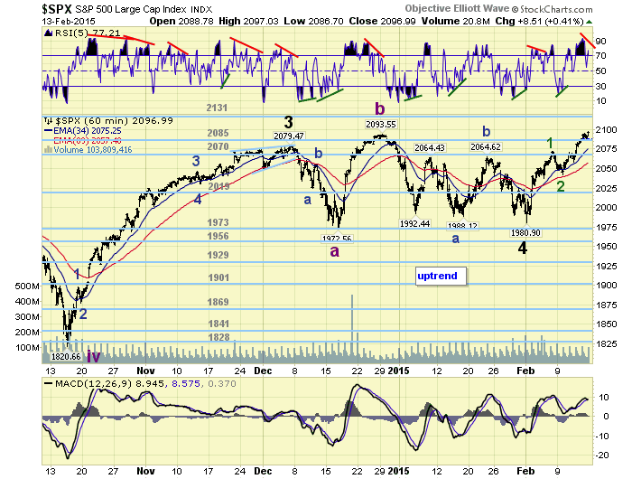
Wednesday, February 18, 2015

The Next Real Estate Crash

by Ramsey Su

On Shaky Ground

Real estate does not crash, it is real estate financing that crashes.

Easy sub-prime mortgages caused real estate prices to artificially appreciate, lack of even-more-sub-than-sub-prime financing caused prices to come back down.  Real estate did not crash, the sub-prime mortgage market did.  During the RTC era, deregulation allowed the S&Ls to lend and participate in all kinds of unsound projects.  Re-regulation shut down the madness.  The daisy chain broke and wiped out the entire S&L industry (Daisy chain was the the most popular Ponzi scheme of those days). It was financing that took the prices up, only to return to earth when financing crashed.

Superficially, the real estate market today is stable and steadily recovering, so I am told.  When you examine the invisible forces propping up prices, today’s market is on shakier ground than the sub-prime or the RTC era.  Government intervention has always been part of the real estate market but never to the extent of today.  Now that the private sector has been squeezed out, the government can only turn to itself.

The Federal Reserve

The Federal Reserve created $1.488 TRILLION via purchases of mortgage back securities under QE3, from September 2012 to present.  Below are two excellent charts from MDN.  They show the 30 fixed mortgage rate vs the refinance and purchase indexes.

1-refinance index vs 30 year fixed

Refi index vs. 30 year fixed mortgage rate – click to enlarge.

2-Purchase-Index vs 30 year fixed

Purchase index vs. 30 year fixed mortgage rate – click to enlarge.

What conclusions can we draw?

QE3 succeeded originally in lowering the mortgage rate, which was already declining.  The mortgage rate subsequently moved in anticipation of but not due to actual Fed actions, such as talk of tapering.  Now rates are at the mercy of global currency wars and who knows what they will do tomorrow, with or without more Fed intervention.

The refinance index behaved as expected, moving inversely to mortgage rates.  The purchase index, however, flat-lined as if purchasers weren’t paying attention to rates at all.  I believe this is because rates are so low already that purchase decisions have become impervious to interest rate fluctuations.

The Agencies

The other force elevating the real estate market is the choke hold on the secondary market by the agencies, namely Freddie, Fannie, the FHA and VA.  Increasingly, it is politics that determines underwriting guidelines.  It has been almost 7 years since the government took over Freddie and Fannie.  It took over 5 years to appoint a permanent director, Mel Watt, for a conservatorship that is supposed to be temporary.  Quietly, Mel Watt has been pushing higher debt-to-income ratios, lower down-payments and lower credit scores.  In other words, sub-prime lending is back.

Increasingly, these agencies are behaving like self insured companies with a random but unlimited amount of loan loss reserves.  They know full well that if the excrement were to ever hit the fan again, they will always be bailed out. The FHA recently reduced its mortgage insurance (MMI) by .5%, from 1.35% to 0.85%.  The market cheered.  The Mortgage Bankers Association reported a 76.5% increase in FHA refinance applications the week this reduction was announced.  Is this a good thing?

This decision to reduce MMI came at a time when the FHA’s capital reserve ratio is at .41% vs. 2% as mandated by Federal Law.  The FHA’s justification is that insurance rates can be reduced because it is on a path to reach that 2% reserve goal in 2 years.  Can you imagine State Farm reducing flood insurance premiums, even though they have inadequate reserves to cover losses, because they think their reserves should be adequate in 2 years time?  What happens if there is a flood in the meantime, especially when the weather report forecasts heavy rain?

The Borrowers, a.k.a. The Sheep

Sam Khater, economist at CoreLogic, wrote an excellent article recently, entitled Ability-to-Leverage Drives Foreclosure Risk.  Mr. Khater presented two charts that perfectly illustrate the deterioration in the quality of borrowers.

Figure 1 of his article shows the high level of foreclosure rates:

3-foreclosure rates since 1980s

Foreclosures have been in a steady uptrend since the 1980s – i.e., since the start of the credit bubble era – click to enlarge.

Figure 2 shows that the current loan-to-value ratios are still substantially higher than before the sub-prime era. Lower ratios would suggest that the market can absorb extraneous shocks with ease, and vice versa.

4-Leverage drives foreclosures

Leverage drives foreclosures.

Sheep will always be sheep.  They survive for the purpose of getting fleeced and then slaughtered. During the original sub-prime era, sheep were turned into mortgage slaves and their household balance sheets destroyed.  The flock has not yet recovered from the 2007 disaster and the masters are already planning their next visit to the slaughter house.  I think they are now labeled “credit worthy borrowers” who are unfairly denied financing because of overly stringent underwriting guidelines.

The Regulators

There were plenty of regulators. The Fed, FDIC, SEC, OCC, OTS all fell asleep at the wheel during the sub-prime bubble.  All of them are still in existence and as regulators, still napping.  Today, as a result of Dodd-Frank, there is a new regulator, the CFPB.  So far, the CFPB has proven to be more of a bureaucratic nuisance, adding to the red tape but serving no preventive purposes. The CFPB started out with a roar.  They wanted QM (qualified mortgages) that mandate a down payment of 20% and a maximum benchmark of 43% DTI (debt to income).

In the battle of one government agency against another, the CFPB was beaten back before it could make a move.  Here is a video of its attempt:

My point is that regulators did nothing to prevent the sub-prime fiasco and are doing nothing apart from inflating a new bubble today.

So What Could Crash the Real Estate Market?

Anything to do with financing could crash the market.  Higher rates, moving to the 5% range for a 30 year fixed rate mortgage, would shut down the market.  Privatizing the agencies would do it, unless the government remains as the unconditional guarantor of all agency mortgages.  In other words, if the Federal Reserve and the Treasury discontinue the massive blood transfusion, the market will crash.

Any negative change to the financial well-being of households could crash the market as well.  The bulls said millions of jobs are being created.  The bears retort that only low paying jobs are being created, while the work force continues to decline.  The facts, as they pertain to mortgages, will manifest themselves in delinquencies.

Defaults are sky high in comparison to historical standards.  Here is the latest delinquency report from the St Louis Fed:

5-delinquencies

Delinquency rates on single family mortgages – click to enlarge.

The Fed’s data is outdated by a quarter.  Black Knight (formerly LPS) has data up to December 2014.  Here is their delinquency table:

6-black knight delinquency table

Up-to-date delinquency and other data, via Black Knight – click to enlarge.

The best leading indicator is the first row in the table above – properties that are in the early stages of default.  This rate is stabilizing at an unacceptable level.  The market has seemingly forgotten that there are still millions of negative equity loans. There are also millions of artificially modified loans in the agencies’ portfolios.  Compounded by the shaky loans that have been originated by the agencies during the last couple of years, especially minimal down FHA loans, too many households remain just a couple of paychecks away from default.

The bigger issue is not what may crash the market but the magnitude of the event.  During the Volcker years, even when rates were raised to astronomical levels (can you imagine a Federal Funds rate of 20%, vs. one approaching negative levels today), the market did not move much because there were only a small minority of loans at risk.  During the sub-prime bubble, if not for derivatives that leveraged its size, Bernanke could have been correct by stating that sub-prime was contained in 2007.  Today, the underlying market weakness is so broad that any new snow flake may be the one that sets off an avalanche.  Policy makers have already gone all in with no tools left to minimize the damage.

As you might expect, I remain bearish on housing.

See the original article >>

The Catastrophic Costs of Extend-and-Pretend Are About to Crush Europe

by Charles Hugh Smith

Like a star which has expanded and now cannot maintain its grand state, Europe's extend-and-pretend economy is now poised to experience a supernova implosion.


The costs of ill-conceived policies are always paid by someone--usually those with the least political power. In ill-conceived wars, the costs are paid by the soldiers on the ground and their families, and the civilians who suffer collateral damage.

The costs of ill-conceived financial policies end up being paid by taxpayers, savers, borrowers and those who lose their jobs in the inevitable bust. Those who conjured up the disastrous policies slink away to plush villas or defend their stubborn addiction to failed ideologies in the media (see Keynesian Cargo Cult and Paul Krugman).

The most ill-conceived financial policy of all is extend-and-pretend: extend-and-pretend means if a debtor is bankrupt, then extend him more loans to maintain the illusion of solvency.

Here's how extend-and-pretend works in the real world:

-- If a homebuyer has defaulted, give him new loans, or shift his loan off the books into zombie mortgage status.

-- If a student defaults on student loans, shift the loans into forbearance, i.e. mask the default by putting the defaulted debt into zombie mode.

-- If a bank is insolvent, give it unlimited access to unlimited lines of central bank credit and lower interest rates to zero so the bank doesn't have to pay interest on deposits.

-- If a nation is bankrupt, extend it new loans.

The official reason for extend-and-pretend is the belief that time will heal all-- that given enough time, all problems solve themselves via some sort of pixie dust. In essence, this faith that time will heal all is a delusional state of magical thinking, for extending and pretending only enables the kleptocrats and the elites benefiting from the failed Status Quo to continue holding power.

As painful as it would have been, Greece should have been refused loans in 2010 and 2011, and been ejected from the euro. The situation was visibly hopeless to everyone then, and extend-and-pretend was never going to solve the structural imbalances in the Greek economy that had been furthered or enabled by the euro and easy credit.

What did Europe buy with its $245 billion bailouts of Greece? Nothing. The $245 billion-- equal to the entire GDP of Greece--squeezed the citizens of Greece while leaving the kleptocracy in charge--the worst possible outcome.

If policymakers had rejected extend-and-pretend and grasped the nettle in 2010/2011, Greece would be through the painful period of adjustment to its own currency. Deprived of the euro gravy train, its ruling kleptocracy would have collapsed or been ejected by the people as a failed regime.

Thanks to extend-and-pretend bailouts, the pain of adjusting to reality is now being dumped not just on the people of Greece but on the people of every nation in the EU. Frequent contributor Mark G. explains why: most of the debt owed by Greece doesn't just vanish when Greece defaults--it must be paid by the other EU nations that guaranteed the debt.


Here's Mark's explanation:

The issue is not whether Greece's European Financial Stability Facility (EFSF) backed debts will be repaid. The question is who will repay them.  European Financial Stability Facility (Wikipedia)
The structure of the EFSF and related packages means that if Greece will not/can not pay then every single guarantor country has to come up with fiscal appropriations to backstop any deficiency left by Greece in a default. This means going back to their national parliaments in most if not all cases for fiscal appropriations to do this. At this point what the Germans demonize as The Transfer Union will emerge stripped of all camouflage in all its hideousness.
This is going to be politically explosive in itself for every one of these Eurozone governments. Nor is this confined to so-called "creditor" states, except in the sense that every non-defaulting state will be a creditor.
So-called debtors and crisis states like Italy, Spain, Portugal and Ireland are all liable in large varying amounts as well as Finland, Holland, France and Germany. The first four, generally classed as being 'debt crisis' states themselves, are liable for a total of 240 billion euros as their end of the EFSF. Since Greece accounts for about 1/3 of the EFSF this works out to 80 billion euros for four weakened sates already experiencing their own Austerity.
I cannot imagine that at this moment any of these cabinet politicians could tolerate a second budgetary line item that decodes as Additional New Money & Guarantees For Greece Under Tsipras/Varoufakis/Syriza.
Greece can indeed initiate that process. And having done so, no one will have any further tolerance for Greece at the table. Their leverage begins and ends with default.
The seeds of disaster were planted when Greece was first admitted to the ECB and euro under false pretenses.

Extending imprudently massive loans to marginal borrowers always plants the seeds of disaster, and extending and pretending turns a potentially containable disaster into an uncontainable financial calamity. Yet this is the game plan of policymakers everywhere, from Europe to the U.S. to China--extend enormous loans to marginal borrowers and then mask the inevitable defaults with extend-and-pretend policies that vastly increase the size of the debt.

By the time extend-and-pretend finally reaches its maximum limits, the resulting implosion is so large that the shock waves topple regimes, banks, currencies and entire nations.

Like a star which has expanded and now cannot maintain its grand state, Europe's extend-and-pretend economy is now poised to experience a supernova implosion.

See the original article >>

Tuesday, February 17, 2015

Mid-Caps doing best job of growing your nest egg

by Chris Kimble

realreturnssince2000feb17

CLICK ON CHART TO ENLARGE

A good number of people invest in stocks with a common goal, grow their nest egg and beat the cost of living. The above chart looks at large, mid-caps, small-caps and tech stocks performance since 2000, net of inflation. The clear winner of this time period is Mid Caps, doubling the next closest index, which was small caps. The NDX 100 is bringing up the rear as it is the only index to be behind the cost of life since 2000.

If one looks at performance since the financial crisis lows in  2009, the NDX is the winner (+234%), followed by Mid Caps (+221%), Russell (+203%) and the S&P 500 (+168%).

When looking at both time frames, Mid Caps have done pretty well! So which index will beat the cost of living over the next 5 to 15 years?

Below is a look at the patterns each of these key index’s are creating at this time.

majorindexattemptingbreakoutfeb17

CLICK ON CHART TO ENLARGE

From  a Power of the Pattern perspective, I took a look at each of these key markets on a monthly basis. Mid-Caps in the upper left, are looking the best, as they are breaking above a long-term Fibonacci extension level. Russell 2000 and SPX are both attempting to break above an important Fibonacci extension levels and the NDX 100 is nearing monthly high resistance created back in 2ooo.

See the original article >>

Greek stand-off

by Buttonwood

SO the talks between Greece and the EU finance ministers broke up in acrimony last night and we have a new "deadline" of Friday. That is the date Jeroen Dijsselbloem, the Dutch finance minister, set for Greece to apply for an extension of the bailout programme. Greece called the EU plan "absurd and unaceeptable".

The good news is that this is partly an issue of semantics. The EU wants Greece to apply for an extension to the existing bailout programme, and the conditions can be altered once the extension is in place; Greece wants the existing programme to be abandoned and a bridging loan to be offered while a new deal is agreed. It is not difficult to see how a form of words might be found to bridge this gap; one wag suggested that the deal be called an extension in the German language text and a bridging loan in the Greek version.

But the bad news is also that the argument is about semantics. Syriza won election of a platform of rejecting the bailout terms, so needs a victory on this specific issue; the EU has constructed an entire system of condition loans and bailout programmes and does not want to see this destroyed. Neither side will want to give way on the language. It is also a matter of negotiating tactics; the EU is in a better position to drive a bargain if Greece is operating under the existing bailout, Greece will be in a much stronger position if it is able to get money without conditions. So success on this seemingly minor point of language may lead to success on the entire deal.

The markets have inclined, all along, to the view that a deal will be reached in the end because both parties will lose from a breakdown. Perhaps investors have been made cynical by the kind of rhetoric that accompanied debt ceiling talks in the US, when threats of default and shutdown were averted at the 11th hour. My feeling is that this attitude is complacent; Syriza was elected precisely because its leaders did not believe in "politics as usual".

Among the commentariat, the consensus view has been that, since EU austerity has been misguided from the start, the Greeks are right and should get what they want. As Charles Grant of the Centre for European Reform made clear at a meeting yesterday, this is not the view from Brussels; the belief there is that reforms have been working in Spain and will work elsewhere if patience is shown. Allowing Greece to head in the opposite direction will undo the good that has been done. Indeed, this isn't really an issue about the debt any more; Greece has already had its debt service costs reduced massively by a combination of maturity extension and low rates. It is an issue of reform. The EU seems more than happy about Syriza's attempts to crack down on tax avoidance, although experience suggests this raises less money that you hope; it is not so keen on the rest of its programme.

All this gets tied up, rather confusingly, with the idea of democracy; that Greece has just elected Syriza and thus has the right to put its programme into place. The issue was brought up in a Radio 4 Today interview with the economist Christoper Pissarides; what about the rights of German voters, the interview asked? The answer from Mr Pissarides is that German voters should understand that this is an issue of EU solidarity from which one day they might benefit. But this is not what German voters feel. One assumes that Mr Pissarides thinks German voters should change their mind. But once one goes down this road, an appeal to democracy is lost; if the German voters can be "wrong", then democracy is not the gold standard.

It is generally accepted that democracy has its limits. First, the rights of minorities must be respected; 51% of the population does not have the right to enslave, or kill, the other 49%. But the second constraint is a financial one. Voters cannot create prosperity simply by voting; they can vote for the preconditions of prosperity but a lot of hard work and skill is not needed. If they run persistent current account deficits and thus incur debts overseas, they must find a way to keep servicing those debts or lose that financial support. Greece could indeed refuse to do a deal. But that implies refusing all the other support from the EU including the liquidity that stands behind the Greek banking system. This will not be a pleasant option.

This brings us back to the game of chicken. Will a failure of the talks lead to more damage in Greece or in the wider EU? The former seems more likely at the moment and certainly seems to be the belief of EU finance ministers. But Syriza may have raised unrealistic expectations among its voters about the kind of deal it can pull off. That is why compromise is far from certain.

See the original article >>

Monday, February 16, 2015

EU Leaders "Are Afraid The Syriza 'Virus' Will Spread Across Europe"

by Tyler Durden

As anti-austerity protests continue to build in numbers across Europe (and not just in Spain where Podemos now holds a commanding poll lead over the status quo) KeepTalkingGreece reports that Greek parliamentary spokesman for Syriza, Nikos Filis notes "The wave of protests indicates a new beginning... And it scares the dominant forces in Europe. Because Syriza virus can spread and in their communities." And we suspect that is indeed the Eurogroup's greatest fear...

Via AVGI (Google Translate),

The demonstrations of solidarity with the Greek people against the austerity policies and enrolled in a European perspective changes and upheavals. This scares the dominant forces in Europe. Because the "virus" SYRIZA can spread and in their communities,"said the parliamentary spokesman of SYRIZA Nick Phillis. 

"The wave of protests indicates a new beginning because SYRIZA virus can spread to the rest of Europe, as solidarity rallies in Greek people are against the austerity policies that degrade the lives of European citizens. The protests shall be entered in a European perspective changes and upheavals. And it scares the dominant forces in Europe. Because SYRIZA virus can spread and in their communities."

Commenting on Juncker statements and attitude of Europeans, in recent times, given the current Eurogroup for the Greek issue, Nikos Phillis speaks of "democracy deficit in Europe" and notes:

"They have behind them saying in recent days, seems to insist on completion of the Memorandum program harden their stance. This element is important to take account of people and Greece and Europe. Most likely not end today, having a horizon until 28/2. It is a political issue, not a technical one, because they put issues not related financial interest, such as labor. And on the part of creditors is not the issue of a minimum wage only, is subject a comprehensive, collective bargaining rights of a system, a European acquis in Greece is not the case. When elections take place in a country, we must respect the will of citizens, it is sovereignty issue. But the loan agreement is a bilateral relationship and the Greece and its creditors, the memorandum is a relationship that the Greece and has to do with the domestic legislation. Therefore, it says Juncker and others in Europe is not right, why do not question multilateral European treaties, but a treaty that its internal legislation. This raises issues of sovereignty and democratic representation. The negotiations should take into account the political change in our country. If not taken into account, this shows the perception in Europe for democracy, indicates lack of democracy in Europe ".

The Greek Solidarity anti-austerity protests are spreading...

See the original article >>

Grexit


View image on Twitter

Monetary Aggregates Compared

by Pater Tenebrarum

The Fed has Provided the Bulk of Money Supply Growth since 2008

We have discussed the topic of money supply growth extensively in these pages over time. Below is a brief recap of how the system works in the US. Note that although fractional reserve banking and central bank-directed and backstopped banking cartels are in place all over the world, there are several “technical” differences between them. So the workings of the US system cannot be transposed 1:1 to e.g. Japan’s system or the euro system.

There are two possibilities of growing the fiat money supply: In “normal” times, commercial banks will extend loans which are partially “backed” by fractional reserves. These loans create new deposit money, which once again can serve as the basis of further credit creation, which again creates new deposit money, and so forth. It can be shown mathematically that based on a hypothetical fractional reserve requirement of 10%, extant deposit money in the system can be grown 10-fold (for a detailed discussion of the “money multiplier”, see here).

In actual practice, reserves have not represented a constraint for credit and money supply growth by commercial banks for quite some time. In the US banks can e.g. “sweep” money from demand deposits into so-called MMDAs (money market deposit accounts) overnight, letting these funds “masquerade” as savings deposits, which allows them to circumvent reserve requirements. Moreover, if credit demand is so strong that interbank lending rates (i.e., the Federal Funds rate) threaten to rise above the target rate set by the Federal Reserve, the central bank will supply additional reserves to the extent necessary to keep the rate on target. Thus the required fractional reserves will be supplied even if commercial banks don’t have sufficient excess reserves to lend to banks short of reserves.

None of this has been of importance since the 2008 crisis however, as “QE” has created such an overhang of excess reserves that interbank lending rates have continually wallowed close to the lower end of the 0.00%-0.25% Federal Funds target corridor. Moreover, up until late 2013/early 2014, commercial bank credit growth had slowed to a crawl anyway. So barely any money supply growth has come from the banking sector after the crisis. Enter the Fed, and “QE”.

In theory, if the central bank buys securities directly from banks, it would only issue bank reserves in payment (the selling bank receives a check drawn on the Fed, and upon depositing it, its reserves account at the Fed is credited). In actual practice however, QE in the US system concurrently also creates new deposit money at close to a 1:1 ratio. Most of the broker-dealers the Fed uses as counterparties in its open market operations belong to banks, but they are legally distinct entities (i.e., they are legally non-banks). Hence, when their accounts are credited, not only bank reserves are created, but new deposit money as well.

Our friend Ronald Stoeferle, one of the managers of the Incrementum fund in Liechtenstein, has mailed us an interesting chart that compares the growth rates of the official US monetary aggregates and total debt in system since 2008. It shows how the Fed really had to put the pedal to the metal to create money supply growth. System-wide debt growth meanwhile remained subdued (the government has grown its debt enormously and corporations have also expanded their debt load, households however have deleveraged):

1-Monetary Aggregates since 2008

Growth rates of US monetary base, M2, M3 and total credit market debt owed since 2008 – click to enlarge.

Note that the Fed no longer calculates M3, but several people have reconstructed it using alternative data sources (e.g. here is an article explaining how our friend Bart at Nowandfutures is calculating M3 these days. John Williams of shadowstats has also reconstructed the series).

Even though “QE” translates directly into deposit money (which is counted as part of the money supply; by contrast, bank reserves are not part of the money supply, as they remain outside of the economy), the smaller base from which the monetary base started out in 2008 meant that base money had to be expanded to a far greater extent in percentage terms to achieve the growth in the broad monetary aggregates depicted above.

It should be noted that all deposit money created as part of “QE” operations represents so-called “covered money substitutes”, as the bank reserves covering it have been created concurrently. By contrast, if new deposit money comes into being in a commercial bank credit operation based on fractional reserves, the bulk of the money substitutes (i.e., the deposit money) created in the process consists of uncovered money substitutes. If more than a certain percentage of depositors were to attempt to withdraw their demand deposits at the same time, they would find out that the money is actually not there. Due to QE, nowadays a far larger percentage of the deposit money in the system is actually of the covered variety than was previously the case (approx. 29% vs. about 5% in the pre-crisis era).

What Should be Counted as Money?

As readers know, we prefer the “Austrian” measure of the money supply, money TMS (which stands for “true money supply”) over the official broad money supply aggregates. As Murray Rothbard noted in his essay “Austrian Definitions of the Supply of Money”:

[…] money is the general medium of exchange, the thing that all other goods and services are traded for, the final payment for such goods and services on the market.”

This seems straightforward enough and surely everyone would agree with this definition. In a fiat money system, we can differentiate between “standard money” – i.e., banknotes – and deposit money. Both are equally serviceable for effecting final payment for goods and services and hence form part of the money supply in the broad sense.

Why was it thought necessary to create the Austrian money measure TMS and what makes it different from the official monetary aggregates? It all comes down to the definition of money cited by Rothbard above. The official measures such as M2 contain components that are actually not money according to this definition, while excluding some that are.

The most important of the non-money components are money market funds. Since money market funds buy short term debt securities and issue share units to investors, they are merely a credit intermediary: The money they use in order to buy e.g. commercial paper shows up in the form of deposit money on the accounts of borrowers. Investors holding mutual fund shares aren’t holding money; they cannot use their mutual fund shares for payment. These shares must first be sold, and only thereafter the money received for them can be used in payment. Counting these money market funds as part of the money supply therefore results in double-counting.

For more details on which components of the money supply aggregates are not part of money TMS and which components that are not part of the “Ms” are included in it, readers should check out Michael Pollaro’s excellent and extensive article on the topic. The article also contains a list of references to essays by various other “Austrian” economists on the topic.

In terms of money TMS – this is to say actual money – the Fed has been a bit more effective in blowing up the money supply than is indicated by the growth of M2 and M3. At the beginning of 2008, the broad money supply measure TMS-2 stood at $5.3 trillion; as at the end of December 2014, it stood at approx. $10.703 trillion, in short, it has more than doubled.

We have recently show the chart of TMS-2 in a different context, but here it is again:

2-US money TMS-2

US money TMS-2 (broad true money supply) – click to enlarge.

The difference between the growth rate of TMS-2 and M2 is largely due to the latter’s money market funds component – M2 started from a much higher base in 2008, and due to the stock and bond market rally since 2009, money market fund investments have been drawn down in favor of investment in “risk assets”.

Note that while changes in money market fund holdings may occur on account of people replacing them with investment in stocks and bonds, this decision has no influence whatsoever on the amount of money in the system, as every purchase of securities is matched by a sale. All that happens is that the ownership of securities and the money used to pay for them changes.

This is also why the “money on the sidelines” argument often cited by stock market bulls really makes no sense. Whenever a trade takes place, there is as much “money on the sidelines” after it as there was before it. Only a change in ownership occurs. The only sensible thing that can be said in this context is that the overall supply of money has more than doubled since 2008 courtesy of the Fed’s electronic “printing press” – in that sense, there is indeed more “money on the sidelines”.

Recent Developments

Below is a chart showing the annualized growth rate in commercial and industrial loans in the US. The annualized rate of growth has recently accelerated to about 13.8%, which means that commercial banks have so to speak taken the baton from the Fed in terms of creating money supply growth:

3-C and I loans, y-y

Annualized growth rate of US commercial and industrial loans – click to enlarge.

These are actually typical boom time credit growth figures. They are counterbalanced a bit by a much slower growth rate in consumer credit. This is the main reason why the contribution of bank lending growth to money supply growth hasn’t been strong enough to achieve much more than keeping money supply growth roughly steady since the end of “QE”.

It remains to be seen whether the recent collapse in the oil price will affect these credit growth rates. A lot of credit has been pumped into the oil patch in recent years, and this activity seems now likely to grind to a halt. It seems therefore possible that the slowdown in the broad money supply growth rate in evidence since its 2010 and 2011 peaks will soon resume. Currently (i.e., as of year-end 2014), the year-on-year growth rate stands at 7.97%, which is down from the 16.7% and 15.67% peak growth rates in 2010 and 2011 respectively, but roughly still in the same range that has prevailed since late 2013 when “QE” was discontinued.

4-TMS-2 growth rate

TMS-2, year-on-year growth rate – click to enlarge.

As this chart also indicates, asset price bubbles tend to peak with a lag to peaks in money supply growth rates, usually after a certain (unknowable) threshold in the annual growth rate is undercut. The threshold just prior to the 2008 crisis was very low (less than 2%), but it was e.g. at about 5% in 2000 before the Nasdaq bubble broke. What level of money supply growth will be decisive this time around is something we will once again only be able to ascertain in hindsight, but the fact remains that such a threshold exists.

Conclusion:

The Fed has been responsible for the bulk of money supply growth since 2008, but this has recently changed. For the moment, the commercial banks are “back in the game” and have replaced the effect “QE” had on money supply growth by ramping up their inflationary lending. Traditional bank credit growth has ergo once again become an important measure to watch. The sideways move in broad money supply growth that could be observed over the past year could still continue for a while, but we suspect that there will eventually be a further slowdown. If so, it will be bad news for the asset price bubble.

See the original article >>

Key Market Gauge Hits All-Time High

by Dana Lyons

You’ve heard me mention many times that we consider breadth, i.e., the number of stocks advancing versus declining, to be an important barometer of the market’s overall health. The more stocks that are advancing, the healthier the rally. One way to measure market breadth is by looking at indices on an “equal-weight” basis. Again, an equal-weight basis is just that: it places an equal weight on each of the components in the index as opposed to placing greater weight on those stocks with the largest market cap. This way, it is easier to tell if there is broad participation across the whole market or sector rather than perhaps just a few of the larger-cap issues leading the way.

Thanks to the Rydex/Guggenheim family of funds, we can easily monitor these equal-weight indices through ETF’s. We looked at one example the other day in the Equal-Weight Materials ETF (ticker, RTM). While the broad materials index has been lagging, RTM was hitting an all-time high. As of yesterday, we can say the same thing about the Equal-Weight S&P 500 ETF (ticker, RSP). It too is now at an all-time high.

image

As the chart shows, after moving sideways for the past few months, the Equal-Weight S&P 500 broke out to a new all-time high. This again is important considering it takes all constituents equally into account. Thus, if the ETF is at an all-time high, the majority of its components must also be doing well. This is good news for the broad stock market at the present time.

If there is a chink in the armor here, it is in the relative ratio of RSP to the S&P 500 (specifically, we are using the SPDR S&P 500 ETF, SPY). Despite the new high in RSP, its ratio versus SPY has not yet surpassed the high it made last June. We have seen this sort of divergence before (i.e., RSP goes to a new high but the RSP/SPY ratio does not), generally near tops in the market. For example, in 2007 (not shown) the RSP/SPY ratio peaked in February. Meanwhile, the RSP continued to make new highs into June. Of course, the market topped soon afterward.

We are not saying that the RSP/SPY ratio must confirm the new highs or else the market will collapse. If asked which was more important, the absolute price or the ratio, we would say the absolute price of the RSP. It is unquestionably a bullish sign to have it hitting all-time high ground. We are simply pointing out the fact that conditions are not “perfect” (when are they?), despite the breakout. The ratio divergence in the past has been a good warning sign of danger in the market. That’s why we bring it up.

The main takeaway, however, is a bullish one. The fact that a broad index like the equal-weight S&P 500 is making an all-time high suggests that the rally is healthy and that the market top is not imminent. Of course the market can top at any time. However, history would suggest that, like with the NYSE Advance-Decline Line, any market decline would likely result in at least 1 more eventual marginal new high in the S&P 500 before THE top is in.

See the original article >>

Greece and Euroland's Crumbling McMansion of Debt

by Charles Hugh Smith

All the gimmicks lenders press on borrowers to maintain the artifice that the loan is being serviced are financial frauds.


Sometimes the best way to summarize a complex situation is with an analogy. The Greek debt crisis, for example, is very much like the subprime mortgage crisis of 2007-08.

As you might recall, service workers earning $25,000 annually got $500,000 mortgages to buy McMansions in subprime's go-go days. The applicant fudged a bit here and there on income and creditworthiness, and lenders reaping huge profits from originating and selling mortgages were delighted to ignore prudent underwriting standards and stamp "low-risk" on the mortgage because it was quickly sold to credulous investors.

The bank made its money in transaction and origination fees, and passed the risk of default on to investors who accepted the fraud that the loan was low-risk.

The loan was fundamentally imprudent and risky because the borrower was not qualified for a loan of such magnitude. But since the risk was distributed to others, the banks ignored the 100% probability of eventual default and skimmed the profits upfront.

Greece was the subprime borrower, and its membership in the euro gave the banks permission to enter the credit rating of Germany on Greece's loan application. Though anyone with the slightest knowledge of Greece's economy knew it did not qualify for loans of such magnitude, lenders were happy to offer the loans at interest rates close to those of Greece's northern neighbors, and then sell them as low-risk sovereign debt investments.

In effect, the banks were free-riding the magical-thinking belief that membership in the euro transformed risky borrowers into creditworthy borrowers.

It's as if the $25,000/year worker wrote in a rich cousin's sterling credit score on his mortgage application. The lender and applicant conspired to fudge the numbers to lower the apparent risk of the loan. In the case of Greece, Greece and the lenders each fudged the numbers; there was no real penalty for doing so, and the rewards for doing so were substantial.

Marginal borrowers eventually default, and sure enough, both the subprime borrower and Greece soon defaulted. Life isn't perfect; people lose their jobs, get divorced, have medical emergencies, etc., and recessions lower GDP and national income.

Prudent lenders make allowances for these risks. But lenders who make big money originating loans and offloading them to others have no incentive to be prudent; rather, they have every incentive to make as many loans as they can, as quickly as they can, to maximize their profits.

Faced with massive writedowns, the lender has two choices: it can loan the defaulting borrower more money, with the explicit guarantee that the borrower will use the money to pay interest on the original mortgage. The total loan amount goes up, but the loan stays on the books at full value.

Or the lender can roll the mortgage into a lower-interest loan, effectively entering partial forbearance: the promised return on the mortgage plummets, but as long as the borrower makes small monthly payments, the loan stays on the books at full value.

Both of these strategies have been deployed in Japan for decades to keep impaired debts on the books at full value.


The last choice is to turn the mortgage into a zombie loan: the loan is neither written off nor listed as being in default: it enters a zombie state, not in good standing but not in default, either. The mortgage can stay in this netherworld for years, as the lender waits for the market to rise enough that the house can be sold without the lender absorbing a huge loss on the mortgage.

Unfortunately for buyers of sovereign debt, there is no house that can be sold to pay down the debt. Lenders can demand the debtor-nation sell off its assets to make good on the loans, but there is little recourse should the debtor-nation refuse.

When the borrower can barely make the monthly payment, he becomes a zombie. The loan principal barely budges, and so the future is unending penury. The borrower can cut expenses--bike to work, only eat beans and rice, only buy thrift-store clothing, etc.,--but this austerity doesn't change anything: he still can't afford the loan.

This is why austerity is a fake solution: no matter what the guy earning $25,000 a year does, he will never be able to pay down the $500,000 mortgage.

Meanwhile, the poorly constructed McMansion is falling apart. The loan didn't boost the borrower's productivity, or create a new income stream; the borrowed money was squandered on something that did nothing for the borrower that something much, much cheaper could have done just as effectively.

What did Greece get for its $300+ billion in debt? Did it transform the lives of all citizens for the better, fix all its dysfunctional systems, and build an economy for the 21st century? No; the borrowed money simply masked the dysfunctional systems and allowed the Status Quo kleptocracy to reap fortunes.

Greece's lenders want to keep the imprudently issued loans on the books at full value.They followed the strategy of loaning Greece more money, but only to make the interest payments. Now there is fevered talk of some version of partial forbearance: rolling the debt into new loans, perhaps writing off a chunk of the debt, etc.

None of this changes the fundamental fact that Greece was unqualified to borrow that much money. No matter what the guy earning $25,000 a year does, he will never be able to service the $500,000 debt in a way that frees him from zombie servitude to the lender.

So the hapless subprime borrower with the crumbling McMansion and Greece both have the same choice: decades of zombie servitude to pay for the crumbling structure, or default and move on with their lives.

All the gimmicks lenders press on borrowers to maintain the artifice that the loan is being serviced are financial frauds. They are simply new frauds piled on the initial fraud of issuing a visibly imprudent loan. The borrower was not creditworthy and the lender should never have offered him loans of that magnitude and at that low interest rate. The losses belong to the lenders, period.

See the original article >>

Sunday, February 15, 2015

Weighing the Week Ahead: Will Energy Stocks Support the Market Breakout?

by oldprof

Stocks show continuing strength, testing the top of the recent trading range and making new highs. The sector rotation has favored “risk on” despite rather soft economic data. At the heart of this anomaly is the energy trade. In a holiday-shortened week, I expect markets observers to ask:

Is there a bottom in energy stocks? Will this support the overall market breakout?

Prior Theme Recap

In last week’s WTWA I predicted that the punditry (in the absence of much fresh data) would be asking whether it was time for “Risk on.” This was a very accurate call, with plenty of attention throughout the week. The general market reaction was “yes” and the traders were taking note of the decline in utilities and bonds, and the strength in oil prices and commodities.

Feel free to join in my exercise in thinking about the upcoming theme. We would all like to know the direction of the market in advance. Good luck with that! Second best is planning what to look for and how to react. That is the purpose of considering possible themes for the week ahead.

This Week’s Theme

Last week’s trading was something of a mystery. The “risk on” question got a definite “yes” with an increase in stocks and cyclical sectors combined with selling in bonds and defensive stocks like utilities. This happened despite rather soft economic news.

While there is a fairly normal economic calendar, I expect the punditry to focus instead on the new record in stocks. In particular, most will be asking:

Can Energy Stocks Support the Market Breakout?

Background

Over the last two months I have carefully raised and explored the “message” from various markets.

These themes all gave due respect to the approach of seeking a “message from the market.” This is a favorite for most traders and pundits, but it often serves to explain the past. Few seem to find predictive edge from this approach, although it sounds good on TV.

The alternative is to use economic data and corporate earnings to discover where markets may not be efficient. This helps to identify sectors and stocks that are mispriced. My own approach is to emphasize economic data to predict markets, as I explained in my 2015 Annual Preview. Last week the thesis seemed wrong, but the result was a winner. The jury is still out for this year, but it is a subject of continuing interest.

The Viewpoints

There is a wide range of opinion on the prospects for oil prices and energy stocks. Here are the main contenders:

  • Energy stocks have not bottomed. Citi warns to look out for a “20 handle” on crude oil!
  • Crude oil supply and demand are not that far out of balance, and the gap is closing. (Barron’s cover story has this and contra viewpoints, stock ideas, MLP’s). FT on falling rig counts.
  • Technicals say “no.” Cam Hui digs deep, including this chart:

WTIC

As always, I have some additional ideas in today’s conclusion. But first, let us do our regular update of the last week’s news and data. Readers, especially those new to this series, will benefit from reading the background information.

Last Week’s Data

Each week I break down events into good and bad. Often there is “ugly” and on rare occasion something really good. My working definition of “good” has two components:

  1. The news is market-friendly. Our personal policy preferences are not relevant for this test. And especially – no politics.
  2. It is better than expectations.

The Good

There was some good news last week.

  • Progress in Greece. While some will see the emerging agreement as temporary and merely delaying matters, this type of negotiated solution is actually quite typical. Each side does as little as possible. There is an opportunity for face-saving. The worst crisis outcome is averted. The best case is that the time will be used constructively, while the worst case implies revisiting the issue. Markets seemed less worried about Greece this time, but the progress was a small positive.
  • Eurozone GDP was positive and slightly higher than expectations at 0.3%.
  • Earnings reports have been positive. It may not seem like it, but 78% of reporting S&P companies have beaten on earnings and 58% on sales. (FactSet). Some readers have accurately objected that these results reflect success against lowered expectations. FactSet reports that 80% of companies are reporting a negative outlook and that Q1 forward earnings have been cut more than any time since 2009. The question right now is whether estimates have fallen enough, and apparently they have. The earnings context has been very negative, and WTWA emphasizes the fresh news. That has been more encouraging of late. Brian Gilmartin continues his more upbeat take, writing as follows:

    The SP 500 is growing earnings on an operating basis, about 6.5% – 9.5% per year, the last few years, and I expect that to continue through calendar 2015.

    q1 ’15 earnings growth is currently expected to be -2%,  including Energy’s drag of a whopping -62%, so excluding that drag, the SP 500 earnings growth on an operating basis is expected at +4.4%

    Full-year 2015 earnings growth is expected at +2.4%, so excluding Energy’s drag of 53%, growth on an Ex-Energy basis is roughly +7.5%.

  • Ukraine cease fire. I am scoring the cease fire as a positive. It was better than nothing and I give deference to the market reaction. With that in mind, the initial response from combatants was to increase hostilities. Few serious analysts have great hope for rapid progress. For investors, we are not even close to the reduction in reciprocal sanctions – the factor that would stimulate European growth and worldwide equity markets. Issues via Brookings.

The Bad

The bad news included some significant economic reports.

  • West Coast port strike continues – a slowdown and a lockout.
  • Weekly jobless claims climbed. The 304K was a disappointing shift from the last two weeks.
  • Michigan Consumer Sentiment fell to 93.6, dropping from 98.1 and missing expectations. The chart from Doug Short is the best, showing why this series is an important economic read.

dshort michigan sentiment

  • Farmland values are falling in the Midwest – for the first time in decades. Strong crops – lower prices. (Jesse Newman WSJ).
  • Retail Sales missed badly, even when you massage to exclude gasoline sales and include other adjustments. Steven Hansen at GEI has the analysis. (Scott Grannis has the bright side). Calculated Risk calls the result “OK” and provides this chart:

RetailJan2015

The Ugly

The human cost in Ukraine continues as fighting rages. (WSJ).

The Silver Bullet

I occasionally give the Silver Bullet award to someone who takes up an unpopular or thankless cause, doing the real work to demonstrate the facts.  Think of The Lone Ranger. No award this week, but nominations are welcome. I am seeing plenty of bad charts, but little refutation.

Quant Corner

Whether a trader or an investor, you need to understand risk. I monitor many quantitative reports and highlight the best methods in this weekly update. For more information on each source, check here.

Recent Expert Commentary on Recession Odds and Market Trends

Bob Dieli does a monthly update (subscription required) after the employment report and also a monthly overview analysis. He follows many concurrent indicators to supplement our featured “C Score.”

RecessionAlert: A variety of strong quantitative indicators for both economic and market analysis. While we feature the recession analysis, Dwaine also has a number of interesting market indicators.

Doug Short: An update of the regular ECRI analysis with a good history, commentary, detailed analysis and charts. If you are still listening to the ECRI (three years after their recession call), you should be reading this carefully. Doug has the latest interviews as well as discussion. Also see Doug’s Big Four summary of key indicators.

Georg Vrba: has developed an array of interesting systems. Check out his site for the full story. We especially like his unemployment rate recession indicator, confirming that there is no recession signal. Georg continues to develop new tools for market analysis and timing. Some investors will be interested in his recommendations for dynamic asset allocation of Vanguard funds and TIAA-CREF asset allocation. He has added a method for Vanguard Dividend Growth Funds. I am following his results and methods with great interest. You should, too. This week Georg updates his Business Cycle Index, which made another new high.

BCI-Fig-1-2-12-2015

Cullen Roche takes a look at the misery index, now at an eight-year low. He even checks out how it would score using Shadow Stat’s “phony inflation” approach.

misery

The Week Ahead

It is a normal week for economic data.

The “A List” includes the following:

  • Initial jobless claims (Th). The best concurrent news on employment trends, with emphasis on job losses.
  • Housing starts and building permits (W). Permits provide a good sense of future construction.
  • Leading indicators (Th). Still seen by many as a good recession warning.

The “B List” includes the following:

  • FOMC minutes (W). Pundits will squeeze hard to find some new information.
  • PPI (W). Still not important with overall inflation so low. Someday, but not yet.
  • Industrial production (W). Volatile series is difficult to predict, but still important.
  • Crude oil inventories (Th). Maintains recent interest and importance.

There is plenty of FedSpeak. Important corporate earnings continue, although the season is winding down. There are regional Fed reports, but these are usually not important.

How to Use the Weekly Data Updates

In the WTWA series I try to share what I am thinking as I prepare for the coming week. I write each post as if I were speaking directly to one of my clients. Each client is different, so I have five different programs ranging from very conservative bond ladders to very aggressive trading programs. It is not a “one size fits all” approach.

To get the maximum benefit from my updates you need to have a self-assessment of your objectives. Are you most interested in preserving wealth? Or like most of us, do you still need to create wealth? How much risk is right for your temperament and circumstances?

My weekly insights often suggest a different course of action depending upon your objectives and time frames. They also accurately describe what I am doing in the programs I manage.

Insight for Traders

Felix has moved to a “bullish” posture for the three-week market forecast, but it continues to be a close call. The data have improved a bit, but are only slight better than the recent neutral readings. There is still plenty of uncertainty reflected by the high percentage of sectors in the penalty box. Our current position is still fully invested in three leading sectors, and we have gotten more aggressive. For more information, I have posted a further description — Meet Felix and Oscar. You can sign up for Felix’s weekly ratings updates via email to etf at newarc dot com.

As I have noted for five weeks, Felix continues to feature selected energy holdings. Felix is not just a momentum trader!

Insight for Investors

I review the themes here each week and refresh when needed. For investors, as we would expect, the key ideas may stay on the list longer than the updates for traders. Major market declines occur after business cycle peaks, sparked by severely declining earnings. Our methods are focused on limiting this risk. Start with our Tips for Individual Investors and follow the links.

We also have a new page summarizing many of the current investor fears. If you read something scary, this is a good place to do some fact checking.

My bold and contrarian prediction for 2015 – that the leading sectors would lose and the laggards would win – looked a lot better over the last two weeks. If I am correct, there is a very, very long way to run for the cheapest market sectors – energy, technology, cyclicals, and financials.

Other Advice

Here is our collection of great investor advice for this week:

Stock and Sector Ideas

Growth and value ideas converging? Bill Nygren of Oakmark explains and also has some ideas, including GOOG, MA, and WFM. More value plays with dividends from Dennis Ruhl of JP Morgan (via Barron’s).

“Safe” energy plays. “Aggressive” plays. (Both from Barron’s).

Tim Melvin shows why liquidity is over-rated for the individual investor. Regular readers know that I like his theme of regional bank stocks.

Bill Miller likes AMZN, AAPL and BABA.

Watch out for falling REITs.

Market Outlook

Michael Batnick revisits the listing of things people used to worry about instead of buying stocks. Enjoy his list of these golden oldies (the 1929 chart?) as well as this distribution of market returns over the last 89 years.

tumblr_njohlxh7bK1tvtougo1_1280

Ben Carlson shows that rising interest rates are consistent with higher stock prices, using the table (below) of average annual returns. I explained the reason for this in 2010, charting the curvilinear relationship between interest rates and stocks. Basically, extremely low rates are associated with intense skepticism about earnings and the economy. The move to normalize rates is positive for stocks.

int-rts-1

The “fighting the Fed” part does not start for years. Sam Ro has the data:

screen shot 2015-02-09 at 7.39.25 pm

Final Thought

I do not know whether we have reached a bottom in energy prices, but I have identified two important themes.

First, low US interest rates reflect a crowded leveraged trade. European bonds (for a change) represent the funding currency and US bonds the source of return. The interest rate margin is only about 1%, but the trade may be leveraged at 15-1. The currency risk in these trades is often hedge, but I suspect that many funds are “going commando” by relying on dollar strength.

This trade is vulnerable to a weaker dollar or to rising US interest rates. If either or both of these occur, long-term rates could rise rapidly as the trade is unwound.

Second, some hedge funds are investing in distressed bonds of energy companies and hedging by shorting the stocks. This puts continuing pressure on stocks, while providing a bit of support in the debt market. The hedge ratio is theoretical, since these are not convertible bonds. A significant increase in the stock prices could lead to short covering as the trade is unwound. This is difficult to measure and to play, but watching short interest in energy stocks is one idea. Bespoke charts it (via BI).

energy sector schort interest 021115

Risk and Reward

There is enough strength in the rest of the market that leadership from energy is not necessary for good returns. I want to reemphasize last week’s final thought. What is often thought of as safe has become risky.

Risk. Many investors wisely begin by thinking about risk. That is how I start each interview with a potential client. Everyone has the need to protect a portion of the investment portfolio, with the assurance that any losses will be modest.

It is not always easy to identify safety. Last year’s most successful investments were bonds and bond proxies. The quest for safe yield has become a crowded trade. Those celebrating the success of bond mutual funds and their utility payouts should look at this week’s results. It is a very small taste of what will happen when interest rates return to more normal levels.

Reward. And we all need some investment reward, either to keep pace with inflation or to increase the retirement nest egg. There is excessive focus on arguments about the overall market valuation. There are plenty of cheap stocks and sectors.

Financials, technology, and consumer discretionary are all attractive and cheap.

See the original article >>

Saturday, February 14, 2015

weekend update

by Tony Caldaro

REVIEW

New all time highs. The week started at SPX 2055, gapped down to open the week, then hit 2042 late Monday afternoon. That was the low for the week. Tuesday the market gapped up, and then made higher highs for the rest of the week culminating with an all time high at SPX 2097. For the week the SPX/DOW gained 1.55%, the NDX/NAZ gained 3.00%, and the DJ World index gained 1.75%. On the economic front reports were not quite as rosy. On the uptick: wholesale/business inventories. On the downtick: retail sales, export/import prices, the WLEI, plus weekly jobless claims and the budget deficit increased. Next week, after the Monday holiday, we get reports on the NY/Philly FED, Housing and Industrial production.

LONG TERM: bull market

The 2009 Cycle wave [1] bull market continues to unfold as labeled. This five Primary wave bull market has only completed Primary waves I and II. When this occurred in 2011 Primary wave III began, and it has been underway ever since. Primary I divided into five Major waves, with a subdividing Major wave 1 and simple Major waves 3 and 5. Primary III appears to be alternating. It has had a simple Major wave 1, a quite extended and subdividing Major 3, and possibly a subdividing Major wave 5 is now underway.

SPXweekly

During Primary I the market displayed somewhat of an oddity in its five Major wave pattern. Major wave 1 was longer than both Major waves 3 through 5 combined. Normally, the first wave of any five wave sequence just does enough to kickoff the sequence. Then after a second wave decline, the third wave is the longest and thrust of the advance. Once this occurs, and after a fourth wave decline, the fifth wave can be any length. Primary wave III is displaying exaggerated but more normal characteristics. Major wave 1 did just enough to kick off Primary III. Then after a Major wave 2 correction, Major wave 3 advanced a near perfect Fibonacci 4.236 relationship to Major 1: SPX 2082 v SPX 2079. Also during the five Intermediate waves, that created Major wave 3, Int. wave v was a near perfect match to Int. wave i: SPX 2084 v SPX 2079. And, to our surprise, we have alternation now between the zigzag of Major 2 and the irregular flat of Major 4. Despite these lofty levels, wave patterns are actually starting to normalize.

MEDIUM TERM: uptrend

After making a new high in early-December the market entered a two month trading range which ended on the first trading day of February. We labeled the early-December SPX 2079 high as Major wave 3. Then the correction to SPX 1973 by mid-December Int. A, the uptrend to SPX 2094 in late-December Int. B, and the downtrend to SPX 1981 in early-February Int. C. This completed an irregular failed flat for Major wave 4. From that low the market has rallied 5.9% in less than two weeks to kick off Major wave 5.

SPXdaily

As noted in the previous section: once the third wave is longer than the first, the fifth wave can then be any length. Normally, after an extended third wave, like we observed during Major wave 3. The fifth wave might be equal to the first wave. Should this be the case, the minimum we should expect for Major wave 5 is SPX 2199 (i.e. 1981 + 218). The market closed at its high on Friday: SPX 2097. However, this has not been just any normal market. It has been a market driven by central bank liquidity in an attempt to avoid the deflationary effects of a Saeculum crisis cycle. Or, as most like to call it a deflationary Secular cycle. As a result we are expecting Major wave 5 to advance well beyond the one to one relationship to Major wave 1. However, we are not quite ready to post a potential price/time target until the DOW makes all time new highs. Maybe next weekend. Medium term support is at the 2085 and 2070 pivots, with resistance at the 2131 and 2198 pivots.

SHORT TERM

After the downtrend low at SPX 1981 two weeks ago, we started seeing five wave patterns for the first time since December. We noted the first five wave advance: 2010-1991-2040-2028-2050, and called it a potential uptrend. The market rallied to SPX 2072 that same week, then pulled back to 2055 on Friday. During that advance the market generated a WROC buy signal, also suggesting an uptrend was underway. Then after Monday’s SPX 2041 low the market took off to the upside again in a five wave pattern: 2058-2049-2071-2058-2097. The uptrend was confirmed and new highs were hit on Friday.

SPXhourly

Taking a conservative approach this uptrend may be all of Major wave 5, ending Primary III when it ends. Major wave 1 was only one uptrend too. Therefore, one could count the SPX 2072 high as the first wave, the SPX 2042 low as the second wave, and the current advance as part of wave 3. At SPX 2133 this third wave will equal the first wave, and this is close to our next OEW pivot at 2131. At SPX 2189 this third wave would have a 1.618 relationship to the first wave, which is close to our OEW 2198 pivot. Either way, the two pivots look like a good match for the internal structure of this uptrend.

A more aggressive approach would be to suggest this uptrend is only Intermediate wave i of Major 5. We actually tend to favor this approach for reasons we will explain when we present the price/time targets. Short term support is at SPX 2058 and SPX 2049, with resistance at the 2131 and 2198 pivots. Short term momentum ended the week with a potential negative divergence.

See the original article >>

SPY Trends and Influencers February 14, 2015

by Greg Harmon

Last week’s review of the macro market indicators suggested, heading into the week that the equity markets were coming off of a good rebound higher but showed signs of exhaustion Friday. Elsewhere Gold ($GLD) looked to continue to pullback while Crude Oil ($USO) tried to move higher off of a bottom. The US Dollar Index ($UUP) might continue to consolidate the rise, pulling back mildly, while US Treasuries ($TLT) were biased lower in their uptrend.

The Shanghai Composite ($ASHR) looked to continue its pullback from a major run higher and Emerging Markets ($EEM) continued to consolidate in a bear flag in their downtrend. Volatility ($VXX) looked to remain low but slowly rising slowing the wind behind equities to move higher. The equity index ETF’s $SPY, $IWM and $QQQ, were all in a consolidation pattern in the intermediate term, despite the moves higher last week. The IWM looked the strongest and ready to test the all-time highs this week while the SPY was close behind but the QQQ a bit weaker.

The week played out with Gold continuing lower before a small bounce Friday while Crude Oil held another test of support in its bull flag. The US Dollar did continue the sideways consolidation while Treasuries continued down to new 6 week lows. The Shanghai Composite reversed back higher, in what could be a bear flag, while Emerging Markets looked messy in a tight range. Volatility made a new 2015 low as it neared a critical level. The Equity Index ETF’s saw this as good news, with the SPY and IWM making new all-time closing highs and the QQQ 14 year highs. What does this mean for the coming week? Lets look at some charts.

SPY Daily, $SPY
spy d

The SPY ended last week at the 50 day SMA with a Spinning Top doji, and Monday confirmed it higher. This also confirmed a break of the range since the start of the year. The rest of the week continued higher with Thursday a new all-time high close and followed up with another on Friday. The Bollinger Bands® have opened higher allowing the move to continue on the daily chart as the 20 day SMA turns up. The RSI on this timeframe is making a two month high as it continues into the bullish zone over 60. The MACD is also pointing higher.

Moving out to the weekly timeframe sees the strong candle piercing the consolidation zone that has held the SPY since late October. The RSI is making a marginally higher high and rising. It never left the bullish zone. The MACD is about to cross up, also supporting more upside price action. There is resistance (maybe) at the spike to 212.97 with a Measured Move to 224 above. Support lower may come at 209 and 206.40 followed by 204.30. Continued Upward Price Action.

SPY Weekly, $SPY
spy w

Heading into a shortened February Options Expiration week the equity markets look strong, breaking long consolidations to the upside. Elsewhere look for Gold to lower in the short term in the longer consolidation while Crude Oil consolidates, and may be ready to reverse higher. The US Dollar Index looks to continue in a consolidation range while US Treasuries are biased lower.

The Shanghai Composite looks to continue to pullback in the uptrend and Emerging Markets look to hold in the bear flag, and might prove it a reversal higher. Volatility looks to remain subdued and now drifting lower, keeping the bias higher for the equity index ETF’s SPY, IWM and QQQ. Their charts all look strong on both the daily and weekly timeframes. If you had to pick a weakness then the gaps in the QQQ chart and move out of the Bollinger Bands® may signal short term exhaustion not seen in the SPY and IWM. Use this information as you prepare for the coming week and trad’em well.

See the original article >>

The Week Ahead: Will Stocks Melt Up?

by Tom Aspray

Greece leaving the euro, war in the Ukraine, and lousy Retail Sales data could not keep the stock market down last week. In this week’s technical review, I point out that several of the major averages have staged marginal upside breakouts, but most market analysts are not impressed.

Instead the focus seems to remain on how much the stronger dollar has hurt earnings, which they feel do not justify the current high levels of the major averages. Others are worried about what type of ripple effect the low crude oil prices will have on the economy.

Many may wait for the preliminary reading on GDP that is due at the end of the month. As I discussed in Barron’s Roundtable-Too Cautious Like 2013? the bullish panelists are only expecting gains of 10% or less. Many seem to think that the market needs a 15-20% correction to get in line with the fundamentals.

Others remain convinced that, as one analyst said, “Stocks will be ‘ripped to smithereens,’” or that are already in a recession or bear market. In the most recent trading lesson Tell Tale Signs of a Correction I took a look at what type of warning signs we typically see before a 15-20% market correction. I concluded that we currently do not see such warnings but that did not rule a 5-10% market correction.

With this week’s strength, a 5-10% correction is looking less likely, but a convincing upside breakout will make it even less likely. I have not seen anyone discussing the potential for stocks to melt up from current levels. This could be a rally like we saw in 2013 when the Spyder Trust (SPY) was up over 32%. If we get a confirmed breakout, a 3-6 week rally to significant new highs is likely, which would clearly surprise the majority.

In a December column (Is the Bull Market Only Half Over?) I discussed the following quote from Sir John Templeton, “Bull-markets are born on pessimism, grow on skepticism, mature on optimism, and die on euphoria.” If we are in this type of bull market now, we have not yet reached the optimism phase.

Click to Enlarge

There are some technical reasons that I think we could see a much stronger rally from now than the market expects. They are based on breakouts above long-term resistance and what a market typically does after such a breakout.

To look at these periods, I use quarterly close only charts of the S&P 500. The first example is what happened after the market top in 1929. The chart covers the period from 1929 to 1954 when the S&P 500 was finally able to surpass this key resistance, line a. It took the market twenty-five years to overcome this resistance and the market’s reaction was very powerful.

The chart on the right covers the period from 1946-1981 as the S&P rose from the breakout level in 1954 at 30 to a high in 1972 of over 121. The S&P then formed a new long-term trading range using the 1962 and 1974 lows, along with the 1972 high. It took eighteen years before this trading range, lines c and d, was completed in 1980 (point 2).

Click to Enlarge

One gets a different perspective on the 1980 breakout in the chart of the period from 1955 through 1997. After the breakout at point 2, the S&P 500 corrected back to the breakout zone in a fifteen month correction that took the S&P 500 down 23%. This market decline was accompanied by a high level of bearish sentiment. From the 1982 correction low, the S&P 500 started a multi-year uptrend that finally peaked in 2000.

Another range developed using the 2000 and 2007 market highs and the intervening lows (lines e and f). This trading range lasted for thirteen years and was completed in the first quarter of 2013, point 4, as the S&P 500 moved decisively above the resistance at line e.

I would expect that the completion of such a trading range would result in a significant multi-year rally. From the chart, it is clear that the S&P 500 has had little in the way of a correction since the upside breakout.

If this breakout was the start of another longer-term bull market, then one or more significant corrections are likely before it is over. In fact, one is possible before the year is over, but the current technical evidence suggests it may come from significantly higher levels.

Many investors continue to be fixated on if and when the Fed will raise rates. The next meeting is on March 18. As many of you have noticed in the past year, the stock market turns soft heading into the meeting, so would expect the uncertainty to grow as we get closer.

Click to Enlarge

The weekly chart of the 10-Year T-Note yield shows that yields have risen since the end of January as support going back to early 2013, line b, was tested. There is strong resistance in terms of yield at 2.20%, so that is where any further rise in rates is likely to stall.

There are no signs from the weekly studies that yields have bottomed as the MACD is still in a solid downtrend. I would expect to see more signs of bottoming before there is clear evidence that yields have really bottomed.

There also has been quite a bit of interest in the gold market in 2015 as many gold bulls are proclaiming the start of a new bull market. Both gold and the gold miners have had a very nice rally as the Market Vectors Gold Miners (GDX) is up 15% so far in 2015.

I did not recommend buying as my long-term analysis did not indicate that a major low was in place. I was also concerned that gold typically tops out in February so that the rally might be short-lived. But I did miss a great trading opportunity.

One technical tool that I have used for many years in the commodity markets is the Herrick Payoff Index (HPI) developed by the late John Herrick. Early in my career, I had the pleasure of meeting John at several conferences. The HPI uses open interest, volume, and price to determine whether money is flowing in or out of a commodity.

I have featured it periodically in my daily columns and pointed out in Crude Oil Money Flow Turns Positive that the HPI was signaling positive money flow after the close on February 2, which favored a sharp rally in crude oil.

Click to Enlarge

Some of my readers have wondered what the HPI is telling me about the gold market. The weekly chart of Comex Gold shows that the rally topped out four weeks ago at the converging resistance, lines a and b. The next good weekly support is in the $1180-$1200 area with the monthly projected pivot support at $1195.

The weekly OBV did not form any positive divergences at the lows and looks ready now to drop back below its WMA. The weekly HPI moved above the zero line on Friday, January 9 and gold rallied the following two weeks. The HPI has turned lower but is holding above its WMA and the zero line. This is positive. I will be watching the weekly HPI closely as the correction proceeds as the daily HPI (not shown) is currently negative.

The economic calendar was light last week as Retail Sales were weak on Thursday, declining in January at the same rate as December. Some are attributing this to the possibility that consumers are spending more on services. Gasoline sales dropped 9.3% and are down over 16% in the past two months.

The University of Michigan mid-month reading on consumer sentiment dropped back to 93.6 after the January reading of 98.1, but it is still in a positive trend. With the markets closed Monday, the first reports are on Tuesday with the Empire State Manufacturing Survey and the Housing Market Index.

On Wednesday, we get Housing Starts, PPI, Industrial Production, and the FOMC minutes, which could cause some volatility Wednesday’s afternoon. On Thursday, we get the flash PMI Manufacturing Index as well as the Philadelphia Fed Survey. It looks like many of the manufacturing gauges have softened in the past few months, but it is still in a positive trend.

What to Watch

The stock market rally tried to stall on Friday, but then accelerated to the upside in the afternoon. The almost 2% gain in the S&P 500 and other major averages was a clear positive for the technical studies. I had argued a week ago in Do Stocks Have Enough Juice to Breakout? that such a breakout could occur.

A few of the key market averages like the NYSE Composite had closed January below their quarterly pivots (see Pivot Table here) but reversed the next week to close back above them.

The weekly technical studies are generally positive, but some of the daily studies—especially the OBV—are lagging. To further support the view that stocks can accelerate even higher from here, we need to see a close well above the all time highs in the next week or so. Such a move is consistent with the new weekly and daily highs in the NYSE Advance/Decline line.

The defensive sectors like the utilities were hit hard last week, but the longer-term technical picture discussed last week suggests the decline will turn out to be a buying opportunity, though the pullback could last a while.

At the end of January, it was clear from the monthly charts (Any Warnings from the Monthly Charts?) that the major trend was positive. I have found that when you are in a choppy daily environment, relying on the longer-term charts is best.

The AAII survey saw an increase in the bulls last week as the bullish % rose from 35.49% to 40%. The change in the bears was even more severe as the bearish % went from 32.42% to 20.33%.

One industry group that I recommended in January was the semiconductors and we were able to get long the Market Vectors Semiconductor (SMH) near the correction lows. I reviewed this group last week in Are These Tech Stocks Ready for Lift Off?

Click to Enlarge

There have been some significant improvements technically as 5-day MA of the % of S&P 500 stocks above their 50-day MAs has completed its bottom formation, closing Thursday near the mean of 64.3%. Typically, it will now move towards the 80% level as more stocks move above their 50-day MAs.

The weekly chart of the NYSE Composite shows that it completed its short-term flag formation, lines a and b, last week. The weekly starc+ band is at 11,305, along with the quarterly projected pivot resistance. The target from the flag formation is in the 11,500 area.

Follow Comments Following Comments Unfollow Comments

Click to Enlarge

The weekly NYSE Advance/Decline made new highs over the past two weeks as it continues to lead prices higher. The former highs have been overcome, yet the NYSE is still below the September high of 11,108. The daily A/D line (not shown) is in a strong uptrend and is well above its clearly rising WMA.

The weekly on-balance volume (OBV) has moved back above its flat WMA—which is a plus—but it is still well below the late December high. The daily OBV is also lagging.

S&P 500
The daily chart of the Spyder Trust (SPY) shows that it dropped back to its rising 20-day EMA last Monday before turning higher  It has held above the quarterly pivot at $199.42 on a weekly closing basis but just by a fraction. The starc+ band and the resistance from the prior peaks, line a, is in the $212 area. The weekly starc+ band is at $215.58.

As I noted last time, the daily close above $206.50 was significant.  There is minor support now at $207.24 with the rising 20-day EMA at $205.24.

The daily S&P 500 A/D line broke through its resistance, line b, at the start of the month and could test its all time highs this week. The A/D line is above its now rising WMA.

Click to Enlarge

The daily on-balance volume (OBV) is much weaker as—while it’s now above its WMA—it is still below the January highs. Stick with the previously recommended long positions.

Dow Industrials
The SPDR Dow Industrials (DIA) is now very close to the all time highs at $180.56 as the Friday high was just a few cents lower. The daily starc+ band is at $183.08 with the weekly at $185.65.

DIA has short-term support now at $177.50-$178.50 with the 20-day EMA at $176.98.

The Dow Industrials A/D line has broken its downtrend, line h, but is well below its prior highs and is acting weaker than prices.

The daily on-balance volume (OBV) is in a short-term uptrend and well above its rising WMA. The weekly OBV (not shown) will close above its WMA this week.

Nasdaq 100
The PowerShares QQQ Trust (QQQ) accelerated to the upside last week after it overcame the upper boundary of the trading range, line a. The daily starc+ band is at $107.56 with the upside target from the trading range in the $109-$111 area. The quarterly projected pivot resistance is at $115.62.

The Nasdaq 100 A/D line moved through its downtrend, line c, at the start of February. The daily A/D line is still below the all time high at line b.

Click to Enlarge

The daily OBV is back above its WMA, but is still acting weaker than prices. The weekly OBV (not shown) is close to moving back above its WMA this week.

There is first good support at $104.58 with the now rising 20-day EMA at $103.58.

Russell 2000
The iShares Russell 2000 (IWM) moved well above the all time highs from late December in Friday’s session. The daily starc+ band is now at $123.74 with the quarterly projected pivot resistance at $132.98.

The Russell 2000 A/D line is back above its WMA, but is well below its December high. The A/D line now has important support at line g. The daily OBV has barely moved with prices, while the weekly is back above its WMA but also below its previous highs.

For IWM there is some support in the $119.50-$120 area with the rising 20-day EMA now at $118.83. We are still long IWM from our January recommendation and would stay with them.

See the original article >>

Follow Us