Thursday, July 25, 2013

Should You Still Use Commodity to Diversify Investment Portfolio?

By James Picerno

A new study from the Bank of International Settlements (BIS) raises doubts about the value of commodities as a tool for enhancing portfolio diversification. The paper’s smoking gun, so to speak, is that “the correlation between commodity and equity returns has substantially increased after the onset of the recent financial crisis.” Some pundits interpret the study as a rationale for avoiding commodities entirely for asset allocation purposes. But that’s too extreme.

In fact, this BIS paper, although worth a careful read, isn’t telling us anything new. That said, it’s a useful reminder for what should have been obvious all along, namely: there are no silver bullets that will lead you, in one fell swoop, to the promised land of portfolio design. The idea that adding commodities (or any other asset class or trading strategy) to an existing portfolio will somehow transform it into a marvel of financial design is doomed to failure. Progress in the art/science of asset allocation arrives incrementally, if at all, once you move beyond the easy and obvious decision to hold a broad mix of the major asset classes.

Correlations are a key factor in the design and management of asset allocation, but they’re not the only factor. And even if we can find assets and strategies with reliably low/negative correlations with, say, equities, that alone isn’t enough, as I discussed last week. You also need to consider other factors, starting with expected return. It may be tempting to focus on one pair of assets and consider how the trailing correlation stacks up today. But that’s hardly the last word on making intelligent decisions on how to build a diversified portfolio.

Perhaps the first rule is to be realistic, which means recognizing that expected correlations, returns and volatility are in constant flux—and not necessarily in our favor, at least not all of the time. Bill Bernstein’s recent e-book (Skating Where the Puck Was: The Correlation Game in a Flat World), which I briefly reviewed a few months ago, warns that the increasing globalization of markets makes it ever more difficult to earn a risk premium at a given level of risk. As “new” asset classes and strategies become popular and accessible, the risk-return profile that looks so attractive on a trailing basis will likely become less so in the future, Bernstein explains. That’s old news, but it’s forever relevant.

As more investors pile into commodities, REITs, hedge funds, and other formerly obscure corners, the historical diversification benefits will likely fade. Granted, the outlook for expected diversification benefits fluctuates through time, and so what looks unattractive today may look considerably more compelling tomorrow (and vice versa). But as a general proposition, it’s reasonable to assume that correlations generally will inch closer to 1.0. That doesn’t mean that diversifying across asset classes is destined to become worthless, but the expected payoff is likely to dim with the passage of time.

The good news is that this future isn't a total loss because holding a broad set of asset classes is only half the battle. Your investment results also rely heavily on how and when you rebalance the mix. Even in a world where correlations are higher and expected returns are lower, there’s going to be a lot of short-term variation on these fronts. In other words, price volatility will remain high, which opens the door (at least in theory) for earning a respectable risk premium.

Still, it’s wise to manage expectations along with assets. Consider how correlations have evolved. To be precise, consider how correlations of risk premia among asset classes compare on a rolling three-year basis over the last 10 years relative to the Global Market Index (GMI), an unmanaged market-weighted portfolio of all the major asset classes. As you can see in the chart below, correlations generally have increased. If you were only looking at this risk metric in isolation, in terms of history, you might ignore the asset classes that are near 1.0 readings, which is to say those with relatively high correlations vis-a-vis GMI. But by that reasoning, you’d ignore foreign stocks from a US-investor perspective, which is almost certainly a mistake as a strategic decision.

Nonetheless, diversifying into foreign equities looks less attractive today compared with, say, 2005. Maybe that inspires a lower allocation. Then again, if there’s a new round of volatility, the opportunity linked with diversifying into foreign markets may look stronger.

The expected advantages (and risk) with rebalancing, in other words, are constantly in flux. The lesson is that looking in the rear-view mirror at correlations, returns, volatility, etc., is only the beginning—not the end—of your analytical travels.

Sure, correlations generally are apt to be higher, which means that it’s going to be somewhat tougher to earn the same return at a comparable level of risk relative to the past. But that doesn’t mean we should abandon certain asset classes. It does mean that we’ll have to work harder to generate the same results.

That’s hardly a new development. In fact, it’s been true all along. As investing becomes increasingly competitive, and more asset classes and strategies become securitized, expected risk premia will likely slide. But what’s true across the sweep of time isn’t necessarily true in every shorter-run period. The combination of asset allocation and rebalancing is still a powerful mix—far more so than either one is by itself. And that’s not likely to change, even in a world of higher correlations.

See the original article >>

Sugar prices revive despite caution over Brazil

by Agrimoney.com

Sugar prices recovered despite downbeat comments on Brazilian production data and a caution that the low ethanol prices, expected to stimulate demand for the biofuel, have lower the floor for values of the sweetener.

Raw sugar futures for October delivery stood 1.2% higher at 16.33 cents a pound in midday deals in New York on Thursday, reversing losses of the previous sessions.

The rebound came despite negative reaction from brokers such as Sucden Financial to data released late on Wednesday on sugar production in Brazil's key Centre South region, showing that output had, in the first half of this month, hit its highest levels of 2013-14.

"The market is surprisingly steady after the release of what we felt were bearish numbers," Sucden senior trader Nick Penney said.

"What caught the eye was the mix" of cane converted into sugar, rather than ethanol, which rose to 45.4% from 41.9% for the second half of June.

Mr Penney said: "This can of course change, but the trend seems to have reversed from early in the crop in favour of sugar," with extra supplies of the sweetener pressing on prices.

Competition for cane

Wednesday's sugar report, from cane industry group Unica, also took an upbeat view on ethanol demand, highlighting a "surprising" rise in consumption of the hydrous variety, used by flex fuel cars as an alternative to gasoline.

Prices of hydrous ethanol had fallen below 65% of gasoline prices in Goias and Sao Paulo states, and fallen below 60% in some cities, a decline which will Unica said would "stimulate demand" of the biofuel.

However, separately, Job Economia cautioned that declining actual ethanol values had been behind the low price compared with gasoline - a factor negative to sugar prices in lowering the level at which mills will shut off production of the sweetener in favour of making biofuel.

"The price support that hydrous ethanol has been providing for export sugar ceased as from the second half of June," the Brazil-based consultancy said, adding that this had let international prices "searching" for a floor between 15-16 cents per pound.

"The minimum support price of ethanol for raw sugar was 15.45 cents per pound in the last week."

'Prices have now bottomed out'

However, ABN Amro, in a quarterly report, sounded a more bullish note on sugar prices, estimating that they will end the July-to-September quarter at 17.40 cents per pound.

The forecast reflects a calculation that the parity price for mills to produce either sugar or ethanol is actually "slightly below 17 cents a pound" in sugar terms.

"Sugar prices have now bottomed out," the broker said.

Demand from the ethanol market, "coupled with the current low sugar prices, will rein in the sugar production growth seen in the past few seasons", ABN analyst Mathijs Deguelle said.

"While over the past few weeks, there have been predictions that sugar will fall to the 15-cents-a-pound range, we believe this is unlikely."

See the original article >>

NAV Premiums of Certain Precious Metal Trusts and Funds - Diversity of Judgement

by Jesse

There is a fascinating market structure in gold as you know if you frequent this café, that revolves around the COMEX.
Occasionally get questions about what some other people are saying about this.
I generally don't like to comment on other people's work, especially when it is just about an opinion.  Opinions can differ greatly and most of the time it is not worth discussing.
When reading what someone says, try to sort out what is factually based, and what is just opinion, a guess, or just rhetoric. You can evaluate the facts, and the rest is what it is.
Facts matter, and opinions are sometimes what could be called judgement, which everyone exercises since the data does not often present itself so completely in the real world that things become simple and undeniable math.   Judgement is how one bridges the gaps in their data to reach conclusions of varying quality.
Judgement comes with experience, but it is also subject to emotions and idiosyncrasies of the mind.  Managing one's judgement is one of the most critical tasks the advanced investor must endure, as in the case of any advanced thinker in any field.   People are not computers, but living breathing beings of a complex nature and it is rare to find someone who is completely objective, although many would fancy themselves to be. 
I recall reading a nice description of the gold forwards arrangement for example.  After a long exposition which was really quite good and complete, the author concluded by dismissing the entire area as silly and useless because the data was not available to him in exactly the way in which he wanted to have it when compared to other sets of data with which he was more familiar.
If only life were so simple, and so compliant.  Data differs in quality and quantity, always.  Because some data is more complete than other data does not make it superior to other data, especially when the quality of the data can be called into question, and the problem one is approaching is somewhat complex and parts of it are hidden.   Everyone is familiar with the old saying, 'garbage in and garbage out.' 
The sorting and evaluating of data from various sources is the basis of the scientific method, and one examines all the available data, not just that which pleases us the most because it looks nice on paper, but could in fact be wrong.  
And the great trap is to become too familiar with a problem over time, so that one obtains an emotional stake in a particular aspect of the problem.  Then it becomes MY data and approach, versus all others.  This is commonly called 'not invented here' and it is much more common than you might think.  And not in others, but in ourselves.
At the end of the day, be your own best critic.  That is to say, before you find faults with others, look at yourself, and assess your own work to the highest standards you may obtain.  And then you may look with a critical eye at what others may present, and take what is solid and worthy, and consider the rest on its own merits, subjecting your own body of thought to the same rigorous scrutiny, always.
That is why I present my work in public, and take nothing for it.  It is harder to fool yourself when you are forced to put your thoughts down on paper, and to present your reasoning.  It presents an impedance to one's thought that makes it stronger, more robust.   If you have an opinion, label it so.  If you have reached a conclusion, show the facts and your logic. 
And if you have a judgement, that is all well and good, but make sure you understand the risks in your own conclusions and adjust for them accordingly, and be honest in showing them to others.
It has often been shown that collective judgement can frequently be insightful because the idiosyncrasies of individuals are lost in the collation of perspectives.  That of course presumes that the judgements are all of a certain quality and not mere opinions.  One of the great faults is to presume that all judgements are of comparable quality.  They are obviously not, despite the notion that each person is entitled to their opinion.
Having said all that, there is certainly something odd going on the gold market.  That is undeniable, and when some dismiss this as conspiracy, well, that is because they have nothing better to say, but it makes them appear to be wise.
I wish I could tell you what will happen with certainty but I cannot.  But I can keep myself informed on the progress of an unusual condition, relying on all the metrics and data at our disposal.  Yes it does vary in completeness, and not all of it is equally relevant. 
And this is complicated greatly by the undeniable fact that our markets are subject to fraud, and even key metrics have been shown to have been rigged.  Anyone who does not take this into account, who denies this now known fact, is not worth the time it takes to read them.  They are just ostriches with their heads in the sand because it comforts them.  And the best we can do is not join them in this, and to check carefully for the sand in our own eyes, before looking for the sand in others.

See the original article >>

Corn falls to 33-month low as U.S. weather supports crop outlook

By Rudy Ruitenberg and Phoebe Sedgman

Corn (CBOT:CU13) fell for a fourth day to a 33-month low as rain and cool weather in the U.S. boost optimism the world’s the biggest grower will produce a record crop. Soybeans fell to the lowest level in more than two weeks.

An expected lack of heat across the U.S. Midwest in the next two months will avoid “significant stress” for corn and soybeans, MDA Weather Services wrote in a forecast today. Scattered thunderstorms are forecast in the Midwest and no hot weather is expected during the next 10 days, favoring corn and soybeans, DTN said in a report yesterday.

“Recent improvements in the U.S. weather outlook have alleviated some risk around the new crop-supply outlook,” Rabobank International wrote in a report today. “We maintain a bearish view on most agri commodity prices this month.”

Corn for December (CBOT:CZ13) delivery fell 0.8% to $4.765 a bushel, the lowest since Oct. 5, 2010. The grain has tumbled 32% this year as U.S. farmers are set to harvest a record 13.95 billion bushels, 29% more than 2012 when the worst drought since the 1930s hurt yields, based on USDA estimates.

“Favorable weather conditions for the U.S. corn belt continue to drive the market, with corn still lingering at a long-term low,” U.K. grain merchant Gleadell Agriculture Ltd. wrote in an online comment.

Soybeans (CBOT:SX13) for November delivery fell 1.6% to $12.3675 a bushel on the Chicago Board of Trade by 7:41 a.m., and earlier today touched $12.315, the lowest for a most-active contract since July 8. Futures trading volume was more than double the average in the past 100 days for the time of day, data compiled by Bloomberg show.

Production

Soybeans have slumped 12% this year as the U.S. Department of Agriculture predicts domestic output will rise to a record 3.42 billion bushels, boosting world stocks 20% from a year earlier to 74.1 million tons, an all-time high.

World wheat production may be a record 697.8 million tons on a rebound in output in Russia and the European Union, the USDA predicts.

Wheat for September delivery slipped 0.3% to $6.515 a bushel in Chicago, while milling wheat for November delivery traded on NYSE Liffe in Paris fell 0.5% to 189.25 euros ($250.32) a ton, the lowest intraday price for a most-active contract since February 2012.

See the original article >>

World energy use to rise 56% by 2040 led by Asia, EIA says

By Moming Zhou

World energy consumption will rise 56% in the next three decades, driven by growth in developing countries such as China and India, the Energy Information Administration said.

Demand will increase to 820 quadrillion British thermal units in 2040 from 524 quadrillion in 2010, the EIA said in the International Energy Outlook 2013, with the two Asian countries accounting for half the gain. One quadrillion Btu is equal to 172 million barrels of crude oil. China’s energy consumption will double the U.S. level by 2040.

“Rising prosperity in China and India is a major factor in the outlook for global energy demand,” EIA Administrator Adam Sieminski said in a news release. “This will have a profound effect on the development of world energy markets.”

Demand in countries outside the Organization for Economic Cooperation and Development will increase by 90% through 2040. Use by OECD members, including the U.S. and Japan, will grow 17%.

Use of petroleum and other liquid fuels will grow to 115 million barrels a day in 2040 from 87 million in 2010. Liquid fuels will account for 28% of demand in 2040, down from 34% in 2010.

Brent Prices

Brent crude will average $106 a barrel in 2020 and $163 in 2040, valued in 2011 dollars. Brent, a gauge for more than half the world’s oil, averaged $107.83 this year through yesterday.

Brent for September settlement slid 40 cents, or 0.4%, to $106.79 a barrel at 10:25 a.m. New York time on the London-based ICE Futures Europe exchange. West Texas Intermediate, the U.S. benchmark, fell $1.10, or 1%, to $104.29 on the New York Mercantile Exchange.

U.S. oil production climbed to 7.56 million barrels a day in the week ended July 19, the most since December 1990, the EIA said yesterday in a weekly report.

A combination of horizontal drilling and hydraulic fracturing, or fracking, has unlocked supplies in shale formations in North Dakota, Texas and other states. Rising output helped the U.S. meet 89% of its energy needs in March, the highest rate since April 1986, EIA data show.

“Advances in technology make liquids production in previously inaccessible regions increasingly feasible,” the EIA said. “An important example of the potential impact of technological advances is the rapid growth of U.S. shale oil production in recent years.”

World Shale

World shale oil recoverable resources are 345 billion barrels, according to the EIA.

The report also made these predictions:

  • Fossil fuels, including oil, natural gas and coal, will supply almost 80% of world energy through 2040.
  • Natural gas use will grow 64%, faster than any other fossil fuel. Consumption will be 185 trillion cubic feet in 2040, up from 113 trillion in 2010.
  • Renewable and nuclear, the fastest-growing sources, will increase by 2.5% a year.
  • Coal consumption will rise 1.3% a year to 220 quadrillion Btu in 2040 from 147 quadrillion.
  • Energy-related carbon dioxide emissions are projected to increase 46% to 45 billion metric tons by 2040.
  • Net electricity generation will almost double, rising to 39 trillion kilowatt-hours from 20.2 trillion.
See the original article >>

Is Gold's Rally A Bull Trap?

by Tom Aspray

The market internals were weak Wednesday, especially notable was the negative A/D ratios in the Nasdaq Composite though it actually closed higher. The McClellan oscillator has confirmed a new short-term downtrend and could drop below the zero line with a lower close Thursday. The stock index futures are showing significant losses in early trading despite Facebook FB +23.98%’s (FB) stellar earnings.

Monday’s $39 rally in the gold futures had some gold bulls out of the closet while skeptics warned that rumors of a gold shortage were part of a global conspiracy. Gold lost $14 on Wednesday, which accompanied a $2 drop in crude oil.

Given the high level of bearish sentiment for the precious metals, is now the time to buy or is this just another bull trap?

chart
Click to Enlarge

Chart Analysis: The weekly chart of the Comex Gold futures has a typical seasonal tendency as demonstrated using the Seasonal Trend feature from Trade Navigator.

  • This analysis shows a top in gold around January 18 while the analysis of seasonal experts like John Person indicates a top in February.
  • The chart shows a typical bottom for gold on July 5 but many experts look for a bottom in late July or even early August.
  • One, of course, has to remember that these are tendencies, and before you act, the technical studies need to agree.
  • Last year gold formed a multiple bottom in the May-June period, and the technical studies were in agreement by early July of 2012.

The monthly chart of the gold futures (updated through 7/25) indicates that we should close the month above the June close of $1274.

  • The 61.8% Fibonacci retracement support from the 2008 low at $1179 was broken in June but not on a weekly or daily closing basis.
  • The weekly OBV (not shown) violated its WMA in October of 2012.
  • The monthly OBV dropped below its WMA at the end of November of 2012, so the multiple OBV analysis was negative with gold’s close at $1720.
  • The uptrend in the OBV, line a, was broken at the end of January.
  • The monthly OBV made new lows in June as did the weekly OBV (not shown).
  • The weekly and daily OBV (not shown) have moved back above their WMAs after confirming the price lows.
  • The insert shows that the rally from the 7/5 lows was exactly equal to 1.618 times the rally from the 6/28 low to the 7/2 high.

chart
Click to Enlarge

The daily chart of the Spyder Gold Trust (GLD) shows that the daily starc+ band was tested on Monday and Tuesday.

  • The resistance from the April and May lows, line b, has been tested.
  • Tuesday’s high at $130.14 was just above the quarterly pivot at $129.89.
  • The more important 38.2% Fibonacci retracement resistance is at $137.43.
  • The 50% resistance level is at $144.43 with the downtrend, line a, at $147.43.
  • The rising 20-day EMA is at $125.24 and a close below $122.70 will indicate the rally is over.
  • The daily OBV has moved above its WMA but shows a pattern of lower lows, line d.
  • The OBV is still well below the downtrend from last September, line c.
  • More importantly, the weekly OBV is still well below its declining WMA
  • GLD is currently up just over 11% from the June lows.

The Market Vectors Gold Miners (GDX) is up over 21% from its June lows as it has reached the resistance from April and May.

  • The chart shows converging resistance in the $29.50-$30 area, lines e and f.
  • The 38.2% retracement resistance is just below $35.
  • GDX reversed to the downside Wednesday after testing its daily starc+ bands. It is still above its declining 50-day SMA.
  • There is next support in the $26 area with the 20-day EMA at $25.43.
  • A daily close below $24.70 would be the first sign that the rally was over.
  • There is additional support at $23.65 with the June low at $22.21.
  • The daily on-balance volume (OBV) shows a well-defined downward trading channel as it made significant new lows on June 26, line h.
  • The OBV is back above its WMA but is still below the downtrend, line g.
  • There was a large up volume spike on June 28, which was a positive sign

What it Means: In my opinion, the daily and weekly technical readings suggest that gold has not completed a bottom yet. At a minimum, I would expect to see at least one more drop to or below the June lows before a bottom is completed. Going back to 2004, GLD has not begun a significant new uptrend when its weekly OBV was below its declining WMA.

Even if my analysis is wrong, the risk is too high in buying GLD at current levels of $127.48 as a stop under the June lows of $114.68 would be a risk of 10%, which is too high. It is a good example why risk analysis so important.

Those who bought near the lows have a different risk profile, but I would suggest taking some profits at current levels. To improve the outlook, GLD would need to close above $138.

How to Profit: No new recommendation

See the original article >>

Is It "The Great Rotation" Or "Bad Behavior"

by Lance Roberts

There has been a significant number of articles written since the beginning of this year pronouncing that the "Great Rotation" of money from bonds into equities has finally arrived.  Most recently, my colleague Josh Brown, posted a note stating:

"My argument was a very simple one...Capital does not chase value, it follows performance, and stocks had been winning for too long to continue to escape notice. Once the bonds started looking shaky, it had become a fait accompli.

The debates had tapered off by late spring and now the evidence has become undeniable. It took a few relevant periods (one-year, six-months, etc) of stock vs bond outperformance to do the trick, but Americans are back to investing for their futures again. It's a shame they're coming in so late, but this is the nature of the beast."

The reality, unfortunately for most investors, is summed up best by the last part of Josh's statement.  It is much more likely that the current "rotation" of money from stocks into bonds is more likely a continuation of the bad investment behavior by retail investors rather than a secular shift in sentiment.

Retail investor's actions are driven by emotion rather than logic.  The chart below shows the investor psychology cycle of investment behavior overlaid against the S&P 500 index.  The bar graph in the chart is the 3-month average of net monthly inflows by retail investors into equity based mutual funds.  (Note: the data provided by ICI only goes back to 2007, however, I wanted to include the previous market cycle for comparative purposes.)  Not surprisingly, net equity inflows have turned positive at the peak of the market in 2011, just prior to the debt ceiling debate debacle, and the current QE driven asset inflation.

ICI-NetEquity-Inflows-072513-2

As I recently discussed in "Is This A 2007 Redux" the similarities in the current market environment, and the 2007 peak, are surprisingly similar from the perspective of leverage, earnings and economic growth.  We can now add investor behavior to that list.

Tyler Durden at Zero Hedge recently posted the following which further supports my concern:

"Much has been made of the inflows into US equity markets in the last few weeks with the heralding of The Great Rotation that will lift us to Dow 36,000 and beyond. The only problem...is that, as BofAML notes, institutional investors have never (that's a long time) sold as much stock as they have in the last 4 weeks - as retail has been piling in.

Flow-of-Funds-072413

On a four-week average basis, net sales by the Institutional clients group are the largest in our data history (since 2008). Private clients have been net buyers of US stocks on a four-week average basis since early June. Private clients' net buying streak is currently their longest since late 2011.

So it would appear the 'real' great rotation is passing the hot-potato of liquidity-driven stocks from the 'smart' money to the 'dumb' money once again."

I very much agree with this sentiment.  As article after article is written chastising investors for not "jumping into the market" the psychological "fear" of being "missing out" is dragging the remaining retail holdouts back into the market. 

The reality is that we have witnessed this same behavior by retail investors time and time again the outcome of which has never been good.  Despite words of advice from some of the great investors of our time that the road to investment success is paved by knowing when to:

  • "buy low and sell high"
  • "cut losers short and let winners run," or;
  • "buy fear and sell greed"

retail investors repeatedly do the opposite.  As markets rise, and reach extreme levels of exuberance, it is only then that retail investors believe it is time to jump in.  Unfortunately, as shown by the BofAML study, much of that belief is driven by the self-serving interests of the Wall Street community that profits the most from retail investors emotionally driven decisions.

When will we ever learn?

See the original article >>

The Stock Market Nirvana Trade

By: Doug_Wakefield

"What the mind can conceive and believe it can achieve" ~ Napoleon Hill

When one looks at the US stock markets over the last two years, especially since August 2011, it would appear that it has become liberated from entering a bear market for more than a few days or weeks.

With each subsequent drop, a rally has ensued. US stock indices seem to move one step closer to nirvana with each passing "minor correction" in prices. One need never worry again, as we gain greater confidence in the masters of finance, who with the mere mention of the words, "a highly accommodative policy", can levitate stocks.

But something is very wrong with this picture. Outside of the Dow's value scrolling across the bottom of the daily news or the values showing up in our monthly online statement, is the every increasing dependency on more and more debt and "temporary" intervention to make certain "the recovery" removes all memory of the events of 2008 from our minds. Outside of the euphoric, "all time highs achieved again" is the nagging reality that no negative geopolitical or global economic event or data has phased US stocks for almost 2 years now. A bad day or two for sure, but that is all that the public has had to experience for almost 22 months.

Have we really arrived at a world of no pain and all gains, brought to us by the "highly accommodative policies" of the masters of finance and market intervention?

As we head into August, I would like to present you with data I believe supports the reality that millions of investors are soon to be stunned once again like they were in 2008. Like the Tsunamis we have watched in the last 10 years, we must remind ourselves and others that the bursting of global stock bubbles don't care about our long term plans, they change the landscape for everyone, including central bankers.

Lessons 1 - Forget The Real World, Watch the Computer. Power Continues to Concentrate

For months and months, anyone trying to explain why major technical, fundamental, or geopolitical risk would impact US stocks has looked like a fool who did not understand the new paradigm, brought to you by your nearest central banker. Sadly, this has bred rising complacency along with rising stock prices. Yet while this rally has gone on much longer than I and many others would have imagined, anyone willing to examine the evidence through what has ALREADY occurred, can see that the nirvana rally moves closer each day to a painful return to reality.

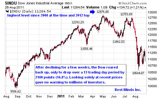
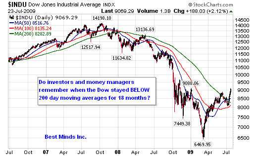
If you have no understanding of high frequency trading platforms or speed computer trading, then watch the report released by 60 minutes in June 2011, Wall Street: The Speed Traders. Anyone who believes this film is solely for those interested in keeping up with "financial news", needs to remember that in July 2011, the Dow topped and lost 2100 points (16.8%) in 13 trading days.

Consider the following opening remarks from this excellent piece:

"Most people don't know it, but the majority of the stock trades in the United States are no longer being made by human beings. They're being made by robot computers, capable of buying and selling thousands of different securities in the time it takes you to blink an eye.

These supercomputers - which actually decide which stocks to buy and sell - are operating on highly secret instructions programmed into them by math wizards, who may or may not know anything about the value of the companies that are being traded.

It's known as "high frequency trading," a phenomenon that's swept over much of Wall Street in the past few years and played a supporting role in the mini market crash last spring that saw the Dow Jones Industrial Average plunge 600 points in 15 minutes."

Does this sound like the world of "buy good companies and hold them", or "don't try to time when to get and get out of the markets, invest for the long term?" Anyone who downloads Scott Patterson's book, Dark Pools: The Rise of the Machine Traders and the Rigging of the US Stock Market (2013), learns the following:

"All of that turnover was having a real-world impact on stocks. At the end of World War II, the average holding for a stock was four years. By 2000, it was eight months. By 2008, it was two months. And by 2011 it was twenty-two seconds, at least according to one professor's estimates. One founder of a prominent high-frequency trading outfit claimed his firm's average holding period was a mere eleven seconds."

"Doug, I work with very sophisticated investment managers. I am certain they are at the top of the high speed trading world, even if I am not." From my own research, it is clear that those who desire to turnover stocks in seconds dominate the global markets today. Structures like pensions and mutual funds that are investing for "the long term" are being forced to follow whatever the biggest and fastest fish are doing in the global waters.

This makes investing look easy on the upside while returns that are clearly unsustainable are being produced, thus lulling the public into a false sense of security. Risk has grown at ever increasing levels of leverage while prices have climbed the unsustainable ladder.

NYSE Margin Debt Rises To New All Time High As Net Worth Slides To Record Low, Zero Hedge, 5/28/13

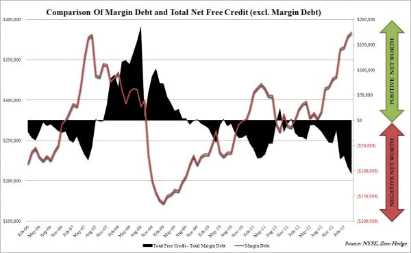
As history proved two summers ago, when high-speed trading platforms pull back from stocks to protect their own capital, "long term" investors can be left holding the bag.

The problem we have with a world driven by speed computers, is that eventually, the computers are playing a game, looking for patterns. Whereas humans could have evaluated economic and geopolitical news in order to PREPARE a portfolio for rising risk, the computer - unless finding certain terms by which to react in milliseconds to "the news" by means of artificial intelligence - is solely focused on finding the pattern and beating its next slowest competitor in the DAILY scalping game of hyper trading. As long as the rhetoric from central bankers matches the view of "we have overcome risk and will always bring your 401k statement right back up", the public at large will remain ignorant and complacent. However, the reality is that millions of investors have placed their futures next to a small group who have left them holding the bag before when markets roll over from extremely leveraged levels.

Yes, the world of investing has changed radically.

"In 1933, the number of specialist firm on the NYSE totaled 230. By 1983, acquisitions and mergers had reduced that number to 59. By 2001, there were only 10. Today, only four DMMs (Designated Market Maker) control the trading on the NYSE: Goldman Sachs, Knight, Barclays, and newcomer GETCO....Most industry professionals we talk to believe these four horsemen are responsible for 40-50% of all trading on the NYSE. "[Broken Markets: How High Frequency Trading and Predatory Practices on Wall Street are Destroying Investor Confidence and Your Portfolio (2012) Sal Arnuk and Joe Saluzzi, location 621 of 5286 in the Kindle Edition]

Lesson 2 - Is Predictable a Good Thing?

If you wanted the public to believe that they were watching an economic recovery, what better way to do it than to have the Dow rise over a long period of time, totally ignoring negative economic and geopolitical events? If you had the power to turn markets at certain junctures, then the other smaller computers and investment fish would eventually see bad news as good news, and buying the dip would become a "sure thing". If you think this would be impossible to accomplish in a market as complex and diverse as the U.S. equity markets, take a look at the charts below. This is not speculating on what WILL happen; it is already a piece of history.

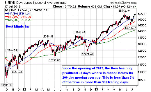
Once the Dow broke above the 200 day moving average in December 2012, it has only briefly stalled below this level. Did the high-speed trading platforms have anything to do with this? Could they have helped "lead" the "recovery"?

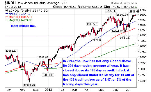
Now move forward to 2013. Notice, that once it was determined that the 200 day MA would hold at the end of 2012, and the fiscal cliff was a joke - I mean, who ever said we had to have a debt ceiling again anyway or record the amount of national debt we were accumulating. The bounce level was going to be at the 50 or 100 day moving averages, and beyond that, what is there to know?

Now think with me. Does history reveal that financial and political leaders desire the public to be pleased with their progress, when they had little to do with the progress that was made? Is it possible that the "progress" that has been made, required loading the system with more and more debt and interfering with markets to avoid those same markets from producing fear, while on the other hand rewarding complacency? Does that sound like a free market?

While the world of investors is still in the nirvana phase, is there anything one can gain from examining the historical archives? Do you remember a recent period in market history where SELLING rather than BUYING took place when these same moving averages were hit?

Lesson 3 - The Faster the Speed, the MORE likely an Accident

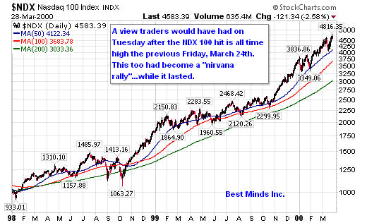
We gain confidence the more we see something working. We lose confidence the more we see something not working. And yet, this is exactly how great speculative bubbles are formed. Instead of seeing rising risk as a caution to sell and pare down, we see the rising prices as a lost opportunity and eventually succumb to watching individuals purchasing stocks and funds at their highest prices on record. We saw this in the spring of 2000, the fall of 2007, and are watching in live right now in the summer of 2013.

The best way to watch the math reveal a trap and not a triumph, we need to look for a pattern where markets climb faster with each subsequent rise, and declines become more shallow. Whether we return to the March 2009 bottom - the lowest this century - or the October 2011, we can see this pattern has already unfolded quiet clearly.

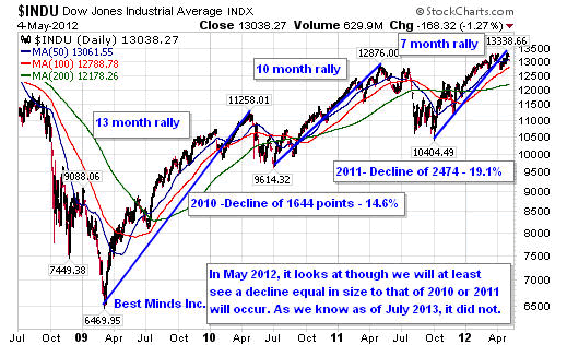
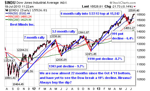
Looking at the two charts above, we can see the following:

  • Rally of 13 months; decline of 14.6% into 2010 low.
  • Rally of 10 months; decline of 19. 1% into 2011 low.
  • Rally of almost 22 months, no decline beyond 10%.

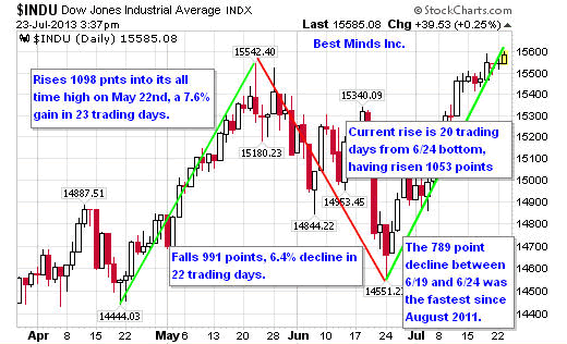
Eventually, the bounces become so predictable - both computers and individuals totally ignoring all real world risk in order to capture the latest and hottest power rally - we can see price levels achieve the larger gains in shorter periods of time. The powerful drop that took place between June 19th and June 24th can only be seen in one way...another opportunity to get in, not a warning sign of a major top.

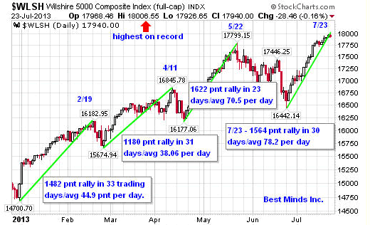
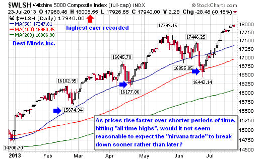
We can see the same pattern in the larger Wilshire 5,000, the broadest US stock index. Once the "fiscal cliff" was revealed as another stall in seriously challenging the status quo on December 31, 2012, US stocks took off. The Wilshire topped on February 19th. After a pull back to its 50-day moving average, it took off again, topping on April 11th. Once again it pulled backed to the 50 day MA, and started rising.

By the time it reached its high on May 22nd, it had scaled 1622 points in 23 trading days, averaging 84% more points than the climb into the April 11th top. More points; shorter timeframe.

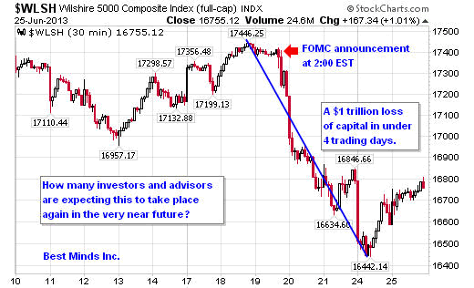
US stocks had drifted sideways into the June FOMC meeting. When the Federal Open Market Committee (FOMC), finished their regular scheduled meeting on June 19th, their press release (2:00 EST) was not well received by investors or more accurately, the split second artificial intelligence buried in the high frequency computer trading programs. In less than 4 trading days, the Wilshire had shaved off $1 trillion in paper wealth.

After touching its 100-day moving average, the Wilshire 5000 started up again. As of the close of business on Tuesday, July 23rd, the Wilshire has reached 18,000 for the first time in the history of American markets. Its climb between the June 24th low and this price level has taken 20 trading days, thus producing a daily average price increase faster than its previous run into its May 22nd high.

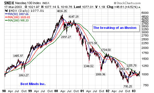
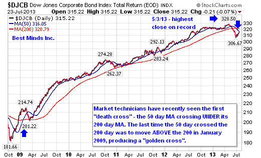
2000 and 2013 - Both are Warning US Stock Investors Now

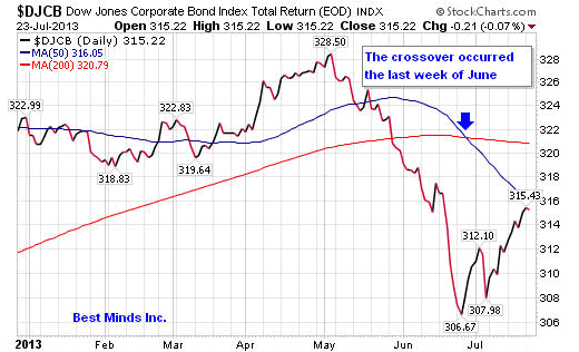
In case this still appears purely academic, let's look at four more charts; two of the NASDAQ 100 - one in March 2000 and the other three years later - and two different views of the Dow Jones Corporate Bond Index, which on May 3, 2013, reached its highest level on record.

Even material written 18 months ago by bankers outside of Wall Street, supports the fact that the REAL world of finance has not been signaling a nirvana trade for some time now.

"We currently live in a world of extraordinary levels of government intervention and manipulation of the global market economy. Tax credits, credit facilities, foreign currency interventions and 'voluntary haircuts' on foreign bonds are government attempts to postpone inevitable market corrections." Economic Uncertainty, Texas Banking, January 2012, pg 9

May we all remember, when everyone is doing the same trade, then it is time to look in a different direction. The great trades made by contrarians were never from following the crowd.

See the original article >>

Comex Gold Explained

By: Adrian_Ash

Miguel Perez-Santalla writes: A primer on how physical gold stocks are held for Comex contracts, and what stock changes mean...

There has been a lot of misinformation recently about Comex warehouse gold stocks.

Most notably, there's confusion about how this year's sharp drop in the quantity of gold bullion held in Comex warehouses might point to some looming shortage of metal to settle gold futures contracts, or even signal an outright default by sellers to buyers.

But there is no mystery or hidden agenda of how Comex works. In this article our goal is to explain how the Comex works in the simplest fashion. Having been involved in the physical gold markets for thirty years - both making and taking delivery on the exchange, as well as through off-exchange deals for miners, refiners, fabricators and investors - I hope I'm in a position to share a true "insider" view, the better to inform this debate properly.

First question: How does gold get into warehouse stocks of the futures exchange? Although it's a lengthy process, the answer is actually quite simple. Gold is recovered either from mine output or scrap jewelry and other products, such as bars and coins, at a refinery. The refiner then produces gold bars to the standard and specification of the exchange, in this case the CME Group.

These gold bars belong either to the refiners themselves, meaning they have bought and own the gold. Or they belong to the refiner's customers, who bought and owned the gold at the refinery, hiring it to make that metal into saleable bars.

Now, for this particular refinery to deliver metal onto the commodities exchange, it must be a registered acceptable brand, such as Heraeus, Johnson Matthey orMetalor Technologies to name a few.

Once these gold bars are produced, the metal must then be transported to the warehouse by exchange-approved carriers such as Brinks Inc., Via Mat International or IBI Armored Inc. There is no other way for the gold to get onto the exchange. Gold may move between Comex-approved warehouses, such as those operated by HSBC Bank, Brinks Inc., and Scotia Mocatta Depository. But any moves made between these warehouses must be made using the same approved carriers. No gold can enter the marketplace from outside of this refining loop.

Once gold is removed from an exchange-approved warehouse and held somewhere outside of this circle of integrity, there is no way for the CME exchange to guarantee the bar's quality. This means that once a person or investor removes bars from the warehouse, then to return them to the exchange they would need to start at the beginning again. By going through the hands of the gold processor and refiners, this provides guarantee of the standard and quality of the material being delivered on the exchange.

So with the gold inside the warehouse, second question: When is the gold considered eligible or registered on the commodities exchange?

Answer: When acceptable bars are brought into an exchange-approved warehouse they become "eligible" for settlement of gold futures contracts traded on the exchange. So at this point, the owner of the bars may deliver them onto the exchange, and warehouse receipts are created. That is when the gold bars become "registered" stocks.

Eligible gold stocks may or may not ever become registered stocks. Why? Because the warehouse is still a warehouse and the owner may simply want to vault their metal securely, before using it to meet demand elsewhere - for manufacturing, or from investors in another marketplace, such as Asia. This eligible gold may belong to an investor, a refiner, a hedge fund, a bank or producer. Many times these people are holding the metal for their end customers. And it may move at any time, and is much more flexible than the warehouse receipts that are registered stocks.

The CME, the exchange, does not have any direct control over nor interest in the size of eligible stocks. Registered stocks however are officially recognized by the CME for good delivery on the exchange. That means that this inventory exists and is set aside to make delivery against gold futures contracts. Traders who stand for delivery, rather than cash payment, when their contract settles take delivery of the warehouse receipt. This does not change the quantity of registered stocks inside the warehouse. It remains registered, but the receipt changes ownership.

If a gold futures buyer wants to take physical delivery of the gold and "break" the receipt then this is possible. But it is a process and takes time. Once broken, if the gold remains in the exchange circle of integrity - meaning the exchange-approved warehouse - then those bars become eligible stocks. But if the gold bars are removed from the exchange-approved warehouse then they no longer are eligible and are no longer tracked in any way.

Third question then: How do the warehouse receipts work?

A warehouse receipt is a bearer instrument much like a check. It can be endorsed from one party to another. The holder of the receipt pays the storage costs. Most times when people take delivery of a warehouse receipt they leave it with their brokers. In some cases people may want to take possession of the warehouse receipt themselves. This is rare, just like with equity or bond certificates; no one actually takes delivery of the documents any longer. But it is still possible for a fee.

If a person owns a warehouse receipt, the gold that it represents is still in the registered stocks, even if they have taken physical delivery of the document. They can always redeliver these receipts onto the exchange by selling contracts.

How does the gold futures exchange work? CME Group is the largest futures exchange in the world. Many commodities, of which gold is one, are traded on this exchange. The gold exchange - which is often still referred to as the Comex, its original name prior to being bought by the CME - is the largest gold exchange by volume in the world.

On the exchange, futures contracts are traded. These contracts are agreements to deliver a specified quantity and grade of metal at a specified time. Because of the ability to margin these contracts, meaning to pay a deposit on a greater value of gold, there is a lot of liquidity in the market. Much of this liquidity is provided by speculators who are trying to make money on the direction of the gold price. This enables the gold industry - the mine producers, refiners, manufacturers and retailers - to protect themselves from market risk, hedging their exposure to price movements by trading contracts for prices in the future. This is the reason that the gold futures market exists.

Most commodity futures contract positions are closed prior to the delivery period. This means that more often than not, the people that contract to trade on the exchange liquidate their contractual commitments prior to having to take delivery. But this does not mean that all that business is founded only on speculation. For example, a jewelry manufacturing firm may contract to sell a gold contract as they physically buy gold. Perhaps because the product they are making has not been sold to a customer yet.

For simplicity's sake, imagine a jeweler needs 100 ounces of gold to make four hundred gold rings. The process may take him two weeks, and in that time period he may not want to take the price risk. So the jeweler decides to sell one gold contract (100 ounces) on the CME at the same time as he buys the physical gold for production. In this way he is hedged, which means he no longer has price risk. In two weeks' time, when the rings are ready and he has found the buyer, he sells the rings to the buyer and at the same time buys back the contract.

In this instance there is no settlement of physical via the commodities exchange. There are many examples similar to this one that are used every day, one way or another, for hedgers of commodities. A main factor in the gold market is that typically, when gold registered stocks are falling, that means the gold price is falling too. This indicates that gold is being better used off the market, instead of being held on the exchange. As for the total quantity of eligible and registered stocks in CME warehouses, it also tends to track prices higher and lower. When gold prices rise, it attracts more investors, who make use of gold by holding it as a store of value. This metal itself needs storing, and it's important to remember that, as we saw above, the Comex warehouses are used to do just that, alongside their role in vaulting gold bars for futures contract delivery.

The higher gold prices go, in short, the more people want to own it. So the more metal there will be held in warehouses on behalf of investors. And when prices fall, as they have in the last nine months and more, some owners of metal will find better-rewarded uses elsewhere, outside Western investment stockpiles, and converted for instance into the smaller kilobar products favored by Asian investors currently paying $20 per ounce over international prices in China.

Comex Stockpile vs. Gold Price

As you can see, there's little urgency or importance in the 2013 plunge in Comex warehouse gold stocks. Gross quantities are lower, but they are greater than any period prior to 2005. Just looking at the level of warehouse stocks, it is difficult and presumptuous to extrapolate market fundamentals from the holdings of eligible or registered gold at any one time. There is still plenty of metal, and there are hundreds of millions of dollars of gold traded every day off of the Comex, by thousands of different participants each with their own motivations.

Yes, there are lots of good reasons to buy gold today, I believe. But misunderstanding the basics of what is in truth a simple part of the global market shouldn't be one of them.

See the original article >>

Facebook: King of Ads

By tothetick

41% of Facebook’s advertising revenue comes from mobile advertising today according to the latest earnings report that was published yesterday and that is already a 30% increase on this time last year. Mark Zuckerburg, Chief Executive Officer of Facebook, stated: “We’ve made good progress growing our community, deepening engagement and delivering strong financial results, especially on mobile. The work we’ve done to make mobile the best Facebook experience is showing good results and provides us with a solid foundation for the future”.

That surge in mobile advertising comes at a welcome time for Facebook as Yahoo and Google both see their revenues from advertising decrease over the same period. Facebook’s revenue growth from advertising increased by a whacking 13% and that was way higher than was previously expected by analysts.

dvertising in Newsfeed on Facebook

Advertising in Newsfeed on Facebook

Facebook has a staggering 819 million mobile users today, and despite added competition from companies such as WhatsApp Messenger , for example, they have not only maintained but increased their market share. The number of mobile users is an increase of 51% on the number that used Facebook on their mobiles in 2012! While 41% of the revenue comes from mobile advertising, a staggering 88% of the entire company’s revenue is based on advertising today, whether that be on a computer or a mobile device. There are 699 million people that are active users every day of Facebook and 1.15 billion people in the world use Facebook every month, at least. The number of daily users has increased from 58% of the total number of users in 2012 to 61% this year.

So, the reasons behind Facebook’s success faced with Google’s and Yahoo’s recoiling revenues in the sphere of advertising? More and more people have access to internet via smartphones these days and mobile devices. But, that means that there is growing concern to insert advertising on such small screens and still to remain effective. What has Facebook done? It has simply inserted the advertising in the news feeds on the pages of the users of Facebook. There is a growing belief that Facebook is the place to post your company’s ads if you want to get noticed.

The new competitors coupled with the worry that news-feed embedded ads would deter users has proved to be completely wrong, apparently. According to Chief Operating Officer of Facebook Sheryl Sandberg the social network site had increased quantity of newsfeed advertising and also the type of advertising they were providing during this second quarter of the year. Zuckerburg stated that the ads represent about 5% of what is posted on the newsfeed and that means about one in twenty posts is actually advertising. The surprising thing about doing this is that burying the ad in the newsfeed means that a person that connects automatically reads the ad as they may be fooled into thinking it has been posted by a friend or family member. So, it becomes automatically more attractive. How long that will last is highly debatable. Whether or not the users will quickly become aware of the fact that they are the guinea pigs being fed the bait through advertising remains to be seen. Zuckerburg stated that now they had the quantity, they would be working on the quality of the advertising, which in itself should help users wise up to the fact that they are being used. Surely, it’s quality that should have come first.

Sandberg did state that advertising and marketing revenues were up across the board today and that people are prepared to spend more on that. But, at the moment, advertising on mobile devices only stands for 3% of all advertising spending today. The world’s figure amounts to just 2%. So, Facebook believes that the potential is enormous. That is with the added fact that people are spending more of their time on mobile devices today. So, things look set to change. Does, that mean when I check for a new car, I will be inundated by ads for new cars or I check a hotel in Rio de Janeiro that I get ads linked to that as I open my smartphone just like on the PC? Will we never escape from advertising?

Facebook: Mark Zuckerburg

Facebook: Mark Zuckerburg

Apparently, given the fact that most people use Facebook on their mobile devices while watching prime-time television in the evening in the US, the company believes that there is the added potential of using brand marketing in conjunction with other types of media. Sandberg stated that 88 million out of 100 million people in the US use Facebook in this way in the evening.

Facebook’s revenue increased by 53% to $1.813 billion in the 2nd quarter of 2013. Analysts had previously expected revenue to be around the $1.618-billion mark. Revenue stood at $1.184 billion this time last year.

Facebook stock rose a hefty 17% during market trading yesterday and today we shall see if that continues.

See the original article >>

Gold GLD ETF Reverses as TLT Breaks Down

By: Anthony_Cherniawski

GLD briefly slipped above its 50-day moving average yesterday, but could not hold it as support. Today is day 26 of the new Master Cycle. The reversal in a minute Wave [iv] makes it extremely left-translated and bearish for several more months.

TLT made a downside breakout, making a low thus far at 107.45. This move breaks the retracement and opens the way for a resumption of longer-term decline. This will magnify the losses at the banks and the Federal Reserve. The only way to stop the losses is to sell, but the selling will feed on itself.

The implications for the banks goes beyond only losses. The banks have already been covering up losses since 2007. This move brings up the spectre of insolvency again.

See the original article >>

The Conglomerate Way to Growth

by Ricardo Hausmann

CAMBRIDGE – Countries do not become rich by making more of the same thing. They do so by changing what they produce and how they produce it. They grow by doing things that are new to them; in short, they innovate.

This illustration is by Chris Van Es and comes from <a href="http://www.newsart.com">NewsArt.com</a>, and is the property of the NewsArt organization and of its artist. Reproducing this image is a violation of copyright law.

Illustration by Chris Van Es

Many countries have been altering their growth strategies to reflect this insight. But they are being distracted by some of the greatest – but atypical – examples of success.

We all have heard of Steve Jobs, Bill Gates, and Mark Zuckerberg – twenty-something college dropouts who built billion-dollar companies at the cutting edge of global innovation. We have heard of the many start-ups that they and others acquired for hundreds of millions of dollars - Instagram, Skype, YouTube, Tumblr, and, most recently, Waze. So why not emulate these successes?

The main problem is that these examples are peculiar to the software industry, which provides a woefully insufficient blueprint for the rest of the economy.

The software industry is unique, because it has unusually low barriers to entry and ready access to a huge market through the Internet. A start-up is typically just a group of kids with a good idea and programming skills. All they need is time to write the code. Incubators provide them with space, legal advice, and contacts with potential clients and investors.

But consider a steel, automobile, or fertilizer plant – or a tourist resort, a hospital, or a bank. These are much more complex organizations that must start at a much larger scale, require much more upfront investment, and need to assemble a more heterogeneous team of skilled professionals. This is not something at which a young college dropout is bound to excel, because he lacks the experience, the organization, and the access to capital that these ventures require.

And, compared to software development, these activities also require more infrastructure, logistics, regulation, certifications, supply chains, and a host of other business services – all of which demand coordination with public and private entities. Most important, these activities are most likely to be central to economic growth in developing and emerging countries. So, how will companies in these sectors arise, and what can be done to stimulate their formation?

Many developing-country governments are ignoring that question. For example, Chile’s government, obsessed with so-called “horizontal” policies that do not tilt the playing field in favor of any industry, recently implemented Start-Up Chile, a program with standardized rules to encourage new ventures. Although the rules were designed for all industries, the scheme attracts almost exclusively software ventures – the only ones that can be formed with the low level of support that the program provides.

Other industries face more daunting chicken-and-egg problems: countries lack the capabilities that growth industries demand, yet it is impossible to develop these capabilities unless the industries that require them are present. One way to solve this coordination problem is through vertical integration – that is, firms that can solve internally the coordination of the supply and demand for any new capability.

That is why national business groups – conglomerates – often play a key role in transforming an economy and its exports. This is especially true in developing counties, where many markets are missing and the business environment is often extremely challenging.

Conglomerates can use their knowledge, managerial skills, and financial capital to venture into new industries. They can start things at a scale that would be impossible for a start-up. They can make credible commitments to future suppliers and influence the business ecosystem to make new industries feasible.

Consider South Korea. In 1963, the country exported goods worth less than $600 million at today’s prices, mostly primary products such as seafood and silk. Fifty years later, it exports goods worth almost $600 billion, mostly electronics, machinery, transportation equipment, and chemical products.

This transformation was not achieved through independent start-ups. It was done through conglomerates, or chaebols in Korean. For example, Samsung started as a trading company, moved to food processing, textiles, insurance, and retail, and then on to electronics, shipbuilding, engineering, construction, and aerospace, just to name a few activities. South Korea’s transformation was reflected in the transformation of its leading companies.

But, in many developing countries, conglomerates have not played an equivalent role. They have focused on non-tradable goods and services – those that cannot be imported or exported – and have eschewed international competition. They have focused on banking, construction, distribution, retail, and television broadcasting.

Once these companies dominate one market, they move to another that is equally sheltered from competition and devoid of export opportunities, often using their size and political influence to keep out would-be competitors. Instead of becoming agents of change, they often prevent change. (Indeed, the big economic debate in South Korea nowadays concerns whether the chaebols are stifling innovation by preventing start-up competitors from challenging them.)

The productive transformation that developing countries need is much easier to achieve with the support, rather than the obstruction, of their conglomerates. But ensuring such support requires policies that nudge (or even shove) conglomerates toward export industries that can grow beyond the limits of the domestic market – industries in which competition will encourage the discipline that they lack as a result of dominating local markets.

To succeed, conglomerates need the support of government and the acceptance of society. They must earn it through their contribution to the growth of employment, exports, and tax revenues, and to the country’s technological transformation. That is what General Park Chung-hee (South Korea’s longtime ruler, and father of current President Park Geun-hye) pressured the chaebols to do in the early 1960’s. And it is what governments and civil societies in developing countries today should demand of their conglomerates.

See the original article >>

Hoisington: "The Secular Low In Bond Yields Has Yet To Be Recorded"

by Tyler Durden

Authored by Lacy Hunt and Van Hoisington via Hoisington Investment Management,

Lower Long Term Rates

The secular low in bond yields has yet to be recorded. This assessment for a continuing pattern of lower yields in the quarters ahead is clearly a minority view, as the recent selling of all types of bond products attest. The rise in long term yields over the last several months was accelerated by the recent Federal Reserve announcement that it would be “tapering” its purchases of Treasury and mortgage-backed securities. This has convinced many bond market participants that the low in long rates is in the past. The Treasury bond market’s short term fluctuations are a function of many factors, but its primary and most fundamental determinate is attitudes toward current and future inflation. From that perspective, the outlook for long term Treasury yields to fall is most favorable in light of:

a) diminished inflation pressures;

b) slowing GDP growth;

c) weakening consumer fundamentals; and

d) anti-growth monetary and fiscal policies.

Inflation

Sustained higher inflation is, and has always been, a prerequisite for sustained increases in long term interest rates. Inflation’s role in determining the level of long term rates was quantified by Irving Fisher 83 years ago (Theory of Interest, 1930) with the Fisher equation. It states that long term rates are the sum of inflation expectations and the real rate. This proposition has been reconfirmed in numerous sophisticated statistical studies and can also be empirically observed by comparing the Treasury bond yield to the inflation rate (Chart 1). On an annual basis, the Treasury bond yield and the inflation rate have moved in the same direction in 80% of the years since 1954.

Presently the inflation picture is most favorable to bond yields. The year-over-year change in the core personal consumption expenditures deflator, an indicator to which the Fed pays close attention, stands at a record low for the entire five plus decades of the series (Chart 2).

Additional factors restraining inflation are the appreciation of the dollar and the decline in commodity prices. The dollar is currently up 14% from its 2011 lows. A rise in the value of the dollar causes a “collapsing umbrella” effect on prices. A higher dollar leads to reduced prices of imports, which have been deflating at a 1% rate (ex-fuel) over the past year. When importers cut prices, domestic producers are forced to follow. Commodity prices have dropped more than 20% from their peak in 2011. This drop in commodity prices has also contributed to lower rates inflation.

Sustained higher inflation is not currently evident, and the forces that create inflation are absent. Thus, a period of sustained higher long term rates is improbable.

GDP

GDP growth, whether if measured in nominal or real terms, is the slowest of any expansion since 1948. From the first quarter of 2012 through the first quarter of 2013, nominal GDP grew at 3.3%. This is below the level of every entry point of economic contraction since 1948 (Chart 3). Real GDP shows a similar pattern. For the past four quarters real economic growth was just 1.6%, which was even less than the 1.8% growth rate in the 2000s and dramatically less than the 3.8% average growth rate in the past 223 years. These results demonstrate chronic long term economic underperformance.

Over the past year, the Treasury bond yield rose as the nominal growth in GDP slowed. The difference between the Treasury bond yield and the nominal GDP growth rate (Chart 4) is important in two respects. First, when the bond yield rises more rapidly than the GDP growth rate, monetary conditions are a restraint on economic growth. This condition occurred prior to all the recessions since the 1950s, as indicated in the chart. This condition also signaled the growth recessions in 1962 and 1966-67. Second, the nominal GDP growth rate represents the yield on the total economy, a return that embodies greater risk than a 30 year Treasury bond. Thus, the differential is a barometer of cyclical value for investors in Treasury bonds versus more risky assets.

On two occasions in the 1990s the Treasury bond/GDP differential rose sharply. Neither a quasi- nor outright recession ensued, but in both cases bonds turned in a stellar performance over the next year or longer. This economic indicator simultaneously casts doubt on the prevailing pessimism on Treasury bonds and the optimism over U.S. economic growth.

Consumer

Consumers have not yet healed from the great recession. Their income and employment situations have languished. Based on the standard of living, as measured by the real median household income, this entire recovery has bypassed the consumer sector. The standard of living has contracted regularly in recessions, but this is the first time deep into an expansion that it has continued to erode. The current standard of living is unchanged from 1995 (Chart 5).

In spite of job gains in the first half of 2013, the downward pressure on the standard of living actually intensified. Approximately three quarters of the increases in jobs were in four of the lowest paying industries – retail trade; the temporary help services component of professional and business services; hospitality and leisure; and the nursing and residential care facilities component of the medical category. These increases may reflect efforts of firms to minimize the increase in health care costs associated with full time employment under the Affordable Care Act. Part time jobs averaged increases of 93,000 per month in the first half of 2013, while full time jobs averaged increases of only 22,000 per month. Full time employment as a percentage of the adult population is currently 47%, which is near the lows of the last three decades.

Historically, when taxes are increased, the initial response of households results in a lower saving rate rather than an immediate reduction in spending. For some consumers, recognition of the tax changes in their income is a problem, particularly for those whose earnings are dependent on commissions, bonuses or seasonal work. This explains the sharp drop in the personal saving rate to 2.7% in the first five months of this year, a level at or below the entry points of all the economic contractions since 1929. The 2013 slump in the saving rate is a precursor of the painful adjustments that lie ahead, and an additional restraint on economic growth. (Note: In late July the Bureau of Economic Analysis is expected to release a benchmark revision to the National Income and Product Accounts. As a result of the revision the personal saving rate may be raised by up to 1.5%. This is due to the change in consumer ownership of defined benefit pension plans. This revision will no t change the trend of the saving rate, nor will this higher figure indicate a source of funds for immediate spending since consumers will only receive such pension benefits when they retire.)

The drop in the saving rate in 2013 also serves to explain why the primary drain from higher taxes occurs with a lag after the taxes take effect. Based on various academic studies there is a two or three quarter lag in curtailed spending after the tax increase. Thus, the main drag on growth will fall in the third and fourth quarters of this year, with negative residual influences persisting through the end of 2015. Approximately $140 billion of the tax increase constitutes what might be termed a reduction in permanent income, or its equivalent life cycle income. In addition to working with a lag, over a three year period this portion will carry a negative multiplier of between two and three.

Monetary & Fiscal

Astronomical sums of money have been expended by both monetary and fiscal authorities since the crisis. With the benefit of hindsight it is clear their efforts have not aided economic growth, but rather the balance of their actions has been counter productive. The Fed has maintained the Fed Funds rate at near-zero levels, and it has tried to lower longer term rates through a series of quantitative easings. The effect of each of the quantitative easings was the opposite of the Fed’s intentions. During every period of balance sheet expansion long rates rose, yet when securities purchases were discontinued yields fell (Chart 6). The Fed cannot control long rates because long rates are affected by inflation expectations, not by supply and demand in the market place. This is extremely counter intuitive. With more buying, one would assume that prices would rise and thus yields would fall, but the opposite occurred. Why? When the Fed buys, it appears that the existing owners of Treasuries (now amounting to $9.5 trillion) decide that the Fed’s actions are inflationary and sell their holdings, raising interest rates. When the Fed stops this program, inflation expectations fall creating a demand for Treasuries, bringing rates back down. The Fed’s quantitative policies have been counter productive to growth as interest rates have risen during each period of quantitative easing. During QE1 and QE2, commodity prices rose, the dollar fell and inflation rose temporarily. Wages, however, did not respond. Thus, the higher interest rates during all QEs and the fall in the real wage income during QE 1 & 2 served to worsen the income and wealth divide. This means many more households were hurt, rather than helped, by the Fed’s efforts.

In terms of government spending, fiscal policy has not, and will not, have a major affect on economic growth. The increased spending immediately following the financial crisis did little to encourage the economy to grow faster. Likewise, the decrease in spending associated with the “sequester” will unlikely be a drag on growth after the initial and lagged effects are fully exhausted. The research on government spending multipliers suggests that the multiplier on spending is very close to zero.

The impact of tax changes is not nearly as harmless. It has been argued that an expired “temporary payroll tax cut” would not effect spending as the initial increase in income was not seen as permanent. The facts seem to counter this opinion. The average monthly year-over-year growth rate of real personal income less transfer payments for 2011 was 3.4%, and in 2012 it was 2.2%. This year, with the payroll tax change in effect, the average is 1.8% through May. The slower income has resulted in a slowdown in spending. Like income, real personal consumption expenditures has trended lower, with average monthly year-over-year growth rates of 2.5% for 2011, 1.9% for 2012 and 1.8% through May of this year. This trend is expected to continue for some time.

A Final Consideration Favoring Bonds

In the aftermath of the debt induced panic years of 1873 and 1929 in the U.S. and 1989 in Japan, the long term government bond yield dropped to 2% between 13 and 14 years after the panic. The U.S. Treasury bond yield is tracking those previous experiences (Chart 7). Thus, the historical record also suggests that the secular low in long term rates is in the future.

See the original article >>

How Spain Just Made Mario Draghi's Nightmare Worse

by Tyler Durden

Yesterday, ahead of the monthly update from the ECB, we posted "What Keeps Mario Draghi Up At Night, And Why The European Depression Has A Ways To Go" in which we showed that not only has M3 in Europe terminally broken apart from bank lending to the Euroarea private sector, but that lending to European banks was growing at the slowest annual pace on record. Today, the ECB showed that Draghi's unpleasant dream is becoming a full-blown nightmare with M3 sliding from a 2.9% growth rate in May to just 2.3% in June, suggesting that whatever the ECB is (not) doing is not working and yet another stimulus round is imminent.

However, putting into question whether even such a stimulus would do anything, is the fact that actual private sector lending contracted even more, and in June declined from a previous record pace of -1.1% to a new record low of -1.6%. In other words, not only is Europe's Keynesian debt trap getting bigger by the month, but the European monetary plumbing system is completely and perhaps permanently fractured.

As long as the gray line continues to be below zero, and certainly as long as it continues to decline, one can kiss all propaganda of a European "recovery" goodbye.

Specifically, in the "loans to non-financial corporations" category, on a seasonally adjusted basis, lending declined by €12.8bn in June, following a €17.4bn contraction in May and a similar move in April. However, it was the loans to households which were the notable outlier, as lending fell by €5.1bn in June. This is only the second fall in loans to households since July 2012, and comes on the heels of a €7.7bn contraction in May. Not only are corporations deleveraging in Europe, but now, once again, households have joined the fray.

Finally, looking at the actual culprits by nation, one country stands out like a sore thumb. We will let readers spot which European nation is responsible for the accelerating European credit crunch on their own.

Indeed, despite Mariano Rajoy's urgent desperation to massage the economic data in Spain, propping up PMI at all costs and now unemployment, which in the second quarter declined from 27.2% to 26.3% due to a strong tourist season (even with 5.98 million people unemployed), what the credit data is showing is that the pain in Spain remains, and until credit creation is once more positive there is little hope for any sustained improvement in either Spain, or the entire continent. And this ignore the fact that even with the SAREB soaking up the bulk of bad loans in the country (offset by rising sovereign debt), NPLs continue to hit record monthly all time highs: something which means the Cyprus one time, "non-blueprint" will sooner or later be repeated by Madrid.

See the original article >>

What Drives Negative GOFO and Temporary Gold Backwardation?

by Keith Weiner

I coined the term temporary backwardation in March of last year. This is what I said:

But in the “new normal”, post 2008, the expiring gold or silver future often flirts with or even slips into backwardation for a period before expiry.  This is anything but normal.  It’s not a sign of imminent financial Armageddon, but it is a sign that beneath the surface there is a growing rot in the core of the system.

I used the word “temporary”, not to imply that this pathology would stop (I said it was the “new normal”), but to refer to the fact that each contract spends a short time in backwardation before either rising out of backwardation or expiring. I used the word temporary to distinguish from permanent backwardation, which will affect all contract months—the farthest first and most severely. Look at this  chart of crude oil. When that happens in gold, the end of the dollar will be near indeed.

Since I wrote the article on temporary backwardation, the rot in the monetary system has increased. I posted a short alert on July 8, marking the first day that the October contract entered backwardation. The rot has crept from the active month (which was still very much August) to the next contract, October. I also showed the progression of how far in advance each contract was entering backwardation (Apr: 30 days; Jun 42; Aug: 55; and Oct: 61).

Let me emphasize that I think this should be regarded as rot. Backwardation provides an opportunity for a risk-free profit. At least, it is free of conventional risk. The trade does not depend on access to credit, and it involves no price exposure. Of course, as I look at it, there is one risk. Whomever takes the bait by selling metal and buying a future risks not getting his metal back. The contract may not be honored, paying dollars at the end.

One should regard rising backwardation as one would regard rising Credit Default Swaps on a bond. Even if the yield on a bond isn’t rising exponentially (yet), rising CDS should be cause for concern. Even if the gold price measured in dollars isn’t rising exponentially (yet), rising backwardation should be great cause for concern.

While we currently have backwardation in the near contract and the next active contract, there is no backwardation beyond October. Here is a picture of the gold basis for 2013 through 2016 (December contracts shown), taken on Friday July 19. It looks similar to the idealized yield curve.


chart-1, long term basis curveOther than Dec 2013, which has a negative basis (it is not backwardated; its cobasis is negative), the basis is not only positive, but it is rising for each succeeding year. I acknowledge that this is open to interpretation, but I don’t see how one can look past a positive and rising long term basis curve and conclude that monetary collapse is imminent – click to enlarge.


When distrust occurs broadly and in earnest, I expect it to creep from the farthest contracts inwards. If there is doubt about delivery, then surely Dec 2016 is much riskier than August 2013. This will be a process of the withdrawal of the gold bid on the dollar (which will look like the withdrawal of the gold offer to those who look outwards from the dollar point of view). With a rapidly withdrawing offer in spot gold, and at the same time an increasingly reluctant bid especially on far futures, there would be a large backwardation that is greatest the farthest out on the curve. In comparison, as of Friday, we have under 0.5% annualized backwardation in August and barely above 0 for October.

Nevertheless, the occurrence of backwardation in gold at all, much less two successive active contracts is serious. Recently, a related phenomenon has made the news and generated much analysis. The GOFO rate has gone negative. Let’s talk about what GOFO is. Short for the Gold Forward Offered rate, GOFO is similar to the basis. Here is a chart overlaying the 3-month GOFO with the October gold basis. I have omitted the axes, as I just wanted to show the shapes of the curves. There are some differences that cause a different scale for each data series.


chart-2, GOFO und OCtThe London Bullion Market Association defines GOFO as the rate at which bullion banks are prepared to lend gold on a swap against US dollars. OK, but what does this mean? Let’s take a step back and look at the London market – click to enlarge.


The London market offers a product called forwards, which are similar to COMEX futures with a few differences. They are not listed on an exchange, so they’re less transparent. The settlement date can be set to fit the buyer’s needs. Unlike COMEX futures, forwards always have a convenient expiry date, so there is no need for “naked longs” to sell the expiring contract. In contrast, the “contract roll” pushes the basis off the bottom of the graph. This is why I showed the October contract, rather than showing a pasted-together series of nearer contracts as they dropped.

GOFO depends on the spread between the gold forward and the gold spot market. This is why the GOFO graph looks so similar to the gold basis graph. Keep in mind that GOFO is an offer by bullion banks, not a pure spread between prices in a market. Along with a few other factors, this makes the GOFO rate less “noisy” than the basis.

After reading my articles (Why Does the “Paper Gold” Price Track the Physical Gold price?, The Gold Futures Open Interest Caper, What is the Meaning of GLD Outflows?, and Why is Gold Draining out of COMEX Warehouses?), readers should be able to guess the punch-line: it is arbitrage that keeps GOFO in sync with the gold basis.

To understand why the spread between the forward and spot gold is important to GOFO, let’s drill down into the transaction that the bank is offering to the client. It is a swap, which means each party is exchanging an asset and the opportunity to get a yield on for another asset. A swap is not a simple trade. It comes with a clause that both parties agree to return the assets to the other party after a specified duration.

In this case, the client has dollars and wants gold. In calculating its offer, the bullion bank must consider its costs and benefits in doing this transaction. Here is a breakdown of the discrete steps (all are committed simultaneously):

  1. Client gives dollars to bank

  2. Bank invests dollars (receiving LIBOR)

  3. Bank borrows gold (paying GLR)

  4. Bank gives gold to client

At the end, the client returns the gold to the bank, which delivers it to the gold lender, and the bank returns the dollars to the client.

The equation that represents the above swap is:

GOFO = LIBOR – GLR

LIBOR is a typical interest rate that could be earned on dollars. GLR, or Gold Lease Rate, is the “interest rate” that could be earned on gold. Ever since the 1930’s, of course, there has not been any real borrowing and lending of gold as money. However, there is a specialist market for borrowing and lending gold, who refer to it as “leasing” (who might want to lease gold is the topic for a separate article).

It is logical that the rate on a swap is the difference in the interest rates between the two things being swapped. Because of the mechanics of how the bank provides the swap using the forwards market, arbitrage will keep this rate close to the spread between forwards and spot. Arbitrage will also keep this forwards spread close to the spread between COMEX futures and spot—the basis.

The next question is whether LIBOR is falling or GLR is rising. LIBOR has indeed fallen slightly, from 28bps at the start of April to 26.5bps on July 19.

Let’s develop a single integrated theory that takes into account all the facts. First, we have temporary backwardation. This indicates a liquidity issue in near-dated futures, if not a broader problem in the monetary system. Second, the basis has been falling (even far-dated futures), and cobasis has been rising. Evidence of this is the increase in advance dates that each contract goes into temporary backwardation, plus we have two active months backwardated for the first time in a long time (years, to my recollection). Third, there have been many news reports since April, of higher than normal positive spread in the gold prices between London/NY and China.

I think there is a simple arbitrage that explains all observed phenomenon. For every gold bar that a bullion bank buys, it has several options for how to make money without incurring price risk. One is to “lend it on the swap” as described in the GOFO example above. Another is to carry the gold by selling a futures contract against it, earning the basis.

A third is to sell it for a premium in China. If this premium is larger than the profit of the first two options, then selling to China will be attractive. This option has another advantage. It does not expand the bank’s balance sheet, with the attendant capital requirements. It is a simple buy and sell, with the only headache being actually shipping the bar to China.

Water flows down-hill, from higher elevation to lower. Analogously, gold flows up-price, from lower price to higher. Right now the spare bars are going from New York and London to China. The result is temporary backwardation and a negative GOFO.


Dr. Keith Weiner is the president of the Gold Standard Institute USA, and CEO of Monetary Metals.  Keith is a leading authority in the areas of gold, money, and credit and has made important contributions to the development of trading techniques founded upon the analysis of bid-ask spreads.  Keith is a sought after speaker and regularly writes on economics.  He is an Objectivist, and has his PhD from the New Austrian School of Economics.  He lives with his wife near Phoenix, Arizona.

See the original article >>

Follow Us