By Barry Ritholtz
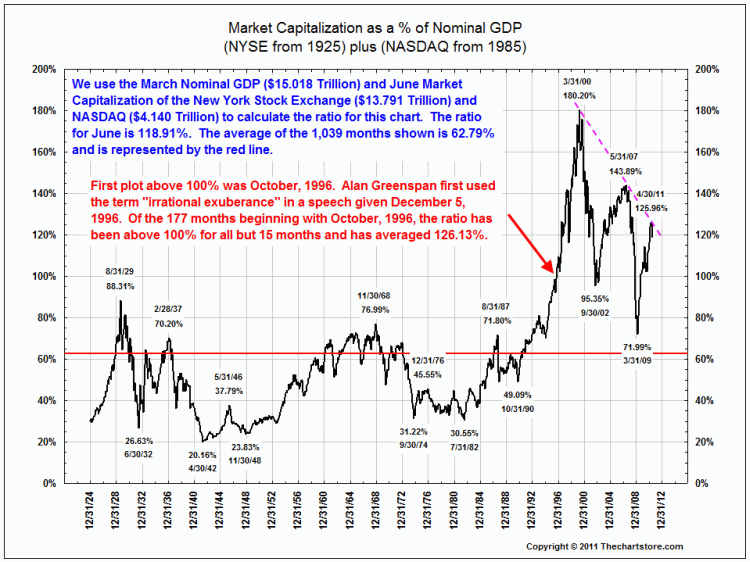
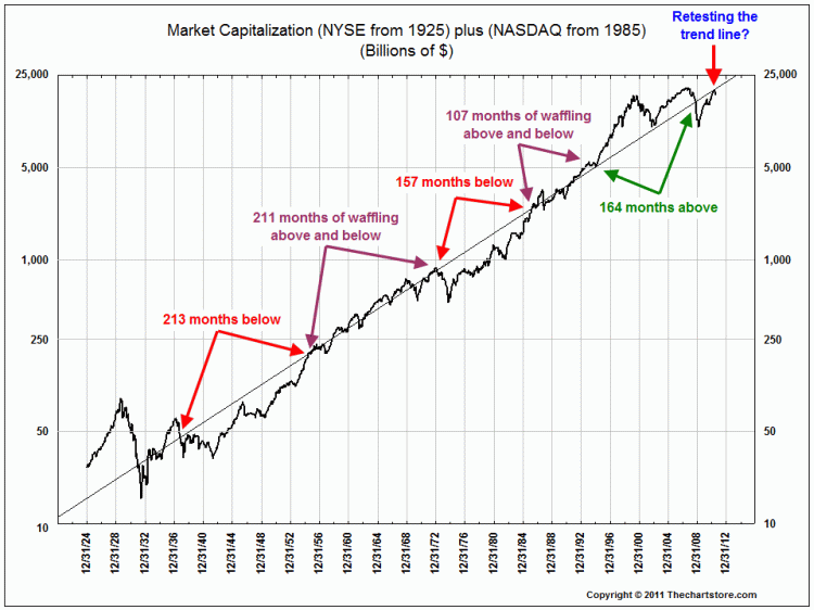
I always find these charts instructive in terms of where we are over the longer cycle in terms of valuation relative to economic activity of the US.
The two biggest changes post-1996 has been the increasing US exposure to overseas growth, and rates that started low went to ultra low.
>
>
Market Capitalization as % of GDP
click for larger charts
>
Market Cycles Above and Below Trend Line

No comments:
Post a Comment