By Lee Adler
In Part 1 of this report we looked at non-farm payrolls, which come from the BLS the Current Employment Statistics Survey or CES, a survey of business establishments. The BLS also does a survey of households. The household survey or CPS — Current Population Survey– sometimes tells a different story from the establishment survey. It’s also important in that it breaks out full time employment from total employment so that we can analyze that important metric separately.
The actual NSA (not seasonally adjusted) number of persons reported in the CPS as employed in June rose by 409,000 from May. Over the previous 10 years, June always had an increase. The average was 712,000. Last year the increase was 475,000.
The year over year gain in total employment under the CPS was 1.1%, down from 1.2% in May. The annual growth rate has decelerated from 2.2% last October. The growth rates were actually stronger before the Fed restarted pumping money into the economy in November, when it settled its first MBS purchases in QE3.
Full time employment in the CPS rose by 757,000 in June, which is always an up month for full time jobs. This year’s gain was weaker than last year’s 1.39 million and weaker than the average gain of 1.37 million. The annual gain was 1.2% down from 1.8% in May. It was better than a trough of 0.8% set in March, but still below the 2.4% rate when QE3 was announced in September and 2.1% when the cash started hitting the system in November. It’s clear that the resumption of QE last fall spurred neither total jobs, nor full time jobs.
The sharp slowing of the growth rate does hint that the fecal cliff and secastration, and the approach of the full implementation of Obamacare may have had a negative effect. However stronger months have alternated with weaker months since these programs took effect so it is not yet clear if the budget cuts and tax increases have had or will have a lasting impact.
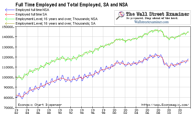
Full Time and Total Employed Long Term View – Click to enlarge
The chart above gives some perspective on how far total employment and full time employment fell in the first stage of the 2008-09 depression, and how much they have yet to recover.
With QE3 in late 2012, the Fed began adding more fuel to an engine that was running at its natural capacity. Job growth has not accelerated in response to the flood of money printing. While house prices and stock prices are rapidly inflating thanks to too many dollars chasing too few assets, job growth has been tepid. The Fed is blowing massive asset bubbles while the economy plods along at the a growth rate little different from when it was in a long pause in QE in 2011 and 2012. Money printing works to inflate asset prices, but it does nothing to stimulate job growth.
Full Time Employment, Stocks, and The Fed – Click to enlarge
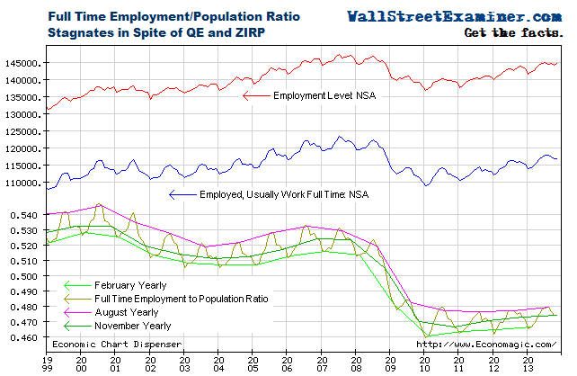
The chart below shows that while the number of jobs is growing, the full time employment to population ratio has barely budged since the recovery began in 2009. The economy seems to barely be keeping pace with population growth. The full time employment to population ratio bottomed at 46% in January 2010, and it’s at 47.8% today. That compares with 47.7% a year ago. There has been virtually no improvement in the past 12 months. This ratio is still at levels last seen in 1982 and 1983 at the bottom of a horrible recession.
Full Time Employment to Population Ratio – Click to enlarge
Fed ECB and BoJ- Click to enlarge
The number of unemployed persons is growing right along with the number of people who do have jobs. It is a sad state of affairs for the US, but markets don’t care about that. They respond to the amount of cash in securities dealer accounts, which, thanks to the Fed (and lately the BoJ), continues to grow. As long as the Fed continues to pump money into the markets, I doubt that slow employment growth will matter much. In fact, most will see it as an excuse for the Fed to continue blowing a bubble.


No comments:
Post a Comment