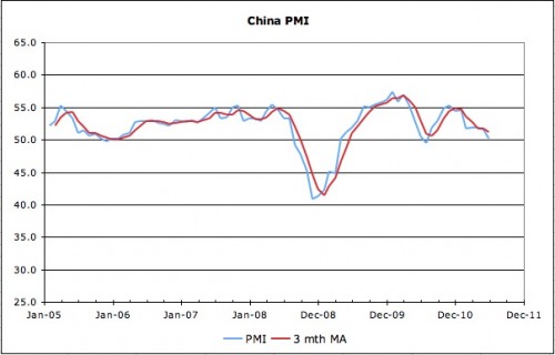
China’s latest flash PMI data was not good (via Markit here) – if the trend continues, next month will see China on the wrong side of the ledger:

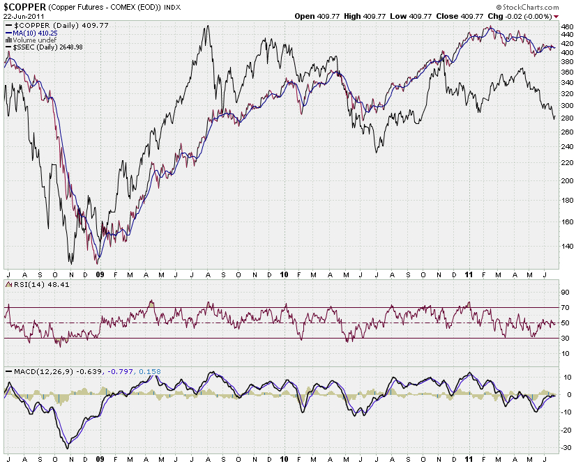
You’d think that weakness in the China growth engine would be reflected in commodities prices – but the charts would suggest otherwise. Consider that bellweather of commodity demand – copper:

Apologies for the somewhat crowded chart, but it’s interesting from a few perspectives – starting from the top:
1) The copper price has rolled off its highs but has materially lagged the selloff in Chinese equities. As we have discussed previously (most recently here and background here), the Shanghai Composite has been led down by the resources and financials sectors. Eyeballing the relative price movements suggests that equities tend to lead the copper price – particularly at turning points.
2) The copper price has been diverging from equities since the start of March. With domestic tightening leading to unwinding of copper inventories in China and difficulties in its property development sector, it’d be reasonable to expect copper to follow the equities markets lead rather than the reverse.
3) I’ve included the RSI for copper to illustrate that the price could fall someways before becoming oversold by this measure. Notably, the MACD looks to be crossing over again – suggesting that momentum is turning against coppers price.
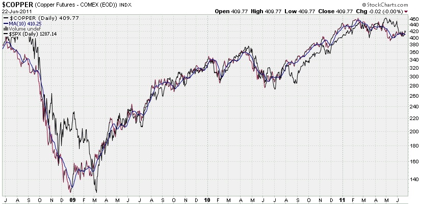
Finally, and in some ways following on from yesterday’s post about the impact of the investor class on commodities prices, consider the following chart that maps US equities against the copper price. For mine, the correlation says a lot about US monetary policy, its impact on investors, and the resultant movement in the copper price.

No comments:
Post a Comment