It was a strange jobs report on Friday that had stock traders scratching their heads. The unemployment rate dropped from 9.4% to 9.0%, which is a huge drop. But then we learned that the big reason for the drop was not the creation of a whole bunch of jobs (only 36,000) but rather the removal from the “work force” of thousands of people who the Bureau of Labor Statistics figures have dropped out. The 8:30 AM EST release of that news caused prices to fluctuate wildly for a few minutes in the overnight futures sessions, then things settled down and traders got back to thinking about how POMOs are going to keep the party rolling. The up close for the major averages was in keeping with the market’s tendency to have jobs report days move in the direction of the underlying trend. We are in an uptrend, and we got an up close.
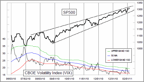
The calming down this week following last Friday’s frightful sell off has allowed the VIX to fall back down to just below its lower 50-1 Bollinger Band. That can mean that the market is extended, but the VIX can also stay down there for a long time as prices trend higher.
I still think that the combination of POMO and positive seasonality will keep the market trending higher, at least through June when both are scheduled to end. But there are a couple of unusual intermarket relationships that I would like to share with you that have me worried about the real underlying strength of the market.

The top chart shows the SP500 and compares it to the current situation in lumber futures according to the COT Report. Those reports come out on Fridays, and our newer readers should know that I like to take time on Fridays to go over the meaningful indications found in the data.
It is a bit of a strange stretch to think that what is happening with the positions of commercial lumber futures traders would have much to do at all with the fortunes of the stock market, but the correlation between these two is far from appearing to be random. My conclusion is that the lumber COT data is reflecting the same sort of banking and liquidity forces that make the movements of lumber prices such a great leading indicator for a variety of things, including interest rates and home prices.
The current high reading for the commercial lumber futures traders net short position is equivalent to what we saw at the April 2010 stock market top. Other high readings a few years ago did not have quite the same clear and clean response by stock prices, but it is pretty clear that the SP500 seems to have a much easier time going upward after the commercial lumber traders have been net long. This is not a good enough correlation all by itself to make me want to abandon a bullish stance. But it is a cause for concern which says that if we did not have the Fed providing all the liquidity to the market, we would likely be seeing some more significant troubles for the stock market.
The lower chart shows another strange relationship between things that arguably ought not to have a relationship. A couple of years ago, I was wondering about the total amount of money that was tied up in currency futures contracts, so I set out to calculate it. One difficulty with tracking that is that at every quarterly expiration the number of currency futures contracts makes a big drop, and then starts building back up again. So to smooth out the data, I used a 63 trading day simple moving average to take out the quarterly spikes.
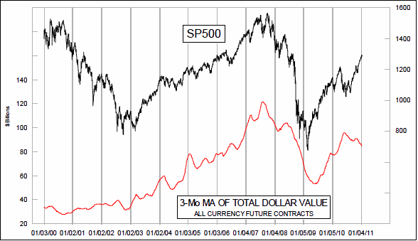
When I saw what the resulting chart plot looked like, I immediately recognized it as resembling the shape of the SP500′s chart plot. So I put the two together and sure enough they seemed to move together. But other than finding an interesting coincidence of data behavior, there did not seem to be much use to it. I could not come up with the answer to the question, “So what?”.
But now, they are doing something interesting. The total value of currency futures contracts has been declining since the middle of 2010, but stock prices are heading higher. I figure that QE2 is the best explanation for why the stock market is still doing well. But seeing that something which is supposed to correlate to stock prices is not doing well suggests that there are problems underlying the stock market’s advance.
T-Bond traders were not heartened by the strange employment news, with prices breaking down below the level of the December low. By all rights this is a breakdown from a consolidation zone, and conventional trend following theory would say we should accept this as a sign that a new downtrend leg is beginning. But I am suspicious about this. It is a little bit too neat, especially after such an organized and precisely orderly sideways consolidation structure. My reaction to the seeming breakdown is, “That’s what they want us to think.”
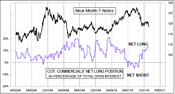
The top chart on page 3 shows the commercial traders’ net position in 10-year T-Note futures. They are back up to a pretty big net long position, which seems to imply that T-Note (and T-Bond) prices are closer to a bottom than to a top. Curiously, T-Bond futures are not showing the same sort of net long position. For now, I believe that it is better to sit out this dance, until prices start behaving in a more sensible and detectable way.
Gold lost a little bit of the big gains we saw on Thursday, but not too much. It still looks like a typical breakout move above the short-term declining tops line shown in Thursday’s Daily Edition.
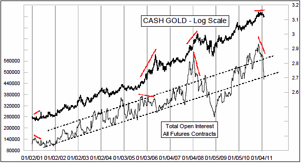
This week’s COT Report showed that total open interest in gold futures plummeted from a week ago. This is a new type of gold rush – - people rushing for the exits. The middle chart shows how the open interest numbers have been rising mostly in a parallel trend channel, and that excursions outside those lines have coincided nicely with important tops and bottoms. The rapid drop over the past 2 weeks has taken open interest all the way down to the lower line, befitting a bottom that appears to be in.
The bottom chart looks at the Dollar Index, and shows that commercial traders of currency futures have moved pretty aggressively over the past 3 weeks back to a big net long position in the dollar. The indicator in this chart combines their positions in all of the different currency futures contracts listed in the COT Report, weighted according to the current dollar value of each contract. This big net long position indicates that the dollar is likely to rise in value in the weeks ahead.
That might seem like bad news for the price of gold, but that is the old model of thinking for how the dollar and gold relate to each other. It used to be that gold and the dollar would pretty reliably move in opposition to each other. But 2010 saw them flip back and forth between strong positive and negative correlations, so we can no longer say with any confidence that a rising dollar would be bad for gold prices. [..]
©2011, McClellan Financial Publications, Inc.
No comments:
Post a Comment