Sunday, July 31, 2011

Buy Platinum and Sell Gold


Platinum’s rarity and many industrial uses could bring about solid opportunities, and investors may consider lightening up on gold in favor of select, liquid equities that track platinum.

As gold prices have continued to make a series of new highs this year, platinum prices have languished. The platinum futures are current trading just over $1800, which is below the 2011 high of $1889. In March 2008, platinum made a high of $2308, so it is currently more than 27% below the all-time highs.

Of course, platinum is much more rare than gold, as the annual supply is estimated to be around 130 tons, which is just a fraction of the world’s gold production. It terms of rarity, precious metal experts have concluded that platinum is 16 times more rare than gold.

The majority of the world’s platinum comes from South African or Russian mines. In order to get one troy ounce of platinum, it takes ten tons of ore, which is generally mined in miserable conditions. A small amount of the world’s platinum supply comes from Canada and the US.

Unlike gold, platinum has a number of industrial uses, with 80% going to the automotive industry for catalytic converters, although chemical companies also use a fair amount as well because platinum is resistant to corrosion.

The greater rarity of platinum and its extensive industrial demand are in clear contrast to this year’s lagging price action relative to gold. Historically, this spread will eventually widen out, which will provide some interesting investing opportunities.
chart
Click to Enlarge

Chart Analysis: This long-term chart features platinum prices on the top with the platinum/gold spread on the bottom. This chart goes back to 1995, showing the platinum price low of $332 in October 1998 as well as the 2008 high of $2308.
  • Platinum prices have been in a range between $1658 and $1889 all year, and the uptrend, line a, is now at $1672
  • The weekly on-balance volume (OBV) (not shown) is acting stronger than prices
  • The spread is currently at $179 after hitting a recent low of $165. This spread had a high of $525 at the end of January
  • The chart of the spread shows a well-defined downtrend with the 21-week weighted moving average (WMA) of the spread at $240. A move above this level would suggest that the spread had bottomed
chart
Click to Enlarge

As for individual stocks, there are very few pure platinum plays, as the ore it is mined from also contains nickel and copper. Anglo American plc (AAUKY) is a very large, $53 billion company that in addition to mining platinum, also mines diamonds, coal, base metals, and iron ore. Additionally the company mines, processes, and refines the platinum group metals.
  • The weekly chart looks quite similar to that of platinum prices. AAUKY has important chart support, line a, in the $21.60-$22.35 area. The longer-term uptrend, line b, is in the $19.40 area
  • The weekly OBV did confirm the recent highs but has now dropped below its weighted moving average. The daily OBV (not shown) is neutral
  • Prices seem ready to reverse to the downside this week, as they are below the highs at $24.35. Further resistance is in the $26.30-$27.53 area
There are several platinum ETFs or ETNs, but most have low average volumes, which means a wide bid/ask spread. ETFS Physical Platinum Shares (PPLT) seems to be the most liquid, trading with average daily volume over 60,000. It is designed to reflect the performance of the price of physical platinum, minus expenses.
  • PPLT looks ready to close lower this week (chart updated through July 28), which would leave a bearish candle formation. The doji that formed in June (see circle) also led to a sharp decline
  • There is initial support at $172 with more important support in the $166 area, line d. A violation of this level would indicate a drop to the 61.8% support at $163
  • The weekly OBV is acting stronger than prices, as it made new highs this month. It is also above its rising weighted moving average. Longer-term OBV support is at line e
  • The daily OBV (not shown) looks less positive
  • Resistance from the previous peaks stands at $183 and $186.60
What It Means: It had been many years since I looked at the spread between platinum and gold, but commodity expert and active spread trader John Person suggested I take a look at the spread, which he found quite interesting. Though he had no formal recommendation for the spread, he did provide this information for those who were looking to trade this spread:

“The margin requirement is quite significant, the spread is $4,132.00. We would have to do a ratio quantity like two platinum to one gold, since gold is $100.00 per dollar move while platinum is $50.00”


Though the spread is clearly at the lower end of its typical range, my analysis does not yet suggest that it has bottomed out. A pattern of higher highs and higher lows could be formed in the next few months.

Those who have a large, profitable position in gold ETFs like the Spyder Gold Trust (GLD) might consider selling some of their shares and scaling into a platinum ETF like PPLT.

How to Profit: The chart analysis for Anglo American plc (AAUKY) and ETFS Physical Platinum Shares (PPLT) suggests that they are likely to drop back to recent lows, which may provide a good entry point. Look for a test of support levels on AAUKY at $21.60-$22.30 and at $166-$171 for PPLT to signal buying opportunities.

Macro Week in Review/Preview July 30, 2011


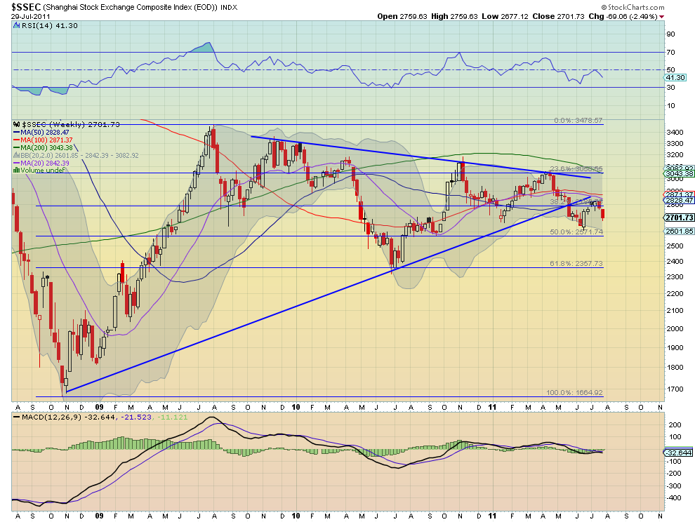
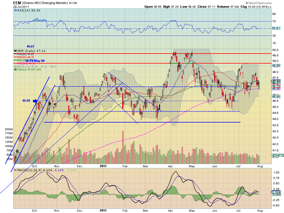
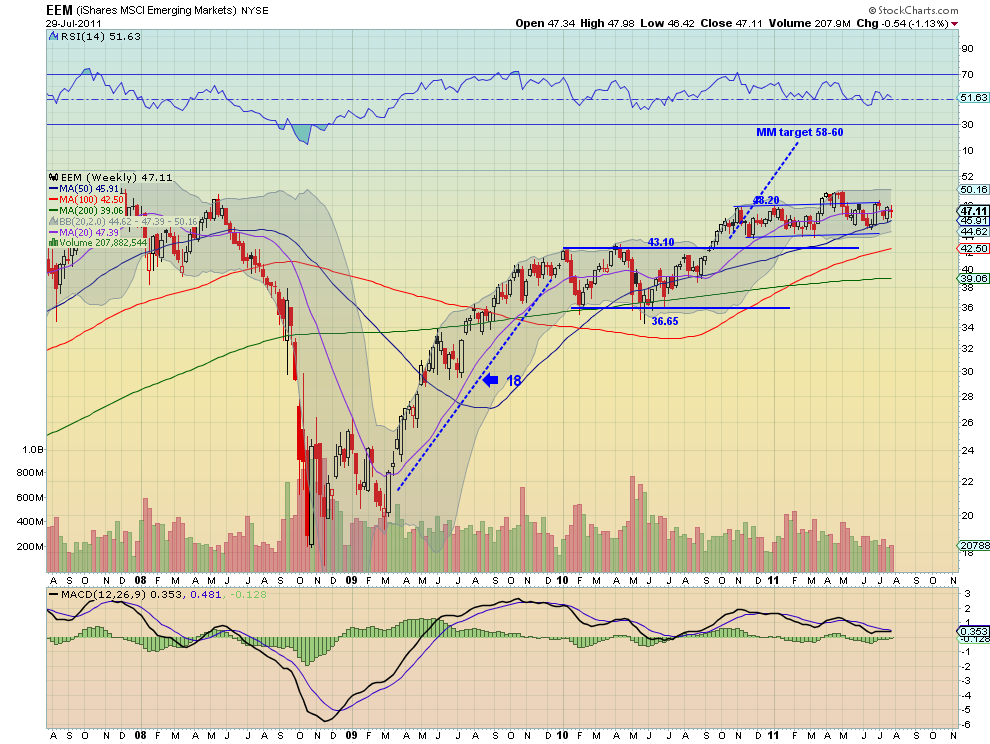
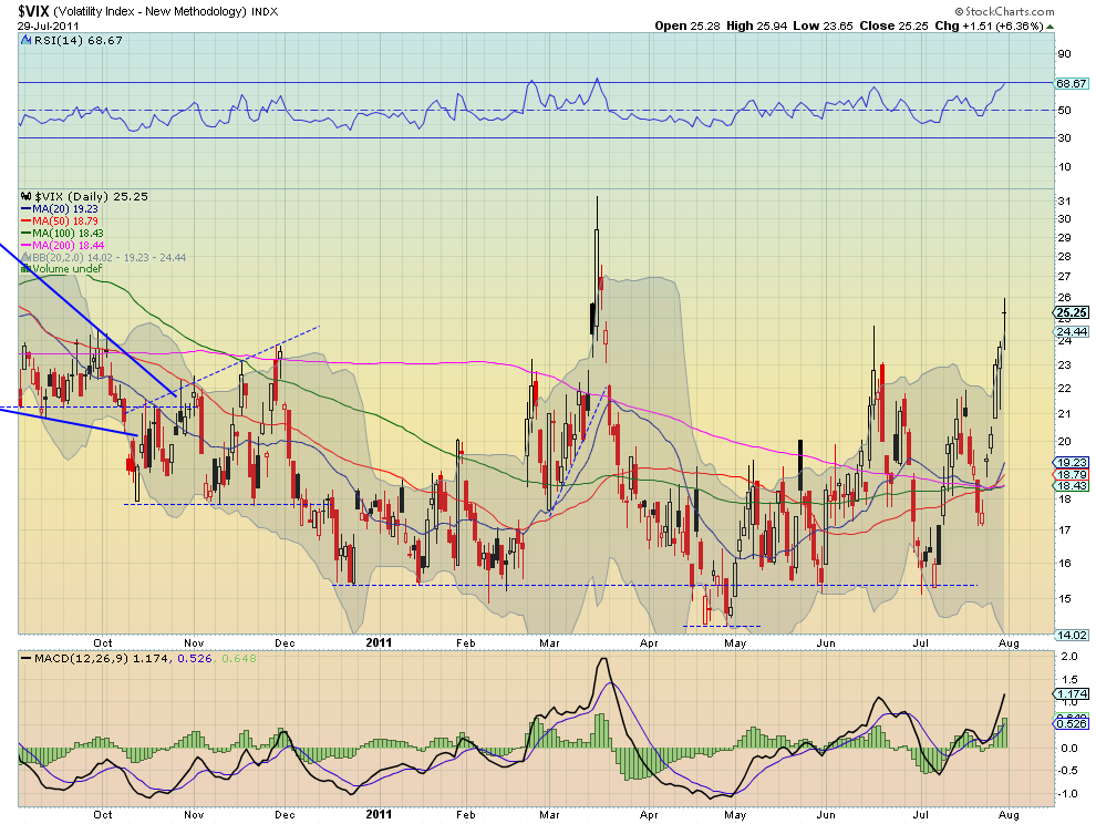
Last week’s review of the macro market indicators looked for the move higher in Gold and Crude Oil to continue. The US Dollar Index and US Treasuries conversely are set up to move lower, with a chance of Treasuries just running in place. The Shanghai Composite and Emerging Markets look as though they may test the top of their consolidation ranges. Volatility appears to remain muted and allow for the Equity Indexes SPY, IWM and QQQ to continue to test higher and perhaps break their consolidation ranges, with the QQQ already making a new high.

The week began with Gold gapping higher and rising through the week while Crude Oil fell modestly. The US Dollar Index consolidated in a lower range while US Treasuries remained stable until a big move Friday. The Shanghai Composite fell Monday and then consolidated while Emerging Markets remained in their range. The Volatility Index climbed slowly all week finishing at its highs just at the top of the range pushing Equity Indexes SPY, IWM and QQQ lower on the week and back towards the middle of their ranges. What does this mean for the coming week? Let’s look at some charts.

As always you can see details of individual charts and more on my StockTwits feed and on chartly.)

Gold Daily, $GC_F
gold d3 stocks
Gold Weekly, $GC_F
gold w4 stocks
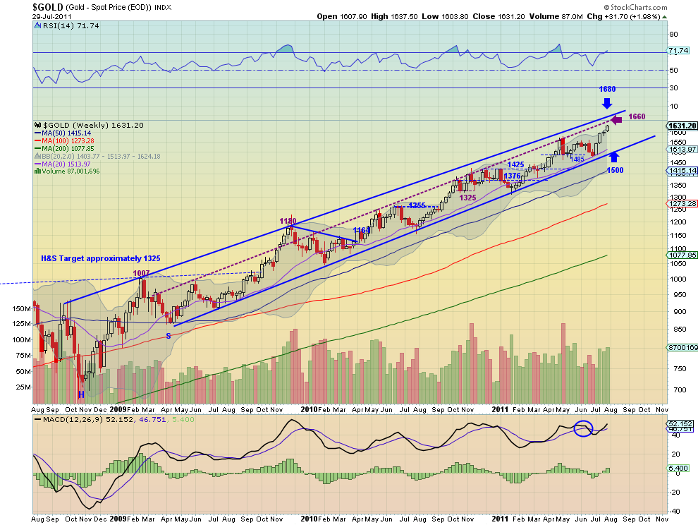
Gold jumped to start the week and then consolidated until a move higher again on Friday. The daily chart shows the Relative Strength Index (RSI) level around the 70 level and the Moving Average Convergence Divergence (MACD) indicator leveling in positive territory after a pullback. All of the Simple Moving Averages (SMA) are sloping higher as well. The weekly chart shows the break higher from the doji last week with rising RSI and increasing MACD. This chart looks like money. The bias for Gold remains to the upside next week with targets on Measured Moves (MM) to 1645, 1665 and then 1720. Any pullback should be contained by support at 1580-1600 consolidation area or the strong support at 1560 below that.

West Texas Intermediate Crude Daily, $CL_F
oil d5 e1311976573242 stocks
West Texas Intermediate Crude Weekly, $CL_F
oil w9 e1311976598182 stocks
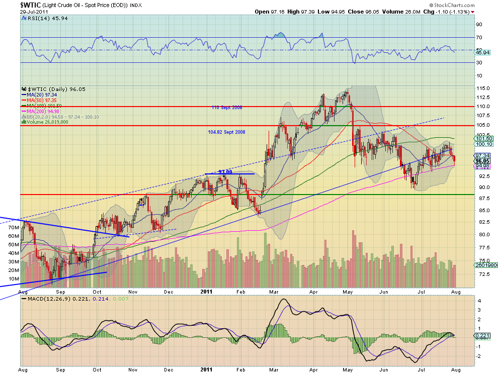
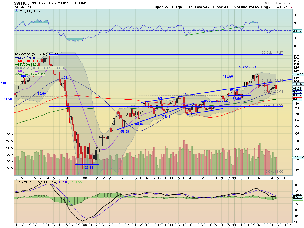
Crude Oil started the week with a doji, signaling the rise had ended and then fell for the rest of the week finding the 200 day SMA on Friday as support. But the RSI on the daily chart is rolling lower ad the MACD is crossed negative, suggesting more downside. The weekly chart shows the bearish engulfing candle taking hold as the RSI rejects at the mid line. Also notice that all of the SMA’s on both time frames are now flat to rolling lower. Crude Oil is poised to continue lower next week now with support at 93 and then the 90.41 Fibonacci level followed by stronger support at 88. Any rise should meet resistance at 100 and a major spike at 104.82.

US Dollar Index Daily, $DX_F
usd d5 e1312028729735 stocks
US Dollar Index Weekly, $DX_F
usd w7 e1312028753561 stocks
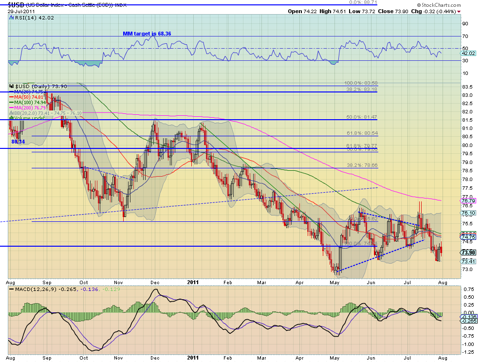
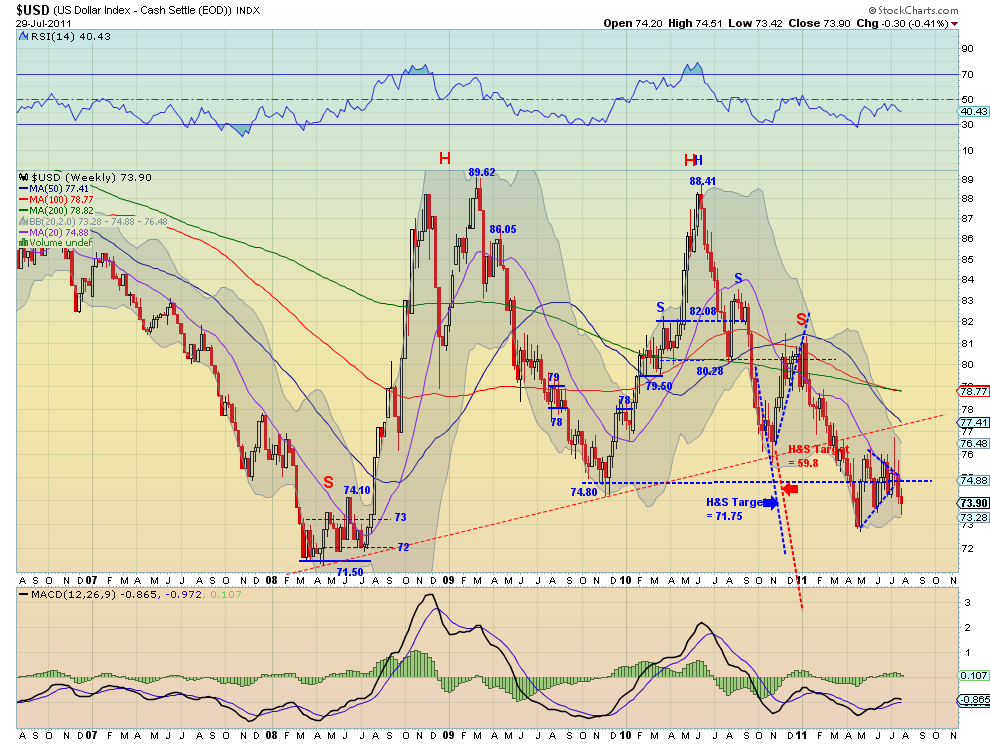
The US Dollar Index continued to fly a bear flag lower this week between 73.50 and 74.50 after falling out of the symmetrical triangle but below all of the SMA’s. The RSI on the daily chart is pointing lower while the MACD is diverging, improving, suggesting that the flag may continue. The weekly chart shows the move lower and the RSI and MACD suggesting more downside. Expect this continue to trend lower with any upside surprise to find resistance at 74.80 or on a super spike at 77.3, the neckline of the three year uptrend. Support comes at 73 and 72 before testing the all time low and then Head and Shoulders and MM targets of 63 and 59.8 kick in. Ugly set up.

iShares Barclays 20+ Yr Treasury Bond Fund Daily, $TLT
tlt d3 stocks
iShares Barclays 20+ Yr Treasury Bond Fund Weekly, $TLT
tlt w4 stocks
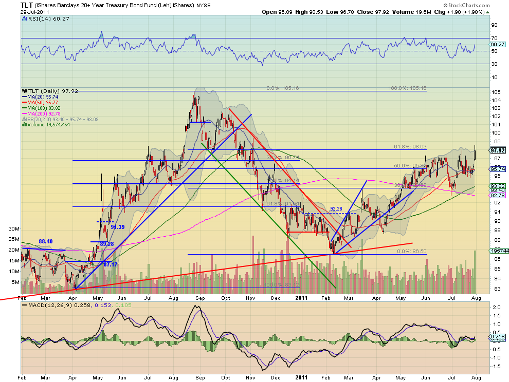
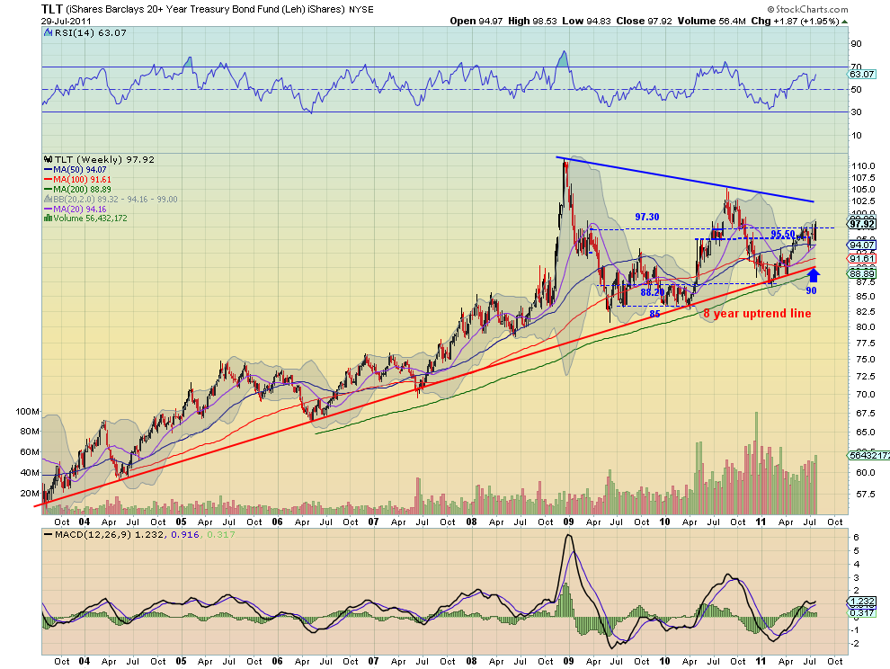
US Treasuries, as measured by the ETF TLT, continued their consolidated most of the week before rocketing higher on Friday. The daily chart show a rising RSI and a MACD that crossed positive, suggesting more upside, on heavy volume Friday. The weekly chart shows that the move finally pushed it through the middle range of the symmetrical triangle, from 95.50-97.30. It also shows the increasing volume as the RSI and MACD point higher. Look for US Treasuries to continue higher, if they hold the 97.30 break, and a test of 100 and then the top rail at 102.50. Losing the break should see support in the 95.50 area.

Shanghai Stock Exchange Composite Daily, $SSEC
ssec d3 stocks
Shanghai Stock Exchange Composite Weekly, $SSEC
ssec w3 stocks
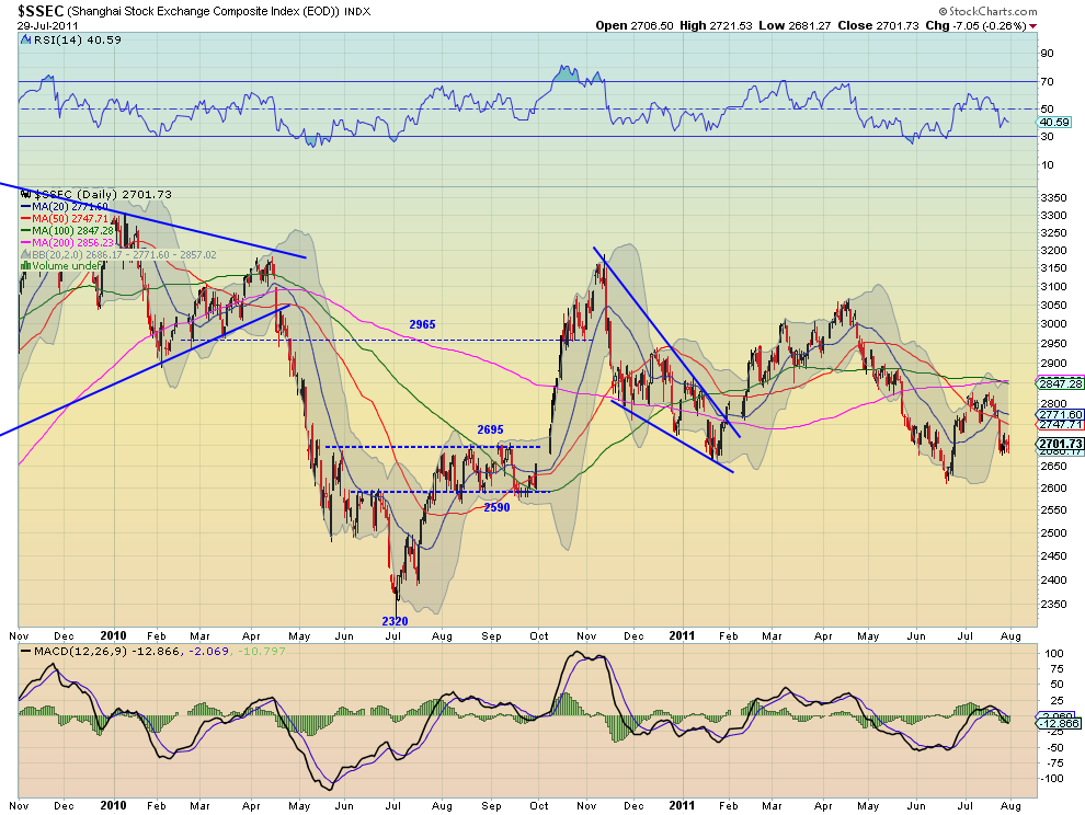
The Shanghai Composite jolted lower on Monday and then consolidated there for the week in a bear flag. This marks the 7th consecutive lower high. The RSI on the daily timeframe combined with the negative MACD suggest there my be more downside. The weekly timeframe shows that the fall is also a rejection at the falling SMA’s. The RSI on this timeframe also suggests lower. Look for the Shanghai Composite to continue to operate in a narrow range between 2695 and 2800 with any short term spikes limited to 2590 lower and 2900 above in the coming week.

iShares MSCI Emerging Markets Index Daily, $EEM
eem d3 stocks
iShares MSCI Emerging Markets Index Weekly, $EEM
eem w4 stocks
Emerging Markets, as measured by the ETF EEM, held in the upper end of the range for the week. The daily chart shows the RSI continues to meander around the mid line and the MACD around the zero level. On the weekly timeframe the broad range from the daily chart is put in perspective. More consolidation is shown on this chart as well as the RSI and MACD offer no guidance in this time frame. Continued consolidation in the range bounded by 45.50 below to 48.78 above is expected for the coming week.

VIX Daily, $VIX
vix d3 stocks
VIX Weekly, $VIX
vix w4 stocks
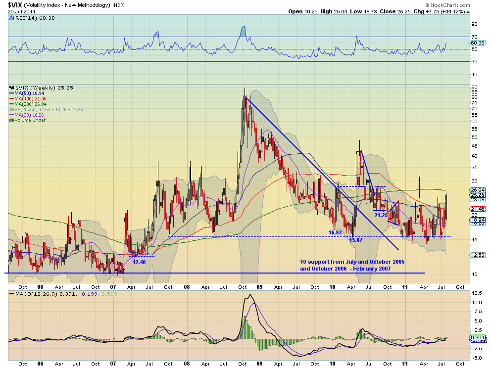
The Volatility Index marched higher throughout the week ending at its highest closing level since March out of the Bollinger bands. The daily chart shows that the RSI is touching 70 and the MACD is growing suggesting more upside, despite the long legged doji, signaling indecision. The weekly chart shows that is peeking above the recent range but still has resistance above at 28-30 before the 12 month range can be declared broken. Both the RSI and MACD on this timeframe suggest that a test higher is coming. Should it fail then there is support at 24 and 21.25 before 18 lower.

SPY Daily, $SPY
spy d6 stocks
SPY Weekly, $SPY
spy w5 stocks
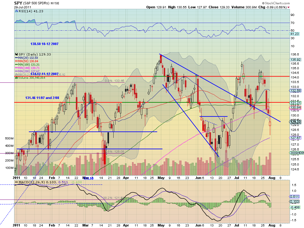
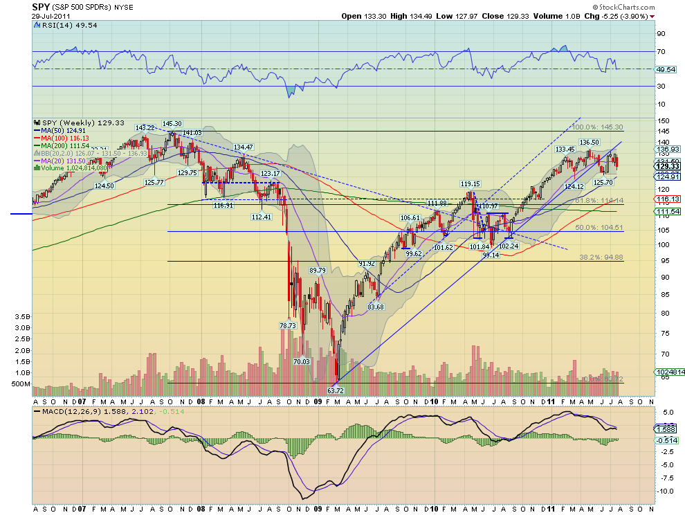
The SPY began the week in consolidation mode before beginning a plunge on Wednesday through the support of the previous downtrend line. Friday’s candle with long shadows signals some indecision. The RSI pointing lower and the MACD growing more negative on the daily timeframe suggest resolution of the indecision to the downside. The weekly chart is not so clear as it remains in the 126-136.50 range from the past six months. The RSI on this timeframe suggests lower but the MACD is improving. Look for a bias to the downside in the coming week but within the range above 126. A confirmation higher, by a move above 130 would suggest more range bound trading in the coming week. The upside resistance at 131.46 and then 134.12 should halt any rallies.

IWM Daily, $IWM
iwm d5 stocks
IWM Weekly, $IWM
iwm w3 stocks
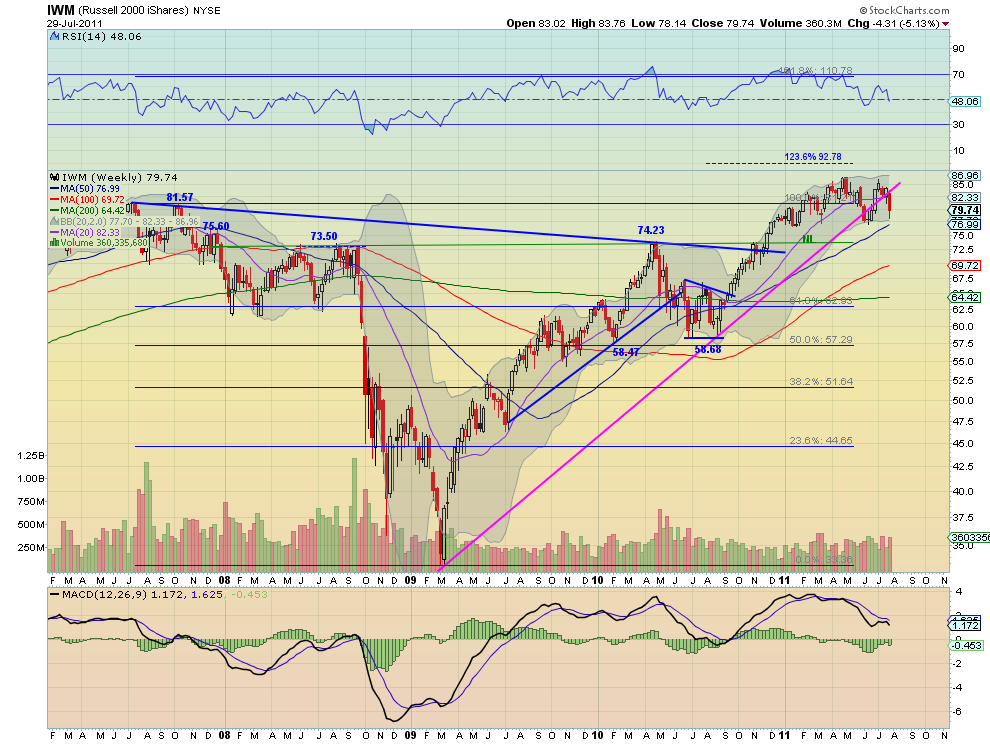
The IWM on the other hand began the week falling and then plunged further from Wednesday onward through the support of the previous downtrend line. Friday’s long hollow red candle though showed very positive upside intraday action. The RSI is pointing lower but leveling and the MACD is growing more negative on the daily timeframe though, suggesting more downside or consolidation. The weekly chart remains in the 76.5-86 range from the past six months. The RSI on this timeframe suggests lower but is leveling and the MACD is pointing lower. Look for a bias to the downside in the coming week but within the range above 76.5. A move higher above 80.50 would suggest more range bound trading in the coming week. The upside resistance at 81.57 and then 84 should halt any rallies.

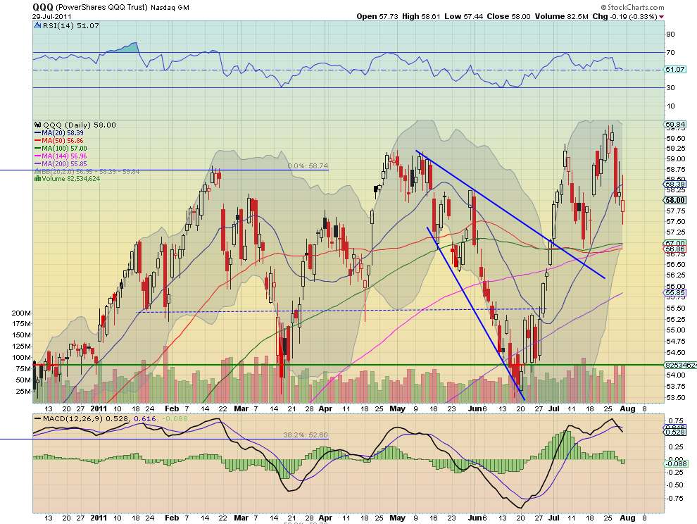
QQQ Daily, $QQQ
qqq d1 stocks
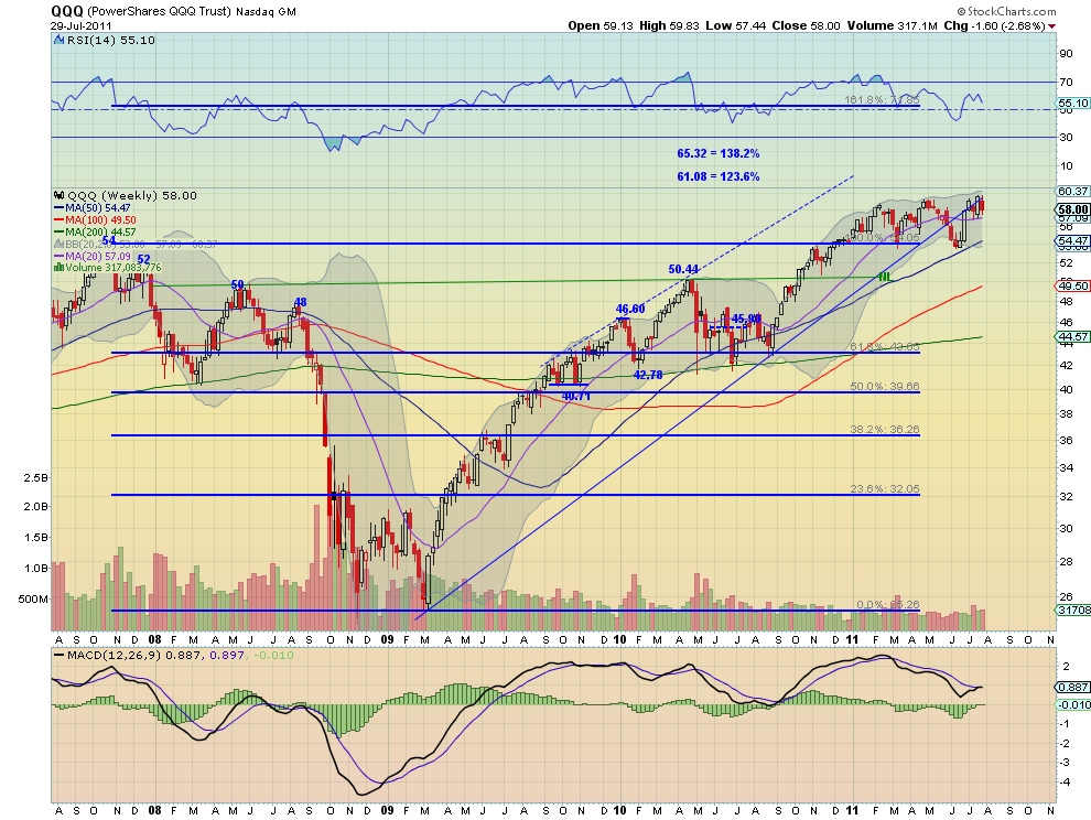
QQQ Weekly, $QQQ
q w4 stocks
The QQQ began the week much like the SPY in consolidation mode and actually making new highs before beginning a plunge on Wednesday that continued for the rest of the week. Friday’s candle with long shadows signals some indecision, but Hollow red candle also shows there was positive intraday action. The RSI flat lining and the MACD growing more negative on the daily timeframe suggest resolution of the indecision to the downside, although consolidation is possible at this level. The weekly chart remains in the 54.26-60 range from the past six months. The RSI on this timeframe suggests lower but the MACD is improving to a potential cross up. Look for a bias to the downside in the coming week with support at 57 and then 55.50 lower, but unlike the SPY and IWM well above the bottom of the range at 54.26. A confirmation higher, by a move above 58.50 would suggest another test of the top of the range at 60 in the coming week.

Gold and US Treasuries look to continue their moves higher in the coming week, with Crude Oil and the US Dollar Index continuing lower. The Shanghai composite looks to consolidate further in the middle of its range while Emerging Markets do the same at the upper end of their range. Volatility looks biased to the upside contributing to the view that Equity Indexes, SPY IWM and QQQ will continue lower. All look to remain within their ranges with the QQQ remaining the strongest much higher in its range. News driven breaks to the upside should be contained in the range with the possible exception of the QQQ’s. Use this information to understand the major trend and how it may be influenced as you prepare for the coming week ahead. Trade’m well.

NASDAQ STOCKS SHOW TROUBLING DRAWDOWNS

by Tom McClellan

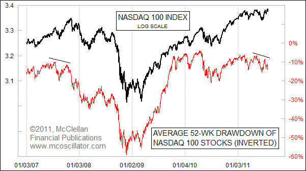
I mentioned to the readers of my Daily Edition earlier this week that I had noticed an interesting divergence in behavior among the stocks that make up the Nasdaq 100 Index (NDX). The NDX was alone among the major indices in moving to a slightly higher closing price high on July 22. One big problem with that rally was that it did not involve a majority of the component stocks.

In fact, on the day when the NDX hit its recent high, the average component stock of the NDX was down 11% from its 52-week high. By comparison, when the overall market topped at the end of April 2011, the average NDX stock’s drawdown was only 6.7%.

Drawdown is a measure of how far a price has fallen from its recent high, and is a widely used measure of risk in portfolio analysis. Every stock or portfolio will have a different drawdown because of their different behavior.

I figured that this difference in drawdowns might make for an interesting indicator, which is how I got to this week’s chart. The indicator measures the average of the drawdowns for each of the NDX’s component stocks, measured from its own highest close over the past 52 weeks. I inverted that average drawdown indicator for display in this chart, so that the eye can more easily match its performance to what the NDX is doing.


Average Drawdown of NDX Stocks
You can see that most of the time, this indicator correlates very well with the behavior of the NDX itself. That is to be expected, since both the price index and the average drawdown indicator are making measurements of the behaviors of the same set of stocks. They should look like each other, and so when they do look like each other, that is not a surprise.

It is when they diverge from each other that we get the more interesting information. The NDX itself has been able to make higher price highs, thanks mostly to the bullish behavior of some of its largest weight components. But the average NDX stock is seeing larger and larger drawdowns, meaning that the job of pushing the index to higher highs was being done by a shrinking pool of its components, while the rest were starting to head south. This sort of divergence is a classic sign of waning participation, and it is why technical analysts like to watch breadth indicators like the Advance-Decline Line.

The last time that we saw a divergence like this one was at the big top in 2007, and you can see what happened after that instance. When major averages make higher price highs on waning participation, it is a sign that liquidity is getting tight, and that the little guys are suffering first. Eventually, that condition of illiquidity comes around to bite even the biggest and best stocks.

See the original article >>

CONGRESS: YOU ARE THE SCOREKEEPER, NOT A PLAYER!


Imagine a card game, where every entity in the economy is one of the players, and you, Congress, are the scorekeeper. The message here is the difference between being the scorekeeper and being a player. The problem is, you are acting like one of the players when, in fact, you are the scorekeeper. And you support your mistake with false analogies that presume you are one of the players, when, in fact, you are the scorekeeper for the dollar.

That correct analogy is between scorekeepers in card games and your role as scorekeeper for the US dollar. As scorekeeper in a card game, you keep track of how many points everyone has. You award points to players with winning hands. You subtract points from players with losing hands.
So as the scorekeeper, let me ask you:

How many points do you have? Can the scorekeeper run out of points? When you award points to players with winning hands, where do those points come from? When the scorekeeper subtracts points from players with losing hands, do he have more points? Do you understand the difference between being the scorekeeper and being the players?

You are the scorekeep for the US dollar. You spend by marking up numbers in bank accounts at your Fed, just like your Fed Chairman Bernanke has testified before you. When you tax, the Fed marks numbers down in bank accounts. Yes, the Fed accounts for what it does, but doesn’t actually get anything, Just like the scorekeeper of a card game doesn’t get any points himself when he subtracts points from the players.

When Congress spends more than it taxes, it’s just like the scorekeeper of the card game awarding more points to the players’ scores than he subtracts from their scores. What happens to the players total score when that happens? It goes up by exactly that amount. To the point. What happens to dollar savings in the economy when Congress spends more than it taxes? It goes up by exactly that amount. To the penny.

The score keeper in a the card game keeps track of everyone’s score. The players’ scores are accounted for by the scorekeeper. The score keeper keeps the books. Likewise, the Fed accounts for what it does. The Fed keeps accounts for all the dollars all its member banks and participating governments hold in their accounts at the Fed. That’s what accounts are- record keeping entries. So when China sells us goods and services and gets paid in dollars, the Fed- the scorekeeper for the dollar-marks up (credits) the number in their reserve account at the Fed. And when China buys US Treasury securities, the Fed marks down (debits) the number in their reserve account. And markes up (credits) the number in China’s securities account at the Fed. That is what ‘government borrowing’ and ‘government debt’ is-the shifting of dollars from reserve accounts to securities accounts at the Fed.

Yes, there are some $14 trillion in securities accounts at the Fed. This represents the dollars the economy has left after the Fed added to our accounts when the Treasury spent, and subtracted from our accounts when the IRS taxed. And it also happens to be the economy’s total net savings of dollars. And paying back the debt is the reverse. It happens this way: The Fed, the scorekeeper, shifts dollars from securities accounts to reserve accounts Again, all on it’s own books. This done for billions of dollars every month. There are no grandchildren involved.

The Fed, the scorekeeper, can’t ‘run out of money’ as you’ve all presumed. The Fed, the scorekeeper, spends by marking up numbers in accounts with its computer. This operation has nothing to with either ’debt management’ which overseas the shifting of dollars between reserve accounts and securities accounts, or the internal revenue service which overseas the subtraction of balances from bank reserve accounts. And so yes, your deficits of recent years have added that many dollars to global dollar income and savings, to the penny. Just ask anyone at the CBO.

It is no coincidence that savings goes up every time the deficit goes up- It’s the same dollars that you deficit spend that necessarily become our dollar savings. To the penny.

A word about Greece.

Greece is not the scorekeeper for the euro, any more than the US states are scorekeepers for the dollar. The European Central Bank is the scorekeeper for the euro. Greece and the other euro member nations, like the US states, are players, and players can run out of points and default, and look to the scorekeeper for a bailout.

What does this mean? There is no financial crisis for the US Government, the scorekeeper for the US dollar. It can’t run out of dollars, and it is not dependent on taxing or borrowing to be able to spend. That sky is not falling. Ever.

Let me conclude that the risk of under taxing and/or overspending is inflation, not insolvency. And monetary inflation comes from trying to buy more than there is for sale, which drives up prices. But, as they say, to get out of a hole first you have to stop digging. (I don’t think you, or anyone else, believes acceptable price stability requires 16% unemployment?)

Someday there may be excess demand from people with dollars to spend for labor, housing, and all the other goods and services that are desperately looking for buyers with dollars to spend. But today excess capacity rules. And an informed Congress That recognizes it’s role of scorekeeper, and recognizes the desperate shortage of consumer dollars for business to compete for, would be debating a compromise combination of tax cuts and spending increases. Instead, presuming itself to be a player rather than scorekeeper, Congress continues to act as if we could become the next Greece, as it continues to repress the economy and turn us into the next Japan.

See the original article >>

Who Owns Treasury Debt?

By Barry Ritholtz

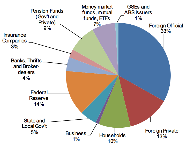
As a reminder, check out this great chart from Société Générale showing who holds US Trasury debt. In the unlikely — thought increasingly possible — event of an unscheduled water landing failure to raise the debt ceiling, a technical default would be avoided by making the payments on these bonds:
>
click for larger graphic


An Economy at Stall Speed

By John Mauldin

An Economy at Stall Speed
Is There a Recession in Our Future?
What I Told the Senators
Escalating Eurozone Interbank Liquidity Crisis: Dollar-Euro Impact?
Time for Friends, Fish, and Wine

The GDP numbers for the second quarter came in, and there is no way to spin them as anything but ugly. And the revisions were worse. We simply have to take a few pages to look at them. And, as I noted last Monday in the Outside the Box, I met with some ten Senators Monday afternoon (as well as Congressmen in the morning), plus a lot of staff. Getting ten Senators in a room for 90-plus minutes is not so often done. I will report in this week’s letter about our conversation and my impressions.

But first, I was in Vancouver for a few days this week at the Agora conference. I had dinner with old friends Bill Bonner, Barry Ritholtz, David Tice, Frank Holmes, and Keith Fitzgerald. I had spoken that morning and my speech was well-received, getting a fair complement of laughs. I was somewhat on a roll. I mentioned that I think a lot of the better financial speakers are actually frustrated stand-up comics, and there was general agreement on that.

I say that to set up the next item. This past April I spoke at my own investment conference in La Jolla (co-sponsored with Altegris Investments). It was a brand new speech, and I did something I have not done in years: I actually practiced it several times, as I did not want to embarrass myself, given the quality of the other speakers. I came off the stage feeling that I had given the worst speech of my career. The room was absolutely silent. I normally get a lot of laughs. I was getting no reaction at all. As I made my way to the rear of the room I was actually quite depressed.

Then several people (people who cut me no slack) told me that it was the best speech they had ever heard me give. I was surprised and said, “But the audience was so quiet. How come?”

“John, you just walked them through a scenario that was so compelling and so fraught with regard to our problematic future that it was very sobering. There really was nothing to laugh at.” This from a man who has been very blunt with me and has heard me speak many times and tells me if I am off my game. I got the same comment a lot.

I am now using a different speech, so we are going to make the one from our conference available online to all those who have signed up for my accredited investor letter. It is the last speech of the conference to be posted, so now every one is online – speeches by David Rosenberg, Martin Barnes, Neil Howe, Gary Shilling, and more, plus the panel sessions. A very powerful lineup it was.

If you are an accredited investor (net worth of over $1.5 million), you can go to www.johnmauldin.com and click on The Mauldin Circle and fill out the form, and one of my worldwide partners will get in contact with you and give you access to the speech. And if you have not yet reached that status, you can still sign up, and my partner CMG, based in Philadelphia, will make sure you get access. These all are management firms that, like Altegris, have access to some of the best alternative investments and commodity funds I am aware of. Let them show you what adding some of the managers they represent can do for your portfolio. (In this regard, I am president and a registered representative of Millennium Wave Securities, LLC, member FINRA.) Please read the risk disclosures on the form and at the end of the letter carefully when you are thinking about alternative investments. And now to this week’s letter.

An Economy at Stall Speed

There is no way to spin the GDP report that came out this morning as anything but very bad. It was just last May that the consensus was that second-quarter GDP would be 3.3%. That had been revised down to 2.7%, but the number came in at 1.3%. Normally, at this time in a recovery we are growing at close to 3 times that number, or 3.6%. (You can read the press release and see the data I write about at http://www.bea.gov/newsreleases/national/gdp/gdpnewsrelease.htm.)

Even worse, the first-quarter number was revised down from 1.9% to an anemic 0.36%. For new readers, note that the first estimate of a quarter’s growth is just that, an estimate. There are three monthly revisions that follow, and after a few years it is revised yet again with the aid of hindsight. And the 4th quarter of 2010 was taken down from 3.1% to 2.35%!

If you are looking for something (anything) that can explain the new number, then you could attribute a small portion to the effects from the Japan earthquake and tsunami, as “durable goods” from motor vehicles and parts reduced GDP by about .2%.

And it gets worse. It seems that BEA went back and revised the numbers for the recession. Would it surprise you to learn that the recession was worse than we thought at the time? The peak-to-trough decline was 5.1% instead of 4.1%. That means that in real terms the economy has not yet recovered back to the pre-recession levels. David Rosenberg notes that in his research “going back to 1947 and never before have we seen this dynamic of the level of overall economic activity lower on the second birthday of the recovery than it was at the prior cycle peak. Typically two years into a recovery, real GDP is already 9.5% above the pre-recession high.”

Look at this chart from the St. Louis Fed. It is real Gross Domestic Product going back five years. This is just ugly. More on this later, as I made this point with the Senators (I wish I’d had this data when I was there!)

Now, notice the direction of the revisions. Care to wager the over/under on where the revisions will go when the second quarter is revised? Dare we say it could go negative? Say it ain’t so, Joe!

I don’t have time to cover it this week, but global growth is slowing. China’s PMI came in at 48.9 in July. Korean exports are slowing.

Joan McCullough notes:

“Working from Q309, forward, read GDP as follows:

“1.7, 3.8, 3.9, 3.8, 2.5, 2.3 … now here it comes: 0.4 … and then today’s 1.3%.

“I won’t keep you in suspense any more. Here’s my take: MOMENTUM IS BROKEN. A big, ol’ monkey wrench, courtesy of input arising from the change in inventory and Imports. And once momentum stumbles, then H2 growth becomes a wild card, right?”

Is There a Recession in Our Future?

I mentioned a chart from Rich Yamarone, Chief Economist at Bloomberg (who I’m having dinner with next Tuesday in NYC). I previously wrote:

“And the last chart is one I had not seen before, and is interesting. Rich notes that if year-over-year GDP growth dips below 2%, a recession always follows. It is now at 2.3%.”

Growth is clearly decelerating. Look at the growth numbers from the St. Louis Fed website for the last six quarters:

2009-10-01 13019.012
2010-01-01 13138.832
2010-04-01 13194.862
2010-07-01 13278.515
2010-10-01 13380.651
2011-01-01 13444.301

It will be very interesting to see, at the end of the month, what the numbers are for the second quarter. Another quarter like the first quarter and we should either be close to or actually dip below 2%.

Oops. Today David Rosenberg updated that chart. This from Rosie:

If Rich is right, then the next revisions will be down. And the growth in the second half is not going to be all that good for jobs and consumer spending.

And this from Rosie as well:

The economy is at stall speed, it is quite possible we’ll see further downward revisions to the already anemic growth numbers, and Congress and the President are dithering over the debt ceiling. It will not take much to push us into an outright recession. We can go a few days, I think, with the latter problem, but not too long or the markets will throw up.

I should note that the Congressmen and Senators I met with were a very wired-in bunch. Many of them are in the leadership. And they had no clue as to how the debt-ceiling snafu would play out. Lots of speculation, but no real idea. And they were worried.

But enough on the GDP. Suffice it to say that the stock market drops about 40% on average in a recession. Just sayin’.

What I Told the Senators

It started when a friend gave Senator Dan Coats a copy of Endgame. He read it and underlined, highlighted, and scored it. The Senator Rob Portman took it off his hands and read it. They asked me to come to DC and meet a few Senators. You don’t say no to such a request, but the only free day I had was Monday. I met with nine of them for about 90 minutes and Senator Cornyn (from Texas) privately beforehand for an hour. I offered him a copy of the book, but he said he was already reading it on the iPad he was carrying. I gave him one anyway. ;-)

I met with several chiefs of staff before the meeting, and they decided I should not use the typical PowerPoint approach but just talk, and gave me advice on how to go about it. Evidently, Coats and Portman had worked the room, because nine guys showed up more or less on time. Two Democrats, six Republicans, and an independent (Lieberman). Jon Kyl was there, as well as Gang of Six member, Tom Coburn from Oklahoma. Also Corker, Lugar, Coats, Portman, and Mike Lee, the “Tea Party” senator from Utah, who took the most notes. But there were a lot of them taking notes. And asking questions, some rather pointed. Overall, I was very impressed with the level of knowledge in the room and the candor.

I started by explaining what I meant by the debt supercycle and how deleveraging recessions are fundamentally different from business-cycle recessions, which is why we are not seeing a normal recovery. And it is happening all over the developed world. I think I surprised them by jumping to Europe first, noting that Europe appeared to be imploding even as we were meeting. I made the point that we could see a banking and credit crisis coming from Europe that might be worse than the subprime crisis. I noted that it was not just Greece, Ireland, and Portugal. Spain and Italy have their own share of problems, and the markets have taken their interest rates up by 1% in just the last month, just as a large rollover of debt is coming due.

We’d better stay with this Europe thing for a few minutes. A few weeks back, I talked about Italy and said I thought their debt was longer-duration, and so they might not go critical quite so fast. I got this note from London partner Niels Jensen, pointing out to me how wrong I was:

“Wrong! Italy average debt duration is in fact quite short, as illustrated in the chart below. Within Europe, only the UK has really long average debt duration (about 13 years). Most countries are averaging 5-7 years. Italy is no exception. Best, Niels.”

Then today I get this note from Bluemont Capital Advisors, written by Harald Malmgren, Global Economic Strategist, and Mark Stys, Chief Investment Officer. It is short but important, so I am going to quote it in full. Thanks, guys.

Escalating Eurozone Interbank Liquidity Crisis: Dollar-Euro Impact?

“Italian and Spanish interbank lending is freezing up. French Finance Ministry officials and banks have been in emergency meetings this week regarding Eurozone interbank market stress. IMF and EU officials are warning that France might also face downgrade if greater spending cuts are not made. Finance Ministry staff have been warned to be available 24/7 (irrespective of sacred August holidays!) as contagion may soon affect French banks and sovereign debt.

“In spite of last week’s Eurozone Summit agreement on Greece and EFSF ‘flexibility’, Italian and Spanish sovereign debt yields have resumed escalation this week. Moreover, the Italians had to cancel issuance of longer maturity debt as demand was insufficient. German Finance Minister Schauble damaged confidence Wednesday when he said the EFSF would not have a blank check to purchase Eurozone sovereign debt in the secondary market.

“Eurozone banks’ primary holding of capital is in the form of Eurozone sovereign debt. It is obvious that the EFSF is not large enough to handle crises on the scale of Italian and Spanish
sovereign debt. Schauble’s statement is interpreted as indicating precarious support within the
German parliament for the recent Summit package for Greece and the EFSF, and that an increase
in EFSF is unlikely. (Schauble is personally powerful within the CDU, so his statements most
likely carry more political weight than Merkel’s at present.)

“Meanwhile, US money market funds have been withdrawing from Eurozone bank commercial paper, leaving Eurozone banks with a big gap in availability of short-term funding and a severe shortage of dollars.
“In the background, the Fed has quietly advised the ECB and some other central banks that Congress has warned the Fed not to repeat the huge liquidity support to Europe and Asia that it provided in 2008. European officials believe the Fed would be less able to come to the rescue again with increased swap lines and direct loans to Eurozone banks, as it did post-Lehman.

“Thus, in parallel with the US debt ceiling uncertainties, the Eurozone appears to be entering into renewed crisis of breakdown in interbank trust and escalating borrowing costs for Italy and Spain, and maybe even France. Whatever happens with the US debt ceiling, attention will soon turn back to Eurozone sovereign debt problems and threats to the viability of Eurozone banks from debt contagion.

“It is increasingly possible that the ECB may not be able to function as lender of last resort on the scale required to cope with an interbank lending breakdown. It is also thus likely that the Eurozone will suffer a shortage of dollars for its interbank credit markets. Demand for dollars will likely escalate, while confidence in Eurozone financial institutions falls. This could force Eurozone banks to purchase dollars in the open market and drive the dollar higher.”

I made some similar points to the Senators about why the euro is going to parity – if it survives. Then I went into my “Japan is a bug in search of a windshield” spiel, pointing out that the yen will fall in half.
All this to say is that the bond markets are going to get spooked sooner than we are prepared for. If the US does not show up with a credible deficit-reduction program by the end of 2013, we could see interest rates rising even in the face of a deflationary recession. If we do nothing, we become Greece.

And the $4 trillion they are talking about? That is a down payment. We need $10-12 trillion in cuts over ten years, which I explained would put us into a slow-growth-at-best, Muddle Through economy with high unemployment and tough tax policies. I pointedly showed Senator Mike Lee why we could not cut spending too fast (as the Tea Party wants) – unless we want Depression 2.0 and 20% unemployment. It has to be my “glide-path” option. As I said, Lee was taking notes fast and furious. And asking the right questions. I like him. Lieberman was also engaged (I really do like him), and they were all very candid about the political problems they were facing. And it was a very sober group as we ended the meeting. But they all politely thanked me for coming and talking frankly. Even the Dems (I confess I think I know the name of one, but the website picture does not look like him, so I don’t want to get it wrong. But he was impressive with his questions as well.)

I could go on, but long-time readers know by now my Endgame scenario. I got a lot of promises that the Senators would read my book. Coats and Portman got extra copies to give out on the floor.

I have to tell you, gentle reader, that leaving that meeting I was very sober as well. They made it clear that getting it done is going to be very hard, and it will take real commitment from men and women like them to get us through this. They all noted that their mail was running 100 to 1 against cutting Medicare. Every one of them. They know that they cannot close the deficit gap just with the elimination of the Bush tax cuts. And I think I convinced any who weren’t already, that not getting the deficit under control means Depression 2.0 and a disaster.

The debate in 2012-13 will be, how much Medicare do we want and how do we want to pay for it? Sadly, I think the only way is with a VAT (value-added tax), since less than 50% of citizens pay any income taxes now. Want to run on a program of taxing the “middle class?” Didn’t think so. Want to run on a platform of cutting Medicare? That is not a winner either. We are at an impasse.

We need a massive restructuring of our entire tax code to be more encouraging of creating jobs. But that is another story for another week. It is time to hit the send button.

Well, just one brief commercial. If Senators are reading Endgame, maybe you should be! Get it at your local bookstore or Amazon.com.

Time for Friends, Fish, and Wine

While I will be in New York for a few days next week, I first head on Thursday morning for Grand Lake Streams, Maine. I will take a float plane in from Bangor with Nouriel Roubini and my son and a few others. This is I think year 6 for me to go fishing. Bloomberg is sending a TV crew. We fish, then eat the fish we catch for lunch, drink good wine, fish some more, have a gourmet dinner, drink more wine, and talk economics. The event is organized by David Kotok of Cumberland Advisors. The list of friends is so long. John Silvia (chief econ at Wells Fargo), Martin Barnes, Barry Ritholtz, Paul McCulley, Bill Dunkelberg (chief econ at the National Federation of Independent Businesses), some Fed econ types, hedge-fund managers – and this year there will be seven ladies. About 40 people in all. Seems the limit is the number of guides we can get. My son Trey has grown up with this crowd. It is our favorite time together of the year.

NYC will be fun. Yahoo and Bloomberg. I meet with my publisher, Debra Englander from Wiley, about the next books under way. As noted, Rich Yamarone has an all-star cast lined up for dinner, and I get to be with Art Cashin. I will also get to hang out with Doug Kass and Vince Farrel. How fun. Mike West of Biotime will be at dinner Wednesday. I think he may be the most important man of our times. If anyone can figure out how to stop this aging thing, it will be him. What a great week!

And you have a great week as well. Now let me close with a great line from Doug Casey, who sat next to me on the Whiskey Bar panel at the Agora Symposium, which had the crowd in stitches. Ritholtz was on a roll, too, and some of the rest of us got in a few good lines. Great fun!

“The situation is hopeless, but it is not serious.” Gentle reader, we get through this.

Your really looking forward to next week analyst.

See the original article >>

Follow Us