by Tom McClellan
I mentioned to the readers of my Daily Edition earlier this week that I had noticed an interesting divergence in behavior among the stocks that make up the Nasdaq 100 Index (NDX). The NDX was alone among the major indices in moving to a slightly higher closing price high on July 22. One big problem with that rally was that it did not involve a majority of the component stocks.
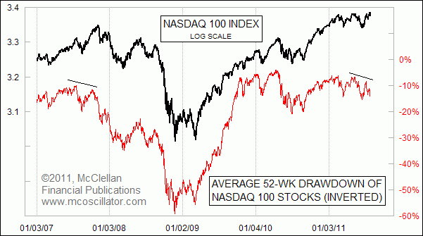
In fact, on the day when the NDX hit its recent high, the average component stock of the NDX was down 11% from its 52-week high. By comparison, when the overall market topped at the end of April 2011, the average NDX stock’s drawdown was only 6.7%.
Drawdown is a measure of how far a price has fallen from its recent high, and is a widely used measure of risk in portfolio analysis. Every stock or portfolio will have a different drawdown because of their different behavior.
I figured that this difference in drawdowns might make for an interesting indicator, which is how I got to this week’s chart. The indicator measures the average of the drawdowns for each of the NDX’s component stocks, measured from its own highest close over the past 52 weeks. I inverted that average drawdown indicator for display in this chart, so that the eye can more easily match its performance to what the NDX is doing.

You can see that most of the time, this indicator correlates very well with the behavior of the NDX itself. That is to be expected, since both the price index and the average drawdown indicator are making measurements of the behaviors of the same set of stocks. They should look like each other, and so when they do look like each other, that is not a surprise.
It is when they diverge from each other that we get the more interesting information. The NDX itself has been able to make higher price highs, thanks mostly to the bullish behavior of some of its largest weight components. But the average NDX stock is seeing larger and larger drawdowns, meaning that the job of pushing the index to higher highs was being done by a shrinking pool of its components, while the rest were starting to head south. This sort of divergence is a classic sign of waning participation, and it is why technical analysts like to watch breadth indicators like the Advance-Decline Line.
The last time that we saw a divergence like this one was at the big top in 2007, and you can see what happened after that instance. When major averages make higher price highs on waning participation, it is a sign that liquidity is getting tight, and that the little guys are suffering first. Eventually, that condition of illiquidity comes around to bite even the biggest and best stocks.
Well actually it's really helped me a lot. I really appreciat for posting
ReplyDelete