Sunday, July 31, 2011

Industrials Sector Collapses

by Bespoke Investment group

Since the S&P 500 made its intraday high on July 7th, things have sold off quite a bit. Nothing has sold off more than the Industrials sector. As shown below, the sector is down 9.37% since 7/7 and it's sure to open down another percentage point or more this morning. Below the table, we provide a six-month chart of the sector, which highlights the fact that it completely broke below support yesterday and is now like catching a falling knife.


August 2011 Economic Forecast: Terrible

by Steven Hansen

Econintersect’s Economic Index is designed to spot Main Street economic turning points. We warned in April of an economic slowing – and most indicators have now confirmed that the Main Street slow down began around the beginning of the 2Q2011.

GDP, however, is designed more as a Wall Street indicator – and does not measure distress of Main Street. If it did, the economy would be considered in a deep depression based on employment, industrial production, or even net worth of the average Joe.

Personal consumption expenditures expanded at 1.47% in 1Q2011, have fallen to 0.07% in 2Q2011. Main Street literally did not grow in 2Q2011.

Econintersect’s Forecast for August 2011 says the slowdown continues.

Our Jobs Outlook: Terrible

Starting with employment, there is no good news. We are accustomed to digesting seasonally adjusted data handed out by the Bureau of Labor Statistics (BLS). Econintersect believes the methodology of the BLS is too complex, and whilst over time it yields the correct answer – the month-to-month answer creates a poor picture of the underlying jobs picture.

The much simpler methodology of ADP likely creates a better feel of employment dynamics when looking at month-over-month change.

But folks, we need to understand that all these numbers are seasonally adjusted – and in truth – the economy historically does not grow jobs in the second half of the year.

So when you hear there was jobs growth – it is imaginary in reality, grown by an algorithm in the computer of the BLS. So when Econintersect tries to forecast jobs, it forecasts by second guessing an algorithm.

Likely actual jobs growth is zero, or more likely down. Jobs have grown 5 times in the last 10 years in August – but this August we are in a soft spot. So when you hear employment is up – it could actually be down. But even in the best of Augusts, your friend Frank down the street is not likely to find a job in August.

The current economy continues to run well under pre-recession levels. Econintersect’s Employment Index is based on economic elements which create jobs. Econintersect’s Job’s index (explanation here) was at a cycle low in June.

This index measures the historical dynamics which lead to the creation of jobs, but it is not precise as many factors influence the exact timing of hiring. This index should be thought of as a measurement of jobs creation pressures.

At this point, the jobs growth YoY is well above Econintersect’s Index. May 2011 employment data was weak and only 2/3rds of Econintersect’s forecast. June 2011 employment data was even weaker at 44% of Econintersect’s forecast. We believe this same weakness will continue for the coming months until the YoY BLS non-farm private jobs growth returns to Econintersect’s Index’s year-over-year growth rate.

The index projects August 2011 non-farm private jobs growth is projected at 140,000 (up from July’s forecast of 135,000) – however it could be as low as 60,000 based on correlating this index to “reported” jobs growth.

As you can see from the red line in the graph above – Econintersect is projecting very poor jobs growth for the rest of the year.

The Main Street Outlook: Terrible

The Econintersect Economic Index counts things using pulse points. It is not a monetary index, it does not need to adjust data for inflation. Further its methodology handles seasonality by looking at data year-over-year and considering rate of change.

This model says the Main Street economy rolled over severely – and August likely will be the worst month since the end of the recession – not necessarily contracting but definitely not growing.

The real time data in the next few weeks are critical in understanding whether the potential of an economic contraction on Main Street is looming.

Econintersect believes the non-monetary transport counts are the canary in the economy. Transport counts have collapsed since our last forecast. The transport counts are literally at the doorstep of contraction, and in most cases remain below pre-recession levels.

Last month it was pointed out that transports and the main index itself softened last year about the same time, and at that time many warned of a possible double dip recession which did not occur. However, this year the downtrend in the transport portion is much more severe.

The Main Street economy will be worse in August 2011 than it was in July 2011.
For a complete explanation of the EEI, please see the October 2010 forecast.

The Great Recession Just Became Greater

by Rick Davis

Included in the BEA’s first (“Advance”) estimate of second quarter 2011 GDP were significant downward revisions to previously published data, some of it dating back to 2003. Astonishingly, the BEA even substantially cut their annualized GDP growth rate for the quarter that they “finalized” just 35 days ago — from an already disappointing 1.92% to only 0.36%, lopping over 81% off of the month-old published growth rate before the ink had completely dried on the “final” in their headline number. And as bad as the reduced 0.36% total annualized GDP growth was, the “Real Final Sales of Domestic Product” for the first quarter of 2011 was even lower, at a microscopic 0.04%.

And the revisions to the worst quarters of the “Great Recession” were even more depressing, with 4Q-2008 pushed down an additional 2.12% to an annualized “growth” rate of -8.90%. The first quarter of 2009 was similarly downgraded, dropping another 1.78% to a devilishly low -6.66% “growth” rate. And the cumulative decline from 4Q-2007 “peak” to 2Q-2009 “trough” in real GDP was revised downward nearly 50 basis points to -5.14%, now officially over halfway to the technical definition of a full fledged depression.

One of the consequences of the above revisions to history is that the BEA headline “Advance” estimate of second quarter GDP annualized growth rate (1.29%) is magically some 0.93% higher than the freshly re-minted growth rate for the first quarter. From a headline perspective, that makes for a far better report than the 0.63% drop from the previously published 1Q-2011 number — since otherwise the new 2Q-2011 numbers would be showing an ongoing weakening of the economy.

Unfortunately, meaningful quarter-to-quarter comparisons are nearly impossible in light of the moving target provided by the revisions. But among the notable items are:

– Aggregate consumer expenditures for goods was contracting during the second quarter, with annualized demand for durable goods dropping 4.4% during the quarter — into the ballpark of the numbers we have measured here at the Consumer Metrics Institute. This decline was enough to shave 0.35% off of the overall GDP (with just automotive goods removing 0.65% from the annualized GDP growth rate).

– The drag on the GDP from governmental cutbacks purportedly moderated by a full percent, improving to a -0.23% drag from a revised -1.23% impact in the first quarter. This reversal may be the result of either the waning effect of expiring stimuli or overly optimistic BEA “place-holders” while more data gets collected. Many state and local public sector employees would be shocked to learn that real-world governmental downsizing has moderated.

– Net foreign trade added 0.58% to the GDP growth rate after subtracting 0.34% during 1Q-2011 (a 0.92% positive swing) — all in spite of oil prices reaching recent peaks at the end of April. Anomalies in imports caused by tsunami suppressed trade with Japan may have been the culprit here, since the growth rate in exports (and their contribution to the overall GDP growth) actually dropped quarter-over-quarter. Imports reportedly pulled overall GDP down by only 0.23%, after subtracting 1.35% from the revised figures for the prior quarter.

– Commercial Fixed Investments contributed 0.69% (over half) of the reported annualized growth, up over 50 basis points from the revised contribution for the first quarter. Inventory building contributed an additional 0.18% to the growth rate, although that number is only about half of the boost provided in the revised 1Q-2011 data. These are the only two really positive signs for the economy contained in the report.

– Working backwards from the data, the BEA effectively used an aggregate annualized inflation rate of somewhere near 2.39% to “deflate” their top-line total nominal data into the “real” data used for their headline numbers. This was after raising the aggregate deflater effectively used for the first quarter to somewhere near an annualized 2.72% rate — indicating that the BEA believes that (for the purposes of their headline number) inflation moderated somewhat during the second quarter. They wrote in their July 29 press release that:

“The price index for gross domestic purchases, which measures prices paid by U.S. residents, increased 3.2 percent in the second quarter, compared with an increase of 4.0 percent in the first. Excluding food and energy prices, the price index for gross domestic purchases increased 2.6 percent in the second quarter, compared with an increase of 2.4 percent in the first.”

We understand that the aggregate “deflater” has to use numbers appropriate to the individual line items being deflated, including producer price inflation data and foreign exchange inflation rates (although 2.39% might be modest for most of those as well). But if the unadjusted trailing 12 month price changes in CPI-U (3.6%) recorded by the Bureau of Labor Statistics (the official source of U.S. Government inflation data) is used to “deflate” the nominal data, the actual “real” growth rate for the second quarter drops to 0.011% (slightly over 1 basis point), which the BEA would normally round to zero. It is likely that the entire reported growth rate for the second quarter is actually an artifact of under-recognized systemic inflation.

ChartMatters: Are We Headed For A Double-Dip Recession?

By Caroline Corbett & Lance Roberts

Is a second recession in so short of a time in the offing? It certainly seems that way. The hope for a continued recovery has grown dim lately as many of the economic indexes are moving towards contractionary territory. As we posted recently in "EOC Index Shows Economic Weakness" there are several concerns pressing the US economy and, in the words of David Rosenberg, chief economist at Gluskin Sheff, "one small shock" could send us into a second recession.

With the recent release of the Chicago Fed National Activity Index, our proprietary economic index is just one small step away from crossing the 35 mark which has always been a pre-cursor to recession.


We have discussed many times recently that the unemployment rate remains high, housing prices are slipping into a secondary decline, consumer and business spending is slowing, while gas and food prices remain high, eating up more than 20% of consumers wages and salaries. Add on top of these factors the likelihood of a Greek debt default, a slowdown in the Eurozone, a weaker dollar and Washington locked in debate over the debt ceiling — well, the list of risks far outweigh the positives.

It doesn't take an economist to figure out that any one of these factors could send us tumbling into a second recession.However, that doesn't seem to deter Wall Street economists and main stream media, who all seem to be wearing rose colored glasses these days.

Most of the mainstream media and economists claim this is simply a soft patch of the recovery. David Rosenberg refuted this claim in an interview with Bloomberg Television saying, "[it's] not normal to have two soft patches this close together nearly two years after the recession ends. It doesn't happen. This will be two separate recessions." He also stated in the interview that he believes that there is a 99% chance of another U.S. recession and the only reason he didn't put it at 100% was that he needed a "margin of error".

He noted in his most recent issue of "Breakfast with Dave" that real disposable income, household employment, real business sales, and manufacturing production all peaked in March. This type of behavior was not characteristic of the soft patch last year, and this is the first sign of a looming recession.

More importantly, remember that the recovery to date in the economy has not been an organic one. With more than $5 Trillion injected into the system through various Federal interventions and stimulus, it is disappointing that we only increased GDP by a little more than $900 Billion in the last two years. That is expensive growth any way you price it and is unsustainable without further injections.

However, not to be daunted by facts and figures, a recent CNNMoney survey of 18 leading experts shows that they believe there is about a 15% chance of a new recession. Of course, this is pretty much the same group of individuals who told everyone that the economic slow down in early 2008 was just a "soft patch" as well.

The risks, however, are real. According to Bernard Baumohl of the Economic Outlook Group, "the fragile US recovery means the economy is much more vulnerable to geopolitical shocks and a rise in fuel prices. Since the instability in the Middle East is far from over, there are real risks for the U. S. and international economy."

Dr. Gary Shilling, author of The Age Of Deleveraging, also notes the threat to the economy of another drop in housing prices. There is currently an excess inventory of 2 to 2.5 million homes with only 500,000 homes being absorbed out of that inventory per year.

This means that it will take at least 4 to 5 years to clear that inventory if rates stay the same. If home prices drop another 20% in order to clear the market, it will force price declines on existing homes that will move the number of underwater mortgages from the current level of one in five to more than one in three. Shilling argues that the ripple effect will drive the economy into a second recession.

Robert Samuelson, in an article for the Washington Post, compares the current state of the economy to the climate of the economy during the "depression within a depression" from 1937-1938. During this recession, the unemployment rate rose to 20%, the economy's output fell 18%, and industrial production dropped 32%. The climate leading to this recession is very similar to the economy today.

Then, as now, commodity prices were rising rapidly and inflation fears were growing. Federal budget was criticized as too large and the president was perceived as anti-business. Similar complaints exist today. However, there are some significant differences between then and now.

Policy reversal in 1937-1938 was much more drastic than anything being considered today. The federal deficit fell from 5.5% to .1% of GDP between 1936 and 1938. Today's budget deficits are much larger as a share of GDP and prospective reductions are much smaller. Still, the parallels are unsettling.

Finally, statistically speaking, the data suggest the definite possibility of a second recession. Mark Thoma recently analyzed a graph of real GDP growth in an article for economitor.com. The graph shows a downward growth heading to below 2% GDP growth.

This 2% line has been indicative of a recession in the past. Almost every drop below this line has led to a recession measuring back to 1947. The Fed, however, is hoping for a turnaround in the third quarter that could prevent us from hitting this line. Thoma believes the government needs to start taking action in order for this to happen. "Policymakers need to realize that unemployment, not the deficit, is the immediate crisis to be addressed and take action. Unfortunately for the unemployed, that's unlikely to happen," he stated in the article.


We agree with Thoma that unless some initiatives are taken we will hit that 2% mark very soon and head into our second recession.

Of course, all of this is barring another round of Quantitative Easing by the Fed. However, even that may not be enough to offset the real problems facing the U.S. economy.

10 Signs That The U.S. Is Still In Recession


At a time when we approach the unprecedented potential of a default by the US on its national debt, it is worth acknowledging that there may well be trouble ahead (...and imminently). As we face the music and prepare to lace up our dancing shoes, it seems prudent to remember where we were a year ago, and then appraise whether current downbeat perceptions are muddying the water.

So from the starting point of Energyland™ to the general economy, let's take a look at ten reference points, to see if we need to throw in the towel, or just throw some shapes:

1) The US unemployment rate is currently 9.2% (vs. 9.5% at the same time last year). That said, the labor force participation rate is at 64.1%, its lowest level since March 1984 (when Jump by Van Halen spent the majority of the month as Billboard #1).
The low participation rate is because people are so disenchanted they are dropping out of the jobs pool. Not good.

2) US gasoline demand is down 3.3% on the same four-week period as last year - not that encouraging. However, the national average retail price explains some of this weakness away, as it is currently $3.70/gal, compared to $2.74/gal last year: demand destruction in action.

3) Core Inflation is at +1.6% year-on-year (vs. +0.9% for this time last year). It is bouncing from the low of +0.6% last October, which is its lowest level seen since October 1965 (when Yesterday by The Beatles spent the majority of the month as Billboard #1). Inflation including food and energy highlights how rising commodity prices are having the biggest impact on inflation, with it currently at +3.6% year-on-year.


4) Global energy prices: European prompt month coal is up 35% (...South African up 35%... Australian up 26%), WTI crude oil is up 25%, Brent crude oil is up......54%.

5) US natural gas industrial demand: According to Bentek, although total demand for natural gas is on average 1 Bcf/d higher so far in 2011 year-to-date versus the same period last year, industrial demand is down 0.2 Bcf/d. Although this decline may be partially explained away by increased energy efficiency, it highlights the industrial sector is not going gangbusters (see 10).

6) Stock markets: The MSCI world equity index is up 17% over the last year, as is the S&P 500. Europe (DJ EuroStoxx 50) is down 2% (Euro debt problems and lackluster growth are taking their toll apparently), while China is up a moderate 5%.

7) Natural gas pricing: UK prompt month pricing is up 34% (...due to potential LNG displacement as a result of the Japanese earthquake, also back under the influence of crude pricing), while US pricing is down 6% (..due to near-record production levels as shale plays ramp up).

Jan 2010 - Present 
Brent crude (black), S&P500 (red), coal (blue), UK natgas (green)

8) The Housing Market: According to the National Association of Realtors, the average price of an existing home is now $236, 200 versus $230,000 last June, while the S&P/CaseShiller housing index says house prices are down 4.5% versus the previous May. Which one you want to believe depends on whether you are trying to buy or sell a house; all we know is that housing has been in a secular bear market since 2006, and is near to its end. Although it may not be there yet.

9) Global oil demand: According to the IEA, global oil demand averaged 87.4 mb/d in Q2 of last year, while this year it was 88.2 mb/d.

10) Global Manufacturing Sector: on the upside, the key regions of the US, Europe, China, and Japan, are all showing expanding manufacturing sectors. On the downside, no region is showing a faster rate of expansion versus last year.So where does this leave us? In a nutshell: a mottled economic environment in the US, while global commodity prices rise.

Yes, unemployment is falling, but at the expense of people leaving the job pool; the housing market remains depressed, although we must be nearing the end of the bear market soon (after over half a decade). Inflation remains contained, although rising commodity costs are trying to usurp this, while the manufacturing industry continues to expand, albeit at a slow pace.

At least low natural gas prices in the US are providing some relief. But as global commodity prices and data highlight, there is increasing demand for commodities due to economic strength.....but from emerging markets and not the US.The best we can hope for is a return to strength in housing, employment, and manufacturing in the US, while commodity prices stay in check enough not to derail the global economy.

See the original article >>

How Investors Should Prepare as the Debt-Ceiling Deadline Approaches

By Kerri Shannon

U.S. President Barack Obama earlier today (Friday) addressed the nation about the debt-ceiling deadline, urging Congress to find a way "out of this mess" - something investors have made repeated pleas for.

The lack of progress on the debt-ceiling debate has angered many investors who find themselves in a frighteningly uncertain position.

"What's happening in Washington is appalling, disgusting, and disgraceful on so many levels; it effectively holds our money ‘hostage' until things settle down," said Money Morning Chief Investment Strategist Keith Fitz-Gerald.

A time frame on when things may actually "settle down" is hard to gauge, because even if something is passed by Aug. 2, the debt-ceiling debacle won't be over. 

"Washington is beginning to understand the seriousness, so that's a good thing," said Fitz-Gerald. "The bad thing is, even if they pass something, the debate is going to continue for months, if not another several years, because they don't have the political willpower to make the tough decisions."

This means a U.S. credit-rating downgrade is not off the table, regardless of what's decided by Tuesday's debt-ceiling deadline.

If the United States loses its top-tier AAA credit rating, hundreds of billions of dollars of pension-fund assets that can't be committed to anything less than AAA-rated investments will get slammed, and the mess will spill into the stock market.

"If we get a ratings downgrade, those pension funds have to realign all of their holdings," said Fitz-Gerald. "Potentially that craters the bond market then the stock market goes because everybody wants to raise cash and it becomes a self-feeding cycle that goes straight into the basement. So that's the real danger here - budget agreement or not."

This potential "haircut" - cut in value - of U.S. Treasury debt that would result from a rating downgrade has led many investors to search for more safe-haven investments. Investors who are fleeing U.S. Treasuries so far have turned to corporate bonds, cash, emerging-market stocks and gold, but many still haven't done enough haircut-proofing.

So as an investor, what should you do?

It's very late in the game, according to Fitz-Gerald, but not too late to add protection to your assets.

"All this political gamesmanship may be appalling, but it is a long way from over, so take a few minutes to be absolutely certain your protective stops are in place," said Fitz-Gerald. "Check out inverse funds that profit when the stuff hits the fan. Let the storm blow over, but be prepared to act because there's going to be a lot of companies - if we get the haircut - that go on sale."

Fitz-Gerald said a U.S. credit rating downgrade after the debt-ceiling deadline would create buying opportunities for investors who are prepared.

"That's the important thing: This political game is going to crater the markets, but none of the companies are going to change their earnings, so you've got the opportunity to go shopping on the cheap if we do get the haircut. Many of the companies themselves are still producing superb earnings, especially if they're the "glocals" that we've talked about so often (and which have produced higher profits for several quarters)."

With the Aug 2. debt-ceiling deadline only four days away, don't wait to haircut-proof your portfolio.

Some Charts before you consider selling the panic


Some charts below, before the World ends, according to some at least. Yes, the trader is bearish, and we see the market going lower long term, but let’s not forget, the market is moving on extremely small illiquid volumes, all summer. Some of the moves are almost not significant statistically speaking. Before one gets too bearish reading the newspapers, consider we are once again approaching support levels in the market. Despite everything feeling very bad, the Economy is falling once again, and the long term charts are saying sell, we are approaching some support levels. Beware selling into these supports and then chasing everything much higher, at least in the short term. Don’t be surprised to see the market reverse, and confuse everybody. Also note, the big Vix formation we mentioned weeks ago, is reaching some resistance levels. SPX, Vix, Stoxx, Italy ans Spain.


See the original article >>

Implied Vol Skew Update


The IV skew and vix divergence continues to signal further selling pressure. As discussed before the correlations are strong but not 100% on a day to day basis. Still further selling pressure does look highly probable.

I will note though a temporary buy signal may be approaching as noted on the chart below (two prior lows are circled). Over the past month there does appear to be a lag where the divergence leads the SPX so if in fact this “buy area” is reached there may still be further selling pressure.


See the original article >>

Selling Exhaustion


The SP500 has touched the 200sma this morning with a low of 1282.86 just below the cited target range for a low and has now reversed higher as the TRIN has been falling since the open. In spite of all of the negative news this morning the TRIN opened much lower than at yesterday's open, which suggests that the selling may have reached a short term exhaustion point.


I exited swing short trades in individual stocks and the TWM this morning in anticipation of a 2 to 5 day rally. This morning's low may be the low of wave (E) of the triangle or wave (E) may extend in time, but so far this morning's action does not support the idea that a crash is imminent. Now, if we see repeated tests of the lows throughout August going into September, then perhaps the view would change, but for the time being the outlook is for a resumption of the intermediate uptrend after the wave (E) low is established.

Expect More Weakness Next Week

by zentrader

The chart below is of the percentage of stocks on the Nasdaq that are above their 50dma and you can see the stair-step pattern should see this chart hitting new lows sometime in September, as each new low is about 3 months apart. This is not a given, nor is my prediction based on any sort of technical pattern, but logic would dictate that is where we are going based on historical precedence as lower highs and lower lows are a very clear trend.


I posted this chart earlier this week when it was stuck in a channel and felt like whichever way we break is the next major market move. So far so good and despite being down for the last 6 days on the Dow, I don’t get a sense that we’re at the bottom.


See the original article >>

The Week Ahead: More “Bizarro World”


It’s all about the debt-ceiling debate right now, and mounting fears have caused technical damage that will take time to resolve. Use any short-lived rally as a chance for selective selling.

It was a rough week for the markets this past week, and the week ahead may be no better. Last week, Senator John McCain used the word “bizzaro” in his description of how the debt crisis was being handled. It is nice to have one politician who is not afraid to speak his mind. Comic book fans will remember that Bizarro World was a fictional, cube-shaped planet from DC Comics (how appropriate!).

It would be nice if last week’s action in the financial markets and in Washington, DC was fictitious, but unfortunately, it was not. The debt crisis weighed on the markets from the start of last week, and the selling pressure picked up steam as the week progressed. This week may be just as treacherous.

Another vote is scheduled for late Friday, but I am not optimistic that it will mean much. In all likelihood, we will wake up on Monday and still be without a deal. Investors definitely have started to run scared, as they removed $13.6 billion from stock mutual funds and ETFs in the first four days of last week.

Institutions are also nervous, as very short-term T-bill rates have spiked, therefore causing the yield curve to flatten out. Historically, a flat yield curve is negative for the economy. Yields on the ten-year T-note dropped to new lows for the year, as they seem to be the safest haven, after gold.

Though a deal will eventually be done, what we can’t determine is whether the confidence in the markets and economic recovery has suffered a fatal hit. A contraction in credit at this fragile time in the economic recovery could have serious implications.

There has been some technical damage to the stock market as well, and while the analysis of the Advance/Decline (A/D) line still suggests that a major top is not complete, some time is likely needed to repair the damage.

The negative short-term analysis allows for more selling, and the S&P 500 could drop back to the March lows, which are more than 3% below Friday’s close.
chart
Click to Enlarge

A surprise decline in claims for unemployment insurance was one of the few positives last week. The much weaker GDP numbers, especially the big downward revision in the first quarter numbers, hit stocks hard early Friday.

These numbers did not help make the dollar more attractive, as the dollar index violated support (line a) on July 21. Though it is possible that the dollar is forming a double bottom, a more likely interpretation is that it will break below the recent lows, which will cause heavier selling.

Gold was the big winner last week, and after completing its flag formation (lines c and d) on July 12, the Spyder Gold Trust (GLD) has accelerated to the upside. It is still below the upside targets from the flag formation, which are in the $160-$162 area.

Platinum prices have been lagging gold, as platinum is just $155 more expensive than gold. In January, one ounce cost $525 more, and the long-term chart of the platinum/gold spread is quite interesting.

The week ahead is a big one for economic reports with the main focus being on jobs. The ADP Employment report is due out Wednesday, with jobless claims due Thursday, and the key monthly jobs report scheduled for Friday.

There are some other reports as well, with the ISM Manufacturing Index and Construction Spending set for release on Monday. On Tuesday, we’ll get the Personal Income report, while the ISM Non-Manufacturing Index and Factory Orders will be released on Wednesday.

What to Watch

Last Thursday, I identified some key levels for ETFs that represent the major stock indexes. Those levels were decisively broken in the Spyder Trust (SPY) and SPDR Diamonds Trust (DIA). Technology has been the strongest sector recently, and the tech-heavy PowerShares QQQ Trust (QQQ) is so far holding well above its key support.

Stocks made their lows on the opening last Friday, and despite much-worse-than-expected economic numbers, S&P futures closed almost ten points above the early lows. Though this does possibly mark a short-term low, a rally this week will have to be watched closely.

My concern is that we will see a sharp reflex rally once a deal on the debt ceiling is made, but that rally won’t last more than a day.
chart
Click to Enlarge

S&P 500

The monthly chart of the Spyder Trust (SPY) shows that it has closed lower for the past three months. It is currently not far above the monthly uptrend, line a, at $127. There is further support from the April 2010 highs at $122.

The 200-day moving average (MA) (not shown) is still rising but was violated last Friday.

Once below Friday’s low at $127.97, the next key chart support is at $126.19 and the June lows. SPY made a low in March at $125.28 during the panic selloff.

The S&P 500 A/D line has broken the uptrend from the June lows and now shows a pattern of lower highs and lower lows. The June lows now represent important support.

There is initial resistance for SPY at $130.40-$131 with much stronger resistance at $132.63.

Dow Industrials

The SPDR Diamonds Trust (DIA) was hit hard last week, falling as low as $120.64 last Friday. One can make a case from the weekly chart that a weekly head-and-shoulders top is forming. The neckline (line b) is just above the $119 level with the June lows at $118.54.

A decisive close below both of these levels on a weekly basis would clearly be serious. The weekly OBV did confirm the highs in May, but it remains below its weighted moving average (WMA) and has broken its uptrend, line c.

The Dow Industrials’ A/D line has reversed sharply, breaking the long-term uptrend, but it is still above the June lows. If those lows are broken, a more serious decline could occur.

There is significant resistance for DIA at $122.50-$123 and more important resistance now at $123.80 to $124.39.
chart
Click to Enlarge

Nasdaq 100

The tech sector was the strongest last week, as the PowerShares QQQ Trust (QQQ) held above key support at $56.87-$56.98. Friday’s low was $57.44.

The better relative performance, or RS analysis, is evident on the %Change chart, as QQQ shows higher lows while SPY shows lower lows.

The Nasdaq 100 A/D line did not confirm the recent highs and this divergence is now more of a concern. A break of longer-term support will confirm the divergence.

There is initial resistance at $58.80-$59.30.

Russell 2000

The iShares Russell 2000 Index Fund (IWM) was hit hard last week, down over 5%, and it is already close to the June lows at $77.23, having reached $78.24 on Friday.

If the June lows are broken, the major 38.2% support is at $76.11.

The Russell 2000 A/D line is declining, but it is still holding above major support.

See the original article >>

Buy Platinum and Sell Gold


Platinum’s rarity and many industrial uses could bring about solid opportunities, and investors may consider lightening up on gold in favor of select, liquid equities that track platinum.

As gold prices have continued to make a series of new highs this year, platinum prices have languished. The platinum futures are current trading just over $1800, which is below the 2011 high of $1889. In March 2008, platinum made a high of $2308, so it is currently more than 27% below the all-time highs.

Of course, platinum is much more rare than gold, as the annual supply is estimated to be around 130 tons, which is just a fraction of the world’s gold production. It terms of rarity, precious metal experts have concluded that platinum is 16 times more rare than gold.

The majority of the world’s platinum comes from South African or Russian mines. In order to get one troy ounce of platinum, it takes ten tons of ore, which is generally mined in miserable conditions. A small amount of the world’s platinum supply comes from Canada and the US.

Unlike gold, platinum has a number of industrial uses, with 80% going to the automotive industry for catalytic converters, although chemical companies also use a fair amount as well because platinum is resistant to corrosion.

The greater rarity of platinum and its extensive industrial demand are in clear contrast to this year’s lagging price action relative to gold. Historically, this spread will eventually widen out, which will provide some interesting investing opportunities.
chart
Click to Enlarge

Chart Analysis: This long-term chart features platinum prices on the top with the platinum/gold spread on the bottom. This chart goes back to 1995, showing the platinum price low of $332 in October 1998 as well as the 2008 high of $2308.
  • Platinum prices have been in a range between $1658 and $1889 all year, and the uptrend, line a, is now at $1672
  • The weekly on-balance volume (OBV) (not shown) is acting stronger than prices
  • The spread is currently at $179 after hitting a recent low of $165. This spread had a high of $525 at the end of January
  • The chart of the spread shows a well-defined downtrend with the 21-week weighted moving average (WMA) of the spread at $240. A move above this level would suggest that the spread had bottomed
chart
Click to Enlarge

As for individual stocks, there are very few pure platinum plays, as the ore it is mined from also contains nickel and copper. Anglo American plc (AAUKY) is a very large, $53 billion company that in addition to mining platinum, also mines diamonds, coal, base metals, and iron ore. Additionally the company mines, processes, and refines the platinum group metals.
  • The weekly chart looks quite similar to that of platinum prices. AAUKY has important chart support, line a, in the $21.60-$22.35 area. The longer-term uptrend, line b, is in the $19.40 area
  • The weekly OBV did confirm the recent highs but has now dropped below its weighted moving average. The daily OBV (not shown) is neutral
  • Prices seem ready to reverse to the downside this week, as they are below the highs at $24.35. Further resistance is in the $26.30-$27.53 area
There are several platinum ETFs or ETNs, but most have low average volumes, which means a wide bid/ask spread. ETFS Physical Platinum Shares (PPLT) seems to be the most liquid, trading with average daily volume over 60,000. It is designed to reflect the performance of the price of physical platinum, minus expenses.
  • PPLT looks ready to close lower this week (chart updated through July 28), which would leave a bearish candle formation. The doji that formed in June (see circle) also led to a sharp decline
  • There is initial support at $172 with more important support in the $166 area, line d. A violation of this level would indicate a drop to the 61.8% support at $163
  • The weekly OBV is acting stronger than prices, as it made new highs this month. It is also above its rising weighted moving average. Longer-term OBV support is at line e
  • The daily OBV (not shown) looks less positive
  • Resistance from the previous peaks stands at $183 and $186.60
What It Means: It had been many years since I looked at the spread between platinum and gold, but commodity expert and active spread trader John Person suggested I take a look at the spread, which he found quite interesting. Though he had no formal recommendation for the spread, he did provide this information for those who were looking to trade this spread:

“The margin requirement is quite significant, the spread is $4,132.00. We would have to do a ratio quantity like two platinum to one gold, since gold is $100.00 per dollar move while platinum is $50.00”


Though the spread is clearly at the lower end of its typical range, my analysis does not yet suggest that it has bottomed out. A pattern of higher highs and higher lows could be formed in the next few months.

Those who have a large, profitable position in gold ETFs like the Spyder Gold Trust (GLD) might consider selling some of their shares and scaling into a platinum ETF like PPLT.

How to Profit: The chart analysis for Anglo American plc (AAUKY) and ETFS Physical Platinum Shares (PPLT) suggests that they are likely to drop back to recent lows, which may provide a good entry point. Look for a test of support levels on AAUKY at $21.60-$22.30 and at $166-$171 for PPLT to signal buying opportunities.

Macro Week in Review/Preview July 30, 2011


Last week’s review of the macro market indicators looked for the move higher in Gold and Crude Oil to continue. The US Dollar Index and US Treasuries conversely are set up to move lower, with a chance of Treasuries just running in place. The Shanghai Composite and Emerging Markets look as though they may test the top of their consolidation ranges. Volatility appears to remain muted and allow for the Equity Indexes SPY, IWM and QQQ to continue to test higher and perhaps break their consolidation ranges, with the QQQ already making a new high.

The week began with Gold gapping higher and rising through the week while Crude Oil fell modestly. The US Dollar Index consolidated in a lower range while US Treasuries remained stable until a big move Friday. The Shanghai Composite fell Monday and then consolidated while Emerging Markets remained in their range. The Volatility Index climbed slowly all week finishing at its highs just at the top of the range pushing Equity Indexes SPY, IWM and QQQ lower on the week and back towards the middle of their ranges. What does this mean for the coming week? Let’s look at some charts.

As always you can see details of individual charts and more on my StockTwits feed and on chartly.)

Gold Daily, $GC_F
gold d3 stocks
Gold Weekly, $GC_F
gold w4 stocks
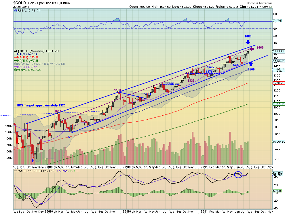
Gold jumped to start the week and then consolidated until a move higher again on Friday. The daily chart shows the Relative Strength Index (RSI) level around the 70 level and the Moving Average Convergence Divergence (MACD) indicator leveling in positive territory after a pullback. All of the Simple Moving Averages (SMA) are sloping higher as well. The weekly chart shows the break higher from the doji last week with rising RSI and increasing MACD. This chart looks like money. The bias for Gold remains to the upside next week with targets on Measured Moves (MM) to 1645, 1665 and then 1720. Any pullback should be contained by support at 1580-1600 consolidation area or the strong support at 1560 below that.

West Texas Intermediate Crude Daily, $CL_F
oil d5 e1311976573242 stocks
West Texas Intermediate Crude Weekly, $CL_F
oil w9 e1311976598182 stocks
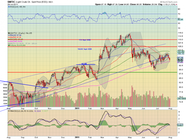
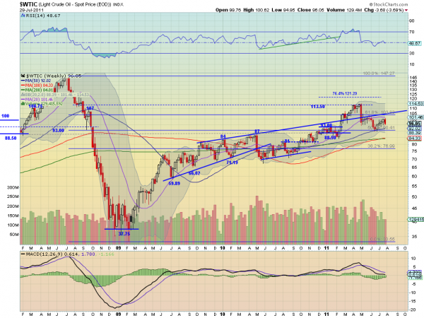
Crude Oil started the week with a doji, signaling the rise had ended and then fell for the rest of the week finding the 200 day SMA on Friday as support. But the RSI on the daily chart is rolling lower ad the MACD is crossed negative, suggesting more downside. The weekly chart shows the bearish engulfing candle taking hold as the RSI rejects at the mid line. Also notice that all of the SMA’s on both time frames are now flat to rolling lower. Crude Oil is poised to continue lower next week now with support at 93 and then the 90.41 Fibonacci level followed by stronger support at 88. Any rise should meet resistance at 100 and a major spike at 104.82.

US Dollar Index Daily, $DX_F
usd d5 e1312028729735 stocks
US Dollar Index Weekly, $DX_F
usd w7 e1312028753561 stocks
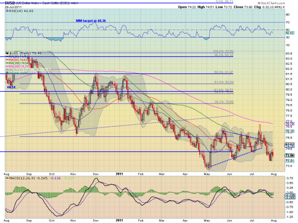
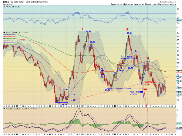
The US Dollar Index continued to fly a bear flag lower this week between 73.50 and 74.50 after falling out of the symmetrical triangle but below all of the SMA’s. The RSI on the daily chart is pointing lower while the MACD is diverging, improving, suggesting that the flag may continue. The weekly chart shows the move lower and the RSI and MACD suggesting more downside. Expect this continue to trend lower with any upside surprise to find resistance at 74.80 or on a super spike at 77.3, the neckline of the three year uptrend. Support comes at 73 and 72 before testing the all time low and then Head and Shoulders and MM targets of 63 and 59.8 kick in. Ugly set up.

iShares Barclays 20+ Yr Treasury Bond Fund Daily, $TLT
tlt d3 stocks
iShares Barclays 20+ Yr Treasury Bond Fund Weekly, $TLT
tlt w4 stocks
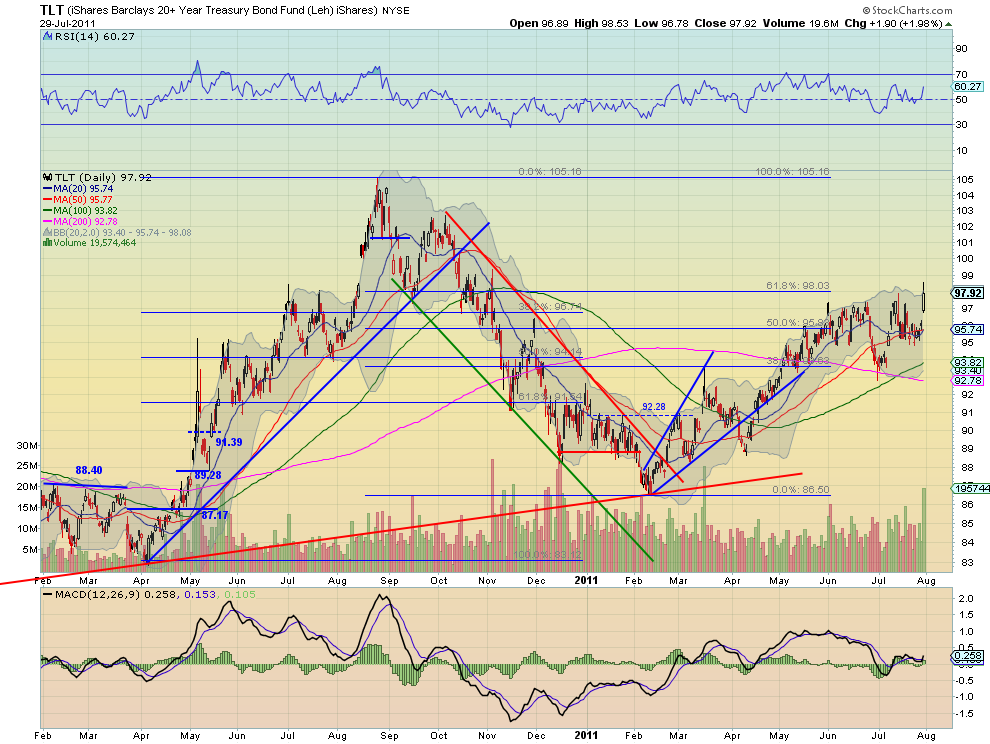
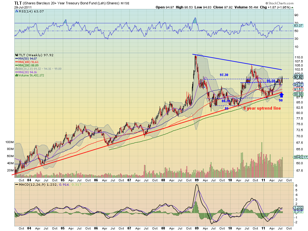
US Treasuries, as measured by the ETF TLT, continued their consolidated most of the week before rocketing higher on Friday. The daily chart show a rising RSI and a MACD that crossed positive, suggesting more upside, on heavy volume Friday. The weekly chart shows that the move finally pushed it through the middle range of the symmetrical triangle, from 95.50-97.30. It also shows the increasing volume as the RSI and MACD point higher. Look for US Treasuries to continue higher, if they hold the 97.30 break, and a test of 100 and then the top rail at 102.50. Losing the break should see support in the 95.50 area.

Shanghai Stock Exchange Composite Daily, $SSEC
ssec d3 stocks
Shanghai Stock Exchange Composite Weekly, $SSEC
ssec w3 stocks
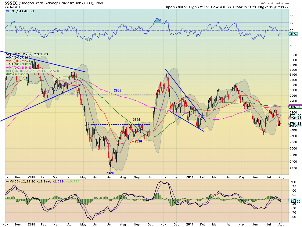
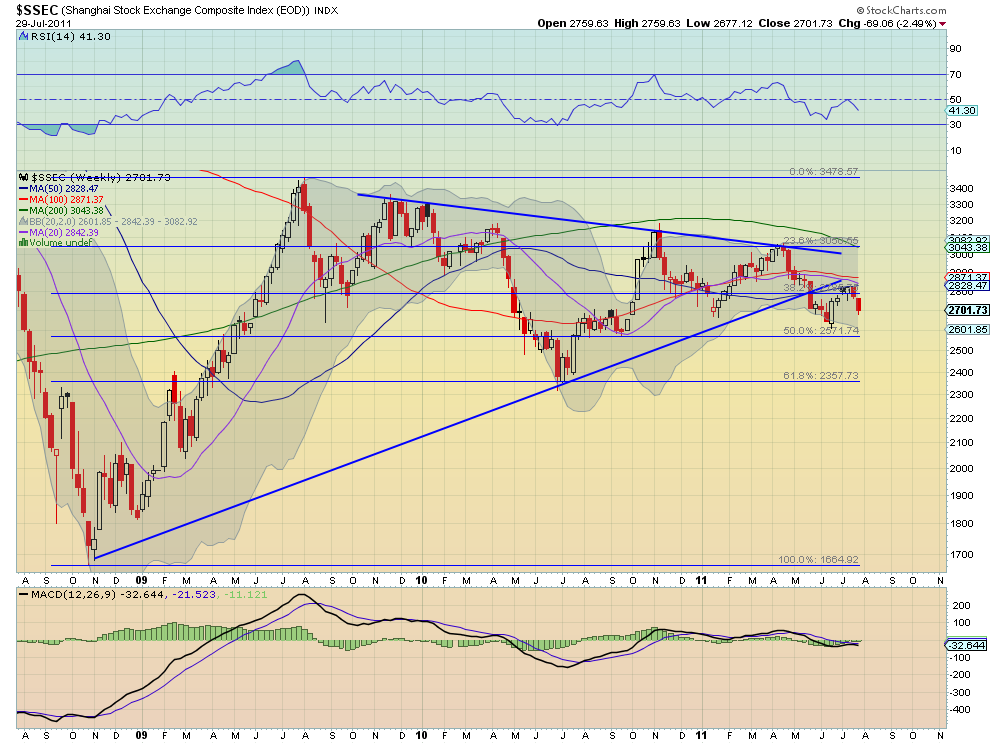
The Shanghai Composite jolted lower on Monday and then consolidated there for the week in a bear flag. This marks the 7th consecutive lower high. The RSI on the daily timeframe combined with the negative MACD suggest there my be more downside. The weekly timeframe shows that the fall is also a rejection at the falling SMA’s. The RSI on this timeframe also suggests lower. Look for the Shanghai Composite to continue to operate in a narrow range between 2695 and 2800 with any short term spikes limited to 2590 lower and 2900 above in the coming week.

iShares MSCI Emerging Markets Index Daily, $EEM
eem d3 stocks
iShares MSCI Emerging Markets Index Weekly, $EEM
eem w4 stocks
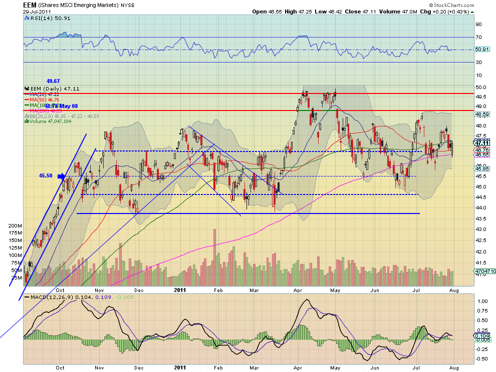
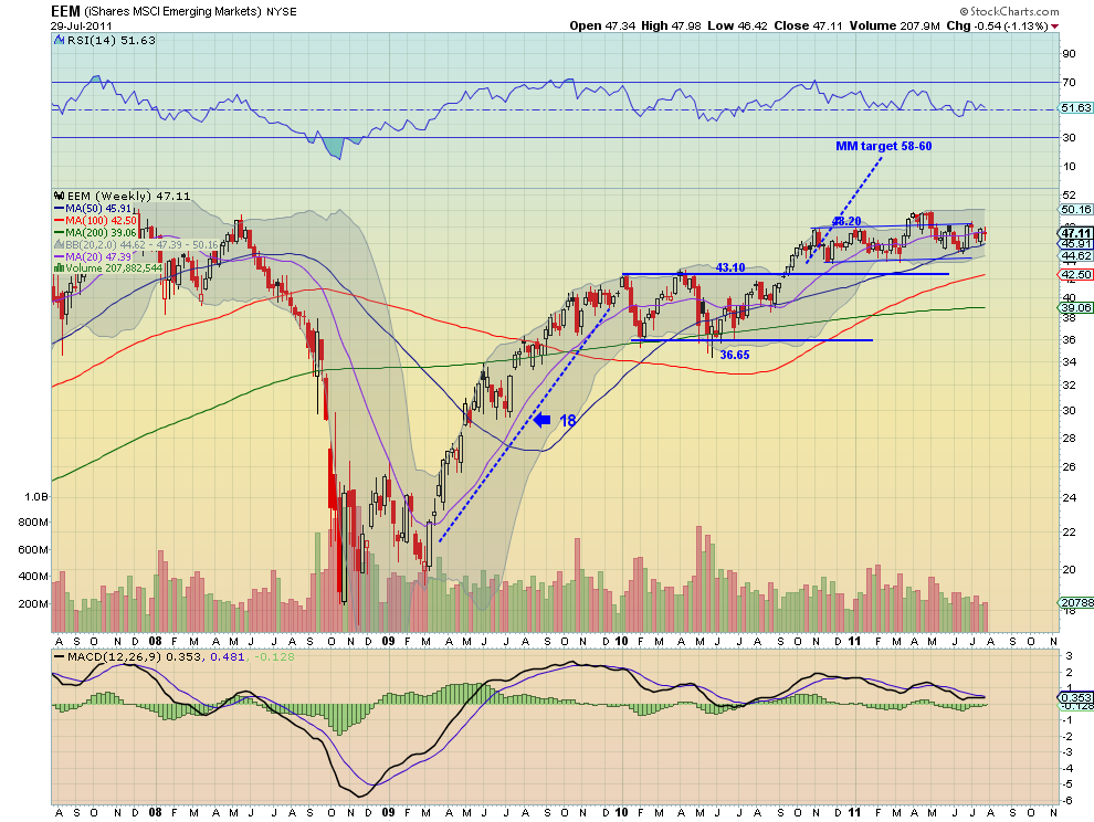
Emerging Markets, as measured by the ETF EEM, held in the upper end of the range for the week. The daily chart shows the RSI continues to meander around the mid line and the MACD around the zero level. On the weekly timeframe the broad range from the daily chart is put in perspective. More consolidation is shown on this chart as well as the RSI and MACD offer no guidance in this time frame. Continued consolidation in the range bounded by 45.50 below to 48.78 above is expected for the coming week.

VIX Daily, $VIX
vix d3 stocks
VIX Weekly, $VIX
vix w4 stocks
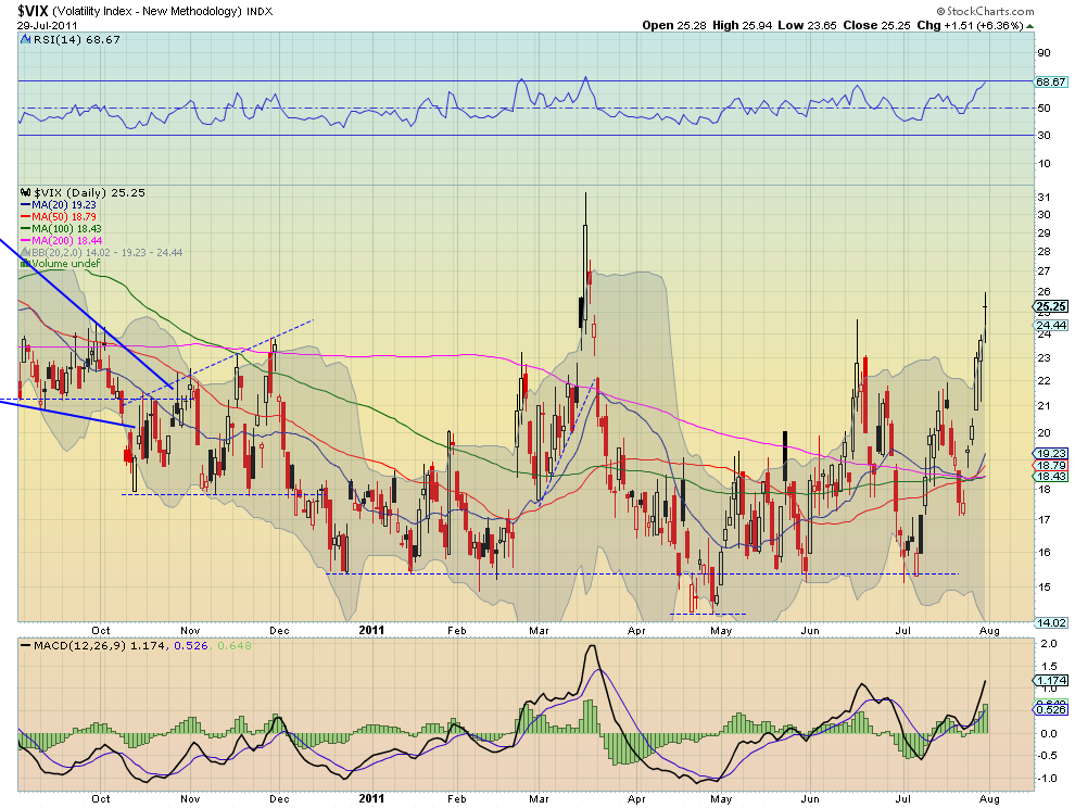
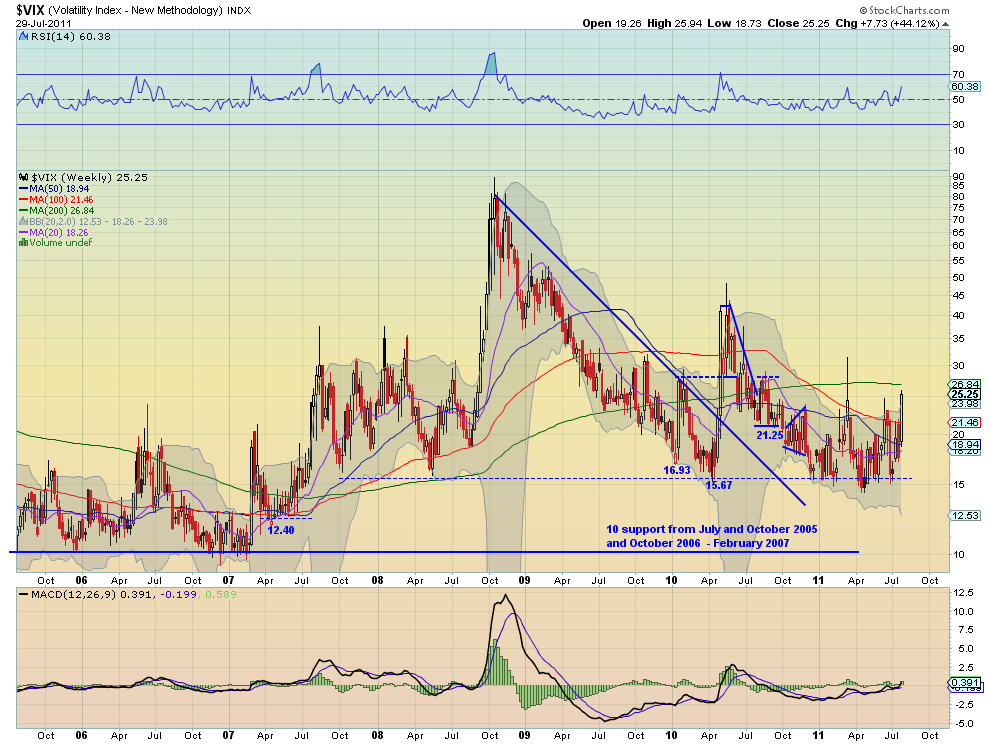
The Volatility Index marched higher throughout the week ending at its highest closing level since March out of the Bollinger bands. The daily chart shows that the RSI is touching 70 and the MACD is growing suggesting more upside, despite the long legged doji, signaling indecision. The weekly chart shows that is peeking above the recent range but still has resistance above at 28-30 before the 12 month range can be declared broken. Both the RSI and MACD on this timeframe suggest that a test higher is coming. Should it fail then there is support at 24 and 21.25 before 18 lower.

SPY Daily, $SPY
spy d6 stocks
SPY Weekly, $SPY
spy w5 stocks
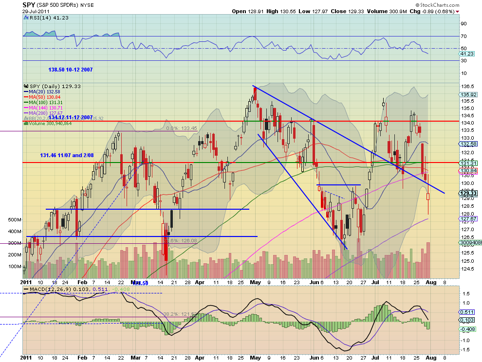
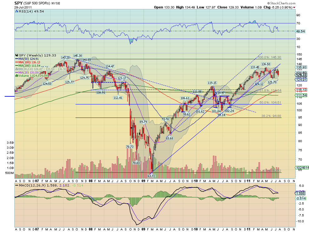
The SPY began the week in consolidation mode before beginning a plunge on Wednesday through the support of the previous downtrend line. Friday’s candle with long shadows signals some indecision. The RSI pointing lower and the MACD growing more negative on the daily timeframe suggest resolution of the indecision to the downside. The weekly chart is not so clear as it remains in the 126-136.50 range from the past six months. The RSI on this timeframe suggests lower but the MACD is improving. Look for a bias to the downside in the coming week but within the range above 126. A confirmation higher, by a move above 130 would suggest more range bound trading in the coming week. The upside resistance at 131.46 and then 134.12 should halt any rallies.

IWM Daily, $IWM
iwm d5 stocks
IWM Weekly, $IWM
iwm w3 stocks
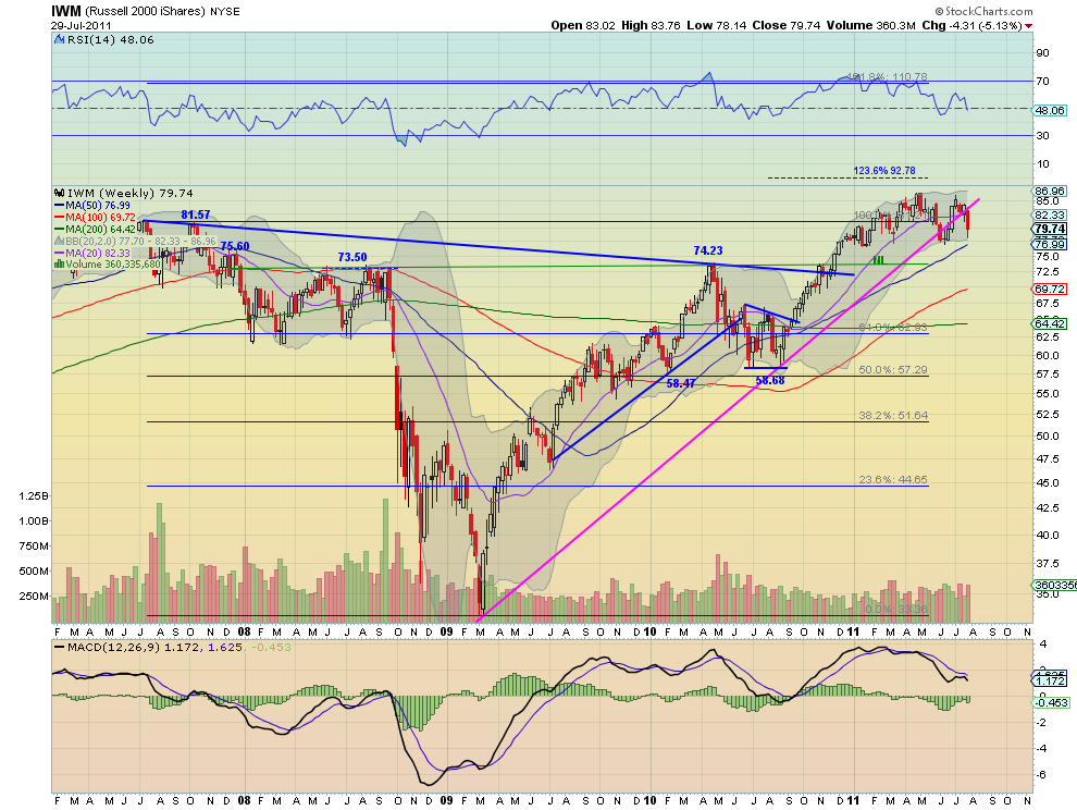
The IWM on the other hand began the week falling and then plunged further from Wednesday onward through the support of the previous downtrend line. Friday’s long hollow red candle though showed very positive upside intraday action. The RSI is pointing lower but leveling and the MACD is growing more negative on the daily timeframe though, suggesting more downside or consolidation. The weekly chart remains in the 76.5-86 range from the past six months. The RSI on this timeframe suggests lower but is leveling and the MACD is pointing lower. Look for a bias to the downside in the coming week but within the range above 76.5. A move higher above 80.50 would suggest more range bound trading in the coming week. The upside resistance at 81.57 and then 84 should halt any rallies.

QQQ Daily, $QQQ
qqq d1 stocks
QQQ Weekly, $QQQ
q w4 stocks
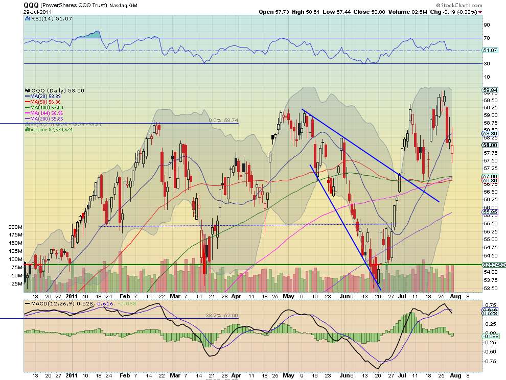
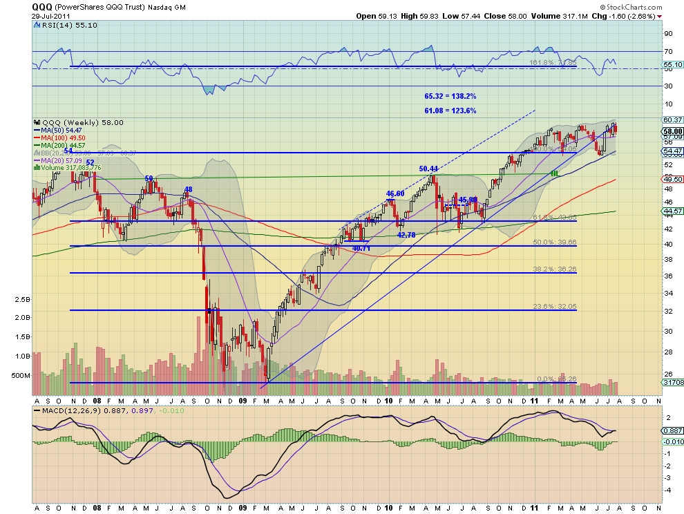
The QQQ began the week much like the SPY in consolidation mode and actually making new highs before beginning a plunge on Wednesday that continued for the rest of the week. Friday’s candle with long shadows signals some indecision, but Hollow red candle also shows there was positive intraday action. The RSI flat lining and the MACD growing more negative on the daily timeframe suggest resolution of the indecision to the downside, although consolidation is possible at this level. The weekly chart remains in the 54.26-60 range from the past six months. The RSI on this timeframe suggests lower but the MACD is improving to a potential cross up. Look for a bias to the downside in the coming week with support at 57 and then 55.50 lower, but unlike the SPY and IWM well above the bottom of the range at 54.26. A confirmation higher, by a move above 58.50 would suggest another test of the top of the range at 60 in the coming week.

Gold and US Treasuries look to continue their moves higher in the coming week, with Crude Oil and the US Dollar Index continuing lower. The Shanghai composite looks to consolidate further in the middle of its range while Emerging Markets do the same at the upper end of their range. Volatility looks biased to the upside contributing to the view that Equity Indexes, SPY IWM and QQQ will continue lower. All look to remain within their ranges with the QQQ remaining the strongest much higher in its range. News driven breaks to the upside should be contained in the range with the possible exception of the QQQ’s. Use this information to understand the major trend and how it may be influenced as you prepare for the coming week ahead. Trade’m well.

Follow Us