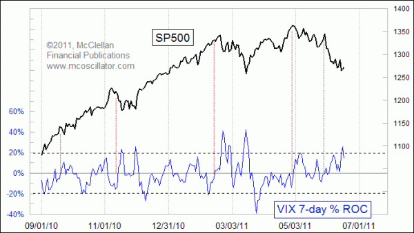
Back in February 2010, I introduced Chart In Focus readers to the 7-day rate of change (ROC) for the VIX. It is a fun little indicator, and offers us a nice simple way to see the VIX in a different form than just looking at what the raw values say.
The math is very simple: We just compare the VIX today with the VIX of 7 trading days ago, and find the percentage difference between those two numbers. It ignores all of the values between, which might seem like we are unnecessarily ignoring important data. But the result does a couple of magical things which make it worth looking at.
The first magical indication is that any reading above around +20% is a pretty good sign of an oversold bottom for stock prices, one that is worthy of a bounce. It does not seem to work the same way when we look at extreme negative readings for this indicator. Remember that the VIX is a fear indicator, and so the sudden development of fear which produces a high reading on the 7ROC is not the same phenomenon as a sudden abandonment of fear. Deeply negative readings for this indicator are usually seen at the kickoff of a strong up move, and not at the end of one.
The other magical insight that this indicator gives us occurs when it passes upward through zero. An upward crossing through zero often (but not always) marks an important top for stock prices. These seem to be better top signals when the upward crossing through zero occurs after a longer period below zero. The red vertical lines highlight some good examples of this sort of indication.
The stock market selloff during May and June 2011 unfolded without any big spikes upward in the VIX, which was confusing for a lot of people. If the market was in a downtrend (they wondered), why was the VIX staying so low? We now have the answer, with the sudden jump upward in the 7ROC indicator to a high of 25.8% on June 16. Fear reaches a climax at the end of a decline, not in the middle of one.
Two weeks ago, I showed a comparison of the chart pattern of the big silver price top in 1980 versus the current structure. Despite so many differences in the economy of 1980 versus now, there was a surprisingly strong pattern correlation in the price behavior.
I recently updated that relationship for readers of our Daily Edition. The June 16 issue of that subscription publication also showed what the same comparison looks like for gold prices, with some really interesting conclusions. Hint: the correlation is still working, for the moment anyway.
We are now offering a free 2-week trial for new subscribers of our Daily Edition. If you have been thinking about signing up for our Daily Edition, now would be a good time to give it a try, and get to see how that 1980 pattern comparison is continuing to develop, plus get our other real-time insights about stocks, bonds, and gold.
No comments:
Post a Comment