
April 22, 2011
The financial media have been getting really excited about gold and silver lately. Gold has seen postings above $1500 for the first time, and silver is closing in on the $50 mark last seen when the Hunt brothers tried to corner the silver market in 1980.
Silver is a lot more volatile on a daily basis than gold is. Silver seems to attract the hottest of the hot money, and moves around a lot more as a result of that speculative intensity.
This week’s chart shows a comparison of the daily percent changes in gold and silver prices each day since the beginning of 2010. It is helpful in terms of visualizing the relationship between these two metals. Each dot represents one day’s value for the percent change in cash gold and cash silver. If we instead looked at gold and silver futures, it would look slightly different due to the inherent inefficiency in the gold and silver “fix” reporting. And if we had a different period in history under examination, that too would make it look different.
One point which jumps out is that even though there is a great deal of variability, there is an obvious linear relationship that is highlighted by the linear regression line drawn on the chart. For Excel users, it is easy to create a linear regression line like this one. Just create the chart, then select CHART-ADD_TRENDLINE, and choose “Linear” for the regression type. You can also select the options to add the regression line equation and R-squared value for display on the chart.
A couple of points are worth noting about this regression line. The first is that a 1% move in gold produces, on average, a greater than 1% move in silver prices. This is not a surprise; silver is more volatile than gold. So in the language of portfolio analysis, silver has a “beta” that is greater than 1.0 when compared to gold price movements. This means that silver’s daily moves upward and downward are bigger than those seen in gold. This is similar to how a tech stock might move up and down by greater amounts than the SP500 or some other benchmark, whereas a utility company stock might have quieter moves. Beta is the measure of those greater or lesser movements.
Beta shows up in the regression line equation for this set of data as the 1.2731 factor multiplying the X variable. This means that on average, if gold moves 1%, then silver will move 1.2731%.
The other number in that regression line equation is 0.0018, which represents where the regression line crosses the Y axis. In portfolio management jargon, this is “alpha”, which refers to the performance of an asset (silver) relative to the benchmark (gold) on a risk-adjusted basis. In real terms, the meaning of that 0.0018 number is that since Jan. 2010 the price of silver has outperformed gold by 0.18% per day. If we looked at another period, when metals prices were not in a protracted uptrend, the figure for alpha would likely be different, but the beta figure should be similar since silver prices tend to magnify the movements in gold prices.
It should be understood that the normal use of alpha is in terms of grading a portfolio manager’s performance relative to a benchmark like the SP500, after factoring out the market risk. But the same math can be applied to the relationship of silver prices versus the benchmark of gold prices. And doing this regression analysis helps us see more precisely why silver’s price movements seem to be bigger than gold’s on a daily basis.
Related Charts
Oct 14, 2010 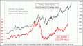 Gold Prices Lead The Way For Commodities | Aug 06, 2010  Correlations May Not Be What They Seem | Dec 04, 2009 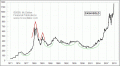 How Gold Forms Tops |
No comments:
Post a Comment