by Bill Luby
For those who missed today’s market action and just looked at the post-mortem reports, today probably looked like just another in a series of uneventful days. For those who were paying attention to the likes of the VIX futures and ETPs based on VIX futures such as TVIX (+10.7%) and VXX (+5.2%), however, the tension in the air was obvious.
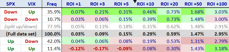
But the SPX, DJIA and NASDAQ composite indices were all up today, so what’s the big deal? It turns out that investors are easily spooked if the VIX (+2.6%) and the SPX (+0.1%) both move in the same direction. As the graphic below shows, the VIX and the SPX move in the same direction about 22% of all trading days. I think the real issue behind the concern about the direction of the VIX and the SPX is related to a hypothesis I laid out yesterday in What the VIX Kitchen Sink Chart Says :
“…the general consensus seems to be that stocks just do not deserve their current lofty valuation. In this type of environment, many investors become particularly susceptible to confirmation bias and scramble to find one or more indicators which will tell them what they have already begun to believe: that a major correction is likely just around the corner.”
The last time I crunched the numbers for VIX and SPX daily correlations , was in May 2007 and in looking at data from 1990, I concluded that a High Positive Correlation Between VIX and SPX Often Signals Market Weakness . Interestingly, when I ran the numbers today, the data from the last five years had completely reversed the conclusions. Thanks to some particularly strong results from 2009 and 2010, the full data set (1990-2012) now shows that when both the VIX and SPX are up on the same day, the mean returns for the next 1-100 trading days far exceed the typical returns for the full data set.
In terms of key takeaways, it now appears that stocks perform best following days when the SPX is up and the VIX is down (the ROI +1 column refers to the performance of the SPX one day hence) and worst on days when the SPX is down and the VIX is up. Interestingly, if one combines the up/down and down/up days, as I have done in the “split up/down” row, the aggregate data set of the SPX and VIX going in different directions looks almost exactly the same as the full data set in terms of future performance.
Getting back to the up/up phenomenon of today and yesterday, this bodes quite well for stocks going forward, based on historical data. By the same token, down/down days correspond to future performance that is, on average, well below the full data set.
Of course another key takeaway is that no matter what the data says today – for this study or any study – future events may overwhelm the current historical data and invalidate the generally accepted conclusions, even with a large sample size.
Now I will be the first to admit that stocks are overdue for a pullback, but just because the VIX and SPX both advanced on two consecutive days does not necessarily mean the planets are aligning for an Aquarian selloff. If investors are looking for that market reversal silver bullet, the SPX-VIX correlation data are not going to make them happy.
[For the record, the data in the table below includes Fridays and Mondays, so it is possible that calendar reversion may have had an impact on the results.]
Below is a larger than usual set of links for those who may be interested in digging into the history of some of the SPX-VIX correlation themes in this space.
Related posts:
No comments:
Post a Comment