Mark Hulbert addresses a topic that is quite timely. When different advisers or commenters arrive at different conclusions, especially when they seem to be using the same type of reasoning, how do we know what to think? Frankly, most of the time we humans tend to choose the conclusion which we want the data and reasoning to arrive at and then find the data and rationale rather than the other way around. Since we tend to choose the data that we want, Mark feels that a discussion about what data to even look at is of paramount importance:
Rather than spending our energy on analyzing a specific data set, as most analysts do, we should instead be focusing the bulk of our effort on deciding which data set we should be studying in the first place.
Mark illustrates this issue by generously comparing two different advisory firm’s claims about how undervalued/overvalued the markets are which seemingly use a similar rationale. I say generously, because in order to not have his main point get lost in the weeds he avoids digging into each firms methods, which would be necessary in order to have the discussion Mark suggests we have.
So let us have that discussion.
First though, let me make a quick disclaimer. My comments are not in any way meant to claim that either firm is a good or bad advisor in general. Firms can make good/bad arguments on this topic, and still be good choices to manage your assets, or a portion of them, depending on what your goals, needs or objectives are. I can disagree with someone’s claim that stocks are (or are not) cheap in general without that changing my opinion of their abilities as a stock picker at all (or I might feel they have other merits of note.) If that is what you are looking for, you need to evaluate them on far more factors than this question. If you are relying on them to make asset allocation choices for you in general based on value then depending on how important other factors are in their process, this question may be extremely important.
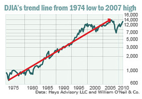
Consider, for example, Don Hays, of the Hays Advisory Service. Earlier this week, in arguing to clients that the bull market is destined to continue strongly for many more years, he presented a chart of the Dow Jones Industrial Average back to the stock market’s late-1974 low.
Compared to a trendline that he drew connecting that low to the stock market’s October 2007 high, stocks currently are well below trend — nearly 40% below, in fact. Hays asks: “How could anyone be neutral on the U.S. stock market with a history like this?”
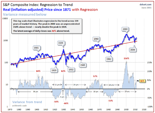
An answer is provided by, among others, Jeremy Grantham, the chief investment strategist at Boston-based GMO. Grantham also is a strong believer in regression to the mean, having placed the principal at the core of his investment approach. By looking at a lot more history than just the last four decades, Grantham has concluded that stocks are overvalued right now and dangerously close to forming another bubble. In fact, according to Grantham’s calculations of fair value for the S&P 500, the market is around 40% overvalued.
Here is the chart Don uses:

Here is where Mark chooses to be generous:
So take your pick. Even if you believe the markets follow a regression-to-the-mean process, you still can conclude that stocks are either as much as 40% overvalued or as much as 40% undervalued.
Mark wants us to concentrate on the point that we need to have the debate, not make the debate in his article, so I understand. However, really? Can you really make that conclusion either way? Are they even really using the same type of reasoning? I suspect Mark doesn’t believe so based on the next two statements:
Unhelpful as this discussion is to those who want to know whether to buy or dump stocks, it does help us focus on an under-appreciated aspect of historical analysis: Whatever time period you choose to focus on, you’re in effect assuming the stock market in the future will perform like it did over that period. Once you choose a time period, in other words, what you find becomes virtually a foregone conclusion.
He has quickly identified a common flaw with many arguments, choosing particular time periods, and one of these claims is based on a very particular time period to get their claim to work. Mark knows that as he gently tells us:
It’s hardly a surprise, for example, that you will reach a bullish conclusion upon comparing the market’s current level to a trendline connecting the December 1974 bottom and the October 2007 top — as Mr. Hays has drawn.
He then gives his preference:
For my money, I prefer to look at more history than just the last four decades. In fact, I think a compelling argument can be made that recent decades are, if anything, actually an unhelpful basis for comparison — since they represent the apex of the Pax Americana era in world history. After all, it’s quite unlikely that the U.S. will enjoy the same degree of geopolitical hegemony and financial power around the globe over the next several decades as it did over the last several.
Good points, but it really lets Mr. Hays off the hook. Now that we have set the stage for the discussion, let us see look at how we should look at the data, and why.
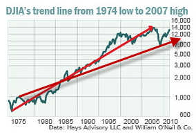
Mark makes some good points about picking the time periods. Mr. Hays picks a period that includes very low valuations and then ends at period with very high valuations without providing any data about that fact. Those issues however are not the main problems with his argument contra Mark’s plea. The same period, with just a different set of lines changes the conclusion dramatically. So choosing the data set to use is an important question, but how you use it is just as important. Here is the same chart with me adding a line from an early peak of the market to the latest low of that market using the same graph:

If the mere arbitrary drawing of a line changes your view of the markets trend from around 8000 on the Dow to around 16000 then that should tell you that the exercise is pointless and meaningless. Mr Hays’ argument is not valid. We can all play around with this type of analysis and put lines wherever we wish and it will not mean anything. The statistically minded of us will immediately recognize the problem, neither line is a regressed trend line at all, and thus tells us little about any underlying trend. Jeremy Grantham does use regression to trend, but he first develops a true trend line using regression analysis. So does Doug Short. Just as importantly Mr. Hays’ chart is not adjusted for inflation (also known as showing a “Real Return”) while Jeremy Grantham and Doug Short do:

Notice that this chart is much flatter once you take out the distortion of inflation and the message quite different when you use a true regressed trend line. Interestingly, while picking the time period does change the trend line, a true trend line such as this is far less sensitive to doing so than mere lines drawn from a low to a peak. In fact, even cherry picking the time period Mr. Hays did, but using a true trend using regression analysis would still yield an overvalued market, if less so. That robustness to starting and end points is an example of a way to test one’s conclusions and methodology. Even a time period specifically chosen to come up with a distorted outcome wasn’t enough to change the conclusion to an opposite one, it just softened it.You even come up with an overvalued market (though not by a lot) if you choose the particular time period illustrated in Mr. Hay’s chart and do not adjust it for inflation.
So, using real regression to the mean analysis, adjusting for inflation and using more data (all the way back to 1870) shows us a market that is 40% or more overvalued, just as Mr. Grantham claims. Even if one were to argue that adjusting for inflation wasn’t appropriate and that pre 1970 data wasn’t relevant anymore and not adjusting it for the low and high starting points, merely using an actual regressed trend line shows the market as overvalued. I’ll take a well thought out process that has shown itself to be predictive of future returns (see here) using valid statistical techniques and adjusting for as important a factor as inflation over arbitrary (okay, not arbitrary, carefully chosen to arrive at a conclusion) lines drawn on a graph to give the appearance of rigor.
I would argue that these two men (firms) are not even using the same type of reasoning. This is masked because both of them use the word trend, but they are talking about two very different animals.
I also think it is important to point out that Jeremy Grantham uses regression to the mean as a general approach (when things get too high they go down, when they get to low they go up) more than he relies on a specific trend line. They use a regressed trend as a tool, but make their decisions with more weight given to their components of returns analysis and regression to fair value (which for the S&P 500 would be an expected return of 5.7% above inflation. We suggest using a number of different methods as well (normalized P/E over various time frames, Q Ratio, Market cap relative to GDP, etc.) and to use methods which when tested show a statistically significant relationship to subsequent returns and over long time periods and different market environments.
Mark didn’t want to say all that so he could convince others to begin the work of winnowing the wheat from the chaff in general as opposed to spending his time on this specific difference. Hopefully this is a first step in the right direction of doing so.
No comments:
Post a Comment