by
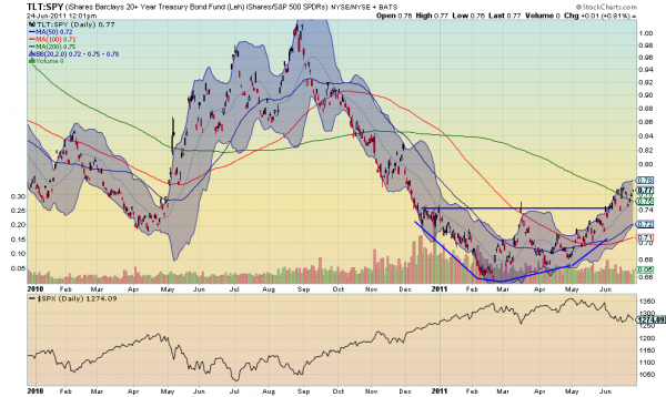
Yesterday I wrote that the S&P 500 was starting to look even better to the short side (link below). Let me give you one more reason to start looking that way if you are not already. Below is the ratio chart of iShares Barclays 20+ year Treasury Bond Fund (ticker: $TLT) against the S&P 500 SPDRs (ticker: $SPY).

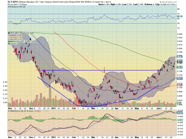
On the bottom scale for comparison is the S&P 500 Index. Notice how closely the ratio follows the shape of the Index. Now focus in on the last six months of the ratio. Not only as it based and is

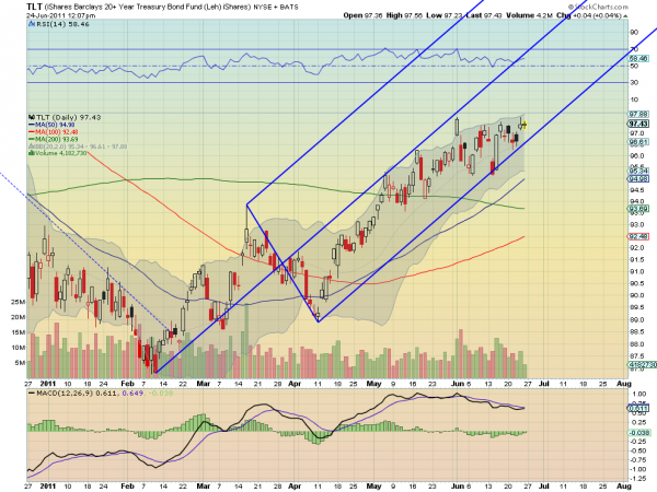
rising, but it is now putting a floor at the previous top of the base. But a ratio chart is influenced by the relationship between two stocks, so lets look at the prognosis for the $TLT in the final chart.

This shows that Treasuries are being drawn towards the lower Median Line, but with little downside. If this line holds then the ratio above will continue higher, and the Relative Strength Index (RSI) and Moving Average Convergence Divergence (MACD) indicator suggest that it will hold. This is not a guarantee of a lower S&P 500 but the planets are aligning.
No comments:
Post a Comment