by
Copper is important because it is considered by many to be a market tell. I explored whether this is true or not two months ago in the story linked below. But whether you believe in the correlation long term or not is irrelevant if the collective market does. So what does Copper have to say for itself? Let’s look at it from four different perspectives.
Point and Figure

The simplest interpretation is the Point and Figure chart. Above is a standard 3 Box Reversal chart with 4 point box size for Copper. If you are not familiar with Point and Figure charts they look at price movement solely, without regard to time or volume or anything else. This chart shows Copper in a downtrend since it broke the Triple Bottom by printing the ‘O’ in the 404.0 box. The price objective for the breakdown is 384.0.
Andrew’s Pitchfork

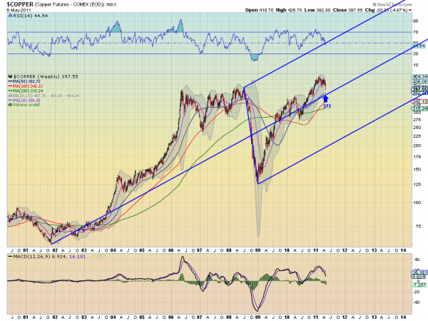
Also a clean chart technique the Andrew’s Pitchfork has been working well in the metals complex lately. The basic premise is that the tines of the Pitchfork or Median Lines, attract the price. This chart shows that Copper rose from the Lower Median Line at the beginning of 2009 to the Median Line and has been contained in the gravity of that line since. It is now being pulled back to the Median Line which is currently at 373. You can see that it can overshoot the Median Line like it did in mid 2010 so 373 is not a price objective.
Elliott Wave Principles

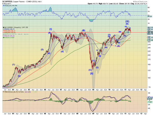
Contrary to what the media would have you believe Elliot Wave is used by people besides Robert Prechter and does not always give a doomsday scenario. Elliott Wave Principles applied to the Copper chart show that it is in the corrective Wave (IV) of the Primary Motive Wave higher. It is not clear if it is in the intermediate wave c (as the chart shows) or still in wave a. Either one points to more downside. Wave (II) and Wave (IV) often have different characteristics so since Wave (II) was an expanding wave then Wave (IV) can be expected to be more sideways as it has been. Not a rule but an observation. This would mean that the correction does not have much more to go lower.
Fibonacci

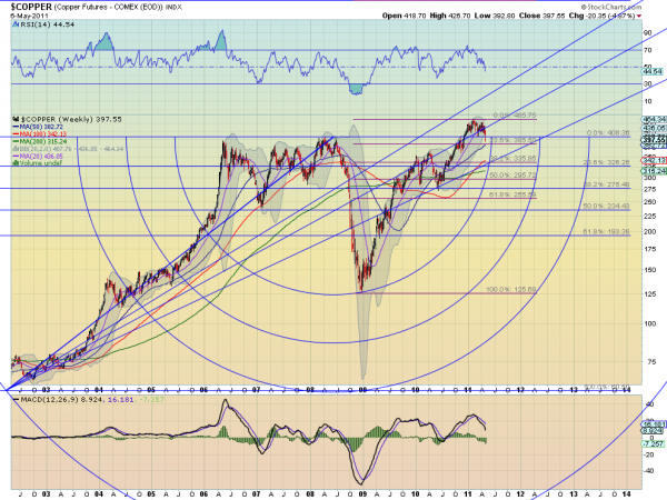
This one is a bit more crowded with two sets of Fibonacci retracement levels (Levels), Fibonacci Arcs (Arcs) and Fibonacci Lines (Lines). The blue Levels and the Arcs and Lines are generated from the low at 60.50 in 2001 and trace to the top at 408.36 in mid 2008. the purple Levels are from teh correction low to the recent high. You can see the Lines roughly bounding the move higher from mid 2009 until the throw over when Copper broke to new highs late last year. Also that the Arc was support at the low at the end of 2008 into 2009. As the price bounces back below the 100% Level on the blue lines it is moving through time toward the Arc again. This view shows the purple 23.6% Level coming into play as potential support at 385.50 and then a drop to 335.85 below that.
So four different perspectives, but each one sees Copper heading lower with targets of 384, 373 and 385.50 at least. One final note that each time chart also had the Relative Strength Index (RSI), Moving Average Convergence Divergence (MACD) indicator and Bollinger Bands on it. The RSI and MACD both also suggest more downside and the Bollinger bands which had been squeezing are now expanding to allow for a run. These indicators suggest that maybe the price objectives above are not the end of the fall. What do your charts say?
No comments:
Post a Comment