Inflation is sure to be part of the discussion at the press conference with Chairman Bernanke today, which gives us yet another excuse to look at some chart porn.
Have a gander at the first graphic — its from the NYT, whose graphic department is usually pretty awesome:
>
>
The original
click for larger graphic
Source: Behind the Rising Cost of Food (NYT)
>
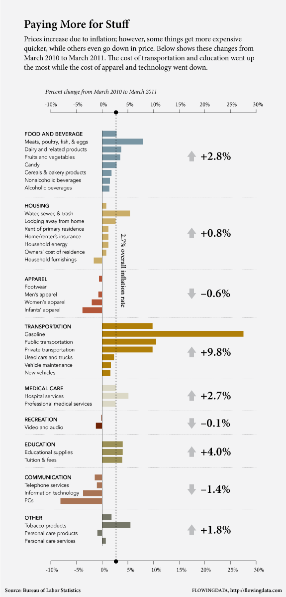
But even awesome can be improved upon; The above chart was the inspiration for an improved version from Flowing Data:
>
>
New & Improved
click for larger graphic
Source: How much more we pay for stuff now than we did last year (Flowing Data)
No comments:
Post a Comment