Wednesday, February 4, 2015

The Longer Outlook in …..The Nasdaq 100

by Greg Harmon

The Nasdaq 100 has a long history for being the index for technology stocks. This was a great assumption for the early 2000’s, but now the index is laden with biotech companies as well. This has been good over the last few years as the strength in biotechs has benefited the Nasdaq while tech stocks have weighed it down. This has propelled the Nasdaq 100 near the 2000 highs, the height of the tech bubble. This is the last major index that has not made a new all-time high. Perhaps a rally in tech names will get it there. But the chart suggest it might take a while.

nasdaq

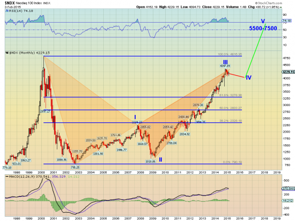
The monthly chart going back past the tech bubble peak is very clean. There are two main stories involved. The first is the harmonic Bat playing out, shown by the two triangles. This bearish Bat is just 11 Nasdaq points away from the Potential Reversal Zone (PRZ) at 4358. Close enough for chart art. A move lower from here would look for a retracement of 38.2% of the pattern, or to 3278.

But the funny thing about a harmonic Bat is that it can morph into a harmonic Crab. No magic spell involved, just a continuation over 4358. This would move the PRZ to 6350. There are a couple of ways this could happen. It could just continue higher. It could pullback, but less than 38.2%, and then move up to the new PRZ, or it could move sideways and then higher. Of the three, the last two carry a higher probability.

There are a couple of reasons for this. First, the index is overbought on the momentum indicators. The RSI has been running over 70 for over a year and a quick look at the price action shows that historically it has not behaved well when this ends. The MACD is not close to the extreme level in 2000 but it is well above all other levels when you pull that out. It is also starting lower towards a cross down. These could produce either a pullback or continued consolidation.

But Elliott Wave principles raise the probability of a flat move or small pullback. The price action from the 2002 low to the present looks like the first 3 waves of a 5 wave impulse higher. One of the Elliott Wave principles is that the two corrective waves in the 5 wave pattern often are of different character. That is if one if flat the other trends or zigzags for example. In this case Wave II trended lower, so Wave IV would be expected to be flatter.

Using that concept and a similar timeframe for Wave II could see Wave IV ending at 4000 in early 2016, before a final Wave V higher to between 5500 and 7500. The Crab PRZ is nearly in the middle of that range. All of the bullish cases for the longer term fail on a break below 3278 and a then a target of 2328 arises, or a 61.8% retracement of the original Bat pattern.

See the original article >>

US Dollar Reversal

by Short Side of Long

Chart 1: The strong US Dollar rally is finally showing signs of weakness

US Dollar Index 

Source: Fin Viz (edited by Short Side of Long)

Over the last few sessions, we have potentially seen first signs of weakness in the powerful US Dollar rally, which started in early July of last year. While I do not think the US Dollar bull market is over yet, there is a potential for a serious correction in coming weeks and/or months. Obviously, this should impact many asset classes, which I wrote about several weeks ago:

If the correction in the US Dollar would occur in coming weeks, it might boast many different asset classes. Firstly, the dramatic crash in Crude Oil could finally find some sort of footing. Stabilisation in energy prices could help energy stocks as well. Foreign currencies such as Japanese Yen and Australian Dollar find themselves at major historical support levels of 120 yen and 0.80 cents, so both of these could rebound for awhile.

Emerging market currencies have been under pressure recently, so a peak in the greenback could stabilise these currencies and put a bid under the extremely cheap emerging market equity complex. Finally, as already discussed in previous posts, Gold has been holding up well despite the Dollar rally. Therefore, Dollar weakness might only further strength Gold as it attempts to break out into a new uptrend.

Chart 2: Bullish sentiment has remained at super high nose bleed levels

US Dollar Sentiment 

Source: SentimenTrader (edited by Short Side of Long)

US Dollar could correct for awhile, either in a form of a prolonged consolidation or even possibly an initial sharp reversal sell off. The truth is, bullish sentiment on the currency is ridiculously high and a major shake out could occur at any point in time. If we observe Chart 2, we can see that the Public Opinion (thanks to SentimenTrader website) has been at nose bleed levels and recently hit a record high.

At the same time, commitment of traders report (thanks to CFTC), shows that hedge funds and other speculators hold an extremely high level of net long contracts. Every man and their grandmother expect higher US Dollar. Honestly, so do I, as I've been long since the summer months of 2014. All of this means that the trade is probably overdone, way too loved, over-owned and overbought... at least in the short term.

Pay attention to the USD index in the next few weeks!

Chart 3: Hedge funds continue to heavily sit on the long side of the trade

US Dollar COT 

Source: Short Side of Long

See the original article >>

2008 Deja Vu: GMAC Confirms SEC Probe Of Subprime Loans, Will "Investigate Itself"

by Tyler Durden

While not entirely surprising, the fact that GM Financial has admitted that:

  • *GM FINANCIAL: SEC PROBING SUB-PRIME LOAN SECURITIZATION

Of course, we should not worry about this... we are sure it is "contained" as GM reports it is "investigating matters internally" - just like it did with the ignition switch year ago?

Via GM's 10K,

In July 2014, we were served with a subpoena by the U.S. Department of Justice directing us to produce certain documents relating to our and our subsidiaries’ and affiliates’ origination and securitization of sub-prime automobile loans since 2007 in connection with an investigation by the U.S. Department of Justice in contemplation of a civil proceeding for potential violations of the Financial Institutions Reform, Recovery, and Enforcement Act of 1989.

Among other matters, the subpoena requests information relating to the underwriting criteria used to originate these automobile loans and the representations and warranties relating to those underwriting criteria that were made in connection with the securitization of the automobile loans. We were subsequently served with additional investigative subpoenas to produce documents from state attorneys general and other governmental offices relating to our sub-prime auto finance business and securitization of sub-prime auto loans.

In October 2014, we received a document request from the Securities and Exchange Commission in connection with its investigation into certain practices in sub-prime auto loan securitization.  We are investigating these matters internally and believe that we are cooperating with all requests. Such investigations could in the future result in the imposition of damages, fines or civil or criminal claims and/or penalties. No assurance can be given that the ultimate outcome of the investigations or any resulting proceedings would not materially and adversely affect us or any of our subsidiaries and affiliates.

Nothing to see here, move along... the rebirth of the subprime lending bubble...

and the delinquencies are alreasy surging...

See the original article >>

Tuesday, February 3, 2015

Secular Bull and Bear Markets

by Doug Short

Was the March 2009 low the end of a secular bear market and the beginning of a secular bull? At this point, over five-and-a-half years later, the S&P 500 has set an inflation-adjusted record high based on monthly averages of daily closes.

Let's examine the past to broaden our understanding of the range of historical trends in market performance. An obvious feature of this inflation-adjusted series is the pattern of long-term alternations between up-and down-trends. Market historians call these "secular" bull and bear markets from the Latin word saeculum "long period of time" (in contrast to aeternus "eternal" — the type of bull market we fantasize about).

Click to View
Click for a larger image

The key word on the chart above is secular. The implicit rule I'm following is that blue shows secular trends that lead to new all-time real highs. Periods in between are secular bear markets, regardless of their cyclical rallies. For example, the rally from 1932 to 1937, despite its strength, remains a cycle in a secular bear market. At its peak in 1937, the index was 29% below the real all-time high of 1929. For a scholarly study of secular bear markets, which highlights the same key turning points, see Russell Napier's Anatomy of the Bear: Lessons from Wall Street's Four Great Bottoms.

If we study the data underlying the chart, we can extract a number of interesting facts about these secular patterns (note that for the table below I am including the 1932-1937 rally):

The annualized rate of growth from 1871 through the end of December (the latest month for which we have an inflation rate) is 2.25%. If that seems incredibly low, remember that the chart shows "real" price growth, excluding inflation and dividends. If we factor in the reinvested dividend yield, we get an annualized return of 6.86%. Yes, dividends make a difference. Unfortunately that has been less true during the past three decades than in earlier times. When we let Excel draw a regression through the data, the slope is an even lower annualized rate of 1.76% (see the regression section below for further explanation).

If we added in the value lost from inflation, the "nominal" annualized return comes to 9.06% — the number commonly reported in the popular press. But for a more accurate view of the purchasing power of the market dollars, we'll stick to "real" numbers.

Since that first trough in 1877 to the March 2009 low:

  • Secular bull gains totaled 2075% for an average of 415%.
  • Secular bear losses totaled -329% for an average of -65%.
  • Secular bull years total 80 versus 52 for the bears, a 60:40 ratio.

This last bullet probably comes as a surprise to many people. The finance industry and media have conditioned us to view every dip as a buying opportunity. If we realize that bear markets have accounted for about 40% of the highlighted time frame, we can better understand the two massive selloffs of the 21st century.

Based on the real (inflation-adjusted) S&P Composite monthly averages of daily closes, the S&P is 144% above the 2009 low and only about 1% off its record close.

Add a Regression Trend Line

Let's review the same chart, this time with a regression trend line through the data.

Click to View
Click for a larger image

This line is a "best fit" that essentially divides the monthly values so that the total distance of the data points above the line equals the total distance below. The slope of this line, an annualized rate of 1.76%, approximates that number. Remember that 2.25% annualized rate of growth since 1871? The difference is the current above-trend market value

The chart below creates a channel for the S&P Composite. The two dotted lines have the same slope as the regression, as calculated in Excel, with the top of the channel based on the peak of the Tech Bubble and the low is based on the 1932 trough.

Click to View
Click for a larger image

Historically, regression to trend often means overshooting to the other side. The latest monthly average of daily closes is 91% above trend after having fallen only 13% below trend in March of 2009. Previous bottoms were considerably further below trend.

Will the March 2009 bottom be different? Perhaps. But only time will tell.

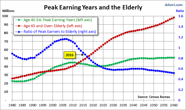
For a more optimistic view, see Chris Puplava's assertion a year ago that The Secular Bear Market in Stocks Is Over. Chris's commentary includes some interesting demographic analysis based on the ratio of the higher earning, bigger spending age 35-49 cohort to less financially empowered age 20-34 cohort. Unfortunately this ratio is being savagely trumped by a far more powerful demographic shift: The ratio of the elderly (65 and over) to the peak earning cohort (age 45-54). The next chart, based on Census Bureau historical data and mid-year population forecasts to 2060, illustrates this rather amazing shift.

In the chart above, the elderly cohort (red series) is dramatically increasing in numbers. The ratio of the two, the blue line in the chart, peaked in 2007 and began its long rollover in 2008, coincident with the beginning of the last recession. We have many years to go before this ratio approximately levels out around 2030.

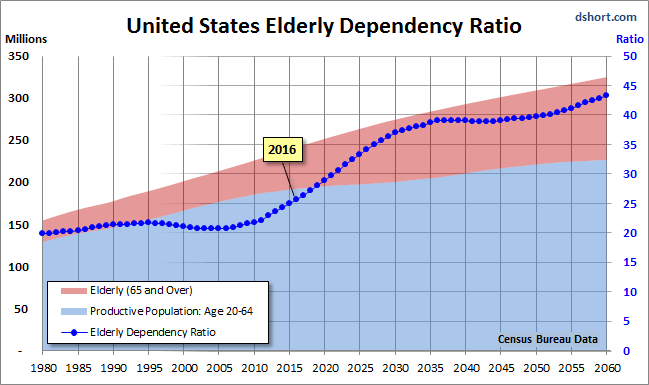
Even more disturbing is the elderly dependency ratio, the label given by demographers to the ratio of the 65 and older population to the productive workforce, which for developed economies is usually identified as ages 20-64. The next chart illustrates the elderly dependency ratio with Census Bureau forecasts to 2060. Note that in this chart I've followed the general practice in demographic research of multiplying the percent by 100 (e.g., the estimated mid-year 2014 elderly dependency ratio is 24.3% x 100 = 24.3).

As the chart painfully illustrates, the elderly dependency ratio is in the early stages of a relentless rise that doesn't hit an interim peak until around 2036, over two decades from now. Given the unprecedented demographic headwinds for today's investors, I'm unable to share the Chris's confidence that the US is now in a new secular bull market.

See the original article >>

FTSE Stock Market Triple Top - The Golden Age of QE and The Fiat Endgame...

By: Clive_Maund

As you are doubtless aware we are living in a new paradigm - the age of global QE has arrived. Amongst the major power blocs it started with the US, spread to Japan, which adopted it with a particular gusto, after suffering from deflation for decades, and just has been taken up by Europe in a big way, after waiting for half its young people in many constituent countries to become unemployed due to the ravages of deflation. Smaller countries will have to join in or their currencies will soar and they will become uncompetitive.

It is vital to understand that, having become a universal policy, QE is here to stay - this is a genie that can't be put back into the bottle. The reason is that any attempt to reverse course and rein it in would quickly lead to soaring interest rates because of immense debt levels, a global market crash and a liquidity crisis, in other words a deflationary implosion. Another important to note is that in this "Golden Age of Fiat" where money does not have to be backed by anything and where our masters are accountable to no-one, they can indulge in as much QE as they like.

QE has a number of huge advantages for the ruling elites. First of all it allows them to remain in power indefinitely, because credit crises and the social strife that follows can be avoided by the simple expedient of printing ever more money - the European elites were slow to grasp this point, but judging from the magnitude of their just announced QE, they definitely understand this now. As we know, one of the maxims of the elites is to "privatize profits and socialize losses" - put crudely and simply, when they make money they keep it all to themselves, but when they goof up and lose money, they will push the bill onto the general population, the middle and lower classes - a brazen and glaring example of this being when the "too big to fail" banks and other big institutions in the US got society at large to bail them out at the height of the financial crisis via TARP, the Troubled Asset Relief Program, which of course was not put to a vote.

QE is just another enormous scam, a principal objective of which is to socialize bank and government debt by inflating it onto the masses. They print money (QE), hand as much of it as they please to their crony pals in banks and other powerful elite controlled institutions, and then the increase in money supply reduces the relative magnitude of government debt, since while the debt is nominally the same, there is much more money in existence to service it or pay it off. The public then picks up the tab in the form of inflation as the increased money supply drives up prices.

The reason for the bizarre mismatch where stockmarkets have been continually rising but commodity prices have been falling is due to the fact that the elites are awash with cash to play the markets, while the average poor schmuck on the street is getting poorer and aggregate demand is diminishing as a result, reducing the demand for raw materials. One would think that this must eventually impact stock prices as overall sales fall and profits drop, but in the crazy world in which we now live, we have to factor in the elites with their huge bags of free cash that they have to invest in something, which includes the big banks of course. Their cash mountains resulting from QE could overwhelm old fashioned considerations like corporate profitability and drive stock prices higher regardless. This can be a difficult concept for older investors, who grew up in an age of relative fiscal propriety, to grasp.

A crucial point to understand is that the world is now actually run by and for the benefit of the big banks, who are a "de facto" World Government. Governments and politicians universally do what these banks require of them, or they suddenly find themselves sidelined or usurped - or worse. The banks have encouraged everyone and everything to get into as much debt as possible to maximize profits - they spirit money into existence and then turn round and lend it out at comparatively vast rates of interest. They are using to QE to clamp interest rates at 0 (for them), so that they can maximize the differential with the rates they charge, resulting in, needless to say, huge profits for doing very little, and, as mentioned above they use the zero rates to stop their massive debts from compounding and use the QE to inflate them away at public expense.

The above is not abstract theorizing - it is necessary that we understand what the game really is in order that we have a greater chance of being on the right side of the trade. If we really are in the new age of global QE, then we are living in a very different investment landscape to what would otherwise be the case, with the Masters of the System now able to adjust the faucets to decide how deep recessions will be, and even whether there is a recession or not - and don't forget a recession to them is when the value of their investments falls, not when the guy on the street is broke or unemployed. This is why we have the situation where big Western stockmarkets like the FTSE in the UK or the S&P500 in the US are near to all-time highs, while the average middle class person is struggling.

Comprehending that we are in a new age of global QE, where they can print up as much money as they like at any time, changes the way one looks at markets. This gives the elites the power to manipulate markets on a grand, unprecedented scale.

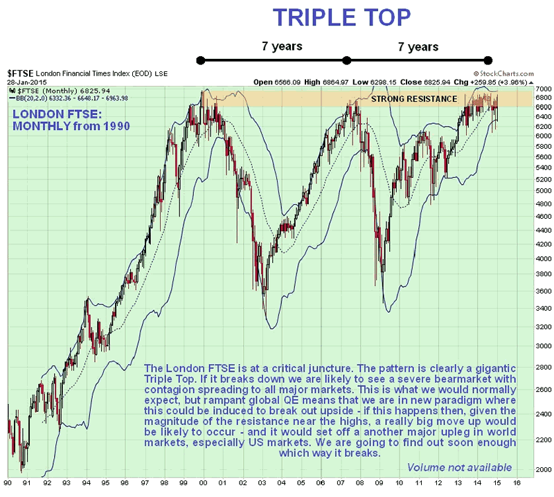
A dramatic example of such gargantuan manipulation may be about to play out in the London stockmarkets. The normal interpretation of the giant pattern forming in the UK FTSE index which we looked at not long ago, using traditional Technical Analysis, is that a huge Triple Top is completing, but the government may be able to avert this outcome by simply doing QE on a sufficient scale to head this off and force an upside breakout. All they have to do is keep pumping money at a sufficient rate and make sure it reaches those whose task it is to keep the market levitated. This is the "new paradigm" that we wrote of near the start - never before have governments had such power to control markets. If they succeed in breaking the FTSE out the top of its gigantic Triple Top, where there is huge resistance, this index will soar. If it starts to descend from this Triple Top, things could get ugly in a hurry.

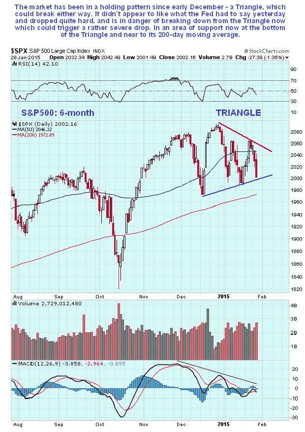
The markets' reaction to the Fed yesterday was negative, as we can see on the 6-month chart for the S&P500 index below...

S&P500 6-Month Chart

If the FTSE does break out upside from its Triple Top, then US and other markets should soar too. The US should remain "leader of the pack" for various reasons. The obvious one is that its currency, the dollar, is the global reserve currency. The next is that it is "smelling of roses" right now because it is not doing QE, while other centers of economic power are, although the fact is that the Fed still has a huge tub of money from the last big QE to goose the markets. Still another one is that the US is geographically homogeneous and distant from world trouble spots, unlike Europe which is composed of potentially warring tribes. So while there might be some nasty shakeouts in the US markets over the short to medium-term, as might be occasioned by a disappointing earnings season, there should be plenty of cash sloshing about to drive them back up again. All this is a reason why we are looking at things like airline stocks, which stand to benefit also from the drop in the oil price.

The other side of this manipulation coin is that they also have to power to beat down things they don't like, such as gold and silver, by endless waves of naked shorting - but this will only work until the gap between the physical and paper price becomes untenably large. Given the rampant global QE now underway and the resulting destruction of currencies, and the fact that most of the available physical gold in the world has already been bought up by Asian countries, most notably China, their power to beat down the paper price of gold looks spent, and it is starting to rise again, after the onslaught of the past 3 years.

The end result of relentless global QE would be a hyperinflationary depression, where prices rise strongly because of the endless increase in money but get people get poorer as wages fail to keep pace. When you mention hyperinflation people think of it as prices rising by thousands of percent per year, like in the Weimar Republic in Germany or Zimbabwe at its worst, but it doesn't have to be anywhere near that bad to be hyperinflation - if prices only rise by 60% per year, most citizens would be ruined within 2 years. That could easily happen if this QE gets out of hand.

When we consider the outlook for gold and the impact on the gold price of all this relentless global QE, any fool can see that if you continually increase the money supply, the cost of something finite like gold is going to rise - and possibly rocket, especially as a lot of the physical supply of gold has already been soaked up by more shrewd players like China. This means that the jokers on the Comex with all their naked shorting are going to be way out on a limb, when the price gap between paper and physical gold yawns to untenable and unsustainable levels - it is already big.

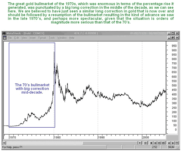
So even though the blizzard of unbacked money created by the ongoing global QE can be expected to drive the prices of many investments like stocks higher and higher, gold (and silver) are not going to be left out for much longer. They are already starting to come to life. Older investors will recall that gold's gigantic bullmarket of the 1970's was punctuated by a big 2-year correction in the middle of it that corresponds to the big 3-year correction that we have just witnessed, before it took off higher again into a massive ramp and a spectacular blowoff top, which is what we should see repeated again, only this time round, given the unprecedented excesses that now exist, it is likely to be orders of magnitude larger.

Gold 1970-2005 Chart

The biggest danger to the system that could yet - and at any time- cause markets to crash would be a widespread failure of confidence in the banks and the system. So far investors don't seem to care about banks and governments destroying their children's future with their reckless QE programs, but should that change and investors "get cold feet" things could get nasty in a hurry. We are going to need to keep our wits about us.

See the original article >>

The VIX and the Stock Market

by Pater Tenebrarum

A Disturbance in the Farce?

We usually like to keep an eye on indicators that are not getting a lot of attention, in an attempt to circumvent the “what everybody knows isn’t worth knowing” problem. Recently, several noteworthy things have happened with the $VIX, or rather, the derivatives traded on the VIX. The VIX is a measure of implied volatility, referring to front month options on the S&P 500 Index (it used to be the S&P 100 back when OEX options were still the most liquid index options – the OEX version is these days called VXO). While the first OEX version used only at-the-money options expiring 30 days hence, the calculation has been expanded over time. Now it is a blend of front and second-month at-the-money and out-of-the-money options. Those interested in the precise calculation procedure can take a look at it here: CBOE VIX White Paper (PDF). The aim is to calculate the expected 30-day volatility of the SPX at a 68% probability (one std. deviation) as expressed by the options market.

gi-takingstock01rb1

Image credit: James Steidl / Thinkstock)

For some time VIX futures and options that reference these futures have been trading. Both the futures and options are extremely popular, as hedging instruments, but also as speculative vehicles. In addition, there are VIX ETNs (both long and short, some of which are leveraged), which are also highly popular. Since the stock market usually becomes much more volatile when it goes down rather than up, the VIX tends to rise whenever the market declines. In a steadily rising market with little volatility, the term structure of VIX futures tends to be in contango. There have already been two occasions in 2015 when the cash VIX traded above the futures curve, and even now (after a strong market rise on Monday), the nearest futures contract trades above the two subsequent ones.

1-$VIX

On two occasions in 2015, the cash VIX was trading above the level of VIX futures. The term structure remains partially inverted – click to enlarge.

2-VIX term structure

VIX futures curve – although the cash VIX ended below the futures curve on Monday, March and April futures are still in backwardation vs. February futures – click to enlarge.

When the first inversion of 2015 occurred in January, the event was subject to what could turn out to be an erroneous interpretation at Business Insider. While it is true that over the past year or so, the curve tended to invert close to short term lows, it didn’t invert right at those lows, but before they were made. It is also the case that generally, over the longer term, VIX curve inversions are actually a negative sign, as Gavekal points out here (with a chart that shows a lot more history than the one in the BI article). Prior to the 2008 unpleasantness the VIX term structure also went into backwardation. It was obviously not a good idea to buy stocks at that juncture (it was a good idea to buy VIX calls though).

The recent episodes of VIX futures curve inversion are still small, and may well turn out to be meaningless, similar to those seen last year. However, one needs to keep in mind a few things here: With the sole exception of the October correction, these inversions tended to last just one day in 2014, and were as a rule followed by a divergence (a lower low in the SPX, while the backwardation disappeared). This year we have had two of them closely grouped together on rather mild declines. If the phenomenon turns out to be persistent and the backwardation steepens, then it will definitely fall under the header “warning sign”.

“No More Hedging Required”

Moreover, the event needs to be brought into context – namely into context with what has happened with VIX options. We were surprised to learn what has happened in terms of call vs. put open interest in VIX options in January, and how this was rationalized, according to a Bloomberg report :

“Even with stock swings nearly doubling since 2014 and U.S. equities poised for their worst month in a year, traders aren’t signaling too much concern.

Investors own about 2.4 million options betting on a rise in the Chicago Board Options Exchange Volatility Index, compared to about 1.6 million contracts wagering on a drop. That’s around the lowest ratio of calls to puts in more than two years, data compiled by Bloomberg show, indicating traders don’t anticipate an increase in market turbulence anytime soon.


This seems to be the exact opposite of what VIX futures are signaling, as backwardation in VIX futures is always a sign of “concern.” Here is more about why speculators and hedgers alike seem no longer willing to bet on a rise in the VIX – in spite of the fact that it has actually clearly moved into a higher trading range this year:

“Traders have abandoned options betting on jumps in the VIX since November, even as the gauge spiked at least 18 percent three times this month. Stocks’ tendency to power past declines at the end of 2014 encouraged traders to shed hedges and speculative bets in VIX options they weren’t profiting from, according to Todd Salamone of Schaeffer’s Investment Research Inc.

“We’ve seen a massive drop-off in call open interest,” Salamone, senior vice president at Cincinnati-based Schaeffer’s, said by phone. “There’s been the lack of a big selloff or major volatility pop that hasn’t been short-lived, which could be responsible for that.”

Individuals use VIX options as a tool to protect their stock holdings from losses or to speculate on increases in market stress. The VIX moves in the opposite direction of the Standard & Poor’s 500 Index about 80 percent of the time. Investors have dramatically reduced their positions in VIX calls since September, when they owned about 4.4 contracts betting on upside in the gauge for every put, the highest ratio since February 2007.

Open interest in calls has plunged 50 percent since then, while ownership in options wagering on a VIX decline has grown 49 percent. The put-call open interest ratio in the contracts fell to 1.4 on Jan. 23, the lowest since April 2012.”


We believe there is a lot more speculative interest in VIX calls than hedging interest, but that is just a hunch. We also believe that those trading VIX futures are more likely to be professional traders, as the futures obviously involve a lot more risk than the options; more risk than for option buyers that is – option writers are exposed to very similar risk as futures traders.

We find it quite remarkable that call open interest in VIX options has plunged dramatically just as the VIX actually seems to be threatening to break higher. This definitely strikes us as a bearish divergence. It also means that the behavior of the term structure is most likely of the “warning sign” variety. In fact, it is suggested in the article that the lack of protection via VIX calls may be exacerbating stock market volatility this year (as non-hedged longs are more likely to use stops):

“The frustration level has steadily grown as people see these spikes in the VIX become more and more fleeting,” Breier, a senior equity-derivatives trader at BMO in New York, said by phone.

The stock market’s durability last year could have led to investors shedding unused protection and never replacing it, Salamone at Schaeffer’s said.

“Those that typically use VIX call options to hedge long portfolios could be giving up on those hedges,” he said. Through most of last year, “it wasn’t unusual for 90 percent of those calls to expire worthless,” he said.

The consequences endured by underhedged investors may have already surfaced in exacerbated stock swings. The S&P 500 has posted average daily moves of 0.9 percent so far this year, almost double the 0.53 percent average each day in 2014.”


What’s more though, hedging activity seems to have moved away from the options market to the futures market, indirectly confirming our above assertion regarding VIX futures mainly being the playground of professional traders. Incidentally, some of the rising open interest in VIX puts is possibly explained by the increase in long positions in VIX futures. Once again though we think one should not underestimate how much short term speculation there is in VIX options. It is as though traders in these options have “learned their lesson” and are now increasingly betting on declines in the VIX – quite possibly at exactly the wrong time:

“Even as VIX options traders give up on calling for more turbulence, hedge funds and other large speculators own the most such bets in VIX futures contracts since December 2009, according to data compiled by the Commodity Futures Trading Commission. These managers held about 86,700 long positions and 79,700 short ones through Jan. 20, CTFC data show. Hedge funds are expressing the view that volatility will gradually rise this year without trying to time when the VIX will spike, according to Dan Deming at Equity Armor Investments.

“Right now, there’s a belief from a trader’s perspective that owning VIX futures is a better strategy,” Deming, managing director at Equity Armor, said by phone from Chicago. Larger market participants “are buying downside puts because they’ve ramped up their volatility exposure,” he said.

The two most-owned options on the VIX are wagering on it to decrease within the next 30 days. Contracts expiring Feb. 18 with a strike price of 14 have the highest ownership, followed by options wagering on a drop to 15 by that same day.


Something has clearly changed – but the one factor that is most unlikely to have changed is that the options crowd will be wrong again. If so, then the VIX is set to rise.

Conclusion:

Investors and traders should keep a close eye on the VIX term structure and the put/call open interest ratio in VIX options. The term structure can be followed here, at VIX Central. Charts summarizing various VIX options-related data can be found here. If these recent trends persist, it could well prove to be meaningful.

Addendum: Bonds vs. Stocks

Here is one more chart that deserves to be looked at from time to time, and now is such a time. It plots the ratio of the 30 year treasury bond price vs. the SPX. As you can see, whenever this ratio has “broken out” to the upside, it too warned of an impending increase in market volatility. Its current rise may yet turn out to be a flash in the pan, but this also bears watching closely:

3-30-year-SPX ratio

The ratio of the 30 year treasury bond price vs. the SPX – it seems to have bottomed in 2014, and now it is rising. So far the increase is small, but it may well turn out to be an early warning sign as well – click to enlarge.

See the original article >>
Follow Us